Theses Thesis/Dissertation Collections
10-1-2009
Visualizing threat and impact assessment to
improve situation awareness
Michael Cooper Nusinov
Follow this and additional works at:http://scholarworks.rit.edu/theses
This Thesis is brought to you for free and open access by the Thesis/Dissertation Collections at RIT Scholar Works. It has been accepted for inclusion in Theses by an authorized administrator of RIT Scholar Works. For more information, please [email protected].
Recommended Citation
Improve Situation Awareness
by
Michael Cooper Nusinov
A Thesis Submitted in Partial Fulfillment of the Requirements for the Degree of Master of Science
in Computer Engineering
Supervised by
Dr. Shanchieh Jay Yang Department of Computer Engineering
Kate Gleason College of Engineering Rochester Institute of Technology
Rochester, New York October 2009
Approved by:
Dr. Shanchieh Jay Yang
Thesis Advisor, Department of Computer Engineering
Dr. Moises Sudit
Committee Member, Department of Industrial Engineering
Dr. Marcin Lukowiak
Rochester Institute of Technology Kate Gleason College of Engineering
Title:
Visualizing Threat and Impact Assessment to Improve Situation Awareness
I, Michael Cooper Nusinov, hereby grant permission to the Wallace Memorial Library
to reproduce my thesis in whole or part.
Michael Cooper Nusinov
Acknowledgments
I would like to thank my advisor Dr. Yang for being incredibly patient and encouraging
with me while working on this thesis. I would also like to thank my other advisors Dr.
Sudit and Dr. Lukowiak, particularly Dr. Sudit for lending his expertise and feedback in
the early stages of this work. Finally, I would like to thank John Salerno, George Tadda,
and Melissa Clymer for their professional expertise and feedback in designing the
Abstract
Visualizing Threat and Impact Assessment to Improve Situation Awareness
Michael Cooper Nusinov
Supervising Professor: Dr. Shanchieh Jay Yang
Situation awareness comes from combined knowledge of the environment, friendly actions
and adversaries’ actions. Impact assessment applies that knowledge to determine the
con-sequences of those actions on specific missions and assets. In domains such as asymmetric
warfare and cyber security, impact assessment is critical to provide timely and
comprehen-sive situation awareness. An analyst needs to be able to quickly and accurately assess a
situation, see the factors affecting important assets, and come to a conclusion on what the
best course of actions are to take. Many attempts have been made to visualize a situation
from observed raw data for better awareness. However none have attempted to visualize
the impact and threat of observed actions on assets and missions.
This thesis investigates critical visual elements that will enhance situation awareness.
Our approach leverages results of threat and impact assessment of ongoing situations.
These include changes in effects on assets and missions by activities, and the projection
of current situations into the future. This set of information is strategically placed and
displayed to facilitate analysts to perform forensic and real-time analysis. While other
visualization tools have focused on achieving situational awareness through representing
raw data in a meaningful way, this visualization attempts to enhance situational awareness
Contents
Acknowledgments . . . iii
Abstract . . . iv
1 Introduction. . . 1
1.1 Fusion Models . . . 1
2 Related Work . . . 6
2.1 Dragon . . . 7
2.2 Jove . . . 8
2.3 SecureScope . . . 10
2.4 VisAlert . . . 11
3 Visualization Implementation . . . 14
3.1 Important Concepts . . . 14
3.2 Design Challenges . . . 15
3.3 Underlying Data Structure . . . 17
3.4 Software Implementation . . . 19
4 ViSAw Features . . . 20
4.1 Current Overview . . . 21
4.1.1 Impact vs Reliability Scatter plot . . . 22
4.1.2 Heartbeat Graphs . . . 25
4.1.3 Activity/Asset Matrix . . . 25
4.1.4 Zoomed in scatter plot . . . 26
4.2 Detailed Past Screen . . . 27
4.2.1 Event Search Box . . . 29
4.2.2 Event Timeline . . . 31
4.2.3 Playback Map . . . 31
4.2.4 Event Details Table . . . 33
4.3 Plausible Futures Screen . . . 36
4.3.1 Future Playback Map . . . 38
4.3.2 Priority Intel Requirements . . . 39
4.3.3 Plausibility Star Graph . . . 40
5 Example Workflow . . . 43
6 Conclusions and Future Work . . . 56
List of Tables
2.1 Representative Visualizations . . . 7
3.1 Summary of important concepts . . . 15
List of Figures
1.1 Salerno’s combined fusion model [20] . . . 3
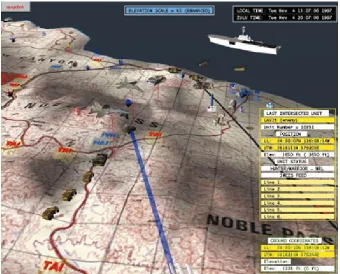
2.1 Dragon visualization. Assets are displayed as three dimensional models on a terrain map . . . 8
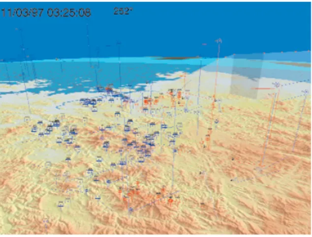
2.2 Jove visualization. Assets are represented as symbols on 3D map. Move-ment curtain shows asset history . . . 9
2.3 SecureScope visualization, asset to event category relationships are shown . 10 2.4 VisAlert visualization, shows relationships between assets and alerts . . . . 12
3.1 Overall Process Diagram . . . 16
3.2 Overall schema diagram of the underlying database . . . 18
4.1 Current Overview screen . . . 21
4.2 Current Overview Component break down . . . 22
4.3 Row of Impact vs Reliability scatter plots for the asset “Reconnaissance Flight Crew” . . . 23
4.4 Impact vs Reliability scatter plot. . . 24
4.5 Heartbeat Graph showing the “health” of an asset . . . 25
4.6 Activity-Asset Matrix showing the effect of three activities on two assets . . 26
4.7 The zoomed in scatter plot showing multiple events and their order of oc-curring . . . 27
4.8 Detailed Past Sceen . . . 28
4.9 Detailed Past component breakdown . . . 30
4.10 Event Search Box, here we are searching by Activity name . . . 30
4.11 Event Timeline, solid triangles are events occurring during the time repre-sented by the yellow line . . . 31
4.12 Playback map, two events are occurring; a blue asset is impacting a red asset, and another red asset is acting on itself . . . 32
4.13 Three sample assets are shown here. One is a blue asset at an impact of 0, one is a red asset at an impact of 0.6 and the third is a compromised red asset with an impact of 0.85 . . . 32
4.15 Event Flowchart, here it is shown which events caused which other events . 35 4.16 Plausible Futures screen . . . 36 4.17 Plausible Futures component breakdown . . . 38 4.18 Future playback map, instead of stepping through events, this map allows
you to focus on one future at a time . . . 39 4.19 Priority Intel Requirements box. The analyst takes notes on what
informa-tion needs to be collected . . . 40 4.20 Plausibility Radar Graph. For this future event the intent of the executing
asset is very high . . . 41
5.1 Current Overview screen. Here we can see an overall view of the current situation for the Retrieve Farc Intel. . . 44 5.2 Looking at the Reconnaissance Flight Crew we see that there is an
impor-tant activity affecting the asset . . . 45 5.3 Right clicking on an activity allows the analyst to explore the details of the
activity’s events in the past . . . 46 5.4 Detailed Past screen. From here the analyst can step through events and
see their effects on the assets involved in the mission . . . 47 5.5 Looking at the Event Flowchart view allows us to see the progression of
events . . . 48 5.6 Double clicking on a scatter plot, opens that time period in the Zoom area.
Here we can see four events that were part of that activity . . . 49 5.7 Right clicking on an activity allows the analyst to explore the activity’s
plausible futures on the Plausible Futures screen . . . 50 5.8 The Plausible Futures screen, showing a plausible future and its effect on a
targeted asset . . . 52 5.9 Looking at the Plausibility Radar Graph, the analyst can determine why an
event was projected to occur . . . 53 5.10 Using the Priority Intel Requirements section of the Plausible Futures screen,
Chapter 1
Introduction
Situation awareness is “the perception of the elements of the environment, the
comprehen-sion of their meaning and the projection of their status in order to enable decicomprehen-sion
superior-ity.” [21] Situation awareness is critical in any area where humans make critical decisions
based on information from the environment. This could range from driving a car to
com-manding a battlefield. Using experience from the Air Force, Colonel John Boyd created the
Observe-Orient-Decide-Act loop to achieve situational awareness [13]. The OODA loop
provides a basic conceptual idea on how to achieve better situation awareness.
As situation awareness matured, formal processes were developed to handle large amounts
of data being collected. Information fusion models were developed to take this data and
process it in a structured way. Two of the most accepted fusion models, the Joint Director’s
of Laboratories model (JDL model) [20] and Endsley model [8] are described below, as
well as an attempt to combine both models into a unified model.
1.1
Fusion Models
A commonly referred fusion model is the Joint Director’s of Laboratories model (JDL
Data Assessment and handles the incoming raw data stream. At Level 1, or Object
Assess-ment, this raw data is correlated to identify objects or tracks. Level 2 is called Situation
Assessment. This is where knowledge of objects and their relationships to one another are
combined to form the overall situation. Level 3, or Impact Assessment, attempts to
deter-mine the impact of the situation. Finally, Level 4 is the Process Refinement step where
feedback is given and adjustments are made to any of the other levels of the model.
Another important model is the Endsley model [8]. While the JDL model is primarily
a data-driven model, Endsley’s model is a mental model and attempts to model how an
analyst would think about situation awareness. The three main areas of Endsley’s model
are Perception, Comprehension, and Projection. Perception involves perceiving the status,
attributes and dynamics of elements in the environment. Comprehension involves
combin-ing the elements found durcombin-ing Perception to understand the significance of those elements.
Projection involves predicting what is going to occur in the future. A fourth stage,
Reso-lution, was added by McGuinness and Foy [18]. Resolution attempts to determine the best
steps to take to obtain the desired outcome of the situation.
A newer model, proposed by John Salerno [20], attempts to combine both the JDL
model and the Endsley model (Figure 1.1). Level 1 from the JDL is combined with
Ends-ley’s Perception. This stage is where activities are correlated together, entities are identified
and groups are made. Salerno then takes JDL Level 2 and 3 and divides them temporally
into the current and the future, which corresponds to Endsley’s Comprehension and
Pro-jection.
Figure 1.1: Salerno’s combined fusion model [20]
thing’s force of impression on another.” [3] Impact assessment is the determination of the
consequences of these forces on assets. To determine the threat on an asset, concepts such
as capability, opportunity and intent need to be considered [22]. Capability is “the facility
or potential for an indicated use or deployment required to achieve a goal.” [3] Opportunity
can be defined as any favorable circumstances that may help achieve a goal. Finally, intent
is a desire or determination to act in a specific way. Together all of these aspects determine
whether a perceived threat may emerge. Threat can be formally defined as “an expression
of intention to inflict evil, injury, or damage.” [3] Threat assessment involves assessing the
likelihood of future actions and their possible outcomes.
Recent work has begun to focus on the automation of this impact and threat assessment.
plausible threat by these events. Fava et al.[9] use Variable Length Markov Models to estimate future events in attack tracks. FuSIA [15] attempts to combine multiple projection
algorithms using Dempster-Shaffer.
While these processes exist to automate situation assessment it is important to note
that situation awareness comes from the awareness of the analyst and therefore can never
be completely automated. Situation awareness can only be achieved by an analyst’s
un-derstanding of the situation assessment. Therefore an efficient means of conveying the
information to the analyst is essential. The analyst must be able to receive the information
and understand it quickly and accurately. Visualizations are one such way to display the
information collected through situation assessment. By taking the data and transforming it
into a visual representation, the analyst can absorb the information faster and easier.
This thesis investigates methods of displaying information to analysts in such a way
as to enhance their situation awareness. By focusing on not only raw data, but also the
results of situation assessment, such as impact and threat assessment, this visualization
will provide the analyst with a richer set of information. With this additional information
the analyst will be able to make informed decisions quicker and their overall awareness
will improve.
To design a successful visualization, many factors need to be considered. In situation
awareness it is very easy to be overwhelmed with data. Therefore it is important to
exam-ine how an analyst approaches a situation and provide information that will help the analyst
the mental model of the analyst to design a visualization that enhances the analyst’s
per-ception, comprehension and projection and therefore improve the analyst’s overall situation
awareness.
This thesis document is organized as follows: The first chapter introduces the problem.
Chapter 2 discusses past visualization efforts and gives a detailed look at the features of
a representative set of existing visualizations. Chapter 3 outlines the overall challenges
of designing a visualization as well as discusses how the visualization is implemented.
Chapter 4 describes in detail the features of the visualization and why they were chosen.
Chapter 5 provides an example of how the visualization might be used by the analyst,
illustrating the benefits of the visualization. Finally, Chapter 6 concludes this thesis and
Chapter 2
Related Work
Situation awareness is a complex task. To assist analysts in understanding a situation,
vi-sualizations have been developed to convey the information in a meaningful way. Whether
it is as simple as an organized table, or as complicated as a three dimensional display,
visu-alizations were designed as a means to break down information and display it to analysts.
In the era before computers, visualizations were paper maps with acetate overlays
indicat-ing locations and status of assets. Thus, the first computer visualizations were designed
to replace these physical maps [7], as the process was time consuming to create and the
computer displays could be updated much faster.
More sophisticated techniques began to be developed, such as Hoffmanet al.[16] who use the concept of gestalt and pre-attentive processing to display a large number of assets as
density textures, increasing the user’s comprehension of a situation. AGI [1] is developing
visualizations for Space Situation Awareness. Their visualizations show satellite tracking
information, orbit estimations, and debris tracking.
Below is a more detailed look at four visualizations. These visualizations are a
repre-sentative look at the overall evolution of visualization techniques. The first visualization,
each asset. Jove [11] incorporates movement of assets and the terrain of the environment.
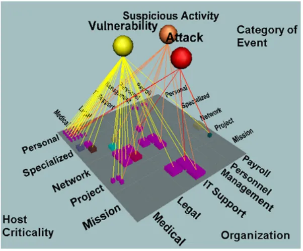
SecureScope [6] moves beyond displaying assets on a map, and instead displays the
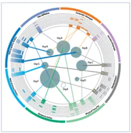
rela-tionships between assets, missions and events. Finally, VisAlert [12] displays asset-event
relationships but also incorporates time to display patterns in events.
Table 2.1: Representative Visualizations
Name Description Figure
Dragon [7] Virtual reality system displays a detailed 3D terrain map, where assets are represented by 2D symbols or 3D models.
2.1
Jove [11] Focus on terrain modeling, with dots on the map accompanied by lines and curtains to display history of movements.
2.2
SecureScope [6] Three dimensional depiction of assets, alerts, tasks, and their re-lationships.
2.3
VisAlert [12] Assets surrounded by a circular display of alerts; location around circle corresponds to alert type and distance to center corresponds to time.
2.4
2.1
Dragon
Dragon was built on a virtual reality work bench to replace the use of paper maps and
acetate overlays. Much time was spent printing and distributing maps and this visualization
was created to resolve this issue. Dragon displays assets and other key features on a three
dimensional terrain map. Most assets are displayed using two dimensional symbols texture
mapped onto the sides of a cube. This is done so that in the three dimensional visualization,
the two dimensional symbols are always visible. Tanks, ships and planes however are
displayed as three dimensional models for better recognition from the user. The allegiance
of each asset is conveyed as a blue tint or American flag for friendly units and a red tint or
details of the assets, such as speed, heading, and current condition. As reports are received,
[image:19.612.140.480.144.418.2]this information is updated for the user.
Figure 2.1: Dragon visualization. Assets are displayed as three dimensional models on a terrain map
The visualization is controlled by a joystick and an on-screen cursor. Two modes of
navigation are available, one where the user controls the map, and one where the user
directly controls the camera. Using the on-screen cursor the user can also select assets to
see information about that asset as well as move the asset around.
2.2
Jove
Jove is another visualization which displays assets on a three dimensional map. Assets are
the asset’s position. These asset symbols are displayed as a billboard so that, no matter
[image:20.612.152.469.143.384.2]what angle the camera is at, the symbols are always visible.
Figure 2.2: Jove visualization. Assets are represented as symbols on 3D map. Movement curtain shows asset history
Two things that are important for situation awareness are movement history as well as
terrain. Using the history of an asset helps determine the intent of that asset. This movement
history is represented in Jove as a line for land based units, or curtain for aircraft and
undersea assets. Terrain is represented in Jove as both a geometrically modeled terrain as
well as shaded textures. A higher level of detail is used on terrain that is close to the camera,
while lower levels are used farther away. Using the terrain, the user is able to determine
2.3
SecureScope
Unlike Dragon and Jove, SecureScope, a visualization developed by Secure Decisions,
attempts to enhance situation awareness by displaying relationships between assets, events,
and missions. A three dimensional grid is used to organize assets. The assets can be
organized in one of many ways such as by location or by function. Missions or events
are displayed as spheres above the grid and lines are drawn to represent the relationship
between the assets and these elements. Other grids can be used to display asset to asset
relationships as well. Colors can be used to denote type of asset or event, severity of event,
or importance of mission. Using SecureScope, the user can easily and accurately see these
[image:21.612.160.461.379.628.2]interrelationships between assets, missions and events.
2.4
VisAlert
VisAlert was also designed to display the relationship between assets and event alerts.
VisAlert was designed under the basis of displaying the “three W’s” where, what and when.
Assets are laid out in the center of the visualization in such a way that their location
cor-responds to the “where” relative to one another. Alerts, or events, are organized in a circle
around the assets (the “what”). Time, or “when”, is represented by rows in the circle. Asset
to alert relationships are drawn as a line from the asset, to the area on the circle that
corre-sponds to the alert, with the distance from the circle outward corresponding to the time the
alert took place. The thickness of the line indicates the number of alerts of that type that
were associated with the given asset and the color of the line indicates the severity of the
alert. The assets size also corresponds to the number of unique alerts seen on that asset.
These additional visual cues help an analyst gather information about the situation faster.
VisAlert originally focused on the cyber domain, visualizing machines and attacks on
those machines. VisAware [17] expands the scope of VisAlert to be any domain. For
example, VisAware was applied to achieve enhanced awareness during a disease outbreak
by visualizing locations of reported cases (the “where”) and associating them with the type
of disease reported (the “what”). It was also suggested that VisAware could be applied
to emergency response awareness, correlating locations with emergency events as well as
resources such as hospitals and emergency vehicles.
While these visualizations are very proficient at what they’re designed to display, none
of them explicitly convey the impact and threat on the assets and missions from the events.
Figure 2.4: VisAlert visualization, shows relationships between assets and alerts
They do not use the results of situation assessment processes such as threat and impact
assessment.
While visualizations such as SecureScope and VisAlert display asset to event
relation-ships they don’t display the impact on the asset from the event. They may indicate the
severity of the event but they don’t explicitly show the consequences of the event on the
asset. They also lack the display of projected events. By not displaying plausible future
events the analyst is forced to spend time working out future scenarios on their own.
To further enhance situation awareness, a visualization would have to incorporate not
only the concepts displayed by these past works: asset location, asset history, and asset to
event relationships; but also display impact scores, plausible future events and their threat
analyst to achieve situation awareness. We will also discuss our way of implementing the
Chapter 3
Visualization Implementation
The visualization described in this thesis is meant to address the shortcomings observed
in the visualizations discussed in the previous section. It is important to establish what
information needs to be displayed to the analyst before we explore how we can display it.
3.1
Important Concepts
Before we describe the visualization in any detail, we must outline some basic concepts
and their definitions. A situation is made up of a series of activities, a group of assets
and the state of the assets. Activities are composed of a set of related events. Events are
occurrences which affect the state of an asset. Often times they are carried out by one asset
and target another asset but may involve many assets. Events have an associated reliability
associated with them. The higher the reliability, the more likely it is that the event occurred
as it was observed. There is also an impact score associated with an event with regards to
the asset it is targeting. In the case where an event is targeting multiple assets, the event
may impact each asset differently. If an event is a projected future event, then that event
has an associated plausibility of occurring at some point in the future. This plausibility is
generally made up of multiple factors, including capability, opportunity and intent.
are relationships between assets, where assets may support or protect other assets. A
mis-sion represents an end goal as well as a group of assets that are necessary for achieving that
goal. Some assets are more important to the mission than others and the mission has a goal
state they want each asset to be at to achieve their overall end goal.
Table 3.1: Summary of important concepts
Term Definition Example
Activity A group of related events A terrorist plot to kidnap a group of people and hold them for ransom Event A single occurrence which impacts one
or more assets
Disable security systems
Impact The damage on the asset by the event Very Damaged Reliability The likelihood that the information
about the event is accurate
Not Very Reliable
Plausibility The likelihood that the event will occur in the future
Likely
Asset An object of interest Security Guards Mission an overall goal and a group of assets
involved in achieving that goal
Capture Terrorist Group and protect es-sential personnel
3.2
Design Challenges
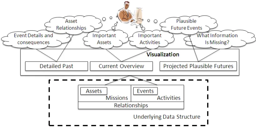
Figure 3.1 shows several key concepts that are important to an analyst in achieving situation
awareness. An analyst is interested in the important assets that are involved in the situation
as well as the relationship between assets. Inter-asset relationships are important, as they
help the analyst understand if one asset is compromised what other assets will now be
open to threats. The analyst will also need to know all important activities occurring in the
situation as well as the impact of these activities on the important assets.
Figure 3.1: Overall Process Diagram
in detail what happened. By looking at the details of past events and activities, the analyst
can see how the current situation came to be. The analyst will also want to examine any
plausible future events so that he may be better prepared for what is to come. By knowing
why future events are projected to occur, the analyst can take measures to mitigate the threat
and impact of the future event or possibly prevent that future from occurring altogether.
There will always be information that is unknown. These intelligence gaps will prevent
the analyst from achieving complete awareness of the situation. The analyst will want to
know what questions should be answered and what data should be collected to know more
about the situation.
Overall, the analyst wants to obtain a quick perception of the current situation, a deeper
comprehension of past events and their details, and an anticipation of projected future
events. To do achieve this, the following details need to be displayed in some manner:
each other.
• Any important activities occurring, the events that make up those activities and the
details of those events.
• Plausible Future Events that may occur
• Collection requirements to fill in the missing information.
These details correspond to an underlying set of data which needs to be stored and accessed
by the visualization.
3.3
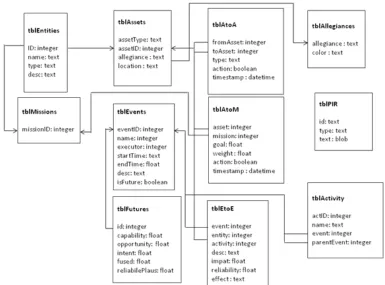
Underlying Data Structure
The data first needs to be stored before it can be displayed to the analyst. For this
visualiza-tion all of the data is stored in a SQLite database. SQLite databases are stored as a single
file on the hard drive but can be queried with standard SQL commands. SQLite was chosen
for its compatibility with Adobe Flex, the platform that the visualization is built on. The
overall schema of the database is represented in Figure 3.2.
The key data elements, as seen in Figure 3.1 are assets, missions, events, activities and
the relationships between these four items. Both assets and missions are stored in a table of
entities. These entities have a name, type (asset or mission), and description. Assets have
additional attributes: asset type, allegiance and location. The combination of assets and
missions in the database was meant to accommodate events that impacted missions directly,
however in the current visualization that is not done. Events have a name, a start and end
Figure 3.2: Overall schema diagram of the underlying database
Projected future events have additional attributes. These attributes are plausibility scores
for capability, opportunity, intent, and overall plausibility, as well as a reliability score for
these values. Missions and activities simply have a name.
Since events can affect multiple assets, the relationships between event and target asset
are stored separately from the events themselves. These event-to-asset relationships contain
an impact score, an effect on the asset in words, and a reliability score on how accurate the
impact is. Relationships between assets and missions are represented by the mission ID,
the asset ID, a goal state as well as a weight value signifying the importance of the asset to
the mission. Asset-to-asset relationships are stored simply with the parent asset ID and the
and parent event IDs.
3.4
Software Implementation
The visualization was designed in Adobe Flex. Flex was chosen because of its focus on
designing graphical user interfaces. It is also operating system independent so the
visual-ization could run on Windows, Mac, or Linux if it needed to. Adobe AIR allows Flex to
run on the desktop instead of in a web browser. This was done to give the application direct
access to files on the hard drive such as the SQLite database file. Adobe AIR also contains
built in support for accessing SQLite files.
The visualization code was designed to be as modular as possible. Each major section
of the visualization is divided into its own package and each component is a separate class.
There are also some utility packages that all of the sections share.
Components communicate among one another through events and listeners. Events
occur based on the input of data or through user interaction. Individual components listen
on these events and when the events are received their display is updated accordingly.
By designing the visualization in Adobe AIR and using an SQLite database for the
underlying data we were able to rapidly prototype various visualization features. These
features were demoed to experts in the field of situation awareness and through their input
we were able to modify and enhance the visualization. In the next chapter the details of
the final visualization features will be discussed, including why we chose to display certain
Chapter 4
ViSAw Features
The visualization, called ViSAw is divided into three screens. Each screen is meant to
encompass one temporal aspect of situation awareness (refer back to Figure 3.1). First, the
Current Overview’s focus is on the current situation, with a brief representation of how the
past led up to the current situation and how this current situation may plausibly change in
the future. It is not meant to provide any details but give the analyst an overall picture of
the situation and a quick perception of the current impact of activities on assets. Second,
the Detailed Past screen allows the analyst to examine, in detail, events that have occurred.
Here the analyst can play back past events and see how they affected assets. Third, the
Plausible Futures screen facilitates the analyst’s anticipation of plausible future events and
examine why these plausible future events are projected to occur. This screen also lets the
analyst record what information needs to be collected to know more about the situation.
In this chapter, each screen will be broken down and described component by
compo-nent. The basic function of each component will be outlined as well as why the component
4.1
Current Overview
The Current Overview is situated in the center of the three screen layout. Its primary
purpose is to convey to the user the current state of important assets and missions. The
Current Overview screen allows the user to see a summary of how the past led up to the
current situation and how the situation may change in the future. The Current Overview
[image:32.612.105.519.290.594.2]screen contains four important features that will be discussed in depth later in this chapter:
Figure 4.1: Current Overview screen
1. A series of scatter plots for each asset. These scatter plots represent activities
Figure 4.2: Current Overview Component break down
Each scatter plot represents a discrete amount of time.
2. A line graph, referred to as a “heartbeat” graph for each asset. It consists of two lines,
one for the impact on the asset, and one for the reliability that the impact is correct.
3. A matrix of Activities and Assets. This matrix shows a numerical impact score for
each asset by each activity. The user can choose for which mission to display the
assets.
4. An area to see one of the scatter plots zoomed in. This zoomed in area shows every
event in a selected scatter plot.
4.1.1 Impact vs Reliability Scatter plot
Each asset on the center screen has a row of scatter plots with each scatter plot representing
by activities on each asset. Each scatter plot is arranged such that the y-axis corresponds
to the impact of the activity on the asset, while the x-axis corresponds to the reliability
that the impact is accurate. Activities are displayed as circles on these plots with the most
recent activity within that box highlighted with a thicker border. With this arrangement,
high impact activities are all found towards the top of the scatter plots while highly reliable
scatter plots are found on the far right of the scatter plots.
Figure 4.3: Row of Impact vs Reliability scatter plots for the asset “Reconnaissance Flight Crew”
Activities are made up of a series of events, so for each interval of time there is a group
of events for each activity. To reduce clutter and allow the analyst to get a better sense of
the activities affect on the asset, the events are combined and only the most recent event in
that time period is shown. While this might not be the most optimal way to aggregate the
events, it shows the end result of the activity in that time period.
With many assets and activities the analyst may become overwhelmed when looking at
these rows. To draw the eye of the analyst towards important time periods the background
of the plots will be colored based on the presence of activities in key areas. If an activity
crosses a threshold value for either impact or reliability, the background is colored yellow.
If an activity crosses threshold values for both impact and reliability, the background is
attention. These threshold values can be set on an options panel at any time during using
the visualization. This allows the analyst to customize what values he feels are important.
The analyst can also modify upper and lower bounds for impact and reliability values. Any
activities with values outside of those bounds will not be displayed on the plots. With this
option the analyst will not be distracted by activities deemed unimportant by the analyst
allowing the analyst to focus their attention on the activities which are important.
Figure 4.4: Impact vs Reliability scatter plot.
Many alternatives representations were considered. The main focus of this section of
the screen is to display the impact on assets by activities. Initially a gradient ranging from
green to red was considered, where green represented a low impact and red represented
a higher impact. This proved to be insufficient since multiple activities could affect the
same asset at the same time and the gradient would become confusing. Furthermore, the
reliability of the change in impact is equally as important and the gradient does not take that
in to account. Analysts would see that the impact on an asset is very high (red) but not know
that the reliability is very low. Two stacked gradients were also considered, one displaying
the impact and one displaying the reliability, however this arrangement was confusing and
because of its ability to clearly convey both impact and reliability at the same time as well
as allow multiple activities to be displayed at once. The only drawback is that time must be
represented in discrete intervals instead of continuously. This is remedied by allowing the
analyst to modify the amount of time represented in each interval.
4.1.2 Heartbeat Graphs
To the right of the series of scatter plots is the heartbeat graph. This graph contains two
lines, a red line indicating the impact on the asset and a blue line indicating the reliability
that the impact is accurate. The x axis of this graph is time, and the time ranges from the
beginning of events to the current time. It is meant to mimic a traditional EKG display and
shows to the analyst the relative “health” of the asset allowing the analyst to get a very brief
[image:36.612.263.342.414.506.2]view of the state of the asset over time.
Figure 4.5: Heartbeat Graph showing the “health” of an asset
4.1.3 Activity/Asset Matrix
The Activity-Asset Matrix is a two dimensional matrix with rows corresponding to each
activity while columns correspond to each asset. Where the activity and asset meet, a
of that impact on the asset by the activity. The matrix’s purpose is twofold. First, the
ma-trix allows the analyst to examine the relationship between activities and assets. Second, it
functions as a navigational instrument, allowing the analyst to click on an asset and have
the center portion of the screen highlight that asset. Originally, this section of the Current
Overview screen was going to be a simple list of missions, red assets and blue assets for
navigational purposes. However using the matrix instead provides the analyst with more
[image:37.612.220.395.281.467.2]information than just a list of assets.
Figure 4.6: Activity-Asset Matrix showing the effect of three activities on two assets
4.1.4 Zoomed in scatter plot
The zoomed in scatter plot is activated when the user double clicks on one of the Impact vs
Reliability scatter plots described in Section 4.1.1. It provides a larger view of the scatter
plot as well as displays individual events of each activity. The zoomed view attempts to
make up for the shortcomings in the scatter plots, most notably that the scatter plots could
affected the asset is not explicitly clear. This zoomed in view provides a larger area to plot
the events alleviating clutter. This view also numbers the events in the order in which they
occurred. In this way the analyst can see the order the events occurred without having to
[image:38.612.243.377.200.340.2]go to the Detailed Past screen.
Figure 4.7: The zoomed in scatter plot showing multiple events and their order of occurring
Each of the components on the Current Overview screen work together to paint a picture
for the analyst of what the current situation is. They provide enough information so that
the analyst can quickly get an idea of the overall situation without flooding the analyst with
too many details. When they have a handle on the overall situation they can then use the
other two screens to examine the details.
4.2
Detailed Past Screen
The Detailed Past screen’s main purpose is to allow the analyst to playback events that have
occurred and examine the details of these events. From this screen the analyst can search
for events with specific criteria and then step through them sequentially, viewing which
Figure 4.8: Detailed Past Sceen
Past Screen is composed of six main components:
1. The event search box allows the analyst to search through all the events for events
which match a specific criterion. Events can be searched by the asset involved, the
time the event occurred, activity the event is a part of, or mission affected by the
event.
2. The event timeline displays events as small triangular icons chronologically. The user
can click on a spot on the timeline to jump to that point in time.
click to playback the events as they occur, or click anywhere on the event timeline
to jump to that point in time. The playback map will show executing assets affecting
target assets as well as the impact on assets up to that point in time.
4. The event details table displays all the details of events in tabular form. These details
include the start and end times of the event, the executing asset, the target asset, the
impact on the target, the reliability that this information is accurate and a description
of the effect the event had.
5. The event flowchart view displays the causal relationships between events by
dis-playing the events as rectangles and arrows connecting an event to the events it led
to.
6. An activity-asset matrix is also displayed on this screen. It shows the effect of
activi-ties on assets up to the chosen point in time of playback.
4.2.1 Event Search Box
The event search box is used by the analyst to search through all of the events that have
occurred and find specific events of interest. The analyst can choose to search by activity,
asset involved, mission involved, or time the event occurred. Once searched, the analyst
can then choose which of the events matching the criteria he wants to look at in detail. This
event search is necessary because the volume of events may become quite large. Without
a method to search the events and only obtain those events the analyst is interested in, the
Figure 4.9: Detailed Past component breakdown
Figure 4.10: Event Search Box, here we are searching by Activity name
This event search box is also minimized while the analyst is using the rest of this screen.
The event search is important for initially choosing which events to examine, however it is
not as important as the other features on the screen beyond that. By hiding the event box,
it frees up screen space for some of the more important features that are used for analyzing
[image:41.612.101.510.384.425.2]4.2.2 Event Timeline
Once the events are selected from the event search, they are displayed on the event timeline.
Events are arranged chronologically on the timeline from earliest event to latest event and
are displayed as triangles along the line. A yellow line is used to indicate the currently
selected time.
Figure 4.11: Event Timeline, solid triangles are events occurring during the time represented by the yellow line
As events are played back, the yellow line moves along representing the passage of
time. Events which are ongoing at that point in time are filled. This allows the analyst to
see which events are active at any point in playback at a glance.
4.2.3 Playback Map
The playback map displays all relevant assets laid out on a context-appropriate map. The
assets are represented by icons corresponding to their allegiance as well as the impact on
the asset at the current playback time.
Figure 4.13 gives a few examples of asset icons. The blue rectangular icons represent
friendly assets while the red diamond icons represent hostile assets. Displaying these icons
with both a signifying color as well as shape provides two different visual cues to allow the
analyst to identify the assets. These icons are based on the MIL-STD-2525 standard [4],
allowing those familiar with the standard to immediately recognize the asset types. The
Figure 4.12: Playback map, two events are occurring; a blue asset is impacting a red asset, and another red asset is acting on itself
asset. These temperature bars are updated as the events are played back by the analyst,
as the impact increases the temperature bar fills up and the color of the bar changes from
white to orange to red. The temperature bars provide a way for the analyst to see the impact
on an asset as a percentage of that assets health. Furthermore, when the impact on an asset
exceeds a threshold, an international “no” symbol is overlaid on the asset icon signifying
that the asset has been compromised. This symbol is used so it is obvious to the analyst
which assets are compromised without having to look closely at each temperature bar.
As events are played back, the list of active events are displayed in a list. The active
events are those events where the current playback time falls within the events begin and
end times. Indicators on the map will show which assets are involved with each of these
active events. If one asset is acting on another asset, an arrow will move from the executing
asset towards the targeted asset. If an asset is acting on itself a burst effect will radiate
from the asset. Each of these indicators can be seen in 4.12. The analyst can click on any
of these active events and the playback map will highlight with a yellow glow those assets
which are involved with the selected event.
With these features and the Event Timeline, the analyst can playback a series of events
seeing how the impact on assets changes as well as which assets were responsible for the
events.
4.2.4 Event Details Table
This table lists all of the events that have occurred along with details about those events.
The table displays the event names, start times, end times, executing assets, targeted assets,
effect on the targeted asset, the impact on the targeted asset and the reliability that this
information is correct. Using this table, the analyst can scan through the events and see the
details of an event of interest.
The impact and reliability scores are converted from a numerical value into a verbal
description of the score. This was done based on feedback from an actual analyst who
said that verbal descriptions would promote a better understanding of these values than a
number would.
Table 4.1: Conversion chart from numerical Impact score to verbal descriptions
Impact Range Verbal Description
= 1 Completely Damaged
<1 and>= 75 Severely Damaged
<75 and>= 50 Damaged
<50 and>= 25 Slightly Damaged
<25 Not Damaged
4.2.5 Event Flowchart View
The Event Flowchart View emphasizes the cause and effect nature of events. It displays all
of the events as a series of boxes along with the Event Name and the time the event began.
The boxes are arranged in order of causality with arrows pointing to an event from the event
that caused it. With the flowchart view, the analyst can examine the causal relationship of
the events, tracing through a series of events. For example in 4.15, both Events X and Y
were caused by Event A. These causal relationships may provide insight for the analyst
into why events occurred.
The Detailed Past Screen is used for the analyst to examine the details of past events.
The components work together to allow the analyst to examine all, or a subset of events,
and play them back so the analyst has a better idea of what happened. An understanding of
4.3
Plausible Futures Screen
The main purpose of the Plausible Futures screen is display any projected future events and
their impact to missions and assets. From this screen the analyst can search through all the
projected plausible futures, choose a future and display the plausible impact that future has
on assets. The future is displayed in a very similar fashion to the events on the Detailed
Past screen. The analyst can also examine why the future was projected to occur. The
Plausible Futures screen provides the ability for analysts to take notes on what additional
information needs to be collected to better understand the situation as well. The Plausible
[image:47.612.104.517.350.649.2]Futures screen is composed of six main components:
1. The event search box is nearly identical to the Detailed Past’s event search box;
how-ever the results of these searches are future events. It allows the analyst to search
through all the events for events which match a specific criterion. Events can be
searched by the asset involved, the time the event occurred, activity the event is a part
of, or mission affected by the event.
2. The playback map is also very similar to the Detailed Past’s playback map; however
this map only displays one future event at a time. The user can select a future from
the drop-down menu and the playback map will show executing assets affecting target
assets as well as the impact the future may have on the target assets.
3. The event details table displays all the details of the projected events in tabular form.
These details include the executing asset, the target asset, the impact on the target,
the reliability that the projected impact is accurate, the plausibility that the event will
occur at some point in the future, the reliability that this plausibility is accurate and a
description of the effect the event had.
4. An activity-asset matrix is also displayed on this screen. It shows the effect of
activi-ties on assets for the chosen future event.
5. The Priority Intel Requirements area is the space where the analyst is able to make
notes on what information needs to be collected. They can also view, or edit notes
that were previously taken.
6. The Plausibility Star Graph is a pop up screen that displays each factor that went into
Figure 4.17: Plausible Futures component breakdown
the analyst can see why a future was projected.
4.3.1 Future Playback Map
The future playback map displays the assets related to the missions in the same way that the
Detailed Past screen does, with the assets represented by icons relating their allegiance to
the user. A drop down menu is populated with all projected future events, or, if the search
box is used, those events chosen from the search results. The analyst can choose a future
event from the drop down menu and the plausible results are displayed on the map. An
arrow moves from the executing asset to the targeting asset(s) and a temperature bar next
to the target asset(s) indicate the plausible impact on those assets.
By mirroring the Detailed Past screen, the analyst does not need to learn the layout
Figure 4.18: Future playback map, instead of stepping through events, this map allows you to focus on one future at a time
familiar with both of them. However, a temporal playback approach was not chosen for the
Plausible Futures screen because it would not make sense in this context. Unlike the past,
where events occurred in a specific order, many plausible futures may be conflicting and if
one occurs it makes the other one impossible to occur. For example, if there is a hostage
situation two plausible futures could be the hostages are executed and the hostages escape.
If one of these events does occur in the future, the other event could not. For this reason
future events are chosen one at a time to view so that the plausible impact of two events
does not conflict.
4.3.2 Priority Intel Requirements
In a real life situation, often times information is missing or incomplete. The analyst needs
collect that information. The Priority Intel Requirements (PIR) area allows the analyst to
take notes on areas where more information needs to be gathered. By right clicking on
assets on the map and futures in the table, the analyst can choose to open up a PIR box
for that object. This displays an editable text box where the analyst can enter notes on
what information needs to be gathered about that object to enhance the projection of future
events. Information that was previously entered will also be displayed allowing the analyst
[image:51.612.193.420.280.424.2]to edit that text as well.
Figure 4.19: Priority Intel Requirements box. The analyst takes notes on what information needs to be collected
4.3.3 Plausibility Star Graph
Many factors go into projecting future events. For this visualization we consider the
capa-bility, opportunity and intent of the executing asset. The Plausibility Star Graph displays
these three factors on spokes of a star graph with the distance from the center of the graph
corresponding to the value of that factor, as seen in 4.20. With this graph, the analyst can
see which factors were the leading components in projecting the future event. By knowing
to prevent the future from occurring by limiting the executing asset’s capability.
Figure 4.20: Plausibility Radar Graph. For this future event the intent of the executing asset is very high
The Plausible Futures screen allows the analyst to examine plausible future events.
By viewing the details of these future events and analyzing why they were projected will
enhance the analyst’s anticipation of the future and allow him to take steps to mitigate
threat.
These three screens individually provide one piece of the larger situation. The analyst
will need to move back and forth between the screens to fully understand the situation.
For that reason the analyst is able to select an activity from the Current Overview screen
and explore it in either the Detailed Past or Plausible Future screens. This inter-screen
connectivity is vital so that the analyst maintains context across the three screens.
By dividing the information into three screens, the analyst is able to focus on one step
at a time. The Current Overview screen provides the analyst with a quick perception of the
assets have the highest impact at a glance. By examining the scatter plots, the activities
im-pacting the assets can be determined. From there the analyst can move to the Detailed Past
screen to analyze the details of the activities and the events that form them. By playing back
past events, the analyst can gain a strong comprehension of what happened. The analyst
can also look at the Plausible Futures screen to help anticipate what is likely to happen in
the future. By examining future events’ plausibility scores, the analyst can determine why
the future events were projected to occur and can plan a course of action to best protect
against the event.
In the next section, we will examine how all of these components work together by
providing an example of how an analyst might use the visualization. By looking at an
example of how the visualization is used, the true value of the visualization will hopefully
Chapter 5
Example Workflow
To better understand how ViSAw works and to see the value of it, an example of how it
might be used is illustrated. In this example, a made-up scenario set in Columbia is used.
This scenario consists of about fifty events which are grouped into nine activities. These
events occur over a period of three months, from November 2007 to January 2008. Of
the nine activities, only three are important and the other 6 are used as background noise.
There are two missions that are being observed, “Retrieve FARC Intel” and “Operation
Baracuda”. “Retrieve FARC Intel” is the more interesting mission with six red assets and
two blue assets involved, while “Operation Baracuda” is a simple mission with only one
red asset and two blue ones.
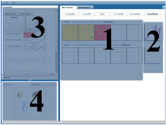
For this example, we’ll be focusing on the “Retrieve FARC Intel” mission. The analyst
starts on the Current Overview screen (Figure 5.1). From here we can see the overall view
of the situation. By clicking on the mission tabs we can navigate to the assets related
to each mission. For the Retrieve FARC Intel mission we can immediately see five assets
with activities of interest. The Farc Safe House has an activity one week ago that has a high
reliability of occurring. The Reconnaissance Flight Crew, Simon Trinidad, Alfonso Cano
Figure 5.1: Current Overview screen. Here we can see an overall view of the current situation for the Retrieve Farc Intel.
have a high impact as well as a high reliability.
We’re going to focus on the Reconnaissance Flight Crew (Figure 5.2). Clicking on the
activity in the upper right portion of the scatter plot we can see that the activity in question
is the “Farc Scenario 1” activity. We can also see where that activity affects the asset in
other time periods. Hovering over the activity in question gives us a tool tip with the name
of event within that activity that caused that impact as well as a textual description of the
impact and reliability. As noted in Section 4.1.1 events are combined and only the most
recent event for each activity is shown per time period. This reduction of events prevents
Figure 5.2: Looking at the Reconnaissance Flight Crew we see that there is an important activity affecting the asset
end result of that activity for each time period.
At this point we have a pretty good perception of our mission and its assets. We know
that the Reconnaissance Flight Crew is in danger and we’d like to get a more detailed
com-prehension of what happened. By right clicking on the activity we can choose to explore
that activity on the Detailed Past screen (Figure 5.3).
On the Detailed Past screen, the Event Timeline now contains only events from the
”Farc Scenario 1” (Figure 5.4). By stepping through the events in chronological order we
Figure 5.4: Detailed Past screen. From here the analyst can step through events and see their effects on the assets involved in the mission
Crew was performing a reconnaissance mission to gather intelligence on the Farc
Oper-ating Area when the Revolutionary Armed Forces began monitoring their mission. It can
then be seen that the Flight Crew was shot down by the enemy and the crew were captured.
As we are examining the details of these events we may find it beneficial to see what event
caused another event. By looking at the Event Flowchart we can see these causal
relation-ships. Figure 5.5 allows us to see that the Reconnaissance Plane Crash led to the Hostage
Situation. While stepping through the events in this activity we can use the Activity-Asset
matrix to quickly see what the impact on other assets in the Retrieve Farc Intel mission are
Figure 5.6: Double clicking on a scatter plot, opens that time period in the Zoom area. Here we can see four events that were part of that activity
After stepping through the events in the activity we have a pretty good comprehension
of the situation, what occurred and how it happened. Now we need to know what might
happen in the future. To do this we go back to the Current Overview screen. For the
Reconnaissance Flight Crew we can see an activity that is projected to occur a week in
the future (Figure 5.6). By double clicking on that scatter plot we can zoom in on that
time period. By zooming in we can see that there are four projected events that are part of
that activity and while the latest project future isn’t too threatening, there is one event that
is. Right clicking on the activity in the scatter plot we can choose to view these projected
On the Plausible Futures screen, there is a drop down menu from which to choose
plausible futures. Here we choose the “Hostage Execution” event, which was the most
threatening event from the zoomed scatter plot on the Current Overview screen (Figure
5.8). By examining this event we can see that the Revolutionary Armed Forces red asset is
projected to kill the Reconnaissance Flight Crew. From the Event Table, we can examine
why the event is projected to occur by opening up the Plausibility Radar Graph (Figure
5.9). On this window, we see the opportunity and intent of the Revolutionary Armed forces
is very high, while the capability of the asset is not as great. This indicates that we should
act quickly to plan a rescue attempt before the capability of the Armed Forces to execute
the hostages increases any more.
Before planning and executing the rescue mission we may want to gather more
intelli-gence information. This is where the Priority Intel Requirements panel is used. Similar to
accessing the Plausibility Radar Graph, the Priority Intel Requirements panel is opened by
right clicking on the event in the event and choosing to “Edit Priority Intel Requirements”
(Figure 5.10. In the resulting text box, notes on what information needs to be collected can
be entered. These notes are then saved and other analysts can view what was typed. This
box allows analysts to organize their thoughts so that its easier to collaborate and task the
necessary groups to go about collecting the needed information.
By using the Plausible Futures screen, we can improve our anticipation and projection
of the future. With this additional information we are better equipped to make decisions on
how to proceed next.
From gaining a better perception of the situation in the Current Overview screen, to
im-proving their comprehension and anticipation in the Detailed Past and Plausible Futures
screens, ViSAw helps to improve situation awareness. ViSAw allows the analyst to explore
Chapter 6
Conclusions and Future Work
This thesis outlines a visualization for enhancing situation awareness through displaying
threat and impact called ViSAw. Previous visualizations focused on displaying raw data
to enhance situation awareness while ViSAw attempts to display the results of impact and
threat assessment to the analyst to enhance their awareness. The visualization is divided
into three screens each representing one temporal aspect of the overall situation. The
Cur-rent Overview screen provides a quick perception of the curCur-rent situation, the Detailed Past
screen provides a richer comprehension of past events, and the Plausible Future screen
shows the projected future events. By breaking up this information into three screens, it
allows the analyst to focus on each aspect, but also move back and forth between these
aspects seamlessly.
This visualization is a good start but it is far from perfect. Future work in this area
is needed to refine and enhance the visualization. The following is a list of features that
would make for a more ideal visualization tool:
• More advanced search capabilities for past and future events. Currently events are
searched by one of a limited set of criteria. Searching by a combination of criteria
• An optimal way to combine events in each activity. Currently events are grouped by
activity and only the most recent event in the time window is displayed. Perhaps it
would make more sense to display the most threatening, the most reliable, or perhaps
some combination of factors.
• The Impact vs Reliability scatter plots do not represent trends very well. Perhaps
in-corporating a theme river [14] into the visualization would allow for the identification
of trends.
• Currently the Priority Intel Requirements section of the visualization is vague. It only
stores basic text to describe collection requirements. Further research should be done
into the best way of organizing and displaying this information.
• Artistic improvements could be made to enhance the overall look of the visualization
• Currently, the visualization simply receives data from a pre-populated database.
Ide-ally the visualization would be able to communicate with a variety of sources to
receive its data in real time.
Formal usability and robustness studies need to be conducted to determine which
as-pects need improvement. While designing this visualization we met with experts in
situa-tion awareness to receive feedback and guidance. This advice was instrumental in shaping
the visualization however a more exhaustive usability study with these and other users
Attempts were made to keep the ideas addressed in the visualization as generic as
pos-sible; however this visualization currently only focuses on the domain of asymmetric
war-fare. Future work could explore extending this visualization to other domains such as cyber
security. Additional usability studies would have to be done to see if these concepts would
be useful or applicable in other domains. For example the playback maps would need to be
modified since a geographic map may not be appropriate for the cyber domain and a layout
Bibliography
[1] AGI. Space Superiority, Analytical Graphics, Inc., 2009.http://www.stk.com/ solutions/specializedAreas/spaceSuperiority/.
[2] B. Argauer and S. Yang. VTAC: Virtual terrain assisted impact assessment for cyber attacks. In Proceedings of SPIE Defense and Security Symposium, volume 6973, 2008.
[3] E. Bosse, J. Roy, and S. Wark. Concepts, Models, and Tools for Information Fusion, pages 40–56. Artech House, Inc., 2007.
[4] Common warfighting symbology, Nov. 2008. http://assist.daps.dla. mil/quicksearch/basic_profile.cfm?ident_number=114934.
[5] A. D’Amico and M. Larkin. Methods of visualizing temporal patterns in and mission impact of computer security breaches. DARPA Information Survivability Conference and Exposition, 1:0343, 2001.
[6] A. D’Amico and S. Salas. Visualization as an aid for assessing the mission impact of information security breaches. In Proceedings of DARPA Information Survivability Conference and Exposition, 2003., volume 2, pages 18–20, April 2003.
[7] J. Durbin, J. Swan II., B. Colbert, J. Crowe, R. King, T. King, C. Scannell, Z. Wartell, and T. Welsh. Battlefield visualization on the responsive workbench. In Proceedings of Visualization ’98., pages 463–466, Oct. 1998.
[8] M. Endsley. Toward a theory of situation awareness in dynamic systems.Human Fac-tors: The Journal of the Human Factors and Ergonomics Society, 37:32–64, March 1995.
[9] D. Fava, S. Byers, and S. Yang. Projecting cyberattacks through variable-length markov models. IEEE Transactions on Information Forensics and Security, 3(3):359– 369, Sept. 2008.
![Figure 1.1: Salerno’s combined fusion model [20]](https://thumb-us.123doks.com/thumbv2/123dok_us/57306.5301/14.612.130.480.103.303/figure-salerno-s-combined-fusion-model.webp)