City, University of London Institutional Repository
Citation
:
Wood, J., Slingsby, A. and Dykes, J. (2010). Layout and colour transformations for visualizing OAC data. Paper presented at the GIS Research UK 18th Annual Conference, 14 - 16 Apr 2010, University College London, London, UK.This is the unspecified version of the paper.
This version of the publication may differ from the final published
version.
Permanent repository link:
http://openaccess.city.ac.uk/407/Link to published version
:
Copyright and reuse:
City Research Online aims to make research
outputs of City, University of London available to a wider audience.
Copyright and Moral Rights remain with the author(s) and/or copyright
holders. URLs from City Research Online may be freely distributed and
linked to.
Layout and Colour Transformations for Visualising OAC Data
Jo Wood, Aidan Slingsby Jason Dykes
giCentre, Department of Information Science,
City University London, Northampton Square, London, EC1V 0HB, UK Tel. +44 (0)20 7040 0180
sbbb717|jwo|[email protected], http://gicentre.org
Colour version of this paper available at http://gicentre.org/papers/gisruk10/wood_layout_2010.pdf
KEYWORDS: OAC, cartogram, mapping, perceptually uniform colour
1. Introduction
The Output Area Classification (OAC) is a geodemographic classifier that characterises the UK population by socioeconomic characteristics at Output Area (OA) (Vickers and Rees, 2007). Categories are based on clusters identified by K-means clustering of 41 of the 2001 census variables. Table 1 shows the 7 OAC super-groups along with some of their characteristic census variables. Each Output Area is allocated its most similar OAC category resulting in significant data generalisation. This is both intentional and essential to their utility. Knowledge of such variability between and within categories is beneficial to its use.
Table 1.
OAC super-groups with the census variables that deviate most from the national
mean, using our new colour scheme with the SASI (2009) colours on the left.
The use of OAC in both local and national governments for analysis, for reporting statistics and for studying the impact of policies is increasingly encouraged (e.g. DCLG, 2009, p.73) and graphical techniques for depicting such data are becoming increasingly important (e.g. LCC, 2008).
We present a national map of the 259,847 OAs in England, Scotland and Wales coloured by their closest super-group and degree of typicality. We also provide separate maps for each super-group. In order to present these data effectively, we use a hierarchical cartogram as a base map that normalises area by population density and a colour scheme in which hue indicates the super-group and lightness indicates its degree of typicality. The contributions of this work are:
• Space-filling rectangular hierarchical cartograms for efficient depiction of all output areas. • A new colour scheme that allows comparison of super group categories and classification
uncertainty.
Blue collar communities High:Low: flats, HE qualifications. terraced housing
City Living High:Low: detached housing, have non-dependent children, 5-14 (age). HE qualification, live alone, born outside UK, rented (private), flats
Countryside High:Low: population density, take public transport, flats 2+ cars, work from home, agriculture/fishing, detached housing
Prospering Suburbs High:Low: public rent, terraced housing, flats, no central heating, rented 2+ cars, detached housing Constrained by
Circumstances
High: flats, rented (public)
Low: detached housing, 2+ cars, HE qualifications.
Typical Traits High:Low: rent (public) terraced housing
The cartograms can be used with any spatial hierarchy, are scalable (we have successfully mapped all the >1.7 million UK postcode units in their postcode hierarchy) and can depict two data variables simultaneously using size and colour (when generalised to treemaps, position can be used to depict further information; Slingsby et al, 2009).
2. Colour Selection
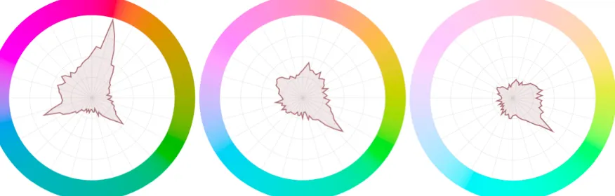
Perceptual variation in hue, saturation and lightness is non-linear. This has strong implications for the design of colour schemes (Brewer, 1994). The colours used by SASI (2009) (left of Table 1 and Figure 2) vary in hue, lightness and saturation making the red and yellow more prominent than grey, giving them unintentional and undue emphasis. Perceptual colour spaces can help us design colour schemes that allow categories to be compared more effectively. We use the CIELuv colour space as recommended by Wijffelaars et al (2008) in which distance between colours in this colour space is proportional to perceptual discrimination. Figure 1 graphs the distance between hues at 5-degree intervals on a hue colour wheel in the CIELuv space at three different lightness values, where higher values indicate better perceptual discrimination at that hue. This shows that the perceptual discrimination between hues is variable and varies greatly with lightness (at 30% lightness, red/orange is particularly distinctive; at 70% lightness, the level of distinction is lower and is strongest for yellow/green).
Figure 1:
Graphs showing the ease of hue discrimination at lightnesses of 30%, 50% and
70% (left to right). Distance from the centre of each graph is proportional to degree of
perceptual discrimination of the given hue.
In depicting typicality with lightness, it is more important to distinguish hues at the darker end of the lightness scale. We therefore identified seven hues at perceptually equal intervals for a lightness of 30%, and then allocated them to the OAC categories to match the SASI (2009) scheme as closely as possible (see Table 1). Colours are less discriminatory since saturation and lightness are equal, have equal perceptual prominence and are perceptually equally spaced. Since lightness is held constant, we can map it to another variable. As its perception is non-linear and hue-dependent, we use the CIELuv colour space using Wijffelaars et al’s (2008) method to generate colour palettes for each hue where lightness varies in a perceptually-linear manner.
In Figures 3 and 4, lightness indicates the degree of typicality (Tg) to a super-group (g):
€
Tg =1− dg
max(d) (1)
where dgis the distance to cluster g, max(d) is the distance to the furthest cluster and dg=min(d) when
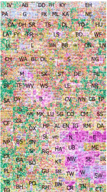
[image:3.595.82.520.343.483.2]3 Space-filling hierarchical rectangular cartograms
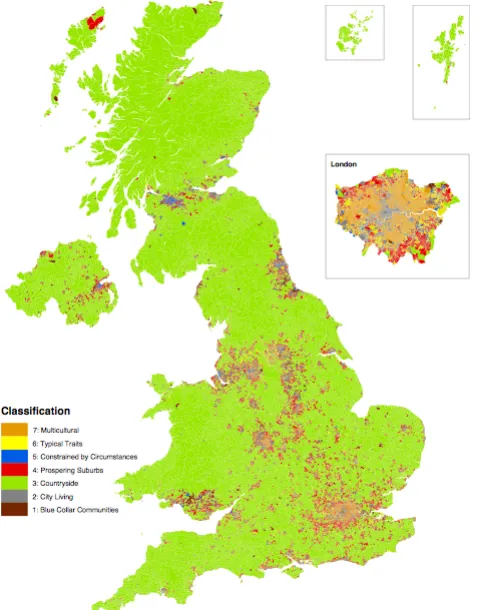
Figure 2 is a map of OAs produced by SASI (2009) coloured by OAC super-group. Since each OA each contains a similar number of households (50-100), sizes vary greatly depending on population density. This makes their depiction on national maps challenging. ‘Countryside’ (green) dominates the map when, in fact, it relates to a very small proportion of the population. Major urban areas are visible as fine-grained heterogeneous patches, but the structure of these is impossible to detect.
[image:4.595.179.418.276.581.2]Density-normalising cartograms are widely used for this type of problem (e.g. Dorling et al., 2008). They have the effect of enlarging the parts of the map with high population density at the expense of those parts with low population density. This causes necessary geometrical distortion, the nature of which depends on the type of cartogram. Gastner cartograms (Gastner and Newman, 2004) distort shape but maintain contiguity, whereas rectangular (Florisson et al., 2005; Wood and Dykes, 2008) and circular (Dorling, 1996) cartograms fix shape to assist in size comparison, at the expense of area contiguity.
Figure 2.
OAC super-groups mapped to Output Areas using SASI colours (SASI, 2009)
In Figure 3, we use a space-filling rectangular hierarchical cartogram that displays OAs as rectangles sized by population, using the colour scheme described in section 2. An advantage of space-filling cartograms is their efficient use of the space through the complete tessellation of the data into a rectangle. The corresponding disadvantage is that contiguity between areas is not necessarily preserved and there may be considerable positional displacement. However, the hierarchical nature of this cartogram allows us to map the OAs within the UK postcode hierarchy, a well-recognised spatial frame of reference.
4. Interpretation
The interpretation of Figure 4 is much easier as a large high-resolution poster, however many clear and interesting patterns are visible:
• London ‘Multicultural’ is more typical than the multicultural classification in other parts of
GB, probably due to its dominance in defining the class.
• ‘Countryside’ OAs tends to be typical of their super-group.
• ‘Constrained by Circumstances’ in Glasgow is less typical than in Newcastle.
• ‘Typical Traits’ and ‘Prospering Suburbs’ show low spatial autocorrelation, but the latter are
[image:6.595.75.521.236.635.2]restricted to Northern England and the Southwest.
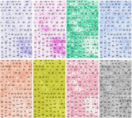
Figure 4.
Similarity to specific super-groups (bottom right is similarity to closest, as Figure 3
but using lightness only to show typicality).
Mapping the similarity to each super-group individually is also interesting. Since lightness is comparable between the hues, direct comparison can be made:
• ‘Multicultural’: correlates to large cities with those in London most typical.
• ‘Typical Traits’: generally areas show a very strong similarity to this cluster, but less so in
• ‘Countryside’: tends towards either strong or weak similarity.
• ‘Constrained by Circumstance’: A broad-scale northern emphasis in part a response to the
southern emphasis of some of the other classes
5. Conclusion and ongoing work
Population-density normalising cartograms with well-designed colour schemes that allow the representation of two variables, appears to be a useful combination of techniques. The space-efficiency provided by rectangular cartograms enlarges OAs of interest at the expense of position and contiguity. Contiguity is perhaps the most serious concern and we are working on new cartogram layouts that minimise contiguity distortion. Broad spatial patterns are detectable and the postcode hierarchy provides a useful spatial reference. Where lightness and saturation are held constant, the colours are less distinguishable from each other, but with the benefit that no colour is given undue prominence. Lightness can be varied to map to another variable and these lightnesses become comparable across hues.
6. Acknowledgements
The authors are grateful to the Willis Research Network for funding Aidan’s position and for Dan Vickers’ help with the assembling the OAC data. National Statistics Postcode Directory, obtained through UKBorders/Edina. OAC-data made available from SASI (2009).
References
Brewer, C., 1994. Colour use guidelines for mapping and visualisation. In Visualization in Modern Cartography. New York: Elsevier, pp. 123-147.
DCLG (UK Department of Communities and Local Governement) (2009). Supporting local information and research: Understanding demand and improving capacity.
http://www.communities.gov.uk/publications/communities/supportinglocalresearch
Gastner, M.T. & Newman, M.E.J. (2004). Diffusion-based method for producing density-equalizing maps. Proceedings of the National Academy of Sciences of USA, 101(20), 7499-7504. Florisson, S., Kreveld, M.V. & Speckmann, B. (2005). Rectangular cartograms: construction &
animation. In Proceedings of the 21st annual symposium on Computational geometry. Pisa, Italy: ACM, pp. 372-373. Available at: http://portal.acm.org/citation.cfm?id=1064152
LCC (Leicestershire County Council) (2008). Report: Leicestershire Community Safety Partnership
Strategic Assessment 2008. http://www.lsr-online.org/reports/Leicestershire_community
_safety_partnership_strategic_assessment_2008
SASI (Social and Spatial Inequalities Group, University of Sheffield) (2009).The National
Classification of Census Output Areas. http://www.sasi.group.shef.ac.uk/area_classification/
Slingsby, A., Dykes, J. & Wood, J. (2009). Configuring Hierarchical Questions to Address Research Questions. IEEE Transactions on Visualization and Computer Graphics, 15(6).
Vickers, D. & Rees, P. (2007). Introducing the National Classification of Census Output Areas.
Population Trends, 125, 380-403.
Wijffelaars, M. Vliegen, R and van Wijk, J. (2008). Generating Color Palettes using Intuitive
Parameters. Computer Graphics Forum, 27(3), 743-750.
Wood, J. & Dykes, J. (2008). Spatially Ordered Treemaps. Visualization and Computer Graphics,
IEEE Transactions on Visualization and Computer Graphics, 14(6), 1348-1355.
Biographies
Dr Aidan Slingsby is a Willis Research Fellow at the giCentre at City University London with research interests in designing, implementing and using geovisualisation techniques for assessing data quality and variability and for visual data analysis.