City, University of London Institutional Repository
Citation
:
Wood, J., Radburn, R. and Dykes, J. (2010). vizLib: Using The Seven Stages of Visualization to Explore Population Trends and Processes in Local Authority Research. Paper presented at the GIS Research UK 18th Annual Conference, 14 - 16 Apr 2010, University College London, London, UK.This is the unspecified version of the paper.
This version of the publication may differ from the final published
version.
Permanent repository link: http://openaccess.city.ac.uk/416/
Link to published version
:
Copyright and reuse:
City Research Online aims to make research
outputs of City, University of London available to a wider audience.
Copyright and Moral Rights remain with the author(s) and/or copyright
holders. URLs from City Research Online may be freely distributed and
linked to.
City Research Online: http://openaccess.city.ac.uk/ [email protected]
vizLib: Developing Capacity for Exploratory Data Analysis in
Local Government – Visualization of Library Customer Behaviour
Robert Radburn, Jason Dykes, Jo Wood
giCentre, School of Informatics, City University London, EC1V 0HB Telephone: +44 (0)20 7040 0212, Fax: +44 (0)20 7040 8584
E : {sbbd476 | jad7 | jwo} @soi.city.ac.uk, W : http://www.soi.city.ac.uk/~ {sbbd476 | jad7 | jwo}
KEYWORDS : libraries, local authority, exploratory data analysis, visualization Processing
1. Introduction
A growing public expectation for better local services and a new local government performance framework (The Audit Commission, 2008) means that local authorities are increasingly needing to use their data holdings to understand citizens. ‘Strong and Prosperous Communities’ (DLCG, 2006) requires all local authorities to demonstrate that they understand their communities by deploying their local administrative data. The systematic analysis of large structured spatio-temporal data sets is difficult, but Visualization and Visual Analytics (Thomas and Cook 2005) may provide solutions - the NVAC centres are supporting the visual exploration of geographic data in areas such as security and health (e.g. Bhowmick et al., 2008).
2. Context and Rationale
Leicestershire County Council provides services to more than 600,000 people. Its Research and Information Team uses rich innovative maps and graphics to inform evidence-based policy (e.g. Radburn, 2008). To extend this work researchers need access to visual techniques for integrating, synthesising and exploring large structured spatial data sets. Each has unique characteristics, and so generic packaged solutions can be inadequate (Fry, 2007). Alternatively, flexible visualization environments through which informative dynamic interfaces can be rapidly developed to suit the data and task in hand may empower local authority researchers in their analysis and improve the evidence base upon which decisions are made (Lloyd et al., 2008).
The skills required to use these technologies are rare in local authorities and data sources are typically unexplored at present. We address this skills gap through the ESRC funded UPTAP programme which supports researchers in developing data analysis skills with the aim of Understanding Population Trends and Processes. An UPTAP User Fellowship has enabled an LCC researcher (Radburn) to work with City University for five months to develop the visualization skills required in an important service delivery area – Libraries. Emerging technologies and developing techniques are being used to exploit previously unexplored data stores and gain knowledge of population trends and processes in Leicestershire
3. Leicestershire Library Records
authority possesses containing detailed customer behaviour and preferences (including lending records on books, films, and music) at 54 libraries across the county on a weekly basis.
4. Approach
Within the national libraries service readily available socio-economic data sources are used to profile communities (EMMLAC, 2005). But knowing your customer is different from
understanding how they engage with the service. Just as supermarkets use data driven marketing techniques (Humby et al., 2003) the TALIS database could be used to understand which
customers deliver what value and in what proportion through analysis of the spatio-temporal behaviour of library users. LCC has already identified the utility of applying marketing techniques to a small sub-set of the TALIS database (Radburn et al., 2007) concluding that:
i. there was no such thing as an ‘average’ customer ii. the classic Pareto 80/20 rule held (Novos, 2004)
iii. those who visited the library most recently are more likely to revisit
Analysing the data from all 54 libraries to see whether these characteristics are spatially variable could lead to information overload – hence the desire to use visualization to explore the following kinds of questions:
i. Who are the best customers using the library service? Which areas are they living in? ii. How do priority groups use the library service?
iii. Can the library database provide an up-to-date snapshot of the changing demographics of the local area?
To address these types of research questions through visualization the fellowship consists of three stages: skills development, the production of bespoke visualization prototypes and the
communication of the results to relevant communities.
5. Preliminary Results
Our initial manipulation and visualization of the TALIS database has employed the high level open design tool
Processing
(Fry & Reas, 2007; Fry 2008).Processing
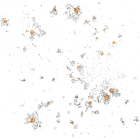
encourages an exploratory approach to data visualization as code linking graphical methods can be quickly configured and deployed. Feedback is rapid and graphical so data can be visually queried very efficiently (Fry, 2008). For example, the total book lending for Leicestershire’s 15,000 postcodes can be quickly visualized with basic interactions to display useful information about the data in a short ‘sketch’ consisting of a few lines of Processing code (Figure 1).Figure 1. The structure of library usage in part of Leicestershire. Libraries are represented by shaded symbols sized according to annual loans.15,000 unit postcodes are sized according to annual loans in an interactive Processing application that zooms, pans and provides instant
Figure 2. Detail for part of Leicestershire selected through interactive functionality. Left - Symbol size and density reflects numbers of loans; Right – colour composites show proportions
of loans in adult fiction (red), adult non-fiction (green) and other (blue) categories. An item of interest is interactively selected and detail provided through a rapidly responding and
configurable graphical interface.
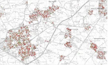
Figure 3. Further detail around Hinckley showing RGB colour composites and an OS LandRanger backdrop. © Crown Copyright / Database right 2008. An Ordnance Survey / EDINA
[image:5.612.90.525.394.657.2]When compared to alternative development environments such as Flash or SVG,
Processing
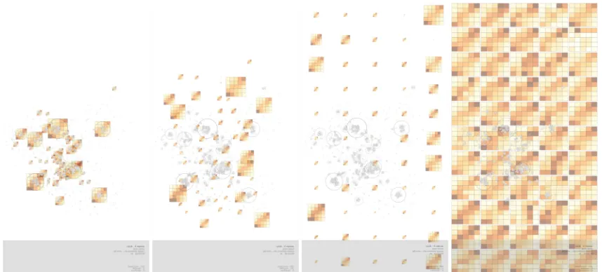
provides high levels of flexibility in an environment that has the advantages of being based upon (and sometimes drawing directly upon) a fully functional and robust programming language (Java). This means that it is extremely quick and enables us to calculate the positions of symbols and draw them to screen rapidly enabling large datasets to be visualized and animated very effectively. Consequently we can explore TALIS by considering libraries and customer types through combinations of highly interactive implementations of bespoke and novel graphics. [image:6.612.94.522.313.607.2]These include: recency / frequency plots (Radburn et al., 2007) that segment behaviour and allow ‘best customers’ to be selected and library profiles to be compared; spider plots showing the spatial relationships between libraries and customer locations; spatial treemaps (Wood and Dykes, 2008) in which space-filling layouts are utilised to generate data-dense graphics. These can be conditioned by time, type of loan and other characteristics in Processing in real time. Evidence that morphing is beneficial for transitioning between graphical alternatives (Heer and Robertson, 2007) has led us to use develop novel interactions that vary the visual parameters used in graphics and rapidly morph between combinations of these techniques. Figures 4 and 5 show examples.
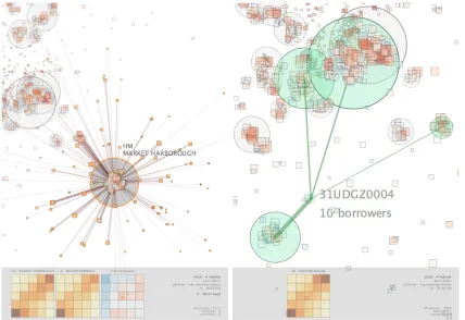
Figure 4. – Interactions showing recency / frequency (RF) and spider plots. The former show numbers of users in recency (columns) / frequency (rows) quintiles, with most recent and frequent users at the top right. The ‘CHI comparison’ allows RF plots for interactively selected libraries to be compared, here revealing that Market Harborough has consistently fewer users in the low recency quintile and more recent / frequent customers. The latter link libraries with users
Figure 5. – Fast animated transitions change spatial ordering from geographic coordinates in which RF plots overlap to a spatially ordered treemap in which they are distinguishable but retain
some geography in their layout. The transition can be considered as ‘ordering’ and ‘visualization change’ in Heer and Robertson’s taxonomy.
6. Summary and Conclusion
The government is demanding that local authorities use local data more effectively and base decisions around customer behaviour. For library services a spatial approach to understanding users can help address the three questions that organisations need to answer when entering into a dialogue with customers (Novos, 2007):
• What will you say? • Who will you say it to? • When will you say it?
Visualization can help us answer these specific questions but the skill set required to
develop and use flexible interactive graphical applications that suit particular
combinations of data set and task (Andrienko
et al.
, 2005) is rare in local authorities. The
vizLib
project is embedding geovisualization into an organisation through an investment
in people and their skills, rather than the generation of software ‘solutions’ expected to fit
all situations. Our initial work with
Processing
suggests that it is a promising approach
for applied geovisualization that makes a number of novel and potentially useful
visualization methods possible. Interesting trends have been noted and insights gained
from our initial work
as we compare libraries, customers and places and consider their spatialvariation.
Acknowledgments:
References:
Andrienko, G., Andrienko, N., Dykes, J., Mountain, D., Noy, P., Gahegan, M., et al. (2005). Creating Instruments for Ideation: Software Approaches to Geovisualization. In J. Dykes, A. MacEachren & M.-J. Kraak (Eds.), Exploring Geovisualization (pp. 103-125).
Amsterdam: Elsevier.
Bhowmick, T., Robinson, A. C., Gruver, A., MacEachren, A. M., & Lengerich, E. (2008). Distributed Usability Evaluation of the Pennsylvania Cancer Atlas. International Journal of Health Geographics, 7(6).
Department for Communities and Local Government. (2006). Strong and prosperous communities: the local government white paper. Retrieved 12/12/08, from http://www.official-documents.gov.uk/document/cm69/6939/6939.asp
East Midlands Museums Libraries and Archives Council. (2005). How to… Develop a Community Profile: A guide for museums, libraries and archives. Retrieved 12/12/08, from http://tinyurl.com/EMMLAC2005
Fry, B. (2008). Visualizing Data. Sebastopol, CA: O'Reily, 382 pp.
Fry, B., & Reas, C. (2007). Processing: A Programming Handbook for Visual Designers and Artists. Cambridge, MA: The MIT Press, 736 pp.
Heer, J., and Robertson, G., 2007, Animated transitions in statistical data graphics: IEEE Transactions on Visualization and Computer Graphics, v. 13, p. 1240-1247.
Humby, C., Hunt, T., & Phillips, P. (2003). Scoring Points: How Tesco is winning customer loyalty: Kogan Page, 276 pp.
Novos, J. (2004). Drilling down: Turning Customer data into profits with a spreadsheet: booklocker.com, 196 pp.
Radburn, R. (2008). Understanding the Loughborough Foodscape. Leicester: Leicestershire County Council.
Radburn, R., Thomas, N., Forster, P., & Pye, S. (2007). Beyond the comfort zone. Public Library Journal, 22(3), 20-23.
The Audit Commission. (2008). Comprehensive Area Assessment Joint Inspectorate Proposals for Consultation. Retrieved 12/12/08, from
http://www.audit-commission.gov.uk/caa/downloads/CAAConsultation08.pdf
Thomas, J. J., & Cook, K. A. (2005). Illuminating the Path: The Research and Development Agenda for Visual Analytics: Pacific Northwest National Laboratory and Department of Homeland Security.
Wood, J., and Dykes, J., 2008, Spatially Ordered Treemaps: IEEE Transactions on Visualization and Computer Graphics, v. 14, p. 1348-1355.
Biographies:
Robert Radburn is an ESRC UPTAP research fellow at City University London developing capacity for visual exploratory analysis in local government, and a Senior Research Officer at Leicestershire County Council working to support evidence-based policy.