Rochester Institute of Technology
RIT Scholar Works
Theses Thesis/Dissertation Collections
10-1-2008
Brilliance, contrast, colorfulness, and the perceived
volume of device color gamut
Rodney L. Heckaman
Follow this and additional works at:http://scholarworks.rit.edu/theses
BRILLIANCE, CONTRAST, COLORFULNESS,
AND THE PERCEIVED VOLUME OF DEVICE
COLOR GAMUT
by
Rodney L. Heckaman
A dissertation submitted in partial fulfillment of the requirements for the degree
of PhD in the Chester F. Carlson Center for Imaging Science Rochester Institute
of Technology
16 October 2008
Author_______________________________________________________________
CHESTER F. CARLSON CENTER FOR IMAGING SCIENCE ROCHESTER INSTITUTE OF TECHNOLOGY
ROCHESTER, NEW YORK
CERTIFICATE OF APPROVAL
PhD DEGREE DISSERTATION
The PhD Degree Dissertation of Rodney L. Heckaman has been examined and approved by the dissertation committee as satisfactory for the thesis required for the PhD degree in Imaging Science
Dr. Mark D. Fairchild, Dissertation Advisor
Dr. Roy S. Berns
Dr. James Ferwerda
Dr. Garrett Johnson
Dr. John Klofus
DISSERTATION RELEASE PERMISSION ROCHESTER INSTITUTE OF TECHNOLOGY
CHESTER F. CARLSON CENTER FOR IMAGING SCIENCE
BRILLIANCE, CONTRAST, COLORFULNESS,
AND THE PERCEIVED VOLUME OF DEVICE
COLOR GAMUT
I, Rodney L. Heckaman, hereby grant permission to Wallace Memorial Library of R.I.T. to reproduce my dissertation in whole or in part. Any reproduction will not be for commercial use or profit.
Brilliance, Contrast, Colorfulness, and the Perceived Volume of
Device Color Gamut
By
Rodney L. Heckaman
Submitted to the Chester F. Carlson Center for Imaging Science in partial fulfillment of the requirements for the PhD Degree at the Rochester Institute of
Technology
Abstract
With the advent of digital video and cinema media technologies, much more is possible in achieving brighter and more vibrant colors, colors that transcend our experience. The challenge is in the realization of these possibilities in an industry rooted in 1950s technology where color gamut is represented with little or no insight into the way an observer perceives color as a complex mixture of the observer’s intentions, desires, and interests.
By today’s standards, five perceptual attributes – brightness, lightness, colorfulness, chroma, and hue - are believed to be required for a complete specification. As a compelling case for such a representation, a display system is demonstrated that is capable of displaying color beyond the realm of object color, perceptually even beyond the spectrum locus of pure color.
All this begs the question: Just what is meant by perceptual gamut? To this end, the attributes of perceptual gamut are identified through psychometric testing and the color appearance models CIELAB and CIECAM02. Then, by way of demonstration, these attributes were manipulated to test their application in wide gamut displays.
DEDICATION
ACKNOWLEDGEMENTS
This work would not have been possible without the support of many.
To my faculty advisor, Prof. Mark D. Fairchild and my committee, Dr. John Klofus and Profs. Roy Berns and James Ferwerda, and Dr. Garrett Johnson.
To all the faculty and staff of the Center for Imaging Science for their high degree of dedication and excellence.
To the MCSL support staff, Coleen Desimone and Valerie Hemlink, and the research staff David Wyble and Lawrence Taplin.
To Professor Harvey Rhody who pointed me in the right direction at the start and Professor Anthony Vodacek, the current graduate school coordinator.
To Susan Chan who makes sure we all toe the line in navigating the plethora of necessary paper work and bureaucracy. And finally, to my fellow students whose combined energy is more than self sustaining.
I would especially like to acknowledge the MacBeth Engel Fellowship in Color Science for their financial support and thank the Sony Corporation for their supporting grant.
They each stood and walked to the kitchen, and through the fog and frost of the window, they were able to see the pink bars of light on the snowy banks of Himmel Street's rooftops.
"Look at the colors," Papa said.
Its hard not to like a man who not only notices the colors, but speaks them.
Table of Contents
1 Introduction... 1
1.1 The challenge of understanding what we see ... 1
1.2 The perceptual aspects of color... 2
1.3 Visual media technology – expanding our visual experience... 5
1.4 Dissertation goals ... 5
2 The visual media experience – High Dynamic Range (HDR) displays ... 7
2.1 Jones and condit, 1941... 8
2.2 High Dynamic Range (HDR) display technology ... 11
2.3 The Maxwellian View ... 12
2.4 The MCSL Prototype HDR Display ... 14
3 Perceptual gamut... 27
3.1 The gamut of real objects ... 27
3.2 Perceptual gamut in color appearance attributes... 31
3.3 Traditional color gamut representations ... 33
3.4 The case for a perceptual gamut: Expanding Display Color Gamut Beyond the Spectrum Locus [Heckaman and Fairchild, 2007) ... 51
4 The effects of display media properties on perceived color gamut volume... 67
4.1 Methodology ... 68
4.2 Experiment 1: Relationship between Color Appearance and Color Gamut of the Display ... 69
4.3 Experiment 2: The Effect Display Gamut Volume on Image Preference ... 74
4.4 Experiment 3: The Effect of Display Color Gamut Volume and Lightness Contrast on Image Preference and Colorfulness... 81
4.5 Conclusions... 90
5 The use of CIECAM02 and CIELAB in predicting the perceptual effects of display color gamut ... 95
5.1 Methodology ... 95
5.2 Experiment 1: Lightness Contrast, Chroma Range, Brightness, Colorfulness, and Perceive Gamut Volume ... 96
5.3 Experiment 3: Lightness Contrast and Colorfulness... 100
5.4 Conclusions... 106
5.5 CIELAB or CIECAM02? ... 109
6 Brilliance ... 113
6.1 Isolated stimulus... 114
6.2 Related stimulus and the perception of brilliance ... 114
6.3 The NT opponent color system – Grayness... 120
6.4 Brilliance – Hunt/Nayatani ... 123
7 Brighter, more colorful colors and darker, deeper colors based on a theme of
brilliance ... 137
7.1 Background ... 137
7.2 Methodology ... 140
7.3 Results and Discussions... 148
7.4 Psychophysical Testing ... 152
7.5 Conclusions... 159
8 The gamut of real objects – Redux... 161
9 Overall summary and conclusions... 165
APPENDIX A: Test Images ... 179
A.1 White point test images ... 179
A.2 RIT Test images: the effects of display media properties on gamut volume ... 180
A.3 Sony Test images: the effects of display media properties on gamut volume... 181
APPENDIX B: Sony Display... 183
B.1 Display Characterization... 183
B.2 Simulated Primaries... 184
APPENDIX C: Brighter, more colorful and deeper darker colors... 187
C.1 Brighter, more colorful and deeper, darker Test Scenes... 187
C.2 Regressed polynomial forms and their coefficients ... 188
C.3 Loci of equi-gray value for each of the twenty-four NCS hues... 190
C.3 Preference results on a scene-by-scene basis averaged over all observers... 193
APPENDIX D: Matlab HDR Rendering Engine Code... 195
D.1 HDR_Register ... 195
D.2 HDR_ForwarD_Model... 195
D.3 HDR_Calib ... 198
List of Figures
Figure 1-1: “… sea of gentle water that changed colors on account of the blankets
of flowers that covered it” ... 1
Figure 2-1: Stanford Memorial Chapel, a classic HDR scene having 6 orders of magnitude of dynamic range ... 7
Figure 2-2: Typical remote, sunlit, front lit scene [Jones and Condit, 1941]... 8
Figure 2-3: Summary of average brightness values for all groups of scenes [Jones and Condit, 1941] ... 9
Figure 2-4: Frequency of occurrence of brightness scale [Jones and Condit, 1941] ... 10
Figure 2-5: Sunnybrook Technologies, Inc. HDR display [Seetzen, 2004] ... 11
Figure 2-6: A Maxwellian View configuration [Wyszecki, 1982]... 12
Figure 2-7: Extended Maxwellian View (BIGMAXTM) [MacLeod, 2003] ... 13
Figure 2-8: BIGMAXTM gamut [MacLeod, 2003]... 13
Figure 2-9:The MCSL prototype HDR display... 15
Figure 2-10: Histogram of CIEDE94 for 400 randomly generated, measured data for MCSL HDR ... 16
Figure 2-11: Scatter plot of CIEDE94 against ! a*b* for 400 randomly generated, measured data ... 17
Figure 2-12: Projector LUT ... 18
Figure 2-13: LCD R-channel LUT ... 18
Figure 2-14: LCD G-channel LUT ... 19
Figure 2-15: LCD B-channel LUT... 19
Figure 2-16: Projector LUT ... 20
Figure 2-17: LCD R-channel LUT ... 20
Figure 2-18: LCD G-channel LUT ... 21
Figure 2-19: LCD B-channel LUT... 21
Figure 2-20: MCSL prototype HDR rendering engine... 22
Figure 2-21: MCSL HDR display luminance rendering strategy ... 24
Figure 2-22: Brightside HDR display luminance rendering strategy ... 24
Figure 2-23: Gamut of the MCSL HDR Display ... 25
Figure 3-1: The MacAdam Limits [MacAdam, 1935] ... 27
Figure 3-3:Horizontal sections through the psychological color solid at Munsell
values 1/ to 9/ [Nickerson, 1943] ... 28
Figure 3-4: Maximum color gamut for real colors (inner gamut) compared to the optimal color gamut (outer gamut) [Pointer, 1980]... 29
Figure 3-5: Optimal color solid with Pointer surface color solid [Steingrimsson, 2002]... 30
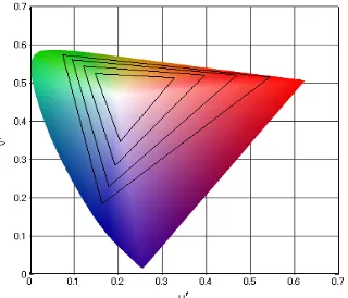
Figure 3-6: Optimal color solid with Pantone color solid [Steingrimsson, 2002]. 30 Figure 3-7: The gamut of a typical digital display device in CIE Chromaticities superimposed on the locus of pure, spectral colors ... 33
Figure 3-8: A first display system having a white point 110 to the magenta side of a reference white line 118... 35
Figure 3-9: A second display having an extended green primary 206 form that of the first display 108... 35
Figure 3-10: The gamut of the second display system after the secondary colors have been altered... 36
Figure 3-11: Forward Model Lookup Table... 38
Figure 3-12: Gray Scale Illuminance... 39
Figure 3-13: DLP Gamut in CIE Chromaticities ... 40
Figure 3-14: DLP Gamut in CIELAB... 40
Figure 3-15: DLP Gamut is CIECAM02 Lightness versus Chroma and ac versus bc... 41
Figure 3-16: DLP Gamut in CIECAM02 Brightness versus Colorfulness and am versus bm ... 43
Figure 3-17: Observed Average and 95% Confidence Intervals for Lightness Contrast and Chroma Range ... 45
Figure 3-18: Observed Average and 95% Confidence Intervals for Brightness and Colorfulness ... 47
Figure 3-19: Predicted (dots) versus Observed 95% Confidence Interval (bars) .. 49
Figure 3-20: A gamut expansion methodology ... 52
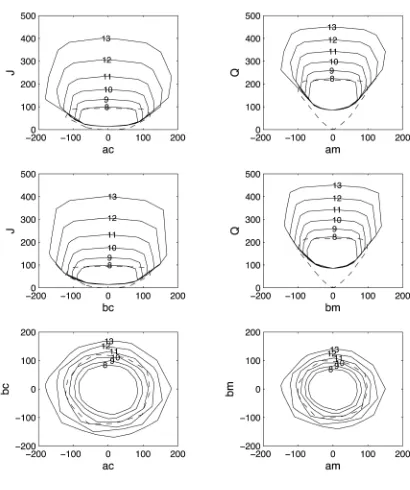
Figure 3-21: MacAdam Limits of visual efficiency, CIE Illuminant D65, 20 Observer... 54 Figure 3-22: The perceptual gamut in CIECAM02 lightness, chroma, brightness,
Figure 3-24: The Grand Tetons, Neon, and the Stanford Memorial Church images clipped to the display’s white point of the left and fully rendered on the right. The illustrations on the right allow for two additional bits of encoding beyond diffuse white (i.e. the display maximum luminance is four times that used to represent diffuse white... 61 Figure 3-25: Relative increase in perceptual gamut volume in lightness and
chroma on the left and brightness and colorfulness on the right as a function of the number of bits encoded in display luminance for the CIECAM02 viewing conditions Dark, Dim, and Normal. ... 62 Figure 3-26: Relative increase in perceptual gamut volume in lightness and
chroma on the left and brightness and colorfulness on the right as a function of the number of bits encoded in display luminance for various levels of viewing flare under normal viewing conditions (500 lux). ... 63 Figure 4-1: Color gamut for the simulated primaries plotted in CIELAB [Sakurai
2007]... 70 Figure 4-2: Color gamut for the simulated primaries plotted on u’v’ chromaticity
diagram [Sakurai 2007] ... 71 Figure 4-3: Perceptual gamut in CIELAB of the Flowers image (colored solid)
compared to the full display gamut (wire frame) ... 71 Figure 4-4: The average interval scale results for twenty-eight observers in the
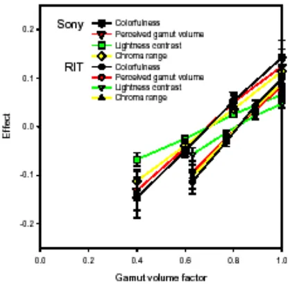
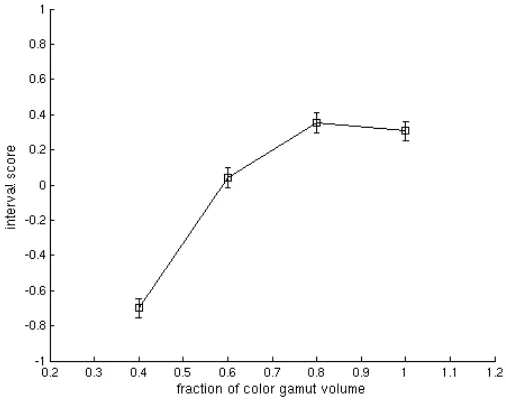
experiment at both Sony and RIT as function with the gamut volume factor. Each symbol corresponds to each attribute of the left top in this figure [Sakurai 2007] ... 73 Figure 4-5: Overall RIT results for preference in terms of interval score averaged
across all 20 observers and 10 scenes with 95% confidence interval shown . 76 Figure 4-6: Preference results for Group 1 – highly colorful images ... 78 Figure 4-7: Preference results for Group II – Scenic images... 79 Figure 4-8: Preference results for Group III – flesh tones ... 79 Figure 4-9: Overall Sony results for preference in terms of interval score averaged across all eight observers and 10 scenes with 95% confidence interval shown ... 80 Figure 4-10: Correlation between the Sony and the RIT results for the fine
common scenes with linear regression analysis results... 81 (a) color gamut volume factor k=1.0 ... (b) color gamut volume factor k=0.8
82
(c) color gamut volume factor k=0... (d) color gamut volume factor k=0.4 82
Figure 4-11: Simulated primaries in xy chromaticities for a color gamut volume factor k of 1.0 (a), 0.8 (b), 0.6 (c), and 0.4 (d) as shown and within each of (a), (b), (c), and (d), a lightness contrast factor kLCof 1.0, 0.875, 0.75, and 0.825
Figure 4-12: Overall results for colorfulness as a function of the percentage of the N.T.S.C. color gamut area in xy chromaticities for each of the log contrast ratio tested in terms of their category scores averaged across 6 observers and 10 with 95% confidence interval shown ... 85 Figure 4-13: Contours of equal colorfulness as a function of the percentage of the
N.T.S.C. color gamut area in xy chromaticities and the log contrast ratio obtained by multiple linear regression of the mean category scales across 6 observers and 10 scenes ... 86 Figure 4-14: Overall results for lightness contrast as a function of the percentage
of the N.T.S.C. color gamut area in xy chromaticities for each of the log contrast ratio tested in terms of their category scores averaged across 6
observers and 10 with 95% confidence interval shown ... 87 Figure 4-15: Contours of equal lightness contrast as a function of the percentage
of the N.T.S.C. color gamut area in xy chromaticities and the log contrast obtained by multiple linear regression of the mean category scales across 6 observers and 10 scenes ... 88 Figure 4-16: Overall results for preference interval scale as a function of the
percentage of the N.T.S.C. color gamut area in xy chromaticities for each of the log contrast ratio tested in terms of their category scores averaged across 6 observers and 10 with 95% confidence interval shown ... 88 Figure 4-17: Contours of equal preference as a function of the percentage of the
N.T.S.C. color gamut area in xy chromaticities and the log contrast obtained by multiple linear regression of the mean category scales across 6 observers and 10 scenes ... 89 Figure 5-1: The average observer data with corresponding 95% confidence
intervals for colorfulness, lightness constrast, chroma range, brightness, and perceived gamut volume ratio plotted against the corresponding CIECAM02 derived percepts. ... 97 Figure 5-2: The Experiment 1 results giving the ratio scale and 95% confidence
intervals of colorfulness, lightness contrast, chroma range, brightness, and perceived gamut volume averaged over all observers plotted against the corresponding CIECAM02 derived percepts for each scene. The 45-degree line represents a perfect match between the observer results and the
CIECAM02 derived percepts... 99 Figure 5-3: Experiment 3 average observer data with corresponding 95%
Figure 5-5:Average observer data for lightness contrast ratio against fractional display dynamic range
!
kLC for each of % N.T.S.C. color gamut area with 95% confidence intervals for the data means. The line plots represent CIECAM02 (solid) and CIELAB (dashed) derived percepts averaged over all scenes... 102 Figure 5-6: Average observer data with corresponding 95% confidence intervals
for colorfulness plotted against the corresponding CIECAM02 derived percept under dark viewing conditions for each of lightness contrast factor
!
kLCtimes full, dynamic range of the display for three (3) representative scene types. ... 104 Figure 5-7: CIECAM02 derived percept for colorfulness under normal viewing
conditions (solid line) and dark viewing conditions (dashed line) against % N.T.S.C. color gamut area in CIE tristimulus values of x and y and for each of lightness contrast factor
!
kLCtimes full, dynamic range of the display... 105
Figure 5-8: CIECAM02 derived, absolute colorfulness under normal (solid line) and dark (dashed line) viewing conditions against fractional display dynamic range
!
kLC for each % N.T.S.C. color gamut area tested and three typical scenes. ... 107 Figure 5-9: CIECAM02 derived lightness contrast under normal (solid line) and
dark (dashed line) viewing conditions against fractional display dynamic range
!
kLC... 108 Figure 6-1: Go as a function of stimulus monochromatic wavelength with
achromatic (C. 7000K) surround at 100 mL (corrected for stimulus
impurities) [Evans, 1978] ... 118 Figure 6-2: NT Color Perception Space in the Modified Opponent Color System
... 122 Figure 6-3: Relative luminance for spectral colours for different criteria: (dashed)
experimental results for zero grey content for one observer (Evans and Swenholt, 1969); (dashed-dot) equal brightness to the surround; (dotted) largest cone response equal to that of white; (solid) optimal colours of the same purities as those used by Evans and Swenholt [Hunt, 1982]... 124 (a) blue primary (b) yellow primary ... 125 Figure 6-4: Planes of equal hue in the NT system [Nayatani, 2003] ... 125 Figure 6-5: Loci of equal hue and gray value in the Y_B and G-R plane in the NT
system [Nayatani, 2003]... 126 Figure 6-6: Illustration of the wider color gamut (transparent blue) achieved by
lowering the white point the HDR display. The inner gamut in opaque blue is sRGB ... 129 Figure 6-7: The CIELAB values for the seven (7) sample sets in Munsell hue ... 130 Figure 6-8: Results in terms of each stimulus’ computed NCS chromaticness
Figure 6-9: Illustration of the wider color gamut (transparent blue) achieved by lowering the white point the HDR display. The gamut in opaque blue is sRGB ... 134 Figure 6-10: Combined results for Experiment 2 in terms of NCS Whiteness and
Chromaticness where the open circles represent stimuli where gray content was perceived and the “x”s as those where fno gray content was observed. The dotted line represents the theoretical loci of G0 (
!
gr=0)... 135
Figure 7-1: NCS nuance partitioning by whiteness (w), blackness (s), and
chromaticness (c) ... 138 Figure 7-2: NCS color triangle with lines of iso-grayness, deepness, and
clearness. ... 138 Figure 7-3: The loci of constant gray in an equi-hue plane for blue in the NTCS
overlain with arrows showing the direction of brighter, more colorful colors and of deeper, darker colors originating at Nayatani’s Gr. ... 139 Figure 7-4: Predicted (crosses) and actual (o’s) NCS notation and CIELAB hue
(crosses) as a function of LCh for illuminant D50, NCS Hue B30G with mean-square error noted as “mse”. Note that the “actual” value for c=100 and s=100 was estimated from the actual data for s=100. ... 142 Figure 7-5: Linear interpolation in mapping CIELAB LCh to NCS chromaticness
C [and blackness S]... 143
Figure 7-6: Lightness and chroma expansion factor
!
"= 100gr#0gr0#gr #60 $ % & ' ( ) * , !
gr"gr0, as a
function of the grayness (
!
gr) of the source sRGB primaries for various parameter values of exponent
!
" and offset
!
gr0... 144 Figure 7-7; An equi-hue plane in the target set of primaries showing the resultant
expansion of an input value. ... 145 Figure 7-8: CIE L* (
!
LCMAX) at maximum chroma (
!
CMAX) as a function of hue... 145
Figure 7-9: Locus of equi-gray levels in CIELAB for the NCS hue Y overlain by the extent of the sRGB primaries (dashed) and the xvYCC target set. ... 146 Figure 7-10: Locus of equi-gray levels in CIELAB for the NCS hue R overlain by
the extent of the sRGB primaries (dashed) and the xvYCC target set. ... 147 Figure 7-11: Locus of equi-gray levels, gr<0, for the sRGB primaries in CIELAB
Figure 7-17: Overall Preference... 157 Figure 7-18: Lady scene illustrating the inability of the most aggressive
application (
!
[gr0,"]=[0,2]) to preserve flesh tones ... 158 Figure 7-19: Coast scene illustrating the propensity of the most aggressive
application (
!
[gr0,"]=[0,2]) for genrating artifacts – contouring in the sky in this
case... 158 Figure 8-1: The loci of
!
G0 mapped to CIELAB in their respective color in comparison with the MacAdam Limits, the theoretical maximum color gamut of ideal materials, shown as a mesh. ... 162 Figure 8-2: The points
!
G0 for each of the twenty-four (24) NTS aim hues mapped to CIELAB and shown as circles of their respective color in comparison with the MacAdam Limits, the theoretical maximum color gamut of ideal
materials, shown as a mesh. ... 163 Figure 8-3: The Pointer gamut of object colors mapped to CIELAB as a surface in
comparison with the MacAdam Limits, the theoretical maximum color gamut of ideal materials, shown as a mesh. ... 164 Figure B-1: Chromaticity diagram of the display gamut (solid line). The solid line
is the display and the dot and broken lines indicate those of 1953 N.T.S.C. and sRGB, respectively. ... 183 Figure B-2: CIEXYZ Y versus their respective digital counts for each to the
List of Tables
Table 2-1: MCSL HDR Display Configuration ... 15 Table 3-1: Relative Perceptual Gamut Volumes ... 42
Table 3-2: Square Root of the Gamut Area Ratios
!
APh/APr ... 48
Table 3-3: Ratios in Contrast and Maximum Brightness (max Q)... 48 Table 3-4. Display primaries in tristimulus values and maximum output Ymax... 51 Table 3-5: The baseline display’s maximum tristimulus values (
!
XYZmax) for each of the RGB channels and the displays white point (XYZwhite) and black point (XYZblack) ... 53 Table 3-6: CIECAM02 viewing conditions... 53 Table 4-1: Image-by-image preference cluster hierarchy... 77 Table 5-1 CIECAM02 viewing conditions... 96 Table 7-1: Nuance categories having a dominating main attribute... 138 Table B-1: CIE chromaticities and luminance of the measured display primaries
1
INTRODUCTION
1.1
THE CHALLENGE OF UNDERSTANDING WHAT WE
SEE
Gabriel Garcia Marquez in the first volume of his autobiography, Living to Tell the
Tale [Marquez, 2003], writes of when he, as an adolescent, disembarked from the
town of Sucre on the Caribbean coast of Columbia that “ … the entire region was
a sea of gentle water that changed colors on account of the blankets of flowers
that covered it according to the time, place, and our state of mind.” The very
essence of the notion of “changing colors … according to time, place, and our
state of mind” is the essence of R. M. Evans’ work in color that began in the early
1930’s and culminated in the period from 1945 to 1974 at The Eastman Kodak
Company.
1Figure 1-1: “… sea of gentle water that changed colors on account of the blankets of flowers that covered it”
Evans notes in the preface of his book, The Perception of Color[Evans, 1978]
that the study of color over 150 years has developed into the science of
colorimetry – that the physical attributes of the stimuli can be measured and
specified in very simple terms and with precision approaching the sensitivity of
the eye and that stimuli can be computed that exactly match one another. Yet, up
to the time of Evans’ death in 1974, there had been little advancement in
understanding what an observer such as Marquez actually saw in the blankets of
flowers in the Columbian region of Sucre.
The way in which the eye’s sensitivities are used by an observer who is
presented with more and more complex situations is a correspondingly complex
mixture of the observer’s intentions, desires, and interests. In this context, Evans
began with the simplest possible stimulus and eventually arrived at a treatment
of the perception of color in everyday situations. In his development of the
subject, he introduced the concept of brilliance as a fundamental attribute of
color perception.
1.2
THE PERCEPTUAL ASPECTS OF COLOR
Munsell’s representation of color perception in hue, value, and chroma
was perhaps one of the first realization of the perceptual attributes of color
occurred, and as the science of colorimetry developed, it wasn’t until the CIE
differences, yet directly derived from the measured, physical parameters of color.
Furthermore, correlates of the three fundamental perceptual attributes of hue,
chroma, and lightness could also be directly derived. But, as Evans notes, these
attributes could only be applied in the limited case of a fixed background where
the appearance of the stimulus is controlled exclusively by the stimulus itself.
1.2.1 The Hunt and Nayatani Models
Based in these fundamentals, work in color perception shifted to the color
appearance of related stimuli, principally through the study and modeling of
chromatic adaptation. Hunt [1991] published a model of color vision for
predicting color appearance that was first outlined in the early 1980s. In this
model, Hunt recognized five different visual fields – a uniform color patch of
about 2°
subtense, a proximal field, the background, the surround, and the
adapting field. Further, Hunt’s model required 16 independent input variables to
fully describe these fields including three for reference white. In this context,
Hunt described well beyond three perceptual attributes – hue and colorfulness;
saturation, relative yellowness-blueness, and relative redness-greenness;
brightness and lightness; chroma; and whiteness-blackness. Of course, they are
not all mutually exclusive, and in the evaluation of his model, observers scaled
hue, lightness, colorfulness, and chroma.
In a similar effort, parallel with Hunt’s work, Nayatani[1990] describes his
color appearance model of a uniform color stimulus in achromatic backgrounds.
His model requires specification of eight physical parameters of the viewing field
the perceptual attributes of hue, brightness, lightness, saturation, chroma as
derived from saturation and lightness, and colorfulness.
1.2.2 CIECAM97s/CIECAM02/iCAM
By today’s standards exemplified in CIECAM97s/CIECAM02, five
perceptual attributes are believed to be required for a complete specification of
color appearance – brightness, lightness, colorfulness, chroma, and hue
[Fairchild, 1997]. It is by these standards that Evans would be pleased in that his
“central thesis” has been realized and accepted. Furthermore, the latest work in
color appearance, iCAM [Fairchild, 2004], extends the capabilities of color
appearance to that of image appearance and the provision of complex viewing
environments – a logical extension of Evans’ work that he fully recognized and
certainly would have pursued had he lived.
1.2.3 And Beyond
Yet, in all this, the central thread of Evans’ work, clearly its motivation
and his passion, was his concept of brilliance as a unique and fundamental
attribute of our perception of color. And it was this thread that led him to extend
the fundamental perceptions of color to more complex stimuli and the additional
perceptions they invoke. To him, brilliance could not be directly derived from
1.3
VISUAL MEDIA TECHNOLOGY – EXPANDING OUR
VISUAL EXPERIENCE
With the advent of electronic and, more recently, digital media
technologies, much more is possible in achieving brighter and more vibrant
colors, colors that transcend our experience. As this dissertation is written, digital
video and cinema display media are at the “sweet spot” of growth in these
technologies with brighter and more colorful video projectors and displays
available seemingly every day. Hence, the focus of this dissertation’s applications
phase will be on these media as a means of understanding perceptual gamut and
realizing the opportunities for its expansion, and as a demonstration of this
understanding.
1.4
DISSERTATION GOALS
The goals of this dissertation are then four fold:
1. to present the case for the use of perceptual representations of the gamut of
visual media instead of those traditional representations in xy chromaticity
diagrams that remain pervasive in the industry to this day,
2. to address how the perceived volume of a color gamut be specified, enlarged,
and manipulated through appropriate control of display and viewing
condition properties,
3. to build on Evans’ work and understanding of brilliance as perhaps a
description of perception outside the realm of everyday experience, and
4. to demonstrate an application of brilliance to the expansion and re-definition
of visual media gamut as the technology of this media continues to grow and
2
THE VISUAL MEDIA EXPERIENCE – HIGH
DYNAMIC RANGE (HDR) DISPLAYS
In the venue of High Dynamic Range (HDR) imaging currently in vogue,
contrast ratios of up to 6 orders of magnitude have been reported at levels
beyond the limits of the fully adapted human vision system. In this venue when
photographing the classic image shown in Figure 2-1, the photographer reported
that either the shadows could be viewed in detail or the sunlit window and
skylight, but not both, depending on the photographer’s state of adaptation.
Scenes even beyond the above are a part of our everyday experience – a scene
where our attention is on the shadowed portion of a building with direct sun in
our field of view or direct sun filtered through foliage or reflected in the ripples
of water in a lake. We react typically by squinting, shading our eyes, changing
[image:34.612.233.379.430.652.2]our viewing angle, or just looking away.
Current display media surely fail in all aspects of our everyday experience,
and it is in this context that corresponding HDR display technology offers
certainly one form of promise. Yet, it is the greater promise of this technology to
take us beyond our experience – an experience that is well within our ability to
perceive and an experience that is offered by expanding the gamut of this
technology in the perceptual sense. Those perceptions of colored objects
suggested by Evans can be invoked and color brightness and purity beyond the
bound of the gamut of everyday perception achieved. It is in this context that the
HDR display can effectively serve as a tool for defining perceptual gamut in its
fullest sense.
[image:35.612.208.404.384.519.2]2.1
JONES AND CONDIT, 1941
Figure 2-2: Typical remote, sunlit, front lit scene [Jones and Condit, 1941]
In a classic paper [Jones and Condit, 1941], Jones and Condit measured the
luminance range of 130 natural scenes and determined their contrast ratio or, in
The results for the five groups are shown in Figure 2-3 below where
!
Bo,MIN is
the minimum luminance measured in foot-Lamberts (3.426 cd/m2
per
foot-Lambert),
!
Bo,MAX the maximum luminance,
!
BSo the luminance [contrast] ratio,
and
!
Bo
( )
M the mean luminance. Figure 2-4 plots the frequency of occurrence ofluminance [contrast]2 scale for all scenes.
Figure 2-3: Summary of average brightness values for all groups of scenes [Jones and Condit, 1941]
From their results, Jones and Condit obtained an average contrast scale of
160:1 with a maximum of 750:1 occurring in Group 4 scenes – front lit in sunlight
with the principle object in the shade. While these data were aimed at obtaining a
strategy for correct exposure, it is worthy to apply these results to current
display media. High quality, LCD displays are reported to achieve contrast ratios
2 Noted as “Brightness Scale” in Jones and Condit’s paper, perhaps correct at the time
of 300:1, and it could be said that such a display would reproduce certainly more
than half of Jones’ and Condit’s scenes with identical range.
Figure 2-4: Frequency of occurrence of brightness scale [Jones and Condit, 1941]
However, display device contrast ratios are often reported on rather
optimistically as the ratio of the display’s maximum brightness when totally on
to it’s minimum when totally off (or with large checkerboard patterns).
Furthermore, two factors greatly influence what is actually achievable under real
viewing conditions – internal flare where light from a highly illuminated area of
the screen scatters to those areas of low illumination and external flare where
ambient lighting reflects off the viewing surface into the observers field of view.
Under these conditions, contrast ratios of 30:1 are more typical for LCD displays
current video display technology fails us for the entirety of Jones and Condit
scenes, the technology then fails to represent all aspects of our experience3 .
2.2
HIGH DYNAMIC RANGE (HDR) DISPLAY
TECHNOLOGY
A very compelling technology that continues to stir interest both in the
research community and ultimately in consumer video applications is that
introduced by Sunnybrook Technologies4
, Inc. The technology was developed at
the Structured Surface Physics Laboratory of the University of British Columbia
which they characterize as a high brightness display or HDR technology
[Seetzen, 2004].
Figure 2-5: Sunnybrook Technologies, Inc. HDR display [Seetzen, 2004]
This technology was first introduced in the form of a video projector whose
filter wheel and electronics were modified to produce only a modulated
luminance channel which is further modulated in three RGB channels of a LCD
panel with backlighting removed (see Figure 2-5). The result is a very bright
image, 2,700 cd/m2
compared to 300 cd/m2
for a typical, high quality LCD
display, and a very low measured black level of 0.05 cd/m2 achieved by limiting
the leakage in the LCD panel at its input by the projector. Hence, contrast ratios
3 Note that Jones and Condit were not looking for high dynamic range (HDR) scenes and
did not include directly viewed light sources or highlights in their measurements.
of 54,000:1 are obtained compared to 300:1 reported for typical LCD displays,
and this technology is capable of approaching 5 orders of magnitude in dynamic
range characteristic of the fully adapted, human visual system.
2.3
THE MAXWELLIAN VIEW
Figure 2-6: A Maxwellian View configuration [Wyszecki, 1982].
It could be said that the Sunnybrook HDR display technology is simply a
derivative of a much earlier technology familiar in the study of vision and based
on a very early concept first introduced in the 1860s by Maxwell [Wyszecki,
1982]. Figure 2-6 illustrates the simplest optical arrangement based on the
Maxwellian View where the where the image of a source S completely fills the
aperture of the lens, and the observers eye focused on the lens sees the lens
uniformly filled with light. In this way, retinal illuminance can be produced as
Figure 2-7: Extended Maxwellian View (BIGMAXTM) [MacLeod, 2003]
A recent realization of the Maxwellian View called the Extended Maxwellian
View or BIGMAXTM was suggested [MacLeod, 2003]. The image of a backlit LCD
panel or 3-chip LCD projector is formed by a Fresnel lens/holographic diffuser
combination onto the observer’s retina (Figure 2-7). Unlike instruments based in
the Maxwellian View requiring highly restrictive viewing, the image can be
viewed binocularly without such restraint “ … while still providing
pigment-bleaching light levels” with “ … dynamic range, color gamut, and spatial and
temporal resolution … sufficient for demanding applications in vision research.”
[MacLeod and Beer, 2003]. Figure 2-8 illustrates the expanded gamut of such
devices in terms of the cone response signals
!
S
L+M and
!
L L+M.
2.4
THE MCSL PROTOTYPE HDR DISPLAY
From the point of view of MSCL research activities in HDR imaging and
perception, such a display would clearly add value, and to this end, a HDR
display was built based on the Brightside Technologies prototype [A version of
this Brightside monitor was subsequently donated to the lab by Cyprus
Technologies.] but with features specific to the MCSL work. These intended
features included a dynamic range of 5 orders of magnitude commensurate with
the fully adapted human vision system and the highest gamut volume possible.
2.4.1 Background - The Technology
The optical configuration of the Brightside display (Figure 2-2) consists of a
fresnel lens and holographic diffuser sandwiched behind the LCD panel to
collimate the projector beam and form the image of the projector in the plane of
the LCD panel. The projector image at the diffuser is defocused to eliminate the
moiré pattern resulting from the pixels of the projector beating against the LCD
pixels as a perfect one-to-one correspondence in alignment is not practical. The
defocused image is then sharpened by inverse filtering the luminance channel of
the LCD panel. Hence, because the Brightside HDR display requires equal
luminance from both the projector and the LCD channels for sharpening the
projector image, color gamut is reduced.
display is intended for experimental purposes with one observer, the observer’s
position in viewing the display remains relatively constant and moiré has not
been seen as a significant problem. Finally, as the viewing position is fixed, the
distance between the LCD panel and the diffuser and fresnel lens was adjusted to
minimize “sparkle” caused by optical scattering between the layers.
Figure 2-9:The MCSL prototype HDR display
Table 2-1: MCSL HDR Display Configuration
Plus U5-232 DLP Projector
2000 Lumens
2000:1 contrast ratio (full ON/Off)
VGA (1024 10 768) resolution
F=2.6-2.9, f=18.4-22 mm projection lens
Monochrome mode with color wheel removed
768 x 1024 (VGA) LCD Panel
derived from 15” Apple XGA display and associated driver
150 mm, achromatic focusing lens
Fresnel lens to collimate projected image into a narrow viewing angle for maximum brightness
Reflexite BP331, Surface Relief Diffusive Microstructure (SRDM) engineered diffuser
Custom Reflexite 24 inch fresnal lens to redistribute the collimated light into a binocular, non-restrictive viewing area
Driven by a MAC G4 or G5 computer configured with a dual-headed VGA graphics display board
2.4.2 Characterization
Both the MCSL and the Brightside displays were characterized according to
the following transformation [Berns, 2002] using two series of ramps – a projector
Photo Research PR-650 spectrophotometer was used to capture the XYZ data for
each of the ramps.
! X Y Z " # $ $ $ % & ' ' ' =PM R G B 1 " # $ $ $ $ % & ' ' ' ' =P
Xr,max(Xk,min Xg,max(Xk,min Xb,max(Xk,min Xk,min Yr,max(Yk,min Yg,max(Yk,min Yb,max(Yk,min Yk,min Zr,max(Zk,min Zg,max(Zk,min Zb,max(Zk,min Zk,min " # $ $ $ % & ' ' ' R G B 1 " # $ $ $ $ % & ' ' ' ' (2-1)
for RGB the scalar input values of the LCD panel, P the scalar attenuation of the
full output of the projector, and
!
Xrgb,maxYrgb,maxZrgb,max and
!
Xk,minYk,minZk,minthe
maximum and minimum output of the LCD panel respectfully for each of the
RGB LCD ramps with the projector full on (
!
P=1.0).
Figure 2-10: Histogram of CIEDE94 for 400 randomly generated, measured data for MCSL HDR
was 1.05 with a standard deviation of 0.70. From Figure 2-11, the distribution of
!
CIEDE94 values seem, for all practical purposes, independent of their value in
!
a*b*.
Figure 2-11: Scatter plot of CIEDE94 against
!
a*b* for 400 randomly generated, measured data
2.4.3 MCSL HDR Performance
Figures 2-12,13,14, and 15 plot the respective scalar values for each of the
projector and the LCD RGB channels’ LUTs with a normalized matrix M given
below and a computed dynamic range of 114,000:1. The maximum luminance of
the display was measured as 1,800
!
cd m2.
!
M=
Figure 2-12: Projector LUT
Figure 2-14: LCD G-channel LUT
Figure 2-15: LCD B-channel LUT
2.4.4 Brightside HDR Performance
Figures 2-16, 17, 18 ,and 19 plot the respective scalar values for each of the
projector and the LCD RGB channels’ LUTs with a normalized matrix M given
below and a computed dynamic range of 86,000:1. The maximum luminance of
the display was measured as 3,320 cd m2, almost twice as bright as the MCSL
!
M=
0.2236 0.4132 0.1502 0.0034 0.1566 0.7037 0.1355 0.0042 0.0504 0.1105 0.7286 0.0059 "
# $ $ $
%
& ' ' '
(2-3)
Figure 2-16: Projector LUT
Figure 2-18: LCD G-channel LUT
Figure 2-19: LCD B-channel LUT
2.4.5 Rendering engine
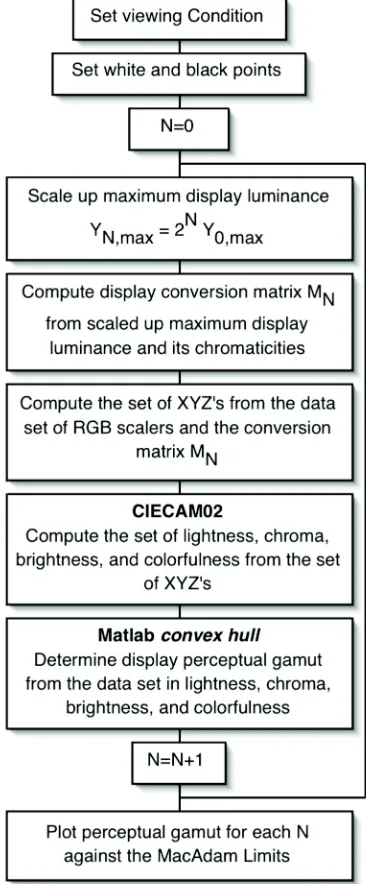
Figure 2-20 illustrates the process for rendering an image for display on either
of the HDR monitors. The MATLAB code for each of these processes is given in
Figure 2-20: MCSL prototype HDR rendering engine
HDR_Register
HDR_Register builds an affine transform H for aligning the image of the
projector with the LCD panel. The application first displays a square matrix of
lines on the LCD panel. The observer, positioned where he or she will be viewing
images on the display, selects the projector image with the curser, then proceeds
to select each of 16 points successively left to right and top to bottom.
XYZ_white) from RGBXYZ ramp data. A validation set of RGBXYZ data,
selected randomly over the gamut of the display, were then processed through a
reverse model contained within the HDR_Forward_Model and CIEDE94
computed with associated statistics.
HDR_Calib
XYZ image data in structured form is converted to projector and LCD digital
counts for display from the calibration data structure provide by the forward
model described in the above. The rendering strategy employed is to linearly
scale the image luminance to the entire dynamic range of the display and to first
place the burden of rendering the luminance on the projector to preserve
optimum color gamut as mediated by the LCD. Out of gamut points are mapped
to their maximum chroma with hue preserved. Figures 2-21 and 22 illustrate the
results for the luminance channel in both the MCSL and Brightside HDR
displays.5
One problem with this strategy is that image highlights that are very bright
tend to result in de-saturated colors thereby reducing perceived colorfulness.
Simply clipping the highlights, while increasing colorfulness, results in a loss of
detail in the highlights. In future studies, some form of non-linear scaling based,
perhaps, on the image statistics may be required to preserve both highlight detail
and colorfulness. Furthermore, images that have less dynamic range than the
display are necessarily rendered in a non-realistic manner appearing too bright
5 It is noted that the Brightside HDR display has an inherent green cast corrected by the
with excessive contrast. Again, in future studies, not only non-linear mapping
techniques, but placement in the display’s tone scale needs to be considered.
Figure 2-21: MCSL HDR display luminance rendering strategy
HDR_Transform
The projector image (K_HDR) in digital counts is first aligned to the LCD
image via the affine transform data structure HDR_Transform, H, then displayed
accordingly with its corresponding LCD image, RGB_HDR, from the image data
structure.
Rendering Performance
Figure 2-23 illustrates the resulting gamut of the MCSL HDR display in
CIELAB (white point set to display max). As the rendering strategy is the same
for the Brightside display, its gamut should be similar.
3
PERCEPTUAL GAMUT
In his paper, Maximum Visual Efficiency of Colored Materials [MacAdam, 1935],
MacAdam stated that “One of the most compelling objectives of pigment and
dye chemists has been to … produce colors of ever greater purity without the
sacrifice of brightness.” In the interest of insuring that reasonable expectations be
set in this regard, MacAdam computed what have come to be called the
MacAdam Limits (see the section “MacAdam Limits and Zero Gray Content” of
the above) and this representation is referred to the theoretical maximum color
gamut of ideal materials.
Figure 3-1: The MacAdam Limits [MacAdam, 1935]
3.1
THE GAMUT OF REAL OBJECTS
In contrast to MacAdam whose limits are specified without realization in the
perception of an observer, Nickerson and Newall [Nickerson, 1943] constructed a
solid representation of the color space of normal human perception realizable in
chroma from zero to maximum, Munsell value from 1/ to 9/, and the five
principle Munsell hues and their complementaries. Figure 3-2 illustrates their
results – the solid on the left represents the discriminatory power of the normal
observer and the right representing the relatively greater lightness capable of
being measured with instruments during the time this paper was published.
Figure 3-3 illustrates horizontal sections through the solid at Munsell values 1/
to /9 where the dotted shape estimates the volume of available Munsell samples.
Figure: 3- 2: The psychological color solid for colors perceived under good visual conditions (left) and for colors perceived when using a good instrument (right) [Nickerson, 1943]Horizontal sections through the
M. R. Pointer [Pointer, 1980] considered the gamut of real surface colors in the
CIE 1976
!
L"
u"
v"
and
!
L" a"
b"
color spaces for a typical dye set used in photographic
paper and typical CRT display. He compared this gamut to the theoretical
maximum gamut as computed from MacAdam with a correction of surface
reflectance of 0.56% and what Pointer calls the real color gamut composed from
the Munsell Limit Cascade, a series of color working standards that include a
sample of high chroma for each of 48 different hues including 7 tints of each hue
in a graded series toward white for a total of 768 colors and representative of the
color gamut permitted by the colorants chosen. Figure 3-4 plots the resulting
Pointer’s maximum color gamut for real colors (inner gamut) derived from the
Munsell Limit Cascade and the corresponding optimal color gamut from
MacAdam with the correction for surface reflections.
Steingrimsson et al [2002] considered that “ ... new coloring and imaging
techniques have allowed to generate surface colors with higher chroma values
than Pointer has found.” To this end, the gamut obtainable with surface colors by
over 3,000 paper samples of Pantone colors used to specify, identify, and display
specific colors or inks in the graphic arts industry was constructed. Figure 3-5
plots the gamut of these samples (inner dark volume) in
!
L" a"
b"
space for CIE
Illuminant D50 compared to the optimal color solid using MacAdam’s approach
of “ … calculating color responses from spectral curves with the values of unity
or zero showing only either one single transmission band or one single
absorbtion band” [Steingrimsson, 2002]. Figure 3-6 similarly plots Pointer’s
gamut of real surface colors described in the above in the same context as an
additional point of comparison.
Most recently, X. Li, et al, of the University of Leeds presented a paper [Li,
2007] that accumulated a large number of reflectance data sets (85,900 samples in
total) for comparison to Pointer’s gamut and the newly standardized Reference
Colour Gamut [ISO, 2004]. Their results are claimed to be more reliable
principally due to the shear number of samples.
3.2
PERCEPTUAL GAMUT IN COLOR APPEARANCE
ATTRIBUTES
These representations by MacAdam, Nickerson and Newall, Pointer,
Steingrimsson, and Li of the gamut of real objects are taken without
consideration of the context in which they are seen. In the most rudimentary of
contexts, the color of a homogeneous object in a homogeneous surround where
the observer is fully adapted to the surround, what the observer actually sees is
affected both by the color of the surround and its luminance. In this most
rudimentary context, the gamut of an object as represented by a CIE chromaticity
diagram or Munsell notation remains invariant even though what an observer
sees is not. Hence, while these invariant representations serve well to
characterize display media, they do not serve well to describe what an observer
sees.
In more complex viewing fields [Fairchild, 1998], perception is affected by the
stimulus and its proximal field, the background, and the surround; their
colorimetric and spatial qualities; and the mode of viewing – illuminant,
illumination, surface, volume, and film. The surface and volume modes are
commonly referred to as object mode where the color appearance attributes are
attributes are brightness, colorfulness, and hue. If the gamut of what an observer
sees in the most rudimentary context is variant, then it can be said that the gamut
of objects seen in such a complex scene is wildly variant, and correspondingly,
those invariant representations of gamut clearly inadequate.
Perceptual gamut needs to be represented in the color appearance attributes
of lightness, chroma, and hue for object colors and brightness, colorfulness, and
hue for illuminant, illumination, and film mode. For objects, such a
representation is sufficient for describing the range of visual experience as
bounded by the MacAdam Limits and in the context of the effects of the
proximal field, background, and surround. In this sense, CIE
!
L"
a"
b" may be
sufficient as the respective values are mediated by the observer’s perceived white
point according to:
!
L"
=116f YY n #
$ % &
'
( )16 (3-1a)
!
a"
=500f XX
n #
$ % &
' ()f YY
n # $ % & ' ( * + , , -. / / (3-1b) ! b"
=200f YY
n
#
$ % &
' ( )f ZZ
n
#
$ % &
' ( * + , , - . /
/ (3-1c)
!
f
( )
" = " 13
7.787"+16116
# $ % & % !
">0.008856
otherwise (3-1d)
for the tristimulus values
!
XYZ of a sample color normalized to the tristimulus
values XnYnZn of reference white. The term
Y Yn
through a systematic removal of the achromatic component of the surround,
higher and higher chroma can be achieved for any given object color without
affecting the object itself [Heckaman and Fairchild, 2007). A similar effect can be
demonstrated by changing the chromaticity of the surround (Liu and Fairchild,
2004); i.e., the perception of the object’s color is correspondingly affected in the
direction opposite to that of the change in surround. Hence, in the realm of our
experience of object color, perceptual gamut might be well served by a CIE
!
L"
a"
b"
representation.
3.3
TRADITIONAL COLOR GAMUT REPRESENTATIONS
Figure 3-7: The gamut of a typical digital display device in CIE Chromaticities superimposed on the locus of pure, spectral colors
A traditional representation of the gamut of a typical additive, digital display
device with RGB primaries in a CIE chromaticity diagram is shown in Figure 3-7
superimposed on the locus of pure, spectral colors. Such a representation does
not give any insight into their respective appearance attributes or relative or
relative luminance values, yet this representation is typically used in the display
display is characterized and its white point set to the maximum output of the
display. By definition, such a display is configured to render appearances only
within the realm of object colors. Colors outside this realm are rendered by
employing varies gamut compression strategies.
In spite of limited insight into the appearance attributes, particularly the
luminance attribute, such a representation continues to be relied on in display
systems development. Two examples are given here that provide a convincing
case against such a representation and an equally convincing case that such a
representation continues to be relied on in the design, development, and
manufacture of such media. But perhaps the clearest example is in the
specification of digital video and cinema, e.g. Rec. ITU-R BT.709-5 [2002] and the
N.T.S.C. standard, where the entire system is rooted in a xy chromaticity
diagram of the set of CRT primaries defined in 1953 in spite of the state of the
technology in display media today.
3.3.1 The case against a traditional representation I: U.S. Patent
7,181,065 [Pettitt, 2007]
As recently as a year ago, a U.S. patent, Enhanced color correction circuitry
capable of employing negative RGB values, was granted to Texas Instruments. In
essence, the patent provides for a method to correct the white point of a digital
By way of illustration, Figure 3-8 (FIG. 1 of the patent) “… is a CIE xy
chromaticity diagram 100 of a first display system … illustrating its white point
110 … [that] is slightly to the magenta side of a reference white line 118”.
Figure 3-8: A first display system having a white point 110 to the magenta side of a reference white line 118
Figure 3-9: A second display having an extended green primary 206 form that of the first display 108
In Figure 3-9 (FIG. 2 of the patent), the green primary of the first display has been
extended to 206 thereby expanding the gamut but with a white point 210 “… that
non-primary color …, the color will have a greenish or bluish tint” relative to the
first display.
In Figure 3-10 (FIG. 3 of the patent), “ … the display system represented in
FIG. 2 [Figure 3-9] after the secondary colors have been altered …. The yellow
point 314 and the magenta point 316 have been moved toward the red point 104,
while the cyan point 312 has been moved toward the blue point 108” thus
correcting the greenish or bluish tint in non-primary colors.
Figure 3-10: The gamut of the second display system after the secondary colors have been altered
To its benefit, the patent does hint at the effect of such an alteration on the
overall gamut of the second display re: “Although the display system
represented by FIG. 2 [Figure 3-9] provides a lot of illumination to a white point
And, at least in the experience of the MCSL laboratory in characterizing a
Samsung DLP projection display [Casella, 2008] that presumably employs the
method of this patent, the grayscale values (R=G=B) and hence their lightness
contrast can be reduced by as much as 30% from the sum of their corresponding
maximum values.
3.3.2 The case against a traditional representation II: The effect of DLP projector white channel on perceptual gamut
[Heckaman, 2005]
Since its introduction in a 1998 paper by Kunzman and Pettit [1998], Texas
Instruments (TI) DLP digital projector technology with white channel
enhancement to achieve brighter images has become pervasive in their intended
markets. Yet in the TI implementation, it is presumed that high brightness is
achieved at the expense of chroma as the addition of a white channel reduces
saturation. Colors, in effect, would appear to be washed out. This section is then
to give credence to this presumption by determining the effect of white channel
enhancement on the perceptual gamut of a projector utilizing this technology
and to illustrate yet another example of the case against relying on a traditional
gamut representation in a xy chromaticity diagram.
DLP Characterization
The InFocus LP650 implements the TI DLP technology and was ideal for this
application as it incorporates two modes of viewing – the “Presentation Mode”
with white channel enhancement and the “Photographic Mode” where the white
determined by comparing the respective volumes of perceptual gamut in these
two modes.
In the TI implementation, the RGB luminance signal is first allowed too
increase until its maximum is reached, then a portion of the luminance is shifted
to the white segment of the filter wheel in three discrete levels according to:
!
Ycombined =YRGB +Ywhite (3-2a)
!
Xcombined =XRGB +Xwhite (3-2b)
!
Zcombined =ZRGB+Zwhite (3-2c)
Figure 3-11: Forward Model Lookup Table
The InFocus LP650 was characterized in both modes using the Wyble [2004]
methodology. Using this methodology, the forward model is characterized
according to:
R'
incorporating the
!
R'G'B'W' contributions and their respective black residuals.
Seventeen (17) step ramps were judged sufficient for the purpose of computing
gamut.
Figure 3-12 illustrates the resulting differences in absolute projector screen
illuminance under dark viewing conditions (little or no viewing flair) between
the "Photographic Mode" and “Presentation Mode”. In terms of full-on/full-off
contrast ratio, the InFocus LP650 was measured off the screen to be 430:1 in
“Photographic Mode” and 788:1 in “Presentation Mode” in a completely
darkened room.
Figure 3-12: Gray Scale Illuminance
DLP Perceptual Gamut
The representation of the gamut in a CIE Chromaticity Diagram for this DLP
is shown in Figure 3-13. This diagram does not distinguish between the two
modes of this projector, nor does it give any insight into their respective
that the gamut of the two modes are identical. Hence, the “Presentation Mode”,
being brighter, would be presumed to be “better”.
Figure 3-13: DLP Gamut in CIE Chromaticities
one plane. The volume of perceptual gamut in Chroma is compressed as a result
of an enhanced white channel, yet lightness contrast is relatively unaffected for
neutrals. The effect is similar when gamut is computed using CIECAM02 as
shown in Figure 3-15. Adaptation was taken to be complete (D=1) under dark
viewing conditions with adapting fields LA and Yb taken to be one-fifth the
respective white point luminance values for each mode. As before, chroma is
mapped cylindrically to one plane.
Finally, the predicted effect of white channel enhancement on brightness and
colorfulness is obtained using CIECAM02 as illustrated in Figure 3-16. The
volume of gamut has been expanded in brightness by white channel
enhancement and colorfulness compressed to a similar extent as chroma.
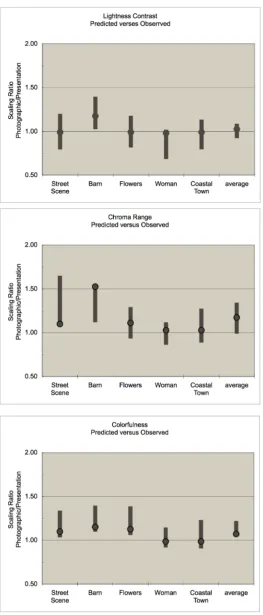
These gamut representations predict that the effect of white channel
enhancement is to compress the chroma portion of gamut while affecting
lightness to a much lesser amount. The effect on brightness and colorfulness is to
expand the gamut in brightness yet compress colorfulness. Table 3-1 summarizes
these conjectures in terms of the ratio of their relative gamut volumes.
Table 3-1: Relative Perceptual Gamut Volumes
Gamut Representation
Volume Ratio – “Photographic Mode” to “Presentation Mode”
CIELAB LCh 1.53
CIECAM02 LCh 1.58
CIECAM02 QM 0.92
Psychophysical Testing
A psychophysical experiment was done using the images shown in Appendix
A.1, White Point Test Images, to test the validity of the gamut analysis. The Street
Scene was chosen for the pastel colors of the buildings. The Barn chosen as a
control as its luminance values are below the point where the white channel
comes into play, and presumably this image should rate the same in each
projector mode. The Flowers image was chosen as high in chroma or
Figure 3-16: DLP Gamut in CIECAM02 Brightness versus Colorfulness and am versus bm
The images were projected onto an 8-foot wide screen in the Grum Learning
Center of the Munsell Color Science Laboratory under dark viewing conditions
in both Presentation and “Photographic Mode”. The judges were dispersed in
the room according to normal conference room viewing conditions. Each image
was simultaneously viewed on a Sony 23 inch CRT color monitor that served as a
Two trials were completed by 27 expert judges. Each were asked to scale
lightness contrast, chroma range, brightness, and colorfulness relative to the
reference monitor on an absolute scale – first in “Photographic Mode” then,
leaving the room and returning, in “Presentation Mode”. The scale was anchored
at 1.0 representing the reference monitor and 0.0 representing uni-gray for
lightness contrast and chroma range and black for brightness and colorfulness.
The first trial was intended as a pilot and as training for the judges.
Test Results
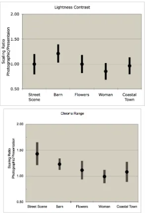
The results of the second trial are presented in Figure 3-17 for lightness
contrast and chroma range and Figure 3-18 for brightness and colorfulness. The
data are presented in terms of the ratio of scale value given to each attribute in
“Photographic Mode” to that given in “Presentation Mode”. The data points
represent the mean ratio over all judges and the bars 95% confidence intervals.
An average ratio value of 1.0 for any attribute is interpreted to mean that the
observers rated the image as equal i
![Figure 2-2: Typical remote, sunlit, front lit scene [Jones and Condit, 1941]](https://thumb-us.123doks.com/thumbv2/123dok_us/57977.5376/35.612.208.404.384.519/figure-typical-remote-sunlit-lit-scene-jones-condit.webp)