Rochester Institute of Technology
RIT Scholar Works
Theses
Thesis/Dissertation Collections
8-1-2013
Modern Arabic Calligraphic-Based Logos: The
Influence of Traditional Arabic Calligraphy on
Modern Arabic Calligraphic-based Logo Designs
Amer Alkharoubi
Follow this and additional works at:
http://scholarworks.rit.edu/theses
This Thesis is brought to you for free and open access by the Thesis/Dissertation Collections at RIT Scholar Works. It has been accepted for inclusion in Theses by an authorized administrator of RIT Scholar Works. For more information, please contactritscholarworks@rit.edu.
Recommended Citation
1
Thesis submitted to the faculty of
the College of Imaging Arts and Sciences in candidacy for the degree of
Master of Fine Arts in Graphic Design, School of Design
Amer Alkharoubi Aug 1, 2013
MODERN ARABIC CALLIGRAPHIC–BASED LOGOS
Nancy A. Ciolek
Associate Professor, Graphic Design
Signature of Chief Advisor
Date
Bruce Ian Meader
Associate Professor, Graphic Design
Signature of Associate Advisor
Date
Joyce Hertzson
Professor, Graphic Design
Signature of Associate Advisor
Date
Chief Advisor
Associate Advisor
Associate Advisor
3
Reproduction Granted
Inclusion in the RIT Digital Media Library Electronic Thesis and Dissertation (ETD) Archive
I, Amer Alkharoubi, hereby grant permission to
Rochester Institute of Technology to reproduce my thesis documentation in whole or part. Any reproduction will not be
for commercial use or profit.
Signature of Author
Date
I, Amer Alkharoubi, additionally grant to Rochester Institute of Technology Digital Media Library the non-exclusive license to archive and provide electronic access to my thesis in whole or in part in all forms of media in perpetuity. I understand that my work, in addition to its bibliographic record and abstract, will be available to the worldwide community of scholars and researchers through the RIT DML. I retain all other ownership rights to the copyright of the thesis. I also retain the right to use in future works (such as articles and books) all or part of this thesis. I am aware that Rochester Institute of Technology does not require registration of copyright for ETDs. I hereby certify that, if appropriate, I have obtained and attached written permission statements from owners of each third party copyrighted matter to be included in my thesis. I certify that the version I submit is the same as that approved by my committee.
Signature of Author
Date
Abstract
Thesis Definition
Review of Literature
Research
Process
Conclusion
Appendices
Bibliography
A Brief History of the Arabic Language and Script
The Development of Traditional Arabic Calligraphic Styles
The Kufi Style
The Thuluth Style The Naskh Style The Dewani Style The Ruqaa Style References
The Study Aljazera TV Logo Kalakeesh Logo Emirates Logo
Madenat Alfrosiya Logo Fowzia Logo
Bahrain TV Logo
Glossary of Terms Thesis Proposal
5
Abstract
Calligraphy in the Arabic language is an ancient form of
communication and a method of documenting history. The Arabic script started in a very simple form with characters similar to each other. However, through the years, many developments have occurred within this form of communication. These developments were created by several artists and calligraphers, which resulted in generating a variety of styles of scripts with unique treatments. Since the twentieth century, these traditional calligraphic styles have started to lose their importance, and the use of modern Arabic
calligraphy is becoming more dominant, especially in the fields of
modern design such as graphic design. However, traditional Arabic calligraphy still has a noticeable impact on modern Arabic designs.
This thesis introduces a new way of understanding the influence
of traditional Arabic calligraphy on modern Arabic calligraphic-based logo designs. The process is accomplished by explaining and
substantiating these influences in a step-by-step study applied on
six selected Arabic calligraphic-based logos. As a conclusion, the
study confirms a strong influence of traditional Arabic calligraphy
7
Thesis Definition
Calligraphy in the Arabic language is an ancient form of
communication and documenting history. The Arabic script started in a very simple form with similar characters that had no signs to separate them from each other or elements to control speech. However, along the years, some additions and improvements were done to the characters to make them more independent,
and dots and accent marks were included as a part of the script to differentiate the similar characters. These changes created a homogeneous relationship between the written language and the spoken language. As a result of this evolution, calligraphy was more than just a tool for writing, as it became integrated into various forms of visual arts.
Traditional Arabic calligraphic styles started with many strict rules.
However, the influence of other cultures on the Arabic language
affected these styles to evolve and branch into many subdivided styles that broke many of these rules. This created interrelationships between cultures, which impacted the art of calligraphy and resulted in introducing a variety of styles. This development of calligraphy inspired designers and artists to expand their use of this form of art into design solutions. Arabic calligraphy became a part of graphic design, architecture, textile design, fashion design,
graffiti and furniture design.
This thesis introduces a new way of understanding the influence
of traditional Arabic calligraphy on modern Arabic calligraphic-based logo designs. This thesis answers the question, How did traditional
Arabic Calligraphy influence modern Arabic calligraphic-based logo designs? The answer is achieved by a step-by-step study that concludes that traditional Arabic calligraphy has a significant influence on modern Arabic calligraphic-based logos.
Situation Analysis
9
The study is based on the author’s own judgment and understanding of the influence of traditional Arabic calligraphy on modern Arabic
calligraphic-based logo designs. The process of the study is done by choosing six selected Arabic logos, de-constructing and
examining their different parts, comparing each logo to five
traditional styles and extracting the similar parts among them, and then manipulating the extracted characters in order to achieve a similar design to the original logo.
The goal is to explain and substantiate the influences of traditional
Arabic calligraphy on modern Arabic calligraphic-based logo designs by:
Evaluating and studying the history of Arabic calligraphy Presenting the traditional Arabic calligraphic styles and their characteristics
Comparing modern Arabic calligraphy with traditional styles and studying the similarities between them
The application of this thesis is a set of informational pieces that will introduce an overview of the Arabic language
and Arabic calligraphy, the traditional Arabic calligraphic styles,
and the influence of the traditional Arabic calligraphic styles
on modern Arabic calligraphic-based logo designs. These informational pieces are presented as a set of
four printed posters and two animated clips. •
• • Thesis Study and Process
Thesis Goal and Methodology
Thesis Application
11
Review of Literature
by Muhammad Taher Alkurdi Egypt, Alhilal, 1939
This book is a great reference for ancient and traditional Arabic script. It includes information about the development of the Arabic language, the development of script and calligraphy. This book will help in understanding and researching the history of traditional Arabic calligraphic styles, their characteristics and their rules. Arabic Calligraphy History
and Etiquette
by Hashem Muhammad Alkhattat Baghdad, Book World 1986
This book is a traditional Arabic calligraphy handbook. It includes information about calligraphy pens and how to use them properly, the different characteristics of each style and the point system of traditional Arabic calligraphic styles. This book will help in understanding how the traditional styles were constructed,
what make them different or similar to each other and the different point systems that each style uses.
The Rules of Arabic Calligraphy
by Tarek Mahfouz Egypt, Ibn Sena, 2011
This book is a traditional Arabic calligraphy handbook. It includes
information about five traditional styles, calligraphy pens for each
style, how to use the pens properly, the different characteristics of each style and what makes each style unique from other styles. This book will help in understanding how the styles were
constructed and what makes them different or similar to each other. Learn Arabic Calligraphy:
Review of Literature
by Rana Abou Rjeily Mark Batty Publisher 2011
This book introduces a new typeface that is designed to make learning the Arabic alphabet easier for non-Arabic speakers. It explains the Arabic language for non-Arabic speakers
in a very simple way. This book will help in inspiring and finding new
ways to illustrate and explain the history of the Arabic language for non-Arabic speakers.
Cultural Connectives
by Ben Wittner Gestalten Verlag 2009
These two books explore the Arabian graphic design world
and the different areas of influence and design. They contain many
examples of Arabic graphic design pieces that include calligraphy, typography, information design, logo designs and independent projects. These books will help in researching a variety
of calligraphic-based logo designs and styles. Arabesque(1&2):
Graphic Design from the Arab World and Persia
by Daud Sutton
Walker & Company 2007
This book focuses on Islamic geometric patterns, simple and complex, man-made and in nature and offers unique insight into Islamic culture. In addition, it explores the world of geometrical calligraphy in Islamic art. This book will help in studying the aspect of geometrical calligraphy and its characteristics.
Islamic Design:
13
Review of Literature
by Abdullah Fatteeni
http://www.draw-art.com/showthread.php?t=1335&page=1%20 %28accessed%20February%2026,%202013%29
A forum based workshop on how to write the calligraphic Kufi style
using a grid system. This web page will help in understanding the different treatments and characters that can be created
and are based on a grid system in the Kufi style.
Learn the Kufi Style
2011
http://arabicletters.info
A website that has a group of calligraphers that discuss Arabic and calligraphy. It has a great amount of information about the Arabic language, the Arabic characters and letters and information about the different calligraphic styles in Arabic.
In addition, this website is a great resource for images,illustrations and calligraphy work. This website will help in gathering information about calligraphy and the Arabic language and characters.
2008
http://galileoart.com/forum/lofiversion/index.php?t3215.html
A website that explores the history of Arabic calligraphy
and the development of the traditional Arabic calligraphic styles. This web page has a great amount of information and images that
will help in conducting the research about the thesis topic. Arabic Letters
The History
15
A Brief History of the Arabic Language and Script
1.1
The Arabic language is one of the main languages spoken in the world. Historians believe that it has existed since the Sixth century and it was mainly spoken by people in the Arabian Peninsula. However, after the advent of Islam in the Seventh century, Arabic was adopted as the main language of the religion. As Islam spread outside the Arabian Peninsula, non-Arabic Muslims had to learn how to speak the language in order to practice the religion and read the Quran. However, in addition to the religious
practices, the language became the main language in people’s
everyday transactions.
However, the written Arabic language did not spread as fast as the spoken language. The reason behind this was because most of the religious practices and Quran verses were memorized and inherited from people who practiced and memorized them before. There were some written verses of the Quran kept in
possession of a few people who knew how to write the Arabic script. In the era of Caliphat Abu Bakr, the year 632 AD, and after many wars, many Muslims who memorized the Quran or kept the written verses were killed, and people were afraid that they would lose the Quran. As a solution, Caliphat Omar Ibn Alkhattab suggested that they gather the scattered written verses of the Quran into one book, copy, publish and distribute it to the people. In 644 AD,
the Quran was refined in the era of Caliphat Othman Ibn Afan.
2
1
The Development of Traditional Arabic Calligraphic Styles
1.2
The first Arabic Kufi style, Figure 1.2.1, was a minimal Arabic
calligraphic style. The characters did not have any dots and there
were no accent marks to define speech. The absence of these
two elements, in addition to the similar characters, made learning
the language very difficult for people who had recently learned
the language. Learning the Quran incorrectly and misspeaking the language was a huge concern.
Figure 1.2.1
Many historians mention that the Quran was written using
the Kufi style, which is the oldest Arabic style that had the same
characters and rules of the Arabic script that is used in present days.
The Kufi style was a descendant of the Anbari style, which was
an Arabic style known in Yemen. Travelers from Yemen, who were known for mastering the art of calligraphy, traveled through Mecca and Medina to settle in Kufa City in Iraq. Kufa City was built by Caliphat Omar Ibn Alkhattab and became the city of
calligraphers, developing many different styles.4
Figure 1.2.2
The First Form of the Arabic Script
The First Development
After the interrelationship between Arabic and non-Arabic cultures, the Arabic script started to develop in order to make the language
easier for people to understand The first development was done
by Abu Alaswad Aldowali, who lived from 603–688 AD. Abu Alaswad Aldowali added small dots above and under the letters and set the rules to control speech. These dots were known as accents and were colored in red in order to differentiate them from the main characters. However, this method did not resolve the problem of
17
In the era of the Caliphat Abdulmalik Ibn Marwan in the Umayyad
Caliphate, the second development to the Kufi style was done
by adding the dots to the similar characters. This addition was developed by Nasr Ibn Asem and Yahya Ibn Yamur, who were
students of Abu Alaswad Aldowali.6
Figure 1.2.4
The Development of Traditional Arabic Calligraphy Styles
Figure 1.2.3
The Second Development
The Final Development
The final stage of the development was the addition of
the accent marks. This was suggested by Alhajaj Ibn Yousef
Althagafi to the Caliphat Abdulmalik Ibn Marwan in order to
eliminate any confusion between the red speech accents
and the characters’ dots. 7
The addition of the dots was done to the characters similar
to each other that might confuse people while using the language. The dots are considered a part of the character. These dots
were added using the same color of the characters in order to differentiate them from the red accent dots. In the Arabic language,
fifteen characters have dots. Ten characters have one dot each,
Arabic characters, words and sentences are all written and read
from right to left. There are twenty-eight primary characters and five
secondary characters in the Arabic language. Arabic is a cursive language, and there are very few words that are non-cursive. Each character has at least two different treatments which depends on its placement in a word and whether the character is connected from the right, the left, not connected or connected from both sides. Most of the characters can be connected from both sides.
However, there are some characters that can only be connected from the right side. All Arabic styles and typefaces have the same number of characters. The difference between these styles depends
on many factors like the pen and the angle of writing. In the figure
below, the Arabic alphabet is represented using a typeface based on the Naskh style, which is one of the most common styles of writing in Arabic.
Figure 1.2.5
The primary and secondary characters of the Arabic alphabet introduced using the Naskh calligraphic style
The Primary Characters
The Secondary Characters
The Development of Traditional Arabic Calligraphy Styles
Reading Arabic
19
The system of accent marks was based on using small slabs and small characters above and under the main characters to control the speech. In Arabic, accent marks are called Tashkeel. This system of accent marks was developed by
Alkhaleel Ibn Ahmad Alfarahedi.
In calligraphy, accent marks are used in two traditional styles, Thuluth and Naskh. However, in typography or hand-writing,
it is common to use accent marks with any style.
Figure 1.2.6
The Thuluth Style Accent Marks
The Naskh Style Accent Marks
Accent marks are used to inform the reader of the right
pronunciation of the word. Accent marks can change the meaning of a word completely and they are essential in understanding
the language. In the English language, vowels are most closely related to accent marks in Arabic. The difference between them is that vowels are actual letters that are written in a word, however, accent marks are not.
Figure 1.2.7
The use of accent marks using the Thuluth style (left) and the Naskh style (right)
The Development of Traditional Arabic Calligraphy Styles
Accent Marks
The rules and shapes of the accent marks are the same.
The Development of Traditional Arabic Calligraphy Styles
Calligraphy Pens
The Point System
The calligraphy pen is the most important element in creating a calligraphy style. Calligraphers might use the same pen for different styles. However, the shape and cut of the head of the pen, the amount of pressure applied on the pen and the angle of holding
the pen while writing, are specific aspects that will determine each
style. The calligraphy pen for the style is usually cut and created by the person who developed the style itself.
In Figure 1.2.8 are three different angles and cuts that are used
with the most common Arabic styles. These specifications are used
by calligraphers who are specialized in Arabic calligraphy. However, any chiseled pen with a right-angled cut can be used to produce beautiful calligraphy work. Left-angled cut pens that are
used for Latin calligraphy are difficult to manipulate to use for Arabic
calligraphy because of the different angle.
Figure 1.2.8
Figure 1.2.9
The point system for the character Aayn in the Thuluth style (left),
the Naskh style (middle) and the Ruqaa style (right)
The point system was developed by Ibn Muqla, a prince from the Abbasid Empire. The point system is a measuring system that uses dots, which are similar to the characters dots, executed by the calligraphy pen for each style to govern the dimensions of each character. These points are executed in a different color to eliminate
any confusion. This system is complicated, and it is the first element
that a calligrapher has to master. Calligraphers spend weeks and months perfecting this technique, which will result in creating a
uniform style that has perfect constancy and flow.
The point system is specific for calligraphy and it is not applicable
for the regular hand written language. Figure 1.2.9 shows three different point systems for the same character in three different traditional Arabic calligraphic styles.
21
[image:22.612.104.591.275.509.2]The Kufi Style
1.3
Figure 1.3.1
The name of the Kufi style in Arabic
The Kufi style has more than 30 sub-styles and it is considered
to be one of the most versatile styles in Arabic calligraphy.
The style is very geometrical and decorative. However, it started as a freehand style.
Figure 1.3.2
The origin of the Kufi style is Kufa city in Iraq The Kufi style is one of the oldest Arabic calligraphy styles.The Kufi style was descended from the Anbari style, which was an Arabic style known in Yemen. Then the Anbari calligraphers traveled to Kufa in Iraq and settled there and developed
the Kufi style. Kufi means the thing from Kufa. The Kufi style is the first style that Muslims used to write the Holy Quran.
However, since the twentieth century it is as mostly been used for
display and decorations. 9
Kufa city, Iraq
Iraq
The Kufi Style Origin
Figure 1.3.3
Figure 1.3.4
The Kufi Style
The Kufi Calligraphy Pen
Many kinds of writing tools can be used with the Kufi style such as
brushes or bamboo pens. The angle of the writing tool is straight
and the tip of the pen is very wide. These specifications will result in making the style to be very geometrical, which lead many Kufi
calligraphers to use a grid system instead of the pen in order to
achieve perfect geometrical treatments.10
14
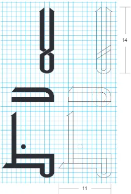
11
Figure 1.3.4 shows three different characters, Lam-alif, Dal and Dhaa, from the Arabic alphabet written using the grid
system of the Kufi style. The Lam-alif is fourteen squares high,
and the Dhaa is eleven squares wide. The curves in the Dal
are based on two perfect circles. Each dot is usually a perfect circle that has the proportion of one square depending on the grid system.
The Kufi style is one of the unique styles that use perfect rounded
23
The Kufi style is one of the most versatile styles in Arabic calligraphy.
It has many different sub-styles most of them were developed to serve as a decorative solution based on manipulating the words and the characters, which makes the calligraphy very hard to read
in most cases. The characters in the figure above are written using a common style of Kufi called “Kufi Muthafar” which is translated into a typeface to make it more unified and easy to use.
Figure 1.3.5
The Kufi Style
The Kufi Characters
Examples of the Kufi Sub-styles
The Primary Characters
The Secondary Characters
[image:24.612.291.587.464.703.2]The next few figures demonstrate different sub-styles of Kufi. The first example shows the same sentence written with three different treatments using the same sub-style, the Kufi Muthafar. The other three examples are created using the sub-style Kufi Muraba or the squared Kufi.
Figure 1.3.6
The same sentence executed using one of
The Kufi Style
Figure 1.3.7
25
[image:26.612.101.592.309.533.2]The Thuluth Style
1.4
Figure 1.4.1
The name of the Thuluth style in Arabic
The Thuluth style is used mostly as a display style, and it is more complex and stylized than other styles. It is used for book titles,
art pieces, decorations, people’s names and store signs.
The Thuluth style is considered to be one of the most difficult styles
for a calligrapher to master because of its unique balance and elaborated details.
Figure 1.4.2
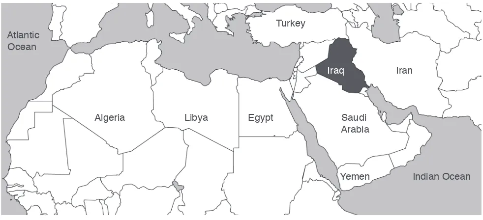
The origin of the Thuluth style is Iraq
Iraq Atlantic Ocean Indian Ocean Turkey Egypt Iran Libya Algeria Saudi Arabia Yemen Iraq
The Thuluth Style Origin
The Thuluth style was developed by Ibn Muqla, a prince from the Abbasid Empire. Thuluth in Arabic means one-third. The style is named after the size of the pen that was used to develop this style, which was one-third of the size of the regular writing pen at that
Figure 1.4.3
The calligraphy pen that is used for the Thuluth style is cut at a 30 degree angle and has to be held at a 70 degree angle. In Thuluth, the point system uses wider dots than other styles. In addition, the pen pressure is lighter. These two important characteristics will effect the look and the dimensions of the characters in the style.
The Thuluth Calligraphy Pen
The Thuluth Characters
Examples of the Thuluth Style
The Thuluth Style
13
In the figure above, the characters are written using a Thuluth
typeface that is based on a Thuluth calligraphic style in order to
show a unified and easy set to follow. In calligraphy, each one
of these characters has multiple forms of execution depending on many factors.
Figure 1.4.4
Figure 1.4.5 demonstrates different treatments executed on two different characters, Raa and Meem, from a traditional Thuluth calligraphic style according to their placement in a word. The Primary Characters
27
The Naskh Style
1.5
The Thuluth and Naskh styles are very similar. The difference between them is that the Naskh style is simpler and easier to read. The Naskh style is one of the most recognizable traditional styles in Arabic calligraphy. It is mostly used to write books and publications, which makes it very recognizable.
[image:28.612.101.593.320.546.2]The Naskh style was developed by Ibn Muqla, the same person who developed the Thuluth style. It was developed as a simple version from the Thuluth style. The Naskh and Thuluth styles have many similar characteristics, and they are categorized as the most important styles that a calligrapher has to know.
Figure 1.5.1
The name of the Naskh style in Arabic
Figure 1.5.2
The origin of the Naskh style is Iraq
Iraq Atlantic Ocean Indian Ocean Turkey Egypt Iran Libya Algeria Saudi Arabia Yemen Iraq
The Naskh Style Origin
Before the style was named Naskh, Ibn Muqla called it Albadiya, which means the wonderful. After that, the name Naskh was given to this style because it was used primarily for copying books and writing literature. The word Naskh, means copy. The style
was also used to write certificates and ejazat, which is a type of certificate that is earned by mastering an art through another master
or mentor. Ejazat is given to people who mastered calligraphy or
Figure 1.5.3
Figure 1.5.4
The Naskh Calligraphy Pen
The Naskh Style
The calligraphy pen that is used for the Naskh style is the same as the Thuluth style. The pen is cut at a 30 degree angle and has to be held at a 70 degree angle. However, in Naskh, the point system uses square dots. In addition, the amount of pressure applied on the pen is stronger than the amount used in the Thuluth style. These two important differences will affect the look and the
dimensions of the characters in the Naskh style.15
The Primary Characters
The Secondary Characters The Naskh Characters
In the figure above, the characters are written using a Naskh
typeface based on a Naskh calligraphic style in order to show
a unified easy set to follow. However, each one of these characters
29 Figure 1.5.5
Examples of the Naskh Style
The Naskh Style
The Dewani Style
1.6
Figure 1.6.1
The name of the Dewani style in Arabic
The Dewani style is one of the unique traditional style that is easy to recognize. It is a very light and elegant style and it is considered to be the royal style in Arabic calligraphy. It is a fancy style that was mostly used for royalty transactions, orders and letters.
Figure 1.6.2
The origin of the Dewani style is The Ottoman Empire (Turkey)
Iraq Atlantic Ocean Indian Ocean Turkey Egypt Iran Libya Algeria Saudi Arabia Yemen Iraq
The Dewani Style Origin
The word Dewani in Arabic is used to describe a royalty office
or bureau. The style was mostly used for special letters sent
by the emperor or a high class person. However, after the style
16
The Dewani style first appeared in the Ottoman Empire period.
The style was developed by Ebraheem Munief, in the area currently known as Turkey. When the Dewani style was developed,
31 Figure 1.6.3
The Dewani Calligraphy Pen
The Dewani Style
The calligraphy pen that is used in for the Dewani style is cut at a 15 degree angle and has to be held at an angle between 90 and 100 degrees. This right angle will result in producing sharp
pointed endings that are unique characteristics in the Dewani style.17
Figure 1.6.4
The Primary Characters
The Secondary Characters The Dewani Characters
In the Dewani style, the characters should be written at a slanted
angle towards the left-bottom of the writing line. This rule is specific
for Dewani and it does not appear in any other style.
Most of the characters in the Dewani style have curves and share similar elements. Therefore, it is very common for a character to have the same beginning or ending of another character. This characteristic makes the style easier to learn the character
forms, but difficult to master writing the technical forms and
executing them beautifully.
Another characteristic of the Dewani style is the connected dots.
In the Kufi, Thuluth and Naskh styles, the dots have to be separated
if the character has more than one dot. However, in the Dewani style, the dots are connected in the characters that have more than one dot. If the character has two dots, the dots will be written as a short slab. If the character has three dots, the dots will be
Figure 1.6.5
Examples of the Dewani Style
The Dewani Style
Figure 1.6.5 demonstrates different treatments executed
33
[image:34.612.100.592.272.497.2]The Ruqaa Style
1.7
Figure 1.7.1
The name of the Ruqaa style in Arabic
The Ruqaa style is one of the easiest styles to learn and read. Many people tend to match their handwriting to fall in between the Ruqaa and the Naskh styles. People usually use this style when they want to write fast or write many words in a small space.
Figure 1.7.2
The origin of the Ruqaa style is The Ottoman Empire (Turkey)
Iraq Atlantic Ocean Indian Ocean Turkey Egypt Iran Libya Algeria Saudi Arabia Yemen Iraq
The Ruqaa Style Origin
The Ruqaa style was developed by Mumtaz Baik, a consultant for the prince Abdulmajeed Khan, who was the Emperor
of the Ottoman Empire at that time. Mumtaz Baik was a famous Dewani calligrapher. He developed the Ruqaa style as a simple version from the Dewani style. The word Ruqaa in Arabic means
Figure 1.7.3
The Ruqaa Calligraphy Pen
The Ruqaa Style
The calligraphy pen that is used for the Ruqaa style is cut at a 15 degree angle and has to be held at an angle that is between 50 and 60 degrees. This angle of the pen determines the width
and shape of the dots and the characters.20
The characters in the Ruqaa style are smaller and bolder than the characters from other styles. Similar to the Dewani style, the Ruqaa style uses connected dots. In addition, in Ruqaa, if the character is the last character in a word, and it has one or more dots, it is common to connect the dot(s) to the end of the character. This treatment made it easier for people to use the style in their handwriting. It is easier to connect the dots to the character or connect them as one line instead of raising the pen from the paper and putting two or three dots next to each other.
Figure 1.7.4
The Ruqaa Characters
The Primary Characters
35 Figure 1.7.5
Examples of the Ruqaa Style
The Ruqaa Style
http://en.wikipedia.org/wiki/Arabic (accessed March 17, 2013) Muhammad Taher Alkurdi, Arabic Calligraphy History
and Etiquette (Egypt: Alhilal, 1939), 52.
http://en.wikipedia.org/wiki/Islam (accessed March 17, 2013) Alkurdi, Arabic Calligraphy History, 65.
Alkurdi, Arabic Calligraphy History, 76. Alkurdi, Arabic Calligraphy History, 84. Alkurdi, Arabic Calligraphy History, 86. Alkurdi, Arabic Calligraphy History, 70. Alkurdi, Arabic Calligraphy History, 110–111.
http://ar.wikipedia.org/wiki/%D8%AE%D8%B7_%D9%83%D9%8 8%D9%81%D9%8A (accessed February 26, 2013)
http://www.draw-art.com/showthread.php?t=1335&page=1 (accessed February 26, 2013)
Alkurdi, Arabic Calligraphy History, 101.
Tarek Mahfouz, Learn Arabic calligraphy: Naskh, Riqa,
Farsi, Thoulth, and Dewani, (Egypt: Ibn Sena, 2011), 7
37
The Study
2.0
This thesis offers an answer to the question How did traditional
Arabic Calligraphy influence modern Arabic calligraphic-based logo designs? The process is accomplished by explaining and substantiating the influence in a step-by-step study applied on six
selected Arabic calligraphic-based logos.
Each logo has to be based on an Arabic calligraphic solution. Logos that are based on a typographic solution or hand drawn text were eliminated.
The logos have to be varied in their designs and calligraphic styles in order to eliminate repetition and expand the study to multiple design styles.
It is not necessary for the logo or the designer of the logo to be famous or recognizable. This will allow the study to explore and focus on the design of the forms that create the logo.
After applying the rules on a group of logos, these six Arabic calligraphic-based logos are chosen:
Aljazera TV logo Kalakeesh logo Emirates logo
Madenat Alfrosiya logo Fowzia logo
Albahrain TV logo. • • • 1 2 3 4 5 6 Figure 2.0.1
Choosing the Six Logos
The Six Logos
1 2 3
39
This step is done in order to understand the different characters and treatments in each logo, how the text in the logo is supposed to be read, and how many characters the text in the logo has.
This step is the most important step in the study. The text in the logo
is compared to the five most common traditional Arabic calligraphic styles. These five styles are Kufi, Thuluth, Naskh, Dewani and
Ruqaa. The comparison is done in order to highlight the similar characters and characteristics between the text in the logo
and the five styles.
Some of the logos in the study have similar repeated parts. Focusing on these parts will help in understanding the logo and how it was designed and constructed.
After highlighting the similar characters from the traditional styles, simple manipulations are applied to these characters in order to achieve a similar look to the original logo taking into consideration keeping the manipulations minimal and simple.
The final stage is to reconstruct the logo using the manipulated characters. This step will demonstrate that the influence that was
visible in the comparison stage is evident.
The Study
Legibility Test
De-constructing the Logo
Comparing the Logo to Five Traditional Styles Examining Similar Parts
Manipulating the Characters
Reconstructing the Final Logo
The first logo in this study is the Aljazera TV logo. This logo
is one of the famous examples of using modern Arabic calligraphy in logo designs. The logo is used by the Aljazera Network
located in Doha, Qatar.
Figure 2.1.1
2.1 Aljazera TV Logo
De-constructing the Logo
The Aljazera TV logo consists of two main parts. The first part is the
text and the second part is the decorative elements. The decorative elements in the design are attached to the text to create a unique
flow and continuity.
Figure 2.1.3
1 2 3 4 5 6 7
The word in the text is Aljazera, which in Arabic means
the island. Aljazera is one word consisting of seven characters: The first and second characters are vertical characters
The other five characters are horizontal characters The first, second and sixth characters have no dots
The third and fourth characters have one dot each •
• • •
41
The Naskh style appears to have a matching look and treatment with the text in the logo. The dots of the last character in the logo
and the decorative elements are influenced by the Kufi style. The next figure demonstrates the similarities between the logo and
[image:42.612.97.591.117.369.2]the Naskh style.
Figure 2.1.4
Figure 2.1.5
Aljazera TV Logo
Comparing the Logo to Five Traditional Styles
Manipulating the Characters
After focusing on the similar parts between the logo and the Naskh characters, the manipulation process is applied as follows
Rotate the Naskh characters by -30 degrees
Re-arrange and scale the characters to match the text in the logo
Modify the first two characters to match the design of the logo
Figure 2.1.6
• • •
The final step is to reconstruct the logo using the manipulated characters. The traditional styles, Naskh and Kufi, are used cleverly
to result in a modern calligraphic solution. Further design decisions
are made in order to achieve a final elegant design.
The goal of this study is to substantiate that traditional Arabic
calligraphy has an influence on modern calligraphy.
Figure 2.1.7
Aljazera TV Logo
For the decorative elements and the dots of the last character,
the same concept and treatment of the Kufi style is applied
to achieve the final look. The characters from the Kufi style are used for inspiration and the final look of the design depends
on the designer decision and creativity.
43
The Kalakeesh logo is another example of using modern calligraphy in logo designs. The logo is used by a group of designers who are interested in creating female accessories, jewelry, clothing
and fashion in the Middle East.
Figure 2.2.1
2.2 Kalakeesh Logo
De-constructing the Logo
The Kalakeesh logo consists of two parts. The first part is the word
Kalakeesh, and the second part is a decorative element consisting of a swirl and a small character.
Figure 2.2.2
The Arabic word Kalakeesh does not have an exact meaning in the standard Arabic language. The word is an informal word that means a group of things that have the same look or feel.
The word Kalakeesh consists of five characters:
The first, second and third characters are vertical characters The fourth and fifth characters are horizontal characters The first three characters do not have any dots
The fourth character has two dots attached as one line
The fifth character has three dots attached as one line in the shape of a flipped check mark
The second character is one of the secondary characters in Arabic
Figure 2.2.3
1 2 3 4 5
The Kalakeesh logo is inspired by three different styles. The Thuluth, Dewani and Ruqaa styles appear to have similar characters and treatments to the logo. The three styles are mixed together to form a coherent, balanced look. The shape of the second character is inspired by the Dewani style, which is the only style that has this
kind of execution. The elongated ends of both the first and the third
characters appear in the Thuluth style. The attached dots appear in
both the Dewani and Ruqaa styles. The next figure demonstrates
[image:45.612.155.568.107.501.2]the similarities between the logo and the three styles.
Figure 2.2.5
Logo Thuluth Dewani Ruqaa
Figure 2.2.4
Kalakeesh Logo
Comparing the Logo to Five Traditional Styles
45
After combining the characters from the different styles,
the manipulation process is applied on the first, second and fifth
characters as follows (see Figure 2.2.6)
[image:46.612.285.582.66.268.2]Rotate the top part of the first character and the second character Scale and elongate the bottom part of the first character, the second character and the right part of the fifth character
Figure 2.2.6
• •
Logo Combined
characters Rotate Scale and elongate
Kalakeesh Logo
Manipulating the Characters
In Figure 2.2.7, the manipulation process is applied on the third
and fifth characters as follows
Pinch the slab from the fifth character, duplicate the slab
and attach it to the third character
Add a pointed ending to the top of slab that is attached to the third character
Figure 2.2.7
• • Combined characters
Logo Pinch, duplicate and attach Add a pointed
The final step is to construct the logo using the manipulated
characters from the three styles. In the original logo,
the characters and treatments are refined in an elegantly
[image:47.612.95.586.84.414.2]executed solution to achieve a coherent design.
Figure 2.2.6
The goal of this study is to substantiate that traditional Arabic
calligraphy has an influence on modern calligraphy.
Reconstructing the Final Logo
47
The Emirates logo is one of the most famous examples of Arabic calligraphic-based logos. The logo is used by Fly Emirates, an international airline company located in UAE.
Figure 2.3.1
2.3 Emirates Logo
De-constructing the Logo
The word in the logo is Alemarat, which means The Emirates. The word Alemarat is one word that consists of seven characters:
The first, second, fourth, and fifth characters are vertical characters The third, fifth and seventh characters are horizontal characters
The seventh character is the only character that has dots The rest of the characters do not have any dots
The second character is one of the secondary characters in Arabic
Figure 2.3.2
1 2 3 4 5 6 7
• • • • •
The text in the logo is arranged to be read from top to bottom, which is not the correct way to read Arabic. In order to understand how the word in the logo is read correctly in Arabic, the characters are re-arranged to be read from right to left.
The Naskh and Thuluth styles appear to have similar characteristics
with the logo. The second, third, fourth and fifth characters from the Naskh style, and the first, sixth and seventh characters
from the Thuluth style are a match to the characters from the logo. In addition, the treatment of the matching characters is very important to notice as well. The small-elongated ending at
the bottom of the first and sixth characters, and the crown on top of the second character are unique treatments for these specific styles.
Figure 2.3.4
Figure 2.3.5
Emirates Logo
Comparing the Logo to Five Traditional Styles
49 Figure 2.3.6
Figure 2.3.7
• • •
• • •
First, the manipulation process is applied on the first
and sixth characters as follows Scale horizontally and rotate Duplicate the bottom part
Flip the duplicated part vertically and attach to form one character
The second character is manipulated as follows Scale vertically
Scale the bottom part Re-arrange the top part
Emirates Logo
Manipulating the Characters
Figure 2.3.8
The characters from both styles are re-arranged to match the arrangement of the original logo. Some additional design
[image:51.612.285.592.71.438.2]decisions are made in order to refine the final design.
Figure 2.3.9
Reconstructing the Final Logo
Emirates Logo
The goal of this study is to substantiate that traditional Arabic
51
[image:52.612.289.470.57.205.2]The Madenat Alfrosiya logo is a great example of a text-as-image logo based on a calligraphic solution. The form of the logo represents a horse head and it was designed as a concept to be the logo of an equestrian city in the Arabian Gulf area. The text in the design can be easily read in Arabic and it is manipulated in a way that does not effect its readability.
Figure 2.4.1
2.4 Madenat Alfrosiya Logo
De-constructing the Logo
The Madenat Alfrosiya logo consists of two words and some small
decorative elements that are used to fill the negative space in order to complete the shape of the horse’s head. The two words
are Madenat and Alfrosiya. The decorative elements consist of accent marks and small characters.
[image:52.612.288.581.342.579.2]The first word is Madenat, which means city in Arabic.
The word Madenat is one word that consists of five characters: All five characters are horizontal
The first and second characters have no dots The third and the fifth characters have two dots each
The fourth character has one dot
[image:53.612.91.588.49.655.2]1 2 3 4 5
Figure 2.4.3
• • • •
The second word is Alfrosiya, which means equestrian in Arabic. The word Alfrosiya is one word that consists of eight characters:
The first and second characters are vertical characters The other five characters are all horizontal characters
The first, second, fourth, fifth and sixth characters have no dots
The third character has one dot
Figure 2.4.4
• • • •
Madenat Alfrosiya Logo
1 2 3 4 5
53
Madenat Alfrosiya Logo
In the Madenat Alfrosiya logo, the similar treatments and parts
in the text are visible. The first word and the second part
of the second word have similar treatments. The characters have
the same flow and follow the same rules. This way of visualizing
the logo will result in an easier understanding of how the logo was designed and constructed.
Figure 2.4.5
Examining Similar Parts
Comparing the Logo to Five Traditional Styles
Logo Kufi Thuluth Naskh Dewani Ruqaa
There are multiple styles mixed in the design of the Madenat
Alfrosiya logo. The first part of the first word of the logo appears to
[image:54.612.98.591.358.520.2]match the Dewani style. The last character of each word matches the last character from the Thuluth style. The third character from the second word matches the third character from the Naskh style, and the fourth character from the second word matches the fourth character from the Ruqaa style.
The manipulation process is applied to the matching characters
to the first word in the logo as follows
Scale the top part of the character from the Dewani style Duplicate the character, scale it and cut the top part Elongate the bottom part from the new character Add the character from the Thuluth style
Add the dots at the same placement of the dots in the original logo and scale the last part to match the look of the last part
of the original logo as well
The manipulation process is applied to the matching characters to the second word in the logo as follows
Re-arrange the characters from the Ruqaa and Naskh styles Duplicate the Ruqaa character and place it on the top-right of the Naskh character
Rotate and scale all the characters Add the character from the Thuluth style
[image:55.612.100.595.104.580.2]Add the dots at the same placement of the dots in the original logo
Figure 2.4.7
Figure 2.4.8
Scale
the top part Duplicate,scale and cut
Logo Elongate the
bottom part Add the Thuluth character Add the dots and scale
Re-arrange
the parts Duplicate the Ruqaa character
Logo Rotate and
scale Thuluth characterAdd the Add the dots
• • • • • • • • • •
Madenat Alfrosiya Logo
55 Figure 2.4.10
The final step is to reconstruct the logo using the manipulated characters. The designer of the original logo did not sacrifice
the calligraphy work in order to create the logo. The addition of the decorative elements complemented the logo and completed the missing parts, which resulted in a cohesive beautiful design. Reconstructing the Final Logo
The goal of this study is to substantiate that traditional Arabic
calligraphy has an influence on modern calligraphy.
The Madenat Alfrosiya logo achieved this goal.
The Fowzia logo is one of the most interesting calligraphic-based logos designs. The logo is designed for a law agency owned by a female lawyer named Fowzia Janahi.
Figure 2.5.1
This simple calligraphy test is done to verify that the Fowzia logo is a calligraphic-based logo. This test is done because the logo
[image:57.612.292.589.207.432.2]has a unique flow and the characters have unusual arrangement.
Figure 2.5.2
2.5 Fowzia Logo
57
The word in the logo is Fowzia, which is the name of
the female lawyer who owns the company. The word Fowzia
is one word that consists of five characters:
All the characters are horizontal characters
The first and third characters have one dot each The fourth and fifth characters have two dots each
The second character has no dots
Figure 2.5.4
1 2 3
4 5
• • • •
This step of re-arranging the characters is important in order to understand how the characters of the logo appear. The text in the Fowzia logo is read from right to left. However, the arrangement of the characters is unusual in the Arabic language. Each character is placed individually using the initial form of the character without any attachments to other characters. Then, each character is rotated by 45 degrees. After that, the characters are placed close to each other in order to touch, which will create a cursive feel to the word. However, the connection of the characters is not a real connection because it does not affect the form of the character itself.
Figure 2.5.3
De-constructing the Logo
The Fowzia logo has two main parts that are repeated to create
[image:59.612.287.585.84.290.2]the five different characters. The fifth character is used to create the top of the first and second characters. The third character is used to create the base of the first, second, and fourth characters.
Figure 2.5.5
Fowzia Logo
59
Since the logo has two main repeated parts, it is logical to look for the characters that match these repeated parts. Three characters from three different styles match the similar parts of the logo. The third character from the Dewani style matches the third
character from the logo. The fifth character from the Kufi style matches the fifth character from the logo. The dots from
[image:60.612.103.591.108.542.2]the Thuluth style match the shape of the dots that are used in the original logo.
Figure 2.5.6
Fowzia Logo
Comparing the Logo to Five Traditional Styles
The manipulation process for the character from the Dewani style is applied as follows
Rotate the character to match the character from the original logo Scale the top part of the character to create the pointed ending
The manipulation process for the character from the Kufi style
is applied as follows Remove the top part
Duplicate, and then rotate the two duplicates Combine the two duplicates to form one character
and then flip them horizontally
After combining the two duplicates, scale horizontally
[image:61.612.284.579.277.377.2]and fill the void center that is created
Figure 2.5.7 Figure 2.5.8 • • • • • • Fowzia Logo
Manipulating the Characters The Dewani
Character Rotate Scale thetop part
Logo
The Kufi
Character Removethe top part Duplicateand Rotate Combineand flip Scaleand fill
61
After adding the dots from the Thuluth style, the final step
is to reconstruct the logo using the manipulated characters from
the Dewani and Kufi styles. Then, the manipulated characters
are rearranged and rotated to match the original design.
[image:62.612.279.580.80.428.2]Fowzia Logo
Figure 2.5.9
Reconstructing the Final Logo
The goal of this study is to substantiate that traditional Arabic
calligraphy has an influence on modern calligraphy.
The Bahrain TV logo is a very interesting example of modern calligraphic logo designs. The complicated design of the logo makes it hard to understand, even for people who speak Arabic. The logo is used for both the main
and the international TV channels of the Kingdom of Bahrain.
Figure 2.6.1
This simple calligraphy test is done to verify that the Bahrain TV logo is a calligraphic-based logo. This test is done because the treatment of the logo is very unusual and the text in the logo is hard to read and understand. The word in the logo is read from top to bottom, which is unusual in the Arabic language.
2.6 Bahrain TV Logo
Figure 2.6.2
63
In the Bahrain TV logo, the characters are arranged vertically to be read from top to bottom. In addition, the connection and treatment
of the characters is unusual. The fourth and fifth characters should be connected, and the seventh character is flipped up-side-down
in order to achieve a cohesive look with the other characters.
Figure 2.6.3
De-constructing the Logo
Bahrain TV Logo
1 2 3 4 5 6 7 The word in the logo is Albahrain, which means The Bahrain
in Arabic. The word Albahrain is one word that consists of seven characters:
The first, second and fourth characters are vertical characters The third, fifth, sixth and seventh characters
are horizontal characters
The first, second, fourth and fifth characters have no dots
[image:64.612.286.495.76.342.2]The third and seventh characters have one dot each The sixth character has two dots
Figure 2.6.4
• •
One of the characteristics that make the Bahrain TV logo look very complex is that the characters are executed using similar strokes, which will result in making the word in the logo very hard to read and understand. These identical strokes are an interesting
and a difficult design choice. The repetition of the same stroke will
[image:65.612.289.488.73.217.2]make it impossible to differentiate the characters from each other when they are not in the context of this design.
Figure 2.6.5
Bahrain TV Logo
65
Despite the fact that this logo does not follow the rules of traditional Arabic calligraphy, it is inspired by some of the treatments of some traditional Arabic calligraphic styles. Since the design has identical strokes, it is logical to choose one suitable part that has similar
characteristics to these identical strokes. Visually, the fifth character
[image:66.612.102.588.110.449.2]from the Ruqaa style appears to match the identical strokes of the Bahrain TV logo. On the other hand, the dots in the Naskh style are a match to the dots from the Bahrain TV logo.
Figure 2.6.6
Bahrain TV Logo
Comparing the Logo to Five Traditional Styles
The manipulation process for the character form the Ruqaa style is applied as follows
Duplicate and rotate the Ruqaa character Combine the two duplicates to form one stroke
The next step is to manipulate the stroke that was created
in the previous step. The manipulation process is applied as follows Make 4 copies of the stroke from the previous step
Rotate two copies and remove their bottom part Combine the 4 new strokes to form one character
Figure 2.6.7 Figure 2.6.8 • • • • •
The stroke that was created in the first step of the manipulation
process is manipulated again in order to create the short stroke from the original logo. The manipulation process is applied by scaling the stroke horizontally with maintaining the width of the stroke itself.
Figure 2.6.9
Bahrain TV Logo
Manipulating the Characters The Ruqaa
Character Duplicateand Rotate Combine
Logo
Rotate and remove the bottom part
Combine 4 copies of the
strokes from the previous step Logo
Scale
horizontally Combine
A stroke from
the first step
67
Bahrain TV Logo
Reconstructing the Final Logo
The goal of this study is to substantiate that traditional Arabic
calligraphy has an influence on modern calligraphy.
The Bahrain TV logo achieved this goal.
After adding the dots from the Naskh style to the same placement as the dots from the original logo, the Manipulated strokes
and characters are being used to reconstruct the logo.
69
Conclusion
This thesis introduces a new way of understanding the influence
of traditional Arabic calligraphy on modern Arabic calligraphic-based logo designs. This thesis answers the question, How did traditional
Arabic Calligraphy influence modern Arabic calligraphic-based logo designs? The answer is achieved by a step-by-step
study that substantiates that traditional Arabic calligraphy has
a significant influence on modern Arabic calligraphic-based logos.
The apparent conclusion after conducting the study on six selected modern Arabic calligraphic-based logos, is that it is evident
that traditional Arabic calligraphy has a significant influence
on these six selected logos. However, this thesis topic introduced some challenges.
The Challenge
Arabic calligraphy is so versatile and each style has many
treatments. There are many characters and the idea of comparing modern Arabic calligraphy to the exact traditional calligraphic style was very hard.
The Solution
Using a calligraphic-based typeface in order to simplify the study. Calligraphy vs Typography
Explaining Arabic Calligraphy to non-Arabic speaking Cultures
Selecting the Six selected logos
The Challenge
How to explain an ancient art that has many strict rules and characteristics to people who speak a different language and that are from a completely different culture. The history of the language is very important in order to understand what the subject in study is. However, the history is very old, long and confusing.
The Solution
Simplifying the history by focusing on the most significant
events and developments that changed the Arabic language and calligraphy in order to make the subject more understandable. Challenges
The Challenge
There are so many Arabic logos that are designed to be readable. They are designed by drawing the text, using typography,
using a grid calligraphy or designed by manipulating calligraphy. Many of these logos have a mix of design styles.
The Solution
71
Glossary of Terms
A
English Terms
A mark used to indicate an accent, stress, etc., as for pronunciation or in musical notation.
Line or a group of lines either derived from or resembling letter forms and characterized by qualities usually associated with cursive writing, especially that produced with a brush or pen.
A logo that is executed using the art of calligraphy
To break down into constituent parts; dissect; dismantle
The capability of being discerned or distinguished
A graphic representation or symbol of a company name, trademark, abbreviation, etc., often uniquely designed for ready recognition.
To adapt or change to suit one’s purpose or advantage.
To construct again; rebuild; make over
A particular kind, sort, or type, as with reference to form, appearance, or character
The style or design of a font
A measuring system in calligraphy that uses dots to govern the dimensions of each character.
Accent Mark Calligraphy Calligraphic-based Logo De-construct Legibility Logo Manipulate Reconstruct Style Typeface
Glossary of Terms
Arabic Terms
The Emirates
The Island
A royalty office or bureau
A group of things that have the same look or feel (informal)
The thing form Kufa (Kufa, a city in Iraq)
Equestrian city
Copy
An ancient term for the piece of paper or skin that is used to write on
One-third Alemarat
Aljazera
Dewani
Kalakeesh
Kufi
Madenat Alfrosiya
Naskh
Ruqaa
73
Thesis Proposal
B
The Development and Influence
of Calligraphy on Design
in the Arabic Culture
Amer Alkharoubi
Thesis Proposal for the Master of Fine Arts Rochester Institute of Technology
Situation Analysis Calligraphy in the Arabic culture is an ancient form of
communication and documenting history. The Arabic script started in a very simple form with similar characters that had no signs to separate them from each other or elements to mark or modify how to speak. However, along the years, some additions and improvements were done to the characters to make them more independent. In addition, dots and accents were included as a part of the script to differentiate similar characters. These changes created a homogeneous relationship between the written language and spoken language. As a result of this evolution, calligraphy was more than just a tool for writing and it became integrated into various forms of visual arts.
The traditional Arabic calligraphy styles have strict rules and are
difficult to master. However, these traditional styles branched into
many subdivided styles that broke a lot of the rules. These styles
evolved as a result of the influence of other cultures on the Arabic
language. This helped in creating an interrelationship between cultures which made a huge impact on the art of calligraphy and introduced a variety of styles. This development of calligraphy inspired designers and artists to expand their use of this form of art in different design solutions. Calligraphy became a part of
architecture, textile and fashion design, graffiti, graphic design and
furniture design. All these additions to Arabic calligraphy created
several modern styles with flexible rules and freedom that gave
designers more independence and distinguishable approaches. However, there are many challenges facing Arabic calligraphers and calligraphy styles in general. The identity of the traditional Arabic calligraphy is constantly evolving and this may adversely affect these styles as it begins to lose its importance and its place. Despite the strong presence of calligraphy in the religious forums and formal designs — as it confers a kind of calm and professionalism — this does not mean that this form of art is not in danger. Designers no longer care to learn the complex laws of the traditional script and they are jumping the barrier to learn more free styles which are easier, modern, and are not governed by the strict laws of the traditional script.
75
Problem Statement How the development of calligraphy affected design in the
Arabic culture?
Since the art of calligraphy was established in the Arabic language,
many modifications have been done to it along the years. The
addition of dots, accents and decorated elements was done in order to distinguish the characters and make them easier to read. In addition, interrelationships and cultural exchanges affected the Arabic calligraphy styles to be more diverse and versatile. All these factors resulted in creating new styles that are more artistic and aesthetically pleasing.
In my thesis, I will examine some of the developments and characteristics of the modern Arabic calligraphy style and how
these developments influenced the use of calligraphy in the fields of
graphic design and architecture. I will focus on the history and the rules of the traditional Arabic styles, their importance to designers, and the challenges that face Arabic designers in their use of different styles.
My application will be a series of informational posters that will represent the use of Arabic calligraphy applied within different areas of design. These posters will include historical information about Arabic calligraphy and analysis of some of the modern styles used in various graphic design solutions.
Design Ideation
Informational posters
Informational posters that will represent the use of Arabic calligraphy applied within different areas of design
These posters will include:
The evolution of calligraphy and script in the Arabic language Calligraphy in logo designs
Text–as–image calligraphy
These posters will be designed in both English and Arabic
The size of each poster will be 22” x 34”.
• • • Project
Goal and description
77
Brain Storming
Figure B.1
Figure B.2
79 Figure B.3
Figure B.4
81 Figure B.5
Flow Charts
Inspirations
Thesis Proposal
A brief history of Arabic calligraphy
Traditional Arabic calligraphy styles and their characteristics The development of calligraphy in the Arabic language
New and modern styles in Arabic calligraphy
Calligraphy’s new trends and implementations in graphic design
Calligraphy in logo design
Calligraphy in text–as–image
The challenges that Arabic calligraphers face when using calligraphy as a design solution
Thesis Proposal
83
Thesis Proposal
Figure B.7
Thesis Proposal
Methodology
Designers who are interested in Arabic calligraphy between the ages of 18 and 50
Evaluating and studying the history of Arabic calligraphy
Presenting the traditional Arabic calligraphy styles and their rules Analyzing the important developments in the history
of Arabic calligraphy
Studying the effects and impacts of the developments on the style of Arabic calligraphy
Comparing the modern calligraphy style with traditional styles and studying the similarities and differences between them
Distribute evaluation surveys to designers and calligraphers Presentations in calligraphy conferences and universities Submitting materials to calligraphy blogs and websites Participating in calligraphy workshops
85
Thesis Proposal
Bibliography
http://29letters.wordpress.com/2010/09/20/urban_arabic_graffiti/
http://29letters.wordpress.com/2011/11/23/arabic-logos-from-29arabicletters-for-2011
http://everitte.org/page/2/
http://iconshots.com/articles/modern-arabic-calligraphy-examples/ http://www.arabiccalligraphy4u.com/2009/09/nadia-for-n