City, University of London Institutional Repository
Citation
:
Beecham, R., Dykes, J., Meulemans, W., Slingsby, A., Turkay, C. and Wood, J.
(2016). Map LineUps: effects of spatial structure on graphical inference. IEEE Transactions
on Visualization and Computer Graphics, doi: 10.1109/TVCG.2016.2598862
This is the accepted version of the paper.
This version of the publication may differ from the final published
version.
Permanent repository link: http://openaccess.city.ac.uk/id/eprint/15119/
Link to published version
:
http://dx.doi.org/10.1109/TVCG.2016.2598862
Copyright and reuse:
City Research Online aims to make research
outputs of City, University of London available to a wider audience.
Copyright and Moral Rights remain with the author(s) and/or copyright
holders. URLs from City Research Online may be freely distributed and
linked to.
City Research Online:
http://openaccess.city.ac.uk/
[email protected]
Map LineUps: effects of spatial structure on graphical inference
[image:2.612.70.551.127.301.2]Roger Beecham, Jason Dykes, Wouter Meulemans, Aidan Slingsby, Cagatay Turkay and Jo WoodMember, IEEE
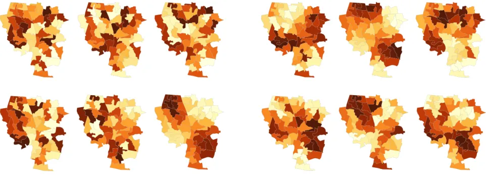
Fig. 1: Two map line-up tests. Left: constructed under an unrealisticnullofComplete Spatial Randomness. Right: constructed under anullin which spatial autocorrelation occurs.
Abstract—Fundamental to the effective use of visualization as an analytic and descriptive tool is the assurance that presenting data
visually provides the capability of making inferences from what we see. This paper explores two related approaches to quantifying the confidence we may have in making visual inferences from mapped geospatial data. We adapt Wickhamet al.’s ‘Visual Line-up’ method as a direct analogy with Null Hypothesis Significance Testing (NHST) and propose a new approach for generating more credible spatial null hypotheses. Rather than using as a spatial null hypothesis the unrealistic assumption of complete spatial randomness, we propose spatially autocorrelated simulations as alternative nulls. We conduct a set of crowdsourced experiments (n = 361) to determine the
just noticeable difference(JND) between pairs of choropleth maps of geographic units controlling for spatial autocorrelation (Moran’s
Istatistic) and geometric configuration (variance in spatial unit area). Results indicate that people’s abilities to perceive differences in spatial autocorrelation vary with baseline autocorrelation structure and the geometric configuration of geographic units. These results allow us, for the first time, to construct a visual equivalent of statistical power for geospatial data. Our JND results add to those provided in recent years by Klippelet al. (2011), Harrisonet al. (2014) and Kay & Heer (2015) for correlation visualization. Importantly, they provide an empirical basis for an improved construction of visual line-ups for maps and the development of theory to inform geospatial tests of graphical inference.
Index Terms—Graphical inference, spatial autocorrelation, just noticeable difference, geovisualization, statistical significance.
1 INTRODUCTION
Maps are attractive tools for studying spatial processes. They convey patterns, structures and relations around the distribution and extent of phenomena that may be difficult to appreciate using non-visual tech-niques [12]. However, even when trained in spatial data analysis, hu-mans find it difficult to reason statistically about spatial patterns [10]. This is especially true when visually analysing patterns in choropleth maps (Figure 1). Here, spatial units are coloured according to a sum-mary statistic describing some process, such as local crime or unem-ployment rates. The same colour value representing a local average or rate is used for the entirety of that spatial unit and units can vary in size,
• Roger Beecham, Jason Dykes, Wouter Meulemans, Aidan Slingsby,
Cagatay Turkey and Jo Wood are at the giCentre, City University London.
E-mail:{roger.beecham|j.dykes|wouter.meulemans|a.slingsby|
cagatay.turkay.1|j.d.wood}@city.ac.uk.
Manuscript received xx xxx. 201x; accepted xx xxx. 201x. Date of Publication xx xxx. 201x; date of current version xx xxx. 201x. For information on obtaining reprints of this article, please send e-mail to: [email protected].
Digital Object Identifier: xx.xxxx/TVCG.201x.xxxxxxx/
shape and visual complexity. Notice also the boundaries between spa-tial units: they are very often detailed and thus highly visually salient, yet are typically incidental to the phenomena being depicted. In an exploratory visual analysis, these types of effects may lead to faulty claims about apparently discriminating spatial processes.
Graphical inference [20] is a technique that may offer support here.
Wickhamet al.’s line-up protocol – where an analyst must identify a
‘real’ dataset from a set of decoys constructed under anull
hypoth-esis– is intended to confer statistical credibility to any visual claim
of discriminating structure. However, although there is some empiri-cal support for line-up tests as a generalisable classification task [18], there are few examples demonstrating or providing empirical evidence for their use when applied to choropleth maps. The mismatch between the statistical parameters describing a spatial pattern and graphical per-ception of those parameters is not well understood.
Klippelet al.[10] investigate this phenomenon through laboratory
tests that explore people’s ability to identify statistically significant spatial structure in two-colour maps consisting of regular grids.
Al-though Klippelet al.’s experimental set-up is impressive, the authors
spatial structures considered relate to a tradition within geography of
testing against anullassumption of spatial independence, orcomplete
spatial randomness(CSR), a condition which is highly unlikely for
most spatial data. Also, in focusing on three categories of spatial
au-tocorrelation structure, Klippelet al.do not consider systematically
how visual perception varies withdifferent intensitiesof
autocorrela-tion structure.
A number of recent studies (e.g. [16, 7, 9]) have contributed empirically-validated models for describing how individuals perceive non-spatial correlation in different visualization types. These models quantify how ability to perceive differences in statistical correlation varies at different baseline intensities of that structure, as measured by Pearson product-moment correlation coefficient (r) [16], and between visualization types [7, 9]. We apply and adapt the techniques used in these studies in order to model how individuals perceive spatial
auto-correlation indifferingchoropleth maps. Thedifferencesin map type
relate not to the encoding of data to visual variables, but to the char-acteristics of the region under observation. We use model parameter estimates and exploratory analysis of the response data to suggest rec-ommendations for setting up visual tests of spatial autocorrelation in maps. Data are collected from 361 Amazon Mechanical Turk workers. We apply the secondary data analysis of Kay & Heer [9] as closely as possible and find that:
• Ability to discriminate between two maps of differing spatial
au-tocorrelation varies with theamount (or intensity) of baseline
positive spatial autocorrelation.
• Comparison of spatial autocorrelation in maps ismore
challeng-ingthan comparison of non-spatial structure. The difference in
autocorrelation required to discriminate maps is greater than that
observed in Harrisonet al.’s study.
• Introducinggreater irregularityinto the geometry of choropleths
makes testsmore challenging(the difference in autocorrelation
required to discriminate maps is again larger), but also results in greater variabilityin performance.
• There is substantial between-participant variation. This may be a
limitation of using a crowdsourcing platform. It may also relate to idiosyncrasies and visual effects introduced into the received stimulus that we cannot easily quantify.
Our findings offer early empirical evidence for an improved con-struction of line-up tests using maps. We reflect on this and outline an immediate research agenda and theory to inform geospatial tests of graphical inference.
2 BACKGROUND
2.1 Spatial autocorrelation structure in geography
A well-rehearsed concept in spatial analysis disciplines is that of
spatial dependence, orTobler’s First Law of Geography, which states
that: “everything is related to everything else, but near things are more related than distant things” [17]. Geographers have developed numerous analytic techniques for measuring spatial autocorrelation and deciding whether an observed spatial process is really present. The orthodoxy here is to perform a test of whether the observed pattern is significantly different from random. Geographers ask how probable the observed pattern would be if an assumption of spatial
in-dependence, orcomplete spatial randomness(CSR), were operating.
Moran’sI coefficient[13] is thede factosummary statistic for spatial
autocorrelation; it describes the distance-weighted co-variation of attribute values over space and is defined by:
I= n
∑i∑jwi j
∑i∑jwi j(zi−z¯)(zj−z¯)
∑i(zi−z¯)2
(1)
The numerator in the second fraction is the covariance term: iand
jrefer to different geographic measurements in a study region,
spa-tial units or polygon areas in the case of choropleth maps, andzthe
attribute value of each geographic measurement, for example local crime rates or house prices. The degree of dependency between
ge-ographic units is characterised bywi j, which refers to positions in a
spatial neighbours’ weights matrix, neighbours being typically defined by shared boundary (as in [19], see [2]) and weighted according to an assumption that influence is inversely proportional to distance (1/di j or 1/di j2). Notice thatI is normalised relative to the number of units being considered and the range in attribute values (z). As with
Pear-son product-moment correlation coefficient (r), Moran’sI can range
in value from 1 (complete positive spatial autocorrelation), through 0 (complete spatial randomness), to -1 (complete negative spatial auto-correlation).
When testing for statistical significance, Moran’sIcan be compared
to a theoretical distribution, but since the spatial structure of the map is also a parameter in the analysis [14] – the geometry of a region
partly constrains the possible Moran’sIthat can be achieved – a more
common procedure is to generate a sampling distribution of Moran’sI
empirically by permuting attribute values within a region any number
of times and calculating Moran’sIon each permutation. This is the
same technique proposed in Wickhamet al.[20] for generating decoys
in line-up tests of spatial independence.
The assumption of CSR within geographic analysis is a strange one.
Acceptance ofTobler’s first lawis an acknowledgment that CSR can
never exist. Rejecting anullof CSR therefore reveals little about the
process that is actually operating [14]. We get a sense of this when generating line-up tests with choropleth maps (Figure 1). Imagine that the maps convey per capita household income. The decoys in the left
map line-up generated under thenullhypothesis of CSR ‘look’ far
less plausible than the more autocorrelated decoys in the right line-up. Tobler’s Law tells us that CSR is unlikely for geographical data and this is easily observable in practice.
Our proposal is instead to generate line-up tests with non-CSR de-coys that are more visually plausible and therefore potentially analyt-ically useful. For example, an analyst believes that she has identified a spatial pattern of interest – that the spatial distribution of crime rates in small neighbourhood units of a Local Authority are spatially
auto-correlated. She then specifies a more ‘sensible’null hypothesis; for
instance, one that contains autocorrelation structures we typically see in crime datasets for areas with the same type of geography. A number
ofnulldatasets (decoys) are created under thisnull hypothesisfor use
in a line-up test. This procedure allows us to compare our pattern of interest against plausible nulls, established in line with observations that comply with Tobler’s Law.
2.2 Visual perception of spatial autocorrelation structure
Crucial to such an approach is an understanding or expectation of the power, loosely defined, of such a test. In frequentist statistics, power is the probability of rejecting the null hypothesis if there is a true effect of a particular stated size in the population [5]. Power is thus contin-gent on experimental design, sample size, confidence level and target effect. Experimental designs with extremely large sample sizes are
said to have high power as thenullhypothesis may be rejected with
even negligible differences in effect.
Before proceeding with spatial line-up tests, it is necessary to at-tempt to estimate the power likely in different line-up designs.
How-ever, avisualanalogue of power may need to be considered slightly
differently. Our modified conception uses power as a mechanism for
describing thesensitivityof a map line-up test: that is, the
probabil-ity ofvisuallydetecting a statistical effect where that effect existsin the data. Our presupposition is that, when constructing visual line-up tests with maps, the size of this statistical effect varies not with sam-ple size, but with the baseline intensity of autocorrelation and the level of irregularity in the regions under observation. We hope to establish empirical support for this assumption and derive a model of its effect.
Klippelet al.’s [10] work is prescient here. The authors sought to
as regular 10×10 grid cells. Several autocorrelation structures were generated: clustering of the two colours (positive spatial autocorrela-tion), random distribution (spatial randomness) of those colours and dispersed (negative spatial autocorrelation). The authors found that dominant colour has the most substantial effect on participants’ abil-ity to identify statistically significant spatial clustering, that random patterns are harder to identify than significantly clustered or dispersed patterns and also that background and recent training in the concept of spatial autocorrelation has relatively little effect on ability to discrimi-nate statistically significant spatial dependency.
Klippelet al.’s study design and findings are compelling. However,
in limiting the stimulus to two-colour, regular grid maps, the authors avoid visual artefacts introduced by ‘real’ geography, such as variation in geometry, that likely interact with human abilities to perceive auto-correlation structure. In addition, the thresholds of spatial autocorre-lation structure used in Klippelet al.’s study – statistically significant clustering, dispersion and randomness – relate closely to the tradition in geography of testing against CSR. The authors therefore do not ad-dress systematically how perception varies as a function of different intensities of spatial autocorrelation structure.
2.3 Modelling perception of non-spatial correlation
Three notable studies [16, 7, 9] attempt to model how humans per-ceive data properties, in these cases bivariate correlation structure, when such data are presented at different baseline levels of correlation and in different visualization types. Crucial to this work is the
con-cept ofJust Noticeable Difference(JND) – how much a given stimulus
must increase or decrease before humans can reliably detect changes in that stimulus [7]. We believe the concept of JND, and Rensink & Baldridge’s and later Harrisonet al.’s procedure for estimating it, might provide useful information for constructing map line-up tests with varying intensities of spatial autocorrelation structure – poten-tially giving an estimate of the size of effect required to discriminate that structure.
3 EXPERIMENT
3.1 Methodology
We re-implement the staircase procedure employed by Rensink &
Baldridge [16] and Harrison et al.[7] as closely as possible, using
Moran’sIas our measure of spatial autocorrelation. For a given
spa-tial autocorrelationtarget, we show participants two choropleth maps
side-by-side with different values of Moran’sI and ask them to
se-lect the one they perceive to have the greater spatial autocorrelation
structure. If they arecorrect, we make the subsequent test harder by
showing two new maps in which the difference between the values
of Moran’sI is reduced. If they areincorrect, we make the test
eas-ier by increasing the difference in Moran’sIbetween the two maps.
This process continues until a given stability criterion is reached; the staircase procedure thus aims to “home-in” [7] on JND.
There are two staircaseapproaches– those operating fromabove
and those frombelow. In theabovecase, the comparator (non-target)
map is characterised by a value of Moran’sI higherthan the target: 0.8
if the target is 0.7 and the difference being tested is 0.1. In thebelow
case, the comparator (non-target) map is characterised by a value of
Moran’sI lowerthan the target: 0.6 assuming the same target as above.
This distinction becomes important when considering the distribution of our observed JNDs and likely ceiling effects.
Both Rensink & Baldridge and Harrisonet al.start the staircase
with a distance inrof 0.1. This distance inrdecreases in steps of 0.01 where the more correlated plot is correctly identified. Where partici-pants fail to correctly identify the more correlated plot, they are moved backwards by three distance steps (0.03). The staircase procedure ends after 50 assignments have been made or a stability criterion is reached. This stability criterion is computed continuously using a moving win-dow of the last 24 user assignments. Here, the last 24 assignments are ordered chronologically and divided into three groups, each consisting of eight successive tests. Stability is reached when there is no signif-icant difference between these three sets of observations as calculated via anF−test(2,21;α=0.1). Given the ratio of distances inrused to
decrease and increase the difference between target-comparator pairs,
the resulting JNDs approximate to the minimum difference inrthat
can be correctly perceived 75% of the time.
To adapt the staircase procedure for maps it was necessary to de-part slightly from certain decisions taken by Rensink & Baldridge and
Harrisonet al.[16, 7]. Firstly, since we think comparisons of
spa-tial autocorrelation are particularly demanding (as evidenced by the
performance of the expert participants in the Klippelet al.tests [10])
and more visually complex than in the non-spatial equivalents, we do not expect to estimate JND to the same level of precision as in these earlier papers. Our approach to decreasing and incrementing data dis-tance is procedurally the same, but our disdis-tance steps are coarser. We increment by 0.05 and penalise by 0.15 – using the same ratios but a different scaling. Additionally, in cases of exceptional performance – if participants successfully discriminate between the more autocorre-lated map at a distance of 0.05 – we introduce two finer steps of 0.03 and 0.01, again penalising incorrect assignments by three steps in the staircase. There is a risk that this addition may result in a staircase not reaching stability since unequal variance is introduced at the very end of the staircase. Analysis of individual performance during a pilot sur-vey and also on the full collected dataset does not suggest this effect to be of practical concern.
A second departure, which also has implications for the staircase,
is the baseline Moran’sI used in the targets. Rensink & Baldridge
and Harrisonet al.consider six targets: three displaying relatively low
correlation (0.3, 0.4, 0.5); three displaying high correlation (0.6, 0.7, 0.8). Since we are unsure as to the extent of a linear relationship
be-tween derived JND and baseline Moran’sI, we wish to collect data on
a larger number of targets. We therefore add targets of 0.2 and 0.9.
Harrisonet al.identify the problem of ceiling and floor effects: an
upper limit ofr=1 and a lower limit ofr=0 where positive
correla-tion is considered. With a target of 0.8 and an approach from above, for example, participants may fail to discriminate the plots at the max-imum possible distance (0.2) and answer randomly for the remainder of that test case. We expect to observe a strong ceiling effect contin-gent on approach. Chiefly, this is because we anticipate much wider JNDs than appear in the non-spatial correlation example. A second reason is more procedural – simulating autocorrelation structure of values greater than 0.95 using our described permutation approach
be-comes problematic. We therefore cap the upper ceiling of Moran’sI
to 0.95. We revisit the role of ceiling and floor effects when discussing our observed results.
3.2 Materials
Motivating the user study is the need to understand how numerically-defined autocorrelation structure in choropleth maps is visually per-ceived; and the desire to use this knowledge to derive empirically-informed recommendations around the design and configuration of vi-sual line-up tests. For this reason, we consider it important to base our experiments on realistic geometries typical of those used in choro-pleth maps. It is difficult to generate these synthetically; for exam-ple,Voronoipolygons of differently clustered point patterns often do not look realistic. We instead use real geographies. To avoid pre-conceptions about spatial processes operating in these real regions, however, we choose geographic units likely to be unfamiliar to
partic-ipants. UK Census Output Areas (OA)1offer this. There are
approxi-mately 175,000 OAs in England and Wales. OAs are the lowest level at which population geography is made available, with an average of about 150 households per unit, and the areas of units vary depending upon population density.
We wish to generate maps from these OAs that contain approx-imately 50 unique polygons. An initial approach was to randomly select an OA and find its 49 nearest neighbours. This is simple and procedurally efficient, but usually produces regions that are generally circular and seem unrealistic. Instead we use Middle Super Output Ar-eas (MSOAs) – a higher level census geography composed of approx-imately 25 OAs. Combining the OAs contained within two adjacent
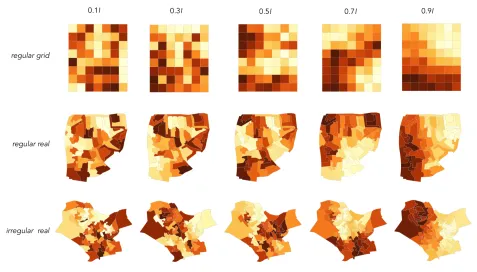
Fig. 2: Example stimuli used in the experiments. Three categories of geography were used:regular grid,regular realandirregular real.
MSOAs gives us the sets of∼50 unidentifiable and realistic regions
that we need.
As regions become more irregular, visual artefacts or idiosyncrasies become more likely. We want to investigate how irregularity of ge-ography affects the ability to discriminate between autocorrelation in
maps. Our region-selection approach not only enables the use ofreal
regions; it also allows us to select regions of varying irregularity from a sampling distribution that is representative and realistic of geometries commonly encountered in choropleth maps.
We try to characterise the irregularity of study regions in two ways: using the Nearest Neighbour Index and coefficient of variation. The Nearest Neighbour Index (NNI) is the average distance between each geographic unit and its nearest neighbour divided by the average area of units in that study region. The coefficient of variation (cv) measures the variation in areal extent of a series of geographic units, capturing the degree of similarity or irregularity in sizes of individual units. Af-ter visually inspecting maps generated at various thresholds of these
measures, we findcvto be more consistently discriminating and
con-ceptually perhaps most closely relates to the category of irregularity likely to interact with ability to discriminate autocorrelation structure in maps. We select maps at two positions in this sampling distribution, representing geometries that contain spatial unit sizes that are compar-atively regular (cv∼0.4) and irregular (cv∼1.2) (Figure 2). Addition-ally, for comparison we generate maps in the contrived regular grid (7×8) layout. Thus, our three levels of irregularity are:irregular real, regular realandregular grid(Figure 2).
Generating the choropleth maps used as stimuli in our experiment is procedurally straightforward. We use the same technique employed
by Wickhamet al.[20] when proposing decoy plots in line-up tests.
Unique maps are created by permuting the attribute values of each ge-ographic unit until a desired intensity of spatial autocorrelation
struc-ture, as measured by Moran’sI, is reached. Where the target increases
above a Moran’sIof 0.3, this procedure becomes very slow. We
accel-erate the process by starting with a unique permutation and recording
the resulting map’s Moran’sI. We then randomly sample a pair of
individual geographic units and swap their attribute values. If this
op-eration reduces the distance inIbetween the currentIand our target,
the swap remains and we randomly sample a new geographic unit pair.
This continues until a desired Moran’sIvalue is reached. Despite the
edit to our map generation procedure, we cannot generate choropleth maps sufficiently quickly for use in a dynamic testing environment
as do Harrisonet al.when generating different intensities of
bivari-ate correlation structure. It is therefore necessary to pre-generbivari-ate all maps used in our staircase tests. For each position in the staircase
(uniquetarget×comparatorpair), thirteen iterations of that position
are generated. This requires 4,784 maps for each geometry type and
an execution time of∼2 hours per geometry. We use a continuous
se-quential colour scheme derived through linear interpolation between shades defined in ColorBrewer YlOrBr [8].
An advantage of pre-generating and storing the maps is that we can relate participant assignments to the exact stimulus received and explore factors such as the influence of areas of the map dominated with darker colours. All stimuli used in the tests are generated in the
Rprogramming environment. The code, boundaries for the UK
ad-ministrative areas, along with the data analysis can be accessed at:
http://www.gicentre.net/maplineups.
3.3 Procedure
The conditions in our experiment again closely mirror those described
by Harrisonet al.. We test eight target values of Moran’sI, which
can be divided into two groups representing low [0.2, 0.3, 0.4, 0.5] and high [0.6, 0.7, 0.8, 0.9] spatial autocorrelation, and for each tar-get use two categories of approach (above and below) for estimat-ing JND. Participants are assigned to one high and low target and for each target complete two staircase attempts to detect the JND for that target – one using the above approach and one the below approach. Each participant thus performs four separate trials. We use a coun-terbalanced design: for each unique target pair, the order receiving high−f irst×low−second|low−f irst×high−secondis varied sys-tematically between participants. The geography-type does not vary within-subject. A single participant completes all tests on the same
geography-type: eitherregular grid,regular realorirregular real.
pro-very high lower very low
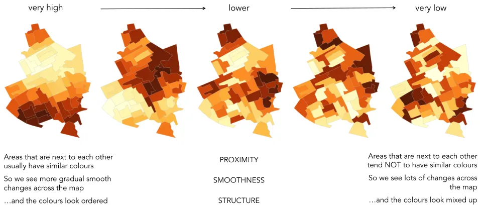
Areas that are next to each other usually have similar colours So we see more gradual smooth changes across the map …and the colours look ordered
Areas that are next to each other tend NOT to have similar colours So we see lots of changes across
the map …and the colours look mixed up PROXIMITY
SMOOTHNESS
[image:6.612.70.548.49.255.2]STRUCTURE
Fig. 3: Image used in training. We suggest strategies for judging spatial autocorrelation structure.
vide an image with suggested strategies for identifying autocorrelation structure (Figure 3).
During the ‘dummy’ test, the staircase procedure is made explicit. Participants are given feedback on whether they chose correctly and if so, are informed that the subsequent test will be more challenging; if not, that it will be more easy. Feedback without this description is also given during the formal tests. Throughout the test procedure
partici-pants are made aware of their performance. Following Peeret al.[15],
we attempt to mitigate against poor respondent performance by requir-ing Amazon Mechanical Turk (AMT) workers with an approval ratrequir-ing of at least 99%, having completed more than 10,000 AMT HITs.
Data were collected from 361 participants; all registered workers on AMT. Forty-two percent were female, 25% reported holding a high school diploma as their highest level of qualification, 52% were edu-cated to Bachelors level, 19% to Masters level and 2% were PhDs. To enable meaningful quantitative analysis of results, data from 30
par-ticipants were collected for eachgeography×target×approach
com-bination. Participants were paid $2.18 to complete the survey; since the median completion time was 18 minutes, this approximates to the US minimum wage.
4 RESULTS
4.1 Data cleaning
A consequence of using a crowdsourced platform for perception re-search is greater uncertainty around whether concepts are understood and whether participants make a concerted effort to perform the task
seriously. Harrisonet al.validate the use of AMT for their test by
running a pilot and comparing estimated JNDs with the same graphics tested in Rensink & Baldridge and using the same procedure, but con-ducted in a controlled laboratory setting. Inspection of the
individual-level data captured in Harrisonet al.’s study (presented in plots
ap-pearing in Kay & Heer’s paper), does suggest some variation between-participants and the authors discuss the challenge of dealing with ob-servations where performance is worse than chance.
Our JND scores suffer from between-participant variation. There is also evidence of certain participants chance-guessing through the pro-cedure. A challenge particular to our data is that, since we estimate
JND with less precision than Harrisonet al.and over a wider range of
target Moran’sI, scores become artificially compressed. This is
par-ticularly true for tests of high baseline Moran’sIwhere the approach is
from above and of low baseline Moran’sIwhere the approach is from
below. The ceiling (and floor) effects substantially constrain the pos-sible values that JND can take. Figures 4 and 5 highlight this problem of compression due to approach. In Figure 5, observed staircases are presented for tests that reach ‘stability’ somewhat artificially. Notice
that where the targetI is high (0.8) and the approach is from above,
the difference between comparator and target cannot increase above
0.15. Equally, where the targetIis low (0.2) and the approach is from
below, the resulting data difference cannot increase above 0.2. In addition to visual inspection, these ceilings and floors can be identified from studying accuracy rates for the computed JNDs. Sta-bility in the staircase procedure is reached when there is no significant difference between three subgroups describing a user’s last 24 judg-ments. Given the distances used to increment and decrease data differ-ence, this should approximate to a user correctly identifying the more correlated plot 75% of the time. This cut-off procedure nevertheless fails where there are ceiling or floor effects – there are obvious limits
to the extent to which data difference inIcan be increased, the error
rate subsequently increases but the computedF-Statisticis insensitive
to this.
In Harrisonet al.’s data, such a compression of scores does not
appear to exist. Instead, the authors identify a more systematic differ-ence in estimated JNDs between approach conditions and relate this
to the linear relationship between JND andr. Where the approach
is from above, JND is slightly overestimated as the test is compara-tively easier; where the approach is from below, JND is slightly
un-derestimated. Harrisonet al.do identify a chance boundary for JND
– the JND in the staircase procedure that would result from partic-ipants randomly guessing through the staircase (JND = 0.45). Any JNDs at or above this boundary would indicate that participants could not adequately discriminate between the plots. Observations beyond this chance threshold are not removed, but the proportion of collected JNDs above the threshold is calculated for each tested visualization
and visualization types with>20% of observed JNDs worse than the
threshold are removed. In Kay & Heer, the chance threshold is also used to treat outliers. JNDs approaching or larger than chance are cen-sored to the threshold or to the JND ceilings or floors.
We also calculate a chance boundary for JND by simulating the staircase procedure, but pay attention to how this boundary varies by
each test-case (target×approachpair). Clearly, chance in the
stair-case will vary for differenttarget×approachpairs and will tend
to-wards the ceilings where the target is high and the approach is from above and the floors where the target is low and the approach is from below. The censoring method described in Kay & Heer may be one ap-proach to treating outliers where scores are not artificially compressed; for example, where the target is 0.8, the approach is from below and the estimated JND is 0.7 – an obvious outlier. This score would be censored tomin(base−0.05,0.4)→0.4. Given the precision with which we estimate JND, simply censoring to these thresholds would not, as we understand it, remove the observed compression effect. As an example, if the approach is from above and the baseline Moran’s
1 regular grid 2 regular real 3 irregular real 0.0 0.2 0.4 0.6 0.8
0.2 0.4 0.6 0.8 1.0 0.2 0.4 0.6 0.8 1.0 0.2 0.4 0.6 0.8 1.0
target I
JND I
approach
above
below
Fig. 4: Computed JNDs pre-cleaning for theregular grid,regular real andirregular real maps from left to right respectively. Results from the above condition are blue, from the below condition are red. Note that observations have been ‘jittered’ around their centre (x-location) to mitigate occlusion. Dashed lines are linear models fit to above (blue) and below (red) conditions and to the dataset as a whole (black). The chart can be directly compared with Figure 2 of Kay & Heer [9].
target I 0.8 user 127
target I 0.8 user 282
target I 0.8 user 293
target I 0.8 user 294 0.00 0.25 0.50 0.75 1.00
0 10 20 30 0 10 20 30 0 10 20 30 0 10 20 30
test number
Moran's I
answer
correct
incorrect
target I 0.2 user 14
target I 0.2 user 18
target I 0.2 user 67
target I 0.2 user 89 0.00 0.25 0.50 0.75 1.00
0 10 20 30 0 10 20 30 0 10 20 30 0 10 20 30
test number
Moran's I
answer correct
incorrect
target I 0.8 user 127
target I 0.8 user 282
target I 0.8 user 293
target I 0.8 user 294 0.00 0.25 0.50 0.75 1.00
0 10 20 30 0 10 20 30 0 10 20 30 0 10 20 30
test number
Moran's I
answer correct
incorrect
target I 0.2 user 14
target I 0.2 user 18
target I 0.2 user 67
target I 0.2 user 89 0.00 0.25 0.50 0.75 1.00
0 10 20 30 0 10 20 30 0 10 20 30 0 10 20 30
test number
Moran's I
answer correct
incorrect target I 0.8
user 127
target I 0.8 user 282
target I 0.8 user 293
target I 0.8 user 294 0.00 0.25 0.50 0.75 1.00
0 10 20 30 0 10 20 30 0 10 20 30 0 10 20 30
test number
Moran's I
answer
correct incorrect
target I 0.2 user 14
target I 0.2 user 18
target I 0.2 user 67
target I 0.2 user 89 0.00 0.25 0.50 0.75 1.00
0 10 20 30 0 10 20 30 0 10 20 30 0 10 20 30
test number
Moran's I
answer
correct incorrect
target I 0.8 user 127
target I 0.8 user 282
target I 0.8 user 293
target I 0.8 user 294 0.00 0.25 0.50 0.75 1.00
0 10 20 30 0 10 20 30 0 10 20 30 0 10 20 30
test number
Moran's I
answer correct
incorrect
target I 0.2 user 14
target I 0.2 user 18
target I 0.2 user 67
target I 0.2 user 89 0.00 0.25 0.50 0.75 1.00
0 10 20 30 0 10 20 30 0 10 20 30 0 10 20 30
test number
Moran's I
answer correct
incorrect target I 0.8
user 127
target I 0.8 user 282
target I 0.8 user 293
target I 0.8 user 294 0.00 0.25 0.50 0.75 1.00
0 10 20 30 0 10 20 30 0 10 20 30 0 10 20 30
test number
Moran's I
answer correct
incorrect
target I 0.2 user 14
target I 0.2 user 18
target I 0.2 user 67
target I 0.2 user 89 0.00 0.25 0.50 0.75 1.00
0 10 20 30 0 10 20 30 0 10 20 30 0 10 20 30
test number
Moran's I
answer
correct
incorrect
Fig. 5: Example staircases suffering from the ceiling and floor effects. Successive trials are shown from left to right in graphs for different participants with the last 24 tests indicated by the dashed line and the targetIindicated by the solid line. Notice how the participants with a high target from above (top row) and a low target from below (bottom row) ‘stabilise’ with a high error rate and thus with artificially low JNDs.
min(0.95−base,0.4)→0.25 – too small given the JNDs we estimate using the below approach.
Cleaning JNDs on the accuracy rates for the last 24 observations on which they are based may be one means of removing this compression effect. If, for example, the accuracy rate is less than 60%, it is likely that a ceiling or floor effect is present; were it not, the stability crite-ria would not have been reached. This approach, however, does not fully address the problem of artificial ceilings, as the resulting JNDs
can still be biased at certaintarget×approachcombinations.
Con-sequently, we instead remove the JND compression due to approach by taking only the measurements for both the above and below ap-proaches where there is a range of difference values to play with: the
mid-range target Moran’sI of 0.4, 0.5 and 0.6. Doing so results in
lines that more closely approximate to linear. However, this risks
giv-ing too much weight to the middle targetIs where we still collect data
using both approaches. When developing our model, we therefore re-sample at these mid-bases to ensure an equal number of data points are recorded at each target.
Finally, we must decide on how to clean outliers. Earlier, we iden-tified the censoring approach used by Kay & Heer to treat outliers that
are not constrained by ceilings or floors. The authors censor scores to an approximate chance threshold for the staircase as a whole (JND
of∼0.4). Given that our test is comparatively more challenging – it
is conceivable that for the irregular geography participants could not
distinguish between a Moran’sIof 0.4 and 0.8 – we decide against this
threshold. Instead we remove all estimated JNDs where the accuracy
rate on which the score is based begins to approach chance (≤0.55).
The analysis that follows is based on this revised dataset: JNDs
based on low accuracy rates (≤0.55) are removed, so too are data
likely to exhibit artificial compression of scores due to approach, with
re-sampling of observed JNDs at the middle values of Moran’s I to
ensure equivalent observations across targets. This reduces the dataset to a total of 633 computed JND scores.
4.2 Data analysis
Although the plots in Figure 4 suffer from the discussed compression effect, they do suggest that ability to discriminate between
autocor-relation structure varies with Moran’sI and also with irregularity in
1 regular grid 0.0312 0.0625 0.125 0.25 0.5 1
0.2 0.4 0.6 0.8 target I
JND I
2 regular real
0.0312 0.0625 0.125 0.25 0.5 1
0.2 0.4 0.6 0.8 target I
JND I
3 irregular real
0.0312 0.0625 0.125 0.25 0.5 1
0.2 0.4 0.6 0.8 target I
JND I
1 regular grid
0.0312 0.0625 0.125 0.25 0.5 1
0.2 0.4 0.6 0.8
target I
JND I
2 regular real
0.0312 0.0625 0.125 0.25 0.5 1
0.2 0.4 0.6 0.8
target I
JND I
3 irregular real
0.0312 0.0625 0.125 0.25 0.5 1
0.2 0.4 0.6 0.8
target I
JND I
1 regular grid
0.0312 0.0625 0.125 0.25 0.5 1
0.2 0.4 0.6 0.8
target I
JND I
2 regular real
0.0312 0.0625 0.125 0.25 0.5 1
0.2 0.4 0.6 0.8
target I
JND I
3 irregular real
0.0312 0.0625 0.125 0.25 0.5 1
0.2 0.4 0.6 0.8
target I
[image:8.612.76.546.52.223.2]JND I
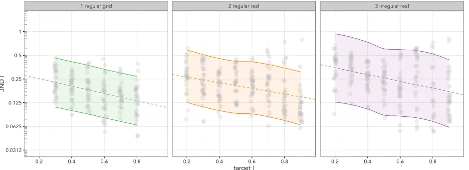
Fig. 6: Prediction Intervals (95%) forregular grid,regular realandirregular real.
(0.3-0.8), suggests JND increases as the geography becomes more
ir-regular (ir-regular grid0.19;regular real0.23,irregular real0.28).
Fol-lowing Harrison et al., Table 1 quantifies these differences in JND
scores using Mann-Whitney-U tests.
Table 1:Mann-Whitney-U test for differences in JNDs between geogra-phies. With Bonferonni correction, the null hypothesis is rejected at
α=0.017.
comparison-type U p-value effect size (r) regular grid - irregular real 25233.5 <0.001* 0.33 regular real - irregular real 27501.5 <0.001* 0.19 regular grid - regular real 29515.0 0.008* 0.14
We are fortunate that both Harrisonet al.and Kay & Heer describe
in detail their data analysis and make scripts available via a git reposi-tory. Our analysis attempts to follow the process taken by Kay & Heer in fitting a model to individual-level data, though for the reasons out-lined in Section 4.1, we do not use censoring to treat outliers, ceilings and floors.
We start by fitting a linear regression to our observed data. Kay &
Heer make a strong case forlog transformationof the outcome
vari-able (JND). They identify problems of skew and non-constant variance in residuals; skew in residuals being a particular problem in data sets associated with ceilings and floors. Although we mitigate these effects in data cleaning, unequal variance in the distribution of residuals over the regression model is likely due to high variation within participants (also known as heteroscedasticity [3] and one of the assumptions of linear regression). It is good practice to check and correct for this
unevenness. The residuals derived from a linear model fit to the
regu-lar realgeography exhibit both skew (γ=1.6) and kurtosis (κ=6.9) and with log transformation they more closely approximate to
nor-mal (γ=0.3,κ=3.15). Our residuals also suffer from non-constant
variance, but unlike Kay & Heer this variation is not obviously a
func-tion of baseline Moran’sI. Again, following Kay & Heer Box-Cox
transformation helps provide some justification for log transformation
of the outcome: λ =−0.11, 95% CI -0.3 – 0.1, which includes 0
(the log transform) and excludes 1 (the linear model) atp<0.00001
(LRχ2,99.42). The estimated value ofλsuggests that log transforma-tion here is appropriate.
A further refinement made by Kay & Heer compensates for partic-ipant effects. Since each particpartic-ipant contributes up to four data points to our model, we might expect two randomly sampled observations from the same participant to be more similar than two observations selected from different participants. In other words, JND may vary systematically as a function of who is taking the test. Kay & Heer cor-rect for this by adding as an offset a varying-intercept random-effect
for each participant (uj). Here, the intercept for a given participant
(j) is higher or lower than the overall intercept (b0) by the amountuj,
with the valueujassumed to be randomly drawn from a normal
distri-bution,N(0,σu2). Our model for predicting JND fromMoran’s Ican
be summarised as:
log(yi) =b0,j+b1Ii (2)
b0,j=b0+uj (3)
The parameters estimated for models constructed separately for each geography appear in Table 2. In all three models we find a
con-sistent effect: as Moran’sI increases, so too does participants’
abil-ity to correctly judge differences (decreasing JNDs). Comparing the
slopes between the models, the effect of increasing Moran’sIis most
pronounced forregular grid, indicating the greatest improvement in
discrimination with increasing autocorrelation.
An interesting observation is the impact of the participant effect on
model fit (pseudoR2). This addition substantially improves model fit
for the real geographies, but has little effect on the regular grid. This effect could possibly be due to certain permutations leading to
arte-facts introduced by the real geographies: that theirregular realmodel
displays the largest improvement in fit (0.13→0.51) also supports this statement.
Finally, in order to evaluate how well our models predict JND, we plot prediction intervals (95%) [1] for the three geographies (shown in Figure 6). Prediction intervals attempt to account for the uncertainty associated with model prediction, considering both fixed and random effects – in our case the uncertainty associated with between partic-ipant performance. The intervals were generated empirically from 1,000 simulations for each observation. Again, notice that the pre-diction intervals become wider with increasing geometric irregularity.
Table 2: Intercept, slope and R2 estimates for the three log-linear
re-gression models
complexity exp(intercept) exp(slope) pseudo R2fixed
pseudo R2
fixed+random
regular grid 0.311 -0.344 0.15 0.16
regular real 0.312 -0.438 0.12 0.42
irregular real 0.424 -0.370 0.13 0.51
5 FURTHER EXPLORATORY ANALYSIS
When introducing the context for this study, we made a link between
JND and statisticalpower. Statistical power is the probability of a
sta-tistical test correctly detecting a stasta-tistically significant effect where that effect exists in the population. In our translation to graphical in-ference, JND gives an estimate of the size of effect, or difference in
Moran’sI, required for that effect to beperceived. An alternative and
target I
dif
fer
[image:9.612.70.541.61.326.2]ence in I
Fig. 7: Each position in the staircase is represented forirregular real,regular realandregular grid for the below approach only. Length is the proportion of incorrect assignments with the vertical lines around each baseline / difference combination representing a 20% error rate. Where the number of assignments for any baseline / difference position is less than 100, transparency is applied linearly fading to zero.
We calculate these proportions using all data collected through the staircase procedure and show these graphically in Figure 7. Each posi-tion in the staircase is represented for each geography type, along with markers representing the 20% error rate – the threshold typically used for power in frequentist statistics. We are cautious about relating these data directly to line-up tests, as performing a judgement in the stair-case procedure is very different to making graphical inferences using line-ups. Individual judgements are not independent; it is likely that the tests preceding any given position in the staircase will influence participants’ performance. This might explain the lack of consistency in observed error rates given our model. Whilst the error rates
gener-ally decrease with greater target Moran’sI (left-to-right) and greater
difference inI(top-to-bottom), we do not regularly observe a
‘top-to-bottom diagonal’ that would suggest a consistent effect between irreg-ularity of study region and error rates. Additionally, since just two plots are shown, the probability of correctly identifying the target by
chance is much greater than in a line-up testproper, where a real plot
must be identified amongst an ensemble of decoys.
6 DISCUSSION
The purpose of this study was to establish an empirical basis for au-tocorrelated map line-up tests. Our results support the assumption that ability to discriminate between autocorrelation structure in maps
varies with baseline Moran’sI and irregularity in the size of
geo-graphic units within study regions. In both cases, these influences are in the direction that we would expect. With greater intensities of autocorrelation structure, JND, that is the difference in spatial auto-correlation effect required for that effect to be perceptible, decreases. This finding may support our argument for constructing decoy maps in line-up tests with some degree of spatial autocorrelation. We ar-gue that more informative line-up tests might be constructed at or ap-proaching our predicted JND thresholds and that these thresholds be used as expectations around the outcome of a graphical inference test. If estimated JNDs were simply pinned to the chance boundaries or the ceilings and floors of each test condition, then this would justify
line-up tests that assumecomplete spatial randomness.
Whilst our results do offer useful insights into the visual perception of autocorrelation structure in maps, our model fits are very
differ-ent to those observed by Harrisonet al.. Baseline autocorrelation and
the varying geometry of regions explain only a portion of the
varia-tion in estimated JND scores. Moreover, that ourR2values improve
substantially when we adjust for participant effects suggests variation between individual performance. This variation might be the result of collecting data via crowdsourcing: we might expect more consis-tency in performance between analysts for example. However, since this between-participant variation increases with greater geographic irregularity, it might also relate to artefacts introduced into the real geographies that we have not quantified in this study.
6.1 Limitations – effects of geography and statistic
An issue that we have yet to address is that our results are only ex-pressed in terms of a single autocorrelation summary statistic. Whilst
Moran’sI is regarded as thede factomeasure of spatial
autocorrela-tion, and we use a standard means of identifying spatial neighbours [4], other statistics and weighting functions are available. It may be that participants interpret the strength of spatial dependency in ways that are better characterised by other flavours of this metric or other statistics entirely.
Equally, it is worth noting that the use of a single observation for each spatial measurement means that in the case of irregularly sized
units, different areas of the map are not equally represented inI.
Ef-fectively, the spatial sampling frame is uneven with more samples be-ing collected where there are greater concentrations of spatial units. We suspect that participants may be focussing less on these important areas of multiple proximate measurements and more on the larger ar-eas where samples per unit map area are low. Larger arar-eas seem to stand out when we inspect maps visually and are particularly salient when filled with light, bright colours. This possibility is supported by
Klippelet al.’s study, where larger areas of a single colour acted as a
One line of exploration would be to calculate an autocorrelation statistic that reflects the characteristics of the output graphic rather than the geographically sampled measurements that it aims to repre-sent. The notion here would be to use a regular sampling frame across the map to sample data values and establish autocorrelation based upon spatial covariation. In the regular grid example, our Moran’s
I statistic would be unchanged: sampling with a grid at the scale of
the underlying units would result in an output statistic identical to that already calculated. However, in the case of irregularly sized units, a single large unit may be sampled many times. Since the same colour is applied to the entirety of the region, this large unit would contribute more heavily to the alternative autocorrelation statistic. Tiny units that have low saliency would be unlikely to be sampled and would there-fore have a limited, or no, effect.
Also worth noting is that in choropleth maps the area of the graphic covered by any particular colour can vary substantially in the cases of less regular geometry. This difference is likely to increase with coeffi-cient of variation in unit area. The largest effect identified in Klippel et al.’s study of perception of autocorrelation structure in two-colour maps was where one colour was dominant – where a greater propor-tion of the overall area of the map was occupied by a single colour. We do not as yet have evidence to suggest that the areas covered by particular colours were influential in participants’ responses.
Other factors that affect interpretation relate to the manner by which neighbours in a region relate to one another and the relative position
of their centroids. Moran’sIemphasises similarities or differences
be-tween units that are in close proximity – units with centroids very close to one another have a substantial influence on the spatial autocorrela-tion statistic used in this study. In the case of irregularly sized units, two small units can have very close centroids and thus an inordinate effect on the autocorrelation metric. These small units are unlikely to be visually salient and so this important and influential aspect of spa-tial dependency is easily missed. Taken to its extreme, a pair of tiny neighbouring units will have a dominant effect on the statistic even
when that effect isvisuallyunobservable. The influence of proximity
is particularly significant when a distance weighting function of 1/d2
is employed in calculatingI. Such a situation is common in many
applied contexts where clusters of smaller units occur in populous ur-ban centres. The effects of weighting functions on covariance can be usefully explored with interactive graphics [6].
Additionally, we did not in this study account for unit shape. This too is likely to result in dissonance between a spatial autocorrelation statistic and its visual perception. This is particularly so where ge-ometric centroids are used in the weighting function. Units that are curved in shape and partially enclose other units can have geometric centroids that are beyond their boundaries and thus within and close to the centroids of the units that they partially contain. An extreme exam-ple would involve a small central unit being entirely contained within a larger peripheral ‘doughnut’. If these units were perfectly circular
and aligned at the same centroid withdat zero, then the weighting of
this association and the contribution of any covariance to the autocor-relation statistic would be infinite. This particular case is highly un-likely, but the relationships between distance measurements are com-plex and this comcom-plexity increases with unit irregularity. One means of improving performance would be to show the unit centroids used in the spatial autocorrelation measure explicitly where spatial depen-dency is being considered. This information is arguably more impor-tant to their interpretation than the more complex boundaries. This raises an important point around the choice of cartographic represen-tation used to convey spatial structure. Choropleth maps were selected in this study as they remain a ubiquitous geovisualization technique. However, MacEachren [11] identifies nine map types used to represent spatial data. Comparisons of perceived spatial structure across these geovisualization types would be instructive.
6.2 Towards perceptually-validated map line-ups
Through empirical evidence, ideas and resources (http://www.
gicentre.net/maplineups), this research provides abasisfor
the use of graphical inference techniques and an improved
construc-tion of map line-up tests. That ability to discriminate spatial auto-correlation in choropleth maps varies with our two key experimental factors, and possibly many more, is instructive. If graphical inference is considered a technique for providing confidence around visually-perceived patterns and effects, then evidence and some expectations around the difficulty and variability with which those effects are per-ceived is necessary. We have argued that, when applied to graphical inference, JND has obvious links to statistical power. In Figure 7, we attempted to derive power estimates by plotting the error rates for each position in the staircase along with markers representing the 20% er-ror rate – the threshold typically used for power in frequentist statistics. We suggest that such a threshold might also be used to inform expecta-tions when constructing line-up tests with autocorrelated decoys. For example, an analyst studying crime rates in a given region may per-ceive (and observe) a greater degree of spatial dependency (Moran’s
Iof 0.7) in that region than was the case a decade ago (Moran’sIof
0.5). She may construct a line-up test to further investigate this differ-ence in statistical effect. Given the (very speculative) data in Figure 7, we would generally expect the effect to be noticeable. If it is not, then we might caution against using that choropleth map to visually explore spatial autocorrelation structure – artefacts introduced into the map might affect ability to reason statistically about that structure.
We do not suggest that our experimental data – individual observa-tions taken from the staircase – are reliable estimates of visual power in line-up tests. However, they provide an obvious and immediate avenue for further research: for example, a large-scale quantitative perception
study replicating our controls (varying geography and Moran’sI) but
instead of deriving JND using the staircase procedure, collecting inde-pendent observations within a map line-up setting and comparing error rates across experiment conditions. A large crowd-sourcing platform such as AMT is clearly well-suited to such an undertaking.
7 CONCLUSION
This study sought to provide empirical evidence to inform the use of line-up tests in choropleth maps. We replicated an established
ex-perimental procedure for measuringjust noticeable differencein
non-spatial correlation – that is the minimum difference in correlation re-quired to be visually observable roughly 75% of the time. The aim was to investigate whether, as is the case in studies of non-spatial cor-relation [16, 7, 9], JND varies with the intensity of baseline spatial au-tocorrelation. We also aimed to investigate the extent to which some characteristics that are specific to spatial data, such as irregularity in the regions under investigation, were influential. Our findings sug-gest an effect from both factors and in the direction that we were ex-pecting. As baseline autocorrelation increases, the difference in effect required to discriminate that structure decreases. In the cases of irreg-ular geography, we find JNDs that are wider and also observe greater between-participant variation. These findings offer contextual infor-mation to support line-up tests that assume autocorrelation rather than complete spatial randomness. Our estimated JNDs may contribute to an expectation around the likely outcome of a map line-up test and
therefore relate to the concept of statisticalpower: the probability of
correctly detecting an effect where that effect exists in the population. It is worth noting this study’s two experimental factors – baseline spa-tial autocorrelation and coefficient of variation in unit area – explain only a portion of the variation in estimated JND scores: our model fits are very different to those for studies of non-spatial autocorrelation [16, 7, 9]. We believe this variation in performance is likely to relate to artefacts not measured formally in this study and that are particular to spatial statistics and cartographic representation.
ACKNOWLEDGMENTS
REFERENCES
[1] N. Altman and M. Krzywinski. Points of significance: Sources of varia-tion.Nature methods, 12(1):5–6, 2015.
[2] R. Bivand.Creating Neighbours, 2015.
[3] T. S. Breusch and A. R. Pagan. A simple test for Heteroscedasticity and Random Coefficient Variation.Econometrica: Journal of the
Economet-ric Society, pages 1287–1294, 1979.
[4] C. Brunsdon and L. Comber. An Introduction to R for Spatial Analysis
and Mapping. Sage, London, UK, 2015.
[5] G. Cumming.Understanding The New Statistics: Effect sizes, confidence
intervals, and meta-analysis. Routledge, London, UK, 2012.
[6] J. A. Dykes. Exploring spatial data representation with dynamic graphics.
Computers & Geosciences, 23(4):345–370, 1997.
[7] L. Harrison, F. Yang, S. Franconeri, and R. Chang. Ranking visualiza-tions of correlation using Weber’s Law.IEEE Conference on Information Visualization (InfoVis), 20:1943–1952, 2014.
[8] M. Harrower and C. A. Brewer. ColorBrewer.org: An online tool for selecting colour schemes for maps.The Cartographic Journal, 40(1):27– 37, 2003.
[9] M. Kay and J. Heer. Beyond Weber’s Law: A second look at ranking vi-sualizations of correlation.IEEE Trans. Visualization & Comp. Graphics (InfoVis), 22:469–478, 2016.
[10] A. Klippel, F. Hardisty, and R. Li. Interpreting spatial patterns: An in-quiry into formal and cognitive aspects of Tobler’s First Law of
Geogra-phy.Annals of the Association of American Geographers, 101(5):1011–
1031, 2011.
[11] A. M. MacEachren. Some truth with maps: A primer on symbolization
and design. Association of American Geographers, 1994.
[12] A. M. MacEachren.How maps work: Representation, visualization, and
design. Guilford Press, New York, USA, 1995.
[13] P. A. P. Moran. Notes on Continuous Stochastic Phenomena.Biometrika, 37:17–33, 1950.
[14] D. O’Sullivan and D. Unwin. Geographic Information Analysis. John Wiley & Sons, New Jersey, USA, 2 edition, 2010.
[15] E. Peer, J. Vosgerau, and A. Acquisti. Reputation as a sufficient condi-tion for data quality on Amazon Mechanical Turk. Behavior Research
Methods, 46(4):1023–1031, 2014.
[16] R. Rensink and G. Baldridge. The perception of correlation in scatter-plots.Computer Graphics Forum, 29:1203–1210, 2010.
[17] W. Tobler. A computer movie simulating urban growth in the Detroit region.Economic Geography, 46:234–240, 1970.
[18] S. VanderPlas and H. Hofmann. Spatial reasoning and data displays.
IEEE Transactions on Visualization and Computer Graphics, 22(1):459–
468, 2016.
[19] L. Waller and J. Gotway. Applied Spatial Statistics for Public Health Data. John Wiley & Sons, New Jersey, USA, 2004.