Rochester Institute of Technology
RIT Scholar Works
Theses
Thesis/Dissertation Collections
5-20-2015
Learning Beyond the Classroom: Photography as a
major design element in graphic design layouts for
print and web
John E. Dyer
Follow this and additional works at:
http://scholarworks.rit.edu/theses
This Thesis is brought to you for free and open access by the Thesis/Dissertation Collections at RIT Scholar Works. It has been accepted for inclusion in Theses by an authorized administrator of RIT Scholar Works. For more information, please contactritscholarworks@rit.edu.
Recommended Citation
John E. Dyer
A Thesis submitted in partial fulfillment of the requirements for the degree of: Master of Fine Arts in Visual Communication Design
Learning Beyond the Classroom:
Chief Thesis Adviser:
Chris Jackson, Professor, CIAS – School of Design
Signature of Chief Thesis Adviser Date
Associate Thesis Adviser:
Joyce Hertzson, Professor, CIAS – School of Design
Signature of Associate Thesis Adviser Date
Associate Thesis Adviser:
Mitch Goldstein, Assistant Professor, CIAS – School of Design
Signature of Associate Thesis Adviser Date
School of Design Administrative Chair:
Peter Byrne, Professor, CIAS – School of Design
Signature of Associate Thesis Adviser Date
MFA Thesis Candidate:
John E. Dyer, Visual Communications Design
Signature of MFA Thesis Candidate Date Thesis Committee
Approval
Chris Jackson
Joyce Hertzson
Mitch Goldstein
Peter Byrne
John E. Dyer
05/20/2015
05/20/2015
05/20/2015
05/20/2015
Table of
Contents Abstract 4
Introduction 5
Review of Literature
Photography in Design 6
Online Pedagogical Approach 8
Process
Inspiration 10
Research Focus 11
Gathering Content 12
Blog Design 12
Video Tutorials 15
Effective Design Examples 18
Ineffective Design Examples 21
Designing a Course 24
Summary
Usability Testing Results 25
Imagine RIT Survey Results 25
Integrating Blogging into a Ground Based Course 28 Conclusion
Significance of the Project 27
New Questions Generated 27
Appendix
A: Copy of Proposal 32
B: Tutorial Video Scripts 48
C: Effective Design Examples 52
D: Ineffective Design Examples 56
E: Photography in Graphic Design Course Outline 60 F: Photography in Graphic Design Course Syllabus 66
G: Online Peer Feedback 71
H: Imagine RIT Surveys 74
Abstract Learning Beyond the Classroom: Photography as a major design element in Graphic Design Layouts for print and web, is a thesis which explores alternative methods for learning and the teaching of the design process through the use of shared experiences and expert testimony.
The final thesis will provide a resource for designers and students to be able to discuss the effective and ineffective application of design principles and provide some basic lessons in the use of photography in graphic design.
Elements of design that are to be discussed include, but are not limited to: typography, hierarchy, color, scale and placement. While discussions may go into additional topics the main categories will be effective design examples, ineffective design examples and lessons.
The “Examples” sections will discuss what is effective and ineffective with re-designed advertisements and/or web pages. In addition to discussing what is ineffective, alternative designs for the advertisement will be provided.
The “Lessons” section will contain written and/or video demonstrations on how to create a successful advertisement using photography as a primary element of the design. They will also provide some basic tools for choosing and manipulating photographs for your design needs.
In addition to on-line resources, this thesis will include a course outline and syllabus for a potential undergraduate course named “The Use of Photography in Design.” A course focused on dealing with all aspects of photography for designers, including designing with photography, working with photographers, the use of stock photography and manipulating photos for use in designs.
Overall this thesis is designed to help designers and instructors continue to learn and discuss the basic design principles in an open environment, outside of the traditional classroom.
Keywords:
Photography, Graphic Design, Advertisement, Web, Lessons, Examples, Syllabus, Classroom, Pedagogy
Project Website:
Introduction Photography has become a predominate part of design. The use of photography in design should receive as much consideration as the other elements of design such as typography and illustration. While layout and typography are wildly taught in schools, the integration of photography in design is not a major focus of education in the undergrad or graduate level of many graphic design programs. It should not only be taught but should remain a major part of graphic design education. Today’s use of photography in advertising and web design require more than a casual attention to teaching these skills. A more in-depth approach to integrating photography in design is needed while still embracing the basic principles of design.
Learning Beyond the Classroom:
Since the process of learning continues long after graduation, resources are needed to address modern design problems. A blog that addresses current problems and remarks on successful design solutions will provide a resource that students and young designers can not only learn from but also contribute. My proposal is to establish such a resource and to populate the blog with posts that will forward the use of photography in design and promote conversation as to the future of such design. It will evaluate poor designs and offer suggestions for improving the design using basic design elements. It will offer suggestions for working with photography including the use of stock photography,
manipulating the photograph to meet your design needs and understanding what to look for when purchasing photography.
Survey of
Literature Fotografiks: An equilibrium between photography and design through graphic expression that evolves from content.
David Carson and Philip Meggs 1999
Gingko Press
An introductory essay explores the synergy between graphic design and photography, and the dynamic relationship that exists between words and pictures. Anecdotal captions provide philosophic comments on the nature of the photographs, aspects of the page design and observations on the process of assembling parts to form a whole.
Graphic Design and Photography, San Francisco.
J. Crager 1996
Graphis
Volume 52, Issue 302: 94-95
Issue 52 of Graphis magazine presents the following articles: Picasso: War and Peace, written by Claude Roy; Canada: Advertising and Editorial Art, by P. Arthur; 50 Advertisements of the Year, by Charles T. Coiner; The Human Figure
in the Art of Ancient Sardinia, by Christian Zervos; Newspaper and Magazine Promotion, by C.F.O. Clarke; Carnival Art at Basle, by Maria Netter; Aztec Picture Writing, by C.A. Burland; Mexican Design Motifs, by Paul Arthur; and Japanese Text-Books, by Jean Benonie.
The ‘other’ pictures: Stock photography in graphic design libraries.
Cathy Donaldson 2004
Art Libraries Journal Volume 29, Issue 3: 32-36.
Student graphic designers want fast, easy and cheap access to high-resolution images. As well as using the image-rich art books in their libraries, these students can now use stock photography: those images of cute children, attractive couples, active seniors, funky pets and preternaturally fresh fruit, plants and flowers that are used to communicate, influence, and sell something, somewhere, to someone.
How to use photography in web design.
Ezwquiel Bruni 20 August 2013
Webdesigner Depot. http://www.webdesignerdepot.com/2013/08/how-to-use-photography-in-web-design/.
Bruni talks about the importance of the right image or video. He discusses the use of contrast, quality, relevance, big images sell and drawing attention. A lot of topics are superficially covered in a very short article.
Photo/Graphic design: The interaction of design and photography.
Hurlburt, Allen 1983
Watson-Guptill Publications.
Survey of
Literature Importance of Photography in Graphic Design. Sonnie
2 December 2013
Design The Planet. http://www.designtheplanet.com/importance-of-photography-in-graphic-design/.
Sonnie discusses the historical aspect and the emotional aspect of using photography in design. He uses quotes from Ansel Adams and others like “A picture is worth a thousand words” to make his point. He does talk about
the difficulty of picking the right image and that too many images can confuse the viewer.
Color graphics: The use of photography to produce graphic designs in color
Pär Lundqvist 1980.
Focal Press.
Photograms, Photography, Artistic, Technique, Prints, Photomechanical processes.
Type & image: the language of graphic design.
Philip B. Meggs 1989
Van Nostrand Reinhold
The extraordinary flowering of graphic design in our time, as a potent means for communication and a major component of our visual culture, increases the need for designers, clients, and students to comprehend its nature. In this lively and lavishly illustrated book, the author reveals the very essence of graphic design.
Photography in design.
Multiple 5 April 2012 Creative Blog
http://www.creativebloq.com/photo-editing/photography-in-design-1233169.
This is a collection of very brief statements from leading designers on the use of photography in design. It is a do and don’t statement from each. While useful it does not take any individual idea further than a sentence or two in length.
Type, image, message: merging pictures and ideas: a graphic design layout workshop.
Nancy Skolos and Thomas Wedell 2006
Rockport Publishers
Survey of
Literature Maximizing WordPress: Get more out of this great publishing platformBrian LaFrance
nd
Slideshare
http://www.slideshare.net/blafrance/maximizing-wordpresspubconvegas2013br ianlafrance
A presentation about WordPress including mobile considerations, managing Javascript, plugins and tips.
Get the Most from WordPress.com
Multiple nd
Learn WordPress.com http://learn.wordpress.com
A series of tutorials on using WordPress from getting started, designing and publishing.
Rethinking the Way College Students Are Taught
Emily Hanford nd
American RadioWorks
http://americanradioworks.publicradio.org/features/tomorrows-college/lectures/ rethinking-teaching.html
Nine alternatives to lecturing
nd
Centre for Teaching Excellence
https://uwaterloo.ca/centre-for-teaching-excellence/teaching-resources/ teaching-tips/alternatives-lecturing/active-learning/varying-your-teaching-activities
What the Best College Teachers Do
Ken Bain 2004
Harvard University Press
What makes a great teacher great? Who are the professors students remember long after graduation? This book, the conclusion of a fifteen-year study of nearly one hundred college teachers in a wide variety of fields and universities, offers valuable answers for all educators.
Teaching Tips: Strategies, Research, and Theory for College and University Teachers. Twelfth Edition
Wilbert J. McKeachie and Marilla Svinicki 2006
Houghton Mifflin
Survey of
Literature Using Blogging as a Learning ToolMacie Hall
2013
The Innovative Instructor Blog
http://ii.library.jhu.edu/2013/11/27/using-blogging-as-a-learning-tool/
With the increased interest in introducing digital literacy skills in the classroom as a means of preparing students for the 21st century marketplace, our teaching and learning center has had more questions from faculty about using blogs as a teaching tool. The Innovative Instructor doesn’t advocate using technology for technology’s sake, but student blogging can be a way to achieve several learning outcomes for your course.
WordPress in the College Classroom: Five Sources
Elizabeth F. Cornell 2013
Elizabeth F. Cornell
http://www.elizabethfcornell.net/2013/07/16/wordpress-in-the-college-classroom-five-sources/
Despite their membership in the digital tribe, few of my undergraduates have any experience with WordPress or any blogging platform. Using WordPress in my classroom gives students an opportunity to increase their digital literacy as they read and discuss works of literature.
Live Blogging in the College Classroom: A Professor and Student Perspective
William Grose and Shayla Thiel-Stern 2008
Hournal of Electronic Publishing
http://quod.lib.umich.edu/j/jep/3336451.0011.303?view=text;rgn=main
Live blogging means writing about events as they are happening. William would not be taking notes for his own review, he would be writing about the class while I was lecturing, and putting those notes out on the Internet where the whole world could see them.
The Use of Blogs as a Knowledge Management Tool
Delaney J. Kirk and Timothy L. Johnson 2009
Academic Exchange Quarterly
http://rapidintellect.com/AEQweb/cho4462z9.htm
Process Inspiration
When I started working on the concept for this thesis I wanted to find a way to combine my experience and education with my strong desire to teach. By creating this project I was able to not only include my years of experience but also embrace most of the new techniques and tools that I have acquired in this program. In the blog I was able to include elements of interaction design, motion design, 3D design and of course traditional graphic design. Overall I feel that this project has become a true synopsis of both my experience and education.
For twenty-five years I worked for a major photographic company as both an in-house designer and as a photographer. Working with photography as a major element of my design was not a choice but just standard practice. After returning to school, to further my education, I became acutely aware that
the use of photography as a major element of design is just not taught. When I started looking at other programs around the country I found similar results.
While many schools offered programs in both photography and design, there is very little cross over. Concepts like purchasing photography, working with stock images and modifying existing photography to meet ones needs takes a back seat to other design principles. In today’s image intensive society working with photography has become the standard instead of the exception. This does not just apply to traditional print design, but to interactive design and motion design as well. It was this need for further eduction that inspired this thesis.
I wanted to build an environment where students and designers can share their experiences and continue to further their learning opportunities post graduation.
With this goal in mind, I felt that setting up an interactive environment, such as a blog, would be a place that two way communication could be initialed. I then decided to fill the blog with tutorials and examples in order to start the conversation, with the hopes that more would soon contribute.
Ansel Adams once was quoted saying, “When words become unclear, I shall focus with photographs. When images become inadequate, I shall be content with silence.” 1 Understanding that this quote does come from a photographer,
it still embodies the idea of the importance of photography in design today. Good photography can replace inadequate text, but without a good photo, one should try another direction for their designs. Design is more than following a grid and having great typography, it is just as much about choosing the right imagery with the right message and emotions.
Research Focus
While there was considerable research done on the basic principles of design, the use of photography in design and into the use of the applications to create this project, I really wanted to focus the main part of my research on the pedagogical aspects of design. My main focus was on alternative methods of teaching including on-line learning, the use of blogging and post
graduation education.
Some of the research I found was actually quite surprising, college professors who felt that lectures were ineffective, new sources of communication for those that were previously unwilling to participate in class and a new level of energy by having open discussions instead of regimented lectures.
Professor Joe Redish at the University of Maryland found that during a lecture many students would only retain content long enough to pass a test and would dispose or forget the information shortly after. “He says lecturing has never been an effective teaching method, and now that information is so easily accessible, lecturing is a waste of time.”2
Timothy L. Johnson of Drake University found that using on-line blogs gave students who were less apt to speak up during class time a chance to voice their opinions and become part of the conversation. “Students who were unwilling to speak up in class indicated they felt more comfortable writing their thoughts and responding to the thoughts of others in a blog/comment format.”3
By allowing students to openly discuss ideas and concepts Physics Professor Eric Mazur at Harvard found that the students were helping and teaching each other, and were explaining things in a way that the others could comprehend.
“And something happened in my classroom which I had never seen before,” he says. “The entire classroom erupted in chaos. They were dying to explain it to one another and to talk about it.”4
There seemed to be almost as many negative comments on the use of blogging as a teaching tool. Teachers who would post their lectures as videos, professors who would ignore the questions and content on their blogs and of course those that refused to accept any other method than the old tried and true methods were some of the main concerns voiced by both students and teachers.
Gathering Content
Choosing designs for effective and ineffective examples was not as easy as I first thought it would be. While there are numerous sites that feature award winning advertisements as well as just as many that feature design failures, selecting a limited quantity that could be recreated with stock photography was difficult. I found that most award winning or highly effective designs used original photography, while not surprising this made my task more daunting. To my advantage many ineffective designs used very common often used stock
photography making my job easier for those designs.
My source for all stock photography used in this project was iStock.com, a combination of already acquired images and newly purchased images were used to complete the examples and tutorials. All the images required moderate to extensive alterations in Adobe Photoshop.
For one of the effective design examples I was unable to find any usable stock photography. Instead I recreated the layout in Maxon Cinema 4D using a combination of original modeling and stock models from Turbosquid.com.
Blog Design
I started the process by looking for a blogging service. After choosing to work with WordPress I found that the free site did not have as much flexibility as I wanted. In order to customize the typefaces and colors I would have to purchase an upgrade. So I explored WordPress.org. This allowed me to install the software on my own service provider (MacHighway.com) and allowed for full customization of any free or purchased template.
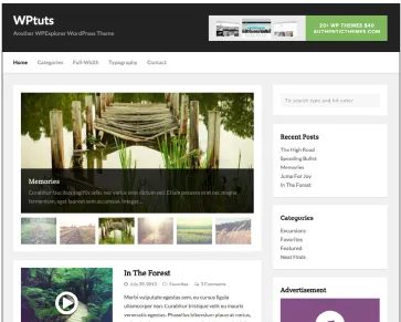
[image:13.612.178.541.428.719.2]I installed the WPEX WPTuts template, in figure 1, on my server since it had many of the features I was looking for in the blog. The colors and typography would need to be changed but I could do this by modifying the CSS style sheet.
I chose Helvetica for the site. I knew it would be available on all platforms and would give the site a clean appearance. By using a standard web safe typeface I would not have to rely on pre-loading web safe fonts while opening the site.
Using the customization tools, I changed each of the headline styles and body copy style to Helvetica, using both Bold and Regular appropriately. Figure 2 shows a small portion of the style sheet used by the template. All editing was done through the browser using WordPress’s Appearance Editor.
Black #000000 R:0 G:0 B:0
White #FFFFFF
[image:14.612.177.542.58.264.2]R:255 G:255 B:255
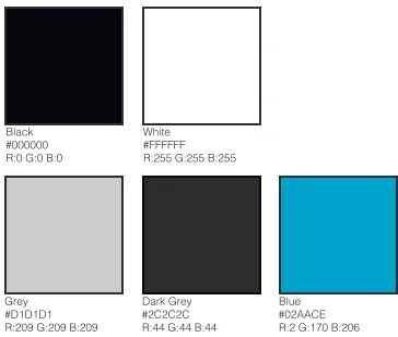
[image:14.612.176.540.417.726.2]In addition to the typographic changes there were also color changes. I wanted to create a standard pallet from which to work with. Initially I though about using only a greyscale pallet but I introduced the light blue for headlines and as a highlight color. Figure 3 shows each of the specific RGB values and hex codes for web safe colors.
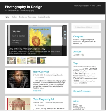
During this process I also removed all the advertising, since there is no need to advertise other company information on this thesis. I also revised the titles, subtitles and copyright information. I added categories specific to the site, this allowed for a greater level of organization. I felt it would be essential to have a direct link to the archives and include a list of tags. The size of each of the tags helps indicate how many times it has appeared in the site.
[image:15.612.181.542.283.658.2]Figure 4 shows the final revised version of the project website, with all the above modifications. The first category of posts is a rotator with the four video tutorials showing. This feature can be change to any of the categories to feature them on the blog website.
Video Tutorials
Creating the video tutorials took multiple paths, in some cases I wrote a script first and then prepared the images to fit the script. In others I wrote the script based on what video and images I had. All though the path I took to get there varied all of the same steps did take place in all four videos.
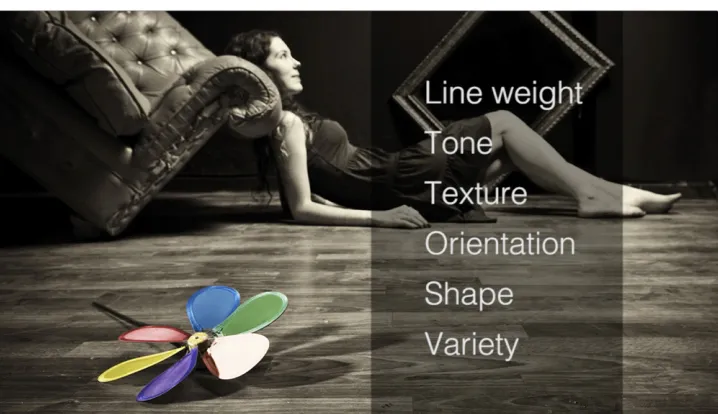
The introduction and closing sequence was created in Adobe After Effects. It was made using a combination of stock photos and text that represented some of the principles I would be discussing in the videos. For consistency I chose to use the same opening and closing on all four videos. The actual individual title sequence for each video was then added in using Adobe Premier, where I did all the final assembly of the videos. Figure 5 is a still from the
opening sequence and shows the transition between two of the stock photos.
The first video I created was “Using an Existing Photograph, Logo and Copy”. The idea behind this video was to represent a common scenario for a designer
when they are given all the materials from a customer and then have to find a way to make it work. For this video I created two versions of an advertisement using Adobe InDesign. The first used the photograph as is with the text placed over the image (as in Figure 6), for the second I removed the background around the sunflower added a rule and then placed the text on the white background and blue rule.
The raw video was created by using Quicktime to record my actions on the screen, after which I wrote a script to accommodate the footage I had and then recorded the audio using Adobe Audition in the department’s sound booth. The music used in the opening sequence was stock music from iStock.com.
[image:16.612.181.539.229.435.2]In addition to the video I added text and graphics that further emphasized the
The second video, “Choosing the Right Photograph for the Right Occasion”, was built differently from the first video. For this video I gathered the photographs I was going to use and this included some of the redesigned ads, posters and book covers. I then proceeded to write a script that talked more about the benefits and disadvantages of using stock photography as well as how to look at the true meaning behind a photo.
Since there was a long monologue in the beginning of the video I needed to come up with a way of showing different images with out any specific use. I imported all 25 photographs into Apple’s Photos and generated a slideshow. I used the Vintage Prints preset and then exported the slideshow to a Quicktime movie file. (Figure 7)
In Adobe Premier I assemble the opening and closing sequences with the slideshow movie and added additional images and Photoshop layouts. I added some additional title overlays and added the voice over that I recorded in Adobe Audition and exported the final movie as a MP4 with H.264 compression which
[image:17.612.177.542.57.265.2]was uploaded to my account on YouTube. From there I embedded the shared link into a blog post on the project web site.
Fig. 6, Using an Existing Photograph, Logo and Copy
[image:17.612.182.539.522.725.2]With the third video, “Building the Right Hierarchy for Your Design”, I wrote the script first and then proceeded to create the images and select the photographs to fit to the script. I did do some previous research into types of photographs I had available when writing the script.
I wanted to focus on how photography can be used to create hierarchy and that it is not just a principle for text treatment. I started by showing several photographs that had various different treatments of hierarchy, such as position, color and scale.
The illustrations were created in Adobe Illustrator, I felt that the message was simpler to communicate with simple graphics instead of trying to find media that could be used in its stead. The text and other graphics were again added in Adobe Premier using the still title tool. The final sequence of the advertisement
layouts was created in Adobe Photoshop with the effects also created there. Figure 8 shows the text treatment used in the video.
As was done before the finished video was exported to MP4 format and
uploaded to my YouTube account, the shared link then embedded into the post on my web site.
The fourth video in the series, “Modifying a Photograph to Meet Your Design Needs”, Was also created by writing the script first. After having the script I used Adobe Photoshop to create the various masks and effects to show how images can be altered. The goal here was to show how simple changes can be used to make a design more effective. Figure 9 shows one of the techniques demonstrated in the video.
[image:18.612.181.540.57.264.2]Each of the different examples were created using Adobe Photoshop with layer masks. I saved two versions of each photo and did a simple blend between
Effective Design Examples
The goal of the effective design section was to illustrate that simple designs with stock photography and a minimal amount of text could serve the purpose of the design just as well as a expensive advertisement done with custom photography and a large budget. Each of the designs in this section features a stock photograph as the main element of the design and some of them feature the same photograph as was in the original design. It would have been easy to select award winning advertisements, but I am not sure that would have made the point as well as these choices.
[image:19.612.179.540.56.264.2]For the redesign of First Things First (Figure 10) I used the original photograph, which was available on iStock.com, to recreate the poster design. I changed the colors, the logo and the written text without changing the feel or message of the advertisement. These changes were made in Adobe Photoshop. I found this poster design effective mainly because of the great choice of a photograph.
Fig. 9, Modifying a Photograph to Meet Your Design Needs
[image:19.612.262.460.497.725.2]The emotion that this image generates really sets the tone for the poster. It is a quick read with a simple, understandable message. For a poster design you can read the entire poster without having to stop and read it, just a quick glance will get the message across.
The Smoking Cessation poster from the Alberta Health Service works in much the same way. (Figure 11) This poster is a recreation of an award winning campaign, although the original photograph from the poster has been replaced with a stock photograph with similar colors and content. The concept is simple, in the series of posters the same tag line and layout is used on each design with a different image featuring a different act that would remind you of smoking.
While I did find the headline and call to action effectively done, I also found that the logo and extra information was too small to be seen with a quick viewing. The extra text next to the call for action should of been eliminated and the logo should be enlarged for better balance in the design. Overall I did see this as an effective design, an appealing photograph with a simple easy to read message. Always a good combination on a poster design.
[image:20.612.261.459.198.487.2]While effective by the standards I have been writing about, hierarchy, contrast and color, the Royal Navy print advertisement (Figure 12) is not the best example of what an advertisement can be. While I like the effect of the top
models from TourboSquid.com, although I had to recreate textures for them. After rendering a large Photoshop file I did use the dodge and burn tools in
Photoshop to add more lighting and shadow areas.
What I liked about this advertisement was the large but not overtly blatant way they created the headlines. By having them appear to be part of the wall they fit in well with the overall concept. This is an advertisement certainly focused on men, the boys and their toys concept taken to a new level.
Today photography is used just as commonly in web design as in print design, therefore I wanted to make sure I included at least one example of a web based image. The Southern Gentleman’s web advertisement (Figure 13) is a simple and effective example of a web banner commonly seen on many commercial web sites.
[image:21.612.262.460.58.314.2]For this banner I needed to extend the background of the photograph in Photoshop and create a new logo. The logo started as a free stock logo from Brands of the World, and then I modified it to meet my needs. This banner uses good hierarchy, a simple message and good contrast with both the text and the photography.
[image:21.612.180.540.595.725.2]Fig. 13, Southern Gentlemen Web Banner
Ineffective Design Examples
There are numerous goals I intended while working on the ineffective design examples. First was that the choices I made were not about a poor photograph, rather how it was used or how the text was treated. Secondly, when redesigning the ineffective designs I wanted to use all the content from the original design. In some cases I would rather have edited the content but I felt it would be a better comparison to keep all the pieces. Third, the changes I made had to comply to all the principles that I have already discussed in the other posts and videos, hierarchy, contrast, color, scale, readability and when possible simplicity.
The first example was the New York Laundry advertisement, a newspaper ad for a clothing line. (Figures 14a & b) I started with a stock photograph that needed quite a bit of retouching. The cloths had to be recolored and the background had to be removed to match the feel of the original advertisement. Some of the text in that design was unreadable so I had to substitute my own text and the represented typefaces were close estimates to what was originally used.
Some of the issues with this design was the use of too many typefaces, the lack of contrast and the placement of the text. I my redesign I modified the background to allow for more contrast, moved the placement of the photograph in order to make more room for text and changed the typeface and color of the type to add consistency and readability.
The second example I worked with was the book cover for Perception. (Figures 15a & b) This had to be one of the poorest book cover designs I have ever
seen, I would have thought with the cost of producing a novel that more attention would have been given to the design of the cover. First of all the lack of hierarchy had me confused as to who the author actually was, and the
[image:22.612.179.541.257.488.2]the entire cover. I then established effective hierarchy with both scale and color. I also enlarged the flag which was almost invisible in the original design.
I wanted to simplify the overall design, by doing this it is stronger and should stand out better on a store shelf.
The third example I recreated was a teen pregnancy advertisement. (Figures 16a & b) I actually found the advertisement disturbing and not just because of
the content. All of the text, including the body copy, was created in all caps, which is so difficult for some to read because of the lack of word shapes. The body copy was also placed over a strong pattern and was all right justified.
[image:23.612.180.541.114.380.2]Fig. 15a, Original Book Cover Fig. 15b, Redesigned Book Cover
[image:23.612.182.541.497.725.2]To recreate the original advertisement I combined three stock photographs, the male teen, a pregnant woman and the asphalt pattern using Adobe Photoshop. I also reproduced the text and graphics as in the original advertisement.
For the redesign I changed all the text to sentence structure and established more hierarchy. I enlarged the call to action and separated it from the rest of the body copy so the viewer would not have to search for it. I split the paragraph of text up into bulleted items that increased the readability and focused the importance of the message. I also shifted the photo to the right and eliminated the vertical red line that served no function in the design.
The fourth example is the Baby Can Wait advertisement, another teen pregnancy story. (Figures 17a & b) This redesign was going to be more of a challenge because of the amount of text in the design. The original advertisement used full justified text that was light and placed on top of the photograph of a young teen. Some of the text becomes unreadable due to the lack of contrast between the text and photograph.
I stared with a stock photograph and modified the background, scaling and lighting to match the original advertisement. I also matched the text as close as I could with size and leading choices. For the redesign I changed all the type to one typeface and established better hierarchy. I also took the single continuous paragraph and broke it up into multiple paragraphs for readability. I then moved the photograph and text to eliminate the overlap. While the story was interesting I did find that the original text was too long for any advertisement and I really wondered who would actually take the time to read the whole story.
[image:24.612.181.540.190.420.2]Designing a Course
Photography in Graphic Design is a ground based course I designed as part of this thesis, while I feel education does continue after graduation, it is equally as important to have the right foundation in formal education. The standards I used to design this course are based on those for the College of Imaging Arts & Sciences at Rochester Institute of Technology.
Photography in Graphic Design is not a photography course for designers, it is a design course that teaches the use of photography in design. This course provides a structured analysis of the use of photography in design through written assignments, lectures and group discussions. It also provides a practical application of current and historical trends by the completion of a variety of design projects utilizing photography as a major element of each design. Emphasis is placed on the basic design principles, selection of photography and integration of photography and content.
A large portion of the course will be dedicated to historic design movements that featured the use of photography in design. By analyzing these different movements students will learn different techniques for incorporating
photography and techniques for modifying photographs for their designs. The movements that will be covered during the course are:
• The Inventors of Photography
• Photography and the Printing Process • The Influence of Modern Art
• Russian Suprematism and Constructivism • The Swiss Movement
• The New York School • Editorial Design • Designing for a Cause • Design for an On-line World
In order for students to understand the different movements a combination of projects and written assignments will be used. Projects will be print and on-line based designs using techniques and styles from each of the periods studied during the course. Written assignments will be discussion questions based on regular reading assignments from Megg’s History of Graphic Design.5
The course will be fast paced with project assignments lasting about two weeks and written assignments due in a weeks time. Although fast paced, each student will come out of the course with several potential portfolio examples and a solid understanding of how photography has been used in past design and how they can continue to use photography in their own designs.
Summary Usability Testing Results (Peer Feedback)
The full results of the comments from classmates, first year graduate students and some of my students from Contemporary Media II can be found in Appendix G on page 71 of this thesis.
The results of the limited feedback I have seems to be mostly positive, good design, good presentation and overall good ideas. I was afraid the concepts would be too rudimentary for graduate students, since my target audience was younger, but it seems to be well received. Some of the less positive comments have been around not being apart of the target audience or already knowing too much about the subject. Others asked for complete redesigns or rewriting of ineffective advertisements not realizing my constraint of using the same content in both versions.
What I found encouraging was some discussion around the legal issues of using and purchasing photography. The use of model releases, royalty free vs. limited use and extended use, and protecting your images once placed on the web were some of the discussion comments. While out of the scope of this thesis I found the topics interesting and certainly relevant. I believe that getting expert opinions or at least links to expert resources would be valuable to add to the project in the future.
Imagine RIT Survey Results
The full results of the Imagine RIT surveys can be found in Appendix H on page 74 of this thesis.
I received 28 survey returns from a wide age range and experience range of individuals. A summary of the results are below. I found the majority of the results to be positive and even some of the negative comments were positive comments by other individuals. All surveys were given anomalously.
The age of participants ranged from 11 - 85 and the gender was almost split evenly. Approximately 2/3 of the people had design training and half of them had worked in the design industry.
Video Tutorial Survey Results
The following charts are rated 1-5 (1 = worst, 5 = best) Some Design Training
Were the Videos Professional Made
Were the Videos Clear and to the Point
Worked in Design Filed
Yes 64% No 36% Yes 50% No 50% 0 3 6 9 12 15 15 10 1 0 5 10 15 20 18 7 1 1 Below 20 24% 50 Plus 10% 40-49 14% 20-29 52%
Age of Surveyed Gender of Surveyed
Male 54%
0 2 4 6 8 10 12 4 9 12
Ease of Use
Readability Overall Design Learning Opportunity 0 5 10 15 20 2 7 16 0 3 6 9 12 15 3 7 15 0 5 10 15 20 2 4 19
Website Survey Results
Integrating Blogging into a Ground Based Course
During the Contemporary Media II course, I was teaching this semester, I tried to introduce a blog into the classroom for sharing group projects and information. I was hoping that it would start some additional conversations or exchanges that would widen the research the students were doing. However the results were met with mixed results.
The successful part was everyone signed up and initially participated by uploading group projects that could be downloaded and shared by the other groups within the class. This did take some prompting in the beginning but eventually everyone participated. But that is really as far as the blogging experience went. (Figure 18)
After the first quarter of the course I abandoned the blog. There had been no additional contents or comments made on the site and really no sign of any use. Instead of beating a dead horse I just moved on with other ideas. While this idea may have worked in a different class, and it won’t be the last time I try something like this, these particular students did not need this kind of resource and saw it as a waste of time and energy.
The students from this course was the entire senior class of the Medical Illustration program, in addition to the twelve of them it also included four second year graduate students from the same program. Since these sixteen students took every class together, including the graduate students, they were a very small and tight knit group that was used to sharing everything already. They regularly used Google Docs and other services to share all their assignments and they were always around each other during the day.
[image:29.612.180.542.522.726.2]I would like to try to use something similar to what we did in this class again in the future but I feel it would have to be the right situation and certainly the right group of students. I am finding out quickly this semester what works for one often does not work for another and flexibility is the key to teaching.
Conclusion Significance of the Project
My overall goal of this thesis was to call attention to an area of study that is lacking in todays educational system. Photography and the use of imagery is the predominate portion of most designs today, both for print and for the web. Even with motion graphics and user interface design the use of photography is on the rise. However the use of photography in design is not being widely taught in design programs.
This thesis provides a place that the discussion about photography in design can begin, a place where students and seasoned professionals can share opinions and experiences with each other. A place where people can learn beyond the classroom. The tutorials and articles that are currently in the project are hopefully only a beginning. These were meant to get the conversation started, to find out what more needed be discussed and to provide a central resource that designers can access to share their stories.
The course outline and syllabus are an attempt to provide a opportunity for students to build an general understanding of the history of photography in design and to teach them how to implement photography in their own designs by creating a series of projects based on different historical periods. This course would also provide these students with portfolio examples that are often missing from students looking for their first employment.
This project was never an attempt to answer all questions on the use of
photography in design, nor could it ever do that. Many of the questions have still not been asked any many more have not even been formed. It was meant to be a starting point, an awareness project that attempts to bring the subject to the forefront of design education. This topic is nothing new, photography in design has been around as long as the photographic process has existed. It has been treated in a wide variety of ways, from the Swiss movement to editorial design photography has been and will continue to be the major element in most design.
New Questions Generated
During the feedback process some common discussions and concerns seemed to keep coming up and I think these are areas that need to be additional exploration. One are that can up is the legal issues surrounding the use of photography, how to purchase imagery, what kind of license is needed, what kind of rights do I need to secure from a photographer and what are the ramifications of posting these images and designs on-line. This could be a whole project on it’s own and would need to involve legal experts knowledgeable in copyright law.
Another area that was requested was to expand tutorials to include more techniques on how I modified existing photos. While this is more achievable I wanted to stay away from doing pure Photoshop demonstrations since there are already so many great resources available for those kinds of tutorials. This would only be another take on what anyone can already find through Adobe or YouTube.
What surprised me most was the overwhelming support and understanding of the topic of this thesis. Across the board everyone agreed that this was a valid are to explore and that it is not an area covered in most programs. This shows me that the discussion needs to continue, that more articles and tutorials can be added to the project site.
So the biggest question in my mind is how do we incorporate photography into the traditional classroom. As I stated before, by introducing projects that are photographic based instead of illustration based would be a start. We need to stop discouraging or even forbidding the use of photography in our design projects. It is easy to fall back on pure illustration
Appendix A: Copy of Proposal Appendix B: Tutorial Video Scripts Appendix C: Effective Design Examples Appendix D: Ineffective Design Examples
Appendix E: Photography in Graphic Design Course Outline Appendix F: Photography in Graphic Design Course Syllabus Appendix G: Online Peer Feedback
Appendix H: Imagine RIT Surveys
John E. Dyer
MFA Visual Communications Design
School of Design | College of Imaging Arts and Sciences Rochester Institute of Technology
Last updated: 3 December 2014
Learning Beyond the Classroom:
Photography as a major design element
in graphic design layouts for print and web
Appendix AThesis Committee Approval :
Chief Thesis Adviser:
Chris Jackson, Professor, CIAS – School of Design
Signature of Chief Thesis Adviser Date
Associate Thesis Adviser:
Joyce Hertzson, Professor, CIAS – School of Design
Signature of Associate Thesis Adviser Date
Associate Thesis Adviser:
Mitch Goldstein, Assistant Professor, CIAS – School of Design
Signature of Associate Thesis Adviser Date
MFA Thesis Candidate:
John E. Dyer, Visual Communications Design
Abstract Learning Beyond the Classroom: Photography as a major design element in Graphic Design Layouts for print and web, is a thesis which explores alternative methods for learning and the teaching of the design process through the use of shared experiences and expert testimony.
The final thesis will provide a resource for designers and students to be able to discuss the effective and ineffective application of design principles and provide some basic lessons in the use of photography in graphic design.
Elements of design that are to be discussed include, but are not limited to: typography, hierarchy, color, scale and placement. While discussions may go into additional topics the main categories will be effective design examples, ineffective design examples and lessons.
The “Examples” sections will discuss what is effective and ineffective with re-designed advertisements and/or web pages. In addition to discussing what is ineffective, alternative designs for the advertisement will be provided.
The “Lessons” section will contain written and/or video demonstrations on how to create a successful advertisement using photography as a primary element of the design. They will aslo provide some basic tools for choosing and manipulating photographs for your design needs.
In addition to on-line resources, this thesis will include a course outline and syllabus for a potential undergraduate course named “The Use of Photography in Design.” A course focused on dealing with all aspects of photography for designers, including designing with photography, working with photographers, the use of stock photography and manipulating photos for use in designs.
Overall this thesis is designed to help designers and instructors continue to learn and discuss the basic design principles in an open environment, outside of the traditional classroom.
Keywords:
Photography, Graphic Design, Advertisement, Web, Lessons, Examples, Syllabus, Classroom, Pedagogy
Project Website:
http://www.johnedyer.info/photoblog/
Thesis Website:
Problem Statement Photography has become a predominate part of design. The use of photography in design should receive as much consideration as the other elements of design such as typography and illustration. While layout and typography are wildly taught in schools, the integration of photography in design is not a major focus of education in the undergrad or graduate level of many graphic design programs. It should not only be taught but should remain a major part of graphic design education. Today’s use of photography in advertising and web design require more than a casual attention to teaching these skills. A more in-depth approach to integrating photography in design is needed while still embracing the basic principles of design.
Learning Beyond the Classroom:
Since the process of learning continues long after graduation, resources are needed to address modern design problems. A blog that addresses current problems and remarks on successful design solutions will provide a resource that students and young designers can not only learn from but also contribute. My proposal is to establish such a resource and to populate the blog with posts that will forward the use of photography in design and promote conversation as to the future of such design. It will evaluate poor designs and offer suggestions for improving the design using basic design elements. It will offer suggestions for working with photography including the use of stock photography,
manipulating the photograph to meet your design needs and understanding what to look for when purchasing photography.
Survey of
Literature Fotografiks: An equilibrium between photography and design through graphic expression that evolves from content.
David Carson and Philip Meggs 1999
Gingko Press
An introductory essay explores the synergy between graphic design and photography, and the dynamic relationship that exists between words and pictures. Anecdotal captions provide philosophic comments on the nature of the photographs, aspects of the page design and observations on the process of assembling parts to form a whole.
Graphic Design and Photography, San Francisco.
J. Crager 1996
Graphis
Volume 52, Issue 302: 94-95
Issue 52 of Graphis magazine presents the following articles: Picasso: War and Peace, written by Claude Roy; Canada: Advertising and Editorial Art, by P. Arthur; 50 Advertisements of the Year, by Charles T. Coiner; The Human Figure
in the Art of Ancient Sardinia, by Christian Zervos; Newspaper and Magazine Promotion, by C.F.O. Clarke; Carnival Art at Basle, by Maria Netter; Aztec Picture Writing, by C.A. Burland; Mexican Design Motifs, by Paul Arthur; and Japanese Text-Books, by Jean Benonie.
The ‘other’ pictures: Stock photography in graphic design libraries.
Cathy Donaldson 2004
Art Libraries Journal Volume 29, Issue 3: 32-36.
Student graphic designers want fast, easy and cheap access to high-resolution images. As well as using the image-rich art books in their libraries, these students can now use stock photography: those images of cute children, attractive couples, active seniors, funky pets and preternaturally fresh fruit, plants and flowers that are used to communicate, influence, and sell something, somewhere, to someone.
How to use photography in web design.
Ezwquiel Bruni 20 August 2013
Webdesigner Depot. http://www.webdesignerdepot.com/2013/08/how-to-use-photography-in-web-design/.
Bruni talks about the importance of the right image or video. He discusses the use of contrast, quality, relevance, big images sell and drawing attention. A lot of topics are superficially covered in a very short article.
Photo/Graphic design: The interaction of design and photography.
Hurlburt, Allen 1983
Watson-Guptill Publications.
Survey of
Literature Importance of Photography in Graphic Design. Sonnie
2 December 2013
Design The Planet. http://www.designtheplanet.com/importance-of-photography-in-graphic-design/.
Sonnie discusses the historical aspect and the emotional aspect of using photography in design. He uses quotes from Ansel Adams and others like “A picture is worth a thousand words” to make his point. He does talk about
the difficulty of picking the right image and that too many images can confuse the viewer.
Color graphics: The use of photography to produce graphic designs in color
Pär Lundqvist 1980.
Focal Press.
Photograms, Photography, Artistic, Technique, Prints, Photomechanical processes.
Type & image: the language of graphic design.
Philip B. Meggs 1989
Van Nostrand Reinhold
The extraordinary flowering of graphic design in our time, as a potent means for communication and a major component of our visual culture, increases the need for designers, clients, and students to comprehend its nature. In this lively and lavishly illustrated book, the author reveals the very essence of graphic design.
Photography in design.
Multiple 5 April 2012 Creative Blog
http://www.creativebloq.com/photo-editing/photography-in-design-1233169.
This is a collection of very brief statements from leading designers on the use of photography in design. It is a do and don’t statement from each. While useful it does not take any individual idea further than a sentence or two in length.
Type, image, message: merging pictures and ideas: a graphic design layout workshop.
Nancy Skolos and Thomas Wedell 2006
Rockport Publishers
Survey of
Literature Maximizing WordPress: Get more out of this great publishing platformBrian LaFrance
nd
Slideshare
http://www.slideshare.net/blafrance/maximizing-wordpresspubconvegas2013br ianlafrance
A presentation about WordPress including mobile considerations, managing Javascript, plugins and tips.
Get the Most from WordPress.com
Multiple nd
Learn WordPress.com http://learn.wordpress.com
A series of tutorials on using WordPress from getting started, designing and publishing.
Rethinking the Way College Students Are Taught
Emily Hanford nd
American RadioWorks
http://americanradioworks.publicradio.org/features/tomorrows-college/lectures/ rethinking-teaching.html
Nine alternatives to lecturing
nd
Centre for Teaching Excellence
https://uwaterloo.ca/centre-for-teaching-excellence/teaching-resources/ teaching-tips/alternatives-lecturing/active-learning/varying-your-teaching-activities
What the Best College Teachers Do
Ken Bain 2004
Harvard University Press
What makes a great teacher great? Who are the professors students remember long after graduation? This book, the conclusion of a fifteen-year study of nearly one hundred college teachers in a wide variety of fields and universities, offers valuable answers for all educators.
Teaching Tips: Strategies, Research, and Theory for College and University Teachers. Twelfth Edition
Wilbert J. McKeachie and Marilla Svinicki 2006
Houghton Mifflin
Survey of
Literature Using Blogging as a Learning ToolMacie Hall
2013
The Innovative Instructor Blog
http://ii.library.jhu.edu/2013/11/27/using-blogging-as-a-learning-tool/
With the increased interest in introducing digital literacy skills in the classroom as a means of preparing students for the 21st century marketplace, our teaching and learning center has had more questions from faculty about using blogs as a teaching tool. The Innovative Instructor doesn’t advocate using technology for technology’s sake, but student blogging can be a way to achieve several learning outcomes for your course.
WordPress in the College Classroom: Five Sources
Elizabeth F. Cornell 2013
Elizabeth F. Cornell
http://www.elizabethfcornell.net/2013/07/16/wordpress-in-the-college-classroom-five-sources/
Despite their membership in the digital tribe, few of my undergraduates have any experience with WordPress or any blogging platform. Using WordPress in my classroom gives students an opportunity to increase their digital literacy as they read and discuss works of literature.
Live Blogging in the College Classroom: A Professor and Student Perspective
William Grose and Shayla Thiel-Stern 2008
Hournal of Electronic Publishing
http://quod.lib.umich.edu/j/jep/3336451.0011.303?view=text;rgn=main
Live blogging means writing about events as they are happening. William would not be taking notes for his own review, he would be writing about the class while I was lecturing, and putting those notes out on the Internet where the whole world could see them.
The Use of Blogs as a Knowledge Management Tool
Delaney J. Kirk and Timothy L. Johnson 2009
Academic Exchange Quarterly
http://rapidintellect.com/AEQweb/cho4462z9.htm
Design Ideation
Blog Appearance Flow Chart for Blog
Web Font Family
Tutorials
Good Examples
Bad Examples
Photography in Design!
Home Page About
Books and Resources
Academic Links Tutorials
Good Examples
Bad Examples Tutorials
Good Examples
Bad Examples
Bad Examples Bad Examples Guest Essays
Design Ideation
Black #000000 R:0 G:0 B:0
Grey #D1D1D1
R:209 G:209 B:209
White #FFFFFF
R:255 G:255 B:255
Dark Grey #2C2C2C R:44 G:44 B:44
Blue #02AACE R:2 G:170 B:206
Blog Color Pallet
Screen Captures of Tutorial Video Non-Web Font Family
Helvetica Light
Helvetica Light Oblique
Helvetica Regular
Helvetica Oblique
Helvetica Bold
Methodological
Design The final project will be an online teaching resource for designers and students that use photography in their design work. The project will consist of a blog
featuring original articles on the effective and ineffective uses of photography in design. It will also include how-to articles and links to other resources including books and other articles on similar topics.
An additional goal of having featured guest designers contribute to the blog would add to the status and provide additional resources for learners. The first of which will be provided by Professor Mitch Goldstein who will modify one of his existing presentations.
The target audience would include anyone with a desire to learn more about the use of photography in design, especially undergraduate and graduate students, young designers and educators.
The hardware and software components for viewing the blog are fairly generic, any computer or mobile device with internet access and a browser can be used to access the blog, although access to contributors will be limited by request to an administrator.
The blog will be hosted using WordPress.org software on my current service provider, where I already have a vanity address and multiple site capability. This will require some expertise in the programing and use of Wordpress as well as the use of Adobe After Effects and Premiere to create video tutorials. Tutorial videos will be hosted on my YouTube.com account and then embedded in the WordPress tutorial posts.
While using a template as a starting point for the blog, the colors, typography and hierarchy will be updated through the modification of the CSS style sheets. These changes will not only present a more consistent look to each post and
their associated links, it will also eliminate built in advertisements and give it a more professional appearance within the parameters of my design ideation. The blog has also been designed to be responsive to work on various size monitors and mobile devices.
I will create four posts with effective advertisements and explanations as to why they work and how they may be improved if needed. Each example will be designed from stock photography and will be based on actual ads already published. Each written portion of the article will be three to four hundred words in length.
Methodological
Design 1 Using an Existing Photograph, Logo and CopyFor the tutorials, I will design four video animations or written presentations:
2 Choosing the Right Photograph for the Right Occasion 3 Building the Right Hierarchy for Your Design
4 Modifying a Photograph to Meet Your Design Needs
The video animations will be designed by using screen captures, both still and video, photographs and InDesign files which will be edited in a combination of Adobe Premiere and/or After Effects. I will also provide a voice-over for the tutorials. In addition to the contents, I will design title sequences and visuals that will comply with the parameters of my design ideation. Each tutorial will be 2:00 to 3:00 minutes in length. For each post, links to external resources will be provided, as needed, for additional tutorials or reference material.
The course outline and syllabus will be created using a word processor and/or page layout application and will be output as a PDF for inclusion in the printed and on-line versions of the thesis documentation. The templates will be based on standards currently used by the College of Imaging Arts & Sciences at Rochester Institute of Technology.
Implementation Strategy
The blog will be hosted on my account on a Machighway server using a free WordPress template. This blog already exists and just needs to have the posts (content) added to the existing site. The blog has been re-designed by modifying its CSS style sheet as in the example in my design ideation. This was done with skills aquired in Web & UI Design as well as Interaction Design.
Using my research and my 29 years experience I will use existing ads as the basis for designing sample ads for both effective and ineffective examples. This will be done in Adobe Photoshop, Illustrator and InDesign, all of which I have a high degree of comfort using at this time. The tutorial videos or animations will be created using Adobe After Effects and/or Premiere which I am still learning but have enough experience with video editing to adequately complete any tasks. The videos will be hosted on my YouTube account with embedded versions provided on the blog post.
The written course outline and syllabus will use skills learned in ITDI776 College Teaching Course that I have already completed.
Lessons and examples will be reviewed by my committee members with additional input from other resources. The outline and syllabus will also be reviewed for completeness and compliance with RIT guidelines.
Dissemination The very nature of a blog is to be out in the world and to be seen by many individuals. The blog will be registered in search engines so as to reach anyone looking for the topic.
On campus dissemination
Imagine RIT - May 2015 Thesis Show - May 2015
Off-campus dissemination
AIGA Design Educator Roundtable - October 2015 AIGA Design Educators Workshop - October 2015
SUNYCON 2015 - October 2015
Evaluation Plan The inherent nature of blogs provides a means for feedback. The use of comments, likes and dislikes, and social media sharing provides an excellent account of how much participation there is.
In addition to the comments and feedback of peers who will provide validation or dissension to the written articles that are posted on the blog, there will be opportunities during Image RIT 2015 to get educated and non-educated feedback on articles and lessons.
Initially articles can be reviewed prior to submission by academic resources for not only content but for possible social or cultural misunderstandings.
Pragmatic
Considerations My examples and tutorials will require the purchase of stock photography. Purchases
of individual images from iStockPhoto.com are on a credit basis with photos costing either one or three credits.
I will need at least 12 photographs for the tutorials and examples. This could cost as little as $130.00 to as much as $325.00 since credits are purchased on a scale the total amount will depend on the cost of the individual images.
In addition to purchasing photos for tutorials there is a monthly charge for Adobe Creative Cloud of $30 per month for students.
Timeline October 2014 – May 2015
October November December January February March April May
5-1
1 12-18 19 - 25 26 - 1 2 - 8 9 - 15 16 - 22 23 - 29 30 - 6 7 - 13 14 - 20 21 - 27 28 - 3 4 - 10 11 - 17 18 - 24 25 - 31 1 - 7 8 - 14 15 - 21 22 - 28 1 - 7 8 - 14 15 - 21 22 - 28 29 - 4 5 - 11 12 - 18 19 - 25 26 - 2 3 - 9 10 - 16 17 - 23
Graduation
Spring Break Finals W
eek Finals W eek W inter Break Classes Begin Thanksgiving Document Project Proposal Defense Research Creation of Examples and Tutorials Committee Meeting Signed Proposal Due Presentation Prep Thesis Website Presentation Committee
Meeting Committee Meeting Finalize
Committee
Finish Final Project
Thesis Report Publish Report Report Revisions Show Prep Defense Prep 17 17 16 16 15 15 14 14 13 13 12 12 11 11 10 10 9 9 8 8
Bibliography Books and Journals
Carson, David, and Philip B. Meggs. Fotografiks: an equilibrium between photography an design through graphic expression that evolves from content.
Corte Madera, CA: Gingko Press, 1999.
Crager, J. 1996. Venezky. Martin, Graphic Design and Photography, San Francisco. Graphis 52 (302): 94-95.
Donaldson, Cathy. 2004. The ‘other’ pictures: Stock photography in graphic design libraries. Art Libraries Journal 29, (3): 32-36.
Hurlburt, Allen. Photo/graphic design: the interaction of design and photography. New York: Watson-Guptill Publications, 1983.
Lundqvist, Pär. Color graphics: the use of photography to produce graphic designs in color. London: Focal, 1980.
Maier, Manfred. Basic principles of design. New York: Van Nostrand Reinhold, 1977.
Meggs,Philip B.. Type & image: the language of graphic design. NewYork:Van Nostrand Reinhold,1989.
Skolos, Nancy, and Thomas Wedell. Type, image, message: merging pictures and ideas: a graphic design layout workshop.
Gloucester, MA: Rockport Publishers, 2006.
Online References
“How to use photography in web design.” Webdesigner Depot RSS.
http://www.webdesignerdepot.com/2013/08/how-to-use-photography-in-web-design/.
Importance of Photography in Graphic Design”. Design The Planet. http://www. designtheplanet.com/importance-of-photography-in-graphic-design/.
Photography in design.” Creative Blog. http://www.creativebloq.com/photo-editing/photography-in-design-1233169.
Image Sources
“Ad in Women’s Wear Daily for Cotton Inc./DDBNY.” Sara Forrest Photography – Blog. http://www.saraforrestphoto.com/blog/?p=882
(accessed October 13, 2014).
Bad ads.” Insomnia Notebook. http://paranoiastrikesdeep.blogspot. com/2011/12/bad-ads.html (accessed February 20, 2014).
Café para empezar la semana- 20 anuncios creativos.” Pixel Monster Diseño.
http://pixelmonstermx.blogspot.com/2012/03/son-de-los-que-tardan-en-arrancar-la.html (accessed February 20, 2014).
“Cotton On-Campaign Series Ads.” Behance. https://www.behance.net/ gallery/4298123/Cotton-On-Campaign-Series-Ads
Bibliography Diesel brings interactive advertising to Interviews iPad app.” Mobile Marketer.
http://www.mobilemarketer.com/cms/news/advertising/6045.html (accessed February 20, 2014).
King, Jamilah. “5 Really Bad Teen Pregnancy Prevention Ads.” Color Lines.
http://m.colorlines.com/archives/2013/03/a_brief_history_of_new_york_citys_ teen_pregnancy_shame_tactics.html (accessed February 20, 2014).
Maidenberg, Micah. “Where the wry things are.” Chicago Journal. http://www. chicagojournal.com/news/10-21-2009/Where_the_wry_things_are (accessed February 20, 2014).
Nguyen, Alex. “The first milestone of my career.” Alex Nguyen.
Appendix B.1
Tutorial Video Scripts
Using an Existing Photograph, Logo and Copy
Hello all,
Todays lesson is using existing images and copy to design a print ad. This is often the case when working with a well established company as a customer.
Country Fresh wants a print ad for their unsalted butter. They have provided a photograph, logo, title and the body copy that we are to use.
The photo was chosen to highlight relationship of the color of the flower and their unsalted butter, this is the photo they will use in all their unsalted butter layouts including their packaging.
Placing the copy and logo on top of the photo does not make for a very clean and readable ad, and as always our goal should be to make all ads readable. So how can we make this image work?
Since the sunflower is the focus of the ad we can eliminate the background and create a cleaner negative space. Here I used the pen tool in Photoshop but you can use any method that you prefer.
Since this is not a Photoshop tutorial I am including links to two YouTube videos for using the pen tool and masking in Photoshop.
Now that the sun flower has been masked and imported into InDesign it is time to add the log