City, University of London Institutional Repository
Citation:
Slingsby, A., Dykes, J., Wood, J. and Clarke, K. (2007). Mashup cartography: cartographic issues of using Google Earth for tag maps. Paper presented at the ICA Commission on Maps and the Internet, 31 Jul - 2 Aug 2007, Warsaw, Poland.This is the unspecified version of the paper.
This version of the publication may differ from the final published
version.
Permanent repository link:
http://openaccess.city.ac.uk/400/Link to published version:
Copyright and reuse: City Research Online aims to make research
outputs of City, University of London available to a wider audience.
Copyright and Moral Rights remain with the author(s) and/or copyright
holders. URLs from City Research Online may be freely distributed and
linked to.
Mashup cartography: cartographic issues of using
Google Earth for tag maps
Aidan Slingsby, Jason Dykes, Jo Wood
giCentre, School of Informatics, City University, London, EC1V 0HB, UK.
1.
Introduction
Cartography is the study and practice of visually representing the Earth’s surface and the associated objects and phenomena of interest. Cartography incorporates a number of aspects (Robinson et al, 1984, ch1) including mathematical projections (projecting a curved surface onto a plane), abstraction (identifying the objects and phenomena of interest), communication (clearly communicating a message) and aesthetics (visually appeal).
Aspects of cartography are continually changing along with technological advances. Computers are now used for managing map data and for producing maps, GPS is routinely used to support surveying1 and the world wide web is increasingly being used as a means to
disseminate maps (Kraak and Brown, 2001; Peterson, 2003). New types of map are being produced such as interactive maps (Andrienko and Andrienko, 1999), animated maps (Harrow, 2004) and cartograms (Dorling, 2007) and maps for the visual exploration of data (Kraak and Maceachren, 1999).
Although the technology and dissemination of maps has changed over the past few decades, the central cartographic principles of communication and aesthetics still hold – the desire to convey information by clear, unambiguous and attractive means. As Inhof (1975) pointed out, there are no hard and fast rules for cartography, however, the design and production of new types of map using new methods of dissemination benefit from a review of cartographic practice in order to fulfil their communicative and aesthetic role.
In this paper, we discuss cartographic issues encountered when producing a new type of map (interactive tag maps) using geographical mashups (with Google Earth as the viewer) for the visual exploration of spatial data (Slingsby et al, 2007). Geographical mashups are the result of using Internet-based tools that combine data from multiple sources and techniques for producing interactive maps (Wood et al, 2007). They have a number of unique cartographic issues that the producer and user need to be aware. Of particular importance for the visual analysis of spatial data – of less importance to more informal uses of mashups – is whether the maps are representative of the dataset being viewed. We approach these questions by taking an analytical approach to helping us understand the behaviour of Google Earth for interpreting input data (encoded in the well-documented KML format) and rendering our data, much of which is undocumented. Although we deal with a specific type of map (interactive tag maps) and a particular software application (Google Earth), our findings and analytical approach are more widely applicable. We would encourage producers and users of other types of map and other geographical viewers in mashup to consider taking a similar approach.
2.
Mashups
‘Mashups’ are the results of combining Internet-based tools and data to produce new content (Merrill, 2006). They are facilitated through widely available and usually free tools with
published APIs, XML-based feeds and dynamic scripting languages (Garrett, 2005). Mashups have become hugely popular and widespread2 for the informal presentation of data, but are becoming increasingly used for more formal uses (see examples below). Geographical (map-based) mashups are widespread. Each is based around an interactive map viewer to display one or more spatial datasets. Such interactive map viewers are free at the point of use, allow developers to incorporate data through simple and open data formats or APIs and have built-in geographical context (imagery, roads and place names). Generally there are two groups of interactive map viewers: those which are embedded in web pages using AJAX (Garrett, 2005) technology or as applets (Java, flash or customised plugins) and more heavyweight standalone geobrowsers.
The best known example of a mashupable web-based interactive map viewer is Google Maps (Miller, 2006), based on AJAX technology (Yahoo! Maps is another notable example). Geographical mashups based on such viewer are produced by a diverse set of producers (from individuals to organisations) for a diverse set of uses such as crime mapping (e.g. Chicago Crime Map3), business directories (e.g. Yell4), hotel accommodation (e.g. Trip Advisor5),
directions (e.g. Google Maps and Directions6) and neighbourhood statistics (e.g. London Profiler7).
Standalone geobrowsers are able to deal with larger datasets and more complex visual representations of information than their web-based counterparts. The best known example is is Google Earth, a built-in gazetteer, high resolution imagery, other ancillary datasets and a well-documented XML-based data input format, known as KML. NASA Worldwind is an open-source option and the Java version is platform independent and customisable. Microsoft’s Virtual Earth is like a standalone application that is embedded in a web browser, using proprietary ActiveX technology. As more the web-based mashups, uses of standalone browsers are diverse. Google host and encourage a large community of general Internet users to develop and make available geographical mashups based on Google Earth8. Google Earth
is also increasingly being used for scientific visualisations9 and geographical mashup
technology is increasingly having an influence in geographical information science (Miller, 2007).
Google Earth has a number of interesting characteristics may make it suitable to support the exploration of large spatiotemporal datasets. Firstly, its easy to use KML input file format allows anyone to augment Google Earth’s rich datasets with ‘volunteered’ geographical information (Goodchild, 2007). For example, it has been used effectively in relation to catastrophic events (Miller, 2006), widely demonstrating the power of combining datasets spatially to mainstream computer users. Secondly, Google Earth has been shown to have the flexibility to support a wide range of visual encodings for exploring multivariate spatial datasets. For example, Wood et al (2007) found that Google Earth could support Shneiderman’s (1996) widely cited “visual information-seeking mantra: overview first, zoom and filter, then details-on-demand”. In separate work, Pezanowski et al (2007) extended the user interface to support complex spatial querying. Finally, its intuitive user interface and the streaming technology it uses to collect data from remote servers, allows spatially-referenced results to be disseminated and presented to wide groups of users.
2http://www.programmableweb.com/mashuplist/
3 http://www.chicagocrime.org/map/ 4 http://www.yell.com/
5 http://www.tripadvisor.com/ 6 http:///maps.google.com/ 7 http://www.londonprofiler.org/
8 For example, those listed at http://earth.google.com/gallery/index.html
9 For example, NASA’s Goddard Space Flight Center: http://svs.gsfc.nasa.gov/ (see their Yellowstone
3.
Tag maps
‘Tags’ are free text labels widely used for marking-up Internet content to help with its organisation; for example, photographs (e.g. Flickr10) and video clips (e.g. YouTube11).
We are not concerned with tags themselves, but with the most common way in which they are visually summarised, namely, ‘tag clouds’ (Hassan-Montero and Herrero-Solana, 2006). A tag cloud is a group of the most prominent tags in a collection, each of which are sized according to their importance. They are usually arranged alphabetically, in order for tags to be found quickly. Tag importance is usually assessed as a measure of the number of times a tag has been used to tag content. For example, the Flickr website has a tag cloud of the most frequently used (‘popular’) tags12.
Tag clouds have recently diversified in use and are now widely used for summarising words in other contexts, such as documents, speeches and keywords. The Tag Crowd13 website is an
[image:4.595.90.499.313.567.2]example of a service that facilitates this.
Figure 1: Tag map (left) showing the local importance of words and tag cloud (right) showing the 50 words of most overall importance for the geographical area. The smaller bounding box is ‘bank of america’; the larger is ‘starbucks’ (more spatially diluted).
A tag map (Jaffe et al, 2006; Ahern et al, 2007; Slingsby et al, 2007) is a spatial version of a tag cloud. Instead of words’ sizes being related to their global importance within a collection of words, they are related to their local importance in relation to a word’s position on the map. Tag maps can be generated from a set of georeferenced words at a variety of different spatial scales.
10 http://www.flickr.com/ 11 http://www.youtube.com/
4.
Generation and delivery
Tag maps were developed to explore the spatio-temporal structure of words, therefore the phenomena they represent. We use MySQL14 to store and retrieve georeferenced text and
PHP15 to query the database and generate output. These technologies allow us to generate tag
maps by gridding the area under study into cells and outputting the sized and positioned words in KML16 for display in each cell in Google Earth. Google Earth provides a means for
interactively selecting an area – and therefore a spatial scale – for which an interactive tag map can be generated at an appropriate scale for the selected area, and which can be visually synthesised with Google Earth’s ancillary data and that of third-parties.
Subject to word culling:
<Style id="style1"> <LabelStyle>
<color>ffffffff</color> (1) <scale>1</scale> (2)
</LabelStyle> <IconStyle>
<scale>0</scale> (3)
</IconStyle> </Style>
...
<Placemark>
<styleUrl>#style1</styleUrl>
<name>Word</name> (4)
<Point>
<coordinates>
-93, 27, 0 (5)
</coordinates> </Point> <description>
Count=45 (6)
</description> </Placemark>
Not subject to word culling:
<Style id="style2"> <LabelStyle>
<scale>0</scale> (1)
</LabelStyle> <IconStyle>
<scale>1</scale> (2)
<Icon> <href>
http://.../word.png (3)
</href> </Icon> </IconStyle> </Style> ... <Placemark> <styleUrl>#style2</styleUrl> <name></name> <Point> <coordinates>
-93, 27, 0 (4)
</coordinates> </Point> <description>
Count=45 (5)
</description> </Placemark>
The word (4), is positioned (5), has a description (6), is coloured opaque white (1) and has a specific size (2). The icon is suppressed (3).
The word is an image (3), is positioned (4), has a descriptions (5 and has a specific size (2). The label is suppressed (1).
Box 1: The KML used to describe the words of the tag map. The method on the left is subject to Google Earth’s word culling and the method on the right is not.
Google Earth takes KML as its input, a fully-documented XML-based language which allows geometry and text to be described in geographical space (Google, 2007b). This is interpreted by Google Earth and displayed with the aerial photography and other suppied contextual information. In this paper, we use the Placemark element (a geographical feature) to
14 http://www.mysql.com/
15 http://www.php.net/
describe each word. A Placemark has a position, an icon (graphical image), a text label and
a description (see the KML reference for complete documentation). The visual appearance of placemarks is controlled by the Style element in KML, which can be in the same or a
separate KML file.
We found that where words were specified as text labels of Placemarks (Box 1, left),
Google Earth automatically removes those which would otherwise overlap and make that map less legible. As is demonstrated in the following section, this ‘word culling’ is significant and greatly affects the resulting tag maps. It is helpful behaviour, in the sense that word overcrowding never occurs and words can be easily read. However for our spatial data exploration purposes, we wanted to know how many words were being culled and more importantly, which words for being culled. To study this, we needed to turn off this behaviour, in order to compare. There is no standard way of doing this, but we found that we could achieve this by suppressing the text labels in Placemarks, using a graphical image of the text instead as a Placemark Icon (box 1, right).
In this paper, we use two data sources. The first is data from go217, a mobile telephone service
provider which allows users to search for nearby businesses and services. Go2 kindly provided one month of usage logs, in which every query is accompanied by the location and time at which it was made. The second data source is from the 1:50,000 Ordnance Survey Gazetteer (supplied by Edina18), from which we have extracted common British placename prefixes and suffixes19. In each case, the individual georeferenced words are held in a MySQL database and tag maps are generated when required.
The two main cartographic issues we face are as follows:
• where to position words on a map – each word represents a spatially-aggregated summary of many;
• how to deal with the situation where words overlap, a particular issue in areas where there are more important words
We distinguish between static maps and maps and interactive maps and explore these issues in the following section.
5.
Cartographic issues for static maps
5.1.
Text placement
The issue of text placement has always been of great importance in traditional cartography (Imhof, 1975) and the automated label placement is an active research area. For example, van Dijk et al (2002) review some of the methods for doing this and develop a framework for evaluating the results of such methods. They identify four categories within which to evaluate text placement: aesthetics, label visibility, feature visibility and label-feature associate. Aesthetics do not relate to the position of text, rather to the manner it is displayed (van Dijk et al cite text angle, curvature and letter spacing factors). The features which are labelled on tag
17 http://www.go2.com/
18 The data is Crown Copyright/database right 2007. An Ordnance Survey/EDINA supplied service
(http://edina.ac.uk/digimap/).
19 The extracted placename elements are taken from http://en.wikipedia.org/wiki/List_of_generic
maps are not features in the traditional mapping sense – instead they are local summaries of ‘features’ (individual georeferenced words).
As stated above, the two most challenging cartographic problems of tag maps, is how to place words at representative positions and how to prevent the map from becoming too overcrowded. Van Dijk et al’s (2002) ‘label-feature associate’ and ‘label visibility’ (respectively) relate to these. These problems are strongly related, because representative positions for two or more local word summaries may be spatially coincident, thus reducing each others’ visibilities (through overplotting). An approach to dealing with this situation is to adjust the positions of the words in order to try and achieve a balance between the representativeness of position (label-feature associate) and the legibility of the word (label visibility). Where there are many words, it may not be possible to display them all and some words cannot be shown. Selecting which words to display is a balance between the local importance of the word and its legibility.
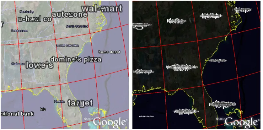
[image:7.595.89.508.284.491.2]
Figure 2: Tag maps in which words are placed at cell centres with GE word culling (left) and without GE word culling (right).
Figure 2 shows two tag maps in which the words are placed at the cell centres for which they are locally important (the cells are generated by the gridding procedure, section 1.2). All the important words were supplied in the KML for both maps and all of these can be seen in the illegible tag map in Figure 2 (right). Figure 2 (left), however, is legible because the majority of words are not displayed, having been removed by Google Earth’s word culling.
The words in Figure 2 have been specified using the two different methods shown in Box 1. Both methods use exactly the same input data and both describe the words in KML
Placemarks. However, in Figure 2 (left), words are specified in the Placemark through the name element, with the Icon element suppressed in the IconStyle element. Google Earth
centres the word on the position of the Placemark (specified by the Point element of Geometry) and formats the text according its LabelStyle (if the Scale element has a
value of 1, it is of ‘normal’ size). For Figure 2 (right), a graphical image and size of the word is specified in the IconStyle, and no text is specified for the name element. Google Earth
centres the image of the word at the IconStyle size at the required position.
right), which result in poor ‘label visibility’ in van Dijk et al’s (2002) definition. In the former case, Google Earth employs an algorithm for culling all the words that would make the map illegible. As can be seen in Figure 2 (left) this is very helpful from a label visibility perspective. The way in which the cull achieved is undocumented, leading to concerns about a possible and unknown bias in the sample of words chosen for display by Google Earth that would ultimately affect the interpretation of the datasets being explored. We will refer to these two methods as “with GE word culling” and “without GE word culling”, and compare both methods for a number of word positioning experiments to try and understand Google Earth’s culling algorithm and also to explore issues of word placement for tag maps.
[image:8.595.91.505.333.544.2]In Figure 2 (left), it is apparent that a small amount of word overlap is allowed – it appears that there is a geometrical area overlap threshold, below which word overlap is allowed. In this Figure, there is a bias in selection of the words that Google Earth has selected for display. The largest longest words and the smallest shortest words (e.g. the large “domino’s pizza” superimposed with the small “ihop”) are favoured. Words between these two extremes are not shown. This bias is for geometrical reasons, and is problematic on two grounds. Firstly, word length should not affect its likelihood of being displayed and secondly, some of the smaller (less important) words are displayed at the expense of larger (more important) words.
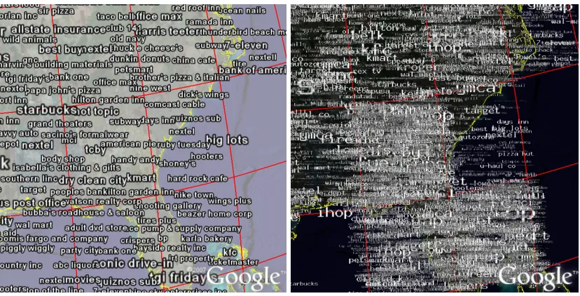
Figure 3: Tag maps in which words are placed at random locations within the cells in which they are important, with GE word culling (left) and without GE word culling (right).
Figure 4: Tag maps in which words are placed at random locations within the cells in which they are prominent with a Gaussian distribution around the cell centres, with GE word culling (left) and without GE word culling (right).
Figure 4 also uses a random distribution, but ensures that there is a Gaussian distribution around the cell centres (this is more obvious in Figure 4, right). This reduces the likelihood of words appearing on cell boundaries, reducing the potential for words to be positioned too far from the original position of the phenomena that they represent – improving the likelihood of a better label-feature association. A word on a boundary of a cell may belong anywhere in the two surrounding cells (four, if a grid intersection).
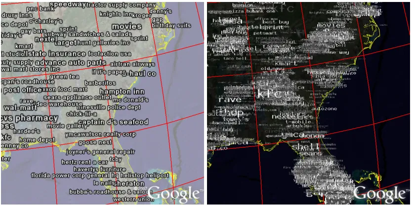
Figure 5: Tag maps in which words are placed at the average positions of the original georeferenced words in the cells in which they are important, with GE word culling (left) and without GE word culling (right).
[image:9.595.89.509.447.656.2]has been reduced (by excluding the oceans), inevitably, more words have been culled. In the trade-off between feature-label association and label visibility, this method favours the former. As is the case in our other examples, the version without GE word culling gives a better indication of the overall distribution, showing where there are higher densities of words. Even though positions are more representative, words tend to be placed towards the centres of cells, due to edge effects. Additionally, where there is a high concentration of many georeferenced words, these are unlikely to become spread out, in the way that was achieved with the random distributions.
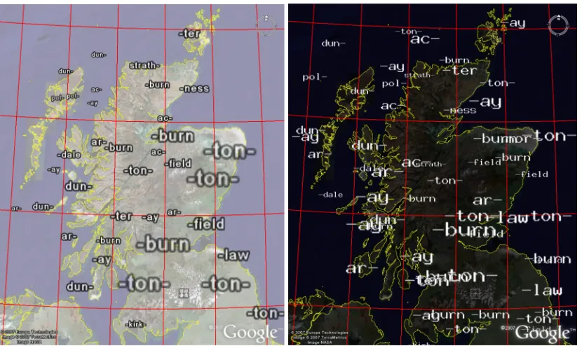
Figure 6: Scottish placename prefixes and suffixes. The top four in each cell have been supplied with GE word culling (left) and without GE word culling (right).
Google Earth’s word culling algorithm made for much more legible maps, but did not necessarily result in appropriate words (in terms of their local importance) being selected for display. Avoiding GE’s word culling algorithm gives us more control for producing static maps. Whilst largely illegible, they helped reveal spatial structures. Legibility can be improved in a number of ways. The following section shows how interactive zooming and panning is one such way. Alternatively we can limit the words supplied for each cell to the most important – this can result in legible tag maps. Figure 6 shows Scottish placename prefixes and suffixes, in which only the four most prominent words for each cell have been supplied (for this example and at this zoom level, four words produced good results). In Figure 6 (left) it is clear that some have been culled. In Figure 6 (right) the maps remain quite readable, even though some of the words overlap.
5.2.
Visual interference with background imagery
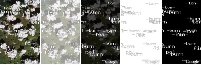
[image:10.595.91.506.207.454.2]Figure 7: Visual interference with background imagery. From left to right: the clouds on the aerial photograph make the overlaid text hard to read. Overlaying the imagery with translucent white, translucent black and opaque white and opaque black may make the text easier to read.
In Figure 7, the white clouds on the aerial photograph make the white text difficult to read. The black overlays make the text much more legible. Where the text is outlined in black, as in Figures 2, 3, 4 and 5 (left), both a black and a white overlay are suitable – white was used because it reproduces better in greyscale.
6.
Cartographic issues for interactive maps
Interactive maps offer further opportunities for presenting detailed information without overloading the map with information.
6.1.
Panning and zooming
[image:11.595.89.501.72.206.2]Google Earth’s word culling algorithm operates dynamically on the input KML files, in response to zooming and panning. As the user zooms in on regions that contain culled words, these words will be gradually be reveal as space becomes available.
Figure 8: Welsh placename prefixes and suffixes (using GE word culling), at various zoom levels from zoomed out (left) to zoomed in (right) according to the red box. Each screenshot uses exactly the same KML (and the same spatial grid resolution).
[image:11.595.87.510.519.612.2]Figure 9: Two views of the same tag map (using GE word culling). The left view is panned North with respect to the view on the right.
Google Earth’s culling algorithm is also highly sensitive to panning. Figure 9 shows the same tag map (using exactly the same KML), but the tag map on the left has been panned northwards compared to that on the left. ‘Domino’s pizza’ and ‘-bread’ is consistent between views, but ‘bally total fitness’, ‘kmart’ and ‘-salon’ are examples of important tags (large text size) that are not visible in the leftmost view.
The fact that the culling algorithm is sensitive to panning suggests that by panning, one can see many different subset collections of words. Exploring the dataset by both panning and zooming allows the user to reveal many more words than are visible on a static map. This may overcome some of the limitations of the static map.
6.2.
Toggleable layers
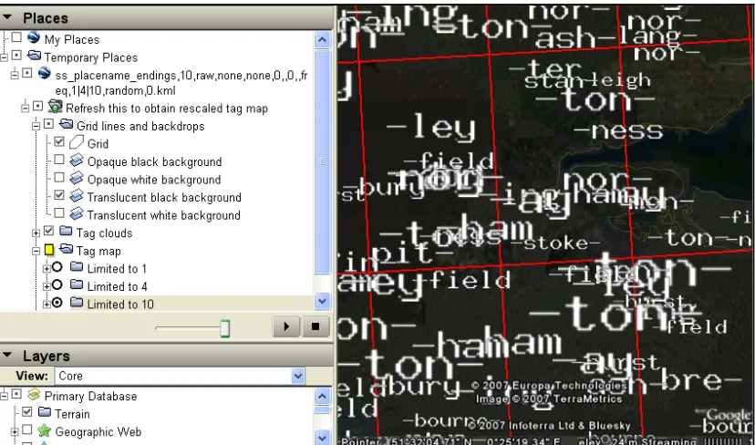
Google Earth is organised around hierarchically-nested layers of information which can be turned on and turned off (apart from the aerial imagery which cannot be turned off, only obscured). Each user-specified KML file appears as a separate layer, which can themselves contain layers (Folders) and items (Placemarks), each of which can be turned on and
Figure 10: Toggleable layers in Google Earth. Notice the user-defined layer from a KML file “ss_placename…”, containing a NetworkLink (labelled “Refresh this…”, the grid (visible), backgrounds to reduce impact of aerial imagery and “Tag map” folder, and with the “limited to…” layers. At the bottom as layers containing Google Earth ancillary data.
This allows cartographic representations to be organised into groups (Folders) which can be shown or hidden, as shown in Figure 10. In Figure 6, we limited the words to the top 4 in each cell. In Figure 10, we have provided the top 1, 4 and 10 words in three separate folders in the same KML, which allows us to easily compare the effects of restricting the words to these numbers. Notice also that we can easily show or hide the grid and the opaque and translucent background images. It is also possible to load multiple KML files, showing and hiding as many as required.
6.3.
Triggering spatially-constrained aware queries from within
Google Earth
Google Earth’s NetworkLink, provides the capability to instigate further queries from within
Google Earth. It allows a particular section of KML (within the NetworkLink) to be
[image:13.595.92.506.70.314.2]Figure 11: Exactly the same geographical area, but with tag maps at different sampling resolutions, generated by refreshing the NetworkLink at two different zoom levels. In the right image, a bubble containing the Placemark description is showing, for a specific localled important word (‘-combe’). Notice the link, which will trigger a tag map containing only ‘-combe’.
The gridding procedure used to produce tag maps, sets the cell widths to a proportion of the visible geographical extent, so the action of, zooming in and regenerating the tag map through the NetworkLink, results in a resampled tag map in which word importance is assessed over
smaller geographical areas (Figure 11). Google Earth is thus a means of conditioning data by geography and selecting (and varying) the spatial scale at which to study the phenomena under consideration.
An alternative way to instigate new queries from within Google Earth is to embed URLs into a Placemark’s free-text description (HTML), as shown in Figure 11 (right). Clicking on
the Placemark will result in the appearance of a ‘bubble’ containing the description text,
which, in this case, contains a URL link. This link (labelled “Click for tag map of –combe” in Figure 11, right) triggers the generation of a new KML file of a tag map for the current geographical extent, which only contains the ‘-combe’ placename ending.
[image:14.595.90.506.69.357.2]6.4.
Inspection
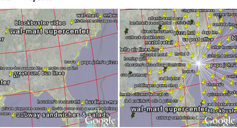
Figure 12: Placemarks have been collapsed into the centres of cells (left). When one is clicked upon, it will ‘explode’ revealing all its contents (right).
Where KML Placemarks with icons are spatially coincident, Google Earth will collapse the Placemarks into a single icon. Where the name element has been supplied, Google Earth
will fit as many labels as it can around the icon. Again, there may be geometrical bias in choice of words shown, as can be seen in Figure 12 (left). As in Figure 2, all the words have been supplied and positioned at the cell centres – the only difference between Figure 2 (left) and Figure 12 (left) is that the Icon has not been suppressed (see Box 1, left, line 3). Figure 12 (right) shows that clicked upon, all the collapsed words are revealed. This approach is similar to that of ‘excentric labelling’ described by Fekete and Plaisant (1999).
The description element of Placemarks and the ‘bubble’ which pops up when the Placemark is clicked upon allows the details of individual words to be inspected (Figure 11,
right).
7.
DISCUSSION
The work on generating usable tag maps for exploration draws attention to a number of characteristics of Google Earth in its current guise that may have an effect on the static and interactive cartography that we generate from it. We structure our discussion of these issues into five sections: the visual interference of background imagery, text placement, text culling, map interaction and the mashup approach.
7.1.
Visual interference of background imagery
7.2.
Text placement
Since the words on a tag map represent summaries of words in entire cells, there is more than one approach to choosing a precise position for words. Using the cell centres was not visually appealing and was problematic because of the overplotting of words. Using a function to spread the words around the cell was more visually appealing and allowed many more words to be displayed. Using a random function worked well, but it was possible that words could be displayed up to a cell’s distance away from the whereabouts of the phenomenon being represented. For this reason, we experimented with a random function that ensured a Gaussian distribution around the cell centres. This reduced the edge effects of the cells, but also reduced the number of words that were visible and results in a grid pattern that might be considered less visually appealing and less aesthetically satisfactory than the other solutions. An interesting combination of the random positioning and Google Earth’s word culling is that it gives a different sample of words each time, though whether or not this is a biased sample is not something that we have determined as yet. Using the average positions of words within the cell is likely to provide the best feature-label association (subject to the edge-effects of the grid sampling), but it often does at the expensive of label-visibility because the words are not usually distributed as widely as with the random positioning technique.
7.3.
Text culling
We greeted Google Earth’s undocumented but effective text culling with mixed feelings. It made our maps legible without us having to intervene, but we were concerned that the method it used may cause bias in the output results. This was partly confirmed by the precedence it gave to large long words and small short words in Figure 2 (left). We were impressed by the dynamic nature of the algorithm though: that when the map was zoomed in, words which were not previously visible, appeared as soon as space was available. The sensitively of the algorithm to panning at the same zoom level was initially disconcerting, but on reflection and with a working knowledge of the effects of this behaviour, we began to use it as a way in which different samples of words could be interactively explored. In a static context, we have demonstrated that the effects are less positive, due to the fact that only a single snapshot sample is shown. We need to understand the word culling algorithm in more detail to know whether the sample was biased in any way.
Standard KML provided us with a way in which to bypass Google Earth’s word culling (by using the graphical images of words as icons in Placemarks) and given us control over what
to show and what not to show. Where all the important words were included in the KML (as in the left of Figures 2, 3, 4 and 5), the maps were unsurprisingly illegible. However, if we limit the words to the n most prominent in each cell as we did in Figure 6 (where n=4), we can produce a legible map, even though there is some word overlap. Using this technique, we can produce tag maps of the most important words. In Figure 10, we illustrated how toggleable layers could be used to limit the number of words in each cell to different amounts, at a click of a button. Section 3.3 also showed that it is possible to provide the means for dynamic queries to be triggered from with Google Earth.
7.4.
Map Interaction
culling is in operation, the action of regenerating the map from Google Earth will produce a different sample of words.
Where GE’s word culling is not in operation and where most words overlap (right of Figures 2, 3, 4 and 5), the map is illegible. However, by zooming into the most crowded areas, they will become less overcrowded as more words leave the field of view.
Interactive maps allow information to be summarised, such that the user can obtain more information in selected areas. The use of Google Earth’s ‘exploding Placemarks’ (Figure
12) are a good example of this. In addition, further information about specific words (such as their importance score) can be added to the description element of Placemarks, so that
the user can inspect the Placemark, using a pop-up window showing this further
information.
7.5.
Mashup approach
We used Google Earth within a ‘mashup’ approach in which a number of tools are selected and combined. Google Earth is an example of a geographical information viewer, of which are others available. The functionality and behaviour of Google Earth is specific to Google Earth (in its current implementation of v4.1.7076.4458, beta). However, some of the techniques and findings presented here are likely to be more widely applicable in other applications, mashups and geobrowsers.
An advantage of using the mashup approach is that developers of the components often respond to user opinion on Internet discussion boards, and updates tend to be more rapid than traditional software products. Since they are usually well-used, there is much help available on the Internet. The file structures for data input and output (often XML-based) are usually simple, because the components are designed to be used alongside other similar components in a system. This makes it relatively easy to substitute a component in a system, because of the loosely-couple architecture. The simplicity and flexibility of KML is demonstrated by our work, which has allowed us to generate useful maps and interfaces to our data with acceptable levels of label visibility and feature-label association, without the need to delve into the lower-level APIs.
There are also disadvantages to using the mashup approach. As we found, aspects of Google Earth’s behaviour were undocumented. The authors have not found any questions, concerns or articles about the algorithm Google Earth employs for text culling, so it is likely that this is highly effective for most Google Earth users. Through experimentation, we have found ways to achieve some of the behaviour we require using standard KML in order to generate static and interactive cartography to meet our requirements.
8.
Applications and future work
Although tag maps are a new and a very specific cartographic representation, we have shown that many of the cartographic issues we discuss are applicable to cartography in general (as illustrated by our use of Dijk et al’s (2002) terminology for the quality of standard cartographic text-placement). Our experiences of dealing with large datasets in cartography, using spatial selection, different scales of spatial sampling and map interactions are also more widely applicable. In other work (Wood et al, 2007), we have shown that that these characteristics make this approach extremely suitable for finding structure in large datasets by facilitating the (relatively) easy generation of novel cartographic representations at different spatial scales.
Although we have found KML to be very flexible, we have three implementation suggestions for KML and Google Earth (albeit, quite specific) which we would find useful. The most simple of these is to add a tag to KML which can turn word culling off, without us having to generate images of the words as Placemark icons. By using this in conjunction with
restricting the number of words per cell, we can produce legible map with which we maintain control. To control word culling more effectively, when it is in operation, we would like to be able to set priority levels for individual Placemarks to control which are more likely to be
culled, so that we can preserve the most important words be more likely to be preserved on the map. This would be useful for other cartographic representations; e.g. the names of larger places should take precedence over smaller places. The most complicated change we suggest is that word-culling be done alongside word position modification – we envisage that this would use some balance between moving the position of a word slightly and removing the word together. Words would only be culled, if they could not be moved anywhere such that the required level of label-feature association was met. This word positioning/culling algorithm would use new specific KML tags within individual placemarks to set moving or
culling priorities and to specify the areas within which the label may be moved. Currently, words are culled when it might be more appropriate to adjust their positions slightly. We would, of course, require this behaviour to be fully documented.
Our work with mashups for the visual exploratory analysis of data is ongoing. We continue to work on new and novel cartographical representation which can be applied dynamically and in response to user actions. For example, we combine tag maps with tag clouds (Slingsby et al, 2007), which shows a geovisualisation view alongside an information visualisation view of the same data for the same geographical extent, revealing the effects of spatial variability. We are also using colour to distinguish words based on other attributes; for example, the language origin of the placename prefixes and suffixes, which form a spatial pattern. We have developed other novel cartographical visualisations using KML and Google Earth; for example, data dials (Wood et al, 2007) which are multivariate graphics showing multiple aspects of data at a particular location. We have also been using Google Earth and KML to explore temporal structure in data.
9.
Conclusion
of graphical images of words in Placemarks. In the context of visualisation, particularly in
the case of interactive maps, we sought maps in which the relationship between feature in our dataset and the labels displayed was more consistent and comprehensive, sometimes at the expense of legibility and aesthetic quality. The flexibility of KML is demonstrated by our work.
Our specific example of a mashup using Google Earth to produce tag maps has revealed a number of issues which are more widely relevant. Firstly, it illustrates the – sometimes surprising – flexibility and opportunities offered by tools such as Google Earth. For example, the relative ease with which data can be dynamically resampled by using intuitive zooming and panning tools for spatial selection, is relevant for many visual representations of spatial data. Secondly, some of the problems with mashups are highlighted, for which users need to be aware. For example, we had concerns about Google Earth’s undocumentated word-culling, and we have shown how if was possible to do a number of systematic experiments to help us understand more about this behaviour and so to produce results which were acceptable to us. The issue of word culling of particular importance for exploratory data analysis, because of the aim to reveal patterns which are not merely artefacts of the means of display; rather they should be patterns in the data which hopefully correspond to patterns in the underlying phenomena.
Acknowledgements
We gratefully acknowledge the support of go2 Directory Systems (http://www.go2.com/) in allowing us access to samples of their spatially referenced query data, Keith Clarke for approach go2 systems for us, the Leverhulme trust, which funded Keith's sabbatical at City University and the helpful remarks and observations of colleagues in the giCentre. Figures are screen shots taken from Google Earth (v4.1.7076.4458, beta, free version), incorporating its ancillary data and aerial imagery from NASA, Europa Technologies, TerraMetrics, Infoterra Ltd & Bluesky and Cnes/Spot image.
References
Adrienko, G. and Andrieko, N. 1999. “Interactive maps for data exploration”. International Journal of Geographical Information Science, Volume 13 (4), pp. 355-374.
Ahern, S., Naaman, M., Nair, R. and Yang, J. 2007. “World Explorer: Visualizing Aggregate Data from Unstructured Text in Geo-Referenced Collections”. In proceedings, Seventh ACM/IEEE-CS Joint Conference on Digital Libraries, (JCDL 07), June 2007, Vancouver, British Columbia, Canada.
Dorling, D. 2007.“Worldmapper: The Human Anatomy of a Small Planet”PLoS Medicine 4 (1)
Fekete, J. D. and Plaisant, C. 1999. “Excentric Labeling: Dynamic Neighborhood Labeling for Data Visualization”. CHI 99: the CHI is the limit, human factors in computing systems, Pittsburgh; PA, New York.
Garrett, J. 2005. “Ajax: A new Approach to Web Applications, Adaptive Path Essay Archive”, http://www.adaptivepath.com/publications/essays/archives/000385.php
Google Inc. 2007b “KML 2.1 Reference”. http://code.google.com/apis/kml/documentation
Harrower, M. 2004, “A Look at the History and Future of Animated Maps”. Cartographica 39 (3), pp 33-42.
Hassan-Montero, Y., and Herrero-Solana, V. 2006. “Improving Tag-Clouds as Visual Information Retrieval Interfaces”, InScit2006: International Conference on Multidisciplinary Information Sciences and Technologies, Mérida, Spain. 2006. Portal: Beyond Data Services”, AutoCarto, Vancouver, WA.
Imhof, E. 1975.“Positioning names on maps” The American cartographer 2 (2), pp128-144.
Jaffe, A., and Naaman, M. 2006. “Generating Summaries and Visualization for Large Collections of Geo-Referenced Photographs”, MIR 2006: 8th ACM SIGMM International Workshop on Multimedia Information Retrieval, Santa Barbara, CA, ACM, 2006.
Kraak, M-J, Brown, A. 2001.“Web Cartography”, CRC Press, ISBN 074840869X
Kraak, M-J. and Maceachren, A. 1999. “Visualization for exploration of spatial data”.
International Journal of Geographical Information Science, Volume 13 (4), pp. 285-287
Merrill, D. 2006. “Mashups: The new breed of Web app”. IBM developerWorks. http://www.ibm.com/developerworks/xml/library/x-mashups.html
Peterson, M.P. 2003. “Maps and the Internet”. Elsevier, 470 pages, ISBN 0080442013.
Robinson, A.H, Sale, R.D., Morrison, J.L. Muehrcke, P.C. 1984. “Elements of Cartography” (5th edition). John Wiley & Sons, New York, USA, ISBN 0-471-09877-9.
Slingsby, A., Dykes, J., Wood, J. and Clarke, K. 2007. “Interactive Tag Maps and Tag Clouds for the Multiscale Exploration of Large spatiotemporal Datasets”, 11th International Conference on Information Visualisation. Zurich, Switzerland.
Wood, J, Dykes, J., Slingsby, A. and Clarke K. 2007. “Interactive visual exploration of a large spatio-temporal data set: reflections on a geovisualization mashup.” IEEE Transactions on Visualization and Computer Graphics, November 2007.