City, University of London Institutional Repository
Citation
: Slingsby, A., Dykes, J., Wood, J., Foote, M. and Blom, M. (2008). The Visual
Exploration of Insurance Data in Google Earth. Paper presented at the GISRUK08, 2 - 4 Apr
2008, Manchester Metropolitan University, Manchester, UK.
This is the unspecified version of the paper.
This version of the publication may differ from the final published
version.
Permanent repository link:
http://openaccess.city.ac.uk/563/
Link to published version
:
Copyright and reuse:
City Research Online aims to make research
outputs of City, University of London available to a wider audience.
Copyright and Moral Rights remain with the author(s) and/or copyright
holders. URLs from City Research Online may be freely distributed and
linked to.
City Research Online:
http://openaccess.city.ac.uk/
[email protected]
The Visual Exploration of Insurance Data in Google Earth
Aidan Slingsby
1, Jason Dykes
1, Jo Wood
1, Matthew Foote
2, Mike
Blom
31
The giCentre, Department of Information Science, School of Computing, City University,
Northampton Square, London, EC1V 0HB, UK
Tel. +44 (0)20 7040 8800
[email protected]; [email protected]; [email protected]
2Willis Research Network, Ten Trinity Square, London, EC3P 3AX, UK
[email protected]
3
Willis Analytics, Ten Trinity Square, London, EC3P 3AX, UK
Tel. +44 (0)20 7488 8111
[email protected]
KEYWORDS: insurance, geovisualization, interactive data exploration, Google Earth, KML
1.
Introduction
The global insurance industry is concerned with the management of financial risk. The distribution and level of potential risk to an individual insurance company is dependent on its portfolio, comprising individual policies, each of which has its own specific terms, conditions and exceptions. In many cases, insurers will look to transfer some or all of the aggregate risk of these policies through a second level of insurance, termed reinsurance. In order to manage and spread their risk, individual insurance and reinsurance companies must each fully understand the composition and spatial distribution of their exposure (the specific objects that they insure) and the potential losses that they might incur. Insurance cover for losses incurred from catastrophic events is a particularly important part of the insurance industry. Catastrophic events and exposure are inherently spatial, yet the availability and use of spatial data and methods for assessing risk in the insurance industry has been inconsistent (BNSC/Infoterra, 2001). The potential for the use of such information is significant, particularly in the areas of underwriting where the location and characterisation of risk (resulting from events such as floods, earthquakes and windstorms) affects the pricing and rating of insurance and catastrophe risk assessment where models are used to estimate the frequency and severity of potential loss for particular portfolios.
Visualization and geovisualization techniques can both complement and help communicate the results of GIS and other analyses in the exploration of multivariate datasets (MacEachren et al 1999; Gahegan, 2005) and may provide insights and solutions for managing exposure and potential loss. Graphical techniques and the use of geobrowsers such as Google Earth1 are also being used in a communicative
role to engage a variety of different audiences within insurance companies with information about policies, exposure and potential losses (e.g. Lloyds, 2005). Such techniques are being used by a huge and growing online community2, have visualization applications in science3 and also provide scope for
geovisualization (Wood et al, 2007). In this paper, we focus on one particular geo-browser, Google Earth, which provides access to a rich array of datasets including aerial imagery, roads, administrative boundaries and photographs and, importantly, allows additional data to be added through the well-documented KML format.
1 http://earth.google.com/ (we are using version 4.2).
Google Earth can be used in three interesting ways. Firstly, its easy to use KML input file format allows anyone to augment Google Earth’s rich datasets with ‘volunteered’ geographical information (Goodchild, 2007). For example, it has been used effectively in relation to catastrophic events (Miller, 2006), widely demonstrating the power of combining datasets spatially to mainstream computer users. Secondly, Google Earth has the flexibility to support a wide range of visual encodings for exploring multivariate spatial datasets; for example, Pezanowski et al (2007) extended the user interface to support complex spatial querying. Slingsby et al (2007a) discuss how cartographic bias in Google Earth can be identified and, at least in some cases, overcome. Finally, its intuitive user interface and the streaming technology it uses to collect data from remote servers, allows spatial data to be disseminated and presented to wide groups of users.
Figure 1: Exposure (plotted as point data) coloured by the building sum insured (see legend), shown with a flooding event with a 500 year return period. Data supplied by Willis Analytics (sums insured are representative only).
In this paper, we provide examples of how Google Earth can be used to interactively explore exposure, catastrophic events and potential loss information to answer questions of relevance to the insurance industry. We hope that some of the ideas presented here will give practical and useful ideas for individuals and organisations working in or with the insurance industry.
2.
Interactive mapping
2.1.
Mapping
A simple but effective means for visually interpreting spatial data is to map it and compare with other spatially-referenced data. KML4 is the XML-based markup language used to import spatial data into
Google Earth. It allows data to be specified as <Placemarks>, each of which has a geometrical description (as points, lines and/or polygons) and a visual appearance (colour, transparency, line thickness, icon). Hypertext descriptions containing further information can be associated and are available on-demand from the Google Earth interface.
Flooding is an example of an event that may be strongly related to potential loss. Mapping exposure with flooding extents and inspecting data for individual data points on-demand may help portfolio
managers evaluate geographical relationships between exposure and potential loss and communicate the complexity and spatial variation of this relationship to others (figure 1).
2.2.
Filtering by attribute
The combination of Google Earth and KML provides the means to encode interactive behaviours for zooming and filtering operations that support Shneiderman’s (1996) “visual information-seeking mantra: overview first, zoom and filter, then details-on-demand” (Wood et al, 2007). As shown in figure 1, KML can be used to specify details-on-demand behaviour through hypertext descriptions. KML can also be used to specify the filtering of data by attribute, by space and by time.
Filtering by attribute can be achieved by using KML to structure the data into a hierarchical set of
<Folders> that reflect the attribute structure. These are displayed in the Google Earth “Places” panel, enabling users to turn on and turn off different levels of the hierarchy. Filtering by different combinations of attribute can be achieved by restructuring the hierarchy.
2.3.
Filtering by space
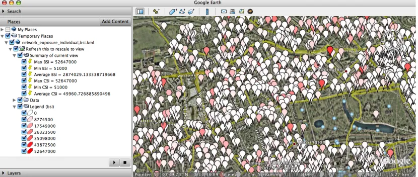
Google Earth and KML can be used to allow a user to spatially select data and retrieve information based on this selection using the <NetworkLink> element. When the user selects data, Google Earth sends the coordinates of the user’s selection back to the server as an HTTP request. These can be interpreted by a server-side script5, which can retrieve spatially relevant results of analyses, encode the
[image:4.595.91.506.436.612.2]results as KML and then return this KML to the user. These may be the results of simple summary statistics or complex GIS or other analyses, run on demand or precomputed.
Figure 2 shows a simple example in which the user selects exposure data by framing it in Google Earth through zooming and panning. The coordinates of the selected area are sent through the
<NetworkLink> to a server-side script that calculates the average, minimum and maximum building
sum insured (BSI) and contents sum insured (CSI) for the selected area. These are returned as KML, and are displayed on the left in figure 2.
Figure 2: User selection of a spatially-constrained subset of data, and its subsequent summarisation (see statistical summary on the left).
5 Perl, ASP, JSP, PHP are suitable server-side scripts which are capable of connecting to databases and
2.4.
Filtering by time
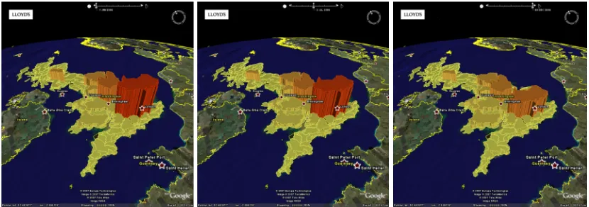
<Placemarks> can be mapped onto a timeline using the <TimeSpan> tag. Where <TimeSpan>
[image:5.595.89.504.188.334.2]tags are present in a KML file, Google Earth displays an appropriately scaled interactive timeline, enabling the user to filter the display of data by time. The timeline can also be “played” allowing temporal structure to be shown through animation. Figure 3 is an example developed and used by Lloyds, in which the timeline is used to show changes in the value of aggregate exposure over the course of a year. Such data can also be presented as symbols, as more appropriate area symbolism than perspective height or as continuous datasets (Wood and Dykes, 2008).
Figure 3: Changes in aggregate exposure by sum insured for flooding areas in 2006 (January, July and December) by UK flooding region (UK Environment agency). Source: Lloyds (used with permission).
2.5.
Comparison with ancillary data
Figure 4: Postcode sectors coloured by average buildings sum insured (normalised by area). Visual comparison with aerial imagery shows that the postcode sector in the upper left is less densely built up than the other postcode sectors, partly accounting for its low aggregate insured value. Data supplied by Willis Analytics (sums insured are representative only).
3.
Spatial aggregation
Patterns in spatial data are scale dependent (Openshaw et al, 1987). However, the aggregation of data also introduces the ‘modifiable aerial unit problem (MAUP)’, where the patterns may be dependent on the units into which points are aggregated, as illustrated in figure 4. The ability to explore spatial data at different spatial scales and units of aggregation is therefore important. Where the data are disaggregated, there is potential to study the stability of patterns across spatial scales.
Google Earth does not provide built-in spatial aggregating functionality (except for collocated point
[image:6.595.91.504.329.429.2]<Placemarks>); however, spatial aggregation can be implemented in a number of ways. It can be performed on demand using a server-side script through the <NetworkLink> as described in section 2.3. Alternatively, multiple aggregations can be precomputed and included in a single KML file grouped either into <Folders> or mapped to the timeline using the <TimeSpan> element. Figure 5 shows the former case, in which the user can select the required spatial aggregation in the “Places” panel. In the latter case, the timeline is used, not to interactively select by time, but to interactively select or “play” (animate) through all the different spatial aggregations.
Figure 5: Four different spatial scales of aggregation (exposure coloured by buildings sum insured) in four different layers. The user can select which layer (spatial aggregation) to view. Data supplied by Willis Analytics (sums insured are representative only).
4.
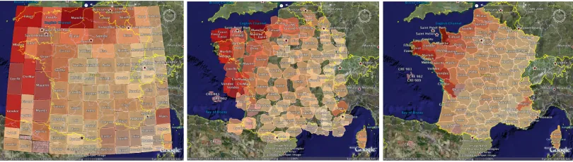
New views of spatial data
[image:6.595.96.501.636.751.2]Figure 6: Rectangular cartogram (squarified) showing CAT model output by French département, sized according to the average potential annual loss and coloured by the standard deviation (left); intermediate stage during transition (middle); map coloured by the standard deviation of annual loss by département (right). Data supplied by Willis Analytics.
Figure 6 (left) shows a squarified (Bruls et al, 2000) rectangular cartogram. Each rectangle represents a French département, sized by potential loss and coloured by the standard deviation estimated by a CAT model for a particular event type and a particular portfolio. Rectangles are as square as possible to enable relative sizes to be compared more easily and they are as close as possible to their true geographical position within the constraints of the squarified cartogram (Wood and Dykes, 2008). The cartogram shows that departments with larger potential losses have higher standard deviations around these losses, and that the highest potential losses and standard deviations tend to be in the North and West with the Alps as an outlier. The map in figure 6 (right) shows the geography most effectively and its relationship to the standard deviation (through colour) but does not show the magnitude of potential loss.
There is some evidence that animated transition is a useful way of relating multiple views of data (Heer and Robinson, 2007). We computed transitional stages between our spatial and semi-spatial views and mapped these to the timeline using the <TimeSpan> tag – as in section 3 – to allow the user to interactively relate these two views of the same data. Figure 6 (middle) shows an intermediate stage of the transition between the two complementary views. It may be useful to use this technique to compare other types of spatial and more abstract graphical representations.
5.
Conclusions, implications and ongoing work
The relationships between the composition of portfolios and the geographies of exposure and potential losses are important factors in decisions about understanding, accommodating and transferring risk. We have shown how KML and Google Earth can be used for geovisualization in the insurance industry to explore these relationships. This may help analysts develop ideas about spatial patterns in data relating to exposure, risk and potential loss and communicate interesting aspects of these data and findings. The examples presented here are indicative of cases where analysts and decision makers are using these technologies to share data and functionality to support their work. The techniques described provide plenty of scope for developing novel and bespoke views and interactions for the visual evaluation and synthesis of a range of data types used in the insurance industry with considerable potential benefit.
6.
Acknowledgements
The authors are grateful to Willis Analytics for funding the Willis Research Network, which makes this collaboration between academia and the insurance industry possible. We are also grateful to Trevor Maynard and Paul Nunn at Lloyds for permission to use their example for figure 3.
References
Andrienko, G.L. and Andrienko, N.V. 1999. “Interactive maps for visual data exploration”. International Journal of Geographical Information Science 13 (4), pp 355-374.
British National Space Centre / Infoterra. 2001. “Analysis of Earth Observation Uptake by the Insurance Sector.” BNSC National Earth Observation (EO) Programme, Sector Studies Programme (BNSC Project OB 3/41/26 – limited access).
Bruls, M., Huizing, K. and Wijk, J.V. 2000. “Squarified Treemaps”. http://www.win.tue .nl/~vanwijk/stm.pdf (accessed, 17th December 2007)
Dykes, J.A. 1998. “Cartographic visualization: Exploratory spatial data analysis with local indicators of spatial association using Tcl/Tk and cdv”. The Statistician 47 (3), pp 485-497.
Gahegan. M. 2005. Chapter 4: “Beyond tools: Visual support for the entire process of GIScience”. Exploring Geovisualization, J. Dykes, A. M. MacEachren and M.-J. Kraak (eds). Elsevier Ltd, 2005.
Goodchild, M.F. 2007. “Citizens as sensors: the world of volunteered geography”. GeoJournal 69, pp 211–22.
Grossi P., Kunreuther H. and Windeler D. 2005. “An introduction to catastrophe models and insurance.” Chapter 2 in Catastrophe Modelling: A New Approach to Managing Risk. Grossi P., Kuntreuther H. (eds), Springer, New York.
Haslett, J., Wills, G.J. and Unwin, A.R. 1990. “SPIDER: An interactive statistical tool for the analysis of spatially distributed data”. International Journal of Geographical Information Systems 4 (3), pp 285-296.
Heer, J. and Robertson, G. 2007. “Animated Transitions in Statistical Data Graphics.” IEEE Transactions on Visualization and Computer Graphics 13 (6), November/December 2007, pp 1240-1247.
van Krevelda, M. and Speckmannb, B. 2007. “On rectangular cartograms”. Computational Geometry 37 (3), pp 175-187.
Lloyds. 2005. “Lloyds uses Google Earth to prepare for the worst”.
http://www.lloyds.com/News_Centre/Features_from_Lloyds/Lloyds_uses_Google_Earth_to_prepare_f or_the_worst.htm (accessed, 21st December 2007)
MacEachren, A.M., Wachowicz, M., Edsall, R., Haug D. 1999. “Constructing knowledge from multivariate spatiotemporal data: integrating geographical visualization with knowledge discovery in database methods”, International Journal of Geographical Information Science 13 (4), pp 311-334
Miller, C.C. 2006. “A Beast in the Field: The Google Maps Mashup as GIS/2.” Cartographica 41, pp 187-200.
Openshaw, S., Charlton, M.E., Wymer, C., Craft, A. 1987 “A mark 1 geographical analysis machine for the automated analysis of Point data sets”. International Journal of Geographical Information Systems 1 (4), pp 335–358
Pezanowski, S., Tomaszewski, B. and MacEachren, A.M. 2007. “An open geospatial standards-enabled Google Earth application to support crisis management”. Joint CIG/ISPRS conference on geomatics for disaster and risk management, Toronto, Canada, Ontario.
Shneiderman, B. 1996. “The eyes have it: A task by data type taxonomy for information visualizations”, Visual languages, Boulder; CO, IEEE Computer Society Press, 1996.
Slingsby, A., Dykes, J., Wood, J. and Clarke, K. 2007a. “Mashup cartography: cartographic issues of using Google Earth for tag maps”. ICA Commission on Maps and the Internet, July/August 2007, Warsaw, Poland. pp79-93.
Slingsby, A., Dykes, J., Wood, J. and Clarke, K. 2007b. “Interactive tag maps and tag clouds for the multiscale exploration of large spatio-temporal datasets”. Information Visualization 07, Banissi, E. (ed), IEEE Computer Society.
Wood, J, Dykes, J., Slingsby, A. and Clarke K. 2007. “Interactive visual exploration of a large spatio-temporal data set: reflections on a geovisualization mashup”. IEEE Transactions on Visualization and Computer Graphics 13 (6), pp1176-1183, November/December 2007.
Biography
Aidan Slingsby is a research fellow at the giCentre, City University London. He is interested in spatial data representation, methods for the visual analysis of large spatio-temporal datasets and computation methods that support this work. He works part time in the Willis Research Network and part time on other projects.
Jason Dykes is a senior lecturer in geographic information at the giCentre, City University London, with interests in developing and using interactive graphics to explore complex structured data sets. Jason has particular interest in the development and evaluation of geovisualization applications and the statistical analysis of spatial pattern.
Jo Wood is a senior lecturer in geographic information at the giCentre, City University London. He is particularly interested in analysing surfaces and hierarchies in applications ranging from geomorphometry to insurance risk. He is the author of the LandSerf GIS and other software packages in Java.
Matt Foote is Research Director of the Willis Research Network (www.willisresearchnetwork.com), an international group dedicated to researching the key issues facing the global insurance industry. He has 20 years experience in remote sensing, GIS and coastal geomorphology with publications in Transactions in GIS, Geomorphology and the Journal of Coastal Research.