City, University of London Institutional Repository
Citation
:
Karampelas, P., Basdekis, I. & Stephanidis, C. (2009). Web user interface
design strategy: Designing for device independence. Paper presented at the 5th
International Conference, UAHCI 2009, 19-24 Jul 2009, San Diego, USA.
This is the accepted version of the paper.
This version of the publication may differ from the final published
version.
Permanent repository link:
http://openaccess.city.ac.uk/15245/
Link to published version
:
Copyright and reuse:
City Research Online aims to make research
outputs of City, University of London available to a wider audience.
Copyright and Moral Rights remain with the author(s) and/or copyright
holders. URLs from City Research Online may be freely distributed and
linked to.
City Research Online:
http://openaccess.city.ac.uk/
[email protected]
Web user interface design strategy: Designing for device independence
Panagiotis Karampelas1, Ioannis Basdekis2, Constantine Stephanidis2, 3
1 Hellenic American University, Athens, Greece
2Institute of Computer Science, Foundation for Research and Technology – Hellas, Greece 3 Computer Science Department, University of Crete
[email protected], {johnbas, cs}@ics.forth.gr
Ref as: Karampelas, P., Basdekis, I. and Stephanidis, C. (2009): Web user interface design strategy: Designing for device independence. In: C. Stephanidis (ed.), Proceedings of the 13th International Conference on Human-Computer Interaction HCI International 2009 July 19-24, 2009, San Diego, CA, USA. pp. 515-524.
Abstract. Until recently, Web services were available only through a desktop web browser. Nowadays, methods of access move beyond the desktop computer towards ubiquitous access through portable devices. As a consequence, users have the chance to interact with a growing diversity of computing devices such as PDAs, smart phones, etc., with diverse characteristics that tend to replace conventional laptop and desktop computers. User interface designers, on the other hand, strive to design usable interfaces to cater for the diverse requirements of these devices. The design strategy proposed in this paper aims at assisting user interface designers in designing for diverse devices recommending a specific line of activities in the process of design. A case study of application of the proposed design strategy is presented, outlining its advantages.
Keywords: User interface design, Device independence, Web accessibility, Prototyping.
1 Introduction
Users nowadays confront with a growing diversity of computing devices that strive for substituting the conventional laptop or desktop computers in any form of everyday electronic activity. Manufacturers, correspondingly, struggle to attract more users for their novel and unique computing devices, often sacrificing design standards for increasing innovation. In such a controversial environment, user interface designers address the challenge of developing user interfaces that comply with the technical requirements of the devices and the desires of the manufacturers, and still remain usable and accessible for all potential users.
In the Human Computer Interaction (HCI) field several techniques have been proposed for producing user interfaces for multiple devices [1]. The existence of such a large number of techniques denotes that none of them is sufficient to address all the emerging design problems. Depending on the diversity of the devices, the business-specific requirements of the application, the user interface designer’s experience, and the project limitations in terms of cost and/or time, the most appropriate or the least problematic technique is usually adopted.
This article proposes a user interface design strategy for addressing the above issues, based on the experience gained in the context of a research project which aimed at the development of a set of electronic services (eServices) for people with disability. The eServices are accessible via the Internet with the use of alternative computing devices such as laptops and mobile devices.
2 Related Work
As mentioned previously, designing for multiple devices is a problem that has engaged researchers’ interest several years ago, when actually the first mobile devices were introduced [1, 2]. The need for different design techniques and approaches from the existing ones, addressing the design of conventional computers, stems from the diverse characteristics of new mobile devices such as smaller displays, limited or absent input devices, slower processors, less memory capabilities and limited power [3]. In addition to the aforementioned limitations, the context of use of such devices comes to add more constraints. The mobility of the user, the lighting of the environment and the attention span the user can devote to the device are some examples of such constraints [4, 5].
One such categorization proposed by W3C1 identifies three categories of techniques: multiple authoring, single authoring and flexible authoring. According to Simon et al. [6], the multiple authoring technique requires the user interface designer to produce a separate user interface which complies with each device’s specific limitations. The single authoring technique, on the other hand, demands one single implementation of the user interface which is automatically adjusted when displayed on a specific device. This can be achieved either by using a device independent toolkit to produce the user interface, or using a markup language to describe the interface and a presentation mechanism to display it, or using model-based user interface design methods. The third category, flexible authoring, is a hybrid methodology combining multiple and single authoring techniques at the designer’s will.
Another classification by Nilsson et al. [7] categorizes user interface design techniques using the model-based methodology again in three classes based on the different design stages. Thus, the first category comprises methods that produce at the design time a user interface for each device, while the second includes the methods that are used to transform the user interface of the application to fit one platform or the other. The third category, according to that classification, allows the user interface to decide automatically when it is necessary to adapt itself and how, based on the device displayed and the context of use.
Discussing the advantages and limitations of the different categories of the aforementioned methods, one can see that no method can be applied universally with the same results. The multiple authoring technique, for example, while providing very well adapted user interfaces, requires the production of as many interfaces as are the devices, with the danger to defeat consistency [6]. Single authoring techniques, on the other hand, offer consistency and uniformity of the generated user interface [1], defeating though simplicity of creation and predictability of the final design, since the design process is most of the times administered by a software component. As will be discussed in the following sections, flexible authoring techniques have the potential to avoid some of the aforementioned limitations, since they combine methods from both other categories.
3 Design Strategy for Device Independence
The proposed approach is built upon the flexible authoring methodology. The method suggests the preparation of different designs for the diverse devices early in the user interface design life-cycle and the implementation of an automatic transformation process that is able to adjust the basic interface components of the user interface designs according to the limitations of each device. The objectives of the developed methodology are to address the most common requirements for a user interface (e.g., easy to learn and remember, efficient, powerful, and flexible [8] as well as accessible).
The proposed methodology includes the following steps:
1. Identify device-specific constraints or capabilities. In this phase the different limitations or features of the computing devices should be identified. The identified characteristics can be organized according to their type. Thus, a typical classification contain:
• Output interaction capabilities such as the screen size of the device, screen resolution, number of colors, speech synthesizer, etc.
• Supported input interaction modes, such as physical or virtual keyboard, size of keys, touch screen, stylus, speech recognition, etc.
• Processing capability, e.g., processor power, memory size, etc.
• Connectivity, e.g., support for different networking protocols such as GPRS, WCDMA, Bluetooth, WiFi (802.11b or g), WiMax (802.16)
• Power supply, e.g., power connectivity, consumption and duration, etc.
2. Identify the context of use for each device. This phase comprises the analysis of the contexts of use for each device. In most cases, the devices are neither used in the same context nor interchangeably. However, there are cases where a user will continue using the same device even if there is the opportunity to use an alternative device with more capabilities. For example, the user comes home from outside and carries a PDA device using a specific application. Even though inside the house there is a computing device with fewer limitations (i.e., larger screen), the user continues working with the PDA device. Thus, in this phase the following issues need to be identified:
• Potential use locations, e.g., outdoor/indoor environment, factory or office environment, etc.
• Condition of use in terms of lighting, noise, etc. (usually related to the use location).
• Parallel activities, e.g., the device is used while working/walking, etc.
3. Select the ‘worst case’ device. The computing device that appears to have the highest number of important limitations against all the diverse contexts of use should be selected in this phase. If in a specific context of use just one device appears to have the most limitations, then the user interface design should be started based on these limitations and context of use. If more than one device appears to have similar limitations but in different contexts of use, then any device can be selected.
4. Design the first user interface prototype according to the device-specific limitations. Using well-established prototyping techniques [11], such as paper and pencil, mock ups, etc., proceed with the development of the first prototype for the selected device.
5. Infer a generic set of requirements based on the first UI design. Specific design requirements can emerge from the first prototype regarding, e.g., navigation, content structure, presentation, accessibility, etc.
6. Design the user interface prototypes for the other devices applying the set of generic requirements. Proceed with the user interface prototype development for the remaining devices taking into consideration the design requirements elaborated in the previous step. Additional design specific requirements may emerge for the alternative devices. These design artifacts can be incorporated and extend the set of the generic requirements.
7. Decide which user interface componentscan be automatically transformed between the diverse computing devices. Upon completion of the user interface prototypes, common components shared among the diverse devices can be identified. The appropriate transformation or adaptation strategy can also be inferred based on the prototypes of the different devices. E.g., if the user interface designs for all the devices are the same, then an automatic transformation should be adopted.
8. Evaluate the user interface prototypes for all the different devices. An appropriate usability evaluation methodology should be selected to identify potential usability problems in the user interface prototypes. The selection of the evaluation method depends upon several factors such as available resources, evaluators with expertise, time to complete the project, etc.
9. Revisit the set of requirements and the prototypes according to the findings. This stage requires an analytical review of the design requirements based on the evaluation findings, as well as a review of the user interface prototypes in order to amend potential usability problem or inconsistencies between the diverse computing devices.
4 Applying the Design Strategy for Device Independence
4.1 Project Description
The proposed design strategy was applied in the context of a project that aims at the development of a set of accessible electronic services for the Greek community of people with disability, and in particular the members of the Greek Association of the Blind. The web application is addressed to registered members and offers a variety of services including short messaging, blogs, news, web email, support for virtual communities and various other useful electronic tools. Most specifically, virtual community support is provided through services such as discussion boards, chat rooms, document areas, members’ management and web links catalogues.
The aforementioned services are targeted to be available over the Internet and optimized for a specific Personal Digital Assistant Mobile Phone, HTC TyTN II, and for any web browser of a conventional desktop or laptop computer. Accessibility is one of the key requirements for the project, since the majority of the target end users are people with disability. Other requirements include the provision of advanced functions for the service administrators (e.g., members’ management).
4.2 Implementation of the Design Strategy for Device Independence
In the performed case study, the design team, comprised of two experienced user interface designers, followed the steps proposed in section 3. The team started collectively working on the individual steps of the strategy as described below:
Step 1: Identification of the device-specific constraints or capabilities.
In this step a comparison table with the identified features was created and the features were characterized as constraints or not (Table 1).
Step 2: Identification of context of use.
The conventional PC was assumed to be used in a well-illuminated home/office environment, with average noise. It was also assumed that the user will be concentrated on a specific interaction task during the use of the system. Regarding the mobile device, the design team considered that it can be used outdoors in diverse light and noise conditions and in parallel with other activities, e.g., commuting, walking, etc.
Based on the previous steps, it was decided that the limited screen size and resolution as well as the limited memory and processing capabilities characterize the mobile device as the one with the most limitations. Taking also into consideration the diverse context of use of the mobile device, it was confirmed that this was the ‘worst case’ device in the specific project.
Table 1. Device-specific features. The features in bold denote device constraints.
HTC TyTN II Conventional PC Screen max resolution 240x320 1280x1024
Screen size 2.8” 19”
Interaction modes Small QWERTY Keyboard Touch screen
Jog wheel
QWERTY Keyboard Pointing device (mouse)
Processor power Qualcomm MSM7200, 400MHz Pentium Compatible Processor >2.0 GHz
Memory 128 Mb 1 or 2 Gbs
Connectivity HSDPA / UMTS / GSM / GPRS / EDGE / Wi-Fi 802.11b/g / Bluetooth 2.0
ETHERNET / Wi-Fi 802.11b/g / Bluetooth 2.0
Power Supply 365 Hours Continuous / 3 Hours
Step 4: Design of the User Interface for the mobile device.
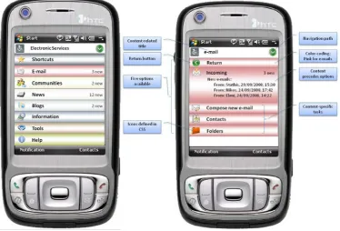
The design of the user interface started using the storyboarding technique for the e-mail service and continued for all the other services (Figure 1).
Fig. 1. Mockup of the main menu and the e-mail services for the mobile device. The identified generic guidelines/requirements have been appended to the mockup
Step 5: Inference of the set of the generic guidelines.
In the user interface prototyping step, several design considerations were generalized and drafted as a set of generic requirements. More specifically, the following generic requirements/guidelines were adopted to rule the overall design of the various user interfaces. The requirements/guidelines are listed below as they were generated, without taking into account priority considerations:
• Respect G. A. Miller’s magical number [9]. List of objects, options, etc. should be limited to 7±2.
[image:5.595.118.493.363.617.2]able to recover from wrong choices easily. Placing the Return button as the first option in all the screens can help users recover from their errors.
• The content should have higher priority than the menu options. Since the majority of the users are people with disability and use assistive technology in order to navigate through the application, the content of the page should be placed closer to the top of the page in order to have fast access and avoid information overloading (e.g., reading the menu again and again).
• Current navigation path (breadcrumb trail) should be available on request. The user should be able to reveal the full navigation path in order to get oriented inside the website if necessary but without overloading user’s memory.
• Skip option should be available for all the group of links. To make navigation faster a skip link will be available for non-visual interaction.
• The icons used should be embedded into the application’s cascade stylesheet. To avoid information overload, e.g., listening the alt image of the icons for people that use assistive technology, all the icons used should be defined in the stylesheets.
• Color coding should be used for all the available services. Since the application comprises different services, for enhancing user orientation, different colors will be used.
• The tasks/options displayed in each page should be content specific. To avoid user confusion, in each page should be allowed only options related to the content.
• The title of each page should be content related. Instead of repeating in each page the title of the application and other information that is irrelevant for completing the tasks presented in each page, only a short descriptive title about the actual content is allowed.
• No conventional options menu should be provided. The application should not have a conventional menu that runs at the top or side of the page. The menu options should appear only on the first page of the application. When a user selects a specific service it is considered that s/he should focus on the available tasks in this service and not be distracted by the other available services.
• A shortcuts mechanism should be available. A user defined list of favorites’ options or shortcuts should be available as the first option for the users to prepare a personalized menu of options. In that way the users will be able to minimize the selections in order to use the most preferable services.
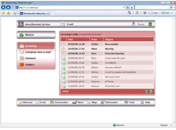
Step 6: Design of the User Interface for the conventional PCs
[image:6.595.120.473.435.696.2]Using the set of the generic requirements/guidelines produced, the design team proceeded with the design of the user interface for the conventional PCs (Figure 2).
Fig. 2. Mockup of the E-mail service for the desktop.
Step 7: Decision upon the common components between the different devices
specific actions in a separate screen and to insert a link in the related content to display these actions. For example, the available options when viewing an e-mail are Reply, Reply to all, Forward, Move and Delete. In the case of the mobile device, instead of displaying all the options along with the text, only an option titled E-mail options will be displayed. When this option is clicked, the list of the aforementioned actions will be displayed.
Another decision that was reached through this phase was the extensive use of pagination in order to fit the content in the small screen of the mobile device.
Step 8: Evaluation of the alternative user interfaces
The evaluation process started when all the alternative user interfaces were designed. The cognitive walkthrough evaluation method [10] was selected and two expert investigators analyzed representative tasks for each service. Based on the feedback of the investigators, several minor corrections to both designs were applied, such as ordering of user defined shortcuts, login procedure, etc.
Step 9: Refinement of the requirements/guidelines and user interface designs
The user interface designs were revisited and the changes suggested were incorporated. There was no need to revise the set of guidelines at this stage. By completing this step, the design strategy for device independence was concluded and the prototypes were delivered to the development team for implementation.
5 Discussion and Future Work
The case study reported in the previous section was a first experimental application of the proposed Design Strategy for Device Independence, providing a test-bed for the usefulness and validity of the overall approach. Since the entire process was completed successfully in less than a month, the conclusion can be drawn that this design strategy can be very cost effective in terms of time devoted to the alternative user interface designs. The method allows for easy inclusion of an unlimited number of different devices, since the user interfaces developed for the computing device with the most constraints can easily be adapted to other devices with more or less constraints. Another advantage of the method is that it allows the designer to fully exploit the device characteristics, defining each time the functionality that cannot be supported in the ‘worst case’ devices. The method can easily be implemented, since the user interface design of the basic components remains unchanged in all devices, and only some limited functionality is rendered in a different way. The components defined while designing the electronic services can easily be reused in other projects with different objectives.
However, some limitations were also revealed through the implementation of the design strategy. First, there may be the risk that a designer limits the functionality of a component in order to achieve the best design for the ‘worst case’ device, For example, in the message board component the hierarchy of the replies was flattened for simplicity. However, this type of trade-offs can sometimes improve the overall usability. For example, the hierarchy of replies in a message can be considered as by design complicated even for desktop computers, let alone mobile devices with small screen. Thus, the design decision to simplify the replies structure also constitutes a better design decision for the desktop user interface.
In the case study presented, the designers had to deal with the design constraints imposed by one device. In case there are more devices with similar limitations, the design strategy seems to perform very well, since designing for the second ‘worst case’ device entails only some additional decisions regarding the transformation of the common components in Step 7 if necessary. All the other design decisions would have been consolidated in the process of defining the design requirements while designing for the ‘worst case’ device. Thus, the user interface design process for the second ‘worst case’ device seems to be more effective and efficient than designing the user interface from the beginning.
The planned usability evaluation of the system under development will contribute to further validate the proposed strategy. If the usability evaluation with real users reveals limited usability problems, then the method will be proved to be very effective. The authors plan to apply the same design strategy in other similar projects with a higher number of devices in order to test its effectiveness and efficiency and to better assess the outcomes.
Acknowledgments. The authors would like to thank Panhellenic Association of the Blind, as the coordinator of the
project “Universally Accessible eServices for Disabled People” for their valuable support. The project is funded by the Greek Government under the 3rd Community Support Framework and the work done will be available at http://www.ameanet.gr.
References
2. Karampelas, P., Akoumianakis, D., Stephanidis, C.: User interface design for PDAs: Lessons and experience with the WARD-IN-HAND prototype. In: N. Carbonell, C. Stephanidis (Eds) User Interfaces for All, LNCS 2615, pp. 474 -- 485, (2003)
3. Ye, J-H., Herbert, J.: Framework for User Interface Adaptation. In: C. Stary and C. Stephanidis (Eds): UI4ALL 2004, LNCS 3196, pp. 167 -- 174, (2004)
4. Lemmela, S., Vetek, A., Makela, K., & Trendafilov, D.: Designing and evaluating multimodal interaction for mobile contexts. In: 10th International Conference on Multimodal Interfaces, pp. 265 -- 272. ACM, New York (2008)
5. Pascoe J., Ryan N., Morse D.: Using while moving: HCI issues in fieldwork environments, ACM Transactions on Computer-Human Interaction. 7, 3 (September), pp. 417 – 437. ACM Press, New York (2000)
6. Simon, R., Wegscheider, F., Tolar, K.: Tool-supported single authoring for device independence and multimodality. In: 7th International Conference on Human Computer Interaction with Mobile Devices & Services, pp. 91 – 98, ACM, New York (2005) 7. Nilsson, E. G., Floch, J., Hallsteinsen, S., Stav, E.: Model-based user interface adaptation. Computer & Graphics, 30, 5 (October),
pp. 692 -- 701. Elsevier (2006)
8. Mayhew, D. J.: Requirements Specifications within the Usability Engineering Lifecycle. In: Sears, A., Jacko, J. (Eds): The Human-Computer Interaction Handbook, 2nd Ed., pp. 917 -- 926, Lawrence Erlbaum Associates (2006)
9. Proctor, R. W., Vu, K-P., L.: Human Information Processing: an Overview for Human-Computer Interaction. In: Sears, A., Jacko, J. (Eds): The Human-Computer Interaction Handbook, 2nd Ed., pp. 43 -- 62, Lawrence Erlbaum Associates (2006)
10.Jordan, P.W.: An introduction to usability. Taylor & Francis Ltd. London, UK (1998)