Theses
Thesis/Dissertation Collections
5-2013
Learn HTML: A refreshingly fun way to learn the
foundations of HTML
Brandon Capp
Follow this and additional works at:
http://scholarworks.rit.edu/theses
This Thesis is brought to you for free and open access by the Thesis/Dissertation Collections at RIT Scholar Works. It has been accepted for inclusion in Theses by an authorized administrator of RIT Scholar Works. For more information, please [email protected].
Recommended Citation
A refreshingly fun way to learn the foundations of HTML
Brandon Capp
MFA Computer Graphics Design School of Design
Committee Chair
Chris Jackson Associate Professor Computer Graphics Design
Signature of Committee Chair Date
Committee Member
Lorrie Frear
Associate Professor Graphic Design
Signature of Committee Member Date
Committee Member
Marla Schweppe Professor
Computer Graphics Design
Reproduction Granted
I, Brandon Capp, hereby grant permission to Rochester Institute of Technology to reproduce my thesis documentation in whole or part. Any reproduction will not be for commercial use or profit.
Signature of Author Date
Inclusion in the RIT Digital Media Library Electronic Thesis and Dissertation (ETD) Archive
I, Brandon Capp, additionally grant to Rochester Institute of Technology Digital Media Library the non-exclusive license to archive and provide electronic access to my thesis in whole or in part in all forms of media in perpetuity. I understand that my work, in addition to its bibliographic record and abstract, will be available to the worldwide community of scholars and researchers through the RIT DML. I retain all other ownership rights to the copyright of the thesis. I also retain the right to use in future works (such as articles and books) all or part of this thesis. I am aware that Rochester Institute of Technology does not require registration of copyright for ETDs. I hereby certify that, if appropriate, I have obtained and attached written permission statements from owners of each third party copyrighted matter to be included in my thesis. I certify that the version I submit is the same as that approved by my committee.
Abstract
Problem Statement
Review of Literature
Websites - General Audience
Websites - Young Audience
Books/Articles
Process
Thesis Parameters
Structure
User Interface
Visual Metaphors and Interactivity
Color Choices
Typography
Code Samples
Usability Testing
Conclusion
Appendix (Proposal)
Bibliography 5
6
7
8
9
10
13
13
14
19
22
37
43
45
49
51
52
Learn HTML is an interactive website with the purpose of teaching foundations of HTML. The website was designed to appeal to a teenage audience, ages 15 - 19 years old. To effectively appeal to and engage the target audience, several design decisions were considered.
The nature of the website diverges away from the typical text based approach utilized in similar applications by abandoning a dependency on the heavy use of text to communicate information. Learn HTML, instead, features a strong use of graphic elements, visual metaphors, and a heavy focus on interactivity, all of which offer the user a visual representation of information.
Through interaction with the provided graphic elements and visual metaphors, the user is offered an enjoyable and engaging learning experience through which they are able to seamlessly gain knowledge through means of experiential learning.
Learn HTML consists of three main sections:
The HTML Elements section of the website exposes the user to foundational HTML elements necessary to build a basic HTML web page. The user is provided with interactive visual representations of important HTML elements, which provide information relevant to each HTML element.
The How Does It Work section of the website offers the user a look at how HTML elements are used to construct an HTML web page. In this section, the user is provided with an interactive side-by-side comparison of a basic HTML web page and the HTML markup used to construct it.
The HTML Quiz section of the website allows the user to test the knowledge that they have gained through their exploration of the previous two sections. In this section, the user must build a basic HTML document correctly utilizing all of the HTML elements covered in the previous two sections.
It is no secret that the world of today is becoming increasingly dependent on and enveloped in technology, specifically the World Wide Web. As of December of 2012, the number of active websites on the World Wide Web was over 630 million, far exceeding the roughly 46 million in December of 2000 (Pingdom). As the World Wide Web rapidly grows in size, so too does the demand for individuals to design, create, and maintain its contents. As a result, many future career opportunities in these fields exist for the young people of today.
Perhaps as a direct result of the rapid growth of the World Wide Web, education in design and design related fields is also on the rise. Education in these fields, however, is no longer limited to higher education and is becoming more common in high school curricula – this became evident after reviewing numerous high school curricula including that of the high school that I previously attended. Taking this into account, it is apparent that designing, creating, and maintaining websites is becoming increasingly relevant and familiar to young individuals. When surveying the available electronic resources commonly used as HTML learning or reference tools, however, it has become apparent that there is a major issue present; these resources fail to successfully address a young audience.
Learn HTML is meant to be a solution to this problem. The overall design of the website aims to appeal to and engage a young, teenage audience. Through the integration of a clean and intuitive interface, graphic elements and visual metaphors, and a strong focus on interactivity, Learn HTML is meant to offer a refreshing and engaging way to learn foundations of HTML.
Diverge away from the text based approach utilized in similar applications Design and create a unique, engaging, and intuitive interface targeted toward a young audience (teenagers ranging in age from 15 - 19)
Utilize a combination of graphic elements and interactivity as a means to communicate information and promote experiential learning
Reduce the amount of information to be communicated, focusing only on the most important foundations of HTML
Provide the user with the necessary skills to create a basic HTML web page
•
•
•
•
•
Before beginning to conduct my research, I first assessed the scope of my proposed project in the hope of determining the most sensible approach to take once I began the research process. Based on the nature of my proposed project, I determined that it was imperative to focus on several different aspects while researching, all of which would be used toward the development of a successful solution to my initial problem statement.
A significant portion of the scope of my proposed project was to address specific issues present in existing electronic resources commonly used as HTML learning or reference tools. In order to successfully address these issues, I found it necessary to further explore and analyze the structure, content, method of delivery, and overall design utilized in these existing electronic resources, specifically sections of these resources focused specifically on teaching foundations of HTML. In doing so, I concentrated my focus on websites with the following two purposes:
Teaching HTML to a general audience
Teaching HTML specifically to a young audience, including children and teenagers
In order to effectively design and create a website that would be successful in both engaging a teenage audience and providing the user with the necessary skills to create a basic HTML web page, I found that it was imperative to utilize several additional resources. These additional resources consisted of supplementary websites and books, all of which were used as a means to assist me in addressing other issues relevant to my proposed project such as:
Designing for a teenage audience
Engaging teenagers through means of interactivity Implementing standard usability practices
Selecting essential foundations of HTML Teaching/communicating foundations of HTML
Websites - General Audience (For additional sources, see page 58)
HTML Dog - http://www.htmldog.com
HTML Dog is an informational and educational website that offers an abundance of resources, all of which relate to the World Wide Web. The resources available on
HTML Dog primarily consist of tutorials and reference tools focused on teaching markup and programming languages such as HTML, CSS, and JavaScript.
Although HTML Dog offers numerous services and resources, I focused primarily on the HTML reference section as it was the most relevant to my proposed project. The HTML reference section is structured and organized in such a way that the user
is able to easily navigate to specific HTML elements. Each of the provided HTML elements has been grouped into a specific category based on their function. These categories include structure, meta information, text, links, etc. The corresponding web pages for each of the available HTML elements provide:
A brief description of the corresponding HTML element, what it is used for, and where it belongs within an HTML document
Both required and optional attributes to be used with the HTML element An example of how the HTML element appears in HTML markup
Although the structure and organization of the HTML reference section is well designed, it seems to lack certain features such as examples of how the HTML markup appears in a browser window. Based on the text based approach utilized in the HTML referencesection along with the amount of information that is provided, it appears as though HTML Dog is directed toward addressing a general audience – the methods implemented do not seem to address a specific demographic or skill level.
My exploration of HTML Dog was used primarily as a means to analyze the structure, organization, and method of delivery utilized in an existing electronic HTML resource/ reference tool. Analyzing such characteristics not only assisted me in structuring and organizing my thesis, but it also assisted me in diverging away from a text based method of delivering information. Through my exploration of HTML Dog, I was also able to determine which HTML elements and concepts are of significant importance and would be useful to include/cover in my thesis.
Summary
Design Analysis
Impact On Thesis
•
•
•
Websites - Young Audience (For additional sources, see page 60)
Lissa Explains It All - http://www.lissaexplains.com
Lissa Explains It All is an informational and educational website that offers an abundance of services and resources, all of which relate to the World Wide Web. The primary objective of the website is to offer “HTML help” to kids and beginners.
Although Lissa Explains It All offers numerous services and resources, I focused primarily on the HTML section as it was the most relevant to my proposed project. The HTML section utilizes “sections” as a method of separating information, with
each section consisting of several topics. The structure that is implemented provides the user with an extremely in-depth and involved assortment of information. The primary objective of the HTML section is to not only educate the user on HTML, but to teach the user how to construct an HTML web page.
The initial section immediately begins to cover a multitude of topics such as setting up a web page and adding a background image to a web page. The following sections quickly transition to covering more advanced topics such as changing the color of text, creating links, creating buttons, and creating forms.
The overall structure, organization, and design of Lissa Explains It All is poor at best. The introduction of information begins at a level that is far too advanced for the target
demographic – it immediately becomes intimidating and overwhelming. The flow of information is also difficult to follow. The lack of hierarchy and design within the provided information creates confusion while attempting to read through it. Overall, the visual design (choice of color and graphics) of Lissa Explains It All somewhat addresses a young audience, however, the website as a whole fails to do so.
My exploration of Lissa Explains It All was used primarily as a means to analyze the structure, organization, and method of delivery utilized in an existing electronic HTML resource/reference tool targeted specifically toward a young audience. Analyzing such characteristics assisted me in determining possible methods to implement, or not to implement, when designing my project. I also focused heavily on analyzing the language used to communicate the provided information to a young audience. Summary
Design Analysis
Books/Articles (For additional sources, see page 56)
Don’t Make Me Think: A Common Sense Approach to Web Usability by Steve Krug
Don’t Make Me Think is an informational and educational book focused on teaching accepted web usability standards. Throughout the book, the reader is educated on how users interact with different aspects of a website and how specific concepts and web practices can be utilized to design and create user friendly websites.
The initial section of Don’t Make Me Think is used as a means to provide a brief overview of the overall mission of the book, as well as secondary information such as the language used throughout the book. The following few chapters serve as an introduction to how users interact with different aspects of a website such as buttons, search bars, and the website’s overall layout. The later chapters employ a more complex focus, covering topics such as how users interact with content (text) and concepts related to how users navigate through the different pages of a website.
Don’t Make Me Think also employs a strong focus and emphasis on implementing user testing while designing and creating a website/web page.
Throughout the entire book, the reader is not only provided with information about accepted web usability standards, but they are also provided with examples and explanations of how this knowledge can be utilized to design and create user friendly websites. Don’t Make Me Think uses a multitude of graphics, charts, comical yet informative drawings, and images to assist in effectively communicating the provided information to the reader.
My exploration of Don’t Make Me Think was used primarily as a means to assist me in designing and creating a user friendly website. With a target audience consisting of teenagers, it was of particular importance to design and create a clean, intuitive, and user friendly interface/website. Through my reading of Don’t Make Me Think, I was able to gain a familiarity with important concepts such as how users interact with different aspects of a website and learn how to utilize this knowledge to design and create a website that is effective in engaging my target audience.
Summary
Books/Articles
Head First HTML with CSS & XHTML by Elisabeth Freeman and Eric Freeman
Head First HTML with CSS & XHTML is an informational and educational book focused on teaching HTML, CSS, and XHTML. The book utilizes a playful approach to teaching through the use of quirky content, images, language, and typefaces.
Although Head First HTML with CSS & XHTML offers an abundance of information covering numerous topics, I focused primarily on the first main section of the book as it was the most relevant to my proposed project (the first section focuses on HTML).
The initial pages of Head First HTML with CSS & XHTML are used as a means to provide a brief overview of the overall mission of the book, as well as secondary information such as the authors, the topics to be covered, and the language used throughout the book. Once the reader arrives at the first main section, they are introduced to basic information including a brief history of HTML and a brief explanation of how the web works.
The majority of the first main section follows a tutorial structure, providing the reader with step-by-step instructions on how to begin writing and creating a basic HTML web page. The tutorial also consists of additional features such as examples, explanations, and areas reserved for answering likely questions pertaining to topics that were recently covered. Visual metaphors are also used heavily throughout the tutorial, which provide effective assistance in communicating the provided information.
My exploration of Head First HTML with CSS & XHTML was used primarily as a means to analyze effective uses of visual metaphors to communicate information. As stated in my original proposal, my thesis required a strong use of graphic elements, visual metaphors, and a heavy focus on interactivity, all of which would be used to visually represent information. Through my reading of Head First HTML with CSS & XHTML, I was able to analyze the use of several different visual metaphors and
determine how well they communicated the related information/concepts. My analyses provided me with important information and inspiration which was used toward developing effective visual metaphors that could be combined with interactivity. Summary
Books/Articles
Teenage Usability: Designing Teen-Targeted Websites by Nielsen Norman Group
Teenage Usability is an informational online article focused on providing a collection of research relating to sevaral different aspects of teenage usability. The research offered in the article was derived utilizing a collection of methodologies including:
Usability testing Field studies Interviews Focus groups
Teenage Usability provides an abundance of useful information, all of which focuses on presenting the reader with insight on how and why teenagers use websites. The provided information/research serves to educate the reader on important
considerations to take when designing websites for a teenage audience. The article consists of several specialized topics such as:
Properly preparing content/language
Age group differences relating to scrolling, patience, etc. Appropriate uses of interactivity
My exploration of Teenage Usability was used primarily as a means to assist me in developing an understanding of how and why teenagers use websites. This article was of particular importance not only because my target audience consists of teenagers, but also because the information provided in the article focuses secifically on topics that are significant to my thesis. Through my reading of Teenage Usability,
I was able to gain a familiarity and understanding of important aspects relating to teenage usability such as the proper implimentation of interactivity and effective content design. The information provided in the article also assisted me in creating a user friendly interface. Overall, the article is an all around usefull resource and provided me with assistance in designing and creating a website that is effective in engaging my target audience.
Summary
Impact On Thesis Title
•
•
•
•
Technical Specs Target Audience Concept Objectives
•
•
•
•
•
After conducting my initial research, I had acquired an abundance of knowledge and familiarity relevant to the issues that I would be addressing through and within my thesis. Through my research, I gained a familiarity with the structures, designs, content, and methods of delivery utilized in existing electronic resources commonly used as HTML learning or reference tools. The knowledge that I had gained through my exploration of the selected electronic resources as well as the selected books and articles also provided me with the ability to select a very refined collection of HTML elements and concepts that would be included/covered in my thesis. At this point in the design process, I was now well prepared to take this accumulation of knowledge and begin to focus on addressing the issues and goals that I had originally stated in my problem statement.
Thesis Parameters
Design and create an educational website targeted toward teenagers (15 - 19 years old) with the purpose of teaching selected basic foundations of HTML. The representation and delivery of the information should rely heavily on the use
of graphic elements, visual metaphors, and interaction as a means to promote experiential learning. The finished thesis should offer a refreshing and engaging way to learn foundations of HTML while providing the user with the knowledge and skills necessary to construct a basic HTML web page.
Diverge away from the text based approach utilized in similar applications Design and create a unique, engaging, and intuitive interface targeted toward a young audience (teenagers ranging in age from 15 - 19)
Utilize a combination of graphic elements and interactivity as a means to communicate information and promote experiential learning
Reduce the amount of information to be communicated, focusing only on the most important foundations of HTML
Provide the user with the necessary skills to create a basic HTML web page
Software Adobe Dreamweaver, Illustrator, and Photoshop
Markup/Scripts HTML5, CSS, and jQuery
Dissemination Available via the World Wide Web
Age Teenagers ages 15 - 19 years old
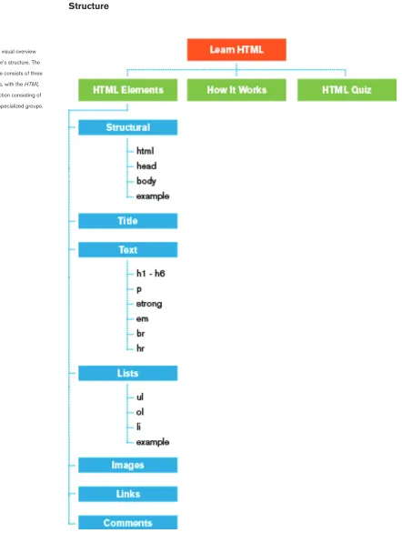
Structure
In order to design and create effective educational media, it is imperative that the media itself employs a specific structure. In order to effectively educate an individual on any given assortment of material, the educational media must utilize three main focuses, which I have adapted and categorized as follows:
Explanation Demonstration Evaluation
These three focuses are derived from common methods of education including lecture, demonstration, and assessment. The educational media’s successful implementation and combination of these three methods is crucial to an individual’s ability to comprehend and retain the material (Kelly, McCain, and Jukes).
While considering initial design decisions, I concentrated on developing a structure that would both allow for a sensible organization of the provided material as well as have the ability to successfully educate the user on the material. After examining the information and concepts that I had determined were necessary to include in my thesis, I decided that the most appropriate approach was to organize the material into several specialized sections, which include:
HTML Elements How It Works HTML Quiz
Organizing the material into these three sections creates the ability to progressively introduce the user to information and concepts, which is crucial to the learning process. Employing this structure also allows for the implementation and distribution of the previously mentioned methods of education, which is outlined below:
HTML Elements (Explanation)
How It Works (Demonstration)
HTML Quiz (Evaluation)
1. 2. 3.
•
•
•
Structure
The HTML Elements section of the website serves to introduce the user to the information and concepts that I determined were the most necessary to include. In this section, the user is exposed to an assortment of important foundational HTML elements. Each of the HTML elements is accompanied by explanations of important components such as the HTML element’s:
Function/purpose Appropriate contents Anatomy (parts)
To further structure the HTML Elements section, the included HTML elements have been categorized into specific groups based on their function/purpose (Fig 1.1). Organizing the HTML elements in such a way allows the user to select and focus on manageable groups of HTML elements that share common characteristics (such as those used for formatting text, creating lists, etc.). The organization of the groups themselves is also significant. The groups are organized as a means to progressively introduce the user to relevant information and concepts, i.e., the initial groups provide basic information while the information present in the later groups becomes slightly more complex/specific.
HTML Elements (Explanation)
[image:16.612.180.541.487.663.2]•
•
•
Fig 1.1
Structure
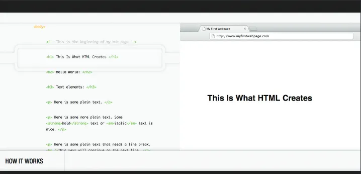
The How It Works section of the website serves to expose the user to the application and implementation of the information and concepts covered in the HTML Elements
section. In this section, the user is presented with a side-by-side comparison of a basic HTML web page and the corresponding HTML markup used to construct it. The provided HTML web page and markup is used as a means to provide an example of the actual application of the material, demonstrating the proper use of all of the HTML elements and concepts first covered in the HTML Elements section. The user is able to interact with and explore this demonstration, which promotes a
further understanding and comprehension of the material.
The overall structure of the provided HTML markup is also significant. The order in which the HTML elements appear in the demonstration mirrors the order in which they appear/are covered in the HTML Elements section (with the exception of the structural elements, i.e., the html, head, and body elements). This assists in further linking the material provided in the How It Works section to that covered in the
HTML Elements section. How It Works
[image:17.612.181.540.440.613.2](Demonstration)
Fig 1.2
Structure
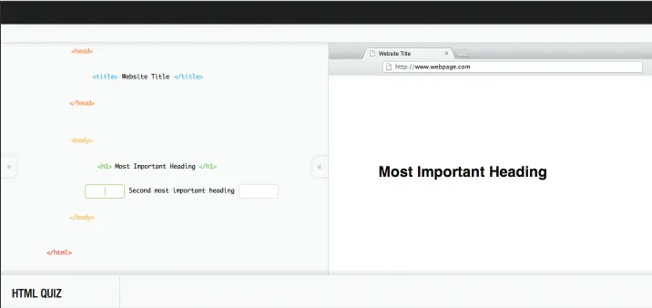
The HTML Quiz section of the website serves as means to assess the user’s ability to comprehend the material both covered and demonstrated in the previous two sections. In this section, the user must exhibit the ability to build a basic HTML web page, correctly utilizing their newly acquired knowledge of important HTML elements, attributes, and concepts. While taking the quiz, the user is presented with one HTML element at a time, in which they are required to fill in the correct opening and closing HTML tags based on the content between the two. Implementing this type of interaction not only increases the user’s familiarity of writing HTML markup, but it promotes a further understanding and comprehension of the material.
The overall structure of the quiz is also significant. The order in which the HTML elements appear within the quiz mirrors the order in which they appear/are covered in the HTML Elements section (with the exception of the structural elements, i.e., the html, head, and body elements). The similarity is even stronger in relation to the
How It Works section. The order in which the HTML elements appear within the quiz is identical to the order in which they appear within the demonstration. This consistency of structures further assists in creating strong associations between the material covered in all three sections of the website.
[image:18.612.180.538.472.641.2]HTML Quiz (Evaluation)
Fig 1.3
Structure
Fig 1.4
User Interface
While beginning to design the user interface, my main objective was to develop a solution that was able to accommodate my gathered material/information and maintain a clean, concise, and intuitive design. Perhaps one of the largest influences on many of my design decisions was an article that I discovered during the research process. Through my reading of Teenage Usability: Designing Teen-Targeted Websites by Nielsen Norman Group, I was exposed to an abundance of information,
all of which relates to several different aspects of teenage usability.
In the article, there is a reoccurring focus on the importance of considering how and why teenagers use websites. Each of the topics covered within the article point to the notion that it is imperative that the overall design, structure, and functionality of a successful website/interface is clean and intuitive (Nielsen, Norman, and Tognazzini).
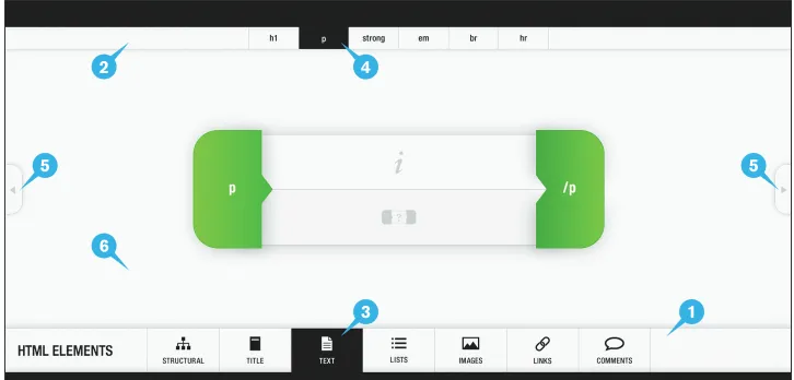
Below is a breakdown of the different components that construct the user interface.
[image:20.612.178.541.403.577.2]The main navigation serves as a means for the user to navigate either within a main section of the website or to one of the other main sections. To assist in maintaining the user’s focus on the main content area, the main navigation resides fixed at the bottom of the screen. Each of the buttons contained within the main navigation (with the exception of the button to the far left of the screen, which is used to navigate through the main sections of the website) provide the user with the name of a group of HTML elements, which is accompanied by an icon. The use of
Fig 2.1
Depicted here is an example of the most commonly occurring layout of the user interface.
5 5
1 2
3 4
6
User Interface
icons serves to offer an additional, visual description of each group of HTML elements, promoting a quick recognition of the type of HTML elements contained within each of the groups.
The secondary navigation serves as a means for the user to navigate within the currently selected group of HTML elements. To assist in maintaining the user’s focus on the main content area, the secondary navigation resides fixed at the top of the screen. Each of the buttons contained within the secondary navigation provide the user with the name of a specific HTML element. Because the secondary navigation contains more focused/specific information than the main navigation, the secondary navigation is smaller in size/importance.
To assist in enhancing the usability of the user interface, the currently selected
group of HTML elements within the main navigation is distinguishable from the
rest, i.e., the button for the current group appears black while all others appear grey. This serves as a means to provide the user with quick and comprehendible feedback
as to which group of HTML elements they are currently viewing.
To assist in enhancing the usability of the user interface, the currently selected
HTML element within the secondary navigation is distinguishable from the rest, i.e.,
the button for the current HTML element appears black while all others appear grey. This serves as a means to provide the user with quick and comprehendible feedback
as to which HTML element they are currently viewing.
The additional navigation serves to enhance the usability of the user interface. The implementation of an additional means of navigation provides the user with the
option to select the most convenient way to navigate through the HTML elements contained within a specific group. To assist in maintaining usability, the additional navigation is only visible when needed.
The area of the screen not utilized by the main and secondary navigation creates the
main content area. The concise design and placement of the main and secondary
navigation allows for the majority of the screen to remain open and free of clutter. Reserving the center of the screen specifically for content assists in directing and maintaining the user’s focus on the most significant and important information. 2.
3.
4.
5.
User Interface
Fig 2.2
Visual Metaphors and Interactivity
While beginning to review the material that was to be included in the website, it became apparent that a significant portion of the website would require a focus on educating the user on the selected HTML elements. Utilizing my gathered research, I determined that it was necessary to employ a focus on educating the user on specific aspects relevant to each HTML element, including each HTML element’s:
Anatomy
Function/purpose Appropriate contents HTML markup
Attributes (where necessary)
With this information prepared, it was my main objective to develop a way in which it could be delivered to the user in an engaging manner. In developing this solution, it was imperative that I remained focused on diverging away from the standard text based method of delivery utilized in other electronic HTML learning/reference tools. With my target audience in mind, I made the decision to develop visual metaphors, in which I could use as a means to deliver the necessary information in a visual and engaging way. In utilizing a visual/graphic method of delivery, I was afforded the ability to combine the delivery of the information with a heavy focus on interactivity, which further supports the overall dynamism of the way in which the user receives the necessary information. Implementing a combination of graphics and interactivity not only creates a more enjoyable learning experience, but it promotes experiential learning, through which the user is able to more easily comprehend the provided information and concepts.
The visual metaphors that were developed primarily appear in the HTML Elements
section of the website. Each visual metaphor utilizes a common graphic appearance and interactivity, although slight variations do exist. These variations serve to
accommodate the different concepts being communicated and include:
Horizontal HTML elements Vertical HTML elements
HTML elements that require the use of attributes A combination of horizontal and vertical HTML elements
Visual Metaphors and Interactivity
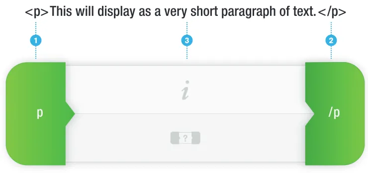
Below is a breakdown of a general visual metaphor for an HTML element, which provides an overview of the different components and how they relate to the actual HTML markup of an HTML element (a paragraph element is used for demonstration purposes and does not hold a particular signifance).
The opening tag signifies the beginning of an HTML element. In the visual
metaphor, the opening tag maintains its place relative to the where it would appear in an actual HTML element (at the far left of an HTML element).
The closing tag signifies the end of an HTML element. In the visual metaphor, the closing tag maintains its place relative to the where it would appear in an actual HTML element (at the far right of an HTML element).
The contents of an HTML element belong between the opening and closing tags. In the visual metaphor, the center section (contents) consists of two halves, each of which serves to provide the user with information relevant to the HTML element (see Fig 3.2 for details). Placing this information between the opening and closing tags assists in reinstating the notion that this is where the contents of an HTML element belong. It is also important to note that, like the buttons in the user interface’s main navigation, the two halves employ the use of icons. The icons assist in reducing the use of text as well as maintaining the clean, minimal design of the visual metaphor. 1.
2.
[image:24.612.174.544.242.416.2]3.
Fig 3.1
Depicted here is an example of how the components of a visual metaphor relate to those of an actual HTML element.
<p>This will display as a very short paragraph of text.</p>
1 3 2
Visual Metaphors and Interactivity
Below is a breakdown of the functionality/interactivity of the center section (contents).
When the user clicks on either the top or the bottom half, the corresponding information relevant to the HTML element is revealed.
The information section provides the user with an explanation of the HTML element’s function/purpose.
[image:25.612.179.545.196.549.2]The contents section provides the user with an explanation of the appropriate contents to be placed between the HTML element’s opening and closing tags.
Fig 3.2
Depicted here is an example of the information and contents sections in their active state.
1.
2.
2 1
1
Visual Metaphors and Interactivity
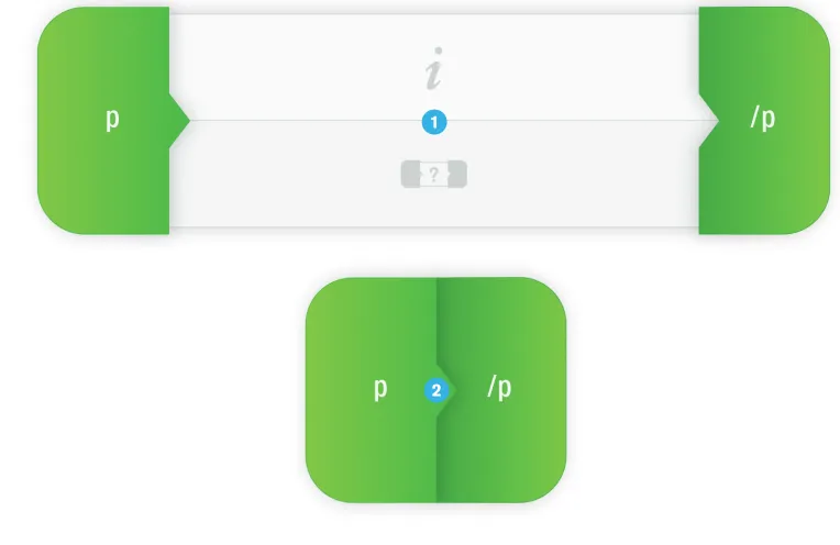
Below is a breakdown of the functionality/interactivity of the visual metaphor as a whole. Implementing the following functionality/interactivity is used as a means to not only provide additional information relevant to the HTML element (see Fig 3.4 for details), but also to re-instantiate the anatomy of an actual HTML element.
When the user clicks on either the opening tag or the closing tag, the HTML element transitions between two states.
The open state is the initial state of the visual metaphor. While the visual metaphor is in this state, the user is able to interact with the center section (contents) to reveal the provided information. The user is also able to hover over the opening and closing tags to reveal additional information (see Fig 3.4 for details).
[image:26.612.163.545.244.492.2]While the visual metaphor is in the closed state, the user is only able to interact with the opening and closing tags. Hovering over either tag reveals additional information (see Fig 3.4 for details) different from that which is revealed when the visual metaphor is in the open state.
Fig 3.3
Depicted here is an example of the two possible states (open and closed) of a visual metaphor.
1.
2.
1
Visual Metaphors and Interactivity
Below is a breakdown of the functionality/interactivity of the opening and closing tags while the visual metaphor is in both the open and closed states. Implementing the following functionality/interactivity is used as a means to not only provide the user with examples of actual HTML markup, but also to re-instantiate the differences between the different components of an HTML element.
When the user hovers over either the opening tag or the closing tag, additional information relevant to the HTML element is revealed.
When the user hovers over either the opening tag or the closing tag while the visual metaphor is in the open state, the additional information provides the user with the
name of the tag accompanied by the appropriate HTML markup of the tag.
When the user hovers over either the opening tag or the closing tag while the visual metaphor is in the closed state, the additional information provides the user with the
[image:27.612.166.541.260.425.2]name of the HTML element accompanied by the appropriate HTML markup of the HTML element.
Fig 3.4
Depicted here is an example of the additional information that is provided in both the open and the closed state of a visual metaphor.
1.
2.
Visual Metaphors and Interactivity
As previously stated (on page 26), slight variations exist between the visual
metaphors that are used to represent HTML elements. These variations are necessary to accommodate the different concepts being communicated. One such concept is the use of attributes with HTML elements. As two of the HTML elements included in the website require the use of attributes to function properly, it was imperative that additional features were developed to effectively communicate this.
As attributes are most commonly placed inside of the opening tag of an HTML element, I developed a simple feature, which was added to the opening tag of the existing visual metaphors where necessary (W3Schools). This addition assists in visually communicating the correct use and placement of attributes as well as educating the user on the specific function/purpose of each of the included attributes.
Below is a breakdown of the functionality/interactivity of the opening tag in a visual metaphor that includes the attribute feature.
When the user hovers over the opening tag, attributes relevant to the HTML element are revealed.
The visual appearance of the opening tag slightly differs from that of the visual metaphors that do not include the attributes feature. This difference in appearance serves to provide the user with feedback, i.e., that an additional feature is present.
The attributes container becomes visible once the user hovers over the opening tag. Provided is a list of attributes relevant to the HTML element. The user has the ability to select any of the provided attributes to learn about their function/purpose. HTML Elements
(With attributes)
1.
[image:28.612.173.556.420.536.2]2.
Fig 3.5
Depicted here is an example the opening tag of a visual metaphor that requires the use of attributes.
1
Visual Metaphors and Interactivity
Below is a breakdown of the functionality/interactivity of the list of attributes and how it relates to the information that is provided within the contents section (the bottom half of the center section, which provides the user with an explanation of the appropriate contents to be placed between the HTML element’s opening and closing tags). The addition of this functionality/interactivity is necessary due to the inclusion of attributes.
The default state is the initial state of the contents section. While in the default state, the user is provided with a general explanation of the appropriate contents to be placed between the HTML element’s opening and closing tags.
Once the user selects (clicks) one of the attributes, the contents section transitions to the updated state. While in the updated state, the user is provided with an explanation of the selected attribute’s function/purpose.
[image:29.612.176.543.277.510.2]It is important to note that other than the mentioned differences, visual metaphors that include the attribute feature possess the exact same functionality/interactivity as all of the other visual metaphors.
Fig 3.6
Depicted here is an example of the two possible states (default and updated) of the contents section of a visual metaphor that requires the use of attributes.
1
2
*
1.
Visual Metaphors and Interactivity
As previously stated (on page 26), slight variations exist between the visual
metaphors that are used to represent HTML elements. These variations are necessary to accommodate the different concepts being communicated. One such concept is the existance of different orientations of HTML elements.
Although most HTML elements utilize a horizontal orientation in HTML markup (as seen represented by the visual metaphors in Fig 3.1 - 3.6), there are several HTML elements that utilize a vertical orientation. As five of the HTML elements included in the website utilize a vertical orientation, it was imperative that a new visual metaphor be developed to accomodate this additional orientation. In developing a solution to this issue, it was also imperative that the new visual metaphor possesed both the same visual appearance and functionality/interactivity as the horizontal visual metaphor.
Below is an example of the visual metaphor that was developed for HTML elements that utilize a vertical orientation (an unordered list element is used for demonstration purposes and does not hold a particular signifance).
The visual metaphors that appear in the vertical orientation possess the exact same components and functionality/interactivity as all of the other visual metaphors.
[image:30.612.210.506.434.618.2]It also is important to note that none of the visual metaphors that appear in the vertical orientation utilize any additional features, i.e., the attribute feature.
Fig 3.7
Depicted here is an example of a visual metaphor for an HTML element that utilizes a vertical orientation.
HTML Elements (Vertical orientation)
*
Visual Metaphors and Interactivity
Several areas of the website required the implementation of a specialized approach in order to successfully engage the user and effectively communicate important information and concepts. One such concept relates to both the combination and proper use of specific HTML elements such as:
HTML Head Body Lists
In attempting to communicate the necessary material, I developed a solution consisting of what I refer to as interactiveexamples. The interactive examples are used as a means to introduce the user to concepts including nesting HTML elements and the appropriate structure that specific nested HTML elements should utilize. Through the interaction with the different components of the interactive examples,
the user is provided with the ability to explore a visual representation of the these concepts, which assists in elaborating how the included HTML elements are used. To further assist in the effective delivery of the information/concepts, the interactive examples utilize the same visual metaphors that are used to educate the user on the included HTML element’s function/purpose and appropriate contents.
[image:31.612.180.540.505.677.2]Interactive Examples
Fig 3.8
Depicted here is an example of an interactive example consisting of nested HTML elements.
Visual Metaphors and Interactivity
Below is a breakdown of the functionality/interactivity of an interactive example.
The left side of the screen consists of a scaled down version of a group of nested HTML elements, which provides the user with a full view of the entire group.
The right side of the screen consists of a full scale version of the group of nested HTML elements, which provides the user with a focused view of the currently selected area.
The user has the ability to click and drag the magnifier vertically, selecting which area of the group of nested HTML elements they would like to focus on. As the user drags the magnifier, the HTML elements on the ride side of the screen scroll respectively.
The currently selected HTML element is the HTML element that appears underneath the magnifier’s viewport. Whichever HTML element the user chooses to focus on will appear at full opacity in the center of the screen on the right side.
HTML elements that are not currently in focus will appear at a lighter opacity
[image:32.612.181.541.199.374.2]on the right side of the screen. This serves to remove these HTML elements from focus, assisting in reducing the amount of information present on the screen.
Fig 3.9
Depicted here is an example of an interactive example consisting of nested HTML elements.
3
1 2
5
4 4
1.
2.
3.
4.
5.
Visual Metaphors and Interactivity
It is important to note that the visual metaphors utilized in the interactive examples possess the exact same components and functionality/interactivity as all of the other visual metaphors.
[image:33.612.151.544.231.716.2]It also is important to note that the functionality/interactivity of the visual metaphors on either side of the screen is mirrored on the opposite side of the screen. This serves to further emphasize that the two groups of nested HTML elements (the one on the left side of the screen and the one on the right side of the screen) are in fact the same group.
Fig 3.11
Depicted here is an example of an additional area of the website that utilizes an interactive example.
*
*
Fig 3.10
Visual Metaphors and Interactivity
Below is a breakdown of the functionality/interactivity of the How It Works section of the website.
The left side of the screen serves to hold example HTML markup, which combines to create a simple HTML document.
The right side of the screen serves to hold the output (result) of the example HTML markup. Accordingly, the visual appearance of the right side of the screen is meant to resemble that of a browser window.
The user has the ability to click and drag the magnifier vertically, selecting which area of the HTML markup they would like to focus on. As the user drags the magnifier, the output on the ride side of the screen scrolls respectively.
The currently selected HTML element is the HTML element that appears underneath the magnifier’s viewport. Whichever HTML element the user chooses to focus on will appear at full opacity in the center of the screen on the right side.
[image:34.612.177.542.214.383.2]The output of HTML elements that are not currently in focus will not appear on the right side of the screen. This serves to remove these HTML elements from focus, assisting in reducing the amount of information present on the screen.
Fig 3.12
Depicted here is an example of the How It Works section of the website.
1 2
3
4 4
1.
2.
3.
4.
5.
Visual Metaphors and Interactivity
It is important to note that the overall structure/layout as well as the functionality/ interactivity of the How It Works section of the website is very similar to that of the interactive examples. Implementing familiar elements such as structure and interactivity across multiple areas of the website assists in maintaining a sense of consistency between the different areas. This consistency allows the user to more easily interact with and comprehend the provided material.
[image:35.612.162.540.192.682.2]*
Fig 3.14
Depicted here is an additional example of the How It Works
[image:35.612.181.542.281.441.2]section of the website.
Fig 3.13
Depicted here is an additional example of the How It Works
Visual Metaphors and Interactivity
Below is a breakdown of the functionality/interactivity of the HTML Quiz section of the website.
The left side of the screen serves to hold the quiz questions (the HTML markup), which combine to create a simple HTML document.
The right side of the screen serves to hold the output (result) of the HTML markup. Accordingly, the visual appearance of the right side of the screen is meant to resemble that of a browser window.
The user has the ability to click and drag either of the focus arrows vertically, selecting which area of the quiz they would like to focus on. As the user drags the focus arrows, the output on the ride side of the screen scrolls respectively.
The currently selected question is the quiz question that appears in between the two focus arrows. Whichever question the user chooses to focus on will appear in the center of the screen on the right side.
The answer inputs serve to provide the user with areas where they can enter an answer for each quiz question and are only enabled for the currently active question. The user is able to submit their answer using the Enter key on the keyboard.
HTML Quiz
1.
2.
3.
4.
[image:36.612.180.541.215.385.2]5.
Fig 3.15
Depicted here is an example of the HTML Quiz section of the website.
1
2 4
3 4 3
Visual Metaphors and Interactivity
It is important to note that the overall structure/layout as well as the functionality/ interactivity of the HTML Quiz section of the website is very similar to that of both the interactive examples and the How It Works section. Implementing familiar elements such as structure and interactivity across multiple areas of the website assists in maintaining a sense of consistency between the different areas. This consistency allows the user to more easily interact with and comprehend the provided material.
It is also important to note that upon submitting an answer, the user is provided with feedback as to whether or not the submitted answer is correct. The opening and closing tags display in their appropriate color when a correct answer is submitted and display in black when an incorrect answer is submitted.
*
[image:37.612.180.541.375.550.2]*
Fig 3.16
Depicted here is an additional example of the HTML Quiz
Color Choices
Considering decisions such as selecting appropriate colors to apply to the different components of the website was one of the final steps in my design process. Through the addition of color, I not only hoped to enhance the aesthetic quality of the website, but I also wanted color to assist in educating the user on the provided material.
While initially considering which colors to utilize throughout the website, I primarily focused on exploring and analyzing several websites targeted toward a teenage audience. In doing so, I was provided with the ability to gather insight as to which types of colors are effective in engaging and appealing to teenagers. Through my research, I found that the majority of these websites implement a combination of bright colors and neutrals, such as white or grey. Utilizing this knowledge, as well as that gained while conducting additional research, I was able to begin experimenting with possible color choices.
As previously mentioned, the use of color would not only act as a means to enhance the aesthetic quality of the website, but it would also be used heavily as a means to assist in educating the user on the provided material. To assist in satisfying these objectives, it was imperative that the final color palette:
Engages and appeals to the target audience Works cohesively together
Does not distract from the provided information
Independently directing my focus toward groups of components such as the user interface and the HTML elements (visual metaphors and the HTML markup) further assisted me in developing a color palette that is successful in satisfying all of the objectives listed above.
Color Choices
As previously mentioned, I independently directed my focus toward groups of components of the website while experimenting with possible colors. One such group of components is the user interface. While experimenting with different colors, I decided that the user interface would utilize a neutral color palette, which provided me with the ability to reserve the use bright colors specifically for the HTML elements. Implementing this approach assists in directing the user’s focus away from the user interface and maintaining it on the most significant and important information.
The main content areas utilizes an off-white color. This serves to provide a neutral area in which the most significant and important information can be housed.
The main and secondary navigation bars utilize an off-white color, which is slightly darker than that utilized in the main content area. The currently selected navigation buttons also utilize this same off-white color (for the text and icon).
The top and bottom bars utilize a shade of black. This serves to contrast with the off-whites utilized in other components of the user interface. The text and icons which appear within the main and secondary navigation buttons also utilize this same shade of black.
User Interface
2
3
1
3 2
1.
2.
[image:39.612.181.541.300.473.2]3.
Fig 4.1
Color Choices
While the user interface utilizes a neutral color palette, the HTML elements (visual metaphors and HTML markup) utilize a color palette consisting of bright colors. The application of bright colors is used not only as a means to appeal to and engage the target audience, but it is also used as means to create a high level of contrast against the neutral colors present in the user interface. The colors applied to the HTML elements also serve several functional purposes, which include to:
Further categorize the different types of HTML elements
Create connections between the visual metaphors and HTML markup Assist the user in transitioning between the different sections of the website
As the HTML elements covered throughout the website are represented as both visual metaphors and HTML markup, it was imperative that I developed a method that would assist in creating a connection between the two. The color applied to the opening and closing tags of a specific HTML element are consistent in all three main sections of the website – the color of the opening and closing tags is the same whether the HTML element appears as a visual metaphor or as HTML markup. For example, the color orange was applied to the opening and closing tags of the head element in the HTML Elements section, How It Works section, and the HTML Quiz section of the website. Implementing this consistency assists in establishing a connection between the visual metaphor and HTML markup for each of the HTML elements. This consistency also assists the user in transitioning between the two. HTML Elements
•
•
•
[image:40.612.179.536.536.712.2]1
Fig 4.2
Color Choices
The colors utilized by the opening and closing tags of each of the visual metaphors is consistent with the colors utilized by the opening and closing tags of the corresponding HTML elements as they appears as HTML markup.
1. 1
[image:41.612.113.541.125.550.2]1
Fig 4.3
Depicted here is an example of the How It Works section of the website. The focus is on the color applied to the opening and closing tags of the head element.
Fig 4.4
Color Choices
As previously discussed (on page 19), the HTML elements covered throughout the website are categorized into several specialized groups. With the target audience in mind, I determined that it was necessary to develop additional methods of categorizing the different types of HTML elements, which include HTML elements used for:
Creating the structure of an HTML document
Creating metadata and content (document title, text, images, links, etc.)
The HTML elements used for creating the structure of an HTML document utilize a
warm color palette, which consists of red, orange, and yellow.
The HTML elements that belong inside of the head and body elements, or those used for creating metadata and content, utilize a cool color palette, which consists blue of green.
It is important to note that the opening and closing tags of the visual metaphors utilize a subtle gradient and texture, both of which assist in creating a separation between the graphics (visual metaphors) and the main content area.
It is also important to note that the hover states of the function/purpose and contents icons utilize the same colors that are used in the opening and closing tags of the visual metaphor in which they appear.
1.
2.
•
•
*
*
1
[image:42.612.177.539.292.465.2]2
Fig 4.5
Hex Value #333333
Hex Value #CCCCCC
Hex Value #F1F1F1
Hex Value #FD5F28
Hex Value #CC0000
Hex Value #F79300
Hex Value #F75802
Hex Value #06B4E6
Hex Value #0388D9 Hex Value
#F5C900
Hex Value #F59900
Hex Value #82D130
Hex Value #4CB32F
the colors utilized in the user interface. Each color is accompanied by its hexidecimal color value.
Fig 4.7
[image:43.612.76.546.120.677.2]Typography
While determining which typefaces to utilize throughout the website, it was
necessary to make several considerations. Not only is it imperative that the selected typefaces work well with and support the overall design of the website, but they also need to serve several functional purposes, which include to:
Support the purposes of the different components of the website Accommodate the target audience
Display well on screen
The typeface Helvetica Neue Medium Condensed is utilized throughout both the user interface and the visual metaphors including areas such as the:
Main navigation Secondary navigation Opening and closing tags
Additional information (see Fig 3.4 for details)
This specific typeface was selected for the clean design of the letterforms, which work well with the overall design of the website. As this typeface was selected to apply specifically to text of significant importance, the medium weight of the typeface was chosen. Utilizing the medium weight assists in assigning importance to specific text without making that text too predominant. To further establish a visual hierarchy within the text that utilizes this typeface, uppercase and lowercase letterforms were delegated. The text that appears within the main navigation utilizes all capital letterforms while that in the secondary navigation utilizes all lowercase letterforms. The condensed version of the typeface was chosen to assist in maintaining the
clean design of the website. Like the use of the medium weight, the use of compact letterforms also assists in reducing the predominance of certain text, specifically that which utilizes all capital letterforms.
The typeface Helvetica Regular is utilized throughout the entire website including areas such as the:
Center section (contents) of the visual metaphors Output (result) of example HTML markup
Typography
This specific typeface was also chosen for the clean design of the letterforms, which work well with the overall design of the website. As this typeface was selected to apply specifically to large areas of text, several considerations were made. Given both the educational nature of the website and the target audience, it is imperative that areas of the website that consist of considerable amounts of text appear uncluttered and that the text itself is easy to read (Nielsen, Norman, and Tognazzini). To assist in enhancing both the design and readability of such text, the size of the
text and the line height were both assigned substantial values.
The typeface Monaco Regular was selected to apply specifically to the example HTML present in both the How It Works and HTML Quiz sections of the website. While working on these two sections, it became apparent that the selection of an additional typeface was necessary. The utilization of Monaco is used as a meansto assist in visually separating the HTML markup present in the How It Works and HTML Quiz
sections from all of the other content present on the screen. Monaco is also the most common default typeface used in text editors (software commonly used for writing HTML markup), making it an appropriate selection for this particular application. Monaco
Helvetica Neue
67 Medium Condensed 26ptHelvetica Neue
67 Medium Condensed 18ptHelvetica Neue
67 Medium Condensed 16ptHelvetica Neue
67 Medium Condensed 14ptHelvetica
Regular 16ptMonaco
Regular 14ptFig 5.1
Code Samples
Below are selected samples of the jQuery code used to produce the functionality/ interactivity of different components of the website.
To produce the functionality/interactivity of the center section (contents) of the visual metaphors, variables and if statements are combined with the use of custom
[image:46.612.163.539.214.612.2]functions to check whether or not specific instances are occurring and delegate tasks accordingly. Several jQuery effects are also utilized to create animations and handle the manipulation of specific CSS properties such as background color and height.
Fig 6.1
Depicted here is an example of the jQuery code used to handle the hover functionality/interactivity of the center section (contents) of the visual metaphors.
Fig 6.2
Code Samples
[image:47.612.154.542.109.562.2]To produce the functionality/interactivity of the visual metaphors as a whole, variables and if statements are combined with the use of custom functions to check whether or not specific instances are occurring and delegate tasks accordingly. Several jQuery effects are also utilized to create animations and handle the manipulation of specific CSS properties such as width and margins.
Fig 6.3
Depicted here is an example of the jQuery code used to handle the click functionality/interactivity of the opening and closing tags of the visual metaphors.
Fig 6.4
Code Samples
[image:48.612.150.541.122.550.2]Certain areas of the website implement the use of jQuery plugins to produce specialized functionality/interactivity such as that utilized in the interactive examples. All of the jQuery plugins have been edited/customized to accommodate the specific needs of the areas in which they are used.
Fig 6.5
Depicted here is an example of the jQuery code used to handle the sliding animation utilized in the HTML Elements section of the website (the animation linked to the selection of an item in the secondary navigation).
Fig 6.6
Code Samples
[image:49.612.151.539.112.561.2]To produce the functionality/interactivity of the quiz in the HTML Quiz section of the website, variables and if statements are combined with the use of custom functions to check whether or not specific instances are occurring and delegate tasks accordingly. Several jQuery effects are also utilized to create animations and handle the manipulation of specific CSS properties such as height and position.
Fig 6.7
Depicted here is an example of the jQuery code used to handle the functionality/interactivity of the quiz in the HTML Quiz section of the website.
Fig 6.8
Depicted here is an additional example of the jQuery code used to handle the functionality/ interactivity of the quiz in the
Unfortunately, due to several factors, user testing was not implemented until late in the design process. Although user testing occurred later than I had originally planned, I was still provided with the opportunity to receive feedback regarding the overall effectiveness and usability of the website. The feedback that I received from the implementation of user testing assisted me in making necessary refinements.
In conducting user testing, I determined that it would be beneficial to receive feedback from an abundance of individuals, including both individuals within the target audience and additional individuals of various ages. The main focus of the user testing, however, was maintained on individuals within the target audience.
The main objective of conducting user testing was to gather feedback regarding several important aspects of the website, which include the:
Effectiveness of the utilized method of delivery in educating the user Effectiveness of the utilized method of delivery in engaging the user
Usability of the interface and the different components (such as the visual metaphors) Overall aesthetic quality of the website
Below is a breakdown of the results/feedback gathered specifically from the user testing of individuals within the target audience. Provided are the averages of the gathered ratings, 1 being the lowest possible rating and 10 being the highest.
As previously mentioned, the feedback that I received from the implementation of user testing assisted me in making necessary refinements. One such refinement was the addition of introduction screens to each of the three main sections of the website. Much of the feedback that I received mentioned the user experiencing a slight sense of confusion upon initially arriving at any one of the three main sections. To address this issue, the introduction screens were added, which provide the user
with a brief explanation of the main section that they are about to explore.
•
•
•
•
Effective Delivery of Material
Engaging Delivery of Material
Usability Overall Design
9.1 9.3 9.6 9.5
Results/Feedback
Additional refinements made as a result of the feedback that I received were subtle. One such refinement was the adjustment of specific quiz questions present in the
HTML Quiz section of the website. Much of the feedback that I received mentioned the user experiencing difficulty with the quiz questions involving links and images, even after they had reviewed all of the material provided on the website. To address this issue, the format of these specific quiz questions was edited to require the user to input less information. Another such refinement was the addition of a splash page (a small home page), which provides the user with a brief introduction to the website.
Below are a few of the comments that were gathered from individuals that
participated in the user testing that I administered. The comments were submitted by both individuals within the target audience and additional individuals of various ages.
“I know a little bit about HTML and I think this would be great for a beginner!”
“I like how you can interact with everything. I feel like I could learn HTML using this!”
“Definitely a unique approach. I think that you created an enjoyable way for people to learn about HTML.”
Although the World Wide Web offers an abundance of useful resources focused on educating individuals on HTML, very few of these resources attempt to specifically address a young audience (none of which are successful in doing so). The lack of resources available to young individuals sparked my initial interest in creating an educational website targeted specifically toward teenagers. Combining my passion for design, education, and HTML, I was able to develop Learn HTML; a unique website focused specifically on educating teenagers on foundations of HTML.
My initial objective was not only to create an educational website that would engage teenagers, but to also develop an effective educational tool that delivers the provided material in an innovative and refreshing way. Upon exposing numerous individuals – specifically teenagers – to Learn HTML, it became apparent that I was considerably successful in fulfilling these objectives. Many of the individuals that used Learn HTML mentioned that it is engaging and that it offers an enjoyable learning experience. Despite the brief amount of time allotted to each of the users, many of them were able to achieve relatively high scores on the quiz section of the website, which further supports the overall effectiveness of the utilized methods.
Upon conducting the processes mentioned throughout the previous pages, I feel as though I have developed a unique a