Refining 'State of the art' : graphical user interface redesign for Gallagher's existing digital product the "TSi": Master of Design exegesis
105
0
0
Full text
(2) JOY ROXAS MDES _ Exegesis 2014.
(3) Refining ‘State of the art’ Graphical User Interface redesign proposal for Gallagher’s existing digital product - the “TSi”. Print Ve rsio n J oy Roxas Mast er o f De sign Exe gesis 2 014.
(4) AUTHOR’S NOTE T h i s do cu m e nt h a s l i m i t a t i on s i n r e g ar ds to int er act i o n s w i t h g a l l e r y a n d vi de os - se e M e di a fol d e r. Exe g e s i s i s b e s t ex p er i en c e d on ‘iB o oks’ for m a t - s e e d i s c for i n t e r a c ti ve version.. ii.
(5) We have a do u ble-e dg e d r el a t i on sh ip w ith th e pr o d u cts a n d se r v i ces we u se. They emp ower u s an d fru strate u s; they simpl if y and co mpl i cate o u r lives ; they s ep a rate u s and b ring u s cl oser to geth er. (Garrett, 2011, p. 03).. iii.
(6) Ackn ow l e d ge m e n t s. First and foremost, a big thank you to Tony, Chris, Dan and Julieanna for the supervision throughout this degree. Appreciate all the support and time taken to make this a memorable learning experience. Gallagher Group, Callaghan Innovation, Massey University and Ministry of Business, Innovation and Employment (MBIE) for the scholarship opportunity. Mum, Josh, Kuya, Addie & Papa maraming salamat po for all the love and support. I also want to dedicate this to the following people who have been a part of this journey: Aakash P.. Durgesh P.. Leah E.. Monica B-N.. Agnes C.. Emily C.. Lisa C.. Monica N.. Alexis O.. Inah C.. Manissa G.. Monica T.. Allen O.. Jess C.. Marianne C.. Nelson L.. Angela K.. Kelly O.. Max S.. Rachel E.. Brittany B.. Kelly S.. Maxine O.. Shinji D.. Carina E.. Kieran S.. Michelle M.. Sonya E-W.. Daphne O.. Kyle L.. Mitos M.. Steph I.. And last but not the least, to the big man above for all the guidance, wisdom and strength. Philippians 4:13. first chapter:. Chapter 1 - Introduction iv.
(7) C HAPTER 1. Introduction. In this chapter we explore the following:. 1.. Abstract. 2.. Definitions. 3.. The “TSi”. 4.. Gallagher Group. 5.. Design Background.
(8) 1 Abstract This design research project proposes a new and improved touch. performance and enable strategic farm management decisions - in. screen graphical user interface (GUI) for Gallagher’s on farm animal. the office, in the yard or elsewhere on the farm. The redesign begins. management product - the “TSi”. The re-design concept aims. with a thorough critical analysis of the TSi’s existing GUI,. to develop appropriate design aesthetic treatments, as a. identifying issues involved with information and visual hierarchy of. foundation for a more attractive, intuitive, easy to use graphical. elements such as navigation, buttons, text and graphical icons.. user interface. The intention is to encourage farmers and farm workers to readily engage and exploit the full performance capability of the TSi and to reduce the perceived stigmatism of learning specialist software that requires adopting to new technologies. The design research propose that a GUI enhances the end user experience to create a more desirable and usable product by introducing User Interface (UI) elements and utilising common user scenarios. The research has incorporated end user feedback and co-creative development process with the Gallagher product. The methods and processes used include user observation, rapid prototyping and mind-mapping user journeys through a series of workshops done at Gallagher headquarters (Hamilton) and Massey University (Wellington). These are tested methods and processes used within the field of Human Computer Interaction and User Experience design advocated by academics and theorists such as Don Norman, Jakob Nielsen, Jesse James Garrett and Bill Moggridge.. development and marketing team. The TSi is a revolutionary weigh scale device that allows users to. Key Words: ‘TSi’, State of the art, Graphical User Interface, User. instantly record and access data on individual animals and groups. Interface, User Experience. of animals. This allows farmer’s to critically assess livestock. 6.
(9) 2 Definitions Hu ma n-C o m pu t e r In t er a c t i on ( H C I ) Commonly used in the field of computer science, it is a. Yo u can’t b e g o o d at on e or the ot her, b e go o d at b o th Philip Fierlinger (Head of Design, XERO) on the relationship between UI and UX. discipline concerned with the design, evaluation and implementation of interactive computing systems for human use and is the originating discipline implemented by UX and UI (Hewett, Baecker, Card, Carey, Gasen, Mantei, Perlman, Strong & Verplank, 2009).. Us er E xp e ri en ce ( U X). Grap hi c al Use r In te rfa ce (GUI). UX encompasses all aspects of the end-user’s interaction with. A visual language combining text and graphical elements. the company, its services, and its products. It goes far beyond. that provides a variety of components such as windows,. giving customers what they say they want and explores. menus, icons through intangible representations enabling. seamless merging of the services of multiple disciplines. flexibility and malleability (Moggridge, 2007).. (Nielsen, J., & Norman, D. (n.d.)).. Us er In t e rfa ce ( U I). S ta te of the A r t - The ‘TS i’. UI refers to the visual elements or tools that skin and create an. Refers to the highest level and most modern development. aesthetic that users directly interact with, which is part of the. of a device, technique, or scientific field achieved at a. software system as a whole.. particular time.. 7.
(10) 3 The “TSi” A revolutionary weigh scale device that allows users to instantly record and access data on individual animals and groups of animals, this enables critical assessments on farmer’s livestock performance and strategic farm management decisions - in the office, in the yard or elsewhere on the farm.. 8.
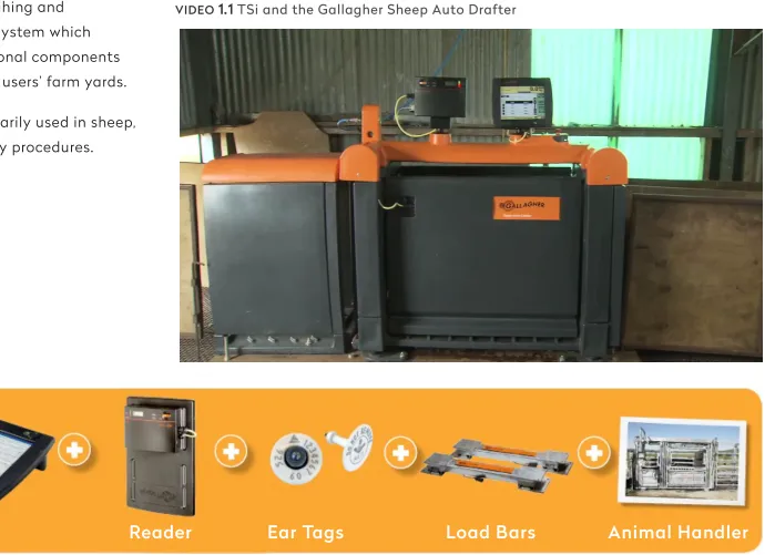
(11) TSi in Co nt ex t The TSi is a key element in. See it in action:. building a weighing and. VIDEO. 1.1 TSi and the Gallagher Sheep Auto Drafter. identification system which requires additional components situated in the users’ farm yards. The TSi is primarily used in sheep, cattle and dairy procedures.. TSi FIGURE. Reader. Ear Tags. Load Bars. Animal Handler. 1.1 TSi weighing and animal identification system 9.
(12) The R e -de si gn. G ALLERY 1.1 TSi Existing Interface Main screen (Collect Screen). This project focuses on the re-design of the existing user interface - software - and not the hardware/ physical product itself. The TSi was introduced to the market in 2007 and has kept the same interface since. Gallagher has employed design thinking towards the TSi’s existing user interface but have not applied graphical design aesthetic and visual communication elements sensitively and effectively. Critical analysis of the existing UI is located in: Chapter 2: Structure - Existing User Interface. 10.
(13) 4 Gallagher Group Gallagher Group is based in Hamilton, New Zealand and has been developing, manufacturing and marketing world leading farming products since the 1930’s. Founded by Bill Gallagher Snr, the inventor of the worlds first electric fence system right on his own backyard in 1938 (Gallagher Overview, 2006). The company turns over $200 million a year in sales from exporting New Zealand made products to 130 countries through 9 majorityowned distribution subsidiaries and 13 associated distributors (Mace, 2012). In 2013, Gallagher celebrated their 75th year designing and delivering innovative solutions to their customers all over the world.. VIDEO. 1.2 Gallagher. Corporate Video (2013). TSi is featured at 02:00 - 02:43 Duration: 11′ 49″. 11.
(14) 5 Design Background My undergraduate studies (BDes Hons) focused on visual communication design through a graphic design practice, but throughout the four years of study an interest in interactive and digital technologies arose. This interest has led to a variety of hybrid experimentations involving design and technology and has led me towards user interface and user experience design. For this masters degree (MDes), my focus is to further refine those skills and apply appropriate UI and UX methods and processes to fulfill the project requirements. Design thinking is an essential ingredient in creating not just beautiful products but even better experiences for the end user. The agriculture industry is no exception, it is the backbone of New Zealand’s economy and a major determinant of employment and social wellbeing in the country (“Agriculture and the New Zealand Economy”, 2013). This in turn has assisted farmers in making better decisions in the field for many years — in this case for Gallagher, it has contributed to 75 years of innovation.. next chapter:. Chapter 2 - Research 12.
(15) C HAPTER 2. Research. In this chapter we explore the following:. 1.. Strategy. 2.. Scope.
(16) 1 Strategy. Th e fo und at i o n o f a s u c c e s s ful u se r exp e ri e nce i s a cl ea rl y a r ti cul at e d st r at e gy. K now i ng b o t h w h a t we wa nt t he p r o du ct t o a c co m p l i sh fo r o ur o r ga n i s at ion and what we wa n t i t t a c c o m p l i s h fo r o u r u se r s informs the d e c i si o ns we h ave t o m a ke a b o ut eve r y a sp e ct of t h e us e r ex p e r i e nce .. Garrett (2011), page 35. 14.
(17) `. Re s e a r c h Q ue s t i o n. Can a new graphical user interface design of Gallagher’s state of the art digital device the ‘TSi’ enhance the end user experience farmers currently have in the field?. 15.
(18) P roj e c t Obj e ct i ve s • Work with TSi specialists and observe farm workers and their environment to develop a comprehensive understanding of the products and problems. This will enable preparation of a requirements specification describing design issues, customer interests and product requirements. • Develop a comprehensive understanding of state of the art for the field of animal management screen-based products and related fields of graphics-based interfaces (hand held readers, weigh scale indicators, etc.) • Incorporate feedback into the final design proposal. • Analyse data and prepare material to communicate findings and establish foundation for design. • Generate, develop and prototype Gallagher specific GUI designs for screen based weigh scale products with specific emphasis on TSI. Undertake user testing to validate and refine design. • Produce design specifications that comprehensively describe final design in terms of graphic treatments, interactivity and usability.. 16.
(19) De si gn R ol e • To understand the current way the company approaches research and development of a product and adapt to this environment. • Explore new avenues with state of the art through a series of critical analysis of the existing GUI and information architecture. • To apply user-centered graphic design aesthetic approaches specifically appropriate for farmers and the farm environment with an emphasis on usability, desirability and experience.. 17.
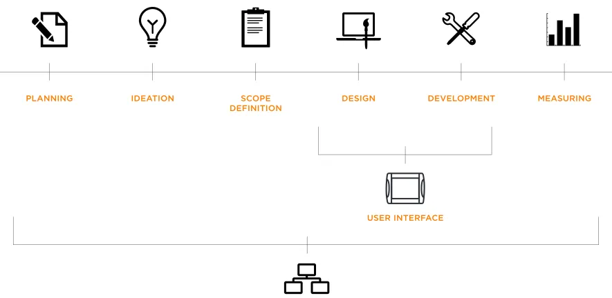
(20) Scal e of Pr oj e ct This task fits under an umbrella within a larger project involving co-creation with the Gallagher development team and. under the discipline of UI design, but for this to be effective a thorough understanding and application of UX methods is. stakeholders, therefore the focus is on proposing a new GUI. needed. User Experience as a discipline and a role encompasses. design that becomes a starting point for the overall redesign of. the whole process relating all those involved in the project and. the TSi. Primarily my task for the project as a designer fits. is an essential foundation for User Interface design.. PLANNING. IDEATION. SCOPE DEFINITION. DESIGN. DEVELOPMENT. MEASURING. USER INTERFACE. FIGURE. 2.1 Project Workflow - UI and UX. USER EXPERIENCE. 18.
(21) Metho ds & P r o ce s s e s The following UI and UX methods were used for this research project and will be explored throughout the exegesis.. FIGURE. 2.2 Methods & Processes used.
(22) Metho d_ U s e r Obse r va t i on Usability specialist Jakob Nielsen suggests using simple methods in practical design situations, including the ‘User and task observation’ technique as part of the “Discount Usability Engineering” method (Nielsen, 1993). This primary analysis requires focusing early on the users, quietly observing (without interference) their actions at their locations (1993, p.18).. 20.
(23) G ALLERY 2.1 Farm Visits with existing customers Common yard setup. Farm Vis it s Farm visits attended in the months of March and May (2013) across the Waikato, Wairarapa and Palmerston North regions were organised with Gallagher. The objectives were to observe the existing customers of the TSi and how it was currently used in the users’ environment..
(24) Over view _ Fa r m Vis it s Observation notes and feedback from the 5 farmer’s observed throughout the 2-day road-trip in May (2013).. Farmer A • Male, mid 40s, Self-taught, mid-high computer literacy • Overall has a great experience with the TSi • Suggests a better page for individual animals. Farmer B • Male, mid 30s, self-taught, young, high computer literacy • Owns a smartphone - ‘Galaxy S4’ • Extensive knowledge on farming management systems • Suggests having a portable companion for the TSi • Suggests smartphone capabilities added to Gallagher products. Farmer C • Male, mid 60s, taught by son, low-computer literacy • Mainly an Angus breeder • Still uses orange notebook (analog) to keep track of information. Farmer D • Male, late 30’s, mid-computer literacy • Owns an old Nokia phone • Has 4 farms. main one covering 300 acres • Uses TSi for sheep, beef and deer weighing • Has owned TSi for 12 months • Requests the latest software • Suggests a timeline feature to compare different weight gains.
(25) • Has never used the TSi manual, learns by trial and error. • “Next logical step is not always obvious”. • Uses the TSi once-twice a week on average. • Has never used the TSi manual. • Prefers to use a pen/pencil rather than fingers with the TSi. • Has difficulty with ‘filtering animal’ feature • Highly analytical approach to tasks. Farmer E. • Suggests adding smartphone capabilities. • Male, mid 40s, advocate, advanced-power user • Has used TSi for 3 Years. Summary. • Previously used Tru-test (competitor) product before the TSi. Most of the farmers visited were young, advance users or at least within range of an assistant that knows how to operate the TSi.. • Weighs around 10,000 Lambs/Year • Has a team of 27yo, 36yo, 70+yo who all use the TSi. Their main uses varies and range from basic weighing to advanced features such as ‘drafting’ showing that the TSi has a complex set of features and is highly customisable to suit the user. The overall. • Weighs Lambs 500 (group) per week • Don’t know enough about system as yet, eager to learn more • Recognises the TSi speed as ”very slow”. review of the product was of high quality and this is primarily due to the fact that there is no direct competitor the the TSi system. There are a lot of suggestions about improving software performance and implementing technologies that are existing and familiar such as mobile technologies which is beyond the scope of. • Owns a smartphone - ‘Galaxy S3’ • Used to high-speed performance with current technologies. this project. There were no minor issues or critiques about the interface itself but it was evident that the issues and concerns voiced were highly dependent on the existing design and structure. • Has a ‘follow your nose’ experience. of the content..
(26) M e tho d _ Use r M a tri xe s Collecting data about the users are very commonly constructed into User Personas (sometimes called user profiles or user models). These are fictional characters that represent the needs of a multitude of real users. They assist in ensuring that the users are constantly in mind during the research and design process (Garrett, 2011) . Although creating personas is a common method used within UX, I wanted to explore a revised process or exercise where the personas were investigated further, focusing mostly on an existing customer base and looking at user behaviours. David Rollert a User Experience Design Consultant and UX strategist Stephanie Troeth suggest that we should design for multifaceted users by looking at modeling user groups through a matrix exercise. Defining key “dimensions” of customer groups through demographic, psychographics attributes and asking key questions such as “What can I use the TSi for?”. Dissecting and filling in as much of the matrix as possible with appropriate answers through an iterative process based on existing knowledge of users, patterns become more evident, keeping in mind that these are still assumptions (Troeth, 2013).. 24.
(27) Ma trix Wo rks h o p In June (2013) a group workshop was led at Gallagher headquarters, introducing and conducting the matrix exercise alongside stakeholders, development and marketing team.. G ALLERY 2.2 Matrix Workshop with Gallagher team Attributes about existing users identified.
(28) Over view _M at r ix Wo r k s h o p The exercise began by instructing the participants to work on the matrixes together as a group, filling in the 9 boxes and answering a variety of questions with existing knowledge of TSi users. Started. • TSi is ultimately TASK-oriented. • TSi is context-ubiquitous. Demonstrating to users outside the agriculture industry could be used as a method of user testing.. off by outlining important axis’ on the whiteboard and testing out the first matrix sheet with chosen dimensions and asking the question: “What can I do with the TSi?”. Then moved on to two more matrixes once the group became more comfortable and familiar with the exercise.. • Products & Services - “people at the shop don’t get it”. How do we educate them/get them excited and comfortable selling the TSi? • The ability to edit someone else’s data, could be an issue. How can we limit/ remove as much human errors so people don’t feel stupid/angry.. Notes • New Zealand has sold 19 TSi’s in the first year, followed by 40 then 80 devices. • There is a need for pre-built example/customisable templates. Summary The exercise was useful in identifying the key attributes and dimensions for the target audience of the TSi. As a group we established that within the existing customer base, the most. • Novice - Experts and Low Tech - High Tech are the main dimensions identified. • Windows CE6 is the operating system the TSi runs on which has no gestural/new touch interface capabilities. • No major changes in the TSi’s hardware besides the change from black frame to orange.. common users were the ‘young and analytical’. Although these are the “ideal” customers for the product, catering the design to accommodate the ‘old and novice’ as well as those who assist in selling the product is also equally important..
(29) 2 Scope. W i th a c l ea r s e n se o f w h a t we want and what o ur use rs wan t , we c a n f i gu r e ou t how t o sat i s fy a l l t h o se s t r a t e gi c o bj e cti ve s. St ra te g y b e c o m e s s c o p e w he n yo u t r ansl at e us er ne e d s an d pr o d u c t o b je c tive s i nt o sp e c i fi c re q ui rem e n t s fo r wh at con t e nt and fun ct i ona l it y t h e p r o d u c t wi l l offe r t o u se r s.. (Garrett, 2011, p. 57). 27.
(30) Exi sti n g U se rs - Ta r ge t A ud i en c e The main customer base of the TSi ranges from a multitude of users from farmers, to breeders and even veterinarians. The existing target market are segmented into the following:. Stud Breeders. Contract Grazier. Dairy Farmer. Commercial Finisher. Commercial Breeder. General Farming.
(31) A nim al Wei gh i n g S y s t em s The TSi is part of Gallagher’s Animal Management System (AMS) division within the line of products in Animal Weighing and is currently the most advanced weighing and data collection system on the market.. Weigh Scale W210. Basic - Clamshell series. Weigh Scale W610. Weigh Scale & Data Recorder W810. TSi. Advance - TSi. 29.
(32) Competition The direct competitor of Gallagher is a company based in Auckland called Tru-Test, who directly deal with a similar line of products as Gallagher. Although they have a vast customer base and are well known, Tru-Test does not have a product that matches the capabilities and features of the TSi. Their most advanced animal weigh scale is the WOW!™ XR3000 and would be the closest competitor to the TSi (“Weigh Scales” 2013).. FIGURE. 2.3 WOW!™ XR3000. FIGURE. 2.4 EziWeigh7 Bluetooth®. One thing that is worth noting about Tru-Test is that they have explored and introduced the use of mobile technologies into their systems. Utilising Android mobile operating systems to link data through to other agriculture sources and networks such as NAIT (National Animal Identification and Tracing). This recognition of mobile technologies is definitely an innovative step for the agriculture industry..
(33) The su m o f a ll con s trai nts. Her e i s one o f th e few effe cti ve key s t o t h e Des ign pr oblem: th e abi li ty of th e Desi gner to r e co g ni se a s ma ny of th e co n strain ts a s p oss ibl e [ .. .] wi lling ness and en thus ias m fo r wor kin g with in these constraints.. Design Q&A with Charles Eames (Wunsch, 2008). 31.
(34) P roj e c t C on st r ai n ts Identifying relevant constraints of the project is the starting point. According to Moggridge (2007) “the constraints come from everywhere that matters to the project” (p.729) and designing with these in mind are crucial. This research project had the following constraints:. Te c h n o l o g y C o n s t r a i n t s. Time Constraints. The touch screen technology of the TSi does not support. 52-week period for the Master’s degree. This project required. multi-touch and gestural interaction which are common. ongoing communication with the clients onsite (Hamilton). features in today’s existing tablet technologies. This creates. and offsite (through email, phone, video conferences) and. particular challenges to overcome that design must. adopting to the schedule of farmer’s when making user. accommodate and create solutions for.. observation and farm visits.. Specifications:. Confidentiality Constraints Due to the competitive environment of product. • Operating System: Windows CE6 • Typefaces used: Arial or Tahoma only • Colours: 18-bit • Screen size: 800 x 600 px with a 12” screen (diagonally). development, the design concepts proposed throughout the project were restricted to the company’s internal staff and academic supervisors, this included user testing and review of the designs..
(35) R is e of U se r In t e r face s In 1993 Jakob Nielsen stated that User Interface Design was a fairly new field of study that hasn’t attracted much historical analysis, due to the fact that people have been preoccupied building and testing those interfaces. 10 years on, it remains true today in regards to documented information and analysis, but the progression in UI design led by tech giants Apple, Google and Microsoft have revolutionised and continually push the boundaries in interaction design.. 33.
(36) “The mother of all demos” Douglas Englebert took the stage in San Francisco on December 19, 1968 demonstrating “The mother of all demos” (Hicks, 2013) by introducing the ‘mouse’ which became the primary method of input for personal computers, this was headlined “The Demo that changed the world” (Moggridge, 2007, p. 30) influencing generation of technologists. This included Alan Kay who introduced the concept of the ‘Dynabook’ which we would recognise as a the first prototype tablet computer. Even though this concept never came into fruition due to technological constraints at the time, it was evident that Englebert sparked a chain of innovative thinking.. VIDEO. 2.1 Douglas Engelbart presents for the first time the. FIGURE. 2.5 Alan Kay’s Dynabook. computer mouse (1968) Duration: 1′ 54″. The earliest signs of GUI was the Xerox Alto, inspired by Kay’s Dynabook concept, the team at Xerox PARC completed a stand-alone, single-user desktop computer which introduced the WIMP interface — windows, icons, menus, pointer. This essentially defined every desktop GUI that is being used today. Desktop metaphors were used for the next 30 years and became a staple visual language for communicating to the user on the other end.. 34.
(37) To u c h I n t e r f a c e G ALLERY 2.3 XEROX Alto and WIMP interface. E.A. Johnson was believed to be the first person to develop. Alto interface showcased a clear navigation system. the touchscreen in 1965 but it wasn’t used for personal computing at this point. It wasn’t until the late 2000s when Apple shook the mobile industry by introducing the first iPhone and touchscreen technology became enticing and commercialised to a widespread audience. With the announcement came a revolutionary interface and operating system at the time called “iPhone OS” which was later known as “iOS”.. VIDEO. 2.2 Steve Jobs introduces the first iPhone (2007). Duration: 10′ 01″. 35.
(38) Although Jobs claimed to have invented “Multi-touch” (with a very public patenting announcement), the technology. G ALLERY 2.4 iPad generations iPad Generation 1. itself began in 1982 at the University of Toronto with computer scientist Bill Buxton who pioneered humancomputer interaction and innovated the multi-touch tablet using capacitive technology (Erickson, 2012). This technology made multitouch pinch-and-zoom, smooth scrolling and gestural interactions a thing of the future, making the whole user experience smooth and swift.. Post-PC In January 2010, only a few years after the iPhone’s introduction, Steve Jobs took stage once again to introduce another consumer electronic device - the iPad.. i Pa d c r e ate s an d d e fi n e s a n e n t i r e l y n ew ca t e g or y of d ev i c e s t h at wi l l con n e ct u se r s w i t h th ei r a p p s a n d co n t e n t i n a m u ch mor e i n t i m a t e , i n tu i ti ve a n d fu n way t ha n eve r b e for e . Steve Jobs (2010). 36.
(39) ‘ S k e u m o r p h i c ’ v. ‘ F l a t d e s i g n ’ As iOS and Apple as a company dominated the technology industry with ongoing product development, so did the design of the interfaces. Apple’s design chief Jonathan Ive known as ‘the. VIDEO. 2.3 Apple introduces iOS 7 (2013) Duration: 7′ 33″. man behind Apple’s magic curtain’ (Cava, 2013) is primarily responsible for leading design development of Apple’s products and even more so with its interfaces. ’Skeumorphism’ emulates objects in the physical world by retaining ornamental design cues from structures that were necessary in the original object.. G ALLERY 2.5 Skeumorphic Design. Recently, Apple took a radical turn away from skeumorphism and followed the path of “flat design” with iOS 7 by replacing leather textures and ripped paper edges with minimalist, colourful and simpler icons. ’Flat design’ is a minimalistic design approach that embraces the digital look and is content-centered. Common features are clean, open space, crisp edges, bright colours and two-dimensional/flat illustrations. Rather than bringing aspects of real life to an interface, this approach illustrates the clear separation between tactile objects and technology.. 37.
(40) Microsoft took a massive leap in 2012 with user interface design by introducing the new operating system with Windows 8 “Metro”, simply relying on typography, spacing and colour and discarding real-life effects and superfluous styles flaunted at the time by their rival Apple (Fadeyev, 2013).. VIDEO. 2.4 Windows 8 Viral Video Ad. Duration: 02’ 47”. The re cently p o pularise d “flat” interface sty le is not merely a trend. It is the manifestation of a desire for greater authenticity in design (Fadeyev, 2013). From desktop metaphors to textured imitations of paper and leather towards flat, digital “authentic” design, user interfaces have developed immensely in the last 40 years. Design and technology are utilised to rapidly weave innovative solutions together to enhance the overall user experience. It is an exciting field to be situated in and although it is a space of ever-changing paradigms, the value and role of UI and UX designers have become more relevant and desirable.. 38.
(41) R el evanc e The TSi was launched in 2007, the same year the iPhone was first. Ideally, the initial thought for this project was to disregard both the. introduced by Apple. Touch-interface technology was not a brand. existing software and hardware and design for what is relevant and. new or an innovative discovery at the time, but commercial value. current. In this case, a TSi application built on a tablet device (ie.. and desirability for personal devices became the topic of interest. It. iPad) for the farming environment with TSi’s features and. would be more relevant to compare the iPad directly with the TSi. capabilities. But this project strictly required that the state of the. as they fit in the same category of ‘tablet devices’. It’s worth noting. art was to be revised and this meant that Gallagher hardware and. that the TSi was released before the iPad and wouldn’t have had. software were non-negotiable. In reality, creating and supporting. the Apple product as a reference for touch interface design. These. the infrastructure needed to support mobile technologies in rural. two products both deal with new avenues of interaction and users. areas is a bigger project in itself and is beyond the scope of this. have to adapt to the bigger real-estate in screen size, perhaps the. research project.. biggest challenge was justifying that these devices were needed in the first place. How can these large, portable touch screens become useful tools for completing and achieving tasks?. The next TSi will be built on Windows CE6, Microsoft’s operating system targeted towards industrial handheld devices (“Windows Embedded”, 2014). Although this system does not support gestural. The TSi was essentially designed by programmers and adding. and multi-touch interactions found in most tablet devices, it. features that users required were the priority as ongoing updates. almost benefits the TSi since it does not necessarily need these. became a constant task for the development team. This has. features to function well and get the job done. The trade-offs. caused a lot of issues with the overall usability and has slowed. between the technology and the design is a challenge but the. down the device’s performance in the long-term. Understanding its. existing approaches and trends in UI design at this time can be. purpose and its limitations from the start is important for the. utilised and applied to the re-design of the TSi. How can we create. product’s longevity and this required design thinking from the very. an advance and modern experience with the new TSi through a. beginning. 6-7 years later the UI has not changed dramatically and. low-tech approach? Playing with skeumorphic and flat design. there’s a lot of room for improvement. This is where appropriate. aesthetic ‘styles’ is a starting point for proposing a new GUI. Even. methods of UI and UX are needed, first to understand what is. without the fancy and exciting gestural interactions and mobile. existing in the state of the art and use this as foundation for the. features, the success of the product truly comes down to the right. new structure and GUI.. techniques in information architecture and ultimately comes down to the experience of the users. 39.
(42) A nal ys is_ E xi st in g Us er I nt e rfac es Critical analysis of existing user intefaces of Apple, Google and Xero as main precedents.. 40.
(43) Apple - (iOS 7) According to the ‘iOS Human Interface Guidelines’ (iOS 7) the. G ALLERY 2.6 iOS6 to iOS7. following themes are crucial for the design: Deference: The UI helps users understand and interact with the content, but never competes with it. Clarity: Text is legible at every size, icons are precise and lucid, adornments are subtle and appropriate, and a sharpened focus on functionality motivates the design. Depth: Visual layers and realistic motion impart vitality and heighten users’ delight and understanding.. Although Apple has set out these strict guidelines for iOS 7, the approach to visual treatment does not manifest the quality of the experience that their previous operating systems have showcased in the past. Apple has never created anything that looked similar to iOS 7 before and this has caused many longtime Apple users to feel blindsided by the bold new look (Epstein, 2013). iOS 7 appears to be a complete departure from the UI found in iOS 6 and earlier builds. Perhaps the choice to completely strip away skeumorphic elements have diluted the interface by confusing conventions with flat icons, transparent backgrounds and bright gradients.. 41.
(44) G o o gl e - P ro du ct s & S e r v i c es In the past 3 years Google services have been moving towards a certain understated elegance. The company has started to embrace the importance of interface design and have introduced clean lines, airy typography, and liberal white space across their many platforms. By rediscovering an old idea of index cards, long-established design practices were used.. G ALLERY 2.7 Google Products - UI GMail app on Android operating system. It’ s no t like we’ ve invente d a new way to organise information [ …] we’ ve ac tually tapp e d into one of the oldest pie ces of graphic and information design ar o und [ …] They all have the s ame emb o diments b e cause they ’ re all refle ctions of a similar set o f design pro blems. (Bohn and Hamburger, 2013). 42.
(45) Google’s cards are plain, minimalist white rectangles, possibly. 2. Elasticity. an epitome of flat modernism, or just a subconscious move away from skeuomorphism. This approach to a cleaner. One of the biggest changes since Google started is the way. interface has changed the way Google simplifies increasingly. that its users are accessing the web. The idea behind. deep information. Google’s cards represent the biggest of data. ‘elasticity’ is to allow users to have a seamless visual. in the smallest of packages.. experience as they transition between different devices.. The new experience introduced by Google is based upon three. 3. Effortless. fundamental design principles: Although the technologies used behind Google and its. 1. Fo cus. products are quite complex, they don’t want to portray this complexity in their design. ‘Effortless’ is about keeping the. To allow the user to focus on the task or job that they want to. look simple, clean and consistent.. get done quickly and easily. This is achieved by removing unnecessary clutter and bringing to the forefront items and. Google has proven that design is an essential part of creating. tools that matter. This is also achieved by simple additions. better user experiences and their existing products and. such as adding bolder colours for call to actions or hiding. services have showcased that even complex and. certain navigation items when they’re not in use.. comprehensive data can be beautiful.. By using these methods Google’s UI is able to help its user subconsciously focus on the task that they are trying to accomplish, alleviating frustration from its user experience.. 43.
(46) Xero - Ac c ou nt i n g S o ft wa re Wellington company Xero has also proven that data can be. VIDEO. 2.5 Xero Touch: The mobile app for Xero accounting software. Duration 2” 00’. beautiful and can be enjoyable to interact with. “Xero is benefiting from seven years and $200m of investment in developing a modern, global accounting platform that is free of legacy. No other new entrant has had comparable resources to create the breadth of platform that Xero has already delivered” (Market Release Commentary, 2013 p.2). G ALLERY 2.8 XERO Software - UI Xero multi-platform on mobile and web (cloud). Xero’s simple interface, when combined with its tools for importing and classifying transactions automatically, make it possible for tedious tasks such as expense transactions to be done with ease. The dashboard on the web provides a simple, graphical view of the organisation’s financial health along with an easy to use navigation structure for drilling down into the supporting data. As well as being on the web, the service is designed appropriately on mobile platforms and user data is all backed up in the cloud. Head of Design at Xero Philip Fierlinger is responsible for advocating design as the main reason for the company’s success, through design thinking Xero has flipped and changed the perception users have about accounting softwares. Boring, tedious tasks have become fun and even addictive. 44.
(47) R el evanc e Apple, Google and Xero all benefit from each others successes and rely on each others services to stay relevant and current. This including software development as well as design approaches they take with user interfaces. Apple and Google both build and design. To u c h S c r e e n U s e r I n t e r f a c e P r i n c i p l e s The following principles must be adhered to when designing the Weighscale Touch Screen User Interface (Thompson & Luck, 2005 p. 1-2).. for each other’s operating systems (iOS and Android). Xero’s mobile applications are also designed for Apple and Google products as well to reach a widespread audience and expand their customer base beyond New Zealand.. 1.. respond when touched) must be at least fingerprint sized and must be spaced at least half a fingerprint apart.. The TSi on the other hand does not directly rely on any of these technologies. Gallagher’s development team have created their own software for the TSi built on a Microsoft product (Windows. 2.. buttons are the same colour and this colour is not used for. ‘APS Office’ which is used to transfer information from the TSi into. read-only text or graphics.]. user’s PC’s. TSi is not currently compatible with Mac operating 3.. fingerprints. Patterned background helps the eye focus on the. principles are all indistinguishable when it comes to designing for. image rather than reflections.. mobile devices and having touch interfaces in mind.. scales touch interfaces such as the TSi. These principles will be essential for the re-design of the new GUI and will be implemented. The touch screen background must use a bright colour and should incorporate a pattern. Reduces glare and hides. Despite the differences in technology and software, design. Gallagher has laid out a set of guidelines when designing for weigh. Interactive areas of the screen must be distinguished from other (read only) areas by a specific colour. [E.g. all touchable. Embedded). This includes an office application for the PC called. systems and do not have mobile applications for iOS and Android.. Interactive areas of the screen (i.e. buttons or options which. 4.. When the user touches any interactive area, they must receive immediate feedback (e.g. output a sound or change the button image to represent the "touched" state).. appropriately to work within the software constraints.. 45.
(48) 5.. The time from touching an interactive part of the screen to. 8.. The entire user interface should use no more than 3 to 4. receiving feedback must be minimised - e.g < 250ms. Unless. colours. Too much colour can make the interface look busy. the response is virtually instantaneous to the user, they will. and detracts from the purpose of distinguishing key items by. find the performance unacceptable and will attempt to redo. their colour.. action. 9. 6.. Red and green should be avoided for items that show meaning. A cursor must not be displayed on the touch screen user. by colour. A reasonable proportion of the male population are. interface. This changes the user's focus from touching the. red/green colour blind.. screen to trying to control the cursor. 10. 7.. Where possible, the position of touchable areas of the screen. The interface should mostly, if not exclusively, require only a. should reduce the amount of the screen obscured by the user's. single touch to activate a function. Double-clicking (or. hand while attempting to activate that button.. double-touching), as well as touch and drag should be avoided. Minimises learning required to use the interface. "Double-click" equivalents are timing dependent, hence harder to learn and repeat. Touch and drag more prone to failure than a single touch.. 11.. The user interface must be consistent - buttons, labels or terms, position of similar data, activation of similar functions should all look and /or behave in the same way throughout the interface. next chapter:. Chapter 3 - Design.
(49) C HAPTER 3. Design. In this chapter we explore the following:. 1.. Structure. 2.. Skeleton. 3.. Surface.
(50) 1 Structure. Aft er t h e r e q u ir e me n t s h a ve b e e n d efi n e d a n d p r io r t i s e d , we ha ve a cl e ar p i c ture o f w h at w i l l b e i n c l u d e d i n t he p ro d u c t. T h e r e q u i r e m e n t s , howeve r, d o n ’t des c r ib e h ow t h e p i e ce s fit to g et h er to fo r m a c o h e s i ve who le .. (Garrett, 2011, p. 79). 48.
(51) E xisting U se r In t e r face This project focuses on the user interface of the TSi and the starting point is to analyse the existing interface and outline the key issues and concerns of existing users.. 49.
(52) I NTERACTIVE 3.1 Critical Analysis of TSi’s existing UI - Main screen (YARD - Collect screen). Layout The main screen is laid out in an inconsistent grid that separates certain elements in sections on the page, but accommodates for too much information in one screen.. GUI Limited use of visual icons, mainly text on buttons. The repeated use of ‘blocky, square’ buttons works to a certain extent, but becomes too overwhelming and confusing. It does not visually guide the user through each stage with the lack of variety in shape and form.. Main Navigation The main. Typography Uses the same font (Tahoma) throughout and varies from regular to bold weights. Colour of type is only black and white (active and inactive states).. navigation is sidebar which allows you to see options for the current session and the animal in session. The interface does not clearly indicate what is navigation and what isn’t due to the repetition of similar graphical elements on the screen.. Colours Yellow, Red and Green are used for buttons and background - White and Black for text and copy. Palette works for the lighting but it doesn’t reflect the brand and doesn’t have enough variety in tone to be able to differentiate between elements on the page.. Buttons Dark red rectangular buttons are throughout the interface, inverted when active and greyed out when state is unusable.. 50.
(53) Over view. G ALLERY 3.1 TSi - Main Screens Options Screen - This is essentially the main menu of the whole system. The TSi’s existing GUI heavily relies on bold typographic buttons and lacks the use of other visual and graphical elements such as icons. This has made the interface very text-heavy and because there is a limited variety in the design of the buttons, it can get confusing for the user to determine which states are active. Language of the TSi is based on older systems and are appropriate conventions to stick with. Lack of a persistent navigation has created a disorganised hierarchy with the content and its very easy for the user to get lost in the tasks and not know how they got there. Variety of window layout and content structure means that users must adapt to each stage and does not allow for customisation or at least an ability for views to change. Inconsistent use of type size and weights as well as visual elements such as checkboxes, scrollbars, etc. have not been carefully considered for legibility.. 51.
(54) Meth o d_ M ap pi n g U s er J our n ey s Understanding each stage of the user flow from screen-by-screen is critical for simplifying the complex capabilities of the TSi. According to Garrett “Information architecture is a new idea, but it’s an old practice — in fact, you could say it’s as old as human communication itself” (2011, p. 88). Information architecture is involved with how people cognitively process data and information of any product and attempts to make sense of this data through its presentation of individual screens.. 52.
(55) Node Structure It is critical to structure the content and organise in accordance. A basic approach to reconstructing and understanding. to a navigation system to allow users to move through the. information architecture is through nodes. This abstraction. content efficiently and effectively. By categorising and finding. allows for explicitly setting the level of detail by simplifying it. common patterns, grouping similar tasks and organising. to the task name itself. Utilising a hierarchical tree structure. principles, user journeys can be simplified. Categories must be. each node has a parent/child linked with related nodes. Each. appropriate to the users (keeping in mind the use of. node will lead all the way up to the main parent node of the. conventions and appropriate metaphors).. entire structure, this approach is best understood by users and because software works with a similar hierarchical structure, this is an appropriate approach to take.. Th e mos t imp o r tan t sign of qual ity [ …] i s n o t how ma ny s tep s th e pr o ces s to ok , but w hether each step mad e s en s e to th e user. (Garrett, 2011, p. 91). FIGURE. 3.1 Structure of nodes. 53.
(56) Exi sti n g Info rm at i o n A r ch i t e c t ur e G ALLERY 3.2 TSi - Existing structure (snippets). 54.
(57) M a p p i n g Wo r k s h o p s & E x e r c i s e s Throughout the project, the information architecture and mapping of user journeys were continually revised. The. G ALLERY 3.3 Mapping Workshops Going through the mapping exercise with stakeholders and development team. starting point was to look at the existing architecture of the TSi, explicitly linking each node at every stage appropriately and getting an overview of the state of the art’s current hierarchical structure. This exercise was first done in May (2013) with the Gallagher development team and a second workshop was led on June (2013). The workshops were attended by stakeholders and development team, and the exercise involved “talking aloud” - another usability method advocated by Nielsen (1993) as a way to communicate and point out existing issues. Each participant demonstrated to the group a path a user would need to take to complete a task on the TSi. This was done several times and resulted in many discussions about the existing issues, hidden features and how we could further simplify the architecture for the revised concept.. 55.
(58) Over view _M appin g Wor k s h op TSi’s existing ‘framework’ were posted on the wall with screenshots of the screens and features at each level. Each participant at the workshop was given a post-it note with a task/activity/feature written on it, then walked the group through a typical user journey.. • Less touching/interaction with the screen is actually better for the farmer. • Products have grown around the TSi, they need to work together and be customisable and compatible.. Once the journey was decided the note was attached to the appropriate screen on the wall.. • Need more ability to compare data for individual and groups/ mob of animals.. Notes Summary • ‘Find’ and ‘Add’ both ‘CREATE’ an animal. Misleading language for users and needs clarification.. Exercise highlighted the knowledge gap of the product and features that the stakeholders and development team themselves were not. • ‘Draft Gate - Sound’ feature is rarely used, not many people know or use it, TSi not loud enough to be used in the farm. • Distance between user and the TSi is about 2m - 10m away, it must be seen from afar. • Too many steps to get back to mains screens.. aware of. There were clear struggles identifying logical ways of getting to a feature/task through the screens displayed. A lot of repetition and redundant actions were discovered, this confused users mainly through the misuse of language and a weak hierarchal structure of content where information gets lost. It was difficult for a user to return to the previous screen because of the lack of a ‘back’ button and not having a persistent navigation system. • Induction - an important and long process, lots of data processed. became evident through the exercise. At the end of the first. in this activity, must be a better way of quickly assigning. workshop, gaps were identified and simplifying the architecture. information to speed up the process.. was taken to Gallagher once again for a second workshop as a. • Collect screen focuses solely on 1 animal at a time.. follow up meeting..
(59) 2 Skeleton. Th e co n c ep t ua l s t r u c t u r e b e gi ns t o gi ve sh a p e to t h e m a s s o f r e q u i r e me nt s ar i si ng fro m . O n t h e s kel e t o n p l a n e , we fur t he r ref i ne th e s t ruc t u r e , i d e n t i fyi ng sp e ci fi c a sp e ct s o f in t e rfa c e , n a vi g at i on, and in fo rm a t i on d es i g n t h a t w i l l ma ke t he in t an g i bl e s t r u ct u r e c o n c r et e .. (Garrett, 2011, p. 108). 57.
(60) Metho d_ R a pid It e r a t i ve Pr ot ot y p i n g There are a number of ways to approach prototyping, according to Snyder (2003), there are a wide variety of techniques for designing, testing, brainstorming, testing and communicating user interfaces. some of the most common ones are:. Through a series of workshops at Gallagher and through independent studio back at university, the three approaches to iterative prototyping were used on an ongoing basis and were utilised to get feedback and review from the clients. There was no singular technique that was used the whole way through the design process as it was more important to adapt to the. 1.. W i r e f r a m e s - defines a page layout showing where the. priorities and concerns at the time the designs were needed.. content goes and determines page layout and navigation.. 2.. S t o r y b o a r d s - a series of drawings or images representing how an interface would be used to accomplish a particular task, similarly process to a flowchart but with much more detail and with supporting visuals.. 3.. P a p e r P r o t o t y p e s - a variation of usability testing that involve representative users performing realistic tasks through paper versions of the interface.. 58.
(61) I n iti al C o nc e pt s First set of sketches for the re-design were brought to the first workshop at Gallagher and shown to stakeholders and development team. These initial concepts were iterative and created rapidly, it was more important to come up with a lot of rough ideas to begin with and be open to a multitude of options. Concept Notes • Persistent navigation system that runs throughout the whole system so the user knows where they are and where they can go. • Modular grid system that allows for the layout to have consistency and a strict structure. • History/Activity menu that keeps track of the user’s recent activities and tracks the tasks. • Since the TSi relies heavily on tasks, segmenting common scenarios into activities and creating preset templates are proposed to speed up the starting process - “plug and play”. • Introducing custom graphical icons appropriate to the system as well as universal icons commonly used on other electronic devices for familiarity.. G ALLERY 3.4 First concept ideas.
(62) De sign It e ra t i o n s From the initial concept the strategy was to to gain as much feedback from Gallagher and iterate design ideas, continually partaking in a rapid prototyping process. The following interactive analysis’ demonstrate the main ideas and concepts developed for the re-design with ongoing feedback from Gallagher.. 60.
(63) I NTERACTIVE 3.2 Version 1 - Introducing visual elements. BIG Data and numbers are used to visualise information that farmer’s need to see/want to see. Visualise Data Introducing graphs and statistics that don’t just look good but displays useful information. Navigation Menu Persistent navigation that is active in all screen states, allows users to stay informed and gives them the ability to return to previous states with ease.. Typography Clarify information through appropriate use of typography, testing out different weights and sizes and differentiating between primary and secondary content.
(64) P rot otyp e s The following prototypes were tested and demonstrated on individual iPads and were designed on Apple’s Keynote program to simulate the scenarios. These were then tested with fellow designers at a critique presentation and shown to Gallagher team.. _ [See Media Folder]. I NTERACTIVE 3.3 Modular Grids. I NTERACTIVE 3.4 Templates. I NTERACTIVE 3.5 Settings Menu. Exploring a structured layout that is strict but also flexible for customisation.. Common tasks and user scenarios are demonstrated through templates to save time and encourages exploration.. Simpler settings menu that overlays on top of current screen..
(65) Development Notes • Visually the design works but it’s important to keep the user scenarios in mind, what do the users really want to do. G ALLERY 3.5 UI Moodboards Icons and navigation systems. in this screen? Do the design elements on the interface accommodate for these tasks and activities appropriately? • Orange? Is this the most obvious colour to use? How about introducing accent colours to compliment and break up the visual cues. • iPad is a deceiving simulator since the design itself will have a different resolution and colours and typography will look different. • Typeface needs to be Arial or Tahoma. • Navigation system needs to be further developed. Is a ‘home’ button really needed? • What are other designers doing? Research precedents.. 63.
(66) Us er Sce n ar io s Throughout the development process, designing with specific user scenarios in mind was crucial. This required ongoing discussions with Gallagher and reflecting back on workshops and road-trips to evaluate and decide on which existing scenarios were worth exploring and which ones to introduce.. 1. Creating a New Session (existing) Sessions are the result of recording information on the TSi. Typically one session represents one days work on the farm, but. Draft modes control how animals are drafted. Draft modes are: • Draft by Weight - When drafting by weight an animal is weighed. users may record more than one session per day, also one session. and then drafted. Draft groups are setup as weight ranges. A. may last more than one day. Sessions are identified by a creation. weight range is defined by lower and upper weight limits. If an. date and a session name. (“Gallagher SmartTSi User Manual”, 2011). animal's weight falls inside a weight range the animal will be. 2 . C u s t o m S e s s i o n & Te m p l a t e s ( n e w ) The existing TSi allows for session templates to be used, saved and copied but did not have the capability to customise a session.. 3. Drafting (existing) Drafting is an advanced feature of the TSi which allows farmer’s to filter/group animals into customisable parameters. This in turn saves time and is one of the most powerful features (and one of the most unused features) of the TSi.. drafted to this group. • Draft by List - A draft list enables you to specify a specific group of animals to be drafted off during a session. Draft groups defined within the draft list become the draft groups for this session. • Draft by Rules - Enables drafting by almost any criteria, (e.g. Breed, ADG, previous drug treatments etc). Drafting by rules uses a set of rules (ruleset) to select specific animals. When a ruleset is added to a session it becomes a draft group. A draft group selects specific animals that meet the ruleset criteria. 64.
(67) G ALLERY 3.6 Creating a Custom Session. G ALLERY 3.7 Session by Template - ‘Progress Weight’. Creating a custom Session. Choosing a template of pre-defined sessions. 65.
(68) I NTERACTIVE 3.6 Version 2 - Adding modules to allow for customisation. 3x3 Grid Customisable modular grid structure gives users the ability to use ‘modules’ or tasks that they only want to use at a certain time.. Module Options These are common user tasks and options. Wide / Square / Graph Give users options with different views of windows and different types of data.. 66.
(69) I NTERACTIVE 3.7 Version 3 - New navigation system, darker interface. Top Navigation Splitting navigation system into two parts (top and bottom). Utilising graphical icons and taking elements from web design to show which screen is currently active.. Session & Animal Data Hierarchy issue that relates to Sessions being at the primary activity and animal data is contained under sessions. Separating the two is crucial.. 2x2 Grid Simplifying grid system even more with a wider structure and removing wide/square options.. Bottom Navigation Represents the status of the TSi introducing time and showing data that is unobtrusive.. 67.
(70) I NTERACTIVE 3.8 Version 4 - Icons and Identifying common user scenarios. Custom Icons Designing new icons that suit the TSi, splitting sessions into preset templates/most common user scenarios.. Drafting Advanced feature that is barely used on the TSi but is very powerful, putting it on the surface may increase its usage. Templates Based on Gallagher feedback, these are common user scenarios and tasks that are used on the TSi. 68.
(71) I NTERACTIVE 3.9 Version 5 - Testing a different colour palette and new home screen. Current Screen Status showing active screen the user is on. Sessions Opening recent/ latest sessions are organised by date and allows user to quickly access unfinished sessions. Sorting Allows users to sort sessions by date, name, etc.. 69.
(72) G ALLERY 3.8 Starting a session by template - ‘Progress Weight’. G ALLERY 3.9 Setting up Drafting. From home screen - ‘sessions screen’ choosing a template. Starting from settings menu. 70.
(73) The iterative process continued and last meeting with Gallagher on December (2013) allowed for one last review before finalising the design proposal for this research project.. Final Review Notes • Giving options of different views on sessions screen, list, grid, detail views. • Make buttons look like buttons, which are active/inactive, which ones are clickable? • Are 4 modules on one screen enough? • Colours - needs higher contrast between text and visual elements • Home screen - does it need a higher level before sessions screen?. FIGURE. 3.2 Final review notes (Gallagher) 71.
(74) 3 Surface. At t he t o p o f t h e f i ve - p l a n e m o de l , we t u r n o ur a tt en t i on t o t h o s e a s p e c ts of t he pr o du ct o ur use rs wi ll n ot i c e f i r s t : t he s e nsor y de si gn. H ere , co n t e n t , f u n c t i o n a l i t y, and ae st he t i cs co me t o get h e r t o p r o d u c e a fi nis he d de si gn th at p l ea s es t h e s e n s e s w hi l e ful fi l l i ng al l t he go a l s o f t h e ot h e r fo u r p l a ne s .. (Garrett, 2011, p. 133). 72.
(75) F in al Des ig n P r o p o s al.
(76) User Interface Elements i.. Navigation. ii.. Graphical Icons. iii. Grid Structure iv. Visual Data v.. Keyboard Input. vi. Colours vii. Typography.
(77) FIGURE. 3.3 Top Navigation.
(78) FIGURE. 3.4 Sub-navigation.
(79) FIGURE. 3.5 Bottom navigation.
(80) FIGURE. 3.6 Graphical icons - universal.
(81) FIGURE. 3.7 Graphical icons - custom.
(82) FIGURE. 3.8 Grid structure.
(83) FIGURE. 3.9 Visual data.
(84) FIGURE. 3.10 Keyboard input.
(85) FIGURE. 3.11 Colours.
(86) FIGURE. 3.12 Typography.
(87) User Scenarios i.. Creating a new session - by template. ii. Creating a new session - custom iii. Setting up drafting.
(88) FIGURE. 3.13 Creating a new session - by template I.
(89) FIGURE. 3.14 Creating a new session - by template II.
(90) FIGURE. 3.15 Start session screen.
(91) FIGURE. 3.16 Creating a new session - custom I.
(92) FIGURE. 3.17 Creating a new session - custom II.
(93) FIGURE. 3.18 Setting up drafting I.
(94) FIGURE. 3.19 Setting up drafting II.
(95) FIGURE. 3.20 Draft mode.
(96) G ALLERY 3.10 Final Design Proposal.
(97) C HAPTER 4. Conclusion In this chapter we explore the following:. 1.. Conclusion to study. 2.. Ethics & Embargo. 3.. Appendices. 4.. Reference List.
(98) C on cl usi on t o s t u dy Technology transforms and changes so rapidly that designers,. Gallagher’s TSi is a state of the art device in the agriculture. developers and all those involved in developing software and. industry and as mobile, touch and post-pc devices become more. hardware must continually adapt to the ever-changing. common, there will be constant demand for the product to keep. environment. The standards used for User Interface and User. up with the technologies and features that currently exist. On a. Experience design will constantly and iteratively be redefined and. larger scale, this would include changes in infrastructure around. questioned as new devices and new ways of interactions are. rural areas and pushing for a wider spread in wireless networks. invented. Existing methods and processes will be tested and new. and telecommunications.. ones will be exercised. It’s important for designers to be able to follow these trends and continually question how we can craft. We are designing for multi-faceted users and users themselves. beautiful experiences for the users of the products we design.. change, therefore it becomes crucial that transparency and 2-way communication between businesses and customers are practiced.. In my ideal world, design takes over — its role becomes more. Ongoing feedback from users and testing at early stages are key to. prominent in every aspect of business and is embedded from the. improving products and allows room to build better relationships. very beginning and follows through right to the end of. with customers. At the end of the day, the foundation and. development. Design and technology together creates immersive. architecture of the design must demonstrate (that despite the. and engaging interactions and experiences that transform the way. rapid changes) the core principles of usability remains intact and. we do our tasks, go about our daily lives and gets us excited about. users are put at the forefront.. the next big innovation.. 96.
(99) F in al Exa m in at i o n ( Fe b 2 0 14 ).
(100) E t hi cs & Em b ar go. Open Document (Dropbox): https://db.tt/eUg6AY58. Open Document (Dropbox): https://db.tt/G6q4KqFD xcviii.
(101) A pp e nd i ce s Appendix 1 - List of Images Figure 1.1. Gallagher. (2011). TSi weighing and animal identification system [Digital visualisation] Retrieved from http://www.gallagher.co.nz/tsi/ system.aspx. Figure 2.1. Roxas, J. (2013). Project Workflow: UI and UX [Digital visualisation]. Figure 2.2. Roxas, J. (2013). Methods & Processes used [Digital visualisation]. Figure 2.3. Tru-Test. (2013). WOW!™ XR3000 [Photograph]. Retrieved from http://livestock.tru-test.com/en-nz/indicators/wow-xr3000 Figure 2.4. Tru-Test. (2013). EziWeigh7 Bluetooth [Photograph]. Retrieved from http://livestock.tru-test.com/en-nz/indicators/eziweigh7-bluetooth Figure 2.5. (n.d.). Alan Kay’s Dynabook [Photograph]. Retrieved from http:// history-computer.com/ModernComputer/Personal/Dynabook.html Figure 3.1. Roxas, J. (2013). Structure of nodes [Digital visualisation]. Figure 3.2. Roxas, J. (2013). Final review notes (Gallagher) [Photograph]. Figure 3.3. Roxas, J. (2013). Top Navigation [Digital visualisation]. Figure 3.4. Roxas, J. (2013). Sub-navigation [Digital visualisation]. Figure 3.5. Roxas, J. (2013). Bottom Navigation [Digital visualisation].. Figure 3.9. Roxas, J. (2013). Visual Data [Digital visualisation]. Figure 3.10. Roxas, J. (2013). Keyboard Input [Digital visualisation]. Figure 3.11. Roxas, J. (2013). Colours [Digital visualisation]. Figure 3.12. Roxas, J. (2013). Typogarphy [Digital visualisation]. Figure 3.13. Roxas, J. (2013). Creating a new session - by template I [Digital visualisation]. Figure 3.14. Roxas, J. (2013). Creating a new session - by template II [Digital visualisation]. Figure 3.15. Roxas, J. (2013). Start session [Digital visualisation]. Figure 3.16. Roxas, J. (2013). Creating a new session - custom I [Digital visualisation]. Figure 3.17. Roxas, J. (2013). Creating a new session - custom II [Digital visualisation]. Figure 3.18. Roxas, J. (2013). Setting up drafting I [Digital visualisation]. Figure 3.19. Roxas, J. (2013). Setting up drafting II [Digital visualisation]. Figure 3.20. Roxas, J. (2013). Draft mode [Digital visualisation].. Figure 3.6. Roxas, J. (2013). Graphical Icons - universal [Digital visualisation]. Figure 3.7. Roxas, J. (2013). Graphical Icons - custom [Digital visualisation]. Figure 3.8. Roxas, J. (2013). Grid structure [Digital visualisation].. xcix.
(102) Appendix 2 - List of Galleries. • Image 2.Abraham, T. (2010). Usability Heuristics. Retrieved from http:// www.tingzabraham.com/Information-Architecture/usability/usability-. Gallery 1.1. Gallagher. (2013). TSi existing interface [Photographs]. Retrieved. heuristics-part-2-match-between-system-and-the-real-world/. from http://www.gallagher.co.nz/tsi/ • Image 3. Allen, J. (2012). Paper by FiftyThree. Retrieved from http://www. Gallery 2.1. Roxas, J. (2013). Farm visits with existing customers. 148apps.com/reviews/paper-fiftythree-review/. [Photographs]. • Image 4.Eriksson, J. (n.d.). 76-Synthesizer-Concept. Retrieved from http:// Gallery 2.2. Roxas, J. (2013). Matrix Workshop with Gallagher team. cargocollective.com/jonaseriksson/76-Synthesizer-Concept. [Photographs]. Gallery 2.3. XEROX Alto and WIMP interface • Image 1. (1983). Apple Lisa. Retrieved from http://www.wired.com/ wiredenterprise/2013/10/tech-time-warp-apple-lisa/. Gallery 2.6. Apple. (2014). iOS6 to iOS7. iOS 7 UI Transition Guide. Retrieved from https://developer.apple.com/library/ios/documentation/ userexperience/conceptual/transitionguide/ AppearanceCustomization.html#//apple_ref/doc/uid/TP40013174-CH15-. • Image 2. (n.d.). Alto interface showcased a clear navigation system. SW1. [Photograph]. Retrieved from http://toastytech.com/guis/gv.html Gallery 2.7. Google Products - UI • Image 3. Harslem, E., Irby, C. Kimball, R., Smith, D. & Verplank, B. (1982). The XEROX Alto personal computer. Retrieved from http://www.digibarn.com/ collections/software/xerox-star/. • Image 1. Shankland, S. (2013). Gmail app interface. Retrieved from http:// news.cnet.com/8301-1035_3-57588211-94/is-the-new-gmail-appinterface-dumb-or-am-i-a-freak/. Gallery 2.4. Apple (2014). iPad Generations. Retrieved from http:// www.apple.com/. • Image 2. Ravenscraft, E. (2013). Google search updated. Retrieved from http://www.androidpolice.com/2012/10/29/google-search-updatedbrings-new-google-now-cards-and-voice-actions-yes-you-can-set-. Gallery 2.5. Skeumorphic Design • Image 1. Vredenburg, K. (2013). Great Design Requires Skeuomorphic AND. calendar-events/ • Image 3. Zibreg, C. (2013). Google rolling out new-look Gmail inbox with. Flat Approaches. Retrieved from http://karelvredenburg.com/home/. categories and tabbed UI. Retrieved from http://www.idownloadblog.com/. 2013/3/23/great-design-requires-skeuomorphic-and-flat-approaches.html. 2013/05/29/gmail-web-app-categories/. c.
(103) Gallery 2.8. XERO. (2013). XERO Software - UI [Digital visualisations].. Gallery 3.9. Roxas, J. (2013). Setting up drafting [Digital visualisations].. Retrieved from http://www.xero.com/nz/ Gallery 3.1. Gallagher. (2011). TSi - Main Screens [Digital visualisations]. Retrieved from TSi. Gallery 3.2. Roxas, J. (2013). TSi: Existing structure [Digital visualisations]. Gallery 3.3. Roxas, J. (2013). Mapping workshops [Photographs]. Gallery 3.4. Roxas, J. (2013). First concept ideas [Digital visualisations]. Gallery 3.5. Roxas, J. (2013). UI Moodboards [Digital visualisations]. Gallery 3.6. Roxas, J. (2013). Creating a custom session [Digital visualisations]. Gallery 3.7. Roxas, J. (2013). Session by Template - ‘Progress Weight’ [Digital visualisations]. Gallery 3.8. Roxas, J. (2013). Starting a session by template - ‘Progress Weight’ [Digital visualisations].. ci.
(104) Appendix 3 - List of Video Material. Appendix 4 - List of Interactive Material. Video 1.1. Gallagher. (2011). TSi and the Gallagher Sheep Auto Drafter [Video file].. Interactive 3.1. Gallagher. (2011). Critical Analysis of TSi’s existing UI - Main. Retrieved from http://www.gallagher.co.nz/tsi/in-action.aspx. screen (YARD - Collect screen) [Digital visualisation]. Retrieved from TSi.. Video 1.2. Gallagher. (2013). Gallagher Corporate Video [Video file]. Retrieved. Interactive 3.2. Roxas, J. (2013). Version 1 - Introducing visual elements. from http://www.youtube.com/watch?v=I5ZjyGrqqt4. [Digital visualisation].. Video 2.1. Englebart, D. (1968). The first mouse [Video file]. Retrieved from http://. Interactive 3.3. Roxas, J. (2013). Modular Grids [Digital visualisation].. www.youtube.com/watch?v=1MPJZ6M52dI Interactive 3.4. Roxas, J. (2013). Templates [Digital visualisation]. Video 2.2. Jobs, S. (2007). Steve Jobs introduces the first iPhone [Video file]. Retrieved from http://www.youtube.com/watch?v=wGoM_wVrwng. Interactive 3.5. Roxas, J. (2013). Settings Menu [Digital visualisation].. Video 2.3. Apple. (2014). Apple introduces iOS 7 [Video file]. Retrieved from. Interactive 3.6. Roxas, J. (2013). Version 2 - Adding modules to allow for. http://www.apple.com/nz/ios/. customisation [Digital visualisation].. Video 2.4. Microsoft. (2013). Windows 8 Viral Video Ads [Video file]. Retrieved. Interactive 3.7. Roxas, J. (2013). Version 3 - New navigation system, darker. from http://www.youtube.com/watch?v=ckEGxTeEOtE. interface [Digital visualisation].. Video 2.5. Xero. (2013). Go mobile with Xero touch [Video file]. Retrieved from. Interactive 3.8. Roxas, J. (2013). Version 4 - Icons and Identifying common. http://www.xero.com/nz/. user scenarios [Digital visualisation]. Interactive 3.9. Roxas, J. (2013). Version 5 - Testing a different colour palette and new home screen [Digital visualisation].. cii.
Figure


+7


Related documents
This scanning solution is for the sole purpose of ComX_ML (Company X Medical Laboratory) and no other hospital department is included in the scope of this project...
But, as Judge Moore noted in dissenting from United States v. Ellison, the Sixth Circuit decision rejecting the right to privacy against the suspicionless use of license
This document is the Accepted Manuscript version of a Published Work that appeared in final form in British Journal of Midwifery, copyright © MA Healthcare, after peer review
For vehicles within the warranty period, Ford Motor Company will repair at no cost to the owner, under the Federal Emissions Warranty, covered emission failures caused by
Scaffold Tools Scaffold Belts Couplers Scaffolding Pouches Training & Assessment Basic & Intermediate Scaffolding & Forklift & EWP Operation Scaffold
Gateway home page, under the Filing Reminders section indicating that the form is available... TAF
Following results of the study; remittances had a positive impact on economic development in Zimbabwe.. Remittances impact economic development as it catalyse the
