Article
Methods to Quantify Regional Differences in Land
Cover Change
Alexis Comber1,†,*, Heiko Balzter2,†, Beth Cole2, Peter Fisher2,†,‡, Sarah C.M. Johnson2and Booker Ogutu3
1 School of Geography, University of Leeds, Leeds LS2 9JT, UK
2 Centre for Landscape and Climate Research, Department of Geography, University of Leicester, Leicester LE1 7RH, UK; [email protected] (H.B.) [email protected] (B.C.); [email protected] (S.C.M.J.) 3 Geography and Environment, University of Southampton, Southampton SO17 1BJ, UK;
* Correspondence: [email protected]; Tel.: +44-113-343-9225 † These authors contributed equally to this work.
‡ This author has been deceased.
Academic Editors: Martin Herold, Linda See, Parth Sarathi Roy and Prasad S. Thenkabail Received: 17 November 2015; Accepted: 14 February 2016; Published: 25 February 2016
Abstract:This paper describes and illustrates methods for quantifying regional differences in land use/land cover changes. A series of approaches are used to analyse differences in land cover change from data held in change matrices. These are contingency tables and are commonly used in remote sensing to describe the spatial coincidence of land cover recorded over two time periods. Comparative analyses of regional change are developed using odds ratios to analyse data in two regions. These approaches are extended using generalised linear models to analyse data for three or more regions. A generalised Poisson regression model is used to generate a comparative index of change based on differences in change likelihoods. Mosaic plots are used to provide a visual representation of statistically surprising land use losses and gains. The methods are explored using a hypothetical but tractable dataset and then applied to a national case study of coastal land use changes over 50 years conducted for the National Trust. The suitability of the different approaches to different types of problem and the potential for their application to land cover accuracy measures are briefly discussed.
Keywords:land cover change; land use change; remote sensing accuracy; statistical analysis; visualization
1. Introduction
The correspondence matrix has become thede factomethod for reporting on post classification land cover change [1–3]. There are many examples of its use to describe land cover and land use change (e.g., [4–7]). It is a form of contingency table, summarising the coincident areas or spatial intersection of land classified over two time periods and is referred to as the change, correspondence or transition matrix. A number of summary measures are commonly derived from the change matrix including the overall change/no change proportions and class probabilities of change from the margin totals (columns and rows), described in terms of per classLossesfromTime 1andGainsatTime 2. Various Kappa statistics are frequently used to describe global changes and per class rates of landscape and land cover changes (e.g., [8]) although these measures are not without their critics [1,9,10].
The purpose of this paper is not to contribute to the debate about the salience of Kappa and similar statistics for describing change or accuracy. Rather, it is to explore how methods for analysing contingency tables may be applied to correspondence matrices arising from analyses of land cover and
land use data in order to generate comparative measures of land use/land cover change. Specifically, the aim is to describe how land changes observed in one area relate to those observed in another. Methods for quantifying regional differences are lacking in the land use/land cover and remote sensing literature and yet the object of much geographical analysis is to determine how processes vary spatially. Variation may be a result of different underlying environmental processes (e.g., geological, climatic,etc.), different socio-economic activities, spatial planning policies or different ownership and management regimes. Possible objectives include determining how much more probable land cover change is in Region A compared to Region B or C, or the relative likelihood of a specific change (e.g., from forest to agriculture) in Zone Z compared to Zone Y.
It is within this context that this paper suggests some statistical approaches that can be readily applied to land cover change data, as summarised in a correspondence matrix. These are used to generate comparative statistical measures of per class land cover changes, of regional differences in change and of the likelihood of specific class to class transitions, arising perhaps as a result of different land management strategies.
2. Background
There is a longstanding body of literature describing approaches for measuring land cover change detection. A recent review of land cover change using optical remote sensing identified post-classification comparison as the most widely used change analysis along with the correspondence matrix [3,11]. Methods for quantifying regional differences in land cover changes are, however, surprisingly lacking in the remote sensing literature. For example, Lambinet al.[12] describe the different causes of variation in land cover change operating at regional scales and Lunettaet al.[13] identified variations in the rates of land cover change in different ecological zones using MODIS data but these present only high level explanations for observed regional differences. Some reports of regional analyses can be found. For example, Balzteret al.[14] compared SAR-derived forest maps of Siberia for different forest enterprise districts, and Pijanowski and Robinson [15] compared transition percentages in different metropolitan regions at different spatial scales in the USA using the concept of land cover persistence with ratios of loss and gain. Kumaret al.[16] examined the underlying social and physical reasons for historical cropland cover change associated with different eco-regions using nonlinear bi-analytical statistics to model discrete trajectories for different regions. Balejet al.[17] compared the regional relationships between change and external variables associated with land cover changes, but sought to identify the regionally varying drivers of change rather than to compare regional changesper se. In summary, very few regional comparisons of land cover change have been undertaken and where they have, only simple areal comparisons have been made, with no statistical tests of difference.
in the next section, as well as odds ratios and relative likelihoods from generalized linear models, to allow direct statistical comparisons across different regions.
3. Methods
3.1. Hypothetical Data
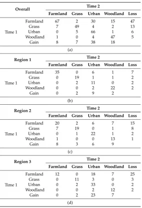
[image:3.595.157.442.252.668.2]A simulated or hypothetical dataset was generated to illustrate the methods and to provide clarity and transparency. These are presented in a series of change matrices and are shown in Table1. These describe the intersecting areas, in pixel counts, of different land classes over two time periods for three hypothetical regions.
Table 1.Land cover changes for (a) overall; (b) Region 1; (c) Region 2 and (d) Region 3.
Overall Time 2
Farmland Grass Urban Woodland Loss
Time 1
Farmland 67 2 30 15 47
Grass 7 49 4 2 13
Urban 0 5 66 1 6
Woodland 1 0 4 47 5
Gain 8 7 38 18
(a)
Region 1 Time 2
Farmland Grass Urban Woodland Loss
Time 1
Farmland 35 0 6 1 7
Grass 0 19 1 1 2
Urban 0 2 11 0 2
Woodland 0 0 2 22 2
Gain 0 2 9 2
(b)
Region 2 Time 2
Farmland Grass Urban Woodland Loss
Time 1
Farmland 20 2 6 7 15
Grass 7 19 0 1 8
Urban 0 1 22 1 2
Woodland 1 0 0 13 1
Gain 8 3 6 9
(c)
Region 3 Time 2
Farmland Grass Urban Woodland Loss
Time 1
Farmland 12 0 18 7 25
Grass 0 11 3 0 3
Urban 0 2 33 0 2
Woodland 0 0 2 12 2
Gain 0 2 23 7
(d)
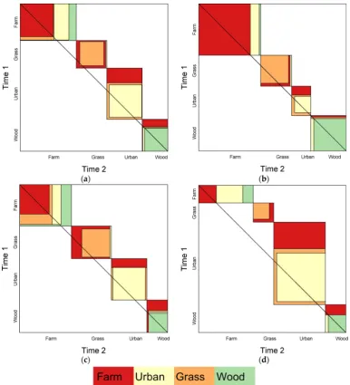
3.2. Visualising Change Matrices
source statistical software, using thevcdandgplotpackages. The data and code used in this analysis will be freely provided to interested researchers on request.
Agreement plots [20] provide a graphical representation of the diagonal and off-diagonal elements in a correspondence matrix. The agreement plots arising from the correspondence matrices in Table1 are shown in Figure1. Large off-diagonal values in the matrix are indicated by the areas around the diagonal and their size, orientation and shading indicates the direction of change. A number of statements about the correspondence matrices can be very quickly deduced from Figure1. For example, the agreement plot shows:
‚ high overall losses from Farmland to Urban and Woodland (Figure1a);
‚ high overall gains to Urban from Farmland (Figure1a);
‚ relatively high levels of change in Region 3 compared to the other regions;
‚ high gains in Woodland from Farmland in Region 2 (Figure1c);
[image:4.595.104.491.291.717.2]‚ large areas of Urban in Region 3 and its gains from Farmland (Figure1d).
3.3. Comparing Changes in Two Regions Using Odds Ratios
It is possible to make a number of statements from the regional change matrices in Table1about the probability of change for any given class in any given region. Losses and gains are derived from the row and column marginal totals and diagonals. For example, the probability of Farmland losses are as follows:
Overall : 47{p67`2 `30 `15q “ 0.41
Region 1 : 7{p35 `0 `6`1q “ 0.17
Region 2 : 15{p20`2 `6 `7q “ 0.43
Region 3 : 25{p12 `0 `18`7q “ 0.68
The objective in some land cover change studies is to compare changes in different regions, perhaps relating to management, policy or ownership. Probabilities provide useful descriptive statistics of the change but they are not directly comparable in this form as they are specific to each region. Odds ratios provide a widely used technique in land use modelling and assessment, principally to examine the underlying drivers and factors associated with land use but as yet they have not been used to compare regional differences.
Odds ratios can be used to compare any two individual regions or class-to-class changes. They indicate the relative likelihood of change between different treatments. Thus, they provide a comparative measure of change and can be used to describe regional differences, differences between land cover classes and differences in specific class to class changes observed in two regions. The odds ratio,θ, of the relative likelihood of change is defined as follows:
θ“ Oddspchange|RegionAq
Oddspchange|RegionBq (1)
An odds ratio of 1 indicates change is equally likely to occur in both regions. If it is greater than 1, then this suggests that change is more likely to occur in Region A. If the odds ratio is less than 1, then this indicates that change is less likely in Region A than in Region B and, in this case, the ratio is inverted to describe likelihood of change in Region B relative to Region A.
To determine odds ratios, the diagonal and off-diagonal elements of the change matrices are collapsed into 2 by 2 matrices, which can then be used to calculate the relative odds of changes in one region compared to another. The overall changes in Regions 1 and 2 indicate change in 13 out of 100 pixels in Region 1 and in 26 out of 100 pixels in Region 2. This results in no change totals of 87 and 74 pixels respectively. The relative likelihood of land cover change in Region 1 compared to Region 2 is:
θ“ 13{87 26{74 “
0.13
0.26 “0.425
That is,relative odds of change in Region 2 are 0.425´1or 2.35 times higher than in Region 1. The significance
of the interactions between regions and land cover change can be tested using aχ2-test and in this case it indicates a significant difference at the 95% level between Regions 1 and 2 (p-value = 0.032).
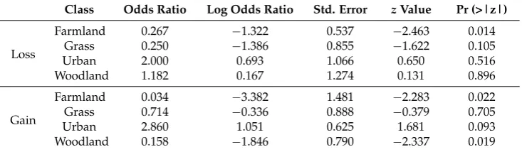
It is also possible calculate to the relative odds and associated significance for changes to different classes. Table2shows the relative odds of land cover losses and gains comparing Region 1 with Region 2.
A number of significant differences in land cover change are suggested by Table2:
‚ the relative odds of loss from Farmland is 3.7 (0.267´1) times greater in Region 2 than in Region 1;
‚ the relative odds of gains in Farmland and Woodland area are 29.4 (0.034´1) and 6.3 (0.158´1)
times greater in Region 2 than in Region 1.
Table 2.The odds ratios of land cover losses and gains in Region 1 compared to Region 2.
Class Odds Ratio Log Odds Ratio Std. Error zValue Pr (>|z|)
Loss
Farmland 0.267 ´1.322 0.537 ´2.463 0.014
Grass 0.250 ´1.386 0.855 ´1.622 0.105
Urban 2.000 0.693 1.066 0.650 0.516
Woodland 1.182 0.167 1.274 0.131 0.896
Gain
Farmland 0.034 ´3.382 1.481 ´2.283 0.022
Grass 0.714 ´0.336 0.888 ´0.379 0.705
Urban 2.860 1.051 0.625 1.681 0.093
Woodland 0.158 ´1.846 0.790 ´2.337 0.019
The gross changes may hide more subtle changes in each class. As a result, the odds ratios may present an example of Simpson’s paradox [26], where different rates (and directions) of per class changes may be masked by the aggregate gross changes. It is possible to quantify differences in the likelihood of specific class-to-class transitions, rather than just losses and gains, and how they vary in different regions. As an example of a specific direction of change, consider the transitions from Farmland to Urban class in Regions 2 and 3 (Table1). The diagonal and off-diagonal elements of the correspondence matrices are collapsed into a 2 by 2 contingency matrix, which is used to generate the relative odds of a specific land cover transition in one region compared to another, as in Table3. The odds ratios suggest that the relative odds of Farmland changing to Urban are (0.218´1) 4.59 times
[image:6.595.115.482.112.219.2]more likely in Region 3 than in Region 2.
Table 3.The 2 by 2 contingency table describing the areas of change from Farmland to Urban in Regions 2 and 3 and the associated odds ratios. The table values summarise the losses from Farmland to Urban and to other classes (Urban).
Region Urban Urban
Region 2 6 29
Region 3 18 19
θ1“ 6{29
18{19 “0.218
Of course, it is important to consider the data that are used to populate the contingency table: by including the areas that did not change as well as those that did, the correct interpretation of this odds ratio above is,change from Farmland to Urban is 4.6 (0.218´1) times more likely in Region 3 than in Region 3, when all possible states of change and no change are considered, and theχ2-test showed this to be significant at the 95% confidence level (p-value = 0.0098). This analysis can be further refined to consider only land use changes (i.e., without considering areas Farmland that did not change). The data are shown in Table4and the odds ratio now describes a different problem: thatchange from Farmland to Urban is 3.8 times more likely in Region 1 than in Region 2, when only observed changes from Farmland are considered, although in this case the differences were not found to be significant (χ2p-value = 0.0956) when only changes were considered.
Table 4.The 2 by 2 contingency table showing the areas of change from Farmland to Urban and from Farmland to other land covers in Regions 1 and 2 and the associated odds ratios.
Region Farmland to Urban Farmland to Other
Region 1 6 9
Region 2 18 7
θ2“ 6{9
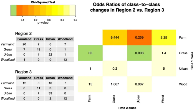
[image:6.595.234.361.428.506.2]Finally, the analysis can be extended to determine the relative odds of change to and from all possible classes. Figure2shows the odds ratios for each class to class pair, comparing changes in Region 2 with those in Region 3. The table elements are shaded by the significance arising from the
χ2-test. Figure2describesthe relative odds of class-to-class changes in Region 2 compared to Region 3, when only changes from the original class are considered. It is easy to identify significant regional differences (shaded in green) and to make the following statements:
‚ changes from Grass to Farmland changes are 35 times more likely in Region 2 than Region 3;
‚ changes from Farmland to Urban change are 125 times more likely (0.008´1) in Region 3 than in
[image:7.595.96.500.238.467.2]Region 2.
Figure 2.The odds ratios of the class-to-class land cover changes (i.e., excluding the diagonal values in the correspondence matrices) between Region 2 and Region 3. The cell shading indicates thep-values arising from aχ2-test, with empty cells indicating where a comparison is not made. The correspondence matrices for Regions 2 and 3 are included for illustration purposes. Significant regional differences are shaded in green.
3.4. Comparing Changes in More than Two Regions
[image:7.595.159.438.678.770.2]The preceding analyses compared only two regions, with data collapsed into 2 by 2 contingency tables. However, in many studies, the objective is to compare more than two treatments and to evaluate differences across multiple factors. Consider, for example, the regional losses and gains in Table5. These can be analysed using mosaic plots which provide a method to evaluate and visualise statistical differences in contingency tables (symmetrical and non-symmetrical).
Table 5.The losses and gains in three different regions.
Status Region Farmland Grass Urban Woodland
Loss
Region 1 7 2 2 2
Region 2 15 8 2 1
Region 3 25 3 2 2
Gain
Region 1 0 2 9 2
Region 2 8 3 6 9
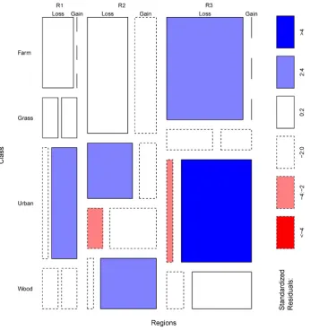
Mosaic plots were proposed by Hartigan and Kleiner [21] and extended by Friendly [22]. In these, the significance of the interactions between column and row factors are indicated by the shading, in which the standardised residuals of a log-linear model are indicated by the colour and outline of the mosaic tiles. The mosaic plot in Figure3has axes for the different regions being compared and the land cover change types. The size of the plot tiles is proportionate to the land cover areas (counts in the contingency tables). Their shading indicates whether the combinations of groups, regions, classesetc. are less or greater than expected under a model of proportionality. In the examples below, tiles shaded deep blue show interactions that are significantly higher than would be expected (i.e., corresponding to combinations of change and region whose standardized residuals are greater than +4), when compared to a model of proportionally equal levels of change. Tiles shaded deep red correspond to residuals less than´4 indicating significantly lower frequencies than would be expected when compared to the model. The standardized Pearson residuals measure the deviation of each tile from independence. From Figure3, statements can be extracted under the assumption of proportionally equal levels of change (loss and gain) for each land cover class and region. In this case, the mosaic plot indicates that the gains to Urban in Region 3 are much greater than expected.
Figure 3. A mosaic plot comparing the losses from and gains to each land cover class in each region (R1–R3).
counts. In this, the rows indicate whether change had occurred or not and the columns indicate the region—a transpose of Table5. To test for an association,A, between the row and column effects, the Poisson regression model is applied:
A`cij ˘
“log`r`Ci`Rj ˘
(2)
where the count in columniand rowjis denoted bycijand has a Poisson distribution,ris an intercept term,Ciis a column effect andRjis a row effect, which is compared against the model:
A`cij ˘
“log`r`Ci`Rj`Iij ˘
(3)
where the extra termIijis an interaction effect between rows and columns. If this is significantly different from zero, then it suggests that there is some degree of association between the row and column effects. Values ofIijwere estimated by fitting Equation (3) to the regional data and the resulting coefficients were related to a comparative index of loss for each of the row categories, using the formula:
CHANGE“100` exp`
Iij ˘
´1˘
(4)
In summary, Equations (2)–(4) apply a generalized linear model to a cross-tabulation of how different factors interact (regions and classes) in order to predict the frequency of occurrence of the count under a Poisson distribution. Note that in the analyses below theCHANGEterm in Equation (4) is used to evaluate land cover losses from Time 1 and gains at Time 2. Due to the way the interaction terms are calibrated, this compares each columncategory j(regions) against a “reference” category which is usually the region with largest area. However, in this case all of the regions have the same number of pixels and so the reference is Region 1. A value of 0 suggests the likelihood of loss for
category jis the same as for the reference category. A value of +50 forcategory jsuggests loss is one-and-a-half times as likely as the reference category, a value of´50 that it is half as likely, and so on. The analysis of loss from a transpose of Table5was calculated and the results are shown in Table6.
Table 6.The likelihood of land use changes for different regions in the study area, relative to Region 1.
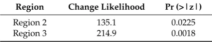
Region Change Likelihood Pr (>|z|)
Region 2 135.1 0.0225
Region 3 214.9 0.0018
The results in Table6suggest that the likelihood of change in Region 2 is 135% greater than in Region 1 and that the likelihood of change in Region 3 is 215% greater than in Region 1.
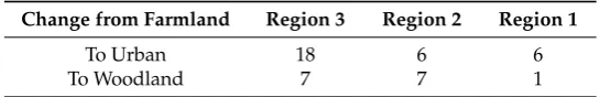
[image:9.595.188.406.489.532.2]The application of the generalised linear models can be further extended to consider how specific class-to-class transitions vary in different regions. Consider the summary data in Table7. This describes the changes from Farmland to Urban and to non-Urban classes (i.e., Grass and Woodland) in the three regions, ordered left to right by the largest column totals. It is possible to determine the likelihood of change to Urban in different regions relative to the region with the largest area of change, in this case Region 3. The results are shown in Table8and indicate that likelihood of land cover change from Farmland to Urban is 286% greater in Region 2 than in Region 3 and 57% less in Region 1 compared to Region 3, although this difference was not found to be significant.
Table 7.The regional changes from Farmland at Time 1 to Urban and other classes (non-Urban) at Time 2.
Change from Farmland Region 3 Region 2
To Urban 18 6
Table 8.The likelihood of regional land cover changes from Farmland to Urban relative to Region 3.
Change Likelihood Pr (>|z|)
Region 2 285.7 0.0504
Region 1 ´57.1 0.4683
[image:10.595.161.434.286.330.2]Finally, it is sometimes useful to be able to compare different land cover transitions. Consider the data in Table 9. They summarise the changes from Farmland to Urban and to Woodland in the three regions, again ordered left to right by the greatest volume of change. The results are shown in Table10and indicate that likelihood of change from Farmland to Urban rather than from Farmland to Woodland is 200% greater in Region 2 compared to Region 3 and 57% less in Region 1 compared to Region 3, although in this case neither of these differences are significant.
Table 9.The changes from Farmland at Time 1 to Urban and to Woodland at Time 2.
Change from Farmland Region 3 Region 2 Region 1
To Urban 18 6 6
[image:10.595.188.406.381.423.2]To Woodland 7 7 1
Table 10. The likelihood of land cover changes from Farmland to Urban rather than Farmland to Woodland in Region 2 and Region 1 relative to Region 3.
Change Likelihood Pr (>|z|)
Region 2 200.0 0.1232
Region 1 ´57.1 0.4683
3.5. Summary
The methods presented in this section describe analyses to compare two treatments using odds ratios (Section3.3) which are extended to approaches for comparing more than two treatments using generalized linear models. These approaches are not new, for example, Comberet al.[27] applied the methods presented in Section3.4, but they have not been applied in the context of land cover analysis and data which are commonly summarised in contingency tables.
4. Case Study
4.1. Introduction
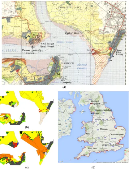
The methods presented in Section3were developed using a simple, hypothetical case study. In this section, these are applied to the results of a national coastal land use change study that compared data from 1965 and 2014. The research was commissioned by the National Trust as part of the Neptune initiative [28]. The full results are in [29] as well as some press reports [30], and the 1965 and 2015 data are provided online [31]. In brief, coastal land use was recorded in 1965 in a survey conducted by students from the University of Reading. The survey was updated manually in 2014 using freely available, open source aerial photography and mapping software, with the remote sensing imagery providing critical evidence for the update mapping. The project adopted a set of change mapping protocols that were specifically developed to ensure robust measures of land use change by minimising spurious or methodological inconsistency between the surveys, details of which are in [29]. Figure4 shows examples of the hand drawn and annotated basemaps and data from the two time periods, as well as the National Trust administrative regions.
a separate organisation). Consequently, it wanted to understand what the impacts were of their land management policies on land use change, in part to demonstrate the conservation value of its activities. Second, it wanted to understand how changes in coastal land uses varied regionally, specifically across and between its administrative regions.
4.2. Non-National Trust vs. National Trust Change
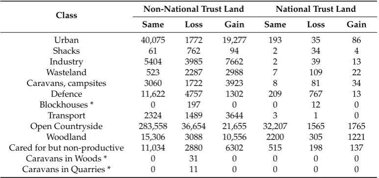
[image:12.595.105.492.276.458.2]It is important to recall that land use changes are composed of losses and gains and these may occur to and from the same class at different locations, reflecting local land use churn—for example, where a campsite is relocated to a larger field by a farmer, this is both a loss to the Campsite land use (e.g., to Open countryside) and a larger gain. Table11shows the overall losses and gains in coastal land use recorded on non-National Trust and National Trust land. These are derived from the marginal totals of the full change matrices included in the Appendices. The data reflect recent, general land use trends: urbanisation, increases in woodland at the arable fringe, decreases of defence land uses and increases in leisure activities (camping, caravans, recreational land such as golf-courses and sports fields which are labelled as Cared for but non-productive).
Table 11.The losses from and gains to different land use classes in hectares on land managed by the National Trust and other land.
Class Non-National Trust Land National Trust Land
Same Loss Gain Same Loss Gain
Urban 40,075 1772 19,277 193 35 86
Shacks 61 762 94 2 34 4
Industry 5404 3985 7662 2 39 13
Wasteland 523 2287 2988 7 109 22
Caravans, campsites 3060 1722 3923 8 81 34
Defence 11,622 4757 1302 209 767 13
Blockhouses * 0 197 0 0 12 0
Transport 2324 1489 3644 3 1 0
Open Countryside 283,558 36,654 21,655 32,207 1565 1765
Woodland 15,306 3088 10,556 2200 305 1221
Cared for but non-productive 11,034 2880 6302 515 198 137
Caravans in Woods * 0 31 0 0 0 0
Caravans in Quarries * 0 11 0 0 0 0
* Not mapped in 2014.
The data in Table11can be used to compare losses and gains in areas managed by the National Trust with those in other areas using odds ratios (Equation (1)). These generate regional comparative measures of the relative odds of change and aχ2-test indicates the significance (statistical likelihood) of the differences. The results of comparing the losses and gains for each land use class in this way are shown in Table12and indicate the relative odds of change on non-National Trust land compared to National Trust land. The 95% confidence intervals of the odds for losses and gains are also included.
Table 12.The Odds Ratios of losses and gains for changes on non-National Trustvs.National Trust land. Bold values show significant likelihoods of greater change on National Trust land.
Class Loss Gain
OR 2.5% 97.5% p-Value OR 2.5% 97.5% p-Value
Urban 4.05 2.81 5.83 0.000 0.92 0.71 1.19 0.575
Shacks 1.18 0.30 4.57 1.000 1.24 0.25 6.29 1.000
Industry 26.19 6.32 108.55 0.000 4.67 1.06 20.68 0.048
Wasteland 3.63 1.67 7.89 0.001 0.55 0.23 1.30 0.263
Caravans, campsites 18.36 8.82 38.25 0.000 3.34 1.54 7.27 0.002
Defence 8.95 7.65 10.46 0.000 0.54 0.30 0.95 0.039
Transport 0.29 0.01 5.95 0.779 0.10 0.01 1.97 0.154
Open Countryside 0.38 0.36 0.40 0.000 0.72 0.68 0.75 0.000
Woodland 0.69 0.61 0.78 0.000 0.80 0.75 0.87 0.000
[image:12.595.97.503.612.761.2]A number of statements about significant land use losses can be made from Table12. The relative odds of land use losses on non-National Trust land compared to National Trust land are:
‚ 4.05 times greater for Urban land uses
‚ 26.19 times greater for Industrial land uses
‚ 2.63 times greater for Wasteland
‚ 8.95 times greater for Defence land uses
‚ 18.36 times greater for Caravans and campsites
‚ 1.47 times greater for Cared for but non-productive land
The relative odds of land use losses on National Trust landversesnon-National Trust land are: ‚ 3.44 times greater (0.29´1) for Transport land uses
‚ 2.66 times greater (0.38´1) for Open Countryside
‚ 1.46 times greater (0.69´1) for Woodland
A number of statements about significant land use gains can be made from Table12. The relative odds of land use gains on non-National Trust land compared to National Trust land are:
‚ 4.67 times greater for Industrial land uses
‚ 3.34 times greater for Caravans and campsites
The relative odds of land use gains on National Trust landversusnon-National Trust land are: ‚ 1.82 times greater (0.55´1) for Wasteland
‚ 1.87 times greater (0.54´1) for Defence land uses
‚ 1.39 times greater (0.72´1) for Open Countryside
‚ 1.24 times greater (0.80´1) for Woodland
‚ 2.14 times greater (0.47´1) for Cared for but non-productive land
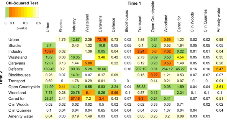
[image:13.595.116.481.527.719.2]It also possible to compare the class to class changes on National Trust land with those recorded on non-National Trust land and to identify any significant differences. The relative odds of class-to-class changes on non-National Trust land compared to National Trust land, when only changes from the original class are considered are shown in Figure5. So, for example, changes from Open Countryside at Time 1 to Urban at Time 2 (i.e., Urban gains from Open Countryside) were 11.99 times more likely on non-National Trust land.
4.3. Regional Comparison
[image:14.595.186.410.275.387.2]One of the main reasons for the original survey in 1965 was concern over what was seen as unfettered development. In the update, there was particular interest in quantifying how rates of development varied in different parts of England, Wales and Northern Ireland. To consider this, the changes (gains) to the land use classes of Urban, Industry, Transport and Caravan and campsites (Table13) were evaluated using the generalized linear models described in Equations (2) to (4). The data used for this analysis are the gains to these classes and the amount of land that did not change (Table13). The results indicate the relative likelihoods of these changes across the National Trust regions (Table14) and show that development, for example, is 53% greater in London and the South East region than in Wales, whereas it is ~15% less likely in the South West region. All of the differences were found to be significant.
Table 13. The areal changes in hectares to land use associated with development (Urban, Industry, Transport and Caravan and campsites).
Region No Change Change
East of England 57,861 2909
Yorkshire & North East 36,401 3007
North West 35,229 2564
Wales 87,868 5589
South West 87,922 4768
London & South East 60,143 5866
Midlands 12,675 495
Northern Ireland 29,822 2122
Table 14.The likelihood of developmental changes in different regions relative to Wales, the region with the largest area.
Region Change Likelihood Pr (>|z|)
South West ´14.74 0.0000
London & South East 53.33 0.0000
East of England ´20.95 0.0000
Yorkshire & North East 29.85 0.0000
North West 14.42 0.0000
Northern Ireland 11.85 0.0000
Midlands ´38.64 0.0000
[image:14.595.168.429.436.535.2]Figure 6.A mosaic plot of the per class land use losses and gains in different regions: East of England (EE), South West (SW) and London & South East (LSE).
5. Discussion
This paper describes a series of approaches for statistically comparing land cover change in different regions (or treatments) based on analyses of data held in correspondence matrices. The methods provide a suite of approaches from which appropriate techniques can be selected depending on the task in hand. They are not intended to be used together as they relate to different questions about change: Section3.3describes methods for comparing two treatments or regions and Section3.4for comparing more than two treatments. The methods are based odds ratios and generalised linear models, are commonly applied to data held in correspondence matrices in other disciplines but have not been previously applied to quantify differences in land cover change or error matrices.
Each of the approaches uses slightly different formulations of the correspondence matrix, the most commonly used framework for describing and analysing land use/land cover changes (and also for accuracy assessments in remote sensing). Odds ratios were used to compare changes in two regions. They describe the relative likelihood of a change occurring in one region compared to another. Generalised linear models (Poisson regression models) were used to quantify the relative differences between changes in three or more regions. An index of change was proposed to compare the likelihood of changes in multiple regions. This measures the relative change likelihood of regions, when compared to one “reference” region. In that sense, they perform a series of binary comparisons of each region to the reference region. This is the nature of comparative statistics—they are by definition relative. However, each region could be specified as the referent in turn to compare all regions against each other.
generate more informative reporting of change and error than simple consideration of different correspondence matrices.
The correspondence matrix is also thede factoapproach for assessing error and accuracy in land cover and land use. In this context, it is frequently referred to in the literature as the error, validation or accuracy matrix. In the error matrix, predicted or modelled data, for example from a classification of remotely sensed imagery, are cross tabulated with observed or ground truth data, commonly derived from a field survey or data that are deemed to be of higher quality. A number of statistics are commonly generated describing from the correspondence matrix including overall accuracy and per class Type I and Type II errors (errors of omission and commission, user and producer accuracies). The generalised linear models suggested by Equation (4) could be modified such thatAccuracyis predicted by the regression rather thanChange(loss or gain) and anIndex of errorconstructed to allow the likelihood of errors in multiple regions to be compared. Future work will explore these approaches in accuracy reporting.
6. Conclusions
In much of land mapping work, there is a need to report how “different” changes observed in one region are from those observed in another. This research was motivated by the need within a project to generate statistics comparing land ownership regions, but the regions may relate to spatial feature: management practices, ecological zones, underlying geological process,etc. Methods for doing this are lacking in the remote sensing and land cover literature and within the sub-disciplines concerned with quantifying land cover change and accuracy. The analyses described in this paper use odds ratios and generalised linear models to compare change in different regions. These approaches are commonly applied in other information sciences. They are simple and intuitive and can be used to compare overall changes, specific class to class changes and per class loss and gains arising in different locations or as a result of different treatments.
Acknowledgments:This work was supported by the National Trust under the Neptune Coastal Land Use Mapping Project. Sadly, Peter Fisher died during the preparation of this manuscript. He will be missed. The authors would like to thank the anonymous reviewers whose comments helped significantly improve this article.
Author Contributions: A.C. designed the methods, managed the research and led the writing. H.B. edited the manuscript. B.C. developed some of scoping work to support the methodology and edited the M.S. P.F. guided the methods. S.C.M.J. ran the change mapping and edited the manuscript. B.O. contributed to initial research specification.
Appendix A
The correspondence matrix of land use on non-National Trust land (hectares).
Class Time 2
Urban Shacks Industry Wasteland Caravans Defence Blockhouses Transport O. Countryside Woodland Cared for C in Woods C in Quarries Amenity Water
Time 1
Urban 40,075 10 251 75 190 41 0 42 499 252 224 0 0 22
Shacks 212 61 3 14 134 0 0 1 304 22 44 0 0 0
Industry 426 0 5404 1287 28 1 0 366 1294 316 120 0 0 1
Wasteland 134 0 429 522 34 4 0 27 1240 262 51 0 0 3
Caravans 451 1 14 58 3060 2 0 1 914 101 122 0 0 2
Defence 531 0 268 204 80 11,622 0 562 2521 200 318 0 0 17
Blockhouses 1 0 69 0 1 0 0 1 75 16 16 0 0 0
Transport 411 0 378 207 10 0 0 2324 322 58 54 0 0 9
O. Countryside 12,487 35 3662 778 3090 927 0 707 283,558 8356 4312 0 0 46
Woodland 445 1 101 30 150 29 0 2 2114 15,306 165 0 0 0
Cared for 1275 22 51 26 90 3 0 65 865 432 11,034 0 0 3
C in Woods 0 0 0 0 10 0 0 0 7 1 13 0 0 0
C in Quarries 1 0 0 0 4 0 0 0 0 6 0 0 0 0
Amenity water 0 0 3 15 0 0 0 0 9 3 1 0 0 0
Appendix B
The correspondence matrix of land use on National Trust land (hectares).
Class Time 2
Urban Shacks Industry Wasteland Caravans Defence Blockhouses Transport O. Countryside Woodland Cared for C in Woods C in Quarries Amenity Water
Time 1
Urban 193 0 0 1 0 1 0 0 20 9 4 0 0 0
Shacks 3 2 0 0 1 0 0 0 26 2 1 0 0 0
Industry 0 0 2 10 5 0 0 0 18 0 5 0 0 0
Wasteland 1 0 2 7 0 0 0 0 101 4 1 0 0 0
Caravans 2 0 0 0 8 0 0 0 65 9 4 0 0 0
Defence 0 0 0 6 1 209 0 0 734 0 1 0 0 0
Blockhouses 0 0 0 0 0 0 0 0 9 1 2 0 0 0
Transport 0 0 0 0 0 0 0 3 0 0 0 0 0 0
O. Countryside 61 3 11 4 22 11 0 0 32,207 1118 111 0 0 0
Woodland 6 0 0 0 3 0 0 0 283 2200 7 0 0 0
Cared for 6 1 0 0 2 0 0 0 127 60 515 0 0 0
C in Woods 0 0 0 0 0 0 0 0 0 0 0 0 0 0
C in Quarries 0 0 0 0 0 0 0 0 0 0 0 0 0 0
References
1. Foody, G.M. Status of land cover classification accuracy assessment.Remote Sens. Environ.2002,80, 185–201. [CrossRef]
2. Cakir, H.I.; Khorram, S.; Nelson, S.A. Correspondence analysis for detecting land cover change.Remote Sens. Environ.
2006,102, 306–317. [CrossRef]
3. Tewkesbury, A.P.; Comber, A.J.; Tate, N.J.; Lamb, A.; Fisher, P.F. A critical synthesis of remotely sensed optical image change detection techniques.Remote Sens. Environ.2015,160, 1–14. [CrossRef]
4. Petit, C.; Scudder, T.; Lambin, E. Quantifying processes of land-cover change by remote sensing: Resettlement and rapid land-cover changes in south-eastern Zambia.Int. J. Remote Sens.2001,22, 3435–3456. [CrossRef] 5. Alphan, H.; Doygun, H.; Unlukaplan, Y.I. Post-classification comparison of land cover using multitemporal
Landsat and ASTER imagery: The case of Kahramanmara¸s, Turkey.Environ. Monit. Assess.2009,151, 327–336. [CrossRef] [PubMed]
6. Dewan, A.M.; Yamaguchi, Y. Land use and land cover change in Greater Dhaka, Bangladesh: Using remote sensing to promote sustainable urbanization.Appl. Geogr.2009,29, 390–401. [CrossRef]
7. Sánchez-Cuervo, A.M.; Aide, T.M.; Clark, M.L.; Etter, A. Land cover change in Colombia: Surprising forest recovery trends between 2001 and 2010.PLoS ONE2012,7, e43943. [CrossRef] [PubMed]
8. Calvo-Iglesias, M.S.; Fra-Paleo, U.; Crecente-Maseda, R.; Díaz-Varela, R.A. Directions of change in land cover and landscape patterns from 1957 to 2000 in agricultural landscapes in NW Spain.Environ. Manag.2006,38, 921–933. [CrossRef] [PubMed]
9. Pontius, R.G., Jr.; Millones, M. Death to Kappa: Birth of quantity disagreement and allocation disagreement for accuracy assessment.Int. J. Remote Sens.2011,32, 4407–4429. [CrossRef]
10. Foody, G.M. Thematic map comparison.Photogramm. Eng. Remote Sens.2004,70, 627–633. [CrossRef] 11. Olofsson, P.; Foody, G.M.; Stehman, S.V.; Woodcock, C.E. Making better use of accuracy data in land change
studies: Estimating accuracy and area and quantifying uncertainty using stratified estimation.Remote Sens. Environ.
2013,129, 122–131. [CrossRef]
12. Lambin, E.F.; Turner, B.L.; Geist, H.J.; Agbola, S.B.; Angelsen, A.; Bruce, J.W.; Coomes, O.T.; Dirzo, R.; Fischer, G.; Folke, C.;et al. The causes of land-use and land-cover change: Moving beyond the myths. Glob. Environ. Chang.2001,11, 261–269. [CrossRef]
13. Lunetta, R.S.; Knight, J.F.; Ediriwickrema, J.; Lyon, J.G.; Worthy, L.D. Land-cover change detection using multi-temporal MODIS NDVI data.Remote Sens. Environ.2006,105, 142–154. [CrossRef]
14. Balzter, H.; Rowland, C.S.; Saich, P. Forest canopy height and carbon estimation at Monks Wood National Nature Reserve, UK, using dual-wavelength SAR interferometry.Remote Sens. Environ.2007,108, 224–239. [CrossRef]
15. Pijanowski, B.C.; Robinson, K.D. Rates and patterns of land use change in the Upper Great Lakes States, USA: A framework for spatial temporal analysis.Landsc. Urban Plan.2011,102, 102–116. [CrossRef] 16. Kumar, S.; Merwade, V.; Rao, P.S.C.; Pijanowski, B.C. Characterizing long term land use/cover change in the
United States from 1850 to 2000 using a nonlinear bi-analytical model.AMBIO2013,42, 285–297. [CrossRef] [PubMed]
17. Balej, M.; Andˇel, J.; Koutský, J.; Olšová, P. Comparing Regional Differentiation of Land Cover Changes in Natural and Administrative Regions of the Czech Republic Using Multivariate Statistics. Available online: http://www-sre.wu.ac.at/ersa/ersaconfs/ersa11/ersa11acfinal00768.pdf (accessed on 1 January 2016). 18. Duveiller, G.; Defourny, P.; Desclée, B.; Mayaux, P. Deforestation in Central Africa: Estimates at regional,
national and landscape levels by advanced processing of systematically-distributed Landsat extracts. Remote Sens. Environ.2008,112, 1969–1981. [CrossRef]
19. Colditz, R.R.; López Saldaña, G.; Maeda, P.; Espinoza, J.A.; Tovar, C.M.; Hernández, A.V.; Benítez, C.B.; López, I.C.; Ressl, R. Generation and analysis of the 2005 land cover map for Mexico using 250 m MODIS data. Remote Sens. Environ.2012,123, 541–552. [CrossRef]
20. Bangdiwala, S.I. The Agreement Chart. Department of Biostatistics, University of North Carolina at Chapel Hill, Institute of Statistics Mimeo Series No. 1859. 1988. Available online: http://www.stat.ncsu.edu/ information/library/mimeo.archive/ISMS_1988_1859.pdf (accessed on 16 January 2016).
22. Friendly, M. Mosaic displays for multi-way contingency tables.J. Am. Stat. Assoc.1994,89, 190–200. [CrossRef] 23. Meyer, D.; Zeileis, A.; Hornik, K. The strucplot framework: Visualizing multi-way contingency tables with vcd.
J. Stat. Softw.2006,17, 1–48. [CrossRef]
24. Zeileis, A.; Meyer, D.; Hornik, K. Residual-based shadings for visualizing (conditional) independence. J. Comput. Graph. Stat.2007,16, 507–525. [CrossRef]
25. Friendly, M. Working with Categorical Data with R and the vcd and vcdExtra Packages. Available online: http://202.90.158.4/pub/R/web/packages/vcdExtra/vignettes/vcd-tutorial.pdf (accessed on 1 January 2016). 26. Simpson, E. The interpretation of interaction in contingency tables.J. R. Stat. Soc. Ser. B1951,13, 238–241. 27. Comber, A.; Brunsdon, C.; Green, E. Using a GIS-based network analysis to determine urban greenspace
accessibility for different ethnic and religious groups.Landsc. Urban Plan.2008,86, 103–114. [CrossRef] 28. Fifty Years of Land Use Change at the Coast. Available online: http://www.nationaltrust.org.uk/article-1355914106958/
(accessed on 16 January 2016).
29. Comber, A.; Davies, H.; Pinder, D.; Whittow, J.B.; Woodhall, A.; Johnson, C.M. Mapping coastal land use changes 1965–2014: Methods for handling historical thematic data.Trans. Inst. Br. Geogr.2016, submitted. 30. Coastal Construction “How Britain’s Shoreline Changed in 50 Years”. Available online: http://www.theguardian.com/
environment/ng-interactive/2015/oct/20/50-years-british-coast-line-then-and-now (accessed on 16 January 2016). 31. Mapping Our Shores: 1965 & 2014 Land Use. Available online: http://goo.gl/4DlZ09 (accessed on
16 January 2016).