Rochester Institute of Technology
RIT Scholar Works
Theses
Thesis/Dissertation Collections
4-1-1989
A corporate identity package for the technical
association of the graphic arts: a methodological
approach
Charles G. Kuhn
Follow this and additional works at:
http://scholarworks.rit.edu/theses
This Thesis is brought to you for free and open access by the Thesis/Dissertation Collections at RIT Scholar Works. It has been accepted for inclusion
in Theses by an authorized administrator of RIT Scholar Works. For more information, please contact
ritscholarworks@rit.edu
.
Recommended Citation
Rochester
Institute
of
Technology
A
Thesis
Submitted
to
the
Faculty
of
The
College
of
Fine
and
Applied
Arts
in
Candidacy
for
the
Degree
of
MASTER OF
FINE
ARTS
A
Corporate
Identity
Package
for
the
Technical
Association
of
the
Graphic
Arts:
A Methodological
Approach
by
Charles
G.
Kuhn
Date:
~Z(e
m
I
l
Advisor~o
~ R~min~~
Date:
_
J:.
,
~
(!:l.Lt:'J
""'1r~-Associate Advisor:
Dr. Richard Zakia/
Date:
S-/IIR7
----~~~~====~---~---Associate Advisor:
Charles Smith/
Date:
8
7
g
J
/~9~r~l=-=j=:...===---Special Assistant to the Dean £or Graduate Affairs:
Philip M. Bornarth/
Dean, College of Fine and Applied Arts:
Dr. Robett
tH.~
Johnston/
Date:
6
nl ..
~g_l
_
I
I,
Charles
G.
Kuhn,
hereby
grant
permission
to
the
Wallace
Memorial Library of RIT,
to reproduce my thesis in whole or in
part.
Any reproduction will not be for commercial use or profit.
Charles G. Kuhn
175-3 Robert Quigley Drive
Scottsville, New York 14546
Acknowledgements
I'd
like
to
thank
Roger
Remington,
Richard
Zakia
and
Charles
Smith
for
all
of
their
advice,
patience
and,
above
all,
encouragement
during
my
thesis
experience.
Also,
my
appreciation
goes
out
to
the
Technical
and
Educational
Center
for
their
assistance
in
printing
the
TAGA
brochure.
Thanks
also
should
go
to
Leonard
Leger
and
Karen
Lawrence
of
TAGA
who
were
ideal
clients
throughout
the
entire
design
process.
Finally,
I'd
like
to
acknowledge
my
wife
Faith,
for
whom
this
report
is
dedicated.
Without
her
support,
none
of
this
would
Table
of
Contents
Page
#
Introduction
1
The
Need
for
a
Strong
Corporate
Identity
2
Technical
Association
of
the
Graphic
Arts
5
Preliminary
Research
6
Semiotics
as
Methodology
8
Sketching
of
Ideas
for
a
New
TAGA
Symbol
10
Choosing
the
New
TAGA
Symbol
11
The
New
TAGA
Signature
13
Colors
of
the
TAGA
Identity
Elements
13
Implementation
of
TAGA
Identity
14
Stationery
14
Brochure
16
Poster
17
Newsletter
18
Standards
Guide
19
Concluding
Remarks
19
Endnotes
23
Appendices
A.
Bibliography
B.
Former
TAGA
Identity
(printed
applications)
C.
New
TAGA
Identity
(printed
applications)
D.
TAGA
Graphic
Standards
Guide
E.
Initial
Correspondence
with
TAGA
F.
Marketing/Communications
Analysis
Figures
Figure
1
.Figure
2.
Figure
2a.
Figure
3
.Figure
4
.Figure
5
.Figure
6
.Figure
7
.Figure
8
.Semiotics
Matrix
-Internal
Characteristics
Semiotics
Matrix
-External
Characteristics
Semiotics
Triangle
-Three
Elements
of
Unity
Sketches
for
possible
new
TAGA
Identity
Identity
Evaluation
Matrix
New
TAGA
Identity
Symbol
with
Key
Words
New
TAGA
Signature
New
TAGA
Identity
Introduction
The
design
problem
concerning
my
thesis
proposal
was
rather
simple
and
clear-cut,
the
solution
was
certainly
going
to
be
more
complex.
The
challenge
for
me
was
to
create
and
develop
a
new
organizational
identity
for
the
Technical
Association
of
the
Graphics
Arts
(TAGA)
,an
organization
concerned
and
dedicated
to
the
science
and
technology
of
the
graphic
arts.
The
original
identity
of
TAGA
lacked
visual
excitement,
vitality
and,
above
all,
a
cohesive
and
consistent
appearance
as
it
was
used
on
printed
applications
(Appendix
B)
.It
also
lacked
a
mark
or
symbol
appropriate
for
an
organization
dealing
in
the
field
of
graphic
arts
research
and
development.
After
examining
and
evaluating
carefully TAGA's
identity
^Managing
Director
Leonard
Leger
and
Membership/Publicity
Vice
President
Charles
Rinehart
of
TAGA,
my
chief
advisor,
Roger
Remington
and
myself
unanimously
agreed
that
TAGA
needed
a
new
and
more
contemporary
identity.
This
new
identity,
however
eventually
turning
out,
ideally
would
represent
TAGA
in
a
more
fitting
way
for
an
organization
that
deals
in
the
graphic
arts
field.
It
would
also
enhance
TAGA's
professional
image,
both
here
in
the
United
States
as
well
as
internationally.
As
David
Carter
says,
"An
organization's
corporate
identity
should
be
equal
to
the
organization's
level
of
capabilities.
"xTherefore,
TAGA's
identity
needed
a
more
professional
and
visually
appropriate
look,
one
that
could
match
its
image
and
reputation
as
-2-The
Need
for
a
Strong
Corporate
Identity
All
organizations,
both
small
and
large,
today
should
recognize
just
how
powerful
an
effective
corporate
identity
can
be
in
promoting
a
favorable
image
of
themselves.
Says
Carter
again,
"For
the
not-so-large
organization,
corporate
identity
is
perhaps
more
important
than
it
is
to
the
industrial
giants.
For
without
growth,
the
small
organization
is
doomed.
A
well-planned
corporate
identity
can
lead
to
growth
for
the
small
organization."The
major
goal
of
every
organization
and
their
corporate
identity
then
should
be
to
make
the
first
impression
boldly,
and
continuing
impressions,
consistently
positive.
"The
definition,"as
James
Pilditch
states,
"of
a
good
corporate
identity
speaks
not
only
of
identifying
the
corporation,
but
also
of
expressing
its
personality-"3Just
because
an
organization
is
very
professional
and
competent
is
not
enough.
If
the
organization
doesn't
look
equally
competent,
it's
going
to
fail
to
achieve
many
of
its
goals.
And
how
that
organization
will
be
perceived
by
its
members
and
prospective
members
in
the
future
will
be
determined
by
the
image
planning
that
takes
place
now.
Asserts
Elinor
Selame,
"Assuming
a
new
corporate
identity,
like
donning
a
custom-tailored
ensemble
for
the
first
time,
is
at
once
a
commitment
to
the
present
and
an
investment
in
the
future."4There
are
many
aspects
of
designing
corporate
identities
to
-3-technology
must
be
considered
when
planning
for
a
new
corporate
identity.
Unless
provisions
are
made
for
these
changes,
the
end
result
can
be
an
identity
package
out
of
sync
with
the
times
in
just
a
few
short
years.
In
developing
a
new
corporate
identity
for
an
organization,
there
are
basically
five
steps
involved:
(1)
Self
study
of
the
organization
(2)
Research
and
evaluation of
the
organization
and
its image
(3)
Definition
of
goals
and
strategies
(4)
Development
of
an
identity
program
(
5
)
Implementing
the
program
A
firm
with
no
real
logo
or
consistent
visual
identity
has
carte
blanche.
There
are
few
limitations
or
constraints
on
how
much
change
can
be
done.
The
only
guideline
is,
the
look
must
be
appropriate
for
the
company.
The
corporate
mark
or
symbol
is,
perhaps,
the
single
most
important
element
of
a
successful
identity.
It
should,
ideally,
represent
the
organization's
personality
and
image
it desires
to
convey
to
its
constituents.
Stanley
Mason
writes,
"The
trademark
or
symbol
often
only
signified
ornamental
luxury
in
the
more
leisurely
times
before
the
invention
of
company
images.
Today,
however,
it
is
something
extremely
functional,
a
sharp
weapon
in
the
struggle
to
attract
the
worn
out
and
often
flagging
attention
of
the
public.
It
has
not
only
become
the
focus
of
a
firm's
image
but,
for
the
majority
of
the
public,
it
is
often
the
only
-4-Effective
corporate
symbols
all
have
the
following
characteristics
in
common:
(1)
They
are
clear,
not
confusing;
original,
not
imitative;
functional,
not
frivolous; distinctive,
not
forgettable.
(2)
They
are
meaningful,
instantly
conveying
the
purpose
and
personality
of
the
organization.
(3)
They
are
easy
to
recognize,
pleasing
to
the
eye;
have
no
unfavorable
visual
connotation
here
or
abroad.
(
4
)
Adaptable
to
a
number
of
applications
.Simply
put
by
Elinor
Selame,
"Most
top
managers
no
longer
regard
symbols
as
mere
'icing
on
the
cake,'but
as
the
yeast
that
makes
the
cake
rise."6The
mark
then
serves
as
a
kind
of
"corporate
shorthand"to
represent
the
organization
as
a
whole.
Of
course
to
accompany
the
mark
there
must
be
strict
attention
and
sensitivity
paid
to
a
compatible
typographical
identification
and
other
graphic
elements
of
the
total
identity
package.
The
final
step
of
a
successful
corporate
identity
is
the
implementation
of
the
program.
There
must
be
a
consistent
and
coordinated
appearance
to
all
of
the
organization's
printed
applications.
Corporate
identity
can
be
accidental,
unplanned
and
therefore
chaotic;
or
it
can
be
purposeful,
planned
and
structured
to
the
way
a
corporation
wants
to
be
seen
by
its
different
constituents.
Wolfgang
Schmittel
states,
"The
more
consistently
and
uniformly
a
firm
presents
itself,
the
more
-5-Technical
Association
of
the
Graphic
Arts
The
Technical
Association
of
the
Graphic
Arts
(TAGA)
is
an
association
of
people
concerned
and
dedicated
to
the
science
and
technology
of
the
graphic
arts.
Organized
in
1948
by
several
technical
leaders
of
the
industry,
it
has
grown
in
size
and
scope.
Today
it
is
international,
having
about
20%
of
its
membership
outside
the
USA
and
Canada.
It
has
recently
exceeded
1,000
in
membership.
The
principal
objectives
of
TAGA
are
the
following:
(
1
)
To
stimulate
research
(2)
To
provide
a
standard
of
professional
accomplishment
and
ethics
(
3
)
To
increase
and
disseminate
graphic
arts
information
and
knowledge
(4)
To
provide
meetings
and
conferences
for
discussions
of
a
technical
and
scientific
nature
(5)
To
publish
the
important
technical
and
scientific
information
generated
by
the
industry
(6)
To
sponsor
student
activities
related
to
the
graphic
arts,
including
the
establishment
of
fellowships
and
scholarships
for
graduate
work
In
addition,
TAGA
holds
an
annual
conference.
It
brings
together
a
diverse
group
of
people
from many
countries
with
widely
different
technical
backgrounds
to
participate
in
formal
paper
presentations,
informal
workshops,
discussions
and
social
gatherings.
The
conference
is
a
principal
international
forum
for
printing
science
and
serves
as
the
focus
of
TAGA's
activities.
It
is
a
conference
of
ideas,
the
breeding
ground
of
new
concepts
-6-TAGA
also
has
a
number
of
standing
committees:
(
1
)
The
Color
Committee
provides
an
open
forum
that
identifies
and
explores
the
diversity
and
scope
of
current
issues
in
color
production.
(2)
The
Ink,
Paper
and
Press
Committee
focuses
on
issues
of
technology,
including
measurement
of
ink
and
paper
characteristics,
interactions
and
the
evolution
of
new
concepts.
(
3
)
The
Electronic
Pre-Press
Committee
addresses
the
issues
associated
with
emerging
pre-press
technology,
which
can
include
the
unique
requirements
of
graphic
arts
image
quality,
data
compression
and
related
industry
standards
activities.
(
4
)
The
Fellowship Committee,
working
through
the
National
Scholarship
Trust
Fund,
assists
in
promoting
and
providing
fellowships
to
graduate
students
for
advanced
study
in
graphic
arts
and
associated
fields.
(
5
)
The
International
Relationships
Committee
is
developing
cooperation
and
exchanges
of
information
with
graphic
arts
technical
groups
in
other
countries.
(
6
)
The
Student
Chapter
Committee
provides
direction
to
universities
and
colleges
for
the
establishment
of
student
TAGA
chapters.
These
student
organizations,
acting
independently,
produce
papers,
meetings
and
publications.
Perhaps
most
important,
TAGA
is
an
organization
firmly
committed
to
promoting
progress
in
the
graphic
arts
field.
It
serves
as
a
stimulus
for
investigation
and
scientific
research,,
a
breeding
ground
for
new
concepts
and
inventions
in
the
science
of
printing.
Preliminary
Research
The
first
objective
to
be
carried
out
during
the
new
TAGA
identity
design
process
was
a
careful
evaluation
of
the
organization,
by
the
organization
itself.
All
TAGA
board
members
were
sent
a
Marketing/Communications
Analysis
(Appendix F)
dealing
with
organizational
characteristics
and
attributes.
The
feedback
received
from
these
returned
surveys
proved
quite
-7-In
order
of
importance
and
frequency
of
appearance,
TAGA
board
members
saw
the
organization
as
characterized
by
the
following
attributes:
(1)
Scientific/technical
(2)
Research-oriented
(
3
)
Disseminator
of
information
(4)
International
forum
(5)
Provider
of
fellowships/scholarships
(6)
Consultative
(
7
)
Educational
(8)
Historical
In
terms
of
importance,
the
first
five
characteristics
were
deemed
the
most
significant
by
TAGA board
members.
They
would
also
later
be
ultimately
considered
in
the
final
design
choice
for
the
new
TAGA
identity
symbol
(Figure
5).
The
second
objective
was
to
determine
how
TAGA's
board
members
evaluated
the
audience's
perceptions
of
them
as
an
organization.
Ideally,
TAGA
wanted
their
audience,
which
includes
scientists,
manufacturers
(research
and
development),
printing
owners
/managers,
technologists
and
educators,
to
see
them
as
an
organization
with
the
following
characteristics:
(1)
Progressive
(2)
Innovative
(3)
Technical/scientific
(4)
International
(5)
Professional
(
6
)
Responsive
(7)
Well-organized
(8)
Involved
(9)
Relevant
(10)
Stimulating
Some
of
the
above
characteristics
would
also
be
incorporated
-8-Semiotics
as
Methodology
It
is
certainly
a
naive
idea
to
suppose
that
a
designer
in
the
visual
sphere
can
proceed
purely
intuitively.
So,
rather
than
traveling
down
the
design
process
avenue
led
only
by
intuition,
a
more
methodological
and
systematic
plan
would
be
necessary
I
felt.
Semiotics,
with
its
strong
structural
basis,
was
thus
chosen
to
guide
me
through
the
design
process
of
creating
a
new
TAGA
identity
symbol.
Semiotics,
otherwise
known
as
the
science
of
signs,
is
a
very
complex
and
sometimes
confusing
theory.
Lengthy
books
and
descriptions
have
been
devoted
to
the
subject,
and
a
far
more
comprehensive
explanation
of
it
is
probably
deserved here.
For
sake
of
brevity,
however,
semiotics
can
be
described
as
a
way
designers
can
incorporate
key
characteristics
or
attributes
of
an
idea
or
object
into
an
appropriate
design,
a
design
that
represents
and
conveys
the
idea's
or
object's
true
and
fundamental meaning
.Also
having
utilized
semiotics
in
designing
a
new
identity
for
Brenner's
Park
Hotel,
an
exclusive
hotel
situated
on
the
fringe
of
the
Black
Forest
in
Germany,
Heinz
Kroehl,
director
of
the
Kroehl
Design
Group,
states
the
benefits
of
the
theory
this
way:
"Modern
semiotics
creates
the
provisions
for
systemizing
the
process
of
visual
designing.
As
a
general
theory
of
signs,
it
comprises
both
language
and
picture
and
provides
a
kind
of
universal
-9-In
TAGA's
case
then,
the
design
of
a
new
identity
symbol
would
have
to
include
considerations
of
how
to
incorporate
the
organization's
already-mentioned
key
characteristics
and
attributes
into
a
final
identity
symbol.
To
get
a
better
sense
of
TAGA's
organization
characteristics
in
terms
of
semantics
(iconic,
indexic
and
symbolic
signs),
and
to
generate
some
design
ideas,
a
semiotics
matrix
was
created.
The
matrix,
derived
from
the
returned
questionnaires
(Appendix
F)
given
to
all
TAGA
board
members,
was
constructed
so
that
TAGA's
qualities
appear
in
order
of
frequency
and
importance.
The
first
board
(Figure
1)
represents
TAGA's
perceptions
of
itself,
or
internal
characteristics.
The
second
board
(Figure
2)
represents
how
TAGA
would
like
its
audience
to
perceive
it
as
an
organization,
or
its
external
characteristics.
On
both boards
TAGA's
characteristics
are
visually
shown
with
images
gathered
from
magazines
and
books
as
iconic,
indexic
and
symbolic.
One
of
the
main
dimensions
of
a
sign
is
semantics
(Figure
2a)
.This
refers
to
the
relation
of
the
sign
to
the
object
it
represents.
Regarding
semantics:
The
relations
of
the
sign
to
its
object
can
taken
on
three
different
basic
forms
which
can
be
further
subdivided
as
follows:
In
an
icon,
the
relations
to
the
object
are
such
that
the
sign
bears
a
similarity
to
the
object.
The
index,
on
the
contrary,
shows
an
object
by
unequivocally
identifying
it
by
means
of
a
definite
characteristic.
In
a
second
form,
the
indication
is
made
by
the
object
as,
for
example,
CO
<
(D
<
CO
o
o
(0
(0
O
c
c
i
(0
v.
o
o
o
3
CO
<
<
CO
O
CO
0)
o
CO
k.CO
o
To
c
4)
+*X
LU
CO
J-o
a
-o
o
CM
a>
3
C
o
o
*?-d)
C
(1)
0
|
"5
J3
c
3
CO
CD
CD
CO
E
CO
c
S
2
~0)r}S5
"5
*
o
cd
CM
o
3
c
T3
CD
O
CO
4-*C
c
D)
d>
'c/J
CO
CD
CD
TJ
iCL
O
CD
Irz
DC
Q.
03
O)
c
CO
^_CD
CD
j_
^
CL
CD
j_CD
>
4< "-*
c
CO
E
E
CO
i_
3
CO
>^
X
CO
c
CO
3
Mia
LL
CD
O)
4-*CO
o
E
CD
^^^ ^.
.Q
o
o
CO
CD
-10-With
a
symbol
the
relation
between
the
sign
and
the
object
is
arbitrarily,
but
by
convention
and
tradition,
clearly
determined.
From
all
of
these
images
gathered
and
placed
in
a
semiotics
matrix,
a
structured
design
process
for
a
new
TAGA
identity
symbol
could
begin.
As
Wolfgang
Schmittel
states,
"An
organization
can
retain
its
vividness
within
the
confines
of
a
rigid,
'restricting'
structure.
Haphazard,
purposeless
and
arbitrary
methods
do
not
lend
to
convincing,
consistent
development."9
Therefore,
initial
brainstorming
and
subsequent
sketching
of
possible
ideas
for
new
identity
symbols
for
TAGA
began
with
the
semiotics
matrix
used
as
a
helpful
design
tool,
not
a
creative
straight
j
acket
.Sketching
of
Ideas
for
a
New
TAGA
Symbol
In
the
initial
stages
of
sketching
ideas
for
a
new
TAGA
identity
symbol,
most
of
the
work
was
spontaneous,
a
kind
of
brainstorming
if
you
will.
Possibilities
included
abstractions,
literal
illustrations,
strictly
typographical
attempts,
as
well
as
combinations
of
the
above
(
Figure
3
)
.Common
printing
metaphors
were
used
in
many
of
the
sketches.
Register
marks,
press
rollers,
screen
patterns,
printer's
loupes
among
others
were
all
considered
during
the
brainstorming.
After
an
exhaustive
effort,
the
possibilities
for
a
new
TAGA
identity
were
narrowed
down
to
a
smaller
number
of
relatively
strong
candidates.
Also
considered
during
this
early
sketching
stage
was
what
(3
aw.
R
mm
5C
o
g
o
<
I
-ilk"CLE")
c
CD
<
CD
C
CO
CD
JO
o
CD
CO
CO
CD
3
D)
LL
r
<
9
(3
0
5
00
|
E
o
D
u.
O
T5
CD
CD
C
CD
<
PS
CD
C
CO
CD
CD
I
I//
S3
J L
"1
P.
*
r
-A
l
J
Jbsl
CO
CD
CD
CO
I
CO
>
c
IBM
c
CD
2
<
-11-According
to
Robert
Swinehart,
an
instructor
of
graphic
design
at
Carnegie
Mellon
University,
visual
classification
of
identity
design
elements
can
be
separated
into
six
different
categories:
(1)
Wordforms
(logotypes)
(2)
Letterforms
(alpha/numerics)
(
3
)
Abstract
forms
(4)
Representational
Forms
(5)
Pictograms
(6)
Aberrations
(combinations
of
above)
Choosing
the
New
TAGA
Symbol
The
final
TAGA
identity
symbol
possibilities
were
selected
by
relating
them
to
an
identity
evaluation
matrix
(Figure
4).
Their
relative
strengths
were
based
upon
three
categories:
syntax,
semantics
and
pragmatics.
Syntax,
or
formal
graphic
structure,
include
the
following
aspects :
(
1
)
Line
(
2
)
Shape
(
3
)
Grid
(4)
Gestalt
Principals
(
5
)
Balance
(
6
)
Ambiguity
(
7
)
Redundancy
Semantics
deal
with
the
verbal
concepts
from
the
semiotics
matrix
developed
for
TAGA.
Finally,
the
pragmatics
of
the
final
new
TAGA
identity
candidates
include
the
following
characteristics:
(
1
)
Impact
(2)
Simplicity
(3)
Timelessness
(4)
Legibility
(5)
Appropriateness
(6)
Adaptability
o
D
E
>
w
I
.2
c
0)
a
a
rx
^^
* *
-a a (9
5
!
o=
CD
T
O
<
'J3
L,
3
u
si
Q
d
a
u
<x>
ui
d
6
ui
6
Ui
ci
o
u.
ui
Q
U
m
< <
3
s
sen
I;
i-z
< c
I
2
-12-The
strongest
candidate
was
then
chosen
(
I
.)
based
upon
the
greatest
number
of
categories
it
fit
into.
It
was
then
decided
that
a
representational
form
(metaphorically-applied
sign)
would
be
the
most
appropriate
choice
for
TAGA's
new
identity.
Therefore,
the
representational
(yet
somewhat
abstract)
translation
of
a
printer's
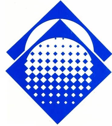
loupe,
a
quality
assurance
instrument,
showing
a
magnified
halftone
pattern
within
it
showed
the
greatest
potential
for
a
new
TAGA
identity
symbol,
my
thesis
committee
and
I
felt*
From
a
syntactic,
pragmatic
and,
perhaps
most
important,
semiotic
standpoint,
the
printer's
loupe
seemed
to
fit
TAGA's
personality
and
image
quite
appropriately
for
the
following
reasons:
(1)
The
printer's
loupe
represents
a
quality
assurance
tool,
but
also
a
tool
suggesting
graphic
arts
research.
(2)
The
loupe's
square
shape
rotated
on
its
side
represents
a
stable
organization,
but
at
the
same
time,
innovative
and
active
in
its
dissemination
of
new
research
in
the
graphic
arts
field.
(3)
The
circular
shape
within
the
loupe
represents
TAGA's
international
scope.
(4)
The
halftone
dot
pattern
progressively
decreasing
in
size
as
it
moves
upward
represents
dissemination
of
information.
(5)
The
halftone
dot
pattern
also
implies
the
organization's
progressive
nature
in
general.
(6)
The
square
shape
of
the
symbol
represents
a
mortar
board
worn
by
graduating
students
and
TAGA's
emphasis
on
promoting
and
supporting
scholarships
and
fellowships
Thus
the
choice
was
made.
It
was
now
simply
a
matter
of
refining
the
symbol
to
a
greater
degree.
The
solution
to
the
problem
of
designing
a
new
TAGA
identity
appeared
to
be
well
on
-13-to
a
design
problem
involving
symbols
is
(a)
the
translation
of
key
words
and
ideas
into
easily
recognizable
symbols,
and
(b)
subsequent
integration
of
these
symbols
into
the
final
design."10The
new
TAGA
identity
symbol,
shown
with
key
words
which
are
represented
by it,
seemed
to
meet
the
above
criteria
(Figure
5)=
The
New
TAGA
Signature
To
complement
the
newly
chosen
symbol
and
complete
its
new
identity,
a
typographical
identification
was
developed
for
TAGA
(Figure
6).
"Technical
Association
of
the
Graphic
Arts"appears
in
five
lines
for
reading
ease
and
comprehension.
The
typeface
chosen
was
Optima
Bold,
a
style
of
type
which
is
clean
looking,
contemporary
and
compatible
with
TAGA's
new
symbol.
The
type
is
set
solid
(no
leading),
flush
left
and
ragged
right.
It
can
be
placed
in
three
different
positions
in
relation
to
the
symbol,
shown
in
the
Graphic
Standards
Guide
(
Appendix
D
)
.However
,
the
one
shown
in
(Figure
7)
is
the
preferred
relationship.
Colors
of
the
TAGA
Identity
Elements
The
new
TAGA
symbol,
whenever
possible,
should
be
printed
PMS
Process
Blue
(Figure
8).
PMS
Process
Blue
is
one
of
the
four
colors
used
in
full
color
process
printing.
It
was
chosen,
therefore,
for
its
appropriateness
to
represent
an
organization
involved
in
graphic
arts
research.
The
color
is
also
very
lively
and
exciting
and
was
chosen
to
enhance
TAGA's
image.
It
also
seemed
to
be
a
much
more
logical
choice
of
color
than
the
green
Figure
5.
TAGA
Symbol
Key
words
represented
in TAGA
symbol:
(1)
Scientific/technical
(2)
Research-oriented
(3)
Information
disseminator
(4)
International forum
(5)
Fellowship/scholarship
provider
(6)
Progressive
(7)
Innovative
?
?????
*???????
V
????????
?????????
[image:30.612.41.568.79.761.2]Figure
6.
TAGA
Signature
Technical
Association
of
the
[image:31.612.117.497.259.643.2]Figure
7.
TAGA
Identity
Preferred
position
of
symbol
and
signature
Technical
Association
of
the
Figure
8.
TAGA
Identity
Preferred
position
of
symbol and
signature
in
color
(PMS Process
Blue)
Technical
Association
of
the
Graphic
[image:33.612.99.284.419.627.2]
-14-bright
color
such
as
PMS
Process
Blue
was
so
that
the
new
symbol
would
visually
"jump
out"at
the
viewer
and
stay
in his
memory.
In
other
words,
I
felt
using
PMS
Process
Blue
would
make
a
strong
symbol
even
stronger.
The
TAGA
signature
should
always
be
printed
in
black,
except
on
stationery
where
it,
along
with
the
slogan,
address
and
telephone
numbers,
is
printed
in
PMS
430
(gray).
Implementation
of
TAGA
Identity
The
next
logical
step
in
the
design
of
the
new
TAGA
identity
was
to
implement
it
on
a
number
of
different
printed
applications.
The
applications
I
chose
were
stationery
(letterhead,
envelope
and
business
card)
,a
brochure,
a
promotional/informational
poster
and
a
newsletter
cover.
These
were
all,
I
felt,
good
tests
for
the
new
identity
created
for
TAGA,
to
observe
its
true
strength
and
validity.
Stationery
A
concerted
effort
was
made
to
bring
a
greater
degree
of
consistency
to
the
look
of
TAGA's
stationery
(Appendix C)
.In
fact,
one
of
the
main
reasons
why TAGA
needed
a
new
identity,
in
general,
was
an
inconsistent
and
uncoordinated
look
among
its
different
printed
applications.
Says
David
Carter,
"If
there
can
be
any
one
single
criterion
for
good
design
it
is
consistency.
In
fact
a
mediocre
design,
when
used
consistently,
will
present
a
design."13-
-15-A
theme
began
to
emerge
here
while
designing
the
stationery
and
was
adhered
to
throughout
the
designing
of
the
other
TAGA
applications:
the
theme
of
bands
of
information,
one
including
the
symbol
and
another
including
typography
or
other
graphic
images
.On
each
piece
of
stationery
two
bands
of
information
appear.
The
first
band
contains
only
the
symbol
printed
in
PMS
Process
Blue.
It's
meant
to
call
attention
to
the
significance
of
the
new
symbol
and
build
viewer
recognition,
retention
and
recall.
The
second
band
of
information
contains
the
TAGA
typographical
identification
(signature),
slogan,
address
and
telephone
numbers.
All
of
this
typographical
information is
printed
in
PMS
430
(gray)
except
for
the
"TAGA"acronym,
which
is
printed
in
PMS
Process
Blue
like
the
symbol.
The
attempt
here
is
to
have
the
viewer
build
an
association
between
TAGA,
the
organization,
and
the
new
symbol
which
represents
TAGA.
The
overall
look
and
feel
of
the
stationery
is
a
clean
and
contemporary
one,
utilizing
positive
as
well
as
negative
space
tastefully,
appropriate
for
the
image
TAGA
wants
to
convey
to
its
audience.
The
reason
the
majority
of
the
typographical
information
is
printed
PMS
430
(gray)
is
so
that
it
doesn't
compete
with
the
power
of
the
symbol.
The
contrast
between
the
type
and
the
symbol
would
have
been
too
stark
if
the
typographical
information
had
been
printed
in
black.
Therefore,
PMS
430
was
chosen
for
its
16-symbol.
The
type
of
stock
used
for
all
of
TAGA's
stationery
is
Strathmore
Oyster
White
Laid.
It
was
chosen
for
its
rich
and
elegant
appearance,
yet
moderate
cost.
It
enhances
TAGA's
image
by
conveying
a
professional
and
distinctive
look.
For
more
detailed
information
regarding
sizes
and
relationships
of
stationery
see
the
Graphic
Standards
Guide
(Appendix D)
.Brochure
The
TAGA
brochure
represents
an
application
which
primarily
serves
three
purposes:
(1)
To,
most
importantly,
introduce
and
emphasize
the
new
TAGA
symbol
(2)
To
describe
the
organization
and
its
objectives
and
characteristics
(
3
)
To
provide
membership
information
A
deliberate
attempt
was
made
to
present
the
brochure
in
a
clean
and
uncluttered
manner,
one
in
which
function
is
primary
and
form
is
secondary,
No
meaningless
rules,
bars
or
ornamentation
occurs
in
the
brochure,
just
a
straightforward
presentation
of
information.
The
symbol
appears
large
on
the
cover
to
introduce
it
to
the
viewer.
It
then
appears
on
successive
panels
in
the
same
position
at
a
smaller
size
to
reinforce
its
image
in
the
viewer's
mind.
Here,
as
in
other
printed
applications,
the
objective
is
to
build
an
association
between
the
new
symbol
and
TAGA,
the
organization.
Of
course
design
was
still
a
major
consideration.
An
emphasis
was
put
on
a
tasteful
balance
of
positive
and
negative
space
throughout
-17-The
typography
is,
for
sake
of
consistency,
Optima
Bold
for
main
headlines
and
Optima
Medium
for
text.
An
effort
was
continued
here
to
use
this
typeface
consistently,
as
in
other
TAGA
printed
applications.
Text
headlines
and
the
symbol
are
printed
in
PMS
Process
Blue.
All
other
elements
black.
The
paper
used
on
the
brochure
is
Consolidated
80
lb.
Glossy
White
Productolith
for
a
clean,
readable
and
contemporary
appearance
.Poster
The
poster
's
main
function
is
to
inform
interested
or
prospective
members
of
TAGA's
organizational
characteristics,
put
simply:
why
TAGA
exists.
Once
again
a
band
on
the
left
side
of
the
poster
with
just
the
symbol
occupying
it
emphasizes
the
new
TAGA
identity.
Two
photographs
are
juxtaposed
at
different
angles
and
in
marked
size
contracts.
One
is
an
enlarged
photo
of
a
pair
of
printing
press
rollers
in
action
and
the
other,
much
smaller
in
size,
is
a
pressman
checking
on
the
quality
of
a
job
he's
running.
Appropriately
he's
using
a
printer's
loupe
to
do
so.
In
addition,
three
bands
of
quality
control
density
strips
blend into
the
larger
picture.
It
was
the
intent
that
all
of
these
images
semiotically
convey
an
impression
of
TAGA's
emphasis
on
stimulating
scientific
research
and
disseminating
this
information
to
other
professionals
-18-Medium,
at
the
bottom
of
the
poster
explains
TAGA's
primary
organizational
characteristics
in
a
concise
as
possible
manner.
Newsletter
The
TAGA
newsletter
cover
was
designed
with
readability
in
mind
but
also
with
a
more
contemporary
and
visually
appealing
look.
Again,
to
stress
the
new
TAGA
symbol,
and
create
reader
awareness
and
retention
of
it,
the
symbol
appears
with
the
organization's
signature
in
a
narrow
band
along
the
left
edge
of
the
page.
Only
the
symbol
prints
PMS
Process
Blue.
The
name
of
the
newsletter
changes
from
the
TAGA
Newsletter
to
just
TAGANEWS
with
TAGA
set
in
Optima
Bold
and
NEWS
set
in
Optima
Medium.
Text
headlines
are
set
in
Optima
Bold
and
text
is
set
in
Optima
Medium,
flush
left,
ragged
right
on
an
ll-
pica
line
length.
All
text
is
set
10
points
with
one
point
of
leading.
In
addition,
kicker
headlines
reverse
white
out
of
black
bands
at
the
tops
of
the
stories.
Also,
on
the
cover
of
the
newsletter
is
one
photograph
which
will
be
treated
a
bit
differently.
On
this
particular
cover
the
photograph
of
the
instructor
teaching
his
class
extends
beyond
the
ruled
border.
This,
I
feel,
adds
a
bit
more
depth
to
the
layout.
On
inside
pages
of
the
newsletter
the
same
format
will
apply
except
that
the
signature
directly
below
the
symbol
in
the
left
hand
margin
will
be
omitted.
The
symbol,
in
PMS
Process
Blue,
however,
will
remain
in
the
same
position
and
at
the
same
-19-was
to
create
a
nice
sense
of
balance,
with
considerations
again
given
to
positive
and
negative
space
relationships.
Standards
Guide
The
final
task
for
me
was
to
create
a
standards
guide
for
the
new
TAGA
identity.
My
focus
was
on
providing
a
fairly
detailed,
yet
not
overly
burdensome,
manual
of
rules
and
guidelines
for
TAGA
to
follow
in
implementing
their
new
identity.
Minoring
in
computer
graphics,
I
felt
it
appropriate
to
design
the
standards
guide
on
the
Macintosh
II
computer.
I
utilized
the
Quark
XPress
program
to
set
up
the
basic
format
that
was
followed
throughout
the
entire
guide.
It's
based
on
a
three
column
grid
with
a
headline
appearing
in
the
same
position
on
each
page
except
the
cover.
I
kept
the
design
fairly
uncomplicated
to
assure
readability
and
ease
of
handling.
Plenty
of
white
space
was
also
a
consideration
in
the
layout
of
the
guide.
This
created
a
nice
sense
of
positive/negative
balance
and
harmony
throughout
the
guide.
Concluding
Remarks
In
retrospect
I
welcomed
the
opportunity
to
create
a
more
contemporary,
visually
pleasing
and,
perhaps
most
important,
appropriate
identity
for
TAGA.
The
design
process
was
extremely
important
and
enlightening
to
me
for
a
number
of
reasons.
Among them,
perhaps
the
most
significant,
was
applying
the
theory
of
semiotics
as
a
-20-on
semiotics,
I
felt
that
a
number
of
means
of
communication
could
be
developed
like
a
mosaic
whereby
each
individual
message
helped
in
its
own
important
way
to
determine
the
overall
character
and
image
of
the
organization
(TAGA)
and
was,
at
the
same
time,
a
component
of
the
complete
picture.
After
taking
a
course
in
semiotics,
led
by
Dr.
Richard
Zakia
and
assisted
by
Roger
Remington
and
Bob
Keough,
and
reading
various
pieces
of
literature
on
the
subject,
I
realized
the
potential
of
semiotics
as
a
design
tool.
Heinz
Kroehl
asserts,
"Today
it
may
be
maintained
that
the
modern
theory
of
semiotics,
. . .
represents
the
supporting
pillar
of
a
theoretical
reinforcement.
Visual
communication
is
inconceivable
without
knowledge
of
graphic
transmission
and
analysis
of
fundamental
structures.
u:L2Inspired
by
the
potential
of
semiotics
in
helping develop
a
new
TAGA
identity,
I
enthusiastically
greeted
the
challenge
that
faced
me.
I
was
very
satisfied
with
the
symbol
that
I
developed.
It's
my
feeling
that
the
symbol
represents
TAGA very
appropriately.
It's
meaningful
and
has
a
high
recall
value
also.
Particularly
inspirational
to
me
was
a
quote
by
Nigel
Holmes
on
symbols:
"The
elements
a
designer
uses
to
create
a
quickly
understood
symbol
are
the
basic
graphic
shapes:
circles,
squares,
diamonds,
and
so
-21-with
each
other
in different configurations,
the
shapes
can
become
very
potent."13I,
therefore,
didn't
want
a
symbol
that
was
too
abstract,
yet
I
wanted
to
create
an
image
that
wasn't
too
literal
either.
I
wanted
the
viewer
to
work
out
the
graphic
translation
of
the
printer's
loupe
himself.
I
am
pragmatic
and
believe
that
the
clear,
concrete
picture,
that
is
easy
to
understand,
in
the
truest
sense
of
the
word,
is
also
the
most
convincing
one.
In
a
humorous
way,
Tom
Wolfe
perhaps
characterizes
the
problems
that
creating
an
abstract
symbol
can
create
for
an
organization.
He
says,
"These
abstract
logos,
which
a
company
is
supposed
to
put
on
everything
from
memo
pads
to
the