Rochester Institute of Technology
RIT Scholar Works
Theses
Thesis/Dissertation Collections
7-1-1998
Derivation and modelling hue uniformity and
development of the IPT color space
Fritz Ebner
Follow this and additional works at:
http://scholarworks.rit.edu/theses
This Thesis is brought to you for free and open access by the Thesis/Dissertation Collections at RIT Scholar Works. It has been accepted for inclusion
Recommended Citation
DERIVATION AND MODELUNG OF HUE
UNIFORMITY
And Development of the
IPT
Color Space
by
Fritz
F.
Ebner
B.S. Carnegie Mellon University (1986)
M.S. University of Rochester (1990)
A dissertation submitted in partial fulfillment of the
requirements for the degree of PhD.
in
the Chester
F.
Carlson Center for Imaging Science
of the College of Science
Rochester Institute of Technology
July 1998
Signature of the Author
-Accepted by
Henry E. Rhody
CHESTER
F.
CARLSON
CENTER FOR IMAGING SCIENCE
COLLEGE OF SCIENCE
ROCHESTER INSTITUTE OF TECHNOLOGY
ROCHESTER, NEW YORK
CERTIFICATE OF APPROVAL
PhD. DEGREE DISSERTATION
The Ph.D. Degree Dissertation of Fritz F. Ebner
has been examined and approved by the
dissertation committee as satisfactory for the
dissertation requirement for the
PhD. degree in Imaging Science
Dr. Mark D. Fairchild, Thesis Advisor
Dr. Roy S. Berns
Dr. Robert Rolleston
Dr. Kathleen Chen
Title of Dissertation:
1FT color space
DISSERTATION RELEASE PERMISSION
ROCHESTER INSTITUTE OF TECHNOLOGY
COLLEGE OF SCIENCE
CHESTER
F.
CARLSON
CENTER FOR IMAGING SCIENCE
Derivation and modeling of hue uniformity and development of the
I,
Fritz
F.
Ebner ,
hereby grant permission
to
the Wallace Memorial Library of R.I.T.
to
reproduce my thesis in whole or in part. Any reproduction
will
not be for commercial use
or profit.
Signature:
DERIVATION AND MODELLING OF HUE
UNIFORMITY
And Development
oftheIPT
Color
Space
by
Fritz F. Ebner
Submitted
to theChester F.
Carlson
Center for
Imaging
Science
College
ofScience
in
partialfulfillment
oftherequirementsfor
thePh.D.
degree
atthe
Rochester Institute
ofTechnology
ABSTRACT
Metric
color spaceshave been determined
tobe significantly
non-uniformin
thehue
attributeof color appearance.
Several
independent
sourceshave
confirmedthenon-uniformity.A data
set was obtained
during
the course ofthis thesis work that contains thelargest
sampling
ofcolorspace to
date
which canbe
used to compare models of color appearance.The data
setobtained was compared to
existing
data
sets andfound
to correspond closely.Lookup
tablemethods were employed to testsignificant
differences
between data
sets.A
simplemodeling
approach wastaken
based
oncommonly
understoodcolor spacemodelsandknowledge
of thevisual system.
Several
color spaces canbe derived using
the simplemodel,
and one waschosenthatmodels
hue uniformity very
wellandhas
otherdesirable
attributes.This
new colorspace
is
namedIPT.
Many
visualdata
setswere plottedin
theIPT
color space and all showimproved
performance overindustry
standard color spaces.The IPT
color spacehas
ACKNOWLEDGEMENTS
I
wishtoacknowledge alltheobservers whoselflessly (but
not withoutreward)
tooktime from
their
busy
schedules to stareat aCRT
screen and makehard
decisions. Names
arelistedin
arbitraryorder.
Adam Stein
Alex Vaysman
Bob
Karz
Brian
Hawkins
Chris
VanCampen
Dave Odgers
Jackie
Holmes
Karen Braun
Laura
Caruso
Maryjo Ebner
Nagesh Narendranath
Phyllis Giambrone
Rene Rassmussen
Ron Macera
Steve
Bloomberg
Sue Zoltner
Mojgan
Rabanni
Dick Losz
Marvbeth Poupart
Doug
Kreckel
Bob
McCarthy
Eddy
Dalai
Gaurav Sharma
Brian
Wiley
Dave Birnbaum
Hong
Li
Jorge
Cajiga
Kathy Loj
Liesl
Wiley
Me
Nancy
Goodman
Genia
Sychtycz
Gus Braun
Roger
Chan
Skip
\^lad
Brawe
Jim
O'neill
Ron Johnson
Gloria
Wimer
Brad
Smith
Judy
Stinehour
Tom Lynch
Chrissy
Larson
Dorothy
Jaehn
Rob
Rolleston
Juliet
Ong
Laura Flick
Martha Birnbaum
Dianne
Steely
Raja Balasubramanian
Steve
Reczek
Jutka
Bolgar
Scott Bennett
Steve Linder
Candice
Dobra
Nancy
Mazur
Pat
Colclough
Pat
Donaldson
I
wouldlike
to acknowledgethefollowing
peoplefor going
wellbeyond
thecall ofduty
(or
aDEDICATION
I
wouldlike
todedicate
thisworktomy
sisterMeg
withwhomI
sharedthefirst 23
years ofmy life. Although
sheneverknew
it,
she showed methatit
is
possibletobe
courageousin
theTable
ofContents
INTRODUCTION
1BACKGROUND
3
2.1 Literature Search 4
2.1.1 Color Order SystemsandColor
Harmony
42.1.1.1 Munsell 4
2.1.1.2 Ostwald 8
2.1.1.3 NCS 10
2.1.1.4 MoonandSpencer 14
2.1.1.5 Others 16
2.1.2 Color
Naming
andColorMeaning
172.1.2.1 Basic Color Names 18
2.1.2.2 ColorMeanings 20
2.1.3 Preferred Reproduction ofPictorial Images 23
2.2 Preliminary
Experiments
302.2. 1 Experiment PI (notcompleted). Semantic differential scaling ofcolorsinthecontextof
business
graphics 392.2.2 Experiment P2. Gamut mappingthrough theuseofcolormatching (Gamut mapping from
below)
462.2.2.1
Perceptually
closestcolor matches(sub-experiment1)
462.2.2.1.1 Abstract:toP2 (sub-experiment
1)
462.2.2.1.2 IntroductiontoP2 (sub-experiment
1)
472.2.2.1.3 Experimental 50
2.2.2.1.4 ConclusionstoP2 (sub-experiment
1)
742.2.2.2
Preserving
meaning incolor matches(sub-experiment2)
762.2.5 Conclusions
leading
tobody
ofthesiswork 80APPROACH ANDRESULTS 81
3.1 ExperimentEl. Findingsurfaces of constant hue in color space 86
3.1.1 Abstract 86
3.1.2 Introduction 86
3.1.3 Experimental 88
3.1.3.1 Script 89
3.1.3.2 Userinterface 90
3.1.3.3
Viewing
conditions 923.1.3.4 Calibration 92
3.1.3.5 Colorselections 92
3.1.3.6 Observers 93
3.1.4 ResultsandDiscussion 95
3.1.4.1 Dataset calculation 95
5.7.5 Conclusion 110
3.2 Developmentofconstant hue color spaces ill
5.2.7 Neural Nets 777
3.2.1.1 Generaloverview Ill
3.2.1.2
Modeling
theCIELABtransformation 1133.2.1.3
Modeling
theconstanthue dataset 1143.2.2 Colorspacevisualizationandparameter
tuning
7763.2.2.3.2 ModelandCoefficients 146
3.2.2.3.3 Color
Matching
Functions 1473.2.2.3.4 ConstantHuedatasets 149
3.2.2.3.5 MunsellValue5 data 152
3.2.2.3.6 Neutral Lightness Response 153
3.2.2.3.7 ChromaticLightness Response 154
3.2.2.3.8 MacAdam
(PGN)
Discrimination EllipsesandSpectral Locus 159 3.2.2.3.9 SuprathresholdColor Difference Ellipses 160 3.2.2.3.10 OSAColorSystemmediumgray (L=0)
constantlightnessplane 1613.3
Experiments
E2.Verification
Experiments 1625.5.7
Comparing
CIELABtoHung
& BentsandEbnerdatasets 7623.3.1.1 Introduction 162
3.3.1.2 Experimental 163
3.3.1.3 Results 165
3.3.2
Comparing
IPTcolor spacetoHung
& BernsandEbnerdatasets 766CONCLUSIONS
170FUTURE WORK 172
APPENDICES 173
6.1 Appendix A: Dataplotsfrom experimentPI 173
6.2 AppendixB: Datafrom experimentP2 175
6.3 AppendixC: Threeparameter filescorrespondingtoFigure 57 177
List
ofFigures
Figure 1. Progression
ofthesisresearchdirection
3
Figure 2. Regions
of confusionin
color space15
Figure 3. MacAdam's
tone compression curvesfor
tone reproduction withlimited dynamic
range
28
Figure
4.
Taxonomy
ofbusiness
graphicsimage
content34
Figure 5. Different
colorsfor
theface. Face
colorsthatare unnaturallook
"wrong"
35
Figure
6.
Different
colorsfor
cars.There
is
no"natural"colorfor
a car35
Figure
7.
Different
colorsfor
figuratively
representativeimages
36
Figure 8.
Figuratively
representativeimages
ofautomobileswithdifferent
colors36
Figure
9.
Reduced
version oftask and semanticdifferential
scalesfor
experimentPI (abstract
sub-class)
41
Figure
10. Example
images from
PI
experiment.Abstract
andData
representativeimages.
..41
Figure 11.
Variance
accountedfor
by
factors from
PCA
43
Figure 12. User
interface for
experimentP2 (sub-experiment
1)
51
Figure
13.
Images
presentedto theobserversfor
experimentP2
(sub-experiment
1)
52
Figure
14.
Example hue leaf
ofCRT
andPrinter
gamutshapes athab=303
56
Figure 15.
Histogram
ofAE*ab
for
exact match exercisefor
entire observergroup
including
outliers
58
Figure 16. Median
match valuesfor 25
colorsin
a*b*plane,and
in
L*-C*ab
planes62
Figure 17. Example
gamutmapping
vector with component vectors63
Figure
18. 2D
weighted vector gamut mapping.Open
arrowheads
indicate
observer results.Filled
arrowheads
indicate
modelpredictions.Hue leaves
shown arefor
thehue
angleoftheobserver match
65
Figure 19. 3D
weighted vector gamut mapping.Open
arrowheads
indicate
observer results.Filled
arrowheads
indicate
model predictions.Hue
leaves
shown arefor
thehue
angleofthepredictedmatch
66
Figure 20. Hue
angle matches onleft,
and "corrected"hue
angle matches onright
(using
Hung's Constant Lightness
data)
68
Figure 21. Comparison
ofObserver
results withKatoh
andIto 1:2:2
vectors.Open
arrowheads
indicate
observer results.Filled
arrowheads
indicate Katoh
andIto
results.Hue
leaves
shown arefor
thehue
angle ofthepredictedmatch70
Figure
22.
Comparison
ofObserver
results withbest
2d
enhancedKatoh
optimizationparameters.
Open
arrowheads indicate
observer results.Filled
arrowheads indicate
model results.
Hue
leaves
shownarefor
thehue
angle oftheobserver match72
Figure 23. Comparison
ofObserver
results withbest
3d
enhancedKatoh
modeloptimizationparameters.
Open
arrowheads
indicate
observer results.Filled
arrowheads indicate
model results.
Hue
leaves
shown arefor
thehue
angle ofthemodelprediction73
Figure 24. Images
usedin
experimentP2,
sub-experiment2
77
Figure
25. Histograms
of colors wherethenullhypothesis
was rejectedbetween
sub-contexts78Figure 29. Munsell
renotation colors with extrapolationboundary
andCRT
gamut projectiononto
CIELAB
a*-b*plane
83
Figure 30.
Hung
andBerns loci
of constant perceivedhue.
Left
plotis CL
data,
right
plotis
VLdata
84
Figure 31. User interface for
experiment91
Figure
32.
Hue leaf sampling
at0 degrees. The large
squareis
thereference color94
Figure
33.
Projection
oftestcolors ontoa*-b*plane.
Large
squaresindicate
reference colors.94Figure
34.
Histograms
ofhue
matchesfor 90
observations atreferencehue
angleof0 degrees.
Histograms
areplottedin
therespectivelocations in
theL*-C*ab
plane ofthereferencecolors
95
Figure 35.
Average
andstandarddeviation
of95%
confidencelimits
ofmeanhue
matches as afunction
ofreferencehue
angle.Units
ofy
axis arein
degrees
(CIELAB
Ahab)
96
Figure
36.
Histogram
overtheentiredata
set(306
colorsX
30
observationmeans =9180)
of weightscalculatedfrom
inverse
absolutedifference
97
Figure 37.
Histogram
overthe entiredata
set(306
colorsX
30
observation means =9180)
ofweights calculated
from
inverse
variance98
Figure 38.
Weighted
meanhue
matchesin
CIELAB
space with +-95%confidencelimits.
...100
Figure 39.
Projection
of constanthue
surfaces ontoCIELAB
a*-b*plane
101
Figure 40. Loci
of constanthue in CIELAB
a*-b*at
different lightness
levels. Dots
representreferencecolors
101
Figure 41
.Weighted
meanhue
matches plottedin
CIECAM97s
color appearance space.The
x-axis
is labeled
by
CIELAB
referencehue
angle102
Figure
42.
Projection
of constanthue
surfaces ontoCIECAM97s
C
cos(h)-Csin(h)
plane.Hue
leaves
arelabeled
by
theCIELAB
referencehue
anglesfor
comparison103
Figure 43. Loci
of constanthue in CIECAM97s
C
cos(h)-Csin(h)
atdifferent lightness levels.
Dots
represent reference colors104
Figure 44.
Quantification
of averagehue
non-uniformity
for
CIELAB
andCIECAM97s
105
Figure 45. Quantification
of maximumhue non-uniformity for
CIELAB
andCIECAM97s.
106
Figure 46.
Constant hue
surfaces shownin
a linear opponent space(Y,X-Y,Y-Z).
Numbers
represent
CIELAB
referencehue
angles107
Figure 47. Constant hue
surfaces shown plottedin
CIELUV
color space.Numbers
representCIELAB
referencehue
angles108
Figure 48.
Hung
andBerns
data
plotted ontop
of experimental resultsin
CIELAB
space.Left
graph comparesCL
(constant
lightness)
data.
Right
graph comparesVL (variable
lightness)
data.
Hung
andBerns data
are shownin
bold dotted lines
109
Figure 49.
3
node,1 hidden layer
neuralnet1 12
Figure 50. Tanh function
is
expansivein
the negative range,linear
near theorigin,
andcompressive
in
thepositive range112
Figure 51. Examples
of nonlinearfunctions.
Left
plotis
function
f
with parameters al =0.45,
G2 =0.6. Right
plotis
f2
withparametersCl =1,
a2=1. Note
thatattheorigin,
f,
has
a slope of120
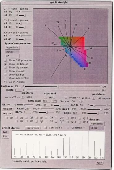
Figures 52.
Visualization
tool userinterface
showing
the three slices of colordimension,
constantlightness,
constanthue,
and constant chroma125
Figure
53. Close
up
ofthecontrols and constantlightness
display
126
Figure
56.
Examples
ofCIE
1931
colormatching
functions
transformed through pretransformation
matrix.Left
image
is
through anidentity
matrix.The
right image
is
through
Hunt-Pointer-Estevez
matrix132
Figure 57.
Three
examples ofCMFs along
with theirinfluence
on the shape of the colorspace.
Color
spaceimages
showHung
andBerns
CL data
set andMunsell
V5
133
Figure
58.
Example hue lines from Guth
typemodel.The
first
image is
rotatedat an angle of0
degrees,
the secondis
at45
degrees.
Note
the shapedifference
of the constanthue
loci
135
Figure
59.
Nonlinear
controlsfor
visualization tool.Six
parameters correspond to thepositiveand negative parts of each of the three channels.
Functions
take theform
ofhyperbolic,
powerfunction,
or chroma compression136
Figure
60.
A line showing
thepath of a gradientsweep from
gray
totheblue primary
(in
CIE
xyY
chromaticity
space)
143
Figure
61.
Path
of a gradientsweep from
gray
toblue primary
in CIELAB
a* b* space.Notice
that the mid chroma colors are more purple than the constanthue
locus.
Dotted
lines
areHung
andBerns
constanthue loci
144
Figure
62.
Path
of agradientsweep from
gray
toblue primary
in IPT P-T
space.Notice
that themid chroma colors are more purplethan the constanthue locus.
Dotted lines
areHung
andBerns
constanthue loci
145
Figure 63.
Color matching functions
oftheIPT
color space compared to theHunt-Pointer-Estevez
primaries.Note
thelarger
response on theleft
tail oftheM
(green)
responsefunction
149
Figure
64.
Constant
perceiveddata
sets plottedin IPT
(left)
andCIELAB (right).
Hung
and Berns33Constant Lightness
(CL)
data
setis in
dotted lines.
IPT is
plottedwithP
andT
scaled
by
100
150
Figure 65.
Quantification
ofhue nonuniformity for
CIELAB, CIECAM97s,
andIPT
151
Figure 66. Maximum
deviation
quantification usedin
thevisualizationtool152
Figure 67. Munsell Value 5
data
plotted inIPT
deft)
andCIELAB
(right)
153
Figure 68. IPT
lightness
correlate as afunction
ofCIELAB
L*154
Figure 69.
Chromatic lightness
response ofCIELAB.
x axisis
L* of chromaticstimulus, y
axisis
L* of neutral stimulus that matchedin lightness (mean
observerjudgement).
RMS
errorbetween
observedlightness
andL*of chromatic coloris 7.12
155
Figure 70.
CIELAB
matching
L*response as afunction
of predictedL*new= L* +0.098 C*ab.
RMS
errorbetween
observedlightness
and predictedis
5.97
155
Figure 71.
Chromatic
lightness
response ofIPT.
x axisis
L*of chromaticstimulus,y
axisis
L* of neutral stimulus thatmatchedin lightness (mean
observerjudgement). ).
RMS
errorbetween
observedlightness
andL* of chromatic coloris 6.73
157
Figure 72.
Plot
offinal
lightness
predictorfor IPT
color spacefor
chromatic colors.RMS
errorbetween
observedlightness
andpredictedis 3.5
158
Figure 73.
MacAdam
ellipses plottedin IPT
(left)
andCIELAB
(right)
along
with thespectrallocus
159
Figure 74. RIT-DuPont
visual color-difference ellipses plottedin IPT
(left)
andCIELAB
Figure
78.
Scale
valuesfor judged uniformity between
IPT
and the2
constanthue data
sets.H&B
areHung
andBerns
data,
E&F
areEbner
andFairchild's data
167
Figure 79. Mean
scale valuesfor
colors anddescriptive
termsfor
abstract representativeimage
type
173
Figure 80.
Mean
scale valuesfor
colors anddescriptive
termsfor data
representativeimage
type
174
List
ofTables
Table
1.
Bipolar
scales arrangedaccording
totheirfactor
loadings
44
Table
2.
Model
parametersfor
weighted vector gamutmapping
model65
Table
3.
Summary
of optimizationresultsfor
Katoh
and enhancedKatoh
models71
Table 4.
Transformation
errorfrom hue
correctionLUTs
116
Table 5. Luminance
and chromaticitiesofviewing
setup
175
Table 6.
Colors
chosenfor
gamutmapping
color match176
List
ofEquations
Equation 1.
Slope
calculationfor
weightedcomponent vector gamutmapping
63
Equation
2. Weighted
colordifference
equation69
Equation 3. Enhanced
weighted colordifference
model71
Equation 4.
Matrix
form
offorward
computation of3
nodehidden layer
neural network...113Equation 5.
General
form
ofCIELAB
typecolor model118
Equation 6. Matrix
torotate second andthirdrowelementsfor
theopponentresponse118
Equation 7. Functional
forms for
nonlinearstep
119
Equation
8. General form
ofCIELUV
typecolor model121
Equation
9. Inverse CIELUV
typeequation122
Equation
10.
Forward IPT
model and coefficients146
Equation 11.
IPT inverse
model andcoefficients147
Equation 12.
Final
lightness
predictorfor
chromatic colorsfrom Fairchild
andPirrotta68.
RMS
errorbetween
observedlightness
andL**(L*,C*ab,h)
is
4.2
156
Equation
13. Final lightness
predictorfor
IPT
color spacefor
chromatic colorsfrom Fairchild
1
Introduction
The
progressionofthis thesisworkthatled
to theeventual characterization ofhue
umformity
and
development
of uniformhue
color spaces was notlinear.
In
fact,
it
was moreevolutionary,
in
the sensethat thefittest
pathsto completionsurvived,whereas thepaths thatoffered
less opportunity
were abandoned.This dissertation is intended
to capture all oftheworkthatwas conducted
from
thecompletion ofthethesis proposalto thecompletion oftheworkthatwas
deemed necessary
and sufficientin
ordertograduate.The background
section covers thestudy preceding
the researchproposal,
as well as twoexperiments thatwereperformed subsequent to completion ofthe proposal.
These
subjectsare relatedto the
study
oftwo things.Firstly,
thestudy
of colormeaning in different
contextsas
defined
by
imagecontent,
using
semanticdifferential
scaling.Secondly,
thestudy
ofobserver color matchesto
derive
gamutmapping
models.The
approachsection,as well asfollowing
sections concentrate onthepath thathas led
to theculmination of the research
efforts,
which is the characterization andmodeling
ofhue
uniformity
of color appearance spaces.A
large
psychophysical experiment was conducted tofind
surfaces of constanthue in CIELAB
color space.Fifteen
equally
spacedhue
anglesin
CIELAB
color space were sampled.Thirty
observers performed ahue matching
task threetimes each over
306
colorscovering
thefull
gamut of aCRT display.
A
computer programwas createdtomodel color spaces
using
variations of several simplemodels.Data
from
twoconstant perceptual
hue
experiments were usedtodefine
metrics ofuniformity for
the metric space.
Several
other visualdata
sets were used to providefeedback
onumformity
and
accuracy
of color appearance phenomena.A
new color appearance spaceis
proposedthathas
acceptablehue
uniformity, models several other visual attributes as well as orbetter
thancommonly
accepted andindustry
standard color spaces, andis
moreclosely
related to ourunderstanding
ofthehuman
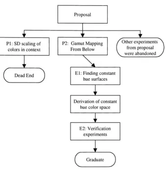
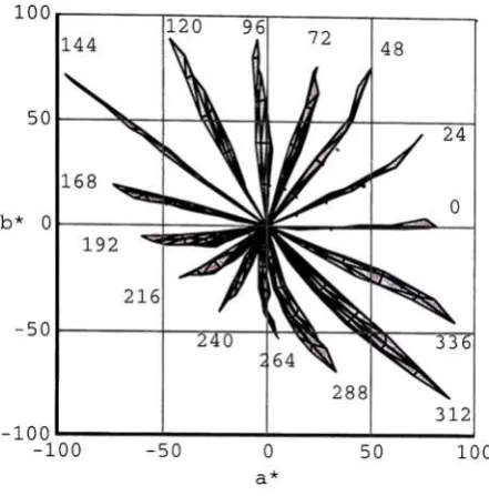
visual system.Figure 1
shows the progressionofthe workperformedthroughout the research period.The
first
two experiments,labeled
PI,
andP2 (P
standsfor
proposal,orpreliminary),
were part oftheinitialproposalthatwassigned off
by
theadvisory
committee.PI
did
not yieldresultsthatwere
deemed
significantenoughtofollow,
thus thepath was abandoned.P2
was publishedin
a
Color Research
andApplication
article, andpartoftheresultsfrom
this experimentshowedthatthe
non-uniformity
inhue in
CIELAB
color space were sobad,
the color name was changedwhen
using
the color space toperformgamut mapping.The
availabledata
setsfor
constantperceived
hue
werefound
tobe
insufficient,
sothesubsequentexperiments(El
andE2)
weredesigned
aroundhue
uniformity.El
was presented atEI98
in San Jose in
January
1998.2Study
ofhue uniformity has been
significant enough towarrantthe completion ofthedegree
Proposal
PI: SD scalingof colorsincontext
Dead End
P2:
Gamut
Mapping
From Below
X
Otherexperiments
fromproposal wereabandoned
El:
Finding
constanthuesurfaces
Derivationof constant
huecolor space
E2: Verification
experiments
Graduate
Figure1. Progressionofthesisresearchdirection.
2
Background
The background
sectionis
comprised oftwoparts.First,
aliterature
searchis discussed
onthesubjects of color
order,
color meaning, colorharmony,
and color preference.Secondly,
[image:17.545.61.401.87.446.2]2.1
Literature Search
2.1.1
Color Order Systems
andColor
Harmony
A
color order systemis
away
todescribe
therelationship
between
colors.Each
color ordersystemattempts to create a space within which colors can
be
specified and comparedin
anintuitively
clear way.The fact
that thereare somany
such systemsimplies
that theremay
notbe
a most appropriateway
tospecify
colorsfor every
situation and withinevery
context.From
a colorharmony
point ofview, there are afew important
color order systems thatrespectivetheories are
based
upon.Color
order systems ofMunsell, Ostwald,
Hard
andSivik,
and
Moon
andSpencer
are thusdescribed along
withthebasic foundations
oftheir respectivetheories of color
harmony. Relevant
experiments will alsobe
discussed.
2.1.1.1
Munsell
Albert H.
Munsell3,4was
bom
in
Boston,
Massachusetts in
1858.
Fie
attended college at theMassachusetts
Normal
Art
School.
Following
this, he
attendedtheJulien
Academy
in Paris
ona graduate
fellowship.
He
won secondprizein
theBeaux Arts
competitionfor his painting
"The
Ascension
ofElijah".
Between
1898
and1905,
he developed his ideas
on color order,notation,and arrangement.
Although
many
othersbefore
Munsell
have
suggested ways to arrangecolors,
he
was thefirst
tocreateanatias ofphysical samplesthatis
perceptually
uniform.The Munsell
color systemis
major
hue
category.Munsell's
major,
or simplehue
categories were red, yellow, green,blue,
andpurple.
Purple is included here because Munsell
thought that therewasalarger
perceptualdistance between
red andblue
than there wasbetween
red-yellow, yellow-green, andgreen-blue.
Intermediate
hues,
or compoundhues,
aredefined between
each of the majorhue
categories.
These
tenhue divisions
makeup
thehue
circle.The hue
circle is thendivided
tenfold for
each simplehue.
The
value5 is
assigned to each simplehue
and10
to eachcompound
hue.
The
notationfor
a given coloris defined
by
a triplet ofhue,
chroma, andvalue.
The
value axis goesfrom
0-black,
to10-white.
The
chroma scale goesfrom
0-neutral,
to an open ended
high
chromanumber,
althoughlarger
valueshave been
assignedby
some.On
thephysical atlas ofcolor, some pigments arenaturally
strongerthan others.Therefore,
the strongest pigment of
blue-green only
goes to chroma of5
whereas the strongest pigmentof red goes to
10.
Furthermore,
the maximum chromamay
nothappen
at value5.
For
example yellow reaches maximum chroma at a value of
7,
whereas purple-blue reachesmaximumchroma at value
4.
The
Munsell
notationfor
a particular color is <hue designation> <value>/<chroma>.For
example, apink color might
have
aMunsell
notationof5R 7/3. Neutral
colors aredenoted
N.
Munsell's
systemdoes
notdirectly
correspond toany
theory
of colorvision,
asdo
othersystems.
Munsell
wasinterested solely in
the perception of color anddid
not attempt toMunsell,
felt
that there was aneedfor
balance in every
aspect of one'slife.
This included
artand color.
He
attempted,
throughheunstics
anddesign tenets,
tospecify
rulesfor creating
harmony
andbalance in
color.Balance,
asdefined
by
Munsell,
is
visual comfort.Balance
means thata color schemeis neither too
light
or toodark,
tooweak or toostrong, toohot
ortoocold.
Balance is described
by
severalgenerallaws:
The
simplestbalance
oftwo colorsis
abalance
about neutral gray.This
means that twocolors that sit ona
line drawn
throughN5
and are equidistantfrom
N5
willbe balanced.
These
colors are consideredtobe
complementary.Area
of color combinations isimportant.
A
strong
red willbalance
alarger field
ofblue
green of small chroma.
"The
strongerthecolor we wishtoemploy,the smallermustbe its
area,whilethe
larger
the area,thegrayer or weakerthechroma."2
Area is
related tovalueand chroma
by
the rule that the product of value and chroma shouldbe
inversely
proportional to the respective areas ofthe two colors
in
question.For
example,
5R
7/6
will
balance
5R
3/3 in
a proportionof9
partsformer
to42
partslatter.
Colors
ofthe samehue
canbe
made tobalance if
they
are createdwithdifferent
valuesand chromas.
It
seems always tobe best if
colors are connectedby
a straightline
whosecenterpoint
falls
on orarounda value of5
(mid-lightness).
There
are9
chieffeatures
ofbalance
asdescribed
by
Faber
Birren
in
"Munsell,
A
grammarofColor"
.
These
are:1.
Gray
colorsharmonize
best
whenneatly
andevenly
spaced.Its
best
to centeraroundN5.
2.
Harmonies
withonly
onehue look best
whenthey
are arrangedneady
andevenly
aroundacenterpointofchroma
/5.
3.
Opposite
colorsofmedium chroma/5
canbe
combinedin
equalarea.4.
Opposite
colors of equal valuebut
ofdifferent
chroma shouldfollow
the abovementionedarea
law.
5.
Opposite
colors of the same chromabut different
value shouldfall
on a straightline
through,
and equidistantfrom,
N5.
6.
Opposite
colors ofdifferent
valueanddifferent
chroma shouldfollow
thearealaw.
7.
Munsell
believed,
asdid
others, that color combinations mostliked
by
people compriseeither colors that are
closely
related or colors that arein
contrast."Neighboring
colorsshould
be neatly
stepped as to value and shouldfind
sequence at middle value5.
They
should
be
ofthesame chromafor
goodbalance.
One
color couldhave strong
chromaandtheothercould
have
weak chroma".The
area rule shouldapply
to these colors.8.
There is
harmony
in
dirninishing
sequences.These
aresequencesthatstartwithhigh
valueand chroma and each successive color
is
reduced in chroma and value, andpossibly
All
ofMunsell's
notions aboutharmony
andbalance
centered aroundhis
color system andsimple geometric relations
between
colorsin
this space.These
relations weredrawn from
expenence as anartist and
designer,
and as such shouldbe
viewedtohave
morevalidity
thanrules that
have been
generatedby
workers such asMoon
andSpencer13
who
did
nothave first
hand
experience withcreating
art.Munsell
defined
ofcomplementary
colorsasthose oppositeonthe
hue
circle,and characterizedthemasmoststrongly
contrasting.He
alsodefined
themas two colorsthatmade neutral
gray
when spun on aMaxwell disk.
He
goes ontosay
thatanadmixture of
any
two colors of equal proportions makes a colorthat on theMunsell
diagram
lies
at the center of aline connecting
the colors.This
confusionbetween
perception andstimuli
is
interesting
because
itis
theonly
placein his
writings thathe infers
psychologicalrelationships
from indirect
observation ofdifferent
stimuli.2. 1. 1.2
Ostwald
Wilhelm
Ostwald6,7was around
60
years ofagebefore he became
interested in
color.Before
this, he had
workedin
thefields
ofmathematics, chemistry, and physics.Ostwald's
systemis
comprised ofplanes of constant
dominant
wavelength, each of whichis defined
by
ablack
point,
a white point and a"fullcolor"
A
fullcolor is defined
by
Ostwald
tobe
anidealized
spectral
"block
dye".
There
are enoughfullcolor descriptions
to span thehue
circle, thusenabling
a3 dimensional
solidtobe formed. Ostwald
createdhis
systembefore
theCIE
1931
standard observer was adopted, and
before Stevens
started work onhis
powerlaw
(1953)
.physical
analog
of a"fullcolor".
All
colors that sit in a given triangle are compnsed of amixture of
black,
whiteand a givenfullcolor.
White
andblack
content aredenoted
by
lower
case
letters
ofthealphabet,
excluding
theletter
j.
Ostwald defined
the equationC+W+B=l,
so
only
two coordinates needbe known
todefine
thepositionin
the triangle.The
triangleis
set
up
such that colors of equal white contentfall
on aline
thatis
normal to aline
thatintersects
thewhitepoint,
is
normalto the equal white contentline,
and is parallel to theline
connecting black
andfullcolor.
The
analogous rule appliesfor
colors of equalblack
content.Colors
of equalfullcolor
contentform
verticallines.
Colorimetrically,
theOstwald
system neither spans the entire visual space(as defined
by
theCIE
xy
chromaticity
diagram),
noris
itperceptually
uniform orinternally
consistent.However,
Ostwald's
ideas
about colorharmony
are quiteinteresting.
Because Ostwald
denned
all colors as mixtures ofblack,
white, and a pure color,his
systemfits
well withhow
graphical artists
deal
with,andthinkabout,colors i.e.in
tints,
tones,
and shades.Faber
Birren,
in his
analysis oftheOstwald
system, said"When
contemplatedin
thelight
ofaveragehuman
appreciation, colors are seen notsomuch
in
terms oflightness
ordarkness,
but
ratherin
termsof whiteness,
blackness,
grayness.A
lavender
(white-containing
purple)
and a sage green(black-containing
yellow)
may have
equallightness.
Yet
they
arehardly
tobe
called2.1.1.3
NCS
The
Natural
Color System
(NCS)
wasdesigned
by
Hard
and Sivik9and
is
aSwedish
standardfor
color notation.The NCS
isintended
tobe
a system that canbe
used without a physicalatlas
for
reference, although one was createdfor it for
illustrative
purposes.NCS
provides away
todescribe
color without referencetoa particularviewing
situation, thusallows theability
todescribe
theperceptionwithoutregardto a particular stimulus.The
NCS
spaceis
arrangedin
accordance toHering's
coloropponency theory,
where yellow andblue
are opposed, as arered and green.
NCS
notationis
similar toOstwald's
notationin
that a given colorlies in
atrianglewhose verticesare white
black
and a maximum chroma color.Colors
aredescribed
by
having
a resemblance toblack,
white, andtoup
to2
ofthe4
primary
hues.
Within
theNCS
triangle,
whitenessandblackness
aredescribed in
thesame manneras theOstwald
system,andthe equation s+w+c=100
is conspicuously
similar, where theletter
sdenotes.
The
notationfor
theNCS
systemis
atriplet,
where thefirst
numberis
blackness,
the second numberis
chromaticness,
defined
as thedistance from
the achromaticaxis,
and the third elementis
an alphanumeric thatdenotes hue
angle.The hue
circleis broken into
quadrants ofyellow, red,blue,
green,
and thehue
notationdescribes
the anglefrom
oneprimary
to the next.They
make the point over and over again that
"subjective
phenomena canonly be meaningfully
measured
using
subjective methods...Thus,
theNCS,
as a systemfor
denoting
colors as andwhen
they
appear to man,is
general and notbased
on theavailability
oftheNCS
Color
Hard
andSivik have
criticizedmany
previousworkersin
colorharmony
for creating
long
lists
of
dogmatic
rules that aremostly
opinion and notbased
onany underlying
generalrules.10
They
give as an example thedefinition
ofcomplementary
colors.There
are atleast
five
different,
somewhatcontradictory,
definitions
ofcomplementary
colors that arefounded
entirely
onwhatthey
call"stimulus
tncks"
instead
ofperception(for
instancethat two colorsmix to
gray
on aMaxwell disk
makes them complementary).Many
of the rules of colorharmony
ofGeothe, Munsell,
Moon
andSpencer,
andChevreul have been
shown tobe
toorigid
and notterribly
usefulin
real world situations.Hard
andSivik have
proposed a model of color combinationsin
which there are9
dimensions.11
These
areInterval,
with"subdimensions"
of:
Distinctness
ofBorder, Kind,
andSize
Chord,
withsubdimensionsof:Complexity, Content,
andType
Tuning,
withsubdimensions of :Color
similarities,Area
relations, andRhythm.
Interval
indicates
thecontrastbetween
colors.Distinctness
ofborder describes
theborderline
between
color surfaces andhow sharp
the edgeis
perceptually.Kind
denotes
wherein
spacethecolors ofthepairreside.
Size
is
thedistance
thecolors arefrom
oneanother.The interval
dimension
canbe
thought of as a moredetailed description
of colordifference.
Chord
describes how individual
colors are experiencedtogether.Complexity
describes
thenumber ofwhich mam attributes are
in
the combination.Type denotes
what othersmay have
calledcomplementary
colors.It
specifieswhethercolors on thehue
circle are opposite one anotheror
in
thesamequadrant,
or in the samehalf-circle.
Tuning
refers to the"Harmonics" ofthe
combination.
Color
similaritiesdescribes
what aspects ofthe colorsin
combination are thesame, i.e. which attributes of each color are similar.
For
example, colors couldbe
all of thesame
blackness,
orwhiteness,orchromaticness, etc.Area
relationsdescribes
the relative sizesof the colors in question.
Rhythm
has
todo
with theregularity
of a pattern or texture.A
repeating
pattern with a smallperiodwouldhave
lots
of rhythm.This
ninedimensional
approach to color combinations seems excessive, and thedimensions
are
hardly
orthogonalin
concept.These
attributes ofperception,
however,
areinteresting
andshould
be
takeninto account whendesigning
experimentsdealing
withthesubject.Flard
andSivik
alsodefine
whatthey
term the"color
gestalt,"which
is
the overall experienceof color and
form
when viewedin
the real world.The basic
elements oftheir color gestalt12 are:
1.
Color
elements:Described
by
the shape ofthe contour that separates the colorfrom its
surround and the actual color ofthe shape.
There is
no mention of smooth gradationsfrom
highlight
toshadow,but
thesepresumably
arepartofthesame colorelement.3.
Overall Form: The
pattern that thecolor elementsandline
networkform.
There may
ormay
notbe
anoverallform.
This
depends
onif
there isarhythmin
theareain
question.4.
Color Character: The
color character can changeif
thecolorelements change, evenif
thedistinctness
ofborder
remains the same.The
color character complements theform
gestalttomake
up
theoverallgestalt.5.
Balance:
This
is
whatmay be known in
other spheres as colorharmony.
It
takes intoaccountcolor
elements,
areabalance,
rhythmbalance,
etc.6.
Totality: The influence
ofcontextontherest ofthegestalt.Quantification
ofsomeoftheseaspects of color gestaltmay
be difficult
toobtain.The study
ofdistinctness
ofborder is
ofinterest
toboth Hard
andSivik's
theory
of colorcombinations and of their gestalt
ideas.10
They
show thatdistinctness
ofborder between
adjacent color
fields
canbe
thought of as a newway
to think about colordifference from
aphenomenological pointof view.
Distinctness
ofborder,
orGT
asthey
abbreviatedit (from
Swedish)
was shown tobe
a onedimensional function.
The
research on theNCS lightness
function
yields ablackness
thatis afunction
ofCIE
Y
asfollows:
s=
100-w
=100
1567
(r+56)
which says that
blackness (or
whiteness)
is ahyperbolic function
ofCIE
Y.
Although
interesting
part of thisis
that a constantdifference in GT along
the achromatic scalecorresponded to a constant
blackness (or
whiteness) difference.
This
makesNCS
blackness
perceptually
uniform withboth blackness
difference
and withborder
distinctness,
GT.
This
relationship
alsoholds
with chromatic colorpairs wherethehue
and chromaticness werekept
constantandthe
blackness
varied.An
equation wasderived
throughmultiplelinear
regressionthat predicted
distinctness
ofborder
GT
=f(As,Ac,A(j))
with avery
high
correlationcoefficient.
Furthermore,
it
wasfound
thatGT
was not an additive quantity,i.e. if GT
between A
andB
is the same asGT
between B
andC (on
the achromatic axis), theGT
between
A
andC
is notAB
+BC.
This lack
ofadditivity
is
notsurprising if
oneconsiders thatcenter-surround antagonism of the visual system enhances contrast
sensitivity
athigh
frequency
edges.The
assumptionis
madehere
also that theborders between
colorsis
sharp.Very
different
results wouldhave been found if
theborders between
the stimuli were evenslightly blurred.
2.1.1.4
Moon
andSpencer
Perry
Moon
andDomina
Spencer13
took the
CIE
specification oftheMunsell
Color
Order
System
and created their"metric
colorspace",
whichis
basically
just
awarping
oftheCIE
XYZ
space to makeit
appear moreperceptually
uniform.They
sought to create amathematical
foundation for
the rules ofcolorharmony
through the use oftheir new color1.
Any
arrangement ofcolors thatcanbe
sensedas anorderly
combination willbe
pleasing.Thus,
in
the newG5
space,
simple geometricfigures
connecting
colors will resultin
apleasing harmony.
2.
The interval (Euclidean distance in
theW space)
between any
twocolorsis
unambiguous.Moon
andSpencer
considered thatany
stimuli that are regarded asconfusing
willnecessarily
be disharmonious.
From
thisthey
created their areas ofambiguity
in their color space.For
the
hue
circle,theregions are asin figure
2.
similarity
Figure2. Regionsof confusionincolor space.
Regions
ofidentity, similarity, and contrast are assumedtobe
pleasing,
whereas theregions ofthe
first
and second ambiguities are assumedtobe
displeasing.
The
same regions arefound in
the other two planes in the space and are represented
by
concentric ellipses inlightness/chroma
at constanthue
values.Moon
andSpencer
(also
referredto asM
andS)
goon to
classify
alarge
number ofharmonies,
in one, two and threevariables,
with [image:29.545.195.322.306.436.2]"A
pleasing balance among
n color patchesis
obtained when the scalar moments about theadaptationpointin CO-spaceareequal,
for
allthepatches"14
Pope15
in his
criticism of theMoon
andSpencer
work points out thatthey
have greatly
oversimplifiedthe
problem,
thatclassification ofharmonies into
groups of simplefigures looks
nice,
but
needstobe
validatedby
experimentation.He
criticizes theirapplication ofBirkhoff
saesthetic
measure1
M=0/C (aesthetic
measureis
orderdivided
by
complexity)
as a truemathematical
equation,
sinceit
wasintended
more as abasic
principlefor
guidance ofdesign.
On
theideas
ofregions ofambiguity Pope has
disagreed,
but
thisis
dealing
with an aestheticcontextmore
generally
associated withfiner
art, and not with graphicdesign,
or pagelayout.
Pope
sumsup his feelings in
thequote"geometric
significancein
the symbolic representationdoes
notnecessarily
mean visualsignificance."13
In
Granger's
experiment on areabalance in
colorharmony,
Moon
andSpencer's
predictionswith regard to area
balance
showed no predictive value, althoughMunsell's
empirical ruleregarding
areabalance
was shown toaccountfor 35%
to53%
ofthe totalvariance.Strangely,
there was a
very high inter-observer
correlationfor
areabalance,
between
.67 and .73.This
may
suggestthat thereisapredictorfor
preference of areabalance
oftwocolor mixes.2.1.1.5
Others
Nayatam,
etal.,18
in
1969
performed some experiments on two colorharmonies.
They
aesthetic measures of
9890
two-colorharmonies from
the equation.From
the predictedaesthetic
measures,
his data
suggested that two colorharmonies
of same or similarhues
tendto
be
moreharmonious
thancomplementary
orcontrasting hues.
Also,
colorsharmonize
better
withN-9
(white),
thanwithN-2
(blackish),
and thataesthetic measureis
affectedmostly
by
value and valuedifferences
than otherdimensions in
color space.The
experiment wasconductedonpairsofcolored patcheswithout referencetoparticularcontext.
In
summary,
it
seems that most colorharmony
models or systems, atbest,
provide somefeeling
todesigners for
a more systematic approach tosynthesizing
colorharmonies.
No
onesystem
has been
showntobe
general enoughtoapply
tenets toallsituations.To
try
todesign
an analysis system that employed one or more of the rules to combinations of color would
both be
aprohibitively large
undertaking, and would not guaranteeany
useful results.The
only
way
to glean usefulinformation
about colorharmonies is
tostudy
observer's reactions tocolor combinations,
both
within the context itis
tobe
usedin,
and over a widesampling
ofthe space.
Only
from
resultsfrom
study
of particular context and application can rulesbe
established
for
thatcontext.2.1.2
Color
Naming
andColor
Meaning
Object
colors are those colors that we experiencein
normal photopicviewing in
the realworld.
Although
viewing
conditions can changedrastically
in
the natural environment(and
man made
buildings),
toa great extent colors of objects appear to remain thesame,
or atleast
quite similar.
This
phenomenon,called colorconstancy, is greaterif
colors are associatedwithThe ability
toseecolors asbelonging
toobjects,in
spiteofthedifferences
of(to
agreatextent)
theactual physicalstimulus
reaching
theeyeallowshumans
touse coloras atool tohelp
themsurvive
in
their environment.The ability
to communicate these colors and to assignunambiguous namesto them
is
a usefultool.2.1.2.1
Basic
Color Names
Naming
ofcolorsin
a givenlanguage
seems to conformto afairly
strictevolutionary
process,
whereby
thelanguage
must pass through successive stages of evolution to get to the nextlevel1
It
has been
shownthat ofthenearly
100
languages
surveyed,
alarge majority
ofthemfollow
thefollowing
rule of evolution(for
existenceof color names):white
_black_ <
[red]
<green
yellow
[blue]
<
[brown]
<purple
pink
orange
gray
This relationship
means thatalanguage
mostlikely
willhave
wordsfor
white andblack before
they
have
thewordfor
red,
andthat thelanguage
willhave
a wordfor
redbefore
ithas
awordfor
either yellow or green.A
language may
have,
afterred,
the wordfor
either green orfor
yellow,
but it
musthave both before it has
a wordfor blue.
These
rules sound morelike
arbitrary
synthesisrules,but
they
have been derived from study
ofalarge
number oflanguages
in
various stages of evolution.In
theEnglish
language,
there are anindefinite
number of1.
The
meaning
ofthecoloris
notpredictablefrom
themeaning
ofits
parts, e.g.blue-green.
2.
Its
significanceis
notincluded in
that ofany
other colorterm. e.g. crimsonis
akind
ofred.
3.
Its
application cannotbe
restricted to anarrow class of objects, e.g.blonde may be
usedto
describe
perhapsonly
hair,
complexion,
andfurniture.
The ISCC-NBS
Dictionary
ofColor
Names20
uses a similar attitude when
assigning
colornames tovolumes
in
theMunsell
color solid.The hue
circleis defined in
terms ofbasic
colornames
descnbed
above,withtheaddition of violet and olive.Intermediate
hues
aredescribed
by
compound colornames,
e.g. reddish-orange.A
slice of constanthue (value
vs.chroma) is
denoted
using
adjectivalmodifiers such asvery pale,
strong,deep,
andlight.
Naming
ofcolorsis
an outcome ofthe evolution of alanguage.
As
thelexicon
grows,
morewords are assigned to smaller
differences
in color(up
to alimit).
As
theISCC-NBS
Dictionary
ofColor Names
illustrates,
in
English,
there are ahuge
number of color names.The meaning
associatedwith, or evokedby
a particularcoloris
aless
welldefined
problem,
however.
Connotation
ofmeaning
of a particular colordepends
oncontext, experience,
culture,
time,
and otherfactors.
There
seems tobe
oneinvariant.
Black
seems tobe
theuniversal color of
mourning
anddeath.
Most
peopledislike black.
Ancient
cultureshad
various and somewhat
arbitrary
meaningsfor
the colorsin
theirworld"1
To Leonardo da
Vinci,
yellow stoodfor
earth, greenfor
water,blue for
air, redfor
fire,
andblack for
total(China)
wasbrown,
oftheMing Dynasty
was green, and oftheCh'ing Dynasty
was yellow.Different
colorssignify different
castesin
India.
The
Hindu
bride
wears yellow ather
wedding,whereas the
Chinese bride
wears,and is surroundedby,
red.2.1.2.2
Color Meanings
Physiological
and emotional responsestocolorshave been
noted and studiedby
psychologists.For
instance,
Felix
Deutch21found
that colorbrought
about reflex actions in theinvoluntary
actions such as pulse rate,
breathing,
andblood
pressure.He
found, however,
that redmay
calm one personand excite another.
There
seemstobe
no general ruleto attribute aresponseto a given color stimuli.
Deutch
reasoned that physiological and emotional changes werebrought
aboutby
subjects'
associations, so
based
onindividual
experiences, people reactedtocolor stimuli accordingly.
Color
preferenceshave been
studiedfrom
anumber ofdifferent
viewpoints.In
asurvey
of21,060
subjects,H.J. Eysenck
reported a meanranking
ofpreference ofbasic
colorsin
thefollowing
order.Blue,
red, green, violet, orange,yellow.However,
thisranking
wasfor
colorin
theabstract,withoutspecific context.Lars Sivik
has done
anumber ofstudiesregarding
themeaning
of color.He
used semanticdifferential
scaling, whichis
ascaling
technique that uses a sevenstep bipolar
scale ofassociations toascertain
subjects'
where thesubject would
fill in
themost appropriate circle related to theirresponse.Sivik
andcoworkers
have
used the same scales ofmeaning for many
such studies23,24,25.Their list
ofsemantic
bipolar
variablesis:
like-dislike,
winter-summer,loud-discreet,
unappetising-appetising,joyful-serious,
hygienic-unhygienic,
oldfashioned-modern,
wet-dry,beautiful-ugly,
soothing-exciting,positive-negative,
sick-healthy, cultured-uncultured,
feminine-masculine,
complicated-simple, stimulating-dull, cold-hot,la^y-energetic,
friendly-hostile,
active-passive, shameless-prudish, old-young, expensive-cheap,tense-relaxed,
near-far,secure-anxious.
From
afactor
analysis(principle
component analysis andorthogonalizing)
oftheresultant
data,
five
majorfactors
werefound.
These
weredenoted
Excitement, Evaluation,
Potency,
Temperature,
Activity.
Since
theexperimentwas performedtobe
"context
free",
theconnotations
from
subjects was general andpossibly
morearbitrary
than wouldbe
the caseif
the stage wasset
in
amorenarrowsense.Given this,
theinter-observer
variance showedtobe
fairly
low.
Further
studieshave been
performedthat setthe context.In "Color
connotationsof exterior
colors,"26
theabove experiment was repeated withthe
difference
being
thatsubjectswere shown pictures of colors on
buildings
instead
of abstract patches.The list
of variableswere,
for
expediency, reduced in number to thirteen: warm-cold, vulgar-cultured,friendly-hostile,
hilarious-serious,
pleasant-unpleasant,
uncommon-common, soothing-exciting, masculinefeminine,
open-enclosed,unclearly-ckarly
demarcated,
strong-weak closure, spacious-cramped.Two
types ofbuildings
wereshown, and
67
colors were usedthatfairly
evenly
sampled the color space.168
observerstookpart
in
the study.Analysis
onthedata
showedthreemajorfactors;
emotional(or pleasantness)
evaluation, social evaluation, anda spatial
factor.
The
spatialfactor is
somewhatobvious,
asanalysis,
Sivik
employed"isosemantic
mapping"
ofthemeanings
in
theNCS
perceptual colorspace.
This
techniqueis
interesting
asit
allows visualization ofthemeaningsin
planes ofthespace,
although thedetails
asto the mechanics ofcreating
the mappings are somewhat vague.Whereas
temperaturewas separated as afactor
{warm-cold
andla%y-energetic)
in
the contextfree
color
study,
it
wasfound
tobe included in
thefactor
called emotional evaluation.For
colorin
the
building
contexttheconcepts ofbeauty
and warmtharehighly
correlated,
but for
colorin
the absence of context
they
areindependent.
This
wasdiscussed
tobe partly
a culturalbias,
because
Sivik
statesthat therearevery
few
"cool"colored
buildings
mSweden,
althoughthisis
not the case
in
many
otherparts oftheworld.The issue
thatmeanings of words are contextdependent
wasalsodiscussed.
If
themeaning
of asemanticvariablechanges as afunction
ofcontext, then there is
nothing
limiting
theSD
pairs tobeing
oppositein
meaning, and thevalidity
ofthevariableis
questionable.This illustrates
the needfor
well chosen variablesthatare
unambiguously
understood as opposite withinthe contextof study.For
thecomparison ofindividual
variables ofmeaning between
colorin
and out ofcontext,
warm-cold,hilarious-serious,
soothing-exciting, masculine-feminine were all
found
tohave
fairly
high
positivecorrelation.Vulgar-cultured,
beautiful-ugly,
andfriendly
-hostile showedfairly
low
correlation.The factors
that werenamed evaluative
in both
studies werefound
tohave
very
low
correlation.Thus,
thisfactor
was
interpreted
tohave
thehighest sensitivity
tocontext.Kobayashi
has
created a"Color Image
Scale"thatassigns semantic
descriptors
to perceptualsegmented
by
hue,
andby
tone,
whichis
a namecorresponding
to theISCC-NBS
colordictionary
tonedescriptors
of a givenhue.
Kobayashi
states that the three adjectivalbipolar
scales of
warm-cool, soft-hard,
and clear-grayish arerelatively
insensitive
todifferences
ofcontext,
personaltaste,
andotherenvironmentalfactors,
and thereforecanbe
usedin
ageneralsetting.
He
goes ontomap
thespaceandassigndifferent
meanings todifferent
partsof space.This
seems tobe
agross overgenerakzation, and although the adjectives that re-describe thecolor space
may be
fairly
invariant,
thereis
no reason tobelieve
that this is an exhaustive useofthe
dimensions
of color meaning.2.1
.3Preferred Reproduction ofPictorial Images
Colorimetry
enables color matches tobe
predicted when original and reproduction aremeasured under
identical
viewing
conditions.Color
appearance models attempt to enablecolor matches to
be
predicted undervarying
viewing
conditions.Even
if color appearancemodels could
exactly
predict matches acrossdiffering
viewing
conditions and mediatypes,
they
may
ormay
notspecify
apreferredreproduction.Additionally,
if viewing
conditions areconstrained to
be
identical, and the originalimage
is free from
defect,
a colorimetncreproduction
may
notnecessarily
be
preferred.Evidence
suggests that,for
several types ofimage
reproductiontechnologiesandmodalities, acolorimetnc reproductionis
notpreferred.In 1948 Buck
andFroelich28
studied
human
complexion under a number of standardlight
sources.
They
determined
the average complexion of the three major races(Caucasian,
assess the
quality
of color reproduction,it
is avery
important volume of color space.They
found
that"...the
preferred source emphasizes the material inbrightness
and saturationwithout marked change
in hue.
Thus,
in
each case, the preference wasfor
thelamp
whosespectral
distribution
and color mostclosely
matched thematerialbeing
viewed."
This
led
tothe
design
of the soft whitefluorescent
lamp,
whichhas
a spectral response thatis
close toaverage
Caucasian
complexion.This may
explainwhy
a warmer colorbalance is
oftenpreferredwhen
viewing
portraits ofpeople.In
1960
Bartleson29 studied thememory
colors offamiliar
objectsusing
c