Answers (Chapter 3) pdf
6
0
0
Full text
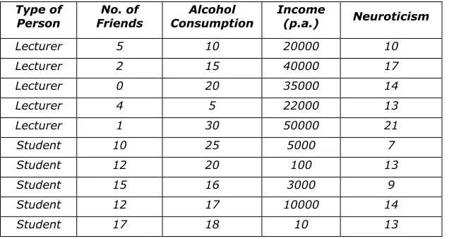
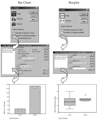
(2) Discovering Statistics Using SPSS: Chapter 3 A clustered chart is one in which each group or category of people has several chart elements. These graphs can be useful if you want to plot two independent variables. For example, if we had noted the gender of each student and lecturer we would have two independent variables (gender and job) and one dependent variable (number of friends). Therefore, we could use a clustered plot to display the average number of friends for lecturers and students and have separate bars (or lines) representing males and females. In this latter case, in which both variables were measured using a between-group design, the Summaries for groups of cases option should be used. Alternatively, you can plot values of several groups along several variables. Imagine we wanted to plot the average number of friends and the average neuroticism score and split these scores according to whether the person was a lecturer or student. We want to plot two bars for the lecturers (one representing the number of friends and one representing neuroticism) and two for the students. To plot this graph we should choose a clustered chart but ask for Summaries of separate variables. to When a type of graph has been selected (simple or clustered) you need to click on move to the next dialog box. On many occasions you will see the term Category axis, and this refers to the X-axis (horizontal). This axis usually requires a grouping variable (in these examples I have used type of person). Variables can be selected by clicking on them in the variable list (left-hand side of dialog box) and moving them to the appropriate space by using button. In the case of bar charts, you can make the bars represent many things the (number of cases etc.), but on the vast majority of occasions you will want them to represent the mean value and so you should select Other summary function and then enter a variable. enables this default to be changed. The default function is the mean, but clicking on and the graph will appear in the Once the graphs options have been selected click on output viewer. These charts can then be edited by double-clicking on them in the viewer. This action produces a new window (called the chart editor) in which you can change just about any property of the graph by double-clicking with the mouse (have a play around with some of the functions!). Try putting some of these principles into practice using our lecturer-student data. Figure 1 shows how to create a bar chart and boxplot of two of the variables measured for the lecturers. Follow these options and see whether you can re-create these graphs (remember that you can edit them to add bar labels and change the colours). A bar chart of the means is a useful way to see the pattern of results (i.e. which group got the highest scores). In Figure 1 the graph shows us at a glance that students, on average, have more friends than their lecturers. Boxplots tell us a little bit more. For one thing the whiskers on the plot (the lines that stick out of the top and bottom) give an indicator of the spread of scores. More important, unusual cases can be identified (outliers) because they are displayed as a dot outside of the main range of scores. In Figure, the boxplot displayed has a single outlier who is represented by the dot above the graph. This person is a student who drank rather more than the other students. The dark line also shows the median score, so we can tell that the median amount of units drunk was higher for students than lecturers. Try plotting graphs of some of the other variables.. Dr. Andy Field. Page 2. 4/21/2003.
(3) Discovering Statistics Using SPSS: Chapter 3. Bar Chart. Boxplot. 14.00. 40 13.20. 12.00 30 10.00. Units of alcohol (per week). 6. Mean No. of Friends. 8.00. 6.00. 4.00. 2.00. 2.40. 0.00. 20. 10. 0 N=. Lecturer. Student. Type of Person. 5. 5. Lecturer. Student. Type of Person. Figure 1: Plotting graphs on SPSS. Task 2 Using the ChickFlick.sav data, check the distributions for the two films (ignore gender): are they normally distributed. The output you should get look like those reproduced below (I used the Explore function described in Chapter 3). The skewness statistics gives rise to a z-score of –0.378/0.512 = 0.74 for Bridget Jones’ diary, and 0.04/0.512 = 0.08 for momento. These show no significant skewness. The K-S tests show no significant deviation from normality and the histogram for Bridget jones’ diary even looks normal. The histogram for Momento is less normal, but the rest of the evidence gives us no reason to suppose it isn’t.. Dr. Andy Field. Page 3. 4/21/2003.
(4) Discovering Statistics Using SPSS: Chapter 3. Descriptives Film Bridget Jones' Diary. Arousal. Momento. Mean 95% Confidence Interval for Mean 5% Trimmed Mean Median Variance Std. Deviation Minimum Maximum Range Interquartile Range Skewness Kurtosis Mean 95% Confidence Interval for Mean. Lower Bound Upper Bound. Lower Bound Upper Bound. 5% Trimmed Mean Median Variance Std. Deviation Minimum Maximum Range Interquartile Range Skewness Kurtosis. Statistic 14.8000 12.1196 17.4804 14.9444 15.0000 32.800 5.72713 3.00 24.00 21.00 7.5000 -.378 -.254 25.2500 21.9133. .512 .992 1.59419. 28.5867 25.2222 24.5000 50.829 7.12944 14.00 37.00 23.00 10.7500 .040 -1.024. Histogram. Std. Error 1.28062. .512 .992. Histogram. For FILM= Bridget Jones' Diary. For FILM= Momento. 6. 3.5 3.0. 5. 2.5. 4. 2.0 3 1.5 1.0. Frequency. Frequency. 2 Std. Dev = 5.73. 1. Mean = 14.8 N = 20.00. 0 2.5. 5.0. 7.5. 10.0 12.5 15.0 17.5 20.0 22.5 25.0. Mean = 25.3 N = 20.00. 0.0 15.0 17.5 20.0 22.5 25.0 27.5 30.0 32.5 35.0 37.5. Arousal. Dr. Andy Field. Std. Dev = 7.13. .5. Arousal. Page 4. 4/21/2003.
(5) Discovering Statistics Using SPSS: Chapter 3. Tests of Normality a. Film Bridget Jones' Diary Momento. Arousal. Kolmogorov-Smirnov Statistic df Sig. .127 20 .200* .097 20 .200*. Shapiro-Wilk Statistic df .972 20 .960 20. Sig. .788 .552. *. This is a lower bound of the true significance. a. Lilliefors Significance Correction. Task 3 Using the SPSSExam.sav data, remember that numeracy scores appear positively skewed. Transform these data using one of the transformations described in this chapter: do the data become normal? These are the original histograms and those of the transformed scores: Histogram. Histogram. 40. 30. 30 20. 20. 10. Frequency. Frequency. 10 Std. Dev = 2.71 Mean = 4.9 N = 100.00. 0 2.0. 4.0. 6.0. 8.0. 10.0. 12.0. Std. Dev = .26 Mean = .62. 14.0. 0.00. Numeracy. .13. .25. .38. .50. .63. .75. .88. 1.00 1.13. Log Transformed Numeracy Scores. Histogram. Histogram. 40. 40. 30. 30. 20. 20. 10. Frequency. 10. Frequency. N = 100.00. 0. Std. Dev = .61 Mean = 2.12 N = 100.00. 0 1.00. 1.50. 2.00. 2.50. 3.00. 3.50. Std. Dev = .21 Mean = .29 N = 100.00. 0 .13. Square Root transformed Numeracy Scores. .25. .38. .50. .63. .75. .88. 1.00. Reciprocal of Numeracy Scores. None of these histograms appear to be normal. Below is the table of results from the K-S test, all of which are significant. The only conclusion is that although the square root transformation does the best job of normalizing the data, none of these transformations actually works!. Dr. Andy Field. Page 5. 4/21/2003.
(6) Discovering Statistics Using SPSS: Chapter 3. Tests of Normality a. Numeracy Log Transformed Numeracy Scores Square Root transformed Numeracy Scores Reciprocal of Numeracy Scores. Kolmogorov-Smirnov Statistic df Sig. .153 100 .000 .120 100 .001 .108 100 .006 .223 100 .000. Statistic .924 .959 .970 .763. Shapiro-Wilk df 100 100 100 100. Sig. .000 .003 .020 .000. a. Lilliefors Significance Correction. Dr. Andy Field. Page 6. 4/21/2003.
(7)
Figure
Related documents
Statistical Inference, 77 J. The concentration index is sometimes applied to bad attributes, e.g., ill health, but the analysis in this Article generally assumes that the currency
So although these migrants initially come to the UK to work and thereby support the economy of the UK, until they obtain indefinite leave to remain, most will not be eligible
What are the driving factors leading companies to request sales tax outsourcing services:. • Complexity of returns at the local level of tax (County
El registro arqueológico, y en particular los procesos posdeposicionales, proporcionan una información clave para conocer el desti- no de las villae y constatar su colapso o
Whilst single sensory experiences like only having VH (as in ED) or only having AH (as in many people with psychosis) may be accounted for with domain specific unimodal
“A monument to the artist” is more known to Krasnoyarsk citizens as the Monument to Andrey Gennadevich Pozdeev (1926-1998), the authorship belongs to the
The right panel, on the other hand, makes it very obvious that the above results for SPEAKERTYPE shown in Figure 5 still hold, but only for when the information embodied by the
In this paper, an algorithm called Hexagon-Diamond Search (HDS) is proposed for ME where the algorithm and several fast BMAs, namely Three Step Search (TSS), New Three Step
