Rochester Institute of Technology
RIT Scholar Works
Theses
Thesis/Dissertation Collections
5-1-1970
The Function of Flat Shape in Painting
Marla Friedrich
Follow this and additional works at:
http://scholarworks.rit.edu/theses
This Thesis is brought to you for free and open access by the Thesis/Dissertation Collections at RIT Scholar Works. It has been accepted for inclusion
in Theses by an authorized administrator of RIT Scholar Works. For more information, please contact
ritscholarworks@rit.edu
.
Recommended Citation
THE FUNCTION
OF
FLAT
SHAPE
IN
PAINT
DIG
by
Maria Friedrich
Candidate for
the
Master
ofFine
Arts
In the College
ofFine
andApplied
Arts
of
the
Rochester
Institute
ofTechnology.
Date
ofSubmission:
May
1970
TABLE OF
CONTENTS
Page
List
ofIllustrations
iv
Introduction:
Thesis
Proposal
viChapter 1:
Background
1
Chapter
2:
Graduate
Concentration
in
Painting
k
Chapter
3:
Thesis
Research
onthe
Function
of8
Flat
Shape
in
Painting
Chapter
ki
The
Painting
Procedures
11
Chapter
5'The Paintings
13
Chapter
6:
Conclusions
23
Bibliography
3^
LIST
OF
ILLUSTRATIONS
Plate
1.
Neolithic
Pot,
using
spiral motif.From
Helen
Gardner,
Art
Through
the
Ages,
p.kk.
(copy)
2.
"Painting,"by
Joan Mir
6,
1930.
From
Time.
July
26,
1968,
p.56.
3.
Ampersands
sincethe
time
ofGutenberg,
showing
the variety
of ways ofpresenting
a singlecharacter.
From
R.I.T.'s
Matrix
8.
An
Exper
iment
in Visual
Communication,
(copy)
k.
The
numberseven,
a gracefulResign
in
woodtype.
From
Matrix .
(copy)
5.
"Hunter
and Birds," stonecutby
Kiakshuk.
From
James
Houston,
Eskimo
Prints,
p.k5.
(copy)
6.
"Women
onthe
Beach," woodcutby
Edvard
Kunch.
From
Time.
February
21,
1969,
p.62.
7.
"Red
andWhite
Plum
Trees,"screen
painting
by
Ogata
Korin,
Tokugawa
Period.
University
Prints,
8.
"Bahia,"acrylic
painting
by
Jack
Youngerman.
From
Time.
April
26,
i960,
p.77
->9.
"The
Human
Edge,"acrylic
painting
by
Helen
Franken thaler
,1967.
From
Time,
March
28, 1969,
p.67.
10.
"Ruby
Gold,"oil
painting
by
Hans Hofmann.
From
The
Art
Gallery
Magazine,
Summer
1968,
p.32.
11.
Thesis
Painting
#
1
12.
Thesis
Painting
#
2
13.
Thesis
Painting
#
3
Ik.
Thesis
Painting
# k
15.
Thesis
Painting
#
5
16.
Thesis
Painting
#
6
17.
Thesis
Painting
#
7
18.
Thesis
Painting
#
8
List
ofIllustrations,
cont.Plate 19.
Thesis
Painting
# 9
20.
Thesis
Painting
10
21.
"The
Return
ofthe
Hunters,"painting
by
Pieter
Breughel the
Elder
(cropped).
From
Time.
January
12,
1970,
p.52.
22.
"Running
Goose,"stencil
by
Egivudluk.
From
James
Houston,
Eskimo
Prints,
p.106.
(copy)
23.
"Man
Carrying
Reluctant
Wife," stonecutby
Pudlo.
From James
Houston,
Eskimo
Prints,
p.72.
(copy)
2*+.
Design
from
aTlingit
ceremonial shirt.From Art
of
the
Northwest
Coast,
Lowie
Museum
ofAnthro
pology,
Berkeley, California,
p.68.
25.
"Genji
Monogatari:
Eastern
House," scrollpainting
attributed
to
Takayoshi,
Fujiwara
Period.
University
Prints.
26.
"Tales
of Genji,"detail
from 16th
century
Japanese
screen.
Art
Institute
ofChicago.
27.
"Tales
of Genji,"detail from
16th
century
Japanese
screen.
Art
Institute
ofChicago.
28.
"Uji
Bridge,"screen
painting
attributedto
Sanraku,
I-Iomoyama
Period.
University
Prints.
29.
"Garage
Lights,"oil
painting
by
Stuart
Davis.
Memorial
Art
Gallery, Rochester,
New York.
30.
"Christ
asthe
Man
of Sorrows," panelpainting
by
Meister
Francke,
painted afterik2h.
From
Time,
November
Ik,
1969,
p.57*
Introduction:
Thesis
Proposal
Submitted
February
1970
I.
Purpose
ofthe
Thesis:
The
purpose ofthis
Thesis
is
to
investigate
the
estheticand
formal
qualities offlat
shapein painting,
andto
summarize
the
researchin
a series of paintings.II.
Scope
ofthe
Thesis:
I
planto
researchthe Japanese
concept of notan
andits
applicationto
their
art,
particularly
to
their
screenpaintings and woodcuts.
I
planto
study
the
works ofEuro
pean painters
Incluenced
by
the
Japanese
print,
as well asthe
works of artists whohave
reached control ofthe
flat
shape
from
otherheritages
orthrough
Independent
intellec
tual
processes.This
group
wouldinclude
Alexander
Cozens,
Matisse, Klee,
Kiro, Mondrian,
Baziotes,
Avery,
Frankenthaler
,Eskimo
printmakers andthe
Northwest Coast
Indians.
I
hope
to
read critical works pertinentto
the
subject,
such asThe Life
ofForms
in
Art,
by
Henri
Focillon,
Point
andLine
to
Flane,
by Wassily
Kandinsky,
andthe
esthetic essays ofPiet
Mondrian.
Visits
to
museums and galleries willbe
undertaken whenever possible.
The
mediain
whichthe
project willbe
executed willbe
oils andacrylics,
on standardtwo-dimensional
canvasesand masonite.
Eight
to
ten
paintings are proposed.III.
Procedures:First,
I
planto
study
in the
library
andto
form my
own
thoughts.
I
wouldlike
to
investigateboth
the
estheticand
the
humanistic
elementsthat have
influenced artistsin
their
handling
of shapein the
past.Then
I
will use cutpaper and
drawings
to
plan a series of paintingsto
summarizewhat
I
have
learned
from my
research.THE FUNCTION
OF
FLAT
SHAPE
IN PAINTING
Chapter 1:
Background
Graphic Design became
my
undergraduate major atR.I.T.
because
I
wasintrigued
withthe
power ofdesigners
to
catchand
hold
the
attention ofthe
public,
andto
shape mindsto
think
and actin
a certain way.In
orderto be
ableto
convince someone of
the
truth
of anargument,
the
designer
needsto
have
adeep
understanding
ofthe
human
psyche.He
shouldknow
notonly
what attractsattention,
but
also whatdesigns
will still please people after
they
have looked
atthem
repeatedly.
He
needsto
know both
whatis
the
currentvisual
fashion,
and also whatkinds
ofthings have
alwaysappealed
to
people,
whatkind
of visualimages
have
retainedtheir
interest
overthe
centuries.It
seemsthat
the
communicative power ofthe
simplebold
image
has
neverbeen
completely
eclipsed,
evenin
periods when
flamboyance
and ornateness werethe
vogue.In
browsing
through any
general arthistory
text
book,
the
simple
forms
appear again and againfrom
paleolithicpaintings and neolithic
pottery,
through
the
beautifully
simplified
Egyptian
portraitstatuary,
African
sculpture,
masks
from New
Guinea,
the
huge
stoneimages
from the
Easter
Islands,
American
Indian
Art,
andfinally,
the
starkly
simple paintings of
the
twentieth
century
(Plates
1
and2).
Peoples
all overthe
world andfrom every
period ofPlate
1.
Neolithic
pot,
using
spiral motif.Plate
2.
"Painting,"Nurnburger Schwab /Haass
De Vinne/Har
Sapphire/Stempell
HammerUnziale/Klingspor
M No.506/Wood Type
^^^^
6c
&
^^^^^
LetteGotisch/Haass
Ornamented Outline Stevens & Shanks
Palatino/Zapf
Crayon/MorganPress
Bodonl Title/Bauer
&
Copperplate Gothic Bold/Mono.Oiotima Cursive/S
Egmont/Amst. Cont.
Banjo/Debemy& Peignot
Plate
3.
Ampersands
sincethe
time
ofGutenberg,
showing
the
variety
of waysof
presenting
a single
character.
Fontanesi/Amst. Cont.
Goramond Italic/Mono.
Forum/Goudy
r
Flirt/Morgan Pr...^-^^^T
M f^^t Co.lon 540 Italic.ATF
Garomond BoldSwash/Mono. ^^^^^k ^^^^^^^^r ^^r
Zentenar-Fraktur/Bauer
FuturaMedium/Bauer Stradivarius/Bauer
recognizable
images
from the familiar
visual world or asabstractions,
such as symbols.Training
in
graphicstaught
methat
asimple,
evencommon
form,
such as aletter
ortraffic
symbol,
couldbe
manipulated
in
anextraordinary
number of ways(Plate 3).
Designs
of greatbeauty
and power couldbe
evolvedfrom
asingle
numeral,
orfrom the
proper placement of a severeblack
shape on a white page.A
study
oftype faces
showedthat
asimple,
useful,
recognizable,
black*
shape could
be
designed to be
esthetic as well as communicative(Plate
k)
.Previous
to my
studiesIn
graphics,
I
had
been
intro
duced
to
the philosophy
ofCarl
Jung
through
a coursein
esthetics.
His belief
that
there
are certain experiences commonto
allhuman beings
through
their
evolutionary de
velopment,
experiences which remain submergedIn
the
psyche,
seemed
to
meto
have
arelationship
to
the
universal appeal of certainforms
in
art.In his
writings,
Jung
usedthe
example of
the
cross,
a configurationfound
in many
cultures.He
saysthat
in the
early
history
ofman,
the
crossroadswas a place of
danger
, one where enemies might attack
from
all sides.Because
ofthis
ancientsituation,
manhas
always
instinctively
placedimportance
onthe
sign ofthe
cross,
although
the
exact meanin?
ofthe
symbolmay
vary from
culture1
to
culture.I felt
that the black
and white prints of paintings ofRembrandt, Ryder,
and othersin
arthistory
textbooks
oftenshowed a psychological attraction
that
mightbe
relatedto
Jung's
theories.
The massing
ofdark
forms
againstlight
seemed
to have
a strangeappeal,
attimes
unrelatedto
the
spirit ofthe
subject matter.I
concludedthat
the
bold
value organization ofthese
paintings contributed essentially
to
their
success,
sincethe
value patterns were subconsciously
recognizable asJung's
primordialforms.
Al
though
It
is
impossible
for
meto
know
whatImages
andaccompanying
events were experiencedby
primitiveman,
I
believe
withJung
that
the
sameImages may be subconsciously
recognized
by
us nowin
the
artwork,
evoking
similar emotionsto
those
which were once elicitedby
them.
A
result ofthese
studies wasthe
development
ofmy
R.I.T.
Senior
Project,
a series of paintingsin
whichI
tried
to
find
simplebut
interesting
images
to
paintin
k
Chapter
2:
Graduate
Concentration
in
Painting
The
Graphic
Design field
has
expandedInto
many
newtechnical
areas.Film, tapes,
and three-dimensional media are now commonin
classroom graphics problems.I
feel,
how
ever,
that
pure,
two-dimensional
design
is
stillthe
mostchallenging
area,
andI became
a graduate studentin
painting
in
orderto
specializein
this
aspect ofdesign.
Because
there
are such anInfinite
number ofthings
that
can
be
done
withpaint,
I
found
that
it
i^
oftendifficult
to be
sufficiently
selective.Because
an art educationin
our
time
includes
years ofstudy
In
arthistory
and constantexposure
to
a widevariety
of stylesthrough
museums,
galleries,
books
andmagazines,
the
studentis
tempted
to
try
everything
at once.Not
only
is
he
aware ofthe
training
ofthe
old mastersin
copying,
but
alsothe
studentlearns
how
a great contemporary
artist,
such asArshile
Gorky
orHenri
Matisse,
spentmany
yearspainting
in
the
manner of other artiststhat he
admired.
I
believe
that
copying
andstudying
past artistsis
still avery
useful exercise.But
features from
a number ofhistorical
phases ofpainting
which particularlyinterested
me,
for
example,
Abstract
Expressionism,
oftenturned
up
unresolved onmy
canvases.
Those
things
which made melove
to look
at paintings,
I
had
simply
putinto
mine.The
overallimpact
of each painting wasadmittedly
weakenedby
this
adulatory
5
and a
distinct lack
ofpleasing
relationshipsbetween the
parts of
the
paintings.Frequently
the
instructor
wouldsuggest
that
I
eliminate entirelarge
areas of apainting
and replace
it
by
a simpleflat band
of color.It
wasde
pressing
to
seehow
helpful
this
wasin
almost allcases,
since
I
obviously
wasgoing
to have to
giveup
alot
ofintriguing
little
ideas
to
get a singlepainting
to
succeed.I
wentthrough
stacks of old paintings and coveredlarge
parts with
flat
areas ofblack,
white,
or"color,
and realizedhow
unnecessary
alot
ofthe
detail
had
been.
It
seemedthat
my
concurrent studiesin
printmaking
had
muchto
contributeto
my
painting.I have
always admiredthe
very
direct
communicative effect ofthe
woodcut andlinoleum
cut,
andhave been
carrying
on anindependent
study
ofJapanese
andEskimo
prints,
especially
ofthe
Eskimo
specialty,
the
stonecut,
for
a number of years.The
most effective prints seemed masterpieces of
the
creation offlat
shapes,
or ofthe
interlinking
offlat
areas of color.The
two
ethnic groups seemedto
concentrate ondifferent
aspects of
shape,
however.
The
Japanese
were expert atthe
integration
ofthe flat
shapeinto
the
entire picturearea,
often
alternating
avery detailed
or realistic element witha
flat
arearepresenting
a stylized object such as abridge,
stream,
wall,
garment orhairdo.
Japanese
prints oftentreat
space and shapein very
sophisticatedrelationships,
turning
from
deep
to
flat
atsurprising
occasions.The
black
or positiveimage
printedfrom their
stone(Plate
5)
The
negative space aroundtheir
plctographsis
usually
effective,
but
oneis
notvery
conscious ofit
in
most cases.A
naturaldevelopment
from
astudy
ofJapanese
print-makers
is
the
study
ofthe
painters whohave
been
influencedby
them,
such asMary
Cassatt, Gauguin,
the
whole gamut ofFrench
Impressionists,
Matisse
andmany
contemporary
artists.It
is
clearthat
the
Japanese
structural organization ofthe
rectangular
format helped
artiststo
brealc away
from
the
standard
European
device
offeaturing
people andthings
andletting
the
surrounding
spacebe
just
background.
Especially
in
the
paintings ofGauguin,
each area ofthe
painting
is
composed of
interlocking
fragments,
like
parts of ajigsaw
puzzle,
\'7hichdepend
onthe
next piecefor
some oftheir
character.
In
the
paintings ofMary
Cassatt,
the
flat
dark
shapes often serve as a structure on which
the
realism ofthe figures
andsetting
aresecurely
based.
The
reliefprintmaker,
however,
has
oneimportant
thing
in his
favor,
onething
that
forces him to
stay
closeto
the
simplicity
that
makes an effective communication withthe
observer.This
is
the
difficulty
ofworking
and reworking
the
medium.It
is
alot
harder
to
carve wood orstone
than
it
is
to
make abrushstroke.
The
printmakerknows,
too,
that
if
he
miscarves,
the
wood cannotbe
putback
in
place soeasily,
sohe
usually
plans morecarefully
for
every
move.A
beautifully
simplifieddesign,
such asMunch'
7
The
painter,
onthe
otherhand,
realizesthat
he
caneasily
repaint
something
if
he
doesn't happen
to
like
it.
So
often
he
endsup repainting
andrepainting
withoutany
clear
idea
of wherehe
wantsto
go.The
conclusionfor
me wasthat
the
simplicity
andorganization common
to
the block
print wouldbe
equally
desirable
in
the
painting,
but
that
this
wouldbe
harder
to
achieve.
Discipline
andplanning,
therefore,
wouldbe
my
key
interest
as a graduate student painterin
orderto
8
Chapter
3:
Thesis Research
onthe Function
ofFlat
Shape
in
Painting
When
I had
decided
that
my
basic
problemin
painting
was
how
to
simplify,
I
began
to
study
various aspects ofthe
simple shape.I
read psychologists such asClifford
Morgan,
Anton
Ehrenzweig
andCarl
Jung
to
learn
more aboutwhy
andhow
shapes andimages
act on usthe
way
they
do.
I
also studied
the
writings of artists and estheticiansfor
their
opinions ofthe relationship
of shape andform
to
the
esthetic and communicative a_ualities ofthe
art object.In
a generalsurvey
ofthe
waysin
whichflat
shapeshave been
usedthroughout
the
history
ofart,
the
following
areas were of particular
interest.
Japanese
art of several periods makes expert use offlat
shape,
especially
the
Heian
periodscrolls,
the
Edo
period
screens,
andthe
19th
and20th
century
prints.The
Japanese
concent of notan,
orflat,
artificial valuepattern,
1
with no attempt at realistic
light
andshade,
is
ofkey
concern.
Especially
impressive
is
the Japanese ability to
combine
beautifully
the
flat,
the
stylized andthe
realisticin
a singlepainting
(Plate
7)
Although
ordinarily
associated withcomplexity
andflamboyance,
Art Nouveau
andits
influence
on modern advertising
design
is
an excellentstudy
in the
use offlat
shapes.
In
some ofit,
a carefulflattening
of pictorialelements
into
aninterlocking
design
is
the
mainfeature.
In
otherwork,
such asthe
ink drawings
ofAubrey
Beardsley,
an elegant
linear
patternis
balanced
by
sophisticatedshapes of
flat black
or white.Textile design
of all periods and countries offersmuch
study
material,
for
asin
the
case ofthe
woodcut,
the
nature of
the
mediahas
encouraged simplification ofdesign.
But
evenin
moderntimes,
when primitivelooms have
been
largely
replacedby
machinesthat
makethe
execution ofcomplex
designs relatively
easy,
many
contemporary
artistshave
createdfabrics
and wallhangings
In
which simple shapesare used with
striking
success.For
example,
the
Swedish
industrial
and graphicdesigner
Stig
LIndberg
has
designed
fabric
patterns ofvery
simple,
abstract shapes whichfloat
and
bump
against one anotherin
alight-hearted
manner.In
general,
the
richness of modernfabrics
andtapestries
often seems
to
depend
onthe
sensitivity
of color andtextural
relationships
between
extremely
simple compartments of space.Jack Youngerman's
symmetrical acrylic paintings seemakin
to
textile
design
in
that the
broad
organization ofhard-edge,
flat
colors makes onethink
offlags
orbanners.
(Plate
8).
This
type
ofstrong,
almostmechanical,
edgeto
edge
treatment
ofthe
squareformat
seemsparticularly
in
tune
withthe
aggressive,
explosive nature of modernlife.
Helen
Franken
thaler,
onthe
otherhand,
makesbold
arrangements of simple
shapes,
yet gives afinal
impression
CO 00 (0
RED AND WHITE PLUM TREES Count TsugaruCollection, Tokyo
THE UNIVERSITY PRINTS BOSTON
OGATA KORIN. 1658 1716 TOKUGAWA PERIOD
Plate
8.
"Bahia,"Plate 9.
"The Human
Edge,"Plate
10.
"Ruby
Gold,"10
poetic
quality
ofthe
color relationshipsbalances
the
feeling
of masculineboldness
emanating
from the huge
rectangular shapes with an air of
the
feminine
andthe
spiritual.
Her
personaltechnique
ofstaining
the
raw whitecanvas with washes of acrylic paint
is
animportant
part ofthe
achievement ofthis
spiritual effect.The
furious plastering
on ofthick
paintin the
work ofHans
Hofmann
(Plate 10)
gives yet again anentirely
different
emotional
tone,
though
the
flat
shapes used are quite similar
to
those
in
the
Frankenthaler
paintings.Here
the
mood
is
brash,
animal and electric.Other
areas of specialinterest
in
the
study
offlat
shape
in
painting,
some of which arediscussed
in
otherparts of
this
thesis
are:1)
African
Art,
2)
Eskimo
Art,
3)
Northwest Coast
Indian
Art,
k)
the
frescos
ofPiero
della
Francesca,
5)
the
paintings ofPieter
Breughel
the
Elder,
6)
the
ink
blot
studies ofAlexander
Cozens,
7)
muralsby
modernMexican
painters such asDiego
Rivera,
8)
the
graphic art ofHenri
de
Toulouse-Lautrec,
paintingsby
9)
Mary Cassatt,
10)
James
Whistler,
11)
the
French
Impressionists,
especially
Georges
Seurat,
12)
Paul
Cezanne,
13)
Henri
Rousseau,
1*+)
Jean
Arp,
15)
William
Baziotes,
16)
Milton
Avery,
17)
Joan
Miro,
18)
Paul
Klee,
19)
Henri
Matisse,
20)
Piet
Mondrian,
21)
Arshile
Gorky,
22)
Robert
Motherwell,
23)
Stuart
Davis,
2k)
Mark
Rothko,
25)
Franz
Eline,
26)
Adolf
Gottlieb,
27)
Arthur
Dove,
28)
Pablo
Picasso,
11
Chapter
k:
The
Painting
Procedure
Five different
procedures were usedin
the
actualpaintings.
First
I took
paintingsI'd
already
started andtried
to
simplify
them
by
eliminating
asmany
shapes aspossible.
I
tried to
structurethem
by
replacing
some ofthe
three-dimensional
forms
withflat
shapes.Second,
I
pastedlarge
pieces ofbillboard
poster overpaintings which resisted simplification
through
the
straightthought
process.Often
the
large,
hard-edge
shapes ofthe
poster
letters
providedjust
the
relief neededfrom the
painterly
softer surface.And
it
was easierto
break away
from
any
hardened
idea
of whatthis
painting
shouldbe
by
introducing
acompletely
foreign
element.Third,
I
laid
scraps offabric
acrossthe
painting
andfound
the
most agreeablebalance between
the
matteflat
fabric
andthe
shinier,
oftendepth-suggestive
paint surface.
This
was similarto
the
posterscrap technique
in
forcing
meaway
from
afailing
direction
apainting
mightseem
to be
inexorably
taking.
Fourth,
I
adoptedMatisse's
technique
ofcutting
out variousforms from
paper andmanipulating
them
onthe
surface
ofthe
canvas until asatisfactory
arrangement wasproduced.
Then
I
traced
aroundthe
paper shapes and removed
them.
The
resulting
composition was paintedin,
usually
in
simpleflat
areas.Fifth,
I
tore
up
olddrawings,
lithographs
and woodcuts12
a
collage,
asdid
Braque
andPicasso,
I
putlayout
paperover
them
andtraced
what seemedto be
the
mostinteresting
forms
and arrangement offorms.
Frequently
the
tracing
procedure was repeated several
times,
eachtime
removing
more
lines
and shapes.In
this
way,
the
tightness
ofthe
drawings
was eliminated andI
was ableto discover
relationships and shapes
that
probably
x^uld neverhave
emergedfrom
my
head.
The resulting design
wasblown up
by
the
grid
technique
onto a canvas or masonite.In
the
last four
techniques,
one great value wasthe
ease with which a change of
basic
design
couldbe
madebefore
the
actualpainting
was started.This
meantthat
a great number of possibilities could
be
tested
before
a commitment
in
paint wasmade,
andtherefore the
final
design
was oftenbetter
than
that
ofmy
earlier paintingsbecause
it
had
been
chosenfrom
so many.A
number of artistshave
successfully
usedtechniques
similar
to
these to
stimulatethe
imagination.
Not
only
did
Matisse
and other modern artists use cut paper andcollage
both
to
design
paintings andto
constructthe
actual work of
art,
but
evenLeonardo
da
Vinci
took
inspir
ation
from
such accidents as stains on walls.The
18th
century
artistAlexander
Cozens
tried
to
getaway
from
stale compositions
by
using
crumpled paper andink
blots.
I found the
activity
oftearing
up my
owndrawings
of particular
help
in
developing
a sense offreedom
and13
Chapter
5:
The
Paintings
Painting
#
1
This
painting
was worked outby laying
torn
and cutpieces of paper on
the
sized white cotton canvas.When
I
thought
I
had
aninteresting design,
I
traced
aroundthe
scraps of paper with
charcoal,
then
removedthem
andbegan
to
lay
on washes of acrylic paint.The
original paperdesign
was notstrictly followed
in
this
particularpainting,
since
the
explosive,
upward movement ofthe
center shapesseemed emphasized
by leaving
sometransparent
transitional
washes
between
the
basic
forms.
I very
gradually
madethe
paint overthe
basic
forms
moreopaque,
sothat
I
could
stop
whenthe
painting
reachedthe
right combinationof
solidity
andtransparency.
It
wasstartling
how
quickly
h a
P
.
Ik
Painting
#
2
First
I
paintedthe
whole piece of masonite a solidgray-violet,
then
laid
the
pieces oftorn
paper againstthis
background.
The
pre-painted surface madeit
easierto
seethe
paperdesign than
laying
it
against white cottoncanvas or primed masonite.
I
recut and shuffledthe
papersuntil a simple progression of shapes seemed
to
take
on adynamic
aspect,
then
sketched aroundthe
forms
with achalk pencil.
I
paintedin
the
forms,
then
adjustedthe
background
sothat
there
was more of a value variationfrom
one side of
the
painting
to
the
other.Some
texture
wasemployed
to
relievethe
starkness ofthe
simple patternof
forms
andintervals.
In
orderto
make softtransitions
in
the
background
areas,
I
used sandpaper and smalldabs
15
Painting
#
3
This
painting
wasoriginally
asimple,
objectivestudy
of a
horse
andrider,
but
it
lacked freshness
andintrigue.
I
covered parts ofthe painting
with paper untilI
found
what seemed
to be
aninteresting
elimination ofmany
ofthe forms.
When
I
traced
aroundthe
paper and paintedin
the
covering
shapes,
the
painting
was still notsatisfactory,
and continued
to
be
unimprovedby
countless adjustments andfurther
eliminations.Then I threw down
onthe
surface apart of a
torn
billboard
poster which contained alarge
red
letter
andzig-zag
shape,
andsuddenly
the
painting
seemed exciting.
I
glueddown
the
paper overthe
paint andfound
that
the
poster,
a combination ofseverity
andgaiety,
made
the
perfect contrastto
the
soft,
mellowtones
ofthe
oil painting.
The
collagetechnique
had
managedto
break
;.#<S*-:*^3-~'
Plate
13.
cl-<t>
16
Painting
# k
Originally
designed
by
the
cut papertechnique,
this
painting
had
reached a stage whereit
seemed almost goodbut
not quite.While
experimentally
laying
pieces ofblack
matte
fabric
over various parts ofthe
painting
to
see whatneeded
to
be
eliminated,
I
discovered
that
the
hard-edged
and
extremely
light-absorbant
character ofthe
wool provided an effective contrast
to
the
soft,
glossy,
warmpaint
tones.
After
experimenting
with a number ofpositions,
I
glueddown
the
cloth.The
solidity
andflatness
ofthe
cloth shape gives a sense of
depth
and spaceto
the
painting
17
Painting
# 5
In
trying
to
design
apainting
by
sketches,
I found
that my
imagination
wasturning
outonly
a series of uninteresting
forms.
When
I
rippedup
somedrawings
in
desperation
andthrew
them
in
aheap,
I
noticedthat
the
heap
had
someinteresting
patternsin
it.
So
I
shuffledthe
pilearound,
andfinally
glued and stapledthe
scrapstogether
in
a new order.Then
I
traced
the
mostinteresting
configurations onto a piece of
layout
paper andblew the
drawing
up
to
be
workedin
acrylics on a piece of masonite.At
first
it
vrasdifficult to
translate
the
extremelinearity
of
the
drawing
into
paint,
because
the
design took
on sucha
different quality
whentranslated
into
a series of adjacent
flat
or almostflat
shapes.Yet
I
found
that
whenI
had
done
a couple of paintingsin this
way,
I
could anticH C r-J (DP
P C
Plate
16.
18
Painting
#
6
This
painting
wasdone
in the
same manner asPainting
#
5,
exceptthat
I
nowhad
had
the
experience ofdoing
onewith
this
method and was ableto
anticipate certainproblems,
such as
the
translation
ofthe
linear
black
and whitedesign
into
flat
andtextured
areas of color.This
time
I
did
notworry
whenthe
character ofthe
painting
seemeddistant
from
the
character ofthe
sketch,
but
instead
took
advantage ofthe
developments
in
mood whichthe
color gave.Thus
the
sketch provided a plan
for
the
division
of space andthe
creation of
form,
but
did
notdictate the
emotionaltone
19
Painting #
7
In
this
painting,
the
cut paper wasactually
used asa stencil.
Starting
with a rawcotton,
stretchedcanvas,
I
laid
down the
shapes untilI
had
the
design
I
wanted,
then
made a wash of polymer medium and watercolor andpainted over
the
paper edges with abroad
brush.
This
provided an
interesting
variationbetween
the
soft,
torn
edges and
the
hard,
cut edges.It
seemed asif
naturehad
done
parts ofthe painting
ratherthan
ahuman being.
However,
the
design
was notsatisfactory
atthis
stage,
and
I
used paper shapesagain,
this
time
tracing
them
against earlier washes with white chalk.
In
placesthe
chalk was
left
permanently,
sinceit
servedto
emphasizethe
distinction between the
matte andthe
gloss areas.The
painting
was completed with abrush,
paletteknife,
and acrylics when
it
seemed clear which areas needed solid=4b
(l)-p
:'i:i;..m:0i^
m
*^r^^HPlate
18.
20
Painting
# 8
Again,
the
tearing
up
ofdrawings
providedthe design
for
this
painting.After
blowing
up
the
layout
paperdesign
by
the
gridmethod,
It
was sketched onto a piece ofmasonite which
had
been
preparedby
giving
it
a wash ofgray-violet acrylic.
In
some areas,
I
sandeddown
the
wash so
that
the
warmbrown tone
andgrainy
"texture ofthe
masonite
became
part ofthe
color andtextural
scheme ofthe
painting.In
other areasI
used washes and allowedthe brush
strokesto
remain onthe
masoniteto
providea
textural
reliefto
the
hard
flat
shapes which characterize21
Painting
#
9
Torn
pieces of paper werelaid
on a piece ofunprimed,
unstretched
canvas,
rearranged untilthe
composition seemedsatisfactory,
andthen
sketched around with charcoal.When
a
preliminary
blocking
in
ofthe
shapes with acrylic washeshad
been
completed,
I
gradually
built up
the
color withopaque acrylics.
Sometimes
I
sandedback
down
to
the
stained canvas
to
enhancethe
impression
of spacein the
orange areas.
In
afew
spotsI
useddifferent
tones
ofgray
pastel
in
a network ofcross-hatching
overthe
paint.While
making
parts ofthe painting
seem moretransparent,
this
made
the dark
shapes atthe
bottom
seem evenflatter
andmore solid
in
comparison.When
completed,
the
canvas wasPlate
19.
Plate
20.
22
Painting
#
10
An
unprimed,
unstretched piece of white cotton canvaswas
the background here for
a progression of acrylicwashes over a
basic
torn
paperdesign.
Although
it
is
necessary to let
the
canvasdry
outfor
severalhours
in
order
to
seeexactly
what color each patch of wash willbe,
this
staining
technique
can producebeautiful
effectsof
delicacy
andtransparency.
In
this
painting,
alarge
area of opaque paint seemed
necessary to
balance
the
delicate
wash areas.When
completed,
the
canvas was mounted23
Chapter 6:
Conclusions
A
shapein
apainting
may have
one oftwo
functions,
or under optimum conditions of
design,
both these
functions.
First,
a shapemay
be
a suggestion of a part ofthe
viei^er'sexternal visual
life.
Second,
it
may be
primarily
an abstract,
formal
element ofdesign.
A
shape which suggests part ofthe
natural world ofthe
viewer can rangefrom
avery
realistic outline of anobject,
such as aboot
ortree,
to
anextremely
stylizedshape which contains
only
the barest
essentialsthat
wouldremind
the
viewer of a particular object.For
example,
in
the
paintings ofPieter Breughel
the
31der,
the 16th
century
Netherlandish
life
whichis
the
subject matter
is
depicted
with greatdetail
and accuracy.Yet
oneis
always conscious ofthe
carefulshaping
ofeach-form
withinthe
picture.In his
painting
"The
Return
ofthe
Hunters"(1565)
the
shapes ofthe
dogs,
hunters
andtrees
againstthe
snow andsky
form
a pattern ofhigh
design
sophistication(Plate
21).
Breughel
often simplifiedthe
shapes of actualforms,
such as grainfields,
trees
and
clothing
untilthey
werevery
graphic and almost completely
flattened,
then
wovethem in
and out ofthe
moredetailed
and textured elements ofthe
picture.A
step
away
from Breughel
arethe
Eskimo
drawing
s,
prints and
ivory
incision
work.The
shapes of naturalforms
have
been
simplified,
yetit
is
Immediately
obvious whatPlate
21.
"The
Return
ofthe
Hunters,"H
P
c+ CD ro
W
3
H
S3 cq
Q
o
o
CD
fcd
CQ
Plate 23.
"Man
Carrying
Reluctant
Wife,"2k
The
images
seemto float
in
spacelike
spirits,
andin
their
isolation
aresimple,
bold
and eye-catching.The
ancienttradition
among
Eskimo
womenin
the
art of skinapplique
has
naturally
influenced
the
art workdeveloped
since
the
coming
ofthe
whiteman,
andindeed,
the
stiffleather
wasused
for
stencils atfirst
in
printmaking.But
in
addition,
the
comments ofWilhelm
Worringer,
in
his
essay
"Abstraction
and Empathy,"Indicate
aninnate
urge on
the
part ofthese
and otherartists*
to
useflattened
forms
for
a more mental purpose."...we
seeIn this
abstract artthe
effortto
releasethe
individual
external objectfrom
its
connection with anddependence
on otherthings,
to
snatchit
from the
stream oftransiency,
to
makeit
absolute....A decisive
consequence of such an artistic purposewas on
the
onehand
the
approximationto flat
representation,
and onthe
otherhand
strict suppression ofthe
representation of space and exclusiverendering
ofthe
individual
form.
Men
wereimpelled toward flat
representationbecause
three-dimensionality
is
the
greatest obstacleto
agrasp
ofthe
objectin
its
self-enclosed material individuality."The Northwest
Coast
Indians, too,
simplified objectiveforms,
but
in
adifferent
way.In their
art,
the
traditional
formula for
depicting
a certain animal or spirit washanded
down from
generationto
generation.The
same smallflat
shapes
found
in
their
totem
poles,
blankets
and paintedfurnishings
werefit
together
withastonishing
variety
(Plate
2*f).
The
creativity andoriginality
of each artistconsisted
in his
placement ofthe
standard shapes.The
25
shapes are often connected
by
touching
atpoints,
whichserves
to
makethe
whole painted surfaceextremely
aliveand
forward
in the
picture plane.The
furthest
reach ofthis first
category,
form
asreminder of real
objects,
wouldbe,
I
think,
the
work ofthe
modern painterAdolf
Gottlieb.
Again
and againhe
used
his
characteristic "disk" and "burst,"in different
spatial
relationships,
but
withvery little
additionalform
in the
painting.The
appeal ofthis
extremely
simpleformat
is
proofthat
it
does
nottake
muchdetail to
remindthe
mind ofsomething
it
has
experienced.The
disk,
orcircle,
whetherit
is
yellov/, -white,
black
orred,
Is
generally
interpreted
asthe
sun,
andthus
the
area aroundit becomes
the
sky.The burst
reminds one ofthe dynamic
tension
presentin
many
ofthe
earth's activities.Besides
its
use as a means ofsimplifying
objects,
flat
shapeis
important
in
the
structuring
of spacein
apainting.
Suzanne
Langer
points outthat there
are"number
less
ways of making spacevisible,
i.e.
virtually
presenting
1
it."
Since
we get ourfeeling
for
spaceby
accumulated experience
with physical objects andtheir
relationship
to
ourselves,
the
relationship
of size of objectshelps
to
construct
the
nature ofthe
spacein
a painting.A
parallelogram
is
likely
to
be
interpreted as a wall orflat
surface,
26
since walls reach our eyes as parallelograms
due
to
perspective.
However,
this
meansthat
almost anywhere aparallelogram
is
used as aflat
shape,
the
narrower endof
the
parallelogram willbe
interpreted
asbeing
farther
away
than
the
widerend,
thus
creating
spacein
even atotally
abstract painting.Similarly,
any
ofthe
othergeometric
forms
usedin
an abstractpainting
willordinarily
create
the
sense of spacegenerally
associated withthem
when
they
are usedto
describe
a natural phenomenon ofvision.
A
square,
or right anglealone,
will represent aflat
plane perpendicularto
the
picture plane.A
shape withtwo
straightlines
converging
at an angleis
likely
to
suggest
something
going
offInto
the
distance.
Donald
Anderson
lists
five
"monocular"clues
in
spaceperception
(in
"binocular",
or normalvision,
youactually
see part
way
around athree-dimensional
object),
which canbe
usedin
handling
the
two-dimensional
design.
These
are1)
relative apparentsize,
2)
overlap,
3)
relative positionin the
field,
k)
light
andshadow,
and5)
aerial perspective.It
is
possibleto
take
any
ofthese
conceptions anddevelop
them
by
means offlat
shapeto
createthe
desired
senseof space
in
a painting.In
Japanese
art,
the
scroll paintings offer a goodexample of
the
use of shapesto
surprise and reshapethe
viewer's natural conception of space.
The
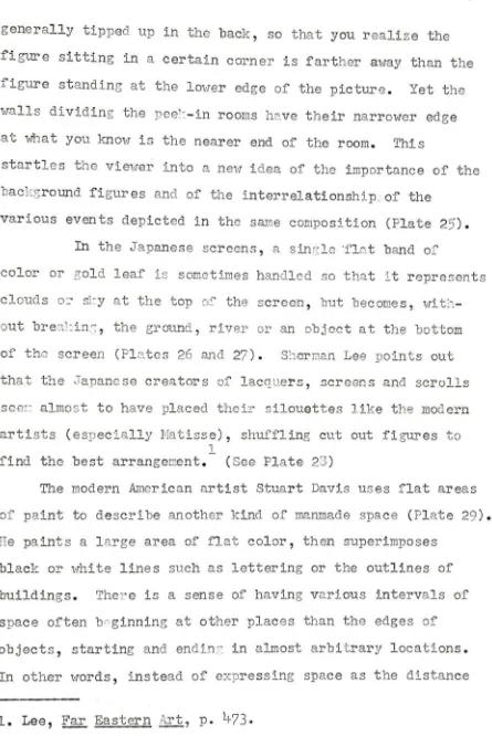
ground planeis
.
'****$*...^g)^U^g9Bp
GENJI MONOG ATARI: EASTERN HOUSE MarquisTokugaivaCollection, Tokyo
CO o CD
THE UNIVERSITY PRINTS BOSTON
ATTRIBUTED TO TAKAYOSH1. XII CENT. FUJIWARA PERIOD
Plate
26.
Tales
ofGenji,
detail
from 16th century
Japanese
screen.Plate
27.
Tales
ofGenji,
27
generally
tipped up in the
back,
sothat
you realizethe
figure
sitting
in
acertain
corneris farther
away
than the
figure
standing
atthe
lower
edge ofthe
picture.Yet
the
walls
dividing
the
peek-in rooms
have their
narrower edgeat what you
know
is
the
nearer end ofthe
room.This
startles
the
viewerinto
a newidea
ofthe
importance
ofthe
background figures
and ofthe
interrelationship,.
ofthe
various events
depicted
in
the
same composition(Plate
25).
In
the Japanese
screens,
a single -flatband
ofcolor or gold
leaf
is
sometimeshandled
sothat
it
representsclouds or
sky
atthe
top
ofthe
screen,
but
becomes,
without
breaking,
the
ground,
river or an object atthe bottom
of
the
screen(Plates
26
and27).
Sherman Lee
points outthat
the
Japanese
creators oflacquers,
screens and scrollsseer.: almost
to have
placedtheir
silouetteslike
the
modernartists
(especially Matisse),
shuffling
cut outfigures
to
1
find
the best
arrangement.(See
Plate
23)
The
modernAmerican
artistStuart Davis
usesflat
areasof paint
to
describe
anotherkind
of manmade space(Plate
29).
He
paints alarge
area offlat
color,
then
superimposesblack
or whitelines
such aslettering
orthe
outlines ofbuildings.
There
is
a sense ofhaving
variousintervals
ofspace often
beginning
at other placesthan
the
edges ofobjects,
starting
andending
in
almostarbitrary
locations.
In
otherwords,
instead
of expressing space asthe
distance
[image:61.559.59.504.26.692.2]-^'ir^c
THE UNIVERSITY PRINTS BOSTON
UJI BRIDGE Mizoguchi MunehikoCollection, Tokyo
ATTRIBUTEDTO SANRAKU. 1559 163S MOMOYAMA PERIOD
CO CO
J-Plate
28.
Plate 30.
"Christ
asthe
Man
of Sorrows,"by
Meister
Francke.
UNIVERSITY PRINTS,BOSTON
THE ENTOMBMENT
LOUVRE. PARIS
TITIAN. 1477 1576
VENETIAN SCHOOL
31-28
between
two
buildings,
it
is
seen as an abstraction independentof physical objects.
Yet the definition
of one spatial areais
clearly
relatedto the
definition
ofthe
next,
andthe
whole
interrelationship
of spatial areasforms
the
frame
work of
the
painting,
against whichthe
detail
ofline
exerts a surface
tension
and yet anotherdimension
of space.In
Davis1paintings,
the
concept of positive and negative
shape seemsto
reach ahigh
degree
ofsophistication,
for
the
shape whichis
positivein
one spatial planebecomes,
at
times,
negativein
the
next,
thus
destroying
completelythe
background-foregrounddivision
commonto
paintingbefore
the
twentieth
century.In
defining
spaceby
flat
shape,
it
is
possibleto
suggest change
in
spaceby
use of a singleline
drawn
across a
flat
color.This
is
seenfrequently
in
the
paintingsof
Joan Miro.
The
second major function of shapein
painting.is.
asan
abstract,
formal
element ofdesign.
This
means
that
the
shape
is
appreciatedby
the
viewerfor
its
design
quality
alone,
ratherthan
any
conscious or unconscious
image
it
provides of a natural object.
The
untrained vieweris
only aware of
its
function unconsciously;the
paintingseems
to
"work" orit
doesn't. Butto
the
artist orthe
trained
viewer,
it
is
anintellectual element of which
he
may
be
conscious
to
the
extent ofbeing
completelypreoccupied
by
it.
It
is
extremely difficultto
29
appreciated
for
their
pureesthetic
ordesign
qualitiesand which
aren't,
since ourentire
intellectual
andsensual
processes
aretrained
by
the
experiences
wehave
with natural
objects.
The
problem ofdistinction
seems
to
me related
to
the two
questions
"what
is
art,"and
"what
is
reality;"people are always
trying
to
answerboth,
but
at some
point,
one mustsimply
accept aworking
definition
and proceed with
the
work athand.
In
addition,
there
arefew
people wholook
at art whoare
really
interested
in
sorting
outthe
puredesign from the
representational
design,
For
example,
it
is
perhapsbut
academic
to
offerthe thought
that
the
spatialfunction
of shape pertainsto
its
usein
describing
natural phenomena ratherthan
to
its
puredesign
quality.
Space
in
painting,
it
canbe
suggested,
is
afake,
anillusion.
But
it
seems clearthat
works of artthat
have
handled
shape
successfully
for
its
ownsake,
whetherintentionally
or as part of
the
naturalintuition
ofthe
artist,
have
continued
to be
consideredbeautiful
and significant no matterhow
muchtime
passes.Art
work which relies onthe
interest
ofthe
subject matteralone,
onthe
otherhand,
more oftenbecomes
dated
anduninteresting
withthe
passageof
time.
For
example,
some ofthe
painteddepictions
ofreligious
figures
from
the
medieval and renaissance periodslook
maudlin and unestheticnow,
whileothers,
in
whichthe
shapes are
interesting
andbalanced,
still canintrigue
a30
the
"Christ
asthe
Man
of Sorrows," paintedby
the
German
Keister
Francke
after1^
(Plate
30),
seems awkward andsentimental,
whileTitian's
"The
Entombment,"' painted ona similar
theme
around1525
(Plate
3D,
is
stillpleasing,
in
large
partbecause
ofits fine
design
qualities.Roger
Fry,
in his
essay,
"Pure
andImpure
Art,"asks
the
question"Why
are we moveddeeply by
certain sequences of noteswhich arouse no suggestion of
any
experiencein
actuallife?
Why
are we moveddeeply by
certaindispositions
of snace
in
architecture which refer sofar
as we cantell
to
no other experience?"!He
answersthis
by
saying
that
the
pleasureis
felt
in
the
"recognition
oforder,
ofinevitability
in
relations,
and
that
the
more complexthe
relations of which weare able
to
recognizethe
inevitable
Interdependence
and
correspondence,
the
greateris
the
pleasure;
this
of course will come
very
nearto
the
pleasurederived
from
the
contemplation ofintellectual
constructionsunited
by
logical
Inevitability."2In
addition,
he
says,
the
whole mustbecome
suffused withan emotional
tone
whichmay
possibly
be
derived
in
the
first
3
place
by
the
emotions of actuallife.
I
think his
definition
is
exemplifiedin
the
paintings ofGeorgia
O'Keefe,
in
whicha
simple,
seemingly inevitable set offormal
relationshipsis
suffused with an indefinable emotionaltone.
Our
feelingsfor
shape,
then,
are somehowvaguely
related
to
natural experience ratherthan
solely
to
anintellectual process or order.
This
seemsto be
in
sympathy
with Jung's
theory
that our current vaguesensations of
1.
Fry
in
Rader'sA
Modern Book ofEsthetics,
p.308.
2.
Loc.
cit.31
approval
anddisapproval
^ dl st-pare r>aia+^+-rlated
to
previo