RIT Scholar Works
Theses
Thesis/Dissertation Collections
5-1-2008
Timing considerations in visual communication
Ahmad Eissa Aloumi
Follow this and additional works at:
http://scholarworks.rit.edu/theses
This Thesis is brought to you for free and open access by the Thesis/Dissertation Collections at RIT Scholar Works. It has been accepted for inclusion in Theses by an authorized administrator of RIT Scholar Works. For more information, please [email protected].
Recommended Citation
Timing Considerations
in Visual Communication
Ahmad Eissa Aloumi
Graphic Design MFA Program School of Design
Professor Deborah Beardslee Date School of Design
Chief Advisor
Professor Alex Bitterman Date
School of Design Associate Advisor
Professor Angela Kelly Date
School of Photographic Arts and Sciences Associate Advisor
Professor Patti Lachance Date
CIAS / School of Design Chairperson
I, Ahmad Aloumi, hereby grant permission to the Wallace Memorial Library of the Rochester Institute of Technology to reproduce my thesis in whole or in part. Any reproduction will not be for commercial use or for profit.
Ahmad Eissa Aloumi Date
My Mom, Dad and Hessah for everything
Alex Bitterman and Angela Kelly for their time, support, and knowledge
Virgilio, Ali and Sarah
for their support throughout this study
Bruce Ian Meader for brucifing me
Deborah Beardslee
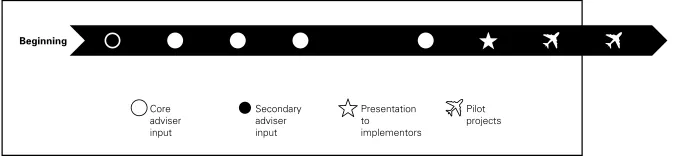
Project Definition 5
Precedents 8
Research 1 4
Synthesis 26
Ideation 4 4
Intermediate Evaluation 6 1
Implementation 9 4
Retrospective Evaluation 1 0 0
Dissemination 1 0 3
Conclusion 1 0 5
Glossary of Terms 1 0 6
Bibliography 1 0 8
Image Credits 1 1 0
Abstract
Viewers are surrounded by visual stimuli on a daily basis. These visuals, which may have intriguing and/or exciting qualities, enable designers to propose effective design solutions that could have heightened impact on the viewer. With this in mind, some designers attempt to construct crystal-clear messages that are eye-catching and easily understood, while other designers try to deliver messages enveloped by a planned ambiguity, which offers diverse paths of comprehension. In the end, this intentional ambiguity can eventually guide viewers toward a single understanding.
Since ambiguity is an outcome of complex principles related to aesthetic and conceptual decision-making, often it is not immediately understood. However, in order to understand ambiguous messages, viewers are affected by both time, which is the indefinite continued progress of existence and actions in the past, present and future, and timing, which is the choice or control of when something should be exposed. Designers should be aware of the effect of time on perception in relation to ambiguous message-making, especially when immediate understanding is required. An example of this would be a solution related to information design such as the transportation map of the London Underground, in which the immediacy of communication could affect human lives.
Time Considerations
Frequency Timing
Pacing Duration
Graphic Design Marketing Studies
Information Design Psychology Studies
Book Design Music Theory
Communication Studies Film & Animation
This study is relevant and important to graphic design because it seeks to offer solutions to improve the perception of an audience by considering the roles of time and timing. Understanding time components can help designers layer and transmit multiple levels of ambiguity in a single design solution. This will not only keep the viewer intrigued for a longer period of time to decode the ambiguous messages, but it may also give him/her a deeper understanding of the final message, while strengthening the relationship between the viewer and the message. Through this study the researcher may find additional uses of time and timing in the perception process, which could also affect audience comprehension. 1 What are the differences and similarities between time and timing?
2 How do variables of time and timing affect viewer perception? For example, will a viewer understand a message differently after one prolonged exposure versus multiple brief exposures?
3 Could time or timing change the degree of ambiguity in a message? How?
4 What are the differences and similarities between the terms vague and ambiguous?
5 What are the benefits of an initially ambiguous design solution?
6 Which visual factors affect audience perception? Why? Key Questions
Associated Areas of Study
Precedent A
Design for a Time of Weird Wild Change By Larry Keeley
Larry Keeley, a faculty member at the IIT Institute of Design in Chicago, is an acclaimed author, speaker, and teacher on the role of innovation in business. He has advised hundreds of clients on how to use rational, repeatable methods to achieve innovation effectiveness.
Keeley’s concepts in the article Design for a Time of Weird Wild Change are important to
this thesis topic. The article clearly shows how time enhances the understanding of new messages. The article suggests the idea that time components’ characteristics changed, and these change have affected the designer’s duty over time. Time is the vehicle toward the message goal. It is the medium, which helps the target audience understand new concepts. Time is the vehicle in the direction of the audience’s perception channels.
Design for a Time of Weird Wild Change is an important precedent for this thesis study because the author shows how time is an important component that has an impact on human comprehension. Delivering a clear, understandable message is a main graphic design goal. Keeley declares several important challenges for designers that matter deeply now and in the future.
First, the author claims that only a few designers understand the scale of modern business transformation, and the misunderstanding by the remaining majority may guide society into a negative situation. This misunderstanding creates a big gap between actual business and society’s perception. A designer’s duty is to create a smooth bridge between the two sides.
Precedent B
Mirror, Mirror. By Peter Laundy
Peter Laundy, adjunct professor in the graduate design planning program at the Institute of Design, Illinois Institute of Technology and Design Synthesis Lead, Doblin Inc., declares that the designer’s responsibility is not to use the prototype (the early primary model) to help clients see things they could do, but to use the prototype to help clients see what their companies might become in the future. Time is an essential factor in this exploration. For example, when a designer creates a graphic design solution for a company, he has to propose not only the design solution, but also other prototypes or suggestions that can be applied to the design.
The author demonstrates the use of time from a different standpoint. He shows how time can be a medium for clients to understand new ideas and to adapt these ideas easily into their businesses by creating plans for each phase. In addition, this article includes interesting illustrations that demonstrate how the development can be achieved and how time can affect it in order to reach completion.
The illustration above shows the different phases that are needed over time in order to achieve the smooth transformation of a company from one stage to another more evolved state.
According to Mr. Laundy, Figure 1.2 shows the process of the prototype and how it affects the act of transforming ideas. The prototype works best in the early stages (before big decisions get made), helping executors move beyond abstractions to understand the solid implications of the changes they are contemplating.
[image:10.612.190.513.367.464.2]Mirror, Mirror is a strong precedent for this thesis study, because it asserts that time is an essential factor to explore and, with the consideration of time components, the transformation of ideas can be more meaningful and understandable, and easier and more helpful to clients. Figure 1.1
[image:10.612.189.527.520.598.2]Precedent C
Visual Design System for Music Education By Andrew Dennis Baker
People who are new to the study of music lack an understanding of the musical elements such as dynamics, form, harmony, pitch, rhythm, tempo, texture, and timber. Andrew Baker, 2004 RIT Alum, Graphic Design MFA Program, developed a visual system that describes the fundamental principles and helps people visualize these elements to make them easier to understand.
Rhythm Beat
Regular
Accented
Variation
Rhythm beat, the beat found within music, is the regular recurring pattern which can be divided into equal units of time. Beats are basic units of time by which all notes are measured (Baker 51).
Rhythm Structure
Rhythm structure is the combination of different note lengths in a place of music or a regulated succession of strong and weak elements. Rhythm is an important parameter of music structure; the other is pitch (Baker 52).
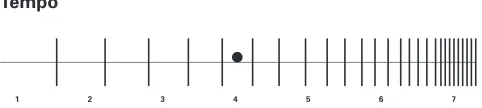
Tempo
1 2 3 4 5 6 7
[image:11.612.190.429.284.345.2]Tempo is the musical speed or pacing of a musical composition. It may be indicated by a metronome designation that links a particular durational unit with a particular durational clock time or by a description of speed and gestural character (Baker 53).
[image:11.612.190.430.422.485.2]Figure 1.3
Figure 1.4
[image:11.612.189.430.568.622.2]Precedent C continued
Baker used Gestalt Principles, the psychological studies of proximity, similarity, continuity, figure/ground, closure, area, and isomorphic conclusions to translate musical elements to a visual language by using formal design elements (line, shape, color, and texture).
Visual Design System for Music Education is a good example that translates intangible elements into visual design solutions.
Precedent D
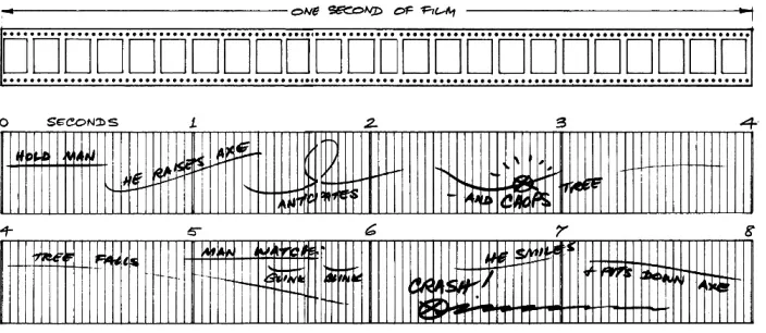
Timing for Animation by Harold Whitaker, John Halas
In animation, time and timing are considered important elements in the animation field because they both are capable of giving additional meaning to movement. Time decisions must always be made before the start of production because the animator and director set the simplicity or complexity of the movement based on how much time is allowed for each scene. The more layers of complexity on the stage, the more time is needed to give the viewer a smooth comprehension.
The animator’s job is to synthesize movement and to apply just the right amount of creative exaggeration to make the movement look natural (Whitaker 2002). In order to apply the right amount of creative exaggeration the given time period must be known in advance. The animator needs to decide upon the exact number of details within a decided number of frames.
[image:13.612.190.542.288.441.2]In film and animation projects, the director sets all timing and acting based on the number of frames per second. Every 24 frames equate to one second of movie play. This is very important because the number of details per second changes the complexity of the details, which affects the level of perception.
Precedent D continued
Complexity of Illustrations
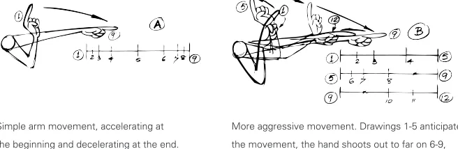
The basis of timing is the constant projector speed of 24 frames per second. If, therefore, something moves from A to B in 6 frames, the drawings required to do this are spaced twice as far apart as they would be if the object moved from A to B in 12 frames, assuming single frame animation is used in both cases. Therefore, for an animator, the timing of an action is the same as deciding the number and spacing of the drawings needed to make up the action (Whitaker 2002).
The following example shows how the number of frames affects the level of details in examples A and B. In diagram A, the hand movement changes in only two frames, whereas in diagram B the hand movement takes six frames to change.
Simple arm movement, accelerating at More aggressive movement. Drawings 1-5 anticipate
the beginning and decelerating at the end. the movement, the hand shoots out to far on 6-9,
and returns to the final position on 10-12.
Timing for Animation is an important precedent for this thesis study, because it acknowledges that time components are central to the field of film and animation. It states the importance of setting the time for each scene, action, and movement before the crew starts producing, since the scene’s complexity is determined by the given time. This formula has strong connections to this thesis study since the main goal for the graphic design solutions is to deliver the message that intends to be delivered in the right time based on the good design decision. However, the formula is still not clear for the majority of the designers. They are still looking further to understand which design decision helps a message to
[image:14.612.193.521.336.443.2]be perceived more quickly. This connection will be expanded in the synthesis section for more clarity and further understanding (see page 28).
This thesis research identifies time concepts as aspects within the process of visual perception. In life, each person has unique experiences and backgrounds. For example, imagine a man, a woman, and a child looking at the same design solution. Each perceives it slightly differently, consciously perceiving and understanding different details of the whole. There are many reasons for these different levels of understanding. One of these reasons is related to time components. This thesis will focus on the concept that people experience different comprehensions of a single design solution as a result of the effect of different time components.
In order to create effective design solutions, designers should research the perceptual capabilities of their intended audience. How will the individual in the audience perceive information? For example, a book or a magazine can be perceived with the same viewer differently each time he has access to it. Otherwise, in the case of a permanent design solution, such as a billboard, the viewer perceives the design solution quickly, either driving a car or as a passenger in a car, and does not have easy access to it again.
Perception is shaped by such factors as individual experiences, different attitudes, a diverse and pluralistic society, economic status, ethnicity, and religious background. Even though this study will not focus on individual variables such as culture, psychology, and cognition, it will clarify time components as an influential medium to perception. The time component study includes the fundamental understanding of time, timing, duration, frequency, pacing, and tempo across disciplines, including music and animation, to guarantee a solid understanding of the time components.
Time is a needed component to absorb visual solutions. In addition, time specification has multiple attributes including timing and duration, and there are other elements affecting the understanding of time: frequency, tempo, and pacing.
Time Components
In his book,Timing for Animation, Harold Whitaker illustrates how timing considerations
are important in animation, since they are the most important elements that gives meaning to the movement of the characters. (Please see Synthesis page 28 for further explanation). Time and timing also ensure the continuation of the sequence. Animation movement is
based on a still sequence of images. With the addition of time, those sequences will be transformed from still frames to smooth motion.
According to John Lasseter from Pixar, “The proper timing of an action establishes the idea behind the action as well as the audience’s interpretation of it. Timing also reflects the weight and size of an object, conveys a character’s thought process and emotions, and strengthens story points” (Whitaker 2002). As a consequence, timing is not only a point that causes when something happens, but also includes the choice or control of when something should be exposed in order to get the ideal implementation.
However, the decision of when something should be exposed is not always made by the production side; what happens is that the producers or design team controls the timeframe of when the audiences will perceive a design solution, and that is what called timing. Despite the fact that the viewers have the choice to either perceive the design solution or not during the timeframe.
Timeframe, potentially controlled by the design team or the producer
Timing, chosen by the viewer
Duration is a type of time mark, in which action continues over and over. It is also described as short or long periods. In addition, duration is usually measured by time such as seconds, minutes, hours, days, weeks, and years (see page 28).
Timing
Time Components continued
Kevin Roberts mentions in his book, Advertising Principles and Practice, that in the field
of marketing the number of times audiences have opportunities to be exposed to a media vehicle such as newspaper, magazine, radio station, television program, outdoor advertising location, edition of Yellow Pages, etc., in a specialized time span is known as frequency.
Michael Miller, author of several successful music guides, establishes in his book The Complete
Idiot’s Guide to Music Theory the definition of frequency as the number of vibrations of multiple degrees of highness or lowness of a tone that occur simultaneously.
Consequently, frequency is the rate at which something is repeated over a particular period of time. An example would be repeating almost the same viewing experience over and over in front of an audience in a set amount of time. However, there are other time characteristics
that affect frequency and duration as well, such as pacing, the consistent and continuous
speed in motion (please see Synthesis page 27, Illustration B for further explanation).
In his book Visual Design System for Music Education Andrew Baker states that “Tempo may
be indicated by a metronome designation that likens a particular duration unit with particular duration in clock time or by a description of speed and gestural character” (Baker 53). To clarify the difference between pacing and tempo, pacing could be the time it takes to cross a road (five minutes), while tempo could be the number of steps in those five minutes. Pacing could also be the time needed to finish reading a book, number of pages per hour, whereas tempo will be the number of reading sessions.
Graphic Design
Graphic design is design that goes beyond the information to be read. Graphic design is visual communication, and involves many different types of audiences. It helps more people understand a given message and helps speed up learning. The ultimate design goal is to accommodate all of the target audience by finding the best design solution to a design problem. In addition, a good design solution can save time by presenting information for viewers in clear ways. Graphic design communicates and expresses itself through visual elements.
Graphic design is a creative process that combines art and technology to communicate ideas. The designer works with a variety of communication tools in order to convey a message from a client to a particular audience. The main tools are image and type
(Poggenpohl 1993).
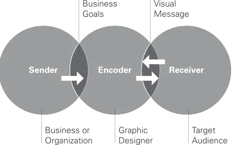
Visual communication combines speech, written language, and imagery into messages that are aesthetically pleasing, connect with the audience on intellectual and emotional levels, and provide them with pertinent information. When properly executed, graphic design identifies, informs, instructs, and even persuades viewers to do something. It is important that the sender of a message and the receiver speak the same visual language – in this manner, the designer acts as the interpreter and translator of messages. Reducing the amount of information that is visually portrayed creates a more concise and clutter-free design – the goal for all forms of communication (Hembree 14).
Sender Encoder Receiver
Business or
Organization GraphicDesigner TargetAudience
Visual Message Business
Goals
For effective visual communication to occur there must be a sender of a message, typically a client, and a receiver, such as the target audience. The designer encodes a visual message by translating the needs of the sender into images and content that connect with the receiver.
[image:18.612.192.433.474.624.2]Graphic Design is Visual Communication
Information Design
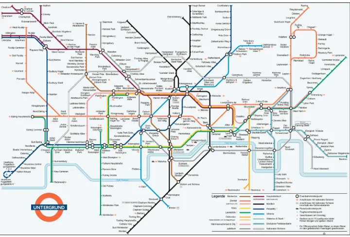
Information Design is an area of graphic design concerned with visually organizing information when immediate understanding is required. For instance, a transportation map with multiple
station stops contains complex data that can easily confuse a passenger. The actual reason
behind Information Design implies viewing the design problem in a special filter, disassembling it with analytical curiosity, and assembling it again in a simplified way with a feeling for precision and detail (Schuller 2007).
Harry Beck designed the celebrated London Underground subway map in 1933. A guiding principle behind this design was delivering only the necessary information by reducing the map to a diagram of only straight and 30-degree angles. He simplified the complexities of London’s transportation system into a clean, clear diagram. This information design solution provided necessary information for London train users that made it easy for train passengers to navigate the system.
© Transport for The London Underground Map 2008
[image:19.612.192.552.369.613.2]Beck’s design was revolutionary and was quickly adopted by commuters because it was useful and met the needs of the users (Garland 19). The celebrated London Underground map is a great information design solution that contains complex information. The London Underground map has some unique design decisions which helps the user understand the map in a very short time period.
Designing a Message
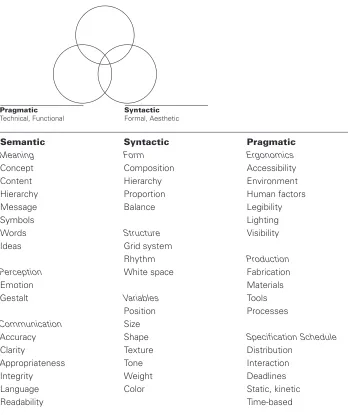
Over the years, several RIT design professors adapted the semiotic model shown below, which offers a good structure for creating or analyzing graphic design solutions. This model has the objective purpose of evaluating the semantic, syntactic, and pragmatic components of a design problem. This semiotic model can also be used to evaluate the final design solution’s success as compared to established goals.
Semantic Syntactic Pragmatic
Meaning Form Ergonomics
Concept Composition Accessibility
Content Hierarchy Environment
Hierarchy Proportion Human factors
Message Balance Legibility
Symbols Lighting
Words Structure Visibility
Ideas Grid system
Rhythm Production
Perception White space Fabrication
Emotion Materials
Gestalt Variables Tools
Position Processes
Communication Size
Accuracy Shape Specification Schedule
Clarity Texture Distribution
Appropriateness Tone Interaction
Integrity Weight Deadlines
Language Color Static, kinetic
Readability Time-based
[image:20.612.190.538.271.686.2]The semiotic model is important for this thesis, because it helps define the depth of the relationship between a design problem’s goals and potential design decisions. In addition, the structure of this model serves as an outline for designers to organize,
Figure 2.3 Semantic
Conceptual, Meaning
Syntactic
Formal, Aesthetic
Pragmatic
Gestalt Principles
Around 1900, German psychologists began to formulate concepts based on “pattern seeking.” Gestalt means a configuration with properties not divergent from the sum of
the individual parts. In Gestalt theory, the whole of a visual image is different from and
greater than the sum of its parts (Kaufmann 8). Gestalt principles are based on human psychology and visual perception.
The dots have been arranged to form a directional symbol. The viewer can perceive each dot individually while the arrow is the dominant symbol (the resulting gestalt).
Gestalt Principles continued
Figure/Ground is the fundamental principle of perception. It allows the viewer to digest the design solution that gets the focus of attention, which is the figure, and distinguish the negative space or ground which is usually seen as further away from the figure
(Schriver 313).
Perceptual groupings are preferential according to the nearness of parts, thus visually closer parts form groups. For example, five bodyguards walking together draw more attention than a larger, scattered gathering of men.
Audiences see identical visual units as in groups, knowing that like objects are defined by shape, size, color, and direction. For example, a bird flying against the flock in the sky becomes immediately apparent.
Viewers are able to continuously perceive the edge of a shape or the movement of a sign. For example, an arrow in a wayfinding sign obtains the viewer’s attention and their understanding continues beyond the design solution’s physical edge.
Humans have a natural tendency to visually close gaps since actual closed shapes are more visually stable than open shapes. Viewers may see the letter O from the letter C because the human mind is capable of supplying the missing pieces in a composition.
Figure/Ground
Proximity
Similarity
Continuity
Closure
Ambiguous Messages
In his book Thinking, Problem Solving, Cognition, Richard E. Mayer describes perceptually
ambiguous visuals, and specifies how ambiguous visual messages were of special interest to the Gestaltists. He also mentions how artists have been fascinated by this perceptual fact. Perceptually ambiguous visuals are of special interest in the investigation of thinking because ambiguous design solutions exemplify the fact that sometimes the same perceptual input can lead to multiple levels of different representations. Gestaltists took this as suggesting that the mind was actively involved in interpreting the input.
On the other hand, in his book Perception and Imaging, Richard Zakia explains ambiguous
messages as design solutions which can take on multiple meanings through the language, the actual wording, of the messages. Designers can play with words that have similar sounds but different meanings, such as made/maid, rain/reign, and board/bored. They can also develop it by the visual shape of words that have a similar look but different meanings, such as natural/neutral, angel/angle, and conservation/conversation.
Ambiguity extends to more than just words. It can also apply to visuals, to create one meaning or multiple layers of meaning. Planned ambiguity adds interest to the design solution, and can provide different levels of meaning during the process of perceiving a message over a period of time.
[image:23.612.190.314.515.688.2]In this ambiguous figure (2.10), it is possible to see either a young woman or an old woman. It is a drawing, and if you examine it in detail it will probably be rather hard to decide what all of the different components represent in each of the interpretations. Nose, hat, feather, ear, etc. are identifiable. But your mind seems to be imposing these interpretations on the drawing rather than being compelled by the “perceptual evidence” (Schmidt 2005).
Rhetorical Operations
According to Zakia in his book Perception and Imaging, rhetoric is no longer limited to
the art and study of language used in an effective and persuasive manner. Rhetorical operations go across the rational definition, which is related to the writing and speaking of words. Rhetoric deals with communication. It also can be useful when applied to graphic design problem solving (see examples on page 38).
Addition refers to the introduction of a new visual element in a composition or visual statement, such as an advertisement. The elements can be words , color, texture, shape, form,
line, parts of image, the interval between elements, and movement (Zakia 289).
Subtraction is the opposite of repetition, so instead of adding elements into the design solution, designers take something away from the design solution. This affects the resulting visual communication. “Holding back or suppressing can give the picture an enigmatic quality and serve as invitation for the viewer to become more involved and participate in the forming of the statement (Zakia 296).
Taking some element away from the design composition and replacing it with an entirely new element that adds to the value of the message.
Changing positions between two or more existing elements in the design solution in order to emphasize the message
and affect the communication outcome. In an exchange,
the elements in a visual statement are identical but inverted
(Zakia 307). Addition
Subtraction
Substitution
Exchange
" !
!
" " !
Perception
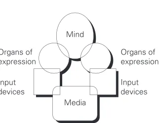
To create effective design solutions, graphic designers need to have an indepth knowledge of the perception abilities of the audience. Each viewer comes from a different background, which influences the way he/she looks, thinks, perceives, and interacts with the design
solution. According to Mark von Wodtke in his book Mind Over Media, viewers have many
channels of perception through their eyes, ears, tongue, nose, and skin. Moreover, people receive information in various ways, such as through observation, direct experience, and
[image:25.612.192.354.304.429.2]comprehension. The following two models from Mind Over Media show aspects of perception.
Figure 2.4
Figure 2.5
L
Reading comprehension
Reading skill
Reading Impression
Visual comprehension
R Visualizing
skill
Seeing
Words Visual
information
[image:25.612.188.558.513.694.2]Perception continued
Levels of Perception
Awareness
Cognitive
Precognitive
Understanding Image
Impression
Your Raw Perception Primary Perception Secondary Perception
Recognition & Interpretation
Comprehension
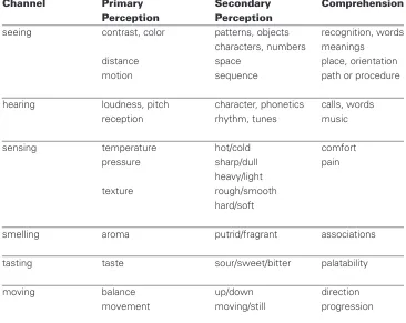
Viewers perceive information based on different levels of perception. According to Wodtke,
perception happens in both awareness, the ability to be conscious to perceive and understand,
and comprehension, the action of understanding. In addition, each channel of perception has primary perception (impressions) and secondary perception (images and understanding) levels.
Channel Primary Secondary Comprehension
Perception Perception
seeing contrast, color patterns, objects recognition, words
characters, numbers meanings
distance space place, orientation
motion sequence path or procedure
hearing loudness, pitch character, phonetics calls, words
reception rhythm, tunes music
sensing temperature hot/cold comfort
pressure sharp/dull pain
heavy/light
texture rough/smooth
hard/soft
smelling aroma putrid/fragrant associations
tasting taste sour/sweet/bitter palatability
[image:26.612.191.383.187.366.2]moving balance up/down direction
Figure 2.6
[image:26.612.188.554.462.753.2]This thesis synthesis merges information, essentials and resources into a combined problem statement to further guide research and examination. The diagram below was constructed to create the most useful organizational structure for communicating the collected research. Communication theory, perception theory, and visual elements are used to express the effect of time components on visual communication.
Communication Perception
Theory Theory
Semantic Perception
Syntactic Channels
Pragmatic Gestalt
Time Visual
Components Elements
Timing Point Color
Duration Line Value
Frequency Size Brightness
Tempo Shape Graduation
Pacing Form Texture
Visual Communication
First, as expressed in the Research section on page 19, the semiotic model can be a useful evaluation tool to identify each of the three components: meaning, form, and use, to determine how well a design solution satisfies appropriate goals of the solution. This model provides a mechanism for not only generating, but also evaluating, a visual solution to clarify a complex idea. In addition, this thesis synthesizes aspects of each semantic, syntactic and pragmatic decision and selects some relevant elements from each to help analyze selected design solutions.
Secondly, visual elements such as point, line, shape, format, color, value, brightness, gradation, and texture are used to analyze and categorize the channels of perception, as described earlier on page 25, in which the primary and secondary perceptions help improve comprehension and understanding of the design solution through the different channels of perception.
Timing
The process of Duration
Duration
Time Components
Time and timing are the main focus in this thesis study. Time, which is the indefinite
continued progress of existence and actions in the past, present and future, and timing,
which is the choice or control of when something should be exposed, are necessary components for the absorption of visual messages. Toward this aim, the following definitions summarize (on page 28) and analyze the different characteristics of the time components, and find relationships between time, timing, frequency, tempo, and pacing. In addition, time specification has multiple attributes including timing, which is not only a point designating when something happens in a timeframe, but also the choice or control of when something should be exposed in order to get the ideal implementation.
Timeframe,
potentially controlled
Timing, chosen by the viewer
How are time components created?
Example A below clarifies each of three time components and the relationships between them. For example, timing (single action on a time line) is repeated over and over to create the duration. Every time component has a relationship with the other. Frequency, tempo, and pacing are working as filters for timing and duration, as is illustrated in example B, and the overlapping of each time component creates multiple differences .
Example A Example B
Timing
Duration
Frequency
Tempo
Time Components continued
Time Component Definitions
Timing is a point at which something happens, and the control over when something should be exposed in order to get the ideal implementation.
Duration is one type of designation in which an action continues over a period of time past, present, and future; it has start and end points. In addition, duration can be short or long in length.
Frequency is the amount of either regular or
random repetition of a particular duration over
a selected period of time.
Pacing is the consistent and continuous speed in exposing, developing, and perceiving a graphic design solution. The speed of pacing is rated by an instrument, such as a clock, for measuring time. Timing
Duration
Frequency
Pacing
action
start end
Channels of Perception
How do time components affect visual communication?
As is delineated in the Research section, viewers have different levels of perception depending on how they understand the design solution. According to Van Wodtke, perception happens in both awareness and comprehension. In addition, each channel of perception has primary perceptions (impressions) and secondary perceptions (actual images and understanding).
Sight The perception of something using the visual sense.
Hearing The perception of sound, made possible by vibratory changes in air pressure on the ear drums.
Touch To feel or manipulate with the hands in order to contact or sense.
Smell To use the sensitive nerves in the nose to assess aroma.
Taste The sense that perceives the particular qualities of food by means of the sensory organs on the tongue (taste buds).
Movement The act of changing location, position, or the way in which something moves.
More channels in use = Faster comprehension
Using multiple perception channels shortens the needed time to understand a message.
Thus, each time a designer activates more channels of perception in their design solution by using visuals, sounds, textures, aromas, tastes, or actions the viewer understands the message faster because the message is perceived via different directions.
Impact of perception channels on amount of time needed to comprehend
Channels of Perception continued
Channels of perception are divided into two groups: implied channels and real channels. The researcher found that most designed messages use visual elements that act as implied channels, such as line, shape, form, color, and texture. These visual elements are all filtered through the sense of sight, which is a real channel. The diagrams below show the processes of sending and perceiving both a non-visual message and a graphic design message.
The process of sending and perceiving a non-visual message
Real Channels of Perception
The process of sending and perceiving a graphic design message
Graphic Design Solution
Implied Real
Channels of Channels of
The perception process involves elements divided into three groups:
Since this thesis focuses only on the time components and design decisions, the illustration below explains the process of designing and sending a graphic design solution.
The process of perception for a graphic design solution
The level of perception is based on the visual elements and is affected by the time components, which are involved in every perception process. These theories are synthesized into concept sketches that explain the relationship between the number of activated perception channels and the degree of immediate understanding. 1 Elements controlled by the receiver, such as psychological, cultural, and cognitive, which assimilate comprehension.
2 Elements controlled by those responsible for message-making, including the sponsor, designers, and advertisers who manage the message’s ambiguity level.
3 Media considerations such as type of media, placement of the composition, and exposure time.
Visual
Elements Viewer Real Channels of Perception
Sight
Hear
Touch
Smell
Taste
Movement
Implied Channels of Perception
Hear
Touch
Smell
Taste
Movement Time
Conceptions Design
Matrix A
Considering the perception process as explained on page 29, this matrix shows how activating perception channels shortens the time needed for the message to be perceived. Each time the designer uses more perception channels, the number of time components needed to understand the message decreases, and the comprehension becomes easier.
Perception Channels
Sight Hearing Touch Smell Taste Movement
real
implied
cowboy
softness smoke flavor
real
implied
jar tomato
glass Heinz Heinz upside down
tomato bottle
real
implied
soccer ball footprints sperm
team supporter soccer ball race
Design Solution
Heinz, Magazine color full page Mike Straznickas; Sarah Block
Matrix A continued
Perception Channels
Sight Hearing Touch Smell Taste Movement
real
implied
abstract color Coca-Cola Typography
raider cold sweetness Coca-Cola
real
implied
leaf as lips
smoothness
real
implied
white arrow
speed
Design Solution
Theater de Vidy-Lausanne Werner Jeker, Les Ateliers du Nord Switzerland
FedEx logo. 1994 Lindon Leader.
Matrix A continued
Perception Channels
Sight Hearing Touch Smell Taste Movement
real
implied
boy hunger
boy crying skin healthy food
real
implied
abstract shape cow
cow stand
real
implied
hand impression mark car
car fun friendship speed
Design Solution
Human Rights Posters. 1989 UWE Loesche, Germany
Volkswagen of America Ad Paul Renner; Arnold Communications Sudan Poster. 2000
Matrix A continued
Perception Channels
Sight Hearing Touch Smell Taste Movement
real
implied
boy spider hill
typography climbing
real
implied
egg UK map
fry hot hot flip
real
implied
face text
technology hand matrix
Design Solution
Time Out Michal Johnson
Museum Für Gestaltung Zurich, Peter Moser; Velvet Creative The Economist
Ambiguous Messages
As mentioned on page 23 of the Research section, Richard Zakia explains in his book
Perception and Imaging how an ambiguous message within a design solution can take on multiple meanings through language or visuals. Multiple layers of meaning or message keep the interest of the viewer and offer extra levels of information.
The illustration below shows the process of designing a simple design solution, which is delivered smoothly to the viewer to obtain clear understanding. This is unlike the process of designing an ambiguous message that transmits multiple levels of meaning, and requires extra effort to perceive and understand the intended message.
Clear Message Making
design process
Ambiguous Message Making
ambiguous process extra layers
of information
Ambiguous Messages continued
An example of an ambiguous message is the visual identity symbol for FedEx, the logistics services company based in the United States and founded in 1971.
The original Federal Express logo designed by Richard Runyan in 1973
The new FedEx logo designed by Lindon Leader in 1994
Examples of Rhetorical Operations
Rhetorical operations deal with communication. They are useful approaches from art and study of language that have been extended to visual communication to create meaningful complexity within graphic design solutions. Rhetoric operations are considered tools that can create ambiguity and keep the interest of the viewer for a longer period of time.
Addition refers to supplemental visuals that add to a design solution and create extra emphasis.
Museum Für Gestaltung Zurich, Switzerland. Peter Moser; Velvet Creative,
Office GmbH. Lucerne, Switzerland.
Examples of Rhetorical Operations continued
Subtraction is the opposite of addition. Instead of adding elements to the design solution, designers take something away to affect the resulting visual communication.
Subtraction
McDonald’s Hockey Ad, Chris Staples; Dean Lee.
Examples of Rhetorical Operations continued
Substitution is taking something away from the design solution and replacing it with an entirely new element that adds to the value of the message.
Substitution
Lace Sneakers Poster 2004 Marcus Chwalczyk, Germany Sudan Poster 2000
Luba Lukora, USA
Exchange
Examples of Rhetorical Operations continued
Instead of removing something from the design solution, exchange means changing positions between two or more existing elements to emphasize the message, and affect the resulting visual communication.
Unicef, More Education for Girls
Atakan Sevgi; Hakan Ertan. Saatchi & Saatchi, Istanbul
real
implied
Perception Channels
Sight
Hearing
Touch
Smell
Taste
Movement
Rhetorical Operations
Addition Subtraction Substitution Exchange
Matrix B
Matrix C
This matrix explores the relationships between channels of perception, rhetorical operations, and Gestalt Principles.
real implied
Perception Channels Rhetorical Operations Gestalt Principles
movement
taste
smell
touch
hearing
Initially, the design application requirement for this study was expressed by redesigning a set of printed applications for an existing company using the analysis findings in this thesis to improve the company’s message. The researcher assessed which graphic elements are most useful for each application (such as stationary, signage, advertisements, billboards, and literature), considering the required time components for each application to be perceived and understood. The researcher shifted the concept from a commercial company toward a non-profit organization that would help improve selected worldwide issues, such as the health and education of children and their families. These kinds of issues need immediate action from people in today’s societies in order to accept responsibility and provide help for broken communities.
Finding an issue for which the time components of duration and frequency have a different effects on comprehension of the intended message became a priority. Furthermore, the effects of these time components may yield multiple levels of understanding for one intended message. In addition, the application could include outside content that has the issue of time and needs to conveyed quickly. Issues pertaining social awareness are ones that are complex in nature, in need of help in a short timeframe, and require multiple layers of understanding. The committee suggested narrowing the selected problem range to find a specific outside content area that can have the advantage of designing an ambiguous message due to its complex significance. In the following process, all these factors contributed which issue was chosen, and which type of design application would most successfully convey the needed message.
The Broader Context
Education is an important factor in the stability of communities, societies, and nations. It furthers economic development, promotes employment, enhances the development and application of skills relevant to employment, and contributes to sustainable development. Educating children is key to ending the global cycle of poverty (Dubai Cares 2008).
Some Related Statistics
Approximately 120 million children in the world are still denied access to primary education. Of the children who do not attend school, 58% are girls (Dubai Cares 2008).
One in every three children in developing countries does not complete five years of primary education, the minimum required for achieving basic literacy (Unicef 2007).
Over 50% of all African girls are not allowed to go to school and obtain an education
(DirectAid 2007).
© Getty Images 2008
Selected Outside Content
Children’s education in Madagascar was chosen as the outside content of the final design application for this thesis study. Research related to the basic needs for children’s education was gathered and analyzed. The effective use of time components will be explored to create a range of different levels of understanding to prompt either immediate or gradual reactions from the viewing public.
Lack of Education in Africa
Madagascar
Children’s Education
Frequency Duration
Cultural
Psychological
Cognitive
Arabian Gulf Kuwait
Audience Viewer
Long Duration Short Duration
Information Source
DirectAid, a non-profit organization located in Kuwait, has active projects in Africa, including Madagascar. This organization had analyses of selected projects including those related to the issues of children’s education. The following chart shows the degree of need for specific issues in Madagascar.
Project Needs in Madagascar 2008-2009
Needed during the year
Needed in specific time
Student Sponsorship Orphan Sponsorship Instructed Sponsorship Providing Academic Book Educational Session Build Orphans House Digging for W
ell
Healthy Care Camp Oblation Project Perform The Hajj Providing Fast Breaking meals Providing The Holy Qur’an Religious Institutes Holy Qur’an Contest
25
20
15
10
5
0
Needed during the year
Needed in specific time
End of the project
Student Sponsorship
Orphan Sponsorship
Instructor Sponsorship
Providing Academic Books
Educational Session
Build Orphan Houses
Digging for Wells
Healthy Care Camp
Oblation Project
Performing The Hajj
Provide Fast Breaking Meals
Providing The Holy Qur’an
Religious Institutes
Holy Qur’an Contest
Information Source continued
The chart below organizes the projects over the calendar year based on need. Each project has its own requirements and demands related to time components such as actual timing, start and end points, and the overall duration. The organization of these different projects helps to clarify the messages that need to be delivered to outside audiences in order to get desired reactions.
Selected Goals
The thesis committee suggested there should be more focus on researching specific DirectAid projects that relate to children’s education in Madagascar for 2008-2009. These projects can serve as a foundation of data which meet the criteria of a complex message. From the complexity of information, a ambiguous message can be created and revealed in the final application, which will meet the application goals (see page 44).
Provide student supplies, such as pens/pencils, books, uniforms, bags, etc.
Quantity 150,000 students
Cost in dollars $ 39 per student
Provide seasonal clothing for the students and maybe their families.
Quantity 500,000 clothing items
Cost in dollars $ 6.5 per clothing item
Provide three meals a day for each student and their families.
This will allow the families to send their children to school rather than work.
Quantity 500,000 meals
Cost in dollars $ 3.90 per meal
Provide a salary and living supplies for licensed, qualified teachers.
Quantity 100 teachers
Cost in dollars $ 117 per teacher
Provide a house town that includes a school classroom, housing for students, farming grounds, a water source, and a small store.
Quantity 5 houses
Design Application
The research in this thesis will be applied toward the design of a poster series in which each poster delivers the same intended end message with ranging degrees of ambiguity. Time and timing considerations will be incorporated into the process of analyzing and understanding optimal viewer comprehension. In addition, throughout the poster series, there are a number of qualities that need to be observed, such as the effect of time components on visual communication, and the effect of different design decisions on the message-making within resulting design solutions.
Why a poster series?
One of the best vehicles to deliver DirectAid’s goals while meeting the goals of this thesis is a poster series. Posters offer different degrees of perception at various distances. Posters offer a balance between economical production cost and powerful message delivery. In addition, DirectAid or other organizations that deal with time-sensitive issues benefit from applications that do not require extended time in the production phase.
The current promotions for the DirectAid organization are weak and ineffective in their use of graphic design elements and variables. Few of the design solutions employ consistency and the organization does not manage to visually communicate its goals to identified audiences in a timely manner in order to yield productive responses. For examples of existing posters from DirectAid see Appendix B.
This design solution promotes the need for This design solution promotes the need
the Holy Qur’an book in Africa, 2006. to find sponsors for orphans in Africa, 2005.
This design solution would be targeted toward educated adults living in Kuwait, where DirectAid is located, or in the Arabian Gulf area, where the citizens have cultural viewpoints similar to Kuwait’s citizens. In this way the researcher will be sure that the target audiences share the same potential for understanding semantic and aesthetic decisions within each poster application.
The Problem
Examples of DirectAid’s existing posters
The Audience
UOI¹d�√ 5LK�*« p½«ušù p²¹b¼
∫rKÝË tOKŽ tK�« wK� ‰uÝd�« ‰uI¹ ¨Á—d³�« «dJ�« …dH��« l� tÐ d¼U� u¼Ë ʬdI�« √dI¹ Íc�«® ©Ê«dł√ t� ‚Uý tOKŽ u¼Ë tO� l²L²¹Ë ʬdI�« √dI¹ Íc�«Ë
tOKŽ oH²� .d~�« ʬdI�«
„Æœ ≤ WLOIÐ
Design Application continued
Stage A The Design Process
In the ideation stage of the design process, one way to begin devising an appropriate message is through the use of a generative matrix. This method organizes key words and concepts in order to apply them toward new design solutions that address established communication goals. In addition, a generative matrix encourages the designer to cross-reference and compare aspects or characteristics of a subject that the designer may not otherwise have considered. It helps the designer to be very systematic and deliberate in his/her message-making process.
Attributes/ Perceptual Goals Features
Quality Effective Serious Needy Poor Hopeful Beautiful Happy
Culture X X X
Color X X X X
Gender X X X
Instructor X X X X
Students X X X
Backpack X X X
Books X X X
Uniform X X X
School X X X
Classroom X X X
Library X X X
College X X X
Poster ideation was prompted by these particular intersections on the matrix above:
Quality/Instructed Effective/Gender Serious/Instructor
Needy/Backpack Poor/Classroom Hopeful/College
Beautiful/Student Quality/School Needy/Library
Effective/Uniform Happy/Book Poor/Color
Design Application continued
Stage B Gathering Images
Gathering and organizing images related to children’s education in Madagascar further helped the researcher to understand the issues surrounding this topic. In addition, the process of gathering images helped the researcher to notice the cultural and life style attributes that Madagascar’s people have, which influenced the designer’s decisions, such as color choice, type of font, and kind of written message. This stage helped the designer carefully deliver the atmosphere in Madagascar to the viewer. The collected images were distributed into eight categories:
Natural environment Schools and classrooms Teachers and teaching styles Kinds of food
Starvation House town Poor families Orphaned children
students can not go to school because they work to get food
Help DirectAid provide 500,000 meals for students in Madagascar
$
3.90
The cost of full meal in Madagascar
The price too high for most children to offered
Help DirectAid provide 500,000 meals for students
150
students can not go to school
because they work to get food
Help DirectAid provide 500,000 meals for students in Madagascar
classroom dormitory eating place infirmary small farm water well playground
are all synonyms for home in Madagascar
You have the chance to help DirectAid provide a house town for students thirsting for education.
Potential Content 1 Provide a house town
Potential Content 2 Provide school supplies
Potential Content 3 Provide three meals a day
Design Application continued
Stage C Ideation Sketches
On the basis of the five different goals that DirectAid set to help children’s education in Madagascar in the year 2008-2009 (see Page 49), a series of sketches begun through applying the generative matrix intersections was initiated (see stage A, page 51). Rhetorical operations were also involved to obtain different degrees of ambiguity, in order to cover the second main focus area of this thesis, which deals with defining ambiguous messages. The layouts below were the first steps toward the final application. By testing time components against a range of design choices, a more significant evaluation was achieved.
are all synonyms for
home
in MadagascarYou have the chance to help DirectAid provide a house town for students thirsting for education. classroom dormitory eating place infirmary small farm water well playground
You have the chance to help
DirectAid provide a house town for students thirsting for education
Every year many students do not attend
school
because they do not have ahome
You have the chance to help DirectAid provide a house town for students thirsting for education.
Final Content
Design Application continued
Stage D Final Outside Context Selection
After several stages of sketches, it was easy to notice that the importance of providing communities to Madagascar’s children in order to enable them to enroll in school was a strong potential message for the focus of this application. Providing houses and communities in Madagascar helps children to go to school, learn, and obtain knowledge. The unexpected interconnectedness between these subjects provides a foundation for different degrees of ambiguity in the design. Thus, the thesis committee recommended the researcher focus more on the issue of providing a community that includes a school classroom, housing for students, farming grounds, a water source, and a small store. The focus of this research is to generate various layouts that communicate different levels of information in order to arrive at the final design solutions that meet the goals that are defined on page 44.
Every year many students do not attend school because they do not have a
home.
classroom dormitory eating place infirmary small farm water well playground
are all synonyms for home in Madagascar
You have the chance to help DirectAid provide a house town for students thirsting for education.
You have the chance to help DirectAid provide
thirsting for education. Every year many students do not attend school because they do not have a home.
a house town for students
Every year many students
do not attend school because they do not have a home.
You have the chance to help DirectAid provide a house town for students thirsting for education.
are all synonyms for
home
in Madagascar
You have the chance to help DirectAid provide a house town for students thirsting for education. classroom
dormitory eating place infirmary small farm water well playground
Final Content
continued
You have the chance to help
DirectAid provide a house town for students thirsting for education
Every year many students do not attend school because they do not have a home.
You have the chance to help
DirectAid provide a house town for students thirsting for education
Every year many students do not attend school because they do not have a home.
Design Application continued
Final Content
Selected Poster Series Direction
From this range of layouts for the final selected outside content, three design solutions were picked to be the poster series application for this thesis. The selected posters were the most design solutions that had been developed. The selected design solution included complex information: the need to provide aid for communities in order to educate children in Madagascar. In addition, they activated various channels of perception in order to achieve different degrees of comprehension by each individual viewer.
You have the chance to help
DirectAid provides a community for students in need of education
Every year hundreds of students miss school because they need to work to support their families
classroom dormitory dining hall infirmary small farm well water playground
in Madagascar
Help DirectAid provide a community for students in need of education.
all support a
home
classroom dormitory dining hall infirmary small farm well water playground
Selected Poster Series Direction Design Solution A
You have the chance to help
DirectAid provides a community for students in need of education
Selected Poster Series Direction continued
Design Solution B
classroom
dormitory
dining hall
infirmary
small farm
well water
playground
in Madagascar
Help DirectAid provide a community for students in need of education.
Selected Poster Series Direction continued
Design Solution C
classroom
dormitory
dining hall
infirmary
small farm
well water
playground
all support a
home
in MadagascarAfter defining timing and duration in the synthesis section (see page 28), the relationship that ties the elements of timing, frequency, and duration together was clarified. The researcher then arrived at a point where he needed to analyze the effect of time components on the design decisions. Finding the time components that have the most positive affects on viewer comprehension of intentionally ambiguous design solutions is critical.
The purpose of this intermediate evaluation stage is to analyze the effects of viewing duration and frequency on the preliminary layouts generated in the ideation phase of this project (see page 57). Three groups of questions were established for this purpose. The first group of questions related to visual aesthetic decisions such as those involved with color, line, size, shape, form, and texture. The second group of questions focused on typographic decisions such as text size, font choice, and hierarchy decisions. The third group of questions was concerned with the clarity of meaning and communicative success. The questions attempt to determine if the design decisions in each solution were successful, and if the intended subject matter in each poster was quickly conveyed. Through these questions the researcher aimed to discover whether the time components of duration and frequency have an effect on message comprehension.
As has already been stated, this design solution would be targeted toward educated adults living in Kuwait or in the Arabic gulf area who have an interest in contributing toward solving problems in countries with poverty around the world. To mimic this target audience, a selected group of native Arab speaking students from the RIT English Language Center and students from the academic programs at RIT were identified.
The process of evaluation enabled the researcher to observe differences between the effects of duration (short and long) and those of frequency on visual communication. It was decided that a relevant manner of evaluation would be to sequence and group the posters to ensure equal response coverage of each. With each poster tested equally, the success of specific design decisions would become evident (for further explanation see page 62).
Introduction
Audience and Location
The evaluation was done in three sequences with three groups of people each evaluating three different posters with different time components: frequency, short duration, and long duration. Each group was exposed to two different posters in two different orders as shown below. Group one tested posters A & B, group two tested posters B & C, and group three tested posters C & A. The reason for this process was to ensure that all the posters were tested with different time components in mind, and the evaluators had a fresh eye and feeling toward each solution.
Test 1 Test 2
Duration Short Duration
(Short, Long) and Frequency
Group One
Group Two
Group Three
How the time components were integrated into the evaluation process:
Short Duration
This time component was tested twice by every group in each poster evaluation session. The evaluator was exposed to the design solution for 5 seconds or less, with enough time to capture the poster, and get the evaluator’s attention.
Long Duration
30 seconds was the exposure time for the design solution in this phase, which was intended to mimic the time of waiting on at a subway station, bus stop, or in a car at a traffic light. 30 seconds is a shorter time than in real life, but takes into consideration that the evaluation environment is different, and the attention of the evaluator is more focused.
Frequency
The researcher tested frequency by showing the viewers each poster for 5 seconds, repeated three times with two pauses of 5 seconds each. The time was set this way in order to echo the advertisements and other visual communication messages that people are exposed to, such as on their typical route to work or school.
Evaluation Procedure
Poster
B
Poster
B
Poster
A
Poster
A
Poster
C
Poster
The Questionnaire
On the initial evaluation sheet, the questions were ordered in three categories: visual aesthetics, typography, and message clarity. However, the thesis committee suggested mixing the questions within these three categories together, and re-form the questions into direct and indirect questions, so the evaluators answer the same question two times in two different ways. The reason for this system is to ensure the evaluator is not randomly answering the questions, therefore avoiding false answers.
Direct Questions
The poster layout is visually pleasing. The colors are attractive.
The title has clear meaning. The text size is easy to read. The font is easy to read.
The spacing between words is easy to follow. The title of the poster is able to be distinguished. The text is easy to understand regardless of native language.
The message is straightforward. The copy of the poster is eye-catching. The imagery of the poster is attention-grabbing The subject matter of the poster
is quickly conveyed.
The information presented flows logically.
Indirect Questions
The visuals are relevant.
The colors clearly present African culture.
The imagery presents the issue of children’s education.
The poster is sponsored by the nonprofit organization, DirectAid.
The poster informs society about DirectAid’s mission and goals.
The poster educates you about the lack of education in Madagascar.
The poster raises funds for children’s education in Madagascar.
The font choice reflects the seriousness of the issue. The purpose of the poster is to aid orphaned children.
Children in Madagascar need help.
The poster gives hope for children in Madagascar. Children’s education in Madagascar is improving. The sponsor of the poster is DirectAid. DirectAid is trying to help children in the world. The message seems loud and scary.
Because of the information on the poster would consider donating $20.
Which poster do you feel was more successful? Why? Visual Aesthetics
Typography
Final Questionnaire Form Page one
Poster Series Questionnaire Ahmad Aloumi
MFA Candidate
Evaluator Bac