This is a repository copy of
From Taxonomy to Requirements: A Task Space Partitioning
Approach
.
White Rose Research Online URL for this paper:
http://eprints.whiterose.ac.uk/136486/
Version: Accepted Version
Proceedings Paper:
Elshehal, M, Alvarado, N orcid.org/0000-0001-9422-4483, McVey, L
orcid.org/0000-0003-2009-7682 et al. (3 more authors) (2018) From Taxonomy to
Requirements: A Task Space Partitioning Approach. In: Proceedings of the IEEE VIS
Workshop on Evaluation and Beyond – Methodological Approaches for Visualization
(BELIV). BELIV Workshop 2018, 21 Oct 2018, Berlin, Germany. IEEE .
[email protected]
https://eprints.whiterose.ac.uk/
Reuse
Items deposited in White Rose Research Online are protected by copyright, with all rights reserved unless
indicated otherwise. They may be downloaded and/or printed for private study, or other acts as permitted by
national copyright laws. The publisher or other rights holders may allow further reproduction and re-use of
the full text version. This is indicated by the licence information on the White Rose Research Online record
for the item.
Takedown
If you consider content in White Rose Research Online to be in breach of UK law, please notify us by
From Taxonomy to Requirements: A Task Space Partitioning Approach
Mai Elshehaly*1, Natasha Alvarado†2, Lynn McVey‡2, Rebecca Randell§2, Mamas Mamas¶3, and Roy A. Ruddle||1
1School of Computing, University of Leeds, Leeds, United Kingdom
2School of Healthcare, University of Leeds, Leeds, United Kingdom
3Keele Cardiovascular Research Group, Keele University, Stoke on Trent, United Kingdom
ABSTRACT
We present a taxonomy-driven approach to requirements specifica-tion in a large-scale project setting, drawing on our work to develop visualization dashboards for improving the quality of healthcare. Our aim is to overcome some of the limitations of the qualitative methods that are typically used for requirements analysis. When applied alone, methods like interviews fall short in identifying the full set of functionalities that a visualization system should support. We present a five-stage pipeline to structure user task elicitation and analysis around well-established taxonomic dimensions, and make the following contributions: (i)criteria for selecting dimensions from the large body of task taxonomies in the literature,,(ii)use of three particular dimensions (granularity,type cardinalityand
target) to create materials for a requirements analysis workshop with domain experts,(iii)a method for characterizing the task space that was produced by the experts in the workshop,(iv)a decision tree that partitions that space and maps it to visualization design alternatives, and(v)validating our approach by testing the decision tree against new tasks that collected through interviews with further domain experts.
Index Terms: Human-centered computing—Visualization— Visualization design and evaluation methods
1 INTRODUCTION
Medium- to large-scale visualization projects present a number of challenges to the research community. These challenges stem from a need to steer the design and evaluation of visualization systems toward supporting a diverse user population and heterogeneous data sources. Qualitative techniques are typically adopted in the visual-ization literature to identify user tasks and prioritize requirements that cater to those tasks. The aim is to obtain a small number of requirements that offers feasibility, given a project’s limited time and resources, while also offering generalizability to a large number of users and tasks.
To this aim, visualization researchers seek to answer questions such as:(i)What abstract task categories cater to a diverse group of users? (ii)What are the features/dimensions that characterize these abstract tasks and allow for the elicitation and generation of
similar ones? (iii)How to map these task features/dimensions to
visualization features? To address these questions, a number of multi-dimensional task taxonomies and typologies have been presented in
*e-mail: [email protected] †e-mail: [email protected] ‡e-mail: [email protected] §e-mail: [email protected] ¶e-mail: [email protected] ||e-mail: [email protected]
the literature [2, 3, 6, 29]. They have been proven especially useful in the later stages of design that map identified task categories to visualization features [13, 14, 30]. A recent study by Kurzhals and Weiskopf [15] highlighted the benefits of adding structure to the earlier stages of design. By adopting a grid technique in interviews, they were able to capture previously missed knowledge constructs, and to relate them to specific visualization features.
In this paper, we develop a five-stage pipeline to elicit user tasks and map them to visualization features, as part of the requirements analysis phase of a project calledQualDash. The aim of QualDash is to design and develop a visualization dashboard that supports the use of National Clinical Audit (NCA) data for quality monitoring in healthcare. NCAs are databases commissioned and managed on behalf of NHS England by the Healthcare Quality Improvement Part-nership (HQIP). Our design context is, therefore, one of a large-scale visualization project, which presents the challenges of numerous heterogeneous user groups and a vast diversity of tasks.
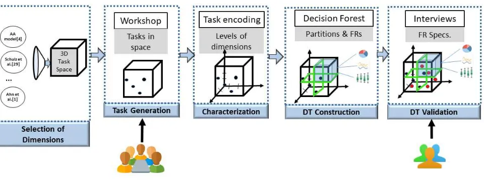
Figure 1 outlines the five stages of our pipeline. Our contributions in this paper can be summarized along the different stages as follows: 1. Selection of dimensions:We explain our process for selecting task space dimensions from the wealth of taxonomies avail-able in visualization literature (Section 3), and report on three dimensions that we found useful in a real-world setting.
2. Task generation:How we used those dimensions to design a workshop activity foruser story generation[8, 10] (Section 4). The workshop brought together 26 participants representing 22 different NCAs.
3. Task space characterization: A method for characterizing the tasks, to identify the distinct levels of each dimension (Section 5).
4. Decision Tree construction: A method for partitioning the task space along the dimensions to obtain a decision tree that maps a given task to visualization design alternatives (Sec-tion 6).
5. Validation:We demonstrate the validity of our decision tree by testing it against new tasks that were collected through two semi-structured interviews, which used the three task space dimensions, and resulted in a consolidated list of functional requirements for QualDash (Section 7).
2 BACKGROUND ANDRELATEDWORK
Figure 1: A five-stage pipeline for taxonomy-driven requirement specification.
body of FRs remaining in an uncategorized and unstructured format, which complicates prioritization of relevant functionalities. The re-mainder of this Section focuses on two approaches that are typically used to classify FRs and map them to concrete design alternatives: the agile approach and the task taxonomy-driven approach.
2.1 The Agile Approach to RE
Agile analysts work collaboratively with their users to decompose requirements in order to allocate priorities at the goal and sub-goal level. Auser story[8] is a short story describing a user role (who), the task that the user wants to achieve (what) and the reason they want to achieve it (why). User stories became the de facto standard in agile RE. The use of facilitated workshops, involving a group of users with the aim of developing user stories, is an extremely popular approach for agile projects.
While user stories are effective in capturing the essence of func-tional requirements, they share the same threats to validity that have been reported for qualitative techniques [12]. Namely, structuring methods need to be employed to draw out the detail of the func-tionality or to provide a coherent view of the, often numerous, user stories. In this paper we adopt the facilitated workshop technique for user story generation from the agile approach, and merging it with a taxonomy-driven approach derived from the visualization literature.
2.2 The Task Taxonomy-Driven Approach to RE
Much like agile analysts do, visualization researchers collaborate with domain experts and end users to understand and prioritize user tasks and goals. At a high level, models like the nine-stage design methodology [27] guide the iterative phases of requirements analysis, design, prototyping and evaluation. Others like the nested model [20] and nested blocks [19] allow researchers to strategically ground identified requirements and design decisions in theory. They provide structure to these decisions. Specific to the requirements analysis phase are several task taxonomies that have been introduced in the visualization literature [1, 3, 4, 6, 12, 19, 25, 30]. Amar and Stasko [3] and Sediq and Parsons [26] advocate the use of these classifications as a systematic basis for thinking about the design process. Use of task classifications as a “checklist” of design items to consider has been repeatedly advocated [11, 16].
Recently, Kerracher et al. [12] promoted the usefulness of classifi-cation for task understanding, data abstraction and technique design. They argued that by setting out the range of potential tasks of interest (i.e. the task space), one may overcome known problems associated with simply asking people to introspect. Namely, the collected tasks
may be incomplete due to the users’ limited ability to articulate their needs, or they may be skewed towards a specific user group. The taxonomy-driven approach we present addresses these threats by adding taxonomic structure to the task space creation process.
3 SELECTION OFTAXONOMYDIMENSIONS
This section describes how we chose dimensions from established taxonomies to structure our requirements analysis in a real-world project setting. Our work draws on thelearnanddiscoverstages of the nine-stage design study methodology [27], to identify a set of dimensions that“informs the data and task abstraction”[27]. The criteria that we used prioritized dimensions that:
1. Cater to the application domain, e.g. all dimensions relating to graph structures are removed.
2. Provide a clear separation between tasks in terms of their data requirements.
3. Separate tasks that require different sets of visual encodings.
An iterative selection process begins with retrieving the set of dimensions in relevant task spaces and taxonomies in the literature, excluding dimensions that did not satisfy the criteria, and retaining dimensions that were needed to preserve the distinctions that were made in other criteria. Our survey of task taxonomies focuses on addressing this goal, while a more extensive survey is beyond the scope of this work.
Three dimensions were found to satisfy the criteria and facilitate RE. We label these dimensions as:granularity,type cardinalityand
target. In the remainder of this Section, we describe each dimension and the rationale for its selection. We also describe initial levels for each dimension that were derived from the literature. These levels are used as a starting point for task generation (Section 4) and characterization (Section 5), to identify ones that are most relevant to QualDash’s requirements.
In addition to the three dimensions, we considered theGoal
dimension presented by Schulz et al. [25], which distinguishes tasks that are pursued by users in an exploratory, confirmatory or presenta-tion setting. This dimension aligns with the“why”dimension of the Brehmer and Munzner typology [6]. The levels of this dimension were used to divide groups in the workshop activity and design the corresponding guiding scenarios for each group, as will be discussed in Section 4.
3.1 The Granularity Dimension
The Andrienko and Andrienko (AA) model defines two different levels for task granularity [4]: elementary (involving individual elements) and synoptic (involving sets as a whole). Bertin defined three levels for this dimension (with an additional intermediate level for subsets as a whole) [5]. Recent taxonomies by Kerracher et al. [12,13] found this three-level approach to be useful within specific visualization contexts. For example, for network visualization, it was found useful to separate tasks that require the analysis of clusters or groupings of nodes versus those that targeted the network as a whole. Schulz et al.’s design space [25] also defines a granularity dimension which aligns with Ben Shneidermans information seeking mantra:
(i)Overview all instances for a complete view;(i)Zoom and filter on multiple instances for putting data in context; and(iii)Details on demand for highlighting details.
All of the above have one thing in common, which is that they distinguish between tasks that have different data aggregation re-quirements: individual elements, aggregated subsets, or aggregation of the whole dataset.
Granularity dictates the appropriateness of certain choices for a visualization design. For example, a visualization of individual patients would show many more data points than one that visualizes aggragations of the same data for a whole organisation (e.g. a hospital). Similarly, visualizations that cater to time as a continuum are different from ones that use an ordinal scale to visualize time blocks.
To consider these possibilities, we subdivided the granularity dimension into three axes (population, time and space), which corre-spond to the three types of referrers (i.e. independent variables) in the AA model [4]. The levels of each axis that were appropriate for the present research are shown in Table 1.
Thepopulationaxis determines whether a task requires access to individual level data (e.g. patient-level or physician-level), an aggregate at an intermediate level (organisation or network of collab-orating organisations), or aggregates at a global level (e.g. national) without loss of information that is important for a given task. Given the sensitive nature of healthcare data, it is crucial to understand what data needs to be requested from providers, where and when to capture the data, and what parts of it can be made accessible to different users. The match between the granularity that users wish to explore in their tasks and that which could be made accessible is constrained by data governance. Typically, individual-level data can be accessed only inside an organization, whereas aggregated data can be shared within a network of institutions or individuals (e.g. trust boards and professional bodies). It can also be made accessible via the audit on a national scale.
Thetimeaxis discriminates between tasks that require real-time data (that means daily, in the context of NCAs), an intermediate aggregation (monthly) or aggregated periodic data that is made
available from the corresponding audit’s annual report. These levels map to the three levels defined by Bertin [5].
Finally, thespaceaxis specifies whether data should be collected within a specific region or whether a location-agnostic dataset is sufficient to address the task.
3.2 The Type Cardinality Dimension
The AA model defines a functional view of datasets and tasks [4]. In this view, a dataset can be described mathematically as a function:
f(x1,x2, ...,xM) = (y1,y2, ...,yN) (1)
whereMis the number of referrers (i.e. independent variables) and
Nis the number of characteristics (i.e. dependent variables). The
cardinalityof the set ofMreferrers andNcharacteristics considered can determine the dimensionality of the visualization alternatives
to consider. We must stress here that our use of the word
“cardi-nality”is different from that of Schulz et al. [25], as their use of the term is similar to our“granularity”dimension. Our task space uses“cardinality”to describethe number of variables (i.e. referrers and characteristics) involved in a task. We further include in our definition of“cardinality”the data types for the elements of the variable set in a given task. We refer to this dimension as the“type cardinality”dimension and let it describe the number of variables that fall within each variable type for a given task. We adopt here the same data types that were defined in the Vega-Lite grammar [24]:
Quantitative,Nominal,OrdinalandTemporal.
Deciding on the right type cardinality for a task is crucial for identifying visualization design alternatives. For example, a bar chart is suitable for a task that involves one quantitive and one nominal variable(1Q,1N), whereas a scatter plot is more suitable for tasks that involve two quantitive variables(2Q), and if there is a nominal variable as well(2Q,1N)then that may be encoded in a scatter plot using color or shape.
3.3 The Target Dimension
In their faceted approach for task space characterization, Schulz et al. [25] described a task as a combination of five smaller com-ponents:(goal,means,characteristics,target,cardinality). Two of these dimensions (characteristicsandtarget) concern the facets of data which are sought by users in a task and the relational constructs among them. To facilitate the discussion around these constructs, we combine these two axes and simplify them under atargetdimension. We choose to label this dimension astarget in order to facilitate the discussion with users. Intuitively, asking users what pieces of information they target when looking at a visualization is easier than asking them to reflect on data characteristics they seek after.
Combining the levels of the target and characteristics dimensions by Schulz et al. [25] yields a set of nine levels(specific values, data objects, trends, outliers, clusters, frequency, distribution, correlation, association)that affect the choice of visualization techniques as will be demonstrated in Section 5. The specific value and data object levels distinguish between tasks in which users wish to identify a specific value (characteristic) given a number of independent vari-ables (referrers) from those in which users search for data objects given certain data characteristics. This distinction is in-line with the data function dimension of the AA model which classifies the former as direct lookup and the latter as inverse lookup tasks.
4 GENERATION OFUSERTASKS
Table 1: The three axes of granularity
Axis Tax. Levels Rationale
Population Individual, organisational, Users may have access to patient-level data or data aggregates within their organisations, network, global across different collaborating organisations or data at from a global scale.
Time Daily, monthly, annual Users may access timely (e.g. monthly) data or only periodic (e.g. annual) data.
Space Regional, location-agnostic Data from specific locations may have limited availability.
with the workshop participants. This section describes the workshop procedure, materials and results.
Procedure Participants were divided into five groups of 5-6 experts. Each group was presented with the three dimensions chrono-logically in the form of an example scenario. To account for different contexts of use for QualDash, two of the groups were assigned an
exploratory analysisscenario, two were assigned aconfirmatory analysisscenario and one group was given aninformation presen-tationscenario. These three types of scenarios were inspired from the levels of theGoaldimension of the task space in [25]. In each group, participants were presented with a paper-based activity sheet (see Supplemental Material) that described the example scenario in a step-wise fashion and asked them to write down similar details that were relevant to their audit(s). After developing their own indi-vidual scenarios, the group discussed their scenarios. A QualDash team member was responsible for facilitating the discussion in each group. The purpose of the discussion was to elicit more information about the answers that were given on the activity sheet and to elicit functional requirements that users felt were crucial to their analysis.
Materials Three versions of the paper-based activity sheet were handed out to participants according to their group membership (Group 1: Explorers, Group 2: Confirmers, and Group 3: Pre-senters). Each sheet presented a short example that illustrated to participants a potential scenario in their assigned setting. These short scenarios were inspired from previous discussions with a clinical lead working with an Intensive Care Unit (ICU) NCA. The scenarios described a situation at a high-level of detail to avoid steering the discussion toward the specific audit. Participants were asked to read the example then think in terms of their own audit(s). They were asked to provide details on relevant metrics and come up with a similar analysis/ presentation scenario that fits their audit’s needs (Step 1). To elicit their knowledge along the granularity dimension, they were presented with possible levels of detail within the given example and were asked to select the levels which are relevant to their own scenario (Step 2). Next, a similar format was used to elicit their knowledge along the target and type cardinality dimensions (Steps 3 and 4, respectively).
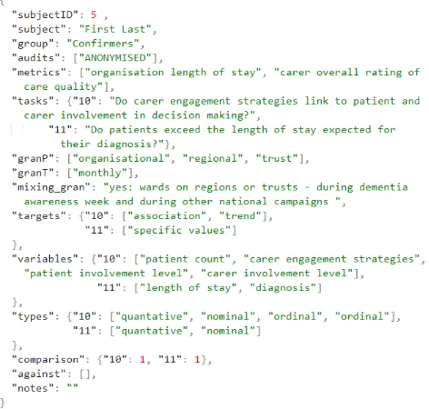
[image:5.612.321.557.143.368.2]Results We collected 49 unique tasks from workshop partici-pants, involving 78 different variables. The diversity of the tasks and the pieces of information they included stemmed from the variety of audits with which our participants work. We created a unified array of JSON objects that stored all of the tasks in one file and dissected them into their constituent dimensions. This format facilitated our analysis and enabled us to explore different ways to cluster the tasks. Figure 2 shows an anonymised example. The first items are a participant’s name, audit(s), and the metrics that are most relevant to their audit. Next are all of the tasks that were listed by the participant, population and time granularity levels described in their answers and whether they required mixing different levels of granularity. Following that are the targets and variables that the participant listed for their tasks, and the variable types determined by ourselves for each of the variables. The “comparison” field reports on whether the participant described as useful the comparison against a bench-mark. The “against” field reports on whether they warned against something (e.g. some participants warned against showing an out-lier without providing supplementary information). Finally, the
Figure 2: JSON format to store tasks from one participant. The fields reflect the dimensions used to characterize each task.
“notes” field reports on any comments they wrote or mentioned in the discussion.
The steps to generate the JSON entry in Figure 2 begin by consid-ering an individual participant’s responses on an activity sheet along with any comments written down by the group’s facilitator. After information about the participants is filled out (first four items), the tasks written by the participant (second half of Step 1) are copied in thetasksarray and each task is assigned a unique ID. Next, the
granP,granTandmixing granentries are populated with responses to the Step 2 questions, in which the participant selects levels of granularity of population and time in each task and indicates whether it requires mixing different levels of granularity.
Thetargetsandvariablesentries are populated from the par-ticipant’s answers to questions in Step 3 and Step 4, respectively. Occasionally, a participant’s answer did not explicitly state targets or variables but these could be derived from the tasks. For example, for task 10 in Figure 2, the participant did not specify patient count in her answer. Since engagement strategies are considered referrers in this task, we consider as characteristics the counts of patients affected by the individual strategies and the levels of engagement for both patients and carers within each strategy. Therefore, a decision was made to addpatient countas a variable.
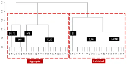
Figure 3: Task clusters based on population granularity. LettersI,O,
NandGrepresent clusters havingIndvidual,Organisational,Network
andGloballevels, respectively. Two clearly separable clusters emerge when considering individual versus other aggregate tasks.
5 CHARACTERIZATION OF THETASKSPACE
This section lays the collected tasks along each dimension. The goal is to derive a set of levels that can be used to characterize and discriminate a task, by positioning it at a constrained location in the task space. To achieve this, we observe the distribution of tasks along each dimension separately, based on the initial levels that were determined from the literature in Section 3. We then observe the groupings of tasks in the space and decide whether the levels need to be modified (i.e. by splitting or merging existing levels) to yield a clear separation of tasks. This allows us to then partition the space at the individual levels and map different partitions to a narrow set of visualization alternatives.
5.1 Levels of the Granularity Dimension
As described in Section 3.1, we break down task
granular-ity into three main axes: population, time and space. For
the population axis, we extracted fourteen unique granular-ity terms that were listed by the workshop participants, and merged terms ontologically based on data governance consid-erations (see Section 3.1) to produce a granularity feature vec-torfG(Individual,Organisational,Network,Global)for each task.
Terms likepatients,physiciansandpatient cohortswere merged
into the individual feature. Terms like unit, organisation, site
andwardwere mapped to theOrganisationalfeature. Terms like
trust,patient networkandpro f essional bodywere mapped to the
networkfeature, and terms likeauditandnationalwere mapped to theglobalfeature.
The vectorfG(Individual,Organisational,Network,Global) po-sitions each of the collected tasks at one or more level(s) along the granularity dimension. For example, some participants indicated interest in viewing data at both a network- and global-level for some of the tasks. The goal of our task space characterization then is to map the user-specified levels of granularity into levels that yield a unique position for each task along this axis. Once a clear segrega-tion of tasks is achieved, the resulting levels can inform our choice of visualization design alternatives. To achieve this, we cluster the tasks by theirpopulationgranularity vector fG. Figure 3 shows the
results of hierarchical clustering and reveals two broad categories of tasks:(i)tasks that require one or two levels of aggregation but no individual-level details;(ii)tasks that require details at the individ-ual level. The separation between these two clusters enables us to position any given task at either one of the two levels: individual or aggregate, which also map back to the AA model’s elementary and synoptic levels. Backed by this finding, we declare the final levels of granularity in our task space as:individualandaggregate.
For thetimeaxis of granularity we inspected the data and found that all tasks involving individual-level data also required that the data was recent (daily or monthly). By contrast, tasks involving aggregates were looser about their timeliness requirement, indicating that annual was sufficient. Therefore, we combine this axis with the two levels of the population axis without adding any new ones.
Thespaceaxis was less expressed in the data collected through our workshop. Only two of the tasks involved interest in location-specific data, whereas the majority of our participants agreed that organisations are compared based on resources and demand rather than based on geographical location. We, therefore, concluded that incorporating spatial information is not a requirement for QualDash.
5.2 Levels of the Type Cardinality Dimension
This characterization was performed by grouping tasks according to their data types and cardinalities (the number of variables of a given type). This reduced the 49 tasks to 14 unique combinations of type cardinality ((1Q,1N),(1Q,2N), etc.).
We investigated several ways of further grouping those combina-tions. For that, we could not find an ontological grouping that would merge them into coarse-level features the same way we did with gran-ularity. Automated hierarchical clustering did not yield promising results either because it combined task groups that do not necessarily yield similar visualization requirements. For example a task group that has one quantitative and one nominal variable(1Q,1N)and one that has two quantitative and one nominal(2Q,1N)variables may be clustered together because their feature vectors have high similarity: <1,1,0,0>and<2,1,0,0>respectively. However, when thinking in terms of visualization design, the former group is best served with a histogram, whereas the latter can use a colored scatter plot, for example. Therefore, we decided to keep all 14 levels of this dimension for the decision tree approach that is described in Section 6.
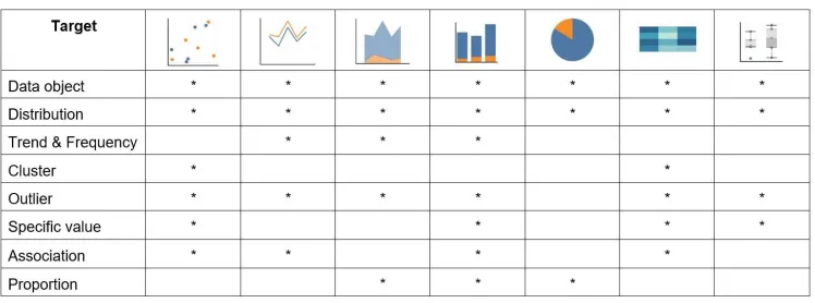
5.3 Levels of the Target Dimension
The targets collected from workshop participants were quite diverse. They covered all of the levels:specific values, data objects, trends, outliers, clusters, frequency, distribution, association and correla-tion. Many participants warned against the latter, however, in a quality improvement context. They stressed that QualDash should affordassociationrather than correlation as a target. We, therefore, merged thecorrelationlevel withassociation. Some participants suggested new targets, providing examples of specific values like
averageand aspects of distributions likevariance. We chose not to add more levels for these as they fit into our specified levels. By contrast, a few participants mentioned interest in proportions (i.e. parts of a whole) as a target, for which we added an extra level calledproportion. These findings resulted in the following levels:
specific values, data objects, trends, outliers, clusters, frequency, distribution, association and proportion.
Figure 4: Mapping targets to possible visualizations.
6 DECISIONTREECONSTRUCTION
This section describes the derivation of a decision tree that can map a user task (see Section 4) to a set of visualization alternatives. Gen-erally speaking, decision tree construction methods tend to prioritize splitting decisions along dimensions that are expected to reduce het-erogeneity in a dataset. We use a similar logic to build our reasoning around the user tasks and mappings to visualization alternatives. Namely, we begin with splitting the most heterogeneous dimension, which is the Type Cardinality dimension. First, we describe the derivation for two-variable tasks. Then we describe the derivations for tasks with three variables and 4+ variables, both of which utilize the two-variable decision tree.
6.1 Two-variable Tasks
Tools such as Tableau Show Me [18] and Vega-Lite [24] provide rules for mapping the number and type of variables to different sets of visual marks and encodings. We adopted Show Me’s “automatic marks” rules [18] because they provide clear guidelines for two-variable tasks, but the decision tree could just as easily be based on an alternative set of rules.
The decision tree is constructed in three steps. First, the rules are used to identify the visualization alternatives that are appropriate for each type cardinality combination (see Figure 5 top). Second, we expand the space of alternatives by linking our data to the 97 visualization specification files released with Vega-Lite [24] to fetch any possibly missed alternatives for the given type cardinality level. Third, we seek to answer the question: how to narrow down the number of alternatives for each level to the most informative subset? To answer this question, we separately consider each type cardi-nality, and filter the visualization alternatives that get passed from parent node to child node in the decision tree (see Figure 6). To decide which visualization alternatives travel down each branch in the tree, we relied on both our own experience and the default views in Tableau Show Me. A filter that is based on the population granu-larity (see Section 3.1) separates the visualization alternatives into those that are suitable for individual data (for QualDash that only occurs for(1Q,1N)tasks) vs. aggregated data. The visualization alternatives are then filtered again, using the target dimension (see Section 3.3) of the tasks to produce the decision tree that is shown in Figure 6.
6.2 Three-variable Tasks
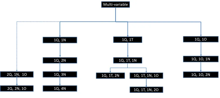
For three-variable tasks we seek to determine a base case that exists in the two-variable decision tree. In QualDash, all of the three-variable user tasks can be mapped to a base case by subtracting one of the nominal variables (see Figure 7), and color or shape encoding makes it straightforward to add a nominal variable to any of the two-variable visualization alternatives. Once the base case has been
identified, the population granularity and target dimension filters are applied in the same way as for two-variable tasks (see Section 6.1) An example can clarify this concept. Consider a task with the type cardinality(1Q,1N,1T). This three-variable task can be mapped to two different branches in the two-variable decision tree (Figure 6). Namely, we may consider the case(1Q,1N)as the basis of this combination then add time, or map it to the(1Q,1T)case and then add a nominal. Our prioritization scheme favors the latter option.
One of the(1Q,1N,1T)tasks that our domain experts provided is: How many patients received treatment(s) in a particular time scale? In which patient count is a quantitative measure, type of treatment is a nominal category and time scale is a temporal variable. This task can make use of a scatter plot, a line chart, area chart or bar chart. At the granularity axis, this task looks at aggregated data (i.e. no patient-level detail is necessary) and seeks to specify a specific value as target which maps down to a bar chart. The path that this task takes in the decision tree maps it directly to a leaf-level node containing a bar chart. Therefore, QualDash would plot the number of patients over discrete points in time (e.g. months or years) in a bar chart. It may then use shape or color to encode the type of treatment.
6.3 Four- and Five-variable Tasks
Similarly, to determine visualization alternatives for four- and five-variable tasks we identify a three-five-variable base case by subtracting nominal or ordinal variables (see Figure 7). The affinity heuristic in [18] provides rules for generating a trellis of small multiple displays for the variable(s) that are subtracted. Other guidance could be provided by the matching views of Vega-Lite [24] or best practices
for theAdd to Sheetcommand in Show Me [18].
An exception happens with the addition of a quantitative variable (see(2Q,1N,1O)in Figure 7). Mackinlay et al. [18] consider the two-variable basis(2Q)for this to be a scatter plot. They note that
“scatter plots (Q,Q) require additional heuristics to handle multiple fields, particularly when a Q field is being added.” We further emphasize that our collected data did not include a two-variable case with two quantitative variables. Interest in more than one quantitative variable only appeared in tasks in which users wished to find associations or trends while considering categorical factors. An example task in this category is“Do organisational factors like size or configuration play a part in rates of morbidity or mortality?” In this case, the “or” between the two quantitative variables (morbid-ity and mortal(morbid-ity) implies that users do not wish to see these two in the same plot, so a scatter plot may safely be ruled out in this case. Instead, two separate views can be used to associate organisational factors to morbidity, then separately, to mortality. Alternately, the two quantitatives may be overlaid in the same view.
Figure 5: Visualization alternatives for the first 6 levels of the type cardinality dimension for two- and three-variable cases.
Figure 6: Decision tree for the set of two-variable tasks. Numbers in brackets show the number of tasks (from training data) that exist in each leaf-level node.
[image:8.612.111.484.513.680.2]afford mapping to a 2Qcase, which is mapped to a scatter plot in Show Me, with the addition of categorical variables in the form of encodings or trellis. It also affords mapping to one of the three cases in Figure 6.
Worth noting is that the tasks in the QualDash project context are of a specific nature in that they involve no more than 5 variables in the general case. Analysis tasks that involve high-level inference using multidimensional dataset are not currently covered in our space. However, in theory our method could scale well to those high-dimensional tasks, provided that their diversity does not add too many levels on each dimension. The branching in our decision tree (Figure 6) is bound by the number of levels in the space.
6.4 Requirements for QualDash
Our taxonomy-driven approach provides a simple and systematic mapping from the large variety of tasks we collected from domain experts (see Section 4) to the small set of visualization techniques that exist at the leaf-level of the decision tree in Figure 6. The main benefit of our approach is that it enables us to specify a minimal set of visualization functionality to include in the first version of QualDash, by selecting the most prominent visualization alternatives in the leaf-level of the decision tree. This leads to QualDash having the following minimum requirements:
FR1: Visualize an aggregate overview in a bar chart view
FR1.1: Functionality to drag a bar and create a linked scatter plot for individual-level detail
FR1.2: Functionality to switch between bar and line view to support different temporal granularities
FR2: Visualize individual-level data in a scatter plot view
FR3: Visualize time as a line chart view
FR3.1: Functionality to switch between line and scatter plots to support different targets
FR4: Functionality to break down a view with one categorical
vari-able using color encoding or a level of detail
FR5: Functionality to extend a view into a trellis by adding up to
one quantitative or up to three categorical variables.
7 REQUIREMENTSVALIDATION
The purpose of validation is to verify that the decisions made by the tree perform a sound mapping to correctly classify a task into a group of visualization alternatives. To do this, we consider the data collected from the workshop and used to build the tree a training dataset. In this section, we introduce new data points in the space and trace them through the tree.
To validate our decision tree, we conducted two interviews with clinical leads working with two different NCAs: a pediatric inten-sive care unit (PICU) audit and a Myocardial Ischaemia National Audit. In our interviews, we asked questions specific to their corre-sponding audits in the same order and structure that was presented to participants of the workshop activity. This helped us elicit de-tailed information from the interviewees, which in turn enabled us to immediately position their tasks along the dimensions of our three-dimensional space.
We demonstrate the mapping from these tasks to visualization alternatives by tracing four sample tasks (two from each interview) down the decision tree in Figure 6. The tasks are:
1. How many patients died in a time period?
• variables: [patient count, time]
• position in space:(1Q,1T,aggregate,speci f ic value)
• Tree outcome:Bar
2. What is the case mix in a time period with a high death rate?
• variables: [diagnosis, patient count, time]
• position in space:(1Q,1T,1N,aggregate,proportion) • Tree outcome:Bar
3. How many STEMI cases met the “call to balloon target” every month?
• variables: [patient count, meets target]
• position in space:(1Q,1N,aggregate,speci f ic value) • Tree outcome:Bar
4. For non-target meeting cases what was the time of call, admis-sion, cath lab admission and ventilation?
• variables: [patient, meets target, event, time]
• position in space:(1Q,1N,1O,1T,individual,cluster) • Tree outcome:Scatter + trellis.
8 CONCLUSION
We presented a three-dimensional task space that enables a system-atic characterization of user tasks. The proposed dimensions were derived from the wealth of taxonomies in the visualization literature and used in a five-stage pipeline to structure communication with domain experts and to provide the appropriate level of abstraction for requirements specification. We were able to use this approach to map a diverse set of user tasks to a concise set of requirements. Fur-thermore, by taking a task through a set of decisions that determine where the task lies in the space, we greatly simplified the process of identifying visualization alternatives. Having established a decision tree that partitions the space of possible tasks for the QualDash project, identifying design alternatives is also greatly simplified for new tasks that may arise throughout the life cycle of the QualDash project. Furthermore, task sequences [7] are easily identifiable by finding recurrent trajectories through the task space (see Section 2 in Supplemental Material).
One of the strengths of our taxonomy-driven approach is the abil-ity to highlight not only what is important for users but also what
isnotimportant. This enabled us to prioritize requirements and
discard others. A good example is thespaceaxis of granularity.
Our intuition was to include geographic data visualizations in Qual-Dash to follow the convention of the annual reports of several audits. However, our data collection revealed that users have little interest in geographic information for their analysis purposes. We were able to elicit this information by explicitly asking them what level of spatial granularity they required. We were also able to exclude a large number of visualization alternatives by ruling out multidimen-sional techniques. This was made possible by explicitly discussing type cardinality with workshop participants. Similarly, for the tar-get dimension, participants warned against specific tartar-gets that they consider misleading in practice. We hope that the proposed method offers a structured and deterministic approach to guide the itera-tive functional requirements specification for visualization software design.
ACKNOWLEDGMENTS
REFERENCES
[1] J.-w. Ahn, C. Plaisant, and B. Shneiderman. A task taxonomy for network evolution analysis. IEEE transactions on visualization and computer graphics, 20(3):365–376, 2014.
[2] R. Amar, J. Eagan, and J. Stasko. Low-level components of analytic activity in information visualization. InInformation Visualization, 2005. INFOVIS 2005. IEEE Symposium on, pp. 111–117, Oct 2005. doi: 10.1109/INFVIS.2005.1532136
[3] R. Amar and J. Stasko. Knowledge precepts for design and evaluation of information visualizations.Visualization and Computer Graphics, IEEE Transactions on, 11(4):432–442, July 2005. doi: 10.1109/TVCG .2005.63
[4] N. Andrienko and G. Andrienko.Exploratory analysis of spatial and temporal data: a systematic approach. Springer Science & Business Media, 2006.
[5] J. Bertin. Semiology of graphics: diagrams, networks, maps. 1983. [6] M. Brehmer and T. Munzner. A multi-level typology of abstract
visual-ization tasks.Visualization and Computer Graphics, IEEE Transactions on, 19(12):2376–2385, 2013.
[7] M. Brehmer, M. Sedlmair, S. Ingram, and T. Munzner. Visualizing dimensionally-reduced data: Interviews with analysts and a character-ization of task sequences. InProceedings of the Fifth Workshop on Beyond Time and Errors: Novel Evaluation Methods for Visualization, pp. 1–8. ACM, 2014.
[8] M. Cohn. User stories applied: For agile software development. Addison-Wesley Professional, 2004.
[9] A. Dennis, B. H. Wixom, and D. Tegarden. Systems analysis and design: An object-oriented approach with UML. John Wiley & Sons, 2015.
[10] L. Girvan and D. Paul.Agile and Business Analysis: Practical guidance for IT professionals. BCS Learning & Development Limited, 2017. [11] J. Heer and B. Shneiderman. Interactive dynamics for visual analysis.
Queue, 10(2):30, 2012.
[12] N. Kerracher and J. Kennedy. Constructing and evaluating visualisation task classifications: Process and considerations. InComputer Graphics Forum, vol. 36, pp. 47–59. Wiley Online Library, 2017.
[13] N. Kerracher, J. Kennedy, K. Chalmers, and M. Graham. Visual techniques to support exploratory analysis of temporal graph data. In
Eurographics Conference on Visualization (EuroVis)-Short Papers, pp. 1–21, 2015.
[14] Y. Kim and J. Heer. Assessing effects of task and data distribution on the effectiveness of visual encodings. InEurographics Conference on Visualization (EuroVis) 2018, vol. 37. Wiley Online Library, 2018. [15] K. Kurzhals and D. Weiskopf. Exploring the visualization design space
with repertory grids. InEurographics Conference on Visualization (EuroVis) 2018, vol. 37. Wiley Online Library, 2018.
[16] T. Lammarsch, A. Rind, W. Aigner, and S. Miksch. Developing an extended task framework for exploratory data analysis along the struc-ture of time. InProc. Eurographics Intl. Workshop on Visual Analytics (EuroVA). Citeseer, 2012.
[17] B. Lee, C. Plaisant, C. S. Parr, J.-D. Fekete, and N. Henry. Task taxonomy for graph visualization. InProceedings of the 2006 AVI workshop on BEyond time and errors: novel evaluation methods for information visualization, pp. 1–5. ACM, 2006.
[18] J. Mackinlay, P. Hanrahan, and C. Stolte. Show me: Automatic pre-sentation for visual analysis.IEEE transactions on visualization and computer graphics, 13(6), 2007.
[19] M. Meyer, M. Sedlmair, P. S. Quinan, and T. Munzner. The nested blocks and guidelines model. Information Visualization, 14(3):234– 249, 2015.
[20] T. Munzner. A nested model for visualization design and validation.
IEEE transactions on visualization and computer graphics, 15(6), 2009.
[21] P. Murray, F. McGee, and A. G. Forbes. A taxonomy of visualization tasks for the analysis of biological pathway data.BMC Bioinformatics, 18(2):21, Feb 2017. doi: 10.1186/s12859-016-1443-5
[22] J. Robertson and S. Robertson. Volere. Requirements Specification Templates, 2000.
[23] B. Saket, P. Simonetto, and S. Kobourov. Group-level graph
visualiza-tion taxonomy.arXiv preprint arXiv:1403.7421, 2014.
[24] A. Satyanarayan, D. Moritz, K. Wongsuphasawat, and J. Heer. Vega-lite: A grammar of interactive graphics.IEEE Transactions on Visual-ization and Computer Graphics, 23(1):341–350, 2017.
[25] H.-J. Schulz, T. Nocke, M. Heitzler, and H. Schumann. A design space of visualization tasks.IEEE Transactions on Visualization and Computer Graphics, 19(12):2366–2375, 2013.
[26] K. Sedig and P. Parsons. Interaction design for complex cognitive activities with visual representations: A pattern-based approach.AIS Transactions on Human-Computer Interaction, 5(2):84–133, 2013. [27] M. Sedlmair, M. Meyer, and T. Munzner. Design study methodology:
Reflections from the trenches and the stacks. IEEE Transactions on Visualization and Computer Graphics, 18(12):2431–2440, Dec 2012. doi: 10.1109/TVCG.2012.213
[28] H. Sharp, J. Taylor, D. Evans, and D. Haley. Establishing require-ments for a mobile learning system. a MOBIlearn project technical publication by the Open University, UK, 2008.
[29] S. Wehrend and C. Lewis. A problem-oriented classification of visual-ization techniques. InProceedings of the 1st Conference on Visualiza-tion ’90, VIS ’90, pp. 139–143, 1990.