
The Townsville Common : codifying a private view of natural energies
21
0
0
Full text
(2)
(3) 114 emphatic lines standing as concentrated energy. By contrast, rhythms of softly intersecting subordinate marks of outstretched leaves allude to the expansiveness of their energy. Beyond the quality of the marks, arrangement of lines within the study is fundamental to portraying abundance. The notion of overflowing quality of abundance is indicated in layers of omnidirectional lines expressed as grass blades. In the background, are rhythms of lightly rendered guinea-grass connoting the depth of abundance in terms of pictorial depth. Superimposed upon this portrayal, in the lowerright of the study, is the natural sheathing formation of grasses. The compactness of these interlocking ‘v’- like forms lends the notion that the energy of abundance is concentrated in the stem-kernel and dispersed through the divaricated blades reaching out to greet the rain. In Townsville Common: Wet Season I [Plate 4.5.4.2], the interrogated section of the print, Townsville Common 9 [Plate 4.4.4], features distant hills veiled by gently falling rain and framed by a water-laden branch. To the artist, this section epitomises the notion of contentment experienced in the Wet Season. The satiated demeanour suggested by the drooping foliage and the inverted “U” of the overhanging branch lends a sense of satisfaction and calm to the energy expressed. This feeling of contentment is enhanced by the horizontal vista shown beyond capturing a sense of tranquillity by its contrast with the foreground. To convey the idea of contentment in the study, shape as a design element is used to sensitise the image with the feeling. This feeling is complex, encompassing three underlying nuances: depth, a sense of containment and calm. Shape is employed to connote depth of feeling within containment and calm by contrast between clarity of foreground shapes and vagueness of shapes in the distance. Going further, the.
(4)
(5) 116 contrast also extends to shapes within these areas. For instance, within the dominant branch arching across the study from left to right, defined shapes are shown in the massed drooping foliage appearing in the left foreground, which contrast with softly rendered shapes in the foliage mass on the right. Contrast between clarity and vagueness of shapes in this branch creates pictorial depth by an impression of a movement backward in space as if viewed through a keyhole. For the author, this depth is a pictorial analogue standing for depth of feeling. The proscenium arch effect of this same branch evokes the sense of containment by framing the vista thus creating a somewhat cavern-like enclosure. Additionally, the enclosed shapes formed by the arrangement of the arching branch, the line of hills plus the horizon, denote the idea of containment further. Shape is also used to evoke the sense of calm within contentment by parallel rhythms of water patterns receding towards the horizon. These rhythms create an impression of light glistening on the water, which, when viewed with the effect of shape discussed above rounds out the notion of contentment. In Townsville Common: Dry Season I [Plate 4.5.4.3], the interrogated section of the print, Townsville Common 8 [Plate 4.4.4], features dry spiny scrubland consisting of angular tree-limbs. To the artist, this section epitomises the notion of brittleness experienced in the Dry Season by the appearance of angular limbs as weak and easily fractured. To portray this notion in the study, texture as a design element is used to emphasise the fragility of internal structures and their surfaces. Employment and placement of textural variations and their contrasts explicates brittleness both in the vegetation and on the ground. Arrangement of textures within the study is pivotal to expressing this notion. To capture the spirit of internal brittleness (i.e. weaknesses.
(6)
(7) 118 where there is the potential for fracturing) in the study, fine texture contrasts with coarse texture in the tortured trees to connote potential fracture areas. In the background, these trees appear skeletal, thus highlighting their fragility by their apparent inflexibility. Drawing attention to the notion of internal brittleness are three tree trunks in the foreground-left of the study. Contrast between the heavily textured trees and the lightly textured ground show that these trees have been shattered already. Within the textured surface, however, voids indicate the potential for the internal shattering process to be ongoing. There is the same strong textural contrast between trees and ground. The brittleness of the ground is evoked by the suggestion of skeletal trees piercing through it. Further surface fragility is shown in the trees on the right. Here, strong use of texture arrests the eye with small fragile protrusions. In Townsville Common: Dry Season II [Plate 4.5.4.4], the interrogated section of the print, Townsville Common 14 [Plate 4.4.4], features stony ground at the base of two dead trees. To the artist, this section epitomises the literal notion of barrenness (which follows “brittleness” when the dry becomes prolonged) by the lack of obvious nurtured vegetation. To convey the idea of barrenness in the study, tone as a design element is used to heighten the presence of barrenness. From a personal viewpoint, the sense of barrenness goes beyond outside appearances. It is a deep-seated deficiency of convertible power. Fundamental to the expression of this notion, is the juxtaposition of contrasting tones. Hence, natural deficiency, known as “barrenness” is expressed by hard-edged rocks protruding from the surface ground. The intention being that the knife-edges of the rock interrupt, even block, the flow or conversion of natural energies. These knifeedges, created by abutment of contrasting tones, occupy the central half of the study..
(8)
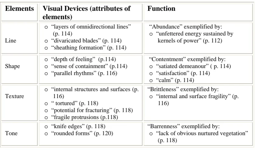
(9) 120 The notion of their hardness is heightened by comparison with tonally rounded forms of two dead tree-stumps in the background.. By intention, each of the above studies integrates intuition and analysis by focusing on one of four elements (line, shape, tone and texture) in relation to pivotal sections extracted from prints of the Seasonal Change Suite. Use of complementary attributes of the chosen element and disposition of these attributes transpose the artist’s experiences of seasonal change from the print to the studies. The essence of using each element in the relevant study is shown in template form in Table 4.5.4.1. Table 4.5.4.1 TEMPLATE OF VISUAL DEVICES TO PORTRAY SEASONAL CHANGE Elements. Line. Shape. Texture. Tone. Visual Devices (attributes of elements). Function. o “layers of omnidirectional lines” (p. 114) o “divaricated blades” (p. 114) o “sheathing formation” (p. 114). “Abundance” exemplified by: o “unfettered energy sustained by kernels of power” (p. 112). o “depth of feeling” (p.114) o “sense of containment” (p.114) o “parallel rhythms” (p. 116). “Contentment” exemplified by: o “satiated demeanour” ( p. 114) o “satisfaction” (p. 114) o “calm” (p. 114) “Brittleness” exemplified by: o “internal and surface fragility” (p. 116). o “internal structures and surfaces (p. 116) o “ tortured” (p. 118) o “potential for fracturing” (p. 118) o “fragile protrusions (p.118) o “knife edges” (p. 118) o “rounded forms” (p. 120). “Barrenness” exemplified by: o “lack of obvious nurtured vegetation” (p. 118). Table 4.5.4.1 demonstrates the connection between the elements, their attributes as visual devices and their function as applied in the study paintings to generate the notion of the energies experienced throughout the seasonal change cycle. Complementing Table 4.5.4.1 is Figure 4.5.4.1 which presents, as a flow chart, the progression from the feeling as driver for the study to pictorial representation..
(10)
(11) 122. 4.5.5 Migratory Patterns Study Paintings The four paintings grouped under the title, Migratory Patterns Suite (Townsville Common: Migration I, Townsville Common: Migration II, Townsville Common: Migration III and Townsville Common: Migration IV), are studies for the final stage of the process (i.e. a painting in which an idiosyncratic visual code portraying the energies of migratory patterns is applied). In visual terms, these studies explore and reveal the artist’s interrogation of extracted sections from the prints of the Migratory Pattern Cycle Suite (Section 4.3.5). By intention, this exploration will point the way to formulating a code of visual devices for conveying the notion of energy experienced in The Common during migration. In Townsville Common: Migration I [Plate 4.5.5.1], the interrogated section of the print, Townsville Common 15 [Plate 4.4.5], features a section of wooded uplands (Section 2.3.2). To the artist, this section epitomises the energy of busyness, in the sense of aerial vibration of birds’ chatter, shown by rising, fragmented and fussiness of the marks portraying the hillside. In essence, this section carries personal associations of busyness: vibrating sounds of heightened activity. To portray this notion in the study, line as a design element is used. It expresses the energy of busyness (aerial vibrations of sounds) by contrasts of rhythms and focal resolution. Here, variant vibrations in pitch are connoted by different renderings of line. For example, low vibrations are shown in rising wavy lines with little tonal contrast to the background, whereas high vibrations are shown in vertical and oblique lines of strong tonal contrast with the background. This explication of busyness depends on line arrangement. Many vertical wavy lines rising from the horizon on the right side of the study have little tonal contrast. By intention, the nebulous effect so created alludes to the vibrations of continuous lowpitched background sounds, which are in stark contrast to the vibrations represented on.
(12)
(13) 124 the left. Here, high contrast of line is used to capture high-pitch vibrations on a hillside. The transience of these vibrations is indicated by gradual merging of high pitch (i.e. straight lines of high tonal contrast with the background, rising obliquely) from the right fading into low pitch (i.e. wavy lines of little tonal contrast with the background, rising vertically) on the left. Strongly contrasting vertical lines, interrupted by occasional horizontal lines also shown on the left connote the introduction of other vibrations of sound in an ever-changing vibrational interaction. In Townsville Common: Migration II [Plate 4.5.5.2], the interrogated section of the print, Townsville Common 37 [Plate 4.4.5], features a variety of forms all leading beyond the frame: a bird, tree silhouettes and subtle shapes of air movement (Section 4.3.5). To the artist, this section epitomises the energy of pathways, in the sense that migrating creatures instinctively follow routes of natural forces along seemingly predetermined corridors. . To portray this force in the study, shape as a design element is used to allude to the different energies of different flight paths. In this depiction, finely rendered swirling shapes in the background connote the energy of air currents. Bisecting these air currents portrayed in the background is a slashing oblique shape. This shape indicates the energy driving birds along their flight paths, and, from a pictorial perspective, it lays out a route between departure and destiny. The importance of this oblique shape, and the more subtle ones surrounding it, has a correlation in the stylised shape of the bird in the upper-left corner. This correlation is important, as the bird’s serpentine shape mirrors both the background swirls and the motion of the tree silhouette pathways shown in the foreground. In the energy pathways of the trees, the notion projected is that there is a pathway of energy vibrating from the trees for birds to follow. By design, the very deliberate arrangement and simplicity of forms discussed.
(14)
(15) 126 above to give a viewer pause sufficiently long enough to read the subtle energies of migratory pathways. In Townsville Common: Migration III [Plate 4.5.5.3], the interrogated section of the print, Townsville Common 35 [Plate 4.4.5], features a malevolent dark form encroaching on a pathway. To the artist, this section epitomises uneasiness in the sense that division of shape and marks created by the arrangement of tone rests uneasily to the eye. Moreover, the artist saw this section of the print as a point wherein there was the idea of a flock of migrating birds being concerned on encountering a disturbing influence on the peacefulness of their journey. To convey the idea of uneasiness in the study, tone as a design element is used in such a way as to create potential for a viewer to experience visual disturbance. Hence, conflict between contrast of subtle tonal gradation, rendering round forms portrayed in the upper right of the study and bulging shape in lower right, with the strong contrast of tone, portraying angular forms predominantly concentrated in the centre of the study, is employed. From a more intimate of uneasiness, this arrangement of tone revolves around a central area of dark tone—the lurking malevolence (Section 4.3.5). From this dark centre, which reaches out into space on the left, a tonally rounded form emerges. To connote the idea of uneasy energy (a concept personally associated with vibrations of fleeing birds) the tones within this rounded form are comprised of many small marks concentrated at and emerging from the dark centre. These small marks add to the indication of uneasiness by the restless quality shown in their calligraphy-like twisting gesture and tonal variation. By intention, the tonal gradation created by the dissipation of the number of marks towards the bottom-right corner, correlates to the dissipation of uneasy energy: the further away from the lurking malevolence, the less the uneasiness..
(16)
(17) 128 Hence, the uneasy energy flow from the birds and their sounds also dissipates as they flee. Adding another dimension to the use of tone, this corner is a critical element in the composition of the study and to the notion of unease encoded as it also marks the beginning of an ascending rhythm. The pathway originating in this corner is flat and angular and leads to a contrasting spherical form. In leading the eye upward to this spherical form, the choice of direction the eye may take also introduces the notion of disturbance. Creating more disturbance for the viewer are zigzag lines that appear to cut into the sphere. For the artist, this pictorial assault connotes sounds of uneasiness: a constant hum (the sphere) pierced by strident calls (the zigzag lines). Going further with presenting the energy of uneasiness, is the potential reading of the pathway as being an overpass with razor-sharp escarpments spanning an indeterminately deep void. In Townsville Common: Migration IV [Plate 4.5.5.4] the focus is on vibrational movement, in the sense of vibrations surrounding agitation. The interrogated section of the print, Townsville Common 31 [Plate 4.4.5], features a section of “leaf-winged beings” (Section 4.3.5). To the artist, this section epitomises the energy of agitation by inferring restricted physical movement by the net-like marks overlaying the leafwings. This net-like covering conjures up a personal feeling of agitation experienced by the artist when physically restrained or when visual access to the outside is denied. To portray this notion (from the perspective of the leaf-winged-beings) in the study, texture as a design element is used to capture restricted movement of leaf-wing shapes by dynamic relationships of texture. Relationships of texture are employed to lend the idea that the restricted movement is not so disquieting as to induce terror. In the study, the two slightly textured, light-toned leaf-wing shapes in the centre and their.
(18)
(19) 130 strong contrast to the heavily textured darkness on either side are pivotal to expressing the idea. By intention, this contrast and the configuration of the horizontal alignment of marks in the abutting dark areas thrusts sidewards into the slightly-textured leafwinged shape of the left. The energy of this thrust forces the shape under attack to compress and bulge upwards at the area of contact and doing so becomes restrained by the net. Thus, the impression of agitation is accented. In the dark area on the right side of the study, texture is thickly applied in a wave-like pattern contrasting strongly with the delicate surface of the leaf-wing shape on the right. This contrast helps to connote increase of heart-beat perceived by the artist to exist during times of agitation: an intensifying and releasing motion of energy. Adding further to the idea of restrained movement, and hence agitation, are remnants of the net-like covering portrayed in the original print (Townsville Common 31) shown as oblique slashing marks across the face of the study. This net connotes a barrier for the fluttering wings. However, energies are not constant; therefore, a nontextured area is also shown. This non-textured area at the top of the study serves, by its juxtaposition with the areas below, to draw attention to the textured areas thus highlighting the notion of agitation.. By intention, each of the above studies integrates intuition and analysis by focusing on one of four elements (line, shape, tone and texture) in relation to pivotal sections extracted from prints of the Migratory Pattern Suite. Use of complementary attributes of the chosen element and disposition of these attributes transpose the artist’s experiences of migratory patterns from the print to the studies. The essence of using each element in the relevant study is shown in template form in Table 4.5.5.1..
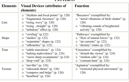
(20) 131 Table 4.5.5.1 TEMPLATE OF VISUAL DEVICES TO PORTRAY MIGRATORY PATTERNS Elements. Line. Shape. Tone. Texture. Visual Devices (attributes of elements) o o o o o o o o o o o o o o o o o. “rhythms and focal points” (p. 120) “fragmented, fussiness” (p. 120) “rising, wavy” (p. 120) “rising , straight” (p. 120) “nebulous” effect (p. 120) “swirling” (p.122) “slashes” (p. 122) “serpentine” shapes (p. 122) “silhouettes” (p. 122) “subtle transitions” (p. 124) “lurking malevolence” (p. 124) “razor-sharp escarpments” (p.124) “deep void” (p. 124) “net-like” (p. 126) “sidewards thrust” (p. 126) “compress and bulge” (p. 126) “heartbeat” (p. 126). Function “Busyness” exemplified by: o “aerial vibrations of birds chatter” (p. 120) o “vibrating sounds of heightened activity” (p. 120) “Pathways” exemplified by: o “flow of natural forces” (p. 122) o “air currents” (p. 122) o “destiny” routes (p. 122) “Uneasiness” exemplified by: o “disturb the viewer” (p. 124) o “strident calls” (p. 124) o “constant hum” (p. 124) “Agitation” exemplified by: o “restricted physical movement” (p. 126). Table 4.5.5.1 demonstrates the connection between the elements, their attributes as visual devices and their function as applied in the study paintings to generate the notion of the energies experienced throughout the migratory patterns cycle. Complementing Table 4.5.5.1 is Figure 4.5.5.1 which presents, as a flow chart, the progression from the feeling as driver for the study to pictorial representation..
(21)
(22)
Figure
Related documents