Rochester Institute of Technology
RIT Scholar Works
Theses
Thesis/Dissertation Collections
2006
The Work of Fred Troller: An Evaluative Study of a
Graphic Designer
Tara Markert
Follow this and additional works at:
http://scholarworks.rit.edu/theses
This Thesis is brought to you for free and open access by the Thesis/Dissertation Collections at RIT Scholar Works. It has been accepted for inclusion
in Theses by an authorized administrator of RIT Scholar Works. For more information, please contact
Recommended Citation
The Work
of
Fred
Trailer
An Evaluative
Study
of
a
Graphic
Designer
A thesis
submitted
to the
Faculty
of
the
College
of
Imaging
Arts
and
Sciences
in candidacy for the Master
of
Fine Arts Degree
Tara Markert
Graduate Graphic
Design MFA Program
School
of
Design
College
of
Imaging
Arts
and
Sciences
Rochester Institute
of
Technology
Chief Advisor
Bruce Ian Meader
Associate Advisor
David Pankow
Associate Advisor
R.
Roger Remington
School of Design Chairperson
PattiJ. Lachance
Author
Tara Markert
Approvals
Bruce Ian Meader
Date
David Pankow
Date
R Roger Remington
Date
Patti J Lachance
Date
Tara Martkert
Date
I hereby grant permission to the RIT Wallace Memorial Library to
reproduce my thesis in whole or part. Any reproduction will not be for
commercial use or profit.
Acknowledgements
I
wish
to
express
my
gratitude
to
each of
my
committee members.
Roger
Remington,
David
Pankow
and
Bruce
Meader,
your
wisdom
and
guidance
throughout the
year were
indispensable.
I
would
like
thank
Kari Horowicz for
including
me on
the fateful
trip
to
Fred Trailer's
studio
Contents
1
Thesis Project
Definition
2
Precedents
5
Research
13
Synthesis
18
Ideation
25
Implementation
32
Dissemination
38
Retrospective
Evaluation
40
Conclusion
41
Glossary
42
Bibliography
44
Appendices
A
Steff Geissbuhler Interview
B
Fred
Trailer
Lecture
at
RIT
Thesis Project Definition
Introduction
This
thesis
will
provide a process
to
help
graphic
design
scholars and
historians
conduct an evaluation of
a
designer
whose
work
has been rarely
documented
within
a specific
design
style.
Through
implementation
of
this
model
of
research
and evaluation
,
graphic
design
scholars
will
not
only be
able
to
identify
that
designer's philosophy
and personal
style,
they
will
also
recognize
the
value
of
studying
within
a specific style of graphic
design.
This
evaluation
process
includes placing the
work
of
the rarely documented designer beside the
work
of pioneers
in this
stylistic
idiom in
order
to highlight
similarities of
thought,
process, form
and
implementation.
The opportunity to
do
this recently
arose with
the donation
of
Swiss
designer
Fred Trailer's
personal
collection
for inclusion in the Graphic Design Archive
at
Rochester Institute
of
Technology. Fred Trailer's
work
has
remained
largely
undocumented.
His
work
enables
this thesis to
determine
a model
by
which
the
work
of
any
rarely documented designer
can
be
placed
within
an
historical
context.
RIT
holds
sufficient comparable work within
the
Graphic
Design
Archive
so
that
Trailer's
work
can
be
substantiated as an
integral
component
of
Swiss
design,
which was
known
for
its
strict use of mathematical
grids,
objectivity,
and asymmetrical
sans serif
typography
(flush left,
ragged right).
The
evaluation process
this thesis
provides
will
enable
the design
scholar or
historian to better
understand an
established
design idiom.
As
a
consequence,
this
knowledge
can
be
appropriately
applied
to
a
design solution,
rather
than
merely
mimicking
certain visual elements.
For the
purpose of
this
thesis,
a
Swiss
'tool
kit'
Precedents
Josef
Muller-Brockmann
Swiss
graphic
designer
Josef
Muller-Brockmann
was
born
in
1914. He began practicing
graphic
design in
the
1930s.
After nearly
20
years
of
practice
with
illustrative
and
sometimes
humorous
design
work,
he
became
convinced
that
graphic
design
must
be
objective and
informative.
(Muller,
p
26)
In
1
957,
he
was
appointed
graphic
design
professor
at
the
Zurich
School
of
Design,
where
he
influenced Fred
Trailer,
among
others.
Muller-Brockmann
also
taught
at
the
Ulm
Hochschule
fur
Gestaltungin
1963.
Images from
Josef
Muller-Brockmann:
A Pioneer
of
Swiss
Graphic
Design
Josef Muller-Brockmann
is
a
key
figure in the Swiss design
movement.
The book Josef Muller-Brockmann: A Pioneer
of
Swiss Graphic
Design
by
Lars
Muller-Brockmann
and
Paul
Rand
sheds
light
on
his
lengthy
and
soul-searching
education,
during
which
his philosophy
of graphic
design
as
a medium of
objective communication was
formed. For the
purpose of
this
thesis,
Muller-Brockmann
serves as
the
principal
advocate of
the
Swiss
design
movement as we understand
it today. His
work
is
symbolic of
the
efforts
toward
bringing
the
standards of objective
design to fruition.
The
posters
below
are
among Muller-Brockmann's
most renowned
works.
Each
one exemplified
his
social
awareness,
as well as
his
use of
imagery
to
relate
a message
with
clarity.
His
use of
bold photography
gives
the
viewer
an
almost
immediate
understanding
of
the
feeling
of
the
message.
Minimal
use of
bold
colors
is
another
characteristic
of
his
work.
Swiss
Committee
to
Combat Noise
Weniger LSrm
Campaign Poster
1960
Precedents
(Catherine
McCoy
Essays
McCoy
received an education
in industrial design before
co-chairing
the
Graphic
Design
department
at
Cranbrook
Academy
of
Art.
McCoy
was
well-versed
in Modernist
design;
however,
the
design
program
at
Cranbrook
was
considered post
modern or
deconstructive.
Graphic design
history
has been documented mostly in
fragments.
Among
the
most
comprehensive of
these
are
the
writings of
Katherine McCoy.
Since
the 1
990s,
her interest in the
history
of
graphic
design
and
design
education
led
her to
write
extensively
on
the
subject
of
Swiss
design
and
its
journey
to
America,
focusing
largely
upon
its
blossoming
in the
academic
field.
The
symposium
Another 60s Revolution
took
place
recently
at
the Kansas
City
Art Institute in
Missouri,
accompanied
by
an overview of
Swiss design
written
by
McCoy. The document's lexicon
of crucial
design
elements and a
list
of
the
design
movement's
prominent
contributors serve as a
launchpad from
which
we
are able
to further study the influence
Swiss
that design has had
upon
American designers.
Rob
Roy Kelly
was
a graphic
design
educator
who
was
heavily
influenced
by
Swiss
graphic
design
teaching
methods.
He
was
the
chair of
the
graphic
design
department
atthe
Kansas
City
Art Institute from
1
964
-
1 974.
Another
article of value
to this thesis is "Bits
and
Pieces
of
Basel,"
an article
by
McCoy
from Print
magazine,
which
chronicles
the
Swiss
design teachings
of
Hans Allemann
and
Inge
Druckrey
for the
Kansas
City
Art Institute in the 60s.
This
was
a
revolutionary
teaching
system
invited into the United States
by
Rob
Roy
Kelly.
Below
are examples of
work
from
Druckrey
and
Allemann,
and one example of
student
work
from
one
of
Allemann's
classes.
..
,
f,
.-_,
rffisctil
immw
orra
orra
:-'>.
orra
\
*%
orraorraorragM!
orra0*'8
orra
'1
Kitchen
t
Utensils
Macys
Inge
H.
Druckrey
Orra
poster
1965
Hans Allemann
KCAI
poster
1968
Student
work
Hans
Allemann,
Professor
Kansas
City
Art
Institute
1967
Precedents
Fred Trailer's Studio
In
addition
to
being
a graphic
designer,
Fred Trailer
was
a
sculptor,
a
painter,
and a
draftsman. As many
graphic
designers
of
his time
did,
Trailer drew
inspiration
from these
various
mediums of expression.
The
inception
of
this thesis began
with
a
trip
to
Rye,
New
York,
in August
2006,
where
Fred
Trailer's
graphic
design
collection was
housed
at
the time.
There,
time
was
spent
in his
studio
examining his
design,
sculptures, drawings
and paintings.
It
was a
benefit to this thesis to
see
his
studio and
imagine his
work
habits
and
design
process.
Many
designers
today
do
not maintain a
multi-disciplined
practice
that
involves fine
art.
Practice
in fine
art
helps the designer
gain a perspective
that
would otherwise
be
unavailable.
Image
from
RIT
Graphic
Design
Archh/e
Photograph
of
Fred Trailer
Ftochester Institute
of
Technology
Research
Swiss
Culture
Switzerland
was
literally
surrounded
by
warfare
during
WWII. Although the
country
maintained a
policy
of
neutrality,
it
still
had to
endure
the tension
caused
by
a
war
in the surrounding
countries.
This
included arbitrary
bombings,
refugees
seeking asylum,
and
constant
pressure
to ally itself
or participate
in
the
war.
(www.geschichte-schweiz.ch)
Although
Switzerland did
not
dispatch
an
army to
fight,
it
still played a
vital
role
in the
war
by
providing
much
needed
humanitarian
services.
Following
the
symbolism
of
the
Red Cross
as a
"permanent,
neutral
institution to take
care of
military
and civilians
wounded or
imprisoned in
war"
pcrc.org),
Switzerland's
well-developed
health
care system
still
thrives today.
The
country's
neutrality
during
the
Second
World
War,
while on some
levels
ambiguous,
is
on another
level
symbolic of
the
need
for objectivity in
graphic
design
as a means
to
a
better future.
Switzerland's
democratic
values
figured
significantly in its design
ethics,
the development
of
which
reflected
the
need
for clarity in
communication;
a message should not
be
portrayed
from
a
skewed
perspective.
If
a message was portrayed
with
ambiguity
or
bias,
the
miscommunication
would
lead to
confusion and conflict.
(Muller-Brockmann,
83)
The Bauhaus
of
Germany
was
a
widely influential
school of
architecture and
design founded
by
Walter Gropius in 1919.
The
school
appointed
many
well-known
artists,
designers
and architects as
faculty.
The Bauhaus is
a
cornerstone
of
Modernism.
Images
from en.wikipedia.org
03
March
2006
It
seems as
though
such
a
design
movement could not
have
survived
in any
other
climate.
For
example,
the Bauhaus in
Germany
suffered
under
damaging
political pressure
when
the
Nazis forced the
school
to
close
in 1933.
Of
course,
the
ideals
of
the
Bauhaus design lived
on
to
affect other philosophies
in
a positive
way,
but the
core education of
the
Bauhaus
was
brought to
an
abrupt
end, concluding
a movement
that
might
have
continued
to
expand
its
profound
influence.
After the
war,
globalization
brought
about
the restructuring
of solutions
for
language
problems.
For
example,
the Red
Cross
emblems
(below)
rely
on
the
universal
language
of symbols
to convey their
message.
This
use of a semiotic
vocabulary helps
us understand
the idiom
of
Swiss
design through its
symbolic
representation
of an objective message and
its
function
of
catering to the
wide
linguistic
range of an
international
audience.
+
C^
International Committee
of
the
Red Cross
cross, crescent,
and crystal
Research
The difference between
Swiss Design
and
the
International
Typographic
Style
Jan
Tschichold
was an
influential
Modernist
typographer
who
formulated
detailed
rules
of
typographic
placement, weight,
visual
hierarchy
and other such
typographic
variables.
The International Typographic
Style
differs from
Swiss
design in
one crucial
way:
the former
refers
to
a movement
that
is
more
indicative
of
cultivation
in both
Switzerland
and
Germany,
as opposed
to the
Swiss
schools of
design,
found
particularly in Basel
and
Zurich. A highlight
of
the International Typographic
style
is asymmetrical,
sans serif
typography
that
takes hierarchic
precedence
over
imagery
as a message-conveyor.
A
large
part
of
this idiom
came
from the
Bauhaus
as
well
as
Jan Tschichold's
book,
Die Neue
Typographische,
1928.
English typographer
Anthony Froshaug
is
another
key
figure in the
International
Typographic
Style. He
worked
to further
develop
Tschichold's
extensive
work
in
typography.
Froshaug
taught
at
the Ulm Hochschule fur
Gestaltung
in
Ulm,
Germany
from 1 957-1 961
.
While
Swiss
design includes the
same characteristics as
the International
Typographic
Style,
it
also
tends to
focus
more on
the
entire message
than
on
the
typographic
means.
Josef Miiller-Brockmann defined objectivity
as
the
central
motive of
Swiss design,
using
photomontages
to
make
"an
unambiguous
and
forceful
pictorial
statement."
(Muller,
p.
32)
On the
other
hand,
Armin Hofmann
touted the formal
values of
imagery. His
compositions were often stark
black
and
white,
with
the
occasional
minimal
inclusion
of one more color.
Hofmann
would alter
and
join letterforms to
create an
image
out of
text.
He
would
also
explore
the
shape of a
form
until
it visually depicted the
essence of an object.
The functional
goal of
Swiss
graphic
design is
effective communication.
Books
on
the
subject cover
the
basics
of
Swiss
design:
concise, straightforward,
bold,
and
without
decoration. Photographs
and
carefully
constructed
forms
are used
to
add emotion
to
a
design
solution
using
expression or
indications
of
movement
to
develop
a mood
that
matches
the
content of
the
message.
Images from
Poster Collection: Armin Hofmann
Easier
Preii
duspre
e
beim
Letzfturra im St
Afljantal
15-31 VII I9S3
WJWmTdl
Die Gute Form
poster
Armin Hofmann
1954
Research
The difference
between
Swiss Design
and
the
International
Typographic Style
At
first,
the two
images
below may
seem
like
they
come
from the
same
movement.
However, they
do
not.
This
thesis
makes
the distinction between
the two through the reasoning
and
the
education
behind
each
style.
The
International
Style
does
not use emotional expression
through
photographs
of
people,
nor
does it
allow
for
a
slightly freer
expression
through
the
use of
color and placement or
typographic
alignment.
Both
styles maintain clear
thinking
toward the
structure and placement of
elements;
however,
Swiss design
maintains a more organic
feel.
It is
experimental with
imagery
and
type
forms,
and
the International
Style
uses
geometric
forms
and a more
readily
apparent
grid structure.
The very fact that
"typographic"
is
part of
the latter
style's
title
speaks
to its
roots
in
German/Tschicholdian
values.
Both
styles
heavily
influence
one
another.
Fig
1
International
Typographic Style
Ulm
Hochschule
fiirGestaltung
Cover
for
a
quarterly
bulletin
Anthony Froshaug
1958
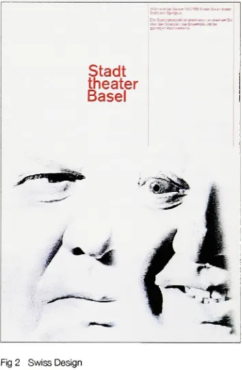
Fig
2
Swiss Design
Stadt
Theater Poster
Armin Hofmann
1967
Fig
1
image from
Meggs'
[image:12.516.41.256.271.494.2] [image:12.516.294.471.272.542.2]Research
Swiss
Design
History
In 1
945,
Swiss
design began to
emerge
from the commingling
of
several
design
movements of
the
preceding
decades:
De
Stijl,
avant-garde,
and
the Bauhaus.
Aspects
of
these
ideals
were combined
to
bring
us
the
movement
in
its
full form.
The
avant-garde movement surfaced
in Russia in the
early
1900s. Avant-garde
design drew inspiration from
Suprematism,
which sought
to convey
political
messages
through
abstract
works.
(Fig 1) Among
these
works were
the
sharp,
geometric styles of
Cubism
and
Futurism. El
Lissitzky,
also
known
for his later
work
at
the
Bauhaus,
was
a pioneer
in this
movement.
De Stijl
(Fig
2),
a movement
known for its
use of
geometric shapes and
primary
colors
in
a minimalist
composition,
was
a
contributing factor to the
appearance
of
Bauhaus design. The Bauhaus in
Germany
came
quickly
on
the heels
of
the
avant-garde movement.
Founded in
1919,
this
new school gave
impetus
to the importance
of
function in design.
Function,
in the
eyes of
the leaders
at
Bauhaus,
led to the necessary raising
of standards
for the quality
of
human life.
Swiss
posters were
an
extremely
popular
form
of
design
over a range of
years,
beginning
in the early 20th
century.
Such
posters were
designed
with
the
above
movements
in mind,
and
their
influences
finally
coalesced
in the 1940s
and
'50s to form
a
decided,
definitive idiom
of
design for
Switzerland. Avant-garde
and
De Stijl
inspired
the
geometric shapes and color
decisions
of
Swiss
design,
while
the
meticulous attention
to function that
characterized
the
Bauhaus
informed its
message clarity.
With
each of
these
influences
fully integrated,
educators and
pioneers set out
to
promote
the
wider
study
and practice of
this
design idiom to
a particular end:
a
better
future
through
social awareness with
clearer
lines
of communication.
Fig
1
Russian Avant-garde
Beat the
Whiles
with
the
Red Wedge
El
Lissitzky
1919
Fig
1
from
Avant-Garde
Graphics
1918-1934
Fig
2 from
www.art-file.com
on
06
April
2006
Fig
3 from
Josef Muller-Brockmann:
A
Pioneer
of
Swiss Graphic Design
Fig
2
De
Stijl
Simultaneous
Counter-Composition
Theo Van
Doesburg
1929
Fig
3
Swiss
Design
Container Corporation
of
America Poster
Josef
Muller-Brockmann
[image:13.516.43.455.453.678.2]Research
Swiss Design
Academic Programs
There
were
two
well-known
Swiss
schools with
intensive
graphic
design
programs;
the
Zurich Kunstgewerbeschule (School
of
Applied
Art)
and
the
Allgemeine
Gewerbeschule
(Basel School
of
Design).
It is
at
these
schools
that
we
find the trailblazers
of
this design
movement
after
WWII.
Beginning
in
1
947,
both
schools
hired
revolutionaries
to head their design
programs.
Armin Hofmann
and
Emil Ruder
contributed
their
ideas
and
rigorous
curricula
to
the Basel School
of
Design. Ruder's
presence was
influential to many in terms
of
testing
the
boundaries
of
typographic
solutions.
Josef
Muller-Brockmann
provided
the
Zurich
School
of
Applied Art
with
his
conclusive method of
study
born
of years of exploration and experimentation within
the
fields
of
graphic
design
and
illustration.
Pioneers
For the
most
part, the
pioneers of
this design
movement are
the
educators
mentioned above.
Hofmann
and
Ruder
provided
the
basis
of
Swiss
design in
Basel,
while
Josef Miiller-Brockmann's
work
is
an
elemental standard of
Swiss
design in Zurich.
Fred Trailer
studied
under
Muller-Brockmann,
as
did many
other
well-known
designers.
The impact the
original professors of
this
movement
had
on
their
students
has
spread
far
and wide.
Steff
Geissbuhler,
Inge
Druckrey,
and
Hans Allemann
hailed from the Basel School
of
Design,
and each
became
an educator
in
turn,
demonstrating
the
structured and
deliberate
Swiss
teaching
philosophies of
their
mentors
and professors.
Trailer,
who
studied
under
Muller-Brockmann in
Zurich,
went
on
to teach
and serve
as chair
in the Graphic Design department
at
Alfred
University
in
Alfred,
New York from 1988-2000.
Research
10
Swiss
Influence
Education
on
America
Rob
Roy Kelly
was
instrumental
in
bringing
Swiss
designers to America in the
1960s. He
contacted
Armin
Hofmann,
requesting that
a
few
of
his former design
students
be
sent
to fill
teaching
positions at
the Kansas
City
Art Institute
(KCAI),
where
Kelly
resided
as
the
Graphic
Design
program
director.
As
a
result,
Hans Allemann
and
Inge
Druckrey
came
to teach
graphic
design in America.
Yale
University
and
the
Philadelphia College
of
Art (now
University
of
the
Arts)
were also
influential
programs
that
embraced
Swiss
thinking
in their
curriculum,
and
hired
Swiss
educators.
Following
their time
at
KCAI,
Hans Allemann
and
Inge
Druckrey
moved
to the
Philadelphia College
of
Art.
Druckrey
has
also
held
positions at
the
Rhode Island School
of
Design
and
Yale. Kenneth
Hiebert,
an
American
who received
his design
education
in
Basel,
taught
at
Philadelphia
College
of
Art/University
of
the
Arts from 1 966-1 999. He
was chair of
the
Graphic
Design Department for 14
years,
and
his dedication to
teaching
Swiss
design
earned national
recognition
for the
school.
Commerce
Geigy,
IBM,
and other
large
corporations
began to implement
Swiss
design
within
their
corporate
design
systems.
These businesses
set
the
standard
for
other
large
corporations
in the
United States.
Among
the
artifacts
designed
for
these
companies,
some
inspired
examples of
Swiss
Design
can
be
found in the
form
of
posters,
annual
reports,
and
inter-office journals. Annual
reports
for IBM
and
Geigy
in Fred Trailer's
collection show a well-balanced
blend
of meticulous
information design
(including
charts, diagrams
and maps
that
explain
financial
details)
and expressive conceptual
design
(such
as a
depiction
of a
bee hive
on
a
journal
cover
that
relates
to
worker
"bees"
and
their
production).
James
Fogleman,
who studied at
Yale
University
after
World War
II,
is
responsible
for the development
of
the
corporate
design
program at
the
American
Ciba-Geigy
Corporation in 1952.
(Kelly,
p.
3)
Fogleman
set
the
pace
for future
designers
at
Geigy,
among
them,
art
director Fred Trailer. This
is
one of
Research
11
Fred Trailer
The
Fred Trailer
collection
includes four boxes
of
Trailer's
own
writing
and
research.
In
one of
these
boxes,
notes were
found for
a
lecture Trailer had
given
at
RIT. The
speech
had
no
title,
but the first
paragraph
clearly
stated
Mr.
Trailer's
views on product
design:
"... I thought
it
would
be
interesting
to
talk
about our
visual
environment,
and
I
[would]
like to focus
on a place where
excellence
of
design
is
rare
or
nonexisting,
a
place where we can
clearly
measure
the
state-of-the art of
design.
I
am
thinking
of our
supermarkets,
where
every man,
woman,
and child
is
exposed
to
constant visual
lethal
radiation."
(RIT
lecture)
Clearly,
Trailer
shared views with
designers
who
maintained
the
standards of
Swiss
design.
His
body
of
work
shows
the
integration
of
applied concepts and
careful
message-making.
Fred Trailer
was prolific
in the
professional practice of graphic
design in both
Switzerland
and
America.
His
collection
includes
work
for IBM
and
Geigy.
Trailer
served as art
director from 1964-1968
at
Geigy. Trailer's
conceptual
design
work
for the
covers of
Geigy
Catalyst
and
IBM Viewpoint
offer
many
prominent examples
of
his
own personal style.
After
Trailer left
Geigy,
he
continued
his design
practice at
his
studio
located
in
his
home
in
Rye,
New York. For
twenty
years
Trailer
worked
as a
contractor,
designing
for many
clients
including
American
Airlines,
Cross-Siclare,
and
Doubleday. In 1 988 he
was
invited to
serve as chair of
the
Graphic
Design
Department
at
Alfred
University
in
Alfred,
New
York,
where
he
remained
until
his
Research
12
Fred Trailer
The
following
images
are examples of
Trailer's
work
for
Geigy
Chemical
Corporation,
including
promotional material
(top
2
images)
and
Geigy
Catalyst
journal
covers
(bottom
2 images).
images
taken
from
RIT
Graphic Design Archive
Geigy
Pastelltone
Fred Trailer
C1959
Geigy
"H"
Fred
Trailer
C1962
Geigy
Catalyst
9 Journal Cover
Fred
Trailer
1959
Geigy
Catalyst
1
0 Journal
Cover
Fred Trailer
Synthesis
13
Scenario
This
scenario was
included in
a
thesis
presentation
given
to first
year
graduate
graphic
design
students
to
explain
the
purpose,
goals
and
benefits
of
this
thesis.
Scenario
You
come across a collection of work
by
a graphic
designer
you've
never
heard
of
before. There is currently little
or
no
documentation
on
this designer.
Problem
For
academic
purposes,
you
need a process
by
which
you can
develop
an
understanding
of
this
designer's
place
in
graphic
design history.
Solution
To
place
trie
'found'
designer
within
his/her
context,
you
must
follow
a
model
that
allows you
to
logically
set
this designer
within
a place and
time,
against
a
background
of a
well-established
design
style
which will
help
define the
body
of
work.
Case
in Point
The
work
of
typographer
Anthony
Froshaug
became better known in larger
circles of
design
history
and practice
when
Robin Kinross
processed and
evaluated
Froshaug's life
and work
in
Anthony
Froshaug:
Typography
and
Texts/
Documents
of a
Life.
These
two
volumes
were
the
product of
intensive
research
of
Froshaug's design
collection.
In the end, Kinross
compiled a comprehensive
representation
of
Froshaug's
work
throughout the
years
he
was
in
practice.
The
progression of
Froshaug's
meticulous
typographic
methods and
philosophy
is
documented,
giving the
reader
a sense of
his
investigative
approach
to
a
design
problem.
Kinross's
volumes allow
their
readers
to
understand
the
context
Synthesis
14
Definitions
for
Evaluation
Process
Design Movement
any
graphic
design
style or
movement,
past
or
present, that
relates
to the
subject's
training,
practice,
and/or
influence
Researcher
the
person who uses
the
evaluation process
(p
1
7)
to
place an obscure
designer
in the
context
of a specified
design
style
Subject
the designer that the
researcher
seeks
to
place
within
a
context
Evaluation Process
the
process
by
which
the
researcher
to
a
full
understanding
of
the implications
of
the design
movement,
its
effect,
and
the
importance
of
the
subject
within
trie
movement.
Evaluation Process
The four
steps of
the
evaluation process are as
follows:
1
Study
the
background
and
influence
of
a specific
design
movement,
including
its
determining
influences,
pioneers,
and
practitioners.
In this
research,
it is
important to
unearth
the philosophy
of
the
movement.
Knowing
the underlying
motives
will
lead to
a
better understanding
of
the
choices made
within
a
particular
design
movement.
2
Evaluate
a range of work
from the
subject's collection.
3
Develop
a
lexicon
of syntactical
design terms integral to:
a) the design
movement
b)
the
subject
4
Choose
specific works
that embody the
principles of
the design
movement
from both the
obscure
designer's
collection of
work
and a collection of work
from the design
movement.
Place the
images/artifacts
within
a comparative
matrix,
using terms from the design lexicon. The
matrix allows
the
researcher
to
determine likenesses
and
contrasts
between the
work
of
the
subject and
the
designers
and pioneers of
the
design
movement.
A study
of
the
matrix reveals
characteristics of
the
subject's
work
that may
or
may
not align
with
the
chosen
Synthesis
15
Determining
Characteristics
Swiss Design
In
Swiss
design,
the
grid structure
for
a
design is
often
mathematically derived.
Proportions
are
carefully
calculated
using
a grid
until
there
is
no space
left in the
composition
that
has
not
been
used.
This
includes
active negative space.
Swiss
typography
is
asymmetrical
(flush
left,
ragged
right)
and
often
makes
use of
sans serif
typefaces. In books that
were presented
in three
languages,
a standard
three-column
grid was used
to
accommodate each
language.
The textual
element of a message was considered
the
most
important.
Imagery
was
included to lend expression, but the text
remained
the
most communicative
part of
the
message.
All
characteristics of
the type
revolved
around
the
goal
for
a
design to
be
clear and objective.
Imagery
in this
style
is
expressive yet objective.
Juxtaposition
of
imagery
becomes
symbolic,
as
in
MijJIer-Brockmann's
Viva Musica
poster
below.
A
small number of
bold
colors are used
in this design
style.
Colors
sometimes
overlap
and are
systematically
placed
to
lend further meaning to the
message.
Eariy
Swiss
Design
often used
red or
rust
colored
text for
contrast with
black,
as
well
as
formally
refined
elements against a white
background. It
also used
silhouetted
photographs,
showing
an
object
separated
from its
original context.
1
26.GeselIschaftsaussteJung
der
schweizerischen
Malerinnen
BMhsuennnen
und
Kunstgewerblerinr*
Nelly
Rudin
Saffa Poster
1958
Josef
Muller-Brockmann
Musica Viva
Poster
1971
Peter
Olpe
Gewerbemuseum
exhibit poster
1968
Left
and
right
images from
Poster Collection: Armin Hofmann
Center
image
from
Synthesis
16
Determining
Characteristics
continued
Fred
Trailer
To derive
characteristics
that
are unique
to
Fred Trailer's
work,
three
areas of
his
work were analyzed:
selected posters
for
several
different
clients,
conceptual
journal
design for
Geigy
Catalyst,
and promotional or
advertisement
design
for Geigy. These three
areas of
his
work were chosen
because
of
their
abundant
presence
in the collection, for their
accurate
representation
of
Trailer's
specific
design
style,
and
for their
evident use of
Swiss
design
principles.
Clockwise
from bottom left
3
Geigy
Sterazolidin
promotional
materials;
Doubleday
book cover;
cover
from
Geigy
Catalyst 1
6;
article
from
Geigy
Catalyst 1
6
Images from
Synthesis
17
Swiss Tool Kit
The
phrase
"tool
kit"
is
a metaphor
for the necessary design
principles
that
must
be learned before the designer
may
apply them in the
style of a certain
design
movement.
Within the
Swiss
tool
kit,
characteristics of
Fred Trailer's
Swiss
design
are
attached
to
each of
the
operative variables
listed below.
This distillation
enables
the
visualization of
the
elements as
they
might
be
applied
in
a modern
design
composition.
The
research conducted
to determine
these
characteristics
serves
to
enhance
the
researcher's
understanding
of
the
Swiss
design
philosophy.
It
should
be kept in
mind
that the
intended benefit
of
using the
evaluation
process
this
thesis
provides
is for the
researcher
to
be
able
to apply the
characteristics of
design
as understood and practiced
by
the designer
they
are
seeking to
place
in
context.
Terms
From the
characteristics
mentioned on
the
previous
pages,
variables
of
Swiss
design
syntax
have been
determined,
that
is,
a
list
of
terms
describing
elements
of
design
that,
when
placed
together
within
a
composition,
capture
the
essence
of
Swiss
design.
Operative
Variables
The
application of
this thesis
will
implement the treatment
of
the
following
four
components as
they
are used
in Fred Trailer's Swiss design
style:
Imagery
Typography
Color
Structure
Tool Kit Contents
The
characteristics of
Fred Trailer's
work
as
found in the tool kit
are as
follows.
Each
of
the four
operative variables
have been
defined
with
a subset of
terms
that
are specific
to
Trailer's
style.
Each
of
these four
"tools"
will
be
used
to
design
a series of
three
posters.
1
Imagery
black
and white
photography treated
as
duotone,
cropped
photograph or
form,
repetition,
montage, form
or
silhouette,
scientific
theme
2
Typography
repetition,
45
angle,
sans
serif, large focal point,
bold,
hierarchic signalling,
strict adherence
to
grid
3
Color
bright,
bold
primaries or
highly
saturated
colors, overlapping,
transparencies,
bands,
geometric shapes
4
Structure
mathematical
grid,
significant amount of
negative
space,
Ideation
18
Selection
of
Application Form
Initially,
the
application
focus
was
the
evaluative process
by
which
any
person
can research and contextualize
the
work
of a
rarely documented
designer.
However,
the
thesis
committee suggested a shift
toward
an
application
that
was more of a
design
artifact
in itself
with
an
'outside'
subject
matter
that
did
not pertain
to the thesis
content.
This
was
deemed
preferable
to
an
information
design
piece
that
would
have
showcased
the
main
points of
the thesis in the
form
of
a poster.
It
was
decided that
a series of
three
posters would
allow
for the implementation
of
Swiss design
principles
through the newly formed understanding
of
the
design
movement.
Four
principles of
design from the Trailer Tool Kit
will
be
applied
to the
posters:
1
imagery
2
typography
3
color
4
grid/structure
Each
poster
will
focus
on one of
the first three
principles
listed
above.
All three
posters
will
incorporate
the fourth
principle: a grid.
The
purpose of
the thesis
application
is to
use
the knowledge
of
this design idiom
and channel
it into
a
cohesive
design
solution
that separately highlights
each of
the
chosen
principles
as
influenced
by
Swiss
Design
and
Fred
Trailer's
work.
Mindmapfor
thesis
application
(^h<l
norreizd
OT--r^
^
=
/
,
'
'
/
\
I
^
War
m.
^VroJLi
Hj
ope^i
fa
revectf
J/
'
-i
d"P
Cttf?qar.'*i
of-"J J
I,
*
-W-^^^^
Jnanp
c-
J
.^-i
-2
J V*.
<*".-?
*
|3
loaned
f'iH^^i.^tjj,)
lap.'
%
Ideation
19
Poster Subject
Matter Ideation
Music
is
a neutral subject area
which
allows
for
expression
through
movement
and
direction. Below
are some sketches of
the
pulse of
the
music,
which
is
a
distinct
part of
the
composition.
Linear
A
series of rhythms were captured
using
line
or
repetitive
elements
to
represent
the texture
of
the
song, Ur Tchun Tan 7se Qi. Each
sketched
line
represents
unique
sonic
elements
that
are prevalent
and
vary only slightly throughout
the
length
of
the
song.
o
V
o
o
&oo
o
\.~
--<-+--O
_
o
_
_
w*~-~***