Rochester Institute of Technology
RIT Scholar Works
Theses Thesis/Dissertation Collections
4-5-2017
Automated Quality Assessment of Printed Objects
Using Subjective and Objective Methods Based on
Imaging and Machine Learning Techniques.
Ritu Basnet [email protected]
Follow this and additional works at:http://scholarworks.rit.edu/theses
This Thesis is brought to you for free and open access by the Thesis/Dissertation Collections at RIT Scholar Works. It has been accepted for inclusion in Theses by an authorized administrator of RIT Scholar Works. For more information, please [email protected].
Recommended Citation
Automated Quality Assessment of Printed Objects Using Subjective and
Objective Methods Based on Imaging and Machine Learning
Techniques.
by
Ritu Basnet
B.E. in Electronics and Communication Engineering
Tribhuvan University, 2010
A thesis submitted in partial fulfillment of the
requirements for the degree of Masters of Science
in the Chester F. Carlson Center for Imaging Science
of the College of Science
Rochester Institute of Technology
April 5, 2017
Signature of the Author: __________________________________________
Accepted by: ___________________________________________________
ii
CHESTER F. CARLSON CENTER FOR IMAGING SCIENCE
COLLEGE OF SCIENCE
ROCHESTER INSTITUTE OF TECHNOLOGY
ROCHESTER, NEW YORK
CERTIFICATE OF APPROVAL
M.S. DEGREE THESIS
The M.S. Degree Thesis of Ritu Basnet has been examined and approved by the thesis committee as satisfactory for the thesis
requirement for the M.S. degree in Imaging Science
Dr. Jeff B. Pelz, Thesis Advisor
Dr. Susan Farnand
Dr. Gabriel Diaz
iii
iv
ABSTRACT
Estimating the perceived quality of printed patterns is a complex task as quality is subjective. A
study was conducted to evaluate how accurately a machine learning method can predict human
judgment about printed pattern quality.
The project was executed in two phases: a subjective test to evaluate the printed pattern quality
and development of the machine learning classifier-based automated objective model. In the
subjective experiment, human observers ranked overall visual quality. Object quality was
compared based on a normalized scoring scale. There was a high correlation between subjective
evaluation ratings of objects with similar defects. Observers found the contrast of the outer edge
of the printed pattern to be the best distinguishing feature for determining the quality of object.
In the second phase, the contrast of the outer print pattern was extracted by flat-fielding,
cropping, segmentation, unwrapping and an affine transformation. Standard deviation and root
mean square (RMS) metrics of the processed outer ring were selected as feature vectors to a
Support Vector Machine classifier, which was then run with optimized parameters. The final
objective model had an accuracy of 83%. The RMS metric was found to be more effective for
object quality identification than the standard deviation. There was no appreciable difference in
using RGB data of the pattern as a whole versus using red, green and blue separately in terms of
classification accuracy.
Although contrast of the printed patterns was found to be an important feature, other features
may improve the prediction accuracy of the model. In addition, advanced deep learning
techniques and larger subjective datasets may improve the accuracy of the current objective
v
Acknowledgements
I would first like to thank my advisor Dr. Jeff B. Pelz for giving me this excellent opportunity to
work in this research project. I am grateful for his continuous support and guidance throughout
this project. This thesis would not have been possible without his constant advice, help and
supervision.
I also want to thank my thesis committee members. I am grateful to Dr. Susan Farnand for her
support, guidance and constant encouragement throughout this project. She was always willing
to share her knowledge and insightful suggestions and helped me a lot in improving write-up of
this thesis. I am indebted to Dr. Gabriel Diaz for taking time to serve in my thesis committee. I
am also thankful to all the faculty and staff of Center for Imaging Science.
My gratitude goes out to all members of Multidisciplinary Vision Research Lab group who
supported during this project. Many thanks to Susan Chan for helping me staying in right track
during the stay at CIS. I would like to acknowledge the financial and academic support of CIS
during my stay at RIT. I also want to thank everyone that directly or indirectly helped me during
my years at RIT.
My deepest gratitude goes to my parents for their love and support. I would like to thank my
vi
Table of Contents
ABSTRACT ... IV ACKNOWLEDGEMENT ... V TABLE OF CONTENTS ... VI LIST OF FIGURES ... IX LIST OF TABLES ... XII
1. INTRODUCTION ... 1
1.1 OVERVIEW ... 1
1.2 OBJECTIVES ... 2
2. LITERATURE REVIEW ... 4
2.1. PRINTED PATTERN QUALITY ... 4
2.2. SUBJECTIVE AND OBJECTIVE TEST ... 4
2.3. MACHINE LEARNING ... 7
2.3.1. CLASSIFICATION ... 7
2.3.2. SUPPORT VECTOR MACHINE ... 8
2.4. GRAPH-CUT THEORY BASED IMAGE SEGMENTATION ... 9
3. SUBJECTIVE TESTS ... 11
3.1. OVERVIEW ... 11
3.2. PROBLEM AND DATA DESCRIPTION ... 12
3.2.1. SAMPLES ... 13
3.2.2. TEST PARTICIPANTS ... 15
vii
3.3. PROCEDURE ... 17
3.3.1. Z-SCORE ... 18
3.3.2. STANDARD ERROR OF THE MEAN CALCULATION... 19
3.4. RESULTS AND DISCUSSION ... 20
3.5. Z-SCORES DATA PLOT OF ALL OBSERVERS FOR EACH OBJECT TYPE ... 26
3.6. Z-SCORES DATA PLOT OF FEMALE OBSERVERS FOR EACH OBJECT TYPE ... 27
3.7. Z-SCORES DATA PLOT OF MALE OBSERVERS FOR EACH OBJECT TYPE ... 28
3.8. Z-SCORES DATA PLOT OF OBSERVERS WITH IMAGING SCIENCE MAJOR AND OTHER MAJORS FOR EACH OBJECT TYPE ... 29
3.9. CONCLUSION... 33
4. OBJECTIVE TEST... 34
4.1. OUTLINE OF PROCEDURE ... 34
4.2. IMAGE PRE-PROCESSING ... 35
4.2.1. FLAT-FIELDING ... 35
4.2.2. CROPPING ... 37
4.2.3. SEGMENTATION USING GRAPH-CUT THEORY ... 40
4.2.4. SPIKES REMOVAL AND BOUNDARY DETECTION OF OUTER RING ... 43
4.2.5. UNWRAPPING ... 44
4.2.5.1.DAUGMAN’S RUBBER SHEET MODEL ... 44
4.2.5.2.UNWRAPPING RESULTS ... 45
4.2.5.3 UNWRAPPING ISSUE WITH SOME IMAGES ... 46
4.2.5.4. AFFINE TRANSFORM (ELLIPSE TO CIRCLE TRANSFORMATION) ... 47
4.3. CLASSIFICATION ... 48
4.3.1. TRAINING DATA (FEATURE)SELECTION ... 48
viii
4.3.3. SUPPORT VECTOR MACHINES ... 51
4.3.3.1. CROSS-VALIDATION ... 52
4.3.4. CLASSIFICATION RESULTS ... 53
4.3.4.1. DATA AUGMENTATION RESULTS ... 59
4.4. DISCUSSION AND CONCLUSION ... 60
5. CONCLUSION AND FUTURE WORK ... 62
REFERENCES ... 66
ix
List of Figures
Figure 1. Object image ... 11
Figure 2. Example of good and bad anchor pairs ... 14
Figure 3. Experiment set-up ... 16
Figure 4. Mean z-scores for three type H objects (Error bars represent +/-1SEM) ... 21
Figure 5. Mean z-score for four type J objects (Error bars represent +/-1SEM) ... 21
Figure 6. Mean z-score for five type K objects (Error bars represent +/-1SEM) ... 22
Figure 7. Mean z-score for ten type L objects (Error bars represent +/-1SEM ... 22
Figure 8. Mean z-score for ten type M objects (Error bars represent +/-1SEM) ... 23
Figure 9. Mean z-score for four type P objects (Error bars represent +/-1SEM) ... 23
Figure 10. Mean z-score for two type S objects (Error bars represent +/-1SEM) ... 24
Figure 11. Mean z-score for eight type T objects (Error bars represent +/-1SEM) ... 24
Figure 12. Mean z-score for five U objects (Error bars represent +/-1SEM) ... 25
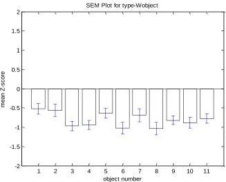
Figure 13. Mean z-score for eleven W objects (Error bars represent +/-1SEM) ... 25
Figure 14. Plot of average z-score vs. number of object with SEM ... 27
Figure 15. Plot of average z-score vs. number of object with SEM for female observers ... 28
Figure 16. Plot of average z-score vs. number of object with SEM for male observers ... 29
Figure 17. Plot of average z-score vs. number of object with SEM for observers labeled ‘expert’. ... 31
x
Figure 20. Flowchart of Image processing ... 34
Figure 21. Test image ... 35
Figure 22. First Example of flat-fielding ... 36
Figure 23. First preprocessing steps in cropping ... 38
Figure 24. Illustration of morphological operations(Peterlin, 1996). ... 39
Figure 25. Cropping example for flat-field image of P-type. ... 40
Figure 26. A graph of 3*3 image (Li et al., 2011). ... 41
Figure 27. Segmentation of test image ... 42
Figure 28. Segmentation of anchor image ... 42
Figure 29. Segmented test image ... 42
Figure 30. Segmented anchor image ... 42
Figure 31. Image Masking for spikes removal ... 44
Figure 32. Daugman’s Rubber Sheet Model (Masek, 2003) ... 45
Figure 33. Unwrapped outer circular part ... 46
Figure 34. Unwrapping problem illustration ... 46
Figure 35. Ellipse to circular transformation and unwrapping of outer ring ... 48
Figure 36. Unwrapping the object at different angles for augmentation ... 50
Figure 37. Linear Support Vector machine example (Mountrakis et al., 2011) ... 51
Figure 38. K-fold Cross-validation: Each k experiment use k-1 folds for training and the remaining one for testing (Raghava, 2007)... 53
Figure 39. Classification accuracy plots for Original RGB data; training (left) and test (right) .. 55
Figure 40. Classification accuracy plots for Original SD data; training (left) and test (right) ... 56
xi
Figure 42. Classification accuracy plots for Red SD data; training (left) and test (right) ... 57
Figure 43. Classification accuracy plots for Green SD data; training (left) and test (right) ... 58
Figure 44. Classification accuracy plots for Blue SD data; training (left) and test (right) ... 58
Figure 45. Classification accuracy plots for Red RMS data; training (left) and test (right) ... 58
Figure 46. Classification accuracy plots for Green RMS data; training (left) and test (right) ... 59
Figure 47. Classification accuracy plots for Blue RMS data; training (left) and test (right) ... 59
Figure 48. Classification accuracy plots for RMS RGB data; training (left) and test (right) ... 60
Figure 49. Box plot for mean z-score of H object ... 73
Figure 50. Box plot for mean z-score of J object ... 73
Figure 51. Box plot for mean z-score of K object ... 73
Figure 52. Box plot for mean z-score of L object ... 73
Figure 53. Box plot for mean z-score of M object ... 74
Figure 54. Box plot for mean z-score of P object ... 74
Figure 55. Box plot for mean z-score of S object ... 74
Figure 56. Box plot for mean z-score of T object ... 74
Figure 57. Box plot for mean z-score of U object ... 74
Figure 58. Box plot for mean z-score of W object ... 74
Figure 59. Plot of average z-score vs. number of object with SEM for observer using glass/contact lenses for visual correction ... 75
xii
List of Tables
Table 1. Sub-categories of acceptable and unacceptable objects ... 12
Table 2. Number of total and selected test objects ... 13
Table 3. Description of Participants... 15
Table 4. Noticeable features of objects ... 26
Table 5. Comparison of acceptance threshold for observers from different groups ... 30
Table 6. Categories of 3 Classes ... 49
Table 7. Classification Accuracy Table for Original RGB, SD and RMS data ... 54
Table 8. Classification Accuracy for SD and RMS for red, green and blue data. ... 57
1
1.
Introduction
1.1
Overview
This thesis work focuses on the study of image quality properties of printing patterns on circular
objects. It is essential to assess the quality of the object in order to maintain, control, and enhance
these objects’ printed pattern quality. In this study, an application is developed that implements
an algorithm with a goal to, as close as possible, resemble how a person would perceive printed
quality of the objects. Since humans are the ultimate user of the colored objects, first a subjective
test was performed to best determine what good and bad quality of these objects are. Subjective
quality assessment methods provide accurate measurements of the quality of image or printed
patterns. In such an evaluation, a group of people are collected, preferably of different
backgrounds, to judge the printed pattern quality of objects. In most cases, the most reliable way
to determine printed pattern quality of objects is by conducting a subjective evaluation
(Mohammadi et al., 2014; Wang et al., 2004).
Since subjective results are obtained through experiments with many observers, it is sometimes
not feasible for a large scale study. The subjective evaluation is inconvenient, costly and time
consuming operation to perform, which makes them impractical for real-world applications
(Wang et al., 2004). Moreover, subjective experiments are further complicated by many factors
2
subjects’ mood (Mohammadi et al., 2014). Therefore, it is sometimes more practical to design
mathematical models that are able to predict the perceptual quality of visual signals in a
consistent manner. An automated objective evaluation that performs in just a matter of seconds
or minutes would be a great improvement. So, an objective test was introduced as a means to
automate the quality check of the circular objects. Such an evaluation, once developed using
mathematical model and image processing algorithms, can be used to dynamically monitor
image quality of the objects.
1.2
Objectives
The main objective of this study is to develop a prototype that can calculate a quality rating for a
printed pattern in round objects. The final goal of the study is to test whether the developed
objective printed pattern quality algorithm matches the quality perceived by the average person,
as determined in the subjective evaluation.
The main objectives of this thesis are:
Conduct subjective test to evaluate the quality of printed patterns in the objects from the
reference objects
Produce an automatic, objective software system for predicting human opinion on the
3
Assess the accuracy of the developed objective printed pattern quality algorithm by
comparing with the quality as determined in the subjective evaluation.
This thesis is organized into three sections. The first section is Chapter 2 where the literature
review is discussed. This chapter gives a brief overview on major methods used in this thesis.
Chapter 3 and 4 are the experimental part of the thesis. In Chapter 3, the assessment of product
quality using subjective methodology and its results are discussed. Subjective methods provide a
reliable way of assessing the perceived quality of any data product. Chapter 4 presents the
procedure and methodology of an automated objective method to evaluate the visual difference
4
2.
Literature Review
2.1.
Printed pattern quality
The quality of printed pattern in objects can be determined using several approaches. In order to
determine if a printed pattern is good or bad, we first have to define what a good quality pattern
is. According to (de Ridder and Endrikhovski, 2002)a good quality pattern can be determined
by three factors: fidelity, usefulness and naturalness. Fidelity describes the reproduction
accuracy of a test object compared to a reference object. Usefulness refers to image suitability
for the task, and naturalness refers to the match between an image the observer’s memory of
such a scene (de Ridder and Endrikhovski, 2002).
2.2.
Subjective and objective test
Subjective testing is one popular way of measuring the quality of printed objects. According to
(Wang and Bovik, 2006), among different ways to assess image quality, subjective evaluation is
one of the most reliable ways. Thus subjective test is extended to quality of printed pattern
objects in this study. In the past many researchers have chosen subjective testing to determine
object quality. For example, Mohammadi, Ebrahimi-Moghadam and Shirani, (2014) consider
subjective testing to be the most reliable method for accessing the quality of images.
Due to various drawbacks that subjective methods suffer from, they are limited in their
application. Further, subjective methods cannot be applied to real-time applications. Next, there
5
consideration. Moreover, display device, lighting condition and such other factors also affect the
results (Mohammadi et al., 2014).
Since subjective tests require manual work, test subjects and time, objective tests were
introduced as a means to automate the quality check problem. Test targets and algorithms can
form the basis for objective methods (Nuutinen et al., 2011).
Previous efforts to evaluate image quality mainly focus on finding the correlation between
subjective tests and objective tests. As an example, Eerola et al., (2014) performed image quality
assessment of printed media. First, they performed a psychometric subjective test of the printed
papers where observers were asked to rank images from 1 to 5 with 5 being the high ranked
quality image. Then those results were compared with a set of mathematical image quality
metrics using correlation techniques. They found a good correlation between image quality
metrics and subjective quality evaluations. The authors concluded five of the metrics performed
better than others but a single metric outperforming all others was not found.
Similar observations were made in another study. Sheikh, Sabir and Bovik, (2006) performed a
large subjective quality assessment study for a total 779 distorted images that were derived from
29 source images with five distortion types. Using the results of this subjective human
evaluation, several algorithms (image quality metrics) were evaluated for objective testing. The
performance of different metrics varied between different groups of datasets and a best single
metric could not be found, similar to earlier study.
Pedersen et al., (2011) argue that since image quality is complex, it is difficult to define a single
image quality metric that can correlate to overall image quality. They also investigated different
6
authors developed a framework that includes digitizing the print, image registration, and
applying image quality metrics. Then they investigated suitable image quality metrics and found
that structural similarity metrics were the most effective for print quality evaluation. As with
previous work, they also used the data collected from subjective testing for validation.
In another study, author Asikainen, 2010) predicted human opinion on the quality of printed
papers through the use of an automatic, objective software system. The project was carried out
as four different phases to attain the goal: image quality assessment through reference image
development, reference image relative subjective print quality evaluation, development of quality
analysis software through programming for quality attributes, and the construction of “visual
quality index” as a single grade for print quality. Software was developed with MATLAB (The
MathWorks Inc, 2015) that predicted image quality index using four quality attributes:
colorfulness, contrast, sharpness and noise. This work demonstrated that data collected from
subjective test about visual appearance of printed papers was required for the automatic objective
system.
The above studies show that several image quality assessment algorithms based on mathematical
metrics can be used to measure the overall quality of images such that the result are consistent
with subjective human opinion. All of these works stated different image quality metrics can be
used for measuring image quality. These works are of great value for forming the foundation of
7
2.3.
Machine Learning
Machine learning is the process of programming computers to optimize performance based on
available data or past experience for prediction or to gain knowledge. First a model is defined
with parameters that are optimized using training data or past experience by executing a
computer program. This is referred to as a learning process (Alpaydin, 2014).
The data-driven learning process combines fundamental concepts of computer science with
statistics, probability and optimization. Some examples of machine learning applications are:
classification, regression, ranking, and dimensionality reduction or manifold learning (Mohri et
al., 2012).
2.3.1.
Classification
In machine learning, classification is defined as the task of categorizing a new observation in the
presence or absence of training observations. Classification is also considered as a process where
raw data are converted to a new set of categorized and meaningful information. Classification
methods can be divided into two groups: supervised and unsupervised (Kavzoglu, 2009). In
unsupervised classification, no known training data is given and classification occurs on input
data by clustering techniques. It also does not require foreknowledge of the classes. The most
commonly used unsupervised classifications are the K-means, ISODATA and minimum distance
(Lhermitte et al., 2011).
In supervised classification methods, the training data is known (Dai et al., 2015). Some
examples of supervised classifiers are maximum likelihood classifiers, neural networks, support
8
support vector machine is one of the most robust and accurate methods among the supervised
classifiers (Carrizosa and Romero Morales, 2013) and is discussed next.
2.3.2.
Support Vector Machine
The SVM is a supervised non-parametric statistical learning technique which makes no
assumption about the underlying data distribution. SVMs have gained popularity over the past
decade as their performance is satisfactory over a diverse range of fields (Nachev and
Stoyanov, 2012). One of the features of SVM is that it can perform accurately with only small
number of training sets (Pal and Foody, 2012; Wu et al., 2008). The SVM’s can map variables
efficiently onto an extremely high-dimensional feature space. SVMs are precisely selective
classifiers working on structural risk minimization principle coined by Vapnik (Bahlmann et al.,
2002). They have the ability to execute adaptable decision boundaries in higher dimensional
feature spaces. The main reasons for the popularity of SVMs in classifying real-world problems
are: the guaranteed success of the training result, quicker training performance, and little
theoretical knowledge is required (Bahlmann et al., 2002).
In one study, Nachev and Stoyanov (2012) used SVM to predict product quality based on its
characteristics. They predicted the quality of red and white wines based on their physiochemical
components. In addition, they also compared performance with three types of kernels; radial
basis function, polynomial, and sigmoid. These kernel functions help to transform the data to a
higher dimensional space where different classes can be separated easily. Among the three, only
the polynomial kernel gave satisfactory results since it could transform low dimensional input
9
such as SVM to predict may be impacted by the use of an appropriate kernel and proper selection
of variables.
In another study, Chi, Feng and Bruzzone (2008) introduced an alternative SVM method to solve
classification of hyperspectral remote sensing data with a small-size training sample set.. The
efficiency of the technique was proved empirically by the authors. In another study, (Bahlmann
et al., 2002) used SVM with a new kernel for novel classification of on-line handwriting
recognition.
In another study, Klement et al., (2014) used SVM to predict tumor control probability (TCP) for
a group of 399 patients. The performance of SVM was compared with a multivariate logistic
model in the study using 10-fold cross-validation. The SVM classifier outperformed the logistic
model and successfully predicted TCP.
From the above studies, it was found that the use of SVM is extensive and it is implemented as a
state-of-art supervised classifier for different dataset types. Moreover, research has shown that
SVM performs well even for small training set. Considering these advantages, SVM classifier is
thus chosen in this study.
2.4.
Graph-cut theory based image segmentation
Image segmentation can be defined as a process that deals with dividing any digital image into
multiple segments that may correspond to objects, parts of objects, or individual surfaces.
Typically, object features such as boundaries, curves, lines, etc. are located using image
segmentation. Methods such as the Integro-differential, Hough transform, and active contour
10
problems (Johar and Kaushik, 2015). For image segmentation and other such energy
minimization problems, graph cuts have emerged as preferred methods.
Eriksson, Barr and Kalle (2006) used novel graph cut techniques to perform segmentation of
image partitions. The technique was implemented on underwater images of coral reefs as well as
an ordinary holiday pictures successfully. In the coral images, they detected and segmented out
bleached coral and for the holiday pictures they detected two object categories, sky and sand.
In another study, Uzkent, Hoffman and Cherry (2014) used graph cut technique in Magnetic
Resonance Imaging (MRI) scans and segmented the entire heart or its important parts for
different species. To study electrical wave propagation, they developed a tool that could
construct an accurate grid through quick and accurate extraction of heart volume from MRI
scans.
The above studies show that the graph-cut technique is one of the preferred emerging methods
for image segmentation and it performs well, as seen in their results. So the graph-cut technique
11
3.
Subjective tests
3.1.
Overview
This chapter discusses the assessment of product quality using subjective methods. As stated
earlier, subjective method is one of the most reliable way of assessing the perceived quality
(Wang and Bovik, 2006). This section is important as it provides critical information for the
next chapter which includes software development of print quality of objects. This chapter starts
with a description of the objects used in the experiment, test participants and lab environment.
Next, the procedure of data analysis is explained in detail and results are discussed before
[image:24.612.183.428.409.652.2]conclusion of the chapter.
12
3.2.
Problem and Data Description
The objects provided for the project were commercial consumer products with a circular shape.
These objects were made up of transparent material with different colored patterns printed on
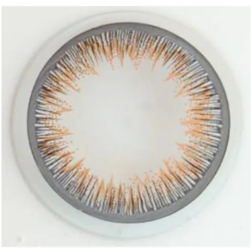
them. The total number of the objects was 358 and they were of 10 different types. The image of
one of the objects is shown in Figure 1. These 10 types of objects have different level of
distortion on the following feature: Outer circle edge
Uniformity of contrast in the outer rings
The orange pattern density
Missing ink in some parts of colored region,
Sharpness of dark spikes
The overlapping of orange pattern on top of the dark spikes.
Table 1. Sub-categories of acceptable and unacceptable objects
Acceptable Description Unacceptable Description
L Good W striation level 3 and halo
P halo-excess post dwells M halo severe and mixed striation and smear
K striation level 1 T missing ink
J striation level 2 H excess outside Iris Pattern Boundary
U excess inside Iris Pattern Boundary
S multiple severe
The description of each type of data is shown in Table 1. For example, objects of type L have
uniformity of contrast in outer rings with perfect circular outer edge, dense orange pattern, sharp
spikes and orange pattern overlapped on the dark spikes. So, these objects are considered to be
the highest quality. Other objects have some amount of distortion in the features as previously
13
unacceptable groups. The goal is to evaluate the notable visual differences of the objects using
subjective evaluation methods.
3.2.1.
Samples
For this study, total 64 objects were selected as the test lenses from within each lenses type by
observing the ratio of difference. Lenses that look different within the same type were selected,
as they give good representation of good and bad lenses. For this study, total 64 objects were
selected as the test lenses from within each lenses type by observing the ratio of difference.
Lenses that look different within the same type were selected, as they give good representation of
good and bad lenses. Table 2 below shows the number of the total objects and selected test
[image:26.612.195.418.424.664.2]objects for each object types.
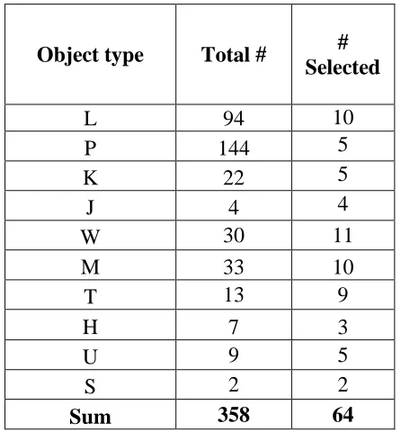
Table 2. Number of total and selected test objects
Object type Total # #
Selected
L 94 10
P 144 5
K 22 5
J 4 4
W 30 11
M 33 10
T 13 9
H 7 3
U 9 5
S 2 2
14
The detail of the objects were observed to study the visual difference among all types. It was
found that type L objects had less distortion and thus were considered as good quality among all.
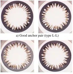
Thus, after test object selection, four type L objects with the best features were selected from the
remaining objects. During the experiment, each of the test objects was paired with one of these
four type L objects. To provide the observers visual references during the experiment, two pairs
of objects were always visible. Those two pairs, referred to as the “anchor pairs,” included one
made up of two Type L objects (the “good pair”) and one made up of one type L and one type M
object (the “bad pair”). The bad pair and good pair were assigned numbers 35 and 80,
respectively and they are shown in Figure 2 below. The pairs were later used as anchor pairs in
the experiment. For training purposes, four objects with severe visible distortion were selected
from the unacceptable group as shown in Table 1.
a) Good anchor pair (type L-L)
[image:27.612.174.430.398.657.2]b) Bad anchor pair (type M-L)
15
3.2.2.
Test participants
A total of thirty observers from the Rochester Institute of Technology (RIT) participated in the
experiment. Twenty-one were students taking a Psychology course. From the remaining nine
participants, six were students and researchers from the Center for Imaging Science and three
were from the Color Science department. The observers who were Imaging Science majors were
considered to be more experienced with assessing image quality, so they were considered as
trained observers. Other observers didn’t have any experience judging image quality, thus were
considered naïve observers. So, in average most of the test subject’s knowledge of image quality
research was limited. Ages of the observers varied from 21 to 45 years, with an average of 25.6
years and a standard deviation of 7.7 years. There were 13 male and 17 female observers, as
shown in Table 3 below.
Table 3. Description of Participants
Students Major No of Students
Male Female Total
Imaging Science 0 6 6
Psychology 13 8 21
Color Science 0 3 3
Total 13 17 30
3.2.3.
Test environment
The subjective tests were arranged in the premises of the Munsell Color Science Laboratory at
RIT, where the Perception Laboratory was reserved for one month exclusively for the subjective
16
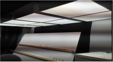
Figure 3. Experiment set-up
A light-colored board with wooden holders was tilted to place the objects as shown in the image.
The four objects with severe visible distortion that were selected from the unacceptable group
were placed on the left end of the lower wooden bar, whereas type L type objects were placed on
the right end. The two anchor pairs (types L-L and types L-M) were placed on the top, with the
good pair on right and the bad pair on the left. Labels were placed on the board below the anchor
pairs. Each test object was paired with one of the four L objects and placed in between the two
anchor pairs. The observers were seated in front of the board and the height of chair was adjusted
so that the level of the observer’s eyes was level with the test pair’s position which provided
them a comfortable test experience. On the right side of the observer’s chair a small table was
17
The measured correlated color temperature for the light source (fluorescent lamps) used to
illuminate the experiment room was 5133K, a light source comparable to daylight on an overcast
day.
3.3.
Procedure
The subjective test consisted of two parts. Before the test started, some background information
about the test subject was collected, including age, gender, visual acuity, possible color vision
deficiencies, and previous experience in image-quality assessment. In addition, the structure and
the progression of the tests were explained to the participant. At the beginning of the experiment,
written instructions were given to the test subject. The paper contained the instructions required
for the experiment, and stated the quality category under evaluation. Furthermore, before the
experiment started, to clarify to the observers the category of the objects, the anchor pairs with
their respective score were also shown.
Each of the observers were trained with four training objects and then were asked to rate the test
pairs relative to the two anchor pairs in terms of their visible differences, which included
differences in color, pattern, lightness (density) as well as overall visual difference. The
observers ranked these object pairs in the range 0-100. The observers were then asked to provide
the acceptable level (score) of the objects below which they would return the objects for
replacement. The observers were also asked what difference in particular did they notice or find
most objectionable of the objects. All the collected data from the observers were recorded. The
observers completed the test in 30 minutes on average, with the minimum time of 20 minutes
18
Visual and color vision deficiency tests were conducted for all the observers and all were
allowed to wear lenses or contacts during the test. Five out of thirty observers did not have
20/20 vision or had a color vision deficiency or both. Their rating data were not included in the
final analysis. Among the remaining 25 observers, there were 13 female and 12 male observers.
There were six observers with Imaging Science as their major and all of them were female. The
remaining 19 observers (which includes 7 female and 12 male) had Psychology and Color
Science majors.
3.3.1.
Z-score
Z transform is a linear transform that makes mean and variance equal for all observers making it
possible to compare their opinion about printed pattern of the objects (Mohammadi et al., 2014).
z-score is a statistical measurement of a score’s relationship to the mean of a group of scores.
Zero z-score means the score is the same as the mean. z-score signifies the position of a score in
a group relative to its group’s mean i.e. how many standard deviations away is the score from the
mean. Positive z-score indicates the score is above the mean (van Dijk et al., 1995). z-score
makes the mean and variance equal for all observers which results in easy comparison of each
observer’s opinion about the similarity and dissimilarities of the object (Mohammadi et al.,
2014). The z-score is calculated as
𝑧 =
𝑋−µ𝜎(1)
where X = data;
µ = mean of the data;
19
The score ranked by each individual observer for each object was converted into a standardized
z-score. First, mean value and standard deviation of the scores of each individual was calculated.
Using equation (1), the z-score for each score of particular observer was calculated. After
calculating z-score for each individual observer’s score, these z-scores were averaged to
calculate the z-score of each test stimulus. In a similar way, the z-score for acceptable level
(score) of objects for each individual observer was calculated. The average z-scores of female
observers’ scores, male observers’ scores, scores of observer with imaging science major and
scores of observer with other majors for each objects were calculated. The average z-score of
each object for these four different groups of observers was used to compare the judgment on
object quality based on gender and experience of image quality analysis.
3.3.2.
Standard Error of the Mean calculation
To estimate the variability between samples, Standard Error of Mean (SEM) was calculated.
SEM is the standard deviation of a sampling distribution of mean. The mathematical expression
for SEM is:
𝑆𝐸𝑀 =
𝜎√𝑁
(2)
Where, SEM= standard error of the mean
20 N = the sample size
The standard deviation of the z-scores for each object of all observers was calculated.. SEM for
each object is calculated using equation 2.
3.4.
Results and Discussion
The z-score for each individual observer’s score was calculated. Then, we calculated the mean of
the z-score of each 64 test objects. The sample size, N was 25. As we increase our sample size,
the standard error of the mean will become smaller. With bigger sample sizes, the sample mean
becomes a more accurate estimate of the parametric mean, so the standard error of the mean
becomes smaller (McDonald, 2014). The z-score value higher than zero indicates the higher
quality rating and below zero indicates lower quality rating for each object. The Figure 4 to 13
below shows the z-score and SEM difference in the object of different type.
These figures show that objects of types H, K, L, P, T and U have higher scores than objects of
types J, M S and W. There are some exceptions in types T and J objects, a few type T objects
were scored low while one type J data object was scored high. Some of the object has smaller
SEM line (blue color) while some have longer SEM line, as shown in the figures. This is due to
scores rated by all 25 observers are not consistent and thus have higher standard deviation for the
21
Figure 4. Mean z-scores for three type H objects (Error bars represent +/-1SEM)
Figure 5. Mean z-score for four type J objects (Error bars represent +/-1SEM)
1 2 3 -2 -1.5 -1 -0.5 0 0.5 1 1.5 2
SEM Plot for type-Hobject
object number m e a n Z -s c o re
1 2 3 4
-2 -1.5 -1 -0.5 0 0.5 1 1.5 2
SEM Plot for type-Jobject
[image:34.612.126.487.408.671.2]22
Figure 6. Mean z-score for five type K objects (Error bars represent +/-1SEM)
Figure 7. Mean z-score for ten type L objects (Error bars represent +/-1SEM
1 2 3 4 5 -2 -1.5 -1 -0.5 0 0.5 1 1.5 2
SEM Plot for type-Kobject
object number m e a n Z -s c o re
1 2 3 4 5 6 7 8 9 10 -2 -1.5 -1 -0.5 0 0.5 1 1.5 2
SEM Plot for type-Lobject
[image:35.612.142.474.414.673.2]23
Figure 8. Mean z-score for ten type M objects (Error bars represent +/-1SEM)
Figure 9. Mean z-score for four type P objects (Error bars represent +/-1SEM)
1 2 3 4 5 6 7 8 9 10 -2 -1.5 -1 -0.5 0 0.5 1 1.5 2
SEM Plot for type-Mobject
object number m e a n Z -s c o re
1 2 3 4 -2 -1.5 -1 -0.5 0 0.5 1 1.5 2
SEM Plot for type-Pobject
[image:36.612.145.470.414.670.2]24
Figure 10. Mean z-score for two type S objects (Error bars represent +/-1SEM)
Figure 11. Mean z-score for eight type T objects (Error bars represent +/-1SEM)
1 2 -2 -1.5 -1 -0.5 0 0.5 1 1.5 2
SEM Plot for type-Sobject
object number m e a n Z -s c o re
1 2 3 4 5 6 7 8 -2 -1.5 -1 -0.5 0 0.5 1 1.5 2
SEM Plot for type-Tobject
25
Figure 12. Mean z-score for five U objects (Error bars represent +/-1SEM)
Figure 13. Mean z-score for eleven W objects (Error bars represent +/-1SEM)
1 2 3 4 5 -2 -1.5 -1 -0.5 0 0.5 1 1.5 2
SEM Plot for type-Uobject
object number m e a n Z -s c o re
1 2 3 4 5 6 7 8 9 10 11 -2 -1.5 -1 -0.5 0 0.5 1 1.5 2
SEM Plot for type-Wobject
26
3.5.
Z-scores data plot of all observers for each object type
After all objects were rated, we asked observers what features were most important in their
judgements of quality. Based on their observation as shown in Table 4 below, the most
noticeable and objectionable differences between object pairs were contrast of the gray color in
the outer ring, orange pattern density, spike pattern and the alignment of orange pattern with the
spikes.
Table 4. Noticeable features of objects
Features Number of observers
Contrast of gray 29
Orange pattern 12
Spikes of the gray pattern 6
Alignment of orange pattern with gray pattern 6
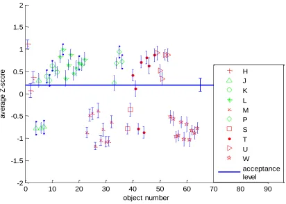
In Figure 14, the average z-score of each of the 64 objects, ranked by 25 observers with standard
error of mean and the mean acceptance level is plotted. Types J, K, L, P fall in the category of
higher quality objects and types H, M, S, T, U, W fall in the category of lower quality objects.
The figure shows that objects of types H, K, L, P, T and U have less visual difference (larger
positive z-scores and high quality) than objects of types J, M S and W. There are some
exceptions in types T and J objects, a few type T objects show big visual difference (higher
negative z-scores and low quality) while one type J object shows less visual difference. The type
T objects have higher density of orange pattern and darker outer ring but a few with higher visual
difference have lighter outer ring and less density of orange pattern. Likewise, in the figure
below, the three type J objects with low z-score have lighter outer ring and less density of orange
27
When ranking of the objects were completed at the end of the experiment, the observers were
asked to identify their acceptance level. The mean z-score of acceptance level for all observers is
0.12. This indicates that for all observers the objects with z-score below this acceptance level are
[image:40.612.102.514.180.474.2]unacceptable and above this level are acceptable.
Figure 14. Plot of average z-score vs. number of object with SEM
3.6.
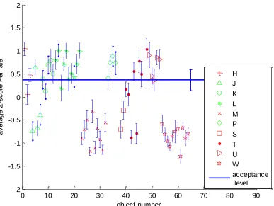
Z-scores data plot of female observers for each object type
In Figure 15, the average z-score of each of the 64 objects, ranked by 13 female observers with
standard error of mean is plotted. The result is similar to the plot of all observers as seen before
but the SEM value is higher, due to the lower number of observers. The mean z-score of
acceptance level for all female observers is 0.37. The mean z-score of female observers for
0 10 20 30 40 50 60 70 80 90
-2 -1.5 -1 -0.5 0 0.5 1 1.5 2
object number
a
v
e
ra
g
e
Z
-s
c
o
re H
J K L M P S T U W
28
objects of types K, L and W have large variation as compared to the z-scores of these objects for
[image:41.612.115.502.135.426.2]all observers, shown in Figure 14.
Figure 15. Plot of average z-score vs. number of object with SEM for female observers
3.7.
Z-scores data plot of male observers for each object type
In Figure 16, the average z-score of each of the 64 objects, ranked by 12 male observers with
standard error of mean is plotted. Only a few difference in the objects z-scores are observed
between male and female observers. The mean z-score of male observers for objects of types K,
L and W have less variation as compared to the z-scores of these objects for female observers.
The mean z-score of acceptance level for all male observers is 0.01. The mean z-score of
acceptance level for all male observers is 0.01.
0 10 20 30 40 50 60 70 80 90
29
Figure 16. Plot of average z-score vs. number of object with SEM for male observers
3.8.
Z-scores data plot of observers with Imaging Science major and other
majors for each object type
In Figure 17, the average z-score of each 64 objects with standard error of mean, ranked by 6
observers with Imaging Science major is plotted. In Figure 18, the average z-score of each 64
objects with standard error of mean, ranked by 19 observers with majors other than Imaging
Science is plotted. In Figure 19, the average z-score of each 64 objects with standard error of
mean, ranked by 7 female observers with majors other than Imaging Science is plotted. The
SEM has higher value in the plots of imaging science and female observer with other majors
other than Imaging Science, due to the low sample size. All the observers with Imaging Science
0 10 20 30 40 50 60 70 80 90
30
as major were female, so in the plot for imaging science major the z-score value for objects of
same type has large variation, similar to that of female observers in Figure 15. The observers
with majors other than Imaging Science included all the male observers and seven female
observers. So, in the plot for other majors the z-score values for objects of same type are close
together, similar to that of male observers. In the plot for female observers with other majors, the
mean z-scores values for types S, K and J objects have large variances compared to z-scores of
observers with Imaging Science major.
The mean z-score of acceptance level for all observers from Imaging Science major, all
observers with other majors, and female observers with other majors are 0.64, 0.06 and 0.13
respectively.
The Table 5 below shows the acceptance threshold for observers from different groups. The
result shows the mean acceptance threshold for female observers, observers with Imaging
Science as their major and female observers with other majors was higher than for the male
observers or for observers with other majors but there was no statistical significance. Also the
mean acceptance threshold for observers with Imaging Science as their major (all of them were
female) was higher than for the female observers with other majors but again there was no
statistical significance.
Table 5. Comparison of acceptance threshold for observers from different groups
Observers Acceptance threshold
All observers 0.12
Female 0.37
Male 0.01
Imaging Science 0.64
Other majors 0.06
31
The observers with imaging science major are considered skilled observers as they can identify
[image:44.612.88.528.177.507.2]visual cue or difference better than observers with others major considered as naive observers.
Figure 17. Plot of average z-score vs. number of object with SEM for observers labeled ‘expert’.
0 10 20 30 40 50 60 70 80 90
32
Figure 18. Plot of average z-score vs. number of object with SEM for observers labeled naïve.
Figure 19. Plot of average z-score vs. number of object with SEM for female observers labeled naïve.
0 10 20 30 40 50 60 70 80 90 -2 -1.5 -1 -0.5 0 0.5 1 1.5 2 object number a v e ra g e Z -s c o re o th e r m a jo r H J K L M P S T U W acceptance level
[image:45.612.140.473.387.636.2]33
3.9.
Conclusion
In this paper, a statistical method was used for the subjective evaluation of the visual difference
and quality of the printed objects. The experiment was performed with 30 observers, but only the
data from 25 observers (with 20/20 vision and no color vision deficiency) was used for analysis.
Based on the participants’ observations, the most noticeable and objectionable differences
between object pairs were contrast of the gray color in the outer ring and orange pattern density.
From the result, we can conclude that object of types H, K, P, T and U have less visual
difference than the object of types J, M, S and W. However, for a few of the type T objects, a big
visual difference was observed and less visual difference was observed for a one of the type J
objects. These type T objects with big difference have lighter outer ring and less density of
orange pattern and the type J object with less difference has darker outer ring and higher density
of orange pattern. This also indicates that the most noticeable difference between object pairs
34
4.
Objective test
4.1.
Outline of Procedure
In this chapter, an objective method is used to evaluate the visual difference and quality in
printed objects. The goal of the objective evaluation method is to predict the quality of an object
accurately and automatically as compared to results of subjective evaluation methods. It should
also be able to mimic the quality of an average human observer (Mohammadi et al., 2014).
Figure 20 below shows the flowchart of the six main steps utilized in this objective method,
namely flat-fielding, image cropping, segmentation, spike removal, unwrapping, and image
[image:47.612.263.352.367.665.2]classification.
35
4.2.
Image Pre-processing
To reduce the influence of the background and non-uniform illumination and to facilitate further
processing, pre-processing images of objects is required (McDonald, 2014). The image in Figure
21 contains the background and the circular ring. The subjective test results indicate that the
most noticeable difference between test image pairs for the observers was contrast of the gray
color in the outer ring of different images. So the region of interest in this study is the gray outer
ring.
The intensity of a test image is not uniformly distributed because of illumination variation.
Hence the first two preprocessing steps are flat-fielding and cropping.
Figure 21. Test image
4.2.1.
Flat-fielding
To access the actual differences in the different print patterns, we need to first remove variations
in those images that were caused by unintentional external factors. Some of these factors include
changes in image acquisition times, changes of the camera viewpoint, change of sensor etc. So to
detect the difference between the images, pre-processing must include steps to account for
100 200 300 400 500 600 700 800 900 1000 100
200
300
400
500
600
700
36
differences in illumination, sensor sensitivity, and other optical system components (Brown,
1992). This preprocessing step is known as flat-fielding.
A flat-field refers to a uniformly illuminated empty image field. By capturing an empty image
field and using it as a reference, captured frames can be corrected for extraneous variations
caused by such things as dust, sensor variation, and vignetting. (Tukey, 1993).
a. Test image b. Flat-field image for test image
[image:49.612.70.518.206.598.2]c. Test image after flat-fielding
Figure 22. First Example of flat-fielding
Thus the raw image is divided by the flat-field frame to correct for the variation in the images.
Figure 22(a) is a raw (uncorrected) test image. Figure 22(b) shows the flat-field image captured
100 200 300 400 500 600 700 800 900 1000 100
200
300
400
500
600
700
100 200 300 400 500 600 700 800 900 1000 100
200
300
400
500
600
700
100 200 300 400 500 600 700 800 900 1000 100
200
300
400
500
600
37
just after the raw image. Figure 22(c) shows the corrected (‘flat-fielded’) image, which was the
result of dividing the raw image pixel-by-pixel by the flat-field image.
4.2.2.
Cropping
The background of resulting flat-field images as shown in Figure 22(c) is a white background
with a dark circular ring. By performing RGB to binary transformation of the flat-field image,
background and foreground segmentation can be done, such that background pixels have a value
of 1 and the foreground (the circular ring) has a value of 0. Cropping includes RGB-to-gray
transformation and thresholding to find the bounding box that circumscribes the circular ring.
The region of interest is extracted from the flat-fielded image by cropping it to the smallest
rectangle containing only the circular ring image. The following steps were carried out to
achieve the goal.
1) Search Space reduction: To increase the time efficiency for Region of Interest (ROI)
extraction or cropping process, the image space is reduced as much as possible. This is referred
to as search space (Kazakov, 2011). In our case, the circular ring was almost at the center of the
images for most of the data sets except for few in which the ring was either shifted vertically up
or down in the image. Therefore, the height of the image was unchanged and the width of image
was reduced by removing 100 columns each from the first and last columns. The resulting image
is shown in Figure 23(a).
2) Binary Image Processing: The space reduced image was then converted to a binary image as
shown in Figure 23(b). The binary image was produced using an MATLAB function (im2bw)
with threshold of 0.5 (The MathWorks Inc, 2015). All pixel values above that threshold were
38
(a) Space reduction (b) Binary image
Figure 23. First preprocessing steps in cropping
3) Morphological Closing: Mathematical morphology (Wilkinson and Westenberg, 2001)
provides an approach to process, analyze and extract useful information from images by
preserving the shape and eliminating details that are not relevant to the current task..The basic
morphological operations are erosion and dilation. Erosion shrinks the object in the original
image by removing the object boundary based on the structural element used (Haralick et al.,
1987). Structural elements are small elements or binary images that probe the image (Delmas,
2015). Generally a structuring element is selected as a matrix with similar shape and size to the
object of interest seen in the input image. Dilation expands the size of an object in an image
using structural elements (Haralick et al., 1987). Figure 24(a) and 24(b) below illustrate the
dilation and erosion process. Based on these operations, closing and opening are defined (Ko et
al., 1995). In binary images, morphological closing performs dilation followed by an erosion,
using the same structuring element for both operations. Closing can either remove image details
39
Here is a brief overview of morphological closing. For sets 𝐴 and 𝐵 in 𝑍2, the dilation operation
of 𝐴 by structuring element 𝐵, denoted as 𝐴 ⊕ 𝐵, is defined as
𝐴 ⊕ 𝐵 = {𝑧|[(𝐵̂)𝑧⋂𝐴 ⊆ 𝐴}
where 𝐵̂ is the reflection of 𝐵 about its origin. The dilation of 𝐴 by 𝐵 is the set of all
displacements, such that 𝐵̂ and 𝐴 overlap by at least one element.
(a) Dilation (b) Erosion
Figure 24. Illustration of morphological operations(Peterlin, 1996).
The erosion of 𝐴 by structuring element 𝐵, is defined as
𝐴 ⊖ 𝐵 = {𝑧|[(𝐵̂)𝑧⋂𝐴 ⊆ 𝐴}
The erosion of 𝐴 by 𝐵 is the set of all points 𝑧, such that 𝐵, translated by 𝑧, is contained in 𝐴 .
The closing of 𝐴 by B is denoted as 𝐴⦁𝐵, is defined as
𝐴 ⦁ 𝐵 = (𝐴 ⊕ 𝐵) ⊖ 𝐵
The closing of 𝐴 by 𝐵 is the dilation of 𝐴 by 𝐵 followed by erosion of the result by 𝐵.
The binary image as shown in Figure 25(a) was subjected to a morphological Matlab close
40
location of black pixels was calculated to compute the square boundary of the circular ring. This
square boundary coordinates was then used to crop the original RGB image. At the completion
of this step, the circular ring image was cropped as shown in Figure 25(b) below.
[image:53.612.317.482.160.335.2](a)Morphological closing (b) Resulting cropped image
Figure 25. Cropping example for flat-field image of P-type.
4.2.3.
Segmentation using Graph-cut Theory
In this step, the gray layer (i.e. outer ring and the gray spikes) was segmented from the object
image. A graph-cut method (Boykov and Jolly, 2001) was implemented for image segmentation
in this study. A brief discussion on graph-cut theory is presented below.
In graph-cut theory, the image is treated as graph, G = (V, E), where V is the set of all nodes and
E is the set of all arcs connecting adjacent nodes. A cut C = (S, T) is a partition of V of the graph
G = (V, E) into two subsets S and T. Usually the nodes are pixels, p, on the image P, and the arcs
are the four or eight connections between neighboring pixels, 𝑞𝜖𝑁. Assigning a unique label, 𝐿𝑝,
41
labelling problem. Minimizing the Gibbs energy, 𝐸(𝐿), in Equation 3.1 below gives the solution
L= {𝐿1, 𝐿2… 𝐿𝑝,… 𝐿|𝑃|}(Nagahashi et al., 2007).
𝐸(𝐿) = 𝜆· ∑ 𝑅𝑝𝐿𝑝+ ∑(𝑝.𝑞)𝜖𝑁𝐵{𝑝,𝑞}
𝐿𝑝≠𝐿𝑞
𝑝𝜖𝑃 (3.1)
Figure 26. A graph of 3*3 image (Li et al., 2011).
In the Equation 3.1, N denotes a set of pairs of adjacent pixels. Rp is the region properties term
while B{p,q} is the boundary properties term. The relative importance of Rp vs B{p,q} is
specified by the coefficient term λ which is greater than or equal to zero. The individual penalties
when pixel p is assigned to the background and the object are Rp(“bkg”) and Rp(“bj”),
respectively as assumed by the region term Rp(Lp). While the penalty for discontinuity between
pixel p and q is accounted for by the boundary term B{p,q}. As shown in Figure 26, each pixel is
represented as a graph node along with the two nodes: source S(object) and sink T(background)
(Li et al., 2011). For more on graph-cut theory see Reference (Felzenszwalb and Huttenlocher,
42
In segmentation based on graph-cuts, for the purpose of reducing running time a K-means
algorithm (Duda et al., 2012) is used to divide the image into many small regions with similar
pixels having same color (Li et al., 2011). These small regions are the nodes of graph-cuts.
Figures 27 and 28 show the result of segmentation using graph-cut theory for the original
cropped images shown in Figure 22 and 25 respectively. Figures 29 and 30 show the gray layer
[image:55.612.123.302.263.448.2]of the image extracted using segmentation.
[image:55.612.329.507.263.441.2]Figure 27. Segmentation of test image Figure 28. Segmentation of anchor image
[image:55.612.125.300.482.655.2] [image:55.612.329.505.483.654.2]43
4.2.4.
Spikes Removal and Boundary Detection of Outer Ring
In the subjective test, observers indicated that the most noticeable difference between test image
pairs was contrast of the gray color in the outer ring of different images. So the outer ring can be
considered as the region of interest in our study and the gray spikes may be discarded.
In this step, the resulting image after the segmentation will be masked to remove spikes which
are directed towards the center of the image. To accomplish this, first the RGB image was
converted to gray level image. Then the maximum distance of the dark pixels (the lowest trough
location of the spikes) from the center of the image inside the outer ring image boundary was
determined. Then a circular mask was created with radius equal to this maximum distance and is
shown in Figure 31(b). After mask was created, it was applied to the original image and the
results can be seen in the Figure 31(c). The spikes from the original image are removed in the
final masked image.
44
[image:57.612.204.397.69.262.2]c. Extracted outer limbal ring
Figure 31. Image Masking for spikes removal
4.2.5.
Unwrapping
After the outer ring was successfully extracted from the masked image, the next step was to
perform comparisons between different ring images. For this purpose, the extracted outer ring
had to be transformed so that it had a fixed dimension. Therefore, an unwrapping process was
implemented to produce unwrapped outer ring images with same fixed dimension.
4.2.5.1.
Daugman’s Rubber Sheet Model
The homogeneous rubber sheet model invented by Daugman maps each point (x,y) located in
the circular outer ring to a pair of polar coordinates (r,θ). For the polar coordinates, the radius r
lies inside the range [0,1], and the angle θ lies inside the range [0,2π] (Daugman, 2009). This
method was used to unwrap the circular outer ring and transform it into a rectangular object. This
45
Figure 32. Daugman’s Rubber Sheet Model (Masek, 2003)
This method first normalizes the current image before unwrapping. The remapping of the outer
circular ring region from Cartesian coordinates (x, y) to normalized non-concentric polar
representation is modeled as:
𝐼(𝑥(𝑟, 𝜃), 𝑦(𝑟, 𝜃)) → 𝐼(𝑟, 𝜃)
where
𝑥(𝑟, 𝜃) = (1 − 𝑟)𝑥𝑝(𝜃) + 𝑟𝑥𝑙(𝜃)
𝑦(𝑟, 𝜃) = (1 − 𝑟)𝑦𝑝(𝜃) + 𝑟𝑦𝑙(𝜃)
I(x, y) is the outer circular region image, (x, y) are the original Cartesian coordinates, (r, θ) are
the corresponding normalized polar coordinates, (𝑥𝑝, 𝑦𝑝) and (𝑥𝑙, 𝑦𝑙) are the coordinates of the
inner and outer circular ring boundaries along the θ direction (Masek, 2003).
4.2.5.2.
Unwrapping Results
The results of unwrapping the image using Daugman’s Rubber Sheet Model are shown in Figure
46
Figure 33. Unwrapped outer circular part
4.2.5.3.
Unwrapping Issue with Some Images
The results of unwrapping can also be seen in Figure 34. In this example, the final unwrapped
image was not perfect. There are some missing parts from the original outer ring as seen in
Figure 34(c) and (d). This was due to the outside ring not being perfectly circular. Although the
actual original object was circular, its obtained image was elliptical in some cases due to image
acquisition issues, mainly changes in viewing angle. To compensate for this issue, an affine
transform was used as described in the next section.
a. Original test image b. Spike removal c. Unwrapping issue
d. Final unwrapped image
Figure 34. Unwrapping problem illustration
100 200 300 400 500 600 50
100
150
200
250
300
350
400
450
500
47
4.2.5.4.
Affine Transform (Ellipse to Circle Transformation)
While capturing images of the printed objects, different types of geometric distortion are
introduced by perspective irregularities of the camera position with respect to the scene that
results in apparent change in the size of scene geometry. This type of perspective distortions can
be corrected by applying an affine transform (Fisher et al., 2003).
An affine transformation is a 2-D geometric transformation which includes rotation, translation,
scaling, skewing and preserves parallel lines (Khalil and Bayoumi, 2002). It is represented in
matrix form as shown below (Hartley and Zisserman, 2003).
(𝑥 ′ 𝑦′ 1
) = [
𝑎11 𝑎12 𝑡𝑥
𝑎21 𝑎22 𝑡𝑦
0 0 1
] ( 𝑥 𝑦 1)
or in block from as
𝑥′ = [ 𝐴 𝑡
0𝑇 1] 𝑥
Where A is a 2*2 non-singular matrix that represents rotation, scaling and skewing
transformations, t is a translation vector, 0 in a null vector, x and y are pixel locations of an input
image.
The affine transformation was used to first convert elliptical images to circles and then perform
the unwrapping. The results can