Rochester Institute of Technology
RIT Scholar Works
Theses Thesis/Dissertation Collections
6-1-1982
Proposal and Investigation of a Method for
Measuring Process Color Variation via Reflection
Densitometer
Russell Harris
Follow this and additional works at:http://scholarworks.rit.edu/theses
This Thesis is brought to you for free and open access by the Thesis/Dissertation Collections at RIT Scholar Works. It has been accepted for inclusion in Theses by an authorized administrator of RIT Scholar Works. For more information, please [email protected].
Recommended Citation
PROCESS COLOR VARIATION VIA REFLECTION DENSITOMETER
by
Russell H. Harris
A thesis submitted in partial fulfillment of the
requirements for the degree of Master of Science in the
School of Printing in the College of Graphic Arts and Photography
of the Rochester Institute of Technology
June, 1982
Certificate of Approval--Master's Thesis
School of Printing Rochester School of Technology
Rochester, New York
CERTIFICATE OF APPROVAL
MASTER'S THESIS
This is to certify that the Master's Thesis of
Russell H. Harris II
with a major in Printing Technology
has been approved by the Thesis Committee as satisfactory for the thesis requirement for the Master
of Science degree at the convocation of
June 2, 1982
Thesis Committee:
Irving Pobboravsky
Thesis AdvisorJoseph L. Noga
Graduate AdvisorI am grateful to my thesis advisor, Mr. Irving
Pobboravsky, for his many perspective comments and firm
hand in guiding me through the process of writing this
thesis. Without his encouragement and unflagging belief
in the value of the work I could not have completed it.
CONTENTS
Page
List of Tables v
List of Figures vi
Abstract
vj_j_
Chapter I
Introduction 1
Hypothesis 4
Explanation of Proposed System 4
Part A
-Proportional Density Shift .... 13
Part B
-Overall Density Shift 14
Part C
-Densitometric Color Value 14
Sample Worksheet 15
Footnotes for Chapter I 16
Chapter II
Methodology 17
Footnotes for Chapter II 31
Chapter III
Analysis and Discussion of the Data .... 32
Chapter IV
Conclusions 37
Bibliography 39
Appendix A: Sample Graphic Rating Scale 4 3
Colorimetric Densities to AE Values 4 4
Appendix C: Memo Concerning Pressrun
Objectives 46
Appendix D: Sample Press Sheets/Sample
Evaluation Guides 49
Appendix E: Sample Data Collection Sheet 54
Appendix F: Definition of Correlation
Coefficient 55
Appendix G: Collected and Tabulated Data 56
TABLES
Page
Table 1.1: A comparison of Munsell values
and PDS values at various density
levels 11
Table 3.1: A comparison of r. and r. values
for test samples . . . . 33
Page Figure 2.1: Sample graphic rating scale .... 19
Figure 2.2: Sample graphic rating scale
in use 20
Figure 2.3: Conversion of graphic rating scale information to numeric
values 21
This thesis proposes a method of using reflection
density readings taken with a conventional graphic arts
densitometer to provide a numeric measure of the visual dif
ference between a sample press sheet and a reference sheet.
This numerical measure was developed based on the theory
that human response to variation in process color printing
is more affected by changes in the proportions of process
inks to each other than by variation in the overall inking
level of the press sheet.
The thesis then goes on to explain how the proposed
system was tested. First, a set of color samples was
generated. Observer evaluations of these color samples
were converted to numeric values using psychometric evalua
tion methods. Using statistical methods, observer evalua
tions in numeric form were then tested against values
obtained by using the proposed system. Observer evaluations
of the color samples were also compared statistically with
values from the Total Color Difference system as an ad
ditional test.
The thesis concludes that the proposed system is a
reliable predictor of observer response to color variation
when the system is used for the purpose of comparing
reference press sheets to sample press sheets.
INTRODUCTION
During the summer of 1978,1 was an intern at the
United States Government Printing Office (G.P.O.) in
Washington, D.C. At that time the Quality Control Depart
ment of the G.P.O. was in the early stages of developing a
quality attributes program for the purchase of printed pro
ducts from the G.P.O. 's many suppliers. The basic thrust
of the program was to assign acceptability limits to the
many different attributes which make up a piece of printing.
The department developed tolerances for almost every
imaginable aspect of a printed piece, from the size and
number of 'hickies' to acceptable durability standards for
different types of bindings. All these acceptability stan
dards were based on tests using simple, commonly available
instruments for testing printed materials within the printing
industry.
When we at the G.P.O. began to look for a simple
method for assigning numerical acceptability limits to
variation in process color printing, we found that a simple,
reliable technique did not exist. We also found that there
have been few attempts to develop process color variability
tolerances for the buyer of printing. Ian White developer
of the Print Quality Index for the Canadian government,
avoided the matter entirely and set no tolerances on process
color variation. We found that some very large publishers
specify inks, paper, and the densities to which each process
color should be run on standard color control bars which
appear on the press sheet. For this approach to be effective,
such publishers must have an employee remain at the printing
plant during production of the printed piece to check that
color bar densities are met throughout the run and to see
that material specifications are met. This system of color
control is expensive and is feasible only where there are
enough resources to justify the expense.
Generally, the G.P.O., like other buyers, must in
spect their printed products after finishing and binding,
without the benefit of color bars. Even under ideal con
ditions, however, it is known that color control bars are not
always an accurate indicator of color changes on other areas
of the press sheet. Furthermore, most buyers must procure
printing from a variety of sources. Because printers use
different ink sets, different presses, and different pro
cedures, it is difficult to make up standard sets of specifi
cations.
In addition to the approaches mentioned above, there
2
by my thesis advisor, Irving Pobboravsky. The paper des
cribes a method for establishing variability limits in CIE
space. Although the approach is not as complicated as using
the CIE color identification system, it requires the use of
a computer and would require many hours of work to implement,
To put such a system into use, the G.P.O. would have to
require any printer bidding on process color printing for the
government to install such a system. Since the printing
industry is made up of so many small shops, few companies
would have the resources to comply with such a demand. This
would severely limit the number of printers who could bid on
process color work for the government.
Because of the difficulties of using available ap
proaches for setting tolerances for process color variation,
we at the Government Printing Office decided that it would
be worthwhile to attempt to develop such a system. We
decided that a system for measuring process color tolerances
should have the following characteristics: 1. A numeric
measure of color variation. 2. Color variation should be
determined with conventional graphic arts instrumentation,
readily available to printers doing process color work.
3. The measurement system should be easy to understand and
put into effect. 4. The measurement system should allow
binding. 5. The system should haVe acceptability limits
which do not exceed the capacity of the printing process.
Hypothesis
This thesis is the result of my efforts to come up
with such a system. Some of the preliminary work was done
during my summer at the G.P.O., but the bulk of the develop
ment was done after I returned to R.I.T. As you shall see,
the thesis proposes a method for using the conventional
graphic arts densitometer as a basis for a numeric system for
measuring color differences. Use of the conventional densi
tometer satisfies the first two system goals listed above
(numeric measurement, and conventional instrumentation) . The
way the system is put into effect also satisfies the third and
fourth system goals above (simplicity and checking tolerances
after printing) . However, the work presented in this thesis
does not pretend to address the fifty requirement of the
system, that of setting acceptability limits. This is not to
say that acceptability limits cannot be developed, but only
that they are beyond the scope of the thesis. The central
question of the thesis is this: Can a conventional densitometer
provide a numeric measure of the visual difference between
a press sheet and an o.k. sheet which correlates with the
visual difference as seen by observers?
Explanation of Proposed System
The key to the proposed method is use of the con
skeptical as to the feasibility of basing such a method on
this instrument. Although the reflection densitometer has
been widely used in the printing industry and has proved to
be an important element of many quality control programs,
it is also "one of the most misunderstood, misused, and
abused instruments in the industry, and has made significant
contributions to the absence of "quality control."
Because
the densitometer has been abused so often, its use as a tool
4 for color measurement has been frowned on by some experts.
GATF points out in Research Progress Report number 90,
that densitometric color measurement ' cannot be extended to
become a universal color measurement system such as the CIE
system. ' But the same report goes on to explain that the
densitometer is useful when used to assign quantitative
tolerances to quality acceptability limits which have been
determined visually. It also points out that if a densito
meter is correlated, it can be used for matching a proof to
a press sheet.
The proposed color measurement technique uses the
densitometer to indicate density changes based on reference
densities, and not as a universal color measurement system.
The principal advantages of using the densitometer for this
system are that it is easy to use, it is widely available,
and it will do the job.
Besides the use of the conventional densitometer,
6
might find controversial is the way the readings from the
reflection densitometer are manipulated to determine the
numeric value for establishing color variation. Instead of
simply matching densities of readings taken through the
four filters in a densitometer, this system synthesizes these
readings based on the observation that experienced human
observers are more sensitive to change in the proportional
amounts of colorant of each process ink applied to the press
sheet than the overall amount of each colorant. In other
words, if there is a process color patch made up of 25% Cyan,
50% Magenta, and 25% Yellow, it is more important to maintain
this proportional relationship to establish color control
than ensuring that the overall densities of the color patch
increase or decrease. For the system proposed in this
thesis, the concept described above is central to calculating
the value which indicates the amount of color variation
from an 'o.k.1 sheet to a press sheet from a production run.
Although observers will accept greater variations
in overall density of a process color sample if the propor
tional relationships of the process inks are retained,
change in overall density from an 'o.k.' sheet to a sample
press sheet is, nevertheless, significant. Therefore, change
in overall density is also part of the formula used to cal
culate the degree of variation from an 'o.k.' sheet to a
As mentioned above, observers appear to be more
sensitive to changes in the proportions of process ink densi
ties making up a process color patch than to the overall
density of the patch. Not only are observers more sensitive
to this type of variation, but also this type of variation is
more likely to occur in process color printing. Consider that
process color printing is produced by printing combinations
of process inks beside and on top of each other to produce
different colors via the halftone process. Each time a
process ink is applied to a press sheet, the sheet must pass
through a printing unit. When printing, the probability of
a single unit going out of control is much greater than all
the units reacting the same way at the same time. Therefore,
the type of variation which the human eye is the most sensi
tive to, is the most likely to occur.
For example, let's suppose we have a green patch
created by the halftone technique using two process ink
densities as follows: cyan: 0.22, yellow: 0.25. And let's
also assume we have two samples for comparison. The first
sample has these densities: cyan: 0.32, yellow: 0.32. The
second sample has these densities: cyan: 0.22, yellow: 0.32.
The first of these two samples will appear much closer to
the original because the proportions of the two remained
much the same.
important in producing close
color match than maintaining absolute densities. The import
ance of this proportional relationship is the key to the
system which I have developed for expressing color variation
numerically. Variations in the proportions of process ink
densities for the proposed system (to be called the
Densitometric Color Value System, or AD) is calculated by
first establishing the ratios of the process ink densities in
a given sample area on the 'o.k.' or reference press sheet.
The ratios are then calculated for the sample sheet. Any
change in the ratio from the reference sheet to the sample
sheet is a numeric value representing a color change in the
overprint sample. I have named this numeric value
Proportional Density Shift (PDS) . The technique for calcul
ating PDS is explained below:
Proportional Density Shift (PDS) is calculated by
comparing density ratios from an area of the 'o.k.' press
sheet. The following three steps determine these ratios:
1. Measure the red, green, and blue densities
(D , D , D, ) of the
'o.k.'
press sheet and the
r g b
sample.
2. Sum each of these two sets of densities: (Note
from this point, primed values represent the
'o.k.'
press sheet and unprimed values represent
I
' =D ' + D
'
+ n ' L
r g ^b
Equation 1.2
I
=Dr
+Dg
+Db
3. Calculate the ratio of each density measurement
to its sum and convert these ratios to
percentages.
Procedure 2.1
D ' D
'
D
'
-^-100,
-5-. 100,
-2-. 100
V
V
V
Procedure 2.2
D D D
. 100, -2
. 100, . 100
I
I
I
4. Calculate the absolute difference between the
percent density for the 'o.k.' press sheet and
the reproduction for each of the filter readings:
Equation 3.1: AD r
Equation 3.2: AD
g
Equation 3.3: AD, D o, O D r -%D r o o D g -%D g a o -%D, b
5. Determine Proportional Density Shift (PDS) by
adding the absolute values of the differences
found in the previous step.
(Note: The amount of the difference between the
respective ratios is of prime importance, not whether
it is a negative or positive quantity. Because
these differences are added together to determine
PDS, they must be absolute values. If they are not
absolute, the negative and positive differences could
cancel each other leaving the incorrect impression
of a much smaller PDS than actually exists.)
The use of ratios to develop PDS was also important
because the human eye is more sensitive to changes in high
light density than shadow density. If ratios were not used,
a system might have been developed which would have been
applicable to a single density level only.
For example, to the human observer, the visual dif
ference between two printed samples of densities 1.00 and
1.05 will appear to be much closer matches than two patches of
densities .50 and .55. The visual difference will appear
much greater in the lighter of the two samples. This is due
to the fact that the human eye is more sensitive to density
changes at lower printed densities. Since the human eye is,
by definition, the standard for determining correct density
changes in any measurement system, this fact must be included
in any system measuring color variation. Because a small
change in density level is a greater proportion of a highlight
For example, a change from .20 to .25 is a 20 per cent
change in density while a change from 1.00 to 1.05 density
is only a five percent change in density. These differing
degrees of proportional severity reflect human response to
different density levels as demonstrated by the Munsell
Density tables.
The degree of sensitivity to different density levels
in the human eye has been expressed quantitatively in the
tables relating Munsell Value to density. The table below
compares Munsell Density values at four different density
levels with PDS values representing a .06 change in the
density levels of one of the process colors. A comparison
of the Munsell Values and the PDS values shows that the PDS
values correlate reasonably well with human perception of
equal density increments.
Table 1.1
A Comparison of Munsell Values and PDS Values at Various Density Levels
Density Level Munsell Value PDS Value
.25 7.92 9.30
1.00 3.51 2.70
1.50 1.94 1.73
2.00 .77 1.29
So far, we have concentrated on proportional change
must not be forgotten. If the proportions of the process
inks making up a sample remain the same, but they increase or
decrease markedly, the observer will notice color variation.
Therefore, the second part of the numeric value which
makes up the Densitometric Color Value (AD) is change in the
overall density of the color sample. This is referred to as Overall Density Shift (ODS) and is calculated as follows:
Overall Density Shift (ODS) is the absolute difference
in the visual density between corresponding areas of the 'o.k.'
and sample press sheets. To determine ODS, these steps are
followed:
1. The densities of the 'o.k.1 and sample press
sheets are read:
a. D '
v
b. D
v
2. To find Overall Density Shift (ODS) , calculate
the absolute difference between the visual density
readings of the 'o.k.' press sheet and the sample:
Equation 5.1 ODS =
| Dv'
-Dv
|The Densitometric Color Value (AD) is made up of the
two component parts described previously: PDS or Proportional
Density Shift and ODS or Overall Density Shift. Arriving at
the Densitometric Color Value (AD) for any color is simply a
matter of adding the PDS and ODS values together for the
Equation 6.1 AD PDS + ODS
The following is a sample procedure for calculating
the AD for a particular color: (A sample worksheet is included
on the last page of the chapter to clarify the procedure.)
Part A. Proportional Density Shift (PDS)
1. Calibrate the densitometer to the manufacturer's
standard. Then zero all four filters on the sub
strate.
2. Take density readings in the corresponding areas
of the 'o.k.' press sheet and the reproduction.
Record each reading in the appropriate column of
the sample worksheet. (D , D , D, and D '
, D '
, D, '
) . *
r g b r g b
3. Enter the density readings from Step 2 (above) in
columns 1, 2, and 3 of the worksheet. Calculate
the sums for these two sets of readings and enter
them in column 4 of the worksheet.
4. Calculate the ratio of each density measurement to
its respective sum and convert these ratios to
percentages. (Procedure 2.1 and 2.2) Enter these
percentages in columns 5, 6, and 7 of the worksheet.
5. Calculate the absolute difference between the per
cent density for the
'o.k.1
press sheet and the
reproduction for each of the filter readings.
in the third row of the worksheet under columns
5, 6, and 7.
6. Determine Proportional Density Shift (PDS) by
adding the absolute values of the differences
found in the previous step. (Equation 4.1) Enter
this value in column 8 of the worksheet.
Part B. Overall Density Shift (ODS)
1. Calibrate the densitometer to the manufacturer's
standard. Then zero the visual filter on the
substrate.
2. Take density readings in corresponding areas of
the 'o.k.' press sheet and the reproduction with
the visual filter. Record the two readings in the
first column of the section headed Overall Density
Shift.
3. Determine the absolute difference between the
visual filter readings of the 'o.k.' press sheet
and the sample. (Equation 5.1) Enter this value
in the column headed ODS.
Part C. Densitometric Color Value (AD)
1. Determine the Densitometric Color Value (AD).
Sample Worksheet
Part A. Proportional Density Shift
Col
No. 1 2 3 4 5 6 7 8
Dr Dg Db I
f.!00
^100
f^.100
PDSO.K.
Sheet .92 .76 .69 2.37 38.81 32.07 29.12
Sample
Sheet
.97 .80 .75 2.52 38.49 31.75 29.76
ADx .32 .32 .64 1.28
Part B. Overall Density Shift
Col
No. 1 2
DV ODS
O.K.
Sheet
.88
Sample
Sheet
.95
ODS .07
Part C. Densitometric Color Value (AD)
AD = 1.28 + .07 = 1. 35
1. Lake, Daniel
RIT Thesis.
2. Pobboravsky, I.
1962, "A Proposed Engineering Approach to Color Reproduction,"
TAGA Proceedings 1962, pp. 13 3-35.
3. Foss, C.E. and Field, G.G.
1973, "The Foss Color Order System,"
G.A.T.F. Research
Progress Report, No. 96.
4. Field, G.G.
1972, "Graphic Arts Applications of Reflection Densitometry,"
G.A.T.F. Research Progress Report,
No. 90, p. 8.
5. Field, G.G.
1972, "Graphic Arts Applications of Reflection
Densitometry,"
G.A.T.F. Research Progress Report,
No. 90, p. 1.
6. Gaston, John.
1976, "An Investigation of Solid Ink Density Variation
as Determined by the Acceptability of Overprints in Process Color Printing. "
METHODOLOGY
Once the system described in the previous chapter had
been developed, procedures to test the validity of the system
needed to be developed. In order to test these procedures it
was first important to recognize that 'color' is a subjective
phenomenon it is
a human reaction to the range of electro
magnetic radiation from approximately 400 to 750 nanometers.
The final judge of any color or color difference cannot be
a machine, but must be a human or group of humans because
color, by definition, is ahuman reaction to a physical
phenomenon. It is this fact which has made specifying color
by quantitative means difficult for those who have attempted
it. It is also this fact which makes testing the system
difficult. Because color is a sensation, no single system
of quantifying color variation has proved to be an unassail
able standard.
Because color is a subjective phenomenon, it was
necessary that the system be tested both by comparisons with
observations by humans under proper test conditions, and by
comparison with another commonly accepted numerical system
for quantifying color differences. The key to testing the
system was to develop a test method for converting human
to quantitative
could then be compared with the Densitometric Color Values
(AD) from the proposed system.
Fortunately, such methods for quantifying human
responses to subjective phenomenon are used regularly in the
field of psychology. These methods of quantifying human
responses are known as psychometric evaluation techniques.
Several techniques were evaluated before finding the
most appropriate. Among those techniques evaluated was a
simple rank-ordering or ordinal scaling of numbers. This
technique was rejected as too crude since humans are capable
of a high degree of color discrimination under the right
conditions. Next, use of the interval scale was examined.
One approach for developing an interval scale is the use of
the pair comparison technique. However, this approach was
ultimately rejected because of the very large number of
observations needed. So many comparisons would be required
that each observer would need to spend several hours examin
ing the samples. Such a long time requirement to judge the
samples would lead to inaccurate judgements due to boredom,
and would have made it difficult to recruit observers.
Fortunately, an equally accurate, but much simpler
and faster psychometric method is the graphic rating scale.
To judge samples using this technique, observers indicate by
graphic procedure the attribute intensity of two anchor
chosen for the experiment, uses only a single anchor stimulus
and asks observers to locate samples on a straight line so
that the distances between the samples are representative
of the respective attribute distances between the samples.
Verbal indicators are placed along the graphic line to help
observers locate the samples where they see fit. A sample of
such a graphic scale used for this experiment follows: (The
actual graphic rating scale used for testing is reproduced
in Appendix A. )
identical
close
similar
different
very different
Figure 2.1: Sample Graphic Rating Scale
The graphic rating scale is used by asking an
observer to judge how closely a number of color samples
approaches the color of a reference sample. For example, an
observer would be given a reference sample and three other
color samples labeled A, B, and C. He would then be in
structed to indicate on the graphic scale where he felt each
of the samples fell in relation to the reference sample. The
three samples to the reference sample on the graphic rating
scale like this:
A
>-C ?
B >
identical
close
similar
different
very different
Figure 2.2: Sample Graphic Rating Scale in Use
Once the graphic rating of the three color samples is
complete, converting these graphic relationships to quanti
tative values is a simple procedure as explained in Guilford's
book, Psychometric Methods. A numerical scale was placed next
to the graphic scaling line and each sample was assigned the
respective quantitative value on the scale. These numbers
are then used as the quantitative equivalent of the
observer's judgement for each sample. For example, in the
graphic scale below, sample A would receive a value of 1,
sample C would receive a value of 3, and sample B a value of
o
-I
-A ~ identical
2 ~
~~^^
3 - c close
4
-?
5 _
6
-B - w
similar
7
-8
-9
-different
1 0
-1 1 "
1 2
-1 3
-1 I* - very
diffi
Figure 2.3: Conversion of Graphic Rating Scale
Information to Numeric Values
The methodology for testing the hypothesis in this
thesis is to compare human perception of the proposed system
with values calculated using the Densitometric Comparison
System. Once human perception of color samples are quantified
using the graphic rating scale described above, values were
calculated for the same samples using the Densitometric
Comparison System as described in the first chapter. With
numeric values for both human and machine response to the
same color samples, the two systems were evaluated for agree
ment using statistical correlation techniques.
As an additional test, values for the same samples
using the generally accepted Total Color Difference (AE)
value were calculated. Total Color Difference (AE) is
calculated by determining colorimetric densities and then
method for calculating Total Color Difference (AE) is
explained in Appendix B. ) The Total Color Difference (AE)
for each of the color samples used for testing the Densito
metric Comparison System was calculated. Then, statistical
techniques were again used to compare Total Color Difference
values with the observations of the observers.
In this way, the observations of human observers
were tested against both the Densitometric Comparison System
and against the more complex, but generally accepted Total
Color Difference value.
Before explaining the testing procedure further, I
will discuss how the color samples used for testing were
generated. At the outset, a number of approaches for obtain
ing samples of color variation were considered. First, the
possible use of pre-printed process color screen tints was
evaluated. Such an approach would provide a high degree of
control, but was rejected because judgement of any color is
influenced by surrounding colors to such a degree that
isolated screen tints would not reflect the conditions under
which this system would be used. Also, collecting waste
sheets from press runs to obtain samples of sufficient color
variation to conduct an objective experiment was attempted.
However, it was found that data from press sheets was not
representative of the wide range of possible color variation
Due to the problems mentioned above, a special press
run was required for generating a full range of color vari
ation sufficient for testing the hypothesis. Fortunately,
press time was granted on the four-color Rockwell web press
in the Graphic Arts Research Center.
Since a wide range of color samples for testing was
needed, it was important to develop a careful plan for
generating these samples. After consultation with Richard
2
McAllen of G.A.R.C., as well as the pressmen at the Graphic
Arts Research Center, I decided that the best approach to
developing a full range of color samples was to start at the
lowest density levels and build to a variety of higher
aim-point densities for each of the process colors. Starting
with the lower densities and moving to higher densities made
sense because an offset lithographic press naturally takes
time to "come up to
color"
, or to reach proper printing
density.
To be sure the objectives of the press run were
understood by all involved, a memo was distributed to the
press crew two days before the press run was scheduled so
that any questions could be answered. The memo explaining
the press run's objectives and the desired aimpoint densities
can be found in Appendix C.
The Graphic Arts Research Center had a variety of
four-color negatives available to choose from for printing
fashion publication. (See samples of these printed images
in Appendix D. ) These four images were chosen because they
might be found in a typical medium-quality four-color
printing job. That is, there were no extraordinary procedures
or demands in printing these images. Nor, were these images
of low quality. Also, among these four images there is a
wide range of color densities and overprints suitable for
testing.
During the press run, the color control bars on the
press sheet were monitored constantly, until each aimpoint
density was recorded. After obtaining a sheet with the
required aimpoint densities, the sheet was saved. After the
press run, these sheets were examined as a group. Ten press
sheets with a wide range of color variation in comparison
with the 'o.k.' press sheet were chosen to serve as samples
for testing.
After obtaining the color samples for testing, time
was spent experimenting with the densitometer to discover
the best way to take readings within the press sheet. As
mentioned in Chapter I, one of the most important aspects of
the Densitometric Color Value System (AD) is that it evaluates
color within a press sheet without the use of color bars for
taking densitometer readings. Therefore, the densitometer
was used to take readings within the printed image. Because
the collection area of the graphic arts densitometer is
of the collection device was important in obtaining repeatable
readings. After some informal testing, I found that very
repeatable densitometer readings could be maintained when
centering the collection area of the densitometer on a tiny
dot or imperfection in the area to be tested. When using
such a dot for a target, readings were very repeatable.
To test the observers judgements as planned, I
needed to take readings with a densitometer to calculate the
Densitometric Color Value (AD) , and with a small-spot colori
meter to calculate the Total Color Difference value (AE) .
Therefore, a densitometer which could be converted from a
densitometer to a small-spot colorimeter by simply changing
the filter turret was used. Readings from the color samples
were collected using the instrument first as a standard
graphic arts densitometer, and then as a small-spot
colorimeter. By using the same instrument for collecting
data for both the Densitometric Color Value and for the Total
Color Difference value, inter-instrument error was reduced.
Before taking the readings, the instrument was fully
cleaned and the filters were checked. Then readings were
taken in each of the appointed areas using the instrument as
both a densitometer and as a small-spot colorimeter.
After taking the readings, the Densitometric Color
Values (AD) and the Total Color Difference value (AE) were
calculated and recorded in their respective columns on the
Appendix E. To expedite calculating the Densitometric Color
values (AD) , I wrote a program for my HP-25 calculator.
A program the Graphic Arts Research Center had available was
used for converting tristimulus values to the Total Color
Difference value (AE) .
Before continuing with the statistical analysis of
the data, the human observers'
rating of the data had to be
completed. As explained earlier in this chapter, a graphic
scaling technique was used to develop numeric values for
observer evaluations of the color samples.
Nine people were chosen for the panel of observers.
These observers all had familiarity with process color
printing, from either a production or scientific orientation.
It was expected that their familiarity with process color
printing would give an accurate representation of a printing
buyer's response to process color printing.
Before evaluating the color samples, each observer
was given a set of general instructions describing the
graphic scaling techniques and showing a sample of the
graphic scaling rating sheet to be used.
The instructions encouraged the observers to use
their own best judgement when evaluating the color samples,
but to limit, as much as possible, their evaluation to the
small areas to be read by the densitometer/small-spot
colorimeter. After finishing the general instructions on
the observers were encouraged to ask questions.
After answering any questions, the observers were
shown a sample printed sheet in which the areas to be
evaluated were indicated. This sheet was known as the
Evaluation Guide and was used only for the purpose of clearly
locating the areas within the image which were under con
sideration. (Sample Evaluation Guides appear in Appendix D. )
Each observer was then given a more detailed set of procedures
describing how to go about judging the samples. These
procedures follow:
1. Use the Evaluation Guide to locate the small
areas to be judged. There is an Evaluation Guide
Sheet for each different image.
2. Find what you consider to be the sample which
most closely matches the reference color. Indicate
where this sample most appropriately lies on the
line by writing its identification letter beside
the desired spot on the line and drawing an arrow
to the desired spot. For example, if you felt that
sample C were somewhere between close and similar
to the reference sheet, you would place the letter
C opposite that place in the column and draw an
arrow.
3. Now, find what you consider to be the sample most
the continuum this sample should be placed and
mark it as you did in Step 2.
4. Now, proceed to compare the remaining samples
to the reference sheet and indicate the placement
on the line you feel best describes their rela
tions to the local colors in the reference press
sheet. When making this decision, be sure to
compare the small color area on the sample in
question with the same area on the reference press
sheet.
After reading the specific procedures and clarifying
any unclear points, the observers began the ranking
procedure. All samples were viewed in the same viewing booth
under standard viewing conditions of 5000 degrees kelvin in
order to standardize conditions. In an attempt to encourage
the careful consideration of all samples by the observers,
they were encouraged to break from the process of evaluating
the samples as soon as they became bored or felt their minds
wandering. Most observers took advantage of this chance to
break from evaluating the samples. The average time for
judging all the samples was an hour and fifteen minutes.
Once the graphic rating of the color samples was
complete, conversion of these judgements to quantitative
values was a simple procedure as explained in Psychometric
laid next to the graphic scaling line, and the samples were
assigned the adjacent quantitative value on the scale. These
numbers were then used as quantitative equivalents of the
observers'
judgement for each sample.
The form used to collect and organize the data for
analysis appears in Appendix E. At the top of the form, the
image and the area within the image to be evaluated are
indicated. Running down the left hand side of the form are
letters identifying the ten samples to be judged. Along the
top, in the first nine columns are the initials of each of
the observers. In the columns below the initials, the
observers'
judgements of the color samples are recorded. As
explained previously, these quantitative values were extra
polated from judgements made on the graphic rating scale.
The tenth column, headed S, is the standard deviation
of the observer evaluations for each of the samples. The
standard deviation was calculated to explore the degree of
observer agreement on the evaluation of the color samples.
The eleventh column, headed X, is the arithmentic
mean of the observer evaluations of the color samples. The
arithmetic mean was used to produce a single value represent
ing all the observer judgements of the samples.
In the final two columns, headed AE and AD, the
respective AE (Total Color Difference) and AD (Densitometric
Color Value) for each sample are recorded after they have
collecting the data and organizing it on these forms, the
data was analyzed. The analysis and results are explained
Note to Chapter II
Guilford, J. P. Psychometric Methods. McGraw Hill Inc., New York, 1954, pp. 266-90.
G.A.R.C. (The Graphic Arts Research Center) has been
renamed since I carried out the testing for this thesis, G.A.R.C. is now called The Technical and Education
CHAPTER III
ANALYSIS AND DISCUSSION OF THE DATA
As mentioned in Chapter II, four different printed
images were evaluated by the observers, by the AD System and
by the Total Color Difference System (AE) . Three areas were
evaluated within each of these images for a total of twelve
distinct color areas evaluated by the observers and the two
'objective'
systems of measurement. As wide a variety of
colors for evaluation as possible was chosen, including
fleshtones and colors of varying hue, lightness, and saturation.
The four printed images to be tested were identified by the
Roman Numerals I, II, III, IV. Within each of these sample
images the three areas to be evaluated were identified by the
numbers 1, 2, and 3. These areas were identified only on the
sample sheet known as the Evaluation Guide. Samples of the
Evaluation Guides with the areas to be evaluated identified
appear in Appendix D.
For each of the areas evaluated, the observers
judgements were tested for degree of agreement between both
the corresponding Densitometric Color Value (AD) and the
Total Color Difference value (AE) using the correlation co
Appendix F.) The forms containing the collected and
tabulated data, including the observers'
numeric value, the
AE, and AD values for each color sample are presented in
Appendix G.
The following table presents the correlation co
efficients expressing the degree of agreement between
observers'
judgements and the two quantitative systems for
each of the color locations tested:
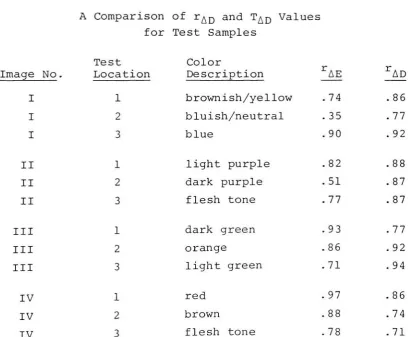
Table 3.1
A Comparison of rAD and T^D Values
for Test Samples
Image No.
Test
Location
Color
Description rAE rAD
I 1 brownish/yellow .74 .86
I 2 bluish/neutral .35 .77
I 3 blue .90 .92
II 1 light purple .82 .88
II 2 dark purple .51 .87
II 3 flesh tone .77 .87
III 1 dark green .93 .77
III 2 orange .86 .92
III 3 light green .71 .94
IV 1 red .97 .86
IV 2 brown .88 .74
[image:42.542.58.467.279.616.2]Examination of the correlation coefficients comparing
observer numeric judgements and both the AE and AD systems
indicates statistically significant agreement for most
samples. For any given sample, the Total Color Difference
(AE) or the Densitometric Color Value (AD) may have greater
agreement with observer judgements but, on the whole,
neither quantitative system has a predominately higher cor
relation at all levels. Most of the correlation coefficients
for the two systems are significant to .10 and many are
significant to .05. There are two exceptions to this
pattern, however. The AE system shows little correlation
between observer judgements on Image I, location 2 with only
a .35 correlation coefficient. There also is little correl
ation between observer judgements and the AE system on
Image II, location 2 with a .51 correlation coefficient. I
cannot explain why these readings show so little agreement
with observer judgements. However, it is interesting to
note that both samples showing poor correlations are
near-neutrals. Otherwise, I could find no pattern between the
correlation coefficients and color description.
It should be pointed out that it is very surprising
that a conventional densitometer produced a more accurate
prediction of human color response than a colorimeter because
the colorimeter is an instrument which has been specifically
designed to match the color response of the standard observer.
that the densitometer is superior to a colorimeter, but
only that a densitometer could be used to provide a reason
ably accurate prediction of color response under certain
circumstances. The fact that the colorimeter did not
perform as well as the densitometer on two of the samples
tested may well be an abberation due to the particular group
of observers. In any case, it is not presented as an import
ant conclusion of the thesis, but only as a point worthy of
comment. The use of the Total Color Difference Value (AE)
to test the Densitometric Color Value (AD) was not meant to
prove that the Densitometric Color Value (AD) is somehow
superior, but only to use a commonly accepted means of color
measurement as an additional test of the hypothesis.
The statistical analysis of the two systems indicates
that the Densitometric Color Value (AD) appears to be a reli
able indicator of human response to process color printing
color variation when examined under standard viewing condi
tions and provided that it is used under conditions for
which it was designed.
However, although the system has made a first step
in proving itself statistically, it is certainly not an
infallible method for predicting human response to color
variation. Because perception of color is truly a subjective
phenomenon, it may be that it is inappropriate to try to
quantify response to color for the print buyer. Certainly,
36
color since he is paying for the printed product.
The subjectivity of human response to the range of
electromagnetic radiation which we call color can be seen by
examining the standard deviations of observer numeric judge
ments on the data collection sheets for the various color
samples (Appendix G) . While there is a general pattern of
consistency in the observer ratings of the samples, it can be
seen that there are also wide swings of judgement by single
individuals in comparison with other observers of the
samples as indicated by the size of the standard deviations.
Before it can be said that the Densitometric Color
Value System is sufficiently accurate and simple for field
use, I would recommend field testing the system with a larger
number of observers, some of whom should be print buyers.
Also, a larger number of color samples using different images,
ink sets and stocks is desirable. Assuming that the tests
were successful and the buyers felt the system was workable,
it would be necessary to develop acceptability limits for
each of the various printing processes to be sure that the
CONCLUSIONS
1. Evaluation of the data contained in the previous chapter
answers the hypothesis stated in Chapter I. A conven
tional densitometer can provide a numeric measure of the
visual difference between a press sheet and an o.k. sheet
which correlates well with the visual differences in
color variation as perceived by a group of observers.
2. Since the Densitometric Color Value System appears to be
easier to use and understand than other color measuring
systems, it may be preferable when comparing o.k. press
sheets to sample press sheets.
3. Human response to process color variation depends on
both the amount of each ink applied to the substrate and
the proportion of each process ink to the other amounts
of process color. Therefore, it is advisable to approach
control of the printing process, not by setting an
arbitrary tolerance such as plus or minus 0.05, but by
a system such as the Densitometric Color Value System
which takes into account the effect of proportional
density change on human perception of such changes.
Based on the above observation, attempts to control
densitometry might do well to use the Densitometric
Color Value system as a basis for such control, instead
of attempting to control variation to arbitrary levels
such as density variations of plus or minus 0.05.
The Densitometric Color Comparison Value (AD) was a more
reliable predictor of observer response to color varia
tion than the Total Color Difference Value (AE) when both
systems were used for the purpose of comparing o.k. press
sheets to sample press sheets. For twelve color samples
tested, the Densitometric Color Comparison Value (AD) had
significant correlations with observer response of at
least .10 for all samples. The Total Color Difference
Value (AE) developed correlations significant to .10 in
only ten of the twelve samples tested. The fact that
the readings from the colorimeter (AE) did not perform
is probably an aberration due to the makeup of the group
of observers or faulty technique in taking the readings.
In any case, this point is not presented as an important
finding of the thesis, but as a point worthy of comment
BIBLIOGRAPHY
Anon. "Density Measurement: Does It
Bring Success?" Roland
News, no. 37, summer 1974, pp. ln-14.
Anon. "Pulman Color Control,"
Lithoprint, October 1973, pp. 50-53.
Ahrenkilde, Sven, and Norman, Richard. "Some Aspects of
Optimum Ink Film Thickness in Color Printing,"
TAGA
Proceedings, 1958, pp. 139-150; discussion p. 213.
Archer, H. B. "Reproduction of Gray with Halftones," TAGA
Proceedings, 1954, pp. 180-193.
Arens, Hans. Colour Measurement. London: Focal Press, 1967.
Balu, J. L. "Stroboscopic Densitometry: A New Real Time Sensor,"
G.R.I. Newsletter, no. 35, February 1977,
pp. 52-55.
Dotzel, W. "Colour Control on Press with a Pocket Calculator," Polygraph, vol. 30, no. 8, April 1977, p. 464 (in
German) .
Evans, Hanson, Brewer. The Principles of Color Photography. Eastman Kodak Company. New York: John Wiley & Sons,
1953.
Field, G. G. "Graphic Arts Application of Reflection Densi tometry, " GATF Research Progress Report, No. 90,
pp. 1-8.
Foss, C. E. , and Field, G. G. "The Foss Color Order
System,"
GATF Research Progress Report, No. 96.
Gaston, John G. III. "An Investigation of Solid Ink Density Variations as Determined by the Acceptability of
Overprints in Process Color Printing,"
Thesis
-Rochester Institute of Technology, School of Printing,
1976.
Guilford, J. P. Psychometric Methods. New York: McGraw-Hill, Inc., 1954, pp. 266-290.
Hammons, B. "Quality Control for the Print Buyer,"
Buyer, vol. 11, no. 1, September 1976, pp. 36-37.
Johnson, T. "Process Colour Control
-2: Determination of
Press Specifications,"
Printing Equipment Materials,
vol. 13, no. 147, June 1976, pp. 35-36, 38-41.
Mac Adams, David L. "Color Essays,"
The Journal of the
Optical Society of America (JOSA) , May 1975, pp. 483-92.
Martin, J. "A Way to Control Runs and Proofs in the Offset
Process."
A paper presented at the 14th IRIGAI
Conference, June 1977, Mirabella, Spain, pp. 16-17.
Pearson, Milton L. Conversion of a Densitometer to a
Colorimeter. Rochester Institute of Technology,
Graphic Arts Research Center, 1970.
Pobboravsky, I. "A Proposed Engineering Approach to Color
Reproduction,"
TAGA Proceedings, 1962, pp. 127-165.
Powers, Stanley A., Miller, Oran E. "Pitfalls of Color
Densitometry, " Photographic Science and Engineering Magazine, vol. 7, no. 1, January-February 1963,
pp. 59-67.
Rhodes, Warren L. "Tone and Color Control in Reproduction
Processes,"
TAGA Proceedings, pp. 48-64.
Richardson, G. W. "Color Matching,"
Gravure Technical Associ
ation Bulletin, Winter 1974.
Snaidr, V. "Measurement of the Color Values of Halftone
Illustrations."
Paper presented at the 14th Inter
national IARIGAI Conference, June 1977, Mirabella, Spain.
Wurzburg, F. L. "Colour Theory: The Problems of Matching
Colour Samples," Printing Impressions, vol. 18, no. 12,
May 1976, pp. 48-49.
Yule, J. A. C. "Evaluation of the Color of Printing Inks,
TAGA Proceedings, 1965, pp. 49-87.
Yule, J. A. C. Principles of Color Reproduction. New York:
APPENDIX A
SAMPLE GRAPHIC RATING SCALE
APPENDIX B
MATHEMATICS FOR CONVERTING COLORIMETRIC
DENSITIES TO A E VALUES
1. Convert colorimetric densities from small-spot colorimeter, Dr' Dg'
Db
to clrimetric reflectances, R, G, B:R =
10_Dr
G = l<fD*
B =
10"Db
2. Transform*
the set of colorimetric reflectances to
tristimulus values, X, Y, Z (for Illuminant Dj-nnJ :
bUUU
X = 1.3255R
-0.5629G + 0.2014B
Y = 0.4957R + 0.4490G + 0.0052B
Z = 0.8248B
*"Conversion of a Densitometer to a Colorimeter,"
Pearson, M. L. , and Yule, J. A. C. , TAGA Proceedings,
1970, p. 404.
3. Transform these tristimulus values to an approximately
uniform color space called
C.I.E.L.* a* b*. (In
a truly
uniform color space, the distance between any two colors
L* = 116
(Y/Yo)1/3
-16 where Y/Yo > 0.01
a* = 500
[(X/Xo)1/3
-(Y/Yo)1/3j
b* = 200
[(Y/Yo)1/3
-(Z/Zo)1/3]
where: Xq, Yq,
Zq
are the tristimulus values of theil-luminant. In this case, Illuminant
D,-nnn was used, whose
tristimulus values are:
X =
.96402 o
Y - 1.0 o
Z =
.82436 o
To obtain the Total Color Difference (AE) between a
reference and a sample, obtain the L*, a*, b* for both
the sample and the reference and perform the following
calculation:
AE =
[(LR-Ls)2
+ (aR- +
(bR
-b^2]1/2
where: subscripts, R & S represent the reference and
APPENDIX C
MEMO CONCERNING PRESSRUN OBJECTIVES
MEMO
SUBJECT: Press Run, Jan. 18, 1978
-Russ Harris'
Thesis
TO: Richard McAllen, Irving Pobboravsky, GARC Press Crew
Thesis Objectives: To see if any ordinary densitometer can
provide measurements of color reproductions which accurately
agree with the color variation seen by observers. If the
densitometer agrees with the way people see color variation,
this will allow buyers of printing to give numerical specifi
cations to printers.
Press-run Objectives:
1. To produce pictoral color prints which have as much
variation as possible in:
a. Hue
b. Overall density
Materials Specifications:
1. Stock: Coated
Samples needed:
Following you will find a list of 12 samples with aim
point densities. These densities are approximate indicators only, and are meant to demonstrate the scope and type of
variation needed. During the press run, other samples which
fall between these approximate values will also be pulled.
SAMPLES NEEDED
1. Start all printers with low s.i.d., but o.k. color balance
Cyan Magenta Yellow Black
.70 .70 .40 1.00
2. Increase Cyan printer to 1.30; other printers remain same 3. Increase Cyan printer to 1.80
4. Decrease Cyan printer to 1.30; increase Magenta printer
to 1.30
5. Increase Magenta printer to 1.80
6. Decrease Magenta printer to 1.30; increase Yellow printer
to 1.00
Note: This is the o.k. press sheet. Color balance should be correct and the solid ink densities on this sheet
should read:
Cyan Magenta Yellow Black
1.30 1.30 1.00 1.50
7. Decrease Cyan printer to .70; increase Yellow printer
8. Decrease Yellow printer to 1.00; increase Cyan printer to
1.30; increase Black printer to 2.00
9. Increase Magenta printer to 1.30
10. Increase Cyan printer to 1.80; decrease Black printer to
1.50
11. Increase Magenta printer to 1.80
12. Increase Yellow printer to 1.60; increase Black printer
to 2.00
S.I.D.
Cyan
1. .70
2. 1.30
3. 1. 80
4. 1.30 5. 1.30 6. 1.30 7. .70 8. 1.30 9. 1.30 10. 1.80 11. 1.80 12. 1.80 Magenta Yellow .40 Black
. 70 1. 00
.70 .40 1.00
.70 .40 1.00
1.30 .40 1.00
1.80 .40 1.00
1.30 1.00 1.50
.70 1.50 1.50
.70 1.00 2. 00
1.30 1.00 2.00
1.30 1.00 1.50
1.80 1.00 1.50
APPENDIX D
SAMPLE PRESS SHEETS/
Image: I
A
2.->
1
he
extravagant
"look!'
of
Persian
Lamb
trims this
bonded
Orlon%
.w
Knit
Suit!
^0.
X
i
DRESC
BLUE
looks li
costs
oni
&%<ple
%$**
A m. Msssfe
Image: III
Shirtw
cDre:
opectj
Thefreshbeautyof asprii
exciting Permanent Press
so rightforthenew care
fashionthisseason! Thesi
50% Fortrel*
polyester a
rayonmakesthese Perma
waistClassicsajoyforeve
them inthe wash andturn come outcrisp,fresh,eve
ironing, noteven atouch
there,everywhere
youil turningcompliments galo freshest-stayingShirtwais
could wishfor. Pickyour
fabulous little-priced$20
now! Wecan promise no
We'll gladly send theSuit
of your choiceto see and
wear a full week free! Ifit
doesn't thrill you beyond
your fondest expectations,
simply return it and owe
nothing. But don't wait!
This fleeting, fantastic
fashion find won't last long,
and we can promise
NO MORE! Better mail
your Free Trial order form
APPENDIX E
SAMPLE DATA COLLECTION SHEET
Image: Location:
M.P. S.A. O.S. B.A. I.F. R.H. C.S. D.J. B.C. S X AE AD
F
C
K
A
H
J
L
B
D
APPENDIX F
DEFINITION OF CORRELATION COEFFICIENT
For a set of given data points { (Xi, Yi) i =
1, 2,
the correlation coefficient is defined as follows:
N},
Correlation Coefficient r = Sxy
Sx Sy
Where Sx and Sy are standard deviation:
Sx
N
2 2
Zxi
-(Exi) /n
n-1
Sy
VI
Zyi2
- (Zyi)2/n
n-1
APPENDIX G
Image: I Location: i
M.P. S.A. O.S. B.A. I.F. R.H. C.S. D.J. B.C. S X AE AD
F 4 2 5 5 3 2 10 3 1 2.7 3.9 3 1
C 11 11 12 20 26 25 20 13 18 5.9 17.3 13 13
K 17 11 20 20 25 26 30 26 18 6.1 21.4 14 16
A 20 11 15 12 27 28 32 17 25 7.9 20.8 11 10
H 25 34 18 26 26 32 20 20 10 7.4 23.4 10 28
J 30 34 24 26 33 38 32 28 31 4.3 30.7 13 28
L 36 21 22 31 35 28 32 23 40 6.7 29.8 12 16
B 37 34 28 43 31 44 32 38 48 6.7 37.2 21 20
D 43 48 34 45 45 46 32 44 48 5.8 42.8 12 28
G 46 48 48 49 50 48 48 47 48 1.2 48.0 44 44
rAE
" '74
rA = -86
Location: 2
M.P. S.A. O.S. B.A. I.F. R.H. C.S. D.J. B.C. S X AE AD
F
C
6 2 3 10 4 4 2 3 2 2.6 4.0 9 3
14 11 8 20 28 27 30 17 32 8.8 20.8 15 14
K 26 11 24 20 28 28 22 33 10 7.8 22.4 18 20
A 16 11 10 20 28 27 30 20 32 8.2 21.6 10 10
H 24 22 27 26 30 25 22 28 20 3.2 24.9 41 44
J 31 22 33 38 36 37 32 35 48 6.9 34.7 30 38
L 38 48 28 38 45 31 32 36 48 7.4 38.2 7 22
B 46 48 46 47 50 45 48 43 48 2.0 46.8 18 37
D 35 37 37 38 40 42 32 45 48 5.0 39.3 15 38
G 43 48 48 47 50 47 32 48 48 5.5 45.7 43 63
rAE = -35
Image: I Location: 3
M.P. S.A. O.S. B.A. I.F. R.H. C.S. D.J. B.C. S X AE AD
F 7 3 15 3 5 8 2 4 2 4.2 5.4 6 4
C 13 5 5 3 13 20 10 7 2 5.9 8.7 4 7
K 24 21 21 12 31 20 22 33 32 6.9 24.0 8 18
A 20 5 3 3 13 13 10 10 2 6.1 8.8 3 7
H 39 43 50 40 50 44 49 38 32 6.2 42.8 31 60
J 33 29 34 26 40 37 33 37 42 5.1 34.6 18 38
L 15 9 12 20 15 15 22 12 11 4.2 14.6 5 9
B 30 29 26 31 47 44 33 38 42 7.4 35.6 16 26
D 41 29 30 25 44 37 33 37 42 6.5 35.3 15 31
G 26 26 25 25 35 29 33 40 32 5.3 30.1 15 22
rAE =
-9
rAD =