Theses
Thesis/Dissertation Collections
1987
A model for automatic optical scaling of type
designs for conventional and digital technology
Bridget Lynn Johnson
Follow this and additional works at:
http://scholarworks.rit.edu/theses
This Thesis is brought to you for free and open access by the Thesis/Dissertation Collections at RIT Scholar Works. It has been accepted for inclusion in Theses by an authorized administrator of RIT Scholar Works. For more information, please [email protected].
Recommended Citation
by
Bridget Lynn Johnson
A thesis submitted in partial fulfillment of the requirements for the degree of Master of Science in the
School of Printing Management and Science in the College of Graphic Arts and Photography of the Rochester Institute of Technology
May 1987
School of Printing
Rochester Institute of Technology
Rochester, New York
CERTIFICATE OF APPROVAL
MASTER'S THESIS
This is to certify that the Master's Thesis of
MASTER'S THESIS
This is to certify that the Master's Thesis of
Bridget Lynn Johnson
nameof student
With a major
in Printing Technologyhas been approved by the Thesis Committee as
satisfactory for the thesis requirement for the
Masterof Science at the convocation of
ABSTRACf
In the history of type design, two methods have been used to scale type-to
produce enlarged or reduced letterforms from a reference size. With original handcut fonts,
designers performed
opticalscaling
(scaling by eye) that varied the proportions ofletterform features over a range of sizes in a
nonlinear
manner. That is, letterform feature proponions were size dependent. This was an entirely manual and intuitive process. Morerecently, however, the use of the lens, as well as computational and other technologies, has
allowed letterforms to be scaled automatically from a
reference character,
a simpleproportional
enlargement or reduction. To date, little work has been done to combine thesetwo methods, that is to say, to automatically perform nonlinear scaling of a reference
character in order to approximate the optical scaling performed by skilledtypedesigners
and punchcutters.
This research developed a mathematical model of optical scale in type design,
consisting of two parts: (1) a model of the scaling of individualletterform features; and (2)
a model of the scaling of entire letterforms. The model was tested by applying it to the
original handcut fonts that supplied the initial data for the research in order to generate
synthetic
letterforms. These nonlinear synthetic letterforms were then compared with theoriginals, as well with proponionally scaled letterforms generated from the originals. The
goal was to determine how well the nonlinear letterforms generated by the model
approximated the original optically scaled handcut letterforms. In addition, the
performance of the proportionally scaled letterforms was compared with the originals, as
LIST OF FIGURES .
CHAPTERI. INTRODUCTION
Hand Punchcutting (2)--Mechanical Punchcutting (6)--Phototypesetting (9)--Digital Typography (10)
CHAPTER II. LITERATURE REVIEW
CHAPTER III. FONT HISTORY
Caslon (20)--Clarendon (25)--Bodoni (28)--Akzidenz Grotesque (32)
CHAPTER IV. HYPOTHESES
CHAPTERV. METHODOLOGY
iv
1
14
19
36
39
Modeling the Scaling of Individual Letterfonn Features (39)--Modeling the Scaling of Entire Letterfonns (41)--Testing the Letterfonn Scaling Model (44)
CHAPTER VI. RESULTS OF RESEARCH 46
CHAPTER VII. ANALYSIS OF DATA AND DISCUSSION OF RESULTS 71
Scaling of Individual Letterform Features (71)--Letterforms Resulting from the Application of the Nonlinear Scaling Model (76)--Font Review (78)--Application of Model to Other Fonts (87)--Low Resolution (92)
CHAPTER VIII. CONCLUSIONS . 96
CHAPTER IX. RECOMMENDATIONS FOR FURTHER INVESTIGATION 99
APPENDIX I. NUMERICAL ANALYSIS
APPENDIX II. FEATURE EQUATIONS
APPENDIX III. SCALING DATA .
APPENDIX IV. FEATURE GRAPHS
APPENDIX V. LETTERFORM NOMENCLATURE
111
109
115
121
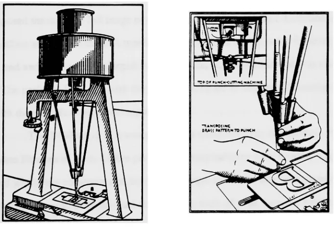
1. A hand punchcutter at his workbench: 1. handcut punch,
2. striking the matrix, 3. unjustified strike, 4. squared matrix
ready for casting,5.cast type . . . , 4
2. Lanston Monotype pantographic mechanical punchcutting machine
with a close-up of a brass relief pattern and the cutting tool
8
3. Times Roman R and a in high and low resolutions 13
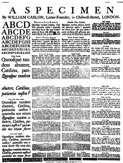
4. William Caslon and Sons 1734 Specimen Sheet 21
5.
Exaggerated English Modem style . 226.
Caslon, Dutch Old Face, English handwriting,and Baskerville original handcut specimens 24
7. Clarendons vs. Egyptians 27
8.
Specimen of Bodoni . 299. Specimen of Akzidenz Grotesque . 35
10. Example of a feature plot with sample data 40
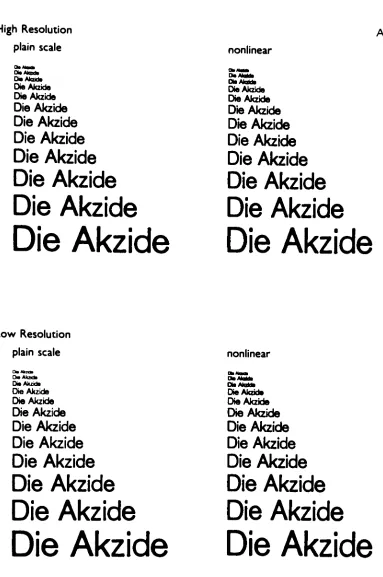
11. Visual display of horizontal growingandscaling . . . 43 12. (Caslon CWO) Comparison of synthetic letterforms with handcut letters 47 13. (Caslon EHR) Enlargements of synthetic and original sizes at high resolution 48 14. (Caslon ELR) Enlargements of synthetic and original sizes, low resolution 49
15. (Caslon RS) Full size range of synthetic letterforms
at high and low resolutions. . . . , 50
16. (Clarendon CWO) Comparison of small, medium and large sizes
of synthetic letterforms with original handcut letters . 51
17. (Clarendon EHR) Enlargements of synthetic and original sizes,
high resolution . . . 52
18. (Clarendon ELR) Enlargements of synthetic and original sizes,
low resolution . . . 53
19. (Clarendon RS) Full size range of synthetic letterforms at high and low res.
54
20. (Bodoni CWO) Comparison of small, medium and large sizes
of synthetic letterforms with original handcut letters . . . 55
21. (Bodoni EHR) Enlargements of synthetic and original sizes, high resolution 56 22. (Bodoni ELR) Enlargements of synthetic and original sizes, low resolution 57 23. (Bodoni RS) Full size range of synthetic letterforms at high and low res. 58 24. (Akzidenz CWO) Comparison of small, medium and large sizes
of synthetic letterforms with original handcut letters . 59
25. (Akzidenz EHR) Enlargements of synthetic and original sizes,
high resolution . . . 60
26. (Akzidenz ELR) Enlargements of synthetic and original sizes, low resolution 61 27. (Akzidenz RS) Full size range of synthetic letterforms at high and low res. 62 28. (Times Roman CWO) Comparison of small, medium and large sizes
of synthetic letterforms with original handcut letters . . . 63 29 .: (Times Roman EHR) Enlargements of synthetic and original sizes, high res. 64
32. (Helvetica CWO) Comparison of small, medium and large sizes
of synthetic letterforms with original handcut letters .
67
33. (Helvetica EHR) Enlargements of synthetic and original sizes,
high resolution
.
.
.
.
.
.
.
68
34. (Helvetica ELR) Enlargements of synthetic and original sizes, low resolution
69
35. (Helvetica RS) Full size range of synthetic letterforms at high and low res.
70
36. Feature equation plot showing nonlineareffect
within the size range 6
to36 points.
. ,
74
37. Range ofresolution for which the nonlinear scaling model
can
be applied using the values of Bv and Bh
93
38. Classifications of horizontal and vertical measurements
105
39. Implementation of scale and growth factors
106
40. Upper case serif width
122
41. Upper case seriflength
123
42. Lower case serif length
124
43. Upper case stem width
125
44. Lower case stem width
126
45. X-height .
.
127
46. Ascender height .
128
47. Descender height.
129
48. Lower case
0bowl width
130
49. Capital letter
0width
131
50. Capital letter H width.
.
.
.
132
51. Horizontal and vertical scale and growth parameters
133
52. Capital Letterform Nomenclature
.
135
53. Capital Letterform Nomenclature (continued)
136
54. Lower Case Letterform Nomenclature.
.
137
55. Lower Case Letterform Nomenclature (continued)
138
56. Ligature and Serif Nomenclature
139
57. Additional Nomenclature
140
CHAPTER I
INTRODUCTION
Handwritten letterforms come in a variety of sizes for a given design. This
practice was carried over from the scribes into the early production of printing types. As
printing and the manufacturing of printing types evolved, type became available in a wider
range of sizes and designs. Printing types which were manufactured by hand had certain
design features that were size dependent For a particular typeface in a given size,
individual feature parts had subtly different proportions
tocompensate for the size at which
they were manufactured. These optical compensations produced an overall consistency in
design and legibility through a range of sizes and later became known as
optical scale
in
type design.
In
the last one hundred years there have been advances in the design and
manufacturing of printing types towards automatically scaling letterforms. This involves
converting a drawing of a given character (the
reference character)
into another size with the
same or similar proportions to the original.
Iffeatures remain a constant proportion of the
original reference image, this practice is known as
proportional scaling.
Another possibilityexists to do automatic optical scaling that approximates what
hand punchcutters practiced when they did everything by eye and by hand. This would
mean converting a drawing of a reference character into another size with features that had
different proportions than the original. This practice could be called
non-proportional
or
produce computer-generated digitalletterforms that simulated optical scale in handcut fonts.
This research is an investigation into the automatic optical scaling of type
designs. This thesis describes a model of individual feature scaling, a model of letterform
scaling, and a method of testing the letterform scaling model. Inthis study, letters were
produced by both the nonlinear and proportional scaling models, and were evaluated both
visually and technically.
The rest of this chapter is a summary of the changes in the technology of type
design and manufacturing and how these affected the scaling of type designs.
HandPunchcuttim~
Before 1885, the process of designing and producing lead printing types from
handcut punches remained practically unchanged since the time of Gutenberg (1450).
Letters were designed and steel punches were handcut for every character in every point
size. A punchcutter had to follow a rigorous discipline to cut every character in every size.
Giambattista Bodoni (b. 1740 d.1813), an accomplished type designer and hand
punchcutter, states:
Truth to tell, not many people would think that the number of the matrices for one Roman comes up to one hundred and ninety-six, and one needs another one hundred and eighty-four for the Italics of the same width and type-face, to be interposed with Roman type when necessary. So, to make an accomplished
equipment of types, three hundred and eighty matrices are needed for one text1
Sometimes the designer was the punchcutter, but more often, the designer
worked closely with a punchcutter. Of the designers of fonts in this study, itis known that
William Caslon arid Giambattista Bodoni were type designers and punchcutters as well as
the matrix makers and type casters for their fonts, while William Besley worked with the
punchcutter Benjamin Fox to arrive at the Clarendon design. Unfortunately,itis not known
who officially "designed" and cut Akzidenz Grotesque. Drawings and sketches usually in a
single size were used as a guide and the other sizes were visualized and interpolated by eye,
given the experience of the punchcutter.
Human visual perception was integral to the punchcutting process. Every aspect
involved the action and judgment of the punchcutter. His eyes and hands manipulated every
edge of the form. No mechanical or optical system could duplicate the way a hand
punchcutter worked.
The relation of small to large must be made evident not by uniformity but by skilful
variations. Yet there must be a pattern letter in the reader's eye that is reproduced as
well as possible in every one of a range of sizes. The punch-eutter must see this
letter in his mind's eye and cut it in all the necessary sizes with the right adaptation
to scale. It must be a letter that is as suitable for large as for small types, handsome
enough for the main line of a title-page and clear enough for a footnote. Many of
our modem types fail at one or the other extreme: some in their large sizes are
obviously mechanicalenlargements, others have small sizes that are
illegible.SOne's familiarity with the letter forms came from repeated practice of drawing
and visualizing the forms until they became second nature to the hand and eye. This was
essential to the success of their producing a font which appeared uniformly smooth to the
eye.
A punchcutter's tools consist of sharpened steel gravers, files, awls, gauges, a
vise, sharpening stones, a facing tool, a strong magnifying glass, and smoke proofing
tools. With the pre-visualized letters or drawings and tools, they cut punches, and
sometimes on a good day, finished three.3 See Figure
1.When the punchcutterjudged a character to be correct in design and scale by
making smoke proofs, the punch was hardened and struck into a brass or copper bar,
which became the
strike.Sometimes during the process of forcing the punch into the bar of
2Harry Carter, "Letter Design and Typecutting," Journal of the Royal Society of Arts (October
1954), p. 885.
copper or brass, the punch would break or twist. It then became necessary for the punch to
be replaced. Also the strike could be misplaced on the bar and the whole striking process
started over. Once the strike was good,itwas "justified" by a justifier. This was a process
of filing and smoothing the strike to base and width align,making sure all the edges were
perfectly parallel and square, flush with other printers' types, and with level face. It then
became a matrix for casting type. The justifier played an integral role with the designer and
the punchcutter in the success of the font. This position, which has been overlooked in
more modern times, took years of training and specialized talent, and once gained, allowed
the justifier to become a very important member of the "team" in typefounding.
Figure 1.A hand punchcutter at his workbench: 1. handcut punch, 2. striking the matrix, 3. unjustified strike, 4. squared matrix ready for casting, 5. cast type.4
Mechanically, it is a highly skilled operation and something more than mechanical accuracy is needed, because an eye for counteracting optical delusions and
producing a harmoniously spaced and aligned alphabet is essential. A good justifier is the condition for success in making printer's type. In the past he has generally taught punch-cutters how to make alphabets that work well, and it is his judgment of a punch that the trade accepts.
s
The scale relationship of letters was of the utmost importance to the punchcutter
and required painstaking attention todetail. Achieving a smooth progression of size and
eveness of weight from small to large was a difficult task, but it gave the font a unified
appearance and harmony. Characteristics of sizes were compensated for. The smaller forms
are traditionally relatively more open in the counters, larger in x-height, slightly heavier in
stem weight, wider in character width, and with shorter ascenders and descenders. The
larger sizes are relatively more enclosed in the counters, smaller x-height, lighter in stem
weight, more narrow in widths, and with longer ascenders and descenders. When different
sizes of a design were used together they related well. Different sizes were made to be used
together as well as with their italic companions. The fonts were not considered successful if
they seemed overbearing in one size, clumsy in another, or awkward when seen together.
A sense of scale and the adaptation of letters to the various sizes of type so as to make them all as comfortabletothe eye as possible is a very important part of the letter-cutter's art. It is a mistaketothink that a range of types from great to small can all be made from one set of drawings. I said that before he can begin cutting a letter, a punch-cutter must have the whole fount in his mind's eye; but in fact he must do more. He must conceive a fount that is susceptible of a production in all the various sizes in which type is needed.P
For four hundred years the processes in hand punchcutting remained almost
unchanged. Every character, in every size, was carefully considered as an inherent part of
the process. The techniques of nonlinear scaling where features change at different rates
based upon the human visual system became firmly entrenched. Together, they presented a
standard which, though desirable, modern type manufacturers found expensive and time
consuming to emulate.
Mechanical Punchcuttini
In 1885, Linn Boyd Benton filed for a United States patent to apply
pantographic principles to the mechanical engraving of punches and matrices. Benton's
punchcutting and matrix cutting machine marked the beginning of the mass production of
punches for automatic mechanical typecasting, such as the Linotype and Monotype
machines. These automatic typecasting machines needed vast quantities of punches and
precise replacements for the ones broken in use, as well as matrices. No punchcutter or
group of punchcutters could ever fufill this need and, obviously, without the punches with
which to replace the worn or engraved matrices there could be no typecasting. The
invention of Benton's machine contributed largely to the financial success of the
Mergenthaler Linotype Company and Lanston Monotype. Precision, speed, price, and the
relative ease with which mechanically cut punches were made paved the way for the
widespread use automatic typecasting, and ultimately, printing.
The pantograph machine operates on a reduction ratio principle. An operator
traces around the outline of an enlarged relief image, which is the "pattern". Adjacently,
overhead and upside down, a sharpened steel cutting tool, functioning as a drill, shaves
away steel from the exactly positioned punch. After many circuits around with differing
sizes of drills, the punch is finished to the specified point size. All surfaces are perfectly
smooth, and it is ready to be struck.
Three to five different sized patterns are needed to approximate nonlinear
scaling of a full range of point sizes on the pantograph machine. The smaller sized patterns,
which are approximately two inches, retain characteristics of smaller point sizes such as
relatively wider character widths, thicker stroke widths, larger x-height, wider bowl
tall, were used to retain the characteristics unique to larger point sizes, such as relatively
narrower character widths, thinner stroke widths, smaller x-height, more enclosed bowls,
and longer ascenders and descenders. When the entire font was cut from several size scaled
patterns the type was better able to capture the nonlinear qualities of handcut types.
Mechanical punchcutting also changed the working process of the type
designer. Except for a few notables, such as Fred Goudy, the designer was in general not
the pantograph operator.
In
hand cutting, the punch can be called the only original work ofartin the whole process of making type. It is that single and unique object by which one can obtain as many as 500 matrices, each matrix being capable of forming millions of types. But in machine cutting the unique object is the drawing, from which any number of patterns can be made, each pattern serving for any number of punches of theletter."?
For mechanical punchcutting the number of decisions involved in the creation of
a font was greatly reduced. With three or four patterns (at most) for each letter, the different
machine settings could interpolate the sizes in between based on a linear scaling
relationship. The pantograph offered repeatable results, which at long last the automatic
typesetting industry was awaiting. The family of type that the designer had once conceived
in his mind's eye, could now bedone automatically on the machine, instead of from a
punchcutter's hand.
In
an attempt to imitate the nonlinear relationships in handpunchcutting, the standard machine settings sometimes were changed and the letters were
slightly distorted. This imitating was not common practice and done only at the discretion
of the designer, instructing the pantograph operator. The types of this time were generally
considered to be It • • •too much influenced by the facility of the pantographic drill which
can cut the Lord's prayer in relief on a 1/6 inch square.tf It was also felt that something
7Beatrice Ward, "Cutting Types for Machines: A Layman's Account," The Dolphin Number Two (1935), p. 64.
precious was being lost with all the new mechanical primness.
Virtue went out with the hand-cutter when the mechanic came in with his pantograph and the rest of the gear. The new engineers were not what the old
engravers were. They could mass-produce, or reproduce, punches;they could not
create, or recreate, the engraved quality that had belonged to typographyin the
roman letter since 1465."9
Still, people embraced the new technology because of the improved speed,
precision, lower cost, and availability, while trying to maintain some of the previous
typographic values of creativity and design integrity. Some companies did better than
others at this, but the primary goal of the day was to build a library of pre-existing older
[image:16.540.94.435.312.546.2]designs in a full range of sizes and make them available to a mass market See figure 2.
Figure 2.Lanston Monotype pantographic mechanical punchcutting machine with a
close-up of a brass relief pattern and the cutting tool.!?
9Stanley Morison,A Tally of Types (Cambridge, England: CambridgeUniversity Press, 1973), p.99.
Phototypesettini
Phototypesetting entered the market in the early 1960's with the same goals as
automatic typecasting: desire for increased precision and speed of typesetting with reduced
manufacturing costs while covering a full range of designs and sizes. A type designer
would create a set of drawings used as "master" images which were then classified into
three broad point size categories: small, medium, and large. Manufacturers introduced these
masters to reproduce the full range of sizes with more authenticity to the original design,
and to help minimize distortions inherent in the system. But, purchasing three film strips
cost more than purchasing one, and very often users did not buy the full range of masters
to reproduce the size range. Instead, they frequently used a single sized intermediate master
and arbitrarily extended its range. Using a variable optics system to size characters as they
are exposed through the full range of sizes introduced even greater distortion, especially at
the smallest and largest sizes. A typeface design ideal at twelve point for text proved too
bulky and awkward when enlarged to display size, and when reduced was too light and
thin. The problem here was with the users, who failed to buy the differently sized masters,
not with the manufacturers who supplied them.
The 1960's and 70's was a period of extensive type duplication. New and
complete libraries of fonts for the phototypesetting industry were needed. Type designers
worked within the constraints of the new hardware and made their compromises in the
name of economics. They still had their familar tools of pens, pencils, brushes and were
able to integrate the camera, a new tool, easily into the design environment. They were not
able to exercise the freedom of their predecessors, the punchcutters, or the mechanical
engravers, in considering every character in every size of the series. Instead, a few sets of
drawings were made and the other sizes were photographically interpolated Generally,
emphasis continued to shift towards automation of production and manufacturing, reduced
technology. What had started out as acraft (punchcutting), where every step of the process
involved human hands touching the objects involved, was indeed turning away from that,
and into an industrial business.
Di~talTxpomphy
In the late 1960's, digital typesetting entered the market and introduced another
significant change in the methods of manufacturing type. There were new problems unique
to this technology. The traditional methods of creating drawings with pens, pencils, and
brushes presented complex difficulties, especially at lower resolutions, when transferring
drawings into a digital format. As Fred Goudy, an accomplished type designer, said in
reference to copying type designs, "You just can't pour all the honey out of a jar. Some of
itis always left behind."I I This is especially true of converting pre-existing type designs
into a digital format. The challenge to the present day type designer is to faithfully
reproduce and maintain stem, serif and hairline weights as well as smooth edges and
diagonals over a range of sizes in digital typography.
In the process of transferring a pre-existing type design into a digital
representation, the image is broken up by a grid laid over the characters. The resolution of
the grid can vary from very coarse to very fine, and each element in the grid is a piece of
information that gets stored away. In the conversion from analog to digital there is an
inherent loss of detailed information, because some of the elements will only be partially
filled. Instead of "painting" by hand in a continuous movement with a sable brush filled
with ink, a machine, the computer, is "stamping" and storing discrete points as data. New
tools need to be incorporated into computer aided design systems that address and minimize
the differences between media
A significant factor in design fidelity is the resolution of the grid, also called the
raster, laid over and enforced on the character. To draw a character on the inner face of a
cathode ray tube (CRT), the lines traced by the flying spot of light can be placed either very
close together for higher resolutions, or farther apart for lower resolutions. For higher
resolution rasters, the problem of character distortion from information loss is minimized
by the increased number of discrete points that defme the character. Conversely, as raster
resolution decreases, there are fewer points to define the character, and the consequent loss
of character information can reduce character legibility. (See figure 3 below.)
=liii===iII!!!-_
-_...
--II=:
-==
III
--_
Iii
--__Ii:..
.
_
....
-
---=--
--••••
---
-...
----
-
...
...=...
Figure 3. Times Roman R and a in high and low resolutions.
Inone sense, the raster resolution (dots per inch) defmes the possibilities of
character weight and scale, while design requirements dictate the important
inter-relationships between the parts of letters. Capita1lener height, x-height, ascender and
descender heights, stem width, hairline width, and bowl widths are predetermined within
the EM square by a type designer. These relationships vary with size and do not always fit
neatly into the inflexible requirements of the raster, especially at lower resolutions, where
edges will be made to map onto the discrete points of the screen. The pixels (PIC-ture
EL-ements) that are filled by the character will be recorded. Any point that is not mostly filled
by the character may be discarded. This process is system dependent, but all systems must
use this or a similar method to digitize characters. Over a range of sizes, the design can
become uneven in height, weight, and color by being too dark or light, or too wide or too
narrow. This makes the reproduction of any design, as well as the creation of a new
design, difficult to maintain with the inherent limitations of the raster.
The problems of faithful design reproduction are compounded by the fact that
digitaltypeis modelled after a set of drawings, which inturnhave been linearly scaled in
both directions, to complete the full range of point sizes. A single size drawing, distorted
by the raster, then interpolated to every point size, can represent a serious typographic
compromise thattypedesigners are often forced to make.
The basic method for exposingtypeonto the inner face of the cathode ray tube
(CRT) is by accessing a reference image already filed and recorded in digital storage. With
the decreasing cost of computer memory, the trend has been to store representations of
fonts in digital form, on magnetic tape or on hard disc. However the fonts are stored, they
will activate "stroking patterns" that will in tum cause the writing spot to paint the letter
onto the phosphor coated inner surface of the CRT display.
When type is scaled from a digital master, it is manipulated by proportionally
reducing or enlarging the length of the stroke and the spacing values between the strokes
with respect to a reference image. This is done by the set of instructions which scale the
letter from the reference image. At the core of the instruction set is an equation that specifies
how to create the new size. This set of instructions is a formalization of a similar kind of
action that the type designer/punchcutter intuitively did when they created a range of sizes.
d=(h/H) D
where d= new length
D=reference length
h=new height
H=reference height
Since the invention of phototypesetting, few attempts have been made to
implement traditional nonlinear scaling techniques in the type design. Digital font
production might now make use of it, except for the fact that proportional scaling is faster,
cheaper, and better understood. Nonlinear scaling methods have remained largely
CHAPTER II
LITERATURE REVIEW
The literature directly addressing the topic of optical scale in type design is rare
and usually found piecemeal, in books and essays. Historically, type designing and casting
were considered a "secret
an," one that privilegedmen learned behind the closed doors of
the private typefoundry. Also, as a design activity, there really were no set rules; one just
learned on the job. Knowledge was handed down from the master to the apprentice through
word of mouth and by experience. Harry Carter's book, A View of Early
Typo~hy,covers the many aspects of this topic in detail. The design knowledge was primarily visual
and intuitive, and largely nonverbal. The workmen in the shop were basically craftsmen
and spoke the same language of
craft.A pointing of the fmger or a nodding of the head was
often all it took to indicate a design correction. Or sometimes it was a a phrase scribbledin
the margin--"too light" or "like this"--with an arrow pointing to a serif or a bowl)
Examples of this kind of communicationcan be seen even today in John Dreyfus' article,
"The Dante Types."
When
itcame to matrix-making and typecasting, it was a slightly different
story. Joseph Moxon wrote extensively and in great detail about these early printers hand
crafts in his book entitled MechanickExercises on the Whole Art of Printini in 1683.
In1764, Pierre Simon Fournier published his Manuel
TypQ~hique,in which he describes
the practices and philosophies of punchcutting from a particularly French point of view.
These books, a few other chapters, paragraphs, and a few vague sentences elsewhere
represent the sum of writing about optical scale in relation to punchcutting. As mechanical
punchcutting began to dominate the scene, and the few surviving punchcuners retired, their
influence waned. The new "industry" was getting underway.
Years later, during the popularization of mechanical punchcutting, Beatrice
Warde published an essay called "Cutting Types for Machines: A Layman's Account."
This article clearly outlines the process of mechanical punchcutting and its relation to
manual punchcutting. It compares the linear scaling achieved by the camera lens to the
nonlinear scaling achieved by manual punchcutting, and discusses the manner in which
artwork is prepared in the different type design processes.
In 1937, Harry Carter, a noted historian of typography and printing, published
what most type aficionados believe to be the definitive article devoted to this subject, called
"Optical Scale in Typefounding." It discusses the problem of optical scale in terms of the
technology of the day--in terms, that is, of lead printing types. He distinguishes the
different qualities and uses of early printers' types and points out the evolutionary changes
that occurred in the history of the typefounding "business": "It is clear to anyone who can
examine enlargements of hand-cut types that the good punchcuners varied the design, or at
any rate the functional features of it, to suit the scale on which they worked."2 From his
perspective, the economics of labor, time, and adaptation led the industry towards linear
scaling techniques.
The introduction of phototypesetting in the early 1960's did not substantially
change the methods for designing type as much as it radically affected the environment in
the composing rooms in most industrialized nations. Mechanical punchcutting design
methods were applied, and, in conjunction with the new technology, streamlined
operations by several orders of magnitude. Because the existing technology was unwilling
to address the problem of optical scale in type design, there was very little literature written
on the topic during this time. The technical innovations of the time up to modem digital
typography, as well as the political shifts, are documented in Seybold's Fundamentals of
Modem Pbotocomposition, published in 1979.
In 1967, digital typesetting machines entered the market and initiated a
substantial change in the type design process. As computers increased their capacity for
larger, cheaper storage, and more sophisticated programming environments were created,
correct optical scaling became more viable. One of the most prolific and articulate writers
on this topic is Charles Bigelow, who has written a series of articles on digital typography
for The Seybold Reports orrPublishini. These articles provide, in lay terms, a clear
historical and technical description of the achievments and problems in the evolution of font
design and manufacturing. He explains how the computer can become a more valuable tool
for designers, especially when traditional notions of integrity, beauty, grace, and legibility
in letterfoms can be incorporated. He expresses a clear understanding of the limitations as
well as the potential inherent in computer aided type design. High, mid,and low resolution
problems are specifically addressed and philosophical as well as artistic guidelines are
prescribed for problem solving. His careful considerations are likely to benefit both
engineers and artists.
Also pertinent is the article"Automatic Scaling of Digital Print Fonts," written
by Richard Casey, Theodore Freidman, and Kwan Wong. Their research dealt with the
high fidelity conversion of a digital image defined in one resolution to another resolution,
using linear scaling techniques. Their software program was designed to reduce the human
Another software program was written by Philipe Coueignoux in 1975 for his
MIT doctoral thesis, "Generation of Roman Printed Fonts". In his program, called CSD,
an acronym for Character Simulated Design, characters are defined by unique elements
called "primitives", any number of which can be combined to make a letter of the roman
alphabet, a logo, or an icon. The primitives are a set of routines which define a grammar of
parts--that is to say, they provide a way of talking about the construction of letters. His
program assumed that skilled designers would understand and incorporate nonlinear optical
scaling techniques in their design of fonts.
In September 1985, Richard Southall, who had been working with Donald
Knuth at Stanford University on the Metafont project, published "Designing New
Typefaces With Metafont," a paper that addresses the complex problems of symbolic type
design--that is, the design of type using symbolic or verbal means (such as computer
programs), rather than direct graphical means (such as pencil and paper). The paper initially
provides a "conceptual framework" in which a consistent terminology is presented for type
design and production. Within this framework Southall carefully traces the different
historical processes and artifacts involved in digital type design, manufacturing, and
printing.
Southall insists that even when computer-assisted design tools are used to
design letterforms, the final judge of their success is still the eye. "The programmer's
remark that 'the character shapes must be right, because the programs are right' is not
entirely a malicious fabrication by the designers. All one can say in reply is that it is the
character shapes, not the programs, that the reader sees."3 The programmer's remark will
not betrue until adequate models of the perception and behavior of letterforms have been
CHAPTER III
FONT HISTORY
The purpose of these font histories is to provide additional background material
and place the fonts used in this study within a historical context. It will also show why
these fonts are unique in typographic history and the contributions they made to this
research. By tracing the models of the four original designs in this study, a deeper
understanding of the designers, forms, structures, and influences will be revealed. This
information will be the foundation of the evaluation for the critique of the fonts generated
by the various algorithms in this study. It is important to know the artistic influences on the
shapes and aesthetic preferences of the designers, as well as the influence exerted by the
new designs themselves.
Each type design in this study was carefully chosen because it was produced
from handcut punches and it represented a new and longlasting design. They represent
classifications from Old Style (Caslon), Clarendon (Clarendon), Modern (Bodoni), and
Sanserif (Akzidenz Grotesque). They are also each unique in design, and when analyzed
together provide a broad basis for a theory of the behavior of optical scale in type design.
Also given is a practical understanding of the processes and tools of the artists as well as an
understanding to of the extent to which their tools influenced the designs. It is interesting to
compare the 16th and 17th century typefounding scenario with today's modern day digital
Caslon
William Caslon was born at Halesowen, England in 1692. As a young man he
apprenticed himself to an engraver of ornamental gunlocks and barrels in London.In 1716,
he started his own business doing silver-chasing and cutting tools for bookbinders. During
this time he did some lettering for bookbindings and handcut punches of type. Around
1720, with the help of William Boyer, an influential London printer who recognized his
skill, he began his initiation into letter-founding at the prestigious James foundry
workshop.
His first commission from The Society for Promoting Christian Knowledge,
was to cut a font of fourteen point Arabic for a Psalter and New Testament. At the bottom
of the proof sheet he printed his name in twelve point roman letters which he had designed
and cut. These letters were so admired and successful that he was persuaded to cut the rest
of the letters in both roman and italic. In 1725, these fonts were completed and marked the
beginning of his own business in letter designing and cutting. It wasn't until 1734 that his
first complete broadside specimen sheet was issued showing fourteen faces of roman and
italic, seven faces of two-lines, seven faces of flowers, and also seventeen faces of foreign
types. (See figure 4 for a reproduction of the 1734 specimen sheet.) Most types printed on
this sheet were cut by Caslon, with a notable exception being the French Canon size
roman, which was acquired from a purchase of fonts from the Andrews foundry and
originally derived from Joseph Moxon's foundry.
During the next fifty years Caslon's types received international success until
approximately 1780, when Bodoni's Modem design came into vogue, and superseded use
of most other designs. From 1780 to 1840, there were no printed specimens of Caslon's
type being offered from the English typefoundries. By 1840, the Modems in use in
England had deteriorated to a visually disreputable state, mostly by poor imitation of
A
SPE.CIME,N
,...
...
_
...JI"':'lI~",,""{''''\'';os.-"I'm'~~-,_ 1lolol"~' us"':. ~·'."'lI1;l::;.'Ir.:l.-.'-"'Iw,,~arur
l:. :t\"""~=,,::,:a.
...
-.
JlaOW&fXllUfo _ _ _ _
..".~IUK&f,IM, . .ow ipGII. .~
a..'r..afOW~IWIX/I- _ . . . "
cmllii:...,.
~....
--'-):~ :..
.
[image:28.539.54.475.71.628.2]&...
..lU,;...
&.... • ,;. &....~.,... .:..r,;.:u.
,;.
..
"....,...,.
::. ..;,.....
,;;H ...
~E:.~~~'i~
"'f!I'; ...,."",. ..."'!':'""'!="'t'!I"'-!
re:7~'l'i'mI"Trt/"!:"'!!orm'''''''i';1
11m-~p'"-.
t-..::n'1"lI"".,~",,:r.+...~
~",." =n-t .. . "~n:J '""rvm
;;=;:~.=.~ -",,"F""IlP ... _.".,:""'"'~
...
~~~~cn::::-..;;a~
1""""'-Tl'W~""1~"""~"",
'J='mG'"'IIOrr.1M",:-;;'fI'I~",",-.r;.".
£/T'II Gowk.
n,il.r.
+;. ...;
rJ)o'~...:."'!f.ft~AlK{iftfI • ..,rAlirwr.~).Itw!'lfiftc
.~ ~.. :r'll'MrJib. . :. . .,. ,..,....
~r":~·';:~h
I'taGowk. •
~:.~~~.~~
...~
..-"-r" _,..,..r~,.."...-,.;.
~~-;.:~: rt-~t..:..:
~1_•.,;~..GIrI&ti
~w....1 ~""'i:'~.J2..•.:!
~=:-.:::.;~---
-
:::••-::-z:;;.:...
~:=..~~-::Ea~:p=
~
...
_
...
-
...
-
....,.$.1111111111111111111&
...
~'tr.;,t ~ ::..~e:.:::
,..~-t-J.. _ -'~t... _
P~...
~--~I~i:.r--..I
""-,-
~.I- ~.,."""' lll~....
"'.~"'_ ~.u ...,...0I'it-r'6litI. Ho e.
::'';;Jl:I:''t:,'::.-'':J:i:t'ft/:;:'·.=
'_~";II,oIftJi" '''-''''_''1'.",_",_
.'_1,•. ,.~';IIIjiI/I....,'Jfi.;Ill6f.·S_" '!I;,
e.-MU,,,,,..JtrIil.YtfII,:~ww,_ N.,.",1.,,.,1,.1tIi.
~'::':'::~::.~-:.;;~,;-~-::~~.~.fi:t.-:~'t::~-::;~~~
.IBC;lJ£ FaIt'1 K t:M,VO'.!t..R.iT.YIYUXI·Z S..upj,.. ltor/;,I.No ••
;:;.i!-:"7:::t",..;::,(...~~~,':~7",,~::.=
,.. ,,,,.,,, ,..~" t/IlIf" ...t',~"•• '" "'''''''IIJ ..."••.
,.. ,./"".p.'Mjit,..,.,t/,;","'.'1'''''- "'!ft.(;,,"1,_, ,...
~E:.:"BCDI FGHlritl.Al.\·U
..
~7~]·::E::.~i~~=P~R.iT'JlilYxrz£"-''''_'''''''''.''''11''
,-".•."',,""~·f"-"'·'.i't...."..,._.,up
--.. .-1'-.-.'/Wo••. , "'P',,,,n-j,, , _
,_..,....,_""~,... ,.,.. ji-li.,-...,.,..".,..II
::r~.:!/i::'...~~~ ~"::,7';.%,':;:t;
~_'",.It6i'.I!"..,~••,-"_,,,,~,..
_h.
?iii;::n~::·;:t~rriJ~~ ~~~Tr?z;
Lner..."."Mo.I.No I.
~~~~~i~~ft~~~~
, ..;:;;'i;'~~i;t;~';i 1~·~~:.:.·~';'t;ii~xi~~--...-.
5~';:.'~;::~~~~~~
=:'::"~:'~":::''"'';-''J::'''"...- ' ':'-J-:::
" . I... _,,.. ., . -..~.~.=-..: ~t1frn~~~~....;;.:;;
.•
_,-""'"""-~=!~~{~
...
,..
...- e _ t..u- 4....e-_' __~ .
e:., _ , ,- _
::.::·.:=~·~U.:A~:--""~.:":;...~:~·,~:.:
~~~f~~!.~g~~S
Twa LinosEngtilh.<t,uoufque tandem abu-tere, Catilina, parientia
noftra? quamdiu nos
e-tiam furor ifte tuus
elu-!{.1IfIII!;lIe tandem.tere, CflIi!iita,patlelltiallDjlra! fjlllJlllliiulIDSeliam jUror
ABCDEFGHI
ABCDEFGHIJK
ABCDEFGHIJKL
ABCDEFGHIKLMN
·-1 f-I •( _ I I _ 1 I •
By WILLIAM CASLON, Letter-Founder,
in
ChifweU-8treet, LONDON.
ABC D
DOUBLE PICA ROMA". DMlkPi~" 11,,1i~1.Q!ourquctandem abu.. " Cab- ~J;"
,,,l1li,",
,,1M"",
Ctllili-lina,.,-tiencia noftra?quamdiU .",fJ",i,.,i"
1ItJjJ,,,,
flltllIIIIi.A B C D E
...
etJamfurori~tu'l8c1udc:c? fIfJI"i,,",f·",ijI,'.111
,I.",,!
quemad fincmr~ ~:jac. ,.,,,, "Iffl"''''
j''.fi'.ff"IttII"jtI~ABCDEFGHJJK~NItlOP .lBCDEFGH7.1XLMNO
ABCDEFG
F_e:u-.Quoufque
tan-dem
abutere,
Catilina,
pati-~oufl1Je
tondem
almtere, Coli/ino,
potientio nojlro?
extreme by exaggerating the thick strokes to an extra-extra bold weight and decreasing the
thin strokes until they were almost illegible scratches. See figure 5.
FRENCH CANON, No.1.
Outmsque tandem
abute-re, Catilina, paticntia no
stra?
quamdiu nos etiam
.fUror iste tuus
eiudet?
Ii
ABCDEFGHIJKLM
V.FIGGINS.
Figure 5. Exaggerated English Modem style)
With many of these fad types no longer suitable for text setting, in 1844 the
British were ready for the revival of their Old Style designs, primarily those of the Caslon
foundry in London and John Baskerville of Birmingham.The Caslon foundry was able to
supply their customers fonts from their original matrices, an advantage, since other
foundries had destroyed their matrices, believing Old Style designs to be outdated. William
Caslon the elderdied in London in 1766, at the age of seventy-four. The foundry was
carried on by his family until 1874, when Henry William Caslon passed on, and the
business was taken over by his manager T. W. Smith, whose sons assumed the name of
Caslon, and continued operating the foundry. In 1937, when the firm of H. W. Caslon&
Co. was dissolved, the Caslon punches were distributed to Stephenson, Blake& Co. Ltd.
of Sheffield, England, and to the St. Bride Printing Library, London, England.
Caslon's design style was influenced by the Dutch Old Face designs cut by
Christopher van Dyck between 1648 and 1670. These designs were in use throughout
England preceeding Caslon in 1720. The English had adopted the Dutch type because of a
lack of experienced type designers at home as well as the quality and availability of the
Dutch fonts. It was thought that, "The Dutch artists appeared for the time to have the secret
of the true shape of the Roman letter...."2Caslon used the Dutch Old Face design as a
model for his designs while giving them some new characteristics. Caslon's fonts were
preferred for their "human, comfortable, friendly to the eye, English" qualities. "... [H]e
introduced into his fonts a quality of interest, a variety of design, and a delicacy of
modelling, which few Dutch types possessed."3 He also had absorbed some of the
qualities of the roundness of English handwriting into his designs and this added to their
appeal. Caslon's fonts were well liked for their minor imperfections, which gave them
interest and revealed something about the human hand that made them.
His letters when analyzed, especially in the smaller sizes, are not perfect
individually; but in mass their effect is agreeable. That is, I think, their secret -- a perfection of the whole, derived from harmoniousbut not necessarily perfect individualletterforms. To say precisely how Caslon arrived at his effects is not simple; but he did so because he was an artist.4
His later contemporary and rival, John Baskerville (1758), was criticized for his types
being too perfect, the main strokes being too thin, and for his printing techniques blinding
the reader. In actuality, their types were not substantially different. See figure 6.
2Daniel Berkeley Updike, Printing Types, Their History. Forms. and Use, A Study in Survivals,2vols (Cambridge, Massachusetts: Harvard University Press, 1922), p. 100.
PICA ROMAN.
Melium, novis rebus ftudentem, manu fua occidit. Fuit, fuit ifta quondam in hac repub. virtus, ut viri fortes acrioribus fuppliciis civem perniciofum, quam
acerbiffimum hoftem coercerent. Habemus enim
fe-natufconfultum in te, Catilina, vehemens, &grave:
non deeftreip, confilium, neque autoritas hujus
or-dinis: nos, nos, dieo aperte, confules defumus.
De-ABCDEFGHIJKLMN OPQ..RSTVU WX
Erasme eerit
a
Bilibaldus Pirkheymer
en
1522.
Plerique infidiantur homini,
propemodum eonjurati ut illum
per-dant,
Ubi quid novi operis prodit, quod
~~~.krl~men
to
aml/nuJ~
tAar
~nun&l
tlJetzeA...,
otAU"tLd~/f"J
0~~.~
B
U T Job anfwered and faid,
2
Oh, that
my
grief were
throughlyweigh-ed, and my calamity laid in the balances
to-gether!
Figure 6. Caslon-, Dutch Old Faces, English handwriting", and Baskerville original handcut specimens'[.
5William Caslon, Type Specimen Sheet, 1734.
6StanIey Morison, On TY.J2e Faces (London: The Medici Society of Seven Grafton St London W. and The Fleuron Limited, 1923), p. 48.
7Alfred Fairbank, A Book of Scripts (Hsrrnondsworth,England: Penguin Books Limited, 1949), p. 48.
Caslon's fonts are slightly condensed with long descenders, closely fitted, and
the face is small in comparison with the body of type. Baskerville's fonts are more open,
especially in the counters, more consistent in both shape and line, and wider in set than
Caslon's. These more perfect features betrayed Baskerville's skill and training as as a
writing master. Although Baskerville never received the national attention and acclaim that
Caslon did, he was to have an influence abroad, both in Italy and France, that later
impacted the use of Caslon's fonts.
The Caslon fonts in this study were taken from the original 1734 Caslon
specimen sheet Ten different sizes that correspond to a unified design were carefully
selected and measured.
Clarendon
In 1808, Robert Thorne moved his foundry to No.2 Fann Street, Aldersgate,
where he stayed in business until 1820, as the Fann Street Foundry.In 1820, the foundry
was put up for auction and was purchased by William Thorowgood.In 1828, Dr. Fry of
the Type Street Foundry retired and his collection of leamed and oriental founts, as well as
his text, blackletter, titling founts, along with his ornaments, were purchased by the Fann
Street Foundry. This acquisition almost doubled their holdings. Robert Besley became
partners with Thorowgood in 1838 and the firm became Thorowgood& Besley. During
this time, in 1845, Benjamin Fox, who was an experienced and accomplished punchcutter,
issued the Clarendon series, under Thorowgood& Besley.? In 1849, Thorowgood retired
and the finnbecame Besley & Company, with Benjamin Fox being the partner. Alderman
Besley retired in 1861, when thefirm was joinedby Charles Reed. The foundry assumed
the name of Reed and Fox and joined in the revival of eighteenth century letters, when, it is
9TalbotBainesReed, The Old EnglishUtter Foundries,editedbyA.F. Johnson(London:
thought, Fox probably cut a face called Medieval. Fox died in 1877, and the firm became
Sir Charles Reed& Sons. After the death of T.R Reed, the firm was made a limited
company and was under the management of A. W. Tillie until 1905, when the stock was
bought by Messrs. Stephenson, Blake& Co. of Sheffield.
When Benjamin Fox first introduced his Clarendon design it was intended as a
heavy face to accompany lighter roman text designs, as in dictionary and display usage.
The design is based on a condensed Modern roman style which had been made popular
abroad by Bodoni, Didot, and Fournier. There was also an influence from an imitation of
an outline copper engravers font as well as a similarity to some architectural lettering of the
day. It is also the first design of what has been recognized as a "related bold". In 1845,
when Clarendon was first issued, it had the special priviledge of being registered under the
designs copyright amendment act and was protected from plagiary for the next three years.
Upon expiration, it was widely copied and became the stock in trade of printers of the day,
much to the dismay of Thorowgood& Besley. With this popularization, the name
Clarendon became synonomous with the kind of bold design of the original. Clearly, many
of the designs were poor copies of the original as everyone jumped on the bandwagon, but
the more prestigious typefoundries did use the Besley& Co. design for their own
reproductions.
Any attempts to depart from the original design, whether to escape the charge of plagiary or to suit national demands, only served to demonstrate how triumphantly Benjamin Fox had overcome the difficulties inherent in relating an extended and condensed type to the conventional modern-face roman.l?
The Clarendon designs are more refined than their related square serifed
Egyptians because of their lighter, more graceful, bracketed serifs and lighter, more delicate
main strokes. A recognizable feature is the curly tail of the capitalR.There is also a strong
horizontal emphasis from the bracketed serifs which combined with the large x-height make
it a very legible design. It has an overall grace and elegance which the Egyptians do not
have. See figure 7.
The Clarendon design remains one of the great successes of British typefounding. Bringing his superb technical skill to the inventive profusion of early nineteenth century letter design, Benjamin Fox produced a type based securely in the English tradition of letter design which had the compliment paid it of the sincerest form of flattery.11
Printing was first performed by
obtaining impressions from solid
blocks, type being invented at a
much later period, there having
MECHANISM OF PRINTING
BROADCASTING COMBINE
Makers of wireless receiving products
form organisation to protect interests
Figure 7.
Clarendons--
vs. Egyptiansl-'.llIb'd1 .,p.
12Types. Materials. MachineI)' Stephenson. Blake&Co. Ltd (London, England: Stephenson, Blake & Co. Ltd., 1922).
The larger designs (48 pt., 60 pt., 72 pt., 96 pt.) depart somewhat from the
relative unity of the smaller text sizes (5 pt. to 36 pt.), In 1956, a modem version of
Clarendon was reissued from the original matrices under the name Consort, by Stephenson
& Blake typefounders of Sheffield.
The Clarendon fonts in this study were taken from the original 1845 specimens.
Eleven different sizes that correspond to a unified design were carefully selected and
measured.
Bodoni
Cavaliere Giambattista Bodoni was born in Saluzzo, Italy in 1740.Inthis small
town in Northern Italy, he grew up the son of a master printer, Francesco Agostino
Bodoni. He served his apprenticeship with his father, where he learned the artof printing
and engraving. When he was eighteen, he moved to Rome and worked in the Vatican
printing house and typefoundry. He worked as a compositor for the Sacrae Congregationis
de Propaganda Fide, the center of the missionary enterprises of the church. His early work
there was to renovate the printing house where, two hundred years earlier, famous
designers and punchcutters such as Garamond,LeBe, and Robert Granjon were
employed. Around 1762, he left Rome and in 1768 was appointed Royal Printer to
Ferdinand, Duke of Parma, with the task of establishing a royal printing house. His
experience in Rome of working with punches and matrices of the finest designs gave him
the inspiration to be a letter designer and cutter.
With only one press, types from Pierre Simon Fournier Junior, one of the most
influential foundries in Europe, and two assistants, Bodoni was the director of the royal
printing house. In 1769, the printing house began to produce materials following the
current French style in typography with ornamental letters, flowers, and vignettes. Later,
in
design.
Indeveloping his own style he had been heavily influenced by the effects of
Philippe Grandjean and the French
Academie des Sciences romain du roi in 1692, Pierre
Simon Fournier Junior of France (1736), and John Baskerville (1757), an important printer
and type designer from England.
Quousque tandem
abutere ,
Catilina,
patientia nostra
~
quamdiu etiam
fu-•ror
iste
tuus nos
e-ludet? quem ad
fi-nem sese
effena-Figure 8. Specimen of
Bodoni.HBodoni's types were of a new class of designs which came to be known as
Modem Roman. Their main characteristics are a thin flat bracketed serif at right angles to
the main stroke, the same thickness as the minor lines of the letters, which were very thin
and sharp in contrast to the heavier main stroke. This greatercontrast between thick and
14Giovanni BattistaBodoni,Manuale tipographico del cavaliereGiambattista Bodoni,2
thin lines was a significant step away from the popular Old Style designs much in use at the
time. See figure 8.
Bodoni cut many varieties of designs in the same size for his own pleasure and.
moreover, because he was not compelled to sell his types for a livelihood.
Bodoni minutely varied his weight, his extruders and his serifs, as well as
condensing or expanding, in order to ensure that he could obtain precisely the effect in printing that he wished in different volumes. Yet all the designs were variants of a basic Modem letter form.15
Bodoni's clean precise type, sharply printed with intense black ink on smooth
white paper, in the simple and spacious composition style he had developed, was
remarkably novel and appealing, especially when compared to the more ornate French style
or the rather ordinary muddy printing of the day.
This new "Modem" style brought him international attention, with an especially
important note of praise of his types from an American contemporary, Benjamin Franklin.
His designs and printing style were successfully copied in France by his European rival,
the Didot's, as well as allover Italy, Spain, and Switzerland. As ducal printer, most of his
expenses were paid by the government, and he also had the luxury of working for his own
profit by selling his types. Throughout his career letter designing and cutting were his
passion. It is said that he spent his life perfecting his punches for them to be as perfect as
possible. Below he is speaking of his punches.
For as long as I live these are a permanant fund. whether I remain where I am or whether I go elsewhere, they will remain my faithful companions, ... they are more than that, I will say, they are my sons, and a father's love, which cannot bear to see faults in them, renders them dear to me so that I could not endure them to be tom from my side.16
Bodoni emphasized four qualities in creating a type design. Regularity, neatness
15Morison, A Tally of Types, p. 31.
and refinement, good taste, and grace are the main qualities that act togetherto create a
good solid
typedesign. Bodoni's notion of regularity is really about an understandingof
the deeper structure of letter parts relating to the whole design.
Analysing the alphabet of any language, one not only can fmd similar lines in many
different letters, but will also find that all of them can be formed with a small
number of identical parts, combined and disposed in various ways. Since, making
equal all that needs no distinction and marking the differences that are requiredin
the most outstanding way, we fmally give the form of every letter fixed laws and
rules which produce harmony without ambiguity, variety without dissonance and
equality and symmetry withoutconfusion. It is a natural advantageof this art
toprint each letter in the same way, though melting thousands of them in matrices
pressed by the same punch. But it depends on the skill of the puncher who
measures, and the parts, which many letters can have in common, should be exactly
the same in all of them. . ..
17Bodoni's emphasis on neatness and refinement, and good taste are reflections
of his background as a craftsman. It is an important aspect of learningvia apprenticeship
that one absorbs these sensibilities from the respected Master of the shop. Good taste is
really an understanding of typographically correct models for type design, based primarily
on knowledge of handwriting. Grace falls into a more subjective and spiritually oriented
category.
. . Grace is the fourth and last quality required by the beauty of types. Everybody
knows how difficult
itis to defme that beauty,charm, and loveliness which is
called grace. But since it certainly wants to look natural and instinctive,
ithas
tobe
so spontaneous and effortless, that we will not be wrong in seeking
itin whatever
is rare and perfect and seems a pure gift of God and nature, though it often results
from a long exercise and habit, makingdifficulties so easy that finally they are
beautifully done, even without thinking of them.
IS'It is these qualities that, when workingtogether, combine to make a beautiful
type
design. Bodoni's types reflect his ideas of beauty and perfection. The numbers in
which he produced them and the passion with which he created and perfected them has
been a model few other type designers have attained.
Cavaliere Giambattista Bodoni died in 1813, at 73 years of age.In 1818,
according to his last wishes, his widow and partner in printing, Paola Margherita Dall'
Aglio, issued the final and most significant work, "Manuale Tipografico del Cavaliere
Giambattista Bodoni", in two volumes, large quarto, with portrait frontispiece, 619 pages
in length, on handmade paper, with spacious margins, showing his modem types as well
as his exotic and learned fonts. She was a close witness to his 50 years of devotion to his
art and states:
His Manual will put the fmal seal on his glory, since this book, the result of fifty years of work and deep reflection on his art, for the execution of which he has prepared and adjusted more than 55 thousand matrices,willbe the monument that will do the most honour to printing and to the Century ofBodoni.l?
The Bodoni fonts in this study were taken from a Giovanni Marderstieg reprint
of the original "Manuale Tipografico". Sixteen different sizes that correspondto a unified
design with slightly condensed width and large x-height were carefully selected and
measured.
Akzidenz Grotesque
There currently exists very little critical public documentation about Akzidenz
Grotesque, even from the original typefounder, except for some obscure information
amongst a handful of private printers and typefounders, and printing historians. The
following information is gathered from such limited sources.
Akzidenz Grotesque was developed in house at the H. Berthold Typefoundry of
Berlin in the late 1890's entirely from handcut punches. There were originally only five
versions of the design regular, demi, bold, condensed, and extended. The fonts had
originally been made up from a number of unrelated gothics, with various names, and in a
varying range of sizes, to work together as a series, which it did with moderate success.
Later in the 1950's, they felt they hadtocompete with other foundries in creating a
"family" of types, like Futura designed by Paul Renner in 1930 for the Bauer foundry or
Univers designed by Adrian Frutiger in 1957 by Debemy& Peignot Their solution was to
rework the Akzidenz Grotesque designs and in the late 50's they came out with the
"Standard" series. The design was carried on and refined until in the 1970's Berthold went
out of the hot metal type business. Standard is still available in filmas well as digital format
for Berthold typesetting machines. In 1951, the Haas foundry introduced Helvetica,
designed by M. Miedlinger, which was based on the early sanserifs. It almost immediately
became the "darling" of sanserifs, and swept all else before it for the last thirty years. Since
then, ithas become the industry standard for a sanserif design.
Inthe late 1890's, most typefoundries were either selling or cutting sanserifs
and Berthold was no exception. The movement had originated in England, where in 1816
William Caslon IV introduced a font of sanserif design in all capital letters. Later in 1830,
the lowercase was added to complete the specimen. Around this time in 1832, Figgins&
Thorowgood were showing "Grotesque", which was their sanserif design, while Blake
and Stephenson were showing their "San Surryhs" and Americans were showing their
sanserif designs under the name of "Gothic". All these different names apply to the same
basic design.
The early English sanserif designs were slightly heavy and their capitals were of
equal width. It wasn't until the German influence that the capitals were proportionally fit.
The design is characterized by marks of monotone weight with no serifs attachedto the
ending of any of the strokes. A more modem inerpretation of this design has been done by
Herman Zapf, with his popular design "Optima", where the ends of the strokes have a
tapered effect This kind of design rests somewhere between a serif and sanserif design.
article, translated from German into English, about Akzidenz Grotesque, which was
published by Berthold on their one hundredth anniversary, it is said, "Its earliest form was
shown in England in 1834 under the rubric of 'French Grotesques' or 'Lapidary Type.'
Our Akzidenz Grotesque was developed in the last years of the 19th century. The work of
the punchcutter is here hidden in a modesty which omits every personaltrait"20It is
assumed, because of exisiting technology at its issue and available knowledge about the
font, that it has been cut by hand and used the traditional burins, gravers, files, and awls of
the day. It is also unknown who the "designer" of Akzidenz Grotesque was, or even if
there was one. It is considered more likely that Berthold had their own "house" designers
and technicans interpret a design from the existing popular sanserifs. This methodismuch
different than a type designer conceiving in his mind's eye a design and carrying out that
design in a range of sizes. But, they needed to have sanserif fonts in their library to satisfy
their customers who wanted them for advertising, "jobbing", and display purposes.
Despite these differences in production methodology, it has been and is a handsome and
successful design. See figure 9.
It hasn't been until more modem times that sanserifs are so widely used and
loved even in text and publishing. Nowadays, one can find entire books, front to back,
filled with sanserif type.
The Akzidenz Grotesque fonts in this study were taken from a copy of H.
Berthold's early specimen sheets which were letterpress printed characters of fonts cast
from the original matrices. Thirteen different sizes that correspond to a unified design were
carefully selected and measured.
21Ibid.
80769 240 M,nca 14kq 50a 16A
Die Akzidenz-Grotesk
80770 280 Mi~ ca.16kg 46a 14A
Die Akzidenz-Groti
80771 360 Mi~ ca l8kg 32a lOA
Die Akzidenz-G
80772 480 M,n.ca.24kg 24a 8A
Die Akzider
ABCDEFGHIJKLMNO PQRSTUVWXYZ
1234567890
abcdefghij kl mnopq rstuvwxyz