City, University of London Institutional Repository
Citation
:
Slingsby, A., Wood, J., Dykes, J., Clouston, D. and Foote, M. (2010). Visual
analysis of sensitivity in CAT models: interactive visualisation for CAT model sensitivity
analysis. Paper presented at the Accuracy 2010 Symposium, 20 - 23 Jul 2010, Leicester,
UK.
This is the unspecified version of the paper.
This version of the publication may differ from the final published
version.
Permanent repository link:
http://openaccess.city.ac.uk/413/
Link to published version
:
Copyright and reuse:
City Research Online aims to make research
outputs of City, University of London available to a wider audience.
Copyright and Moral Rights remain with the author(s) and/or copyright
holders. URLs from City Research Online may be freely distributed and
linked to.
Visual analysis of sensitivity in CAT models
Interactive visualisation for CAT model sensitivity analysis
Aidan Slingsby, Jo Wood, Jason Dykes
giCentre, Department of Information Science City University London
London, UK
sbbb717|jwo|[email protected]
David Clouston and Matthew Foote
Willis Analytics Willis London, UK
cloustond|[email protected]
Abstract—We demonstrate how visual interactive graphics can support both spatial and aspatial model sensitivity analysis, using a Venezuela-based earthquake CAT model as a case study. We identify the model inputs that drive the model’s estimated losses using interactive maps, treemaps to give overviews and linked barcharts, spineplots and maps to explore the effects of specific input combinations on the estimated loss outputs. Interactively linking these methods allow them to be integrated into the workflows of analysts.
Keywords: interactive visualizisation, sensitivity, spatial, multivariate, treemaps
I. INTRODUCTION
Catastrophe (CAT) models used by the insurance industry are important tools for estimating potential financial losses incurred from large natural disasters of different perils
including flood, earthquake and hurricane (Grossi et al., 2005). They do this by taking insurance portfolios that include both spatial and aspatial information abouttheir risks
their exposure – the physical entities that comprise the risk – and model the likely financial loss from an event set – a representative set of events with different return periods
(probability of occurring within a fixed period).
There are usually multiple CAT models available from different modelling companies depending on peril and location. Differences between estimated modelled losses for the same portfolio can be significant and vary by model and model version. Insurance companies need to compare these different views of their risk in order to understand the implications of changes in portfolios. This can be difficult as CAT model outputs are affected by multiple input parameters and the specific details of how the models work are not published.
The insurance broker Willis, help their clients assess their risk and advise them how to manage it. Willis’ Model Sensitivity Analysis (MSA) programme supports this role by enabling the major CAT models to be run thousands of times with systematic perturbations in selected model input values. The resulting sets of model inputs with corresponding outputs helps to identify those model inputs that drive losses and help determine implications for changes in a client’s portfolio. However, wading though the thousands of results that these generate to answer these questions is a time-consuming and laborious process.
We demonstrate how interactive visualisation (Gehegan, 2005) can be used as a visual interface to MSA data using a Venezuela earthquake CAT model as a case study. Willis were particularly interested in the effects of different assumptions about the spatial distribution of exposure made by the models. We address this question as well as studying the effects of varying other model inputs on estimated losses.
II. DATA
Our dataset comprised 12,160 records of MSA data for earthquakes in Venezuela from one of the commercial CAT models, with all combinations of:
• 5 building construction codes: masonry, reinforced concrete, steel and unknown;
• 4 building occupancy codes: commercial, industrial, residential and unknown;
• 4 year-built codes: 1900, 1948, 1968 and unknown;
• 4 number of storey codes: 1, 4, 8 and unknown;
• 19 CRESTA zones (geographical units);
• 2 methods of geographical disaggregation.
The portfolio for each combination of inputs was kept constant. Although this is unrealistic in terms of client portfolios, it allows the correspondence between model inputs and model outputs to be studied.
A. Building codes
The building codes are CAT model specific categorisations of building types. CAT models do not require there to be a full set of input parameters and will treat missing values as “unknown”, assigning a value which it considers regionally representative (of course, this may result in estimated losses that are inappropriate for the portfolio).
B. CRESTA zones
population density and are based upon existing regional boundaries. Venezuela has 19 CRESTA zones (Fig. 1).
C. Spatial disaggregation
The CAT model in our case study takes exposure data at CRESTA level. Since the model operates at a higher resolution than this, the model disaggregates the exposure data, perhaps on population and building inventory data. We consider the effects of two of the CAT model’s spatial disaggregation methods – A and B – which (internally) affect the earthquake events (Fig. 1, top centre) that contribute to the losses and the soil type associated with the exposure.
III. SPATIAL UNITS AND POPULATION OF STUDY AREA Our interactive graphics allow us to study characteristics of population and the CRESTA zones through zoom, pan and details on demand.
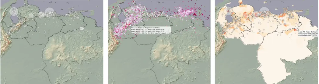
Fig. 11 (left) shows the outlines of the CRESTA zones
where circles represent settlements (>1000 population) with diameters proportional to population and an elevation model. Locations of earthquake epicentres are shown in Fig. 1 (top centre), coloured by magnitude. These graphics show that population and earthquake risk are located in similar areas.
CRESTA zones vary in size greatly. The largest (zone 19) covers about half of Venezuela (~460,000km2), but it has most of its population in one small part (Fig. 1, top right). In stark contrast, the six smallest zones – less than 80km2 in area (the smallest of which is ~10km2) – do not extend beyond the settlements on which they are centred. Examples can be seen around Caracas in Fig. 2. Some of the larger zones have non-contiguous parts on the mainland and the three zones of central Caracas are defined on the basis of geology – their names include the phrases “shallow sediment”, “deep sediment” and “bedrock”.
IV. INTERACTIVE SELECTION OF MODEL INPUTS
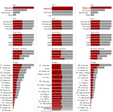
We used interactive bar charts (Hummel, 1996; Theus, 2002) for both selecting model inputs and for displaying the estimated losses. The grey bars in Fig. 3 indicate the total estimated loss associated with the value and are sorted by loss. Fig. 3 (left) shows that the model using disaggregation
1 For colour: http://gicentre.org/papers/slingsby_visual_2010.pdf
method A, estimates highest losses for masonry buildings, but that occupancy type and year-built have little effect. Losses by area (CRESTA zone) vary greatly. The red portions of the bars indicate how much of each loss is associated with the selected inputs – masonry in this case. Changing to spineplots (Fig. 3 centre) shows that this is about half the losses of each other inputs in this particular MSA result set, but that there is some variation around this; e.g. proportionally more for 8 storey buildings. Estimated losses for disaggregation method B are shown in Fig. 3 (right; bars are similarly scaled). It shows that the only differences are between CRESTA zones – perhaps not surprising since differences are down to spatial disaggregation. Zone 1 drops from first to sixth place, incurring a mere fraction of the losses of method A. The loss distribution between zones is different for method B, with a large discrepancy between the top two zones and the others. This allows zone 10 to move from 7th place to 3rd even with though with a lower loss estimate in absolute terms.
The question is whether these patterns are unique to masonry. The barchart in Fig. 4 (left) shows losses incurred from ‘unknown’ construction type, built in 1900 with ‘unknown’ number of floors. Barcharts have been scaled to the maximum selected portion to allow values to be compared more easily. For ‘unknown’ construction, losses differ between different occupancy types – this was not the case for masonry buildings. Fig. 4 (right) indicates a different loss ratio in occupancy types for 8 storey buildings.
[image:3.595.36.560.54.193.2] [image:3.595.313.560.579.709.2]Willis analysts typically manually sift through MSA results to find those that are most significant before studying Figure 1. CRESTA zones in Venezuela with elevation model and settlements (left; settlements as circles with diameter to population), with events (centre; 60% random sample of earthquake epicentres coloured by magnitude with details-on-demand box) and with population density and settlements (right). In all figures, population data from CIESIN (2004), elevation data from USGS (1996), CRESTA boundary data from GfK GeoMarketing and other data from the CAT model.
how this varies spatially using maps. Maps are used to illustrate how changes in a client’s portfolio might affect losses. Our interactive interface supports this workflow.
The huge variation in CRESTA zone size makes the smallest zones difficult to resolve on conventional maps. Inset maps can address this, but many of the small zones are scattered around the country requiring multiple inset maps, In Fig. 4 (bottom) we use a Gastner cartogram (Gastner and Newman, 2004) to show each zone at a similar size. Although this results in huge geometrical distortions, enough spatial cues are retained to make zones recognizable whilst retaining spatial contiguity.
V. OVERVIEW SUMMARIES USING TREEMAPS
Although our interactive tool represents a more streamlined version of the current workflow, sifting through each input combination is laborious and time-consuming.
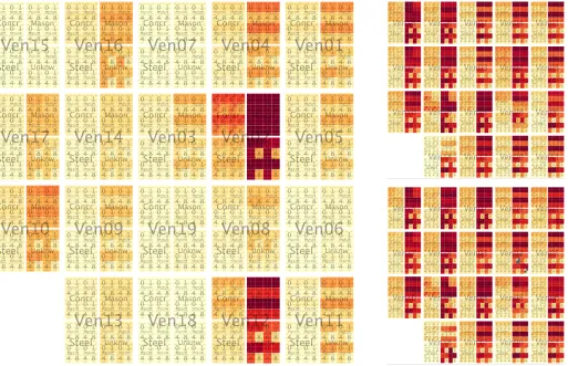
We try to address this problem in Fig. 5 by showing all 6080 combinations concurrently in a treemap, using consistent size, colour and order (Slingsby et al, 2009). Input variables organized into a hierarchy: location, construction type, occupancy, number of floors and year-built. Locations are spatially arranged (Wood and Dykes, 2008) and the others are arranged alphabetically by row (Benderson et al, 2002). Colour (ColorBrewer Rd-Or; Brewer et al, 2003) indicates the loss associated with the combination of inputs.
Findings from the barcharts are apparent in Fig. 5 (left): masonry incurs more loss than other construction types (but the degree is less easy to estimate with colour than length) and unknown and one storey buildings have similar losses that are higher than 4 and 8 storey losses. Method B is not shown due to space constraints, but it confirms that the main
difference between the disaggregation methods is the distribution of losses between CRESTA zones.
Fig. 5 (right) scales colour by the maximum for each CRESTA zone independently, allowing losses associated with each combination of inputs to be more effectively compared. The consistent ordering of elements provide recognizable visual signatures:
• unknown and 1 storey masonry buildings incur higher losses than 4 and 8 storey buildings, with the exceptions of zones 15 and 19 (these are roughly equal) and zones 3, 8, 16, 18 (pattern is reversed);
• year-built affects estimated loss for concrete buildings in zone 19;
• losses incurred from 4 and 8 storey buildings differ markedly for buildings of unknown construction;
• patterns for both disaggregation types are similar, but some of relative proportions differ and absolute values vary most between locations.
Such observations inform the data exploration process allowing particular variable combinations to be selected, studied and presented, perhaps using more familiar graphics.
Variables in the hierarchy can be reordered interactively, for example, moving year-built (currently difficult to resolve) to the base of the hierarchy. Such interactive reordering of the hierarchy emphasises different patterns and assists in data exploration (Slingsby et al, 2009).
VI. CONCLUSIONS
Interactive graphics are powerful means for spatial and aspatial model sensitivity analysis, where this involves analyzing multiple model runs with input perturbation.
Spatial overlay for studying spatial relationships is well-established GIS practice and multiple-linked statistical graphics are well-established information visualization Figure 3. Barcharts of total loss (grey bars) incurred from exposure of
each type and the portion of this (red colouring) contributed to by the selected characteristic (masonry in this case). Disaggregation method A
[image:4.595.41.282.48.287.2](left and centre) is compared with disaggregation method B (right). Spineplots (centre) better show proportions than barcharts.
Figure 4. Studying the effects of different combinations of variables on estimated losses for disaggregation method A, with barcharts scaled to the maximum selected (left), conventional map of losses by CRESTA zone (top left) and Gastner cartogram of the same data in which zones are given
[image:4.595.316.558.51.240.2]techniques. These can be combined to produce spatial and aspatial interfaces to large datasets allowing model outputs for specific combination of inputs to be accessed quickly and conveniently in a way that is compatible with current workflows.
Identifying which particular model input combinations out of the hundreds available is laborious and time consuming. Fixed-size consistently ordered treemaps provide overviews that allow such combinations to be identified.
Interactive linking between these different graphical views of data allows them to be integrated into a workflow. We recommend offering alternative graphical reordering to assist in identifying significant model inputs, offering geometrical and colour rescaling to allow variation to be considered both globally and locally, offering alternative geographical projections of spatial data and using smooth transitions to relate these different data views.
ACKNOWLEDGEMENTS
We gratefully acknowledge the Willis Research Network for facilitating and funding this research and the team in Willis Analytics for the useful feedback and discussion.
REFERENCES
Bederson, B., Shneiderman, B. and Wattenberg, M. 2002. Ordered and quantum treemaps.ACM Transactions on Graphics, 21:833–854.
Brewer, C., Hatchard, G. & Harrower, M., 2003. ColorBrewer in Print. Cartography and Geographic Information Science, 30(1), 5-32. CIESIN, 2004, Center for International Earth Science Information
Network, available from: http://sedac.ciesin.columbia.edu/gpw. USGS, 1996. GTOPO30, available from http://eros.usgs.gov/#
/Find_Data/Products_and_Data_Available/gtopo30_info CRESTA, 2010. “CRESTA” website. https://www.cresta.org/
Gahegan. M. 2005. Chapter 4: “Beyond tools: Visual support for the entire process of GIScience”. Exploring Geovisualization, J. Dykes, A. M. MacEachren and M.-J. Kraak (eds). Elsevier Ltd, 2005.
Gastner, M.T. & Newman, M.E.J., 2004. Diffusion-based method for producing density-equalizing maps. Proceedings of the National Academy of Sciences of USA, 101(20), 7499-7504.
Grossi P., Kunreuther H. and Windeler D. 2005. “An introduction to catastrophe models and insurance.” Chapter 2 in Catastrophe Modelling: A New Approach to Managing Risk. Grossi P., Kuntreuther H. (eds), Springer, New York.
Hummel, J. (1996), Linked bar charts: Analysing categorical data graphically. Computational Statistics, 11, 23–33.
Slingsby, A., Dykes, J. & Wood, J., 2008. Using treemaps for variable selection in spatio-temporal visualisation. Information Visualization, 7(3-4), 210-224.
Slingsby, A., Dykes, J. & Wood, Jo, 2009. Configuring Hierarchical Questions to Address Research Questions. IEEE Transactions on Visualization and Computer Graphics, 15(6), 977-984.
Theus, M. (2002). Interactive Data Visualization using Mondrian, Journal of Statistical Software, 7 (11), pp1-9
[image:5.595.47.560.55.386.2]Wood, J. & Dykes, J., 2008. Spatially Ordered Treemaps. Visualization and Computer Graphics, IEEE Transactions on Visualization and Computer Graphics, 14(6), 1348-1355.