Rochester Institute of Technology
RIT Scholar Works
Theses Thesis/Dissertation Collections
5-1-2007
Timeless
Christopher E. Smith
Follow this and additional works at:http://scholarworks.rit.edu/theses
This Thesis is brought to you for free and open access by the Thesis/Dissertation Collections at RIT Scholar Works. It has been accepted for inclusion in Theses by an authorized administrator of RIT Scholar Works. For more information, please [email protected].
Recommended Citation
Rochester Institute of Technology
School of Film and Animation
Computer Animation Thesis Report
Date: May 18, 2007
By Christopher E Smith
Thesis Title: Timeless
Length: 3 minutes
Format: DVD
Marla Schweppe,
Professor, Thesis ChairComputer Animation Thesis Report
Table of Contents
1. Introduction
1.1 Concept
1.2 Art Style
1.3 Children's look in a dark theme
1.4 Technical Vision
2. Process
2.1 Story Changes
2.2 Design Changes
2.3 Genre of Parable
3. Conclusion
3.1 Success and shortcomings of the film
3.2 What I learned from my graduate thesis
4. Appendix
4.A Thesis Proposal
4.B Storyboard
Abstract
Timeless, a 3D computer animated film, is about exploring the nature of time and nostalgia
through the story of a clock man who resides in an old clock inside an abandoned house. I used Maya,
a 3D computer animation application for the production and Adobe After Effects for the
post-production. Includes appendices for my thesis proposal containing a budget and a timeline,
1. Introduction
1.1 Concept
My thesis project explores the nature of time and nostalgia through the story of a clock man
who resides in an old clock inside an abandoned house. He looks out on the ruin around him and longs
for the time when his world was young and full of life. Restarting the clock mechanism is the key to
his ill-fated plan to go back to his former happy days. His efforts symbolize our own tendency to slip
into nostalgia to simulate a perceived "golden age" for an unpleasant present, but in the end he fails
because like us, he is a prisoner of time and moving ever forward.
My film suggests that there is nothing we can do to restart our past. We must allow ourselves to
live with our reality rather than escape to a fantasy world. And we have to make our lives the best we
can. The clock man does not heed this concept. His action is very similar to our typical behavior to
reject reality and run away from it. I have always wondered why we can't have the power to revisit our
past to help us feel fulfilled and put us in a better place. This thinking inspired me to make this film to
do my best to remind people that we have to move on from our past and look at it in a positive way: our
1.2 Art Style
Toy Story, a Pixar film, inspired my artistic vision largely for a toy look and a simple design
rather than a realistic look in my film. The reason why I chose a simple toy look over a realistic look is
I felt that a realistic look would compete with my desire to show a simple looking world. This would
allow the focus to be placed on the main character's actions rather than the scenery. My belief is that a
realistic look demonstrates the philosophical ability of realism to simulate real life, which doesn't meet
my goal. I followed Pixar's formula to focus on my film's main character's actions surrounding his
world rather than demonstrating its beauty. That's why Toy Story successfully focused on the actions
of several characters to help connect the audience rather than showing off the realistic backdrop.
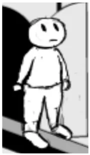
My character design looks a bit simpler compared to Toy Story's character design. I have
researched pictures of cuckoo clocks' clock man figures to visualize my character design. The
character design played a major role in my visualization for my character design. My character design
has fewer details compared to Toy Story's while I wanted to maintain my design to look like a simple
toy.
The environment's design is inspired by a picture I found. The picture expresses a derelict look.
1.3 Children's look in a dark theme
My film uses a children’s look in a dark theme. My purpose for this look instead of a realistic
look for a dark theme is that I wanted to make a film for kids to connect visually. I want them to learn
something from a dark adult content. Kids can be a tough audience to be entertained aesthetically
because kids may not connect to reality. Fantasy is their world.
For comparisons on similarly animated films, I picked Amfraid by a group of students, Anne
Sophie Bertrand, Thibault Debeurme, Sophie Van De Velde, Pascal Verkindt, and Piñata by Mike
Hollands because both films share a common element with my film in terms of using a children’s look
in a dark theme. Amfraid is about a little boy being sent to his grandmother's house for one night and
his fear overtaking him from his imagination. Piñata is about a pinata being tortured at the expense of
children's entertainment and fighting back for respect and survival.
All three films have used 3D computer animation to accomplish their visual style of a children's
look. 3D computer animation allows us to create our style better than a photo-realistic look because if
we use a photo-realistic look for a children's look, it might not feel like a children's film. That's why
computer animation gives us plenty of techniques to achieve our vision or resemble traditional
animation such as stop motion and claymation. Amfraid 's artistic style is inspired by Tim Burton's
artistic style for puppet animation. For Piñata, a pinata is always known for being colorful and
associated with kids. So it makes sense for using a children's look to express its vision. For my film, I
Using an adult look for these films may not be successful aesthetically for connecting kids. A
photo-realistic look is often associated with reality and realism, which express and resemble real life
rather than an abstract world. With a photo-realistic look, Amfraid and my film may end up looking
too scary and terrifying for kids because of dark adult themes. For Piñata, its vision might be lost if it
1.4 Technical Vision
To achieve a toy look from a technical viewpoint, I experimented with Maya, a 3D computer
animation application. I played with Maya's toon shader, and it created the look of cartoon animation
using 3D modeling. Toon shading is a type of non-photo realistic rendering. Non-photo realistic
shading is a rendering technique that produces images in a style, such as cartoon or cel-shaded, in a
manner other than realism. Photo realistic shading produces an accurate and detailed representation of
the subject. Toon shading helped me achieve a toy look, and I was satisfied with the final product after
a few modifications.
During my experiment, I started with a primitive sphere and I put a blinn shader on it (Figure
01.). It didn't achieve my technical vision because it could not achieve the animation look I desired. I
changed from a blinn shader to a toon shader with solid color (Figure 02.). It started to improve, but it
still looked very flat because there was no depth on the sphere. I changed from a solid color shader to a
brightness shader to give its depth (Figure 03.). Actually both solid color and brightness shaders are
based on a ramp shader, which is a shader where you can have control over the way color changes with
light.
Figure 01. Blinn Shader Figure 02. Toon Shader Figure 03. Toon Shader
I chose Maya's toon shader because it has an ability to create a toon line to outline everything
on an object (Figure 04.). Toon shading contains elements of outlines, border lines, and solid color
shading and it gives you the ability to experiment with it to achieve your artistic vision. There are
[image:10.612.193.409.345.509.2]several types of toon lines to choose, so I used a profile line which is also an outline as shown from
Figure 04. Toon shading helped me achieve my artistic vision for a simple toy look rather than a more
detailed look. Also toon shading can recreate the look of traditional cel-animation "ink and paint"
technique for the cartoon look, depending on your taste.
2. Process
2.1 Story Changes
After the approval from the review committee, my story evolved from my proposal story. I
have made several plot changes as a result of the feedback I received from my thesis committee. My
story needed to show more of the clock man's actions in order to develop a connection with the
audience who will feel for his struggle and hope.
In my proposal story, the clock man only had one attempt to restart the clock. However, it did
not seem to have enough motivation for him to build up his emotion to achieve his hope. It was if
everything worked perfectly at first. After my thesis committee's feedback on my proposal story, I
figured that he needed to have a struggle at first to express his sentiment. In the revised story, I added
the second attempt after the failed first attempt to build up his sentiment, especially to feature his
disappointment and aggravation when he acknowledged there was no change. This was absent in the
original story. Also, in the revised story while the clock man tries to restart the clock in the second
attempt, a crack from the first gear wheel is already there while it starts moving slowly. In the original
From my thesis committee's suggestion about the addition of a bird as a prop character in the
clock man's past, I agreed that it would help to show the clock man's relationship to his past much
clearer. So I decided to put a bird into the story, and I realized that the addition of a bird did help my
story a bit for connecting the clock man's past more clearly and with a stronger message. In the
original story, I didn't utilize any prop characters. In the revised story, he becomes happy when he sees
a cawing bird and dances to joyful music along with the cawing bird. This sends the message that he
assuredly thinks the past is back for good.
The revised story's end is a bit different from the end of the original story. In the original story,
the clock man starts to stop functioning as the pendulum slows down to a stop, and the re-creation of
the past begins to fade. He becomes paranoid and starts running toward the door to fix the mechanism
of the clock. But suddenly the wood platform starts to break apart as it has become rotten from too
much water. Then the platform falls off the clock, and he gasps as he tries to jump off. In the revised
story, he unknowingly continues to dance with the cawing bird while the clock suddenly stops
functioning. He suddenly wakes up and gasps to see the past starting to fade away. Then he turns
around to see what's going on with the clock and becomes exasperated to see pieces breaking from one
of the gear wheels. From the result of his exasperation, he starts jumping furiously, and he doesn't
2.2 Design Changes
I have made changes from my original character design (Figure 05.) to a new one (Figure 06.).
The clock man used to have two legs compared to the new character design's simple tube base. The
reason for this change is to make him less human and more a part of the clock as he is responsible to
run it, rather than be disconnected from the clock. If I stuck with my original character design, the
story wouldn't make sense with this design because the original character design of the clock man
wouldn't depend on the clock to keep running in order to restart the past.
To achieve my character design as a toy look, I modified it to look more like a toy rather than a
little human from my original character design. Even my character design looks a bit simpler
compared to Toy Story's, and my goal is to have a simple design. I felt that the new character design's
simple tube base is more suitable to show the audience that the clock man has to depend on the clock
[image:13.612.171.261.477.631.2]because he is a part of it. And at the same time, I wanted to maintain a toy look.
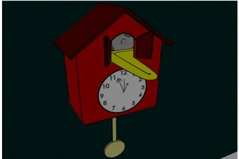
I have also made changes from the old clock design (Figure 07.) to the new one (Figure 08.).
The reason for this change was to restructure the platform so the new character design's simple tube
base could fit onto the empty line of the platform. The new clock design, especially the platform,
represents the new character design's dependence on the clock. It prevents the clock man from falling
down accidentally. In the old design, there is a thin platform between the door and the front base so it
would be easy for the clock man to fall down. That's why I widened the platform in the new design to
ensure the clock man's safety.
[image:14.612.295.529.351.507.2]2.3 Genre of Parable
My film falls into the genre of parable. A parable is a short simple story to illustrate a moral or
religious point for perspectives on life. I use my film's abstract setting as a foundation for illustrating a
poignant point about the main character. Nostalgia is the main theme of my film, and the main
character's desperate attempts to restart his past symbolize his rejection of the harshness of reality. The
abandoned room represents the main character's harsh reality in the present. I use the broken clock as a
symbol that time can't go backward as everything must go forward. The reason why I used the broken
clock as a part of my film's abstract setting is once life is broken, you have to face the harsh reality that
you cannot fix it. We cannot really rewind our past because it carries on to our future. Past is who we
are now and without our past, we won't know who we are at the present.
In comparison to similar animated parable films, I picked Touch of Deceit by Michel Gagne and
Lunch by Keith Lango because they focus on abstract settings for their themes just like my film.
Touch of Deceit is about an innocent rabbit curiously evoking a butterfly, which is actually Satan in a
disguised form. The environment suddenly changes from a forest to hell when the rabbit evokes the
butterfly to give a sense of shock and awe. Also it shows that curiosity can be deadly. Lunch focuses
on this quote by Apostle Paul, “The greedy impale themselves on many heartaches...” The film
portrays a man's desire for a tastier meal due to the influence of greed from an advertising billboard.
The setting of an advertising billboard and a vending machine plays a big role to illustrate how
The success of Touch of Deceit and Lunch stems from having a good simple story to illustrate
their moral point. Touch of Deceit is all about deception, and it tells us that everything we might think
is real could be disguised from a true form. Curiosity can be fatal for us because it can have serious
consequences. That's why the rabbit never acknowledges that the butterfly is actually Satan when he
innocently evokes it even though it lured him to. The dragon symbolizes Satan from the Bible's
perspective. Lunch's main theme is greed and its consequences from our actions. The main character's
dissatisfaction with his sandwich is the main reason why he becomes greedy to get a tastier meal. It
leads him to become insatiable after he sees the advertising billboard about a cool candy. At the end,
after he finally gets his tastier meal, a bird poops onto it, symbolizing punishment for the main
character's action from greed. That's why I made a big impression of my film's moral point on
nostalgia. Making a successful parable film requires good, simple storytelling to make a moral point.
Shortcomings come with parable animated films as well. For Touch of Deceit, there is a lack of
cautiousness by the rabbit when he approaches the butterfly. The rabbit is supposed to be suspicious of
it, unless he is under a spell when a butterfly flies around him. Also its story is a bit too simple to give
complex advice such as being aware of your environment. For Lunch, in my opinion, the main
3. Conclusion
3.1 Success and shortcomings of the film
During the screening of my graduate thesis, I didn't expect the audience to laugh when the clock
man went “Oh, yeah!” in a voice which I didn't imagine as being humorous. I assume that it was a
good thing to have a brief hilarious moment to give the audience a good memory of the clock man's
action. Sometimes unexpected things can have good benefits even if you couldn't have foreseen it. So
I considered that as an unexpected success for my film.
The shortcomings of my graduate thesis focus largely on how I was not sure how to sell my
film originally. In my proposal, my client is the general audience. At first, I was not sure if my film
could work for kids due to the dark adult content, and eventually I realized it could work because the
children's look allowed kids to connect to my film visually. One of my thesis committee members
suggested that my film falls into a genre of parable, which makes a lot of sense because my film
contains a simple moral story. However, I could use more action for the main character to show more
of his emotions and actions in order to better illustrate his desperate acts. For example, the main
character doesn't show a lot of facial expressions due to the simple toy design. Every design comes
3.2 What I learned from my graduate thesis
Before making a graduate thesis, I had no idea that it would require so much more energy
compared to my previous one-quarter films. There were many different things I had to take care of
such as pre-production, changing my story and designs, modeling, animating, and post-production for
half a year.
From coming up with ideas, planning, modeling and animating, I had gone through it step by
step. I sat back and took a look at my graduate thesis, and I felt I could still make several
improvements. I realized that it requires both good concentration and patience in order to produce a
success.
Doing a graduate thesis was very demanding for me and I easily forgot some of the little things
that got lost through my process. Dealing with all the changes and problems really challenged me. It
took me a lot of effort to complete my graduate thesis and this project gave me a perspective about how
challenging making a short film can be. I gained important experience and learned that the success of
Appendix A
Treatment for Thesis Film
Working Title: The Abandoned Cuckoo Clock Start Date: Summer 2006 Producer: Christopher Smith End Date: Winter 2007
Client: General Audience Running Time: 3 min
Budget: $1,340.90 Release Format: DVD, VHS
Story: The abandoned cuckoo clock is in an abandoned house. The clock man from the clock awakens from hibernation, and then tries to dream of making the house lively again.
Concept: The world is driven by the intention of the clock man. The mechanism of clock pendulum drives the 'motor' of his perceived world.
Synopsis: In the opening scene, water drips through the cracked roof onto the sleeping clock man and after several water drops hit him, he finally awakens and get annoyed by the water by wiping off his
face. He gets puzzled about what's going on surrounding him and he gasps to see that the house is
abandoned. He then looks back and sees the clock and the pendulum not moving at all. He starts to
remember the past to see the pendulum moving and look around at the house being lively. After he
stops remembering, he sighs and looks back at the clock as he gets a vision about how to restart the
clock. Then he becomes determined to re-create the past for making the house lively again. He walks
toward the door to get inside the clock and at the same time, the wood platform starts cracking very
Once he gets into the door, he looks around the mechanism. He sees a handle on a mechanical
wheel and he gets a vision that he grabs a handle and move it down to restart the clock. The wheel is a
bit out of reach from him as it is on the top of one of mechanical wheel. He starts jumping to reach the
handle, then finally grabs and holds it. He struggles to pull it down as the wheel is very rusty, and then
while he keeps trying to pull it down, the wheel finally starts to move. He keep pushing the handle and
the whole mechanism of clock and the pendulum start moving. While the whole mechanism of clock
moves, he doesn't realize that one of mechanical wheels' crack starts growing slowly from aging. He
becomes so thrilled to see the clock restarting and suddenly there is a very bright light coming out of
the door.
He gets puzzled and walks out of the door, then he gasps and drops his jaw to witness the house being
lively again. Suddenly the mechanical wheel malfunctions and breaks apart. And then the clock starts
to stop functioning as the pendulum slows down to stop and the re-creation of the past starts fading. He
becomes paranoid and starts running toward the door to fix the mechanism of clock, but suddenly the
wood platform starts to break apart from decomposition from too much water. Then the wood platform
falls off the clock and he gasps and tries to jump out from the platform, but it's too late. He crashes
onto the floor hard, and he breaks apart. He becomes lifeless once again.
Working Title: The Abandoned Cuckoo Clock Start Date: Summer 2006 Producer: Christopher Smith End Date: Winter 2007
Client: General Audience Running Time: 3 minutes
Budget: $1,340.90 Release Format: DVD, VHS
Timeline
Spring Quarter 20053 Summer Quarter 20054
Week 1 Proposal Draft Week 1 Modeling
Week 2 Proposal Draft Week 2 Modeling Week 3 Proposal Draft Week 3 Modeling
Week 4 Proposal Draft Week 4 Modeling
Week 5 Proposal Draft Week 5 Rigging
Week 6 Final Proposal Week 6 Rigging
Week 7 Thesis Proposal Week 7 Rigging
Week 8 Proposal Revising Week 8 Texturing/Lighting Week 9 Thesis Proposal Week 9 Texturing/Lighting
Week 10 Storyboard Week 10 Texturing/Lighting
Exam Week Animatic
Fall Quarter 20061 Winter Quarter 20062
Week 1 Final Adjustments to Animatic Week 1 Final Step Animation Week 2 First Step Animation Week 2 Final Step Animation Week 3 First Step Animation Week 3 Rendering
Week 4 First Step Animation Week 4 Rendering
Week 5 Second Step Animation Week 5 Rendering/Sound Mix Week 6 Second Step Animation Week 6 Rendering/Sound Mix Week 7 Second Step Animation Week 7 Compositing/Final Mix Week 8 Second Step Animation Week 8 Compositing/Final Mix Week 9 Final Step Animation Week 9 Titles and Credits Week 10 Final Step Animation Week 10 Print to Master
Period Item Qty. Cost Total
Pre-Production
Sketchbook 1 10 $ 10.00
Index Cards 1 5 $ 5.00
Subtotal: $ 15.00
Production
Adobe After Effects Pro Upgrade 7.0 1 349 $349.00 Alias MotionBuilder Pro 7.5 1 200 $200.00
Sound Mixing 1 250 $250.00
Subtotal: $799.00
Post-Production
Tape Master DV Cam 1 20 $ 20.00
1 pack of blank DVD+R copies 25 1 $ 25.00
Blank VHS 10 2 $ 20.00
DVD Media Spindle 1 25 $ 25.00
DVD Cases 25 .50 $ 12.50
Printing for Advertising (B/W) 25 .10 $ 2.50 Printing for DVD Cover (Color) 25 2 $ 50.00
Festival Fees 5 50 $250.00
Subtotal: $405.00
Pre. Subtotal: $ 15.00
Prod. Subtotal: $799.00
Post. Subtotal: $405.00
Subtotal: $1,219.00
10% contingency $121.90
Appendix B
Appendix C