City, University of London Institutional Repository
Citation
:
Andrienko, G. & Andrienko, N. (2015). Visualization Support to Interactive
Cluster Analysis. Lecture Notes in Computer Science, 9286, pp. 337-340. doi:
10.1007/978-3-319-23461-8_43
This is the accepted version of the paper.
This version of the publication may differ from the final published
version.
Permanent repository link:
http://openaccess.city.ac.uk/13024/
Link to published version
:
http://dx.doi.org/10.1007/978-3-319-23461-8_43
Copyright and reuse:
City Research Online aims to make research
outputs of City, University of London available to a wider audience.
Copyright and Moral Rights remain with the author(s) and/or copyright
holders. URLs from City Research Online may be freely distributed and
linked to.
City Research Online:
http://openaccess.city.ac.uk/
[email protected]
adfa, p. 1, 2011.
© Springer-Verlag Berlin Heidelberg 2011
Visualization Support to Interactive Cluster Analysis
Gennady Andrienko, Natalia Andrienko
Fraunhofer Institute IAIS, Sankt Augustin, Germany City University London, UK
{gennady|natalia}[email protected]
Abstract. We demonstrate interactive visual embedding of partition-based clus-tering of multidimensional data using methods from the open-source machine learning library Weka. According to the visual analytics paradigm, knowledge is gradually built and refined by a human analyst through iterative application of clustering with different parameter settings and to different data subsets. To show clustering results to the analyst, cluster membership is typically represent-ed by color coding. Our tools support the color consistency between different steps of the process. We shall demonstrate two-way clustering of spatial time series, in which clustering will be applied to places and to time steps.
1
Introduction
Our system V-Analytics [1] enables analytical workflows involving partition-based clustering by methods from an open-source library Weka [2] combined with interac-tive visualizations for effecinterac-tive human-computer data analysis and knowledge build-ing. According to the visual analytics paradigm, knowledge is built and refined grad-ually by iterative application of analytical techniques, such as clustering, with differ-ent parameter settings and to differdiffer-ent data subsets. A typical approach to visualizing clustering results is representing cluster membership on various data displays by or-coding [3-5]. To properly support a process involving iterative clustering, the col-ors assigned to the clusters need to be consistent between different steps. We have designed special color assignment techniques that keep the color consistency.
When data are stored in a table, clustering can be applied to the table rows or to the columns [6]. Spatial time series, i.e., attribute values referring to different spatial loca-tions and time steps, can be represented in a table with the rows corresponding to the locations and columns to the time steps. Two-way clustering groups the locations based on the similarity of the local temporal variations of the attribute values and the time steps based on the similarity of the spatial situations, i.e., the distributions of the attribute values over the set of locations [5].
2
Interactive Two-way Cluster Analysis of Spatial Time Series
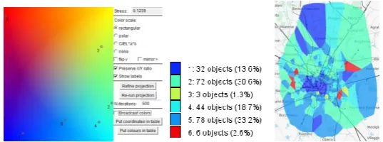
Fig. 1. Left: a projection of cluster centers onto a color plane; right: the spatial distribution of the cluster membership; center: a legend showing cluster colors and sizes.
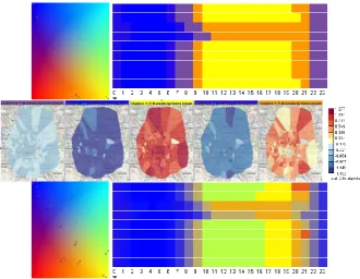
Fig. 2. Top: the 2D time histograms (9 days x 24 hours) correspond to different clusters; the bars in the cells represent the cluster means. Bottom: the time graphs show the variations of the
absolute (left) and transformed (right) values for cluster 1.
Colors are assigned to clusters based on Sammon’s projection [7] of cluster cen-ters (provided by the clustering algorithm or computed) onto a plane with contin-uous background coloring. This ensures that close clusters receive similar colors.
After data re-clustering with different parameter settings, the projection of the new cluster centers is aligned with the previous projection, aiming at minimizing the distances between the positions of the corresponding clusters in the two pro-jections. In this way, corresponding clusters receive similar colors, which makes the clusters traceable throughout the analysis process.
Interactive techniques support progressive clustering [8], in which further cluster-ing steps are applied to selected clusters obtained in previous steps. This allows controlled refinement of the clustering results and, on this basis, refinement of the analyst’s knowledge.
[image:3.595.127.473.284.465.2]series obtained by spatio-temporal aggregation of records about mobile phone calls made in Milan (Italy) during 9 days by 235 spatial regions and 216 hourly time steps. To focus on the temporal variation patterns rather than purely quantitative differences between the call counts in different regions, we transform the original absolute values to the region-based z-scores. As a clustering method, we shall apply k-means.
Figures 1 and 2 show an example of partitioning the set of regions into 6 clusters based on the similarity of the region-associated temporal variations of the transformed call counts. Figure 1 shows the projection of the cluster centers onto a color plane, the colors assigned to the clusters on the basis of the projection, and a map with the re-gions colored according to their cluster membership. To see and compare the tem-poral variation patterns corresponding to the different clusters, we use temtem-poral dis-plays shown in Fig. 2. In the upper part, there are 2D time histograms with the rows corresponding to the days, columns to the hours of a day, and colored bars in the cells representing the average values for the clusters. Each histogram corresponds to one cluster, the bars being painted in the color of this cluster. The histograms demonstrate prominent daily and weekly periodic patterns and clearly show the pattern differences between the clusters. In the lower part of Fig. 2, the original and transformed time series from one of the clusters are shown on time graphs.
We iteratively increase the number of clusters and observe the impacts. In this ex-ample, the major clusters mostly keep unchanged, but several singletons emerge. They consist of regions with unusual time series, for example, having peaks of call counts at times of some public events. Hence, in this example, we have found four major common patterns of the temporal variation of the calling activities (clusters 1, 2, 4, and 5) and several more specific patterns.
Next, we consider the same data set from a different perspective by clustering the table columns (i.e., the hourly time intervals) according to the similarity of the distri-butions of the attribute values over the set of regions. We start with five clusters, the centers of which are projected on a color plane in Fig. 3 (upper left). On the upper right, there is a calendar display with the rows corresponding to the days, columns to the hours of a day, and cells colored according to the cluster membership of the corre-sponding time intervals. A prominent periodic pattern can be seen. The upper two rows correspond to Thursday and Friday, rows 3 and 4 to the weekend, and the fol-lowing rows to five week days from Monday to Friday. In the center of Fig. 3, the spatial distributions of the calling activities corresponding to the five time clusters are shown on maps. The shades of blue and red represent, respectively, values below and above the means.
The observed temporal periodicity corresponds to our background knowledge about human activities. The pattern is preserved with increasing the number of clus-ters. Thus, the lower part of Fig. 3 shows the result for ten clusclus-ters. The temporal pattern has been refined while preserving the same main features as for five clusters.
[image:5.595.133.464.145.401.2]
Fig. 3. Clustering of the hourly time intervals according to the spatial distributions of the call-ing activities. Top: projection and calendar displays for 5 clusters; center: the spatial
distribu-tions corresponding to the clusters; bottom: projection and calendar displays for 10 clusters.
References
1. G.Andrienko, N.Andrienko, P.Bak, D.Keim, S.Wrobel. Visual Analytics of Movement. Springer, 2013.
2. I.H.Witten, E.Frank, M.A.Hall. Data Mining: Practical machine learning tools and tech-niques. Morgan Kaufmann, 2011.
3. G.Andrienko, N.Andrienko. Blending aggregation and selection: Adapting parallel coordi-nates for the visualization of large datasets. The Cartographic Journal, 42(1):49–60, 2005 4. J.J.van Wijk, E.R.van Selow. Cluster and calendar based visualization of time series data.
Proc. Information Visualization:4–9, 1999
5. G.Andrienko, N.Andrienko, S.Bremm, T.Schreck, T.von Landesberger, P.Bak, D.Keim. Space‐in‐Time and Time‐in‐Space Self‐Organizing Maps for Exploring Spatiotemporal Patterns. Computer Graphics Forum, 29(3):913–922, 2010
6. J.Seo, B.Shneiderman. Interactively exploring hierarchical clustering results. Computer, 35(7):80–86, 2002.
7. J.W.Sammon. A nonlinear mapping for data structure analysis. IEEE Transactions on Computers, 18:401–409, 1969.