Theses
Thesis/Dissertation Collections
5-1-1988
An investigation of consumers' preference for a
typestyle in relation to a display poster
Brad Weaver
Follow this and additional works at:
http://scholarworks.rit.edu/theses
This Thesis is brought to you for free and open access by the Thesis/Dissertation Collections at RIT Scholar Works. It has been accepted for inclusion
in Theses by an authorized administrator of RIT Scholar Works. For more information, please contact
.
Recommended Citation
CONSUMERS'
PREFERENCE FOR A TYPESTYLE
IN RELATION TO A DISPLAY POSTER
by
BRAD
A.
WEAVER
A
thesissubmittedin
partialfulfillment
oftherequirements
for
thedegree
ofMaster
ofScience in
theSchool
ofPrinting
Management
andSciences
in
theCollege
ofGraphic Arts
andPhotography
ofthe
Rochester Institute
ofTechnology
May,
1988
School of Printing Management and Sciences
Rochester Institute of Technology
Rochester, New York
CERTIFICATE OF APPROVAL
MASTER'S THESIS
This is to certify that the Master's Thesis of
Brad Weaver
name of student
With a major in
Printing Technology
has been approved by the Thesis Committee as satisfactory for the thesis
requirement for the Master of Science degree at the convocation of
Hay, 1988
date
Name Illegible
Thesis Committee: _ _ _ _ _ _ _ _ _ _
_
Thesis Advisor
Joseph L. Noga
Graduate Program Coordinator
Display
I,
Brad A.
Weaver,
hereby
grantpermission totheWalker Memorial
Library,
ofR.I.T.,
to reproducemy
thesisin
whole orin
part.Any
reproduction will notbe for
commercial useor profit.
This
project could neverhave been
completed without thehelp
ofmany
people.I
would
like
to thankmy
parents,Warren
andMarion
Weaver,
for
alwayshelping
me torealizethe
importance
of an education,andfor
theirencouragement, assistance and supportin attaining
mine.I
wouldalsolike
to thankmy
thesis advisors,Professor
Archie Provan
andProfessor
Marie
Freckleton,
for
all the timeand effortthey
putinto assisting
me.A
special thanksis due
toJoe
Noga,
whosemany
encouragements through variousstages
along
theway helped
togive methedetermination
tomakethis thesisa reality.I
am grateful toVeronica
Hofman,
Steve
Beren,
Robert
Howlett,
Patricia
Corcoran,
Carol
Kawanaka,
Agnes
Thomsen,
Don Dvorachek
andBob
Krughoff
who offered theirsupport
in
numerous ways.In
addition, a very,very
special thanks goes tomy
wife,Sara,
without whosehelp,
understanding
andpatience, this project would neverhave
been
possible... .
BAW
List
ofTables
viiList
ofFigures
viiiAbstract
1
Chapter
I.
INTRODUCTION
1
Footnotes for Chapter
I
3
II.
A REVIEW OF THE LITERATURE
4
Footnotes for Chapter II
7
III.
HYPOTHESIS
8
Limitations
8
IV
METHODOLOGY
9
Experimental
Design
andAnalysis
9
Subjects
11
The
Measuring
Instrument
12
Procedures
12
Footnotes for Chapter IV
13
V.
RESULTS OF THE
RESEARCH
14
VIII.
RECOMMENDATIONS
FOR FURTHER INVESTIGATION
26
LIST
OF REFERENCES
27
APPENDICES
Appendix A
29
Appendix
B
38
Appendix C
45
Appendix D
56
Appendix E
71
Appendix
F
79
Appendix
G
82
Appendix H (Photos
ofPosters)
86
1
Typefaces
andClassifications
15
2
Typeface Responses
16
3
Consumers'Preference
18
1
First Tier
Study
Appendix
A
2
.Second Tier
Study
Appendix
B
INTRODUCTION
Does
the choice of typeface support theillustration
of the poster to combine andreinforce themoodthe
designer had in
mind?To limit
the scope and area ofinvestigation,
thisstudy
willbe
confinedto the areaof
display
posters.The
theory
ofthis thesisis
thatcertain typefaces are more successfulin
conveying
themessageofadisplay
poster.Dreyfus writing in
an articlein Visible
Language,
states:"The functions
which a typemustperformare
partly human
andpartly
mechanical.The human
eye mustbe
abletoreadatype without
difficulty
ordistraction,
but
atthe sametime,
thehuman
mindmustderive
some
degree
of conscious or unconscious pleasurefrom
the impression which thedesign
creates."1
Ovink
wrote"The
reader receives animpression
by
themere aspect oftheprintedtype,
which
is
quitedistinct from any judgment
onthebeauty
oflegibility."2He
tells us:It is important
that we shouldknow
this'feeling-tone'
ofthe
printing
types that arein
usetoday.If
atype,
whilefulfilling
its
originalfunction, i.e.,
theconveying
ofamessage, at the sametime creates acertain mood orfeeling,
thenwe shouldsuitthiscreatedfeeling
tothegeneraltendency
offeeling
of themessage.For
by
doing
so, we make thereadermore accessiblefor
thatkind
ofcommunication.3Dreyfus has
noted that somany
readershave
expressedstatistically
significantpreferences
for
particular styles oftype andthathe
is
convinced thathuman
beings
are notrobots, nor consistent, and that
they
are(to
him)
exhilaratingly
unpredictable.4Dreyfus
real statistical significance were
detected
when readers were askedwhichstyles oftype
they
preferred.The
fact
thatthey
were capable ofreading
agreat
many
different
stylesoftypewithvirtually
nodegree
ofdifficulty
did
not preventthem
from giving very firm
opinions aboutthe types whichthey
preferredtoread.
This
finding
oughttobe
studiedby
thosewhodecide
in
whattypes to attract or to persuade,
but
whichnobody
is
obligedtoread.For
it clearly
matters quite alot
whethertherighttypeis
chosentoappealtoa potential
buyer
or voter or to anyone else whobecomes
a targetfor
persuasion as
distinct
from obligatory
printed matter(like
airline schedulesor
railway
timetables which we allhave
to readfrom
time to time).The
truth revealed
by
careful experimentsis
that ourremarkably
adaptablenervous system
is
quite capable ofdecoding
most typefaces withoutdifficulty,
but
thatit
alsoleads
us todevelop
quitestrong
personalpreferences
for
afew
particulartypes.5To
theauthor,
typefaces arelike
clothes.Preferences
changewithtime;
certain stylesare
in
and others are out.In
addition, wefeel
someclothing
styleslook better
on certainindividuals. Ovink
states:The
typographer... whodid
nothit
upon thespecially
appropriatetype,
willnot
have done
actualharm
to the transmissionofthemeaning
ofthetext, but
he has
missed anopportunity
tointensify
theforce
ofimpression
ofthe textin
a considerabledegree.6
With
these past statementskept in
mind,
the author sets out to show that certainpreferences
for
typestylesdo
existfor
aparticulardisplay
posterathand.
Rehe's
statement summarizesit
well:Some
mightsay
thattypography
does
not needallthis scientificframework.
Their
arguments are wellfounded.
Printing
andtypography
indeed have
proud and
long history
...but typography,
aboveall,
is
a means of communication andhas
toconvey information
asproductively
as possible.. .
Today,
wein
theprinting
industry
are still somewhathesitant
toapply
theresults suggestioned ...However,
if
we combineinherited
wisdom andtradition with new scientific
findings,
then all willbenefit
industry,
]Dreyfus,
J. "A
Turning
Point in Type
Design,"Visible Language.
XIX
(1985),
pp.18-19.
2Ovink,
G. E.
Legibility,
Atmosphere
Value,
andForms
of
Printed Type.
(Leiden:
A. W
Sijhoff,
1938),
p.127.
3Ovink,
G.
E.,
p.121.
4Dreyfus,
J.,
p.19.
5Dreyfus,
J.,
p.19.
60vink,
G.
E.,
p.177.
7Rehe,
R. F
"Psychological Studies
andTheir Impact
onModern
Typography,''
Empirical
studies ofDreyfus,
Poffenberger
andFrankens, Haskins, Ovink,
andBlum
(further detail
on these studies willbe
givenlater)
have
proven that the emotionalconnotations of messages are
indeed influenced
by
typeface selection.What,
then,
influences
adesigner's
selection of a typefacefor
a message, orbetter
yet,for
amessage/picture combination
in
which the picturein itself
alsohas
a connotation?The
norm seemsto
be
selectaccording
tothemeas wellas theapproximatetypographical styleoftheperiod,8
and/orto use
faces harmonious
with theotherelementsand overall design.9A
study
thatdeals
withthe abovewasrecently done
by
Veronica Hofman:
... a
corollary investigation
was performed todetermine
thereasonsbook
designers do
choose particulartypefaceswhendesigning
book jackets. The
responses
included individual
and personal reasons; production, supplier andtimelimitations;
and specificprotocol withinpublishing houses.
All
felt
that a resourcecontaining information regarding
typefaces and thefeelings
they
stimulate wouldbe
valuable.10The face has its
own appeal, and asfar
aslegibility
is
concerned, theGraphic Arts
Manual
writes:The
vastmajority
oftypesfor
display
orheadline
use,one neednotbe told,
arequite
different from
those usedfor
text.What
is
said about thelegibility
oftext type appliesonly in
slightdegree
todisplay
type.The designer
or typographer who employsletters
which are tobe
read ondirectional
signs,
posters,
billboards,
orfor
usein
newspapershas,
asindeed he
shouldhave,
considerablelicense in
their use.Confined,
as such a messageusually
is,
to afew
words or a short sentence,its function is
to challenge a reader'sinterest,
to causehim
to considerits
meaning, and so to persuadehim
to read on.Because
ofthis,
novelty
andinventiveness
on the part of thedesigner in
thechoiceof typestyle and arrangement, within sensiblelimits,
was
done
by
Poffenberger
and Franken.12Together,
in
1923,
they
tested twenty-ninetypefaces used
in advertising
atthetime,
with actual products.The
researchersfound:
The
results of this experiment show quiteconclusively
thatdiffering
typefaces
do vary in
appropriateness and thatjudges
are able to 'feel' thisappropriateness.
Furthermore,
thereis
close agreementbetween
sexes andamong
members ofthe same sexin
the characteroftheirreactions to thedifferent
type specimens.13Schiller,
twelve yearslater,
releasedthe results ofher
experiments.14Her study
wasessentially
the same asPoffenberger
andFrankens, however,
she useddifferent
typefaces.In
addition, she alsotestedfor
theappropriate colorchoice.Her
findings
werevirtually
thesame.
She,
too,
found
that subjects were able to "feel" this appropriateness, orlack
of appropriateness.Another
testof preference wasdone
by
Haskins.15He
took300
randomized subjects and showed them tendifferent
Saturday
Evening
Post
articles with tenheadings
setin
different
types.The
subjects chose whichthey felt
tobe
themost appropriateheadings
for
the articles.His
studies showed that"high-tension"
articles revealed a more
definite
preference oftype;
Bodoni
wasfavored for
medicine articles,Future Bold for
sports, andCheltenham
andBodoni
werefavored
for
crime. Wrolstad's16theory
wasthateducatedadults shouldbe
able to matchtypography
withexamples of art andprinting,
however,
uponinvestigating
this,
he found
this tobe
untrue.Educated
adults could not makethecorrect match.Display
should notbe based
onany
one person'staste,
ratherit
shouldbe
gaugedonlikes
anddislikes.
With
theoverwhelming
growthin
recent years of photographictypesetting
equipment, thelikes
anddislikes
of consumers canbe easily
andThe
Graphic
Arts
Manual
writes ontypography
andtechnology:Rapidly
changing
technology
in
compositionwill affecttypedesign greatly
in
thefuture.
Many
new trendshave already begun. The
newtechnology
is
bringing
to the typographicfield
greaterfreedom in manipulating
typeimages,
and as atthebeginning
ofany
majormovement,
thenewtechniqueshave been
usedboth
badly
and well.Some
of today's trends will provetransitory,
while othershold
morepromisefor basic
changethanmost of us yetrealize.17With
new typedesigns
andrivals
ofoldtypedesigns coming
up
quickly because
ofrapidly changing
technology, how
can adisplay
designer
keep
up
andstay in
competitionwith the
changing fads
ofthetime?
By
simply
testing
thetargetpublic.Due
tothechangein technology,
the authorfeels
the publichas recently become
much more perceptivein
dealing
with the effects of type style.To stay
competitive, thedisplay
designer
of the8Dowding,
G.
Factors
in
theChoice
of
Typefaces. (London:
Wace
andCompany,
Ltd., 1957),
p.80.
F y9Turnbull,
A. T.
andBaird,
R. N. The
Graphics
of
Communications.
(New
York:
Holt,
Rinehart
andWinston
Company,
1964),
p.190.
10Hofman,
V.M. An Invesigation
ofthe affectsoftypefacesuponreader's perception ofthemeaningsofmessagesusing
the semanticdifferential
testing
technique.Published
Master's
Thesis,
Rochester Institute
ofTechnology, (1988),
p. x.11
Graphic
Arts Manual.
Janet
Field,
Ed. (New York:
Musurts
Publishing
Company,
1980),
p.122.
12Poffenberger,
A. T.
andFranken,
R. B. "A
Study
of theAppropriateness
ofTypefaces,"
Journal
ofApplied Psychology. 7
(1923),
p.312.
^Poffenberger,
A. T.
andFranken,
R.
B.,
p.328.
14Schiller,
G. "An Experimental
Study
of theAppropriateness
ofColor
andType
Advertising,"
Journal
of Applied
Psychology.
19
(1935),
pp.652-664.
15Haskins,
J. B.
"Testing
Suitability
ofTypefaces for
Editorial
Subject
Matter,"
Journalism
Quarterly,
35
(1958),
pp.186-194.
16Wrolstad,
M.E. "Adult
Preferences in
Typography:
Exploring
theFunction
ofDesign,"
Journalism
Quarterly.
37
(1960),
pp.215-221.
After researching
thesubject,
the authorhas
come to the conclusion thatdesigners
arenot
selecting
the typefacedesign
thatconsumers prefer.To study
this problemfurther,
thefollowing
hypothesis
is formulated:
If
the typeface selected toaccompany
the artwork on a poster supports the generalviewer's notion
for
appropriateness,
then the message or mood of thefinished
printedproduct will
be
enhanced.Limitations
As
a consequence ofthe thousandsofdifferent
typefacesin
existencetoday,
thisstudy
can
only look
at asmall number of types.Future
research willbe
needed to test a morebroad
selection oftype.Typeface
stylein
relationtoamessage/picture combinationwillbe
the
only
variabletested.All
othertypographicalvariablesfor
theindividual
posters athand
will remain constant; such as size, as
determined
by
cap
height,
position on poster,METHODOLOGY
This
chapterhas been broken into
thefollowing
sections:The
experimentaldesign
andanalysis,the
subjects,
themeasuring
instrument,
andtheprocedure.Experimental
Design
andAnalysis
Four
posters were selected[See
Appendix H
(Photos
ofPosters)].
All
postershad
text
in
the margins.Furthermore,
the text was printedin black
on a whitebackground.
Since black
on whiteis
the normal outputfrom
aphototypesetting
processor,thislimitation
helped
todisguise
what was the originaltext.In
addition,it
assured whatthe artisthad in
mind
black
printon awhitebackground.
The
test was a two-tier process.In
thefirst
tier,
ten typefaces were employed,including
the one the artistused.The
other nine typefaces were pre-selectedby
theauthorwith theassistance ofa commercialtypographer.
Each
ofthe ten typefaces camefrom
tendifferent
typeface categories.The
categories oftype are:Blackletter,
Venetian/Uncial
Oldstyle,
Aldine/French
Oldstyle,
Dutch/English
Oldstyle,
Transitional,
Modern,
Square
Serif,
Sans
Serif, Script,
andDecorative.
Alexander
Lawson22 and theGraphic Arts
Manual^ are the sources the authorrefers to
for
thedescription
of type within these tentype classification categories.
(See
Appendix
C,
Typeface
Groupings,
for
samples oftypefaces mentioned or used
from
each class.Samples
ofeach set message are shownin
Blackletter.
These
faces
were patterneddirectly
from
manuscripts of the scribes(12-15
Century)
before
theinvention
of printing.Old English
andGoudy
Text
areexamples oftypefaces
in
thisgroup.Oldstyle.
1
.Venetian:
Originated
in
Venice
in
1495;
wasbased
on theItalian
humanist
hand. Centaur
andDeepdene
are examples.2.
AldinelFrench:
Based
on thedesigns
ofearly
Italian
andFrench
printers.
Garamond
andBembo
are examplesofthis category.3.
DutchlEnglish: Dutch
andEnglish
typestylesofthe1700's. Caslon
and
Janson
are examples oftypefaces ofthis group.Transitional.
The
word transitionaldescribes faces
with attributesbased
on theOldstyle
fonts,
coupled withfeatures
of the typestyle calledModern.
Examples
of thisgroup
areBaskerville
andCentury.
Modern.
The
modernfaces
aredistinguished
by
theirmechanically
perfectdesigns
with
every line
strokeprecisely drawn. Bodoni is
themost common ofthemodern group.Square
Serif. This group
oftypefaceshave
thepoints ofthe serifeliminated andtheends squared off.
Clarendon, Stymie,
andP.T.
Barnum
areexamples ofthesefaces.
Sans
serif.This
style offace has
grownvery rapidly in popularity
and usein
thiscentury.
As
the nameimplies,
thesefaces have
no serifatall.Among
the more popularexamples
in
usetoday
areHelvetica,
Univers,
andFutura.
Script.
Designed
to simulatehandwriting,
faces in
thesecategories aredistinguished
by
characters that are shapedlike
handwritten
letters
andthe charactersjoin
each other.Typo Script
andCommercial
Script
are examples.A distinction is
often madebetween
true scripts and anothercategory, the so-called
'cursives,'
whose characters arepatterned
after
handwriting,
but do
notactually
join.
Bernhard
Cursive
andCoronet
are two suchDecorative.
Also known
as 'ornamentals'types,
thesefaces include just
abouteverything
thatdoes
notfall
within other categories.Such
typefacesusually have
very
unusual shapes,
intended primarily for
usein
eye-catching
display
lines.
Tuscan
Ornate
and
Rustic
areexamples ofthis group.Nine
typefaces wereselected,
plustheonetheartistusedandwere setin
thesame sizeas the typeface
originally
usedin
the poster.A
strip
was cutto the same size as that cutfrom
the poster,allowing
eachtypefaceexample tobe
slidinto
theposter.A
cross-tabulation was taken of groups of30
on their response to a preparedstatement.
Groups
weredivided into
male-female categories, as well as age groups of20
and under,
21-35,
and36
andover.In
the secondtierofthetest,
the typecategory
notedas preferable(see
Appendix
A)
in
the
first
tierwas expanded.The
authorselectedthreemorefaces in
thiscategory had
themset, and then cut them to the exact size ofthe message cut out of the poster.
This
time,
however,
the authoronly displayed four
strips to the subjects.Again,
testing
andmeasuring
wasdone in
thefashion
notedin
thefirst
tier.The
results,(see Appendix
B)
like
thefirst,
were cross-tabulatedtodetermine if
one specific typeface was preferredfor
the posterat
hand.
Subjects
The
subjectsfor
thisstudy
were picked at randomfrom
variouslocations in
Mid-Central
Wisconsin (i.e.
libraries,
work places, malls, etc.) to produce atarget market.A
target market
is
agroup
atwhomtheexperimentspecifically
intendsto aimits
researching
efforts.
One-hundred
andeighty
subjects werepickedfor
each posterin
both
tiers.A
totalofthe
four
posters, atable wassetup
todisplay
the typefaces to the subjects.The
subjectswere positioned and then asked a two part prepared statement:
For
this picture, whichtypestyle
do
youfeel is
most appropriatefor
the message/picture combination, and/orwhich
typestyle,
if
someone were togive youthe poster, would you placein
theslot.After
selection, thesubjects were thenaskedto takea one pagequestionnaire
(see
Appendix
F).
Last,
andin
conjunction with the questionnaire, the subjects were asked tofill
out a"Reason
for
yourChoice"
sheet
(see Appendix F).
The "Reason for
yourChoice"
sheet
was given to acquire a general
idea
ofwhy
the type was chosen with the message/picturecombination.
These
response answers were usedboth
toconscientiously
stimulate subjectsfor
theirselection, andalsotohelp
shortenthe timeit
tookto take the survey.Procedure
The
test was given torandomly
selected subjects.The
author gave noindication
ofwhat
he
wastrying
toprove.Individual
subjects were asked to take a one minute survey.Once
the subjectwas positioned,he
orsheheard
theprepared statement.Their
response,FOOTNOTES FOR
CHAPTER
IV
22Lawson,
A.
Printing
Types.
(Boston: Beacon
Press, 1971),
pp.47-90.
H
Graphic Arts
Manual,
pp.115-116.
24Stanton,
H.
Fundamentals
of
Marketing.
(New York: McGraw-Hill Book
CHAPTER
V
RESULTS
OF THE
RESEARCH
In
thefirst tier, 180
subjects(for
eachposter)
in Mid-Central Wisconsin
were askedtoview the messages
for
each ofthefour
posters setin
tendifferent
classifications oftype.Overall,
the subjectsdid, indeed,
have
apreferencefor
a certaintype.See Appendix A for
results
(cross
tabulations andbar
graphs).The
subjects were also questioned on theirbasis for selecting
a typeface for
theposter/messagecombinationat
hand (see Test
Booklet,
Appendix F). The
choicesincluded
the
following:
1
.The
poster/message was simple,sotherefore,
thestyle shouldbe
simple;2.
The
poster/message wasformal,
sotherefore, the style shouldbe
formal;
3
.The
style ofwriting
wentbest
with thestyle oftheposter/messagecombination;4.
Other
and why?Here
there was auniformity
of opinion.Most
consumers chose number3,
the style ofwriting
wentbest
with the style oftheposter/message combination.The
author gave threechoices,
as well astheotherandwhy
choice, tostimulate subjectsfor
theirresponse.The
other and
why
choice was more orless
scatteredfor
allbut
one of the poster/messagecombinations
(see
page20).
Typical
responses givenby
those who took thesurvey
arelisted in Table 2.
Of
course,notevery
responseis
shown.The
authorhas decided
tolist
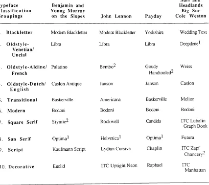
TABLE 1
Typefaces Chosen
in Each Classification for Four Posters
Typeface
Classification
Groupings
Benjamin
andYoung
Murray
on the
Slopes
John LennonPayday
Surf and Headlands
Big
Sur Cole Weston 1. Blackletter 2. Oldstyle-Venetian/ Uncial Modern BlackletterLibra
Modern Blackletter Yorkshire
Libra Libra
Wedding
TextDeepdene1
3. Oldstyle-Aldine/ Palatino
French
4. Oldstyle-Dutch/ Caslon Antique English Bembo^ Janson
Goudy
Weiss Handtooled2 Janson1 Artist Selected
-^ConsumersPreferred
Caslon
5.
Transitional Baskerville Americana Baskerville Melior6.
Modern Bodoni Bodoni Bodoni Bodoni7. Square Serif Stymie2 Rockwell Candida ITCLubalin
Graph Book
8. San Serif Optima1 Helvetica1 Optima1 Futura
9.
Script Kaufmann Script Lydian Cursive Chaplin ITC ZapfChancery
--10.. Decorative Euclid
TABLE 2
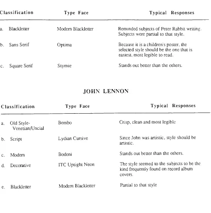
Typical
Reasons
for
Subjects'Selection
BENJAMIN AND
YOUNG MURRAY
ON THE SLOPES
Classification Type Face Typical Responses
a. Blackletter
b. Sans Serif
c. Square Serif
Modern Blackletter
Optima
Stymie
Remindedsubjects ofPeterRabbitwriting.
Subjectswerepartialto that style.
Becauseit isa children'sposter,the
selected style shouldbetheonethatis easiest,mostlegibletoread.
Stands
outbetterthantheothers.JOHN
LENNON
Classification Type Face Typical Responses
a.
Old
Style-Venetian/Uncial b. Script c. Modem d. Decorative e. Blackletter Bembo LydianCursive Bodoni
ITC Uptight Neon
Modem Blackletter
Crisp,
clean andmostlegibleSince Johnwasartistic, style shouldbe
artistic.
Standsoutbetterthantheothers.
Thestyleseemedto the subjectstobethe
kind
frequently
foundon record album covers.PAYDAY
Classification
a.
Old
Style-Aldme/French
b. Sans Serif
c.
Decorative
d.Script
e. BlackletterType Face
Goudy
Handtooled
Optima
RaphaelChaplin
Yorkshire Typical ResponsesSubjects
liketheoudineeffect; thoughttheoudine ofthe typewent well withthe outlineintherainbow andin thebody.
Subjects
likedtheboldness.Subjects
likedtheboldness.Natureof air
"Pop"
orcontemporary in
design.
Consequendy,
subjects wantedtostay away fromconventional styletostay
with entire poster.
Partial to thestyle.
Classification
SURF AND
HEADLANDS
BIG
SUR
COLE WESTON
Type Face Typical Responses
a. Decorative
b. Script
c. Modem
d. Square Serif
e. Blackletter
ITC Manhattan
ITC Zapf
Chancery
Bodoni
ITC Lubalin Graph Book
Wedding
TextBecausethepictureiscontemporary,or
"mod,"
the typestyle also shouldbe.
Demonstratesasweeping
feeling
likethewavesinthepicture.
Boldyetcrisp,clear and mostlegible.
Boldyetcrisp,clear andmostlegible.
With
the secondstudy,
the author expanded the classificationfrom
which the mostpreferredtypeface
from tier
onewasdetermined.
Four
typefacesfrom
this class(including
the one most preferredfrom
tierone)
were shown to the subjects.This
wasdone
todetermine
whichwas preferred theclassification orthe typefaceitself.
Interestingly
enough,
subjectsdenied any
real preference.After
testing
720
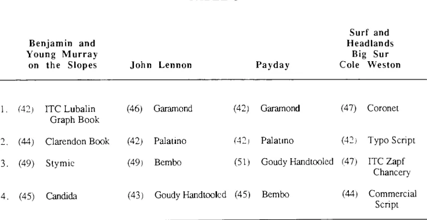
people, the authorcame to theconclusion thatno one typefacewas preferred(see
Table
3).
Only
the classification
itself
was preferred.See Appendix B for
results(cross
tabulations and [image:27.533.53.482.297.518.2]bar
graphs).TABLE 3
Benjamin and
Young
Murray
on the
Slopes
John LennonPayday
Surf and
Headlands
Big
Sur Cole Weston1.
(42)
ITC Lubalin Graph Book(46)
Garamond2.
(44)
Clarendon Book(42)
Palatino3.
(49)
Stymie(49)
Bembo(42)
Garamond(42)
Palatino(47)
Coronet(42)
TypoScript(51)
Goudy
Handtooled(47)
ITC ZapfChancery
4.
(45)
Candida(43)
Goudy
Handtooled(45)
Bembo(44)
Commercial ScriptCHAPTER
VI
ANALYSIS
OF THE DATA
Several
cross-tabulations were writtento analyze thedata for
thisexperiment,
due
tothe
large
amount ofdata involved.
Freedmen, Pisani,
andPurves
tell us:"Many
investigators
prefer tomake thecomparisonin
tabularform,
using
whatis
called acrosstab
(short
for
cross-tabulation)".24This
was also
done
to controlfor
the effect of genderand ofage.
The
comparisonsbetween
typefaces weremade graphically, through thebar
graphs
in Appendix
A. Each
ofthefour
postershad its
owngroup
of180
subjectsmaking
atypeface selection
for it. The
same procedure was madein
the secondtier,
thusyielding
1,440 individual
answersfor both
tiers.The data
was recordedmanually,according
tosubject selection.
The
typefacefor
each poster was recordedfirst,
followed
by
the otherfour
questions(1.
SEX
2.
AGE
3. BUY
4.
REASON)
on the questionnaire(see
Appendix
F,
Test
Booklet).
The
resultsfor
the typeface selectionin
thefirst
tier reflect adefinite
preference oftype.
However,
theresultsfor
the secondtierdo
not.For
BENJAMIN AND YOUNG MURRAY
ON
THE
SLOPES,
first
tier:Stymie
(from
theSquare Serif
classification oftype)
was selected77
times(42.8%).
The
nexthighest scoring
typefacewasBodoni
at22 times
(12.2%).
The
artist choseOptima,
whichranked
fourth
with14
subjects(7.8%).
Second
tier:Stymie
again was selected themost,with
49
votes,but in
percentile,had
only
27.2%.(from
the180
people tested).Candida
had 45
votes(25%),
Clarendon Book
had 44
(24.4%),
andITC Lubalin Graph Book had
For JOHN
LENNON,
first
tier:Bembo,
anOldstyle-Aldine/French
classification,
was selected
71
times
(39.4%),
over all otherfaces. The
second mostpopularwasLibra,
with
24,
or13.3%. The
artist choseHelvetica,
which gotonly
seven votes.Second
tier:All four
typefaces
displayed
werevery
close contenders.Bembo
was the mostpreferred,by
49
subjects(27.2%). Garamond
had 46
people selectit
(25.6%),
Goudy
Handtooled
had 43
(23.4%),
andPalatino
received42
votes(23.3%).
Again,
no real prefrenceemerged
in
the secondtier.
With
PAYDAY,
first
tier:84
(46.7%)
ofthe180
subjects choseGoudy
Handtooled
(another
Oldstyle-Aldine/French
classification).The
closest contender to this wasYorkshire,
with amere8.9%. The
authorconcludedthat thereasonYorkshire
was chosensecond,was
simply because
subjectswere partialto theBlackletter
classification style.The
picture/message,
as aconsequence,
had
nobearing
on theirdecision.
The
artist choseOptima,
which ranked sixth, with12
subjectsselecting it (6.7%).
Second
tier:As in
thefirst,
numerous subjects selectedGoudy
Handtooled
and stated thatthey
identified,
orrelatedthe outline effect
in
the type to the outline effectin
therainbow andin
thebody
ofthe picture.
As
aresult, over50
subjects selectedGoudy
Handtooled.
Bembo,
which wasnumber one
for BENJAMIN
AND
YOUNG MURRAY ON
THE
SLOPES,
tallied45
votes
(25%),
andGaramond
andPalatino both had 42
(23.3%).
The last
poster,SURF
AND
HEADLANDS,
BIG
SUR;
COLE
WESTON,
first
tier:subjectspreferred the
Script
classification.ITC
Zapf
Chancer}',
whichis
aScript
face,
wasselected
77
times(42.8%).
Wedding
Text
(Blackletter)
andBodoni
(Modern)
tiedfor
second with
15
(8.3%).
The
artist choseDeepdene,
which tied(with
Futura)
for
eighthwith
10
votes(5.6%).
Second
tier:ITC
Zapf
Chancery
tied withCoronet
at47
each(26.1%). Commercial Script
totaled44
(24.4%-),
andTypo Script
totaled42 (23.3%).
See
All
cross-tabs reflect no real preferencefor
theface
itself,
but
do
show preferencefor
the classification.
See Appendix H (pouch
attachedtolast
page)for
pictures ofthe posterwiththe typefacepreferred
in
thefirst
tier,
the typeface the authorselected, andalsofor
theFOOTNOTES
FOR CHAPTER VI
25Freedman,
P., Pisani,
R.
andPurves,
R.
Statistics.
(New
York: W.W.
Norton
CHAPTER
VII
SUMMARY
AND
CONCLUSIONS
This study
set outtoresearchthefollowing: Would
consumers,
in
general, single outthe same typeface that the
designer did for
the message/picture combination?The
authorfelt
that notevery designer
wasusing
atypeface thatbest
projects the mood, or"feeling,"
for
thedisplay
posterathand. (See Appendix G
as towhy
the typefacewas selectedby
thedesigner for
each ofthefour
posterstested.) In
order tostudy
thisproblem, ahypothesis
was
formulated. The
hypothesis
stated:If
the typefaceselectedtoaccompany
theartworkon aposter supports the general viewer's notion
for
appropriateness, then the message ormoodofthe
finished
printedproductwillbe
enhanced.The
authorcalled,or attemptedto call,each ofthefour
people who made theselectionofthe typefaces that were used
in
the posters.The
author askedfor
their reasoningsin
making
the selectionsthey
did.
Out
of thefour
posters studied, not one artist wasin
agreement with the public's notion of what the appropriate typeface might
be.
Upon
further
study,it
wasdetermined
that none wasin
agreement with thepublic'schoice ofthetypeface classification.
The data
suggests that thehypothesis,
therefore,is
not true.Although
it
is
true that thereis
apreference oftype thatcould enhance the message/picturecombination, the preference
is
notfor
a single typeface.This
preferenceis simply for
agrouping.
For
allfour
message/picture combinations,"BENJAMIN
AND YOUNG
MURRAY ON THE
SLOPES,"
"JOHN
LENNON,""PAYDAY,"
AND "SURF AND
HEADLANDS,
BIG
SUR;
COLE
WESTON,"
one, out of the ten classifications
groups andmale-female categories set
forth,
no realdifference
in
preference was noted.The
author selected(tested)
30
subjectstosatisfy
therequirements statisticianshave layed
out;
30
subjects represent a population.In
thisstudy
a realpreferencefor
a classificationwas noted
by
the targetmarket(the
peoplein Mid-Central Wisconsin). (See Appendix
B.)
People may
ask,
"What do
theseresults tell thedesigner,
who selects typefacesfor
aliving,
abouthow
to selecttype?"
In
this study, the conclusions suggest thatdesigners
realize that a preference
does
exist.With only
alimited
number oftypefaces,
subjectstested,
and areacovered,however,
it is
apparentthatmuch more workis
neededbefore
thisconclusion
becomes
universal.According
toBlum,
26
"Much
oftheknowledge
abouttypeface selectionis based
onintuition.
There
arevarious schoolsofthoughtconcerning
typeface congeniality; expertsseemto agree
only
thatit is important
to selectthepropertypeface,
nothow
to accomplishthis
end."
This study
suggests a possibleway
to accomplishthis end.The
key
part ofthis researchis
thatdisplay
posters(message/picture
combinations)
are,
indeed,
influenced
by
typeface selection, and that amethodology
for
measuring
thisphenomenon
has
been developed.
Instead
oftesting 180
people, groupedby
age andgender
(as
theauthordid),
themethodology
indicates
thatonly 30
people, allfrom
one agegroup
and the same sex,needtobe
testedwith asample of each ofthe ten classifications oftype.
The highest
numbercouldbe
assumed tobe
themost preferredby
all consumers.If
a
designer
bypasses
the abovemethodology,he
or she couldforego
a sale.Research
on typeface combinationsis
stillin its early
stages ofdevelopment.
The
author
believes
thateventually
thisinformation, along
with researchfrom
thepast,willhelp
in
makina the correct selection of type.Hopefully,
a sample test willsomeday be
developed,
with measureddegree
of accuracy, that couldeasily
show which typeis
FOOTNOTES FOR CHAPTER VII
26Blum,
M.L. An
Investigation
oftheEmotional Connotations
ofPrinting
Types.
CHAPTER
VIII
RECOMMENDATIONS
FOR FURTHER INVESTIGATION
This
researchbarely
skims thetop
ofthefurther
analysis thatis
needed.Wider
rangesoftypefaces must
be looked
into,
anddifferent
targetmarkets shouldbe
tested.The
targetmarkets should
be
groupedaccording
toindividuals
socio-economic and culturalbackgrounds,
andtheregrouping
oftheages should alsobe
investigated. Message/picture
combinations that take
form
ofthatotherthan thedisplay
poster(i.e.
greeting
cards,book
covers,magazine covers, calendars,
etc.)
shouldbe
tested.All
future
research shouldbe done
with theintention
ofarriving
ata solutiontopredictappropriate
typefaces,
depending
on what, andfor
whom the appropriatenessis
mean toLIST OF
REFERENCES
Blum,
Michael.
An
Investigation
of
theEmotional
Connotations
of
Printing
Types.
Published Master's Thesis: Rochester Institute
ofTechnology,
1979.
Dowding,
Geoffrey.
Factors in
theChoice
of
Typefaces. London: Wace
andCompany,
Limited,
1979.
Dreyfus,
John. "A
Turning
Point in Type
Design."Visible Language. 19 (1985).
Graphic Arts Manual. Janet
Field,
Ed.
New
York:
Musurts
Publishing
Company,
1980.
Freedman, P., Pisani,
R.
andPurves,
R.
Statistics.
New York:
W.W.
Norton
Company,
1980.
Haskins,
J. B.
"Testing Suitability
ofTypefaces for
Editorial
Subject
Matter."Journalism
Quarterly. 35 (1958).
Hofman,
Veronica.
An investigation of
the affectsof
typefacesupon reader's perceptionof
themeanings
of
messagesusing
the semanticdifferential
testing
technique.Published
Master's
Thesis:
Rochester Institute
ofTechnology,
1988.
Lawson,
Alexander.
Printing
Types.
Boston: Beacon
Press,
1971.
Modoux,
G. "Package
Design
by
Videography."Paperboard Package.
69(1984).
Ovink,
G. E.
Legibility,
Atmosphere
Value,
andForms
of
Printed
Type. Leiden:
A. W.
Sijhoff,
1938.
Poffenberger,
A. T.
andFranken, R. B.
"A
Study
oftheAppropriateness
ofTypefaces,"
Journal
of Applied Psychology.
1 (1923).
Rehe,
R.
F.
"Psychological
Studies
andTheir
Impact
onModem
Typography."
Inland
Printer!American
Lithographer.164
(March,
1970).
Schiller,
G.
"An
Experimental
Study
of theAppropriateness
ofColor
andType in
Advertising."Journal of Applied Psychology. 19(1935).
Stanton,
H.
Fundamentals of Marketing.
New York: McGraw-Hill
Book
Company,
1973.
Turnbull,
A. T.
andBaird,
R. N.
The Graphics
of Communication.
New
York:
Holt,
Rinehart,
andWinston, Inc.,
1964.
Wrolstad,
M. E.
"Adult
Preferences
in
Typography:Exploring
theFunction
ofDesign."
APPENDIX
A
MESSAGE
BENJAMIN
AND
YOUNG
MURRAY ON THE
SLOPES
Typt;facel
<21F <21M 21-35F 21-35M 35+F 35+M Total
1.
Modem Blackletter
9 1 2 o2 0
9
0
Libra
4 5 5 23
2 213.
Palatino
1 i0
10 2
6
4.
Caslon Antique
2 0 1 -> 23
125. Baskerville 1
0
33
o1 10
6. Bodoni
3
5 43
3 4 227. Stymie 13 11 10 13 14 16 77
8.
Optima2 03 4 o -> 1 14
9. Kaufmann Script 0 1
0
1 0 15
10. Euclid 0
0
1 1 0 0 430 30 30 30 30 30 = 180
1 Typefacesnumbered 1-10areinsequencewiththeclassifications given. (See Table
1.)
130 ITO . 160 -150 140 130 110 -100 30 -| SO 70 -6 0 50 20 2 0
21
2212
i n77
43%
14
X
%
%
X X
%
%
v
\
X
X
**
\
X K
X
X
%
X
'<
*.
<
vTypeface*
1. Modem
Blackletter
2.
Libra
3
.Bembo
4. Janson
5.
Americana
6.
Bodoni7 Rockwell
8. Helvetica2
9. Lydian Cursive
10. ITC Uptight Neon
<21F <21M 21-35F 21-35M 35+F
1 10 o 2 3 2 1 1 2 11 2
3
3
0 1 0 5 13 4 23
1 2 0 00
5 13 4 2 1 1 05+F 3 5+M Total
0
1 35 5 24
11 13 71
3 4 19
1 0 10
3 4 17
1 1 6
2 1 7
4 1 11
0 0 12
30
3030
30
30
30 1801 Typefacesnumbered 1-10areinsequencewiththeclassifications given. (See Table
.30 L70 150 1:0
H
, " c 110 100 90 30 / .J 60 50 40 30 20 10 1 I 2471
40% 19 1710 1
12
o,
%.
<><<$
^
V\
<&%?^
<t <>^
^. o^
4
z
y_.
'o,
V.
<*<>
^
^
<,<>>,
\
^
X
^-
%
%
Z
\
%.
%
\
MESSAGE
PAYDAY
Typeface*
<21F <21M 21-35F 21-35M 3 5+F 3 5+M Total
1.
Yorkshire
1 3 i3
3
4 160
Libra 3 2 4 3 3
0
153.
Goudy
Handtooled
11 12 14 16 15 16 844. Janson 0 0 1 0 1 0 i
5.
Baskerville 1 i2 0 1 7 8
6. Bodoni
3
1 3 2 23
147. Candida 1 0 0 0 1 o
4
8. Optima2 0
3
1 i i 2 129. Chaplin
3
i 1 i 0 0 1010. Raphael 5 5 0 -i
0 1 15
30 30
30
30 30 30 180* Typefacesnumbered1-10areinsequencewiththeclassifications given. (See Table 1.
180 170 160 -150 140 130 120 -110 " 100 90 30 70 -60 50 40 30 20
4
1016
15
84
47% 14 1210
15
z
z
X
%
X
%
%
o,
<5> <&Y^
>:f
9^
^
"0,
x> v> i? 0>^,
c-
Qs
MESSAGE
SURF
AND
HEADLANDS
COLE
WESTON
BIG
SUR
Typeface1
<21F <21M 21-35F 21-35M 35+F
1.
Wedding
Text 2 50
02. Deepdene2 2 12 1
3.
Weiss 2 20
3
4. Caslon 10 2 2
5. Melior 2 12 1
6. Bodoni 2 3 2 4
7. ITC Lubalin Graph Book 12 2
0
8.
Futura0
2 2 39. ITC Zapf
Chancery
16 12 16 1310. ITCManhattan 2 2 2 3
30 30 30 30
typefaces
numbered 1-10arein sequence withtheclassifications given. (See Table1.)
2Artist
selected.+F 35+M Total
4 4 15
1 3 10
0 2 11
1 1 7
1 4 11
2 ~< 15
4 -i 11
2 1 10
10 10 77
3 1 13
130
170
160
140
130 .
120
-so
so
70
i
60
40
30
20
10
15
10
i i11
15
11 in7 U
|
77
43%
13
MESSAGE
BENJAMIN
AND
YOUNG
MURRAY ON THE SLOPES
TypefaceJ
:21F
1. ITC Lubalin Graph Book 6
2. Clarendon Book
8
3.
Stymie29
4.Candida
730
<21M 21-35F 21-35M 35+F
7 5
9
8
8
8 6 78 7 8
9
7 10 7 6
30
30 30^Typefaces
numbered1-4areinthesameclassification(Square Serif).2Typeface
preferredinFirst-Tiertest.30
35+M Total
7 42
7 44
8 49
8 45
30
U
MESSAGE
JOHN LENNON
ypeface1 <21
1. Garamound 9
2. Palatino 7
3
.Bembo2 7
4.
Goudy
Handtooled7
30
<21M 21-35F 21-35M 35+F 35+M Total
8 8 8 6 7 46
7 7 7
8
6
428
8
89
9
497 7 7 7 8 43
30 30 30 30
typefaces
numbered 1-4areinthesameclassification (Oldstyle-Aldine/French).2Typeface
preferredinthe First-Tiertest.MESSAGE
PAYDAY
Typeface1
<21F <21M 21-35F 21-35M 35+F 35+M Total
1.
Garamound
8
6 6 7 8 7 422.
Palatino
7 68
78
6 423.
Goody
Handtooled29
109
7 88
514. Bembo
6
8
79
6 9 4530
30
30
3030
30
= 1801 Typefacesnumbered\^Xareinthesameclassification(Oldstyle-Aldine/French).
2Typeface
preferredintheFirst-Tiertest.MESSAGE
SURF
AND
HEADLANDS
COLE
WESTON
BIG
SUR
Typeface1 <21F <21M 21-35F 21-35M 35+F 35+M Total
1. Coronet 8 7 8 6 8 10 47
2. TypoScnpt
6
7 6 9 7 7 423.
ITC ZapfChancer)'28
9
8
8
7 7 474. CommercialScript
8
78
7 8 6 4430
30 30 30 30 30 = 180typefaces
numbered 1-4 arein thesameclassification(Script).ISO
Survey
Population
60
4 0
20
10
49
42
23-27%
45
25%
I
ITC
Clarendon Stymie *Lubalin
Candida
180
Survey
Population
60
50
40
30
20
10
Garamond Palatino Bembo *
Goudy
Handtooled
180
-Survey
Population
60
50
40
30
_20
_,10
Garamond Palatino
Goudy
Bembo
Handtooled
*180
Survey
Peculation
60
50
*40
20
10
42
23!
44
24=
Coronet Typo Script ITC Commercial
Zapf
ScriptChancery
*APPENDIX
C
e
n
o
Modern
Blackletter
20poml
abcbefghijktmnopqrgruuiusyj
1234567890[]$$:;?!"%&*ii.,/6()
Wedding
Text
abcbefrrljijklrnnopqrstiilifaxrTH
12345B7890[]^:;?!M/o&*ii.,/fe()
20ponl
Yorkshire
20point
abcb
tl
rth^klmnnpqrst ubtoxir*
MeR
Deepdene
ABCDEFGHIJKLMNOPQRSTTJVWXYZ
abcdefghij
klmnopqrstuvwxyz
1234567890&$.,:;?!'"C,fflffiflfffi
Post Medium
ABCDEFQHIJKLMNOPQRSTUV
WXYZ
abcdefgbijklmnopqrstuvwxyz
1234567890&$./;:Ll-,ftflff()/-Libra
ABCdefqhijklmnopqRStuvwxyz
r~
e
Th
Palatino
ABCDEFGHIJKLMNOPQRSTUVWXYZ
abcdefghijklmnopqrstuvwxyz
1234567890[]$C:;?!"%&*ii.//l3()
Goudy
Handtooled
ABCDEFGHIJKLMNOPQRSTUVWXYZ
abcdefghijklmnopqrstuvwxyz
1234567890[]$^:;?!(,%&^;.,/B()
lBpoml
Bembo (true-cut)
ABCDEFGHIJKLMNOPQRSTUVWXYZ
abcdefghijklmnopqrstuvwxyz
1234567890[]$C:;?!"%&^i.,/B()
18poml
Weiss
ABCDEFGHIJKLMNOPQRSTUVWXYZ
abcdefghijklmnopqrstuvwxyz
Alet
Caslon
Antique
ABCDEFGHIJKLMNOPQRSTUVWXYZ
abcdefghijklmnopqrstuvwxyz
1234567890[l$*::?r%&*tf../ft()
18c*>ni
18pom
Janson
ABCDEFGHIJKLMNOPQRSTUVWXYZ
abcdefghijklmnopqrstuvwxyz
123456789O[]$0:;?!"%&*<fi-
,/&()Caslon Regular
ABCDEFGHIJKLMNOPQRSTUVWXYZ
abcdefglujklmnopqrstuvwxyz
Rel
Americana
18poml
ABCDEFGHIJKLMNOPQRSTUVWXYZ
abcdefghijklmnopqrstuvwxyz
1234567890()$C;;?!"o/0<<>)&*(;i>t/f3()
Melior
18poml
ABCDEFGHIJKLMNOPQRSTUVWXYZ
abcdefghijklmnopqrstuvwxyz
1234567890[]$G:;?!"%>>&*n.,/ft()
Baskerville
18point
ABCDEFGHIJKLMNOPQRSTUVWXYZ
abcdefghijklmnopqrstuvwxyz
R E
cl
g
Bodoni
ABCDEFGHIJKLMNOPQRSTUVWXYZ
abed
efghij klmnopqr
stuvwxyz
1234567890&$.,;:?!-'fiflffffiffl
Corvinus Skvhne
ABCDEFGHIJKLM1PQRSTIIVW1YZ
abcdefgMjKlmnopqrstiivwxyz
1234567890&S.,;:?!-/"flnffflUl(i()fi
Craw
ModernABCDBFGHIJKLMNOPQRSTU
VWXYZ
abedef
ghij
klmnopqr
stu
vwxyz
1234567890?!S&0"-%.,;:-For
Stymie
ABCDEFGHIJKLMNOPQRSTUVWXYZ
abcdefghijklmnopqrstuvwxyz
1234567890[]$C:;?!"o/0&*ci.//B()
Rockwell
ABCDEFGHIJKLMNOPQRSTUVWXYZ
abcdefghijklmnopqrstuvwxyz
1234567890[]$^:;?!1'%&*6i.5/B()
ITC Lubalin Graph Book
ABCDEFGHIJKLMNOPQRSTUVWXYZ
abcdeighijklrrinopqrstuvwxyz
1234567890()$C:;?!w%8<^i./B()
ISponl
Candida
AB
CDEFGHIJKLMN
OP QRSTUV
WXYZ
abcdefghijklmnopqrstuvwxyz
1234567890[]$C:;?!"%&*ji.,/B()
18pan]
Odp
Helvetica
ABCDEFGHIJKLMNOPQRSTUVWXYZ
abcdefghijklmnopqrstuvwxyz
1234567890[]$0:;?!,,o/o&*6i.,/8()
ISpoml
Futura
ABCDEFGHIJKLMNOPQRSTUVWXYZ
abcdefghijklmnopqrstuvwxyz
l234567890[]$C:;?l"%&*8J.//(i()
Optima
ABCDEFGHIJKLMNOPQRSTUVWXYZ
abcdefghijklmnopqrstuvwxyz
1234567890[]$C:;?!//%&*eiv/^()
fenud
Typo Script Extended
a^e^/ii/A/'mno/iffr4trs,vuKcuj
12345
67890
.,::-ic'$>/,V?/
Coronet
V
vVZ\
ty/ZL
abcdefahiiklmnopardtuvurxuz
Commercial
Script
Chaplin
Lydian
Cursive
abcckfgkijklmnopqrstuwxijz
ITC
Zapf
Chancery
Medium
ABCDEFGHIJKLMNOPQKSTUVWXYZ
i ii
Raphael
18point
ABCfmTOHIJKLMWOPQKSTUVWXYZ
abcdeigfyijklirjrjopqrstuvwxYZ
1234567890[]c:;?!"%&^i.,/B)()
Euclid
PBCDEFOHIJKLMNOPQI^STUYWXYZ
abcdefgr^ijklrr^rppqrstUvwxyz
1234567890[]$0:;?!<'%c<&*e,i.
,/ro() ISoomlITC
Manhattan
ABCDWCHJKLHNCPCI>IIJVW\yZ
abcdef^ijklrnrcpqrtimfxyz
12345tJ^3[]$i:;?!"^&*.^/P()
18 point
ITC Uptight Neon
iKLin
fiBCDEl
5
In
f
JU
oibcdelfglhijKlninopQiir
APPENDIX
D
MODERN
BLACKLETTER
AND
YOUNG
MURRAY
ON
THE
SLOPES
BODONI
Benjamin
younQmuRR&y
on
the slopes
LIBRA
BENJAMIN
AND
YOUNG
MURRAY
ON THE
SLOPES
STYMIE
BENJAMIN
AND
YOUNG MURRAY
ON THE SLOPES
PALATINO
BENJAMIN
AND
YOUNG MURRAY
ON THE SLOPES
OPTIMA
BENJAMIN
AND
YOUNG
MURRAY
ON
THE
SLOPES
CASLON
ANTIQUE
BENJAMIN
AND
YOUNG
MURRAY
ON
THE
SLOPES
BMAMM
Oh iMJiom
J
KAUFMANN
SCRIPT
MODERN BLACKLETTER
john
Lennon
1940-1980
LIBRA
JOHN
LENNON 1940-1980
BEMBO
JOHN LENNON
1940-1980
JANSON
JOHN
LENNON
1940-1980
JOHN
LENNON
1940-1980
BODONI
JOHN
LENNON 1940-1980
ROCKWELL
JOHN
LENNON
1940-1980
HELVETICA
gOHWWtWW
mo-mo
LYDIAN
CURSIVE
jam
Lennon
1B4O-1980
#|Jtaqj
Payday
YORKSHIRE
BODONI
Payday
Payday
LIBRA
CANDIDA
Payday
Payday
GOUDY
HANDTOOLED
OPTIMA
Payday
%^v
JANSON
CHAPLIN
en,
S
u
*,
Mb
CJ
hH
1
g
co
43
c
ret
C
00
Z
0
L
'
LO
UJ
^
r
U4
5-H
3
-J
CO
&D
0
C
T3
CO
CO
I
iCO
h-J
'a
ctf
0)
<4H
CO
CO
S
o
1
I
O
0
0
CO
CO
PQ
o o
CO
D-C3
co
"D
c
T5
O
<D
c
o
D
CO
CO
to
z
o
LU
LU
^3
E
o
BBS
BOB
ZJ
35
MS?
ten
(0)
or
ma
APPENDIX
E
AND
YOUNG
MURRAY
ON
THE
SLOPES
ITC
LUBALIN
GRAPH
BENJAMIN
AND
YOUNG
MURRAY
ON THE SLOPES
CLAREDON BOOK
I
BENJAMIN
AND
YOUNG
MURRAY
ON
THE SLOPES
STYMIE
BENJAMIN
AND
YOUNG
MURRAY
ON
THE SLOPES
GARAMOND
JOHN
LENNON
1940-1980
PALATINO
JOHN LENNON
1940-1980
BEMBO
JOHN
LENNON
19404980
Payday
GARAMOND
Payday
PALATINO
Payday
GOUDY
HANDTOOLED
5
V)
>-1
<0
5?
APPENDIX
F
QUESTIONNAIRE
AGE
Under 21
21-35
36-Over
<