City, University of London Institutional Repository
Citation
: Loorak, M.H., Perin, C., Collins, C. and Carpendale, S. (2017). Exploring the
Possibilities of Embedding Heterogeneous Data Attributes in Familiar Visualizations. IEEE
Transactions on Visualization and Computer Graphics, 23(1), pp. 581-590. doi:
10.1109/TVCG.2016.2598586
This is the accepted version of the paper.
This version of the publication may differ from the final published
version.
Permanent repository link:
http://openaccess.city.ac.uk/16705/
Link to published version
: http://dx.doi.org/10.1109/TVCG.2016.2598586
Copyright and reuse:
City Research Online aims to make research
outputs of City, University of London available to a wider audience.
Copyright and Moral Rights remain with the author(s) and/or copyright
holders. URLs from City Research Online may be freely distributed and
linked to.
City Research Online:
http://openaccess.city.ac.uk/
[email protected]
Exploring the Possibilities of Embedding Heterogeneous Data
Attributes in Familiar Visualizations
Mona Hosseinkhani Loorak, Charles Perin, Christopher Collins, and Sheelagh Carpendale
Abstract—Heterogeneous multi-dimensional data are now sufficiently common that they can be referred to as ubiquitous. The most
frequent approach to visualizing these data has been to propose new visualizations for representing these data. These new solutions are often inventive but tend to be unfamiliar. We take a different approach. We explore the possibility of extending well-known and familiar visualizations through including Heterogeneous Embedded Data Attributes (HEDA) in order to make familiar visualizations more powerful. We demonstrate how HEDA is a generic, interactive visualization component that can extend common visualization techniques while respecting the structure of the familiar layout. HEDA is a tabular visualization building block that enables individuals to visually observe, explore, and query their familiar visualizations through manipulation of embedded multivariate data. We describe the design space of HEDA by exploring its application to familiar visualizations in the D3 gallery. We characterize these familiar visualizations by the extent to which HEDA can facilitate data queries based on attribute reordering.
Index Terms—Multi-dimensional data, Hybrid visualization
1 INTRODUCTION
We propose Heterogeneous Embedded Data Attribtes (HEDA) as a generic interactive visualization component that can be embedded into a primary and possibly familiar visual representation to create a hybrid visualization that provides visual access to dimensional and multi-typed data entities, while respecting the structure of the primary visual-ization. HEDA provides an approach for visualizing multi-dimensional data with an encoding method for representing heterogeneous data types. The HEDA is an interactive tabular data representation that uses matrix reordering techniques to empower analysts in exploring the data and making visual queries within the context of the primary layout. In addition to visualizing heterogeneous multi-dimensional data, the HEDA’s benefits include: 1) maintaining the familiarity of the primary layout; 2) accessing the detailed data of HEDA on demand; 3) visualizing the data in a single holistic view; 4) specifying interactive queries using matrix reordering; and 5) comparing the values of data attributes for each entity.
The HEDA offers a new way of working with the enormous explo-sion of data, a large portion of which are heterogeneous and multi-dimensional. We refer to heterogeneous multi-dimensional data as data in which the entities have many data attributes that each could be of a different type. The popular dataset of cars [29], is an instance of heterogeneous multi-dimensional data, which is defined over the “car” as the data entity and includes several multi-type (ordered, quantitative, categorical) data dimensions for each entity. Many techniques have been proposed as exploratory visualizations for this type of data. These techniques typically make use of one or more of: (1) dimensional-ity reduction techniques map high dimensional data into a space of lower dimensionality at the cost of abstracting detailed attributes of the data [21, 25]; multiple coordinated views present data in separate views which requires individuals to divide their attention between views; and non-projective visualizations are more likely to provide a complete visual representation of data attributes. However, these techniques may be unfamiliar and or complex (e. g.,parallel coordinates [20] and pixel oriented techniques [23]). Through application of HEDA we attempt
• Mona Hosseinkhani Loorak, Charles Perin, and Sheelagh Carpendale are with the Department of Computer Science, University of Calgary. E-mail: hossem,charles.perin, [email protected].
• Christopher Collins is with the Department of Computer Science, University of Ontario. E-mail: [email protected].
to synthesize the benefits of these alternative approaches.
HEDA was inspired by the Bertin matrix [5], its interactive counter-part Bertifier [38], and TimeSpan by Loorak et al., which described how stacked bar graphs could be extended with tabular visualizations (e. g.,
HEDA) to create a hybrid layout [30]. TimeSpan demonstrated the use-fulness of HEDA for exploring the heterogeneous multi-dimensional data of stroke patients. We generalize that approach by investigating how HEDA can be used to facilitate exploring heterogeneous multi-dimensional data in the context of other well-known visualizations. We chose to work with the D3 gallery [8] as a group of familiar yet fairly comprehensive visualization techniques. From D3, we selected basic visualization techniques and worked towards embedding HEDA into them, looking to reveal the potential design space for embedding HEDA into familiar visualizations. However, as might be expected, the embedding works differently for different visualizations, where variations could be characterized by the degree to which reordering, one of the most powerful features of HEDA, could be applied. Thus, we classified the visualizations into two main categories: 1) reorderable, and 2) transformable. For each category, we provide descriptions and examples of visualization techniques that they contain (§5).
To demonstrate the effectiveness of embedding HEDA, we chose two familiar visualizations: scatterplots and arc diagrams and extended both using HEDA. We show how HEDA helps in exploration and analysis of heterogeneous multi-dimensional datasets in context of a simple and familiar primary layout. We report on initial feedback from the domain experts utilizing Scatterplot-HEDA and ArcDiagram-HEDA for explor-ing their domain-specific data (§6). The main contributions of this paper are: generalizing HEDA as an interactive visualization component that can be used for extending the familiar visualization techniques; visually representing the heterogeneous multi-dimensional data in a single-view hybrid layout; exploring the design space of HEDA by applying it to a set of well-known visualization techniques; and demonstrating how embedding HEDA into existing visualizations improves the exploration capabilities of the primary layout, by providing expert consultations on our implemented prototypes using the expert’s domain-specific data.
2 RELATEDWORK
We review earlier explorations of design spaces opened up by InfoVis techniques, because we explore the HEDA design space. We also review multi-dimensional data visualizations, hybrid visualizations, and visualizations of heterogeneous data, because HEDA represents heterogeneous, multi-dimensional data in a hybrid visualization.
2.1 Exploring InfoVis Design Spaces
A number of InfoVis research papers describe a visualization technique and analyze the design space of possible variations that this visualiza-tion enables. In a recent design space research, Claessen et al. proposed
flexible linked axes (FLINA) [11] for representing multivariate data. In their technique, they visually connect multiple visualizations, such as scatterplot matrices, hyperboxes, and parallel coordinates, using flexible linked axes. Another example is concrete scales [10], which examined the design space of complex measures that use easier to un-derstand units. Visual Sedimentation [19] is a design space exploration of the physical sedimentation process as a metaphor for visualization of data streams. These are just a few design space papers to show how they can potentially open up new directions for future research.
2.2 Multi-Dimensional Data Visualization
We focus on the most closely related works in the large field of multi-dimensional data visualization — non-projective multi-multi-dimensional visualizations, where the intention is to fully represent the multi-dimensional data. Point-based techniques map each data item or subset of the data item’s attributes to a single point. For example, a scatterplot matrix (SPLOM) [4] visualizes data in multiple views by showing all pair-wise combinations of dimensions. A SPLOM gives an overview of the whole dataset with each plot appearing as a small scatterplot, which can make comparing the data details difficult. Pixel-based techniques, such as circle segment [2] and VizDB [24], map each individual data values to a colored pixel. For visualizingm-dimensional datasets, the screen is partitioned intomseparate windows, where each window is assigned to display one data dimension. However, in pixel-based displays the viewer has the challenging task of mentally matching the relative positions from different windows.
Glyph or icon-based techniques use small independent visual ob-jects, such as Chernoff faces [9] and Stick Figures [40], to represent multi-dimensional data attributes [7]. As cross-glyph comparisons can be difficult, they are not well-suited for discovering trends, dis-tributions, and correlations. Axis-based techniques such as Parallel Coordinates [20] and Star Coordinates [22] map attributes to coordinate axes. However, the connecting edges can cause clutter and occlusion issues, which can lead to difficulties in interpretation [52]. Hierarchical techniques like Dimensional Stacking [27] divide the k-dimensional data hierarchically into subspaces. While this is an intriguing data representation idea, each additional data attribute represented adds considerably to the white space in the representation, making this a less-than-compact method for highkdimensions. There is a large body of work focused on multiple coordinated views (MCV) [42], which show different aspects of the data in different views. These multiple views can be explored using interaction techniques such as brushing & linking but, these approaches divide people’s attention between multiple views to discover relationships among data entities.
2.3 Hybrid Visualization
A visualization technique is called hybrid if the representation results from a combination of two or more representations in a single view. At their best, hybrid visualizations offer the combined power of the visualizations they contain. For this discussion, we classify hybrid visualizations by the degree to which they represent multi-dimensional and multi-typed data.
Relational data.Hybrid approaches can offer two ways for exploring the same relational data. NodeTrix [17] and MatLink [18] are well-known hybrid visualizations that take advantage of matrix and node-link diagrams for representing the relations in network data. OntoTrix [3] also combines node-links and matrices to represent ontologies. Applied set relations.Some hybrid layouts show the data in a primary layout and use a secondary visualization to add another data dimension. Bubble Sets by Collins et al. [13] represents set relations among data entities on top of existing visualizations while keeping the primary layout intact and can be used with many primary visualizations, such as scatterplots, graphs, and maps. LineSets [1] create similar approach making use of curved lines to connect entities. KelpFusion by Meule-mans et al. [33] also shows entities’ set relationships on top of a primary layout, using a combination of convex hulls and line-based techniques. Multiple types of relational data.A data set may hold several types of relational data. Elastic hierarchies [54] shows both hierarchical and
network relations by combining the benefits of node-link diagrams with treemaps. Similarly, ArcTrees [36] offers a hybrid combination of one-dimensional treemaps and arc diagrams. Fekete et al. [15] combined treemaps and node-links to represent additional relationships among data entities. TreeMatrix by Rufiange et al. [45] combines adjacency matrices, node-link and arc diagrams, nested inclusion, and icicle diagrams to visualize compound graphs. They all offer a hybrid layouts to represent multiple types of data relations.
Relational data plus one data attribute.This combination of show-ing relational data with one data attribute is not uncommon. The most famous example is Minard’s visualization of Napoleon’s march on Russia [34]. His Sankey diagram that shows Napoleon’s army losses along their trip to Russia is extended with a line diagram showing the temperature of pertinent locations. This hybrid adds the data attribute temperature. PivotSlice [53] uses one data attribute to create multiple facets, which each contain the appropriate data using force-directed layouts and over-drawn links. Pearlman et al. [37] embed pie chart glyphs containing temporal data in a node-link diagram for visualizing a computer network to discover more details about network attacks. Relational data plus all attributes.To fully show a multi-dimensional network data, Viau et al. [50] used a hybrid of scatterplots and node-link diagrams. GraphDice [6] combines node-link diagrams for represent-ing social relationships, with a scatterplot matrix, for visualizrepresent-ing the multivariate attributes of entities in multiple small views. Sarayia et al. [46] use a hybrid of node-links and heat maps to represent temporal attributes over time. SoccerStories by Perin et al. [39] shows node-link paths in several connected visualizations to represent additional data. Papilio [31] takes advantage of quilt-like layouts for representing par-tially ordered relations, and extends the layout with an adaptable-shape matrix for displaying associated homogeneous multi-dimensional data. GSUVis [49] uses arc diagrams and timelines to combine relationships among individuals and homogeneous temporal location data. All data attributes. Yuan et al. [52] presented a hybrid technique extending parallel coordinates with scatterplots to improve the potential for exploration. Both parallel coordinates and scatterplots effectively show data attributes. In this technique, when converting more than two axes into a single subplot, multidimensional scaling techniques are used, resulting in some loss of detailed data.
2.4 Heterogeneous Data Visualization
Little prior work focuses on visualization of heterogeneous data. Early work in Chernoff faces [9] and stick figures [40] was already mentioned. UpSet [28] offers a way to visualize sets and their intersections in the form of a binary matrix. Other multi-typed attributes are represented using techniques such as bar chart and box plot.
Domino [16] relates closely to our work as it provides ways of including associated data and their relationships for multiple intercon-nected heterogeneous datasets. The idea is to use blocks of established visualizations for representing subsets of data that can be assembled through block relationships. With Domino and using several interaction steps, it might be possible to assemble novel visualizations similarly to scatterplot-, parallel coordinate- and barchart-HEDA. However, the objectives of HEDA and Domino are different. Domino provides meth-ods forlinkingtogether subsets of visualized data. In our work, we explore the possibility ofextendingwell-known visualizations through embedding HEDA to reveal one holistic view of multi-dimensional heterogeneous data.The HEDA design space includes extending a much broader range of visualizations such as maps, graphs, and trees, which are not covered by Domino. HEDA can also be applied singly, multiply, radially, and can be used to transform the underlying visualization.
of heterogeneous data have usually been considered as independent visualization techniques. We found only one previous work, TimeS-pan [30], that uses an interactive tabular visualization as part of a hybrid visualization in the context of stacked bar graphs. In our research, we explore the possibility of using heterogeneous tabular visualizations in combination with other well-known and familiar visualizations.
3 HEDA
We describe the concept of HEDA as an interactive tabular visualiza-tion component that can expand common visualizavisualiza-tion techniques by representing the heterogeneous multi-dimensional data details. We outline how HEDA can empower the other visualization techniques and explain how it can be used to make visual data queries.
3.1 HEDA: The Concept
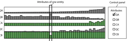
The HEDA matrix as inspired by Bertin’s matrices [5] and the interac-tive Bertifier [38], is a visualization component that can be integrated into other visualizations. TimeSpan [30] used this technique with stacked bar graphs to make a hybrid visualization that shows stroke patients’ multi-dimensional data within the context of their temporal data. We extend this basic idea by showing that HEDA is a powerful modular component that can be successfully integrated with existing visualizations in a variety of different ways. Figure 1 shows five at-tribute rows in a HEDA. Each row represents one atat-tribute and each column holds the attributes for one data entity. In Figure 1, categori-cal attributes are green and quantitative ones are gray. The rows and columns of HEDA can be transposed, allowing orientation to be chosen based on the primary visualization. The attributes can be of any data type: binary, nominal, ordinal, and quantitative.
Quantitative:For quantitative attributes we use size of a bar relative to the minimum and maximum values of that attribute ( ). Alternatives include using position ( ) or value ( ).
Ordinal:We use the given ordering of nominal attributes and assign bar sizes accordingly. For example, shows four ordered values. Nominal:Nominal data do not have a value or ordering. They can be represented using icons ( ) or color ( ). It is also possible to assign an ordering to a nominal attribute based on an arbitrary external ordering, in order to automatically represent it with techniques used for quantitative or ordinal data [35]. Studying nominal data encodings is a vast challenge and beyond the scope of this paper. Thus, for having a consistent encoding across all attributes, we arbitrarily chose to assign external orderings to nominal attributes (with the needed legend), and to use the size of bars ( ) for representing data values.
Binary:Binary data can be either be ordinal or nominal. For ordinal data, we use the given ordering and for nominal data, we simply show one value with half bars and the other value with full bars ( ), or one value with an empty cell and one value with a filled cell ( ).
3.2 HEDA: The Benefits
HEDA is a reorderable matrix visualization suitable for representing and exploring heterogeneous multi-dimensional data. While there is a growing interest in reorderable matrices because of the power they offer in visual interactive query formulation, to our knowledge, only TmeSpan [30] previously used this technique. We discuss the benefits of embedding HEDA into familiar visualizations.
B1: Provide a Holistic View:The common advice in InfoVis is to, if possible, provide an overview — representing as much data as is feasible in a single view [12]. Embedding HEDA as a hybrid component in a familiar visualization explicitly represents as much data as possible in a single view. Creating a holistic view saves people from splitting their attention between multiple views.
B2: Details on Demand:Since the complete representation of all data dimensions is not always required, visualizations extended with HEDA can show their original structure by default. This lets people use the familiar visualization as usual. HEDA can be revealed as needed within the context of the original layout, supporting detailed exploration in the context of the more familiar visualization.
B3: Maintaining Familiarity:Persons with different levels of visual-ization literacy may have different preferences about the visualvisual-ization
QA
QC CA QB
CB
Attributes
CB QC CA QB QA
[image:4.612.332.554.49.122.2]Attributes of one entity Control panel
Fig. 1. A HEDA with 5 attributes ({QA,QB,CA,QC,CB}) using size to encode their values: green for categorical; gray for quantitative attributes.
techniques they are comfortable using [44]. However, if they have complex data consisting of heterogeneous multi-dimensional attributes, representing it with simple, familiar visualizations may be challenging. HEDA makes it possible to 1) visually represent many dimensions of complex datasets, and 2) take advantage of a familiar technique. To-gether this may improve the acceptability of visualizations by domain experts, while effectively assisting them in data analysis tasks. B4: Entity reordering: Visual reordering of entities is one of the significant exploratory features of embedding HEDA into familiar visualizations. Looking at the primary visualization and HEDA, people can form hypotheses about the data. To verify their hypotheses and gain further insight, they can visually formulate queries and reorder the entities to find answers or refine hypotheses.
B5: Three-way Attribute Comparison:One of the significant bene-fits of HEDA lies in its support for comparing entity attributes. Due to the side-by-side representation of entities’ data dimensions in HEDA, these attribute comparisons are possible: self comparison: HEDA visually aligns the different data dimensions of one entity, supporting comparison across attributes of a single entity;single attribute com-parison across entities: HEDA presents entities side by side. This allows the analyst to compare the values of one attribute across several entities in order to see the data distribution and locate extreme val-ues; andmultiple attribute comparison across entities:Depending on the orientation of the HEDA either rows or columns represent one attribute across entities. Representing data dimensions in this manner makes it possible to visually compare two or more data attributes (i.e. rows or columns) in order to discover their dependencies, correlations, and similarities.
3.3 HEDA: The Data Query Details
Reordering rows and columns of a matrix is a known way to reveal patterns in data [38]. As HEDA is a visualization primarily based on this matrix representation, we provide 1) an interactive reordering of attribute locations supporting choice-based comparisons, and 2) a system response to complete the reordering of entities based on one or more currently selected attributes. The attribute rows or columns in HEDA are labeled in an adjacent control panel (Figure 1). By default, the entities are ordered based on a pre-selected attribute. Attributes can be selected in sequence to participate in the reordering of entities. The visual query language in HEDA allows people to logically reorder and subdivide the data entries according to their criteria of interest, for example, sort first by a categorical attribute, then by a quantitative.
Let us consider that{QA,QB,QC,CA,CB}is the set of attributes represented in the HEDA (see Figure 1). Categorical attributes (CA,CB) are shown with green bars, and the quantitative data dimensions (QA,QB,QC) are displayed with gray bars. An attribute can be selected using a checkbox and can be repositioned in the matrix by dragging and dropping the corresponding attribute label. The position of the selected attributes determines their priority in the recursive reordering. Categorical attributes are sorted alphabetically by default, but a new ordering function could be defined.
4 APPLYINGHEDA: THEDETAILS
Query panel
status gender office yearsInFirm age
practice law-school
Attributes
yearsInFirm office gender status age
law-school practice age
status gender
Practice YearsIn Firm office
Law-school
Fig. 2. Arc diagram extended with HEDA. This dataset is lawyers in a firm and their relationships. The attributes shown are: age, status, gender, office, yearsinFirm, practice, and law-school. As indicated by the check in the query panel, the lawyers are ordered according to their age.
because it is among the most familiar of visualizations and because it accepts more than one way of applying HEDA. We implemented these web-based prototypes using D3. A demo version is available at
http://innovis.cpsc.ucalgary.ca/supplemental/HEDA/.
4.1 Arc Diagram-HEDA
An arc diagram is a type of node-link diagram often used for repre-senting relationships between entities such as in networks. The entities (nodes) are positioned along a straight line. The relationships, shown as links, are drawn between the nodes in the form of curved arcs. Since these arcs can be drawn on one or the other side of the nodes, it is possible to show two types of relationship by using both sides of the nodes. Figure 2 shows how HEDA can be embedded into arc diagrams for representing additional data attributes such that 1) all additional data attributes are represented in a unified way (B1), and 2) the visual structure of the original layout is preserved (B3). In Figure 2, besides the main visualization the attribute rows are labeled, the HEDA can be shown or hidden on demand (B2) and the query panel supports selection of the attributes to be used for reordering and the ability to drag and drop attributes for establishing the reordering priority (B4). Interactive Reordering:The linear arrangement of nodes can be re-ordered in arc diagrams interactively, allowing the analyst to make visual queries on data. This can aid in revealing data patterns. The ArcDiagram-HEDA has a query panel that lists all the attributes visual-ized using HEDA (Figure 2). This list of attributes can be reordered by dragging and dropping the attributes’ label. Thus, the nodes, their corresponding arcs, and their attributes shown with HEDA can be re-ordered by the position of the selected attributes in the query panel. This determines the priority of attributes in reordering the entities (B4). Figure 2 is an ArcDiagram-HEDA that is showing a real-world dataset of 71 lawyers working in a corporate law firm [26]. The dataset was collected manually over two years. It extensively describes the relationships among lawyers in terms of friendship, receiving advice from each other, and co-working. It also contains a set of attributes for each lawyer including gender (female, male), office location (Boston, Hartford, Providence), formal status (associate, partner), age, years with the firm, practice (litigation, corporate), and law school (Harvard-Yale, Ucon, other). The dual arc diagram shows two kinds of relationship: friendship and co-working network data. The arcs are directed based on the lawyers’ statement about who are their friends and who they work with. Each lawyer is shown as a small rectangular node, the arcs above the nodes display the friendship relations, and the arcs below the nodes show the co-working network data. In Figure 2, nodes are sorted according to the lawyers’ ages. One can see that status (the second row in the HEDA), whether a lawyer is an associate (half green bar) or a partner (full green bar), is strongly correlated with age.
4.2 Scatterplot-HEDA
Each entity represented in a scatterplot can have multiple attributes. However, a basic scatterplot shows only two quantitative attributes of
18 28
city-mpg
10,272 20,544
30,816 41,088
price
curb-weight horsepower engine-size cylinders symboling fuel-type
city-mpg
highway-mpg compression-ratio fuel-type body
Connecting Lines
Lasso selection
Fig. 3. Scatterplot-HEDA visualization of an automobile dataset. HEDA has been applied as an extension on both X and Y axes.
the dataset, using the vertical and horizontal axes. A few extra data dimensions can be visually displayed by augmenting scatterplots with visual variables such as color and size. However, the number of these additional dimensions is limited, as each suitable visual variable can only be used once for augmenting the layout.
an allocated non-overlapping space. Thus, the HEDA representation of attributes for some entities is not directly inline with the corresponding point. To show the analyst the correlations among entities and their corresponding HEDA attributes, each axis is subdivided as necessary according to the data. Usingconnecting lines, the entities of each axis division are related to their corresponding division in the HEDA (Figure 3). We implemented two powerful interactive features in scatterplot-HEDA to augment data exploration and analysis: lasso-selection, and interactive reordering.
Lasso Selection:Lasso selection is an interaction that supports filtering a set of data entities and being able to follow the selected entities while interactively manipulating the axes and reordering HEDA. Lasso-selecting a set of data entities causes the unselected entities and their representation in HEDA to fade out (see Figure 3).
Interactive Reordering: Interactive reorderng can assist analysts in discovering data patterns. In the query panel, the dimensions under the “X attributes” heading are the ones that are represented on the X axis of the scatterplot and its attached HEDA. The first attribute selected via the checkbox is shown using the X axis itself (spatial encoding). The rest of the attributes are visually encoded with HEDA. However, only the ones which have been checkbox-selected participate in reordering the entities, according to the order they appear on the query panel. The list of X attributes in the query panel can be reordered by dragging and dropping the attribute labels. This reordering manipulates the priority of ordering entities on the X axis. If during this drag and drop operation, the top-most selected dimension,Attr1, is replaced with
another attribute,Attr2, then,Attr2would be replaced and shown on
the X axis, whileAttr1values would be visually shown on HEDA in the
row previously showed the values ofAttr2. For reordering the position
of an attribute row inside HEDA, a reordering interaction has been provided that allows the analyst to drag and drop the attribute labels. The same reordering principles apply to the Y axis HEDA.
5 HEDA DESIGNSPACE
We have described how HEDA can be embedded into an arc diagram and a scatterplot. While HEDA augmented both with new data query potential, the process of embedding in each was different. HEDA is a versatile concept that can be applied to a multitude of visualizations, however, potentially with variations. In this section, we explore the design space of HEDA by discussing how HEDA can be applied to well-known visualizations from the D3 gallery. We first group the visualizations into two categories according to whether reordering via the HEDA respects the familiar visualization or transforms the visu-alization representation structure. We call these top level categories
reorderableandtransformable. Within these two top level categories, visualizations can be grouped again according to whether the change can be applied to the total visualization or to local aspects of the visual-izations structure. Note that several visualvisual-izations can fit in more than one category depending on the data they are representing.
5.1 Reorderable
A visualization isreorderableif it is possible to apply the reordering to the represented data entities of the visualization using HEDA in a manner that the layout of the original visualization is respected. Some visualizations are fully reorderable and some are locally reordeable.
5.1.1 Fully Reorderable
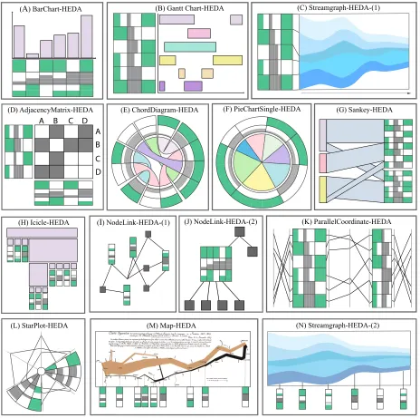
A visualization isfully reorderableif all represented entities of the visualization can be reordered using HEDA without disturbing the original layout of the visualization. Fully reorderable visualizations may embed HEDA as a single unit, as multiple units, or as a ring. Single HEDA:Anarc diagramtakes a single HEDA that can show all data entity attributes, is fully reorderable and supports full interactive visual querying (Figure 2). Similarly,bar chartsaccept a single HEDA and support reorderability and full interactive visual querying (Figure 4-(A)). AGantt chartshows events according to time (e.g., on the x axis) and category (e.g., on the y axis). Events are represented using rectangles: their x-position and width represent their time and duration,
and their vertical position represents their category. Figure 4-(B) shows a GanttChart-HEDA where the HEDA has been applied on the y axis. If this Gantt chart has data for each project, HEDA can show detailed in-formation related to project phases/categories such as priority, risk level, and number of people involved. This fully reoderable single HEDA benefits from interactive reodering and querying. As with a Gantt chart, a single HEDA can be used to reorder the streams of astreamgraph if the vertical axis represents categorical data (Figure 4-(C)). For all of these visualizations the graphical elements can be reordered using HEDA without disturbing the layout of the initial visualization. While arc diagrams, bar charts, Gantt charts and streamgraphs can be drawn vertically or horizontally, the HEDA can be properly aligned to suit. These visualizations are totally reorderable because all data entities can be reordered according to HEDA attributes.
Multiple HEDAs: Anadjacency matrixis a square matrix that is used to represent a finite graph. Each cell of the matrix indicates if the vertices in the row and column are connected in the graph. Applying HEDA to an AdjacencyMatrix-HEDA, shows additional information about each vertex in the graph. Because an adjacency matrix is sym-metric, there are two ways of embedding HEDA. One is similar to the Scatterplot-HEDA: HEDA is duplicated on both axes (e.g., left-right and top-down), as shown in Figure 4-(D). Reordering one HEDA re-orders the second HEDA automatically. The second way is splitting the matrix in two along the diagonal in order to embed a single HEDA between both parts of the matrix. Ascattterplotalso accepts a vertical or a horizontal HEDA, or both, creating a double HEDA, that respects the initial structure of the visualization (Figure 3). These visualizations, when combined with HEDA, support total reordering and data querying while respecting the structure of the underlying visualization. Ring HEDA:Achord diagramrepresents a graph by arranging the vertices in a circle. Arcs connecting vertices represent their relation-ships.Figure 4-(E) shows a ChordDiagram-HEDA with the attributes of vertices peripheral to the main radial layout. This results in a fully reorderable ring HEDA. Apie chartwith categorical slices that convey numerical proportions of data can result in two types of PieChart-HEDA depending on if a slice represents one or more data entities. If each slice represents a single data entity then the resulting PieChartSingle-HEDA is fully reorderable as long as the reordered attribute is categorical. Here HEDA is constructed as for the ChordDiagram-HEDA: a ring HEDA surrounds the pie chart and the additional data of each entity is represented at the periphery of its corresponding slice (see Figure 4-(F)). Reordering according to dimensions of HEDA rearranges the pie slices. Similarly,circular node link layouts, can have a ring HEDA and reordering might find layouts with fewer edge crossings.
5.1.2 Locally Reorderable
A visualization islocally reorderableif it is possible to reorder subsets of the represented entities of the visualization using HEDA without disturbing the original layout of the visualization.
ASankey diagramis a type of flow diagram where the width of a flowing line is proportional to the flow quantity. Figure 4-(G) shows a Sankey-HEDA representing the transfers of countable data entities. A Sankey-HEDA is locally reorderable because reordering can only be applied to data entities enclosed within a given block of the diagram. Indeed, global reordering is not feasible as this would disturb the layout of the Sankey diagram. Tree visualizationssuch as node-link trees, icicle plots and sunbursts must preserve the hierarchical structure of data. Consequently, when HEDA is applied, it is locally reorderable. For example, if the hierarchy of nodes is represented vertically, then reordering nodes vertically would disturb the tree layout. Moreover, for adjacency tree visualizations such as icicle plots and sunbursts, Reordering is only possible among the direct children of a parent in each branch. For nested tree visualizations — techniques that position children inside their parent nodes — HEDA can be embedded locally to visually convey additional data dimensions of nodes, and provide local reordering for comparing the node entities regarding their attributes. Figure 4-(H) shows HEDA applied to an icicle tree.
(B) Gantt Chart-HEDA (C) Streamgraph-HEDA-(1)
A
D C B A D C B
(D) AdjacencyMatrix-HEDA (E) ChordDiagram-HEDA (G) Sankey-HEDA
(J) NodeLink-HEDA-(2)
(H) Icicle-HEDA (I) NodeLink-HEDA-(1) (K) ParallelCoordinate-HEDA
(L) StarPlot-HEDA (M) Map-HEDA (N) Streamgraph-HEDA-(2)
[image:7.612.71.535.48.509.2](F) PieChartSingle-HEDA (A) BarChart-HEDA
Fig. 4. Designs for HEDA applied to a variety of familiar visualization types from the D3 gallery.
nodes expresses their relationship. Applying HEDA to a node-link diagram naively consists of creating one HEDA for each node of the graph. This results in representing each node using a glyph (see Fig-ure 4-(I)), which is useful for representation purposes but does not support reordering and comparison between multiple data entities. An alternative approach consists of embedding a HEDA into each node showing the attributes of neighbouring nodes (see Figure 4-(J)). In this case, the neighbours of a node can be explored and reordered similarly to how children can be reordered in tree visualizations, making Node-link-HEDA locally reorderable. A Node-Node-link-HEDA requires space proportional to the number of nodes and their neighbors. Interactions such as displaying HEDA on demand could solve this issue.
5.2 Transformable
Re-orderability is about HEDA being embedded and used for data queries that reorder while respecting the original visualization. When the application of HEDA is transformative, the advantages of applying HEDA are accompanied by changes to the underlying visualization.
5.2.1 Fully Transformable
A visualization isfully transformableif HEDA can be used to reorder all represented data entities. However, while it can still be embedded
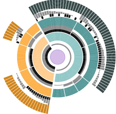
into the visualizations it creates structural changes to the visualizations. For an example of a fully transformable use of HEDA consider radial treessuch as sunbursts. Figure 5 shows a sunburst-HEDA, where appropriate data has been used to create HEDA ring for each level in the hierarchy. Here reordering can be applied at any level in the hierarchy and needs to be propagated down the hierarchy. While this maintains the underlying structure of the tree, visually it may be quite transformed. Multiple hierarchically-propagated HEDAs can be applied to any non-nested tree. We saw thatpie chartswhere each slice represents one data entity can be fully reordered with a ring HEDA. However, when slices represent aggregated data, a HEDA with the full data details can be applied, but now reordering will transform the piechart. Figure 6 (a) shows the original pie chart with a ring HEDA containing aggregated data details. Figure 6 (b) shows within slice sorting and (c) shows across slice reordering. In Figure 6 (c) only the slice colors still hold information about the original pie chart.
Fig. 5. A Sunburst Tree extended with HEDA showing the possibilities offered with local hierarchical reordering. Some nodes have their children reordered according to the binary attribute in black, others according to the continuous attribute in gray.
(a) (b) (c)
Fig. 6. The same data represented in three different ways using a PieChart-HEDA: (a) original pie chart; (b) data entities within each slice are locally reordered according to the ordinal attribute in black; (c) all data entities are globally reordered according to the quantitative attribute in gray, breaking the slices into sub-slices.
Parallel Coordinates(PC) are a popular multi-dimensional visual-ization technique. HEDA and PC are similar in that they both represent multi-dimensional data. HEDA provides a more compact view on the multi-dimensional attributes, which are ordered together, while PC provides complete independence between axes. HEDA seamlessly integrates into PC because one HEDA represents the data for several axes. Figure 4-(K) shows a PC-HEDA with two HEDAs. This ex-tension of parallel coordinates makes it possible to: 1) visualize data attributes using less screen real estate than with PC only; 2) lay out data attributes next to each other, making it possible to compare more than two attributes simultaneously without the need to re-position PC axes; and 3) visually identify data entities sharing the same attribute values, something difficult with PC because of overplotting of polylines. A PC-HEDA is globally reorderable because reordering the data according to one of the data dimensions reorders all data entities. However, when fully applied, a PC becomes a HEDA and thus is transformed.
AStar Plotis the radial version of parallel coordinates, thus HEDA can be embedded into any of the star plot axes (see Figure 4-(L)). However, due to its radial layout, the representation of entity attributes varies depending on the entity’s distance to the center of the star plot. The allocated space for representing attributes of the entities closer to the center is smaller than the space available for those which are far from the center. This might result in a need to create an unused circular central region so that area judgments within the HEDA are still feasible.
5.2.2 Locally Transformable
A visualization islocally transformableif HEDA cannot be used to reorder represented data entities, however, it can still be embedded into the visualization for representational purposes.
Minard’s mapshows the flow of Napolean’s march to Russia on a map [34]. In this well-known visualization, a horizontal line at the
degrees
degrees 0 10 20 30
-10
0 10 20 30
-10
Temperatures ordered by increasing date
Temperatures ordered by weather then by decreasing date
Date
Minimum date
Maximum date
Weather
[image:8.612.82.278.54.248.2]Rain Storm Sun Snow
Fig. 7. A Line Chart extended with HEDA. The original line chart, showing temperatures in ascending order by date (top), is reordered according to weather, then data points within each weather category are locally reordered by descending date (bottom).
bottom of the map shows the temperature of a few places from the map. Temperature is one additional data attribute that has been integrated into the main layout, and can assist analysts in reasoning about the shape and width of the flow on the map. In the same way, it is possible to embed HEDA in Minard’s map to visually represent additional data dimensions of the sampled spatial positions (see Figure 4-(M)). However, this approach has limitations. Due to the underlying spatial structure of the data, reordering the sampled data points is not possible. Thus, HEDA is beneficial only for representation purposes and is not reorderable. Also, HEDA can only be embedded along a dimension of the plane if the mapping is a function,i. e.∀a,b∈A:f(a) =f(b)⇒a=b. In such a map, it means that the trajectory that the army followed cannot go back. This type of local representational benefit applies to all maps. The temporal aspect ofstreamgraphssuffers from the same limita-tions than Minard’s map. HEDA can provide additional data dimensions about a sample of points in time, but reordering is not possible using HEDA in streamgraphs unless time is being reordered (Figure 4-(N)). Remember that the quantitative axis of streamgraphs can be augmented with a reorderable HEDA if each stream is treated as a data entity (see Figure 4-(C)). This provides the opportunity to reorder the streams vertically according to additional data dimensions. A single data entity HEDA can be embedded in individual data representations such as: nodes in a node link graph, leaves in a treemap or other nested trees, and any other visualization where spatial repositioning cannot be tolerated.
6 HEDAINUSE: EXPERTCONSULTATION
We discuss the utility of ArcDiagram-HEDA (Figure 2) and Scatterplot-HEDA (Figure 3) with domain experts.
6.1 ArcDiagram-HEDA Consultation
We discussed ArcDiagram-HEDA with a university professor who studies and analyzes law firms and their organizational structure. We loaded in the implemented ArcDiagram-HEDA a real-world dataset of 71 lawyers working in a corporate law firm [26]. We first explained how to read the visualization with the HEDA collapsed: small squares in the center represent lawyers, upper arc links show friendship relationships while lower arcs show works-with relationships. Then we expanded the HEDA and explained that each square gives additional information about that lawyer, such as age, gender, and length of time in firm. Within five minutes, the expert had understood the visualization moved immediately into fruitful discussions and feedback.
[image:8.612.56.306.259.383.2]Associate Lawyers
status gender office yearsInFirm age
practice law-school
Attributes
yearsInFirm officegender age status
law-school practice Partner Lawyers
Fig. 8. The lawyers are ordered by their status and then age. Left lawyers are associates, and the right ones are partners.
see demographic data and the interaction patterns in a firm.”He also found the tool to be generic enough to be used in different contexts:
“You could do it with the professors too and get the same dynamics out of it.”,“I would generalize it beyond the law firm like an office setting. Who is talking to who and so forth which would be very interesting. [. . . ] It could be the data of a research lab, it could be consulting, it could be a financial firm. This is a lovely and nice setting to do it because you see the same thing in consulting.”
Since the expert was extremely familiar with law firms, he mostly confirmed facts he already knew,e. g., “I wouldn’t expect friendship be-tween partners and associates. Those are hierarchical relationships.”,
“The office distance and correlations does not surprise me at all. Because there are lots of studies that show proximity is the basis for interaction amongst people.” Figure 8 shows these facts, where due to HEDA sorting the associate lawyers are on the right and the partners are on the left. The upper ’friendship’ arcs are more frequent with either associates or partners, while the lower ’works-with’ arcs frequently connect associates with partners.
The expert also found some unknown aspects of the data to explore that would be interesting to law firms,e. g., “For a law firm, I think this gender issue would be particularly important.”,“The Boston office is the largest. Hartford office may be recently founded that could play for the gender difference among offices. But females are still under represented.”This is highlighted in Figure 9, which shows only the partners. The three highlighted filled green squares indicate female lawyers while the rest of the squares in this row are white, indicating male. The second row of the highlighted squares shows that all three female partners work in the same office, which is the Boston office. The expert noted:“The other thing here is age and partner are highly correlated. [. . . ] Partners are older because it’s basically 7 to 10 years out. They are going to be up or out.” After we reordered the HEDA to show the one lawyer who has been in the firm for 10 years but is still an associate, he hypothesized that the lawyer might be a female who took leave for multiple years:“That’s a he? [. . . ] Because sometimes females if they have children [. . . ] might be on leave for multiple years.”; or“He may be what they call permanent associate. YearsInFirm is a pre-requisite for partnership.”
The expert made suggestions for making the tool more useful to the law firms. First, he suggested to integrate more data:“[. . . ] there would be like security, trust, IPOs. So, that may also explain some of the working relationships inside an office. So, breaking it up to categories would be interesting.”,“If I were a firm, I would be interested in which of my lawyers are working together and who is originating the client.”
Second, he recommended to add features to the visualization. He would like the ability to emphasize some aspects of the HEDA:“the squares are the same size. [. . . ] If I am interested in gender issues, then I want the gender rectangles to be larger [. . . ] I would like to make the emphasis where ever I want to.”Also, he wanted to be able to filter rows of HEDA:“I want to focus on gender and law-school, I may want to make the other stuff go away. ”
6.2 Scatterplot-HEDA Consultation
We discussed Scatterplot-HEDA with a institutional research analyst at a university and used their collected real-world student retention dataset. We loaded the records for 449 health students into Scatterplot-HEDA and presented to it the expert. Due to the confidentiality of the dataset, we provide pseudonyms in this description.
The feedback regarding the usefulness of the tool for analyzing the status
gender office yearsInFirm age
practice law-school
Attributes
yearsInFirm office gender age status
law-school practice
Female Partners all working in Boston office Partner Lawyers
Fig. 9. Among the lawyers who are partners, only three are female and they all work in the Boston office.
retention dataset was positive:“I see this tool [as] very beneficial. I can see our office definitely using this just to help understand subgroups, populations of students, and we get asked questions across the board like trying to justify the admission criteria and trying to figure out why the students are not persisting. So I can definitely see that this visual-ization is very helpful over just data mining.”. Like the legal expert, she also suggested that filtering features would help their office get more out of the visualization:“ more filtering into different populations, that would be very beneficial for us.”
The expert used the visualization to confirm many of her ideas based on her experience. For example, the visualization shows that two programs (A, B) in the health science department have a lot of fails and withdrawals. The expert related this fact to the maturity level of students in those programs:“you are coming as a mature student, and you are having a full-time workload, and they are trying to put school on top of that [. . . ] A lot of them are having a little bit of difficulty progressing through the program.” For another program (C) where students are more successful, she noted its group nature:“I am looking at that kind of cohort and those types of students in that program. They tend to gel more. [. . . ] If some of them are left behind, then, their cohorts graduate ahead of them. So, there is a bit of motivation for them to stick together and go through the cohort together.”After observing that students in program D are not successful in graduating even though they are full-time students with high admit GPA, the expert mentioned that program is a tough program:“. . . it is a tough program and people transition out of it a lot in comparison to the other programs.”
Finally, the expert discovered trends in data using HEDA. such as a correlation between students who drop out and their first year GPA. She also thought that looking at HEDA at the beginning might be a little overwhelming. However, she quickly realized the potential of HEDA:
“when your eyes get used to it, and you are able to see what exactly it is showing, it definitely seems very useful.”. While HEDA is initially difficult to parse, the initial “overwhelming” stage was relatively short.
6.3 BarChart-HEDA in Use
The inspiration for our current work is the success of TimeSpan as reported by Loorak et al. [30]. Timespan embedded HEDA to create an interactively reorderable stacked bar chart (Figure 10) to visualize the temporal and multi-dimensional data of stroke patients. By default, the bars are ordered on the x axis based on time. However, through select-ing different attributes and based on the orderselect-ing priority, the bars and their corresponding attributes in HEDA, can be reordered. As a result, individuals can create complex visual queries and observe the results through HEDA and the familiar bar graph. A focus group conducted with stroke experts and demonstrated how it helped the domain experts to better analyze and understand their real-world dataset [30].
7 DISCUSSION
Here, we discuss some important challenges and benefits of embedding HEDA into familiar visualizations, in light of future research directions.
7.1 Making Use of the HEDA Design Space
To further elucidate the HEDA, we show how our design space can be thought of as either a hierarchy (Table 1)1or a 2D space (Table
1Table 1 and Table 2 can be found athttp://innovis.cpsc.ucalgary.ca/
Fig. 10. TimeSpan [30] is an example visualization showing how stack bar graphs can be extended using HEDA.
2)1. Both structures illustrate how for a given visualization, HEDA may be usefully applied in more than one way. For example, HEDA can be applied to Pie-charts differently to be either fully reorderable or fully transformable. When considering how to apply HEDA to a visualization: 1) look at the visualization structure, such as axis, to see whether a HEDA can be positioned such that it is apparent which attributes belong to which data entities; 2) look at the representations of the data entities to see if the HEDAs can be applied locally; then 3) apply basic HEDA interactions observing the effect on the underlying visualization; 4) remember that there may well be more than one suc-cessful application of HEDA, so that it is worth more than one attempt.
7.2 Challenges when Applying HEDA
Nominal data representation using size:Mapping nominal data to size is challenging because nominal data do not have an inherent or-dering. Assigning nominal data an ordering is one strategy. However, often the assigned orderings are arbitrary and context-dependent, and may show an artificial pattern between data values, causing misinterpre-tation. A few techniques have been proposed to order the nominal data using the information in the data itself [32, 43]. Such orderings could result in the automatic assignment of visual variables, such as size, to the nominal data values. They could also enable the visualization to present additional information about the underlying data. It would be useful to employ these data-driven ordering methods in future iterations of the HEDA technique to impose an optimal ordering on nominal values. Furthermore, proposing novel data-driven ways of ordering nominal data is an interesting future research challenge.
Scalability:The scalability of HEDA depends, to a large degree, on the familiar layout it is embedded into. In some cases, such as bar chart, the scalability of HEDA is the same as the main layout. In techniques such as arc diagram, HEDA’s scalability is better than the original layout (Figure 2). In some other techniques, such as node-link diagrams, em-bedding HEDA inside nodes results in taking more space, introducing new scalability issues. However, even in such visualizations, embed-ding HEDA improves data exploration by proviembed-ding visual access to the detailed data attributes. One way of minimizing scalability issues with HEDA is to make certain it is possible to access it on demand. Attribute labeling:Sometimes labeling the attributes that appear in HEDA in context with the HEDA itself is challenging due to the con-straints of the familiar layout. In visualizations such as radial layouts, there is no free space to place labels beside HEDA. Offset labelling techniques have to be devised.
Alignment issues:In some visualization techniques such as scatter-plots, parallel coordinates, and streamgraphs, HEDA values are rep-resented using quantitative axes. In this case, the data entities in the original layout might not be aligned with their equivalent representa-tion on HEDA. In scatterplot-HEDA, we minimized this by providing
connecting lines. Another way of dealing with this alignment issue might be providing explicit connections, such as lines, between entities’ visual representations and their corresponding HEDA component. Identify overlapping data entities: Overplotting is one of the com-mon problems that arises when using scatterplots and parallel coordi-nates. Altering the opacity of points in scatterplots, and lines in parallel coordinates, is a common way of minimizing the overplotting problem. However, in cases where several points and lines are placed on top of each other, recognizing the number of overplotted entities is chal-lenging. In HEDA, overplotting does not happen as each entity has an
allocated space for displaying its dimensions. Thus, one benefit of ex-tending scatterplots and parallel coordinates with HEDA appears when filtering techniques such as lasso-selection are applied on a set of data entities with representations placed on top of each other or extremely close together. Filtering an overplotted area would highlight the data of all selected entities within HEDA, which results in discovering the number of overplotted data as well as their detailed attribute values. Transferable learning:Tabular visualizations such as HEDA might seem overwhelming at first. However, HEDA is a generic technique that can be applied to many different visualizations. Thus, even though it requires some training at first, individuals can take advantage of this training when using other tabular visualizations or other places where a HEDA has been embedded.
Reverting to familiarity: Through interactive revealing/hiding of HEDA, it is possible for an analyst to go back to their familiar vi-sualization at any time.
8 CONCLUSIONS ANDFUTUREWORK
We presented HEDA, an interactive tabular visualization component, that can be embedded into familiar visualization techniques. When embedded, HEDA provides additional power by offering the possibility of interactively formulating visual queries based on the data’s heteroge-neous multi-dimensional attributes, while respecting the structure of the original familiar layout.
We explained how HEDA can be applied to well-known visualiza-tion techniques from the D3 gallery. We classified these visualizavisualiza-tion techniques according to how the embedding of HEDA affects them. We discovered two basic classifications. One group, which we call
reorderable, supports the use of the HEDA within the visualization to achieve either global or local reordering of the visualization’s data entities, while still respecting the visualization’s basic structure. The other group, which we calltransformable, responds to the use of the HEDA within the visualization to achieve either a transformative reor-ganization of the initial visualization, or simply a local embedding of the heterogeneous multi-dimensional attributes for immediate represen-tation enhancement but no reordering power. The use of HEDA opens up a design space for multiple new hybrids with a lot of potential, as demonstrated by our examples.
HEDA allows people to visually explore, query, and analyze multi-dimensional data, while respecting the structure of the original familiar layout. The benefits for embedding HEDA in familiar visualizations include: creating a holistic view of multi-dimensional data; providing a new option for having data details on demand; maintaining the familiar-ity of the initial visaulization; offering the power of interactive visual queries on data by reordering entities based on the embedded heteroge-neous attributes, and supporting three-way data attribute comparisons. The results of this research shed light on new ways of creating hybrid layouts using familiar visualization techniques for representing and exploring heterogeneous multi-dimensional data. We invite further exploration and in-depth application of the proposed hybrid extensions in our design space. One approach we plan to investigate in future work is extending multiple coordinated views with HEDA. The idea behind multiple coordinated views is to represent additional data dimensions. They could benefit from HEDA as it can connect and compact the multiple views while directly representing heterogeneous attributes. Furthermore, examining new ways of embedding other non-projective multi-dimensional visualizations into familiar layouts is an interesting avenue for future research.
ACKNOWLEDGMENTS
Thanks to supports from NSERC, AITF, and SMART Technologies.
REFERENCES
[1] B. Alper, N. Riche, G. Ramos, and M. Czerwinski. Design study of linesets, a novel set visualization technique. IEEE TVCG, 17(12):2259–2267, Dec 2011.
[3] B. Bach, E. Pietriga, I. Liccardi, and G. Legostaev. Ontotrix: A hybrid visualization for populated ontologies. WWW ’11, pages 177–180, New York, NY, USA, 2011. ACM.
[4] R. A. Becker, S. W. Cleveland, and A. R. Wilks. Dynamic graph-ics for data analysis.Statistical Science, 2(4):355–383, 1987. [5] J. Bertin. La graphique et le traitement graphique de
l’information. Nouvelle biblioth`eque scientifique. Flammarion, 1975.
[6] A. Bezerianos, F. Chevalier, P. Dragicevic, N. Elmqvist, and J. Fekete. Graphdice: A system for exploring multivariate social networks.CGF, 29(3):863–872, 2010.
[7] R. Borgo, J. Kehrer, D. H. S. Chung, E. Maguire, R. S. Laramee, H. Hauser, M. Ward, and M. Chen. Glyph-based visualization: Foundations, design guidelines, techniques and applications. In
Eurographics State of the Art Report, pages 39–63, 2013. [8] M. Bostock, V. Ogievetsky, and J. Heer. D3 data-driven
docu-ments. IEEE TVCG, 17(12):2301–2309, Dec. 2011.
[9] H. Chernoff. The use of faces to represent points in k-dimensional space graphically.Journal of the ASA, 68(342):361–368, 1973. [10] F. Chevalier, R. Vuillemot, and G. Gali. Using concrete scales:
A practical framework for effective visual depiction of complex measures. IEEE TVCG, 19(12):2426–2435, Dec 2013.
[11] J. H. T. Claessen and J. J. van Wijk. Flexible linked axes for multivariate data visualization.IEEE TVCG, 17(12):2310–2316, Dec 2011.
[12] W. S. Cleveland and R. McGill. The many faces of a scatterplot.
Journal of the ASA, 79(388):807–822, 1984.
[13] C. Collins, G. Penn, and S. Carpendale. Bubble sets: Revealing set relations with isocontours over existing visualizations.IEEE TVCG, 15(6):1009–1016, 2009.
[14] A. Falguerolles, F. Friedrich, G. Sawitzki, and S. Heidelberg. A tribute to j. bertin’s graphical data analysis. SoftStat, 97:11–20, 1997.
[15] J. Fekete, D. Wang, N. Dang, A. Aris, and C. Plaisant. Overlaying graph links on treemaps. InPoster: InfoVis, pages 82–83, 2003. [16] S. Gratzl, N. Gehlenborg, A. Lex, H. Pfister, and M. Streit.
Domino: Extracting, comparing, and manipulating subsets across multiple tabular datasets.IEEE TVCG, 20(12):2023–2032, 2014. [17] N. Henry, J. Fekete, and M. McGuffin. Nodetrix: a hybrid vi-sualization of social networks. IEEE TVCG, 13(6):1302–1309, 2007.
[18] N. Henry and J.-D. Fekete. Matlink: Enhanced matrix visual-ization for analyzing social networks. InProc. of INTERACT, volume 4663, pages 288–302. Springer Berlin Heidelberg, 2007. [19] S. Huron, R. Vuillemot, and J. D. Fekete. Visual sedimentation.
IEEE TVCG, 19(12):2446–2455, Dec 2013.
[20] A. Inselberg. The plane with parallel coordinates. The Visual Computer, 1(2):69–91, 1985.
[21] I. Jolliffe.Principal component analysis. Wiley Online Library, 2002.
[22] E. Kandogan. Visualizing multi-dimensional clusters, trends, and outliers using star coordinates. InSIGKDD ’01, pages 107–116. ACM, 2001.
[23] D. A. Keim. Designing pixel-oriented visualization techniques: Theory and applications.IEEE TVCG, 6(1):59–78, Jan 2000. [24] D. A. Keim and H. P. Kriegel. VisDB: Database exploration using
multidimensional visualization. IEEE CG&A, 14(5):40–49, 1994. [25] J. B. Kruskal and M. Wish.Multidimensional scaling, volume 11.
Sage, 1978.
[26] E. Lazega.The collegial phenomenon: The social mechanisms of cooperation among peers in a corporate law partnership. Oxford University Press on Demand, 2001.
[27] J. LeBlanc, M. O. Ward, and N. Wittels. Exploring N-dimensional databases. InVIS ’90, pages 230–237, 1990.
[28] A. Lex, N. Gehlenborg, H. Strobelt, R. Vuillemot, and H. Pfis-ter. Upset: Visualization of intersecting sets. IEEE TVCG, 20(12):1983–1992, Dec 2014.
[29] M. Lichman. UCI machine learning repository, 2013.
[30] M. Loorak, C. Perin, N. Kamal, M. Hill, and S.
Carpen-dale. Timespan: Using visualization to explore temporal multi-dimensional data of stroke patients.IEEE TVCG, 22(1):409–418, Jan 2016.
[31] M. H. Loorak, P. Fong, and S. Carpendale. Papilio: Visualizing android application permissions.CGF, 33(3):391–400, 2014. [32] S. Ma and J. Hellerstein. Ordering categorical data to improve
visualization.Proc. Conf. InfoVis, 1999.
[33] W. Meulemans, N. H. Riche, B. Speckmann, B. Alper, and T. Dwyer. Kelpfusion: A hybrid set visualization technique.
IEEE TVCG, 19(11):1846–1858, Nov 2013.
[34] C. J. Minard. Carte figurative relative au choix de l’emplacement d’un nouvel hˆotel des postes de paris. InENPC. 1865.
[35] T. Munzner. Marks and channels. InVisualization Analysis and Design, chapter 5, pages 94–114. CRC Press, 2014.
[36] P. Neumann, S. Schlechtweg, and S. Carpendale. Arctrees: Visu-alizing relations in hierarchical data. EUROVIS’05, pages 53–60, 2005.
[37] J. Pearlman and P. Rheingans. Visualizing network security events using compound glyphs from a service-oriented perspective. In
Proc. of VizSEC, pages 131–146. 2008.
[38] C. Perin, P. Dragicevic, and J.-D. Fekete. Revisiting bertin ma-trices: New interactions for crafting tabular visualizations.IEEE TVCG, 20(12):2082–2091, Dec 2014.
[39] C. Perin, R. Vuillemot, and J. D. Fekete. Soccerstories: A kick-off for visual soccer analysis. IEEE TVCG, 19(12):2506–2515, 2013. [40] R. Pickett and G. Grinstein. Iconographic displays for visualizing multidimensional data. InProc. Conf. on Systems, Man, and Cybernetics, pages 514–519, 1988.
[41] R. Rao and S. K. Card. The table lens: Merging graphical and symbolic representations in an interactive focus + context visual-ization for tabular information. CHI ’94, pages 318–322, 1994. [42] J. C. Roberts. State of the art: Coordinated & multiple views in
exploratory visualization. InCMV ’07, pages 61–71, 2007. [43] G. E. Rosario, E. A. Rundensteiner, D. C. Brown, M. O. Ward,
and S. Huang. Mapping nominal values to numbers for effective visualization.Information Visualization, 3(2):80–95, 2004. [44] P. Ruchikachorn and K. Mueller. Learning visualizations by
anal-ogy: Promoting visual literacy through visualization morphing.
IEEE TVCG, 21(9):1028–1044, Sept. 2015.
[45] S. Rufiange, M. J. McGuffin, and C. P. Fuhrman. Treematrix: A hybrid visualization of compound graphs. CGF, 31(1):89–101, Feb. 2012.
[46] P. Saraiya, P. Lee, and C. North. Visualization of graphs with associated timeseries data. InIEEE Symp. INFOVIS 2005, pages 225–232, Oct 2005.
[47] H. Siirtola. Interaction with the reorderable matrix. InProc. Conf. InfoVis, pages 272–277, 1999.
[48] M. Spenke, C. Beilken, and T. Berlage. Focus: The interactive table for product comparison and selection. UIST ’96, pages 41–50, New York, NY, USA, 1996. ACM.
[49] E. Tarameshloo, M. H. Loorak, P. W. Fong, and S. Carpendale. Using visualization to explore original and anonymized lbsn data.
CGF, 35(3):291–300, 2016.
[50] C. Viau, M. J. McGuffin, Y. Chiricota, and I. Jurisica. The flowviz-menu and parallel scatterplot matrix: Hybrid multidimensional visualizations for network exploration.IEEE TVCG, 16(6):1100– 1108, Nov 2010.
[51] H.-M. Wu, Y.-J. Tien, and C. houh Chen. Gap: A graphical environment for matrix visualization and cluster analysis. Com-putational Statistics & Data Analysis, 54(3):767–778, 2010. [52] X. Yuan, P. Guo, H. Xiao, H. Zhou, and H. Qu. Scattering points
in parallel coordinates.IEEE TVCG, 15(6):1001–1008, Nov 2009. [53] J. Zhao, C. Collins, F. Chevalier, and R. Balakrishnan. Interactive exploration of implicit and explicit relations in faceted datasets.
IEEE TVCG, 19(12):2080–2089, Dec 2013.
![Fig. 10. TimeSpan [30] is an example visualization showing how stackbar graphs can be extended using HEDA.](https://thumb-us.123doks.com/thumbv2/123dok_us/1417888.94565/10.612.55.308.49.145/timespan-example-visualization-showing-stackbar-graphs-extended-using.webp)