Rochester Institute of Technology
RIT Scholar Works
Theses
Thesis/Dissertation Collections
3-20-1979
Energy in Clay Forms
Aviva Schneider
Follow this and additional works at:
http://scholarworks.rit.edu/theses
This Thesis is brought to you for free and open access by the Thesis/Dissertation Collections at RIT Scholar Works. It has been accepted for inclusion in Theses by an authorized administrator of RIT Scholar Works. For more information, please [email protected].
Recommended Citation
Rochester Institute of
Technology
A Thesis Submitted to the
Faculty
ofThe College of Pine and Applied Arts
in
Candidacy
for the Degree ofMASTER OP PINE ARTS
Energy
inClay
Formsby
Aviva Schneider
~provals
Advisor:
Hobart Cowles
Date:~~_.
_
Graduate Academic
Council
Representative:
Date:
Dean, College of
Fine
& Applied Arts:
Date:
Fred Meyer
'-~----5/2-IIZL
7
I
---Dr. Robert H. Johnston Ph. D.
S"
I
~~
\
~t
---
___
_
I,
Aviva Schneider
,
hereby grant
permission to the
Wallace Memorial
Library of
R.I.T.,
to
reproduce my thesis in whole or in part.
Any
Contents
PART ONE: AESTHETIC CONSIDERATIONS 1
An illustrated discussion of my work
PART TWO: TECHNICAL CONSIDERATIONS
7
Construction:
drying
problems, claybodies,7
glazes, and
firing
Colored Clays
-Introductory
Discussion 12Specific Color Considerations
14
PART ONE: AESTHETIC CONSIDERATIONS
The purpose of my thesis has been to create a series of
handbuilt forms in an attempt to give clay
forms,
which aresolid and unchanging, a
feeling
oflife,
energy, and growth.I have not been
trying
to imitate specificliving
forms fromnature; rather, I have been attemptingin my work to create
pieces with a strong
feeling
of unity to them - aunity of
form,
design,
color, scale, and concept.Within this general
framework,
I have narrowed down mychoice of
forms,
designs,
and ideas to an exploration of afew specific ones which I have found interesting.
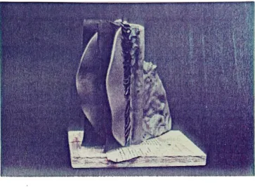
Primarily,
I have been involved with the idea of a spherical form which
is defined
by
edges of slabs extending from a central core asshown in the photographs. I have limited my choice of forms
to ones which may seem very similar. I find that
by limiting
the variables I am working with over a period of time and
by
working in a series within these
limitations,
I am able togradually clarify my ideas more than if I continually change
back and forth from one concept to the next. I have also
experienced many technical difficulties in
building,
drying,
and
firing
these pieces. I find that in order to achieve anysuccessful results I must limit the technical variables I am
working with.
of spheres, I have chosen a variety of aspects of form and
design to focus on different pieces. Control over the
forms
-building
them to look as I envision them - has beenextremely difficult for me, and while it improves with each
piece, many of the ideas are not expressed as clearly in the
pieces as I would have liked. When I began the series, I was
intrigued
by
the importance of the outer edges of the slabsin
defining
the volume vs. the importance of the more openareas - the gaps - between slabs
and the clustering of little
points towards the central core.
They
tend to draw theenergy towards the inside of the piece.
Thus,
a contrast wasestablished;
by
merely altering the spacing of the slabs andthe
intensity
of the points betweenthem,
a shift of theemphasis from the surface to the inner core was established.
I built several pieces simply exploring this change of
emphasis, progressing gradually from areas where the slabs
were close together to more open areas
(see
photos). Colorwas used here simply. The slabs were one solid color. On
the points, where
they
were firm and active ontop,
the colorwas
intense,
graduallyfading
towards the bottom wherethey
were
droopy
and pale.I then decided to introduce a new variable, to add a new
element to the pieces. I was intrigued
by
the way the outeredges of each individual slab connected with all the others
to form a volume - a sphere. I decided to attempt
to
volumes. I used color to exaggerate and define the concept
of two different volumes
by
using alternating slabs of twodifferent colors. That opened many new possibilities.
By
cutting the slabs of each color in an orderly
fashion,
I usedthe idea of progressions to show a movement around the piece,
and
by having
2 colors progressing around the same piecethere were many possibilities for a great deal of movement.
On the one
hand,
there was simply the movement from thechange of the shapes of the slabs. On the other
hand,
therewas also the carryover from one slab to the next of each
color which maintained the volumetric quality. The idea of
two colored slabs progressing around the same central axis to
form two volumes in one space has been very
intriguing
to me,and I have worked a great deal within this
framework,
exploring different shapes and different ways of altering the
slabs.
I have found the idea of progressions, or any reliance
on an order such as numbers for
determining
how a pieceshould be designed and/or built very helpful. For example,
defining
two extremes of a progression, then separating outsteps and
figuring
out an even progression from one extremeto the other can make the transitions flow smoothly. This
sort of reliance on progressions has often been a very
helpful way for me to plan and design pieces, both in terms
of
trying
to enter a new idea andtrying
to clarify one whichable to break from the progression, to be able to respond
purely visually to what happens in a piece or in a series of
pieces. This is especially true once a series is underway
-being
able to respond purelyintuitively
and visually to thework, as far as continuing goes.
In the process of cutting away parts of the slabs, I
have cut into the overall spherical form to some degree in a
number of pieces. I wanted, after makieig several pieces, to
diverge from the sphere - to break the
symmetry and the
predictable, even outlines of the forms. I gradually began
to cut away more and more of the slabs, each time
losing
moreof the overall sphere.
However,
I realized that-in my
opinion - much of the strength
of form was
lost,
and I havebeen careful to preserve the overall sense of the sphere in
the more recent pieces.
My feeling
isthat,
right now, thesphere is an essential aspect of these pieces: with the
changes in color, the contrasts in shapes of slabs, and all
the activity of the points all over the pieces, I feel that
the pieces have become so complex that
they
arebecoming
difficult to look at; uncomfortable. In all that complexity,
something visually clear and familiar is essential, and for
me right now that clarity and
familiarity
is found in thesimplicity and strength of the sphere.
Therefore,
I havemore recently focused on designs which preserve the overall
sense of the sphere, which I find is defined mostly
by
theincorporate
cutting the inner bulk of the slabs away whilepreserving the outer rounded edges as much as possible.
Another variable which has been of interest to me is
scale. When I began
building
these pieces, I began small,partially because I was interested in the
delicacy
and almostprecious quality of small pieces, but also because that was
all I could handle.
Gradually
the pieces got larger - eachtime I increased the scale I lost the first piece or two due
to cracking until I became more comfortable with the increase
in scale. As the pieces became
larger,
I became excitedabout the new possibilities of space and overwhelmed at the
differences in the impact of the images simply from changing
scale. The two largest pieces I built
-about 20" tall
-both cracked
badly,
and while I decided to pursue alternatebuilding
methods(which
I discuss in section2),
I reached apoint where I felt forced to produce some smaller pieces in
order to have something to show for my thesis other than a
bunch of cracked slabs and drawings and technical notes. I
was depressed about
decreasing
the scale until I actuallybegan
building
a small piece. I found then that I had muchmore control over the material and that the
craftsmanship,
the clarity, was much stronger on a small scale than it had
been on the larger pieces. The ideas were much clearer and
the images much more comprehendible. I also felt that while
the larger pieces have a stronger presence
-especially
onbut one no less valid to me.
They
are more personal, moreintimate. I even built two "one-handers,"
only about 4"
high. These pieces which I built
during
the last few weeksof my thesis are important to me in that I was able to work
out a lot more ideas than I would have if I had chosen to
continue on a larger scale because of the time element
involved
(the
larger ones took much longer to build). I mayreturn to a larger scale at some
time,
tout for now it hasbeen very important to
keep
the pieces small and to get themM
m. SUwEH
<yy.:A
1
-'-. .
PART TWO: TECHNICAL CONSIDERATIONS
Construction:
&jffiLng
problems, claybodies, glazes, andfiring
The most severe technical problem I have had throughout
my thesis is cracking
during
drying. The problem generallyappears to be a result of the severe tension which I impose
on the clay, primarily due to forms which
inherently
mustdry
unevenly. The method I have used of
dealing
with thisproblem is that of
designing
andbuilding
a piece even thoughI suspect it will crack, then seeing if and how it cracks,
then evaluating
(with
a great deal ofhelp
fromHobart)
whether the cracks could be eliminated
by
different construction methods, a different claybody, or
both,
and thentrying
again.
Unfortunately,
while cracks are sometimes difficultto explain,
they
are much more difficult to predict-exactly
where the tension will be strongest on a given form and how
persistent the problem will be - so this is the
only way I
can work
-making semi-educated guesses and then just
hoping
for the best and seeing what happens.
The photographs on the
following
pages illustrate thegeneral
building
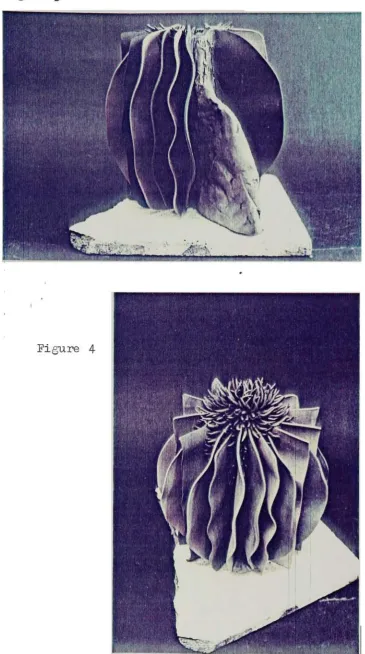
processes I used. Figure 1 shows thecentral core with the first few slabs attached. The slabs
are rolled or poured, then draped over wads of
damp
papertowel to provide the edges with a
feeling
of movement. WhenFigure 1
[image:19.573.108.472.83.349.2] [image:19.573.106.466.408.676.2]Eigure
3
[image:20.573.106.472.43.698.2]8
scoring and using slip. A coil is then attached for extra
strength. Then the points are assembled and attached to the
piece, from bottom to top.
Figure 2 shows the piece with a few more slabs. Note
also the thick slab which is essential for counter-weight.
Figure
3
shows the piece just before the thick slab isremoved. The piece is on a kiln shelf so it can be placed
in the kiln without
being
touched.Figure
4
shows the completed piece beforedrying
andfiring. Wax painted on each of the points at the
top
helpsthem from
breaking
from the weight of the plasticduring
drying.
I began my thesis using the
following
cone 10 porcelainrecipe, which worked pretty well for the
initial,
smallerpieces, presenting only minor cracking problems and
becoming
strong, vitreous, and translucent when fired:
Jean Montalbano's Porcelain
Edgar's Plastic Kaolin 40 Tennessee
#1
BallClay
20Flint 20
Potash Feldspar 10
Nepheline Syenite 10
Dolomite 2
102
While this
body
did not present major problems on myinitial,
small, thesis pieces, I was also using it for somework I was
doing
at cone5
and I found the clay to beclear glaze on it without crazing since it was too porous,
and
second, I was
having
severe losses due to cracking onsome simple
handbuilt
bowl and plate forms I was making.With
help
from Angela Fina andHobart,
I adjusted thebody
tohelp
solve these problems. To decrease the porosity I increased the fluxes. To prevent cracking I reduced the overall
clay content
(to
cut down on shrinkage), cut way back on theball clay, divided the kaolin content i*i half to introduce a
wider range of clay particle sizes, added bentonite to give
it some plasticity, and added pyrophyllite.
Thus,
we arrivedat the
following
formula which I have since used on mysculptures,
bowls,
plates and other forms:Cone
5
Clay
Edgar'
s Plastic Kaolin
15
Grolleg
18Tennessee
#1
BallClay
5
Flint 20
Custer Feldspar
25
Talc
5
Bentonite 2
Pyrophyllite 12
102
I find that this clay is much less prone to
drying
cracks than the former clay. It is not very plastic and
people who have tried to throw it say it is very bad
(although it improves with age). It does not fire white - it
is speckled, but since I generally add colorants, to the clay
10
to warp at cone
5
on certainforms,
such aslarge,
lowplatters, and I would advise cutting back on the flux or
firing
it lower if anyone tries this clay on forms which areprone to warp.
While my thesis pieces have been unglazed, I have been
doing
other work with this clay with a clear glaze. Thefollowing
clear glaze works well over this clay:Val Cushing1
s Clear Glaze ,
*
Kona
F-4
Feldspar 35Gerstley
Borate23
Barium Carbonate
8
Whiting
8
Edgar'
s Plastic Kaolin
8
Flint 18
100
I have
dipped,
poured and sprayed it. I find it works bestif it is not applied too thickly. While it is suggested for
use up to cone 6 I have had some occasional
blistering
withit above cone 5. I have not experienced any problems with
underfiring it slightly.
I have not yet conquered the technical problems of
building
larger scale pieces, but I have been working on aseries of tests on clays which may enable me eventually to
work larger. The tests I have been
doing
are experimentswith
slabs-poured from casting slips. I tried this because
the slipcast slabs may be stronger than the rolled ones and
11
more willing to be wet down and assembled
even after areas
have dried or even when
they
are completely dry.They
arealso faster to produce, resulting in less uneven
drying
due totoo much time spent on any given piece. I tested a number of
casting slips from recipes from various people and several
commercial ones, and so far for my purposes the best one I have
found is the casting slip
Holly
Jones has been using. This isSeeley's "white velvet"
casting slip from Seeley's Ceramic
Service,
Inc. ofOneonta,
N.Y. It tested best for me in thatit was the only one with which none of my tests cracked and
with which I could take two
bone-dry
pieces and attach them andhave them bond. It is sold commercially as a lowfire earth
enware slip, but I have found that
by
overfiringit,
itbecomes stronger and more vitreous. I am still experimenting
with its
firing
range - theuncolored samples I fired to
cone
5
were still quite porous, at cone9
they
were very vitreous. I fired one very small piece I made using thisslip to a flat cone 10 and it completely melted into a
puddle. I have built another piece with this slip and so far
I have not had any
problems-building
with it ordrying
it. Ijust have to find the right temperature. Hobart suggested
when I began
testing
this slip that the flux in it was probablytalc,
and that magnesia has a "sudden andstrong"
fluxing
action, usually somewhere around cone8.
My
guess12
I have fired almost all my pieces to cone 5-10 in an
oxidation atmosphere with no glaze. The reason I have done
this is that all the color variation I want in the pieces is
built in with colored clay - I
am not
looking
for anysurprises or variations from the
firing
process for thesepieces, as
they
are already complicated enough. All I wantfrom the
firing
is to make theclay strong and vitreous and
to
bring
out the colors, with consistency fromfiring
tofiring.
This need is easily satisfied with oxidationfiring
in an electric kiln.
Colored Clays
-Introductory
DiscussionDuring
the past5
years I have been involved intesting
and using colored clays, and while I have chosen a relatively
restricted assortment of colors to use in my thesis
sculptures, I have been actively involved in using a wider
assortment of colored clays for other purposes
-such as my
handbuilt functional pieces and my "creatures" which are very
colorful. I have been
trying
for along
time to increase myrange of color understanding and to
develop
a rnini-libraryfor myself of color samples, so that when I need a certain
color I know how to achieve it. Rather than attempting to
review here all the
testing
I havedone,
I have chosen togenerally discuss some of the colors I have used in a manner
which may
help
other people who are interested in working13
In general, I have found that coloring my clay enables
me to incorporate color into the structure of my pieces in a
manner that no other method of using color would allow. In
my own work, I have found that this enables me to integrate
the color in with the design of a piece to achieve a greater
unity than I would have if color were applied afterwards in
any manner.
The oxides which are commonly used*in glazes for color
can be added
directly
to a claybody to produce colored clays.This is a relatively inexpensive and satisfactory way of
achieving color contrasts, and I
frequently
use these oxides.However,
there are some specific problems or side effectswith some of them - such as
fluxing
the clay or unevencoloring - which have led me to use
commercially prepared
stains. These stains have been extremely helpful to me and I
use them
frequently
and. recommend many of themhighly,
but itshould be remembered that
they
are expensive and sometimes, Ifeel,
unnecessary. The rule of thumb I follow is totry
theoxides first whenever possible and to rely on stains when the
oxides present problems.
In the
following
discussion of specific colors, I amreferring to colorant additions in a white claybody because
this is what I usually use. For dark colors, an iron
body
isfine and I realize it is in a way pointless to start with a
white
body
and add dark colorants. The reason I dothis,
however,
is that I use both light and dark colors, and since14
colors,
I do all my color additions to the same colorbody
-this is easier for me than
having
several base claybodies andhaving
to worry aboutfitting
them together.However,
ifanyone is interested in exclusively or primarily darker
colors, I recommend starting with an
iron-bearing
body.All the references to weights in the
following
discussion refer to the weight of the wet, plastic clay
(i.e.
including
the weight of the water), and'the percentages of colorants refer to the weight of thedry
powder.Specific Color Considerations
Blacks - In
general I have found it much easier to get blacks
unglazed than glazed.
Loading
the clay with many combinations of various oxides
(such
as cobalt, chromium,iron,
manganese, and copper) which have been recommended to me
produce a dark color, but
they
are usually moreblue,
brown,
or green than black.
They
also usually break to one or moreof these colors when glazed, and
they
often flux thebody
tosuch a great extent that
they
vitrify much earlier than theother colors, causing them to crack apart, melt, or cause
other problems.
The best black I have found so far is
10$
black engobestain from Standard Ceramics. This works for both glazed and
unglazed surfaces in oxidation and reduction. It sometimes
15
than anything else I have
found.
The only time I have seenit dissolve into the glaze and run is when the glaze is thick
and on a vertical surface
-otherwise it is stable.
The main
disadvantage
of this stain for me is its cost.It is now about
$10.00
a pound and has been going up steadily.If cost is a primary concern, the next best black I have used
is Jane Peiser's black which is
7$
iron chromate + 1.5 cobaltcarbonate +
3$
manganese dioxide. The only problems I haveencountered with this
black,
aside from it notbeing
quite asblack as the
10$
stain, is occasionalbloating (I
suggestexperimenting with cutting back on the manganese) and
fluxing
my clay; I made some plates with my cone
5
body
using thisblack and
they
warped excessively, but this could be avoidedby
firing
lower or using a more refractory claybody.Greys - Small percentages
(.1-5/-)
of the black stainmentioned above give a wide variety of greys at a much more
reasonable cost than the rich black. These greys usually
tend to be quite blue.
Iron chromate
(I
use1-5$)
produces rich speckledgreys.
It is a more broken color than the stain but I find it rich
and beautiful. Additions of iron chromate to other colorants
makes the other color more speckled and I often use it with
blues and greens when I want them to be
deep
and not asflat
as
they
otherwise often tend to be in oxidation.Blues - Cobalt oxide or carbonate produces
strong,
bright
16
depending
on the strength I want. The only real disadvantages of using cobalt I have found are that it tends to
produce an uneven color when glazed - i.e. I always find
little blue specks within the color. For dark blues or other
dark colors using cobalt in combination with other oxides, I
don't mind these specks.
However,
for pale colors, thespecks tend to stand out and I often find them distracting.
I have also found that additions of
3$
t>r more cobalt fluxthe clay - be
cautious. If adding cobalt to a clay, I
recommend also adding a non-ceramic pigment
-such as poster
paint or the "blue jean blue stain"
in the glaze pantry
(I
have tested it up to
10$
and it burns out in the bisque).This is because the cobalt does not color the clay in the
unfired state and it becomes very confusing to work with.
I have tried numerous blue stains which work very well,
such as the bright
blue,
turquoise,
and bluegreen engobestains from Standard Ceramics.
Generally
.5$-l$
gives a palecolor and
5-10$
gives a strong color.Cobalt prices have been soaring
lately,
as have theprices of the stains. While cobalt looks expensive compared
to other oxides, I still find it relatively inexpensive since
it is so strong - it is still much cheaper than the
stains,
so if the specks are not disagreeable I recommend the cobalt.
Cobalt alone often produces a harsh blue and I
frequently
modify it to make bluegreen with chromium, or with17
5i2
-Chromium oxide is what I usually use for greens and
I have not experienced any problems with it. I often alter
the green with small amounts of cobalt or with burnt umber or
iron chromate for deeper greens or green-browns. I have also
used
10$
bright yellow engobe stain(from
Standard)
plus a fraction of1$
chromium or green stain for a veryyellow-green.
I have found that on pieces glazed with glazes contain
ing
zinc oxide, chromium results in browns and tans ratherthan greens.
Copper in oxidation produces a brighter green than
chromium.
Very
small amounts of copper are needed, and Ihave found that it dissolves easily in the glaze and moves
with
it,
blurring
the color. In reduction copper in the clayproduces as wide a variety of colors as it does in glazes
-including
greens, reds,browns,
and blacks. In reductionsalt
firing
I have had the colors from copper migrate in thekiln and color other pieces. Copper is a strong flux in
claybodies and I have on occasion used too much and had it
flux the clay and make the pieces actually split apart where
sections with copper meet sections with other colors.
Green and black nickel oxides produce muted greens and
golds. I use up to 6$. I have had the nickel cause crystals
in my glaze when
6-10$
was used, but I personally found theseunobjectionable and often beautiful.
18
trouble with
them,
although I also haven't found them toonecessary
since chromium works so well forgreen and is much
cheaper than the stains.
Tans - Rutile
produces a beautiful tan. I use
10-20$
for astrong color or about
3$
for a paler tan. It is usually muchlighter and brighter in oxidation than in reduction. With one exception, I have always found the colors from rutile
reliable and even. The occasion was on an unglazed piece
which had dried unevenly andxwas fired in reduction - the
color was extremely
broken,
ranging from brown to pale tan.The color variations appeared to be due to a combination of
variables such as reduction and soluble materials in the clay
reacting with the rutile, as the color changed in accordance with the way the piece had dried. I have never encountered
this problem on pieces fired glazed or unglazed with rutile
in oxidation and I have used it many times at a variety of temperatures. The color from rutile can be modified in many
ways with additions of other stains and/or oxides. I often
darken it
by
using10$
rutile plus .5$ crocus martis- this
color produces delicious pizza pie crusts and hamburger rolls
for my creatures.
I have tried manganese dioxide for tans but I find that
it leads to
bloating
even with small quantities. I find3-6$
necessary for a medium to strong
tan,
and this quantity oftenproduces bloating.
19
and it produces a
beautiful,
richtan,
somewhat darker thanrutile.
However,
it is very expensive and I find it anunnecessary
expense since I have generally found rutilesuccessful.
Burnt umber also produces a tannish
brown,
and while Ihave relied on it more to modify other colors than alone, I
have never had any trouble with it.
Browns and Red-browns - Crocus
martis and red iron oxide
produce a wide variety of browns and red-browns. In oxida
tion,
crocus martis is relatively purpler and the red iron isrelatively orange - it is
especially orange around cone
04,
getting browner with
increasing
temperatures.3$
gives astrong color, and fractions of
1$
can be used for softertones. In reduction, the color ranges of both these
materials are as varied as the colors in iron glazes
-including
greens, reds, and browns. Yellow ochre is verysimilar to crocus martis in fired color although it is a bit
more orange. I rely more on the crocus martis because its
unfired color is more similar to its fired color and this is
helpful to me in visualizing my colors
during
thebuilding
processes, and because I like its name better. Red iron
oxide has the well known disadvantage of staining one's hands
and tools and I use it as
infrequently
as possible; workingwith many different colored clays demands constantly washing
hands and tools between
touching
the different clays ifsmearing is to be avoided, and while I am completely used to
20
try
to avoid it. Crocus martis has the disadvantage ofbeing
difficult
to wedge into theclay
evenly in small amounts fora pale but even color and it often seems to me that no matter
how much I wedge it I get some streaking.
Therefore,
I relymore on rutile or the commercial stains for pale, even colors.
Even though the stains are expensive, very pale colors
usually are obtainable with less than
1$,
so a little goes along
way. *Manganese dioxide and burnt umber produce browns
(see
discussion of tans above).
I also use brown engobe stain from Standard and I have
had no trouble.
8$
gives a rich, strong, brown.Reds - I have discussed copper reds in reduction
(see
sectionon greens) and iron or crocus martis red-browns
(see
sectionon browns). I have not found any other materials which
produce bright reds when mixed in the clay. I tried adding
cadmium to my clay once but it burned out in the bisque.
Pinks - There are many pink stains produced commercially. I
have found many which work well in oxidation but none which
hold in reduction.
They
are generally strongest at lowtemperatures and gradually weaken as the
firing
temperatureincreases. The best pink I have found at cone
5
oxidation isMason's Underglaze Crimson No. 161 which is wonderful for
creatures'
tongues,
watermelons, and strawberry ice creamcones. About
20$
is needed for a strong color and the stains21
of pink.
Yellows - The
best yellow I have used is
10-20$
yellow engobestain from Standard
Ceramics.
In oxidation this yields apale yellow at cone
04,
somewhat bright at cone1,
verybright at cone
5,
and slightly paler(though
still quitestrong) at cone 10. In reduction it has fired white on all
but a few of my test
tiles,
so I do not recommend it. I haveexperimented with a few other commercial yellow stains but so
far this is the strongest one I have found - it is excellent
for creatures'
bananas,
and again, while it is very expensiveto use, I only use my bright yellow clay in very small
quantities
-fortunately,
it doesn't take much clay to make a-g-"
22
BIBLIOGRAPHY
Cushing,
Val.Firing
in Oxidation to C/4.5.6. "StudioPotter,"
Vol.5,
No.2,
Daniel ClarkFoundation,
NewHampshire.
Feininger,
Andreas. TheAnatomy
of Nature. CrownPublishers,
Inc.,
New York: 1956by
Andreas Feininger.Feininger,
Andreas. Roots of Art. TheViking
Press,
New York1975
by
Andreas Feininger.Rhodes,
Daniel.Clay
and Glazes for the Potter. ChiltonBook
Co.,
Philadelphia,
NewYork,
London:1957
by
Chilton Co.
Rhodes,
Daniel. Stoneware and Porcelain: The Art ofHigh-Fired Pottery. Chilton Book
Co.,
Radnor,
Pennsylvania: