This is a repository copy of Light dominates colour preference when correlated colour
temperature differs.
White Rose Research Online URL for this paper:
http://eprints.whiterose.ac.uk/117933/
Version: Accepted Version
Article:
Huang, Z, Liu, Q, Westland, S orcid.org/0000-0003-3480-4755 et al. (3 more authors)
(2018) Light dominates colour preference when correlated colour temperature differs.
Lighting Research & Technology, 50 (7). pp. 995-1012. ISSN 1477-1535
https://doi.org/10.1177/1477153517713542
© 2017, The Chartered Institution of Building Services Engineers. This is an author
produced version of a paper published in Lighting Research & Technology. Reprinted by
permission of SAGE Publications.
[email protected] https://eprints.whiterose.ac.uk/
Reuse
Items deposited in White Rose Research Online are protected by copyright, with all rights reserved unless indicated otherwise. They may be downloaded and/or printed for private study, or other acts as permitted by national copyright laws. The publisher or other rights holders may allow further reproduction and re-use of the full text version. This is indicated by the licence information on the White Rose Research Online record for the item.
Takedown
If you consider content in White Rose Research Online to be in breach of UK law, please notify us by
Address for correspondence: Qiang Liu, School of printing and packaging, Wuhan University, Luoyu Road 129, Wuhan, China.
E-mail: [email protected]
Light dominates colour preference when
correlated colour temperature differs
Zheng Huang BSc
a, Qiang Liu PhD
a, b, c, Stephen Westland PhD
b,
Michael R. Pointer PhD
b, M. Ronnier Luo PhD
dand Kaida Xiao PhD
ba School of Printing and Packaging, Wuhan University, Wuhan, China b School of Design, University of Leeds, Leeds, United Kingdom c Shen Zhen Research Institute, Wuhan University, Shenzhen, China
d State Key Laboratory of Modern Optical Instrumentation, Zhejiang University, Hangzhou, China
1.
Abstract
Colour preference of lighting is generally influenced by three kinds of contextual factors, which are the
features of light, object and observer. In this study, a series of psychophysical experiments were
conducted to investigate and compare the effect of certain factors on colour preference, including
spectral power distribution of light, lighting application, observers’ personal colour preference, regional
cultural difference and gender difference. Certain LED lights with different correlated colour
temperatures were used to illuminate a wide selection of objects. Participant response was quantified
by a 7-point rating method or a 5-level ranking method. It was found that the preferred illumination for
different objects exhibited a similar trend and the influence of light was significantly stronger than that
of other factors. Therefore, we conclude that the light itself (rather than, for example, the objects that
are viewed) is the most crucial factor for predicting which light, among several candidates with
different CCTs, an observer will prefer. In addition, some of the gamut-based colour quality metrics
correlated well with the participants’ response, which corroborates the viewpoint that colour preference is strongly influenced by colour saturation. Moreover, the familiarity of the object affects the ratings for
each experiment while the colour of the objects also influences colour preference.
2.
Introduction
The Colour Rendering Index Ra (CRI) 1 has been used as the standard criterion for assessing the light
quality during the past half century. Nowadays, particularly as a consequence of developments in
lighting technology, the defects of this metric have been exposed, especially for the LED sources 2-5.
Researchers are beginning to agree that a full description of light quality actually includes many
different aspects, such as fidelity 1, 6, preference 7, 8, naturalness 2, 9, vividness 3, 10, 11, harmony 12 and
discrimination 13, 14. Therefore, describing the quality of a light source with only one metric is not
Internationale de l’Eclairage (CIE) has also set up two Technical Committees (TC1-90 and TC1-91), with the aim of comprehensively investigating the measures on different subjective aspects of lighting
quality 19.
Among the above mentioned aspects, colour preference is widely acknowledged as a very important
dimension, since for general lighting conditions end users may pay much attention to the visual
appreciation of the illuminated scenes. Colour preference has been reported to be impacted by several
contextual factors which include the lighting application 19, 21, regional cultural difference 22-24,
illuminance level 25, 26 and age difference 27. Such research has contributed to the development of light
quality evaluation but has also highlighted new problems. That is, many factors are now considered to
be important when choosing an appropriate light source. In many cases, such a task is not simple even
for experts, let alone for naïve users. Therefore, for general applications, a simple and universal
approach is actually needed, which could achieve a reasonable balance among those contextual factors
and thus help end users to make the right decision.
In addition, it is also gradually accepted that it is difficult to characterize the colour preference with
only one colour quality measure 19. Several researchers have indeed suggested that more complicated
and comprehensive approaches (such as multi-measure methods and graphical methods 6, 28-31) should
be adopted. Such approaches would definitely improve the performance for predicting colour
preference, since they provide much more useful information than a single measure. However, they are
too complicated and too overwhelming for most end users in general applications. Therefore, to set up
a better single measure for colour preference and eventually help end users to choose a suitable light,
the influence of different contextual factors on colour preference should also be considered.
Psychophysical experiments are primarily used to investigate such topics. However, it must be
acknowledged that it is impossible for researchers to design and conduct a psychophysical experiment
which includes every contextual factors 28 and there are indeed certain obvious limitations in the
current literature as discussed below.
Firstly, most contributions on colour preference only discussed the colour quality of light sources with
almost the same correlated colour temperature (CCT) 2, 5, 10, 11, 19, 21-23, 28, 32. Such a design may
unpremeditatedly help to reveal the influence of other contextual factors on colour preference, since it
relatively weakens the impact of light when compared to the conditions where CCT differs. However,
unlike colour fidelity, colour preference should not be restricted by a reference light source, since in
many cases people actually want to choose a favorite light irrespective of the CCT 4, 26, 33-37.
Secondly, the experimental object is also an important concern. The quantity and type of experimental
objects varied considerably between different reported studies. Some researchers invited the
participants to perceive a single type of object under different lights, such as fruit and vegetables 2, 9,
skin tones 38, artworks 25, 33, printed images 36, cosmetic products 10, or consumer goods 4, 11. Meanwhile,
in other contributions, groups of mixed objects were used 3, 28, 34. In 2015, Lin et al. pointed out that the
colour preference was significantly influenced by lighting application 19. However, other than the
works from Lin 39, Wei 32 and Islam 23, there is limited research involving a wide range of experimental
In this study, therefore, a series of psychophysical experiments were designed to address the above
mentioned shortcomings. Certain spectral power distributions (five or nine SPDs) were generated with
uniformly sampled CCT values ranging from 2500K to 6500K using LED lights. A broad range of
objects were adopted in psychophysical experiments, which included four groups of fruit and
vegetables with different colours, five Chinese traditional calligraphies with different background
colours, four pieces of artwork with different colour features and one bunch of artificial multicolour
flowers (In a recent study of Royer et al, such kinds of objects were found to be very crucial when
observers evaluated the lighting conditions 28). Groups of observers with different personal colour
preference, or from different native places in China, were also involved in order to study the influence
of the corresponding human factors on colour preference. The aim of this work was to systematically
investigate and compare the influence of the above contextual factors on colour preference. To our
knowledge, no past studies have been conducted in this manner, especially with such a wide range of
experimental objects and under the condition where correlated colour temperature differs.
3.
Method
3.1 Experimental setup
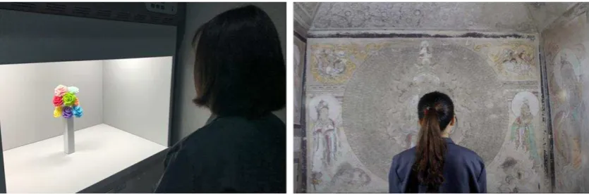
In this study most of the experiments were implemented in a light booth apart from where a
wall-painting experiment was carried out in a museum, as shown in Figure 1. For the light booth
experiments, a booth (width 89 cm × depth 60 cm × height 51 cm) was located in a room without
ambient light. The inner surfaces of the booth were coated with matt medium gray paint (Munsell N5)
and the wall surfaces of the room were also painted with spectrally neutral paint. A commercially
available and colour-tunable light source (Philips Hue) was installed in the inner top surface of the
booth. The light source was mechanically and thermally stable which was demonstrated by a
[image:4.595.96.514.494.632.2]preliminary experiment.
Figure 1 The experimental scenes. Left: light booth, Right: museum (in a simulated cave)
A chair was set in front the light booth at a distance of approximately 40 cm. The height of the chair
was adjustable so that when the participants observed the objects, they could not see the luminaire in
the booth.
Nine SPDs (as shown in Figure 2) were generated by the light source for the experiments. A calibrated
SPDs of the lights, as well as the spectral reflectance factors of the objects.
An illuminance meter (Testo 540) was used to measure the illuminance. In this study, the illuminance
in the centre of the objects for the experiments carried out in the light booth was exclusively set at
200 lx. Note that the illuminance spatial distribution of some experiments was not perfectly uniform,
with a non-uniformity of 20%-30%. This problem could be solved by adding a diffuser in front of the
luminaire. However, a diffuser was not used so as to mimic everyday lighting conditions.
Table 1 summarizes the colorimetric property of the nine SPDs generated by the light source. The
scores of typical colour quality metrics for those SPDs were calculated for the Color Rendering Index
(CRI) 1, Gamut Area Index (GAI) 40, Full Spectrum Colour Index (FSCI) 41, Colour Quality Scale
(CQS: Qa, Qf, Qp, Qg) 6, Feeling of Contrast Index (FCI) 42, Colour Discrimination Index (CDI) 43,
Cone Surface Area (CSA) 44, Thornton’s Color Preference Index (CPI) 45, Luo’s CAM02UCS-CRI 46, Smet’s CRI2012 47 , Memory Colour Rendering Index (MCRI) 48 and IES TM-30 metrics (Rf and Rg) 49. Note that in some scenarios only five of the values of CCT (2500K, 3500K, 4500K, 5500K and
6500K) were used.
Figure 2 Relative spectral power distributions of the experimental light sources generated by the
phosphor converted RGB light bulbs equipped with 5 lime green LEDs, 2 blue LEDs as well as 4 red
LEDs.
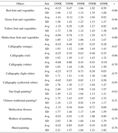
It can be seen from Table 1 that the chromaticities of the nine SPDs were all below the blackbody locus
(the Duv values are all negative). According to a recent study, such chromaticities are generally
preferred by observers because they are more likely to have higher scores for relative gamut while
maintaining high scores for fidelity 7.
The wall painting experiment which took place in a museum (Wan Lin Museum of Wuhan University,
China) used a different experimental geometry. The same chair was set in front of the centre of the wall
painting. The height of the chair was adjusted in order to keep the participants’ eyes within the same
horizontal level as the centre of the painting. Two of the same luminaires were used to illuminate the
wall painting from either side of the observer at an angle of 45°to the plane of the painting. Since the
[image:5.595.133.474.340.515.2]sources and wall painting (176 cm), the participants could not see the luminaires when observing the
painting. In this experiment, the same five SPDs (2500K, 3500K, 4500K, 5500K and 6500K) were
used but the centre illuminance of the wall painting was set to 50 lx, which was the maximum
[image:6.595.88.512.189.499.2]recommended illuminance level in the real caves of Dunhuang.
Table 1 The colorimetric properties of the experimental SPDs and their scores of typical colour quality
metrics.
ID 2500K 3000K 3500K 4000K 4500K 5000K 5500K 6000K 6500K
Measured 2445K 2932K 3451K 3817K 4471K 4767K 5538K 6102K 6637K X 0.478 0.437 0.405 0.385 0.360 0.351 0.332 0.321 0.313 Y 0.408 0.397 0.383 0.371 0.354 0.347 0.331 0.321 0.313 Duv -0.003 -0.004 -0.005 -0.006 -0.007 -0.007 -0.007 -0.007 -0.008 CRI 91 92 89 87 84 83 81 79 79 GAI 50 67 78 85 91 93 96 97 97 FSCI 28 45 57 63 67 68 70 70 70 Qa(v9.0.3) 87 87 85 83 80 78 76 74 73
Qf(v9.0.3) 82 82 81 80 78 76 73 71 70
Qp (v7.4) 96 95 92 90 87 85 83 82 81
Qg(v9.0.3) 113 110 107 105 103 101 101 99 98
FCI(CAM02) 107 105 102 100 94 92 87 83 81 CDI 73 97 114 123 133 135 139 141 142 CSA 0.034 0.042 0.048 0.052 0.056 0.058 0.060 0.061 0.062 CPI 142 143 139 136 131 129 126 124 123 CAM02UCS 85 85 84 83 80 79 75 74 73
CRI2012 83 84 84 83 82 81 78 77 77
MCRI 89 90 90 90 89 88 87 86 85
Rf 81 82 81 79 77 75 74 72 72
Rg 110 108 106 104 102 102 101 100 99
3.2 Experimental design
To comprehensively investigate the influence of different contextual factors on colour preference, a
wide range of objects were selected for the psychophysical experiments, as shown in Figure 3. The
spectral reflectances of some of the objects are shown in Figure 4.
As summarized in Table 2, the objects were divided into five groups for the experiment. In each group,
the order of objects and light sources was randomized and counterbalanced between observers. In order
to test the intra-observer variability for each participant, a randomly selected light source was always
used twice in the scale rating trials, without informing the observers.
Most of the observers only participated in one experimental trial. All the observers passed the Ishihara
test and thus had normal colour vision. None of them was aware of the research purpose before the
experiment. In addition, during the experiment the experimenter reminded the observers to focus on the
Two psychophysical methods, a 7-point scale rating and a 5-level rank ordering, were adopted for
quantifying the observers’ responses (the reason for adopting two psychophysical experiment methods
was to test whether different methods would lead to significantly different results in form of the
preference rank order for each light ).
Figure 3 (Colour online) Different objects adopted in the psychophysical experiments. a-d: fruit and
vegetables of different colors, e-f: Chinese calligraphies with different paper colours (40 cm×40 cm), j:
fine art reproduction of Van Gogh’s sycamore tree (38 cm×29 cm), k: fine art reproduction of Chinese
traditional painting landscape by Qichang Dong (27 cm×27 cm), l: modern oil painting painted by an
anonymous student in our school in China (50 cm×40 cm), m: a bunch of multicolour artificial flowers,
n: fine art reproduction of Dunhuang mural painting (330 cm×200 cm)
Figure 4 (Colour online) The spectral reflectances of fruit and vegetables, calligraphies (ink and paper
colours) and multicolour flowers
According to the scale rating method, the participant could rate the lighting condition using seven
values (-3, -2, -1, 0, 1, 2, 3), which respectively represented strongly dislike, moderately dislike,
[image:7.595.128.467.149.338.2] [image:7.595.121.478.456.642.2]approach, observers would rank the five lighting conditions according to their individual preference (5
for relatively most like and 1for relatively least like).
The details of the 5 experimental groups are summarized in Table 2. Therefore, in the following two
paragraphs only the unique features of certain experiments are described.
Table 2 Details of the psychophysical experiment of each group
Group Light Observers Place Score Time
Fruit and vegetables Five SPDs 2500K-6500K 1000K interval 45 observers
28 male 17 female
Age: 19.4±0.9 year
different personal
colour preference
Light booth 7 point
scale rating 20min
Chinese calligraphies Five SPDs 2500K-6500K 1000K interval 40 observers
20 male 20 female
Age: 19.4±0.8 year
Light booth 7 point
scale rating 25min
Van Gogh and
Chinese traditional painting Five SPDs 2500K-6500K 1000K interval 60 observers
30 male 30 female
Age: 22.0±1.6 year
Light booth 5 level rank ordering 25min Multicolour flowers and modern oil painting Nine SPDs 2500K-6500K 500K interval 36 observers
17 male 19 female
Age: 19.7±1.1 year
different native
places of China
Light booth 7 point
scale rating 25 min
Mural painting Five SPDs 2500K-6500K 1000K interval 20 observers
14 male 6 female
Age: 25.1±1.8 year
Museum 7 point
scale rating 12min
The fruit and vegetables scenario was designed for investigating the influence of personal colour
preference on colour preference. Before the experiment, typical observers with different personal
colour preference were collected by a questionnaire survey. In the questionnaire, the subjects were
asked to rate their preference for abstract colours (red, green and blue, written in words with no real
colors shown in the sheet) using the same 7-point rating method mentioned as above. 323 college
students were invited to participate in the survey and an ideal observer should only prefer one colour
(e.g. with a score no lower than 2) and dislike other colours (e.g. with a score no higher than 0). Among
the finally selected 45 observers, 15 exclusively preferred blue, 15 exclusively preferred red and 15
exclusively preferred green. The fruit and vegetables experiment was finished in two days, so as to
prevent deterioration of the fruit and vegetables. In the experiment, the relative positions of each fruit
[image:8.595.86.508.186.554.2]The Van Gogh and Chinese traditional painting scenario was for exploring the influence of regional
cultural heritage on colour preference. Similarly to the fruit and vegetables experiment, the observers
were also collected by a prior questionnaire. This led to three groups of observers in this trial, each
group of 20 students and they respectively came from eastern provinces (Jiangsu & Zhejiang), western
provinces (Xinjiang & Xizang) and middle provinces (Hubei & Hunan) of China. According to current
research, people from different parts of China actually show different cultural characteristics 50
3.3 Experimental procedure
Upon arrival, the participant was asked to put on a gray coat so as to avoid any reflectance from their
clothes during the experiment. After that, the Ishihara test was implemented. The experimenter then
asked the qualified participant to sign an informed consent form and complete a general information
survey.
The experimenter described the experiment to the participant and escorted him\her to the preset chair.
After the observer adjusting the height of the chair, the room lighting was switched off so the light from
the experimental light source was the only illumination during the trial.
For the scale rating process, the observer was given 15 seconds to adapt to the welcome lighting
condition which was randomly selected from the experimental light sources. Before the formal
experiment, a training phase was provided to the participant with the welcome light and the first object
to be evaluated. As suggested by Zhai et al. 25, during the experiment the questions were read out by the
experimenter and the participant also responded orally. Such a procedure was to avoid incomplete
chromatic adaption when writing answers on white paper.
After the training phase, the formal experiment began. The participant was asked to close his/her eyes
and then the experimenter changed the light. (This procedure took about 15 seconds and was repeated
every time the light was changed. Its aim was to eliminate any influence of the prior lighting condition
caused by a short-term memory effect.) After that, the participant was asked to open their eyes and
observe the object for about 10 seconds. The experimenter then asked the participant to assess the light
quality basing on their personal preference, with the seven values (-3, -2, -1, 0, 1, 2, 3) as mentioned
above. Once the participant had assessed the lighting condition and validated the answer, the
experimenter changed the light and this procedure was repeated for every arrangement of the objects in
each group. During the experiment, the participant was allowed to take as much time as necessary.
The procedure for the 5-level rank-ordering experiments was slightly different. The five experimental
lighting conditions were shown twice for each participant, in the same randomized order. The
participant was asked to make the decision in his/her mind after the first round, while in the second
round to rate the preference order when seeing the light (5 for relatively most like and 1 for relatively
least like). The participant was allowed more rounds in the case where s/he could not respond in two
rounds. However, in fact all the observers in the experiment successfully gave their answers within two
rounds.
4.
Results and Discussion
multicolour flowers scenarios, the trend of the rating scores under the five SPDs condition (2500K,
3500K, 4500K, 5500K and 6500K) was quite similar to that under the nine SPDs (2500K, 3000K,
3500K….6500K), therefore only the rating values of the five SPDs are shown here.
As can be seen from Table 3, the ratings of the SPDs for the different objects showed a consistent
tendency. That is, for the 2500K SPD the average values of the observer rating were always low, while
for the 4500K SPD the values were mostly high.
Table 3 The average value (Avg) and standard deviation (SD) of observer rating for different objects
under different CCTs, together with the Pearson coefficient r between the Avg and SD of each scenario
Object Stat 2500K 3500K 4500K 5500K 6500K r
Red fruit and vegetables Avg -0.33 0.47 1.04 1.02 0.59 -0.86 SD 1.96 1.32 1.15 1.35 1.68
Green fruit and vegetables Avg -1.61 -0.12 1.24 1.04 0.92 -0.96 SD 1.58 1.42 1.23 1.15 1.27
Yellow fruit and vegetables Avg -1.35 0.29 1.20 1.27 0.82 -0.85 SD 1.73 1.38 1.14 1.43 1.38
Multicolour fruit and vegetables Avg -0.96 0.78 1.31 1.29 0.71 -0.88 SD 1.89 1.25 1.06 1.14 1.67
Calligraphy (orange) Avg -0.43 0.48 0.25 0.25 0.28 -0.67 SD 1.93 1.52 1.08 1.10 1.43
Calligraphy (red) Avg -0.25 0.10 0.63 0.40 0.25 -0.86 SD 1.92 1.30 1.13 1.43 1.32
Calligraphy (white) Avg -0.68 0.88 0.43 0.43 -0.10 -0.70 SD 1.65 1.44 1.20 1.34 1.50
Calligraphy (light white) Avg -0.25 0.75 0.73 0.28 0.03 -0.75 SD 1.71 1.51 1.34 1.36 1.66
Calligraphy (yellowish white) Avg -0.65 0.83 0.83 1.13 0.58 -0.95 SD 1.78 1.30 1.17 1.04 1.47
Van Gogh painting* Avg 2.40 3.47 3.98 3.18 1.97 -0.63 SD 1.49 1.22 1.04 1.13 1.21
Chinese traditional painting* Avg 1.75 3.43 4.07 3.45 2.32 -0.31 SD 1.10 1.23 0.92 1.19 1.17
Multicolour flowers Avg -1.33 0.36 0.64 0.72 0.08 -0.80 SD 1.77 1.46 1.17 1.49 1.59
Modern oil painting Avg -0.92 0.92 1.19 1.08 0.89 -0.79 SD 2.03 1.30 1.04 1.44 1.79
Mural painting Avg -0.45 0.85 0.65 0.35 0.20 -0.78 SD 2.21 1.57 1.04 1.31 1.82
* For Van Gogh and Chinese traditional painting scenario, the Avg value represents the averaged rank
order for each CCTs (5 for relatively mostly like and 1for relatively least like).
Another interesting finding is the negative correlation r between the average value and standard
[image:10.595.94.502.232.693.2]observers generally prefer certain lighting conditions, the distribution of their ratings will be
concentrated, while if they generally dislike certain lighting conditions, the distribution will tend to be
scattered.
The above mentioned conclusion also holds in the Van Gogh and Chinese traditional painting groups,
which indicates that the order ranking approach tends to have similar results with scale rating in form
of the preference rank order for each light. Meanwhile, the reason for adopting the scale rating method
in this study lies in its possibility of predicting the acceptance limit as well as its inter-observer
variability for each scenario. Such an advantage enabled the authors to straightforwardly investigate the
influence of different object characteristics on colour preference. Besides, although the paired
comparison approach is commonly believed to be easier for participants, current work 4 has also
reported that such two methods have similar results.
It is worth mentioning that some researchers recommended transforming the observer ratings into
z-scores before further analysis 9. In this study, we analyzed the data with and without z-score method
and the results were quite similar. Therefore, the results of data analysis without z-score
implementation were ultimately shown, since such form of data was more straightforward for assessing
the observers’ preference.
4.1 Inter-observer and intra-observer variability
The inter-observer variability in each experimental trial was quantified by the standard deviations of
the observers’ ratings, as shown in Table 3. Considering the consistency among each trial as well as the results of related works 23, 25, 28, such statistics seems to be reasonable.
As mentioned above, the intra-observer variability of this research (for the scale rating experiments)
was assessed by asking the participants to observe a randomly selected lighting condition twice without
informing them of this. A similar approach was adopted by Jost-Boissard et al. 2. As stated in such
work, when the observers carried out the same experiment twice, the results would not necessarily be
the same, because there were many factors which could impact their decision. Therefore, in this work
we quantified the intra-observer variability by the absolute difference between the two ratings and set
the threshold to a value of 2. That is, if the absolute difference of the two ratings was larger than 2 (for
instance -1 for the first time while 2 for the second time), such ratings would be considered as
abnormal data. After calculating the ratio of abnormal data for all the scale rating experiments and
comparing the results with Jost-Boissard’s work 2, we concluded that the intra-observer variability of
each experiment was acceptable, with a range of 6%-17%. In addition, we strong agreed with
Jost-Boissard’s opinion that the intra-observer variability should be mainly ascribed to the inherent
difficulties of the experiment, rather than the attitude of the observers, provided that the experiments
were carried out with caution 2. And we also found that removing the abnormal data would not
significantly change the final results. Therefore, we retained all the data for further analysis.
4.2 Impact analysis of different factors on colour preference
The effect of different contextual factors on colour preference was investigated using a repeated
different experimental groups. Note that the interactions among 3 and 4 independent variables were
omitted, since none of them were statistically significant.
As can be seen from Table 4, the impact of light SPD on colour preference is significantly stronger than
other factors, as well as their interactions. Meanwhile, the influence of personal color preference is
quite limited. Although we actually find something interesting in this topic, it is safe to conclude that
the impact of personal colour preference is negligible when compared to that of light SPD. To our
knowledge, no past study has discussed the relationship between personal colour preference and colour
preference of lighting: the detailed analysis of such topic will be reported in another paper.
Table 4 Significance of the effect of the independent variables (SPD, object, gender and personal
colour preference) on the dependent variable (preference rating) for the fruit and vegetables group
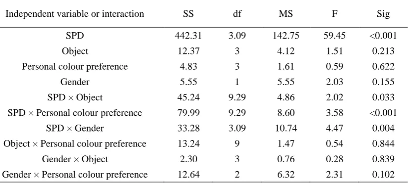
Independent variable or interaction SS df MS F Sig
SPD 442.31 3.09 142.75 59.45 <0.001
Object 12.37 3 4.12 1.51 0.213
Personal colour preference 4.83 3 1.61 0.59 0.622
Gender 5.55 1 5.55 2.03 0.155
SPD × Object 45.24 9.29 4.86 2.02 0.033
SPD × Personal colour preference 79.99 9.29 8.60 3.58 <0.001
SPD × Gender 33.28 3.09 10.74 4.47 0.004
Object × Personal colour preference 13.24 9 1.47 0.54 0.844
Gender × Object 2.30 3 0.76 0.28 0.839
Gender × Personal colour preference 12.64 2 6.32 2.31 0.102
Table 5 describes the result for the calligraphies experiments. The reason for designing such a group
was that the colour feature of such artwork is completely different from that of paintings. In 2013,
Palmer et al defined such a form of colour preference as figural preference (that is, how much the
foreground color is liked when viewed against a coloured background), and they argued that such a
preference was closely related to lightness and hue contrast between the foreground and background
colours52. However, as shown in Table 5, when compared to the impact of light SPD, the impact of
lightness and hue contrast (demonstrated by the interaction between SPD and Object) was also
negligible.
Table 5 Significance of the effect of the independent variables (SPD, object and gender) on the
dependent variable (preference rating) for the calligraphies group
Independent variable or interaction SS df MS F Sig
SPD 154.80 3.03 50.95 21.14 <0.001
Object 18.49 4 4.62 1.47 0.212
Gender 0.62 1 0.62 0.51 0.656
SPD × Object 45.09 12.15 3.70 1.53 0.105
SPD × Gender 24.37 3.03 8.01 3.32 0.019
[image:12.595.99.511.260.445.2] [image:12.595.88.512.634.755.2]The Van Gogh and Chinese traditional painting group was planned to explore the influence of regional
cultural difference on colour preference. A prior study by Bodrogi et al. has reported that the impact of
cultural difference was stronger than that of other contextual factors, including light SPD, object and
gender 8. However, contrary results are shown in Table 6, which still highlights the impact of light. As
far as we are concerned, there are two likely explanations for this condition. First, in Bodrogi’s work
the observers were respectively from China and Germany, while our participants were only from
different regions of China, so there is no doubt that the cultural difference in Bodrogi’s work is much
stronger. Second (and maybe more important), although Bodrogi’s work also used several SPDs with
different CCTs, their SPDs actually had certain special features. That is, the lights in their study were
deliberately generated and the corresponding colour quality metrics (such as CRI, GAI and CQS) for
those lights were almost the same. It is very likely that such an experimental design actually weakened
the impact of the lights.
Table 6 Significance of the effect of the independent variables (SPD, object, gender and regional
cultural difference) on the dependent variable (preference rating) for the Van Gogh and Chinese
traditional painting group
Independent variable or interaction SS df MS F Sig
SPD 354.86 2.52 140.78 50.84 <0.001
Object 0.007 1 0.01 0.14 0.7
Gender 0.16 1 0.16 3.71 0.056
Regional cultural difference 0.14 2 0.07 1.59 0.207
SPD × Object 18.19 2.52 7.21 2.60 0.062
SPD × Gender 13.5 2.52 5.35 1.93 0.135
SPD × Regional cultural difference 21.37 5.04 4.24 1.53 0.180
Gender× Object 0.01 1 0.01 0.14 0.7
Object × Regional cultural difference 0.06 2 0.03 0.70 0.496
Gender × Regional cultural difference 0.14 2 0.07 1.59 0.207
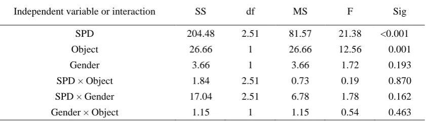
Table 7 Significance of the effect of the independent variables (SPD, object and gender) on the
dependent variable (preference rating) for multicolour flowers and modern oil painting group.
Independent variable or interaction SS df MS F Sig
SPD 204.48 2.51 81.57 21.38 <0.001
Object 26.66 1 26.66 12.56 0.001
Gender 3.66 1 3.66 1.72 0.193
SPD × Object 1.84 2.51 0.73 0.19 0.870
SPD × Gender 17.04 2.51 6.78 1.78 0.162
Gender × Object 1.15 1 1.15 0.54 0.463
The purpose of the multicolour flowers and modern oil painting group was to further test the influence
of lighting application on colour preference. As shown in Table 7, although the SPD is still the key
factor for colour preference, the impact of the object is significantly stronger when compared to former
experiments. One possible explanation for this finding is that the extent of the object difference in this
[image:13.595.91.513.323.508.2] [image:13.595.91.512.557.679.2]objects).
In conclusion, the rm-ANOVA implementations for the above mentioned groups uniformly illustrate
that light always plays a dominant role for human colour preference, at least under our experimental
condition. Besides, we can also conclude that the divergence of the contextual factors is also crucial for
the results of such a study.
4.3 Correlation analysis
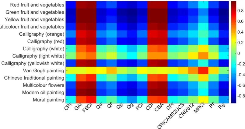
Figure 5 visualizes the performance of current colour quality metrics on predicting colour preference. It
is worth noting that most of those metrics were not deliberately proposed for assessing colour
preference. However, the correlation analysis between such metrics and colour preference are quite
common in current literature 2, 3, 5, 9-11, since a proper metric for colour preference is actually needed.
Note that it is not the intent of this paper to discuss the intricate details of these metrics, thus only the
main findings which related to this topic are presented.
As shown in Figure 5, the GAI, FSCI, CDI and CSA metrics show relatively sound performance while
the performance of other metrics was poor. A possible explanation for this condition is that the four
metrics are all absolute measures which are independent of a reference light source (or with a constant
reference) while most of the other metrics are reference dependent. In this case, we would like to
conclude that unlike lighting fidelity which should be correlated with certain reference light source,
colour preference is to some extent an absolute issue and thus should be quantified by some absolute
measures.
Figure 5 (Colour online) Pearson correlation coefficients between metrics prediction and visual
scaling of colour preference of each object. The value of the correlation coefficients are denoted by
colour, for instance, red for very high correlation while blue for very low correlation
Another possible explanation for the results in Figure 5 is that colour preference is correlated with
[image:14.595.103.506.448.661.2]enhancement 6, 9, 21, 23, 53. Maybe that is why in some related works 2, 11, 23 the GAI was reported to be a
good predictor for colour preference (the CDI and CSA are also gamut based metrics, but were less
discussed in past studies).
Meanwhile, it is obvious that the two relative gamut-based measures (Qg and Rg) performed poorly in
predicting colour preference, which proves reversely the necessity of an absolute gamut-based measure
for this multi-CCT condition. Note however, that not all the absolute gamut-based indices perform well
according to our data, such as FCI (constant reference D65). A possible reason is that different
gamut-based indexes adopt different colour samples for calculating the gamut area. If the colours
sample were not reasonably selected, maybe the correlation between the subjective preference rating
and the metric predictions would be masked 48, 54.
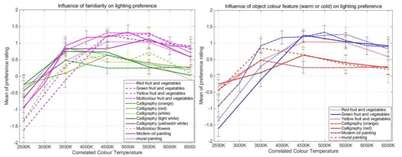
4.4 Other findings
Figure 6 illustrates another two findings of this work. The left graph shows the impact of observer
familiarity on preference ratings. As can be seen from this graph, the rating interval for the familiar
objects is obviously larger than that of unfamiliar objects. It seems that people always have a precise
idea about the colours of the objects which they are familiar with, therefore, it is easier for them to
respond with an explicit answer (e.g. strongly dislike or strongly like). On the contrary, since they are
not familiar with certain other objects, an inexplicit answer (e.g. moderately dislike or moderately like)
is more likely to be provided. Meanwhile, it needs to be mentioned that the modern oil painting and
yellowish white calligraphy were classified as familiar objects in this graph. For the modern oil
painting, we believed that its colours together with the scene it depicted were much more familiar than
those of the other paintings. While for the yellowish white calligraphy, such a yellowish white is
actually the most popular colour for traditional Chinese rice paper. Such paper is the best seller in the
store where we brought it and it also has a sound name “retro paper”.
Figure 6 (Colour online) Left: Influence of observer familiarity (purple and magenta for familiar
objects while dark green and light green for unfamiliar objects) on colour preference. Right: influence
of object colour (red for warm colours and blue for cold colours) on colour preference. Errorbar:
standard error of mean
[image:15.595.90.505.495.657.2]shown in this picture, people always prefer a warm light for warm colours (see the 2500K condition)
while prefer cool light for cool or cold colours (see the 6500K condition). In related works of Liu 22 and
Lasauskaite 55, similar results were also obtained. Note that since there was no object with real cold
colours in our experiment, we could only consider the green fruit and vegetables, yellow fruit and
vegetables and modern oil paintings as relatively cool colour objects.
In summary, Figure 6 illustrates that the observer familiarity and object colour actually has a certain
impact on colour preference. Meanwhile, from the similar trend of preference rating for different
objects, we may conclude again that light is still the dominate factor for colour preference.
5.
General discussion and conclusion
The above discussion has profoundly demonstrated the dominant influence of light on colour
preference, at least under the multi-CCT condition (condition where correlated colour temperature
differs). In fact, in the current literature even in metameric lighting conditions (SPDs with almost the
same CCT), similar results were also reported 2, 9, 32. Just as Jost-Boissard stated, the subjects’ judgment
about lighting did not seem to depend a lot on the colour of the target. This suggests that it is possible
for a give type of light to give a good rendering for all the different colours, and that separate lighting
is not needed for each target colour. 2
The reason for the dominant influence of light on colour preference should be attributed to gamut area.
As mentioned above, people always prefer the light which could enhance colour gamut and thus make
the objects more saturated 6, 9, 21-23, 32, 37. Besides, several past studies have also stated that the GAI
performed well in either multi-CCT or metameric lighting conditions 2, 4, 5, 10, 11, 23.
There are however, other contributions which raise contrary views. Just as the work of Bodrogi et al. 8,
since they intently generated the light SPDs with similar colour quality metrics (including GAI), the
influence of light on colour preference turned out to be weak. Another counter example is the work of
Lasauskaite et al 55. In this work, the colour preference of interior materials was discussed. Since such
unfamiliar objects differed greatly in their structure, texture, colour features as well as optical
properties, the experimental object became the key factor for colour preference, rather than light.
Therefore, it is not safe to arbitrarily conclude that light dominates colour preference under any
condition. When the divergence of other contextual factors greatly enhances, the influence of light will
relatively weaken.
Meanwhile, it is also worth mentioning that according to a recent study of Wei et al., light sources with
similar measures of relative gamut but different gamut shapes would also influence colour preference 21.
Such work actually points out the limitation of the gamut-based metrics, but maybe it is not applicable
to this work, since we are discussing the colour preference for multi-CCT conditions (To our
knowledge, no past studies have investigated the influence of gamut shape on colour preference for the
multi-CCT conditions).
Figure 7 illustrates the gamut shape of the 9 experimental light sources using the IES method. It is clear
that the gamut shape of these lights are quite similar, which obviously belies their huge difference in
validated in a metameric lighting domain. If two light sources have different CCTs, they will correlate
to different reference lights and thus their gamut shapes are incomparable. Just as the case of this study,
the dot-line circles in Figure 7 actually refer to different reference sources (It is also a good explanation
for the failure of the reference based measures, as mentioned above). Furthermore, as for such
multi-CCT cases, except for the condition that one light source has a large gamut but extremely
abnormal gamut shape, maybe the influence of gamut size is still greater than that of gamut shape. This
topic should be explored in further studies.
Figure 7 (Colour online) Gamut shape comparison based on IES method 49.
In light of the above, we would like to firstly state the prerequisites so as to make a safe conclusion.
The aim of this study was to investigate and compare the influence of several contextual factors on
colour preference, especially for general lighting conditions when correlated colour temperature differs.
In such conditions, the gamut sizes of different SPDs may likely be different. As for the issue of gamut
shape, the authors agree that it is actually a very important concern, but as mentioned above, it may be
only valid for metameric light conditions. Furthermore, we suppose that it should be the manufacturer’s
responsibility to provide a product with reasonable gamut shape according to the relevant theory. For
naïve users and general applications, we believe that light dominates colour preference when CCT
differs.
To sum up, in this contribution the impacts of different contextual factors on colour preference for
multi-CCT condition were systemically investigated, with a wide range of experimental objects. It is
found that the familiarity to the object, as well as the colour of the objects to some extent impacts
colour preference. Meanwhile, our most important conclusion lies in the dominate influence of light on
colour preference. We therefore recommend that for daily use, ordinary consumers should mainly be
concerned about the property of light--An absolute gamut-based metric seems to be a good indicator
for this issue, which is much better than the reference based metrics.
[image:17.595.182.413.194.400.2]Declaration of conflicting interests
The authors declared no potential conflicts of interest with respect to the research, authorship, and/or
publication of this article.
Funding
The authors would like to acknowledge the financial support of National Natural Science Foundation
of China (Project No. 61505149), the Open Fund of the State Key Laboratory of Pulp and Paper
Engineering of China (Project No 201528), as well as Young Talent Project of Wuhan City of China
(Project No 2016070204010111).
References
1. Nickerson D and Jerome CW. Color rendering of light sources: CIE method of specification and
its application. Illuminating Engineering 1965; 60: 262.
2. Jost-Boissard S, Fontoynont M and Blanc-Gonnet J. Perceived lighting quality of LED sources for
the presentation of fruit and vegetables. Journal of Modern Optics 2009; 56: 1420-1432.
3. Khanh T, Bodrogi P, Vinh Q, et al. Colour preference, naturalness, vividness and colour quality
metrics, Part 1: Experiments in a room. Lighting Research & Technology 2015: 1477153516643359.
4. Narendran N and Deng L. Color rendering properties of LED light sources. In: International
Symposium on Optical Science and Technology 2002, pp.61-67. International Society for Optics and
Photonics.
5. Smet K, Ryckaert WR, Pointer MR, et al. Correlation between color quality metric predictions
and visual appreciation of light sources. Optics Express 2011; 19: 8151-8166.
6. Davis W and Ohno Y. Color quality scale. Optical Engineering 2010; 49:
033602-033602-033616.
7. Wei M and Houser KW. What is the cause of apparent preference for sources with chromaticity
below the blackbody locus? LEUKOS 2016; 12: 95-99.
8. Bodrogi P, Lin Y, Xiao X, et al. Intercultural observer preference for perceived illumination
chromaticity for different coloured object scenes. Lighting Research and Technology 2015:
1477153515616435.
9. Jost-Boissard S, Avouac P and Fontoynont M. Assessing the colour quality of LED sources:
Naturalness, attractiveness, colourfulness and colour difference. Lighting Research & Technology 2014;
47.
10. Khanh T and Bodrogi P. Colour preference, naturalness, vividness and colour quality metrics, Part
3: Experiments with makeup products and analysis of the complete warm white dataset. Lighting
Research and Technology 2016: 1477153516669558.
11. Khanh T, Bodrogi P, Vinh Q, et al. Colour preference, naturalness, vividness and colour quality
metrics, Part 2: Experiments in a viewing booth and analysis of the combined dataset. Lighting
Research and Technology 2016: 1477153516643570.
12. Szabó F, Bodrogi P and Schanda J. A colour harmony rendering index based on predictions of
colour harmony impression. Lighting Research and Technology 2009; 41: 165-182.
13. Jiang L, Jin P and Lei P. Color discrimination metric based on cone cell sensitivity. Optics express
14. Pardo PJ, Suero MI, Pérez ÁL, et al. Optimization of the correlated color temperature of a light
source for a better color discrimination. JOSA A 2014; 31: A121-A124.
15. Rea MS and Freyssinier Nova JP. Color rendering: A tale of two metrics. Color Research &
Application 2008; 33: 192-202.
16. Rea MS and Freyssinier J. Color rendering: Beyond pride and prejudice. Color Research &
Application 2010; 35: 401-409.
17. Guo X and Houser KW. A review of colour rendering indices and their application to commercial
light sources. Lighting Research & Technology 2004; 36: 183-197.
18. Houser KW, Wei M, David A, et al. Review of measures for light-source color rendition and
considerations for a two-measure system for characterizing color rendition. Optics Express 2013; 21:
10393-10411.
19. Lin Y, Wei M, Smet K, et al. Colour preference varies with lighting application. Lighting Research
and Technology 2015: 1477153515611458.
20. Smet K, Ryckaert WR, Pointer MR, et al. Optimal colour quality of LED clusters based on
memory colours. Optics express 2011; 19: 6903-6912.
21. Wei M, Houser K, David A, et al. Colour gamut size and shape influence colour preference.
Lighting Research & Technology 2016: 1477153516651472.
22. Liu A, Tuzikas A, Zukauskas A, et al. Cultural preferences to color quality of illumination of
different artwork objects revealed by a color rendition engine. Photonics Journal, IEEE 2013; 5:
6801010-6801010.
23. Islam M, Dangol R, Hyvärinen M, et al. User preferences for LED lighting in terms of light
spectrum. Lighting Research and Technology 2013; 45: 641-665.
24. Smet KA and Hanselaer P. Impact of cross-regional differences on color rendition evaluation of
white light sources. Optics express 2015; 23: 30216-30226.
25. Zhai Q, Luo M and Liu X. The impact of illuminance and colour temperature on viewing fine art
paintings under LED lighting. Lighting Research and Technology 2014: 1477153514541832.
26. Kakitsuba N. Comfortable indoor lighting conditions evaluated from psychological and
physiological responses. LEUKOS 2016; 12: 163-172.
27. O'Connor DA and Davis RG. Lighting for the elderly: The effects of light source spectrum and
illuminance on color discrimination and preference. Leukos 2005; 2: 123-132.
28. Royer M, Wilkerson A, Wei M, et al. Human perceptions of colour rendition vary with average
fidelity, average gamut, and gamut shape. Lighting Research & Technology 2016: 1477153516663615.
29. Windisch R, Heidel G, Binder U, et al. Impact of spectral features of common LED lighting
systems on TM-30 color indices. Optics Express 2017; 25: 1824-1830.
30. Society IE. TM-30-15 IES method for evaluating light source color rendition. Illuminating
Engineering Societyp New York (NY), 2015.
31. Quintero JM, Sudrià A, Hunt CE, et al. Color rendering map: a graphical metric for assessment of
illumination. Optics express 2012; 20: 4939-4956.
32. Wei M, Houser KW, Allen GR, et al. Color Preference under LEDs with Diminished Yellow
Emission. LEUKOS 2014; 10: 119-131.
33. Nascimento SMC and Masuda O. Best lighting for visual appreciation of artistic
paintings–experiments with real paintings and real illumination. JOSA 2014.
34. Dikel EE, Burns GJ, Veitch JA, et al. Preferred chromaticity of color-tunable LED lighting.
35. Park B-C, Chang J-H, Kim Y-S, et al. A study on the subjective response for corrected colour
temperature conditions in a specific space. Indoor and Built Environment 2010; 19: 623-637.
36. Wang Q, Xu H, Zhang F, et al. Influence of color temperature on comfort and preference for LED
indoor lighting. Optik-International Journal for Light and Electron Optics 2017; 129: 21-29.
37. Szabó F, Kéri R, Schanda J, et al. A study of preferred colour rendering of light sources: Home
lighting. Lighting Research & Technology 2016; 48: 103-125.
38. Quellman EM and Boyce PR. The light source color preferences of people of different skin tones.
Journal of the Illuminating Engineering Society 2002; 31: 109-118.
39. Lin Y, He J, Tsukitani A, et al. Colour quality evaluation of natural objects based on the Feeling of
Contrast Index. Lighting Research & Technology 2016; 48: 323-339.
40. Freyssinier JP and Rea M. A two-metric proposal to specify the color-rendering properties of light
sources for retail lighting. In: SPIE Optical Engineering+ Applications 2010,
pp.77840V-77840V-77846. International Society for Optics and Photonics.
41. Rea M, Deng L and Wolsey R. NLPIP Lighting Answers: Light Sources and Color. Troy, NY:
Rensselaer Polytechnic Institute 2004.
42. Hashimoto K, Yano T, Shimizu M, et al. New method for specifying color rendering properties
of light sources based on feeling of contrast. Color Research & Application 2007; 32: 361-371.
43. Thornton WA. Color-discrimination index. JOSA 1972; 62: 191-194.
44. Fotios S. The perception of light sources of different colour properties. 1997.
45. Thornton W. A validation of the color-preference index. Journal of the Illuminating Engineering
Society 1974; 4: 48-52.
46. Luo MR. The quality of light sources. Coloration Technology 2011; 127: 75-87.
47. Smet KA, Schanda J, Whitehead L, et al. CRI2012: A proposal for updating the CIE colour
rendering index. Lighting Research & Technology 2013; 45: 689-709.
48. Smet KAG, Ryckaert WR, Pointer MR, et al. Memory colours and colour quality evaluation of
conventional and solid-state lamps. Optics Express 2010; 18: 26229-26244. DOI:
10.1364/oe.18.026229.
49. David A, Fini PT, Houser KW, et al. Development of the IES method for evaluating the color
rendition of light sources. Optics Express 2015; 23: 15888-15906.
50. Xiao L. Hofstede cultural measure about China's eastern and western cultural differences.
Economic Research Guide 2008: 177-178.
51. Islam M, Dangol R, Hyvärinen M, et al. User acceptance studies for LED office lighting: lamp
spectrum, spatial brightness and illuminance level. Lighting Research and Technology 2013:
1477153513514425.
52. Palmer SE, Schloss KB and Sammartino J. Visual aesthetics and human preference. Annual
review of psychology 2013; 64: 77-107.
53. Quintero JM, Hunt CE and Carreras J. De-entangling colorfulness and fidelity for a complete
statistical description of color quality. Optics letters 2012; 37: 4997-4999.
54. Royer MP and Wei M. The Role of Presented Objects in Deriving Color Preference Criteria from
Psychophysical Studies. LEUKOS 2017: 1-15.
55. Lasauskaite Schüpbach R, Reisinger M and Schrader B. Influence of lighting conditions on the