City, University of London Institutional Repository
Citation
:
Andrienko, N. and Andrienko, G. (2013). Visual analytics of movement: An overview of methods, tools and procedures. Information Visualization, 12(1), pp. 3-24. doi: 10.1177/1473871612457601This is the unspecified version of the paper.
This version of the publication may differ from the final published
version.
Permanent repository link: http://openaccess.city.ac.uk/2856/
Link to published version
:
http://dx.doi.org/10.1177/1473871612457601Copyright and reuse:
City Research Online aims to make research
outputs of City, University of London available to a wider audience.
Copyright and Moral Rights remain with the author(s) and/or copyright
holders. URLs from City Research Online may be freely distributed and
linked to.
City Research Online: http://openaccess.city.ac.uk/ [email protected]
Visual analytics of movement: an overview of methods, tools, and
procedures
Natalia Andrienko and Gennady Andrienko Abstract
Analysis of movement is currently a hot research topic in visual analytics. A wide variety of methods and tools for analysis of movement data have been developed in recent years. They allow analysts to look at the data from different perspectives and fulfil diverse analytical tasks. Visual displays and interactive techniques are often combined with computational processing, which, in particular, enables analysis of larger amounts of data than it would be possible with purely visual methods. Visual analytics leverages methods and tools developed in other areas related to data analytics, particularly, statistics, machine learning, and geographic information science. We present an illustrated structured survey of the state of the art in visual analytics concerning the analysis of movement data. Besides reviewing the existing works, we demonstrate by examples how different visual analytics techniques can support understanding of various aspects of movement.
1 INTRODUCTION
The main idea of visual analytics is to develop knowledge, methods, technologies and practice that exploit and combine the strengths of human and electronic data processing [33]. Visualization is the means through which humans and computers cooperate using their distinct capabilities for the most effective results. Visualization is particularly essential for analyzing phenomena and processes unfolding in geographical space. Since the heterogeneity of the space and the variety of properties and relationships occurring in it cannot be adequately represented for fully automatic processing, exploration and analysis of geospatial data and the derivation of knowledge from it needs to rely upon the human analyst’s sense of the space and place, tacit knowledge of their inherent properties and relationships, and space/place-related experiences [5].
Analysis of movement is currently a hot research topic in visual analytics. The researchers leverage the legacy of cartography, with its established techniques for representing movements of tribes, armies, explorers, hurricanes, etc. [36], time geography, with its revolutionary idea of considering space and time as dimensions of a unified continuum (space-time cube) and representation of behaviours of individuals as paths in this continuum [30], information visualization, with its techniques for user-display interaction supporting exploratory data analysis [20], and geovisualization, with its interactive maps and associated methods enabling exploration of spatial information [23]. To meet the challenges posed by today’s data deluge and complexity of the questions to be answered and problems to be solved, the scientists search for the ways to augment the power of human’s visual thinking [13] with the power of modern computer technologies.
In this paper we survey the state of the art in visual analytics concerning the analysis of movement data. We limit the scope of the paper to data about movements of discrete objects whose spatial positions can be represented by points. We do not consider movement of fields, such as ocean currents, and spatially extended objects changing their sizes and shapes, such as clouds. These kinds of moving objects have so far been scarcely addressed in visual analytics while the works dealing with discrete objects are abundant.
1) Looking at trajectories: The focus is on trajectories of moving objects considered as wholes. The methods support exploration of the spatial and temporal properties of individual trajectories and comparison of several or multiple trajectories.
2) Looking inside trajectories: The focus is on variation of movement characteristics along trajectories. Trajectories are considered at the level of segments and points. The methods support detecting and locating segments with particular movement characteristics and sequences of segments representing particular local patterns of individual movement. 3) Bird's-eye view on movement: The focus is on the distribution of multiple movements in
space and time. Individual movements are not of interest; generalization and aggregation are used to uncover overall spatio-temporal patterns.
4) Investigating movement in context: The focus is on relations and interactions between moving objects and the environment (context) in which they move, including various kinds of spatial, temporal, and spatio-temporal objects and phenomena. Movement data are analyzed together with other data describing the context. Computational techniques are used to detect occurrences of specific kinds of relations or interactions and visual methods support overall and detailed exploration of these occurrences.
The structure of the text corresponds to this categorization.
To help the reader better understand the material, we complement the survey of the existing works by illustrated examples showing how different visual analytics techniques can support understanding of various aspects of movement. For the examples, we use a real dataset about movements of ships in the area of North Sea. The Netherlands Coastguard collects data of shipping movements by radar coverage and AIS (Automatic Identification System) base stations. MARIN (Maritime Research Institute Netherlands, www.marin.nl) receives the fused data for use in safety assessment studies with respect to shipping. MARIN has provided an anonymized subset of the data, 8 days duration, for this research. The authors are especially grateful to Y.Koldenhof (MARIN) for describing the analytical tasks in marine safety studies and providing feedback on the application of visual analytics methods. The collection methods and properties of maritime vessel movement data are described in detail by N.Willems in his Ph.D. thesis [57] and papers, e.g., [59][45].
The illustrations have been produced by means of software tools that were available to us, which does not mean superiority of these tools over all other existing tools. The illustrations are also not meant to demonstrate capabilities of particular tools but rather outline possible general approaches, which can be implemented in different ways.
2 LOOKING AT TRAJECTORIES
In this section, we consider, first, the techniques for visual representation of trajectories and interaction with the representations, second, the use of clustering methods for comparative studies of multiple trajectories, and, third, the time transformations supporting exploration of temporal properties of trajectories and comparison of dynamic properties of multiple trajectories.
2.1 Visualizing trajectories
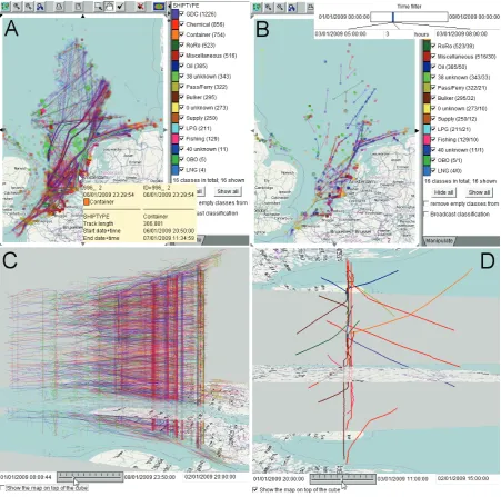
The most common types of display for the visualization of movements of discrete entities are static and animated maps [53][11] and interactive space-time cubes [37][34][32] with linear symbols representing trajectories. These displays as well as some basic interaction techniques are illustrated in Fig. 1.
the trajectories. By mouse-pointing on the map, the user accesses detailed information about the trajectories. The lines are distinctly coloured according to the ship types; other attributes of the trajectories can also be represented by colouring or line thickness. The interactive legend on the right serves as a filter to hide some ship types from the view and focus on the other types (the figures in the legend show the counts of trajectories for each ship type). In Fig. 1B, map animation by means of an interactive time filter is demonstrated. The user can select a time window of a desired length (e.g. 3 hours in the screenshot) and move this window forwards and backwards in time by dragging the slider. In response, the map shows only the fragments of the trajectories that were made during the current time window. The figures in the interactive legend show the total counts of trajectories for each ship type and how many of them are visible, at least partly, with the current filter condition.
Figure 1. A: An interactive map with trajectories of ships shown as lines with 10% opacity. B: Map animation through a time filter. Positions and movements of ships during a 3-hours time interval are visible. C: An interactive space-time cube (STC) showing all ship trajectories with 20% opacity; the vertical dimension represents time. The cube is seen from the southwest. D: A STC with several selected trajectories is seen from the east.
trajectories. The rows and columns of the table correspond to different values or value intervals of two selected attributes, either temporal (e.g., date, day of the week, or hour of the day) or thematic (e.g., ship type, ship size, average speed, or destination port). In the table cells there are small maps; each map shows only the trajectories that have the corresponding values of the attributes. The selection of the attributes for the columns and rows can be easily changed by dragging any attribute from a list and dropping it on the top or on the left of the table display.
Movements in three-dimensional space, e.g. in the air or under water, are harder to visualize than movements on a surface. Ware et al. [56] represent a single trajectory of a whale by a three-dimensional ribbon (in a perspective view) with glyphs on its surface showing the direction of the movement. Hurter et al. [31] represent multiple trajectories of aircrafts in horizontal or vertical two-dimensional projections with animated transitions from one projection to another.
Common interaction techniques facilitating visual exploration of trajectories and related data include manipulations of the view (zooming, shifting, rotation, changing the visibility and rendering order of different information layers, changing opacity levels, etc.), manipulations of the data representation (selection of attributes to represent and visual encoding of their values, e.g. by colouring or line thickness), manipulations of the content (selection or filtering of the objects that will be shown), and interactions with display elements (e.g. access to detailed information by mouse pointing, highlighting, selection of objects to explore in other views, etc.). Multiple co-existing displays are visually linked by using consistent visual encodings (e.g. same colours) and exhibit coordinated behaviours by simultaneous consistent reaction to various user interactions. These are generic techniques used for various types of data, not only for movement data. They have become standard in information visualization and visual analytics; most of the existing software tools include them.
In addition to these generic techniques, Guo et al. [29] suggest several interaction techniques specifically designed for trajectories, including selection of trajectories with particular shapes by sketching. Bouvier and Oates [15] suggest original interaction techniques for marking moving objects on an animated display and tracing their movements.
2.2 Clustering trajectories
Clustering is a popular technique used in visual analytics for handling large amounts of data. Usually existing clustering methods are wrapped in interactive visual interfaces supporting not only visual inspection but often also interactive refinement of clustering results.
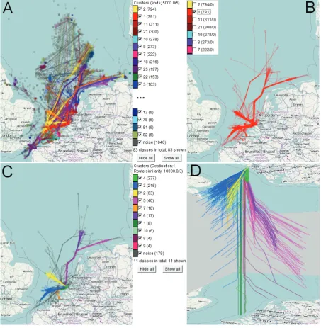
The procedure of progressive clustering is illustrated in Fig. 2. First, the density-based clustering algorithm OPTICS with the distance function “common ends” has been applied to the ship trajectories (Fig. 2A). Each of the resulting clusters consists of trajectories with spatially close end points. In this way, the user uncovers the major destinations of the ships. Second, one of the clusters, namely, trajectories ending at Rotterdam, has been interactively selected, i.e., all other clusters hidden (Fig. 2B). Third, the same clustering algorithm with the distance function “route similarity” has been applied to the members of the selected cluster (Fig. 2C). The user can see the typical routes of the ships coming to Rotterdam. In Fig. 2D, the route-based clusters of trajectories are shown in a STC, which is explained in more detail in the next subsection.
The majority of the clustering tools can only work with data loaded in the computer RAM and are therefore not scalable to very large datasets. Andrienko et al. [8] suggest a way to overcome the limits of RAM. After defining clusters of trajectories on the basis of a subset (sample) of trajectories, the analyst is supported by interactive visual and computational tools in the process of creating, testing, and refining a classification model for assigning trajectories to the clusters. Then the classifier is used to supplement the clusters with new trajectories, which are loaded from a database by portions fitting in the main memory.
2.3 Transforming times in trajectories
Comparison of dynamic properties of trajectories using STC, time graph, or other temporal displays is difficult when the trajectories are distant in time because their representations are located far from each other in a display. This problem can be solved or alleviated by transforming times in trajectories [2]. Two classes of transformations are suggested:
1. Transformations that reflect the cyclic nature of time. Depending on the data and application, trajectories can be projected in time to a single year / season / month / week / day etc. This allows the user to uncover and study movement patterns related to temporal cycles, e.g., find typical routes taken in the morning and see their differences from the routes taken in the evening.
2. Transformations with respect to the individual lifelines of trajectories. Thus, trajectories can be shifted in time to a common start time or a common end time. This facilitates the comparison of dynamic properties of the trajectories (particularly, spatially similar trajectories), for example, the dynamics of the speed. Aligning both the start and end times supports comparison of internal dynamics in trajectories irrespective of the average movement speed. Particularly, movement patterns of fast and slow movers can be compared in this way.
An example of time-transformed trajectories is shown in Fig. 2D. The STC shows route-based clusters of ship trajectories ending at Rotterdam. The times in the trajectories have been transformed so that all trajectories have a common end time. This allows us to see that, although the routes within each cluster are similar, the dynamics of the movement may differ greatly. The speeds can be judged from the slopes of the lines. Fast movement is manifested by gently sloping lines (which means more distance travelled in less time) while steep lines signify slow movement. Vertical line segments mean staying in the same place. The STC in Fig. 2 shows us that some ships just stayed all the time near Rotterdam, others approached Rotterdam and then stayed close to it for time intervals of different lengths, and the remaining ships moved towards Rotterdam with different speeds without stops. Doing such a comparison is hardly possible when the trajectories are positioned in the STC according to their original times.
3 LOOKING INSIDE TRAJECTORIES: ATTRIBUTES, EVENTS AND PATTERNS
sinuosity, tortuousity, as well as statistics of the instant characteristics. Cumulative characteristics are computed for the interval from the start of the trajectory to a given time moment or for the remaining interval to the end of the trajectory.
The most obvious way to visualize position-related attributes is by dividing the lines or bands representing trajectories on a map or in a 3D display into segments and varying the appearance of these segments. Attribute values can be represented by colouring or shading of the segments [35][29][48] or by symbols (glyphs) drawn on the segments [56]. Spretke et al. [48] suggest an interactive tool for segmenting trajectories by dividing ranges of one or more position-related attributes into suitable intervals. Furthermore, clustering may be applied to join adjacent segments with similar characteristics. This allows the user to detect and locate different movement behaviours, for example, day migration, night migration, and stopovers of migrating birds. These behaviours are shown by different colouring of line segments on a map.
Kraak and Huisman [35] use STC to visualize not only known spatio-temporal positions of moving objects but also space-time prisms, i.e., sets of positions that could potentially be visited by the objects during the time intervals between the known positions. The space-time prisms are computed taking into account the maximal possible speeds of the objects and visualized as volumes (3D bodies) in the STC.
Representing dynamic attributes of trajectories on a map or in an STC may be ineffective due to display clutter and occlusions, especially when trajectories or their parts overlap in space. Therefore, position-related dynamic attributes are often visualized using additional displays. A time graph, also known as line chart, can be used for visualizing temporal variation of attribute values [34][35]. One dimension (usually horizontal) of such a graph represents time and the other dimension is used for representing attribute values by positions. Each trajectory is represented by a curve or polygonal line. Wörner and Ertl [63] suggest a display which is similar to a time graph except that the base dimension represents space rather than time. This is possible for movements along a standard route, for example, movements of public transport vehicles. The horizontal dimension the route graph represents relative positions along the route and the vertical dimension is used for representing attribute values, such as speeds. Besides the lines representing individual trajectories, the display may include a line showing the variation of the average values along the route and a band with variable thickness representing the standard deviation. The same techniques are possible in a time graph.
Figure 3. A: A time bars display shows temporal variation of values of a dynamic attribute within trajectories. The bars represent trajectories; the attribute values are colour-coded. B: A trajectory selected in the time bars display is highlighted on a map. The crossing of the vertical and horizontal lines marks the spatial position corresponding to the position of the mouse cursor in the time bars display. C: A trajectory wall represents trajectories by segmented bands stacked on top of a cartographic map. D, E: A map and STC show spatial events extracted from trajectories.
Fig. 3 A demonstrates a time bars display, where the horizontal dimension represents time. Each trajectory is represented by a horizontal bar such that the horizontal position and length of the bar correspond to the start time and duration of the trajectory. The vertical dimension of the display is used to arrange the bars, which can be sorted based on one or more attributes of the trajectories (start time in our example). Colouring of bar segments encodes values of some user-selected dynamic attribute associated with the positions in the trajectories. This may be an existing attribute or an attribute derived “on the fly” from the position records. To represent attribute values by colours, the value range is divided into intervals, and each interval is assigned a distinct colour or shade. The display in Fig. 3A represents the values of the attribute “course difference” expressing the difference between the ship heading and its actual movement direction in each trajectory point. The shades of blue and red represent negative and positive differences, respectively. Darker shades correspond to higher absolute values of the differences. Light yellow is used for values around zero. The legend on the left of the display explains the colour coding.
A disadvantage of temporal displays of trajectory attributes, such as time graph and time bars, is that they lack spatial information. To alleviate this, temporal displays are linked to spatial displays through interactive techniques. An example is shown in Fig. 3 A and B. The mouse cursor in Fig. 3A is positioned on one of the bars. In Fig. 3B, the trajectory represented by the bar is highlighted on a map display. The intersection of the horizontal and vertical lines marks the spatial location corresponding to the position of the mouse cursor in the time bars display. This means that the ship was in this location at the time selected by the mouse cursor.
Such interactive links between displays are useful for exploring in detail one or a few particular trajectories but not suitable for exploration of a large number of trajectories. To show multiple trajectories in their spatial context while avoiding overlapping, the trajectory wall display [51] (Fig. 3C) uses the same idea of stacking as the time bars display. A trajectory wall is a 3D view where the space is represented on a horizontal plane and trajectories are represented by bands stacked in the vertical dimension. The technique is especially suitable for exploration of groups of trajectories with similar shapes. As in a time bars display, the bands representing trajectories are divided into segments, which are coloured according to attribute values. In Fig. 3C, the same attribute and colour-coding are used as in Fig. 3A.
chosen. The ring is divided into bins corresponding to the units of the chosen cycle. The fill levels of the time bins visualize temporally aggregated information about the trajectories that intersect with the query. One of the possible aggregates is count of the trajectories, as in our example. The coloured segments show the distribution of attribute values per time unit. Interactive filtering of trajectory segments according to values of dynamic attributes [6] allows the user to explore the spatio-temporal distribution of particular attribute values or value combinations. The trajectory segments that do not satisfy current filter conditions are hidden from the spatial and temporal displays. For example, the user can set the filter so that only the segments with high deviations of the movement direction from the heading will be visible in the time bars display, map, and trajectory wall. Trajectory segments can also be filtered according to values of two or more attributes. In our example, the user can add a query condition that the movement speed must be at least 5 km/h, to disregard direction deviations in anchored ships.
Furthermore, the points satisfying filter conditions can be extracted from the trajectories into a separate dataset (information layer) consisting of spatial events, i.e., objects located in space and time [6][7]. This dataset can be visualized and analyzed independently of the original trajectories or in combination with them. In Fig. 3 D and E, the yellow circles represent the spatial events constructed from the points of the ship trajectories where the deviation of the movement direction from the heading is either below -30 or above 30 and the speed is not less than 5 km/h. The trajectories in which such events occurred are shown by lines; the filtering of the trajectory segments has been cancelled. It can be seen that high deviations of the direction often occur when ships move in the meridian directions.
Filtering of trajectory segments according to values of two or more attributes allows the analyst to find the segments where all filter conditions are fulfilled simultaneously. To support searching for more complex patterns of movement, in which filter conditions are fulfilled in a particular temporal order (or, more generally, the time intervals on which each of the filter conditions is fulfilled stand in particular temporal relations), Sakr et al. [44] combine interactive visual techniques with queries to a moving object database (MOD). The authors demonstrate finding of complex patterns in aircraft landings such as missed approach (interrupted landing attempt), when an aircraft approaches the airport and descends in order to land but then goes up again. Visual analytics tools are used for an initial exploration of the data, selection of a suitable subset for further analysis by interactive filtering, finding of suitable parameter settings for the MOD queries, and then for viewing and interactive analysis of the query results. The patterns found with the help of the MOD can also be extracted from trajectories as events.
4 BIRD'S-EYE VIEW ON MOVEMENT: GENERALIZATION AND AGGREGATION
Generalization and aggregation enables an overall view of the spatial and temporal distribution of multiple movements, which is hard to gain from displays showing individual trajectories. Besides, aggregation is helpful in dealing with large amounts of data. An illustrated survey of the aggregation methods used for movement data and the visualization techniques applicable to the results of the aggregation is given in [1]. These methods and techniques are also presented in a more formal way in [3]. There are two major groups of analysis tasks supported by aggregation:
Investigation of the presence of moving objects in different locations in space and the temporal variation of the presence.
Investigation of the flows (aggregate movements) of moving objects between different locations in space and the temporal variation of the flows.
4.1 Analyzing presence and density
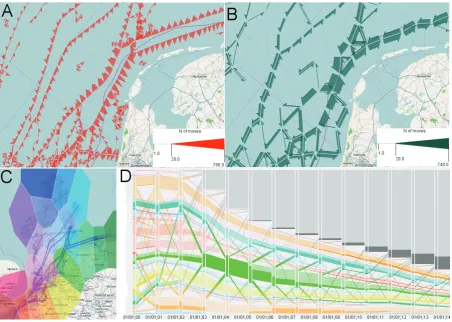
Presence of moving objects in a location during some time interval can be characterized in terms of the count of different objects that visited the location, the count of the visits (some objects might visit the location more than once), and the total or average time spent in the location. Besides, statistics of various attributes describing the objects, their movements, or their activities in the location may be of interest. To obtain these measures, movement data are aggregated spatially into continuous density surfaces (fields) [24][59] or discrete grids [26][1]. While the most common approach is to aggregate points of trajectories and point-related attributes, Willems et al. [59] have developed a specific kernel density estimation method for trajectories, which involves interpolation between consecutive trajectory points taking into account the speed and acceleration. Density fields built using kernels with different radii can be combined into one field to expose simultaneously large-scale patterns and fine features (Fig. 5A). Density fields are visualized on a map using colour coding and/or shading by means of an illumination model. A more recent paper [45] suggests a library of methods and a scripting-based architecture for creation, transformation, combination, and enhancement of movement density fields. This approach allows an expert user to involve domain knowledge in the process of building density fields. Mountain [39] further processes density surfaces generated from movement data to extract their topological features: peaks, pits, ridges, saddles, etc.
An example of spatial aggregation using a discrete grid is given in Fig. 5B. The irregular grid has been built according to the spatial distribution of characteristic points from ship trajectories as described in [10]. The darkness of the shading of the grid cells is proportional to the total number of visits. Additionally, each cell contains a circle with the area proportional to the mean duration of a visit. It can be observed that the average duration of staying in the cells with dense traffic (dark shading) is mostly low; longer times are spent in cells that are not intensively visited.
directions, or to their average speeds, or to any other numeric statistics associated with the directions. This approach combines two kinds of aggregation: by spatial positions and by movement directions.
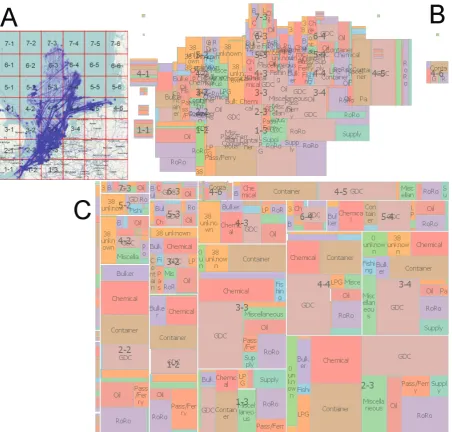
To combine spatial aggregation with aggregation by several arbitrary attributes, researchers from London City university suggest spatially-ordered treemaps [47][60]. Generally, a treemap [46] is a space-filling hierarchical layout of rectangles, typically labelled, differing in size and, optionally, colouring or shading. Each rectangle represents a group of objects with close values of some attribute so that the size of the rectangle is proportional to the size of the group. The group can be further subdivided according to values of another attribute, and the rectangle representing the group is also partitioned into smaller rectangles.
Figure 5. A: Ship movement data aggregated into a continuous density surface (image courtesy of N.Willems). B: Spatial aggregation by cells of a discrete grid: counts of cell visits are shown by shading and mean durations of the visits by areas of circles. C: Time series of cell visits represented by proportionally sized circles in a STC (viewed from the northwest). D: Grid cells clustered according to the time series of visitor counts. E, F: The time series for two selected clusters of cells.
To investigate the temporal variation of object presence and related attributes across the space, spatial aggregation is combined with temporal aggregation, which can also be continuous or discrete. Demšar and Virrantaus [22] extend the idea of spatial density to spatio-temporal density: they aggregate trajectories into density volumes in three-dimensional space-time continuum by generalizing the standard 2D kernel density around 2D point data into 3D density around 3D polyline data. The resulting volumes are represented in a STC. For discrete temporal aggregation, time is divided into intervals. Depending on the application and analysis goals, the analyst may consider time as a line (i.e. linearly ordered set of moments) or as a cycle, e.g., daily, weekly, or yearly. Accordingly, the time intervals for the aggregation are defined on the line or within the chosen cycle. The combination of discrete temporal aggregation with continuous spatial aggregation gives a sequence of density surfaces, one per each time interval, which can be visualized by animated density maps. It is also possible to compute differences between two surfaces and visualize them on a map, to see changes occurring over time (this technique is known as a change map). The combination of discrete temporal aggregation with discrete spatial aggregation produces one or more aggregate attribute values for each combination of space compartment (e.g., grid cell) and time interval. In other words, each space compartment receives one or more time series of aggregate attribute values. Visualization by animated density/presence maps and change maps is possible as in the case of continuous surfaces. There are also other possibilities. The time series may be shown in a STC by proportionally sized or shaded or coloured symbols, which are vertically aligned above the locations [64]; Fig. 5C gives an example. Occlusion of symbols is often a serious problem in such a display.
It is also possible to combine presence/density maps with time series displays such as a time graph or temporal histogram [39][62]. Zhao et al. [64] build circular temporal histograms to explore the dependency of movement behaviours on temporal cycles. They also suggest a visualization technique called ringmap, a variant of a circular histogram where aggregate values are shown by colouring and shading of ring segments rather than by bar lengths. Multiple concentric rings can represent aggregation according to an additional attribute, for example, activity performed by the moving objects.
In our example, the clusters differ mainly in the value magnitudes and not in the temporal patterns of value variation. Fig. 5E shows the time series of the cluster with the highest values (cluster 8). The variation appears random. The same can be observed for other clusters. However, there is one cluster (cluster 1, located between the coasts of England and continental Europe) that has a particular temporal pattern shown in Fig. 5F. There are three time intervals in which the presence values are quite high and the rest of the time they are close to zero. The three intervals with high values occurring in the area of English Channel are also visible in the STC in Fig. 5C (on the right; note that the aggregation represented in the STC has been done by larger spatial compartments than in Fig. 5D and by 6-hour time intervals). This variation of the ship presence can be, probably, explained by weather conditions, but we have no data to check this.
Spatially referenced time series is one of two possible views on a result of discrete spatio-temporal aggregation [4]. The other possibility is to consider the aggregates as a spatio-temporal sequence of spatial situations [12]. The term 'spatial situation' denotes spatial distribution of aggregate values of one or more attributes in one time interval. Temporal variation of spatial situations can also be investigated by means of clustering [4][12]. In this case, the spatial situations are considered as feature vectors characterizing different time intervals. The clustering groups the time intervals by similarity of these feature vectors. An example is presented in Fig. 6.
Figure 6. Hourly time intervals have been clustered by similarity of spatial situations in terms of presence of passenger and ferry boats. Bottom right: time mosaic display where the columns, from left to right, correspond to days from 01/01/2009 (Thursday) to 08/01/2009 (Thursday) and rows, from top to bottom, to hours from 0 to 23. The maps summarize the spatial situations by the time clusters by showing the mean presence values in the cells.
the locations so that identically coloured pixels are placed closely to each other. As a result, a circle emerges around a location in which pixels with same colours form rings; the technique is therefore called Growth Rings. The layout induces perceptual aggregation: the user does not distinguish individual pixels but perceives them all together as one figure. The size of the whole figure shows the total number of visits while the rings show the proportions of occurrences of the attribute values encoded by the colours.
To deal with very large amounts of movement data, possibly, not fitting in RAM, discrete spatio-temporal aggregation can be done within a database [1] or a data warehouse [42]. Only aggregated data are loaded in RAM for visualization and interactive analysis. Using roll-up and drill-down operators of the warehouse, the analyst may vary the level of aggregation.
4.2 Tracing flows
In the previous section, we have considered spatial aggregation of movement data by locations (space compartments). Another way of spatial aggregation is by pairs of locations: for two locations A and B, the moves (transitions) from A to B are summarized. This can result in such aggregate attributes as number of transitions, number of different objects that moved from A to B, statistics of the speed, transition duration, etc. The term “flow” is often used to refer to aggregated movements between locations. The respective amount of movement (i.e., count of moving objects or count of transitions) may be called “flow magnitude”.
There are two possible ways to aggregate trajectories into flows. Assuming that each trajectory represents a full trip of a moving object from some origin to some destination, the trajectories can be aggregated by origin-destination pairs, ignoring the intermediate locations. A well-known representation of the resulting aggregates is origin-destination matrix (OD matrix) where the rows and columns correspond to the locations and the cells contain aggregate values. OD matrices are often represented graphically as matrices with shaded or coloured cells. The rows and columns can be automatically or interactively reordered for uncovering connectivity patterns such as clusters of strongly connected locations and “hubs”, i.e., locations strongly connected to many others [27]. A disadvantage of the matrix display is the lack of spatial context.
Guo et al. [28] use multiple small maps each showing flows to/from one place by colouring or shading the other places according to the respective flow magnitudes. The maps are arranged similarly to the relative positions of the places in the geographical space. Wood et al. [61][62] devised an algorithm to generate so called OD maps, in which multiple OD matrices are arranged according to the geographic positions of the places.
and ending segments of the lines in two different colours. This reduces the clutter but the flows may be not easy to trace. Boyandin et al. [17] use a display with two maps and a table between them. Each row in the table corresponds to one place. Lines representing flows are drawn not between places within a map but between places in the maps and rows in the table. The left and right parts of the display show the out- and ingoing flows, respectively. The rows of the table contain visual representations of the time series of the flow magnitudes. The information content of the display is very high, but the spatial patterns of the flows can hardly be perceived. There is currently no universally good solution for visualizing arbitrary origin-destination flows.
Vrotsou et al. [55] consider aggregated movement data as a weighted directed graph where vertices are the places and arcs are the flows. They compute various centrality measures for the graph vertices, which may be a valuable addition to the other place-related statistics such as counts of visits. The measures are visualised on maps, e.g., by colouring or shading of the places, but this does not show the connections between the places.
Figure 7. A, B: Flow maps based on finer (A) and coarser (B) territory divisions. C, D: Exploration of sequences of visited areas. C: Colour coding of the areas. D: Presence of ships in the areas and aggregated transitions between the areas by time intervals.
The territory divisions demonstrated in Fig. 7 A and B result from a method that accounts for the spatial distribution of characteristic points extracted from trajectories [10]. It uses a special algorithm for spatial clustering of points that produces clusters of user-specified spatial extent (radius). The geographic or gravity centres of the clusters are then used as generating points for Voronoi tessellation. Depending on the chosen radius, the data can be aggregated at different spatial scales.
When movement data are aggregated into flows by time intervals, the result is time series of flow magnitudes. These can be visualized by animated flow maps or by combining flow maps with temporal displays (e.g. [17]). Flows may be clustered by similarity of the respective time series and the temporal variation analyzed cluster-wise, as was suggested for time series of presence indicators in the previous section. Complementarily, time intervals can be clustered by similarity of the spatial situations in terms of flows [12].
represent the trajectories that ended before the respective time intervals. Aggregated transitions between the areas are represented by bands drawn between the bars. The widths of the bands are proportional to the counts of the objects that moved. Gradient colouring is applied to the bands so that the left end is painted in the colour of the origin area and the right end in the colour of the destination area, or in grey for the trajectories that ended.
By interacting with the display, it is possible to explore not only direct transitions between areas but also longer sequences of visited areas. When the user clicks on a bar segment, the movements of the corresponding subset of objects are highlighted in the display (i.e., shown by brighter colours). This is illustrated in Fig. 7D. By clicking on the green segment of the fifth bar, the user has selected the subset of ships that were in the area of Amsterdam in the fifth hour since the beginning of their movement. We can see the previous and past locations of the selected ships and when the transitions occurred. Analogously, the user can click on a band connecting segments to select the objects participating in the respective transitions and trace their movements.
5 INVESTIGATION OF MOVEMENT IN CONTEXT
The spatio-temporal context of the movement includes the properties of different places (e.g., land cover or road type) and different times (e.g. day or night, working day or weekend) and various spatial, temporal, and spatio-temporal objects affecting and/or being affected by the movement [6]. Tomaszewski and MacEachren [50] consider the notion of context on a more general level and suggest a conceptual model that encompasses three aspects of context, spatial (geographical), temporal (historical), and conceptual. They describe a prototype software system for analysis of text documents where spatial, temporal, and conceptual context information can be visually represented to facilitate sense-making.
The methods for movement data analysis discussed so far do not address the context in an explicit way. However, movement data are usually visualized using cartographic maps, which serve as very important providers of information about the spatial context. By looking at the maps, the analyst can relate visible spatial patterns to the spatial context, e.g., observe that the highest ship traffic density is near ports. In principle, information about the temporal context can be represented in temporal displays, such as a time graph, together with movement data or their derivatives; however, this is rarely done in practice. It is more usual to represent context information on additional displays, which are linked to displays of movement data by means of visual and/or interactive techniques. Thus, Lundblad et al. [38] use a time graph to visualize weather parameters along the routes of selected ships. Besides, multiple weather parameters for all ships at a selected time moment are shown on a parallel coordinate plot. The links between the displays are established through interactive selection of ships or time moments for the additional displays. The mosaic temporal display in Fig. 6 conveys context information about temporal cycles through special arrangement of display elements (squares). The colouring of the squares visually links the mosaic display to the display of sea traffic situations.
item, when it happened, and how these objects behaved after that. Furthermore, it is possible to run the animation backwards in order to see how these objects moved before the encounter. Besides the context items that are explicitly represented on visual displays, the analyst also takes relevant context information from his/her background knowledge. Visual displays, especially maps, help the analyst in doing this since things that are shown can facilitate recall of related things from analyst's mind. Thus, we noticed in Fig. 5 that the spatial situations that occurred on Saturday are characterized by exceptionally high traffic of passenger and ferry boats between the southeast coast of the UK and the continent. We knew previously from other sources that many residents of the UK go from time to time for shopping to France and Belgium. Based on this knowledge, we concluded that the observed pattern of sea traffic may be related to this shopping.
So far, we have discussed the cases when context information is represented visually and relationships between the movement and the context are established solely by the user through observation of the visual displays and interaction with them. By the current moment, not much has been done in the visual analytics research for involving context information also in computational processing and analysis of movement data. One existing approach is to produce and visualize dynamic attributes representing certain relationships between positions of moving objects and elements of their spatio-temporal context [6]. Many types of relationships can be expressed in terms of spatial and/or temporal distances [6][7]. This includes spatial proximity of moving objects to certain locations or types of locations, spatio-temporal proximity to a spatial event, spatio-spatio-temporal proximity between moving objects, etc. Crnovrsanin et al. [21] compute spatial distances of multiple moving objects to a selected item of spatial context, such as place (point or area) of interest, static object, or moving object, and visualize the resulting dynamic attributes of the moving objects on a time graph. Patterns formed by the lines on the graph not only show the movements in relation to the selected context item and allow the user to observe common behaviours and detect outliers but also indicate various emergent relationships (referred to as “movement patterns”) among the moving objects: spatial concentration (congestion), convergence, divergence, meeting, coincidence, concurrence, etc. Interactive tools allow the user to select the objects participating in these patterns and observe their traces on a map. Two or more time graphs enable comparison of movements from different places. Orellana et al. [40] computationally extract occurrences of proximity relationships between moving objects and then visualize them on spatial and temporal displays by means of specially designed techniques.
A more generic method for detection and analysis of various types of relationships that can be expressed in terms of spatial and/or temporal distances is suggested in [6]. The main idea is to compute spatial and/or temporal distances from moving objects to context items and represent them as attributes attached to trajectory positions. Then the user interactively filters the positions according to values of one or more of these attributes and creates spatial events from the points and segments satisfying the filter, as described in section 3. The extracted events can be explored visually and with the use of computational methods. We shall present this approach by an example.
perspective of the presented approach, the origin of the context data makes no difference. Context data coming from external sources are processed in exactly the same way as context data previously derived from movement data.
Figure 8. Investigation of near-encounter relationships between ships. A: Extracted events of distance less than 100m to the nearest ship (black circles). B: The events in which at least one of the ships decreased the speed by 10km/h or more. The pie charts show the total counts of events and the counts of events with decreased speed by areas around groups of events. C: Investigation of the spatio-temporal neighbourhood of a selected event in a STC. D, E: Statistics of event occurrence by ship types. D: all events, E: events with speed decrease. F, G: Trajectories of the ships of the “unknown” type.
In our example, the first task is to detect occurrences of near-encounter (close proximity) relationships between ships. We computationally derive a dynamic attribute representing the distance from a ship to the nearest other ship. Then we generate spatial events from the points where this distance is 100m or less. The events are shown as black circles on a map in Fig.8A. Concentrations in areas close to ports are well visible.
To see which types of ships get most often involved in near-encounter relationships, we apply filtering to the ship trajectories according to the events that had been extracted from them. The table in Fig. 8D shows the frequencies of different ship types among all trajectories (column 2) and among the trajectories in which near-encounter relationships occurred (column 3). It can be seen that the ships of the type “0 unknown” were disproportionally often involved in such relationships (the type “0 unknown” means that the AIS messages sent from these vessels contained zero in the field meant for the ship type code). Fig. 8E shows similar statistics for the subset of near-encounter events accompanied with speed decrease. Again, the relative frequency of the ships of the “0 unknown” type is much higher among the trajectories involved in the events than among all ships. The map in Fig. 8F shows the trajectories of the ships of this category; an enlarged fragment is given in Fig. 8G. It is seen that these ships mostly move closely to ports and the movement looks rather chaotic, which can explain the high involvement in near-encounter relationships.
Sections 2-4 show that movement can be analyzed at different levels: whole trajectories, elements of trajectories (points and segments), and high-level summaries (densities, flows, etc.). In principle, analyzing movement in context can also be done at these levels. However, a comprehensive set of visual analytics methods addressing all these levels and different types of context items does not exist yet, which necessitates further research in this direction.
6 CONCLUSION
7 REFERENCES
[1] Andrienko G, Andrienko N. A General Framework for Using Aggregation in Visual Exploration of Movement Data. The Cartographic Journal 2010; 47(1): 22-40.
[2] Andrienko G, Andrienko N. Poster: Dynamic Time Transformation for Interpreting Clusters of Trajectories with Space-Time Cube. In: Proceedings of the IEEE Symposium on Visual Analytics Science and Technology (VAST) 2010; IEEE Computer Society Press, 2010; 213-214.
[3] Andrienko G, Andrienko N, Bak P, Keim D, Kisilevich S, Wrobel S. A Conceptual Framework and Taxonomy of Techniques for Analyzing Movement. Journal of Visual Languages and Computing 2011; 22(3): 213-232.
[4] Andrienko G, Andrienko N, Bremm S, Schreck T, von Landesberger T, Bak P, Keim D. Space-in-Time and Time-in-Space Self-Organizing Maps for Exploring Spatiotemporal Patterns. Computer Graphics Forum 2010; 29(3): 913-922.
[5] Andrienko G, Andrienko N, Dykes J, Fabrikant SI, Wachowicz M. Geovisualization of dynamics, movement and change: key issues and developing approaches in visualization research. Information Visualization 2008; 7(3/4): 173-180.
[6] Andrienko G, Andrienko N, Heurich M. An Event-Based Conceptual Model for Context-Aware Movement Analysis. International Journal of Geographical Information Science 2011; 25(9): 1347-1370.
[7] Andrienko G, Andrienko N, Hurter C, Rinzivillo S, Wrobel S. From Movement Tracks through Events to Places: Extracting and Characterizing Significant Places from Mobility Data. In: Proceedings of the IEEE Conference on Visual Analytics Science and Technology (VAST) 2011; IEEE Computer Society Press, 2011; 161-170.
[8] Andrienko G, Andrienko N, Rinzivillo S, Nanni M, Pedreschi D, Giannotti F. Interactive Visual Clustering of Large Collections of Trajectories. In: Proceedings of the IEEE Symposium on Visual Analytics Science and Technology (VAST) 2009; IEEE Computer Society Press, 2009; 3-10.
[9] Andrienko G, Andrienko N, Wrobel S. Visual analytics tools for analysis of movement data. ACM SIGKDD Explorations 2007; 9(2): 38-46.
[10] Andrienko N, Andrienko G. Spatial generalization and aggregation of massive movement data. IEEE Transactions on Visualization and Computer Graphics 2011; 17(2): 205-219.
[11] Andrienko N, Andrienko G, Gatalsky P. Supporting Visual Exploration of Object Movement. In: Di Gesù V, Levialdi S, Tarantino L (Eds.). Proceedings of the Working Conference on Advanced Visual Interfaces AVI 2000 (Palermo, Italy), ACM Press: New York, 2000; 217-220, 315.
[12] Andrienko N, Andrienko G, Stange H, Liebig T, Hecker D. Visual Analytics for Understanding Spatial Situations from Episodic Movement Data. Künstliche Intelligenz 2012; DOI: 10.1007/s13218-012-0177-4
[13] Arnheim R. Visual thinking. University of California Press, 1969.
[14] Bak P, Mansmann F, Janetzko H, Keim DA: Spatiotemporal Analysis of Sensor Logs using Growth Ring Maps. IEEE Transactions on Visualization and Computer Graphics 2009; 15(6): 913-920.
[15] Bouvier DJ, Oates B. Evacuation Traces Mini Challenge award: Innovative trace visualization staining for information discovery. In: Proceedings of the IEEE Symposium on Visual Analytics Science and Technology (VAST) 2008; IEEE Computer Society Press, 2008; 219-220
[17] Boyandin I, Bertini E, Bak P, Lalanne D. Flowstrates: An Approach for Visual Exploration of Temporal Origin-Destination Data. Computer Graphics Forum 2011; 30(3): 971-980.
[18] Bremm S, von Landesberger T, Andrienko G, Andrienko N, Schreck T. Interactive Analysis of Object Group Changes over Time. In: Proceedings of the International Workshop on Visual Analytics EuroVA 2011, EuroGraphics 2011; 41-44.
[19] Brillinger DR, Preisler HK, Ager AA, Kie JG. An exploratory data analysis (EDA) of the paths of moving animals. Journal of statistical planning and inference 2004; 122(2): 43-63.
[20] Card SK, Mackinlay JD, Shneiderman B (Eds). Readings in information visualization: using vision to think. Morgan Kaufmann, 1999.
[21] Crnovrsanin T, Muelder C, Correa C, Ma K-L. Proximity-based Visualization of Movement Trace Data, In: Proceedings of the IEEE Symposium on Visual Analytics Science and Technology (VAST) 2009; IEEE Computer Society Press, 2009; 11-18. [22] Demšar U, Virrantaus K. Space–time density of trajectories: exploring spatio-temporal
patterns in movement data. International Journal of Geographical Information Science 2010; 24(10): 1527-1542.
[23] Dykes J, MacEachren AM, Kraak M-J (Eds). Exploring geovisualization. Elsevier, 2005.
[24] Dykes JA, Mountain DM. Seeking structure in records of spatio-temporal behaviour: visualization issues, efforts and applications. Computational Statistics & Data Analysis 2003; 43:581-603.
[25] Ersoy O, Hurter C, Paulovich F, Cantareiro G, Telea A. Skeleton-Based Edge Bundling for Graph Visualization. IEEE Transactions on Visualization and Computer Graphics 2011; 17(12): 2364-2373.
[26] Forer P, Huisman O. Space, Time and Sequencing: Substitution at the Physical/Virtual Interface. In: Janelle DG, Hodge DC (Eds). Information, Place and Cyberspace: Issues in Accessibility. Springer: Berlin, 2000; 73-90.
[27] Guo D. Visual Analytics of Spatial Interaction Patterns for Pandemic Decision Support. International Journal of Geographical Information Science 2007; 21(8): 859-877. [28] Guo D, Chen J, MacEachren A, Liao K. A visualization system for space-time and
multivariate patterns (VIS-STAMP). IEEE Transactions on Visualization and Computer Graphics 2006, 12(6): 1461–1474.
[29] Guo H, Wang Z, Yu B, Zhao H, Yuan X. TripVista: Triple Perspective Visual Trajectory Analytics and its application on microscopic traffic data at a road intersection. In: Proceedings of the Pacific Visualization Symposium PacificVis 2011, IEEE, 2011; 163-170.
[30] Hägerstrand T. What about people in regional science? Papers of the Regional Science Association 1970; 24:7-21.
[31] Hurter C, Tissoires B, Conversy S. FromDaDy: Spreading aircraft trajectories across views to support iterative queries. IEEE Transactions on Visualization and Computer Graphics 2009; 15(6): 1017-1024.
[32] Kapler T, Wright W. GeoTime information visualization. Information Visualization 2005; 4(2): 136-146.
[34] Kraak M-J. The space-time cube revisited from a geovisualization perspective. In: Proceedings of the 21st International Cartographic Conference, 2003 (Durban, South-Africa); 1988-1995.
[35] Kraak M-J, Huisman O. Beyond exploratory visualization of space time paths. In: Miller HJ, Han J (Eds). Geographic data mining and knowledge discovery. Second edition. Taylor & Francis: London, 2009; 431-443.
[36] Kraak M-J, Ormeling F. Cartography: visualization of spatial data. Third edition. Guilford Publications, 2010.
[37] Kwan M-P. Interactive geovisualization of activity-travel patterns using three-dimensional geographical information systems: a methodological exploration with a large data set. Transportation Research Part C: Emerging Technologies 2000, 8(1-6): 185-203.
[38] Lundblad P, Eurenius O, Heldring T. Interactive Visualization of Weather and Ship Data. In: Proceedings of the 13th International Conference on Information Visualization IV2009. IEEE Computer Society Press, 2009; 379-386.
[39] Mountain DM. Visualizing, querying and summarizing individual spatiotemporal behavior. In: Dykes JA, Kraak M-J, MacEachren AM (Eds). Exploring Geovisualization. Elsevier: London, 2005; 181-200.
[40] Orellana D, Wachowicz M, Andrienko N, Andrienko G. Uncovering Interaction Patterns in Mobile Outdoor Gaming. In: Proceedings of the International Conference on Advanced Geographic Information Systems & Web Services GEOWS 2009; 177-182.
[41] Phan D, Xiao L, Yeh R, Hanrahan P, Winograd T. Flow Map Layout. In: Proceedings of the IEEE Symposium on Information Visualization InfoVis 2005 (Minneapolis, Minnesota, USA), 2005; 219-224.
[42] Raffaetà A, Leonardi L, Marketos G, Andrienko G, Andrienko N, Frentzos E, Giatrakos N, Orlando S, Pelekis N, Roncato A, Silvestri C. Visual Mobility Analysis using T-Warehouse. International Journal of Data Warehousing and Mining 2011; 7 (1): 1-23.
[43] Rinzivillo S, Pedreschi D, Nanni M, Giannotti F, Andrienko N, Andrienko G. Visually driven analysis of movement data by progressive clustering. Information Visualization 2008; 7(3-4): 225-239.
[44] Sakr M, Behr T, Güting RH, Andrienko G, Andrienko N, Hurter C. Exploring Spatiotemporal Patterns by Integrating Visual Analytics with a Moving Objects Database System. In: Proceedings of 19th ACM SIGSPATIAL International Conference on Advances in Geographic Information Systems (ACM SIGSPATIAL GIS 2011), 2011; 505-508.
[45] Scheepens R, Willems N, van de Wetering H, Andrienko G, Andrienko N, van Wijk JJ. Composite Density Maps for Multivariate Trajectories. IEEE Transactions on Visualization and Computer Graphics (TVCG) 2011; 17(12): 2518-2527.
[46] Shneiderman B. Tree visualization with tree-maps: 2-d space-filling approach. ACM Transactions on Graphics 1992; 11(1): 92-99.
[47] Slingsby A, Dykes J, Wood J. Using treemaps for variable selection in spatio-temporal visualisation. Information Visualization 2008, 7(3-4): 210-224.
[48] Spretke D, Janetzko H, Mansmann F, Bak P, Kranstauber B, Mueller M. Exploration through Enrichment: A Visual Analytics Approach for Animal Movement. In Proceedings of 19th ACM SIGSPATIAL International Conference on Advances in Geographic Information Systems (ACM SIGSPATIAL GIS 2011), 2011; 421-424.
[50] Tomaszewski B, MacEachren AM. Geo-Historical Context Support for Information Foraging and Sensemaking: Conceptual Model, Implementation, and Assessment. In Proceeding of the IEEE Conference on Visual Analytics Science and Technology (IEEE VAST 2010), pp. 139-146.
[51] Tominski C, Schumann H, Andrienko G, Andrienko N. Stacking-Based Visualization of Trajectory Attribute Data. IEEE Transactions on Visualization and Computer Graphics (Proceedings IEEE Information Visualization 2012), 18(12), Dec. 2012. [52] Tversky B, Morrison JB, Betrancourt M. Animation: can it facilitate? International
Journal of Human-Computer Studies 2002; 57(4): 247-262. [53] Vasiliev IR. Mapping Time. Cartographica 1997; 34(2): 1-51.
[54] Verbeek K, Buchin K, Speckmann B. Flow Map Layout via Spiral Trees. IEEE Transactions on Visualization and Computer Graphics 2011; 17(12): 2536–2544. [55] Vrotsou K, Andrienko N, Andrienko G, Jankowski P. Exploring City Structure from
Georeferenced Photos Using Graph Centrality Measures. In: Proceedings of the European Conference on Machine Learning and Principles and Practice of Knowledge Discovery in Databases (ECML PKDD) 2011, Lecture Notes in Computer Science, Vol. 6913, Springer: Berlin 2011; 654-657.
[56] Ware C, Arsenault R, Plumlee M, Wiley D. Visualizing the Underwater Behaviour of Humpback Whales. IEEE Computer Graphics and Applications 2006, 26(4): 14-18. [57] Willems N. Visualization of Vessel Traffic. Ph.D. Thesis, Eindhoven University of
Technology, 2011.
[58] Willems N, van Hage WR, de Vries G, Janssens JHM, Malaisé V. An integrated approach for visual analysis of a multisource moving objects knowledge base. International Journal of Geographical Information Science 2010; 24(10): 1543-1558. [59] Willems N, van de Wetering H, van Wijk JJ. Visualization of vessel movements.
Computer Graphics Forum (CGF) 2009; 28(3): 959-966.
[60] Wood J, Dykes J. Spatially Ordered Treemaps. IEEE Transactions on Visualization and Computer Graphics 2008; 14(6): 1348-1355.
[61] Wood J, Dykes J, Slingsby A. Visualisation of Origins, Destinations and Flows with OD Maps. The Cartographic Journal 2010; 47(2): 117 – 129.
[62] Wood J, Slingsby A, Dykes J. Visualizing the dynamics of London’s bicycle hire scheme. Cartographica 2011, 46(4): 239 - 251.
[63] Wörner M, Ertl T. Visual Analysis of Public Transport Vehicle Movement. In: Proceedings of International Workshop on Visual Analytics (EuroVA 2012), pp. 79-83. [64] Zhao J, Forer P, Harvey AS. Activities, ringmaps and geovisualization of large human