City, University of London Institutional Repository
Citation:
Li, J., Chen, S., Chen, W., Andrienko, G. ORCID: 0000-0002-8574-6295 and
Andrienko, N. ORCID: 0000-0003-3313-1560 (2018). Semantics-Space-Time Cube. A
Conceptual Framework for Systematic Analysis of Texts in Space and Time. IEEE
Transactions on Visualization and Computer Graphics, doi: 10.1109/TVCG.2018.2882449
This is the accepted version of the paper.
This version of the publication may differ from the final published
version.
Permanent repository link:
http://openaccess.city.ac.uk/id/eprint/21109/
Link to published version:
http://dx.doi.org/10.1109/TVCG.2018.2882449
Copyright and reuse: City Research Online aims to make research
outputs of City, University of London available to a wider audience.
Copyright and Moral Rights remain with the author(s) and/or copyright
holders. URLs from City Research Online may be freely distributed and
linked to.
Semantics-Space-Time Cube.
A Conceptual Framework for Systematic
Analysis of Texts in Space and Time
Jie Li, Siming Chen, Wei Chen, Gennady Andrienko, and Natalia Andrienko
Abstract—We propose an approach to analyzing data in which texts are associated with spatial and temporal references with the aim to understand how the text semantics vary over space and time. To represent the semantics, we apply probabilistic topic modeling. After extracting a set of topics and representing the texts by vectors of topic weights, we aggregate the data into a data cube with the dimensions corresponding to the set of topics, the set of spatial locations (e.g., regions), and the time divided into suitable intervals according to the scale of the planned analysis. Each cube cell corresponds to a combination (topic, location, time interval) and contains aggregate measures characterizing the subset of the texts concerning this topic and having the spatial and temporal references within these location and interval. Based on this structure, we systematically describe the space of analysis tasks on exploring the
interrelationships among the three heterogeneous information facets, semantics, space, and time. We introduce the operations of projecting and slicing the cube, which are used to decompose complex tasks into simpler subtasks. We then present a design of a visual analytics system intended to support these subtasks. To reduce the complexity of the user interface, we apply the principles of structural, visual, and operational uniformity while respecting the specific properties of each facet. The aggregated data are
represented in three parallel views corresponding to the three facets and providing different complementary perspectives on the data. The views have similar look-and-feel to the extent allowed by the facet specifics. Uniform interactive operations applicable to any view support establishing links between the facets. The uniformity principle is also applied in supporting the projecting and slicing operations on the data cube. We evaluate the feasibility and utility of the approach by applying it in two analysis scenarios using geolocated social media data for studying people’s reactions to social and natural events of different spatial and temporal scales.
Index Terms—spatiotemporal visualization, semantic visualization, data cube, interactive exploration, visual analytics.
F
1
I
NTRODUCTIOND
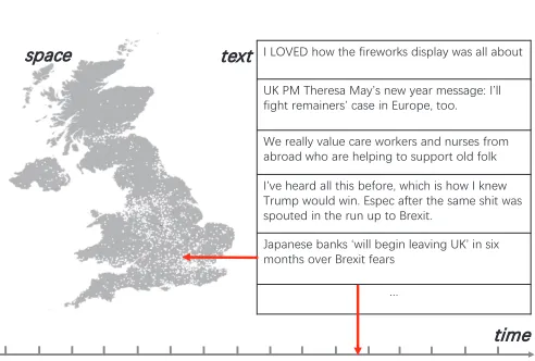
ATA cube [1] is a widely used metaphor representing organization of data along some dimensions of inter-est. For organizing and analyzing data that include texts with temporal and spatial references, such as geolocated social media posts (Fig. 1), we introduce a structure called Semantics-Space-Time Cube, or SSTC. In this structure, three dimensions correspond to (1) semantic categories, or topics, (2) locations (which may be regions in space), and (3) times (which may be time intervals). To understand how the text semantics varies over space and time, one needs to explore the complex and diverse relationships between the three heterogeneous information facets. Examples of such complex relationships are the spatial distribution of the text topics, temporal trend of topic popularity, spatio-temporal dynamics of topic appearance, etc. Our goal is to support the overall analysis task by visual analytics techniques that would not be too complex and difficult to use despite the complexity of the data and task.For achieving this goal, we consider two problems. The
• J. Li is with College of Intelligence and Computing, Tianjin University, China. [email protected].
• S. Chen, G. Andrienko and N. Andrienko are with Fraunhofer Institute IAIS, Germany. S. Chen is also with University of Bonn, Germany. G. Andrienko and N. Andrienko are also with City University London. {siming.chen, gennady.andrienko, natalia.andrienko}@iais.fraunhofer.de • Wei Chen is with State Key Lab of Cad&CG, ZheJiang University.
Manuscript received April 19, 2005; revised August 26, 2015.
濜澳濟濢濩濘濗澳濻瀂瀊澳瀇濻濸澳濹濼瀅濸瀊瀂瀅濾瀆澳濷濼瀆瀃濿濴瀌澳瀊濴瀆澳濴濿濿澳濴濵瀂瀈瀇
濨濞澳濣濠澳濧濻濸瀅濸瀆濴澳濠濴瀌瀠瀆澳瀁濸瀊澳瀌濸濴瀅澳瀀濸瀆瀆濴濺濸濍澳濜瀠濿濿澳 濹濼濺濻瀇澳瀅濸瀀濴濼瀁濸瀅瀆瀠澳濶濴瀆濸澳濼瀁澳濘瀈瀅瀂瀃濸澿澳瀇瀂瀂濁澳
濪濸澳瀅濸濴濿濿瀌澳瀉濴濿瀈濸澳濶濴瀅濸澳瀊瀂瀅濾濸瀅瀆澳濴瀁濷澳瀁瀈瀅瀆濸瀆澳濹瀅瀂瀀澳 濴濵瀅瀂濴濷澳瀊濻瀂澳濴瀅濸澳濻濸濿瀃濼瀁濺澳瀇瀂澳瀆瀈瀃瀃瀂瀅瀇澳瀂濿濷澳濹瀂濿濾
濜澺瀉濸澳濻濸濴瀅濷澳濴濿濿澳瀇濻濼瀆澳濵濸濹瀂瀅濸澿澳瀊濻濼濶濻澳濼瀆澳濻瀂瀊澳濜澳濾瀁濸瀊澳 濧瀅瀈瀀瀃澳瀊瀂瀈濿濷澳瀊濼瀁濁澳濘瀆瀃濸濶澳濴濹瀇濸瀅澳瀇濻濸澳瀆濴瀀濸澳瀆濻濼瀇澳瀊濴瀆澳 瀆瀃瀂瀈瀇濸濷澳濼瀁澳瀇濻濸澳瀅瀈瀁澳瀈瀃澳瀇瀂澳濕瀅濸瀋濼瀇濁
濝濴瀃濴瀁濸瀆濸澳濵濴瀁濾瀆澳瀟瀊濼濿濿澳濵濸濺濼瀁澳濿濸濴瀉濼瀁濺澳濨濞瀠澳濼瀁澳瀆濼瀋澳 瀀瀂瀁瀇濻瀆澳瀂瀉濸瀅澳濕瀅濸瀋濼瀇 濹濸濴瀅瀆
瀖
瀇濼瀀濸 瀇濸瀋瀇
瀆瀃濴濶濸
Fig. 1. Using geolocated Twitter data as an example to illustrate the target data structure. Each tweet is a text posted at some location and time moment.
first is how to construct the cube, in particular, how to repre-sent text semantics in a summarized way suitable for being used as one of the cube dimensions. The second problem is how to utilize the cube structure and take advantage of it for supporting visual exploration of the data.
[image:2.612.315.561.410.576.2]pa-rameters are slightly changed. Therefore, meaningful topics can hardly be extracted fully automatically, without human intervention. Our approach to solving these problems in-volves aggregation of short texts into larger documents and interactive selection of representative topics from results of multiple topic models using a visualization that reveals topic similarities and redundancies.
The problem of visual exploration of text-space-time data is challenging due to the high heterogeneity. The data components (texts, space, and time) differ extremely in their nature and properties. Such data cannot be treated as usual multidimensional data for which numerous analysis and visualization techniques exist. For example, in a parallel coordinates plot, multiple attributes are represented in a uniform way. In the case of heterogeneous structures, data components need to be visualized in different ways depend-ing on their specific nature. While it is possible sometimes to show two components within one display (as in a space-time cube), this can hardly be done with three or more highly diverse components. One needs to use a combination of different displays and rely on interactive operations for uncovering and exploring relationships between them. Such a combination of visual and interactive tools is inevitably more complex than a single display and may be very diffi-cult to use. A design challenge is to reduce the complexity and difficulty while providing sufficient functional power and enabling flexibility in exploration. To address this chal-lenge, we, first, consistently utilize the SSTC metaphor and concepts of projection and slice, second, use similar organization principles for specific displays of the three diverse components and, third, propose a set of interaction operations uniformly applicable to each component.
Our main contributions are the following:
• A scheme ofdata transformation enabling systematic
exploration of text semantics in space and time;
• Use of a cube metaphor for organizing data, defining the system of exploratory tasks, and designing the user interface and interactive operations;
• A workflowfor analyzing text-space-time data, which involves characterization of text semantics through human-controlled topic modeling and interactive visual exploration of multifarious relationships between the text semantics, space, and time;
• A combination of visual and interactive tools that
support the variety of exploratory tasks. The tool design implements the principles of structural, visual, and operational uniformity for reducing the UI complexity. The paper is structured as follows. After introducing the problem statement (Section 2), we review the related work (Section 3), present our approach (Section 4), describe and substantiate our visual design (Section 5), and demonstrate the application of the approach in two case studies (Sec-tion 6). Expert feedback is presented in Sec(Sec-tion 7, followed by a discussion and conclusion in Section 8.
2
P
ROBLEMS
TATEMENTWe describe the structure of the data we are dealing with, introduce the cube metaphor, and define the system of tasks on exploring relationships between text semantics, space, and time.
2.1 Data
The original data format is< text, location, time >. Loca-tions can be specified by coordinates or names of geograph-ical places. Texts are arbitrary and unstructured. It is neces-sary for analysis to represent text semantics in a structured way. We assume that text semantics can be characterized using a finite set oftopics(themes) of interest. For each text, it can be determined how much it is related to each topic. The degree or the likelihood of relatedness can be expressed numerically, e.g., as a number between 0 (unrelated) to 1 (uniquely related). We shall call this number topic weight. Hence, each text is represented by a vector of topic weights
T W V =< w1, w2, ..., wN >, where N is the number of
topics considered. The data structure is thus transformed to< T W V, location, time >.
2.2 Cube
We aggregate and organize the data so transformed along three dimensions comprising the topics, locations, and times, denotedP (toPics),S(Space), andT (Time), respec-tively. The Cartesian productP ×S×T is metaphorically called semantics-space-time cube. For practical purposes, all three setsP,S, andT need to be discrete and finite. The set of topicsP is discrete and finite by construction. The space and time are discretized by partitioning into suitable regions and time intervals, respectively. Any combination (p, s, t)
composed of a particular topic p ∈ P, location (region)
s ∈ S, and time interval (also called time step)t ∈ T will be called apointof the cube. For each cube point(p, s, t), we derive severalmeasuresfrom the data, which include
• thepopularityscore of the topic pat locations during timet, which is calculated as the mean weight of this topic in the messages that were posted at location s
during timet[3];
• a keyword vector consisting of pairs <keyword, weight>, whereweight is a numeric measure that can represent the importance of the keyword in the topicp
at locationsduring timet.
The resulting data structure isP×S×T →(P S, KW), whereP SandKW stand for thePopularityScore and the KeywordWeight vector, respectively.
2.3 Slices and Projections
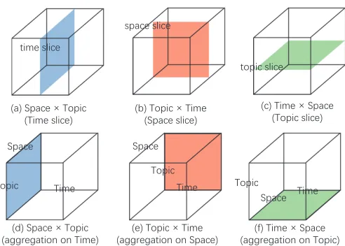
The overall analysis task is to explore the variations of the popularity and keyword usage along the three dimensions of the cube. However, the high dimensionality of the struc-tureP ×S×T does not allow seeing the entire variation, which requires the overall task to be decomposed into simpler subtasks. The whole variation can be viewed as a function of multiple variables and the analysis task as the task of studying the behavior of this function [4]. The overall behavior can be studied by considering itsslices, in which the value of one variable is fixed for exploring the variation over the remaining variables. Using the cube metaphor, a behavior slice corresponds a cutting plane in the cube that is parallel to one of its faces (Fig. 2a-c).
mode, quartiles, etc.) to the respective values of the function. This is done for each combination of the values of the other variables. The result is called aprojection, because it can be metaphorically seen as a projection of the cube content onto one of its faces (Fig. 2d-f). The data structure of a projection is the same as in the slices from which it was obtained whereas the values within this structure are aggregates of the values from the slices.
According to the functional view of data and tasks [4], we shall use a formal notation based on the representation of the cube as P × S ×T → (P S, KW), which also represents the overall analysis task: howP SandKW vary over the whole set P ×S ×T. The measures P S and
KW are independent of each other, the variation of each of them can be explored separately, resulting in two subtasks
P×S×T →P SandP×S×T →KW. In the following, we shall consider both subtasks in a generic way using the notationP×S×T →M, whereM representsP S,KW, or, generally, any other meaningful measure that can be defined and calculated from the data. Fore example, one may apply sentiment analysis [5] to calculate the fractions of the texts with positive, neutral, and negative expressions concerning the topics.
The selection operation takes a slice in the cube cor-responding to one selected value within one dimension (Fig. 2a-c). The corresponding analysis tasks are thus con-ducted within the slice to address the variation of the stud-ied measure over the “plane” formed by the combinations of the values from the two other dimensions. The possible types of analysis tasks based on cube slices are:
• t→(P×S→M)- for a selected time stept∈T, study the commonalities and differences among the spatial distributions of the measures of different topics.
• s→(P×T →M)- for a selected locations∈S, study the measures of different topics and their changes over time;
• p→(S×T →M)- for a selected topicp∈P, study the variation of the measure over space and time; Theaggregationoperation creates aprojectionof the cube content along one dimension (Fig. 2d-f). Aggregation can be applied not only to the set P, S, or T as a whole but to a subset of it. Possible analysis tasks address the variation of the summary values over the projection plane. The task types can be defined analogously to the slice-based tasks:
• Σ(T) → (P ×S → M)- for all times taken together, study the commonalities and differences among the spatial distributions of the aggregate measures of dif-ferent topics.
• Σ(S) → (P ×T → M) - for all locations taken together, study the variation of the aggregate measures of different topics over time;
• Σ(P)→ (S×T → M)- for all topics taken together, study the variation of the aggregate measures over space and time;
2.4 Analysis tasks
Both slice-based and projection-based tasks address the variation of some measure over a “plane”, i.e., a Cartesian product of two dimensions. Let us represent such variation
澻濸澼澳濧瀂瀃濼濶澳灤 濧濼瀀濸
澻濴濺濺瀅濸濺濴瀇濼瀂瀁澳瀂瀁澳濦瀃濴濶濸澼 澻濴濺濺瀅濸濺濴瀇濼瀂瀁澳瀂瀁澳濧瀂瀃濼濶澼澻濹澼澳濧濼瀀濸澳灤 濦瀃濴濶濸 澻濷澼澳濦瀃濴濶濸澳灤 濧瀂瀃濼濶
澻濴濺濺瀅濸濺濴瀇濼瀂瀁澳瀂瀁澳濧濼瀀濸澼
澻濵澼澳濧瀂瀃濼濶澳灤 濧濼瀀濸 澻濦瀃濴濶濸澳瀆濿濼濶濸澼
澻濶澼澳濧濼瀀濸澳灤 濦瀃濴濶濸 澻濧瀂瀃濼濶澳瀆濿濼濶濸澼 澻濴澼澳濦瀃濴濶濸澳灤 濧瀂瀃濼濶
澻濧濼瀀濸澳瀆濿濼濶濸澼
濦瀃濴濶濸
濧濼瀀濸 濧瀂瀃濼濶
濦瀃濴濶濸 濦瀃濴濶濸
瀆瀃濴濶濸澳瀆濿濼濶濸
瀇瀂瀃濼濶澳瀆濿濼濶濸 瀇濼瀀濸澳瀆濿濼濶濸
濧濼瀀濸 濧瀂瀃濼濶
[image:4.612.317.563.39.215.2]濧瀂瀃濼濶 濧濼瀀濸
Fig. 2. Results of selection and aggregation operations are symbolically represented as slices (a-c) and projections (d-f) of the cube.
in a general way as a functionX×Y →Z. It can be explored in two complementary ways [4]:
• Consider the variation of the functionY →Z over the setX, represented asX →Y →Z. Thus, forS×T →
P S, it is “consider how the temporal evolution of the topic popularity varies over the space”:S →T →P S.
• Consider the variation of the function X → Z over the set Y, represented as Y → X → Z. Taking the example ofS×T →P S, it is “consider how the spatial distribution of the topic popularity changes over time”:
T→S→P S.
Using this general schema and treating slice- and aggregation-based tasks in a uniform way, we define the following system of task types:
• Tasks based on time slicest →(P ×S →M)or time
projectionΣ(T)→(P×S→M):
– T1:S →P →M, e.g., which topics were popular at different locations
– T2: P → S → M, e.g., where did different topics receive more attention
• Tasks based on space slicess→(P×T →M)or space
projectionΣ(S)→(P×T →M):
– T3: P → T → M, e.g., when and how long were different topics popular
– T4:T →P →M, e.g., how did the relative popular-ities of the topics differ among the times
• Tasks based on topic slicesp→(S×T →M)or topic projectionΣ(P)→(S×T →M):
– T5: S → T → M, e.g., what are the temporal variation trends at different locations
2.5 Design Goal
Our goal is to design and implement such an approach to supporting all the defined tasks that all the tasks could be fulfilled in a possibly uniform way. The reason for striv-ing towards the uniformity is a desire to make the whole exploration process easier for the analyst. Since the overall analysis task has to be decomposed into multiple diverse subtasks, a possibility to perform these subtasks in similar ways can reduce the cognitive effort required for learning and remembering the functionality provided.
3
R
ELATEDW
ORKThe related research includes works in visual analytics and cognate disciplines that (1) apply topic modeling to repre-sent text semantics, or (2) deal with data having textual, spatial, and temporal components, or (3) utilize different variants of data cubes for supporting data analysis, or (4) use cubes to represent data visually. This section is struc-tured according to these four themes.
3.1 Topic Modeling in Visual Analytics
Probabilistic topic modeling [6] is a class of natural language processing methods that are used for obtaining a structured representation of collections of texts. From a given text collection, these methods extract a set of of latent topics, where each topic is a probability distribution over words of a chosen base vocabulary. The texts are represented by vectors of topic probabilities, or weights [2]. Examples of topic modeling methods are Latent Dirichlet Allocation (LDA) [2] and non-negative matrix factorization [7].
Topic modeling has been widely used in visual analytics works focusing on text analysis [8], [9], [10]. Texts from social media have received much attention [11], [12]. In Re-compile 3 particular, researchers have focused on evolution of topics and their relationships. Xu et al. [13] proposed an topic competition model to characterize the competition for public attention on multiple topics. Sun et al. [14] extended this model for analyzing both competition and cooperation relationships among different topics in social media. Wang et al. [15] proposed a visual analytics system for analyzing the topic transmission between different social groups. Dou et al. [16] supported exploration of hierarchical relationships among topics. Cui et al. [17] focused on dynamic hierarchi-cal relationship among topics in different time periods.
While a large body of research has been done on an-alyzing text topics over time, we are not aware of works that would consider the relationships of topics to a more complex spatio-temporal context. Our work makes the first step in this direction.
3.2 Exploration of Texts in Space and Time
ThemeRiver [18] is perhaps the best known technique to visualize changes of text semantics over time. Themes ex-tracted from texts are represented along a time axis by bands (“currents”) with the widths proportional to the topic strengths. Since the first publication, the idea was actively used and adapted to a variety of tasks, such as analysis of opinion diffusion [19] and anomalous information spread-ing [20]. Liu et al. [21] combine the metaphors of river
and sedimentation to show older data in aggregated form and more recent in detail. Since ThemeRiver has proved its effectiveness and gained high popularity, we used this idea in our time view display.
In the visual analytics research dealing with spatially and temporally referenced text data, such as geolocated social media posts, many works have been focusing on keywords occurring in the texts. The simplest approach is to extract a subset of data containing occurrences of specific keywords and analyze the spatio-temporal distribution of the selected data, particularly, to detect spatio-temporal clusters [22], [23], [24]. In these works, interactive visual analysis is applied only to the spatial and temporal aspects of the data.
Another approach is to process the texts for detecting references to events, i.e., occurrences at specific times and places. Events are identified from groups of texts mention-ing the same places and same or overlappmention-ing times [25]. Markus et al. [26] detect events from peaks of high tweeting activity and meaningfully label them using keywords from the tweets. Zhou and Xu [27] identify events using bursty word detection techniques from machine learning. Chae et al. [28] identify abnormal events using seasonal-trend de-composition. After extracting the events, their relationships to space and time are explored visually using map- and time line- or calendar-based displays whereas the texts related to the events are summarized into word clouds [29], [30], [31]. Additionally, the sentiments of event-related texts can be visually explored [26], [27].
Bosh et al. [32] proposed a system ScatterBlogs for vi-sual detection of events based on multiple occurrences of the same keyword in messages posted at nearby places and times. Such keywords are shown on a map at the places where they occurred using font sizes proportional to the number of occurrences. ScatterBlogs2 [33] extends ScatterBlogs by adding sophisticated tools for text filtering, so that the visual analysis is applied to previously selected potentially relevant texts, such as texts mentioning natural disasters. Chae et al. [34] propose tools for analyzing the spatio-temporal distribution of Twitter users based on the locations and times of the posted tweets. For a detected spatio-temporal cluster of Twitter users, the analyst can run topic modeling on the posted tweets and see the extracted topics represented by a word cloud, which can provide a hint concerning the event that caused the people to convene. A common feature of all these works is their focus on exploring extracted events rather than texts with their semantics. A different focus is taken by Cao et al. [35]: they propose a visualization that shows re-postings of messages mentioning specific events for exploring the diffusion of information through social media. However, like the other works, this work does not address the variation of text semantics over space and time.
time cycles; based on the tweet locations, they explored the distribution of the topics over the territory of a city. The research goal was to investigate to what extent the social media reflect people’s current activities, which is an example of a specific analysis task. The researchers neither intended to define the full space of tasks nor proposed a system or framework for systematic support of the tasks.
3.3 Data Cube
Data cube [1] is a model for organizing multidimensional data designed to support OLAP (On-line Analytical Pro-cessing) queries. For constructing a cube, some data fields (attributes) are chosen asdimensionsand others asmeasures. For each combination of values of the dimensions, the cube contains corresponding measures. In OLAP, hierarchical ag-gregation is applied to the dimensions, and the correspond-ing aggregated measures, such assum,average,count, etc., are pre-calculated and stored. The model has been used and adapted to represent datasets in different domains, such as social media [37], traffic [38], and graph analysis [39]. More recently, several approaches, such as NanoCubes [40], Hashedcubes [41], Gaussian Cubes [42] and Time Lattice [43], have been proposed for performing specific types of tasks on large datasets. These works focus on optimizing the data structure to enable real-time response to interactive operations, whereas our focus is supporting the exploration of various relationships among dimensions.
Most commonly, cells in a data cube contain numeric values. In Text Cube [44], which aims to support OLAP queries on multidimensional datasets with text fields, the cells contain unstructured texts. Zhang et al. [45] construct a Topic Cube using a hierarchy of topics obtained through text analysis. The topics form one of the cube dimensions while the others may consist of spatial locations, dates, and times (day or night). The cube cells contain two kinds of measures, namely, word distribution of a topic and topic coverage by documents. This structure is similar to what we use. While Zhang et al. focus on efficient construction of the topic cube and support of OLAP queries, our focus is enabling visual exploration of relationships between topics, space, and time.
3.4 Space-Time Cube as a Concept and a Visualization Technique
The idea of SSTC resembles the concept of space-time cube (STC), which was introduced by T. H¨agerstrand [46] in late 60s as a metaphor for representing human behavior in geographic space and time. The space is represented by two dimensions of the cube and time by the third dimension. This idea was implemented as a visualization technique for exploring the spatio-temporal distribution of discrete objects, such as events [47] and trajectories [48], [49]. Bach et al. published a review of visualization applications based on STC [50]. Amini et al. [51] conducted an experiment on the use of interactive 2D and 3D displays of trajectories and found that the 3D display outperformed the 2D one for some tasks and was also liked more by the participants.
The STC technique can work well for representing ob-jects that are either sparsely spread within the cube or grouped in clusters, which collectively occupy only a small fraction of the cube volume. In other cases, distribution
patterns can hardly be identified due to occlusion. D ¨ubel et al. [52] systematically discuss the advantages and disad-vantages of 2D and 3D visualizations of spatial and spatio-temporal data. General disadvantages of 3D displays are occlusion, distortion, and difficulty of matching objects to their spatial locations, but 3D views may still be good for exhibiting clusters and some other kinds of distribution.
There were also attempts to use STC for representing spatial time series (e.g., [53, pp.107-108]), i.e., data in which some attribute value exists for each combination of location and time step. Such data can be shown reasonably well in an STC only when there are relatively few distinct locations, the time series are not very long, and small attribute values are hidden. Even under these conditions, the display involves much occlusion, and it may become fully ineffective when these conditions do not hold.
The SSTC differs from the STC by including a semantic dimension composed of topics. As a data structure, SSTC does not reflect the inherent dimensionality of the spatial component, the space being represented as a set of discrete locations, which forms a single dimension of the cube. How-ever, this does not imply that the visual representation of the spatial component must also be unidimensional. On the opposite, the visual representation must respect the inherent properties of the spatial component and look familiar and understandable to the user. This means that the locations need to be represented on a map. Consequently, we can-not create a single display representing simultaneously the spatial, temporal, and thematic dimensions of the SSTC. Instead, we must use a combination of partial views, which, in principle, may be 2D or 3D. The disadvantages of 3D views [52] are very relevant to our data structure, in which, similarly to spatial time series, a measure exists for each combination of location, time step, and topic; hence, the cube is fully filled with values. Therefore, our logical choice is 2D displays.
4
A
PPROACHO
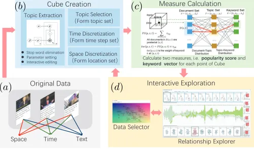
VERVIEW4.1 Workflow
We propose an analytic workflow presented in Fig. 3. The original data available in the form <text, location, time>
(Fig. 3a) are transformed, as explained in Section 2.1, into the form <TWV, location, time> suitable for cube con-struction. The transformation (Fig. 3b) involves definition of discrete finite sets of topics, locations, and time steps. The set of topics is obtained using the LDA (Latent Dirichlet Allocation) method applied after basic text preprocessing including stop-word elimination and lemmatization. The sets of locations and time steps are defined through dis-cretization of space and time. The next step is construction of the cube (Fig. 3c), which involves calculation of the topic popularity and keyword weights for each point of the cube (see Section 2.4). The resulting cube is then explored using visual and interactive techniques (Fig. 3d).
4.2 Cube Creation
濢瀅濼濺濼瀁濴濿澳濗濴瀇濴 濜瀁瀇濸瀅濴濶瀇濼瀉濸澳濘瀋瀃濿瀂瀅濴瀇濼瀂瀁 濠濸濴瀆瀈瀅濸澳濖濴濿濶瀈濿濴瀇濼瀂瀁
濦瀃濴濶濸 濧濼瀀濸 濧濸瀋瀇
濖瀈濵濸澳濖瀅濸濴瀇濼瀂瀁
濖濴濿濶瀈濿濴瀇濸澳瀇瀊瀂澳瀀濸濴瀆瀈瀅濸瀆澿澳濼濁濸濁澳澳濤濣濤濩濠濕濦濝濨濭澔濧濗濣濦濙澔濴瀁濷澳
濟濙濭濫濣濦濘澔澔濪濙濗濨濣濦澔濹瀂瀅澳濸濴濶濻澳瀃瀂濼瀁瀇澳瀂濹澳濖瀈濵濸
濥濸濿濴瀇濼瀂瀁瀆濻濼瀃澳濘瀋瀃濿瀂瀅濸瀅 濗濴瀇濴澳濦濸濿濸濶瀇瀂瀅
濧瀂瀃濼濶澳濘瀋瀇瀅濴濶瀇濼瀂瀁
z濦瀇瀂瀃澳瀊瀂瀅濷澳濸濿濼瀀濼瀁濴瀇濼瀂瀁
z濣濴瀅濴瀀濸瀇濸瀅澳瀆濸瀇瀇濼瀁濺
z濜瀁瀇濸瀅濴濶瀇濼瀉濸澳濸濷濼瀇濼瀁濺
濧瀂瀃濼濶澳濦濸濿濸濶瀇濼瀂瀁 漏濙瀂瀅瀀澳瀇瀂瀃濼濶澳瀆濸瀇漐
濦瀃濴濶濸澳濗濼瀆濶瀅濸瀇濼瀍濴瀇濼瀂瀁 漏濙瀂瀅瀀澳濿瀂濶濴瀇濼瀂瀁澳瀆濸瀇漐 濧濼瀀濸澳濗濼瀆濶瀅濸瀇濼瀍濴瀇濼瀂瀁 漏濙瀂瀅瀀澳瀇濼瀀濸澳瀆瀇濸瀃澳瀆濸瀇漐
(a)
(b) (c)
[image:7.612.49.299.47.194.2](d)
Fig. 3. Data processing and analysis workflow. TABLE 1 An example of LDA result.
index keywords
1 scotland, deal, brexiteers, indyref, means, talks 2 economy, money, pound, due, market, vote, property 3 euref, leave, vote, referendum, remain, eureferendum 4 nhs, love, peace, france, freedom, irexit, frexitl 5 brexitshambles, article, theresamay, nobrexit, court 6 remain, brexitbritain, lies, brexiters, campaign 7 post, postbrexit, impact, trade, future, great 8 trump, world, people, time, america, election, wrong 9 stopbrexit, manchester, march, grexit, exitfrombrexit 10 ireland, english, trndnl, gmt, brexitbill, northern 11 bbc, read, latest, post, blog, blair, interview 12 hate, people, britain, brexiteers, price, racist
4.2.1 Topic Extraction
We employ Latent Dirichlet Allocation (LDA) [2], a proba-bilistic topic modeling method that is often used to sum-marize vast amounts of texts. A topic is defined as a probability distribution over a given vocabulary, i.e., a set of keywords, where keywords with high probabilities represent the semantic content of the topic. Apart from the topic− keywords distributions, an LDA model also producesdocument−topicsdistributions consisting of the probabilities of each document to be related to each topic.
The LDA model does not work well on short texts [54]. A simple but popular way to alleviate the problem is to aggregate short texts into longer pseudo-documents [55], [56], [57]. The texts that are merged into a single document should be semantically related. Texts posted in social media usually contain hashtags, and the use of the same hashtags can be treated as indication of semantic relatedness of the texts. However, the meanings associated with the hashtags may change over time. We therefore aggregate messages that not only have common hashtags but also have close times of posting. The effectiveness of this approach has been proven in our previous work [3].
Table 1 shows representative keywords of topics ex-tracted from a dataset of tweets related to Brexit that were posted in Britain from March 2016 to October 2017. Dur-ing that period, the Brexit was a hot discussion topic in the British society. The keywords in each topic are sorted according to their weights (i.e., probabilities) for the topics. Since each list begins with a different keyword, these most important keywords can be used as topic representatives.
Since we apply the LDA method to pseudo-documents
obtained by aggregation of the original documents (i.e., short messages), it generates the topic probability distri-butions for the pseudo-documents. We propagate these distributions to the original documents in the following way. If a document has been included in a single pseudo-document, it receives the topic probability distribution of this pseudo-document. If a document has been included in several pseudo-documents, the corresponding topic dis-tribution vector is composed of the mean probabilities of the topics computed from the probabilities for the pseudo-documents.
4.2.2 Topic selection
The LDA and other topic modeling algorithms require set-ting the number of topics to generate, which is a parameter of the algorithms. It may be very hard to estimate how many meaningful and distinct topics may exist in a text collection. The choice of the parameter value may have high impact on the result. Some topics can only be found with specific values of the parameter, and even a slight change of the value may lead to extracting a very different set of topics [28].
To reduce the effects of the parameter value choice and be able to compare topics generated with different param-eter setting, we utilize an ensemble-based approach. We run LDA multiple times with different parameter values, e.g., n ∈ {10,20,30,40}. We then create a visual display by projecting all extracted topics on a 2D plane according to their keyword probability distributions by means of a dimensionality reduction method, such as t-SNE [58] or MDS [59]. The topics are represented by points labeled by the keywords with the highest probabilities. Longer key-word lists, as in Table 1, are shown upon mouse-hovering. In this display, very similar topics resulting from different runs will have very close positions.
The topic projection display is used for selecting a topic set for the cube construction. The selected topics should be semantically diverse; therefore, from a group of close topics, it is sufficient to pick a single topic. Furthermore, the analyst may find some topics uninteresting, or vague, or irrelevant to the analysis goals; such topics do not need to be included in the cube.
4.2.3 Space and time discretization
Generally, the spatial and temporal domains are continuous. Since cube construction requires discrete sets of locations and time steps, the space and time need to be discretized. In some applications, predefined space divisions can be suitable, such as administrative division into countries, provinces, cities, etc. Other possibilities for space discretiza-tion include regular division by rectangular or hexagonal grid or irregular tessellation based on the spatial distribu-tion of the data [53]. In studies of human mobility behavior, it is often appropriate to use individual and public activity locations that can be extracted from long-term data [60].
6, the location set consists of the important cites of Britain, and the time period is divided into weeks.
It is possible to use a sliding window along the time axis for considering overlapping time intervals, for example, intervals of the length 1 week with a shift of 1 day.
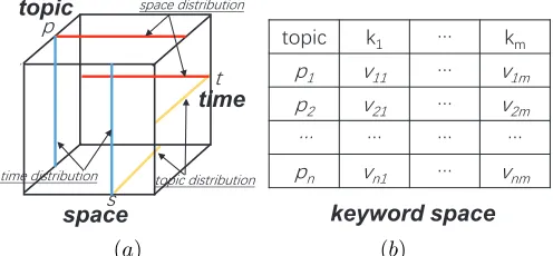
4.3 Measure Calculation
We calculate the popularity score and keyword weight vector, as defined in Section 2.4, for each point (p, s, t) in the cube. For this purpose, we utilize thedocument−topic
and the topic−keyword distribution outputs of the LDA model, as shown in Fig. 4.
space
time topic
Topic Set
ܲ=ଵ,ଶ, … ,
… …
Document Set
ܦ=݀ଵ,݀ଶ, … ,݀
,ݏ,ݐ
Document-Topic Distribution
ܦ ݏ,ݐ
…
Keyword Set
ܭ=݇ଵ,݇ଶ, … ,݇୯
݇
Topic-Keyword Distribution
All documents in ܦ ݏ,ݐ are
posted at ݏ,ݐ
݇ݓ ,ݏ,ݐ =ܲܵ ,ݏ,ݐ ×ݒ
݇ݓ ,ݏ,ݐis the weight of keyword
݇at ,ݏ,ݐ ܲܵ ,ݏ,ݐ = ݒௗ
ௗא ௦,௧
(a) (b)
Fig. 4. Illustration of the calculations of the popularity score and the keyword weight vector.
In thedocument−topicsdistribution, the sets of docu-ments and topics form a bipartite graph, where each edge represents the probability of a document being related to a topic. Similarly, the topic−keywords distribution can be seen as a bipartite graph where the edges represent the keyword weights for the topics, as in Fig. 4b.
To calculate the popularity scoreP S(p, s, t)for the point
(p, s, t), we collect all documents that were posted atsand
t, thus forming a document subset D(s, t), and calculate the sum of their weights on the topicp. Using Fig. 4b as an example, two documents are posted atsandt(marked with light blue shade), thus the popularity score for the point
P S(p, s, t)is the sum of the weights of the two documents on the topic p (the red lines). We multiply P S(p, s, t) by the weight of each keyword for the topicp(obtained from the LDA model) to obtainkw(p, s, t), which represents the prominence of keywordkat the point(p, s, t), as in Fig. 4a. If a topic has a high popularity at a point and a keyword has a high weight for the topic, the prominence (weight) of the keyword at this point is high.
4.4 Interactive Exploration
The interactive exploration of the data organized in the cube is supported by two components, Data Selector and Relationship Explorer. Their functions are described below whereas the visual design is described in detail in the following section.
4.4.1 Data Selector
The analyst may not necessarily need to deal with the whole cube at each moment of the analysis. Only a subset of the topics, or locations, or time intervals may be relevant to the
current analysis focus. The Data Selector supports the selec-tion of relevant subsets of topics, locaselec-tions, and/or times. This defines a sub-cube of the whole cube. The subsequent exploration is done on the sub-cube; the remaining part of the cube is not reflected in the visual displays. The analyst can modify the selection at any moment in the process of analysis, when it is necessary to consider another subset of the data.
To define a sub-cube for further exploration, the analyst separately selects subsets of topics, locations, and times. The selection is supported by an interactive visual display that informs the analyst about the similarities between the ele-ments of the currently considered dimension. This is done by projecting the elements onto a 2D plane according to their similarities by means of an appropriate multidimensional reduction algorithm, such as t-SNE [58] or MDS [59]. The ap-proach is the same as is used for the initial topic set selection (Section 4.2.2); however, different feature vectors are used. For the initial topic selection, the feature vectors were the keyword probability distributions. In this case, the feature vectors are constructed based on the cube structure. For an element of the currently considered dimension, the feature vector may be composed from the values lying within the corresponding slice (Fig. 2a-c). Such a vector represents the distribution of the measures corresponding to the element over the other two dimensions. Another possibility is to define a feature vector based on the projection of the cube content along one of the two other dimensions (Fig. 2d-f). Such a vector represents the distribution of the aggregated measures over the remaining dimension.
space
time topic
瀃 瀆瀃濴濶濸澳濷濼瀆瀇瀅濼濵瀈瀇濼瀂瀁
瀖
瀇瀂瀃濼濶 濾濄 瀖 濾瀀
瀃濄 瀉濄濄 瀖 瀉濄瀀
瀃濅 瀉濅濄 瀖 瀉濅瀀
瀖 瀖 瀖 瀖
瀃瀁 瀉瀁濄 瀖 瀉瀁瀀
keyword space 瀆
瀇
瀇瀂瀃濼濶澳濷濼瀆瀇瀅濼濵瀈瀇濼瀂瀁 瀇濼瀀濸澳濷濼瀆瀇瀅濼濵瀈瀇濼瀂瀁
[image:8.612.50.296.205.337.2](a) (b)
Fig. 5. Feature vector selection. (a) Each object, i.e. location, time step and topic, can be projected according to the distribution of the corresponding measures over one or two other dimensions. (b) The feature vectors that are used for the initial topic selection (Section 4.2.2).
Hence, the topics can be laid out in a projection based on the distributions of the corresponding measures over time and/or space, the locations can be laid out based on the distributions of the corresponding measures over topics and/or time intervals, and the time intervals can be laid out according to the distributions of the corresponding mea-sures over the topics and/or locations. Figure 5a illustrates the construction of the feature vectors, and Figure 5b shows the structure of the feature vectors used for the initial topic selection.
4.4.2 Relationship Explorer
[image:8.612.316.564.409.524.2]and topics. Interactive operations enable the analyst to see various relationships existing among the distributions. The component is described in detail in the following section.
5
V
ISUALD
ESIGNIn designing the visual interface (Fig. 6), we strove to restrict its complexity and difficulty for learning and use notwith-standing the complex structure of the data dealt with. To moderate the complexity, we developed an idea of design uniformity, which is explained below.
5.1 Design Uniformity Principle
The visual interface needs to represent three heterogeneous dimensions of the data, space, time, and topics, and the corresponding measures, i.e., topic popularity and keyword weight vector. The representation of the dimensions needs to reflect their inherent properties, particularly, the geo-graphic arrangement of the locations and the linear ordering of the time intervals. As discussed in Section 3.4, all three dimensions cannot be suitably represented in a single view. We have to use several complementary views, and 2D repre-sentation is preferred over 3D. Based on these premises, we come to the necessity of using three views, spatial, temporal, and topical. The first two reflect the inherent properties of the space and time, respectively, and the third reflects the composition of the topical dimension from different topics.
The idea of uniformity means similar appearance of the three views and similar ways of interacting with them. The implementation of this idea involves several aspects as discussed below.
Structure Uniformity (SU). We want the views to have a similar structure, i.e., similar layouts of display elements or components. The temporal view has to have a linear layout for reflecting the inherent linear ordering among the time intervals. For consistency, we adopt a linear lay-out also for the other two components. Specifically, we represent topics in the topical view by linearly arranged components, called ‘cards’, showing topic-specific informa-tion. Correspondingly, the spatial view includes multiple linearly arranged cards, which contain geographic maps to reflect the specifics of the spatial facet. Unlike the other two facets, time is a continuous succession of time intervals. This inherent feature is reflected in representing data by contin-uous curves or shapes, which is unique for the temporal view. Hence, the views are structurally similar to the extent allowed by the inherent properties of the data facets they represent, but they also have unique features reflecting the specifics of these facets.
Visual Style Uniformity (VU). The use of colors, fonts, labeling, highlighting, and other kinds of visual marks and variables need to be consistent between the views. Similar elements must have similar meanings irrespective of the views in which they appear.
Interaction Uniformity (IU). Since the representation of the data is decomposed into three views, interactive operations are required for establishing links among the views and exploring the distribution of the measures across the dimensions. The same interactive techniques need to be available in all views, and their implementation must be consistent between the views.
Operation Uniformity(OU). As discussed in Section 2.3, the task of studying the overall data distribution is decom-posed into simpler subtasks dealing with data cube slices and projections. In the process of exploration, the analyst should be able to choose slices and projections to consider next. The analyst may also wish to restrict the further explo-ration to a sub-cube of the data (Section 4.4.1). In supporting the selection of sub-cubes, slices, and projections, the cube dimensions should be treated uniformly. Furthermore, the choice of a perspective on the data (i.e., which dimension is fixed or aggregated while the others preserve variation) should not affect the structure and visual appearance of the spatial, temporal, and topical views.
The use of the cube metaphor, in which space, time, and topics are treated as uniform data dimensions, provides a good basis for designing the UI according to the uniformity principle. In the following, we describe the resulting design.
5.2 Data Selector
The Data Selector enables selection of data sub-cubes for fur-ther interactive exploration (Section 4.4.1). The controls for sub-cube selection do not need to be present on the screen constantly. They appear in a pop-up window triggered by clicking on a special button.
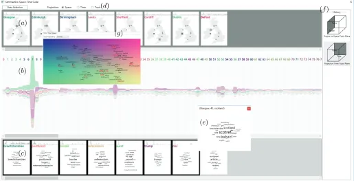
The Data Selector (Fig. 6g) consists of three panels that are integrated in a tab-control. The panels correspond to the three dimensions of the cube. In each panel, the el-ements of the respective dimension are arranged in a 2D layout reflecting the similarities between the corresponding distributions of the data over one or two of the remaining dimensions, as described in Section 4.4.1. The dimensions to use are selected through a drop-down list. The items shown in the projection are labeled, depending on their nature, with the location names, indexes of time steps, or dominant keywords (i.e., having the highest weights for the topics). Collision detection and resolution are utilized to avoid overlaps of the labels. Currently selected items are highlighted. The projection background is colored using a continuous two-dimensional color scale. The purpose of the coloring is explained below.
Color Assignment. In the Relationship Explorer, we
consistently use colors for representing the same data items in different views. An arbitrary assignment of colors to ele-ments of a data dimension would result in using too many unrelated and uninterpretable colors, which complicated and impedes perception and cognition due to the limited human attention capacity [61]. To deal with this problem, colors need to be assigned in a meaningful way. Following the approach proposed by Landesberger et al. [62], we assign colors to objects according to their positions in a projection reflecting similarities between them. With this approach, color similarity indicates object similarity.
5.3 Relationship Explorer
The Relationship Explorer (Fig. 6a-f) shows the distributions of the data over the spatial, temporal, and topical dimen-sions and enables the exploration of relationships among these distributions. The main views are the location view
(a)
(b)
(c)
(d)
(e)
(f)
[image:10.612.49.564.46.309.2](g)
Fig. 6. The visual interface designed for analyzing data involving spatial, temporal, and semantic facets includes two components: Data Selector (g) provides a data overview and enables selection of interesting subsets for exploration. Relationship Explorer (a-f) provides three perspectives on the data based on the facets and supports establishing links among the facets.
Theprojection/slice selector(Fig. 6d) is used to define the
current perspective on the data by selecting a projection or slice of the cube (Section 2.3). The history panel (Fig. 6f) represents symbolically what perspective is taken currently and what were taken before. Besides these permanent com-ponents, the analyst may create temporary pop-up windows representing the keyword weight vectors for selected cube points (Fig. 6e).
5.3.1 Visual Encodings
Thelocation view(Fig. 6a) includes a sequence of location
cards showing locations on a map (see Section 5.1-SU). A location card is meant for comparing data at one location, called current location, with data at the other locations. The visual design of a card is shown in Fig. 7a. The card is la-beled by the name of the current location colored according to its position in the projection in the Data Selector. A time graph on top of the card shows the temporal variation of the number of documents posted at the current location. The location label is colored according to its position in the projection in the Data Selector (Section 5.2). In the map, the graduated circles represent the counts of documents posted at the respective locations in comparison to the current location using blue for lower values and pink for higher values. The current location is marked with a star symbol.
Similarly to the location view, the topic view (Fig. 6c) consists of topic cards, which follows the principle of struc-ture uniformity (Section 5.1-SU). The visual appearance of topic cards (Fig. 7b) reflects the specifics of topics (which are, essentially, vectors of keyword weights) whilst being consistent with the appearance of the location cards, fol-lowing the principle of visual style uniformity (Section 5.1-VU). The main component of a topic card is a word cloud
composed on the topic-related keywords. The font sizes are proportional to the weights of the keywords for the topic. The time graph on top of a topic card shows the popularity variation of the topic. Upon mouse-hovering on a topic card, the keywords that occur in the cards of other topics are highlighted. Simultaneously, these keywords are also highlighted in all cards where they appear. This enables comparing semantic contents of different topics.
激濣濗濕濨濝濣濢 澷濩濦濦濙濢濨澔濠濣濗濕濨濝濣濢
澶濣濦濘濙濦
激濣濗濕濨濝濣濢澔濢濕濡濙 濈濝濡濙澔濛濦濕濤濜
澿濙濭濫濣濦濘 濈濣濤濝濗澔濢濕濡濙
(a) (b)
Fig. 7. Visual design of (a) location card and (b) topic card. The card labels are colored according to the positions of the respective location and topic in the projection in the Data Selector.
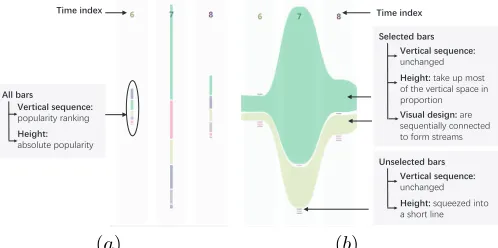
The time view (Fig. 6b) includes narrow cards
[image:10.612.317.559.477.576.2]from top to bottom corresponds to the decreasing order of the scores. One or more items can be selected for viewing the variation of the respective popularity scores in more detail in the extended mode. The bars representing the same selected item in consecutive cards are connected to form a continuous stream, as in Fig. 8b. This representation follows the idea of the ThemeRiver display [18]. The heights of the selected bars extend to use the majority of the vertical space, while the unselected bars are squeezed into a line. The vertical arrangements of all bars do not change to maintain the popularity rankings.
濈濝濡濙澔濝濢濘濙濬
濊濙濦濨濝濗濕濠澔濧濙濥濩濙濢濗濙澮澔 瀃瀂瀃瀈濿濴瀅濼瀇瀌澳瀅濴瀁濾濼瀁濺 澵濠濠澔濖濕濦濧
澼濙濝濛濜濨澮澔 濴濵瀆瀂濿瀈瀇濸澳瀃瀂瀃瀈濿濴瀅濼瀇瀌
濈濝濡濙澔濝濢濘濙濬
濊濙濦濨濝濗濕濠澔濧濙濥濩濙濢濗濙澮澔 瀈瀁濶濻濴瀁濺濸濷 濇濙濠濙濗濨濙濘澔濖濕濦濧
澼濙濝濛濜濨澮澔瀇濴濾濸澳瀈瀃澳瀀瀂瀆瀇澳 瀂濹澳瀇濻濸澳瀉濸瀅瀇濼濶濴濿澳瀆瀃濴濶濸澳濼瀁澳 瀃瀅瀂瀃瀂瀅瀇濼瀂瀁澳 濊濝濧濩濕濠澔濘濙濧濝濛濢澮澔濴瀅濸澳 瀆濸瀄瀈濸瀁瀇濼濴濿濿瀌澳濶瀂瀁瀁濸濶瀇濸濷澳 瀇瀂澳濹瀂瀅瀀澳瀆瀇瀅濸濴瀀瀆
濊濙濦濨濝濗濕濠澔濧濙濥濩濙濢濗濙澮澔 瀈瀁濶濻濴瀁濺濸濷 濉濢濧濙濠濙濗濨濙濘澔濖濕濦濧
澼濙濝濛濜濨澮澔瀆瀄瀈濸濸瀍濸濷澳濼瀁瀇瀂澳 濴澳瀆濻瀂瀅瀇澳濿濼瀁濸
[image:11.612.50.299.186.310.2](a) (b)
Fig. 8. Two modes of a time view representing 6 topics and 3 time cards. (a) The compact mode. (b) The extended mode, in which the popularity variation of two selected topics is represented by continuous streams.
The keyword view is a pop-up window showing the
keyword weights for selected cube points (i.e., combinations of location, time, and topic), or aggregated keyword weights for points on cube projections, or even more aggregated weights for elements of a cube dimension (i.e., the values are aggregated over the other two dimensions) (Fig. 9). The information is shown in the form of word cloud with the font sizes proportional to the keyword weights. The analyst can open several such windows, which are linked through interactive highlighting of the same keyword upon mouse-hovering in one of the word clouds.
(a) (b) (c) (d)
(e) (f) (g)
Fig. 9. Keyword views. (a-c): Views showing aggregated keyword weights for elements in three dimensions, a location (a), a time interval (b), and a topic (c). (d-f): Views showing aggregated data for points on 2D cube projections, time-topic (d), location-topic (e), and location-time (f). (g): A view showing detailed data for a cube point, i.e., a combination of location, time, and topic. The same keyword ‘leave’ is selected for comparing its weights in the different views.
Thehistory panel, as in Fig. 6f, symbolically shows the
currently chosen perspective of the data, i.e., whether it is a slice or a projection and the kind of slice or projection. It also shows the previous choices in the chronological order from top to bottom and allows the analyst to re-visit the corresponding views through clicking on the icons.
5.3.2 Interactive Operations for supporting Tasks
According to the uniformity principle (Section 5.1), we support all task categoriesT1-T6defined in Section 2.4 in a uniform way (IU, OU). To conduct a task, the analyst starts with selecting a projection or slice using the Projection Selec-tor. This defines a two-dimensional ‘plane’, and the analyst’s goal is to explore the data distribution over this ‘plane’. Please note that the term ‘plane’ is used metaphorically while the real data structure is more complex; therefore, the visual representation of the selected ‘plane’ is decomposed into three views. The exploration is performed through se-lecting objects in one view and observing the corresponding distributions in the other views.
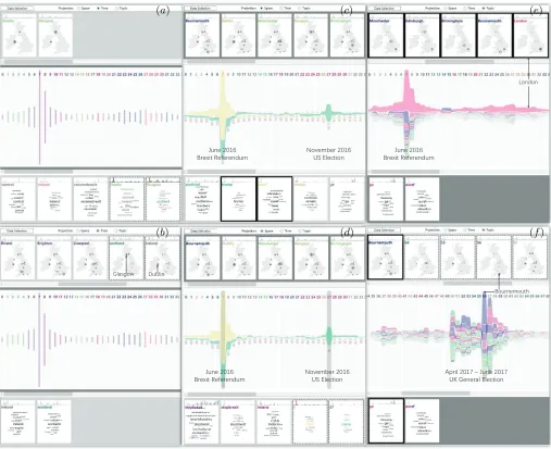
Let us take the task ΣT → (S → P → M) (T1) as an example. The analyst takes the time projection, i.e.,ΣT. Then the analyst selects different locationssin the location view via mouse clicking and observes the corresponding patterns in the the topic view. The interactive operations for the six tasks are summarized in Table 2. The term “pattern” for different tasks has the following meanings:
T1: 1) The topics are sorted according to their populari-ties at the selected locations; 2) a new topic card showing the popularities of all topics atsis added, as shown in Fig. 10a for s=Dublin and s=Glasgow. The word cloud in the new card consists of the representative words of the topics.
T2: 1) The locations are sorted according to the pop-ularities of the selected topic p; 2) a new location card that shows the spatial distribution of the popularity ofpis added, as shown in Fig. 10b forp=‘scotland’ andp=‘ireland’ (‘scotland’ and ‘ireland’ are the representative keywords of the selected topics).
T3: For the selected topic p, the time view shows a continuous stream representing the variation of the topic popularity, as in Fig. 10c.
[image:11.612.48.302.488.598.2]T4: A new topic card showing the popularities of all topics at the selected time intervaltis added, as shown in Fig. 10d fort=7 andt=27.
T5: For the selected locations, the time view shows a continuous stream representing the variation ofporΣP at
s, as in Fig. 10e.
T6: A new location card showing the spatial distribution of the popularities ofporΣP at the selected time intervalt
is added, as shown in Fig. 10f fort∈ {54,55,56,57}. As can be seen from the examples in Fig. 10, the analyst can select two or more locations, topics, or time intervals for performing comparison tasks within the categoriesT1-T6. The discussion presented above refers to the patterns of the popularity scores. To explore the patterns of the keyword weight distribution, the analyst generates and compares keyword views for selected locations, topics, or times (Fig. 9).
6
C
ASES
TUDIESWe have tested the utility of our approach on two case studies based on social media posts related to social and natural events.
6.1 Brexit Dataset
TABLE 2 Operations for tasks.
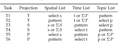
Task Projection Spatial List Time List Topic List
T1 T select s t orΣT pattern
T2 T pattern t orΣT select p
T3 S s orΣS pattern select p
T4 S s orΣS select t pattern
T5 P select s pattern p orΣP
T6 P pattern select t p orΣP
leave the European Union. We used a dataset containing about 380,000 tweets of more than 70,000 users posted during 78 weeks from May 1, 2016 till October 29, 2017 collected through the Twitter streaming API using a spatial query with the bounding rectangles of the UK and Ireland. We retrieved the tweets containing the keyword “brexit”, irrespective of the case, in the texts or hashtags and filtered out the tweets with empty hashtag fields, as we use hashtags for aggregating short texts into longer pseudo-documents (Section 4.2.1). Before applying topic modeling, we con-verted all texts to lower case. As explained in Section 4.2.2, we ran LDA several times giving different values to the parameter n (topic number): n = 10,20,30,40. From the resulting 100 topics, we selected 16 non-redundant topics having clear and relevant meanings (thus, we ignored topics with the most prominent words like ‘day’, ‘great’, etc.). The set of locations was constructed by selecting 14 top cities of the UK and Ireland according to the total amounts of posted tweets. The time span was divided into 78 week-long intervals. Finally, a cube with dimensions14×78×16
was built.
6.1.1 Verifying Expected Patterns
We check, on the one hand, how our system design sup-ports the task typesT1-T6(Section 2.4), on the other hand, whether it is effective in detecting expectable patterns and known facts concerning people’s opinions about Brexit. The exploration we conducted is illustrated in Fig.10.
T1. Fig. 10a: We want to see and compare which topics were popular in Glasgow and Dublin. The reason is that these two cities are always projected close to each other in the data selector regardless of the chosen feature vectors. We take the time projection of the cube; then we click on the cards of Dublin and Glasgow in the location view and obtain the corresponding topic cards in the topic view. These cards show us that the topics “scotland” and “ireland” were the most popular in Glasgow and Dublin, respectively. These are expected patterns, because people are usually more concerned with local affairs. We also observe that the topic “scotland” was quite popular in Dublin. This means that the Twitter users in Ireland might find the discussions concerning Scotland relevant also to Ireland. However, we do not observe a reciprocally high interest to the topic “ireland” in Glasgow.
T2: Fig. 10b: We want to see and compare the spatial distributions of the popularities of the topics “scotland” and “ireland”. We select these two topics in the topic view and obtain two new cards in the location view showing the spatial distributions of the topic popularities represented by the sizes of the circles. Not surprisingly, we observe that, among all locations, the topic “scotland” was the most
popular in Glasgow and Edinburgh while “ireland” was popular in Dublin. People in the other cities were not very much interested in any of these two topics.
T3. Fig. 10c: We want to check whether the times of peaks in topic popularity corresponds to the times of events these topics are related to. This task does not involve the spatial dimension; so, we take the space projection of the cube. We select the topics “euref” and “trump”, which refer to the British Brexit referendum and the current US president. In the time view, we observe the popularity variations of these two topics. As could be expected, the highest popularity of “euref” was attained in the 7th week (19-26 June, 2016), when the Brexit referendum was held. The popularity grad-ually increased before that week and gradgrad-ually decreased in the following weeks; in the remaining times, it was quite low. The topic “trump” had its highest popularity in the 27th week (6 June, 2016 to 13 June, 2016), which corresponds to the beginning of the US presidential election. Interestingly, this topic was also quite popular at the time of the Brexit referendum and in the following weeks.
T4. Fig. 10d: In the time view, we select the 7th and 27th weeks, in which “euref” and “trump”, respectively, had their highest rankings. Two cards showing the popularities of all topics in these two weeks are added to the topic list. The words representing the topics “euref” and “trump” have the largest font sizes corresponding to the highest popularities of these topics in the respective weeks, which is consistent with the previous observations made in the time view. In addition, we observe that, apart from the main topic “euref”, the topics “scotland”, “remain”, “trump”, and “stopbrexit” were also quite popular in week 7, whereas week 27 was strongly dominated by the topic “trump”.
T5. Fig. 10e: We want to look at the overall Twitter activities regardless of specific topics; therefore, we take the topic projection of the cube. We select five large cities from different parts of the studied territory and use the time view to explore the temporal patterns of the aggregated popular-ity, which reflects the general activity of the discussions in Twitter. We see a peak of activity in the 7th week (June 20-26, 2016), when the Brexit referendum was held. It shows that the overall number of tweets posted during the referendum period was higher than in the other weeks, thus resulting in a high aggregated popularity. We can also notice that the temporal trends were very similar in all selected cities except Dublin, where the Twitter activity sharply dropped down in week 8 but then increased in weeks 14-15 (August 8-21, 2016), when the activities in the other cities were quite low. The increase of the discussions in Dublin can be related to events in the Northern Ireland, where on August 10 the first and deputy first ministers sent an open letter to the UK prime minister Theresa May concerning Brexit impact on the Northern Ireland. Evidently, people in Ireland, in particular, Dublin, are concerned about the affairs in the Northern Ireland. These observations show that social media activities increase in response to important social events [3].
濝瀈瀁濸 濅濃濄濉
濕瀅濸瀋濼瀇 濥濸濹濸瀅濸瀁濷瀈瀀 濡瀂瀉濸瀀濵濸瀅澳濅濃濄濉濨濦澳濘濿濸濶瀇濼瀂瀁
濔瀃瀅濼濿澳濅濃濄濊澳瀤 濝瀈瀁濸澳濅濃濄濊 濨濞澳濚濸瀁濸瀅濴濿澳濘濿濸濶瀇濼瀂瀁 濝瀈瀁濸 濅濃濄濉
濕瀅濸瀋濼瀇 濥濸濹濸瀅濸瀁濷瀈瀀
濝瀈瀁濸 濅濃濄濉
濕瀅濸瀋濼瀇 濥濸濹濸瀅濸瀁濷瀈瀀 濡瀂瀉濸瀀濵濸瀅澳濅濃濄濉濨濦澳濘濿濸濶瀇濼瀂瀁
濗瀈濵濿濼瀁 濚濿濴瀆濺瀂瀊
濟瀂瀁濷瀂瀁
濕瀂瀈瀅瀁濸瀀瀂瀈瀇濻 (a)
(b)
(c)
(d)
(e)
[image:13.612.54.561.44.457.2](f)
Fig. 10. Demonstration of fulfilling six types of tasks. (a)T1: Take the time projection and select locations to observe patterns in the topic view. (b) T2: Take the time projection and select topics to observe patterns in the location view. (c) T3: Take the space projection and select topics to observe their streams in the time view. (d) T4: Take the space projection and select time intervals to observe the topic patterns in the topic view. (e) T5: Take the topic projection and select locations to observe their streams in the time view. (f) T6: Take a topic slice and select time intervals to observe the spatial distributions in the location view.
election announcement, the activity decreased but remained high and then raised to its highest values in weeks 56-57. We select the weeks 54-57 in the topic view. Four cards showing the spatial distributions of the popularity of “ge” in these weeks appear in the location list. Since the topic had the highest popularity in London in all four weeks, the spatial distribution maps exhibit high domination of London while the circles representing the values in the other cities are too small for seeing differences. Therefore, we exclude London from the selection and look at the spatial patterns formed by the remaining cities. As could be expected, there was a general increase of activities in all cities in the week of the election (week 57). In the preceding weeks, some cities had relatively higher activities than others; however, the activities in weeks 54 and 55 were not very high in absolute values, as can be seen in the time view. Week 56 differs from the others by having a high peak of activity in Bournemouth, on the south of England. We create a
corre-sponding keyword view, which points at an intensive media campaign for supporting the labor party. Bournemouth is the location of the headquarters of the company JP Morgan known for its strong anti-Brexit position. In the week before the general election, they announced that the conservative party losing the general election would be beneficial for the UK finances, which may explain the high number of the pro-labor tweets.
This test has confirmed that, first, all task types are supported, second, they are performed in uniform ways by applying the same interactive techniques in the different views and, third, the techniques have the power to reveal meaningful patterns.
6.1.2 Studying Temporal Evolution of a Topic
UK, a large number of tweets in this dataset discuss the effects of US social events on the Brexit.
[image:14.612.314.565.278.407.2]There are two peaks in the stream of the topic “trump”. The first peak was in the period of the Brexit referendum. We analyzed the corresponding keyword lists and did not find any special keyword (apart from “trump”) except the keywords related to the referendum. Hence, the first peak was caused by the popularity accumulation from the large number of tweets posted in that week. The second peak was at the beginning of the US election (6 Nov, 2016 to 12 Nov, 2016). In the keyword view, several keywords related to the election had higher prominences, such as “uselection”, “electionnight”, and “electionday”. Like in the previous examples, this confirms that social media activities are highly related to to important social events. In the 33th week (18 Dec, 2016 to 24 Dec, 2016), the keyword “win” appeared, and the corresponding event was that Trump won the election. We found the keyword “muslimban” in the 39th week (29 Jan, 2017 to 4 Feb, 2017), one day after Trump signed the executive order 13769, which prohibits citizens of seven countries in the Middle East from entering the United States within the next 90 days. The higher key-word prominence indicated active discussions concerning the order in the social media. In the 47th week (26 Mar, 2017 to 1 Apr, 2017), the keyword “article” appeared, which was consistent with the news that the prime minister triggered Article 50 of the Treaty on EU. In the 51th week (23 Apr, 2017 to 39 Apr, 2017) keywords about the election, such as “ge” and “generalelection”, appeared again due to the announcement of the British general election. In the 58th week (11 Jun, 2017 to 17 Jun, 2017), we found many names of countries and politicians, such as “russia”, “syria”, “israel”, “usa”, “putin”, etc., which may be related to the Trump’s press conference on June 14, 2017.
Fig. 11. Temporal evolution of topic “trump”.
6.1.3 Exploring Competition of Topics
We compare the temporal trends of two topics with similar meaning, “remain” and “stopbrexit”. We find (Fig. 12a) that the popularity of the topic “remain” (the green stream) had been higher than the topic “stopbrexit” (the pink stream) during the first half of the period. Afterwards, the popular-ity of the topic “stopbrexit” gradually increased and finally exceeded the first one. The topic “stopbrexit”, evidently, refers to the development of the Brexit process whereas the topic “remain” refers more to making the Brexit decision. For seeing more details, we create keyword views for dif-ferent weeks; the keyword views for the weeks 7 and 74 are shown in Fig. 12a. In week 7, many keywords related to the referendum and voting had higher prominence within the
topic “remain”, indicating a willingness to vote for Britain to stay in EU. In week 74, the topic “stopbrexit” contained many keywords related to Manchester, indicating some local events in Manchester. Therefore we selected the location slice corresponding to Manchester and observed the corre-sponding popularity variations of the two topics (Fig. 12b). We found the same temporal trends as for all locations in general, except for a more significant popularity difference in week 74 (Oct 1 to Oct 7, 2017). By retrieving the related information from the Internet, we learned that an organiza-tion named stopbrexit https://www.stopbrexitmarch.com/ organized a march on October 1 2017 in Manchester, thus causing the popularity burst. We also found the keyword “march” in the keyword distribution. The increase of the popularity of “stopbrexit” in week 70, which can be seen in the time view in Fig. 12a, is related to a similar anti-Brexit match that happened on September 9 in London. Hence, by investigating the temporal variation patterns, we can find references to important local events.
(a)
[image:14.612.49.303.450.550.2](b)
Fig. 12. Different popularity trends of “remain” (green) and “stopbrexit” (pink): a) the whole territory, (b) slice for “Manchester”.
6.1.4 Interesting Findings regarding the Spatial Distribution
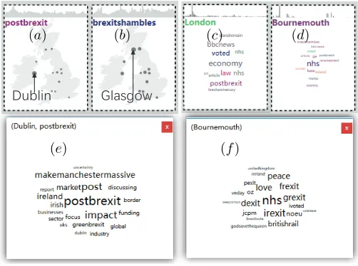
We take the time projection and generate location cards showing the spatial distributions of the popularities of different topics, as in Fig. 13a, b. We also generate topic cards showing the topic popularities distribution in different selected cities, as in Fig. 13c, d. In this way, we find answers to interesting questions regardingspace−topicrelations. A few examples are presented below.
Which city has the highest concerns about the situation after the Brexit?. We look at the spatial distribution of the popularity of the topic “postbrexit” and see that the highest activity was in Dublin (Fig. 13a). We create a corresponding keyword view (Fig. 13e), where we see such keywords as “impact”, “market”, “discussing”, etc. We learn from literature that currently there is no actual border between North Ireland and Ireland, but this situation may change after the Brexit, which will seriously affect the trade between Ireland and Britain. This explains the high concern about the topic “postbrexit” in Dublin.