Theses Thesis/Dissertation Collections
11-20-2015
Visualizing the News: An Analysis of a Year in
Interactive News from The New York Times and
The Washington Post
Maria T. Olivo
mto7238@rit.edu
Follow this and additional works at:http://scholarworks.rit.edu/theses
This Thesis is brought to you for free and open access by the Thesis/Dissertation Collections at RIT Scholar Works. It has been accepted for inclusion in Theses by an authorized administrator of RIT Scholar Works. For more information, please contactritscholarworks@rit.edu.
Recommended Citation
The Rochester Institute of Technology
School of Communication
College of Liberal Arts
Visualizing the News:
An Analysis of a Year in Interactive News from The New York Times and The Washington Post
by
Maria T. Olivo
A Thesis submitted
in partial fulfillment of the Master of Science degree
in Communication and Media Technologies
The members of the Committee approve the thesis of
Maria T. Olivo presented on November 20, 2015
____________________________________ Patrick Scanlon, Ph.D. Director
and Professor of Communication School of Communication
____________________________________ Ammina Kothari, Ph.D.
Assistant Professor
School of Communication Thesis Advisor
____________________________________ Rebecca DeRoo, Ph.D.
Assistant Professor
Department of Performing Arts and Visual Culture
Thesis Advisor
____________________________________ Grant Cos, Ph.D.
Director, Communication & Media
Acknowledgments
After a little more than a year away from home, I feel extremely grateful to have found
the help and support of the wonderful people I met at the Rochester Institute of Technology.
First, I would like to thank my primary advisor, Dr. Ammina Kothari. I will always be thankful
for the dedication, patience and empathy she provided even as my supervisor during my first
semester. I also want to thank Dr. Rebecca DeRoo, who took me on as her first thesis advisee at
RIT. I really appreciate her dedication to my project and her genuine interest in listening to my
ideas in order to give me appropriate feedback.
Thanks to the caring staff of the School of Communication, always willing to help me
and my classmates in every way possible. I thank Senior Staff Assistant, Helen Adamson, for
receiving us with warmth and enthusiasm at the beginning of our first year and for the
unconditional support she showed us during our studies. To my outside coder, Alina Flores, who
volunteered her time, working after hours to help me complete the coding of my data.
Last, but not least, to my loving family, for encouraging and supporting me during this
Table of Contents
Abstract ... 5
Introduction. ... 6
From Printed Press to Online News ... 7
News Audience’s Engagement in Data Journalism and Infographics ... 10
Research Questions ... 15
Methodology ... 17
Data Collection ... 17
Quantitative Analysis ... 18
Qualitative Analysis: Cairo’s Visualization Wheel ... 20
Results ... 22
Quantitative Analysis ... 22
Relationships ... 22
Analysis of the Selected Stories. ... 24
Discussion ... 43
Limitations and Future Research ... 46
Visualizing the News: An Analysis of a Year in Interactive News from The New York Times and
The Washington Post
Maria T. Olivo
School of Communication
College of Liberal Arts
Degree: Master of Science in Communication & Media Technologies
Term Degree Awarded: Fall Semester 2015
Abstract
In the past decade, newsrooms have been struggling to remain relevant while trying to keep and
attract new audiences. Access to diverse online tools and big data has expanded the use of
infographics and data visualization in news stories, increasing reader engagement with complex
content. The increase of interactive visual content in journalism requires rethinking how
journalistic and design elements are incorporated in a story. This study explores how The New
York Times and The Washington Post incorporate principles of design and data visualization to
present complex information for their readers. Using a mixed method approach, a sample of 275
articles that span over a period of one year — from August 2014 through August 2015 — were
analyzed to identify salient forms of information visualizations.
Keywords: infographics, visual journalism, data visualization, interactive, media,
Visualizing the News: An Analysis of a Year in Interactive News from The New York Times and
The Washington Post
Journalism is the process of telling people what they previously did not know,
particularly matters of significant importance (Franklin, 2009). In democratic societies,
journalism is a fundamental aspect of the civil and political life, it holds an important role simply
because through news we discover things we would not know otherwise (Schudson, 2008). The
practice in itself, Schudson (2008) tells us, does not create a democracy, but, it does provide a
series of services to help sustain it. These are: to inform, by providing fair and complete
information for citizens to make their own choices; to investigate: particularly governmental and
concentrated sources of power; to analyze: by providing coherent frameworks of interpretation to
increase the understanding of complex topics; to build empathy: citizens can learn about the
points of view and lives of other people – especially those less advantaged – when journalists
write about them; public forum: by providing “a forum for dialogue among citizens and serve as
a common carrier of the perspectives of varied groups in a society” (p. 12); and to mobilize: by
serving as advocates for certain political programs and perspectives and mobilizing people “to
act in support of these programs” (p. 12).
In the last two decades, the Internet has changed the practice of news reporting not only
in printed news, but in all of the traditional channels. According to Franklin (2009),
technological advances are multiplying the outlets for storytelling, and, as a result, changing the
way people get their news. By the year 2012, half of Americans were reading their news online,
topping all types of traditional media combined (Beaujon, 2012). Furthermore, The Pew
Research Center’s “2015 State of the Media Report” showed that 44% of newspaper readers used
2015). Changes in audience behavior, combined with shrinking of newspaper workflow are
re-inventing how news are produced and presented today. According to Jurkowitz (2014a), there
has been a steady increase in journalism-job losses since the year 2005. However, the slow but
consistent growth of digital native news outlets – and their staff – could be an indicator that the
industry is moving to a new model (Jurkowitz, 2014b).
Newspapers are now generating data-based, media rich stories. Information is presented
in visually attractive ways, while allowing readers – now also called users – to filter and
manipulate data in ways thought impossible within the limitations of the printed medium. By
incorporating interactive infographics in news stories, the media are fulfilling the demands of
their audience, who are asking for more transparency in reporting and participatory story telling
(Rogers, 2014). In this context, designers play a key role by using their unique set of skills – the
understanding of form, function, type and color – to accurately display information from a
journalistic perspective.
In this thesis, I examined the current use of interactive infographics, first by reviewing
when media started including infographics in the stories published online, and then analyzing a
selection of interactive infographics produced by two major news organizations in the US. The
analysis focuses on how The New York Times and The Washington Post incorporate design
elements and opportunities for user engagement in their news stories.
From Printed Press to Online News
Overholser and Jamieson (2005) talk about the concept of general interest and journalism
of service. Catering to the public interest, this reflects that a healthy society is built on the basis
of an informed citizenship (Overholser & Jamieson, 2005). Fink and Schudson (2014) found
journalists became more aggressive in the search for news stories and, particularly after the
Watergate scandal, took the place of watchdogs, trying to hold politicians accountable in the
name of the constituents (Fink & Schudson, 2014). To keep the interests of the citizenry close to
heart sounds like an unrealistic expectation for news outlets, owned by corporations often
focused on profit margins. Nevertheless, the ideas proposed by Nip (2006), Marchionni (2013),
and Overholser and Jamieson (2005) can all be linked to the sentiment of the “public journalism
movement,” which links the telling of news with the ability to serve the public, in an attempt to
break conventions – like gatekeeping – and truly “connect” with citizens.
The use of digital resources is not new. Multimodal news coverage – making use of
pictures, sounds and video – can be traced back twenty years ago, when newspapers started
adding multimedia content to their websites, making use of the resources provided by the
Internet (Boczkowski, 2004). One of such cases was The HoustonChronicle.com, which
launched a special section named the Virtual Voyager: “a multimedia magazine with storytelling
that combined text, still images, audio, video, 360-degree photography, and computer animation”
(Boczkowski, 2004, p. 201).
The dynamic and fast-paced character of online communications points to a new age of
news institutions as it allows audiences to participate in the form of commentators, critics and (in
some cases) even as authors themselves. In the era of social media, we are presented with more
channels to independently publish news and almost all of us are capable of serving as witnesses
to the events around us. It is only necessary to sign up for an account on Twitter.com, for
example, where most news outlets link to the latest news by posting the headlines. All of these
scenarios present possibilities of engagement – the successful interaction between digital
However, even as social media are important means to discover breaking news, people
still view information that comes from it with skepticism (American Press Institute, 2014).
Journalism as a practice is still respected by audiences, but they are just approaching it in
different ways. Perhaps as a response to this immediacy of reporting, increasing numbers of
readers are going to specialized sources to get reliable information, picking different sources for
different topics (American Press Institute, 2014). The web, with its electronic immediacy and its
ever-changing illusion of immersion, seems to provide the ideal channel to make this happen.
But connecting with users is proving a difficult task: a survey of over 500 managing editors
revealed the vast majority had a new pressing priority: reader engagement (Mayer, 2011).
Online engagement is achieved when users maintain their interest in the subject matter
and is usually characterized by positive emotions (O'Brien & Toms, 2008). Engagement can be
procured through certain sensorial attributes that O’Brien and Toms call “point of engagement.”
Those attributes could be aesthetics, novelty, interest, motivation, or specific or experiential
goals (O'Brien & Toms, 2008). Because these attributes don’t always rely on the content
presented –but in sensorial experience of the reader– the challenge is to maintain quality of the
stories at the same time as producing economic benefits.
Newspapers make profit through sales – subscriptions or newsstands – and advertising. A
greater number of subscribers and buyers translates into a more valuable placement for
advertisement (“Reinventing the newspaper,” 2011). Nonetheless, this economic model is being
challenged. Since the late 90s, newspapers have had to face a decrease in readership, which
coincides with the launching of newspapers’ websites (Boczkowski, 2004; Nip, 2006). During
Imitating the offline profit model, digital newspapers are providing subscriptions. These
usually work by way of a paywall that blocks access to the website on some of its section, or
after a certain number of articles are read (“Reinventing the newspaper,” 2011). Advertising is
also present, and much like sales from newsstands and subscriptions are important for
advertisement value, the number of visits and the time spent on the website is a motivating factor
for advertisers. The possibility of participation – potentially resulting in engagement– is a key
factor in keeping readers on a website – and in making them come back (“Reinventing the
newspaper,” 2011).
News Audience’s Participation in Data Journalism and Infographics
Schudson (2010) traces the existence of “data” as a source for news reporting to the
foundation of professional associations that curated and edited field journals, as well as to the
reports of political observatories, whose results were publicly shared by the mandate of the
Inspector General Act of 1978. Rogers (2011) writes that several years ago, data was only
available in print, in the form of expensive books that contained information and “figures” for
reader to interpret. Having the information in a digital form, he argues, data sets became bigger
but also more accessible when they were published online.
In 2010, Rogers wrote a piece for the British newspaper, The Guardian, in which he
mentioned how people around the world wanted to have access to the information their
governments collected. Slowly, governments complied and made large databases of information
available for the use of anyone who wished to examine it (Rogers, 2010). The ability to read this
data and make sense of it is considered a paradigm of modern democracy, according to Rogers
(2014) and Schudson (2010). This is because experts are no longer the only interpreters of
coming together to use modern tools and channels at hand to put the information out there (Gray,
Bounegru, & Chambers, 2012).
Data journalism is enhanced when delivered through electronic means, because through
them we can make use of tools that allow us to better analyze (Weber & Rall, 2012), display, and
read information (Gray et al., 2012). As a growing number of people consume information via
primarily visual channels (Barthel, 2015), there is significant value in using graphics, instead of
simply words, in our communication (Lankow, Crooks, & Ritchie, 2012). But making
information into images adds great value to the construction of the news articles, since visual
representations make it easier to observe patterns that might come up from complex or very large
sets of data (Dur, 2014).
Data journalism is the process of analyzing raw information and connecting all the
important points for the audience. This type of reporting has been around for decades (Schudson,
2010), but current multidisciplinary newsrooms make it possible for more journalists to practice
it (Weber & Rall, 2012). When data stories are a result of crunching numbers, the use of graphics
is an obvious choice. When visually represented, numbers reveal their trends and exceptions, and
facilitate drawing comparisons through the information (Few, 2012). The ability to make
comparisons has an empowering effect on readers, as it allows them to explore the numbers.
Without the graphic, they are left to trust solely the word of the writer. While graphics are also a
product of the author’s interpretation (be it a journalist or designer), information graphics help to
organize topics by providing a point of reference. Today, data journalism is a common practice in
newsrooms, but critical quality journalism is also possible when investigating small samples of
data and straightforward leads. Once the data is analyzed, information in visual form helps
The topic of education is important because, even as Fleming’s visual, auditory and kinesthetic
model of types of learning is being contested, research shows that there is a preference for
acquiring information through visual channels, and recent advances can make the experience
richer (Lankow et al., 2012).
In this sense, visualization of information and data journalism are now two converging
disciplines that depend on each other. Weber and Rall (2012) go as far as to say that it was as a
result of their convergence that data-driven journalism came to be. In the research conducted by
Weber and Rall (2012), it was found that in America, the change of paradigms regarding these
disciplines might be already underway, and designers could be more open to identifying
themselves as journalists, in contrast to a more defined division of tasks visible in German and
Swiss newsrooms. Digital data journalism has been the norm for at least 5 years (Rogers, 2011)
and data visualization took center stage in the practice of journalism, with interactive
infographics becoming common-place in 2009 (Weber, 2013).
For most data journalists enthusiasts like Rogers (2012), infographics – the contraction of
information and graphics – are an obvious part of data journalism. Alberto Cairo, head of the
Program of Data Journalism and Visualization at the University of Miami, is a vocal promoter of
the term “visual journalism” to identify the practice of many professionals that work to make
data understandable by means of visual principles (Cairo, 2014). To support their claim, it is
sufficient to cite the most basic principles of design, that indicate visual stimuli – such as
photographs, illustrations and art – attract the attention at the same time they aid in retention;
they inform and entertain while pulling readers into an article (Pasternack & Utt, 1990).
When computer technology began making its way into most professional practices in the
text, replacing them completely, or complementing the delivery of information (Valero, Català, &
Marín, 2014). This practice would allow the words to emphasize other aspects of the news or to
extend in their explanation of complex issues (Valero et al., 2014). Later, the introduction of
basic programming to the visuals-and-words mix allowed newspapers to work on models of
information processing that emulated those used in applied sciences, such as physics and
statistics (Valero et al., 2014).
With the arrival of computer graphics and programming, online newspapers began to
present new models that emulated those often used in the field of physics and statistics. Although
these representations were not new, recent technological innovations are changing the game
(Valero et al., 2014). Today, the collaboration that occurs between professionals of different
backgrounds yields rich and immersive media results – in which readers feel like part of a virtual
experience – often allowing them the ability to interact with each other (Weber & Rall, 2012).
Infographics and interactive infographics.
Cairo, in his book The Functional Art (2013), says academic texts sometimes make a
distinction between the terms information graphic and visualization, but claims both things are
part of the same “continuum.” A general explanation of “infographic,” however, usually includes
any type of visual representation that is a result of information gathering from a source other than
the author’s imagination (Friendly, 2009). A statistical chart, a bathroom sign, or a map – of
which we have examples as early as the year 6200 B.C. (Friendly, 2009) – are all graphic
representations of knowledge that is more convenient (or simple) expressed through images than
words. Cairo (2013) prefers to use the term “visualization,” and in that vein, openly prefers a
definition by Joan Costa, a well-known Spanish design professor who says: “to visualize is to
Cairo (2014) is also an advocate of establishing visual journalism as a career and
distinctive branch of journalism much like photojournalism is now. He goes as far as to apply the
same ethical principles that journalists are bound to, to the field of data visualization. If we
review what people like Cairo – with over 15 years of practice in the field – say about their
profession, infographics for news articles are based on the same principles of “accuracy, depth
and clarity” journalism is supposed to be based on (Cairo, 2012). Cairo pushes for ethical
commitment of designers – or anyone else somehow involved in this process – with truthful
representation. According to Cairo (2012), this should not stem from old-fashioned rules of
behavior, but on a communitarian goal of happiness. In his article, “Ethical Infographics,” Cairo
(2014) elaborates on how best practices in the field of infographics are operationalized.
We don’t “tell the truth” just for the sake of telling the truth, and we are not “honest”
because “honesty” is a self-evident “virtue.” Arguably, such notions are risible. Rather,
we are honest and we tell the truth because we have evidence to demonstrate that doing
so increases the public’s understanding about relevant matters. Better information is
correlated to well-being. Generalized knowledge can lead to generalized happiness (para.
2.)
An interactive infographic incorporates different elements, including images, text, and
layout into a news item that allows at least one option for navigation or control of the graphic,
according to Weber (2013), who defines interactivity as having varying levels. On a lowest scale,
this includes “object interactivity,” which results in the response for clicking a button. But if this
is done in the context of enlarging a photo, for example, this is not considered interactivity,
because “every click should provide access to new information or to the next information
interactivity. When users can have a direct effect on the content and are able to navigate through
the graphic at their own discretion, we have reached a high level of interactivity.
The news-crafting panorama is now under constant transformation and scrutiny. The
digital age transformed old-fashioned investigative journalism into data journalism and
infographics – particularly in their interactive form (Weber & Rall., 2012) – are now a necessary
component of the journalistic practice (Valero et al., 2014). Infographics have not only become a
de facto portion of in-depth journalism, they are also changing the structure of newsrooms
everywhere (Weber & Rall, 2012), in particular with the addition of programmers and designers
into the investigative process (Valero et al., 2014).Because “data stories” are becoming a crucial
part of digital journalism it is important to analyze how data is visualized based on the story
subject (Weber & Rall, 2012) and formulate guidelines that help incorporate this practice in
newsrooms and journalism classrooms alike. By looking at them in context we can provide
guidelines for better practice, as well as information on the best and current practices for the
academic environment.
Research Questions
The New York Times (from now on NYT) and The Washington Post (from now on WP)
were selected as the sources for the stories to be analyzed. To demonstrate the influence of both
institutions on national journalism practices, I should first review some of their statistics. In
2014, according to data provided by Alliance for Audited Media, the total number of unique
visitors summed up over 27 million for the NYT, paired with a page view count past 477 million.
For the WP, the count of unique visitors surpassed the 17 millions and the page view count was
over 207 (Alliance for Audited Media). While these numbers certainly include worldwide
time of this research, these news portals place number 1 and number 2 respectively on the
rankings of popularity of newspapers websites for the United States, when measured with Alexa
Ranks and Similar Web. Both institutions have won several Pulitzer prizes. On the same note,
both are the corresponding digital platforms for the physical newspapers of the most important
cities in the US in terms of economy (McSherry, 2014) and politics, respectively.
The present research analyzes stories from both websites that include interactive
infographics, in order to answer the following research questions:
RQ1: How are the selected news outlets making use of infographics to
enhance the news-reading experience?
By observing the techniques used to improve the reading experience, we can
gauge the efforts made to improve reader participation, an aspect of the
journalist-audience relationship that managing editors reportedly look to improve (Mayer, 2011).
RQ2: Is there are difference between the types of stories presented through
infographics by the NYT and WP?
Both news outlets cover nation-wide subjects, but differ in editorial style and
cater to different audiences (Doctor, 2015).
RQ3: What types of graphics are commonplace?
Closely tied to RQ2, this question will help us evaluate the trends in terms of
visualization in the past year as not all stories demand visual representation (Dick, 2014).
By analyzing the editorial choices of these newspapers, we might discover the topics
identified as those requiring more detailed explanation.
RQ4: How are design elements and source attribution incorporated in the
While Schudson (2010) claims that data repositories have been in use for decades,
Rogers (2010) says it is a recent popular demand that has made data much more
accessible and part of journalism.
RQ5: Do the graphics follow the best practices defined by Cairo?
Cairo (2013) defines a Visualization Wheel, through which the complexity and
effectiveness of an infographic can be studied. Observing the graphics using his
parameters can help us understand the experience of a reader when interacting with some
of the stories.
Methodology
Data Collection
To have a current and broad sample, I analyzed a year’s worth of interactive stories
published by both NYT and WP, spanning from August 1, 2014 through August 31, 2015. The
sample only included interactive infographics, but did not discriminate in terms of categories,
topics, or article length. In the selection of the items to evaluate, I included every article that
allowed the reader to interact with the content through filtering or manipulating resources
impossible to present on print. To this respect, stories that provided detailed information that
would have proven difficult to represent on a printed version on account of clutter or length
restrictions were considered to fit the criteria. Representations that allowed users to complete
secondary actions – like navigating, comparing within a scale, or allowing to put information in
different contexts – were also included.
I used the The New York Times’ search engine and Twitter account @nytgraphics to
collect all interactive stories published within the time frame of August 1st, 2014 through August
(postgraphics.tumblr.com), where the organization documents their graphics department’s
projects. A total of 275 stories were found: 160 by NYT and 115 by the WP. They were
catalogued with the help of Evernote (an application that helps keep “notes” or “clippings” from
the web).
Quantitative Analysis
I trained a voluntary outside coder to code; 10% of the data set was coded to check for
intercoder reliability. Our agreement ranged from (.80 to 1.0) based on the Scott’s Pi reliability
test. After passing the 10% reliability test the outsider coder coded the remaining NYT stories,
while I completed the WP stories. To analyze these stories, I used a codebook for content
analysis and later ran the answers through SPSS Statistical Analysis program to determine
significant relationships. This codebook was designed using initial open-ended coding of the
dataset. The information collected on the codebook was processed using IBM-SPSS. I used
descriptive statistics and the Chi-Squared test for association was used to check for significant
relationships between variables. The Chi-Squared test is used “to determine whether two or more
groups of observations differ significantly from one another” (Bhattacherjee, 2012).
The following questions were part of the coding book. I included the possible answers
after each question, including the corresponding number for coding purposes.
● Category:
a. Is the graphic part of a story or a standalone entry to the website?
Yes (1) No (2)
b. Does the graphic describe an event?
c. Does the graphic include the steps or stages of a phenomenon? (Tutorial or
diagram)
Yes (1) No (2)
d. Section:
■ Local (US)
■ International
■ Politics
■ Science and Technology
■ Health
■ Sports
■ Business and Economy
■ Lifestyle (like fashion, food or arts)
● Most prominent technique
■ Charts (1)
■ Map (2)
■ Illustrations (3)
■ Photography (4)
■ Videos or animations (5)
● Data accessibility
■ Are users able or invited to filter or input data?
Yes (1) No (2)
■ Is the source of the information clearly provided?
■ Are users directed to review or download the information?
Yes (1) No (2)
■ Does the news source provide a summary of the data?
Yes (1) No (2)
■ Does the article include an index or navigation?
Yes (1) No (2)
● Aesthetic component:
■ Are there decorative elements present? (Background images, sounds,
special effects)
Yes (1) No (2)
■ Does the design of this match the rest of the website’s design?
Yes (1) No (2)
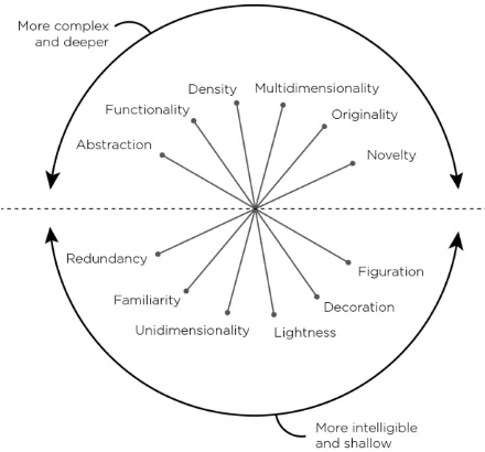
Qualitative Analysis: Cairo’s Visualization Wheel
Alberto Cairo uses a visualization wheel to plan ahead for his projects. In his book The
Functional Art (2013), he also uses it to describe a few select infographics. I employed Cairo’s
model here, to conduct a close reading of a smaller sample of my data. The wheel is divided in
two hemispheres, a “more complex and deeper” side and a “more intelligible and shallower”
side. Each hemisphere contains 6 features, distributed as the end-points of their axes. Cairo
(2013) defines the axes as follows:
Abstraction-Figuration
“An information graphic is completely figurative when the relationship between
the referent and its representation is perfectly mimetic” (p. 52).
This axis refers to the inclusion of visual elements that are not directly used to
enhance the comprehension of the material (p. 53).
Density-Lightness
The amount of data it displays in relation to the space it uses (p. 54).
Multidimensionality-Unidimensionality
This axis is a measure of two related variables: the number of layers of depth a
graphic lets readers navigate, and the different forms it uses to encode the data (p.
54).
Originality-Familiarity
This axis refers to the level of innovation of a graphic. To better explain it, bar charts
and pie charts are very common, therefore very familiar to readers.
Novelty-Redundancy
Information graphic can explain many different things once (novelty) or it can explain
[image:22.612.213.433.477.682.2]the same things several times, by different means (redundancy, p. 57).
Results
Quantitative Analysis
Out of the 275 stories, 36.4% were standalone entries to the website and only 20%
referred to an event. When it came to sections, local (18.5%), lifestyle (18.2%), and politics
(17.8%) were the most common topics explained through infographics. As for the techniques,
maps (38.5%) and charts (37.8%) were the most popular, but these results might be skewed
because of a lifestyle recurring column on the NYT – Titled “36 hours in …” – that frequently
used maps.
The stories coded showed that in most cases (67.6%), users are not able to input data, nor
download the information shown in the article (71.3%). However, the vast majority of articles
(84%) did provide the source of the information. It was also found that only 27% of the articles
were designed radically different from the rest of the website.
Relationships.
NYT was more likely to integrate a graphic into a story than WP, χ2 2 (1, N = 275) =
16.91, p < .01. I intended to measure the frequency with which infographics are published as
standalone entries to their website, to establish whether they are considered journalistic pieces on
their own. In the case of NYT, infographics were more often than not published with a related
[image:23.612.90.460.568.682.2]article, or as follow up of one.
NYT was less likely to publish a graphic that described an event than WP, χ2 2 (1, N =
275) = 14.58, p < .01. Chronologies were a common finding in the collection, however, the WP
dedicated more stories to the description of events, such as the case of a map that marked the
[image:24.612.107.484.178.340.2]progress of riots in Baltimore (Thorp & Lu, 2015).
Figure 3. NYT was less likely to publish a graphic that described an event than WP
WP was more likely to clearly include information about the original source of
information for a graphic than NYT, χ2 2 (1, N = 275) = 13.66, p < .01. NYT usually showed
information that resulted from their own research and cited their sources in the context of the
article. In contrast, WP articles included a credits section at the bottom, where often users could
find a link to the source – be it a government organization, private agency, event, or a public
access document.
WP was more likely to include decorative elements with a graphic than NYT, χ2 2 (1, N =
275) = 24.98, p < .01. WP’s articles often included visual elements that lacked functionality and
Figure 4. WP was more likely to clearly include information about the original source of information for a graphic than NYT
Graphics published under the political section were more likely to offer options for users
to input or filter data, χ2 2 (7, N = 275) = 28.92, p < .01. Both newspapers had extensive coverage
of the elections, and offered interactive features where readers could set the parameters for
various electoral outcomes. Also, the topics of budget and funding featured options for filtering
and organizing the numbers.
Analysis of the Selected Stories
I randomly picked six articles (three from the NYT sample and three from the WP sample)
to conduct a textual analysis to explore effectiveness of the graphics from the end-user’s
perspective using Cairo’s visualization. From the Evernote collection, I picked six random
articles and accessed them through a web browser. Once opened, I navigated through the articles,
finding all possible interactions and taking notes based on the Cairo’s (2013) wheel’s axes. The
following results include the title of the article, its source, the date it was published, and the
authors. I included screen grabs of the specific functionalities of the article, to give a better
1. Title: Who will pick D.C.’s new mayor?
Source: The Washington Post | Published: Sept. 12, 2014 | By Denise Lu, Ted Mellnik
and Samuel Granados.
This graphic falls into the “Charts” category. The users are given a box as a scale to compare a
value – the number of votes needed to win the mayoral election – against the voting population.
The total of voters is first introduced in a white box, for references and is later divided by race
and voting trends. Right after this introduction – that sets a standard for future comparison within
the story – there is a scale that divides said trends, on which the color blue represents
“Democrats”, and “Independent and Republicans” who are grouped together and represented
with beige.
The chart is divided into three main areas, “Mixed Precincts,” “Predominantly White
[image:26.612.102.496.204.407.2]Precincts,” and “Predominantly Black Precincts.” Users are able to filter the chart by “Race” or
Party,” changing the appearance of the chart and showing different parts of the data. On the
“Race” filter, users are able to see a white rectangle with the total of voters for that section, with
no additional possibilities for interaction.
However, on the “Party”
filter, the graphic shows a division
of three main sectors (see Figure 6).
If the “Party” filter is selected, users
can place their cursors over the
chart to see the numerical
breakdown of the population. For
example, if users were to locate
their cursor over the
“Predominantly black precincts”
[image:27.612.66.551.156.355.2]section, over the blue area
Figure 6. The chart presents data filtered by “Party,” but once users place their cursors over the colored areas, a description is showed.
[image:27.612.75.333.426.656.2](Democrats), they would see a legend pop up, explaining: “174,000 in black precincts are
Democrats.” Users are able to identify the democratic majority on the chart just by looking at it,
but the interactive element also allows them to know the exact number that accounts for this
visual representation.
These numbers are estimates that the WP put together, projecting a democratic win where
the black population would have a great influence in the results. The story was updated after the
elections to include a second chart, showing the final count. Here, the “Race/Party” filter was not
an option, but users could see a more detailed division, according to those who voted – for and
against – and those who did not vote.
Cairo’s Visualization Wheel analysis.
According to Cairo’s wheel, this chart is far more abstract than figurative: the elements
used are charts and geometric figures, which are not mimetic representation of the voting
population. There is also a great level of familiarity, since these types of graphic representation
are fairly common.
This graphic is also not dense, but it is
very redundant, because users are able to see
the same information from different
perspectives, at will, and there is also a before
and after that are very descriptive. When
evaluating the
Multidimensionality-Unidimensionality axis, the graphic tilts
towards Multidimensionality, but this is
[image:28.612.303.524.457.667.2]before. Put together with the lack of decorative elements, these characteristics make the graphic
brief and easy to read.
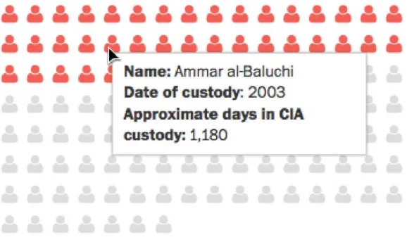
2. Title: The 119 detainees held in secret CIA prisons.
Source: The Washington Post | Published: Dec. 9, 2014 | By Kennedy Elliott, Julie
Tate and Swati Sharma.
This article describes some of the findings related to the 119 detainees secretly kept by
the CIA, providing information such as their names, the time they were imprisoned, living
conditions, and outcome of their incarceration. This story is a chart in which units are
represented as “people” icons. Opening with a brief description for context, the data gives a
comparison of the population versus the select facts highlighted by the authors. If the reader
placed the cursor over one of the icons, they would get information on the specific detainee
represented (see Figure 10). When the information was not available, the description to the left
would warn about the lack of data. Overall, this feature successfully summarizes a lot of data
from the CIA reports because it allows users to find details at will. By keeping some information
hidden – and only showing it as a result of interaction – it adds a layer of complexity that would
interest some users without overwhelming the average reader. However, there is an aspect of this
graphic that might be confusing: the placement of the highlighted icons.
The article presents eight important facts about the detainees. Each fact is included in the
cluster of icons by highlighting the number of people said to be involved in it – like the 39
[image:30.612.153.442.81.253.2]interrogated through “enhanced techniques” – starting always by the first icon, left to right.
[image:30.612.99.521.324.560.2]Figure 11. Comparison between facts 7 and 8, in which the names of the detainees do not correspond with the position previously held.
Nevertheless, because in almost every fact the icons are named after one of the prisoners, the
order of the names is juggled. In Figure 11, we can see how the person identified on the first
position is not the same for facts 7 and 8, resulting in the loss of some consistency. This
reordering could make it difficult to verify how many times a name stands out on any of these
facts, and makes it difficult to keep track of the identities, since all 119 names are moved around.
Cairo’s Visualization Wheel
analysis.
The visualization wheel for this
graphic places it in a high level of
abstraction. While the visual cue of a
“person” icon is nearly ubiquitous, it is far
from a figurative representation such as a
photo or a realistic portrait. While
sometimes the icons could not reveal
further data, each one represented a
detainee and the color cues where present
to create a scale from which to compare the percentage of people involved in each fact. This
means that the graphic is much more inclined towards the functional end than it is towards the
decorative one. When analyzing the density axis, one can see how there is a lot of information
presented, conveniently tucked away thanks to the interactive features that digital publishing
allows. This graphic, while dense, is nearly unidimensional since there is only one type of
[image:31.612.295.538.239.464.2]interaction possible. On the other hand, because the eight facts are presented in almost an
identical manner, we can say there is some redundancy, even if undermined by the random name
assignment.
3. Title: Valar Morghulis: An illustrated guide to all 456 deaths in “Game of
Thrones.”
Source: The Washington Post | Published: April 6, 2015 | By Shelly Tan and Alberto
Cuadra
This is a very complex infographic, showing illustrations, maps, and various levels of
abstraction. The topic at hand is the tally of deaths that took place within the imaginary universe
of Game of Thrones, a hit television show produced by HBO, famous for its gorey and constant
depictions of death. The title of the article “Valar Morghulis” (which on the show means “all men
must die”) is a direct reference to a phrase often – and very appropriately – used by numerous
characters. This feature differs from other articles in its presentation: it almost resembles a
microsite, with navigation elements that vary significantly from those of the Washington Post’s
website (see Figure 13). The particular aesthetic choices make this article an independent
[image:32.612.87.528.248.441.2]website, providing an alternate experience to reading the news on the regular format of the WP.
The information is divided into the four
seasons that had aired at the time of publication,
starting by giving the number of deaths per season,
with the possibility of clicking on the number to
discover more details. Once in view of a particular
season, there is a summary of the events to the left,
and representations of each deceased character to
the right. If the reader wants to know more about a
character in particular, they can click on the
corresponding illustration and the pertaining
information would show to the left, where the
season summary used to be.
Major characters are presented first, in the
order of their demise, followed by supporting and
minor characters, albeit pictured with smaller
illustrations. Extras and unnamed characters are
represented in even smaller portraits, often given a
generic representation based on nationality,
occupation or allegiance (see Figure 14.). Only
major and supporting characters have their names
[image:33.612.67.276.73.638.2]and “method of death” displayed.
Figure 14. The characters’ relevance on the show would
Just after season one’s summary, there is a map, showing the “Deadliest” locations on
both fictional continents (Westeros and Essos). The map is an illustration placed with some of
the interactive characteristic of digital maps found online – users can zoom in and out of a
location and drag the map around – but not much detail is revealed from these interactions (see
Figure 15). At the end of the article, a list of “The deadliest killers” shows the characters with the
[image:34.612.79.519.247.673.2]highest count of on-screen kills.
In contrast to the Washington Post stories previously analyzed, this article shows a great
level of detail and density. This could be attributed to the show’s popularity, and what we could
assume is the news outlet’s intention to increase its traffic from the buzz generated by the article,
as it was published only 6 days before the premiere of season five. Another possibility is that this
was an article for content marketing, planned ahead to coincide with the new season’s premiere.
Cairo’s Visualization Wheel analysis.
This is a very dense graphic. The
information presented takes several minutes
to go over and a lot of detail and decorative
elements were introduced. It is also
multidimensional, allowing users to take
information at a glance or “dig deeper” and
find more information if they wish to do so.
There is some degree of redundancy, as
readers can see the number of deaths by
location and season, and there is a detailed
breakdown of the numbers on each season.
The graphic is also original in its representation of characters and their methods of death:
by assigning an icon to each method, the gruesome nature of their murders is abstracted, making
the interaction with these elements entertaining. This technique is certainly not applicable to all
articles accounting for the passing of people – much less in the context of a war or armed
[image:35.612.300.534.247.475.2]conflict, as is the case for the television show – but it is original and innovative.
4. Title: Which Colleges Do Students Pick?
Source: The New York Times | Published: Sept. 3, 2014 | By Mike Bostock and Neil Irwin
For this feature, the journalists looked into the data provided by a company named
Parchment, which provides services for students to submit transcripts to apply to colleges. The
information retrieved from Parchment revealed certain trends on the preferences of students
when picking a college to attend to, given the chance to choose between two or more.
This graphic is very straightforward, as it shows the most relevant correlations and allows
filtering of the information by school using the drop down menu at the top. Once unfolded, there
is a breakdown of the percentage of students who would accept any given offer over the school
chosen. By picking a school, a user can see how it ranked in relation to the other institutions that
[image:36.612.87.531.134.388.2]accepted the same candidates (see Figure 17).
Something very interesting
about this article is that it allows
filtering through a search bar. Instead
of scrolling or reading all of the
options available, readers can look
up the name of a college simply by
writing it down (see Figure 18). These types of interaction translate into a more organic use of
the digital resources that goes beyond placing the mouse over an element to wait for a new hint
[image:37.612.270.526.81.172.2]of information to be revealed.
[image:37.612.80.532.369.549.2]Figure 19. On this scenario, the results compare what percentage of students would choose University of Michigan if admitted at these other institutions.
Cairo’s Visualization Wheel
analysis.
This chart displays no
decorative elements, marking higher
for functionality on this particular axis.
It is a very dense graphic, the authors
managed to balance the amount of
information by providing various
layers to the interaction, which places
the article on the multidimensional end.
The use of filters and a novel search bar make for an innovative interactive experience, but the
overall display of information is very familiar, as once the information was filtered, the use of
charts was very traditional. To round up the wheel, the ability to hand-pick which colleges to
compare on the chart translated as redundant, as users had the chance to evaluate the information
from various perspectives.
5. Title: The World According to China.
Source: The New York Times | Published: July 24, 2015 | By Gregor Aisch, Josh Keller
and K.K. Rebecca Lai
This is another immersive experience that starts with the showcase of one of the most
commonly used techniques of representation by the NYT: maps. The article is an overview of the
worldwide investments made by China since the year 2005. At the bottom left, there is a legend
[image:38.612.275.519.80.299.2]explaining how the scale of the circles was used to mark the size of the investment on the maps –
the larger the circle, the larger the investment– as well as color-coding greatest to lowest risk of
investment on a scale from magenta to green (see Figure 21).
On Figure 21, we can see how countries like North Korea and Iraq are a great risk for
investment (depicted by their magenta colored circles); yet Chinese investment is of great
significance to those countries. Once a user places their cursor over a circle (instead of marked
territory), a rectangle appears, revealing the percentage of international investment made by
China there. The example highlighted is Niger, considered a moderately risky area for
investment, as the light pink color reveals, and where Chinese capital represents 53% of foreign
investment.
Users are prompted to scroll down to discover more information, and as a transition to
another type of representation, a quote with a summary of the information appears over a blank
[image:39.612.66.538.139.380.2]background. This is a design decision that allows users to take a break from the color clusters
Figure 21. The map shows “China’s share of foreign investment”. According to the legend, the bigger circles show their major
Figure 23. Contrast - after scrolling away from the 2003 sums, readers are shown the 2013 investments made by China. This fragment shows the change in parts of North America.
just presented, while allowing for a smooth transition to another set of information (see Figure
22). Because the blank background covers all of the previously shown elements, it creates an
immersive experience as readers scroll down, removed from any element that could distract them
from the topic in question, and generating a sense of expectation.
Figure 22.A transitioning phrase against a white background helps creating an immersive experience.
Another map is revealed, with different color scheme and a new set of scales. Still in
circles, the investments are now all represented by the color blue, and instead of percentages, we
can see the sum in millions of dollars. The first set of data on this map is marked to be from
As the navigation progresses, the maps zoom in to show specific regions, such as South
America and East Asia. This entry portrays a traditionally static way of representation in
dynamic ways, which provides a sample of how maps are being used in novel ways to display
content. It also turns the transition to a change of scale – something potentially confusing for
readers – an activity that reinforces the frames of the story and helps users catch their pace.
Cairos’ Visualization Wheel analysis.
“The World According to China” is a
very dense, multidimensional infographic that
employs little elements of decoration in its
making. Yet, it is the treatment of the
resources that makes this entry entertaining,
as it took a seemingly mundane activity –
scrolling down to “read more” – and turned it
into an element of interaction unique to digital
media. I consider the axis of Originality-Familiarity to be evenly split because maps are
constantly used in media-rich stories, and part of our everyday lives. However, the innovative
design of this article adds a level of originality. As for the Novelty-Redundancy aspect, I
consider the entry to fall within the criteria of the latter, because of the many opportunities
[image:41.612.304.573.222.461.2]readers are given to evaluate the same information over and over again.
6. Title: A History of the C.I.A.’s Secret Interrogation Program.
Source: The New York Times | Published: Dec. 9, 2014 | By Wilson Andrews and Alicia
Parlapiano.
A chronology of key events pertaining to the C.I.A.’s Secret Interrogation Program is
presented in this much summarized interactive infographic. After the headline, there is a brief
description of the contents and context of the chronology. Then there is the chronology, divided
by the central issues discussed: The Program, Who Was Briefed, Waterboarding, Legal
Justification and Video Tapes – all showing a timeline from 2001 until 2008. On each timeline,
the main events are represented by a colored dot. Once the user places their cursor over one of
these dots, more detailed information – such as a specific date and a paragraph describing the
event – is displayed in a rectangle, very similar to the previously analyzed graphic.
Out of the samples analyzed on this section, this feature is perhaps the most simple, but
[image:42.612.71.551.165.402.2]serves an important reference for readers who are trying to make sense of the revelations of the
report released in late 2009 – like seeing when during the Bush administration the program
gained legal justification. By hiding away the details into the dots, we are left with a minimal
timeline that is available for user scrutiny.
Cairos’ Visualization Wheel analysis.
This infographic is, at first glance, more inclined to lightness than density. However,
because it actually summarizes a great
deal of information and hides it away
through the interactive function, I
decided to rate it as balanced between
the two. I consider this a well-designed
entry, as it managed to arrange a great
deal of information in an organized
manner, without sacrificing the content
for aesthetic purposes. Because we are
looking at dates, this would be
considered an abstraction, but the
purpose of the graphic is not to
represent tangible things, so it is not a dominant axis. However, functionality and familiarity are
well placed to their corresponding ends, since this graphic strongly filled the criteria for both. As
for redundancy, this graphic explains the events on their corresponding category just once, and
because there is only one way to interact with the information, this is definitely a unidimensional
[image:43.612.275.550.237.475.2]graphic.
Discussion
Two of the most influential newspapers in the US are dedicating time and personnel to a
relatively new type of journalism. This should tell us how necessary for the current practice of
the trade data and infographics are. The foundations of data journalism (Schudson, 2010) are
meeting the needs and demands of the readership (Rogers, 2014) and the evident need for
relevance in the news industry (McChesney, 2012). While it is still early to comment on
integration of interactive infographics in journalism, the current state of its practice looks
promising for the readers, the publishing companies and, of course, the new generations of
journalists to come.
Altering the newsroom dynamic is no longer an issue – if it ever was – for these
organizations. The NYT’s The Upshot started with a mixed staff of 15 people (McDuling, 2014),
and the WP works today with 25 professionals of various backgrounds (Darla Cameron, personal
communication, November 14, 2015). In the WP, all of the staff had journalistic experience
before joining the team, but not all are journalists. As Cameron explained, “some newer team
members studied computer science in college, and about 2/3 of the team has web development
skills and primarily makes graphics for the digital space” (personal communication, 2015).
It is important to also consider the implications for journalism schools. Cameron
(personal communication, November 14, 2015) explained the dynamics of a mixed newsroom,
where everybody collaborates and each member of the team approaches news from their
particular expertise. While a journalism degree is not necessary to work in the production of data
stories, given the popularity and impact of these types of articles, it is only logical to expect
should become more and more common, where students from different colleges collaborate
imitating the real-life newsrooms.
After observing how teams are creating richer stories, it’s hard not to side with Cairo
(2014) in the establishment of visual journalism as a formal branch of the informing practice.
Allowing flexibility in the credentials of the makeup of a team can enhance news as a product,
potentially creating more opportunities for reader participation and achieving the much-needed
engagement Mayer (2011) tells us about. These news organizations are making the most out of
the possibilities the electronic medium offers, to expand on the work they do offline. Once
printed, content displayed on paper is static, and readers must interpret the information according
to what is presented. Some of the samples analyzed would take up several spreads on a printed
newspaper, making these featured stories very expensive in terms of production and loss of
advertising space. If the information were to be summarized in one or two pages, the potential
clutter would be overwhelming for readers, ultimately making them avoid reading the story
altogether. Furthermore, digital medium allows for cross-reference using a unique device (i.e.,
the same computer used to read the news), and interactive infographics often allow journalists to
highlight information, making it possible for readers to interpret content on their own.
While the printed versions of both NYT and WP are incredibly popular and iconic, the
transition to the web has opened many doors papers just cannot handle. However, as I reviewed
existing literature on this topic, these changes in the industry are likely being pushed by the need
to stay relevant and profitable. We can only expect newspapers to follow the readers, and the
readers are online, like Beaujon (2012) tells us.
The results from the quantitative analysis show that the NYT is more likely to publish
serves to answer RQ1 and RQ2, as it is possible NYT is relying in the use of interactive elements
within the article to enhance the reading experience, thus increasing user participation. We can
also see that most of the infographics (63%) were actually linked to a story, which means that
data visualization is being used as a way to enrich stories, but not necessarily to create new ones,
as Rogers (2010) suggested.
RQ3 is answered by the breakdown of the sections: local (18.5%), lifestyle (18.2%), and
politics (17.8%). If we pair these with the relationship found between political articles and the
ability to filter data, we can also learn that these stories are meant to be tools for comparison and
accountability. RQ3 had a predictable result, with the predominance of charts (37.8%) and maps
(38.5%). Both of these methods of representation are traditional and would fit in Cairo’s axis of
familiarity (2012) and were probably used because of practical reasons. Charts allow for quick
comparison and organization and tools like Google Maps allow for easy insertion of a map on
any website (as it was often used, by the NYT). The recurrence of politics as a topic, and the
extensive electoral coverage might have something to do with their popularity on these results.
Techniques like illustration and video were less common. In the case of WP, their stories
featured more illustrations, and also more decorative elements, as we could see on the results.
This could be attributed to editorial style, as they were also more likely to include decorative
elements with little to no functionality. WP was also more likely to dedicate interactive features
to the description of events, which could be attributed to the fact that it caters to the surrounding
communities much more than NYT.
A significant section of this thesis is dedicated to the qualitative analysis of the stories.
While the methodology did not include a human factor, analyzing the information from a user’s
Visualization Wheel, I looked at all of the elements that made up six of the interactive
infographics. Cairo’s wheel is not meant to yield information to create predictions or
generalizations. It is, instead, a novel approach to textual analysis, which results in an irregular
graphic, placing each story on a “complex” or “intelligible” hemisphere – an appropriate method
to show the results in an infographics study.
What is interesting about the wheel is that it does not provide numbers. The quantitative
analysis gave us interesting insights about the state of infographics in the past year, but a
qualitative analysis goes into details the numbers will not necessary tell us. None of the six
stories landed exclusively on either axis. Instead, they were balanced, giving complex
information a familiar treatment or simple but relevant data a novel representation.
Following Rogers (2014) claims, information, while more easily available, is not always
easy to access for the average reader. WP was slightly more likely to link to sources that NYT, an
aspect I thought worthy of exploration on RQ4. I also looked at the use of non-function
(decorative) elements and found that, while WP is more likely to use those, they have little
prevalence in the design of infographics. Much like Cairo (2014) explained, the participation of
designers in the newsroom is steadily gaining reputation as the practice of visual journalism –
not to be mixed with photojournalism – since designers are applying the core elements of news
storytelling: clarity, accuracy, and depth.
Limitations and Future Research
One of the main limitations of this research is that the year I chose to analyze was
coincidentally an election year. While my intention was to gather the most current data, the
results were definitely influenced by the coverage of last year’s electoral campaign. Topics such
discussed above, and potentially tipped the scale in the direction of those representation
techniques. Future research should include a broader sample in terms of time range or news
sources, in order to obtain an apt sample for broader generalization. A study focusing on user
engagement or audience analysis would help elaborate on how effective these storytelling
techniques are in terms of engagement. Observing how users interact freely with the content and
perhaps measuring the rate of information retention would certainly give us interesting data,
References
Alliance for Audited Media. (2015). The New York Times Consolidated Media Report [Data file].
Retrieved from http://www.auditedmedia.com
Alliance for Audited Media. (2015). The Washington Post Consolidated Media Report [Data
file]. Retrieved from http://www.auditedmedia.com
American Press Institute (2014). The rational and attentive news consumer.
americanpressinstitute.org. Retrieved from
http://www.americanpressinstitute.org/publications/reports/survey-research/rational-attentive-news-consumer/
Barthel, M. (2015). Newspapers: Fact sheet. Pew Research Center's Journalism Project.
Retrieved from http://www.journalism.org/2015/04/29/newspapers-fact-sheet/
Beaujon, A. (2012). Pew: Half of Americans get news digitally, topping newspapers, radio.
Retrieved from
http://www.poynter.org/news/mediawire/189819/pew-tv-viewing-habit-grays-as-digital-news-consumption-tops-print-radio/
Bhattacherjee, A. (2012). Social science research: Principles, methods, and practices. Textbooks
collection. Book 3. Tampa, Florida: University of South Florida.
Boczkowski, P. J. (2004). The processes of adopting multimedia and interactivity in three online
newsrooms. Journal of Communication, 54(2), 197-213. doi:10.1093/joc/54.2.197
Cairo, A. (2012). Reclaiming the word "infographics" The Functional Art. Retrieved
from http://www.thefunctionalart.com/2012/12/claiming-word-infographics-back.html
Cairo, A. (2013). The functional art: An introduction to information graphics and visualization.
Cairo, A. (2014). Ethical infographics. Investigative Reporters and Editors, Inc. The IRE
Journal, 37(2), 25.
Cairo, A. (2014). Visual journalism. Targeted News Service, Miami, Florida, January 8.
Conboy, M. (2004). Journalism: A critical history. Sage Publications.
doi:10.4135/9781446215111
Dick, M. (2014). Interactive infographics and news values. Digital Journalism, 2(4), 490-506.
doi:10.1080/21670811.2013.841368
Doctor, K. (2015). Is The Washington Post Closing in on The New York Times? Politico Media
Retrieved
from
http://www.capitalnewyork.com/article/media/2015/08/8573545/washington-post-closing-times
Dur, A. B. (2014). Data Visualization and Infographics in Visual Communication Design
Education at the Age of Information. Journal of Arts and Humanities 3(5), May, 2014
Few, S. (2012). Show me the numbers: Designing tables and graphs to enlighten. Burlingame,
California: Analytics Press,
Fink, K., & Schudson, M. (2014). The rise of contextual journalism, 1950s–2000s. Journalism,
15(1), 3-20. doi:10.1177/1464884913479015
Franklin, B. (2009). Journalism. Key concepts in Journalism Studies. London, United Kingdom:
Sage UK. Retrieved from
http://ezproxy.rit.edu/login?url=http://search.credoreference.com/content/entry/sageukjou
r/journalism/0
Friendly, M., (2009). Milestones in the history of thematic cartography, statistical graphics, and