City, University of London Institutional Repository
Citation:
Turkay, C., Lundervold, A., Lundervold, A.J. and Hauser, H. (2012).
Representative factor generation for the interactive visual analysis of high-dimensional data.
IEEE Transactions on Visualization and Computer Graphics, 18(12), pp. 2621-2630. doi:
10.1109/TVCG.2012.256
This is the unspecified version of the paper.
This version of the publication may differ from the final published
version.
Permanent repository link:
http://openaccess.city.ac.uk/3552/
Link to published version:
http://dx.doi.org/10.1109/TVCG.2012.256
Copyright and reuse: City Research Online aims to make research
outputs of City, University of London available to a wider audience.
Copyright and Moral Rights remain with the author(s) and/or copyright
holders. URLs from City Research Online may be freely distributed and
linked to.
City Research Online:
http://openaccess.city.ac.uk/
[email protected]
Representative Factor Generation for the Interactive Visual
Analysis of High-Dimensional Data
Cagatay Turkay,Student Member, IEEE, Arvid Lundervold,Member, IEEE, Astri Johansen Lundervold, and Helwig Hauser,Member, IEEE
Abstract—Datasets with a large number of dimensions per data item (hundreds or more) are challenging both for computational and visual analysis. Moreover, these dimensions have different characteristics and relations that result in sub-groups and/or hierarchies over the set of dimensions. Such structures lead to heterogeneity within the dimensions. Although the consideration of these struc-tures is crucial for the analysis, most of the available analysis methods discard the heterogeneous relations among the dimensions. In this paper, we introduce the construction and utilization of representative factors for the interactive visual analysis of structures in high-dimensional datasets. First, we present a selection of methods to investigate the sub-groups in the dimension set and associate representative factors with those groups of dimensions. Second, we introduce how these factors are included in the interactive visual analysis cycle together with the original dimensions. We then provide the steps of an analytical procedure that iteratively analyzes the datasets through the use of representative factors. We discuss how our methods improve the reliability and interpretability of the analysis process by enabling more informed selections of computational tools. Finally, we demonstrate our techniques on the analysis of brain imaging study results that are performed over a large group of subjects.
Index Terms—Interactive visual analysis, high-dimensional data analysis.
1 INTRODUCTION
High-dimensional datasets are becoming increasingly common in many application fields. Spectral imaging studies in biology and as-tronomy, omics data analysis in bioinformatics, or cohort studies of large groups of patients are some examples where analysts have to deal with datasets with a large number of dimensions. It is not even uncom-mon that such datasets have more dimensions than data items, which generally makes the application of standard methods from statistics substantially difficult (i.e., the “p>>nproblem”). Most of the avail-able analysis approaches are tailored for multidimensional datasets that consist of multiple, but not really a large number of dimensions and they easily fail to provide reliable and interpretable results when the dimension count is in the thousands or even hundreds [1].
In addition to the challenge that is posed by a truly large number of dimensions, it is often the case that dimensions have properties and relations that lead to structures between the dimensions. These struc-tures make the space of dimensions heterogeneous and can have differ-ent causes. Dimensions can have difficult-to-relate scales of measure, such as categorical, discrete and continuous. Some can be replicates of other dimensions or encode exactly the same information acquired using a different method. There can be explicit relations in-between the dimensions that are known a priori by the expert. Some of these relations are likely to be represented as meta-data already. Very im-portantly also, there are usually inherent structures between the di-mensions that could be discovered with the help of computational and visual analysis, e.g., correlation relations or common distributions types. Standard methods from data mining or statistics do not consider any known heterogeneity within the space of dimensions – while this might be appropriate for certain cases, where the data dimensions
ac-• Cagatay Turkay and Helwig Hauser are with the Department of Informatics, University of Bergen, Norway. E-mail:{Cagatay.Turkay, Helwig Hauser}@ii.uib.no.
• Arvid Lundervold is with the Department of Biomedicine, University of Bergen, Norway. E-mail: [email protected]. • Astri Johansen Lundervold is with the Department of Biological and
Medical Psychology, University of Bergen, Norway. E-mail: [email protected].
Manuscript received 31 March 2012; accepted 1 August 2012; posted online 14 October 2012; mailed on 5 October 2012.
For information on obtaining reprints of this article, please send e-mail to: [email protected].
tually are homogeneous, it is obvious that not considering an actually present heterogeneity must lead to analysis results of limited quality.
A natural approach to understanding high-dimensional datasets is to use multivariate statistical analysis methods. These tools provide the analyst with the most essential measures that help with the extraction of information from such datasets. However, a major challenge with these tools is that their results are likely to become inefficient and un-reliable when the dimension count gets substantially large [32]. Take, for instance, principal component analysis (PCA), i.e., a method that is a widely used for dimension reduction [21]. If we apply PCA to a dataset with, for example, 300 dimensions, understanding the resulting principal components is a big challenge, even for the most experienced analysts.
Exactly at this point, the exploitation of any known structure be-tween the dimensions can help the analyst to make a more reliable and interpretable analysis. With an interactive visual exploration and anal-ysis of these structures, the analyst can make informed selections of subgroups of dimensions. These groups provide sub-domains where the computational analysis can be done locally. The outcomes of such local analyses can then be merged and provide a better overall under-standing of the high-dimensional dataset. Such an approach is very much in line with the goal of visual analytics [25], where the analyst makes decisions with the support of interactive visual analysis meth-ods.
In this paper, we present an approach that enables astructure-aware
analysis of high-dimensional datasets. We introduce the interactive visual identification ofrepresentative factorsas a method to consider these structures for the interactive visual analysis of high-dimensional datasets. Our method is based on generating a manageable number of representative factors, or just factors, where each represents a sub-group of dimensions. These factors are then analyzed iteratively and together with the original dimensions. At each iteration, factors are refined or generated to provide a better representation of the relations between the dimensions.
To establish a solid basis for our method, we borrow ideas from factor analysis in statistics and feature selection in machine learning. Factor analysis aims at determiningfactors, representing groups of di-mensions that are highly interrelated (correlated) [15]. These factors are assumed to be high-level structures of dimensions, which are not directly measurable. Similar to our motivation of an analysis of the structures in the dimensions space, factor analysis also assumes that there are inherent relations between the dimensions. However, factor
analysis operates solely on the correlation relation between the dimen-sions and does not allow the analyst to incorporate a priori information on the structures. Moreover, similar to the other multivariate analysis tools, the resulting factors become harder to interpret as the variable count gets large [15]. A second inspiration for our approach are the feature subset selection techniques, where variables (dimensions) are ordered and grouped according to their relevance and usefulness to the analysis [14]. Similarly, we interactively explore the set of dimensions to extract sub-groups that are relevant for the generation of factors in our method.
In order to visually analyze dimensions through the generation of factors, we make use of visualizations where the dimensions are the main visual entities. We analyze the generated factors together with the original dimensions and make them a seamless part of the analy-sis. Due to the iterative nature of our analysis pipeline, a number of factors can be generated and refined as results of individual iterations. We present techniques to compare and evaluate these factors in the course of the analysis. Our factor generation mechanism can be both considered as a method to represent the aggregated information from groups of dimensions and a method to apply computational analysis more locally, i.e., to groups of dimensions. Altogether, we present the following contributions in this paper:
• Methods to create representative factors for different types of di-mension groups
• A visual analysis methodology that jointly considers the repre-sentative factors and the original dimensions
• Methods to assess and compare factors
2 RELATEDWORK
In many recent papers, it has been reported repeatedly that the integra-tion of computaintegra-tional tools with interactive visual analysis techniques is of key importance in extracting information from the nowadays highly challenging datasets. In that respect, Keim [25] describes the details of a visual analysis process, where the data, the visualization, hypotheses, and interactive methods are integrated to extract relevant information. Perer and Shneiderman [29] also discuss the importance of combining computational analysis methods, such as statistics, with visualization to improve exploratory data analysis.
There are interesting examples of works where such an integration has been done. In MDSteer [41], an embedding is guided with user interaction leading to an adapted multidimensional scaling of multi-variate datasets. A two-dimensional projection method, called the at-tribute cloud, is employed in the interactive exploration of multivariate datasets by J¨anicke et al. [19]. Endert et al. [6] introduce observation level interactions to assist computational analysis tools to deliver more reliable results. Johansson and Johansson [20] enable the user to inter-actively reduce the dimensionality of a dataset with the help of quality metrics. In these works, interactive methods are usually used to refine certain parameters for the use of computational tools. Our method, differently, enables the integration of the computational tools by inter-actively determining local domains where these tools are then applied on. Fuchs et al. [13] integrate methods from machine learning with interactive visual analysis to assist the user in knowledge discovery. Oeltze et al. [28] demonstrate how statistical methods, such as correla-tion analysis and principal component analysis, are used interactively to assist the derivation of new features in the analysis of multivariate data. With our work, we contribute to this part of the literature by having the computational tools as inherent parts and integrating their results seamlessly to the interactive visual analysis cycle. Moreover, we bring together the local structures and the related analysis results to construct a complete image of the relations in high-dimensional datasets.
Multi-dimensional datasets, where the dimension count is a few to several dozens approximately, have been studied widely in the vi-sual analysis literature. Frameworks with multiple coordinated views, such as XmdvTool [37] or Polaris [34], are used quite commonly by now in visual multivariate analysis. Weaver [38] presents a method
to explore multidimensional datasets, where the analysis is carried out by cross-filtering data from different views. Surveys by Wong and Bergeron [42] and more recently Fuchs and Hauser [12] provide an overview of multivariate analysis methods in visualization. Compared to all these important related works there are however only few studies published where really high-dimensional data are analyzed. One ex-ample is the VAR display by Yang et al. [43], where the dimensions are represented by glyphs on a 2D projection of the dimensions. In order to lay out these glyphs in the visualization, multidimensional scaling is used based on the distances between the dimensions. Fernstad et al. [7] demonstrate their quality metric based reduction in the analysis of high-dimensional datasets involving microbial populations.
Our now proposed method is realized through a visualization ap-proach, where dimensions are the main visual entities and the analysis is carried out together with the data items as recently presented by Turkay et al. [36]. In this (dual analysis) approach, dimensions are an-alyzed along with the data items in two dedicated linked spaces. This concept enables us to include the representative factors, that we iden-tify, tightly into the analysis. There are few other works where similar dual analysis methods already proved to be useful, such as in param-eter space exploration [4], temporal data analysis [3], and multi-run simulation data analysis [24]. Kehrer et al. [23] integrate statistical moments and aggregates to interactively analyze collections of multi-variate datasets. Wilkinson et al. introduced graph-theoretic scagnos-tics [39] to characterize the pairwise relations on multidimensional datasets. In a later work [40], the same authors used these features to analyze the relations between the dimensions. Similar to our work where we analyze the feature space describing dimensions, Wilkin-son et al. perform the analysis on the feature space that describes the pairwise relations.
The structure of high-dimensional datasets and the relations be-tween the dimensions have been investigated in a few studies, also. Seo and Shneiderman devise a selection of statistics to explore the relations between the dimensions in their Rank-by-Feature frame-work [33]. They rank 1D or 2D visualizations according to statistical features to discover relations in the data. However, in their method the main focus is on the data items, not so much the dimensions. One very relevant related work for us is the visual hierarchical dimension reduc-tion method by Yang et al. [44]. They analyze the relations between the dimensions to create a hierarchy that they later use to create lower-dimensional spaces. In our method, we build upon this idea of con-structing representative dimensions. However, their method mainly involved an automatic derivation of the dimension hierarchy and the representative dimensions were used as the new visualization domain. In our approach, we treat the representative factors as objects of a dedi-cated analysis by embedding them into the visualization together with the original dimensions. Moreover, we provide different methods to generate, compare and evaluate the representative factors. In a similar work, Huang et al. [17] utilized the derived dimensions together with the original dimensions. The authors used several dimension reduction methods to derive new dimensions and observed how these dimen-sions correlate with certain characteristics of the original dimendimen-sions. In an interesting paper from the analytical chemistry field by Ivosev et al. [18], the authors present the idea to group variables according to their inter-correlations and utilize them in dimension reduction and vi-sualization. Although their method is applied only to principal compo-nent analysis, it clearly demonstrates that grouping of variables indeed improves the analysis of high-dimensional datasets.
Our work now contributes to the literature with a structure-aware in-teractive visual analysis scheme for high-dimensional datasets. More-over, we demonstrate that the visually-guided use of computational analysis tools can provide more reliable and interpretable results.
3 REPRESENTATIVEFACTORS
s
2s
1s
2s
1s
2s
1s
2s
11
2
3
4
dimension
[image:4.612.78.279.49.255.2]representative
factor
statistics
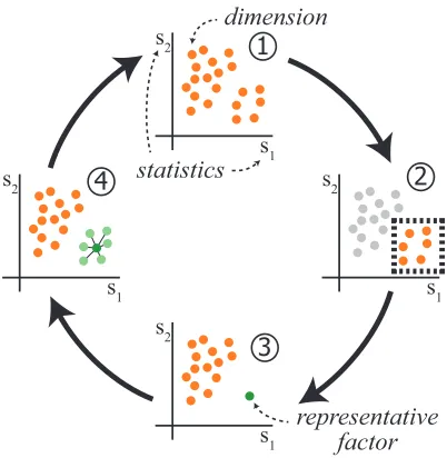
Fig. 1. An illustration of our representative factor generation method. Two statisticss1ands2are computed for all the dimensions and dimen-sions are plotted against these two values (1). This view reveals a group that shares similar values ofs1ands2(2) and this group is selected to be represented by a factor. We generate a representative factor for this group and compute thes1ands2values for the factor (3). We observe the relation of the factor to the represented dimensions and the other di-mensions (4). The analysis continues iteratively to refine and compare other structures in the data.
to achieve a more informed use of the computational analysis tools. A conceptual illustration of our approach is presented in Figure1. Here, we start by computing statisticss1ands2, e.g., mean and
stan-dard deviation, for each of the dimensions in the dataset. We analyze the dimensions by visualizing them in as1vs.s2scatterplot, where
each visual entity (i.e., point) is a dimension (1). We notice some structure (a cluster in the lower right), which we then represent with a factor (2). With the help of a computational method, e.g., PCA, we generate the representative factor for the selected group of dimensions and replace these dimensions with the generated factor (3). We con-tinue the analysis by exploring the relations between the factor and the represented dimensions, as well as the other dimensions (4). The anal-ysis continues iteratively with the generation of new factors and/or the refinement of the existing ones.
Our method operates (in addition to the original dataset) on a data table dedicated specifically to the dimensions. We construct this dimensions-related data table by combining a set of derived statistics with available meta-data on the dimensions. In order to achieve this, we assign a feature vector to each dimension, where each value is a computed statistic/property or some meta-data about this dimension. If we consider the original dataset to consist ofnitems (rows) and p
dimensions (columns), the derived data table has a size of p×k, i.e, each dimension haskvalues associated to it. The set of dimensions is denoted asDand the new dimensions properties table asS.
Through a visual analysis ofS, we determine structures within the dimensions that then result in a number of sub-groups. We represent these sub-groups of dimensions with representative factors and assign feature vectors to these factors by computing certain features, e.g., statistics. Since factors share the same features as the original dimen-sions, this enables the inclusion of the factors into the visual analysis process. Moreover, these factors are also used to visually represent the associated sub-group of dimensions. Factors serve both as data aggregation and as a method to apply computational tools locally and represent their results in a common frame together with the original dimensions.
As an illustrative example, we analyze an electrocardiography
(ECG) dataset from the UCI machine learning repository [9] in the following sections. The dataset contains records for 452 participants, some of whom are healthy and others with different types of cardiac arrhythmia. There are 16 known types of arrhythmia and a cardiologist has indicated the type of arrhythmia for all the records in the dataset. This dataset is analyzed to determine the features that are helpful in discriminating patients with different arrhythmia types.
The raw ECG measurements are acquired through 12 different channels, and for each single channel 22 different features (a mix-ture of numerical and nominal attributes) are calculated (leading to 12×22=264 values per individual). Already this description reveals an important inherent structure within all dimensions, i.e., that they form kind of a 2D array of dimensions (channels vs. features). In addition to the above ECG measurements, 11 additional ECG-based features are derived and 4 participant specific pieces of information are included. The result is a 452×279 table (n=452 andp=279).
3.1 Computational and Statistical Toolbox
In order to generate and integrate representative factors into the visual analysis process, we need methods to visually determine the factors and to analyze them together with the other dimensions inD. The dual analysis framework as presented by Turkay et al. [36] provides us with the necessary basis to visually analyze the dimensions together with the data items. We make use of visualizations, where the dimensions are the main visual entities, as well as (more traditional) visualizations of the data items. In order to make the distinction easier, the visual-izations with a blue background are visualvisual-izations of data items and those with a yellow background are visualizations of the dimensions. For the construction of the factors, we determine a selection of com-putational tools and statistics that can help us to analyze the structure of the dimensions space.
As one building block, we use a selection of statistics to populate several columns of theStable. In order to summarize the distributions of the dimensions, we estimate several basic descriptive statistics. For each dimensiond, we estimate the mean (μ), standard deviation (σ), skewness (skew) as a measure of symmetry, kurtosis (kurt) to represent peakedness, and the quartiles (Q1−4) that divide the ordered values
into four equally sized buckets. We also include the robust estimates of the center and the spread of the data, namely the median (med) and the inter-quartile range (IQR). Additionally, we compute the count of unique values (uniq) and the percentage of univariate outliers (%out) in a dimension. uniqvalues are usually higher for continuous dimen-sions and lower for categorical dimendimen-sions. We use a method based on robust statistics [23] to determine %outvalues. In order to inves-tigate if the dimensions follow a normal distribution, we also apply the Shapiro-Wilk normality test [31] to the dimensions and store the resulting p-values (pValshp) inS. HigherpValshpindicate a better fit
to a normal distribution. In the context of this paper, we limit our in-terest to the normal distribution due to its outstanding importance in statistics [21].
One common measure to study the relation between dimensions is the correlation between them. We compute the Pearson correlation between the dimensions to determine how the values of one dimension relate to the values of another dimension. Correlation values are in the range [-1, +1] where -1 indicates a perfect negative and +1 a perfect positive correlation.
3.2 Factor Construction
Constructing factors that are useful for the analysis is crucial for our method. Since factors are representatives for sub-groups of dimen-sions, they are constructed to preserve different characteristics of the underlying dimensions. The machine learning and data mining liter-ature provides us with valuable methods and concepts under the title of feature (generally called an attribute in data mining) selection and extraction [14]. Feature extraction methods usually map the data to a lower dimensional space. On the other hand, feature subset selection methods try to find dimensions that are more relevant and useful by evaluating them with respect to certain measures [5].
Here, we introduce three different methods to construct represen-tative factors using a combination of feature extraction and selection techniques. Each factor construction method is a mapping from a sub-set of dimensionsDto a representative factorDR. The mapping can
be denoted as f:D→DR, whereD∈2D. Thetdimensions that are
represented byDRare denoted asdR0,...,dtR. Each factor creation is
followed by a step where we compute a number of statistics forDR
[image:5.612.314.558.48.285.2]and add these values to theStable. In other words, we extend theD
table with aDRcolumn and theStable with a row associated withDR.
Notice that eachDRcolumn consists ofnvalues similar to the other
columns of theDtable.
3.2.1 Projection Factors
The first type of representative factor is theprojection factors. Such factors are generated using the output of projection-based dimension reduction methods that represent high-dimensional spaces with lower dimensional projections. Projection factors are preferred when we want the resulting factor(s) to represent most of the variance of the underlying dimensions [21]. In order to determine structures that are suitable to be represented via this type of factors, we analyze the cor-relation cor-relations between the dimensions. Subsets of dimensions that are highly inter-correlated are good candidates to be represented by a projection factor.
In the context of this paper, we use principal component analysis as the underlying reduction method. However, depending on the nature of the data and the analysis, different reduction methods [21] could be employed here, too.
During each projection-factor generation we create two factors, be-ing the first two principal components here. We choose to include two components in order to be able to visualize also the data items in a scatterplot when needed. ForD, where the variance structure cannot be well captured by two components, we suggest two options. The first option is to apply PCA to several subsets ofDand create factors for each of these subsets. These subsets can be determined by observing the inter-correlations between the dimensions inDand separating the sub-groups with stronger inter-correlations. The second option is to use more components (factors) than two where a more accurate num-ber can be determined by certain methods suggested in the literature, such as observing a scree-plot [21]. In our analysis, we prefer the first method instead of creating a larger number of factors perD, since it creates easier to interpret factors.
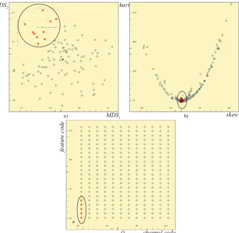
In order to determine sub-groups of dimensions that are suitable to be represented with projection factors, we can make use of MDS. If we apply MDS on the dimensions using the correlation matrix as the distance function and visualize the results, the clusters in such a view corresponds to highly inter-correlated sub-groups, i.e., suitable for a projection factor. In Figure2-a, we see such a sub-group of dimen-sions (consisting of 10 dimendimen-sions) that is suitable to be represented with a projection factor. We then apply PCA to these 10 selected di-mensions and store the first two principal components as the represen-tative factors for these 10 dimensions.
Projection factors are the most suitable factors when the goal of the analysis is dimension reduction. Since different dimension re-duction methods have different assumptions regarding the underlying data, evaluating these assumptions leads to more reliable results. In that respect, dimensions can be analyzed in terms of their descriptive statistics, normality test scores anduniqvalues to determine their suit-ability.
a)
c)
b) skew
kurt
MDS1 MDS2
channel code
featur
e code
Fig. 2. Groups of dimensions that are suitable to be represented by different types of factors. a) MDS is applied to the dimensions using the correlation information. A highly inter-correlated group is selected to be represented by a projection factor. b) A group of dimensions that are likely to come from a normal distribution (skewandkurt ∼0) is to be represented by a distribution model factor. c) Meta-data is utilized to select a group of dimensions (same channel, different features) that then can be represented by a medoid factor.
3.2.2 Distribution Model Factors
The second type of representative factor is thedistribution model fac-tors. These factors represent the underlying dimensions with a known distribution where the distribution parameters are derived from the un-derlying dimensions. Distribution model factors are suitable to repre-sent groups of dimensions that share similar underlying distributions. In the context of this paper, we limit our investigation of the underly-ing distributions to the normal distribution. If a group of dimensions are known to come from a normal distribution, these dimensions can be represented by a normal distribution where the modeled distribu-tion parameters are derived from the group. The representative normal distribution can be written as:
N(t
∑
−1i=0
medi
t ,
t−1
∑
i=0
IQRi
t )
Here, mediis the median andIQRiis the inter-quartile range of the
dimensiondiwhered0,...,di∈D. We prefer the robust estimates of
the center and the spread of the distributions to make our distribution generation step more resistant to outliers. As a final step, we drawn
values fromN to generate the representative factorDR. Notice that,
here, theN distribution is one dimensional, thus we create a single factor for the underlyingtdimensions. In other words,DRis a new
artificial dimension, where the data items are known to come from the modeled distributionN.
In Figure2-b, we visualize the dimensions by askewvs.kurt scat-terplot. Normal distributions tend to haveskewandkurtvalues very close to 0. This view enables us to select a group that is likely to fol-low a normal distribution, and thus, suitable to be represented via a distribution model factor.
0 +1
-1 0 +1
med IQR
med IQR
med IQR
Color map 1:
Color map 2:
skew kurt
a)
c)
b)
d)
e)
Fig. 3. Integrating factors in the visual analysis. a) The normalized dimensions of the ECG data are visualized in amedvs.IQRscatterplot. b) Each channel in ECG is represented by a factor. The coloring is done based on the aggregated correlation. c) The factor for channelDIis expanded (DDI
R ) and visually connected to the dimensions it represents
(dR). The coloring is done on the mutual correlations betweenDDI
R and
dR. d) The relation betweenDDI
R anddRare different forskewandkurt
values. e) Two color maps are used to map correlation information, the first is used to color representative factors using the aggregated correlation and the second for the represented dimensions.
t-distribution or the chi-square distribution. Depending on the dis-tribution type to be tested, dimensions can be visualized either over descriptive statistics or fitness scores to known distributions.
3.2.3 Medoid Factors
The third type of representative factor is themedoid factors, that are generated by selecting one of the members ofDas the representative ofD. Such factors are preferred when the dimensions inDare known to share similar contextual properties or some of the dimensions could be filtered as redundant. The user may prefer to select one of the di-mensions and discard the rest due to redundancy. Meta-data on the dimensions provide a good basis to determine and select the suitable dimensions to be represented by medoid factors.
In order to automatically determine one of the dimensions as the representative, we employ an idea from partitioning around medoids (PAM) clustering algorithm [22]. In this algorithm, cluster centers are selected as the most central element of the cluster. Similarly, to find the most central element, we choose the dimensiond∈Dthat has the minimum total distance to the other dimensions, computed as:
arg min
d
(t
∑
−1j=0
dist(d,dj)),d=dj,(d,dj∈D)
wheredistis chosen as the Euclidean distance andtis the total number of dimensions inD. This dimensiondis then selected as the repre-sentative. In Figure2-c, we make use of the meta-data information to determine a group that is suitable to be represented via a medoid factor. Here, we plot the channel codes and the feature codes on a
med IQR
skew kurt
2 factors
[image:6.612.53.308.47.325.2]9 dimensions 21 dimensions
Fig. 4. Representative factors can be brushed together with the original dimensions. When a factor is selected, all the dimensions that are rep-resented by the factor are highlighted in the other views. And similarly, when one of the represented dimensions is selected in another view, the associated factor is highlighted. Here, 9 raw dimensions and 2 factors (each representing 6 dimensions) are brushed. A total of9+2×6=21
dimensions are highlighted in the other views.
scatterplot. The first five features associated with a channel are known to be associated with the width of sub-structures in the channel, thus they can be represented by a medoid factor.
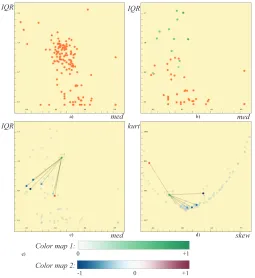
3.3 Integrating Factors in the Visual Analysis
In order to include the factors into the dimensions visualizations, we compute all the statistics that we already computed for the original dimensions also for the representative factors. We add these values on
DRas a row to the tableS. This enables us to plot the factors together
with the original dimensions.
Figure3-a shows the dimensions in a plot ofmedvs.IQR. We then select all the continuous dimensions that are related to the first channel
DIand apply a local PCA to the selected dimensions. We leave out the categorical data dimensions since they are not suitable to be included in PCA calculations. We perform the same operation also for the other 11 channels. This leaves us with a total of 12 representatives, each of which represents 16 dimensions. We compute themedandIQRvalues also for theDRs and replace the original dimensions with their
repre-sentatives in Figure3-b. The representatives are colored in shades of green to distinguish them from the original data dimensions. Here, we see the relation between different channels through the distribution of the factors over themed vs.IQRplot. In order to see how a sin-gle factor relates to the represented dimensions over themedandIQR
values, the factor is expanded and connected with lines to the repre-sented dimensions (Figure3-c). The relations between the factor and the represented dimensions are also observed on askewvs.kurtview (Figure3-d).
Brushing representative factors: Representative factors require a different way of handling in the linking and brushing mechanism. When the user selects a representative factor DR in a view, all the
dimensionsdiRthat are represented byDRin the other views are
high-lighted. Similarly, when the user selects one of thediRdimensions, the relatedDRis highlighted in the other views. Figure4illustrates how
the selections of factors are linked to the other views. Here, for each factor selected in themedvs.IQRview, 6 associated dimensions are selected in the secondskewvs.kurtview. Therefore there are 21 se-lected dimensions in total in the right view. This mechanism enables us to interact with information at both the original dimension level and the aggregated level.
3.4 Evaluation of the representatives
[image:6.612.318.567.49.170.2]kurt skewQ1med(QQ3 2
)
IQR uniq %outpV alshp
1.0
0.0 1.0
0.0
[image:7.612.320.548.47.157.2]med IQR
Fig. 5. Two profile plots for two different representative factors (visible in themedvs.IQRplot) are visualized. Each bin in the profile plots is asso-ciated with the listed statistics. The profile plot for the first factor shows that most of the features of the represented dimensions are preserved. However, the second profile indicates that the factor fails to represent the features.
The first method is related to the correlation based coloring of the factors and the represented dimensions. As an inherent part of the fac-tor generation, we compute the Pearson correlation betweenDR and
the dimensions that it represents diR. The result is a set oft values
corrR, where each value is in the range [-1, +1] as described already.
We color-code these pieces of correlation information in the views us-ing two different color maps (Figure3-e). Firstly, we represent the aggregated correlation values as shades of green. For eachDR, we
find the average of the absolute values ofcorrR. More saturated green
represent higher levels of correlation (either positive or negative) and paler green represent lower levels. Secondly, we encode the individual values ofcorrR when a factor is expanded. Each represented
dimen-siondiRis colored according to the correlation withDR. Here, we use
a second color map where negative correlations are depicted with blue and positive correlation with red.
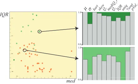
The second mechanism to evaluate the factors is calledprofile plots. When the set of statistics associated with dimensions is considered, factors do not represent all the properties equally. If we consider again how the same factor relates to the represented dimensions overmed
andIQRin Figure3-c andskewvs.kurt, in Figure3-d, we see different levels of similarity betweenDRand the represented dimensions. Since
these relations for all the statistics, i.e., columns ofS, are different, we build profile plots to visually represent this difference information. In order to find the similarity betweenDRanddiiwith respect to the
statistics, we compute the following value:
sims=1−
1
t∑ t−1
i=0|s(DR)−s(diR)|
max(s(dR
i))−min(s(diR))
Thesimvalues are in the range [0, 1] where higher values indicate that the representative has similarsvalues as the represented dimensions. We present thesimsvalues for all the different statistics in a
histogram-like view called profile plots as seen in Figure 5-right. Here, each bin of the plot corresponds to a different s (as listed in the figure) and thesimsvalue determines the height of the bin. Additionally, we
color-code the average ofsimsvalues as the background to the profile
plots, with the color map (marked 1) in Figure 3. In Figure5, we see two examples of factors where the profile plot for the first factor preserves most of the features of the underlying dimensions. However, the second profile plot shows that the factor has different values for most of the features of the underlying dimensions.
4 ANALYTICALPROCESS
The structure-aware analysis of the dimensions space through the use of these factors involves a number of steps. In the following, we go through the steps and exemplify them in the analysis of the ECG data.
1
2 3
uniq %out
skew IQR
a) b)
robust z-std z-std
unit scaling
Fig. 6. a) Different normalization methods could be suitable for different types of dimensions. We use unit scaling for group 1, z-standardization for group 2 and robust standardization for group 3. b) Three differ-ent normalizations are applied on the same group of dimensions and three sets of factors (using PCA) are generated accordingly for the same group. The differences between the results show that transformations can affect the outcomes of computational tools.
Still, these steps are general enough to provide a guideline for the anal-ysis of heterogeneous high-dimensional data using the representative factors.
Step 1: Handling missing data –Missing data are often marked prior to the analysis and available as meta-data. It is important to handle missing data properly and there are several methods suggested in the corresponding literature [15]. We employ a simple approach here and replace the missing values with the mean value of continuous dimen-sions prior to the normalization step. Similarly, in the case of cate-gorical data, we replace the missing values with the mode of the di-mension, i.e., the most frequent value in the dimension. Moreover, we store the number of missing values per each dimension inSfor further reference.
Step 2: Informed normalization –Normalization is an essential step in data analysis to make the dimensions comparable and suitable for computational analysis. Different data scales require different types of normalization (e.g., for categorical variables scaling to the unit in-terval can be suitable, but not z-standardization) and different analysis tools require different normalizations, e.g., z-standardization is pre-ferred prior to PCA. We enable three different normalization options, namely, scaling to the unit interval [0,1], z-standardization, and, ro-bust z-standardization. In the roro-bust version, we usemedas the robust estimate of the distribution’s center andIQRfor its spread. In order to determine which normalization is suitable for the dimensions, we compute certain statistics, namely uniq, pValshp and %out, prior to
normalization. We visualizeuniqvs. %out(Figure6-a) to determine the groups of dimensions that are suitable for different types of nor-malizations. Dimensions with lowuniqvalues (marked with 1 in fig-ure) are usually categorical and scaling to the unit interval is suitable. Dimensions with higheruniqvalues (marked 2) are more suitable for z-standardization. And, for those dimensions that contain larger per-centage of one dimensional outliers (marked 3), a robust normaliza-tion is preferable. We normalize the same sub-group of dimensions using all the three methods and apply PCA separately on the three dif-ferently normalized groups. Figure6-b shows the first two principal components factors. We observe that non-robust and robust normal-izations resulted in similar outputs, however the unit scaling resulted in PCs that carry lower variance.
[image:7.612.58.278.52.186.2]uniq %out
uniq %out
PC2
PC1 PC2
PC1
PC2
PC1
1 2
3
4
[image:8.612.51.569.50.260.2]5 6
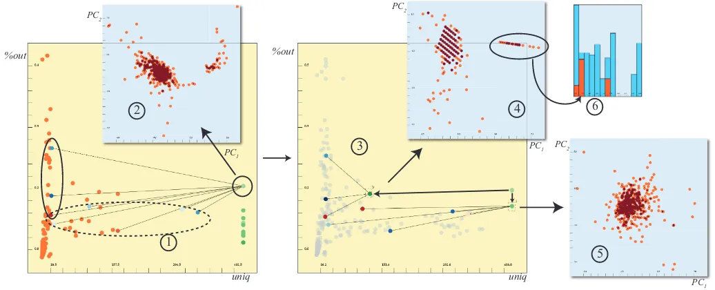
Fig. 7. A sample analysis of the ECG dataset. One factor for each of the channels is created and displayed in auniqvs.%outplot (1). One channel V2has a high%outvalue. The expanded dimensions shows that it has strong correlations with some of the dimensions (solid ellipse) and less with the other (dashed ellipse). We use all the underlying dimensions to apply PCA to the subjects and observe two groups (2), however with some noise. We analyze further and create new factors for the two sub-groups (marked with the ellipses) (3). When we apply PCA using these subgroups separately, we see that the grouping is due to the strongly correlated dimensions (4) and there was no distinctive information in the other ones (5). We bring up a histogram where bins are different arrhythmia types. We observe that the left group in plot 4 is mainly the subjects with coronary artery disease. This means thatV2is a good discriminator for such types of arrhythmia.
features (dimensions) that have largeruniqvalues) and then construct projection factors for each channel. The resulting groups are now dis-played on auniqvs. %outplot (Figure7).
Step 4: Evaluating and refining factors iteratively – In figure7-1 we notice that the factor that is representing theV2 channel (denoted asDVR2), has a higher percentage of 1D outliers. This is interpreted as a sign of an irregular distribution of items in this factor and we decide to analyze this factor further. First, we have a look at the items in a scatterplot of the first two components ofDVR2and we clearly see that there are two separate groups (figure7-2). However, when we expand the selected factor to see its relation with the underlying dimensions, we observe that there are dimensions that the factor has strong correla-tions (D1) and some other that have weak correlations (D2). We decide to refine this factor further by creating two smaller groupsD1andD2
and visualize the new factors in the same view (Figure7-3). When we observe the items in visualizations of the first two components of the new factors (Figure7-4,5), we see that the grouping is solely due the dimensions inD1. The dimensions inD2carry no significant informa-tion.
In order to the analyze the separated group of patients in Figure7 -5, we observe the arrhythmia class label column in a histogram. We find out that the selected group accounts for almost all the patients with coronary artery disease (Figure7-6). This shows that these three dimensions associated with theV2 channel are distinctive features for coronary artery disease.
Here, we present a step-by-step iterative analysis where at each it-eration we refine the factors and dig deeper into the data. The above example demonstrates how the representative factors enables a more controlled use of computational tools and a better understanding of the relations in-between the dimensions.
5 USE CASE: ANALYSIS OF HEALTHYBRAINAGINGSTUDY
DATA
In this use case we analyze the data related to a longitudinal study of cognitive aging [2,46]. The participants in the study were healthy
individuals, recruited through advertisements in local newspapers. In-dividuals with known neurological diseases were excluded before the study. All participants took part in a neuropsychological examination and a multimodal imaging procedure, with about 7 years between the first and third wave of the study. One purpose of the study was to in-vestigate the association between specific, image-derived features and cognitive functions in healthy aging [46]. In the study, 3D anatom-ical magnetic resonance imaging (MRI) of the brain has been com-plemented with diffusion tensor imaging (DTI) and resting state func-tional MRI [16,45]. Here we are interested in the analysis of the anatomical MRI recordings. These recordings are segmented auto-matically [10], and statistical measures, such as surface area, thickness and volume (among several others) are computed for each of the seg-mented cortical and subcortical brain regions. The neuropsychological examination covered tests of motor function, attention/executive func-tion, visual cognifunc-tion, memory- and verbal function. The participants’ results on these tests are evaluated by a group of neuropsychologists.
The dataset covers 83 healthy individuals with the measurements from the first wave of the study in 2005. For each subject, a T1-weighted image was segmented into 45 anatomical regions, and 7 dif-ferent measures were extracted for each region. For a complete list of brain regions, refer to the work by Fischl et al. [8]. These computa-tions are done automatically using the software called Freesurfer [10]. The 7 features associated with each brain region arenumber of voxels,
pValshp - before replacement
pV
alshp - after r eplacement
CC Middle Posterior -- with missing values
[image:9.612.47.298.47.207.2]CC Middle Posterior -- missing values replaced CC Middle Posterior
Fig. 8. Missing values are handled automatically in our system, and the effects of this transformation is observed here. Normality test scores before and after the transformation are to the left. For a large number of dimensions, the normality test scores improved. On the right, the dimensionCerebellum Cortex middle Posterior is inspected before and after missing values are replaced.
We start our analysis with the missing value handling and the nor-malization step. Missing values in the dataset are identified with dif-ferent strings in difdif-ferent columns of our dataset. And these identifiers (specific for each dimension) are recorded in the meta-data file. We replace the missing values with the mean (or mode) of each column. In Figure8, we see the normality test values before and after the re-placement. It is seen that some of the dimensions (marked with the big rectangle) have a large number of missing values which affect their fit-ness to normality. One example is the selected CC-middle posterior dimension (histograms in Figure8), which shows a skewed histogram first (the binning of the histogram is distorted by missing values), and then, nicely fits to a normal distribution after the replacement. We con-tinue with the normalization where we prefer different normalizations for different types. Here, dimensions related to participant specific in-formation and the memory test are scaled to the unit interval and the rest of the dimensions are z-standardized.
After these initial steps, we start by investigating the 7 different features associated with the brain regions and generate 7 projection factors for these 7 sub-groups. We select these groups through the use of the available meta-data (not shown in the images here). Each factor here represents 45 dimensions, being the different brain regions, e.g., one sub-group contains all thenumber of voxelscolumns for the 45 brain regions. We visualize these factors over amedvs.IQRplot (Fig-ure9-a) and bring up a matrix of profile plots, Figure9-b, for these factors. The first observation we make through the profile plots is that thenumber of voxels(marked 1) andvolume(2) features carry identi-cal information. We decide that one of these features needs to be left out. In this specific example it is, of course, clear that number of vox-els is equal to the volume. However, such relations may not be always easily derived from the names of the features and require visual feed-back to be discovered. Moreover, the profile plot reveals that therange of intensityfeature (7) preserves most of the statistics in the underly-ing dimensions. We also mark thestandard deviation of intensitiesas interesting, since the underlying dimensions have different correlation relations with the representative factor. This indicates that this feature is likely to show differences between the brain regions.
We continue by delimiting the feature set for the brain regions to those two selected features. This means that we delimit the operations to 45×2 dimensions and apply MDS on these 90 dimensions using the correlation matrix as the distance values. We identify a group of dimensions that are highly correlated in the MDS plot (Figure9 -c). We find out that this group is associated with the sub-structures in the Cerebellum Cortex (CerCtx) and CerCtx is represented with 5
sub-regions in the dataset. We decide to represent all the dimensions related to the CerCtx via a medoid factor.
As the next step, we create factors to represent each brain-region (not CerCtx, since it is already represented by a medoid factor). We compute a PCA locally for each brain region and create representa-tive factors. In Figure 9-d, we see the factors (using only the first component) over a normality score vs. %outplot. Here, each factor represents a single brain region. We select the brain regions, where the representative shows a normal distribution. Such a normally dis-tributed subset provides a reliable basis to apply methods such as PCA on the participants. From this analysis, the regions of interest areright and left lateral ventricle,brain stem,left and right choroid plexusand
right inferior lateral ventricle. Using only the selected regions, we apply PCA on the subjects (Figure9-e). We select a group of out-lier participants and visualize them on a scatterplot ofbirth year vs.
gender. We observe that this group is mainly composed of older par-ticipants. This observation leads to the hypothesis that the selected brain structures are affected by aging.
Here, we comment on the findings related to the the selected brain regions.Right and left lateral ventricleare part of the ventricular sys-tem that are filled with cerebrospinal fluid (CSF). These regions are interesting and expected findings, and they are known to increase with age (since the brain tissue parenchyma shrinks and the intracranial vol-ume remains constant).Brain stemimage information might not be so reliable in the periphery of the core magnetic field homogeneity of the scanner, thus needs to be left out from the hypothesis. Left and right choroid plexusare small protuberations in the ventricles’ walls/roof that produces CSF. It is unexpected for these structures to influence interesting age-related associations. However, this is an unexpected and important finding that our analysis can provide and can be subject to further investigation.
In order to validate the significance of our findings, we focused on the nine participants that we selected in Figure 9-e. As mentioned above, we analyzed the data from 2005, i.e., when all the participants are known to be healthy. Since the data is from a longitudinal study, there are internal reports on how the cognitive function of the partici-pants evolved over time in the next waves of the study. Through these reports, we observe that one of the nine participants is described as showing an older infarct (through MRI scans) and six of the remain-ing participants (75%) showed declinremain-ing cognitive function durremain-ing the study period. The percentage (of cognitive function decline) in the other participants is 28%. This shows a clinical importance of the selected participants. Moreover, this result supports the above hypoth-esis that the selected brain regions are related to age-related disorders. All in all, the above observations clearly suggest that the interactive visual analysis of the MRI dataset leads to significant and interesting results that are very unlikely to be achieved using conventional analy-sis methods.
Above, we have presented only a subset of the analytical studies that we performed on this dataset. The overall analysis benefits highly from the comparison and the evaluation of the computational analysis results that are performed locally. We demonstrate that our methods are helpful in exploring new relations that provide a basis for building new hypotheses.
6 DISCUSSIONS
MDS1 MDS2
pValshp
%out
PC1 PC2
birthDate
gender
1,2
3 4
5
7 6
3 4
5 6
7
1 2
Cerebellum Cortex med
IQR
a)
c)
b)
d) e)
[image:10.612.60.569.48.293.2]f)
Fig. 9. Analysis of the healthy brain aging dataset. We generate factors for the 7 types of features (a). Each factor represents 45 dimensions (the number of brain regions). We observe the profile plots for these seven factors (b). The profile plots fornumber of voxelsandvolume(1 and 2) reveal that these two features are identical, thus we discard one of them. One of the factors (4) has a varied correlation relation with the underlying dimensions and another factor (7) is a strong representative of the statistics over the brain regions. For each brain region, we limit the features to these two and apply MDS on this subset of dimensions (c). The MDS reveals a tightly inter-related group of dimensions that is found to be associated with the Cerebellum Cortex (CerCtx). CerCtx is represented by a medoid factor and the rest with projection factors. These factors, each representing a brain region, are visualized on apValshpvs.%outplot (d). 6 of the “most normally” distributed factors are selected. PCA is applied on
the participants. We notice a group of individuals with outlying values (e) and find out that this group consists of elderly subjects (f). We conclude that the selected 6 brain regions are likely to be affected by aging (this hypothesis would still have to be tested to make a more definite statement).
an analysis of a simple dataset is regarded as highly important. One suggestion to improve the usability of the system is to further exploit the integration of R and develop a modular system that is accessible also for the domain experts. In order to get a clearer image of the re-quirements, a formal user study is needed. Such a study could lead to simplifications in the analysis process. To make the high-level opera-tions more accessible and traceable, we need to devise special meth-ods where the outcomes of the iterative steps are visually abstracted through a work-flow like interface. Such abstractions can also play a role in the presentation of the results and improve the usability of our system.
Different visualization methods such as parallel coordinate plots could also be incorporated to visualize the factors together with the original dimensions. One possible method to achieve this is to use hierarchical parallel coordinates, suggested by Fua et al. [11]. At sev-eral stages in our analysis, we are building new factors using a subset of factors, which implies that we are creating a hierarchy of factors. In our present realization, we only visualize the relations between the factors and the raw dimensions. Augmenting the visualization with such a hierarchy can likely lead to additional insight. Hierarchical dif-ference scatterplots, as introduced by Piringer et al. [30], is a powerful technique to visualize such hierarchies.
Apart from the present case of healthy aging, the applicability of our tool could also be explored in the broader context of open access brain mapping databases such as BrainMap [26] and NeuroSynth [27]. These databases provide imaging data and meta-data from several thousand published articles available for meta-analyses and data min-ing, and thus are suitable for visual and explorative analysis methods.
7 CONCLUSION
With our method, we present how the structures in high-dimensional datasets can be incorporated into the visual analysis process. We
intro-duce representative factors as a method to apply computational tools locally and as an aggregated representation for sub-groups of dimen-sions. A combination of the already available information and the derived features on the dimensions are utilized to discover the struc-tures in the dimensions space. We suggest three different approaches to generate representatives for groups with different characteristics. These factors are then compared and evaluated through different in-teractive visual representations. We mainly use dimension reduction methods locally to extract the information from the sub-structures. Our goal is not to solely assist dimension reduction but rather to enable an informed use of dimension reduction methods at different levels to achieve a better understanding of the data. In both of the analysis ex-amples, we observe that the results of the analysis become much more interpretable and useful when the analysis is carried iteratively on local domains and the insights are joined at each iteration.
The usual work flow when dealing with such complex datasets is to delimit the analysis based on known hypotheses and try to confirm or reject these using computational and visual analysis. With the advent of data generation and acquisition technologies, new types of highly complex datasets are produced. However, when these datasets are con-sidered, little is known a priori, thus data driven, explorative methods are becoming more important. Our interactive visual analysis scheme proved to be helpful to explore new relations between the dimensions that can provide a basis for the generation of new hypotheses.
ACKNOWLEDGMENTS
REFERENCES
[1] R. Agrawal, J. Gehrke, D. Gunopulos, and P. Raghavan. Automatic sub-space clustering of high dimensional data for data mining applications. InProceedings of the 1998 ACM SIGMOD international conference on Management of data, pages 94–105. ACM, 1998.
[2] M. Andersson, M. Ystad, L. Arvid, and L. Astri. Correlations between measures of executive attention and cortical thickness of left posterior middle frontal gyrus-a dichotic listening study. Behavioral and Brain Functions, 5(41), 2009.
[3] G. Andrienko, N. Andrienko, S. Bremm, T. Schreck, T. Von Landes-berger, P. Bak, and D. Keim. Space-in-time and time-in-space self-organizing maps for exploring spatiotemporal patterns. InComputer Graphics Forum, volume 29, pages 913–922. Wiley Online Library, 2010. [4] W. Berger, H. Piringer, P. Filzmoser, and E. Gr¨oller. Uncertainty-aware exploration of continuous parameter spaces using multivariate prediction.
Computer Graphics Forum, 30(3):911–920, 2011.
[5] A. Blum and P. Langley. Selection of relevant features and examples in machine learning.Artificial intelligence, 97(1-2):245–271, 1997. [6] A. Endert, C. Han, D. Maiti, L. House, and C. North. Observation-level
interaction with statistical models for visual analytics. InVisual Analytics Science and Technology (VAST), 2011 IEEE Conference on, pages 121– 130. IEEE, 2011.
[7] S. Fernstad, J. Johansson, S. Adams, J. Shaw, and D. Taylor. Visual exploration of microbial populations. InBiological Data Visualization (BioVis), 2011 IEEE Symposium on, pages 127 –134, oct. 2011. [8] B. Fischl, D. Salat, E. Busa, M. Albert, M. Dieterich, C. Haselgrove,
A. Van Der Kouwe, R. Killiany, D. Kennedy, S. Klaveness, et al. Whole brain segmentation: automated labeling of neuroanatomical structures in the human brain.Neuron, 33(3):341–355, 2002.
[9] A. Frank and A. Asuncion. UCI machine learning repository, [http://archive.ics.uci.edu/ml]. University of California, Irvine, School of Information and Computer Sciences, 2010.
[10] FreeSurfer. http://surfer.nmr.mgh.harvard.edu, 2012.
[11] Y.-H. Fua, M. O. Ward, and E. A. Rundensteiner. Hierarchical paral-lel coordinates for exploration of large datasets. InProceedings of the conference on Visualization ’99: celebrating ten years, VIS ’99, pages 43–50. IEEE Computer Society Press, 1999.
[12] R. Fuchs and H. Hauser. Visualization of multi-variate scientific data.
Computer Graphics Forum, 28(6):1670–1690, 2009.
[13] R. Fuchs, J. Waser, and M. E. Gr¨oller. Visual human+machine learning.
IEEE TVCG, 15(6):1327–1334, Oct. 2009.
[14] I. Guyon and A. Elisseeff. An introduction to variable and feature selec-tion.The Journal of Machine Learning Research, 3:1157–1182, 2003. [15] J. Hair and R. Anderson.Multivariate data analysis. Prentice Hall, 2010. [16] E. Hodneland, M. Ystad, J. Haasz, A. Munthe-Kaas, and A. Lundervold. Automated approaches for analysis of multimodal mri acquisitions in a study of cognitive aging. Comput. Methods Prog. Biomed., 106(3):328– 341, June 2012.
[17] S. Huang, M. Ward, and E. Rundensteiner. Exploration of dimensionality reduction for text visualization. InCoordinated and Multiple Views in Exploratory Visualization, 2005.(CMV 2005). Proceedings. Third Inter-national Conference on, pages 63–74. IEEE, 2005.
[18] G. Ivosev, L. Burton, and R. Bonner. Dimensionality reduction and visualization in principal component analysis. Analytical chemistry, 80(13):4933–4944, 2008.
[19] H. J¨anicke, M. B¨ottinger, and G. Scheuermann. Brushing of attribute clouds for the visualization of multivariate data.— IEEE Transactions on Visualization and Computer Graphics, pages 1459–1466, 2008. [20] S. Johansson and J. Johansson. Interactive dimensionality reduction
through user-defined combinations of quality metrics.Visualization and Computer Graphics, IEEE Transactions on, 15(6):993–1000, 2009. [21] R. Johnson and D. Wichern. Applied multivariate statistical analysis,
volume 6. Prentice Hall Upper Saddle River, NJ:, 2007.
[22] L. Kaufman and P. J. Rousseeuw.Finding Groups in Data: An Introduc-tion to Cluster Analysis. Wiley, 2005.
[23] J. Kehrer, P. Filzmoser, and H. Hauser. Brushing moments in interactive visual analysis.Computer Graphics Forum, 29(3):813–822, 2010. [24] J. Kehrer, P. Muigg, H. Doleisch, and H. Hauser. Interactive visual
anal-ysis of heterogeneous scientific data across an interface. IEEE Transac-tions on Visualization and Computer Graphics, 17(7):934–946, 2011. [25] D. Keim, F. Mansmann, J. Schneidewind, J. Thomas, and H. Ziegler.
Vi-sual analytics: Scope and challenges. Visual Data Mining, pages 76–90,
2008.
[26] A. Laird, J. Lancaster, and P. Fox. Brainmap.Neuroinformatics, 3(1):65– 77, 2005.
[27] NeuroSynth. neurosynth.org, 2012.
[28] S. Oeltze, H. Doleisch, H. Hauser, P. Muigg, and B. Preim. Interactive visual analysis of perfusion data.Visualization and Computer Graphics, IEEE Transactions on, 13(6):1392 –1399, nov.-dec. 2007.
[29] A. Perer and B. Shneiderman. Integrating statistics and visualization for exploratory power: From long-term case studies to design guidelines.
Computer Graphics and Applications, IEEE, 29(3):39 –51, may-june 2009.
[30] H. Piringer, M. Buchetics, H. Hauser, and M. E. Gr¨oller. Hierarchical difference scatterplots: Interactive visual analysis of data cubes. ACM SIGKDD Explorations Newsletter, 11(2):49–58, 2010.
[31] J. Royston. An extension of shapiro and wilk’s w test for normality to large samples.Applied Statistics, pages 115–124, 1982.
[32] H. Samet. Foundations of multidimensional and metric data structures. Morgan Kaufmann, 2006.
[33] J. Seo and B. Shneiderman. A rank-by-feature framework for unsuper-vised multidimensional data exploration using low dimensional projec-tions. InProc. IEEE Symposium on Information Visualization INFOVIS 2004, pages 65–72, 2004.
[34] C. Stolte, D. Tang, and P. Hanrahan. Polaris: a system for query, analysis, and visualization of multidimensional relational databases. IEEE Trans-actions on Visualization and Computer Graphics, 8(1):52–65, 2002. [35] R. D. C. Team.R: A Language and Environment for Statistical
Comput-ing. R Foundation for Statistical Computing, 2009.
[36] C. Turkay, P. Filzmoser, and H. Hauser. Brushing dimensions – a dual visual analysis model for high-dimensional data. IEEE Transactions on Visualization and Computer Graphics, 17(12):2591 –2599, dec. 2011. [37] M. O. Ward. Xmdvtool: integrating multiple methods for visualizing
multivariate data. InProceedings of the conference on Visualization ’94, VIS ’94, pages 326–333. IEEE Computer Society Press, 1994. [38] C. Weaver. Cross-filtered views for multidimensional visual analysis.
IEEE Transactions on Visualization and Computer Graphics, 16:192– 204, March 2010.
[39] L. Wilkinson, A. Anand, and R. Grossman. Graph-theoretic scagnostics. InProceedings of the Proceedings of the 2005 IEEE Symposium on In-formation Visualization, INFOVIS ’05, pages 157–164, Washington, DC, USA, 2005. IEEE Computer Society.
[40] L. Wilkinson, A. Anand, and R. Grossman. High-dimensional visual an-alytics: Interactive exploration guided by pairwise views of point distri-butions. Visualization and Computer Graphics, IEEE Transactions on, 12(6):1363–1372, 2006.
[41] M. Williams and T. Munzner. Steerable, progressive multidimensional scaling. InProceedings of the IEEE Symposium on Information Visu-alization, pages 57–64, Washington, DC, USA, 2004. IEEE Computer Society.
[42] P. C. Wong and R. D. Bergeron. 30 years of multidimensional multivariate visualization. InScientific Visualization, Overviews, Methodologies, and Techniques, pages 3–33, Washington, DC, USA, 1997. IEEE Computer Society.
[43] J. Yang, D. Hubball, M. Ward, E. Rundensteiner, and W. Ribarsky. Value and relation display: Interactive visual exploration of large data sets with hundreds of dimensions. Visualization and Computer Graphics, IEEE Transactions on, 13(3):494 –507, may-june 2007.
[44] J. Yang, M. O. Ward, E. A. Rundensteiner, and S. Huang. Visual hierar-chical dimension reduction for exploration of high dimensional datasets. InVISSYM ’03: Proceedings of the symposium on Data visualisation 2003, pages 19–28. Eurographics Association, 2003.
[45] M. Ystad, T. Eichele, A. J. Lundervold, and A. Lundervold. Subcortical functional connectivity and verbal episodic memory in healthy elderly – a resting state fmri study.NeuroImage, 52(1):379 – 388, 2010. [46] M. Ystad, A. Lundervold, E. Wehling, T. Espeseth, H. Rootwelt, L.