City, University of London Institutional Repository
Citation: D'Ath, P. (2008). Optimising computer displays for normal and visually impaired
users. (Unpublished Doctoral thesis, City University London)This is the accepted version of the paper.
This version of the publication may differ from the final published
version.
Permanent repository link: http://openaccess.city.ac.uk/19622/
Link to published version:
Copyright and reuse: City Research Online aims to make research
outputs of City, University of London available to a wider audience.
Copyright and Moral Rights remain with the author(s) and/or copyright
holders. URLs from City Research Online may be freely distributed and
linked to.
•
CITY UNIVERSITY
,nLONDON
Department of Optometry
and Visual Science
Optimising computer displays for
normal and visually impaired users
Dr. Penny J D'Ath PhD MCOptom BSc (Optom) FBDO BSc (Psych)
IMAGING SERVICES NORTH
Boston Spa, WetherbyWest Yorkshire, LS23 7BQ www.bl.uk
THE FOLLOWING HAVE BEEN REDACTED AT THE
REQUEST OF THE UNIVERSITY
PAGE 22 FIG1, P26 FIG2, P31 FIG7,P33 FIG10
IMAGING SERVICES NORTH
Boston Spa, WetherbyWest Yorkshire, lS23 7BQ www.bl.uk
THESIS CONTAINS
VIDEO
CD
DVD
Acknowledgements
Throughout this thesis, I have been fortunate enough to have had two excellent supervisors by my side who have stoically offered me support, loyalty and encouragement throughout: Professors David Thomson and Arnold Wilkins.
Particular thanks to David who has guided me (albeit with Satellite Navigation and
innumerable other electronic toys) to altitudes that have, at times, made me quite dizzy from the sheer height of them. He has helped me scale summits, cross glaciers and, at times, ski off-piste to achieve things beyond my wildest expectations. He has never (at least outwardlyl) shown me anything other than belief in my abilities and quite simply, without his backing and support, I would not be where I am today. David has always been a
tremendous source of inspiration to me: from second year Visual Perception to Albania to a Ph.D. to a lecturer's position, I can only thank David for giving me opportunities that others can only fantasise about. David may be an absolute tinker but he will always my hero!
My thanks also to my long-suffering flatmate for the home cooked meals and homespun common-sense. To my colleagues such as J-B for not switching off her office lights, locking the door and hiding under the desk whenever I came to visit. To Brendan for distracting me with a good murder. Also thanks to my family for giving me a surname thus ensuring a lifetime of ridicule and to my friends for blurring the jagged edges in the manner of anti-aliasing only with gin. Works much better!
Particular gratitude to all those long suffering subjects without whom, there would have been no thesis.
My thanks to the College of Optometrists who provided the grant that made this work possible. And thanks to EyeNET for their continued support.
And, last but not least, thank you to my 'highly trained' assistance dog, Mister Teal for never leaving my side even in the face of thesis adversity. Give that dog a bone!
Enjoy!
Declaration
I grant the powers of discretion to the University librarian to allow this thesis to be copied in whole or in part without further reference to me. This permission covers only single copies made for study purposes, subject to normal conditions of acknowledgement.
Abstract
Computers have become ubiquitous in the modern world and most people spend several hours each day viewing computer displays. With the advent of LCD flat panel displays and the increase in graphical processing power, computer displays have rapidly evolved from barely legible text displays to the modern graphical user interface. Despite the improvement in the design and legibility of computer displays, complaints of visual discomfort are still surprisingly common amongst computer users. In many cases, the problems stem from poor workstation design, inappropriate working practices or uncorrected refractive errors or binocular vision anomalies. However, the fact that symptoms often persist when these factors have been addressed suggests that the design of computer displays may be sub-optimal in a number of respects.
There is a vast literature relating to the ergonomics of displays and yet there is still a lack of good quality data on the effects of key parameters on user efficiency and reading speed. In particular, there is very little information about the potential benefrts of changing screen colours.
The first part of this thesis describes a series of experiments designed to systematically examine the effects of contrast, font size, font style, letter spacing, contrast polarity, anti-aliasing and screen colour on the comfort and visual efficiency of users with normal vision. A series of tests were devised to assess user efficiency including search tasks and modified versions of the MNRead and Wilkins Rate of Reading tests. In general, user efficiency judged by performance in these tasks proved to be remarkably immune to changes in screen parameters and it is concluded that the default settings used on most displays is
close to optimal. Many subjects subjectively preferred a background colour other than white although this preference was seldom rewarded by a measurable improvement in efficiency. However, changing the background colour did seem to reduce the prevalence of asthenopic symptoms.
The second part of the thesis describes a series of investigations designed to examine the potential benefits of changing selected display parameters for individuals with Age Related Maculopathy, Primary Open Angle Glaucoma and Retinitis Pigmentosa. Of particular interest was the effect of changing screen colours given the anecdotal evidence that some patients with these conditions gain some benefit from coloured lenses. The relatively small number of subjects and the heterogeneous nature of the groups limited the scope of the conclusions that could be drawn from this study. However, it is clear that the visual
performance of many visually-impaired individuals can be greatly enhanced by the correct
selection of screen parameters, particularly font size, contrast and in some case, colour. A computer programme to assist in the optimisation of these parameters was developed as the final part of this work.
CONTENTS
ACKNOWLEDGEMENTS ...
11
DECLARATION ... 111
ABSTRACT ... IV
1.
INTRODUCTION ... 221.1 Introduction ... 22
1.2 Computers in society - past, present and future ... 24
1.2.1 History of computers ... 24
1.3 Display technologies ... 26
1.3.1 Cathode Ray Tube (CRTs) ... 26
1.3.2 Flat Panel (LCD) Displays ... 27
1.3.3 Plasma Screens ... 30
1.3.4 Organic Light Emitting Diodes (OLEDs) ... 30
1.3.5 Emerging display technologies ... 31
1.4 The visual ergonomics of displays ... 34
1.4.1 Prevalence of eye complaints ... 34
1.4.2 Possible causes of eye problems ... 41
1.4.2.1 The nature of computer displays ... 41
1.4.2.2 Pixel size and resolution ... 43
1.4.2.3 Luminance ... 44
1.4.2.4 Contrast ... 44
1.4.2.5 Colour ... 45
1.4.2.6 The user interface ... 48
1.4.3 Workstation design ... 50
1.4.3.1 Viewing angle ... 50
1.4.3.2 Viewing distance ... 51
1.4.4 Workpractices ... 54
1.4.4 Solutions ... 56
1.5 Summary ... 58
2. OPTIMISATION OF SCREEN CONTRAST - NORMAL SUBJECTS ... 59
2.1 Introduction ... 59
2.2 Methods ... 59
2.2.1 Modified MNRead ... 59
2.2.2 Modified MNRead Test validation ... 60
2.2.2.1 Methods ... 60
2.2.2.2 Results ... 61
2.2.2.3 Discussion ... 62
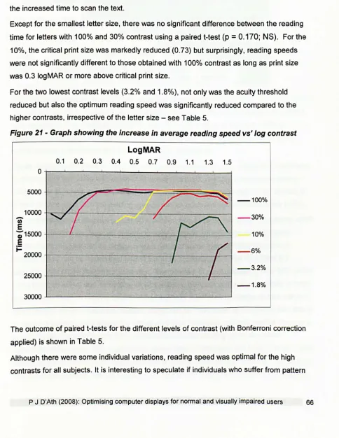
2.3 The effects of screen contrast on reading speed ... 63
2.2.3 Methods ... 64
2.2.4 Results ... 65
2.2.5 Screen contrast and reading speed: Conclusions ... 67
2.3 The effects of contrast polarity ...•... 69
2.3.1 Methods ... 70
2.3.2 Results ... 70
2.4 Screen contrast polarity and reading speed: Conclusions ...•... 73
3. OPTIMISATION OF FONTS - NORMAL SUBJECTS ... 74
3.1 Introduction ... 74
3.2 Fonts and reading ... 74
3.2.1 Terminology ... 74
3.2.2 How is reading defined? ... 74
3.2.3 Normal readers ... 75
3.2.4 Methods for assessing reading ... 76
3.2.5 Eye movements in reading ... 78
3.2.6 Comparison of paper tasks vs' VOT tasks ... 80
3.2.7 Types of fonts ... 81
3.2.7.1 Serif fonts ... 81
3.2.7.2 Sans serif fonts ... 81
3.2.7.3 Proportionally spaced fonts ... 82
3.2.7.4 Mono spaced fonts ... 82
3.2.7.5 Size of a font ... 82
3.3 Font selection and scaling ... 86
3.4 Methods ... 88
3.4.1 Subjects ... 88
3.4.2 Apparatus ... 88
3.4.3 Experiment 1: Subjective rating of different fonts (ranking test): Methods ... 88
3.4.4 Experiment 1: Subjective rating of different fonts (ranking test): Results ... 89
3.4.5 Experiment 2: Subjective rating of fonts (paired comparison): Methods ... 90
3.4.6 Experiment 2: Subjective rating of different fonts (paired comparison): Results ... 91
3.4.7 Experiment 3: Subjective rating of attractiveness and legibility: Methods ... 92
3.4.8 Experiment 3: Subjective rating of attractiveness and legibility: Results ... 92
3.4.9 Experiment 4: Word Search Speed with different fonts (word search): Methods ... 94
3.4.10 Experiment 4: Word Search Speed with different fonts (word search): Results ... 97
3.4.11 Experiment 5: MNRead test with different fonts: Methods ... 99
3.4.12 Experiment 5: MNRead test with different fonts: Results ... 100
3.4.13 Experiment 5: MNRead test with different fonts: Post-hoc results ... 102
3.5 The legibility, readability and visual efficiency of fonts: Conclusions ... 108
3.6 The effect of character spacing on reading speed ... 110
3.6.1 Methods ... 110
3.6.2 Results ... 111
3.6.3 Conclusions ... 113
3.7 The effects of anti-aliasing ... 114
3.7.1 Methods ... 115
3.7.2 Results ... 115
3.7.3 Conclusions ... 117
4. OPTIMISATION OF SCREEN COLOUR: NORMAL SUBJECTS ..•... 118
4.1 Introduction .••...••...•...•....••...•... 118
4.1.1 Colorimetry ... 120
4.1.2 Colour on display screens ... 122
4.2 The effect of screen colour on user performance - validation data ... 123
4.2.1 Validation of performance tests ... 123
4.2.1.1 The Rate of Reading test ... 123
4.2.1.2 Nonsense Sentences Test ... 124
4.2.1.3 Spreadsheet Test ... 125
4.2.2 Methods ... 125
4.2.3 Results ... 126
4.2.3.1 Rate of Reading ... 126
4.2.3.2 Spreadsheet Test ... 127
4.2.3.3 Nonsense Sentences ... 128
4.2.4 Discussion ... 130
4.3 Algorithm for choosing colour ... 131
4.4 The effect of screen colour on user performance - normal subjects ...•..•..•.. 136
4.4.1 Methods ... 136
4.4.2 Results ... 138
4.4.2.1 Preferred colour ... 138
4.4.2.2 Task performance ... 140
4.4.2.3 Asthenopic syrnptoms ... 145
4.4.3 Conclusions ... 147
4.5 The effect of screen colour on user performance - Meares Irlen syndrome .... 149
4.5.1 Introduction ... 149
4.5.2 Methods ... 149
4.5.3 Results ... 150
4.5.3.1 Preferred colour ... 150
4.5.3.2 Task performance ... 153
4.5.3.3 Spreadsheet Analysis results ... 154
4.5.3.4 Nonsense Sentences Results ... 155
4.5.4 Conclusions ... 156
4.6 Colour Memory ... 157
4.6.1 Introduction ... 157
4.6.2 Methods ... 158
4.6.3 Apparatus ... 158
4.6.4 Subjects ... 159
4.6.5 Procedure ... 159
4.6.6 Colour naming and reproduction of nameable colours ... 161
4.6.7 Results: Overall accuracy of naiVe observers ... ·161
4.6.8 Results: Overall accuracy of the group ... 161
4.6.9 Results: Differences as a function of hue ... ·161
4.6.10 Results: Consistency within observers ... 164
4.6.11 Results: Stability over time ... 164
4.6.12 Conclusions ... 165
4.7 Optimising the colour of displays - general conclusions ... 167
4.7.1 Normal subjects ... 167
4.7.2 Subjects with visual stress ... 168
4.7.3 Colour Memory ... 168
5. OPTIMISATION OF DISPLAY PARAMETERS FOR THE VISUALLY
IMPAIRED ... 169
5.1 Introduction ... 169
5.2 Reading with low vision - the effects of colour and contrast ... 172
5.3 Definitions of visual impairment ... 175
5.4 Prevalence and causes of visual impairment ... 176
5.4.1 Age-related macular degeneration (ARMD) ... 176
5.4.1.1 Prevalence of Age-Related Macular Degeneration ... 176
5.4.1.2 Ocular manifestations of Age-Related Macular Degeneration ... 176
5.4.1.3 Symptoms and signs of Age-Related Macular Degeneration ... 178
5.4.1.4 Management of Age-Related Macular Degeneration ... 181
1.4.1.5 Reading and Age·Related Macular Degeneration ... 182
5.4.2 Glaucoma ... 183
5.4.2.1 Symptoms and Signs of Primary Open Angle Glaucoma ... 183
5.4.2.2 Management of Primary Open Angle Glaucoma ... 185
5.4.3 Retinitis Pigmentosa (RP) ... 185
5.4.3.1 Prevalence of Retinitis Pigmentosa ... 186
5.4.3.2 Symptoms and Signs of Retinitis Pigmentosa ... 186
5.4.3.3 Aetiology of Retinitis Pigmentosa ... 188
5.4.3.4 Management of Retinitis Pigmentosa ... 188
5.4.3.5 Treatment of Retinitis Pigmentosa ... 188
5.4.3.6 Reading speed and Retinitis Pigmentosa ... 189
5.5 The effects of display parameters on the performance of the visually impaired 190 5.5.1 Introduction ... 190
5.5.2 Subjects ... 190
5.5.3 General methods ... 194
5.6 The relationship between reading speed and visual acuity, contrast sensitivity and years since diagnosis ... 196
5.6.1 Methods ... 196
5.6.2 Summary Results (ARMD) ... 196
5.6.3 Summary Results (POAG) ... 197
5.6.4 Summary Results (RP) ... 199
The correlations in Figs 103-105 are strongly influenced by an outlier and further research with larger subject numbers would be required to determine whether the associated R-squared values are valid ... 200
5.7 The relationship between reading speed and visual acuity, contrast sensitivity d . d' . 201 an years since lagnosls ... . 5.7.1 Methods ... 201
5.7.2 Results: ARMD group ... 201
5.7.3 Results: POAG group ... 203
5.7.4 Results: RP group ... 205
5.7.5 Summary: Contrast polarity ... 207
5.8 The effect of background colour on reading speed ... 209
5.8.1 Methods ... 209
5.8.2 Results: ARMD group ... 212
5.8.3 Results: POAG group ... 215
5.8.4 Results: RP group ... 218
5.8.5 Summary: positive polarity ... 222
5.8.6 Conclusions for positive polarity colours ... 223
5.9 The effect of text colour on reading speed ... 224
5.9.1 Methods ... 224
5.9.2 Results: ARMD group ... 225
5.9.3 Results: POAG group ... 228
5.9.4 Results: RP group ... 232
5.9.5 Summary: negative polarity ... 235
5.9.6 Conclusions for negative polarity colours ... 236
5.10 Colour combinations ... 237
5.10.1 Results: ARMD group ... 239
5.10.2 Results: POAG group ... ~ ... 243
5.10.3 Results: RP group ... 247
5.10.4 Summary: Colour combinations ... 252
5.10.5 Conclusions: Colour combinations ... 253
5.11 Experiment to examine the effect of font style on reading speed ... 254
5.11.1 Methods ... 254
5.11.2 Results: ARMD group ... 254
5.11.3 Results: POAG group ... 256
5.11.4 Results: RP group ... 257
5.11.5 Summary: Font style ... 259
5.11.6 Conclusions: Font style ... 260
5.12 Discussion ... 261
5.12.1 Discussion: ARMD group ... 261
5.12.2 Discussion: POAG group ... 262
5.12.3 Discussion: RP group ... 262
5.13 Conclusions ... 264
6. CONCLUSIONS ... 265
6.1 Conclusions ... 265
6.2 Main findings ... 265
6.3 Future work ... 266
7. PUBLICATIONS ARISING FROM THIS THESIS ... 267
7.1 Peer reviewed publications resulting from this thesis ... 267
7.2 C%r Research and Application, Vol 32, No. 4, pp 11 -15 ... 268
7.3 The effects of screen colour on asthenopiC symptoms and visual performance in a normal population of display screen users and a sample of individuals with visual stress ... 273
7.4 The effects of screen colour on reading speed in subjects with visual impairment ... 287
8. REFERENCES ... 289
8.1 Electronic citations ... 289
8.2 Journal articles ... 291
FIGURES
Figure 1-World map showing top 10 countries having highest number of personal
computers (From: (Mapsofworld.com, 2006» ... xxii
Figure 2 - Figure showing conventional CRT ... xxvi
Figure 3 - Raster scanning ... xxvii
Figure 4 - Figure showing how conventional Liquid Crystal Displays work ... xxviii
Figure 5 -Summarises the differences between
a
CRT display and an LCD display ... xxixFigure 6 -Figure showing how conventional Plasma screens work ... xxx
Figure 7 -Figure showing
a
conventional OLEO ... ... xxxiFigure 8 - Sony Reader ... xxxii
Figure 9 -Electronic ink (From: Electronic Paper, 2007) ... xxxiii
Figure 10 - iPod screen showing text ... xxxiii
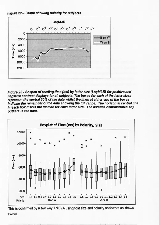
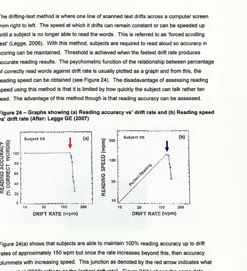
Figure 11 - Figure showing arrangement of pixels ... xliii Figure 12 - Figure showing dimensions of colour ... xlv Figure 13 - Additive colour model ... xlvi Figure 14 - A 'true-bit' display ... xlvi Figure 15 - Picture displaying the monochrome layers and the additive effect ... xlvii Figure 16 - screenshot of Windows 3. 1 ... xlix Figure 17 - Specular reflection ... Iii Figure 18 -Image of screen used for modified MNRead test ... Ixi Figure 19 -Graph showing mean reading time (ms) for 150 sentences. The red bar represents the mean whilst the blue bars represent the mean +/-2 sd. The different coloured dots depict the different MNRead sentence sets ... lxii Figure 20 - Graph illustrating the terminology used ... Ixv Figure 21 -Graph showing the increase in average reading speed vs'log contrast ... lxvi Figure 22 - Graph showing polarity for subjects ... Ixxi Figure 23 -Boxplot of reading time (ms) by letter size (LogMAR) for positive and negative contrast displays for all subjects. The boxes for each of the letter sizes represent the central 50% of the data whilst the lines
at
either end of the boxes indicate the remainder of the data showing the full range. The horizontal central line in each box marks the median for each letter size. The asterisk demonstrates any outliers in the data . ... Ixxi Figure 24 - Graphs showing (a) Reading accuracy vs' drift rate and (b) Reading speed vs' drift rate (After: Legge GE (2007) ... 77Figure 25 - Figure showing MNREAD acuity charts (After: Legge, 2007) ... 78
Figure 26 - Typical eye movements shown for a poor reader taken from an Electra-oculogram recording from 02 Visual Perception at City University ... 79
Figure 27 - Typical eye movements shown for a good reader taken from an Electra-oculogram recording from 02 Visual Perception at City University ... 80
Figure 28 - Serif vs' sans serif ... 81
Figure 29 -Proportionally spaced vs' mono spaced fonts ... 82
Figure
30-
Figure showing x-height.. ... 83Figure 31-Screenshot showing subjective rating of different fonts (ranking test) ... 88
Figure 32 - Histogram showing the results for 'font ranking': 1= difficult, 8 = easiest. The
error bars represent +/- 1 standard deviation ... 89 Figure 33 - Screenshot showing subjective rating of different fonts (paired comparison) ... 90 Figure 34 - Histogram showing the results of the paired comparison test. The error bars
represent +/- 1 standard deviation ... 91
Figure 35 - Screenshot showing subjective rating of different fonts ... 91
Figure 36 - Graph showing subjective rating for 'attractiveness'. The error bars represent
+/-1 standard deviation ... 92 Figure 37 - Histogram showing perceived ease of reading. The error bars represent +/- 1
standard deviation ... 93 Figure 38 - Boxplot of ranking by attractiveness/legibility vs' font. The boxes for each of the
letter sizes represent the central 50% of the data whilst the lines at either end of the boxes indicate the remainder of the data showing the full range. The horizontal central line in each box marks the median for each letter size. The asterisk demonstrates any outliers in the data . ... 94
Figure 39 - Screenshot showing the word search task ... 96 Figure 40 - Histogram showing the mean search time for each font in the word search task.
The error bars represent +/-1 standard deviation . ... 97
Figure 41 - Boxplot of mean search time for each font. The boxes for each of the fonts represent the central 50% of the data whilst the lines at either end of the boxes indicate the remainder of the data showing the full range. The horizontal central line in each box marks the median for each font. The asterisk demonstrates any outliers in the data ... 97 Figure 42 - Reading time as a function of font size for three different fonts for all normal
subjects ... 100
Figure 43 - Boxplot of mean reading time as a function of font size for three different fonts. The boxes for each of the letter sizes represent the central 50% of the data whilst the lines
at
either end of the boxes indicate the remainder of the data showing the full range. The horizontal central line in each box marks the median for each letter size.The asterisk demonstrates any outliers in the data ... 100 Figure 44 - Reading time as a function of font size for three different fonts for normal
subjects <50 yrs ... 101 Figure 45 - Boxplot of mean reading time
as a
function of font size for three different fonts.The boxes for each of the letter sizes represent the central 50% of the data whilst the lines at either end of the boxes indicate the remainder of the data showing the full range. The horizontal central line in each box marks the median for each letter size. The asterisk demonstrates any outliers in the data ... 102 Figure 46 - Reading speed as a function of font size for 3 fonts for normal subjects >=50 yrs
... 103
Figure 47 - Boxplot of mean reading time as a function of font size for 3 different fonts. The boxes for each of the letter sizes represent the central 50% of the data whilst the lines at either end of the boxes indicate the remainder of the data showing the full range. The horizontal central line in each box marks the median for each letter size. The asterisk demonstrates any out/iers in the data . ... 103 Figure 48 - Reading speed as a function of font size for Arial (normal subjects: <50 yrs vs'
>=50 yrs) ... 104
Figure 49 - Reading speed as a function of font size for TNR (normal subjects: <50 yrs vs' >=50 yrs) ... 105 Figure 50 - Reading speed as a function of font size for T1R (normal subjects: <50 yrs vs'
>=50 yrs) ... 105
Figure 51 -Graph showing reading time as a function of font size for text incorporating the 5
character spacings . ... 110
Figure 52 - Boxplot of reading time (ms) as a function of font size for 5 different character spacings. The boxes for each of the letter sizes represent the central 50% of the data whilst the lines at either end of the boxes indicate the remainder of the data showing the full range. The horizontal central line in each box marks the median for each letter size. The asterisk demonstrates any outliers in the data ... 111
Figure 53 - A diagonal line presented on an array of pixels causes aliasing and staircasing becomes apparent ... 113
Figure 54 Figure 55 ... 113
Figure 56 - With and without anti-aliasing ... 114
Figure 57 - Graph showing reading time as a function of font size for the three anti-aliasing conditions . ... 115
Figure 58 - The boxes for each of the letter sizes represent the central 50% of the data whilst the lines at either end of the boxes indicate the remainder of the data showing the full range. The horizontal central line in each box marks the median for each letter size. The asterisk demonstrates any outliers in the data ... 115
Figure 59 - The Intuitive Colorimeter Mark 11 ... 119
Figure 60 - Precision Tinted Lenses ... 120
Figure 61 - Screenshot of the computerised Rate of Reading test ... 123
Figure 62 - Screenshot showing the Nonsense Sentences Test ... 124
Figure 63 - Screenshot showing the 'Spreadsheet Task' ... 124
Figure 64 - Graph showing the correlation between test and retest results for the Rate of Reading test. ... 126
Figure 65 - Bland-Altman plot showing test-retest data for the Rate of Reading test ... 126
Figure 66 - Graph showing correlation between test and retest times to complete the spreadsheet task (63 subjects) ... 127
Figure 67 - Test-retest data for the Spreadsheet test plotted in a Bland-Altman format ... 127
Figure 68 - Graph showing correlation between test and retest times to complete the Nonsense Sentence task (63 particpants) ... 128
Figure 69 - Test-retest data for the Nonsense Sentence task re-plotted in
a
Bland-Altman format ... 128Figure 70 - Colour picker control ... 130
Figure 71 - u'v' coodinates of the red, green and blue pixels on the LCD screen form the apices of the red triangle and, therefore, the triangle bounds the gamut of colours that may be displayed on the screen. The blue circle represents colours of equal saturation around a standard white (u'v' 0.1978, 0.4683). Sixteen points around this circle were selected for the first phase of the algorithm ... 131
Figure 72 - Approximate representation of the 16 colours selected for the first phase of the algorithm ... 132
Figure 73 - Phase 1 of the algorithm ... 133
Figure 74 - Screenshot of phase 2 of the algorithm showing simultaneous presentation of two colours ... 134
Figure 75 - Phase 2 of the algorithm involved a simple elimination process by simultaneous presentation ... 134
Figure 76 -Power calculation ... 135
Figure 77 - Questionnaire
to
determine prevalence and severity of symptoms associatedwith using computer screen ... 136
Figure 78 - Preference of colours ... 138
Figure 79 - Summary data for the Rate of Reading test for a white background and preferred colour background for initial test and follow-up test ... 139
Figure 80 -Summary data for the Spreadsheet Analysis for a white background and preferred colour background for initial test and follow-up test ... 139
Figure 81 -Summary data for the Nonsense Sentences for
a
white background and preferred colour background for initial test and follow-up test ... 140Figure 82 - Histogram showing distribution of severity of asthenopic symptoms with a white background (Baseline) and the preferred colour
at
the follow up assessment ... 145Figure 83 - Frequency table showing the number of participants choosing each of the 16 colours ... 149
Figure 84 - Polar graph showing the distribution of the preferred colour ... 150
Figure 85 - u'v' values of paticipant's Irlen overlay colour and the preferred computer colour plotted in CIE UCS ... 150
Figure 86 - Histogram showing frequency of visual stress symptoms in response to the questionnaire ... 152
Figure 87 - Summary of the data for the Rate of Reading test against a white background and with the preferred colour ... 152
Figure 88 - Summary of search times for the Spreadsheet Test against a white background and the preferred coloured background ... 154
Figure 89 - Summary of time taken to complete the Nonsense Sentence task against
a
white background anda
preferred colour background ... 154Figure 90 - Average error in degrees as a function of the sample hue .. ... 161
Figure 91 - Polar graph illustrating the accuracy of memory of the colour. The continuous curve shows the accuracy of reproduction of the sample from memory. The radius of the plot corresponds to 40 degrees hue angle. The length of the radial lines are proportional
to
the number of participants naming the colour with satisfaction. The length of the lines on the perimeter correspond to the range of settings (mean +/-1 sd) of hue angle when participants were askedto
set the hueto
the colour shown by the colour of the line .. 162Figure 92 - Graph showing consistency within observers. The graph shows the mean absolute error in degrees hue angle on one trial plotted against the error on a second trial with different hue angle ... 163
Figure 93 - Graph showing the average error in degrees as a function over time ... 164
Figure 94 - Windows XP Accessibility Wizard ... 168
Figure 95 - ZoomText ... 169
Figure 96 - The modified international grading system for ARM ... 176
Figure 97 - Photograph showing drusen in the early stages of ARMD ... 178
Figure 98 - Photograph showing geographic atrophy of the RPE ... 179
Figure 99 - Photograph showing disciform scarring ... 180
Figure 100 - Photograph showing typical fundus appearance with RP ... 186
Figure 101- ERG response for
a
normal and an RP subject (After Berson, 1990) ... 186Figure 102 - Graph showing mean reading speed vs' contrast sensitivity as measured using the Pelli-Robson for subjects in the ARMD group ... 195
Figure 103 - Graph showing the correlation between visual acuity and reading speed using normal contrast i.e. black on white for subjects in the ARMD group ... 196
Figure 104 - Graph showing the correlation between years since diagnosis and reading speed using normal contrast i.e. black on white for subjects in the ARMD group ... 196
Figure 105 - Graph showing mean reading speed vs' contrast sensitivity as measured using the Pelli-Robson for subjects in the POAG group ... 197
Figure 106 - Graph showing the correlation between reading speed and visual acuity for subjects in the POAG group .. ... 197
Figure 107 - Graph showing the correlation between reading speed and years since
diagnosis for subjects in the POAG group ... 198
Figure 108 - Graph showing mean reading speed vs' contrast sensitivity as measured using the Pelli-Robson for subjects in the RP group ... 198 Figure 109 - Graph showing the correlation between reading speed and visual acuity for
subjects in the RP group ... 199
Figure 110 - Graph showing the correlation between reading speed and years since
diagnosis for subjects in the RP group ... 199
Figure 111 - Reading speed as a function of font size (LogMAR) for reverse contrast for subjects in the ARMD group ... 200 Figure 112 - Reading speed as a function of font size (LogMAR) for reverse contrast for
subjects in the POAG group ... 202
Figure 113 - Reading speed as
a
function of font size (LogMAR) for reverse contrast for subjects in the RP group ... 204 Figure 114 - Reading speed asa
function of font size (LogMAR) for visually-impairedsubjects for reverse contrast for all groups of visual impairment ... 206 Figure 115 - Reading speed as a function of font size (LogMAR) for reverse contrast
displays for normal subjects ... 207 Figure 116 - Phase 1 of the algorithm - subjects were invited to change the font size
according to their
V
A. Four background colours were selected from the sixteencalibrated colours ... 210
Figure 117 - Phase 2 of the algorithm showing different saturations of the remaining colour
... 210
Figure 118 - Phase 3 of the algorithm showing preferred colour and saturation of the
remaining colour ... 211
Figure 119 - Polar graph showing preferred choice of background colour for subjects in the ARMD group ... 211
Figure 120 - Pie chart showing 'comfort' with background colour for subjects in the ARMD group ... 212
Figure 121 - Pie chart showing 'ease of reading' with background colour for subjects in the ARMD group ... 212
Figure 122 - Reading speed as
a
function of font size (LogMAR) for white background and preferred colour background for subjects in the ARMD group ... 213Figure 123 - Polar graph showing preferred choice of background colour for subjects in the POAG group ... 214
Figure 124 - Pie chart showing 'comfort' with background colour for subjects in the POAG group ... 215
Figure 125 - Pie chart showing 'easiness to read' with background colour for subjects in the POAG group ... 215
Figure 126 - Reading speed as a function of font size (LogMAR) for white background and
preferred colour background for subjects in the POAG group ... 216 Figure 127 - Polar graph showing preferred choice of background colour for subjects in the
RP group ... ... 218 Figure 128 - Pie chart showing 'comfort' with background colour for subjects in the RP
group ... 218 Figure 129 - Pie chart showing 'ease of reading' with background colour for subjects in the
RP group ... ... 219 Figure 130 - Reading speed as a function of font size (LogMAR) for white background and
preferred colour background for subjects in the RP group ... 219 Figure 131 - Reading speed as a function of font size (LogMAR) for white background and
preferred colour background for all groups of visual impairment ... 221
Figure 132 - Reading speed as a function of font size (LogMAR) for white background and
preferred colour background for all normal subjects ... 222 Figure 133 - Phase 1 of the algorithm ... 223
Figure 134 - Phase 2 of the algorithm showing different saturations of the remaining colour
... 224
Figure 135 - Polar graph showing preferred text colour against
a
black background for subjects in the ARMD group ... 224 Figure 136 - Pie chart showing 'comfort' with coloured text ona
black background forsubjects in the ARMD group ... 225 Figure 137 - Graph showing 'ease of reading' with coloured text on
a
black background forsubjects in the ARMD group ... ... 225 Figure 138 - Reading speed as a function of font size (LogMAR) for black on white and
preferred colour on
a
black background for subjects in the ARMD group ... 226 Figure 139 - Polar graph showing preferred foreground colour againsta
black backgroundfor subjects in the POAG group ... 228 Figure 140 - Pie chart showing 'comfort' with coloured text on
a
black background colour for subjects in the POAG group ... 228 Figure 141-Graph showing 'ease of reading' with coloured text ona
black background forsubjects in the POAG group ... 229 Figure 142 - Reading speed as a function offont size (LogMAR) for black on white and
preferred colour on
a
black background for subjects in the POAG group ... 229 Figure 143 - Polar graph showing preferred foreground colour againsta
black backgroundfor subjects in the RP group ... 231 Figure 144 - Pie chart showing 'comfort' with coloured text on
a
black background forsubjects in the RP group ... 231 Figure 145 - Graph showing 'ease of reading' with coloured text on
a
black background forsubjects in the RP group ... 232 Figure 146 - Reading speed as a function offont size (LogMAR) for black on white and
preferred colour on
a
black background for subjects in the RP group .... ... 232 Figure 147 - Reading speed as a function of font size (LogMAR) for black on white andpreferred colour on
a
black background for all groups of visual impairment ... 234Figure 148 - Reading speed as a function offont size (LogMAR) for black on white and
preferred colour on a black background for all normal subjects ... 235 Figure 149 - Figure showing screenshot of the colour combinations ... 238
Figure 150 - Graph showing 'comfort' with preferred colour combinations for subjects in the ARMD group ... 240 Figure 151 - Graph showing 'ease of reading' with preferred colour combinations for
subjects in the ARMD group ... 240 Figure 152 - Reading speed as a function of font size (LogMAR) for preferred
foreground/background combinations for subjects in the ARMD group ... 241 Figure 153 - Pie chart showing 'comfort' with preferred colour combinations for subjects in
the POAG group ... 244 Figure 154 - Graph showing 'ease of reading' with preferred colour combinations for
subjects in the POAG group ... 244
Figure 155 - Reading speed as a function of font size (LogMAR) for preferred
foregroundlbackground combinations for subjects in the POAG group ... 245
Figure 156 - Pie chart showing 'comfort' with preferred colour combinations for subjects in the RP group ... 248 Figure 157 - Pie chart showing 'ease of reading' with preferred colour combinations for
subjects in the RP group ... 248 Figure 158 - Reading speed as a function of font size (LogMAR) for preferred
foreground/background combinations for subjects in the RP group ... 249 Figure 159 - Reading speed as a function of font size (LogMAR) for preferred
foregroundlbackground combinations for al/ groups of visual impairment .. ... '" ... 251 Figure 160 - Reading speed as
a
function of font size (LogMAR) for preferredforegroundlbackground combinations for al/ groups of visual impairment. ... 252
Figure 161 - Reading speed as a function of font size (LogMAR) for the three different fonts
for subjects in the ARMD group ...
254
Figure 162 - Reading speed as a function of font size (Log MAR) for the three different fonts for subjects in the POAG group ... 255
Figure 163 - Reading speed as a function of font size (LogMAR) for the three different fonts for subjects in the RP group ... 257 Figure 164 - Graph showing mean critical print size for the different fonts vs' different
groups of subjects ... 258
TABLES
Table 1 - Comparison of LCD versus CRT displays .. ... xxix Table 2 - Figures for Asthenopia ... xxxvii
Table 3 - Table showing optimum position of display monitor for those with A and V patterns ... Ivii
Table 4 - Contrasts used ... Ixiv Table 5 - Table showing paired t-test values for the different levels of contrast for MRS. Ixvii
Table 6 - Table demonstrating adjustments made for height ... 87 Table 7 -Order of insertion ... 95
Table 8 - Rank order for search times with the different fonts ... 98 Table 9 - Table showing outcome of paired t-tests between each font ... 99
Table 10 - Table showing outcome of paired t-tests between each font for critical print size (cps) for subjects <50 yrs ... 106 Table 11 - Table showing outcome of paired t-tests between each font for the mean critical
print size (MRS) for subjects <50 yrs ... 106 Table 12 - Table showing outcome of paired t-tests between each font for critical print size
(cps) for subjects >=50 yrs ... 106 Table 13 - Table showing outcome of paired t-tests between each font for the mean critical
print size (MRS) for subjects >=50 yrs ... 106 Table 14 - Table showing results for one way ANOVA for each font size ... 112
Table 15 - Table showing outcome of paired t-tests between each type of alia sing for mean reading speed ... 116
Table 16 - u'v' values and corresponding RGB values required to achieve these on the Samsung TFT screen ... 132
Table 17 - Table showing the number of participants choosing each of the 16 colours .... 138 Table 18 -Mean time in seconds (and s. d.) for each of the performance tasks at baseline
and at follow up ... 141
Table 19 - Table showing the prevalence of asthenopic symptoms at baseline ... 144
Table 20 - Table showing the prevalence of Meares-Irlen symptoms at baseline ... 151
Table 21 - Chromaticities of the standard (to-be-remembered) colours used in Experiment 1
... 159
Table 22 - The modified international grading system for ARM ... 177
Table 23 - The diagnosis of glaucoma in cross sectional prevalence surveys ... 183 Table 24 - Characteristics of patients recruited ... 191 Table 25 - Clinical details of patients recruited ... 192
Table 26 - u'v' values and corresponding RGB values required to achieve these on the
Multisync LeO 1860NX screen ... 209
Table 27 - Colours used for foregroundlbackground combinations ... 236
Table 28 - Table showing the foreground/background combinations selected by each subject in the ARMD group .. ... 239
Table 29 - Table showing the foreground/background combinations selected by each subject in the POAG group ... 243
Table 30 - Table showing the foreground/background combinations selected by each subject in the RP group ... 247
Life shrinks or expands in proportion
to one's courage.
Anais Nin (1903 - 1977)
1.
Introduction
1.1 Introduction
According to the founder of Microsoft, Bill Gates, "personal computers have become the
most empowering tool we've ever created. They're tools of communication, they're tools of
creativity, and they can be shaped by their user" (Woopidoo Quotations, 2007).
Computers have become an integral part of modern life. Many people now spend a
significant proportion of their working day interacting with computers. Computers have also
pervaded the domestic environment where they are used increasingly for communication,
entertainment (games, music, films) whilst the internet has revolutionised the way that we
search for information, shop and interact with others.
The BBC reports that on average, ·people in the UK spend approximately 10 hours/ week
using the internet with people in London spending 4 hours longer (BBC, 2006). Figure 1
shows that in the period 2003-2004, 46% of the population in the UK regularly used a
computer, a ranking of 8th in the world (Mapsofworld.com, 2006). By 2007, 60% of the
population in the UK owned a computer, a ranking of 12'h in the world (Aakre & Doughty,
[image:25.527.41.516.43.786.2]2007; Fernandez, 2007).
Figure 1- World map showing top 10 countries having highest number of personal computers (From: (Mapsofworld.com, 2006))
N
f
4.,","rtM\dII 103 I.HongK.., ." t.",.,..,. • ..,
7.UnhH' •• f.. • ..
',U"/IH l(/tIfd_ 4" J,A ... "./la •••
IO.lotIthK_. 4U
World mlp ShowlDl toP 10 CouDtriu
HniDI Hichut Numbers of P.rsonll Compute ..
National Statistics (2006) report similar figures for computer use. They show that between
January and April 2006, more than half of all households (56%) in the UK had a desktop
computer, almost a third (30%) owned a portable or laptop computer and 7% possessed
hand held computers. During the same period, almost 90% of people aged between 16 and
30 years had used a computer in the previous three months compared with only 45% of people in the age group of 50 years or over (National Statistics, 2006). The Office for National Statistics (2006) also reported that in a five year period from 2000 to 2005, the average time spent using computers rose from 96 mins to 120 mins/ day.
These figures confirm that computers are having an increasing impact on almost every aspect of life and most people spend many hours each day interacting with computers in various guises. Despite advances in speech synthesis/recognition and other interface technologies, visual displays remain the most common medium for interacting with
computers. Whilst there have been significant developments in display technology over the past decade, complaints of visual problems associated with using displays are still common and it is likely that the visual characteristics of display screens are still sub-optimal in a number of respects.
This thesis describes a series of studies designed to quantify the effects of key display parameters on the visual performance of normal and visually-impaired observers.
1.2 Computers In society - past, present and future
1.2.1 History of computers
Just ten years ago, the dictionary definition of a computer was "an electronic machine for carrying out complex calculations, dealing with numerical data or with stored items of other information, also used for controlling manufacturing processes, or coordinating parts of a large organisation; a calculator" (The Chambers Dictionary, 1999). Whilst this definition is still accurate in terms of the core function of a computer, the increase in computer power coupled with the development of sophisticated software and peripheral devices has meant that computers are now far more than a calculator but, in fact, lie at the heart of virtually all aspects of modern day life.
The Encyclopaedia Britannica describes the earliest computer as the abacus
(Encyclopaedia Britannica, 2007), though the origins and exact time are often disputed, with some historians claiming it was invented in Mesoptamia sometime between 1,000 BC and 500 BC, others assert it was actually invented by the Chinese (Wikipedia, 2007).
The French mathematician Blaise Pascal invented the first true calculating machine
between 1642 and 1644. The functions were limited. The first programmable machine was not described until the 1830s by Charles Babbage, which he called "The Analytical Engine" (www.maxmom.com. 2007). Babbage's invention was never finished. The next significant milestone in computing history was the development of "punched cards" for information processing which was a move towards true automation (www.history.rochester.edu, 2007).
The first "freely programmable computer" was invented in 1936 by Konrad Zuse
(www.inventors.about.com.2007).This was a binary computer which was essentially a large calculator. The advent of the Second World War meant that computing technology developed at a fast pace. In 1942, John Presper Eckert and John W Mauchly designed a high-speed electronic computer which they called ENIAC (Electrical Numerical Integrator and Calculator). It consisted of 18,000 vacuum tubes and used 180,000 watts of electricity (www.softlord.com. 2007).
Jeremy Meyers in his "A Short History of the Computer" (www.softlord.com. 2007) describes the development of the computer from ENIAC through "controlled control transfer", through random access memory (RAM) and into the 1950s. In the 1950s, according to Meyers, the two major milestones were the use of magnetic core memory and the transistor-circuit element. Jack Kilby (1958) invented the microchip which, in real terms, meant that large amounts of information and data could be stored on something smaller than the size of a pinhead where previously it had taken office floors. The 1960s saw advancements in speed and memory, and increased widespread use of computers in a number of different
environments. The 1970s saw the introduction of the microcomputer; the precursor of the personal computers of today.
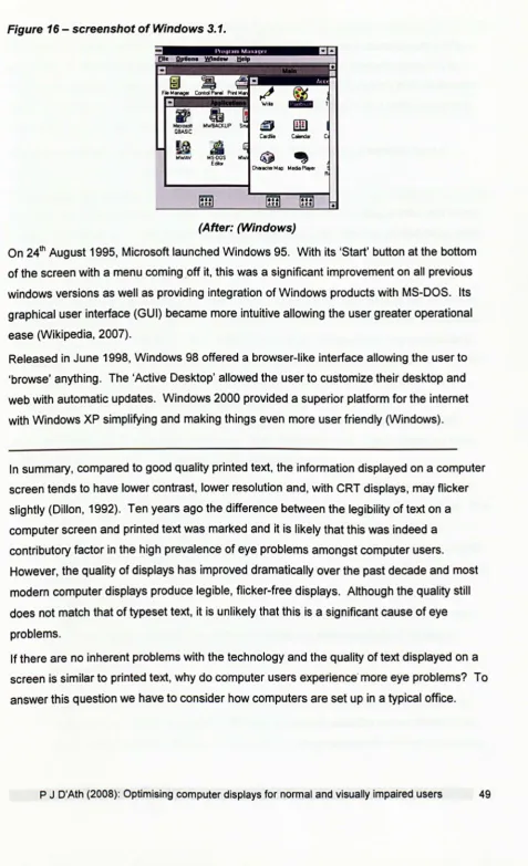
IBM introduced the first personal computer in 1981 (www.blinkenlights.com).However.it was Sir Alan Sugar, director of Amstrad, who brought personal computers to the masses with the introduction of the PCW8256 word processor in 1985 at affordable prices (www.biogs.com).
The introduction of the world-wide web by Tim Berners-Lee in the 80s brought the world to peoples' doorsteps. It made possible immediate contact with people on the other side of the globe at the click of a button. It also made normal daily activities such as grocery shopping accessible and opened the door for people with disabilities. Leiner et al (1999) said: "The Internet has revolutionised the computer and communications world like nothing before" (www.arxiv.org).
In a five year period from September 1998 to September 2003, the number of households in the UK with internet access increased five fold from 9% to 48% (National Statistics, 2003) with 64% of the population having used the internet at some point prior to interview (National Statistics, 2003). By 2007, this figure had increased to 61% of households having internet access with 67% of people aged 16 years or over having used it in the three months prior to interview (National Statistics, 2007). Eighty-eight percent of people in the age range 16-24 years used the internet compared to only 16% of those aged 65 yrs or over (National
Statistics, 2003). This increased to 90% for the 16-24 yrs group and 24% for those aged 65 years and above (National Statistics, 2007). The three main uses for the internet in 2003 were emails (84%), information regarding 'goods and services' (80%) and, travel and accommodation information (68%) (National Statistics, 2003). In 2007, information
regarding 'goods and services' overtook email use as the most common use of the internet (86%). Emails accounted for 85% of use whilst travel and accommodation dropped to 63%. Men (70%) were more likely than women (63%) to use the internet on a daily or almost daily basis (National Statistics, 2007). Almost 80% of all UK internet connections were
broadband connections (National Statistics, 2006).
1.3 Display technologies
1.3.1 Cathode Ray Tube (CRTs)
The earliest computers used mechanical "flags" or lights to signal the result of calculations.
The development of Cathode Ray Tubes (CRTs) provided a new output device for
computers and CRTs were widely used in the computing industry from the 1960s onwards.
These displays developed from small, low resolution screens to sophisticated units capable
of producing large, high-resolution images. Over the past decade, new display technologies
including Liquid Crystal Displays (LCD) and Plasma screens have largely replaced CRTs
except for specialist applications where exceptionally high resolution or precise colour
rendering is required.
A CRT is an evacuated glass tube with a phosphor-coated screen at one end and a filament
and deflection coils at the other (see Figure 2). Electrons are emitted by the filament and
accelerated, focused and deflected by the action of the deflection coils. The electron beam
strikes the screen at the other end of the tube and at the point of impact the phosphor emits
light. The brightness of the light emitted is related to the intensity of the electron beam
which in turn is determined by the accelerating voltage.
Figure 2 - Figure showing conventional eRT
(After: http://www.howstuffworks.comltv3.htm)
There are several methods for presenting information on the screen but the most common
is by raster scanning (see Figure 3). This involves the deflection of the beam in a series of
horizontal lines (scan lines), which are conventionally drawn from the top to the bottom of
the screen. To avoid the perception of flicker on the screen, this process must be repeated
many times a second. Each screen-full of lines is called a field and the number of screens
drawn per second is called the field scan frequency or refresh rate. Most CRTs display between 500 and 1000 scan lines and use refresh rates between 50 and 100 Hz.
[image:30.541.33.528.31.794.2]Information is presented on the screen by modulating the intensity of the electron beam as it is swept across the screen.
Figure 3 - Raster scanning
rr ( )
(After: Thomson (2007), 2nd year optometry lecture)
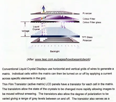
1.3.2 Flat Panel (LeO) Displays
Whilst modern CRT displays are capable of generating very high quality images, they are bulky and inefficient in terms of energy consumption. This has stimulated the search for alternative display technologies and led to the development of thinner, lighter and more energy-efficient displays such as Liquid Crystal Displays (LCDs) and plasma screens. The thin film transistor liquid crystal display or TFT -LCD, is a modern form of the LCD originally developed for monitor usage in the 1970s. These displays consist of a thin layer of liquid crystal material sandwiched between a vertical and horizontal polarizer (see Figure 4). The liquid crystal material is made up of long crystalline molecules. The individual molecules are arranged in a spiral fashion such that the direction of polarization of polarized light passing through is rotated by 90 degrees. Light entering through the vertical polarizer is thus rotated by 90 degrees and passes through the horizontal polarizer. However, when an electric field is applied to the crystals, they all line up and lose their polarizing
characteristics. Without the polarizing effect of the liquid crystal layer, the vertical and horizontal polarizers will attenuate most of the light.
Figure 4 - Figure showing how conventional Liquid { rystal Displays work
liquid
Crysral
Voltage
L
~
§~L~
/ / 1 1 1 1 1 1 \ \ \ \ \ ,
Backlight
Polarizer
Colour Filter
Colour Filter glass
TFT Glass
Polarizer
(After: www.teac.com.au/paqeslhowdoesan/cdwork)
Conventional Liquid Crystal Displays use horizontal and vertical grids of wires to generate a matrix. Individual cells within the matrix can then be turned on or off by applying a current across specific elements in the grid.
Thin Film Transistor (active matrix) LCD panels have a transistor for each cell in the matrix.
The transistors allow the state of the crystals to be changed more rapidly allowing images to be moved without smearing. The transistors also allow the degree of polarization to be varied giving a range of grey levels between on and off. The transistor also serves as a memory for the cell allowing it to stay on without being refreshed. TFT LCD panels are,
therefore, virtually flicker-free (www.cs.ndus.nodak.edu, 1996).
Colour displays are possible by dying the liquid crystals and juxtaposing red, green and blue cells. The individual coloured cells are too small to be resolved by the eye. Consequently, a wide gamut of colours can be produced by varying the relative intensity of the red, green and blue cells in each triad.
Figure 5 -Summarises the differences between a CRT display and an LCD display
C/Fglass
Electrode
TFT glass
Pixel electrode Grate line ~
Data line
Table 1 - Comparison of LCD versus CRT displays
Consideration LCD CRT
Image flicker None Prone to flicker
Image brightness Bright, uniform Bright, tends to be spatially non-uniform and varies over time
Image geometry Uniform Distorted
Image sharpness High Moderate to high
Screen viewing area Full area, very space Partial area, space inefficient efficient
Screen size Smaller screen for equivalent Larger screen for equivalent CRT viewing area LCD viewing area
Specular screen glare Low Prone to specular glare
Energy consumption Low High
Electromagnetic emissions No Yes
Heat emissions Minimal High
Space efficiency High Low
Flexible positioning High Moderate
Weight Light Heavy
Colour range Very Good Excellent
(Adapted from: A/an Hedge www.ergo.human.comell.edu/PubILCD_vs_CRT_AH.pdf)
Wang and Chen (2003) found no significant difference in reading performance when
participants used CRT and LCO displays.
1.3.3 Plasma Screens
Co-invented in 1964, it was not until recently that LCD displays have largely replaced eRT
screens for computer work. The current generation are limited in size and have a relatively
poor temporal resolution which makes them less suitable for television. For this purpose
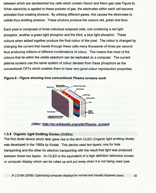
plasma screens have become popular. Plasma displays consist of two layers of glass
between which are sandwiched tiny cells which contain Xenon and Neon gas (see Figure 6).
When electricity is applied to these pockets of gas, the electrodes within each cell become
activated thus creating photons. By utilising different gases, this causes the electrodes to
collide thus emitting photons. These photons produce the colours red, green and blue.
Each pixel is composed of three individual subpixed cells; one containing a red light
phosphor, another a green light phosphor and the third, a blue light phosphor. These
colours when added together produce the final colour of the pixel. The colour is changed by
changing the current that travels through these cells many thousands of times per second
thus producing millions of different combinations of colour. This means that most of the
colours that lie within the visible spectrum can be replicated on a computer. The current
plasma screens use the same system of colour devised from these phosphors as the
[image:33.541.25.532.178.805.2]conventional CRTs which enables them to have very good colour reproduction properties.
Figure 6 - Figure showing how conventional Plasma screens work
(After: http://en.wikipedia.orglwiki/Plasma screen)
1.3.4 Organic Light Emitting Diodes (OLEDs)
The first diode device which later gave rise to the term OLEO (Organic light emitting diode)
was developed in the 1980s by Kodak. This device used two layers; one for hole
transporting and the other for electron transporting with the result that light was produced
between these two layers. An OLED is the equivalent of a high definition television screen
or computer display which can be rolled up and put away when it is not being used (see
Figure 7). Billed as the latest advance in technology, this new generation devices produces
sharper and brighter images than an LCD is capable of by creating light from electricity
which passes through thin layers of molecules.
The advantages of an OLED over other similar flat panel displays is that they can be printed
onto significantly more materials than either LCDs or plasma displays. This lends itself to a
wealth of possibilities such as the clothing industry. In addition, The OLEDs have a much
better viewing angle close to 90 degrees and has a much better range of colours than
conventional LCDs. Conventional LCDs require a backlight. However, an OLED does not
produce any light when switched off and, consequently, uses no power. This makes them
ultimately more economical than an LCD. Their thinness is achieved by them not having to
have a backlight and this means that they can be % inch thick. Currently, the main
disadvantage of OLEDs is the limited lifespan; they only last about five years (assuming 8
hrs use per day) due to the organic materials that they use.
Figure 7 - Figure showing a conventional OLED
(After: http://electronics.howstuffworks.com/oled.htm)
1.3.5 Emerging display technologies
Over the past ten years, the many advantages of LCD displays coupled with a dramatic
reduction in their cost has led to the demise of eRT displays except for specialist
applications. However, the resolution and colour rendering of LCD screens is still no match
for printed documents and the quest for technologies which will match the resolution, quality
and versatility of printed matter goes on. In recent years, this has been driven by the need
to miniaturise displays for mobile phones and the development of electronic readers to
replace books, newspapers, magazines etc.
It is predicted that within the next few years, handheld devices capable of storing thousands
of books will be available. These devices will also be capable of downloading newspapers
and magazines thus transforming the way that we read in much the same way that mp3
players have transformed the way that we access music. However, such a device requires
a display that matches the quality of printed matter whilst being light and energy efficient.
Hsin-Chieh et al (2007) compared the reading performance, subjective satisfaction and
visual fatigue of three e-books; an e-book reader, a notebook computer and a personal
digital assistant. Whilst they found no significant differences in actual reading performance
between either of these three e-books with their group of 22 university students, the
subjects preferred the notebook computer to the other two e-books on offer. In addition,
visual fatigue was rated as significantly higher for the personal digital assistant than with
either of the other two e-books.
A number of manufacturers have taken up this challenge. For example, the Sony Reader
uses a new technology known as "electronic paper" to display high resolution text and
images on a 6" screen (see Figure 8). The unit is currently capable of storing up to 80
complete books and yet weighs less than 80z (Sony Reader, 2007).
Figure 8 - Sony Reader
(After: http://www.mobilewhack.com/images/Sony-Reader.jpg)
Electronic paper or electronic ink works using positive white and negative black electrodes.
Sandwiched between these electrodes, is a thin layer of liquid polymer which acts as a
conductor (see Figure 9). Applying a positive charge to the electrodes results in pushing the
black particles to the bottom whilst forcing the white electrodes to the surface. The resultant
effect gives the pixels a white appearance. Applying a negative force has the opposite
effect and results in a black appearance. The advantages of electronic ink are that they
overcome many of the problems associated with reading from a display screen in that they
produce the same high contrast effects of reading from a hard copy whilst eliminating
unwanted reflections caused by variations in viewing angle or illumination including direct
sunlight. It also requires no front or backlight and is as thin as a piece of paper (E-ink:
Electronic Paper Displays, 2007).
Figure 9 -Electronic ink (From: Electronic Paper, 2007)
Appearance of plxell (IM" trom above throuQh tranlpar.nl elect,odelay.r)
Apple have just launched their latest iPod which is rumoured to be able to be used as an
e-book through the Note Reader option (see Figure 10). It is possible that items such as
iPods could be developed in the future for this purpose.
Figure 10 - iPod screen showing text
(After: http://b/og.wired.com/gadgets/DSC 1367.jpg)
1.4 The visual ergonomics of displays
1.4.1 Prevalence of eye complaints
The legibility of visual displays has improved significantly over recent years and a considerable amount of research has been devoted to developing the modern graphical user interface. Despite this, complaints of eye problems associated with viewing computer displays are still surprisingly common (Ustinaviciene & Januskevicius, 2006) and it is likely that the characteristics of modern displays are sub-optimal in a number of respects. However, the quality of research in this area is variable and many studies failed to use suitable control groups. As a result, it is still uncertain whether those using computer displays are more likely to suffer symptoms than those performing similar visual tasks using printed materials.
The main visual symptoms reported by computer users are "eyestrain", tired eyes, irritation, burning sensation, redness, blurred vision and double vision (Collins, Brown & Bowman, 1998; Berg & Bengt, 1996; Cole, Maddocks & Sharpe, 1996; Bergqvist & Knave, 1994; Bergqvist & Knave, 1994; Lie & Watten, 1994; Lie & Watten, 1994; Dain, Chan & Williams, 1985). These symptoms and signs of eyestrain are collectively referred to as 'asthenopia' or increasingly, as 'computer vision syndrome' (Blehm et al., 2005).
It is generally accepted that these symptoms are temporary. Ustinaviciene & Januskevicius (2006) report that 43% of workers report immediate relief of symptoms upon cessation of computer use, 45% had symptoms for several hours after finishing work and only 12% felt their symptoms continued until the next day.
There is no reliable evidence that work with computers causes any permanent damage to the eyes (Yeow & Taylor, 1991; Yeow & Taylor, 1990; Yeow & Taylor, 1989). Furthermore, there is no good evidence that computer users are more likely to become short-sighted or develop any other form of eye defect (Taino et al., 2006; Mutti & Zadnik, 1996; Hanne & Brewitt, 1994; Toppel & Neuber, 1994; Watten, 1994; Gur & Ron, 1992; Watten & Lie, 1992; Yeow & Taylor, 1990; Yoshikawa & Hara, 1989; Tokoro, 1988; Polakoff, 1986; Starr,
Thompson & Shute, 1982). Indeed, it could be argued that because computer displays tend to be viewed from a greater distance than printed documents, the stimulus for myopia to progress is actually reduced although there is no reliable evidence to support this view.
There is good evidence that reports of visual symptoms correlate with the hours spent using a computer (Taino et al., 2006; Tomei et al., 2006; Carta et al., 2003; Tamez et al., 2003; Travers & Stanton, 2002; Belisario et al., 1988; Knave et al., 1985).
Mocci, Serra & Corrias (2001) recruited 212 bank workers with a mean age of 38.6 yrs who had no refractive error or ocular conditions. Of these, almost a third (31.9%) reported