Rochester Institute of Technology
RIT Scholar Works
Theses
Thesis/Dissertation Collections
2-1-1996
Optimizing text-intesive documents for on-screen
viewing using the model of the Portable Document
Format
Erin Hickey
Follow this and additional works at:
http://scholarworks.rit.edu/theses
This Thesis is brought to you for free and open access by the Thesis/Dissertation Collections at RIT Scholar Works. It has been accepted for inclusion
in Theses by an authorized administrator of RIT Scholar Works. For more information, please contact
Recommended Citation
Optimizing
Text-Intensive
Documents
for
On-Screen
Viewing
Using
the
Model
of
the
Portable Document Format
by
Erin K.
Hickey
A
thesis
submittedin
partialfulfillment
ofthe
requirementsfor
the
degree
ofMaster
ofScience
in
the
School
ofPrinting
Management
andSciences
in
the
College
ofImaging
Arts
andSciences
ofthe
Rochester
Institute
ofTechnology
February,
1996School of Printing Management and Sciences
Rochester Institute ofTechnology
Rochester, New York
Certificate ofApproval
Master's Thesis
This is to certify that the Master's Thesis of
Erin Hickey
name of student
With a major in Graphic Arts Publishing
has been approved by the Thesis Committee as satisfactory
for the thesis requirement for the Master of Science degree
at the convocation of
February 1996
date
Thesis Committee:
Frank Cost
Thesis Advisor
Marie Freckleton
Graduate Program Coordinator
C.
Harold
Goffin
The
materials containedherein
arethe
property
ofthe
author andmay
notbe
reproducedin
partorin
whole without expressconsent.Optimizing Text-Intensive Documents for On-Screen Viewing Using the Model
ofthe Portable Document Format
I, Erin Hickey, hereby deny permission to the Wallace Memorial Library of R.I.T.
to reproduce my thesis in whole or in part.
.---~f--=---L.----Acknowledgements
I
wouldlike
to
extendthanks
to
Romano
Padeste,
Jin
Park,
andChristian
Wittwer,
who wereespecially
helpful
throughout the
programboth
in
and outofthe
classroom.
To
Matthew
King,
yoursacrifices and support will neverbe forgotten. You
area catch.
Table
of
Contents
List
of
Figures
viList
of
Terms
viiiAbstract
xChapter
1
Introduction
1
Statement
of
Problem
1
Background
andSignificance
3
History
ofPortability
3
Changes
in
Information
Access
3
Reasonsfor
Interest
5
Current Use
3
Endnotesfor
Chapter
1
7
Chapter
2
Theoretical Basis
andReview
ofLiterature
8
Legibility
and
Comprehension Studies
8
Digital
Type
11
Portable
Document Format
15
Ergonomics
17
Endnotesfor Chapter
2
18
Chapter
3
Hypothesis
20
Chapter
4
Methodology
21
Preliminary
Experimentation
21
Setting
Standards
22
Final
Experimentation
22
Equipment
Used
22
Method
ofEvaluation
23
ChapterS Results
of
the
Experimentation
24
Results
of
the
Preliminary
Experiment
24
Overall
Legibility
24
Typeface
25
Type Size
26
Leading
27
Line Length
28
Page
Size
29
Navigation
29
Automatic Zoom/Magnification
30
Results
of
the
Second Experiment
32
Procedure
32
Results
of
the
Final
Experiment
33
Chapter 6
Summary
and
Conclusions
34
Alternatives
35
Recommendations for Further
Study
36
Endnotesfor Chapter 6
38
Bibliography
39
Appendix
A
42
Appendix B
50
Appendix C
64
List
of
Figures
1.1
Percent
page visible of an 8.5"x 11"
document
on variousmonitorsizes
2
5.1 Overall
Legibility
25
5.2
Typeface
Legibility
26
5.3
Total
percentage ofrespondentsstating legible
orvery
legible
(typeface)
26
5.4
Type Size
Adequacy
26
5.5
Total Percentage
ofRespondents
Stating
Adequate
(type
size)
. .275.6
Leading Adequacy
27
5.7
Total Percentage
ofRespondents
Stating
Adequate
(leading)
. . .275.8 Line Length
Adequacy
28
5.9
Total Percentage
ofRespondents
Stating
Adequate (line
length)
.285.10 Page Size
Adequacy
29
5.11
Total Percentage
ofRespondents
Stating
Adequate
(page
size)
. .295.12
Effectiveness
ofNavigation
Tools
30
5.13 Total Percentage
ofRespondents
Stating
Helpful
orVery
Helpful
(navigation)
30
5.14
Effectiveness
ofZoom Features
31
5.15
Total Percentage
ofRespondents
Stating
Helpful
orVery
Helpful
(automatic
zoom/magnification)
31
5.16 Results
ofthe
Final
Experimentation,
Question
1
33
5.17
Results
ofthe
Final
Experimentation,
Question
2
33
List
of
Terms
Ascender^-The
segment ofalower
case characterthat
extends abovethe
x-height.Capital
Height-The height
ofthe
uppercaseletters
in
relationto
x-heightContrast-The difference
between
the thick
andthin
elements ofaletterform.
CRT-Cathode
Ray
Tube;
the
technology
behind
mostilluminated
display
devices,
including
computer monitors andtelevision
sets.Descendei^-The
segment of alower
case characterthat
extendsbelow
the
baseline.
Fit-Describes
the
spacing
between
charactersin
afont.
Joins-The
way in
whichdifferent
elements of aletterform
cometogether.
Leading-The
spacebetween
lines
oftype.
Navigation-The
process ofauserfinding
his
orher
way
through
aninteractive
doc
ument.PDF-
Portable
Document
Format;
anon-proprietary
file
format developed
by
Adobe
that
enablesdocuments
to
retain all elements offormatting
regardless ofthe
com puter platformthey
are viewed on or printedfrom.
Pixel-Picture
Element;
the
smallest addressable unit of aCRT
screen.Portable
Documents-Any
document
that
retainsits
originallook
andfeel
asit
trav
els
between
computer platforms.Right Justify-The
same asjustify,
in
typographic
terms;
any
text
that
is
flush
withthe
right andleft
marginsin
adocument.
Serifs-Small
strokes atthe
ends ofthe
stems ofcharacters.Weight-The
thickness
ofthe
stroked elementsthat
makeup
acharacterin
afont.
Light
andBold
areexamples offont
weights.X-Height-The
area of a characterthat
lies between
the
mean andbaselines.
Generally
determined
by
the
height
ofthe
lower
case x.Abstract
Document
portability
programstransform
electronicdocuments
into
astatethat
allows
information
to
be
viewed,
annotated,
andprintedby
any
computersystem,
regardless of
the
originalcomputerplatform or software applicationusedto
createthe
primary document. In
addition,
portabledocuments
maintainformatting,
fonts
and graphics as
they
appearin
the
original.Despite
the
uniqueopportunity
these
programs offerfor
distributing
informa
tion,
most portabledocument developers do
not usethe
technology
effectively.Poor
font
rendering
and page sizestoo
large for
easy
navigation or comfortable monitorviewing
make most portabledocuments
impractical
for
pure electronic use.When
adocument
is
presented onscreen,
it
nolonger has
the
same properties as aprintedpage.
Though
the
information
contained withinit may
nothave
changed,
the
readerhas less
control overthe
conditions underwhichthe
document
willbe
read.It
becomes
the
responsibility
ofthe
creatorto
presentthat
information in
a usefulmanner,
if
he
or she wishesthe
information
to
reachits
audience.The
purpose ofthis
study
wasto
determine
whetherit
is
possible,
through
simple
formulaic
reformatting,
to
createhighly
legible
text
intensive
documents for
onscreen
viewing using
adocument
portability
program,
specifically
Adobes
Portable
Document Format.
This
objective was achievedby determining
the
factors
that
contribute
to
legibility
andcreating
andtesting
variousdocuments based
onthose
find
Three
experiments were conductedto
determine
whetherthe
portabledocument
format is
a viable mediumfor viewing
text
intensive documents
on screen.It
wasfound
that though the
portabledocument format has
revolutionary
specificuses,
andif
documents
areformatted
specifically
for
the
medium users preferthem
overnon-optimized
documents,
users still preferto
readtext
intensive documents
on paper.Chapter
1
INTRODUCTION
Statement
ofProblem
What is
a page?Traditionally
a pageis
either side ofthe
pieces of paperbound
in
abook.
A
page canbe
any
size,
but
its
shapeis generally
rectangularandvertically
oriented.
In
ourday-to-day
lives,
a pageis
the
smallest physical element of adocument,
a
magazine,
term
paper,
or projectreport,
usually
8.5"
x
11",
again verticalin
nature.But
in
the
computerage,
whatdefines
a page?The default
page sizein
wordprocessing
programsis
8.5"
x
11",
the
standardoutput size
for
most printers.But
electronicdocuments do
not usepaper;
the
substrate
becomes
the
computer monitor andthe
sizeis
nolonger
recordedin
inches,
but
in
pixels.The
pixel,
orpictureelement,
is
the
smallestaddressable area of a monitor.
In
general,
monitorshave 72
pixelsperinch,
asignificantly lower
resolutionthan
that
found
in
alaser-printed
page,
whichgenerally has
a resolutionbetween
300
and600
dots
perinch.
The
standard computer screen sizeis
13
inches,
or640
x480
pixels,
positionedhorizontally.
(Despite Apple's
claimthat
its
standardmonitors are growing-from13
to
14
andnow15 inches-the
base
number ofpixelsin
the
monitorhas
notchanged.)
Using
the
monitor as a"page"
forces
usto
reevaluate ourdefinition
ofapage,
in
terms
ofboth
its
size and orientation.As
aresult,
we must revise our output as well.A
problem arises wheninformation intended
to
be
viewed on a computer screendocu-ments are
generally
vertical and cannotbe
viewedin
their
entirety
on mostmonitors,
standard page
sizes,
particularly
8.5"x 11"
documents,
are noteffective means ofdis
tributing
electronic information.1Document portability
programseffortlessly
trans
form existing documents into
a portable state.As
a consequencemany
developers do
notconsider
the
design issues
that
arise as a result ofmoving
adocument from
onemedium
to
another.This
oversighthas led
to
a proliferation of portabledocuments
that
areinappropriate
for
on-screen use.It
is important
to
notethat
not all portabledocuments
areintended
to
be
viewedon a monitor.
The
file formats
aredesigned
to
display
andprintdocuments
exactly
the
way
they
originally
appeared.This
study,
however,
is
concernedonly
withthose
documents
that
aredistributed specifically
for
on-screen,
notprinted,
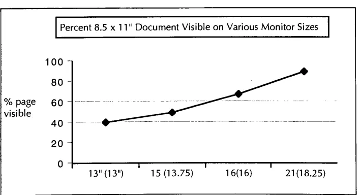
use.The
graphbelow
illustrates
the
difficulty
ofviewing
an8.5"
x
11"
page on a
standard monitor:
Percent
8.5
x1 1
"Document Visible
onVarious Monitor
Sizes
100
80
%
page60
visible40
20
0
1 T13"
(13")
15(13.75)
1 6(1
6)
21(18.25)
Fig. 1
Percent
page visible of an8.5"
[image:16.613.135.487.459.651.2]Background
andSignificance
HISTORYOF PORTABILITY
For
years computers of all platformshave
been
ableto
indirectly
exchangeASCII
(American Standard Code for Information
Interchange)
encodedtext
information
through telecommunication
networks.ASCII has only
ninety-five printable characters, limited
formatting
ability,
and no supportfor
graphics.2Documents
are pre
pared
in
one standardfont
and cannotinclude
charactersbeyond
the
standard ninety-five,
making
transmission
oftables,
formulas,
anddata in foreign languages
quitedifficult.
Using
portabledocuments
in
place ofASCII
removes allthose
limitations.
Spreadsheet
data,
graphs,
any font
andany image
canbe
directly
incorporated into
the
document. If
compressionoptions are usedeffectively,
the
size of a portabledoc
ument-including images
and embeddedfonts-need
notbe
drastically
larger
than the
same
document
createdin
ASCII.
With
the
introduction
ofthe
PCExchange
extensionfor
Macintosh,
Macs
candirectly
communicate withPCs
in
waysbeyond
the
simpletransfer
ofASCII
infor
mation.
The
extension allows aMacintosh
to
recognize aPC-formatted
floppy
disk
and read certain
file
types
in
Macintosh
applications.Even
so,
this
interchange
occurs
only in
onedirection
andin
alimited
capacity.3Not
all
document
types
canbe
translated,
fidelity
in
formatting
is
notguaranteed,
andthe
effects offont
substitution
cannotbe
anticipated.CHANGES IN INFORMATION ACCESS
The
explosion ofthe
personalcomputer market andgrowing
public and commercialuse of
the
Internet
have greatly
changed our accessto
information. In
minutes wetickets
on-line,
orsee museum collectionsdisplayed
on-screenin
our ownhomes. It
is
nolonger
necessary
to
open abook
to
learn how
a computer program works.On
line databases
andhypertext links
cantake
usto the
exactparagraphwe needwithinseconds.
There
has been
somediscussion
aboutpublishing
mainstream magazinesin
electronic
form-specifically
in
the
portabledocument format. Instead
ofdistributing
magazines
throughout
offices,
acompany
would purchase alicense
to
distribute
anumber of electronic copies
from
a server.Libraries
couldplace periodicals on-lineinstead
of onthe
shelves.4For
this
propositionto
be
truly
practical,
however,
a radical redesign
in
a magazineslayout
andtypography
is
necessary.If
an on-screendoc
ument
is illegible
and awkwardto
navigate,
the
possibility
of widespread acceptancewill
be low.
A
recentGartner
Group
report stressesthe
emerging
importance
ofthe
client/server environment
in
electronicpublishing.5The
proliferation of networks
provides aconvenient
way
for
members oforganizationsto
communicate with eachother.
Aside from
e-mail-anASCII-based
operation-theflow
ofdocuments from
oneuser
to
anotheris
stillhardware
and softwaredependent. While
networks allowusers
to
exchangeinformation
freely,
which cangreatly increase
productivity,
anincompatible
file
is
useless.Until
allhardware
and software arecompatible,
there
must
be
away
for documents
to
travel
between
computer platforms.One
ofthese
ways can
be
through the
use ofportabledocuments.
Document
portability
programs are atthe
forefront
ofinformation interchange
in
the
evolving
world of computing.Their
ability
to
presentadocument
asit
originally
appearedin any
application,
using
any
formatting
andany
computer systemoffers an edge no other
technology
has. But
to
optimizethis
advantage,
certain stanReasonsfor
Interest
Document
portability
is
animportant emerging
technology,
onethat
will changethe
way
people communicatein
their
personal and professionallives.
Society
has
become dependent
onvisual communication and as more and more people usepersonal computers
to
accessinformation,
it
mustbe
presentedin
waysthat
meet expectations.Portable documents
provide atremendous
breakthrough
in informa
tion
interchange.
One
can create adocument
in
any
application on aUnix,
Macintosh,
DOS
orWindows-based
computer and readit
in any
ofthose
environments with
its
fonts, formatting,
and graphicsintact,
providing
avisually
attractive alternativeto
traditional
methods ofexchanging
electronicdata.
As
the
useof portabledocuments has
grownin
popularity,
few developers have
recognized
the
differences between
the
media,
that
design
elements effectivein
printmay
nottranslate
wellto the
computer screen.While
the
documents
they
createmay
be
visually
attractive,
the text
is
oftenillegible.
The
immediate
access offeredby
electronic
documents
canbe
more convenientthan traditional
texts,
but
only
whenthe
documents
aredesigned
to
be
readon-screen.CURRENT USE
Apple,
the
computermanufacturer,
produces amonthly
newsletter,
"Information
Alley,"
in
format
that
is
availablefree
of chargefrom
their
Internet
server.While
the
information
included in
the
newsletteris
useful andits
appearanceis
eyecatching,
it is
noteasy
to
read.At
twenty
pagesin
length-with
several graphics and a gooddeal
ofcolor-itis doubtful many
readers will outputthe
document
ontheir
personal printersin
orderto
readit.
Yet
the
developers
insist
onusing
an8.5"
x
11"
Making
the
document
portable sothat
any
user can readit
with allthe
originalformatting
intact
is
a wisepublishing decision.
However,
ignoring
the
mediumin
which
the
document is
viewedis
a problematic oversight.Not only is it difficult
to
navigate
through,
in
placesit is
simply illegible.
PSINet
supplies ato
subscribers oftheir
Internet
access services.
The document
uses ahorizontal
11"x
8.5"
layout. While
the
orientationis
correct,
the
size ofthe
pagesis
still muchtoo
large for full-screen display. In
addition,
the type
is
avery thin,
condensed10-point,
there
are nonavigationaltools,
andthe
document
is
overfifty
pageslong. It
is completely impractical
(See Appendix A).
Portability
programs shouldsucceed,
if only
because
they
areeasy
to
use.Creating
a portabledocument
is
no moredifficult
than
sending
afile
to
a printer.Distributing
information
electronically
is
cheaper(and
in many
casesfaster)
than
printed material.
Portable documents
canbe
morelegible
and attractivethan
ASCII
text, any
electronicdocument
canbe
madeportable anddocument
portability
programs
break
down
the
barriers
setin
placeby
incompatible
computerformats. But
if
portable
documents
aren't createdaccording
to
a set ofdesign
standards-and usersfind
them
difficult
to
read orto
navigate-thetechnology
will not catch on.The
ability
to
exchangeinformation openly
between
computerplatformsis
to
everyone'sadvantage.
With
a set of standardsdesigned
to
enhancethis
ability,
the
technology
Endnotes
for
Chapter
1
*
Dillon, Andrew,
et al."The Effects
ofDisplay
Size
andText
Splitting
onReading
Lengthy
Text From
Screen,"vol9
no3,
Behaviour
andInformation
Technology,
May
1990,
p.215
gives asummary
oftwo
reading
comprehension studiessupporting
this
statement.2
Xenakis,
John
J. "Arrivederci
ASCII,"Information
Week,
February
25, 1991,
p
14
^
While
peripherals such as
Macintosh
cardsfor
the
PC
andPC
cardsfor
the
Macintosh
areavailable,
they
are quite expensive and notwidely
used.^
For further
information
see
P.
N.
Smith,
et al."Electronic
Publishing
withAcrobat:
the
CAJUN
Project,"Proceedings
of
the
International
Conference
onElectronic
Publishing,
Document Manipulation
andTypography,
vol6
no4, 1993,
p
481-494
-*
Gartner
Group,
"Integrated Document Output 8c
Management,"Gartner
Group
Chapter 2
THEORETICAL
BASIS
AND
REVIEW
OF
LITERATURE
For
many
centuries printedtext
documents have
maintained a consistentform
and style.From
the
Gutenberg
bible
to the
pagesofMacWorld,
information is
presentedin virtually
the
same manner.1In
mostlegible
documents,
text
is
arranged on a verticalpage,
surroundedby
margins and graphicsin
away
that
is easy for
a readerto
digest.
As
we moveinto
the
electronicage,
the
definition
of a pagechanges,
and so mustthe
way
textual
information
is displayed.
A large
body
of research wasdeveloped,
mostly in
the
1980s,
concerning
the
relationship
between
electronically
displayed
text, reading
speed and comprehension.Most
ofthese
studiesillustrate
the
difference between
printedtext
andtext
on a videodisplay
terminal.
Unfortunately,
scientists are nottypographers
and mosttypographers
are not scientists.Many
elements often considered obviouswhendetermining
legibility-such
as optimaltype
style, size,
andleading-were
notfactors
in
mosttesting
processes.LEGIBILITYAND COMPREHENSION STUDIES
In "The Visible
Word,"(1969)
Spencer conveniently
analyzes significant print-basedlegibility
studies,
from
the
mid-17thcentury
to
the
1960s.
Based
on several comprehensive
studieshe
summarizes:Words
setentirely
in
capitals areconsiderably
less legible
than
wordsin
lower
case.
Italics
reducelegibility,
but
providedthe
counters ofthe
letters
areopen,
bold face does
not.Semi-bold
types
are preferredby
many
readers. . . .Excessively
long
lines
cause asharp increase in
the
numberofregressions[backtracking]. Short
lines,
onthe
otherhand,
increase
the
numberoffixa
tion
pauses. . . .Leading
permitsline length
to
be
extendedwithoutloss
oflegibility.
. . .Unjustified setting does
notdecrease legibility.
2
He
also notes:The
most reliableinvestigations
all showthat the
commonertype
sizes,
9
to
12
point,
are ofaboutequallegibility. Larger
sizes reducereading
efficiency. ...
In
their
pursuitof optimaltype
sizemany
researchers seemto
have
disregarded
the
influence
ofreading
distance:
a12
pointtype
read at18
inches
is
the
equivalent ofa10
pointtype
at15
inches.3This
is particularly
relevant,
considering
most users viewtheir
computer monitors ata
distance
of18-24
inches.
There
is
nodiscussion
aboutthe
legibility
oftype
styles,
for
example serif versus sans serifWith
abasic
set of parametersin
placefor
creating
legible
printedtype,
a similarunderstanding
oflegibility
in
on-screenviewing
is
necessary.In
1987,
Gould,
etal,
found
that
despite
many
earlier studiesto the
contrary,
including
one ofhis
own,
reading
from
monitors canbe
asfast
asreading
from
paper:The
explanation centers onthe
image quality
ofthe
characters.Reading
speeds equivalent
to those
on paper occur onCRT displays containing
character
fonts
that
resemblethose
on paper(rather
than
dot
matrixfonts,
for
example),
that
have
apolarity
ofdark
characters on alight
background,
that
are anti-aliased(i.e.,
containgrey
level),
andthat
are shown ondisplays
withrelatively
high
resolution.4Previously,
studieswere conducted on monitorswithpositivepolarity,
or coloredtype
(usually
orange orgreen)
on ablack
background,
withlittle
regardto
fonts, leading,
those
commonly
usedtoday; anti-aliasing
of charactersis
implemented
by
Adobe
Type Manager
and most monitorsdefault
to
black-on-white,
or allowthe
userto
choose
the
colors usedfor display.
Document
portability
programshave fixed
maximum page sizes.Unlike
mostapplications
that
display
ASCII
documents,
document
portability
programsdo
notpermit
the
userto
continuously
scrollthrough
lengthy
files.
This limitation is
notnecessarily
adeficiency.
In
1983,
Schwartz,
etal,
studied user responseto
scrolling
and
paging in
electronicdocuments. It
wasfound
that
novice users preferpaging,
though
with experiencedusersboth
methodsproduced similarresults.6In
asimilar
study,
Mills
andWeldon
(1985)
found
no quantitativedifferences
in
the two
viewing
methods.7
Related
studies show
that
readers"establish
a visualmemory for
the
loca
tion
ofitems
within a printedtext
based
ontheir
spatiallocation both
onthe
pageandwithin
the
document."8This is
animportant
consideration whencreating
lengthy
text
documents. Readers increase
comprehensionby
remembering informa
tion
based
onits
spatialrelationship
to
other elements on apage.Such
arelationship
is
.difficultto
createwhenscrolling
through
information.
Dillon,
et al(1990)
studiedthe
effects ofdisplay
size andtext
splitting
on reading
comprehension.Testing
was carried outusing
ajournal
article with an approximate
line length
ofeighty
characters ontwo
different
monitorsizes-twenty
(stan
dard)
andsixty
(similar
in
sizeto
A4
paper)
lines
perscreen.There
was nota significant
difference in
comprehensionbetween
the two.
The
effects oftext
splitting,
ordividing
sentences,
were more apparent.Subjects
tested
withtext-split
documents
were
twice
aslikely
to
flip
between
pages.9Viewing
text
on-screendoes
not providethe
readerthe
luxury
ofeasily returning
to
previous sections.Eliminating
sentencebreaks
reducesthe
necessity
ofturning
back
pages,
and shouldbe
considered whendeveloping
text
for
on-screen use.Galitz
(1993)
gives alist
ofrecommendationsfor presenting
type
on videodis
plays:
Include no more
than
40-60
charactersperline
-A
double
column of30-35
characters separatedby
5
spacesis
alsoacceptable;
Do not
right-justify;
Separate paragraphs
by
atleast
oneblank
line;
Usepaging (not
scrolling).10Concerning
typefaces
he
states,
"Generally,
sans seriftypefaces
are recommendedif
the type
is
less
than
8
pointsin
size ... orif
the
display
environmentis
less
than
ideal."11
His
assertionis
notdocumented.
However,
in
Kingston
(1995)
subjects preferred Palatino
(serif),
followed closely
by
New York
(serif)
andGeneva
(sans
serif).Kingston
found
18-point
type to
be
the
favored
type
size,
though this
would seemrather
impractical
for
lengthy
text
documents.12Based
onthe
literature it
seems evidentthat
for
portabledocuments
intended
for
on-screen use
to
be
effective,
they
mustbe
specifically
designed for
that
medium.DIGITAL TYPE
Well-designed
screenfonts
are anintegral
part ofdeveloping
legible documents for
digital display. The first
typefaces
designed for
computeruseweredeveloped along
with
the
computer,
in
the
1940s.
It
was not untilthe
1960s,
withthe
introduction
of8-bit
computers,
that
both
upper andlower
case characters couldbe
usedin
adigital
font.
But
text
wasdisplayed
as a series ofdots,
forced into
shapeby
the
limitations
ofthe
display
medium.It
was not untilthe
introduction
ofthe
graphical userinterface,
allowing
for
afully
addressable screenarea,
that
type
was ableto
appearin
a widevariety
ofdesigns
andweights on-screen.Inkjet
andlaser
printersfurther
contributed
to the
development
ofdigital
type
by
providing
an outputdevice
capable ofproducing
high
resolution,
low-cost
results.Over
the
pastdecade,
asthe terminal
was replacedby
the
graphics-baseddesktop
computer,
anentirely
new medium wascreated,
replacing
paper asthe
ultimatedes
tination
ofthe
materialdisplayed
on-screen.According
to
Kahn,
et al:"The
infor
mationon
the
screenis
nolonger
a surrogatefor
the
realinformation
onthe
printed page.The
surface ofthe
computer screenis
the
page.The
screenfonts
are nolonger
the
approximation ofthe
type
ourreaderswill see-these screenfonts
arethe type
we must useto
communicate ourideas."13To be
effective,
digitally-displayed
type
must approachthe
legibility
oftype
onthe
printed page.The Lucida
family
oftypefaces,
designed in
the
mid-1980sby
Charles Bigelow
andKris
Holmes,
wasthe
first full
type
family
designed
specifically
for low-resolu
tion
devices. Lucida
is
described
as a"font-independent
design."
Based
on a mathe matical analysis ofhighly
legible
typefaces,
the
elements ofthe
letterforms
weretuned
specifically
for
low-resolutiondevices
before
the
design
or style ofthe
letters
wasintroduced.
Font bitmaps
werehand
editedto
conformto the
limitations
ofthe
display
devices,
specifically
CRT
screens andlaser
printers."Font-independence"
simply
meansthe
principles usedto
design Lucida
areprimarily
dependent
onmathematics,
not a specific artistic style.The
authors".
. . soughtto tune the
letter-forms
ofLucida
to
digital
image
processing
and reconstruction."14Bigelow
and
Holmes
identified
seven critical areasthat
couldbe
tuned
to
optimizeit
for low
res olution use.Weight
refersto
the
ratio of stemthickness
to the
x-height ofa character.Most
popular
typefaces
have
a weight ratiobetween 5:1
and6:1,
with ahigher
ratio producing
a moredelicate font.
A
common problem with screenfonts
is
"rounding
off"
of
the
characterweight whenthe
ratiofalls between
the
boundaries
ofpixels.Rounding
up
adds apixel and causes afont
to
look
too
bold,
whilerounding down
can result
in
the
loss
ofsmalldetails. Lucida has
a weight ratio of5.5:1,
whichreduces
the
margin oferrorin
displaying
fonts
at smallersizes andlower
resolutions.Contrast is
the
difference between
the
thick
andthin
elements of a character.Low
contrasttypefaces
appearsturdy
and aregenerally
easierto
read.Thin
joins,
serifs and
hairlines
tend
to
erode orexpanddisproportionately
underpoor conditions.
A
contrast ratio of2:1
for
the
basic Lucida designs
was chosento
increase
leg
ibility
andto
preventthe
charactersfrom
"breaking
up."
Join
placement
describes
the
way in
whichdifferent
elements of aletterform
join,
or
how
the
serifs,
stems andbowls
cometogether.
For
Lucida,
the
join
was placedrelatively
deeply
in
the
stems,
sothat
any
filling
in
would notcompletely
concealthe
shape of
the
counterform,
orthe
white spacebetween
two
adjoining
elements.The
size and shape ofthe
serifs are animportant
consideration.Serifs
that
aretoo
small willtend
to
"round
down" anddisappear,
whilelarger
serifsmay
expandandoverpower
the
design
of a character.At
higher
resolutions complexserifshapesmay
resultin
much greaterfile
sizes as well aslonger processing
times.
Lucida has
short,
polygonalserifsthat
canaccurately
be
represented as vectors athigh
resolutions,
yet round offto
slab serifs atsmallersizes withoutappearing
too
heavy.
Much
of whatdetermines
the
easewith which atypeface
canbe
readlies in
the
way
the
letters fit
together.
Consistent
fitting
aswell as aharmonic balance
withthe
counters,
or white spaces withinthe
letters,
plays a majorrolein
typeface
legibility.
An
ideal
fit
is difficult
to
achievein
low
resolutiondevices,
because rounding
offforces
charactersinto
unintendedpositions.Regular,
openspacing
was usedfor
Lucida
to
increase
the
probability
ofharmonic display.
Capital height
describes
the
height
of uppercaseletters in
relationto
x-height.In
low
resolutions,
uppercaseletters
often overpowerthe
lowercase,
according
to the
authors,
"for
retrograde reasonsleft
overfrom
monocaseterminals
andprinters."15Their
apparent size and abundanceofstemstend to
roundup,
adding increased
emphasis
especially
at smaller sizes where adifference
of one pixelis
noticeable.To
reduce
their
prominence,
Lucida
capitals areslightly
shorterthan
the
height
ofthe
ascenders.
A
weightratio similarto
the
lower
case waschosen,
as wellas narrowerproportions,
to
lessen
the
effectfurther.
The height
ofthe
lower
casex,
orthe
x-height,
holds
mostofthe
information
communicated
to
areader.As
aresult,
the
complex middlesections oflower
caselet
ters
require greaterresolutionthan the
ascenders anddescenders.
A large
x-heightgives
the
appearance of alarger
font,
as moreinformation
canbe
relayed withinthat
area relativeto the
actual size ofthe
font.
However,
there
is
an upperlimit
to
the
size ofthe
x-height;
anexcessively
large
x-height can reducethe
size ofthe
ascenders
anddescenders
to
such adegree
that
they
are nolonger distinctive. Characters
such as "n" and "h" and "q" and "g"
can
be
confused,
gready
affecting
legibility.
The
x-height of
Lucida
is
52%
ofthe
body
size.This
proportion allows enoughspacefor
detail
withinthe
lower
caseletters,
withoutreducing
the
significance ofthe
ascenders
anddescenders.16The
growth of multimedia applications and personal computer usehas dramati
cally increased
the
demand for CRT-optimized fonts. Harold
Grey
ofthe
International
Typeface Corporation
states,
"We
get alot
ofrequestsfrom
softwaredevelopers
whowantto
use one ofourfonts for
either on-linedoc[ument]
distribu
tion
orCD-ROM
distribution."
While ITC
is
often criticizedfor producing fonts
with
large
x-heights,
he feels
this
growing design
trend
makesITC faces
"quite
goodfor
on-screenreading."
Defining
characteristics ofthese
fonts
arethe
widerfont
width,
greaterx-height,
rounded openbowls
and shorter ascenders anddescenders.
While
the
fonts have
notbeen designed specifically for
usewithmonitors,
as wasLucida,
their
suitability for
suchuseis
intentional.17THE PORTABLE DOCUMENT FORMAT
The
(Portable
Document
Format)
file
"language"is
animportant factor
in
this
study.
It is
whatmakesAcrobat documents
portable.Though
not atrue
computerlanguage,
PDF is
modeled afterthe
Postscript language
and uses a geometric coordinate system
to
describe
apage andits
composite elements.This
resultsin
resolutionand
device independence. Images
and graphics canbe
incorporated into
adocument
much
in
the
sameway
they
areincluded in
any Postscript
file.18As
a resultofAdobe's
effortsto
makethe
Portable Document Format
a standard,
files
canbe
viewedby
any
user,
withoutthe
needto
purchaseany
specialsoftware application.
The "Acrobat
Reader"
is
aviewing
applicationavailablefor
DOS,
Windows,
Macintosh
andUnix
that
is included
withmany
new softwareapplications.
It
can alsobe downloaded from Adobe
attheir
Internet
site.19The
Reader
allows usersto
view and navigatefreely
through
any PDF document.
Creating
aPDF document
canbe
aseasy
assending
afile
to
aprinter-easier,
actually,
because
the
userdoesn't
even need a printer.The
processis
similarto
creating
aPostscript
file;
instead
ofproducing hard
copy,
the
(a Chooser
extensionor printer
driver)
creates aPDF file.
This
file
is
immediately
availablefor
viewing
onany
systemwith aninstalled
viewer,
eitherAcrobat
Reader
orAcrobat Exchange. Additional
functionality,
such ashypertext links
and automaticzoom,
canonly
be
addedin
the
Exchange
program(which
is
notfree)
but any
addedFonts
areincorporated
into
PDF documents
by
three
different
methods:full
embedding,
selectiveembedding
and no embedding.Embedding
is
accomplishedby
including
font
matrixinformation
as part ofthe
description. Matrix
information
is included
only
for
the
individual
charactersused,
notthe
entirefont.
If full embedding is
chosen,
afont
matrixfor every
characterin
adocument is
included. While
this
ensuresthat
aPDF file
willlook
exactly
like
the
original,
it
greatly
increases
the
size ofthe
file. Selective embedding
allows adeveloper
to
choose specific
fonts
to
embed.It is
usefulwhenthe
end-user'sfont
library
is
known,
orif
adocument
contains system andnon-systemfonts,
such as atrademark
typeface.
A document
with noembedding
relies onthe
userhaving
the
fonts
usedin
the
document
installed in
his
orher
system.If
a userhas
afont
installed,
the
reader will access
that
font
whendisplaying
the
portabledocument. If
afont
is
notavailable,
two
multiple masterfonts
suppliedwiththe
interpolate
the
information
anddisplay
afont
asaccurately
aspossible,
based
on arudimentary
"font
description"included
with eachdocument.
The
multiple masterfonts
sometimes
produceillegible
results,
hence
fidelity
withthe
originaldocument
cannotbe
assured.
They
are assistedin rendering
by
a mini-version ofAdobe Type Manager
(also free).
One
strength of electronicdocuments
is
their
ability
to
be
accessedby
multipleusers andviewed
from
a server ordownloaded
to
anindividual
computer over anetwork.
Because
a networkis
often aninformation
bottleneck,
several compressionoptions are available
for
documents.
Because
portabledocuments
are noteditable,
mostdocument
portability
programs support
annotation,
generally
in
the
form
of electronic "sticky-notes."Users
can add comments
to
documents,
similarto
writing
in
the
margins ofprinted pages.Text
canbe
copied andpastedinto any text-editor, but font
andformatting
informa
tion
is
lost.20Most
programs also allow usersto
copy
graphics,
whichby
using
the
same
tool
text
canbe
madeinto
a graphic.It
then
retains allformatting,
but is
nolonger
editable.For
the
purpose ofthis
study,
the
most relevantfeatures
of portabledocuments
include
their
ability
to
retain allformatting
ofthe
original,
remainfully
searchable andsupport
hypertext
links,
allowing
a userto
immediately
accessthe
exactinformation
he
or she needs when
reading
through
lengthy
text
on-screen.ERGONOMICS
The
effectsof extended computer use onthe
human
body
must alsobe
consideredwhen
assessing
the
value ofproperly
designed
portabledocuments. Numerous
studieshave determined
that
spending
hours
in
front
of a computeris
extremely
taxing
onthe
body.
Eye
strain,
neck and shoulder aches and repetitivestressinjuries
all resultfrom
staring
atthe
monitor,
pounding
onthe
keyboard,
andsitting in
one positionfor hours
on end.
Documents appropriately
preparedfor
monitorviewing
couldhave
animpact
on
reducing
someofthe
stresses associatedwith computeruse.21Endnotes
for Chapter
2
1
McLean,
Ruari. The Thames
andHudson
Manual
ofTypography.
(London:
Thames
andHudson,
1980)
p.47
^
Spencer,
Herbert. The
Visible Word.
(New York: Hastings
House,
1969)
p.55
3
Spencer,
1969.
p.35
4
Gould,
John D.
et al."Reading
from CRT Displays Can Be
asFast
asReading
from
Paper," vol29
no5,
Human
Factors,
1987
p.497
~*
Two
such studies are:Gould,
J. D.
andGrischkowski,
N.
"Doing
the
Same Work
With
aCRT
Terminal
andWith
Hardcopy,"
Proceedings
of
the
Human Factors
Society
26th Annual
Meeting, 1983,
p.165-166
andKak,
A.
V.
"Relationships
Between
Readability
ofPrinted
andCRT-Displayed
Text,"Proceedings
of
the
Human Factors
Society
25th Annual
Meeting, 1981,
p.137-140
Schwartz,
Elmar
et al."A Comparison
ofPaging
andScrolling
for
Changing
Screen
Contents
by
Inexperienced
Users,"vol25
no3,
Human
Factors, 1983,
p.
279-282
'
Schwartz describes
this
study in
vol25
no3,
Human
Factors,
p.279
Dillon, Andrew,
et al."The Effects
ofDisplay
Size
andText
Splitting
onReading
Lengthy
Text From
Screen,"vol
9
no3,
Behaviour
andInformation
Technology,
May
1990,
p.215
gives asummary
oftwo
reading
comprehension studiessupporting
this
statement.9
Dillon,
1990
p.226
10
Galitz,
Wilbert.
User-Interface Screen Design.
(Wellesley,
MA: QED
Publishing,
1993)
p.109
nGalitz,
1993.
p.252
-^
Kingston,
Kenneth.
Standards
andGuidelines
for
Aesthetics in Design
andTypography
for Interactive
Multimedia
Programs.
Master's
Thesis,
Rochester
Institute
ofTechnology,
1995
-^
Kahn,.
et al."Typography
for
the
Computer Screen:
Applying
the
Lessons
ofto
Electronic
Documents,"
Seybold Report
onElectronic
Publishing,
July
5,
1993
14
Bigelow,
Charles
andHolmes,
Kris
"The Design
ofLucida:
anIntegrated
Family
ofType for Electronic
Literacy"
in EP86: Text
Processing
andDocument
Manipulation,
J.C.
vanVliet,
ed(Cambridge: Cambridge
University
Press,
1986,
p.6).
I-5
Bigelow
and
Holmes,
p.12
1"
A full
description
of
the
process andreasoning behind
the
design
ofLucida
canbe found
in
EP86,
p.1-17.
1'
Grey,
Harold. Personal
communicationswiththe
author,
September
1995.
*
Bienz,
Tim
andCohn,
Richard.
Portable Document Format Reference Manual.
(MenloPark,
CA:
Addison-Wesley Publishing
Company,
1993)
*"
Adobe's Internet
addressis
http://www.adobe.com
^
supports
Rich
Text
Format
(RTF)
which should allow a copieddocument
to
retainformatting; however,
as of11/2/95
I have
notbeen
ableto
implement it.
21
Gendron,
Marie. "Labor
Dept: Workplace
stressillnesses
skyrocket,"
The Boston
Herald,
Second
Edition,
December
22,
1994.
See
alsoSheedy,
James."
VDT's
andVision Complaints:
A
Survey,"vol
8
nos4-5,
Information
Display,
April,
1992,
p.
20-23;
Bureau
ofNational
Affairs,
"OSHA's Draft Ergonomics
Standard,"Daily
Labor
Report,
March
21,
1995
Chapter
3
HYPOTHESIS
If
documents
areoriginally
designedfor
printed output,
then
they
mustbe
reformattedto
be
effectivefor
on-screen viewing.The fundamental deficiencies in
today's
portabledocuments lie
withdevelopers
failing
to
identify
the
differences
encounteredin viewing
adocument
on-screen andviewing it
on paper.This
study is
concerned withthe
creation ofeffective portabledocuments
for
on-screen use.Page
sizes andfont
choicesplay
amajor rolein
the
legibility
of adocument;
it is
the
goal ofthis thesis to
determine
whetherthrough
simple
reformatting
procedures,
carried outin
areasonable amount oftime, it is
possible
to
customize adocument
for
effective use on a computer monitor.Chapter
4
METHODOLOGY
Legibility
and comprehension arevery
complex areas of study.It
is
impracticable
to
test
allthe
elementsthat
affectthe
legibility
of adocument. But
the
basic
rules oftypography
anddesign,
as outlinedby
Tinker
andSpencer,
shouldapply
to
any
medium.
The
two
factors
that
most affectlegibility
in any
document,
pagedesign
andtypog
raphy,
areparticularly important
for
portabledocuments.
The low
resolution ofthe
monitorand
it's
non-standard"page"
size create specialproblems and
limitations
that
do
not existin
traditional
publishing.The
experimentsin
this
study
weredesigned
to
identify
how
these
elements canbe
usedto
improve
the
effectiveness ofportable
documents.
PRELIMINARYEXPERIMENTATION
A
preliminary
experimentwas carried outto
determine
whattypography
anddesign
elements
currendy
usedin
portabledocuments have
an effect-positive ornegative-on viewers.
Fifteen
respondentswere presentedwithfive
portabledocuments
representativeof
those
currently
published onthe
Internet
and anintroduction designed
by
the
author
based
onthe
principles outlinedin
Chapter
2,
Theoretical
Bases
andReview
of
Literature
(See Appendix A). All
respondents werefamiliar
with portabledocu
ments,
but
nonehad
significantexperienceviewing
them.
Respondents
were askedto
fill
outa questionnairedesigned
to
identify
the
agreeable anddisagreeable
typo
graphic and
design
elementswithin eachdocument
The
results ofthis
experiment,
outlined
in Appendix
B,
determined
the
how
the
document
in
the
second experiment was
formatted.
SETTING STANDARDS
The
preliminary
experimentpinpointeddesign
elements andlegibility
issues
that
most affect a
document
ssuitability
for
on-screen use.Based
onthese
findings,
the
author applied
those
elementsto
anexisting document
originally
intended for
print,
for
the
purpose ofcustomizing it
for
on-screen useusing
the
standardsidentified in
the
first
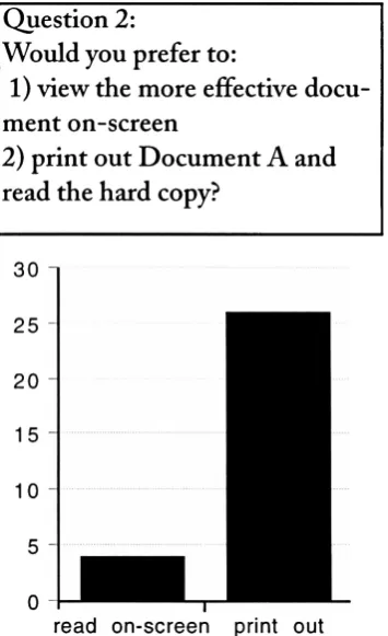
experiment.FINALEXPERIMENTATION
The final
test
determined
if
the
reformatting
procedures were effective.Thirty
respondentswere presentedwith
both
the
original andthe
reformatteddocument
and
then
asked whichwas more effectivefor
on-screen use.They
were also askedwhether
they
preferredto
usethe
document
on-screen orin
its
originalprintedform.
Detailed
results ofthis
test,
aswell asthe
questionnaire,
are shownin
Appendix
D.
Equipment Used
Power
Macintosh 7100/66
Apple
Multiscan
15"
monitor
(640
x480
pixels)
Adobe
Acrobat
Exchange,
Distiller,
andReader
QuarkXpress
Internet account
Method
ofEvaluation
The
truth
ofthe
hypothesis is determined
by
the
responses ofthe
individuals
taking
part
in
the
study.Chapter
5
RESULTS
OF
THE
EXPERIMENTATION
The
results ofthe
three
experiments usedin
this
study
are outlinedbelow. Further
details
ofeach as wellasthe
specifics ofthe
documents
tested
canbe
found
in
the
appendices.
Results
of
the
Preliminary
Experiment
The
tables
below
outlinethe
results ofthe
preliminary
experimentation.This data
was collected
to
reconfirmthe
findings
of previouslegibility
studies conductedby
avariety
ofscientists,
asdiscussed
in
Chapter
2.
In
addition,
the
study
was usedto
determine
whetherthose
findings
apply
to
portabledocuments,
andto
identify
elements specific
to
portabledocuments
that
usersliked
ordisliked.
The data
wasthen
used
to
createthe
secondtest,
Optimizing
aText Intensive Document for
On-Screen Display. The
questionnaire usedin
the
preliminary
experiment as well asmore
detailed
results canbe found in Appendix B.
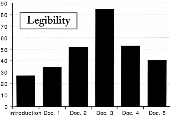
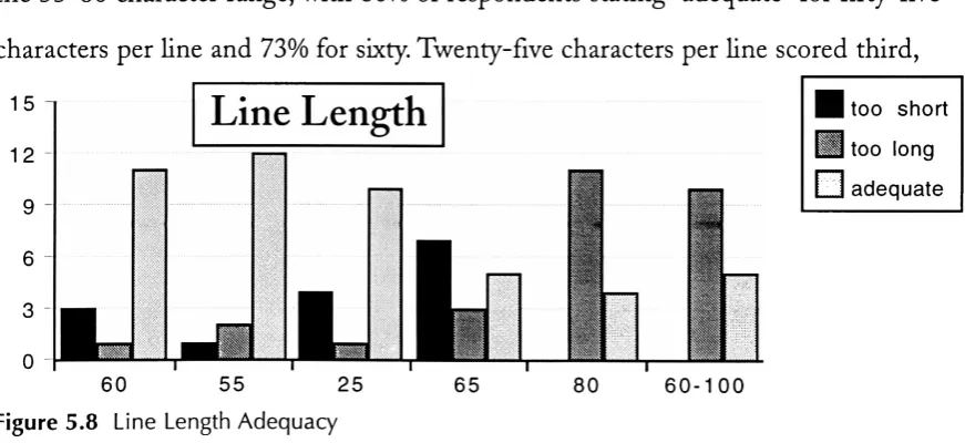
OVERALLLEGIBILITY
Respondents
wereaskedto
view six portabledocuments
and ratethe
effectivenessofthe type
face,
type
size,
leading,
line
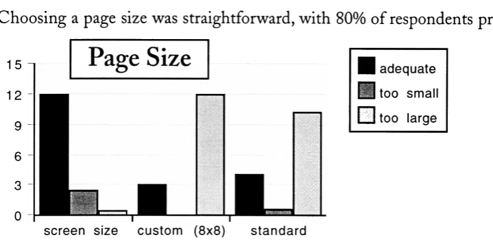
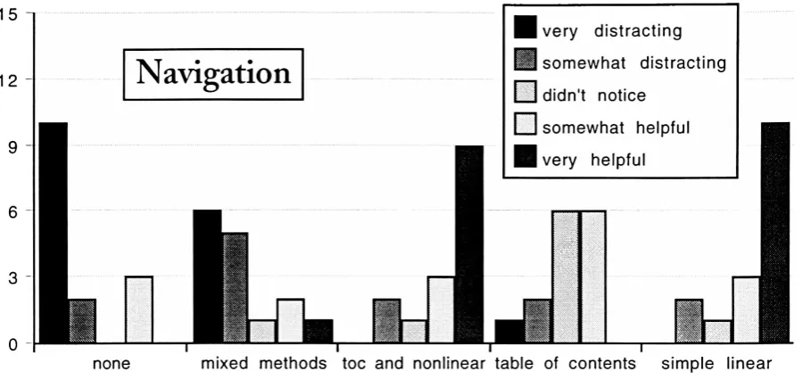
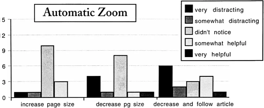
length,
pagesize,
andnavigationaltools
usedin
each.
After
viewing
the
sixdocuments
independently,
respondentswere askedto
ratethe
documents
overallfrom
1-6,
onebeing
the
mostlegible,
sixbeing
the
least.
The
best
possible scorewasfifteen,
the
worst ninety.The
results ofthese
overall ratingsLegibility
90
80
70
60
50
40
30
20
10
0
[image:39.613.149.451.82.292.2]introduction
Doc.
1
Doc.
2
Doc.
3
Doc.
4
Doc. 5
Figure 5.1 Overall
Legibility
are shown
in
Figure
5.1,
withlower
numbersindicating
higher legibility.
The
resultsof
the
studies oudinedin
Chapter
2 indicate
that
legibility
is
notdetermined
by
oneindividual
factor
but
severalfactors
in
combination.Thefollowing
tables
illustrate
the
individual
results of each elementtested
in
this
experiment.The highest scoring
elementwithin each
category is
notnecessarily
the
most effective whencombinedwithothers,
althoughin
generalthe
highest
scores were receivedby
elementsthat
makeup
the
best
scoring
documents
overall.In
somecases,
two
or moredocuments
share similar
elements;
the
resultsofthose
questionswere averagedonly
for
those
elements.TYPEFACE
Percentage
ratingsfor
allprimary
text typefaces
usedin
the
test
documents
areshown
in
Figure 5.3.
Galliard,
Minion,
andLucida
alldisplay
the
elementsthat
make a
typeface
ideal
for
on-screenuse(see
Chapter
2,
Digital
Fonts)
and all scoredfairly
high. Minion is
separatedinto
two
categories,
highlighting
the
effecttype
sizehas
onlegibility.
Though
14-point
Minion
scored a100%
approvalrating,
12-point
Minion
14
Minion
12
Galliard
Courier Bold
Revue
Figure 5.2 Typeface
Legibility
Lucida
scored
only 67%.
Minion
was chosen asthe
maintext typeface
for
experimenttwo
based
onthe
results ofthis
test,
combinedwiththe
high
legibility
rating
overall ofthe
Introduction,
the
document
in
whichit
was [image:40.613.93.488.328.469.2]used.
Figure 5.3
Total Percent
ofRespondents
Stating
Legible
orVery
Legible:
Minion 14
100%
Lucida
73%
Minion 12
67%
Galliard
67%
Courier Bold
47%
Revue
7%
TYPE SIZE
The
resultsdetermining
ideal
type
size arelisted
here,
with an average scoretaken
for documents
that
containedthe
sametype
size.Fourteen-point
type
was selectedfor
the
secondtest
based
onits
high
adequacy rating
as well asthe
mix of"too
small" and
"too
large"
responses.
Results for 12-point
type
were split almostevenly
(53%
to
47%)
15
12
Type
Size
too
smalltoo
large
adequate10
pt12
ptFigure 5.4 Type Size
Adequacy
14
pt16
pt [image:40.613.94.458.561.692.2]Figure 5.5
Total Percent
ofRespondents
Stating
Adequate:
14
point16
point12
point10
point73%
60%
47%
0%
between
"too
small"and
"adequate."Ten-point
wasrated
unanimously
as"too
small."
The
anomaly in
the
resultsfor
16-point
type
are
likely
the
result ofrespondentsviewing
Docu