City, University of London Institutional Repository
Citation:
Wood, J., Beecham, R. and Dykes, J. (2014). Moving beyond sequential design:
Reflections on a rich multi-channel approach to data visualization. IEEE Transactions on
Visualization and Computer Graphics, 20(12), pp. 2171-2180. doi:
10.1109/TVCG.2014.2346323
This is the accepted version of the paper.
This version of the publication may differ from the final published
version.
Permanent repository link:
http://openaccess.city.ac.uk/id/eprint/3839/
Link to published version:
http://dx.doi.org/10.1109/TVCG.2014.2346323
Copyright and reuse: City Research Online aims to make research
outputs of City, University of London available to a wider audience.
Copyright and Moral Rights remain with the author(s) and/or copyright
holders. URLs from City Research Online may be freely distributed and
linked to.
City Research Online:
http://openaccess.city.ac.uk/
[email protected]
Moving beyond sequential design:
Reflections on a rich multi-channel approach to data visualization
[image:2.612.85.539.128.361.2]Jo Wood,Member, IEEE, Roger Beecham and Jason Dykes
Fig. 1. Bicycle flow visualizations at the Museum of London.
Abstract—We reflect on a four-year engagement with transport authorities and others involving a large dataset describing the use of a public bicycle-sharing scheme. We describe the role visualization of these data played in fostering engagement with policy makers, transport operators, the transport research community, the museum and gallery sector and the general public. We identify each of these as ‘channels’ – evolving relationships between producers and consumers of visualization – where traditional roles of the visualization expert and domain expert are blurred. In each case, we identify the different design decisions that were required to support each of these channels and the role played by the visualization process. Using chauffeured interaction with a flexible visual analytics system we demonstrate how insight was gained by policy makers into gendered spatio-temporal cycle behaviors, how this led to further insight into workplace commuting activity, group cycling behavior and explanations for street navigation choice. We demonstrate how this supported, and was supported by, the seemingly unrelated development of narrative-driven visualization via TEDx, of the creation and the setting of an art installation and the curating of digital and physical artefacts. We assert that existing models of visualization design, of tool/technique development and of insight generation do not adequately capture the richness of parallel engagement via these multiple channels of communication. We argue that developing multiple channels in parallel opens up opportunities for visualization design and analysis by building trust and authority and supporting creativity. This rich, non-sequential approach to visualization design is likely to foster serendipity, deepen insight and increase impact.
Index Terms—Movement visualization, visual analytics, bikeshare, impact, visualization models, design study.
1 INTRODUCTION
As the discipline of information visualization matures, we can recog-nise several attempts to reflect on successes and failures in order to abstract and generalize good practice and guidance. Such reflections have ranged in focus from visualization system design [37] to inter-action design [45], from visualization task taxonomies [46] to
visu-• Jo Wood, Roger Beecham and Jason Dykes are at the giCentre, City University London, E-mail: [email protected],
[email protected] and [email protected].
Manuscript received 31 Mar. 2014; accepted 1 Aug. 2014; date of publication 13 Oct. 2014; date of current version 19 Jul. 2014. For information on obtaining reprints of this article, please send e-mail to: [email protected].
alization objectives [49] and from abstractions of visualization archi-tectures [11] to abstractions of the process of reporting design studies themselves [43]. For good reason, most academic accounts focus on
an extended case study reflecting a four-year engagement with a par-ticular data-rich application area, we argue that considering broader issues of visualization design and use such as metaphor, trust, author-ity, storytelling, insight and engagement and the interactions between them, we can extend the notion of what constitutes a ‘design study’ and how we might best approach visualization design.
The main contributions of this work are twofold. Firstly, we offer a detailed conventional sequential ‘design study’ demonstrating how appropriate visualization design can lead to deep insight and impact in a policy making context (Section 2 and Section 4.2). Secondly we offer evidence that extending visualization design to use rich multi-channel engagement leads, though processes of intentional design as well as engineered serendipity, to more impactful and effective dis-course between producers and consumers of visualization (Section 4 and Section 5).
2 DATACONTEXT AND THEPROBLEMDOMAIN
Our focus is on a large dataset that contains personal information about individuals and their spatio-temporal travel behaviors. Very large and rapid increases in the availability, scope and precision of such data has brought many new opportunities for researchers working within the social and behavioral sciences [33]. In transport studies, a community with which we wished to engage, the advent of smartcard technolo-gies is the most obvious example. Although introduced as an effi-cient fare payment method, the data generated by smartcard systems offer a very complete historical record of demand on a public trans-port network [3, 9]. However, linking anonymized customer travel records, these data can be used to characterize and understand various aspects ofindividualtravel behavior [2, 32]. The emergence of recent, information-technology based public bikeshare schemes is another ex-ample. In a similar way that smartcards record ‘tap ins’ and ‘tap outs’ on major metro systems, third-generation bikeshare schemes contain technologies that allow a bicycle’s movement to be tracked and, as with smartcard data, this transactional information can be linked to individual customers.
We explore the roles visualization can play in engaging with the re-search and policy communities and the general public by considering a public bikeshare scheme that was introduced in London, UK in July 2010. The initiative, here referred to as the London Cycle Hire Scheme (LCHS), was modeled on the successfulVélibscheme introduced in Paris in 2007 and constitutes a major public transport project in cen-tral London. At the time of its launch, the LCHS comprised around 5,000 hire bicycles and a network of 315 self-service docking stations each with a capacity to store between 10-40 bicycles. It has since grown to over 700 docking stations and around 11,000 bicycles avail-able for use at any given time. Two major organisations are involved in managing and operating the scheme. Transport for London(TfL) is the local government body with strategic and management respon-sibility for public transport in London, including the LCHS. TfL have responsibility for the medium and long term running of the scheme, including its expansion, pricing and wider strategic perspective on en-couraging cycling in the capital. The logistics companySerco Group
have responsibility for the day-to-day operation of the scheme includ-ing managinclud-ing the communications infrastructure between the dockinclud-ing stations and the distribution and maintenance of the bicycles.
A key characteristic of the scheme that offers opportunities for analysis and visual exploration is the detailed digital record of its use. Three datasets in particular have been central to the visualiza-tion and analysis opportunities offered by the scheme. Firstly, a real-time record of every docking station’s status, including the number of bicycles currently docked and number of free spaces available, is gen-erated continually at 3-minute intervals, resulting in c.300m records generated between the start of the scheme and March 2014. Secondly, every journey made between an origin and destination docking station is recorded and timestamped along with theidof the user making the journey and the bicycle on which it was made. While the precise tra-jectory between each origin and destination is not known (although it can be modeled [59]), the accumulation of approximately 25m jour-neys by January 2014 provides a potentially valuable spatio-temporal
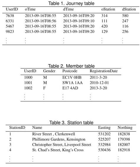
[image:3.612.312.549.128.410.2]picture of journey patterns. Thirdly, approximately 70% of journeys are made by ‘members’ who have registered in advance to use the scheme and so provide details about their home location and gender (via title and name). The structure of the data sources providing detail of where and when journeys are made and who makes them is sum-marized in Tables 1-3.
Table 1. Journey table
UserID oTime dTime oStation dStation
7638 2013-09-16T08:55 2013-09-16T09:20 314 580
6331 2013-09-16T08:56 2013-09-16T09:10 111 247
5467 2013-09-16T08:55 2013-09-16T09:20 420 116
9823 2013-09-16T08:55 2013-09-16T09:20 129 256
. . . . . . . . . . . . . . .
Table 2. Member table
UserID Gender Postcode RegistrationDate
1000 M EC1V 0HB 2011-3-20
1001 M SW1A 1AA 2010-12-01
1002 F E17 4AD 2013-3-20
. . . . . . . . . . . .
Table 3. Station table
StationID Name Easting Northing
1 River Street , Clerkenwell 531202 182838
2 Phillimore Gardens, Kensington 525207 179398
3 Christopher Street, Liverpool Street 532984 182007
4 St. Chad’s Street, King’s Cross 530436 182918
. . . . . . . . . . . .
These member records not only give population-level information about who is using the scheme, but can be linked to journey details to provide a very large, complete spatio-temporal profile of individual cyclists’ journeys. The detail and volume of these data is in contrast to most data sources used in studies of cyclists’ behavior, especially in studies that examine the factors that motivate and discourage cycling within cities [38]. Much of this prior work has involved commission-ing social surveys that ask respondents to recall their experiences and attitudes towards cycling [13, 18], but is vulnerable to self-selection and social-desirability bias [4, 5, 6].
While the LCHS data were not collected and distributed for any single purpose, there are a number of general challenges around the operation and management of the scheme for which they may be suit-able. These vary in theirtask clarity[43] but help to set the context of use and potential for visualization of these data to have impact:
• Day to day operation of the scheme should run smoothly ensur-ing there are sufficient bicycles distributed around the network and sufficient spaces to dock them.
• Intervention in the scheme, such as the redistribution of bicycles to keep the system balanced, should be as efficient as possible.
• What does use of the scheme tell transport planners and re-searchers about the influences on cyclists’ behavior in London and more widely?
• How can patterns of use of the scheme be used to assist in plan-ning for its expansion that meets demand and encourages ‘modal shift’ towards cycling?
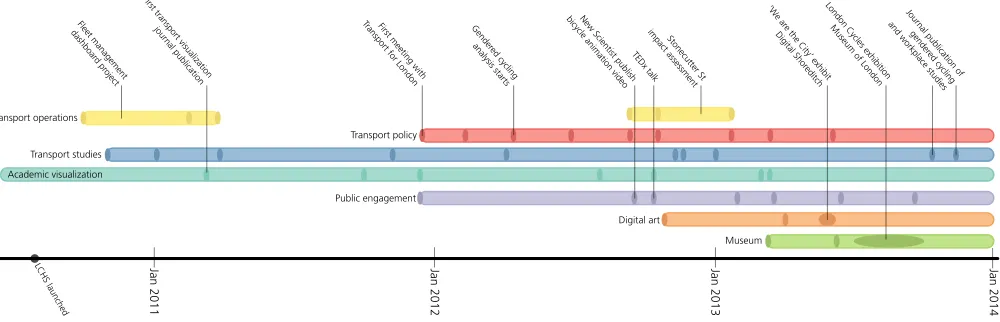
LCHS launched Jan 2011 Jan 2012 Jan 2013 Jan 2014
Transport operations
Transport policy Transport studies
Academic visualization
Public engagement
Digital art
Museum
London Cycles exhibition
Museum of London ‘W
e ar e the City’ exhibit Digital Shor
editch Stonecutter St
impact assessment Fleet management
dashboar
d pr oject
First transport visualization
jour nal publication
First meeting with
Transport for London bicycle animation videoNew Scientist publish Journal publication of gender
ed cycling and workplace studies
TEDx talk Gender
[image:4.612.63.563.55.216.2]ed cycling analysis starts
Fig. 2. Timeline of the seven channels of discourse. Ellipses represent events such as public release of visualizations, talks, workshops, stakeholder meetings and exhibitions. Key events annotated.
3 RETHINKING VISUALIZATION DESIGN MODELS
We can identify approaches to sequential and parallel modeling of vi-sualization design at two distinct scales. Most commonly, modeling has focussed on the transformation of data to visual encoding and its mapping to cognition and task. This is most widely seen in the foun-dational, and much refined,visualization reference modelor “InfoVis pipeline” [11], through which data are mapped to visual form to sup-port interactive sense making. The application of the pipeline model tends to emphasize the visualization design process as something that occupies a single, sequential channel of activity – even when this pro-cess is cyclical [26, 34], or involves loops [43]. There are some at-tempts to consider non-sequential refinements to the pipeline model, such as that of Jansen and Dragicevic [28], who account for visual-izationbeyond the desktopto include branching and merging. Parallel development at this scale is more commonly discussed at the ideation phase of visualization design [27] where the cost of prototyping mul-tiple designs is comparatively small. Some work reports on successful use of parallel prototyping [15] to inform visualization design [20], however multiple designs tend to be merged or filtered ultimately to inform a single ‘product’ or analytical objective.
In contrast, there is relatively little work that models design at the scale of parallel projects with their own distinct objectives and audi-ences. A rare example is that of Sedlmairet al.[42], who considered a three-year study centered around a visual analytics system for the automotive industry. Here, several related component products were developed in parallel but lessons from one stream of activity were used to inform others. In this paper, however, we extend this notion of par-allel development to include a much more diverse set of tasks, contexts and audiences while linking them all to the same underlying data and problem domain.
Prior work (e.g., [35, 43]) tends to characterize visualization design along a number of related continua – private (personal) vs public vi-sualization; exploratory vs analytical vivi-sualization; vaguely expressed vs precisely formed research hypotheses.
Although their useful examples describe single systems, we do not find parallel efforts used to describe the wider processes of discourse in the visualization literature despite a number of examples of long term relationships between visualization producers and consumers.
The literature on visualization design that does describe discourse frequently distinguishes ‘visualization experts’ from ‘domain experts’ (e.g., [34, 43, 48, 49]) and characterizes visualization design as a se-ries of interactions between the two. This dichotomy is understandable given that the impetus behind academic publishing in visualization is for largely computer science based academics to demonstrate their vi-sualization expertise. Design and domain expertise are both undoubt-edly required in order to generate true insight as without both there is a danger of simplistic or ineffective visualization (e.g., some of the
early work characterising computational social science [1]), or visu-alization that is not used by those with domain expertise. However, as techniques mature and tools to implement those techniques become more readily accessible, that distinction is likely to become increas-ingly blurred. Assigning an exclusive role of ‘visualization expert’ or ‘domain expert’ to an individual may fail to capture the more complex multiplicity of roles taken by those engaging with visualization that may change over time [34] or with context.
Understanding the discourse between producers and consumers of visualization is informed by debate in the social research community concerning the ambitions of computational social science and the way in which research is organised. Many early contributions within the computational social sciences have been criticised for simply confirm-ing already existconfirm-ing social theory [19] and few have been published in traditional social science journals or attempted to engage deeply with social science literature [51]. One explanation is that to date, data-driven social sciences studies have largely been defined by, and con-ducted within, computer science departments [19]. Too often there is an emphasis on either using existing methods, or developing new gen-eralizable computational techniques, without adequate consideration of the degree to which such solutions deliver meaningful or important findings [52]. The tensions between computing and domain-specific ambitions have been discussed at length within information visualiza-tion [43] and appear prescient given these current critiques of compu-tational social science [19].
We deliberately characterize the roles of the computing specialist and domain expert less clearly than is typical in this literature through our focus on channels rather than roles. We have expertise and interest both in information visualization and transport studies research. The ‘domain specialists’ in this study (those responsible for the bikeshare scheme’s design, operation and wider strategy) also have evolving and variable expertise in visualization as well as transport theory.
4 VISUALIZATION DISCOURSE CHANNELS
By identifying channels of discourse, we recognise that several may exist in parallel and that they have a capacity to interact with one an-other, while each can be associated with different visualization design approaches. Channels may be characterized by the context of engage-ment rather than a fixed set of participants or precisely defined tasks. In the context of our four-year engagement with the LCHS data, we have recognised seven distinct but connected channels where visual-ization of the data has been central to the discourse between those involved (summarized in Figure 2).
4.1 Discourse with operational managers
One of the challenges in operating the LCHS is to ensure that the sys-tem as a whole isbalanced– that is, that there are sufficient bicycles spread around all docking stations for people to collect and that there are sufficient spaces at those stations for people to dock bicycles at the end of their journeys. This challenge is a specific example of the ‘fleet management problem’ [12] where an optimised relocation of vehicles is required to maintain a balanced system while minimizing the inter-ventions required to ensure that balance. This is particularly challeng-ing in the context of the LCHS because of a strong commuter-driven tidal flow of bicycles between the periphery and the core during peak-hour periods in the morning and evening. We define the role of visual-ization in the support of this task as being part of anoperational chan-nel, characterized by the need for real-time monitoring and response to ensure continuous smooth running of the bicycle hire system.
[image:5.612.45.298.503.625.2]In many ways, the task of designing and using visualization to sup-port this operational channel is one for which visual analytics solutions should be well suited. It is, in terms of the task-information space [43], a crisply-defined task for which there is plenty of computer-based data to support it. Similar well defined analytical tasks have led to new visual analytic designs, such astrajectory lenses[31] that provide an-alytic precision at the cost of having to learning new visual anan-alytic processes. We have previously documented how we designed a spatial gridded dashboard to support realtime monitoring of the scheme [58] that allows parallel visual processing of many hundreds of docking stations in order to identify potential problem areas (local clusters of full or empty docking stations). An example of part of the dashboard is shown in Figure 3 where patterns of docking station use of the previous 24 hours, updated in realtime, can be used by operators to spot prob-lems. Further insight into the causes of the problems can be gained using an OD map representation [56, 58] that avoids the salience bias of longer journeys that would arise with a more conventional flow map of the system.
Fig. 3. A portion of the spatial gridded view of docking station status. Each cell, positioned approximately at its geographical location, shows the number of bicycles currently docked (blue ‘water level’) and its 24 hour history (sparklines). Full stations are highlighted in a darker border, inactive stations visible as horizontal sparklines.
Yet, despite the visual design of such a system being tailored to the task at hand, after initial enthusiasm by the operators of the scheme, the system was never used on a day-to-day basis. In examining the reasons for this ‘failure’, we can identify a number of the pitfalls enu-merated by Sedlmairet al. [43]. At the ‘winnowing’ and ‘discovery’
stages it could be argued that PF-9 – ‘no need for change: existing tools are good enough’ was key here and to some extent so too was PF-15 – ‘ignoring practices that currently work well’. At the early stages of the scheme, in practice the operators could rely on personal knowl-edge of London transport behavior (PF4 – ‘no real data available’) and spreadsheet views of the realtime data to do the job adequately. As a result, at the implementation stage the effort required by operators to learn a new visual grammar and operate an unfamiliar system (PF23 -‘usability: too little / too much’) was seen to cost more than the ben-efits it might confer. This remains a challenge for implementing any new system for day-to-day operational matters in that there is not the luxury of being able to pause operation while a new system is learned and evaluated. We also note that the activity surrounding our initial in-volvement in this channel of discourse with the operators was carried out without the context of other channels to provide evidence to build trust, capability and efficacy.
4.2 Discourse with Policy Makers and Transport Studies
The experience of working via the operational channel in part fed into developing academic work in the transport studies domain. It also demonstrated to us that there may be a role for visualization in sup-porting a more strategic level of engagement with the LCHS, and in particular in supporting the needs of the local government transport authority, TfL, in their various goals to understand and encourage cy-cling in the capital. In this context, the primary goal of using visual-ization was to facilitate deep insight, both with the TfL policy makers and transport studies community. Longer term strategic and epistemo-logical engagement also provided the opportunity to use visualization of the LCHS in a number of parallel channels with cross-over between them.
4.2.1 Exploratory analysis
To open a discourse with those in transport studies researching urban bicycle behavior and its influences (Section 2), it was important to ex-plore how individual cyclists might use the LCHS, and the extent to which cycling within a bikeshare scheme might relate to other forms of cycling. For example, as is the case in other studies of urban cy-clists’ behavior [14, 22], do returning bikeshare customers cycle for utilitarian or other purposes, and are particular types of customer pre-disposed to either behavior? These research ambitions were shared by policy makers at TfL, who wished to explore informal hypotheses about their customers and understand how certain target groups use the scheme.
We first created a set of demographic and behavioral variables to discriminate different types of behavior and used TfL’s informal knowledge of the scheme and current literature in transport studies to guide this process. Using the home postal code recorded for each member, we added two geodemographic classifiers and a ‘distance-to-nearest-docking-station’ variable to each customer record. Recency-Frequency (RF) segmentation [39], a technique that segments cus-tomers according to how often and recently they buy or use a product or service, was then used to separate more active scheme users from those using the LCHS only occasionally. Borrowing from approaches that use similar timed origin-destination travel datasets [2, 32], we clustered members info five groups according to when they typically travel: 9-to-5ers (26% of customers),postwork-ers (13%),anytime users(27%),weekenders(15%) andlunchtime users(19%). Naming these clusters in an identifiable way that resonated with those studying them (in contrast, for example, to naming them C1, C2 etc.) was seen as an important part of the engagement process with policy makers as it provided them with a language with which to communicate findings with others in the organisation. This enriched set of customer-related variables provided the basis for deeper discourse with the transport studies and transport planning communities.
Fig. 4. Visual analysis application for querying customers’ travel behaviors. The main map view shows a filterable spatial distribution of journeys. The bottom row shows a temporal view by day and hour. Customer characteristics such as geodemographic profile, journey frequency and relative cycling speed are shown to the left. In all cases, comparisons may be made between the filtered selection (blue) and global patterns (grey).
4.2.2 Exploring gender and cycling behavior
Exploratory data analysis [47] within this application took place alongside policy makers and operations staff at TfL; we acted as an interface to the tool and guided TfL staff through the various inter-actions bychauffeuring. Early customer satisfaction surveys from the LCHS reveal that women are underrepresented amongst scheme mem-bers, consistent with more general findings of gender and cycling be-havior [17]. Discussing this with transport policy makers at TfL, we agreed the first substantial theme for analysis should address men’s and women’s use of the scheme. The findings from this analysis have already been detailed in [5], but we provide a summary here in or-der to demonstrate the depth of analysis insight achieved through this channel of activity.
Selecting all male and then female customers in the application revealed a dominant commuter function for male cyclists and dom-inant leisure function for female cyclists. This is apparent in the customer-related and temporal views: women are very underrepre-sented amongst the most active users and the9-to-5er, postwork-er
andlunchtimecluster groups. While there is further evidence of this in the temporal view, the differences are perhaps best characterized when studying the spatial view (Figure 5). For men, there is a famil-iar pattern of journeys between London’s major rail hubs and CBD, whereas a very different pattern is true of women: bicycle trips taken within London’s parks are most obvious, with comparatively few taken in central London.
Colleagues at TfL were already familiar with these high-level gen-dered patterns as they had been articulated in a separate channel of activity (Section 4.3). We found the confirmatory nature of these ini-tial insights provided a way of introducing the richer attribute infor-mation and visual discourse discussed in Section 4.2.1. Upon the trust offered by the visual confirmatory analysis we started to uncover pat-terns unanticipated by the transport planners. Highly visible amongst the most active bicycle users were those living outside London who, after commuting into the city on a train, regularly used the scheme
Fig. 5. All journeys made by male (top) and female (bottom) customers.
to travel between the major rail hubs (Figure 5). Importantly, women were very underrepresented amongst this customer population living outside London. In simply selecting either male or female customers, we therefore compare two very different populations. This finding was important to both the transport studies and transport planning commu-nities, as it suggested that the large differences in gendered cycling behavior may be particular to the LCHS rather than representative of wider experiences and attitudes to cycling held by men and women.
[image:6.612.328.559.392.605.2]within 5km of a docking station showed some convergence between male and female customers, particularly in their temporal travel be-haviors. However, we found that women were still underrepresented amongst the more active, commuting scheme users. Further discussing this with TfL, we finally compared male and female customers but controlled both by how far members live from a docking station and how heavily they use the scheme. While this brings even greater con-vergence on some variables, important differences in spatial travel be-haviors remain. Importantly, for this group of active and experienced female scheme users, travel behaviors were spatially constrained: jour-neys within west London and parks dominate, and elsewhere jourjour-neys are taken in very particular parts of the city. The visualization appli-cation became a central part of this process of sense making, building on both the trust built by initial confirmatory analysis, but also the trust and credibility developed in discourse within the public, trans-port studies and academic visualization channels (see Figure 2). It constituted a highly appropriate, and perhaps in fact the only credible, means of finding these particular parts of the city and relating them to each other, existing knowledge (or its absence) and explanations.
4.2.3 Labelling, confirming and explaining behaviors
In a second phase of analysis driven by TfL operations managers, we identified with much greater certainty all commuting journeys, and by extension all individuals we suspected were commuters. Our com-muter modeling has already been documented [6], so we reflect here on the role of visualization in fostering collaboration with colleagues at TfL, as well as the deeper findings elicited by this analysis. By maintaining design consistency with earlier visualizations used with TfL we were able to better communicate our analysis visually and ex-plore modeling assumptions with them. In describing our analytical decisions with reference to real data, TfL were able to offer plausi-ble suggestions for more obscure spatial patterns of workplaces based on their operational knowledge of the scheme. Two important dis-coveries resulted from this second phase of chauffeured interaction. Firstly, that imbalances in numbers of morning and evening commutes to workplaces towards the periphery of London suggest a previously unforeseen operational challenge around managing the bikeshare fleet. Secondly, that there are differences in the geography of men’s and women’s daily workplace commutes which, when analysed alongside data on London’s labour market, appear to partially reflect differences in the actual geography of their respective workplaces. The observed differences in spatial travel behaviors described in Section 4.2.2 might not, then, relate to differing motivations and barriers to cycling as sug-gested in the transport studies literature [18, 22], but to differences in the geography of employment opportunities for men and women.
Given this alternative explanation, in a further analytical step we studied spatial travel behaviors in more detail. A limitation of using the bikeshare dataset to study spatial behavior is that with only the origin and destination of cycle journeys, nothing is known about the nature and context of likely cycled routes. We therefore derived rout-ing information for every cycled OD pair in the dataset by linkrout-ing to a cycle road network routing engine. For each route, heuristics on the nature of cycle journeys were collected including number of signalled junctions, difficult right turns, elevation data, and traffic flow volumes. Given the uncertainty of predicted road choice behaviour, we focussed our analysis on the bridge crossings necessary to connect origin and destination locations. Visual exploration of spatial and gendered jour-ney patterns involving river crossings showed differences in male and female cyclists’ use of bridges, which appear to be strongly related to the geography of their workplaces. This suggested that spatial differ-ences in travel behaviors between men and women are not a function of differing attitudes to cycling, as suggested in transport literature [14, 18, 22]. Women may be underrepresented amongst commuting journeys that involve a river crossing because those very journeys in-volve routes that are busier and more demanding than river crossing journeys cycled by men. This in turn led to further analysis, not de-scribed here, where we considered group cycling behaviors [4] as a strategy for dealing with the demands of urban cycling.
4.2.4 Role of visualization
The analytical path outlined above captures a very deliberate and col-laborative approach to data analysis. The themes we pursued were informed by TfL’s priorities and those within transport studies and our findings were validated against TfL’s knowledge and the literature of the domain. Indesign studyterms, our early engagement with rele-vant literature and the LCHS’s operational priorities might reflect a successful strategy of ‘winnowing’ – of selecting collaborators, find-ing an appropriate dataset and establishfind-ing substantive research needs [43]. The description of data processing and exploratory visual anal-ysis, through to more involved visual analytic activity and detailed explanatory analysis, maps closely onto the iterative process of prob-lem characterisation and abstraction and of design and impprob-lementa- implementa-tion [43]. As an example ofproblem-drivenresearch, our approach was validated by the depth of insights achieved: the fact that work has been published in high profile academic journals within the transport studies domain [4, 5, 6] and that we addressed operational priorities to the satisfaction of the transport authority. Our analysis started with a meaningful, but relatively open set of research questions – how are individual cycle behaviors structured and how do they relate to more general cycle behaviors? By creating a set of discriminating derived variables, and designing tools to visualize and analyse those variables, we developed more focussed analysis requirements and data-driven hypotheses. Our decreasing dependence on exploratory analysis tech-niques in later work reflects a progression towards ‘a final goal of a fully automatic [data analysis] solution’ [43, pp. 2433].
While we subscribe to many of the strategies for effective problem-drivenresearch set out in [43], other apparently separate visualization activities and events played an important role in the analysis and in sidestepping many of the pitfalls common todesign studies. These activities and events are not captured by the more narrow discussion of problem-area, datasets and analysis tasks. For example, the previous work described in Section 4.1 enabled us to build trust and establish some authority when approaching collaborators. The specific events discussed in Section 4.3 and Section 4.4 helped generate excitement and a deeper engagement in the more involved analysis activities. We argue that these parallel influences from other channels of discourse helped protect against PF-5, ‘insufficient time available from potential collaborators’, and contributed to ‘rapport with collaborators’ (PF-11).
4.3 Discourse with the public
Bicycle travel within an urban setting has a resonance with the wider public beyond those involved in the transport policy context. Equally, the potential for novel ways of using new data sources, especially through visual means has the potential to engage the wider community beyond those involved in transport management, policy and academic activity. We wished to capitalise on both of these opportunities by pro-ducing a more accessible and engaging depiction of the data and the findings derived from them.
Unlike the policy and transport studies channel, here the goal wasn’t deep insight but ratherengagementwith the themes of both urban bicy-cle travel and big data / data visualization. This required more familiar graphical encodings of movement as well as the need to generate in-sight rapidly before a non-committed audience lost interest [24]. Cen-tral to the visualization design in this channel was the idea ofmetaphor
supporting that rapid engagement process. This led to the creation of an animated view [53] of the first 5 million journeys incorporating a number of supporting metaphors. The most obvious of which was to encode movement of bicycles with animated movement in a geospa-tial layout. In order to compress a year’s worth of journeys into an accessible two-minute animation, symbols representing an individual journey were generated stochastically but in proportion to the relative frequency of actual journeys made between docking stations. This cre-ated an apparent time-compressed bird’s eye view of flows of cyclists around London.
journeys were represented as the less frequent journeys were gradu-ally filtered out and those that were more frequent became symbolised as gradually elongated ‘trails’ along the most common paths. This was supported by color encoding of journeys as points of light against a dark background with no mapping contextualisation. The effect was to convey a sense of structure emerging out of the chaos of the initial view; a powerful metaphor in persuading a general audience that there was some value in visualizing new data sources such as these. What we did not anticipate was that this metaphor resonated strongly with TfL policy makers too, and it became a useful means by which to in-duct other members of the policy team who had not previously been aware of our visual analytics work. The emerging structure had clear geographic causes, making it easy to associate the patterns observed with the major influences of commuter-dominated travel from main-line railway stations and leisure-dominated travel around the major parks of the city.
The accessibility of this form of representation, in contrast to visual analytic design in the operator and policy channels resulted in this work attracting the attention of the popular press in the UK, includ-ing the New Scientist (see Figure 6), The Economist and a number of national newspapers. The hypnotic effect of the slowly emerging structure was enhanced by the New Scientist with the addition of an ambient musical soundtrack. This embellishment added little in terms of analytic insight, but it may have increased memorability of the in-formation being conveyed [25]. It also suggests that visualization in the public realm is subject to influences and modification beyond the control of the visualization designer in a more familiar research or professional setting.
Fig. 6. Still from bicycle movement animation presented by New Scien-tist magazine [21].
While the design decisions taken to enhance accessibility and en-gagement may attract wider audiences, there is a tension with the design decisions required to facilitate analysis and deeper insight. Adopting separate channels for these two levels of engagement may be one approach to handling this tension, but there is the danger that accessible design can compromise perceptions of academic capabil-ity. This is indicated by one of the comments posted by a viewer of the New Scientist animation: “That is indeed very pretty, but it rather prioritises ‘visual’ over ‘analytics’. I hope they also did some less expensive but more informative analysis.”
One approach to effect greater influence within the discourse with the general public is to adopt a more explicit storytelling approach to visual communication. This was used directly when reporting the visualization work with the LCHS via a TEDx talk [55]. Here, through strong author-driven narrative [44], the unexpected ‘discov-ery’ of structure out of chaos and ultimately an explanation for that structure was made explicit. This contrast between the initially un-intelligible chaos of the visualization with the structure that emerges follows the ‘contour of communication’ that seeks to juxtapose the ‘what is’ with the ‘what could be’ [16]. This was reinforced further with additional storytelling devices such as placing the audience in the picture (the location of the talk was within the mapped area of the visualization) and relating the personal to the bigger picture.
One of the unexpected consequences of having a compact and ac-cessible data visualization story in the form of a 15 minute recorded TEDx talk was that without prompting, policy makers and operators in TfL started to share the recording as a means of explaining how the data from the LCHS could be exploited through visualization. We sus-pect that this was helped by the power of the metaphor ‘structure out of chaos’, as this was precisely the task facing many of those within the organisation sitting on an unexploited source of ‘big data’. Like ear-lier analytic work with TfL, it acted both in a confirmatory capacity, showing features of cycle usage the policy makers were aware of (e.g., large tidal commuting flows), and revealing new insights they were not (e.g., gender-specific behavior). The fact that some members of the policy team were introducing others to data visualization through the TEDx ‘artefact’ suggests a more complex and nuanced set of roles as both consumers and producers of visualization as part of discourse. Visualization systems designed primarily for analytics (such as the one described in Section 4.2) would not have served this purpose.
4.4 Discourse via the Museum Sector
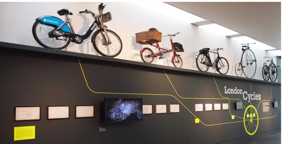
The unforeseen consequences of designing for parallel visualization channels did not only benefit policy makers. By building trust and authority through discourse with the transport studies community and policy makers we were recommended by TfL to the Museum of Lon-don to contribute to a three month exhibition ‘London Cycles’ (see Figure 1) aimed at putting contemporary cycling patterns into a histor-ical context of cycling in London, using bicycles from the museum’s collection alongside new digital acquisitions.
[image:8.612.62.297.340.472.2]TfL donated a single LCHS bicycle to the museum along with a digital record of its travel history in spreadsheet form. The museum’s task was to provide an exhibit that somehow related the physical and digital artefacts in their collection, contextualizing both. By adapting the animation approach discussed in Section 4.3 to include not just general patterns of movement, but additionally highlighting the move-ment history of the bicycle in the museum’s collection, that link could be established through data visualization [54]. The use of a more con-ventional animation-focussed design rather then the more analytically oriented visualization used with TfL and the transport operators fol-lows the recommendation by Hinrichset al. to ‘reward short term exploration’ in museum exhibits while the detail and depth of the data being depicted supported longer term exploration [24]. This formed the centerpiece of an exhibit where visitors were encouraged to find the single highlighted bicycle trajectory among those left by the other 20 million journeys being represented. To support the connection be-tween the digital and the physical this was accompanied by a set of prints depicting the ‘urban signatures’ left by the single bicycle as it was cycled around the city over its lifetime. The design of these printed data visualizations employed the metaphor of the hand-drawn ‘signature’ by using fluid Bézier curves to link docking stations that formed the bicycle’s travel history (see Figure 7). This was further
[image:8.612.329.558.562.703.2]enhanced by relating the line thickness in part to the local curvature of the trajectory as well as a small degree of spatially autocorrelated random noise and superimposing the signatures on a simulated hand drawn map of London [57]. These visual design decisions were not driven by conventional good practice in data visualization (e.g., as doc-umented by Blocket al. for their DeepTree museum exhibit [8]), but rather by reinforcing the metaphor of the human-driven expression of the personal and unique.
Adapting the visualization design to suit discourse with this chan-nel of communication offered the opportunity to provoke discussion on the nature of the digital and visual in recording and explaining our behaviors. This led to the Museum not only archiving the visualiza-tion artefacts themselves, but also the code used to construct them. The Digital Curator at the Museum of London commented “The code, data visualisations and animation reflect the contemporary nature of using open data to make sense of patterns in a useful way for future planning in London. This collection of digital files also reminds us that in contemporary London people are leaving digital traces of their activity behind as they go about their everyday lives”.
4.5 Discourse Through Art
The use of data-driven visualization as a form of artistic expression has led academics to consider what distinguishes analytic-driven and artistically-driven visualization (e.g., [30, 49]). Until recently [10, 23] much of that discussion has focussed on aesthetics in design or even just the presence or absence of pre-defined functional purpose [49]. What appears to be neglected in this discussion of information visual-ization is the role context plays in framing visual thinking [7].
The creation of an art installation ‘We are the City’ as part of the
Digital Shoreditchfestival in London provided an opportunity to con-sider this notion of context framing. An adapted version of the bicycle movement animation was developed that allowed two parameters of the visual encoding – the weighting given to more frequent journeys in comparison to less frequent ones, and the length of the trails left by each journey – to be controlled by body movement via a hidden XBox Kinect device. The frequency weighting parameter was controlled by the number of people detected in the vicinity of the installation and the position of the arms of a viewer was used to control the length of the animated trails. The goal of the interaction was to build on the idea that patterns of bicycle movements were a reflection of how peo-ple had chosen to move around the city. Additionally, the color of the trails was controlled by a live feed to data on where bicycles were currently located around the city. By combining depiction of an indi-vidual’s personal body movement with the passage of a single bicycle shared by many people with the aggregate behavior of many millions of journeys, the intention was to provoke thoughts on the relationship between the individual, shared space, ‘big data’ and visualization.
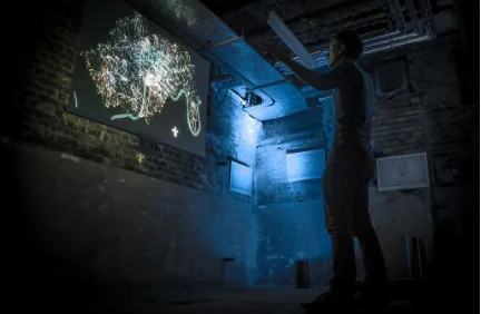
The setting of the installation, located in the basement of a large town hall along with 20 other exhibits, was also important in its im-pact. The environment was dark (see Figure 8) and the rooms in which each of the installations were located were connected by a deliberately disorienting maze of passageways. Teaser postcards showing sample bicycle signatures (see Figure 7) were provided to all visitors to the exhibition. Thus encountering the installation was itself one of ‘dis-covery’. To support this, only oblique instructions were provided sug-gesting that body movement might influence what was being shown, so that the act of revealing structure in movement from the chaos be-came part of the act of discovery.
5 DISCUSSION
5.1 The task-information space
The channels of discourse in which visualization plays a role can be mapped onto the task-information space proposed by Sedlmairet al.
[image:9.612.325.541.50.191.2][43]. This consists of two orthogonal axes that describetask clarity, ranging on a continuum from ‘fuzzy’ to ‘crisp’ and information loca-tion, again on a continuum ranging from ‘in the domain expert’s head’ to ‘in the computer’. Sedlmairet al. [43] use this space to usefully define a design study contribution as “moving forward along either of these axes”.
Fig. 8. Full body interaction and discovery at Digital Shoreditch.
Mapping our channels of discourse to this space reveals a number of contributions that may accordingly be deemed to be ‘design study’ in nature but do not necessarily involve moving ‘forward’ along the axes (Figure 9). We observe that some of the channels occupy quite signif-icant portions of this space (e.g., public engagement) while others are more crisply located (e.g., transport operations). As discourse evolves over time, there may be movement within this space although not nec-essarily towards the crisp task definition / computer-based data portion of the space. The Transport Policy discourse channel, as one of the key objectives of our work, has involved establishing knowledge, refining questions and developing tools in at least three stages. The processes and choices involved in the exploration described in Section 4.2 (trans-port policy and studies channels) bear many of the hallmarks of an information visualization design study and as such show trajectories that move towards more computable solutions. However, we also con-tend that some of the discourse channels deliberately follow different trajectories. For example, engagement via artistic channels involves a more fluid two-way movement between digitally captured data and personal subjective knowledge and emotion. They use artefacts as dis-ruptive interventions designed to present alternative perspectives on a problem and to encourage those who engage with them in re-thinking rather than to clarify tasks. The discourse with the museum sector evolved from artistic expression of subjective experience towards a digitally captured representation, not perhaps in the way foreseen by the design studies methodology, but rather through the process of the museum archiving the source code behind the visualization. Report-ing of the work via the academic visualization channel, includReport-ing this very paper, has shown a trajectory that moves ‘backwards’ along both axes, over time widening the visualization context to encompass less crisply defined problems and more subjective information location.
5.2 Interaction between channels
We contend that interactions between channels are mutually beneficial and indeed necessary to exploit the full potential of visualization. In particular we find that trajectories that may involve transferring infor-mation from the computer to ‘domain expert’ (i.e., moving left in the task-information space), can result in rich and fruitful contributions to other, more analytical discourse channels. This should not surprise us too much – passive ‘visualization awareness’ activities are used to stimulate ideas through analogy in human-centered visualization de-sign [29, 50]. What we emphasize here is that a dede-sign team’s parallel work on multiple forms of discourse relating to the same problem do-main can result in unpredictable, but constructive, interventions that influence design processes.
Fig. 9. Discourse channel trajectories mapped onto the Sedlmairet al.
task-information space. Arrows indicate evolution over time.
interested in data getting to know data and visualization techniques – a useful convergence of knowledge.
In our case, TfL brought policy expertise, partial knowledge of usage patterns and potentially conflicting problem definitions (e.g., revenue generation, changing transport culture, perceived personal safety). While their focus may not have been on using novel visu-alization techniques, they were equipped with a high degree of spa-tial literacy and knowledge when interpreting map views of the trans-port networks in London, allowing us to design map-based views with minimal geographic annotation. As academic contributors we offered some visualization expertise but also transport theory expertise and overlapping imperfect knowledge of usage patterns. This overlapping understanding between the groups was an important factor in building trust, and participation in multiple discourse channels helped estab-lish this. Individuals may have membership of more than one of those roles or their position may change over time, as may the individuals involved. As such, the widely used distinction reported in the visual-ization literature between ‘visualvisual-ization experts’ and ‘domain experts’ seems not to fit well with many of the interactions described here so we challenge the value of this dichotomy in our context.
Additionally we argue that in establishing knowledge and devel-oping approaches, theunexpectedcan contribute effectively to design decisions and analytical pathways. In our experience parallel visual-ization efforts made via additional discourse channels through which rich interaction and broad channels of engagement are achieved can contribute very effectively to these. For example, the effect of the public engagement channel, with the New Scientist endorsed bicycle movie becoming something of a visualization meme in TfL, helped establish interest and confidence in our more standard visualization ef-forts and may have resulted in greater buy-in from TfL colleagues and management as analysis progressed. The authority established via the Transport Policy channel unexpectedly gave rise to discourse with the Museum of London which in turn was fed by artistic activity at Digital Shoreditch. This presented new ways for the Museum to link themes of the personal (both as cyclists in the city and as the artist/analyst’s self-expression) with ‘big data’ and visualization. These may be re-garded asexternalitiesas defined by Robinson [41], but we argue that many of these may be internalised by explicitly recognizing multiple channels of engagement.
5.3 Channels as a contribution to project success
One of the scientific challenges faced in evaluating the impact of multi-channel interactions is in isolating the factors influencing project out-comes. We have argued that there have been clear examples of one channel’s activities having beneficial impacts on another, but we must
also consider other possible drivers of project success. It may be that the geospatial domain considered here lends itself particularly well to engaging visual representation, especially through the familiar paradigm of the map. Similarly, exploring temporal change through animation is both visually engaging and a cognitively plausible design choice. We also acknowledge that careful selection of appropriate vi-sual metaphors and encodings to support them has played an impor-tant part of several of our successful outcomes. Yet the framework of discourse channels has allowed us to target design decisions for differ-ent purposes and audiences while borrowing the gains made in other channels. The approach also allows a degree of risk mitigation in that a parallel approach accommodates ‘project failures’ in some channels.
6 CONCLUSIONS
We present a wider interpretation of the design study model that re-flects our open and flexible approach to using visualization in a vari-ety of contexts. It acknowledges the evolving and overlapping roles played by those who both consume and produce visualization.
Reporting on this work within the confines of data and task ab-stractions, visual encoding and insight development, misses the many other influences from parallel activities. The long-term nature of our engagement with the LCHS and the substantial packages of work we developed outside of conventional data analysis has led us to define and advocate parallel channels of discourse. Acknowledging that ex-ternal influences apply to almost all visualization projects, we find that characterizing these influences may help designing successful visual-ization projects.
Our argument is that these channels are often complementary and that synergies exist between the highly analytical and more personally expressive work. We argue that many pipeline-focussed models of design omit these important influences and opportunities and that may be costly in terms of the way visualization practitioners operate.
Our approach considers design as part of a richer range of engage-ments leading to deeper analytical insight, protecting against possible design pitfalls that may occur [43] and even use them as an opportu-nity to influence an existing design or stimulate an alternative role for visualization. In short it seems that parallel channels of discourse pro-vide excellent opportunity for sharing knowledge and perspectives – a basis upon which to develop new design studies. They additionally offer a rich and important source for serendipity that can beneficially influence ways in which this is achieved at a number of levels.
ACKNOWLEDGMENTS
The authors wish to thank the Cycle Hire Team and managers at Trans-port for London, especially Audrey Bowerman and Sarah Burr. We would also like to thank Hilary Young and the Museum of London for supporting the work. The work was partially supported by a Research Prize and Research Student scholarship provided by City University London.
REFERENCES
[1] L. A. Adamic and N. Glance. The political blogosphere and the 2004 US election: divided they blog. InProceedings of the 3rd international workshop on Link discovery, pages 36–43. ACM, 2005.
[2] B. Agard, C. Morency, and Trepanier. Mining public transport user be-haviour from smart card data.Science, 333(6039):156–157, 2011. [3] W. Bagchi and P. White. The potential of public transport smart card data.
Transport Policy, 12(5):464–474, 2005.
[4] R. Beecham and J. Wood. Characterising group-cycling journeys using interactive graphics.Transportation Research C: Emerging Technologies, 2014.
[5] R. Beecham and J. Wood. Exploring gendered cycling behaviours within a large-scale behavioural data-set.Transportation Planning and Technol-ogy, (1):83–97, 2014.
[6] R. Beecham, J. Wood, and A. Bowerman. Studying commuting be-haviours using collaborative visual analytics. Computers, Environment and Urban Systems, 2013.
[7] J. Berger.Ways of Seeing. Penguin, London, 1972.
learning. IEEE Transactions on Visualization and Computer Graphics, 18(12):2789–2798, 2012.
[9] P. Blythe and H. Bryan. Understanding behaviour through smartcard data analysis.Proceedings of the ICE - Transport, 41(4):173–177, 2007. [10] A. Borsani, B. Merlo, and L. Wang. Dataremix: Designing the datamade
through artscience collaboration.
[11] S. K. Card, J. D. Mackinlay, and B. Shneiderman.Readings in informa-tion visualizainforma-tion: using vision to think. Morgan Kaufmann, 1999. [12] T. G. Crainic and G. Laporte.Fleet management and logistics. Springer,
1998.
[13] D. Davies, S. Gray, G. Gardner, and G. Harland. A quantitative study of the attitudes of individuals to cycling.A quantitative study of the attitudes of individuals to cycling, 1(1):1–20, Jan. 2001.
[14] J. Dill and J. Gliebe. Understanding and measuring bicycling behavior: A focus on travel time and route choice.Bicycling, 29(December):1 – 70, 2008.
[15] S. P. Dow, A. Glassco, J. Kass, M. Schwarz, D. L. Schwartz, and S. R. Klemmer. Parallel prototyping leads to better design results, more di-vergence, and increased self-efficacy. ACM Transactions on Computer-Human Interaction (TOCHI), 17(4):18, 2010.
[16] N. Duarte. Resonate: Present visual stories that transform audiences. John Wiley & Sons, 2010.
[17] J. Garrard, S. Handy, and J. Dill. Women and cycling. In J. Pucher and R. Buehler, editors,City Cycling, pages 211–235. MIT Press, 2012. [18] B. Gatersleben and K. M. Appleton. Contemplating cycling to work:
Attitudes and perceptions in different stages of change. Transportation Research Part A: Policy and Practice, 41(4):302–312, 2007.
[19] J. Giles. Computational social science: Making the links. Nature, 488(7412):448–450, 2012.
[20] S. Goodwin, J. Dykes, S. Jones, I. Dillingham, G. Dove, A. Duffy, A. Kachkaev, A. Slingsby, and J. Wood. Creative user-centered visualiza-tion design for energy analysts and modelers.Visualization and Computer Graphics, IEEE Transactions on, 19(12):2516–2525, 2013.
[21] D. Heaven. Tron-like map of bike journeys reveals London’s hubs. New Scientist, Sept. 2012.
[22] K. C. Heesch, S. Sahlqvist, and J. Garrard. Gender differences in recre-ational and transport cycling: a cross-sectional mixed-methods compari-son of cycling patterns, motivators, and constraints.International Journal of Behavioral Nutrition and Physical Activity, 9(1):106, 2012.
[23] D. Hemment. Emoto-visualising the online response to London 2012. 2013.
[24] U. Hinrichs, H. Schmidt, and S. Carpendale. Emdialog: Bringing infor-mation visualization into the museum. IEEE Transactions on Visualiza-tion and Computer Graphics, 14(6):1181–1188, 2008.
[25] J. Hullman, E. Adar, and P. Shah. Benefitting infovis with visual dif-ficulties. IEEE Transactions on Visualization and Computer Graphics, 17(12):2213–2222, 2011.
[26] P. Isenberg, T. Zuk, C. Collins, and S. Carpendale. Grounded evalua-tion of informaevalua-tion visualizaevalua-tions. InProceedings of the 2008 Workshop on BEyond time and errors: novel evaLuation methods for Information Visualization, page 6. ACM, 2008.
[27] B. Jackson, D. Coffey, L. Thorson, D. Schroeder, A. M. Ellingson, D. J. Nuckley, and D. F. Keefe. Toward mixed method evaluations of scientific visualizations and design process as an evaluation tool. InProceedings of the 2012 BELIV Workshop: Beyond Time and Errors-Novel Evaluation Methods for Visualization, page 4. ACM, 2012.
[28] Y. Jansen and P. Dragicevic. An interaction model for visualizations be-yond the desktop.Visualization and Computer Graphics, IEEE Transac-tions on, 19(12):2396–2405, 2013.
[29] L. C. Koh, A. Slingsby, J. Dykes, and T. S. Kam. Developing and ap-plying a User-Centered model for the design and implementation of in-formation visualization tools. In2011 15th International Conference on Information Visualisation (IV), pages 90–95. IEEE, July 2011. [30] R. Kosara. Visualization criticism-the missing link between information
visualization and art. InInformation Visualization, 2007. IV’07. 11th International Conference, pages 631–636. IEEE, 2007.
[31] R. Krüger, D. Thom, M. Wörner, H. Bosch, and T. Ertl. Trajectorylenses– a set-based filtering and exploration technique for long-term trajectory data.Computer Graphics Forum, 32(3.4):451–460, 2013.
[32] N. Lathia, C. Smith, J. Froehlich, and L. Capra. Individuals among commuters: Building personalised transport information services from fare collection systems.Pervasive and Mobile Computing, 9(5):643–664, 2013.
[33] D. Lazer, A. S. Pentland, L. Adamic, S. Aral, A. L. Barabasi, D. Brewer, N. Christakis, N. Contractor, J. Fowler, M. Gutmann, et al. Life in the network: the coming age of computational social science.Science (New York, NY), 323(5915):721, 2009.
[34] D. Lloyd and J. Dykes. Human-centered approaches in geovisualiza-tion design: Investigating multiple methods through a long-term case study. Visualization and Computer Graphics, IEEE Transactions on, 17(12):2498–2507, 2011.
[35] A. M. MacEachren and D. R. F. Taylor.Visualization in modern cartog-raphy, volume 2. Pergamon Press, 1994.
[36] S. Makri and A. Blandford. Coming across information serendipitously– part 1: a process model.Journal of Documentation, 68(5):684–705, 2012. [37] M. Meyer, M. Sedlmair, P. S. Quinan, and T. Munzner. The nested blocks and guidelines model. Information Visualization, page 1473871613510429, 2013.
[38] J. Pucher and R. Buehler.City Cycling. MIT Press, London, 2012. [39] R. Radburn, J. Dykes, and J. Wood. vizlib: Using the seven stages of
visualization to explore population trends and processes in local authority research.Proc. GIS Research UK, pages 409–416, 2010.
[40] J. C. Roberts. Exploratory visualization with multiple linked views. In J. Dykes, A. M. MacEachren, and M.-J. Kraak, editors,Exploring Geovi-sualization, pages 159–180. Elsevier, Oxford, 2005.
[41] A. C. Robinson. A design framework for exploratory geovisualization in epidemiology.Information visualization, 6(3):197–214, 2007.
[42] M. Sedlmair, P. Isenberg, D. Baur, M. Mauerer, C. Pigorsch, and A. Butz. Cardiogram: visual analytics for automotive engineers. InProceedings of the SIGCHI Conference on Human Factors in Computing Systems, pages 1727–1736. ACM, 2011.
[43] M. Sedlmair, M. Meyer, and T. Munzner. Design study methodology: Reflections from the trenches and the stacks.IEEE Transactions on Visu-alization and Computer Graphics, 18(12):2431–2440, 2012.
[44] E. Segel and J. Heer. Narrative visualization: Telling stories with data. IEEE Transactions on Visualization and Computer Graphics, 16(6):1139–1148, 2010.
[45] B. Shneiderman. The eyes have it: A task by data type taxonomy for in-formation visualizations. InVisual Languages, 1996. Proceedings., IEEE Symposium on, pages 336–343. IEEE, 1996.
[46] M. Tory and T. Moller. Rethinking visualization: A high-level taxonomy. InInformation Visualization, 2004. INFOVIS 2004. IEEE Symposium on, pages 151–158. IEEE, 2004.
[47] J. W. Tukey. Exploratory Data Analysis. Addison-Wesley, London, 1 edition, 1977.
[48] J. J. van Wijk. Bridging the gaps. IEEE Computer Graphics and Appli-cations, 26(6):6–9, 2006.
[49] J. J. van Wijk. Views on visualization. IEEE Transactions on Visualiza-tion and Computer Graphics, 12(4):1000–433, 2006.
[50] R. Walker, A. Slingsby, J. Dykes, K. Xu, J. Wood, P. Nguyen, D. Stephens, W. Wong, and Y. Zheng. An extensible framework for provenance in human terrain visual analytics. IEEE Transactions on Vi-sualization and Computer Graphics, 19(12):2139–2148, 2013. [51] D. Watts. Computational social science: Exciting progress and future
directions.The Bridge on Frontiers of Engineering, 43(4):5–10, 2013. [52] S. Weinberger. Social science: web of war.Nature, 471(7340):566–568,
2011.
[53] J. Wood. Experiments in bicycle flow animation. http://vimeo.com/33712288, 2011.
[54] J. Wood. We are the city. http://vimeo.com/66477874, 2011.
[55] J. Wood. London moves, visualising 16 million cycle journeys across the UK capital. http://tedxtalks.ted.com/video/London-Moves-visualising-16-mil, 2012.
[56] J. Wood, J. Dykes, and A. Slingsby. Visualisation of origins, destina-tions and flows with od maps.The Cartographic Journal, 47(2):117–129, 2010.
[57] J. Wood, P. Isenberg, T. Isenberg, J. Dykes, N. Boukhelifa, and A. Slingsby. Sketchy rendering for information visualization. IEEE Transactions on Visualization and Computer Graphics, 18(12):2749– 2758, 2012.
[58] J. Wood, A. Slingsby, and J. Dykes. Visualizing the dynamics of london’s bicycle-hire scheme.Cartographica: The International Journal for Geo-graphic Information and Geovisualization, 46(4):239–251, 2011. [59] J. Woodcock, M. Tainio, J. Cheshire, O. O’Brien, and A. Goodman.