Rochester Institute of Technology
RIT Scholar Works
Theses
Thesis/Dissertation Collections
5-1-2017
Akchessima: Latin Type Design for Digital Chinese
(Seal Script) Typefaces
Xuan Zhang
Follow this and additional works at:
http://scholarworks.rit.edu/theses
This Thesis is brought to you for free and open access by the Thesis/Dissertation Collections at RIT Scholar Works. It has been accepted for inclusion in Theses by an authorized administrator of RIT Scholar Works. For more information, please [email protected].
Recommended Citation
Akchessima: Latin Type Design for
Digital Chinese (Seal Script) Typefaces
by Xuan Zhang
A Thesis Submitted in Partial Fulfillment of the Requirements for the Degree of Master of Fine Arts in
Visual Communication Design
School of Design
College of Imaging Arts and Science Rochester Institute of Technology
Abstract
Akchessima: Latin Type Design for
Digital Chinese (Seal Script) Typefaces
Xuan Zhang
As multi-language text layout and Chinese/Japanese/Korean typefaces has become an important topic in modern day typography, the visual match-making between Latin and Chinese writing is a very important issue in type design.
For this thesis project, Latin letters are designed based on a Chinese seal script style typeface, in seek of a design principle of matching Latin letter forms for Chinese calligraphic styles, originating from different writing tools and traditions.
There is not one universal principle that would apply on all different Chinese typeface styles. However, based on research of writing habits and technology, multiple methods have been developed in this thesis, which could be used while processing any type design projects.
Approval
Chief Advisor
Nancy Ciolek
Visual Communication Design / School of Design
Signature Date
Associate Advisor
Lorrie Frear
Graphic Design / School of Design
Signature Date
Associate Advisor
Chris Jackson
Visual Communication Design / School of Design
Signature Date
Administrative Chair
Peter Byrne
School of Design
Signature Date
Akchessima Typeface
Akchessima + 汉仪篆书
永晴杂娱逊虞
树流酬闷随转
0123456789
ABCDEFGHIJKLMN
OPQRSTUVWXYZ
abcdefghijklmn
opqrstuvwxyz
,.:;?!"@#$%&*+-^
Preface
This document about type design is a thesis project, but not only a thesis project to me. It has been a long time since I started the project, and now I have already been a professional type designer for 3 years. As your thought, this very project is the start point of my type design career, which I like a lot.
My job is exactly the same as the thesis – designing non-Latin alphabet for the Chinese typeface. Yes, my designs are always based on others’ designs, and I did them letter by letter for 3 years. Sounds boring? A little bit, not quite so, because there are much more beyond the job itself. As I devoted myself to type design & typography, I start to encounter a group of smart persons. During the past 3 years, I met technician working on CJk script, caster of metal types from last century, linguistic trying to save minor scripts from dying, and many more talented people. Understanding of Unicode and Opentype technology, language/ script and their problems I never heard before, and the history of Chinese typography... I learned all these from them. It is really fantastic experience working with them.
They made me to think about what should I do to contribute to Chinese
typography. So I would like to use this thesis not only to get a degree, but gather my experience and thought from these years, to provide an approach towards Chinese typography and information for new designers who have interests in this area as much as possible.
As a result, this thesis not only includes the whole design process, but also a lot of detailed tips on calligraphy and typography of non-Latin script (including Chinese). No matter you are reading this thesis as a committee, or looking for information for your project, or simply for interest in alien culture, I hope you enjoy this little book.
Catalog
Preface
1 Background Knowledge
1.1 The Difference between Latin letters and Chinese Characters 1.2 The Definition of Simulation Typeface
1.3 Chinese and Latin Typeface Styles 1.3.1 Timeline of Chinese Calligraphy
1.3.2 The Four Main Categories of Chinese Print Typefaces 1.3.3 Upper & Lower Case of Latin Letters
1.4 Small Seal Script
1.5 Simple Character and Compound Character
2 Situation Analysis
2.1 Similarity and Difference between Chinese and Latin Type styles 2.1.1 Serif, the Common Feature between Latin and Chinese 2.1.2 Sans-serif in Latin and Chinese
2.1.3 Similar but Longer Design Process 2.1.4 Regional Variation in Chinese
2.2 Reason & Problem of Simulation Type Design for Chinese 2.2.1 Choosing Seal script
2.2.2 Low Design Quality of Seal Script Typefaces
3 Researches
3.1 Bronze Inscription
3.2 “Bad”or “Not good enough” Simulation Typefaces 3.3 Good Simulation Typefaces
4 Early Preparation
4.1 Seal script hand writing 4.2 Latin Script writing
5. Design of the Latin Alphabet
5.1 Early Attempts on Lower-case Letters 5.2 Prototyping Lower-case Letters
50 58 61 68 71 73 76 80 81 85 91 92 94 108 112 136
5.4 Digitization and Modification of Lower-case Letters in Akchessima 5.4.1 Focus on Legibilty
5.4.2 Design of Letters with Straight Lines 5.4.3 Design of Letter with Curves
5.4.4 Design of Letter with Angled Strokes 5.4.5 Modification for Legibility
5.5 Preparation for Upper-case Letters 5.6 Design of Upper-case Letters
6. Numeral, Punctuation, Symbols & Legibility Issues
6.1 Numerals
6.1.1 Alignment of Numerals 6.1.2 Counter shape of numerals 6.2 Punctuations and Symbols 6.2.1 @ sign
6.2.2 Ampersand
6.2.3 Pound, Percentage and other signs 6.3 Legibility Adjustment
6.4 Making Ligatures
7. Mixed text layout in Latin & Chinese
7.1 A Typographic Detail, the ¼ em-width visual space between Latin and Chinese script
7.2 Proportion of Typeface with both Chinese and Latin
8. Design Application
9. Conclusions
Bibliography
Appendix 1: Visual Translation between Regular & Seal Script
Appendix 2: Other Reference Projects by Author
Appendix 3: Original Thesis Proposal
Chapter 1
Background Knowledge
This thesis is about match-making of two different writing systems, and will mention some historical writing styles of them. In order to make it more friendly to the reader of English, the Background Knowledge and Glossary sections are included at the beginning. Some details are further discussed in related chapters.
6
The difference between Latin
letters and Chinese characters
Latin letters are defined as an Alphabetical writing system, which uses a small set of letters representing phonemes of a spoken language. Though Alphabetic scripts denote sounds with letters, they do not usually apply a in a strict one-to-one manner. (Writing systems that use one character/letter for each syllable are defined as syllabic scripts, like Hiragana in Japanese.) Languages using Latin letters includes English, French, and German, etc.
1.1
Fig 1.1
The two words in English are composed with same letters, but different combination order makes them into completely different meaning and sounds.
Fig 1.2
These four Chinese characters all shows the same meaning “Pig”, but in different visual
forms. Of course, they have a diversity in sound.
Chinese characters are also named as Ideographic writing system, and widely used in East Asia’s CJK (China, Japan and Korean. Sometimes the phrase CJKV was used, because Vietnam used Chinese characters for a long time historically.) language area. Every Chinese character not only has its unique sound, but also has a meaning with it. In some way, a Chinese character could be treated as a word in the form of logogram.
MASTERS
STREAMS
The definition of
Simulation Typeface
1.2
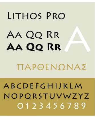
A simulation typeface is one designed after a unique or stereotypical aspect of the letterforms or scripts of a different language.*
For example, Lithos is a glyphic sans-serif typeface designed by Carol Twombly in 1989 for Adobe Systems. As it is inspired by the unadorned, geometric letterforms of the engravings found on Ancient Greek public buildings, it is a Latin simulation typeface to the Greek writing style by that time.
[image:12.595.88.422.245.655.2]* Samples of simulation typefaces”, Wikipedia, http:// en.wikipedia.org/wiki/ Samples_of_simulation_ typefaces, last modified on 21 April 2016, at 16:17.
Fig 1.3
Specimen of Lithos. https://commons.wikimedia. org/wiki/File:LithosPro.png (uploaded on 31 May, 2007)
8
Chinese and Latin
Typeface Styles
Timeline of Chinese Calligraphy
For a better understanding of the topic, a compilation of a brief history of Chinese and Latin calligraphy was developed.
1.3
1.3.1
A timeline of Chinese type style is shown here, and only some specific milestones are highlighted to keep it brief.
Oracle Bone Script
developed between 1200 BC – 1050 BC
Seal Script
developed around 250 BC
Clerical script
developed around 200 BC
Cursive Script
developed around 200 AD
Regular script
developed around 400 AD
Semi-cursive script developed around 950 AD ↑Fig 1.4
Seal script (Zhuan Shu, or Zhuan for short), was defined as the first national standard style in China during Qin Dynasty (221-206 BC). However, just as its name “Seal” decribes, it was mainly used on ceremonial inscriptions rather than as a standardized script.
Instead, Clerical script (Li Shu, or Li for short), which was developed as a hand-writing style, was then decided to be one of the standardized script style and widely used. Seal script serves as the parent style of Clerical script. The transformation from Seal script into Clerical script is call Li Bian, which means Li Transformation, is an important milestone of Chinese characters. It indicates a start point of “modern Chinese characters” that we use currently.
Fig 1.5
From top to bottom, they are in the style of Seal script, Clerical script, Regular script and Semi-cursive script. As you see, they are listed in the order of timeline. Comparing with Seal script, Clerical script is more visually similar to the style of the modern Chinese characters in Regular & Semi-cursive script.
切齒怒目横向天
今生唯恨一劍敗
切齒怒目横向天
今生唯恨一劍敗
切齿怒目横向天
今生唯恨一剑败
10
The Four Main Categories of
Chinese Print Typefaces
1.3.2
† Gutenberg in Shanghai:
Chinese Print Capitalism, 1876–1937, is a book talking
[image:15.595.171.510.324.556.2]about the early history of Chinese movable types.
Fig 1.6
Sample of Song style Chinese characters from Requirements for Chinese Text Layout, W3c Editor's Draft, 15 December 2016.
http://w3c.github.io/clreq/
The earliest surviving sample of Chinese Woodblock printing date back to 868 AD. Around 1050 AD, during the Song Dynasty, the artisan Bi Shen invented printing with movable type, 400 years earlier than Johannes Gutenberg’s 42-line Bible.
However, Bi Shen’s movable types never took the main role in China’s history, while woodblock printing is continuously the main printing method in China. Modern Chinese typography with movable types was brought by the western publishers. (For details, please read the book Gutenberg in Shanghai: Chinese Print Capitalism, 1876–1937†).
As modern typography was introduced and localized in China, four main styles of (text) typefaces have been developed.
Fig 1.7
Sample of Hei style Chinese characters from Requirements for Chinese Text Layout, W3c Editor's Draft, 15 December 2016.
http://w3c.github.io/clreq/
Fig 1.8
Sample of Kai style Chinese characters from Requirements for Chinese Text Layout, W3c Editor's Draft, 15 December 2016.
http://w3c.github.io/clreq/
Hei, which is called Gothic in Japan, is a result of the influence of International Typographic Style. Japanese type designers created the style with the inspiration from sans-serif Latin typefaces in the early 1900s, and China adopted this style from Japan.
Fig 1.9
Sample of Fangsong style Chinese characters from Requirements for Chinese Text Layout, W3c Editor's Draft, 15 December 2016. http://w3c.github.io/clreq/
Kai, which takes Regular script (Kai Shu) as its model, is a calligraphic style simulating the writing of a soft brush.
12
Upper & Lower Case of Latin Letters
1.3.3
Latin Cyrillic
Greek Japanese
Chinese Korean Arabic
Hebrew Thai Devanagari
This thesis will not go into detail of the calligraphic hands, either. But based on the relation from Uncial to Carolingian Minuscule, Fraktur to Bastarda, it is not difficult to see a general evolution – from slow to fast and smooth writing.
And of course, Carolingian minuscule is the spotlighted as the milestone of the division of upper and lower case letters. The mixed-case text might seem quite normal to an English reader, but not that many writing systems are case-sensitive. Among the common-used writing systems, Greek and Cyrillic also have capital and lower case letters, while most of others might not, including Chinese.
Latin Cyrillic
Greek Japanese
Chinese Korean Arabic
Hebrew Thai Devanagari Fig 1.10
Visualized relationship between various scripts, the part from Trajan (Imperial Roman) to Caroline
(Carolingian Miniscule) could describe the transformation from uppercase to lowercase very well.
https://en.wikipedia.org/ wiki/Insular_script#/media/ File:Evolution_of_minuscule. svg
uploaded on 20 April, 2015.
Fig 1.11
Small Seal Script
1.4
Seal Script is a broad category of calligraphic styles. It contains bronze inscriptional writing, silk-based writing, Bird-worm Seal Script, Big Seal Script and Small Seal Script. Small Seal Script is specifically known as common “Seal Script” to the Chinese reading public. Though the name Seal Script (篆) originally meant carving, later its use was limited to personal and official seals. This was the origin of the name “Seal Script”. In seals, its style has changed over time, resulting in several variations, some retaining their original clarity and legibility, others becoming highly decorative but less legible.
Fig 1.12 & 1.13
Diffrent Samples of Seal script, with soft and hard turning strokes.
[image:18.595.86.540.222.434.2]The Seal Script focused in this thesis is Small Seal Script (as shown below in Fig 1.14). If a particular variant of Seal script is not specifically identified, Small Seal Script is meant.
Fig 1.14
14
Simple Character and
Compound Character
1.5
Though Chinese charaters are visually drawn as logograms, It has a built-in logic in making those characters. Generally, Chinese characters can be distinguished into two main categories – simple characters and compound characters. Chinese script is famous for its quantity of characters, but only small set of characters are simple ones. A simple character is usually one simple and individual logogram, representing the basic elements or actions of human life. (Most of them mean common things like water, light, sun or moon, which are the core words in most languages.)
Simple characters can be borrowed or transformed into components – the accurate name is Chinese radicals – to build complicated ones, the Compound Characters. The main method for creating them is called Phono-semantic Compound, which use one radical to indicate meaning, while using another radical to present the sound. A person who knows the language well could easily distinguish the phonetic and semantic radical, therefore predict the sound and even the meaning of a random character.
手
→
扌
+
爪
=
抓
+
奂
=
换
+
高
=
搞
Fig 1.15
Chapter 2
Situation Analysis
18
Similarity and Difference
between Chinese and Latin
type styles
2.1
Serif, the Common feature between
Latin and Chinese
2.1.1
As mentioned in Chapter 1, for text typefaces in Latin Alphabets, there are two main categories – Serif and Sans-serif; in text typefaces in Chinese characters - Hei, Song, Fangsong & Kai.
It is interesting that both writing systems has developed their “serif” in visual style independently. Song style has always been recognized as Chinese serif style due to its symbolic triangle decoration at stroke ends, and this definition is widely accepted. Even in the CSS (Cascading Style Sheets), Song style font is always given a “serif” value in generic-family property.‡ It might be a coincidence, but a coincidence that only happen to scripts that has a long history of printing. Let me explain why.
For serif of Latin, we always refer its origin to Imperial Roman style. In Edward Catich’s book the Origin of the Serif, he reached a conclusion based on his study
into Trajan’s Inscription – the serif is not an invention for decoration from the stone engravers, but has its origin in brush writing. In a word, the serif was written originally, and inherited in movable and digital types. But somehow, the serifs in movables and digital typefaces still served a good function as leading people’s vison to move smoothly between letters.
‡ The definition of font-family property value in CSS, http://www.w3.org/wiki/CSS/ Properties/font-family last modified on 16 June 2011, at 18:02.
Fig 2.1 & 2.3
[image:23.595.351.492.519.674.2]Now let us turn to serif of Chinese. There are two main explanations of its origin. Some people think it as an inherit from soft brush writing. The triangle-shaped end represents the soft brush stop at stroke ends. As time passed by, type cutters simplified their visual language, the strokes became geometrically horizontal and vertical, and the irregular brush stop turned into a triangle-shaped serif. In the other hand, the serif is thought to be invented as a functional feature for the woodblock/movable types. As Chinese characters has lots of horizontal strokes, type cutters added these serifs into the end of thin strokes as reinforce to make them last longer. Personally speaking, the first explanation might be the major reason of the form of serif.
The Latin serif was a hand-written feature originally. Instead of being replaced by faster and simpler hand writing style, it was kept as an important visual element in typefaces. Chinese serif has its calligraphic origin, but formed in the woodblock/movable types. They are both results of printing industry. For any script that does not have a long history of printing, it is impossible for them to form a feature “serif” that is strongly connected to but also distinguished from hand writing styles.
Fig 2.3
Kozuka Mincho & Sabon
Nhg
20
2.1.3
Sans-serif in Latin and Chinese
2.1.2
It is also indicated in Chapter 1.3.2, that Sans-serif style is also a common visual style in both Latin and Chinese. Hei style in Chinese is the name of the Japanese imported style Gothic. And the Gothic style in Japan is the localization of the sans-serif style.
Based on similar attitude on Song style (see Chapter 1.3.2), someone would argue that it is better to use the local name Hei for Chinese. Since Hei style has a traceable origin, it is also okay for me to call it Chinese sans-serif.
It is interesting that Hei style is not only visually similar in the modulated strokes and neutral appearance, but even shares same technical design element – pronounced end. Along with inktrap, pronounced end with concaved top is a common method to avoid ink from spreading in printed letters. But in some typeface like Optima, this design feature also shows the simulation of nib pressure changing at the middle and ends of strokes, or indicates the serif of Roman letters.
Things are almost the same in Chinese. Pronounced ends were used a lot in old Hei style typefaces, especially in those designed for photosetting print. Of course some of the typefaces are digital revived as computer fonts, and the “unnecessary” pronounced ends are treated as the old flavor of 20th century.
Fig 2.4
Hanyi Zhonghei & Optima
Nhg
Similar but Longer Design Process
2.1.3
It is always heard from the learner of Chinese as a foreign language, that they are drawing Chinese characters instead of writing them. It is true, ideographic writing system does seem to be complicated as graphs to the beginners. but if you are a designer who deals with types, you will soon realize the design logic is very similar with other languages.
Type designers often begin with simple letters/characters. For example, Latin typefaces usually begin with letter n & o, then the proportions and design characteristic of them would be applied to the other letters. More details will be discussed with this project in Chapter 4.
[image:26.595.91.416.383.660.2]There is no difference in the design method between Chinese and other script. A common work flow of Chinese type projects begins with designing the strokes. Afterwards, simple characters would be constructed with those strokes. Therefore, the simple characters would be used as components to make the other characters. Follow the steps from simple to complex, use frequently-used characters or their parts to expand the character set… Nothing is new in Chinese type design.
Fig 2.5
22
[image:27.595.193.487.59.377.2]2.1.4
Fig 2.6The 25 simple characters as the beginning template set, containing all basic strokes.
Regional Variation in Chinese
2.1.4
No matter what languages using Latin letters, they are using the same alphabet and mostly same letterforms in a same style. (Though some European languages might use a lot of diacritics, the letterforms are still universal.)
Due to the wide-spread use of Chinese characters, people in different areas of Asia would use different characters to describe the same thing. As they have developed different standards on writing, they would surely pick different characters as their defaults. And the result is the current regional variation of Chinese characters.
[image:28.595.89.534.336.740.2]A “same” character (do not let it mislead you, here “same” means they are just supposed to be the same. For example, though 樱, 櫻&桜are different, they are the same character representing the cherry blossom) might have different forms, and be assigned with different Unicode identifiers. Sometimes, they are not in different forms, but assigned with same Unicode numbers. This is a major problem in CJK typefaces, but it will not be discussed in details in this thesis.
Fig 2.7
24
2.2.2
Reason & Problem of
Simulation Type Design
for Chinese
2.2
Choosing Seal Script
2.2.1
Chinese and Latin script share a lot visual similarity, even though they are different writing systems.
It would make very minor or completely no contribution to both languages if serif of san-serif style is chosen for a simulation typeface projects, as they exist in both scripts already. But it would be a great challenge if a calligraphic style is chosen. So the next question is, which calligraphic style?
Regular script is not a good choice, as many people have worked on that already. Some people thought that regular script fits well with italic calligraphy. It worked very well sometimes, as Fig 2.8 shows.
Fig 2.8
Specimen of Waran, winner typeface of Morisawa Competition 2014.
That is the reason why some people argued that Regular script style should be defined as Chinese italic in CSS style, but that was another discussion that will not continue here.
Low Design Quality of Seal Script Typefaces
2.2.2
Because of the reason mentioned in early chapters, the principle of designing Latin for seal script style has not been developed yet. Therefore, the type foundries in China made their attempts separately.
[image:30.595.83.421.278.617.2]It was obvious that none of them were in high quality. Either they lacked visual harmony with the elegant Chinese part, or they were just a rough design work with limited thoughts. Even this is a very graphic style, sometimes limited to cheap usage like Chinese restaurants, but there are users who care and are not satisfied with the current typefaces in seal script style. Hopefully the simulation typeface project would provide them a better answer, or gives out another possible direction to inspire other type designers.
Fig 2.8
Seal script type specimen from Founder.
Fig 2.9
Chapter 3
Researches
28
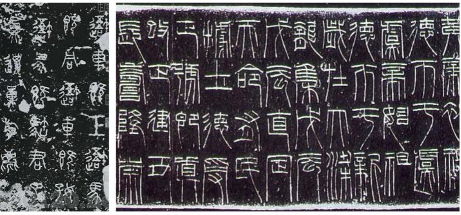
Bronze Inscription
3.1
[image:33.595.171.513.78.338.2]Bronze inscription is the origin of seal script. It is usually carved in on the bronze containers, not written. Based on the picture, it is obvious how it influenced seal script directly on its visual appearance. However, it is not standardized like seal script, so it could only be taken as a visual inspiration.
Fig 3.1
“Bad” or “Not Good Enough”
Simulation Typefaces
3.2
It is hard to define the adjective “Bad”. Here, it is used to describe the design concept that is not agreed in this thesis..
Fig 3.2 & 3.3
Songti Yinwen designed by MakeFont, showing the upper-case alphabet and the sentence “The sUPreMe haPPiness oF liFe is the conViction that We are loVeD.”
Songti Yinwen from MakeFont (造字工房宋体英文)
30
Fig 3.4
Title from The Little Book of Hindu Deities. When the
horizontal bar was added on letters like capital E or R, the top of letters looks too dark.
Title Typeface from The Little Book of Hindu Deities
Neither the name of this typeface nor the designer were known for now. It simply adds a horizontal bar on top of the Capital letters to make it looks like Devanagari. Somehow it achieved editor’s purpose, but it does not explore deeper connection between Latin & Devanagari script, and lacks in consideration on the visual details.
Fig 3.5
Type specimen of TBFZ Tekkin
Reisho
方正铁筋隶书
ABCDEFGHIJKLMN
OPQRSTUVWXYZ
abcdefghijklmnopq
rstuvwxyz
0123456789
TBFZ (Typebank & Founder) Tekkin Reisho (方正铁筋隶书)
Good Simulation Typefaces
3.3
In opposite of “Bad”, these typeface projects are “good” in concept and quality.
The concept of applying fundamental graphic design principles to different script is preferred, as it helps to get a high consistence without losing legibility in multiple languages. Also, The inspiration from the good solutions that the designer reached is highly appreciated in this thesis.
Fig 3.6 & 3.7
Kohinoor Devanagari Letterform Analytics http://www.typeisbeautiful. com/2011/03/3253/ March 16, 2011
Kohinoor Devanagari by Peter Bilak & Satya Rajpurohit
This project is involved with Latin & Devanagari. Though the two writing systems are greatly different, the designers succeed in getting a visual
[image:36.595.83.425.203.653.2]32
Qundas by Laura Meseguer, Kristyan Sarkis & Juan Luis Blanco
[image:37.595.173.512.182.404.2]Qundas is a pretty new typographic matchmaking project, and the design team presented it at the yearly conference of ATypI (Alliance Typographique Internationale) 2016, under the theme of convergence, in Warsaw, Poland. The type family would include script in Latin, Arabic & Tifinagh. As Arabic has two different writing styles, fluid and solid, the Qundas team decide not to only design 3 weight, but also 3 styles – Fluid, Solid and the style in between.
Fig 3.8
Fluid & Solid style in Arabic calligraphy.
Photographed in AtypI 2016, Warsaw.
As a result, Latin & Tifinagh designers would need to search for ways to make the script to look fluid or solid. This is especially hard for Tifinagh, because it was in geometric hard forms originally. Somehow, they imported the concept of different writing tools and materials into their design, and solve the problem excellently. They took inspiration from stone carving to build the solid letters, and write on the soft sands to simulate the fluid shapes. This is brilliant, and Qundas type family turns out to be fantastic.
Fig 3.9
[image:37.595.175.512.529.758.2]Chapter 4
Early Preparation
There are several ways of starting a type project. Some designers prefer to use computer from beginning to the end, like Fujida Shigenobu (藤田重信) from Fontworks.
It does help to draw your letters quickly if you draw them on paper before hands, but it also takes time for you to do the works with hands. Well, you do not know which way is more efficient.
He said so, and he might be right. For current designers, computers and design applications are their daily tools just like pencils. Besides, these tools are becoming more and more handy, maybe someday they would really be used as easy as pencils.
However, type design is only a simple issue of efficiency. For type designers who are taught to practice hand-writing when design types, writing letter with pen or pencils as a design process is not only because they cannot get rid of the old tools and habits.
Languages and writing systems are 100% man-made. Writing reminds the designer the flow of human hands as origins of letters, helps them memorize letterforms both visually and physically, with their eyes and hands. As a result, it is natural to begin this project with writing Chinese and Latin.
Fig 4.1
36
Seal Script Hand Writing
4.1
Though the author is a native Chinese speaker and writer, what is taught in school is modern simplified Chinese. The letter forms are in simplified Chinese (see Chapter 2.1.4) are standardized by Chinese government, and hand-writing are educated from regular script samples. But there is a gap between regular script and seal script, no matter in stroke form or structure.
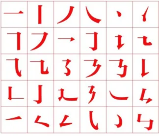
Basically, writing of Chinese characters’ strokes follows the rule of “left to right, above to below”. The strokes could be categorized into horizontal bars, vertical bars, out-strokes, turning strokes, hooks and dots. People often use the character “永” to summarize these features.
側 勒
弩 策
掠
啄
磔
側 勒
弩 策
掠
啄
磔
側 勒
弩 策
掠
啄
磔
亀頭 勒
弩 策
掠
啄
磔 亀頭
勒
弩 策
掠
啄
磔 側
勒
弩 策
掠
啄
磔
側 勒
弩 策
掠
啄
磔
側 勒
弩 策
掠
啄
磔
側 勒
弩 策
掠
啄
磔
亀頭 勒
弩 策
掠
啄
磔 亀頭
勒
弩 策
掠
啄
磔 側
勒
弩 策
掠
啄
磔
Fig 4.2
The character “永” and its modified version (not an actual character, only modified to describe the strokes better in visual) made by IMaDa Yoshikazu (今田欣一).
乐
The only exception might be the closed round shape in seal script, which could be seen in the traditional Chinese character “樂”.
Note the circle shape in the top part. You could write it in two strokes, using one left down stroke and one right turning stroke to form a closing counter. And that is the traditional way to do it, at least before Qing Dynasty. People always want to write the characters faster, which seems to be an universal demand on hand writing. As a result, a lot of calligraphers in Qing Dynasty prefer to write it in one circled stroke. Either way, the different writing order would not affect too much for this project, as the visual form is pretty much the same.
Fig 4.3
38
Fig 4.4
Calligraphy Practice in chancery hand.
Latin Script writing
4.2
It is certainly necessary to practice Latin script hand writing for a Latin type design project. In fact, one cannot take the type design class in RIT if you have not finished your calligraphy class.
Chapter 5
Design of the Latin Alphabet
42
Early Attempts on
Lower-case Letters
5.1
Ideally, all the researches and calligraphy practice are supposed to be finished before starting to draw letters, as a professional design work. But in fact, that this thesis begins with sketches right after the early idea of the thesis proposal. There is no doubt that these sketches would end up as failure.
Fig 5.1
The very first sketches of lower-case letters
Fig 5.1 & 5.3
The very first sketches of lower-case letters
This picture shows the earliest drawing. It is easy to find that no design concept has been form to control the shape, all the letters has many variants in chaos. Without practice and understanding of seal script and Latin calligraphy, it is very difficult to make them visually consistent. After practicing with seal script, second attempt was made as below.
Prototyping Lower-case Letters
5.2
The direction is clear that seal script characteristic should be applied to the typeface. So the experiment follows a simple method – keep writing in both script, especially seal script, until I found a way to make them in harmony.
During that time, it was always attempted to write the full alphabet in one time, but this turns to be a bad decision. The alphabetical order is what people use to learn the language, but not the visual form of letters. It is hard to see the connection between them, nor to summarize the shared shapes of letters. The scrapped sketches proved that start with alphabetical order is not a good idea, at least to a type design beginner.
Fig 5.4
Unused sketches in alphabetical order.
A frequently recommend lower-case letter string to begin with is
“hamburgevons”. The reason for using “hamburgevons” is that it contains many visual elements you can re-use in other letters. The letter “n” and “m” give you the stem widths and the space between them; the letter o gives you the closing counter which would appear again and again in your design; and the letter v tells you the proportion of letters with slanted strokes, etc. If this string was designed carefully, you would have a good start for a type design project.
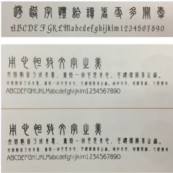
As this project need to fit with another existing typeface, Founder Small Seal Script (方正小篆) was chosen at first. Later, the matchmaking typeface was switched to Hanyi Small Seal Script (汉仪小篆). The letterforms of these two typefaces are basically the same, because they are digital revival of a same set of movable types. The reasons of switching are listed below.
· Hanyi Small Seal Script has a bold version (汉仪粗篆). Though they are not currently built into one type family, like STHeiti & STXihei in macOS, they could give a family option in the future.
Fig 5.5
Hanyi Small Seal Script (汉 仪篆书) & Hanyi Small Seal Script Bold (汉仪粗篆)
永晴杂娱逊虞树流酬闷随转
44
· Hanyi Small Seal Script has a larger UPM (Unit Per Em) 1000. Usually UPM would affect the type quality too much if it is over 1000, but Founder Small Seal Script has an extremely small UPM 256, which resulting a poor quality of outline.
[image:49.595.173.513.180.420.2]· the author currently (from 2014 till now) works for Hanyi, and it is easier to get a license to modify the Chinese font.
Fig 5.6
First prototyping of “hamburgevons”
Here is the first prototype of “hamburgevons”
Grid System and Confirmed
Lower-case Prototype
5.3
Chinese characters are often called “the block characters”, because they are usually set in a square. If you set a CJK grid parameter in a font editor, you would get a full-width em square in default. But it does not mean they are aligned with the edge of the square. Instead, they are aligned with an abstract visual center. However, they are supposed to cover a consistent percentage of the em square, which is called the virtual body§.
[image:50.595.74.424.61.342.2]§ This is translated from the Japanese phrase 仮想ボデー .
Fig 5.6
Snapshot in Glyphs, showing the default CJK grid and a 90% virtual body.
As you can see in Fig 5.7, the alignment is a little bit ambiguous comparing with Latin script. In Latin script, letter has several clear alignment line – baseline, meanline (x-height) and cap-height. Chinese characters look like a set of capital letters, but not precisely aligned to a reference line. Characters with a closed shape like “目” tend to be smaller, while the open shaped ones like “大” would be a little bigger in geometric dimensions. They cannot reach a visual consistency in small ponit sizes unless being designed like this. We could describe the difference in metrics as an ambiguous overshoot in Chinese.
The multi-language alignment will be further discussed in Chapter 8.
Fig 5.7
Single lined Chinese Text, as the sample of Chinese character alignment.
46
In small seal script, the variation of dimensions are even bigger than other styles. Is there any way to apply this specialty in Latin design? The answer is yes. Usually the lower-case letter are aligned with both baseline and meanline, while the round letters have overshoot over these lines a little bit. But if we divide these letter into open and closed shape groups, the Chinese alignment principles could be applied to them.
For example, for the two starting letters “n” and “o”, “n” is the open shaped while “o” is closed. Based on the Chinese alignment rule, “n” should be a little bigger in the open part, so the foots of “n” are made to descend a bit below the baseline. However, it is not common design in Latin, the classic aligning method are still taken into consideration. Taking some inspiration from Hebrew and Devanagari, and the letters are decided to be aligned by their shoulder.
It is necessary to explain why “n” & “o” are chosen out of the “hamburgevons” string at the start point. Even “hamburgevons” is the basic starting string, “n” & “o” are the most fundamental part. “n” is the representing letter with straight lines, and “o” is the simplest letter with curves. In Latin type design, not only designing the letters themselves, but also the space between them is important. For these two letters, their side bearing tells us how the space between straight and curved lines should be.
Fig 5.8
Hebrew and Devanagari Samples, photographed from
Typo 365 vol.1.
Fig 5.9
Well, different type designer has different preferred start point. Like the snapshot below, Matthew Carter like to begin with “hop” string, which also indicates the ascender and descender. Anyway, as we tried to make everything simple and clear, the two-letter word “no” is what we begin with.
Fig 5.10
Matthew Carter showing the letters h, o and p as the start of a type design project.
Screenshot from the documentary movie Helvetica.
Based on this principle, it was easy to make the grid system and first set of sketches. (See next page.)
Human’s eyes are not rulers, and they often lie to their owners. The vertical lines tend to be thinner than horizontal lines if they are given the same width. For a typeface, the horizontal lines should be geometrically thinner than vertical ones, in order to gain a visual evenness. Do not forget this important tip.
48
Fig 5.11
50
Digitization & Modification of
Lower-case Letters
5.4
The sketches need to be scanned and digitized into vector outlines. Before the scanned data got imported into font editors – no matter FontLab or Glyphs – it required to input a name for it. Maybe this is the only free part that a type designer can do without any limitation. This simulation typeface is named
Akchessima. And from now on, Akchessima will be used to refer this project.
Focus on Legibilty
5.4.1
[image:55.595.172.512.294.533.2]Before starting the explanation on details, it will be good to have some additional information on legibility.
Fig 5.12
Blur experiment on Arial letters, from lecture The Legibility of Letters and Words,
given by Sofie Beier, at AtypI 2016, Warsaw.
Legibility could be briefly defined as distinguishment between letters.
Among a lot of researches done on legibility, here is a interesting picture about it. In this picture, the researcher blurred a majority part of the letters in Arial, but reader could still tell the letters correctly. That was because the letters have the key part for people to recognize them, and those parts were not blurred. For example, one will need the cross bar to tell it is letter e, and the closed curve on the right to distinguish letter o from letter c.
Fig 5.13
Typeface Akchessima in progress in January 2012
Akchessima - a typeface by Xuan Zhang
hamburgevons�ck
96 pt 24/36 pt 12/18 pt hamburgevons�bhe�veghm�abmhes�novum�resammgo svegrub�eh�snom�hobbges�hamburgevons�sons�veghm� abmhes�nresammgosvegrub�bhe�a�mahvba�snom�hobbges sons�veghm�abmhes�novum�resammgosve�bhe�grub�eh� boagvoons�a�snom�hobbgeshamburgevons�sons�veghm� abmhes�novum�svegrub�eh�s�brev�a�mahvba�snom�hobbges sons�veghm�abmhes�nsammgo�svegrub�eh�boagvoons� hamburgevons�bhe�veghm�abmhes�novum�resammgo svegrub�eh�snom�hobbges�hamburgevons�sons�veghm� abmhes�nresammgosvegrub�bhe�a�mahvba�snom�hobbges sons�veghm�abmhes�novum�resammgosve�bhe�grub�eh� boagvoons�a�snom�hobbgeshamburgevons�sons�veghm� abmhes�novum�svegrub�eh�s�brev�a�mahvba�snom�hobbges sons�veghm�abmhes�nsammgo�svegrub�eh�boagvoons�Akchessima - a typeface by Xuan Zhang
abcdefghijklm
nopqrstuvwxyz
96 pt 24 pt
a wise man will know what game to play today and play it we must not be governed by rigid rules as by the almanac but let the
season rule us the moods and thoughts of man are revolving just as steadily and incessantly as natures nothing must be postponed take time by the forelock now or never you must live in the pres�
[image:56.595.87.447.55.578.2]ent launch yourself on every wave find your eternity in each moment
Fig 5.14
Typeface Akchessima in progress in Feb 2012.
Instead of explaining design details letter by letter, the finished alphabet will be shown first. And then they will be specified into groups for explanation.
52
Design of Letters with Straight Lines
Design of Letters with Curves
5.4.2
5.4.3
Fig 5.13 shows the letters with straight lines in forms, and they are n, m, h and u. Precisely speaking, the lines are no longer straight but curve inside. The
connection between two legs of n is not a smooth arc, but a emphasized turning point. This is simulating the brush flow of writing a turning stroke in Chinese.
Letter h is basically an n with extended ascender. But letter u is not an upside-down n. Its bottom curve aligns with base line, only the tail go beneath the baseline with equal length as n.
Letter m has been slightly modified with the upper curves in 2nd version, but the general image remains the same. it is approximately a symmetric shape, with the same beginning part as letter n. After some back and forth experiments, center stem of m was decided to be short. It would help to distinguish it from n, and make it more legible in the running text.
nhmu
Fig 5.15
letter n, h, m and u with alignment.
This group of letter begins with o.
Letter o was never a perfect circle, but it is usually centrosymmetric in text types. But in Akchessima, letter o is axis-symmetric to form a similar closing shape in seal script. Based on same reason, we extended the out stroke of c and e to gain the seal script flavor.
Fig 5.16
Letter o, c and e, with Character 目
Later, the “straight” lines were borrowed from finished letter n and h, then the letter b, p, d and q were built.
abpdq
Fig 5.17Letter a, b, p, d and q.
Letter a and g have the variants of single storey and double storey form, and the double storey form was chosen. There are two reasons for the decision. As the tail of a will get below the baseline, it might cause a legibility problem between a and q. Another reason is about the future expansion of character set. Though it is just a display typeface with the Ascii standard character set, there is no guarantee that it is completely unnecessary to make the IPA (International Phonetic Alphabet) extension. And the single storey a and g are needed for IPA. With further consideration like this, it is a safer choice to keep a and g in Ascii part in double storey form.
Letter s has been changed a lot between the two versions. The key characteristic of letter s is the soft curves. But the turning in the first version was too hard, making it less legible than expected. It is a typical result when you sacrifice too much for visual similarity in a simulation typeface.
Fig 5.18
Unicode code chart of IPA (International Phonetic Alphabet) extension. IPA would also borrow the Ascii part, single and double storey a represent different sounds, so it is a must to make a visual difference between them.
Fig 5.19
Letter s and its early version in red.
54
5.4.5
Design of Letters with Angled Strokes
5.4.4
Letters v, w, x and z belong to this group. Like the word “straight” in chapter 5.3.3, “angled” might not be that accurate, either. In the final visualized result, most
of the angled strokes turned to be curved. A straight angled line must be very legible, but it will also lack the visual factors to match seal script.
Letter v and w are softened, along with x. Of course, feet of x have been extended.
vwx
Fig 5.20
Letter v, w and x in Akchessima.
Unlike letter s stands out for its softness, Letter z is distinguished for its hard turnings. If not, it might look like a numeral 2. Though the center strokes are still curved, it was designed to hit with the two horizontal bars directly.
Fig 5.21
Letter z comparing with letter s.
Modification for Legibility
5.4.5
You may find that not all the letters are covered in previous parts, some of them are refined a lot for better legibility, like letter g mentioned in chapter 5.3.3. These letters’ design will be explained separately here.
· Letter i & j
These are the letters with dots.
Dots in heavy weight could be designed with the same width as the stems, but not in light weight. In small sizes, dots looked smaller than a stem stroke in equal width, or sometimes it is hard for people to see. As shown in Fig 5.22, the dots were designed to be wider than the stems, and also carefully treated to keep the seal script flavor. Just like the letter o, dots are not perfect balls, either. They were simulating a hand-written dot, which stopped at the top, and left the paper gently from the bottom
i j
Fig 5.22Letter i and j in Akchessima.
k
k
k
Fig 5.23Letter k modification, with the early version in red.
Also comparing with Helvetica and Univers.
· Letter k
56
r
Fig 5.24
Letter r modification. Red glyph is the early version.
· Letter r
Original sketch of letter r looked like a misplaced German long s. Though some seal script flavor were added into it, the weird shape just turned to be disruption on letter form. Finally, it was decided to make it in the regular way, and here is the drawing.
g
g
g
Fig 5.25
Letter g modification。 Red glyph is the early version. Also compared with Optima and Gill Sans.
· Letter g
Fig 5.26
[image:62.595.129.380.61.291.2]Lower-case Text sample with a unique but even visual pattern, set in 48 pt, with Hanyi Seal Script typeface as reference.
Fig 5.27
Text Sample in 14 pt, with Hanyi Seal Script typeface as reference.
abcdefghijklm
nopqrstuvwxyz
敏捷的棕毛狐狸
跳过了那只懒狗
a wise man will know what game to play today and play it we
must not be governed by rigid rules as by the almanac but let
the season rule us the moods and thoughts of man are revolving
just as steadily and incessantly as natures nothing must be
postponed take time by the forelock now or never you must live
in the present launch yourself on every wave find your eternity
in each moment
北冥有鱼其名鲲鲲之大不知其几千里也化而鸟其名鹏鹏
之大不知几千里也怒而飞其翼若垂天之云是鸟也海运则
将徙於南冥南冥者天池也齐谐者志怪者也谐之言曰鹏之
徙於南冥也水击三千里抟扶而上者九万里去以六月息者
也野马也尘埃也生物之以息相吹也天之苍苍其正色邪其
远而无所至极邪其视下也亦若是则已矣
58
Preparation for
Upper-case Letters
5.5
[image:63.595.175.512.235.465.2]After finishing the lower-case alphabet, the process became much faster than before. Lower-case design process expressed the way they were composed well, it is much easier to build the capital letters based on their skeletons. In this step, all capital skeletons were drawn in whole at beginning. Due to the lack of proficiency, the first sketch was consistent with the design of lower-case alphabet, but not in same quality as the small letters.
Fig 5.28
Sketches of Capital Letters.
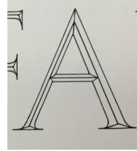
The main problem was the proportion of the letters. In order to solve these problems, several resources have been studied. John Howard Benson’s The Elements of Lettering is the very book to learn about skeletons.
Fig 5.29
[image:63.595.184.510.531.748.2]The linear skeletons showed the archetype model of capital letters, and the corrected ones are modified model for visual comfort. In a word, the corrected skeletons are a good sample to follow with.
In Edward Catich’s book The Origin of the Serifs, he took Trajan Inscription as a
classic sample of Roman capitals. There is a picture in David Harris’ book The Art of Calligraphy shown below, which categorized the upper-case letters by
[image:64.595.85.393.196.513.2]their widths. It is a very good visual explanation on the proportions of classic (Imperial Roman) capital letters.
Fig 5.30
60
Fig 5.31
Photography of Roman letters in the book Eternal Letters.
By the time the letters were drawn, these two books are the main reference. However, it is always good to see more good samples. A recent (2015) published book The Eternal Letter: Two Millennia of the Classical Roman Capital was a great
Design of Upper-case Letters
5.6
[image:66.595.85.400.166.651.2]With this research, it was not hard to process smoothly. Soon after, the capital alphabet sketches were finished. (Actually also with the numerals and punctuation design, but we will discuss about them in the next chapter.) The digitization was also done quickly with the sketches.
Fig 5.32
62
Before everything, the basic understanding of upper-case letters is needed. In early stage of Latin script, there was only capitals. When people invented the minuscule later, they used the capital form at the beginning of text as initials. In a visual designer’ view, the capital initial was an indicator of the beginning of a sentence or a paragraph. To make it visually work, this element should be emphasized. That was the reason that upper-case letters were designed a bit thicker than lower-case ones. If you need a ratio, capital letters are about 10% thicker than lower-case letters.
Fig 5.33
Digitization of Capital
Alphabet
ABCDEFGHIJKLM
NOPQRSTUVWXYZ
It was a much easier job comparing with the lower-case letters. So, in the explanation on the capital designs, only several groups of letters were chosen to show more details and refinements than others.
· Letter H, N and M
This group is the “straight” line group. Just like lower-case letters in Akchessima, most of the strokes are still curved. Since strokes in seal script style are even widths, we did not need to consider too much about the width contrast in H, N & M. (It is interesting that Chinese type designer often made “mistakes” on this, and here is an example.)
HNM 润圆
Fig 5.34
H, N & M in the Chinese Typeface HanyiRunyuan, the vertical strokes are in even width. It is easy to understand that was meant to match the consistent stroke width in Chinese, but it is a bit foreign for Latin.
Fig 5.35
The common ways of adjusting negative space in letter M,
However, the current M is an irregular form. It was inspired by seal script writing, and it looked like an upside-down character “山”. The two center strokes are joined on the upper part, and extended to the baseline. The final decision of the three letters are shown below.
HN
M
山
HN
M
Fig 5.36
The letter H, N and M comparing with the Chinese character “山” and Trajan.
·Letter B & D, letter R & K
Though Akchessima was a narrow typeface in general, most of the forms followed the Trajan proportion. These groups are proofs for this principle.
RK
RK
BD
BD
Fig 5.37Letter B & D in Akchessima, comparing with Trajan.
Fig 5.38
64
RrKkWwMm
Fig 5.39Letter R, K, W & M with their lower cases in Akchessima.
· Letter R, K, W & M
These groups are usually grouped into the letters with slanted straight strokes. Besides, K & W are also those who share similar forms in both upper & lower case. Fig 5.39 shows how they are designed.
The form of angled out stroke in capital K is borrowed from same part of lower-case k. As R was supposed to have a similar stroke in Imperial Roman, it uses the unique component, too.
As a letter, W was originally developed from double V, both lower and upper case represented its origin. The main difference is that lower-cased w used connected v form, while the upper-cased W used two V with crossed arms, or the capital would be too wide.
M was listed here again for it is usually visual similar to an inverted W, but they are different for they were not developed from the same origin.
EL
EL
Fig 5.40
Letter E & L comparing with those in Apple Chancery.
· Letter E & L
Pp
Pp
Fig 5.41
Capital and lower-case letter P, in comparison with Univers.
· Letter P
Chapter 6
Numeral, Punctuation,
68
6.1.1
Numerals
6.1
HALOGEN 0123456789 CAP (TAB)
Halogen 0123456789 Universal
HALOGEN 0123456789 Small Cap
halogen 0123456789 oldstyle
halogen 0123456789 O.S. tabular
Fig 6.1
Numeral sets in Adobe Clean, with various purposes of use.
Design of Letters with Angled Strokes
6.1.1
Fig 6.2
An array of Gill’s numerals, from Financier Design Information, posted by Klim Type Foundry.
https://klim.co.nz/ blog/financier-design-information/
Retrieved in Nov 17, 2014.
Even designing the lining figures, old style figures resource would also help you to build a better form. For example, some old-style numerals designed by Eric Gill all showed 2 with irregular height. But I thought this was a smart idea. Usually old-style 2 has the same height as 0 and 1, which is pretty short. Eric raised the height a little bit, but not as high as 3. As 2 and 3 had very similar curved top part, the difference in height could add distinguishment with short numeral like 0, but without misleading people to recognize it as a 3.
With the inspiration from Eric Gill, even the numerals in Akchessima were lining figures, the closed and open bottom letters vary in form. Open bottom numerals 3, 4, 5, 7 & 9 would extend over the baseline, while closed numerals 1, 0, 2, 6 and 8 still aligned with baseline. 1 was included as closed bottom letter because it chose a form with foot.
Fig 6.3
70
6.2
6.2.1
Counter Shape of Numerals
6.1.2
689
Fig 6.4
Numerals 6, 8 & 9 in Akchessima
Punctuations and Symbols
6.2
Akchessima’s character set covers Ascii Standard. In this section, some representative glyphs are selected to explain the design concept.
b
@
g
b
@
g
Fig 6.5@ sign in Akchessima, comparing with Univers.
@ sign
6.2.1
The sign @ has a history over 500 years, longer than some people expected. However, the origin of @ and its function was not the main topic, this thesis will focus on the modern usage on this sign. Nowadays, A common use of @ is to be a separator in email addresses, separating the user ID and the server domain. (E.g. [email protected], John is the user ID and gmail.com is the domain.)
In order to be a “good” separator, the inner part of @, which looks like a single storey a, was often designed to be slanted. The angled part would interrupt the rhythm of roman letters slightly, and separated the two parts aside the sign.
72
Ampersand
Pound, Percentage & Other Signs
6.2.2
6.2.3
Ampersand was originally a ligature of the letters et, which means “and” in Latin. As seal script was a very archaic writing style, I preferred to pick an original form for it. This became the main reason I designed the ampersand like a ligature of cursive E and t. Of course, in order to keep the visual consistency, cursive E borrowed the shape from numeral 3.
Most of time, the mathematic symbols are designed in a neutral form, for it has stricter visual rules on their usage. (E.g. a mathematic constant should be set in italic style, while the superscript numerals are supposed to be in roman style.) However, in project Akchessima, the most important issue is not the scientific accuracy. Instead of a neutral form, harmonizing with seal script spirit is a prior task. The guideline resulted in the curve and graphic form of the final design of the scientific symbols & punctuations.
&
3
Fig 6.6Ampersand and numeral 3 in Akchessima
%
0
?
2
!
I
=+-~#*<>^,.:;
Fig 6.7Legibility Adjustment
6.3
As Akchessima covers the full character set of ascii standard, it requires to explain some more details in considering with legibility.
·Numeral 1, Lower-case l and Capital I
These three sticks are easy to misread, even some famous typefaces have the trouble. In Erik Spiekermann’s blog post Helvetica Sucks||, he used this graph to show that Helvetica’s letter forms are not legible enough in small sizes.
|| “Helvetica Sucks”, Erik Spiekermann, http:// spiekermann.com/en/ helvetica-sucks Retrieved March 3, 2015.
Fig 6.8
Comparison between Helvetica, Arial, FF Meta & FF Unit, from Erik Spiekermann’s blog.
Fig 6.9
Numeral 1 and its early version in Akchessima (in red), comparing withcomparing with Optima & Minion.
But there are many methods to distinguish these glyphs. If you want 1 to stand out and could be recognized by itself, you could add a foot to it, like most of the text type did.
74
To tell the difference between I and l was hard in a lot of typefaces. Of course, you could add a little tail at the bottom of l, or add serif to I to identify them, but both the tail and serif were too much for seal script style.
In typefaces like Optima, designers did not use characteristic part to identify the letters, but only uses the difference in widths and height to distinguish them when they are together. In Akchessima, both ascender and cap-height were the same, in order to avoid too much variation when set with Chinese text. The difference in width was not obvious, either.
In Akchessima’s case, a top to the lower-case l was added, while the form of capital I was kept as a simple vertical bar.
1Il
1Il
1Il
Fig 6.10
Numeral 1, capital I and lower-case l in Akchessima, Comparing with Optima & Minion.
· Numeral 2 & Capital Z
People need the round top of 2 and the zigzag turning on top of Z to recognize them, and this is also the key point to design these two letters.
Fig 6.11
Numeral 2 and capital Z in Akchessima, Comparing with Univers.
Fig 6.12
Numeral 0 and capital O in Akchessima, Comparison with Univers.
0O
0O
· Numeral 0, Lower-case o & Capital O
76
Making Ligatures
6.4
In chapter 6.2.2, the phrase “ligature” was used. What is a ligature and why do designers need to make them? These questions will be answered in this chapter.
A ligature is a single glyph joined by multiple glyphs. Some of the ligatures were created for visual purpose, like a common fi or fl ligature. As the terminal (top end) of lower-case f would connect to the dot of i or the top of l in an unpleasing way, the two letters are combined into one glyph. In Akchessima, same problem occurs. The cross stroke of f would connect with the letter next to it if followed by i or l, so fi and fl ligatures are designed in Akchessima, too.
As a font is not just a set of glyphs, how do type designers make the ligature works in the computer design applications? Currently, It mostly relies on the OpenType feature to do this. You need to create a mapping from f and i to the fi ligature, and tell the software when to trigger the mapping. You need to write some “script” to let the fi ligature replace the original letters when f and i are set together.
[image:81.595.184.495.248.499.2]In this thesis project, font editor has been switched from FontLab to Glyphs, and the process became much easier. As Glyphs has a database for the characters in many writing systems, if you define the glyph name properly, the software would automatically recognize the relationship between glyphs and their ligatures or other alternative forms.
Fig 6.12
Ligature of fi and fl in Akchessima and Minion
So, making ligatures is simple now. What is needed to be done is to name letter f as “f” and letter i as “i”, then name the fi ligature I made as “f_i”, which connects the two glyph names with an underscore. By doing this, Glyphs recognizes this is the ligature of f and i, then generates this under OpenType liga table.
sub f i by f_i;
This line of script means, the fi ligature would substitute the neighboring f and i when you triggered the ligature feature in text layout applications like Adobe InDesign.
In Akchessima, like f & i, r is also easy to join other letters with serif in meanline. The ri ligature was made originally, and it could also be achieved by similar methods as described above. If it worked, it should be categorized to rlig table, which means the required ligature that the designers insist on his or her own demand. However, the form of ri ligature was not very legible and got scrapped from final design.
ri
Fig 6.13Chapter 7
Mixed Text Layout in
Latin & Chinese
80
A Typographic Detail
:
the ¼ em-width visual space
between Latin and Chinese
7.1
It has been mentioned that, every character in the ideographic system is actually a word with meaning. Also, unlike agglutinative language, e.g. Japanese language, Chinese does not have clear grammatical particles (such as kana は or
が) as markers of topic or something.
This results a big difference between ideographic and alphabetical text –
Chinese does not have word spacing, nor an obvious visual difference for various elements in the text (like kana and kanji in Japanese).
In multi-language text, especially those in Chinese mainly, it is quite often to see some sentences or phrases in Latin inserted into Chinese. Without any doubt, they have word spacing themselves, but the Chinese text surround it does not have. This will make the visual break weird, because there is nothing to notify the switching of writing system, and the sentence would be broken mostly in the Latin part. To ensure a smooth transition between two scripts, a visual space of ¼ full width are usually inserted between Chinese and non-Chinese characters.
啊,那是一款由
Blizzard Entertainment
开发的游戏。
啊,那是一款由
Blizzard Entertainment
开发的游戏。
啊,那是一款由
Blizzard Entertainment
开发的游戏。
啊,那是一款由
Blizzard Entertainment
开发的游戏。
Fig 7.1
Samples of text with or without ¼ em-width visual space between Chinese and Latin script.
Fig 7.2
Sample of text in Akchessima with ¼ em-width visual space inserted correctly.
# Taking Adobe InDesign for example, you would find support from its official document.
http://helpx.adobe.com/ indesign/using/composing-cjk-characters.html
¼ is a common value, but you can also customized yours. In Akchessima, the reference typeface has a pretty big letter spacing in Chinese part. As a result, a big visual space is definitely necessary fo