Browsing and Searching E-encyclopaedias
Ruth Wilson, Julie Shortreed & Monica Landoni
Dept. Computer & Information SciencesUniversity of Strathclyde Glasgow, UK
{ruth.wilson, monica.landoni}@cis.strath.ac.uk
Abstract
Educational websites and electronic encyclopaedias employ many of the same design elements, such as hyperlinks, frames and search mechanisms. This paper asks to what extent recommendations from the world of web design can be applied to e-encyclopaedias, through an evaluation of users’ browsing and searching behaviour in the free, web-based versions of Encyclopaedia Britannica, the Concise Columbia Encyclopaedia and Microsoft’s Encarta. It is discovered that e-encyclopaedias have a unique set of design requirements, as users’ expectations are inherited from the worlds of both web and print.
1. Introduction
Since their beginnings in the 18th century, encyclopaedias have been constrained by a linear, alphabetical structure, hindering access to the rich organisation and interconnections among articles. It was just over a decade ago that a seamless “circle of learning” started to become a real possibility with the web, which can take the reader “out of a linear model and into a connected network of thought” (Castelluccio, 1998). Indeed, hypertext “encourages lateral thinking … and metaphoric comparisons”, and Esposito (1996) observes that reference works are “perfectly matched to the branching, interactive nature of computing” as they are not read in a linear manner. Furthermore, they allow the publisher to provide added value content to the customer and so increase their appeal.
Over recent years, as the traditional features of encyclopaedias have been transformed, they have become increasingly similar to educational web sites in terms of organisation and appearance (Wilson, Shortreed & Landoni, 2004). As the presentation of web sites is a well researched area, with principles now well established, this paper asks if design recommendations which have been proven to succeed for web sites could be borrowed by electronic encyclopaedias (e-encyclopaedias). An evaluation of three web-based encyclopaedias is described (Shortreed, 2001), which attempts to understand this dynamic, evolving genre that is highly adapted to the online environment. In particular, user behaviour with respect to browsing and searching e-encyclopaedias is studied, in an attempt to inform good design.
2. Browsing and Searching on the Web
The more interactive and information-abundant a web site is, the more important it is that users can easily find their way around it. Implementations of browsing and searching functions can all impact either positively or negatively on user experience and satisfaction. Nielsen distinguishes between link-dominant, search-dominant and mixed-behaviour users and recommends that all three should be catered for through search and browse mechanisms (Nielsen, 2000a).
To summarise, recommendations in the literature point to several good practices in web design. To enhance browsing:
• Large web sites should cater for a range of user requirements by implementing a variety of
organisation schemes, such as alphabetical and subject indexes (Rosenfeld & Morville, 2002 ).
• Web sites should have consistent appearance across all pages (Schneiderman, 1997 ; NCI, 2003 ;
Ivory & Hearst, 2002).
• Users should be able to find information within four or five mouse clicks (Zaphiris & Mtei, 1998). • Too many links can cause confusion, but links to the home page and higher levels in the hierarchy
provide a sense of place (IBM, 1999 ; Nielsen, 2000b ; Chi, Pirolli & Pitkow, 2000).
• Links to external sites should be clearly labelled as such (Edwards, 1998 ; Spool et al, 1999).
To enhance searching:
• Search mechanisms are essential in large web sites. They should be available on every page and allow users to make simple, short queries with the option of refining their search (Nielsen, 2000a).
• The different requirements of experienced and novice users should be catered for (Rosenfeld &
Morville, 2002).
• Used carefully, scoped searches can increase usability (Nielsen, 2001).
• Results should be displayed with the best at the top, with a short description for each item (Nielsen, 2000a).
3. Comparison of Three E-encyclopaedias
With these web design recommendations in mind, three free e-encyclopaedias were analysed and compared, all of which differ in terms of their browsing and searching options.
3.1 Britannica
Britannica.com (Britannica), the web-based version of the Encyclopaedia Britannica, gives access to selected articles from the 32 volume encyclopaedia, a selection of approved web sites, articles from leading magazines, Merriam Webster’s dictionary and thesaurus and links to various commercial partners.
3.1.1 Browsing Britannica Britannica has a hierarchical structure and a hybrid organisation scheme. Users can visit homogenously organised subsites based on function (such as shopping) or audience type (such as schools). The design in use during the course of this research had limited browsing functionality through the main interface.
Presentation is consistent throughout the site, and colour is used to tell users where they are; for example, information related to the Britannica shopping subsite is always presented in green while the non-commercial parts of the site are always in blue. Britannica makes use of frames at the top, bottom and left-hand side of the page. These appear on all navigation and destination pages. In addition, a single frame at the top of the page appears on all external web sites accessed directly via Britannica.com.
On navigation pages, scrolling is generally limited to one and a half screens, with the main options visible at the top of the page. However, on destination pages, users may have to scroll up to eight screens.
density than destination pages. No use is made of “breadcrumbs”; page headings and “you are here” indicators make it clear where users are, but not necessarily where in the site hierarchy.
3.1.2 Searching Britannica Britannica.com is a search dominant resource, with a simple search interface. Scoped searching is available, with the option to search the whole site, individual reference works, the web directory or magazine articles. All options in the drop-down menu are visible without scrolling. Search tips, examples and an explanation of valid Boolean operators are only available by accessing the “Help” pages via a minimum of two mouse clicks.
Britannica sacrifices readability for volume and quality of information on the search results page. Results from the encyclopaedia, periodicals, current events and selected web links are all listed with a summary of content and, for the web links, a star rating. To fit the volume of information onto one page, a small font – 7.5pt equivalent – is used which may reduce readability for some users. “Best” results are displayed first. There is no indication of how many have been retrieved – a selection is shown with the option to click on “more”, if available. It is not always clear whether articles are premium content only, i.e. accessible only to subscribers.
3.2 Columbia
The 6th edition (2001) Concise Columbia Encyclopaedia (Columbia), available via the Bartleby.com web site, is a concise, one-volume encyclopaedia. It comprises a variety of reference books including the encyclopaedia, a dictionary, thesaurus and quotations, as well as full-text ebooks in fiction, non-fiction and verse. It has approximately 51,000 entries and 80,000 hypertext cross-references. Options for browsing and searching were available from the main interface, and some orientation clues were provided, but not on every page.
3.2.1 Browsing Columbia The Columbia Encyclopaedia is organised alphabetically although a topical scheme is partially implemented, for bibliographic information only. The parent site, Bartleby.com, can be explored through homogenous subsites based on literature genre.
Presentation is consistent throughout the site, with only one small frame at the top of every page displaying the corporate logo, navigation options and a search box. On navigation pages, scrolling is limited to two screens. Not all main options are visible. For example, on the Columbia home page, the alphabetical index is not visible without scrolling and the lack of density on the page makes it unclear whether there is any further information provided further down the page. On destination pages, scrolling up to nine or ten screens is necessary for longer entries. However, as most entries are concise, this amount of scrolling is unusual. Navigation pages have low density while destination pages are not designed with scannability in mind, with large portions of unbroken text, although some effort has been made to break up longer articles into paragraphs; however, these can be up to one and a half screens in length.
Labelling of links is not always clear. For example, where “previous” and “next” are used, it is not clear that the link takes users to a different encyclopaedia entry, rather than to the next or previous page in the same article. Labelling is more consistent with a print encyclopaedia than with standard web design, such as “contents” for the encyclopaedia “home” page and “guide” for online user information. Users can search a bibliographic index which may be an unfamiliar option for younger or novice users. A “Select search” term is used variously as a command and as an option. Some use is made of “breadcrumbs” to show users where they are in the site hierarchy although they do not appear on all pages.
five search boxes on one page: two Columbia search boxes, an Amazon.com search box and two through advertising.
Search results are presented in typical search engine style, numbered and with a short text extract showing the highlighted query term(s). Results with the query term in the title or entry word are considered “best” and are displayed first. Thousands of results can be retrieved, especially if the search is performed on “full text”.
3.3 Encarta
Microsoft’s Encarta (Encarta) is part of MSN’s Learning and Research zone. It caters for mixed-behaviour users with a combination of search and browse mechanisms.
3.3.1 Browsing Encarta Encarta and its parent site, MSN, are organised hierarchically. A number of organisation schemes are used including functional (shopping, homework), audience-specific (schools, colleges, parents) and topical. An alphabetical scheme is partially implemented but is not available from the primary interface.
Overall, information and other functions are presented consistently. However, major inconsistencies were identified, as follows:
• Accessing the Encarta site via the MSN “Home” page presents the user with a different page layout, frames and search function.
• Inconsistent use of certain navigation elements, such as search boxes which can be presented differently depending on which page the user is visiting.
Encarta makes most use of frames, with both Encarta and MSN frames visible top, bottom and at the right-hand side of the screen. When accessed via the MSN “Home” page, an additional MSN frame appears at the left-hand side of the page. The frames appear on all navigation pages and most, but not all, destination pages.
Navigation pages have very high density and scrolling is limited to one and a half pages. On destination pages, scrolling up to eight screens is necessary in longer articles, although an article outline at the top allows users to jump to individual sections within the same page.
Link labels are generally clear and it is obvious what the instructions refer to, such as “print section”, “next page” or “page 1 of 3”. No use of “breadcrumbs” is made to show users where they are in the site hierarchy.
3.3.2 Searching Encarta Search tips/examples are not available on the primary search interface but can be accessed through “Help” which opens as a separate browser window. A scoped search is partially implemented; the whole of Encarta.com can be searched but is not available directly from the Encarta Reference “Home” page. Various options for enlarging the scope are offered on the search results page.
Encarta displays the “best match” first, which includes a summary and article outline, if available. Below, results for each category are displayed in drop-down menus which means that not all results are visible. Only the title is given, except for MSN web links which are given a content summary. Articles that are premium content, not available on the free version of Encarta, are marked by an asterisk. On one search results page, results can be displayed in as many as four different formats.
3.4 Comparison
design recommendations: Columbia makes some use of breadcrumbs but its labelling of links is unclear, and Britannica makes no use of breadcrumbs but has clearly labelled links and a consistent presentation. However, since a strong, clear structure is a core factor in browsing, and e-encyclopaedia audiences have a diverse set of requirements, Encarta can be said to offer most to users in terms of browsing, by organising its data in several ways.
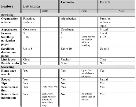
Britannica
Columbia Encarta
Feature
Notes Notes Notes
Browsing Organisation scheme
Function, audience
Alphabetical Function,
audience, topic
Appearance Consistent Consistent Mixed
Frames 3 1 3 or 4
Scrolling: navigation pages
1 1/2 2 Some options
not visible without scrolling
1 1/2
Scrolling: destination pages
Up to 8 Up to 10 Up to 8
Link labels Clear Unclear Clear
Breadcrumbs No Some No
Searching Home page search
Yes Yes Up to five
search boxes on a page
Yes
Scoped Yes Yes Partial
Tips Yes No Yes
Results: best first
Yes Very small font Yes Yes
Results: item description
Yes Not always clear whether item is for subscribers only
No An extract, rather than an abstract
[image:5.595.67.512.153.504.2]Yes
Table 1. Comparison of the e-encyclopaedias’ browsing and searching features
4. E-encyclopaedia Evaluation
The methodology was based on the EBONI (Electronic Books ON-screen Interface) project’s ebook evaluation framework (Wilson & Landoni, 2001), specially developed by the project to bring cohesiveness to all its experiments (Wilson, Landoni & Gibb, 2003).
4.1 Participants
36 participants took part in the experiment. An important aim of the study was to investigate how age and educational background would affect the way people interact with the selected material. To this end, the 3 participants belonged to two distinct groups:
1. “School group”. This comprised a class of 5th and 6th year pupils from Perth Grammar School, Scotland, sitting their Higher Computing exams. All 15 participants were aged 16 or 17 and had obtained either a Standard Grade in Computing or Information Systems Intermediate 2 as entrance to the Higher course.
or MSc in the Department of Information Science, University of Strathclyde, Scotland. The mailing lists were:
• JISCmail lis-books, aimed at those in the academic community with an interest in e-books.
• The eBook Community mailing list, for the general discussion of e-books and the e-book industry.
It was assumed that online participants would all have a qualification or professional interest in information science in general and e-publishing in particular. Postgraduate students were motivated to complete the survey by a desire to help the evaluator (a fellow-student) and an interest in the subject; mailing list respondents’ motivation stemmed from their professional interest in the outcome of the study and the advancement of research into e-books.
75% of online respondents used the Internet daily, and 80% of school participants used it at least two or three times a week; the Head of Computing confirmed that all pupils were familiar with the Internet and used it on a regular basis as part of the school curriculum. In both groups, the majority of respondents had not used an e-encyclopaedia before, and none used one on a regular basis.
4.2 Tasks and Techniques
One evaluator coordinated all aspects of the study, and collaborated with the Head of Computing at Perth Academy with regard to task development and assessment.
Tasks were designed to encourage either searching or browsing, and comprised:
• A search task. This asked participants to find two specific facts, with only one correct answer to each part of the question. While the question was designed to be simple, and using the encyclopaedia’s search functions was allowed, it did involve some scanning and synthesis.
• A browse task. This asked participants to find out a number of facts. To ensure that
search-dominant participants used the browsing facilities, participants were specifically asked to answer the question without using the search box. There was only one correct answer to each part of the question.
• A judgement task. In addition to encouraging browsing, this involved participants in making a
judgement about the relevance of the retrieved information:
These questions are slightly more difficult, since the user must not only locate the answer, but then must analyze the information sufficiently to formulate an opinion based on it (Spool et al, 1999).
The tasks were used to measure accuracy and were designed with two aims in mind:
• To ensure that participants used all the features of the encyclopaedias, in terms of presentation,
navigation and content.
• To ensure that neither group was disadvantaged due to differences in age and education.
Participants were asked about astronomy, a topic of general interest, and tasks were designed to be challenging enough to require both groups to use the encyclopaedias in order to discover the answers, yet not to be beyond the capabilities of either group.
Finally, subjective satisfaction questionnaires were completed by all participants after the tasks. Due to the limitations of time (school group) and resources (online group), interviews and think-aloud sessions were not conducted. However, the evaluator was able to observe the school pupils during the evaluation.
4.3 Procedure
• To provide details about themselves regarding age, and their experience of the Internet and
electronic encyclopaedias.
• To visit a particular e-encyclopaedia and complete some tasks. • To complete a subjective satisfaction questionnaire.
The tasks and subjective satisfaction questionnaires were identical for both groups; however the school group’s evaluation was conducted in a controlled environment with a fixed time limit, while the online group’s evaluation was conducted over the Internet, unsupervised and with no time limit.
4.4 Measures
The criteria for evaluation were derived from EBONI’s e-book evaluation methodology:
• Usability – participants’ success at search and browse tasks was used to measure the usability of
each encyclopaedia.
• Satisfaction, including quality, ease of use, likeability and user affect, and measured via the
subjective satisfaction questionnaire.
4.5 Hypotheses
The purpose of the evaluation was to discover which of the three encyclopaedias was most effective overall in terms of searching and browsing facilities. The following hypotheses were put forward:
• Hypothesis 1. Britannica users will perform best on the search task, which encourages searching for information, then following links.
• Hypothesis 2. Encarta users will perform best on browse and judgement tasks, in which browsing
is encouraged (Encarta’s strong structure will make for successful browsing and will provide contextual information which will assist with relevance judgements).
A secondary aim of the study was to investigate how age and educational background affect the way people interact with the selected material. If e-encyclopaedia publishers are to successfully tailor content and design to suit the needs of their diverse audience, then an awareness of how age and background can influence use is required.
5. Results
Data was analysed individually for each measure, and compared across the three encyclopadias and the two groups of participants. T-tests were employed to test the statistical significance of differences.
5.1 Usability
Figure 1 shows participants’ overall success at the three tasks.
Hypothesis 1 was not validated. In fact, users of Britannica had least success with the search task while Columbia users made no errors at all. Columbia users scored significantly higher than both Britannica (p<0.1) and Encarta (p<0.5) users.
Brit annica Colum bia Encart a
0% 20% 40% 60% 80% 100%
sear ch br ow se j udgem ent
t a sk
t
a
s
k
s
u
c
c
e
s
s
0% 20% 40% 60% 80% 100%
[image:8.595.293.533.69.337.2]Ease of use Likeabilit y User affect Qualit y of cont ent
Figure 1. Participants’ success at the three tasks using the different encyclopaedias
Figure 2. Participants’ subjective satisfaction with the encyclopaedias
Columbia Encyclopaedia bore most resemblance to a print encyclopaedia in terms of content, layout and appearance, albeit enhanced by a search function and hyperlinked cross-references. It is therefore suggested that users’ familiarity with paper encyclopaedias contributed towards their general success at tasks using Columbia. The page layout is consistent with the paper book metaphor, and there is a clear indication that users found the more paper book-oriented alphabetical index easier to use than the topical index on the second task. Despite their initial confusion, the school users made no errors using the alphabetical index. Indeed, one pupil using Columbia commented, “It was easier and quicker to look for things on the index than using the search engine”.
The lack of a browsing facility on Britannica’s main interface is unlikely to have been detrimental to success on the search task. However, layout of search results may have contributed to the higher error rate on both Britannica and Encarta, users finding it easier and quicker to understand Columbia’s more familiar search engine style layout. In addition, the location of tables of contents at the end of long Britannica articles may have contributed to the higher error rate.
The school participants found the judgement task most difficult and made significantly more errors than the online group. Designed to encourage participants to browse and visit several pages or articles, the fact that the error rate is highest on Britannica indicates that the lack of a browsing facility was a disadvantage on this task. Conversely, Encarta’s clear organisation assisted users in making judgments about the information they had found.
5.2 Subjective Satisfaction
Figure 2 shows participants’ subjective satisfaction with the encyclopaedias.
[image:8.595.76.290.117.334.2]Tasks suggested the effectiveness of alphabetical indexes, and responses to the questionnaire confirmed that participants found them easier to use. Although Britannica’s lack of a browsable organisation scheme via its primary interface seemed to be a disadvantage for tasks designed to encourage browsing, it did not seem to have an adverse effect on either user affect or ease of use.
Participants reported that they found Columbia confusing, which can be attributed to its use of non-standard link colours, long drop-down menus and numerous search boxes on one page. The latter point was confirmed by an online respondent:
The encyclopaedia was very distracting, especially with the search engine for Amazon being on the same page.
School participants indicated that they would have been more comfortable using a familiar search interface, such as their favourite search engine. This view was backed up by an online respondent:
For this kind of information, I tend to prefer using just a web search engine and then filtering out the good from the bad from the hits that I get back.
Providing search tips on the main interface would have helped younger users in formulating queries, and there is some indication that online users would have preferred the choice of an advanced search, illustrated by the following comment from a Britannica user:
…a better search interface with more advanced methods of refining your query would have improved the whole experience for me.
5.3 Requirements of Younger Users
In summary, school pupils exhibited the following behaviour:
• Younger users have difficulty in identifying and extracting relevant information where it is not
immediately obvious or where they have a large choice of potentially relevant documents.
• Younger users expect to find the right answer or the relevant information quickly and have a
tendency to blame the site rather than spend time/effort learning how to use it or reformatting their queries.
• Younger users are attracted by multimedia.
• Familiarity with the design of a web site is a significant factor in younger users’ opinion of a new
web site and their ability to navigate their way around the site. The observations would also suggest that younger users may be put off using potentially useful sources of information due to an unfamiliar interface or design.
6. Conclusions
The aim of this evaluation was to understand user behaviour in terms of browsing and searching e-encyclopaedias, and to determine whether recommendations from the field of web design could equally be applied to these resources.
Our results suggest that certain aspects of good web design also apply to e-encyclopaedias. For example, pages should be presented consistently throughout a site, tables of content should be available at the tops of pages, standard link colours must be used and drop-down menus should not require too much scrolling. With regard to searching e-encyclopaedias, consideration must be given to users’ familiarity with common search engine interfaces: some participants said they would feel more comfortable using a web search engine to discover the answers to the tasks, and it was observed that laying out search results in the manner of search engines helped with synthesis and scanning of information.
alphabetical organisation schemes easier to use. This was borne out in both tasks and subjective satisfaction questionnaires.
Moreover, observation of school users suggested that they had a low tolerance to learning how to find information in new resources, and would prefer to use their favourite search engine to find the answers to tasks on the web. Designers of e-encyclopaedias should bear in mind the requirements of this younger audience, as it represents their future user population.
Therefore, e-encyclopaedias are a unique consideration, with users bringing expectations from the worlds of web and print. Good practice with respect to the design of e-encyclopaedias constitutes an awareness of users’ behaviour with paper encyclopaedias, as well as their more recent familiarity with browsing and searching on the web. Moreover, the ongoing evolution of e-encyclopaedias’ content and their broad range of uses and users means that interactions with them are not only varied and complex, but also continually changing. With the web increasingly being used as a source of reference information, quality and conciseness, the traditional advantages of the encyclopaedia, could easily be obscured by presentation which does not pay adequate attention to this shifting behaviour.
The study outlined here represents an initial consideration of a broad range of design features by two distinct groups of users. Its conclusions can be used as a starting point for developing a full set of design heuristics for e-encyclopaedias, based on further, rigorous testing.
References
Castelluccio, M. (1998). The future of books. Management Accounting, 79.
Chi, E., Pirolli, P. and Pitkow, J. (2000). The scent of a site: a system for analyzing and predicting information scent, usage, and usability of a web site. Conference on Human Factors in Computing (CHI 2000), The Hague, Netherlands, April 1-6.
Edwards, J. (1998). The good, the bad and the useless: evaluating internet resources, Ariadne, 16. http://www.ariadne.ac.uk/issue16/digital/
Esposito, J. (1996). Very like a whale: the world of reference publishing. Logos, 7(1).
IBM. (1999). Web design guidelines: visual layout and elements. http://www-3.ibm.com/ibm/easy/eou_ext.nsf/Publish/602/
Ivory, M. and Hearst, M. (2002). Statistical profiles of highly-related web sites. Conference on Human Factors in Computing (CHI 2002), Minneapolis, USA, April 20-25.
NCI. (2003). Research-based web design and usability guidelines. http://usability.gov/guidelines/ Nielsen, J. (2000a). Designing Web Usability. Indiana: New Riders.
Nielsen, J. (2000b). Is navigation useful? Alertbox, 9 January 2000. http://www.useit.com/alertbox/20000109.html
Nielsen, J. (2001). Search: visible and simple. Alertbox, 13 May. http://www.useit.com/alertbox/20010513.html
Rosenfeld, L. and Morville, P. (2002). Information Architecture for the World Wide Web. O’Reilly. Schneiderman, B. (1997). Designing information-abundant websites: issues and recommendations.
International Journal of Human-Computer Studies, 47 (1).
Shortreed, J. (2001). E-encyclopaedias: a usability study. Glasgow: Department of Information Science, University of Strathclyde (MSc Dissertation).
Spool, J., Scanlon, T., Schroeder, W., Snyder, C. and DeAngelo, T. (1999). Web Site Usability: A Designer’s Guide. California: Morgan Kauffman.
Wilson, R. and Landoni, M. (2001). Evaluating electronic textbooks: a methodology. Fifth European Conference on Research and Advanced Technology for Digital Libraries (ECDL 2001), Darmstadt, Germany, 4-9 September.
Wilson, R., Landoni, M. and Gibb, F. (2003). The WEB Book experiments in electronic textbook design. Journal of Documentation, 59 (4), 2003.
Wilson, R., Shortreed, J. and Landoni, M. (2004). A study into the usability of e-encyclopaedias.
Proceedings of the19th ACM Symposium on Applied Computing (SAC 2004), Nicosia, Cyprus,
14-17 March.