City, University of London Institutional Repository
Citation
:
Booth, P., Gibbins, N. and Galanis, S. ORCID: 0000-0003-4286-7449 (2018).
Representation Effects and Loss Aversion in Analytical Behaviour: An Experimental Study
into Decision Making Facilitated by Visual Analytics. In: Proceedings of the 51st Hawaii
International Conference on System Sciences. (pp. 1310-1318). Honolulu: University of
Hawai'i at Manoa. ISBN 978-0-9981331-1-9
This is the accepted version of the paper.
This version of the publication may differ from the final published
version.
Permanent repository link:
http://openaccess.city.ac.uk/21406/
Link to published version
:
10.24251/hicss.2018.161
Copyright and reuse:
City Research Online aims to make research
outputs of City, University of London available to a wider audience.
Copyright and Moral Rights remain with the author(s) and/or copyright
holders. URLs from City Research Online may be freely distributed and
linked to.
Representation Effects and Loss Aversion in Analytical Behaviour: An
Experimental Study into Decision-Making Facilitated by Visual Analytics
Paul Booth University of Southampton
Nicholas Gibbins University of Southampton
Spyros Galanis University of Southampton
Abstract
This paper presents the results of an experiment into the relationship between the representation of data and decision-making. Three hundred participants online, were asked to choose between a series of financial investment opportunities using data presented in line charts. A single dependent variable of investment choice was examined over four levels of varying display conditions and randomised data. Three variations to line chart visualisations provided a controlled factor between subjects divided into three groups; ‘standard’ line charts, ‘tall’ line charts, and one dual-series line chart. The final results revealed a consistent main effect and two other interactions between certain display conditions and decision-making. The findings of this paper are significant to the study visualisation and to the field of visual analytics. This experiment was devised as part of a study into Analytical Behaviour, defined as decision-making facilitated by visual analytics – a new topic that encompasses existing research and real-world applications.
1. Introduction
In the last decade, Visual Analytics (VA) technology and techniques have been applied in areas of business intelligence, healthcare, insurance, fraud, finance, and journalism where issues of data overload present a continued challenge [17]. VA is a multidisciplinary field intended to understand and support decision-making by understanding the reasoning and sensemaking processes that precede them.
However, our own research has begun to identify a number of real-world applications applying VA techniques that directly facilitate decision-making in users – a topic overlooked by current research. Noted examples include; commercial web and mobile applications designed to support financial investment choices, analytics tools to optimise sell-through rates in online auction markets, travel apps that optimise choices
to personal constraints, and healthcare apps designed to improve or develop new behaviours. Such examples of interactive visual interfaces being used to directly facilitate decision-making are abundant, both on the web and in major mobile app stores. Although VA research may have directly or indirectly informed the development of these examples, as a field VA has not formalised a research effort into decision-making as an area of study.
An outgrowth of information and scientific visualization [27], VA was formalized by a research agenda motivating the need to improve situational awareness for national security, border control and disaster response in the US and globally [7]. A revised and shortened agenda was published the following year [26], highlighting the need for VA to support decision-making but without ever proposing decision-decision-making as a topic of study. Instead, the exploratory processes of analytical reasoning were made the primary focus, because they “directly support planning, assessment, and decision making”. This strategy has helped to advance the field of VA significantly and in it, our understanding of the reasoning processes that lead to decisions. Over the past decade however, the gap in the literature on decision-making has grown.
The experiment presented in this paper is intended to form part of a larger body of research into a new topic of decision-making facilitated by VA, which we define under the term of analytical behaviour. Presently, the focus is on applications that capture decisions into the same system presenting data visualisations to the user; providing an observable closed-loop between data and decision-making. This explains our reasoning for isolating certain real-world apps, such as those support financial investment decisions– a scenario that inspired this experiment.
As a topic, analytical behaviour provides a convenient context for previous work, including research by Savikhin et al. on the use VA to support economic decision-making [25], personal financial planning [23], and financial portfolio selection [24]. Their experiments provide evidence that exploratory VA techniques provide effective decision-support tools Proceedings of the 51st Hawaii International Conference on System Sciences|2018
URI: http://hdl.handle.net/10125/50048 ISBN: 978-0-9981331-1-9
(CC BY-NC-ND 4.0)
for people with varying risk preferences. Furthermore, that visualised information “can be useful for overcoming bounded rationality issues that arise from the cognitive limitation of considering all the information at hand” [25].
However, the precise relationship between the visual display of information and decision-making has not yet been examined in these or any other research to our knowledge. To begin to understand and explore the potential to model analytical behaviour, it is necessary to systematically study the components of VA that facilitate decision-making. For example, by conducting experiments that isolate the effect of variations in visual displays on decision-making by reducing or removing interaction variables, as is the case with the experiment presented in this paper. As the results from this experiment will show, variations in the ratio of line charts or using a dual-line chart over two separate line charts can have a significant effect on a user’s perception of risk and return. These results should encourage the need for further investigation into the study of analytical behaviour.
1.1. Data representation
The purpose of representing data is to provide an efficient and effective means for the end user to reach their goal. But the goal of the user may be to explore the data, as with intelligence analysis. Instead, it could be to efficiently perform perceptual tasks, the aim being to accurately decode visualised data to gain knowledge or insights. A person might from an infographic in the newspaper, or to make decisions directly from the data as a financial trader might do.
Data representation is the visual component that stands between the goal of the user and the raw data, regardless of whether the end product is a single chart, dashboard, report, or sophisticated analytics application. The purpose of visualisation is the efficient transmission of data from the screen to the mind of the user, therefore the effectiveness of a visualisation is dependent on maximising signal accuracy between the visual encoding of data and the user’s perceptual decoding and cognitive processing of that same information.
The continuing rise in the scale of data makes the design and evaluation of VA tools uniquely challenging. Volume, variety, and velocity are attributes of ’big data’ [8,22] that make it impossible for a (human) data-product designer to account for all possible future visual representations. For example, increasing the dots shown in a scatter plot reduces the accuracy of visual search tasks [13]. With this in mind, the effectiveness of a scatterplot may change over time given changes in the volume of data. Reviewing user requirements over time helps, but it would be preferable if this could be done
automatically. Measuring the effectiveness of graphs for reasoning and perceptual-task processes is challenging because they relate to cognition and perception more than externalised decision-making.
Two current solutions to the problem of unanticipated representation effects are to provide end-users with customisable components, allowing the user swap out charts and create their own dashboards. This is problematic because it puts the user, a person less likely to understand how to optimise VA to support decision-making, in the role of a VA designer. Researchers are exploring the potential for the computer to take this role on, using mixed-initiative systems to recommend visualisation techniques [12]. However, this is more the case for research into analytical reasoning and task-based process, less so in VA decision-making research.
1.2. Representation effects
Cleveland and McGill aimed to establish a scientific foundation on visual decoding with the theory of graphical perception [6]. Their assertion being that when people extract information from graphs they are carrying out an elementary perceptual task. Their results led to the further ranking of perceptual accuracy by data types; continuous, ordinal, and nominal, by Mackinlay [20]. Perceptual tasks provide one perspective on the accuracy of representation, however, there are also cognitive perspectives that reveal representation effects. Researchers from distributed cognition found that different representations of data caused “dramatically different cognitive behaviours” [33]. The investigation into this “representation effect” was built on earlier psychology research that focused on the form, visual organisation, and sequence of “information displays” [18]. The study measured cognitive effort and accuracy within a cost-benefit framework; limiting its use to the evaluation of tasks but not applicable to the study of analytical behaviour. Zhang has suggested that graphs could be systematically studied without clarifying precisely how [31]. Aside from a theoretical framework to study problem solving using the attributes of external-representations [32], we have found no suitable framework or theories to further this line of research into the study of analytical behaviour. A review of the economics literature into bias and framing effects did provide a more relevant view of decision-making grounded in psychology and is discussed in the next section.
1.3. Bias and framing
A number of cognitive biases have been explored in visual analytics, including; a framework that supports
the detection and mitigation of cognitive biases in visual analytics environments for criminal analysis [21]; identifying and minimising selection bias for high-dimensional data exploration in visual analytics [11]; selection bias as a major opportunity and challenge in healthcare [10]; using mixed-initiative systems to ’neutralise’ bias [14]; and visual analytics techniques as “cognitive amplifiers, cognitive prostheses, and cognitive mediators” [1].
The framing of a decision problem is controlled in part by the user’s role, but also by the formulation of the problem itself, collectively referred to as the “decision frame” [28]. For example, the statistics of a surgical procedure could be framed in two ways; a 90% survival rate or a 10% mortality rate. The impact of similar framing effect has been the subject of two experiments exploring the potential to ’nudge’ a person’s choice with alternate frames in the context of health behaviour change, and another looking at the influence of framing when evaluating mobile apps by their privacy ratings [4,5].
Evidence of framing is otherwise well documented in the economics literature. It was identified thirty years ago that inconsequential differences in the formulation of risk problems produces marked effects [29]. However, economics research has, to our knowledge, never examined the effect of differences in visually encoded data. More recently it has been proposed that different decision frames could have moderating effects on loss aversion in the context of trading goods [2] and that there are three main types of framing effects [19]. However, framing effects are considered one type of cognitive bias and not a framework or model for studying behaviour.
1.4. Prospect theory
The modelling of decisions has long been the focus of economics research. Decades of experiments support widely impactful theories that explain the rational (meaning profit-maximising) and irrational behaviour of ‘economic man’. In classical economics, consumer behaviour was described in terms of utility; how consumers rank goods in terms of satisfaction. Expected utility theory was the normative model for rational choice and had dominated the study of decision-making under uncertainty, prior to the introduction of Prospect Theory in 1979 by Kahneman and Tversky [16] in which they demonstrated several classes of problems that systematically violated the axioms of expected utility theory.
Prospect Theory differs from Expected Utility as a descriptive model of behaviour that is more psychologically accurate. A key empirical insight being that people do, in fact, perceive outcomes relative to a
reference point and not in terms of final states. In other words, the feeling of winning $100 is relative to a person’s current wealth and would be viewed differently by someone who, for instance, lost $100 moments before. The notion of reference dependence provided new insights into loss aversion and biases relevant to choices and judgements [3,16,30].
In addition to the series of simple experiments showing violations of expected utility theory, Kahenman and Tversky’s original paper for prospect theory also presented a formal model of attitudes to risk. Their formulation, and its later revision as ‘cumulative prospect theory’ [30], elegantly accounts for the normative violations in a descriptive model that captures how people evaluate outcomes under risk in an experimental context. To apply prospect theory more broadly, researchers have sought to define more precisely both the reference point and the types of “gains” and “losses” a person is thinking about [3].
The experiments that support Prospect theory reveal that, in general, people are more sensitive to losses than gains. This leads to risk-seeking behaviour when faced with the prospect of losses and more risk-aversion in the domain of gains. To reveal the asymmetry in behaviour, Kahneman and Tversky studied people’s responses to positive and negative prospects (meaning gambles). The reflection effect they found was named due to the reflection of preferences around zero. In other words, most people preferred a more certain gain of $3000 over an 80% chance of winning $4000, but also preferred to take the risk (an 80% of losing $4000 over a certain $3000 loss) when the prospect were mirrored. To our knowledge there have been no experiments to examine the same perceptions of value when risk and outcomes are presented in the form of data visualisations. Previous experiments have only studied the use of explicitly stated probabilities and outcomes in the form of words and numbers.
Following the same approach as Kahneman and Tversky in their original paper, the experiments presented in this paper are a series of choice problems. We do not attempt to apply the prospect theory model as this stage. Instead, this paper aims to produce empirical evidence that the same findings from the original prospect theory experiments hold true when data is visualised to facilitate decision-making under uncertainty.
To apply the formulas of prospect theory to visual analytics requires a single input value for a return outcome and its associated risk. Since risk is only perceptually implied in the variance of the line shown on a line graph, additional work is required to calculate these values that is outside the scope of this experiment. However, the formal application of prospect theory to visual analytics is within the remit of our larger research
programme into analytical behaviour. Results of this work are encouraging but not yet published.
1.5. Online experiments
The use of online experiments has proved to be a valid method of studying perceptual tasks with greater statistical power gained from a larger sample size, when compared to studies using a limited pool of students. Repeating Cleveland and McGill’s original study into perceptual task ranking, Heer and Bostock used Amazon’s Mechanical Turk to recruit a large number of participants, gaining greater statistical power than Cleveland and McGill as a result [15]. The trade-off in online experiments is the lack of control over external factors compared to lab studies. Our preference was to conduct this experiment online to gather evidence of analytical behaviour from people in their own environments.
2. Method
We conducted two experiments; a baseline experiment and a main experiment, using three hundred online participants. The main experiment immediately followed the baseline experiment in the same online session. Participants were recruited and managed using the service ProlificAcademic.ac, the experiment itself was conducted using the online service Qualtrics. With these tools, it was possible to recruit three hundred people, run the experiment, and remunerate participants in less than three days.
2.1. Recruitment of participants
We recruited three hundred participants using the online service Prolific Academic. A service similar to Amazon Mechanical Turk which has been used in other visual analytics studies on perceptual tasks [15]. A reward of £0.50 was offered to fit the estimated completion time of 5 minutes making the remuneration £6.00/hr. pro-rata. The average completion time following three hundred results was three minutes, the total cost of running the study was £165. The three hundred participants were assigned to one of three groups automatically by the Qualtrics software used to conduct the experiment.
2.2. Baseline experiment
In the baseline experiment, three hundred participants were shown the same three sets of prospects, one after the other. Each prospect consisted of two line charts showing two different stock prices
over a thirty-day period. The charts were of equal design, different only in the data they displayed for the three baseline questions B1, B2, and B3.
The first two baseline questions (B1, B2) are designed as perceptual tasks, meaning they have objectively correct answers. B1 asked users to identify the stock with the highest return, this requires a person to visually assess the return (change in value since day one) for each stock and compare them to be able to choose the stock with the largest return.
B2 asked users to choose which stock had the highest risk. Participants were not told how to interpret risk, which is represented as the variance in price over time (i.e. the stock with the least straight line). Both questions, B1 and B2, are problems that have an objectively correct answer and are solved by performing elementary perceptual tasks. They were designed to identify a person’s ability to identify and rank simple risk and return values from line chart visualisations.
The third question (B3) requires people to perform perceptual tasks to decode risk and return values, but unlike the previous two questions it requires an additional subjective judgement. B3 is designed to reveal a person’s appetite for risk under uncertainty, it does not have an objectively correct answer like B1 and B2. This reveals an analytical behaviour scenario where perception informs the answer, but does not provide it. This is also true of the four main experiment questions.
2.3. Main experiment
For the main experiment, three hundred online participants were divided into three groups (G1, G2, G3). The choices, contextual statements, and data were all identical for all three groups. The independent variable used was the method of visualisation; three
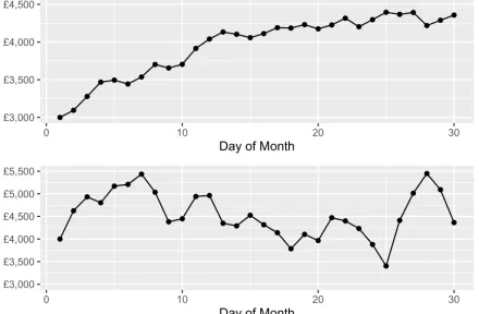
Figure 1: Baseline question 1 tested the ability of users to perform perceptual tasks accurately. Participants were asked to identify the stock with the highest return over thirty days
[image:5.612.321.541.508.652.2]factors were changed across groups. Group 1 were shown a default pair of line graphs – one for each stock price, Group 2 were shown a pair of taller line charts, meaning the aspect ratio was altered, and Group 3 were shown a single, taller line chart with two stocks presented on the same graph.
In all groups, participants were required to choose the stock they preferred to invest in for the next 30 days, based on the performance of each stock over the previous 30 days. The same statement accompanied each pair of stocks and was presented the same to all participants, in all groups:
The charts show the prices of two different stocks over the last 30 days. Choose the stock you would
prefer to invest in for the next 30 days
Participants were not assigned different roles; all users were ‘buyers’ and were not given any additional information or prompts about their current wealth or expectations.
The same data is used for all three display conditions, generated by a simple ’random walk’ function in R. Parameters for variance, day one starting price, and day thirty closing price were used to adjust the patterns of randomised price data to suit each risk-return choice problem presented to participants.
2.4. Predictions and hypotheses
The overall aim of this experiment was to study the effect of visualisation methods on decision-making. The following three hypotheses defined our expectations for the results of the experiment:
H1: Most people will be risk-averse in the domain of gains
H2: Most people will be risk-seeking to avoid a loss (loss aversion)
H3: Choices will be consistent across groups 1 and 2 (no representation effect), with some variation in choices made by group 3.
Questions 1 and 2 in this experiment were designed to elicit similar responses to problems 11 and 12 from the prospect theory experiments conducted by Kahneman and Tversky in 1979 [16]. For instance, question 1 gives participants a choice between a ‘sure thing’ and a risky prospect in the domain of gains, while question 2 presents the same problem in the context of losses - a ‘sure loss’ versus a risky loss. In line with the findings of the prospect theory
experiments, we anticipated people to be risk-averse when making choices in the domain of gains (H1) and risk seeking to avoid a loss (H2).
For participants in group 3 (the dual line chart), we expected the majority of individuals to choose any stock that consistently dominates another stock simply due to it being easier to compare two lines that share the same y-axis. By extension, we expected that a risk prospect that dominates a ‘sure thing’ would be preferred more by participants in the dual-line chart group than in the other two groups who were shown separate line charts (H3). We expected participants in group 3 to exhibit the most, if any, difference in behaviour given that comparisons of risk and return are more efficient when two stocks are expressed on a dual-line chart.
3. Results
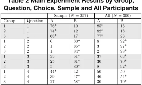
[image:6.612.318.549.87.226.2]In the following section we analyse the results of the baseline questions (B1, B2, and B3) before reviewing the results of the main experiment. The results from B1 and B2 enabled the creation of a subset of data containing the participants who were able to: a) correctly identify the stock with the highest return over 30 days and; b) correctly identify the riskier of two stocks. In short, this sample set of users (N=237) are Table 1 Baseline Experiment Results
[image:6.612.67.290.105.224.2](No Varying Display Conditions)
Table 2 Main Experiment Results by Group, Question, Choice. Sample and All Participants
Question Group Option A (%) Option B (%)
B1 1 90* 10
2 89* 11
3 90* 10
B2 1 5 95*
2 5 95*
3 7 93*
B3 1 75* 25
2 68* 32
3 74* 26
Sample (N= 257) All (N= 300)
Group Question A B A B
1 1 76* 10 85* 15
2 1 74* 12 82* 18
3 1 68* 17 77* 23
1 2 6 80* 8 92*
2 2 1 85* 3 97*
3 2 1 84* 2 98*
1 3 35 51* 37 63*
2 3 25 61* 30 70*
3 3 5 80* 8 92*
1 4 44* 42 50 50
2 4 39 47* 46 54*
3 4 27 58* 30 70*
considered to be people who can correctly perform perceptual tasks and follow basic instructions.
3.1. Baseline results
Table 1 shows the proportion of participant choices for questions B1, B2, B3. These results reveal that the vast majority of the 300 participants chose stock A for B1, then stock B for B2. The table is divided by treatment groups to show that there was no significant variation between the groups before the visual factors were introduced in the main questions for experiment 2. As reported earlier, all three groups were shown the same visual representation of data for questions B1, B2, and B3.
3.2. Main experiment results
The results for both the sample (N = 257) with the total number of participants (N = 300) are given in Table 2. The sample group are those users who correctly answered B1 and B2 in the baseline experiment. Figure 2 shows the percentage of each treatment group that chose option “B” across all four questions.
Figure 2 reveals a consistent main effect across graphical display types (i.e. all treatment groups; responses from G3 are consistently higher than G2 which are in turn higher than G1. The difference between groups varies by question; the closest results are between G3 (98%) and G2 (97%) in Q2, there is a significant interaction between G3 (94.12%) and the other two groups; G1 (59.3%) and G2 (70.93%) in Q3.
4. Analysis of results
The majority of people made decisions in accordance with the experiments from prospect theory discussed in section 1.4. The results provide empirical evidence to support H1 (most people will be risk-averse in the domain of gains) in Q1, and H2 (most people will be risk-seeking to avoid a loss) in Q2. The main effect between groups points to two possible factors contributing to a representation effect in analytical behaviour:
• The height-width ratio of a line-graph effects the shape of the line; ‘taller’ graphs accentuate changes in value, thereby altering a person’s perception of value
• Two lines on the same graph enables more accurate comparisons of risk and return due to differences between line values are visually intuitive.
The difference in choices made across groups does appear to depend on whether the choice is between two gains (Q1), two losses (Q2), higher performing riskier stock versus more certain but lower performing stock (Q3), and two stock with high but different patterns of risk. The two stocks in Q3 had the largest difference in value, leading to the y-axis of the charts in Q3 to be different ranges. A difference which is intuitively evident to the dual-line chart in group 3, where ~20% more people chose the riskier stock.
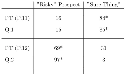
[image:7.612.79.287.396.605.2]The first two questions in the main experiment were based on experimental research problems from the economics literature. Table 3 shows the responses of users from Problems 11 and 12 from Kahneman and Tversky (discussed in section 1.4), compared to the Q1 and Q2 sample results from our own experiment. In their experiment Kahneman and Tversky provided users with two choices for Problem 11; A: $1000, .50 or B: -$500, and two choices for Problem 12; A: $1000, .50 or B: -$500. In our experiment, the general premise of gains and losses was devised to be similar; choose between a sure and risky gain in Q1, then a sure and risky loss in Q2. Although it is possible to design line charts with Figure 2 The percentage of participants in the
sample (N=257) choosing stock B in the main experiment. A main effect of display type on choice is revealed by the consistent group ranking for all four questions. The significant interaction measured for group 3 in Q3 is also visible.
specific return values, it is not possible to encode risk visually quite as simply as Kahneman and Tversky’s problems were able to do so using numbers.
The results in Table 3 above show near identical findings to the original prospect theory experiments; the majority of users are risk averse when it comes to gains but risk-seeking when it comes to losses. However, although the majority of participants chose the risky choice over a sure loss in Kahneman and Tversky’s experiment (Problem 12) and our own (Q2), the number of users choosing the risky prospect is 28% greater in our results. By comparison, the results are only 1% different for Problem 11 and Q1.
The evidence shows that analytical behaviour is consistent with the observations of risk and reference dependence from prospect theory. Furthermore, in the context of the original experiment, our results suggest that visualising uncertain values may lead to an increase risk-seeking behaviour compared to explicitly stating risk and associated return values.
We applied the chi-square test of independence to determine an association between the two categorical variables; the visual display of information (G1,G2,G3) and stock choices (A or B) for four questions (Q1, Q2, Q3, Q4). The most significant interaction with the strongest effect was found for question 3 (X2 (2) = 28.4, p < .0001), with users of the dual-line chart (G3) more likely to choose stock B (80%) than those in other groups (61% in G2, 51% in G1). Cramer’s V (using SPSS) shows a close to moderate effect size of 0.332.
The axis ranges for stock A and B are different in Q3, with stock B offering a greater return but also greater risk. Users in G1 and G2 may have assumed both axis were the same and not checked more carefully as a result; we suspected that more users would choose a risky stock that strictly dominates a low-risk stock. However, it is not possible to separate risk appetite from value perception in this instance. The time taken to answer individual questions was not recorded by the Qualtrics system, creating the possibility that the users
who chose the low-risk/low-return stock had chosen more quickly than other users. It is also possible that a small number of people strictly prefer lower-risk investments to riskier alternatives regardless of how they are presented.
A significant but less sizeable interaction was also found for question 4 (X2 (2) = 6.91, p < .05), with users of the dual-line chart (G3) more likely to choose stock B (58%) than those in other groups (47% in G2, 42% in G1). The effect size is reported as 0.16. In Q4 users had to choose between two risky stocks, though stock B features a large drop in price, followed by a rise. Stock B dominates stock A for the entire period in Q4, the same was also true for Q3. However, the results show that the same five participants that chose A in Q3 (the low-risk, dominated stock) also chose A in Q4. None of those participants chose A for all questions, reducing the potential that participants were inattentively answering. The fact that the same five users chose the stock with lower risk and return (compared to an alternative higher risk-higher return stock), supports the previously stated notion that a small number of users are far more conservative investors.
A slightly less significant interaction was also found for question 2 (X2 (2) = 6.4, p < .05), with users of the dual-line chart (G3) equally likely to choose stock B (84%) as those in G2 (85%), though both are only slightly above G1, (80%). The effect size is reported as 0.1578. Unlike with Q3 and Q4 the axis of A shares the same maximum value (£3k) with only £100 difference in the minimum values (stock A is the lowest at £2500). In at treatment groups the choice is the same; certain loss versus a loss which - due to it variance - has the potentially to rise slightly in price if only momentarily. Our results show that, in accordance with prospect theory, most people are risk-seeking in the domain of losses. Furthermore, that when shown on a single graph (G3), a riskier prospect that mostly dominates a certain loss is preferable to more people than those who see the same on two separate graphs.
5. Discussion
[image:8.612.83.285.106.227.2]This paper presented the results of an experiment conducted online with three hundred participants. The objective was to study the effect of visualisation methods on decision-making. The results contribute new empirical evidence to that most people behave according to particular expectations of prospect theory, such as loss aversion. The data suggests that changes to the height-width ratio of line charts and the use of dual-line chart when compared with two single-dual-line charts, significantly alters the investment choices of some people. Specially, in the context of evaluating and Table 3 Comparison of results from Q1, Q2 to
Prospect Theory problems 11, 12
”Risky” Prospect ”Sure Thing”
PT (P.11) 16 84*
Q.1 15 85*
PT (P.12) 69* 31
Q.2 97* 3
comparing the risk and return of two fictional stock market investments. This experiment represents an early insight into analytical behaviour by aligning the subject of decision-making in VA with economics.
The majority of people in the experiment chose the more certain prospect in the domain of gains (Q1), but also chose the riskier prospect in the domain of losses (Q2). Our results support the expectations presented in the first two hypotheses, they are consistent with the principles of loss aversion. Furthermore, participants’ choices in Q1 and Q2 reflect the results from two experimental problems from the original paper on prospect theory. Therefore, consideration should be given in future research to the possibility that the formal models of prospect theory, though not applied here, could be explored for their use as descriptive, or even predictive models, of analytical behaviour.
In the absence of a formal model, further experimental work would contribute to an improved understanding of risk perception. For instance, asking users to quantify the risk associated with stock investments. The experiment did not aim to examine or account for variations in risk appetite between participants, the baseline questions were devised only to reveal a person’s ability to identify and compare risk and return values. Sensitivity to risk, or lack thereof, may explain why some users do not follow the majority in their own choices.
A fundamental question of analytical behaviour that has emerged from this study, is how - and why - a person’s perception of value differs from the true value in the data. Outside of a VA context, economics is just one of many other research areas that may offer insights into representation effect, bias, and framing effects. As our review of the economics literature has shown, even seemingly irrational behaviour can be systematic and predictable.
Given the widespread use of visualisation across industries and the rise of ‘big data’, these results make for novel and significant findings. Future research is required to understand more about analytical behaviour in contexts other than finance, however, to which the current study is limited. However, this work is relevant to existing economics research into the use of VA tools to improve economic decision-making, mentioned in the introduction of this paper.
On the subject of stimulus and response, the evidence of a ‘representation effect’ may also suggest a previously unidentified heuristic for judging risk from a line chart. We suspect that some form of attribute substitution is occurring ([see 9]), meaning that a person takes a ‘mental shortcut’ to simplify the complexity of risk presented in a graph. Our current hypothesis is that people extrapolate a limited amount of trend information from the chart, based on characteristics
such as peaks, line orientation, or even the relative frequency of gains and losses. To put it another way, calculating an accurate risk value based from a line chart is impossible for most people, therefore we must assume that people apply a specific heuristic when evaluating and comparing risk with line charts. Based on this assumption, we theorise that an extrapolation heuristic could explain why changes to chart ratios influence decision-making. If taller charts magnify ‘peaks’ in the stock price data and people are using the size or frequency of peaks as the basis for a cognitive shortcut, their perception of value would be effected by having more and larger peaks appear. Further research is required to support the notion of an extrapolation heuristic.
The interaction in Q3 and Q4 could be the result of individuals not paying close attention to the differences in the axis ranges for the two stocks. Although this is not a representation effect, it is another potential factor that affects decision-making that can be identified by the system automatically.
The results of this experiment highlight the potential to improve some economic decision-making facilitated by data visualisation. This study is part of a larger body of work we are undertaking into analytical behaviour, identified as a new topic of decision-making in visual analytics. This experiment has identified new opportunities to combine economics with VA and other disciplines to examine a new and exciting topic within VA. Our own future research aims to apply the formal models of prospect theory to the study of analytical behaviour as a descriptive model of decision-making.
6. References
[1] R. Arias-Hernandez, T.M. Green, B. Fisher, "From Cognitive Amplifiers to Cognitive Prostheses:
Understandings of the Material Basis of Cognition in Visual Analytics", Interdisciplinary Science Review. 37 (2012) 4–18
[2] D. Ariely, J. Huber, K. Wertenbroch, "When Do Losses Loom Larger Than Gains?" Journal of Marketing Research. 42 (2013) 134–138.
[3] N. Barberis, "Thirty Years of Prospect Theory in Economics: A Review and Assessment", Journal of Economic Perspectives. 27 (2013) 173–196.
[4] E.K. Choe, "Visual Framing: Nudging Toward Health Behavior Change", (2012).
[5] E.K. Choe, J. Jung, B. Lee, K. Fisher, "Nudging People Away From Privacy-Invasive Mobile Apps Through Visual Framing", IFIP Conference on Human-Computer Interaction, Springer, Berlin, Heidelberg, 2013.
[6] W.S. Cleveland, R. McGill, "Graphical Perception:
Theory, Experimentation, and Application to the Development of Graphical Methods", Journal of the American Statistical Association. (1984) 531–554.
[7] K. Cook, J. Thomas, Illuminating the Path: The Research and Development Agenda for Visual Analytics, IEEE Computer Society, 2005.
[8] A. Gandomi, M. Haider, "Beyond the Hype: Big Data Concepts, Methods, and Analytics", International Journal of Information Management. 35 (2015) 137–144.
[9] T. Gilovich, D. Griffin, D. Kahneman, Heuristics and Biases, Cambridge University Press, 2002.
[10] D. Gotz, D. Borland, "Data-Driven Healthcare: Challenges and Opportunities for Interactive Visualization", IEEE Computer Graphics and Applications. 36 (2016) 90–96
[11] D. Gotz, S. Sun, N. Cao, "Adaptive Contextualization: Combating Bias During High-Dimensional Visualization and Data Selection", Proceedings of the 21st International Conference on Intelligent User Interfaces, ACM. (2016) 85– 95.
[12] D. Gotz, Z. When, J. Lu, P. Kissa, N. Cao, W.H. Qian, et al., "HARVEST: An Intelligent Visual Analytic Tool for the Masses", Proceedings of the First International Workshop on Intelligent Visual Interfaces for Text Analysis, 2010.
[13] C. Gramazio, K. Schloss, D. Laidlaw, "The Relation Between Visualization Size, Grouping, and User
Performance", IEEE Transactions on Visualization and Computer Graphics. 20.12 (2014) 1953–1962.
[14] T.M. Green, W. Ribarsky, B. Fisher, "Building and Applying a Human Cognition Model for Visual Analytics", Information Visualization. 8 (2009) 1–13.
[15] J. Heer, M. Bostock, "Crowdsourcing Graphical Perception: Using Mechanical Turk to Assess Visualization Design", Proceedings of the SIGCHI Conference on Human Factors in Computing Systems, ACM, 2010.
[16] D. Kahneman, A. Tversky, "Prospect Theory: An Analysis of Decision Under Risk", Econometrica: Journal of the Econometric Society. (1979) 263–291.
[17] D. Keim, J. Kohlhammer, G. Ellis, F. Mansmann, eds., "Mastering the Information Age - Solving Problems with Visual Analytics", Eurographics. 2 (2010).
[18] D. Kleinmuntz, D. Schkade, "Information Displays and Decision Processes", Psychological Science. 4 (1993) 221– 227.
[19] I. Levin, S. Schneider, G. Gaeth, "All Frames are not Created Equal: A Typology and Critical Analysis of Framing Effects", Organizational Behavior and Human Decision Processes. 76 (1998) 149–188.
[20] J. Mackinlay, "Automating the Design of Graphical Presentations of Relational Information", ACM Transactions of Graphics. 5.2 (1986) 110–141.
[21] A. Nussbaumer, K. Verbert, E. Hillemann, M. Bedek, D. Albert, "A Framework for Cognitive Bias Detection and Feedback in a Visual Analytics Environment", Intelligence and Security Informatics Conference (EISIC), European, IEEE, 2016: pp. 148–151.
[22] E. Patterson, E. Roth, D. Woods, "Predicting Vulnerabilities in Computer-Supported Inferential Analysis under Data Overload", Cognition, Technology & Work. 3 (2001) 224–237.
[23] S. Rudolph, A. Savikhin, D.S. Ebert, "FinVis: Applied visual analytics for personal financial planning", IEEE Symposium on Visual Analytics Science and Technology (VAST). (2009) 195–202.
[24] A. Savikhin, H.C. Lam, B. Fisher, D.S. Ebert, "An Experimental Study of Financial Portfolio Selection with Visual Analytics for Decision Support", 44th Hawaii International Conference on System Sciences (HICSS). 2011. (2011) 1–10.
[25] A. Savikhin, R. Maciejewski, D.S. Ebert, "Applied Visual Analytics for Economic Decision-Making", IEEE Symposium on Visual Analytics Science and Technology (VAST). (2008) 107–114.
[26] J. Thomas, K. Cook, "A Visual Analytics Agenda", IEEE Computer Graphics and Applications. 26 (2006) 10– 13.
[27] J. Thomas, P. Wong, "Visual Analytics", IEEE Computer Graphics and Applications. 24 (2004) 20–21.
[28] A. Tversky, D. Kahneman, "The Framing of Decisions and the Psychology of Choice", Science. 211 (1981) 453– 458.
[29] A. Tversky, D. Kahneman, "Rational Choice and the Framing of Decisions", Journal of Business. 59 (1986) S251– S278.
[30] A. Tversky, D. Kahneman, "Advances in Prospect Theory: Cumulative Representation of Uncertainty", Journal of Risk and Uncertainty. 5 (1992) 297–323.
[31] J. Zhang, "A Representational Analysis of Relational Information Displays, International Journal of Human-Computer Studies". 45 (1996) 59–74.
[32] J. Zhang, "The Nature of External Representations in Problem Solving", Cognitive Science. 21 (1997) 179–217.
[33] J. Zhang, D. Norman, "A Representational Analysis of Numeration Systems", Cognition. 57 (1995) 271–295.