2008
BioN: a novel interface for biological network
visualization
Lisa McGarthwaite Iowa State University
Follow this and additional works at:https://lib.dr.iastate.edu/rtd
Part of theArt and Design Commons, and theLibrary and Information Science Commons
This Thesis is brought to you for free and open access by the Iowa State University Capstones, Theses and Dissertations at Iowa State University Digital Repository. It has been accepted for inclusion in Retrospective Theses and Dissertations by an authorized administrator of Iowa State University Digital Repository. For more information, please [email protected].
Recommended Citation
McGarthwaite, Lisa, "BioN: a novel interface for biological network visualization" (2008).Retrospective Theses and Dissertations. 14938.
by
Lisa McGarthwaite
A thesis submitted to the graduate faculty
in partial fulfillment of the requirements for the degree of MASTER OF SCIENCE
Major: Human Computer Interaction
Program of Study Committee: Julie Dickerson, Co-Major Professor Steven Herrnstadt, Co-Major Professor
Heike Hofmann
Iowa State University Ames, Iowa
2008
1453072
2008
UMI Microform
Copyright
All rights reserved. This microform edition is protected against unauthorized copying under Title 17, United States Code.
ProQuest Information and Learning Company 300 North Zeeb Road
P.O. Box 1346
Ann Arbor, MI 48106-1346
TABLE OF CONTENTS
LIST OF FIGURES ...iv
LIST OF TABLES...vi
ABSTRACT...vii
CHAPTER 1. OVERVIEW ...1
1.1 Introduction ... 1
1.1.1 Hypothesis ... 2
CHAPTER 2. REVIEW OF LITERATURE ...3
2.1 Introduction ... 3
2.2 Visualization Fields ... 6
2.2.1 Artistic Visualization ... 6
2.2.2 Knowledge Visualization... 8
2.2.3 Data Visualization... 9
2.2.4 Scientific Visualization... 10
2.2.5 Information Visualization ... 10
2.2.6 Correlations Among Visualization Domains... 11
2.3 Visualization History... 12
2.3.1 Pre-1600 – 1600’s... 13
2.3.2 1700’s... 14
2.3.3 Early – Mid 1800’s ... 15
2.3.4 Late 1800’s: The Golden Age... 16
2.3.5 1900-1950’s ... 17
2.3.6 1950’s – Today ... 18
2.4 Visualization Principles... 19
2.4.1 Cognitive... 19
2.4.2 Graphics ... 28
2.5 Data Domains ... 29
2.5.1 Hierarchical... 31
2.5.2 Categorical ... 31
2.5.3 Network ... 32
2.5.4 Spatial ... 34
2.5.5 Temporal... 35
2.5.6 Textual ... 36
2.6 Information Visualization Techniques ... 37
2.6.1 Devices... 37
2.6.2 Visual Techniques... 39
2.6.3 User Tasks and Interaction Techniques ... 44
2.7 Interface Design... 48
2.7.1 Design Considerations ... 49
2.7.2 Modes and UI Controls... 49
2.7.3 Layout ... 51
2.7.4 Navigation... 52
2.7.5 Color ... 53
2.7.6 Typography... 56
2.7.7 Icons, Symbols, and Imagery... 58
2.8 Visualization Tools & Toolkits ... 60
2.8.1 Processing ... 61
2.8.2 Prefuse ... 62
2.8.3 InfoVis Toolkit ... 63
2.9 Evaluation... 64
2.9.1 Types of Evaluations ... 66
2.9.2 Visualization Evaluation... 66
CHAPTER 3. METHODS AND PROCEDURES ...69
3.1 Background... 69
3.1.1 Biology... 69
3.1.2 Biological Visualization Tools ... 71
3.2 Process ... 74
3.2.1 Interview Findings ... 75
3.2.2 Prototype... 78
CHAPTER 4. RESULTS ...81
4.1 Device... 81
4.1.1 Touch Table ... 82
4.1.2 Monitor ... 84
4.2 BioN... 84
4.2.1 User Interface... 84
4.2.2 Capabilities ... 86
4.2.3 Interactions... 95
CHAPTER 5 SUMMARY AND DISCUSSION ...98
APPENDIX...102
BIBLIOGRAPHY...106
ACKNOWLEDGEMENTS...111
LIST OF FIGURES
Figure 1. Diagram of Visualization Process. (Adapted from Ware 2000)……….1
Figure 2. Flow diagram of literature review………..…3
Figure 3. Data, Aesthetics, and Interaction. Adapted from Lau 2007………...…………7
Figure 4. Mind Map of Visualization………..………..8
Figure 5. William Playfair’s export and import chart (1785)………9
Figure 6. Organelle Visualization from MetNet at Iowa State University………..10
Figure 7. Network (Trampoline Systems 2006)……..………10
Figure 8. Author’s Mental Model of Domain Ties………..12
Figure 9. Timeline for Data Visualization History………..12
Figure 10. van Langren Longitude Estimations (1644)………...14
Figure 11. John Priestly Biography Timeline (1765)………..14
Figure 12. Dr. John Snow Cholera Map (1855)………..15
Figure 13. Charles Minard Napoleon’s March (1869)……...……….16
Figure 14. H. Beck’s Map of London Underground (1933)………17
Figure 15. PRIM-9 (1974)…...……….………...18
Figure 16. Visual Encoding Accuracy by Task type…..….………21
Figure 17. Color is pre-attentive, but color and shape is not.………..22
Figure 18. Examples of Gestalt.………..……….23
Figure 19. Rotating Snakes Illusion (Healey 2007)……...………..25
Figure 20. Angles. Which line is longer? They are both the same……….………….24
Figure 21. Before and after applying Tufte’s and Cleveland’s Principles……...………29
Figure 22. Data domains classification. Shneiderman’s Taxonomy and this author’s.……...30
Figure 23. Examples of Hierarchies: Tree (Nakamura 2004) and Table Map (Shneiderman 2006)………31
Figure 24. Categorical Visualizations: alternative Venn diagram (Lu and Dietrich 2004), Mosaic (Yul Huh 2004), and Category Map (Yang et al. 2002)……...………..32
Figure 25. Network Visualizations: Node-link (Salathé 2006), Hyperbolic (Holten 2006), and Matrix (Henry et al. 2007)……….………..34
Figure 26. Space Visualizations: Globe (Spahr 2003), Cartography (Lightfoot and Steinberg 2008), Ambient (Rodenbeck 2007), and Virtual Space (Donath et al. 1999)…….………….35
Figure 27. Temporal: time line (Harrison 2005), sankey diagram (Fry 2008), and time flow (Bloch et al. 2008)………36
Figure 28. Textual Visualizations: Conversation Landscape (Donath et al. 1999), Loom (Donath et al. 1999), tag cloud (Mehta 2006) and arc diagrams (Dittus 2006)……...…….………....………...………..……….37
Figure 29. Example of O+D: Google Maps and the game Wheels of Steel Convoy………..39
Figure 30. Fisheye Distortion (Fekete 2004) and TreeJuxtaposer (Munzner et al. 2003)…...41
Figure 31. Excentric Labeling from Fekete and Plaisant (1998)………...………….42
Figure 32. WebTOC and Visual Scent radio buttons………...………...43
Figure 33. Dimension: 2D, 3D and 4D………...……….44
Figure 34. Cycle of Investigation………..………...45
Figure 35. Hierarchy of UI Controls from Unwin et al. 2006………...………..51
Figure 37. Color patterns. Sequential, Categorical, and Diverging………...………..55
Figure 38. Color contrasts. The inner blocks on the left are the same, while the ones on the right are different………...………..…...………...……….….56
Figure 39. Colors as seen by a person with normal vision, protanopia, deuteranopia, and tritanopia………...………..………...………..….…………...56
Figure 40: Letterform showing serifs………...………..………...…..57
Figure 41. Type with varying contrasting background………...……….58
Figure 42. Universal Symbol for Man and Apple Logo………...………...58
Figure 43. Context matters, From left-to-right it read 12 13 14, but top-down it is A B C….59 Figure 44. Fidg’t Visualizer………...………..………...……….62
Figure 45. NameVoyager created by Martin Wattenburg. (www.babynamewizard.com).….63 Figure 46. Matrix with Fisheye distortion………...………..………..64
Figure 47. Discovery process………...….………...………...…...71
Figure 48. Sample gesture………...……….……….…..………...79
Figure 49. Early Wireframe………...……….………..………..…...…..81
Figure 50. Touch Table………...……...……….………..………..…...….83
Figure 51. Overhead Camera view of multi-person using a touch table.…..…...…………...83
Figure 52. Touch Table conceptual UI layers…...………..………..…...………85
Figure 53. BioN Monitor application…….……….………..………..…...……..85
Figure 54. BioN touch table application………...……….………..…….…..…...……..86
Figure 55. Network Encodings………...……….………..……….…..…...……87
Figure 56. History………...……….………..………..88
Figure 57. Notebook………...……….………..………..…...….88
Figure 58. Camera……….…...……….………..…...89
Figure 59. HTML Export………...……….…….……..………..…...….90
Figure 60. Data panel………...……….………..………..………..…...90
Figure 61. Filter………...……….………..………..………..…...91
Figure 62. HUD and zoom controls……....……….………..………....…...…...92
Figure 63. Magnifier tool………...……..…….………..………...…...92
Figure 64. Multi-window, multi-representation………..………..…...………93
Figure 65. Multi-network conceptual model………….………...………..…...……..94
LIST OF TABLES
Table 1. Properties of the Unconscious and Conscious Mind (Raskin 2000) ... 20
Table 2. Authors and their identification of User Tasks... 45
Table 3. User main goals and tasks ... 46
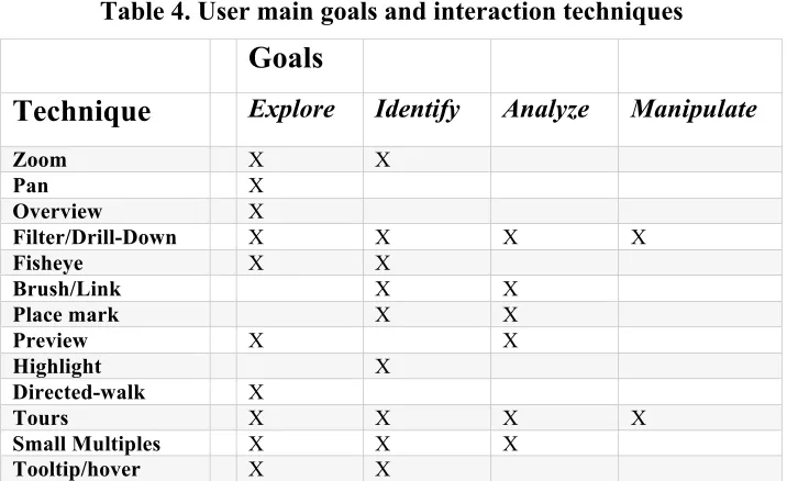
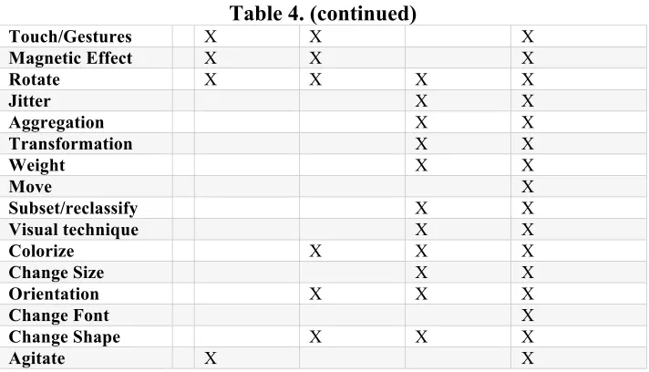
Table 4. User main goals and interaction techniques ... 46
Table 5. Color and associated meanings (Thissen 2004) ... 55
Table 6. Touch-table Gestures... 79
Table 7. Monitor-based Interactions... 95
Table 8. Gesture Classification... 97
ABSTRACT
CHAPTER 1. OVERVIEW
“A picture is worth a thousand words” Anonymous
1.1 Introduction
THE GOAL OF this paper is to present, in brief, the history and current state of Information Visualization, IV principles, techniques, and recommend a new interface for exploring large multivariate biological networks. For a field that has spanned centuries, IV is only now becoming utilized for not only research, but also everyday life. Being able to easily perceive information and disseminate it is a critical factor in our lives. From pill-bottle labels to DNA analysis, the design of information touches our lives in every way.
Among the many reasons why visualizations are needed are visualizations enable external cognition, creating tools outside the mind that can boost mental activities (Ware 2000), and it helps to show complex data in a way that is accessible for viewers. Seeing data encoded with multi-attributes helps with our short-term and/or working memory.
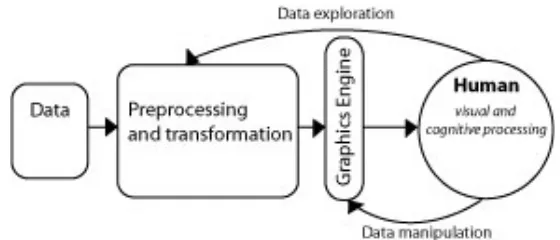
[image:10.612.174.454.579.699.2]Comparisons are also easier when a lot of data can be shown in the same space. The process to create and/or use information visualizations is relatively simple (see Figure 1). The four stages include collection and storage of the data, preprocessing to transform the data into an understandable state, the display hardware and graphics to produce the visualization, and finally, the human perceptual and cognitive system to make sense of what is seen. However, the implementation and factors that go into choosing what is seen is complex and difficult. The cycle also does not show the importance of context and intent of the visualization. Today the IV field is vast, with new tools continuously being created.
After examining numerous topics in IV, we turn our attention to proposing a new User Interface (UI) for investigating and exploring large, complex biological networks. To understand what is available to-date, we conducted a competitive analysis of biological visualization tools that are designed for this task. However, the field of information visualization is still developing and much room for improvement exists. Typical network visualizations rely on tree or node-link based visualization of data. More recent work in social networks has yielded matrices for network visualization. We propose a hybrid visualization that uses a variety of graphing methods. To ascertain requirements and desired content/interactions for this new tool, we interviewed biologists in the field. Based on these conversations we devised a new hybrid visualization utilizing multi-touch tables, and named this new tool BioN (Biological Network). BioN will have the ability to recognize multi-person and multi-gestures to enable scientists to directly manipulate data, thus relieving the need for external hardware and reducing interaction time. Taking the current visualization tools functionality, we devised new gestures, visuals, and dynamic interactions.
1.1.1 Hypothesis
CHAPTER 2. REVIEW OF LITERATURE
Nothing has such power to broaden the mind as the ability to investigate systematically and truly all that comes under thy observation in life. Marcus Aurelius Antoninus
2.1 Introduction
THE FOLLOWING LITERATURE review is organized into sections dealing with unique
areas of Information Visualization (IV). Some of these areas are incredibly detailed and deserve an entire book in their own right. Rather than attempt the almost impossible feat of covering all angles of IV, this author hopes to highlight key topics and provide new insights into how topics might be viewed and/or arranged. While a part of a specific stage for visualization creation, the following paragraphs give a high-level overview of what is covered in each section. Before one can begin to create new graphics, he/she needs to understand what visualization fields exist and previous work that has been created. Next, while planning the visualization, one should be aware of the principles of human cognition and graphing. The domains of data and visualization techniques to show and interact with the data also need to be considered. To create the visualization the designer needs to be familiar with design conventions, available tools, and software. Finally, the visualization needs to be proven effective for the goals it set out to achieve. Below is a diagram showing the sequence of the literature to be covered, and the part of the design process it belongs to.
Figure2.Flow diagram of literature review
FIELDS
Information Visualization. While there are many ways that these fields overlap, there are distinct differences in their goals and designs.
HISTORY
Before one can think about the future, he/she needs to understand the importance of the past. The field of information visualization is older than most people would believe. From the beginning of human history, man has tried to show his thoughts and ideas in a visual manner. Information Visualization started as a small concept for mathematicians and scientists. It experienced a “golden era” as well as dark times of little innovation. Beginning in the 1800’s, statisticians such as William Playfair have worked to show data in a standard scientific way. Modern-day gurus such as Edward Tufte and Ben Shneiderman continue to advance and explore the possibilities of visualization.
PRINCIPLES
When creating Information Visualizations (IV’s), the designer must be aware of many aspects. Since humans are the end users, the creator of IV’s must design for the human cognitive ideal. The human pre-attentive span is vast, yet our attentive state is very limited. We work with limitations, and visualizations need to be designed to compensate and extend our capabilities. Designers of visualizations also have to be aware of conventions used in the graphing community. Violating these principles can lead to confusion for the end viewer and unattractive charts.
DATADOMAINS
Interest in a dataset is often based on a specific quality of the data. While this author has found limited work on the topic, we feel that Information Visualization tools usually have a dominant data characteristic, i.e. there is some aspect of the data that is the most crucial to show (such as a change over time or hierarchy). These characteristics include, but are not limited to, Categorical, Hierarchical, Network, Temporal, Spatial, and Textual. We aim to show general visualization methods based on these characteristics and give specific examples.
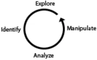
TECHNIQUES
Overview + Detail and Focus + Context. His mantra, “Overview first, zoom, details on demand”, has influenced most major visualizations. Newer techniques include Dynamic Previews, Tours, Dimensions, and many more. Combining these techniques, developers are able to create unique visualizations and interactive graphics.
It has been proven that visualizations that are too cluttered are almost of no use. Static diagrams used to be the only way to read and/or explore data. With the advances of technology, users are now able to directly interact and change the data that they are presented with. Through the use of interaction, the creator is able to customize the display shown without sacrificing the complexity of the information. While the user used to be limited to point/click input, new advances allow the user to use touch, gesture, and even use explore using virtual reality to investigate data.
INTERFACE DESIGN
To create a useful visualization, the interface to the data must fit with the mental model of the user. Those interfaces that are successful in meeting the user’s expectations in terms of usability, aesthetics, and function are the tools that excel in the real world and are the considered the most useful. The designer must also take into account presentation technology, target audience, typography, imagery, layout, and color.
TOOLS AND TOOLKITS
To create the myriad of visualizations available today, software developers have been coding toolkits to allow IV developers to easily produce and experiment with visualizations. While some tools are meant for the beginner IV creator, others allow for rich data design. In this section we will look at examples of some current popular software.
EVALUATION
Evaluations of Information Visualizations are still in the early stages. Few tools have been put under the microscope, so to speak, for any length of time. To be truly useful, visualizations will have to start being proven effective for the task they are designed for. Only recently have experts begun to create criteria for domain-specific tasks that
2.2 Visualization Fields
Classification lies at the heart of every scientific field.
Lohse et. al 1994
THE USES FOR visualizations are diverse. While experts and designers alike agree on few
names for the different domains and the content they include, this author believes that there are differences that have not been previously discussed. In addition, this author has found limited to no previous mention of one type of visual representation field: the Artistic. The sectioning off of these categories is a non-trivial task. Frequently, the content that each field uses has root in more than one domain and below are the main categories that this author believes exist today. This list is non-exhaustive; as such, this author does not believe these are the only categories or that each category is totally distinct from its relatives. Rather, there are discrete characteristics that these fields embody that separate themselves from the others.
2.2.1 Artistic Visualization
Current art influences and is influenced by technology. Huge datasets and database contents are becoming widely available to the world. No longer are computer scientists or engineers alone creating visualizations. With cheaper hardware and user-friendly
development kits, artists are able to create artistic works based on actual data. Called Visualization Art, Data Art, or creative information visualization, this movement uses underlying interaction and data visualization techniques to allow the artist to make a statement using current data sets (Viégas and Wattenburg 2007) and to allow the user to make a personal impression or interpretation of information (See Figure 1) (Lau 2007). While visualization art may use techniques from other visualization fields, it is not critical that the user is able to identify or make accurate inferences about the data. As such, visualization artists use a variety of novel techniques to represent their data and are not overly concerned with the best cognitive/perceptual approaches. The overall goal is to deal with aesthetics and emotional qualities (Vande Moere 2007). A current example is an installation piece called Sensity (Stanza 2004). This work collects data across an urban environment infrastructure through the use of a sensor network that collects and publishes data online. The output of the sensors is the emotional state of the city and is used to create installations and sculptural artifacts. Types of data collected include information on
movement of people, air pollution, and vibrations and sounds of buildings. Visualization designers have much they can learn from the Artistic field, for the Arts have for hundreds of years experimented and developed techniques for ways people represent and perceive the world.
2.2.2 Knowledge Visualization
Figure4.Mind Map of Visualization
Knowledge occurs when data is made meaningful to an individual. The only problem that that creates is that another person may not know what one individual considers
“knowledge”. Knowledge Visualization (KV) aims to improve the communication and remembrance of information that is learned. Spatial strategies help people store, retrieve, acquire, communicate and use resources and knowledge (Sigmar-Olaf and Keller 2005). If one is able to organize data in his/her own mental view, it correlates that he/she begins to understand the data. “Helping students to organize their knowledge is as important as the knowledge itself, since knowledge organization is likely to affect student’s intellectual performance” (Sigmar-Olaf and Keller 2005). Visual representations are often processed more effectively than propositional ones. KV’s are effectively used by experts to help guide and increase comprehension through new content. Some common visualization tools include mental mapping, freestyle maps, guide maps, and information maps.
challenges. KV’s are usually quick sketches using pencil and pen. Allowing for collaboration, mistake fixing, or backward tracking can be difficult.
While KV has its differences from other visualization domains, this author would argue that any work that is done in the realm of visualization should first begin with KV. Further, any effective visualization should lead to a KV, or try to incorporate KV within it. Once we see data represented, we automatically begin to construct our own mental model of how the new data correlates to what we already know. KV has uses in Education, Cognitive Psychology, and Human Computer Interaction (HCI).
Examples of visual formats include sketches, diagrams, images, objects, interactive visualizations, information visualization applications, imaginary visualizations, and stories. Beyond the mere transfer of facts, knowledge visualization aims to further transfer insights, experiences, attitudes, values, expectations, perspectives, opinions, and predictions.
Knowledge Visualization integrates methods from a variety of fields, such as Visual
Communication, Communication Sciences, Visual Perception and Knowledge Management.
2.2.3 Data Visualization
Figure5.William Playfair’s export and import chart (1785)
interactive example from this domain is Jonathon Harris’s Word Count (Harris 2004). This interactive graphic shows the most commonly used English words ranked by frequency.
2.2.4 Scientific Visualization
Figure6.Organelle Visualization from MetNet at Iowa State University
Evolved in the late 1980’s, Scientific Visualizations (SV) are a based on factual observations and phenomena from the real world in complete accuracy (Rhyne et al. 2003). The field aims to help users understand and explore data. SV is closely linked with
Information Visualization; however, it has a more natural modeling structure (e.g. wind flows or anatomy). As such, the creators of SV’s usually do not have a problem mapping their data to a spatial representation. This author would also argue that SV has more intention to educate users than to encourage new discoveries, although it certainly can be used for such tasks. Since SV’s have a natural mapping structure and known data, SV creators are able to create simulations. A user can then see exactly what happens in, for example, a beating heart. The user is also able to test hypotheses by changing conditions around the visualization, but the underlying structure and functions remain the same. A great educational tool, simulations allow users to learn complicated or dangerous tasks in a risk-free environment.
2.2.5 Information Visualization
Unlike Scientific Visualization, Information Visualization (IV) tends to try to visualize abstract, multidimensional data (Shneiderman and Plaisant 2005). These data sets often do not have apparent, clear structures that can be modeled. Matured in the mid-1990’s, this field continues to grow (Rhyne et al. 2003). While the term IV is used as an umbrella for all visualizations, it does have a specific purpose. To psychologists, IV is a representational mode used to show data in a visual-spatial manner. For those in the computer science domain, IV means the use of computer-supported, interactive, visual representation of abstract non-physical based data to increase cognition (Sigmar-Olaf and Keller 2005). Most of all, IV is used to discover information in data. Frequent tasks for IV are to discover patterns, trends, clusters, outliers, and gaps (Shneiderman and Plaisant 2005). IV’s have structure and meaning embedded by the symbols, words, icons, shapes, and glyphs that are used to encode multivariate data (Sigmar-Olaf and Keller 2005).
IV designers and/or creators also face many challenges. IV’s require well-prepared and well-structured data, which explains why networks are still hard to create for they usually are not well structured. Visualizations for large-scale datasets are still a struggle to represent due to limited computer screen size, resolution, and the limited working memory of users. While metaphors can help in the construction of visuals, it is very challenging to find a metaphor that fits the abstract data that IV’s use. Since complex tools are needed to visualize these datasets, users are also faced with the technical challenge of learning new visualization systems.
2.2.6 Correlations Among Visualization Domains
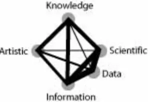
While these visualization fields have distinct differences, in many cases the methods for the visualizations overlap or the fields grew out of each other. Figure 8 shows this author’s mental model of how the fields correlate. The width of the line represents the strength of the connection between fields. For example, the artistic domain has always had strong roots to the Knowledge field, as art is a personal representation of some idea or feeling. Knowledge Visualization helps us map out our ideas of data, which is what
differences, in one respect they are related. All try to accomplish the same basic function by visualizing information, data, or ideas.
Figure8.Author’s Mental Model of Domain Ties
2.3 Visualization History
[image:21.612.260.410.132.234.2]If you want to understand today, you have to search yesterday. Pearl Buck
Figure 9.Timeline for Data Visualization History
VISUALIZATION HAS A long and varied history. While man has long tried to depict
[image:21.612.112.524.353.590.2]created. For a snapshot of the history see Figure 9. Each of the following time periods described correlate to a block of time, indicated by color.
2.3.1 Pre-1600 – 1600’s
The earliest known visualizations dealt with simple geometric diagrams, from
positions of the stars to simple maps. One of the earliest known examples of visualization is from the 10th century. The diagram shows the changing position of seven of the heavenly bodies over space and time (Friendly 2006). Other works include the town layout found in Babylon in 6200 b.c. Visualization continued in the 14th century with the plotting of
theoretical functions, and relationships between tabulating values and plotting them. By the 16th century, scientists were using the newly developed triangulation method to make mapping more accurate, which resulted later in the first modern cartographic atlas by Abraham Ortelius in 1570. Technology, during this time, created the camera obscura (an instrument that allowed the user to capture an image, most notably used in paintings).
The 16th century continued to advance the technology available to visualizations.
Pressing issues during this time were concerned with physical measurement used for astronomy, maps, navigation, and territorial marking. For instance, Descartes and Fermat developed the analytic geometry and coordinate systems. The theories of error of
measurement, estimation, and probability were developed. Statistics for demographics began to arise.
Notable visualization designers began to be recognized. Christopher Scheiner (1630) introduced a new idea that later data visualization expert Edward Tufte would name “small multiples.” These multiple images were used to show the locations of sunspots for a 3-month period. Michael Florent van Langren created what might be the first statistical graphic in 1644. He used a horizontal line to place the 12 known estimates of the difference in longitude between Toledo and Rome (see Figure 10). He chose to represent this data
Figure 10.van Langren Longitude Estimations (1644)
2.3.2 1700’s
With the beginnings of statistics and interest in data, graphic representation began to expand. Maps began to show more than just locations. Isolines and contours were invented, and thematic mapping of actual physical properties began. Edmund Halley (1701) created isolines to show contours on coordinate maps. Introduced by Phillippe Buache and Marcellin du Carla-Boniface, contour and topographic maps were used.
Another notable development during this time was the creation of timelines, begun by Jacque Barbeu-Dubourg. A famous example of this type of representation is from Joseph Priestly in which he showed a timeline of biographies of 2,000 famous people (See Figure 11).
Figure 11. John Priestly Biography Timeline (1765)
2.3.3 Early – Mid 1800’s
The beginning of the 1800’s saw the explosion of graphics and mapping. Most of the modern statistical forms were finalized: bar, pie, histograms, line graphs, time-series, scatter plots, etc. Cartography advanced from single maps to complex atlases on a variety of topics.
[image:24.612.248.384.301.429.2]William Smith ushered in a pattern of using cartography to show quantitative data. Baron Charles Dupin in the 1820’s developed the use of continuous shading to show the literacy distribution and degree in France, which is probably the first unclassified choropleth map. Just a few years later, in 1825, the Ministry of Justice in France created the first national system of crime reporting. André Guerry, a lawyer, used these mapping techniques to compare ranking of departments on pairs of variables, such as crime versus literacy.
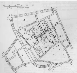
Figure 12. Dr. John Snow Cholera Map (1855)
It was during this time that cholera first appeared in Great Britain, killing over 52,000 people, in an epidemic that lasted for over 18 months. Cholera epidemics continued over the next few years with similar death rates. Dr. John Snow in 1855 created his famous dot map (See Figure 12) that marked the locations of deaths due to cholera. This map showed that the deaths were clustered around a single water pump. What was so remarkable about this map was that Snow showed the number of deaths at precise locations. Dr. Robert Baker, a physician at the time, also tried to show the cholera deaths. However, his map showed the districts affected by the disease, but it did not pinpoint locations.
2.3.4 Late 1800’s: The Golden Age
The rapid growth of visualizations had been established by the 1850’s. Statistical charts were used in official state offices throughout Europe. They were used for social planning, industrialization, commerce, and transportation. So diverse are the developments in this time that covering them all is not feasible. However, a few themes stand out. Maps began to leave the 2D world behind and explore 3 and higher dimensional spaces. Gustav Zeuner, from Germany, and Luigi Perozzo, from Italy, constructed 3D surface plots of population data. Contour diagrams, while developed earlier, expanded in the applications to which they were applied. Edwin Abbott’s Flatland even suggested that possible views in four and more dimensions might be possible.
Figure 13. Charles Minard Napoleon’s March (1869)
Secondly, graphical innovations continued being produced, notably the flow diagram, divided circle diagrams on maps, polar charts, scales, and shapes on maps. Charles Minard created a graphic during this time that is still regarded as one of the best in the history of visualizations. His flow map of the March of Napoleon (see Figure 13) showed the failed attempt of Napoleon’s March to Moscow. The time, temperature, number of men, and other variables are recorded for the entire campaign. Also during this time, Florence Nightingale created a polar area chart to show the causes of death during the Crimea War. Her work lead to sanitation changes for treatment of wounded soldiers in the battlefield.
isolines of equal frequency would appear as concentric ellipses, and that the locus of the lines of means y | x and of x | y were the conjugate diameters of these ellipses. These discoveries were the result of visual analysis from applying smoothing to his data. Perhaps his most notable discovery was that counter-clockwise patterns of winds around low-pressure zones, combined with clockwise rotations around high-pressure zones.
The collection of political and governmental data was widespread during this time, and reports using graphics were published regularly. With all the new forms of graphing, a need arose for the standardization for graphical presentation. The International Statistical Congress recommended that maps and diagrams accompany official publications. State-sponsored statistical atlases ensured that a Golden Age of Graphics ensued. These detailed atlases became time capsules of popular methods, often representing the best work of the period.
2.3.5 1900-1950’s
The innovations of the previous time could not be kept up forever. The next 50-year period was to see few innovations in the graphical community. With declining enthusiasm for “pictures,” the call for quantification and formal statistical methods became the norm in social sciences. However, graphical representations did not lie dormant. Graphics made the transition to mainstream culture, entering English textbooks, school curriculum, and standard use in government. The use of graphics in other fields lead to significant insights in biology, physics, and other sciences. Created by H. Beck, the world-famous graphic of London Underground subway system during this time period (see Figure 14). The world of graphical representation was awaiting new technologies and ideas. Upcoming computational power and modern statistical methodology would spur the field on to new innovations.
2.3.6 1950’s – Today
The dormancy statistical representation faced by the graphing community began to lift during the mid 1960’s due to three significant developments: John W. Tukey called for the recognition of data analysis as a branch distinct from mathematical statistics. He also began a wide variety of new, simple, effective displays (stem-leat plots, boxplots, two-way table displays). Next, Jacque Bertin published a paper that would help organize the visual and perceptual elements of graphics according to features and relations in data. Finally in 1957 the programming language FORTRAN allowed statisticians the computation power necessary to move beyond the hand-drawn maps and graphics. In addition, new themes emerged such as multivariate data, Fourier function plots, Chernoff faces, star plots, clustering, and trees.
Perhaps one of the most revolutionary developments was the PRIM-9 developed in 1974 by J. Tukey, J.H Friedman, and M. Fisherkeller(see Figure 15). PRIM-9 stands for Picturing, Rotation, Isolation, and Masking in 9 dimensions. Created by statisticians and computer scientists, this tool was the first multidimensional, dynamic, and interactive visualization system in the world. Most of the techniques that were used in this system were revolutionary and are still the basis for high dimensional data display today (Friedman and Stuetzle 2002).
Figure 15. PRIM-9 (1974)
The last quarter of the 20th century visualization blossomed into a mature and multi-disciplinary research area. New software tools were developed for a wide range of
visualization methods and data types. Describing all the new developments is beyond the scope of this paper, but a few that stand out are:
• High-dimensional, interactive and dynamic computing systems
• New types of direct manipulation
The 1980’s and ‘90’s gave rise to the desktop computer, which allowed software for dynamic graphics to become more available. New general systems for dynamic, interactive graphics with data manipulation and analysis were created. Today, scientists and designers have a wide array of tools to create visualizations.
2.4 Visualization Principles
Failure comes only when we forget our ideals and objectives and principles. Nehru
IN ORDER TO create effective visualizations, one must know the limitations and abilities
of one’s users and the basic building blocks of how the human mind and memory functions. Research has pointed out that the human perceptual system is limited, not only in how quickly we can recognize something, but also how long we can remember variables. In addition, standards for graphics have been in use for a long time. These principles can help determine scales, colors, and methods to plot data. This section is divided into the two main areas of cognitive principles and graphing principles.
2.4.1 Cognitive
illustrative case where the unconscious mind and conscious mind blend (Raskin 2000). However, there are abilities we know belong to the unconscious (perception) and to the conscious (attention). Raskin provides a table of properties that display the differences between the unconscious and conscious mind (see Table 1).
Table 1. Properties of the Unconscious and Conscious Mind (Raskin 2000)
Property Conscious Unconscious
Engaged by Novelty, emergencies, danger Repetition, expected events, safety
Used in New circumstances Routine situations
Can handle Decisions Non-branching tasks
Accepts Logical Propositions Logic or inconsistencies
Operates Sequentially Simultaneously
Controls Volition Habits
Capacity Tiny Huge
Persists for Tenths of seconds Decades (lifelong)
2.4.1.1 Perception
What we actually see is not necessarily the world that is. Buddhists and Ancient Greek philosophers have known this fact for a long time. Hence, ancient philosophers favored theories that can be proven solely by reason and gave examples of why this method is true, such as Plato’s Allegory of the Cave. J. Raskin (2000) argued that if cameras were limited to what our eyes can actually see, photography would never have been invented. To understand the human perceptual abilities, one must first examine the one organ available for our vision: the eye.
light, and these reactions are signaled to the brain via the optic nerve and indicate brightness, color, and contour.
During vision, the eye continually makes sweeps across a scene. These moves, called
saccades, take approximately 200 milliseconds to initiate. When the eye stops to investigate an object or part of a scene, it is called a fixation, usually lasting around 250-500
milliseconds long (Chen 2004, Healey 2007). Our perception is continually restructuring the sensory input we receive. There are two stages of attention, pre-attentive and attentive. The pre-attentive state has unlimited capacity and uses low-level vision system. In this stage, four main types of pre-attentive tasks have been found: target detection, boundary detection, region tracking, and counting/estimation. Target detection discovers the absence or presence of a target in a scene. An example would be to find a circle amongst a group of squares. Two features in this type of task are color and shape. Boundary detection determines where one region ends and another begins. Region tracking groups elements with unique features that are moving in time or space. Finally counting/estimation helps us to determine how many of selected features exist.
Unique features help us distinguish an object at a glance. Features agreed upon by the scientific community as being pre-attentive include: line, length, width, size, curvature, number, terminators, intersection, closure, color, intensity, flicker, direction of motion, binocular luster, stereoscopic depth, 3D depth cues, and lighting direction (Chen 2004, Deller et al. 2007, Healey 2007, Raskin 2000). Recent studies suggest that several features of an object are not processed separately but affect each other (Raskin 2000). A hierarchy for these features exits, e.g. color is more pre-attentive than shape, and some types are favored over others in certain tasks (Mckinlay 1986) (see Figure 16).
For example, color is easier to detect than shape in boundary detection. Luminance-on-hue preference has been observed (Healey 2007). A combination of pre-attentive features is usually not pre-attentively detectable (see Figure 17). The interference of features with one another is asymmetric, e.g. random color interferes with shape detection and hue-on texture.
Figure 17. Color is pre-attentive, but color and shape is not.
Several working theories to date that try to explain how we our perceptual system works are feature integration, texton, similarity, guided search, and feature hierarchy. Feature integration proposes that if the target has a unique feature, then there is a given access feature map to detect if any activity is occurring. Texton theory states that an early visual system detects a group of features, called textons, which are usually elongated blobs, terminators, or crossing of line segments. Similarity theory supposes our search ability varies continuously, depending on type of task and the display condition and the types can be seen below.
• The visual field is segmented into structural units, which share some common
property.
• There exists a limited resource that is allocated among structural units. Each
unit is compared to the structural model.
• Units are grouped hierarchically, and a poor match between template and unit
= rejection of other units grouped strongly with this.
Figure 18. Examples of Gestalt
By knowing these theories and features, certain tasks have been found easier and harder for human perception. Cleveland and McGill (1984) ranked 10 elementary principles for tasks in graphs. These are, from most to least accurate:
• Position along a common scale
• Positions along nonaligned scales
• Length, direction, angle
• Area
• Volume, curvature
• Shading, color saturation
Whenever possible, the designer of graphics should enable investigation of the graph in the most simple means possible. Using not only pre-attentive features, but also incorporating them into higher up elementary tasks will yield visualizations that are easy to understand and navigate (Chen 2004). This encoding can be dependant on the type of task the user is doing. As such, preattentive features should be carefully incorporated.
simultaneously with some kind of irrelevant, brief disruption in visual continuity like eye saccade, shifts of the picture, flicker, eye-blink, or a film cut in a motion sequence. The blindness we see is not a failure of our visual acuity, but rather due to a lack of or
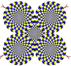
[image:33.612.246.387.277.407.2]inappropriate attentional guidance (Healey 2007). Other illusions occur due to adaptation. The nerves in our eye fatigue after responding to the same stimulus for several seconds. Try staring at a bright red rectangle for a few seconds. If you then look at the complementary color (green) a white rectangle should appear briefly. This fatigue also sets us up for a motion-after effect. The motion perceived depends on contrast within the image (see Figure 19).
Figure 19. Rotating Snakes Illusion (Healey 2007)
Finally, the power of context in an environment plays a part. Angles-in configuration appears to be closer than an angles-out. Angles-in appears when we are near the front of an object, such as a ticket counter, and angle-out occur at the far end of a room (See Figure 20). Other features that can cause optical illusions include texture and non-photorealism. The implication for visualization is that the designer must be aware of object features and guide the user’s eye and mind (Healey 2007).
Figure 20. Angles. Which line is longer? They are both the same
2.4.1.2 Attention
becomes the focus is called the Locust of Attention (LoA) or Locust of Control. The LoA identifies the source of what changes our attention. We are able to see and hear more than what the LoA is, but we cannot completely controls what becomes the LoA. The LoA operates sequentially, and one can only consider one question or control one action at a time (Raskin 2000). The LoA can be external, internal, or mixed (Cheng et al. 2007). An external source will be a cue in the environment that interrupts ongoing thought, such as a loud noise. An internal cue will be created within the current cognitive system goals. External and internal are best placed at opposite ends of the spectrum, with complex tasks mixing the two. Three distinct networks within the brain have been identified with processes called alerting, orienting, and executive control (Cheng et al. 2007). In addition, orientation occurs in the stages: disengage, moving, and engaging with the new focus. Executive control is the processes that are required to solve conflicts, correct errors, and plan ahead. These states describe the process of how our LoA changes.
There exists various dimension of attention, and these are done through priming and manipulation of cues. These cues can be spatial, semantic, and/or timing. Spatial information may or may not be provided in a cue. “Flagging” a stimulus does not necessarily signal where it appears. A flag could be a color change in a background or an object form. These cues can be direct, indirect, or mixed. Direct cues explicitly show the location. Indirect cues point to areas but not an exact local. Some cues will inform us when a target will change, others where it will change. Secondly, semantic cue information involves linguistic, iconic (graphic), deictic (physical pointing), and no information. These cues can help in the
processing of the target. Finally, timing is shown in relation to the occurrence of the stimulus. This cue may be anticipated, concurrent, or retrospective (which means it could occur before, during, or after the beginning of the target). For tasks that take a large cognitive load,
reactive cues may be more useful. Priori cuing is useful since it allows the target to be processed more effectively and decreases response times.
2.4.1.3 Memory
cannot assume a user will remember what they read just 5 seconds ago (Raskin 2000). There is not a single working memory supporting cognition; rather there are several
limited-capacity systems (Sigmar-Olaf and Keller 2005). The most commonly known are short-term and long-term memory. However we also have visual, spatial, associative, auditory, and sensory memory. In this section, we will take a closer look into short-term, long-term, and visual memory systems.
The first type of memory is short-term. While short-term memory is often linked to working memory, the two are distinct. Short-term memory is described as the ability to hold a small amount of information in a highly available, active state. This type of information can be recently processed sensory input, items recently retrieved from long-term memory, or the result of recent mental processing. Working memory, on the other hand, is the theoretical framework that refers to structures and processes used to temporarily store and manipulate data. A better term might be working attention. Many place the average duration of short-term memory as short as 30 seconds, or as long as one minute. In order for information to be used past short-term, it must be periodically repeated or rehearsed. This repetition can be done out loud or by thinking about the information. Consolidating information to long-term is enhanced if any relationship exists between the item in short-term memory and long-term memory. George Miller in 1956 argued that short-term memory had the approximate span of seven items plus or minus two. Recent studies show this number is roughly correct, but memory spans vary widely with population and test material. Span can also depend on the number of characteristics of tested words. Other known effects are:
• Word-length effect: fewer words of longer duration words can be recalled
• Phonological similarity effect: more words can be recalled when they are very similar
or occur frequently in the language
• Single semantic category: more words can be recalled when they are taken from a
single semantic category versus different categories
Long-term memory is the ability to bring back information from storage. This type of information is stored as meaning and can last from 30 seconds to decades. Long-term differs in structure and function from short-term memory. Long-term actually leads to a physical change in the structure of neurons. Information once in long-term memory does not necessarily stay there. Any information is subject to decay or being forgotten. It can take several recalls/retrievals from memory for the information to be maintained for years. The information is also dependant on the depth of processing it receives. Certain sensory information is stored with memory. For example, color has been proven to be stored and is another clue for memory retrieval (Sigmar-Olaf and Keller 2005). Two different types of long-term memory that exist are declarative and procedural. Declarative refers to all
memories that are consciously available. Two types of these memories are episodic (specific events in time), and semantic (knowledge about the external world). Procedural memory deals with the process of moving the body or using objects, i.e. riding a bike.
Finally, the third type of memory to be discussed is visual. Visual working memory stores information that we see from one fixation to the next. It allows us to remember configuration, location, and orientation of visual material since we do not keep a visual model of the world in our mind. We are sensitive to detail in the center of our visual field, missing 99% of what is in our visual field (Sigmar-Olaf and Keller 2005). Visual memory uses different cognitive processes than those used in other memory systems (Chen 2004), but this system is limited to a small number of simple visual objects and patterns, usually holding 3-5 of themfrom one second to the next (Sigmar-Olaf and Keller 2005, Plumlee and Ware 2006). As new objects are seen and added to visual memory, others are dropped. One object stored in visual memory can have several attributes: not just 3 colors, but color/shape/pattern can be stored as a single entity as long as they are bound to the same object. Attributes are simple, and it is not possible to increase information capacity if one object has less
characteristics. In addition, one complex object may take up the entire visual memory
2.4.2 Graphics
While cognitive principles are crucial to facilitate understanding, the principles for creating and/or reading graphics are just as important. Even if a graphic is perceptually easy to view, the end user still may not be able to make sense of the data. Although some graphing methods have been a matter of convention, others principles are still being discovered.
Perhaps one of the best known in the field for making usable graphics is Edward Tufte. With his revolutionary book in 1982 and the subsequent 2nd edition, The Visual Display of Quantitative Information, he ushered in a new wave of thinking about displaying data (Tufte 2001). One of his most popular beliefs is the lie-factor in graphics. Data should be displayed truthfully, without manipulating aspect ratios or other features to make the data say something it really does not, i.e. the size of effect shown in the graphic divided by the size of effect in the data should be close to 1. Another key point is using only enough ink to draw the graphic known as the data-ink ratio. Too much ink is redundant and wasteful and can lead to chart junk (useless graphics or ornamentation). While these decorations can be inviting to viewers, they do not add anything to the data. Many designers add these, but the additions make it appear that the data itself is not important or exciting. Finally, data displays should aim to show as much information as possible. Only with information available at various levels of discreteness can discoveries occur.
Besides Tufte, another notable name is Cleveland. His principles aim to create easier-to-use and clearer graphics. Like Tufte, he wants the data to be the main focus on a display. This feat is accomplished by being aware of contrast between the data points and the background. Correct aspect ratios are critical, as well as providing data at a good
resolution. Guidelines should be used and emphasized. Without these marks, we can become lost within the data. Grid lines offer landmarks as well as easy access to the values the marks are plotted on. The terminology on charts should be easily understood. In addition,
Figure 21. Before and after applying Tufte’s and Cleveland’s Principles
To summarize the work concepts, below is a list of things to keep in mind when creating a graphic (Tufte 2001, Emerson 2008):
• What is most important?
• Is the graph clearly labeled (title, key, axis)?
• Are the grid lines de-emphasized?
• How much ink is used for the data versus the rest of the graphic? Show as little
non-data elements as you can.
• Is the data accurately plotted? What is the aspect ratio?
• What is the medium, printed or digital?
• Is the language easy to understand?
• Minimize the cognitive load for the user; e.g. if you are trying to show differences,
plot the difference rather than the original data points.
• People look at the graphic before the text, if they read the text at all. Put the
conclusion in your caption, clearly stated.
• Put as much information as you can into the graphic.
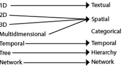
2.5 Data Domains
The goal is to transform data into information, and information into insight. Carly Fiorina
THERE ARE MANY different forms of Information Visualizations. To-date, this author
to represent. Shneiderman in 1996 presented his Type by Task Taxonomy (Shneiderman and Plaisant 2005). His type taxonomy contains the following:
1D: Textual docs, lists of names, all which can be organized in sequential order.
2D: Map data: each item covers some part of a total area.
3D: World data, structure modeling, or results represented by volumes and surfaces
Multidimensional: n attributes become points in an n dimensional space.
Temporal: Items/Events with a start and finish time
Tree: Inheritance and relationships
Network: Relationships
His list of the types of data, this author feels, needs to be updated and rearranged. His use of the term “dimension” is not the most appropriate. 1D types can be more than just textual. Any object that is encoded with a characteristic, such as color or shape, becomes one-dimensional. Rather, dimension should be thought not as the space an object occupies, but the number of characteristics encoded within the object. Secondly, 2D type is constrained to map data, or data that covers area, and 3D is defined as world data or volume. Both 2D and 3D then are concerned with not just geographic information, but Space. Space focuses on more than just physical attributes. For example, ambient visualizations try to show
characteristics of a space within the actual physical location. We have reworked his original taxonomy (see Figure 22). In the following, we define basic categories or domains we
[image:39.612.218.416.578.689.2]believe most Information Visualizations (IV) fill and give examples of typical visualizations. However, we do not make the claim that each IV only fits one category. Many of today’s IV’s use multi-dimensional data to represent data sets. Rather, in this separation, we try to pull out main characteristics that IV’s are based on.
2.5.1 Hierarchical
While Shneiderman names this category Tree, a better term is Hierarchical. Again, his term is limiting. Hierarchies aim to show inheritance and relationships among entities, but more than just tree structures achieve this goal. Entities can be directly or indirectly linked. Direct links are to an entities’ parent or child. Indirect links extend up or down a set of links. For example, two coworkers who are not the other’s boss, but the chain of command for both would meet somewhere further up the hierarchy. Perhaps one of the most pervasive visualizations of hierarchies is the folder structure on most operating systems. Folders and files can be placed in other folders. Lists, column, and icons then display the contents that are located on a specific level of the hierarchy. Another common visualization is a Table Lens (see Figure 23). Here the tree structure is broken down into recursive boxes. Other tools include Cone trees (Robertson et al. 1991), TreeMap, and MoireTrees.
Figure 23. Examples of Hierarchies: Tree (Nakamura 2004) and Tree Map (Shneiderman 2006)
2.5.2 Categorical
in rowboats first. In addition, the class of the passenger mattered, the better survival rate was for those in first class (again since higher classes were able to board lifeboats sooner).
Finally, another use of categories is demonstrated by the Category map developed by Yang et al. (2002). Their category map allows the user to browse well-organized structures of the Internet. This self-organizing map is able to compress and transform complex information space into a two dimensional representation. Neighboring nodes with the same label form a region with the same concept. Users are able to change view and system parameters in the visualization. The Category Map then acts as a more traditional navigational tool.
Figure 24. Categorical Visualizations: alternative Venn diagram (Lu and Dietrich 2004), Mosaic (Yul Huh 2004), and Category Map (Yang et al. 2002)
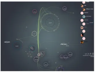
2.5.3 Network
Another difficult data type to display is a network. Unlike hierarchies, networks are not well structured. Entities can have apparent random connections with other entities. Typical visualizations today can handle small-world networks using the traditional node-link model (see Figure 25). However, these visualizations do not scale well due to line, node, and labels crossings (called occlusions). Attempts to bring networks into a 3D space have
experienced the same, if not more, difficulties. Occlusion and line crossings become even more troublesome. Not only can nodes be overlaid side by side, but depth is also a factor. A node in the foreground can easily obscure a receded one. The sheer size of networks is another concern. Node-links diagrams become so large that the whole network is not visible in one view. A new version of node-link diagrams for networks is a Pivot Graph developed by Martin Wattenberg (2006). Using a grid-based approach, the tool focuses on the
methods, the user is able to shrink the graph and reduce complexity, but the true topology of the network is not preserved.
Developed in the mid 90’s, hyperbolic visualizations have experienced a rise in popularity for networks. These visualizations place entities and/or attributes around the rim of an ellipse. Links are then mapped between them (see Figure 25). Different types of hyperbolics exist. Examples of include radial convergence (fixed number of attributes are laid along the perimeter of the circle and connections mapped between them), radial
implosion (multiple layers of attributes circles within a main circle or nodes within the main circle and linked to each other and edge nodes), oval implosion (same as radial implosion except outside shape is an oval), centralized radial network (where nodes are aligned along the outside of the circle but they all map to a central node or group of nodes), and radial grouping (where attributes are grouped according to some criteria in concentric circles within the main circle). Like node-link, hyperbolics have limitations. Links cross and merge as well in this type of graphic. While attributes are always on the edges of the hyperbole, they have to be very small to be displayed and usually require some form of interaction technique to be read. Interaction is more critical since hyperbolics try to condense a large amount of data in a predefined space.
prone (Henry et al. 2007). Without links to guide the eye, it is hard to discern neighbors and routes within the data.
Figure 25. Network Visualizations. Node-link (Salathé 2006), Hyperbolic (Holten 2006), and Matrix (Henry et al. 2007)
2.5.4 Spatial
Geographic information is one of the most recognizable and easily understood domains for viewers. We navigate the world around us from the time we can crawl, so the concepts of space and dimension are extremely familiar. The ability to read maps allows us to move around and find new locations. However, space is more than just representing an actual location on paper or screen. Space is concerned with mapping information to a
circles. The user can then place their circle near other circles to begin a discussion. The user can only see and participate in the discussion they are near to. Groups are easily seen and act like social cues in real life. Even those who do not participate can be seen rather than remain unknown to the other members.
Figure 26. Space Visualizations: Globe (Spahr 2003), Cartography (Lightfoot and Steinberg 2008), Ambient (Rodenbeck 2007) and Virtual Space (Donath et al. 1999)
2.5.5 Temporal
Time is often a critical element of data. Often when an event happened can be just as important as where it occurred. Temporal data lets us learn from the past, plan for the
present, and predict the future. However, time is not always a trivial component to visualize. How we think of time varies. Timed data can be thought of as cyclical or sequential (Parry 2007, Aigner et al. 2007). Seasons and weather patterns are usually repeated over time. As such, this type of visualization is commonly uses a radiating polar chart, circles, and even spirals. On the other hand, specific events unfold step-by-step. These visualizations include the timeline, sankey and flow diagrams (see Figure 27). Another structure of time is
ribbons, or strobe silhouettes (Joshi and Rheingans 2005). The use of banding (vertical shaded bars) can also help separate different time periods.
Figure 27. Temporal: time line (Harrison 2005), sankey diagram (Fry 2008), and time flow (Bloch et al. 2008)
2.5.6 Textual
Text is another important type of data. This form of information is how we
communicate with one another. Often we try to find relationships from whom we talk to and what is said. An important goal in almost any textual visualization is the ability to find patterns. This task includes not only finding who said something, but also when. For example, the visualization Loom (Donath et al. 1999) (see Figure 28) uses threads to show communications between members in a Usernet group. The dialog characteristics can then be easily seen. The group discussion pictured below has lively debates, with threads being posted often and close together. Another way to visualize text comes from the same creators of Loom. Conversation Landscapes uses line plots to show when text was typed and how long a post was (see Figure 28). Tag clouds, where more common text is displayed larger and brighter than less common text, is beginning to spread to mainstream applications (see Figure 28). Finally, arc diagrams (see Figure 28) allow patterns to be easily identified in a sequence. Sequences that are repeated and/or connected are shown with a corresponding arc. The more often the connection is found, the darker and thicker the line becomes (Wattenberg 2002). This visualization has found use in music, DNA sequencing, and textual
Figure 28. Textual Visualizations: Conversation Landscape (Donath et al. 1999), Loom (Donath et al. 1999), tag cloud (Mehta 2006) and arc diagrams (Dittus 2006)
2.6 Information Visualization Techniques
Overview, filter and zoom, details on demand. Ben Shneiderman
WHEN GETTING READY to create visualizations, there are many techniques to consider.
A designer should be aware not only of how the user will receive output and input data, but also ways to build the visualization and allow the user to interact with the system. This section includes the discussion of interaction devices available today, as well as visualization and interaction techniques. Finally, tasks specific to network visualizations will be
presented.
2.6.1 Devices
Today, there are wide assortments of devices that the user can interact with to enter data into an application, system, or tool. Although not as varied as input devices, output devices can further help the user explore a tool. New and novel techniques are continually being explored with the intention of making the hardware integrate seamlessly with the user.
2.6.1.1 Input
develop their own version of these input devices, e.g. Nintendo’s Wii. Other devices that are widely used are trackballs, styluses, tablets, and joysticks.
Newer devices are always being created. While traditional input devices relied on simple button pushing or keyboard entry, today’s input devices can react to user movements, eye position, voice, and even brain wave activity. Phone companies use voice recognition to help their customers through complicated phone message systems. Touch-based displays offer a very intuitive approach to data entry. Kiosks employ this technique to allow the user to navigate menu systems. Other touch devices, such as the recently released iPhone,
recognize hand gestures that trigger specific actions on the interface. This technique is employed on personal digital assistants (PDAs) through the use of a stylus. The touch-based display’s precision is so refined it can enable a user to point to and select just a single pixel (Shneiderman and Plaisant 2005). Eye tracking, while not as common, is another way to give input into a system. While the user is wears a head-mounted device, the system is able to determine where one is gazing and center focus on that point. This technique can be especially valuable to someone with limited to no functional motor capability.
Unfortunately, the cost of such devices is prohibitive for most users.
2.6.1.2 Output
vision and hearing, the sense of touch has been thoroughly investigated in the field of haptics. Haptic devices can give users a sense of touch in a virtual space. The Phantom is a pen-based system that allows the user to interact with and “feel” objects. Unfortunately, these devices are usually expensive and not widely manufactured.
2.6.2 Visual Techniques
2.6.2.1 Overview + Detail
Overview + Detail (O+D) is a technique used to show two levels of information from a single dataset. Its goal is to present the user with an overview of where the user is while showing specific details about the data (usually through the use of zooming or panning). Normally, this type of technique is accomplished with two screens or two separate views of the data. A common use of O+D is in mapping applications and video games (see Figure 29).
Figure 29. Example of O+D: Google Maps and the video game Wheels of Steel Convoy