Rochester Institute of Technology
RIT Scholar Works
Theses
Thesis/Dissertation Collections
5-19-2005
Corporate identity: The Reasons for change
Kwiryun Kim
Follow this and additional works at:
http://scholarworks.rit.edu/theses
This Thesis is brought to you for free and open access by the Thesis/Dissertation Collections at RIT Scholar Works. It has been accepted for inclusion
in Theses by an authorized administrator of RIT Scholar Works. For more information, please contact
[email protected]
.
Recommended Citation
Corporate
Identity: The Reasons for Change
A
thesis
submittedto the
Faculty
ofthe
College
ofImaging
Arts
andSciences
in candidacy
for
the
degree
ofMaster
ofFine Arts
Kwiryun Kim
May
2005
Graduate MFA Graphic Design Program
School
ofDesign
Chief Advisor
Associate Advisor
Associate Advisor
Chairperson
MFA Candidate
Bruce Ian Meader
Associate Professor
Graphic Design
Bruce Ian Meader
College of Imaging Arts
&
Sciences
School of Design
Rochester Institute ofTechnology
Lorrie Frear
Visiting Assistant Professor
Graphic Design
Lorrie Frear
College of Imaging Arts
&
Sciences
School of Des
ign
Rochester Institute ofTechnology
Philip R.Tyler, D.B.A.
Philip R. Tyler
Associate Professor
Marketing
College of Business
Rochester Institute ofTechnology
Patti Lachance
Patti Lachance
College of Imaging Arts & Sciences
School of Design
Rochester Institute ofTechnology
If
/II", ;2s9~
Date
~
11,
Uftr;-Date
~
I?,
.zoo
...:::::
Date
I, Kwiryun Kim. hereby grant permission to the Wallace Memorial Library of RIT
to reproduce my thesis in whole or in part. Any reproduction will not be for
commercial use or profit.
Kwiryun Kim
Kwiryun Kim
Graduate MFA Graphic Design
College of Imaging Arts & Sciences
School of Design
Rochester Institute ofTechnology
Table
ofContents
Thesis Committee Members
3
Thesis Definition
4
Precedents
6
Research
9
Synthesis
13
Ideation
50
Intermediate Evaluation
58
Implementation
59
Dissemination
62
Retrospective Evaluation
65
Conclusion
66
Glossary
ofTerms
67
Bibliography
69
Appendices
Appendix
A
Thesis Development:
Weekly
Review
71
Appendix B
Corporate
Identity
Development Process
80
Appendix
C
Thesis
Show
Exhibition
81
Appendix
D
Final Application
83
Bruce Ian
Meader
Chief Advisor
Associate Professor
Graphic
Design
College
ofImaging
Arts
& Sciences
School
ofDesign
Rochester Institute
ofTechnology
Lome
Frear
Associate Advisor
Visiting
Assistant Professor
Graphic
Design
College
ofImaging
Arts & Sciences
School
ofDesign
Rochester Institute
ofTechnology
Philip
R.Tyler,
D.B.A. Associate
Advisor
Associate Professor
Marketing
College
ofBusiness
Thesis Definition
Problem Statement
Corporate
Identity
plays asignificantrolein
today's
society.Corporate
identity
communicates a company's
business
goalsto the
outside world.To
do
this properly, the
company'sidentity
needsto
evolveconstantly
so it cancontinue
to
maintainanidentity
consistent and appropriate with its changes as abusiness. Sometimes
the
changeis
necessary
and satisfiesneeds,
but
othertimes the
need
for
change is questionable and could resultin
unexpected confusion.Unnecessary
changes canlead
to
a reduction ofidentity
recognition,
often earned aftermany
yearsthrough
exposure.Change
without adequate reason can also cause an alienation ofconsumers,
and wasteresourcesfor
unsuccessful campaigns.This
thesis
is an analysis ofthe
history
of corporateidentity
change,
comparing
successful andfailed
solutions,
andinvestigating
what makes corporateidentity
change successful.Documentation
ofNeed
This
designer
oftenfinds
herself emotionally
attachedto
certain corporateidentities.
When done
effectively,
avisualidentity
systemdevelops
its ownpersonality
andforms
a
relationship
withits
audience.A
good example ofthis
is
the
UPS
corporateidentity.
The
abrupt change wasshocking
andbewildering
to this
designer because
the
rationalefor
the
change was notfully
explained.Since
a corporateidentity
needsto
send animportant,
concise message as well asform
an emotional connection with itsviewers,
understanding
the
process of corporateidentity
change andthe
reasonsfor
doing
sois
importantfor both designers
and public audiences.Understanding
therationale of corporateidentity
change contributesto the
design field
by
raising
awareness ofthe
considerations and requirementsbefore,
during,
and afteran
identity
changehas been implemented. The
negativeimpact
causedby
abruptcorporate
identity
change canbe lessened
withthese suggestions.Situation
Analysis
Major
businesses,
such asFortunelOO
companies,
acknowledgethe
importance
andimpact
ofanidentity
change.There
are a number ofstudiesonhow
to
handle
corporateidentity
changefrom
the
marketing
point of view.Conducting
additionalresearchspecifically for
the
graphicdesign
professionmay
help
further define
andclarify
the
identity
change process.Studying
corporateidentity
changefrom
adesign
perspectivehas its
own set ofobstacles,
suchasissues
withsurveying
viewer opinionduring
thedesign
process,
how
an audiencewill reactto the change,
andthe
risk ofcommunicating
Mission
andGoals
This
research isbeing
done
to
answerexisting
questionsonhow
viewersmay
reactto
changesin
corporate identity.It
will alsocoverapproachesonhow
these
identity
changes shouldbe
handled;
theprocess,
timing,
potentialobstacles,
andfinal
results.This
thesis
willinvestigate
whatacompany
andits
designers
needto
know
whenconsidering
a corporateidentity
change.Finally,
it
will propose an expanded approachto
corporateidentity
changeandconsiderations
for
doing
so.Objectives
The final
thesis
will resultin
the
development
ofa prototypefor presenting
corporate
identity
change.The
proposed guidelines willbe
comprisedoftwo
parts.The first
part willbe
aninvestigation
of significantcase studiesthat
analyzecorporateidentity
change.They
willbe
examinedto
understandthe
reasonsfor
change,
what makes change a success or a
failure,
andthe
sequence of changeovertime.
The
second part isto
help
the
graphicdesign field become
more aware ofthe
purposePrececdents
CBS Eye
Logo
Figure 1. 1
William Golden designed
the
CBS logo
in 1951. It
wasoriginally
designed for
the
television
screen andto
be
inmotion.It
was apioneering
approach,
because
usually
a
logo
or atrademark
is
designed first
for
printmedia,
such as aletterhead
or astationery
system,
andthen
only later
adaptedfor
other applications.The
CBS
logo
is abrilliant
exampleof symbol
design.
It
has
survivedthe test
oftime,
and ofadaptation-color,
line
treatments, backgrounds-without
losing
its
originalimpact.
Over
the years, the
Eye
has been
seen inmany different
colors,
sizes anddimensions;
however,
the
image
ofthe
Eye
itself has
remainedthe
network's signaturefor
overhalf
a century.Golden's
work was influential inthe
design
worldby
increasing
the
role andresponsibility
ofthe
designer
withinthe
corporate world.This
isimportant for
this thesis
for
two
significantreasons:the
Eye logo
isstill used afterexisting for
solong
inarapidly
changing
world,
especially
inthe
broadcasting
industry,
andbecause it is
oneofthe
earliest examples of a corporate
identity
developed for
a newform
of media.William Golden 1911-1959
William Goldenwas educatedin New York's Vocational School for Boys. In
1937,
he joined CBS Radio Networkandthreeyearslaterwas appointedArtDirector. HemarrieddesignerCipe Pineles in1944and spentthepenod
during
World War II inEurope
designing Army
training
manuals.AfterthewarhereturnedtoCBSandin 1951 became Creative DirectorofAdvertising
andSales Promotion. Golden's best knowncreation wasCBS'scorporateidentity
andthelogo"Eye."
HereceivedtheAIGAmedalin 1988. Hewas a pioneerincorporate
identity,
primarilythroughhis philosophyofproducing consistentlyexcellent graphiccommunicationand
integrating
thisharmoniously
withthecorporateimage.
New
UPS Logo
Figures 2.
1,
2.2
UPS
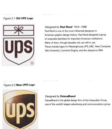
unveiled a newlogo
in March
25,
2003.
Paul Rand's
1960
design
of a string-wrapped parcelsitting
abovethe
carrier's shieldis
gone,
replacedby
alarger,
sleeker emblemdesigned
by
FutureBrand in New York. The
rationalefor
embarking
on such a major redesigninitiative is based
on sound principles.The decision
to
adopt a newlogo,
onethat
reflectsthe
company's new capabilities acrossthe
entiresupply
chain seemstimely,
andthe
earlier muchbeloved
logo
was over40
yearsold,
andonly
representedthe
company's originalbusiness,
whichis
express maildelivery
service.Without
understanding
the
rationalebehind
the change,
viewers mightbe easily
confused orbewildered
by
the
change.The
UPS
logo
changeis
usefulfor
this thesis
because it
is
an example of a major company's
identity
change,
and motivated researchto
explorethe
ideal way
to
presentthe
rationalefor
changing to
a newidentity.
Figure
2.1
Old UPS Logo
g|
Designed
by
Paul Rand 1914-1996
Paul Rand isone ofthemostinfluential designers in
Americangraphicdesignhistory. Paul Rand designedagroup
of corporateidentitiesfor important American institutions.
Many
ofthem,thoughdecadesold,are stillinuse.These include logos for
Westinghouse.UPS,
ABC,
NextComputer,
Yale
University,
CumminsEngine,
andtheubiquitousIBM.Figure 2.2 New UPS Logo
Designed
by
FutureBrand
[image:10.610.187.576.352.798.2]Prececdents
Continued
Graphic Design Archive
ofWallace Memorial
Library
atRIT
Figure
3. 1
The Graphic Design
Archive in
the
Wallace
Library
is aninvaluable
sourcefor
historical
case studies inthe
areasofcorporate identity.It
provides accesstothe
corporateidentity
manuals ofLester
Beall
for
the
International Paper
Company
and ofPaul
Rand
for
IBM,
NEXT
andWestinghouse.
These
manualsdemonstrate
how
corporateidentity
canbe
flexibly
adaptedin
traditional
printmedia,
such as collateralmaterials and
advertising,
as well asin
three-dimensional
applications such as productpackaging
andbuilding
signage.In
additionto these resources,
theweb-basedDesign
Archive Online
also provideslearning
resources onthe
history
ofdesign. It
offers aninteractive collection of
images
andsupporting documentation from
Wallace Library's
Special
Collections,
making it
possibleto
accessprimary
resourcesin design history.
The
Graphic
Design
Archive is
a great inspirationfor conducting in-depth
research [image:11.610.186.422.657.819.2]for
this thesis.
Step
1Understanding
the
Rationale
ofCorporate
Identity
Change
Scope
Determining
the time
spanDetermining
number of corporateidentity
changesCategorizing
industries
Researching
Fortune
100-500
companiesRobert Swinehart
HeteachesCommunication Design andInformationDesignatCarnegie MellonUniversity. He is Vice PresidentoftheInternational InstituteofInformation
Design,
alifetime
honorary
member ofthe American CenterforDesign,
a pastPresidentof
GDEA,
and apast member ofthenationalboard oftheAIGA.B.FA.,
Kent StateUniversity; M.FA.,
Northern IllinoisResearch
Books,
periodicals,
websites:Refer
to the
detailed information
onBibliography
sectionConducting
interviews
with experts:Robert
Swinehart,
a professor atCarnegie Mellon
University,
has
done
extensive researchon corporate
identity
andvirtualidentity
systems.After reviewing
the
thesis
proposalhe
recommended a number ofbooks;
"The brand
gap"
and
"Designing
brand
identity."
He
also advisedthat,
to
managethe
thesis,
it
should notbe
too
broad
and thatit
isvery
important
to
keep
the topic
focusing
on adesigner's
perspective.Reviewing
other relevantdisciplines:
Business,
marketing,
advertising
Step
2
Making
the
Graphic Design Discipline
andBusiness More Aware
ofthe
Purpose
and
Rationale
ofCorporate
Identity
Change
Analysis
Classifying
information
Degree
of changeFrequency
of changeReason
for
changeResults
ofchangeSize
ofbusinesses
Conducting
case studieson each classifiedindustry
Synthesis
Compare
andcontrastdifferent kinds
ofbusiness
Successful
changeandfailed
changeNever
changed and often changedDefining
effectiveness of changeResearch
Continued
10
Step
3
Proposing
aNew Approach
to
Successfully
Present
the
Corporate
Identity
Change
Evaluation
Establishing
apattern of successDetermining
what shouldhave happened
andinvestigating
whathas
yetto
happen
Sorting
criteriafor
successfrom Corporate
Identity
Change
history
Conclusion
Evaluating
different
environmentsfrom
the
pastForecasting
significance of newtechnology's
impact
Identifying
suitable media and application possibilitiesDefining
target
audiencegroup for
the
applicationRealizing
new valueto
design
andbusiness
Explanatory
Diagram
ofThesis
o
ProblemDefinition1.1 Scope
Determining
the timespanHow manycompanieschangetheiridentities? What kindsofbusinesses?
-Majorcompanies
Defining
"Majorcompanies" and researchrationaleResearching
Fortune 100-500companiesi.i Research
Books, Periodicals,Websites
Identifying
expertiseFinding
Experts-contact interview
Other RelevantDisciplines
Cumentty/Recerrtfy
changedQXerox,Kodak
contactthecompany
acquiringinformation
participationintheprocess
AcquiringInformation
t
Understanding
theRationaleofCI Change
Synthesis
1.1 Analysis
Classifying
Information(Wurman'sHatracks)
Dyrates ofchange
by
levelsof changeby
reasonsforchangeby
resultsof changeby
size ofbusinessesOrganizing
Information inmost effectivewayu
Understanding
theGoal CriteriaofCIChangeCompare/Contrast
SuccessfulChangevsFailedChange I leverChangedvsOften Changed
Defining
EffectivenessInvestigating
thepositiveimpactthechange madefromvanousperspectives
Evaluating
theResults(ShannonandWeaver's
CommunicationModel)
Intermediate Evaluation
AwaringdieImportance ofReasonsfor Change
o
Implementation?
?
FINAL APPLICATION|i
-lEvaluating
ReasonsforSuccessful CIChange
Establishing
aPatternofSuccess(ShannonandWeaver'sCommunication Modeland other appopriatetheories)
Determiningwhat shouldhavehappened What hasyetto happen
Developing
aPrototypeforPresenting
CI ChangeSorting
criteriaforsuccessfrom CIchange
history
Evaluating
differentenvironmentsfromthepast
Identifying
surtaote mediaRealizing
New ValueForecasting
significance of newtechnology'simpactRetrospectiveEvaluation
Proposing
aNew Approach toSuccessfully
Presentthe CI ChangeResearch Method
The
research process involves morethan
justgathering
agroup
offacts;
it requires a plannedprocess,
organizing
methods,
andideation
of solutions.Forced Juxtaposition
was usedfor arranging
proper case studies andWurman's Hatracks
was usedto gather andclassify
information.A
survey
wasalsousedto
understandthe
general viewers'opinion on
the
individual
corporateidentity
changes.Forced
Juxtaposition
This
methodis
a useful toolin
brainstorming
in
that
it
encourages,
orforces
theviewerto
makeconnectionsbetween
characteristics orattnbutes ofa subject.By forcing
andexploring
these
relationshipspotential newdirections
are generated and a richerfinal
solution
may
result.Wurman's
Organizing
Hatracks
This
method isa useful problem-solvingtool that
revealsinformation
and relationshipsby
organizing
andreorganizing
facts
andobservations.There
arefive
waysto
organizeinformation:
alphabetically,
by
location,
time,
category
and magnitude.Categorizing Industry
This
topic
is very
broad,
so it is importantto
focus
onthe
most relevantinformation
to
makethe
research more manageable.To
help
ideatepotential solutionsfor
categorizing,
severalproblem-solving tools
mentioned above wereused.By
reorganizing the
informationfrom
different
perspectives, newconclusionsorinterpretations
can occur.This large quantity
of information-allthebusinesses
withcorporate
identity
changes-werecategorizedin 2
steps.Then,
the
appropriate exampleswereselected
from
eachcategory
for
corporateidentity
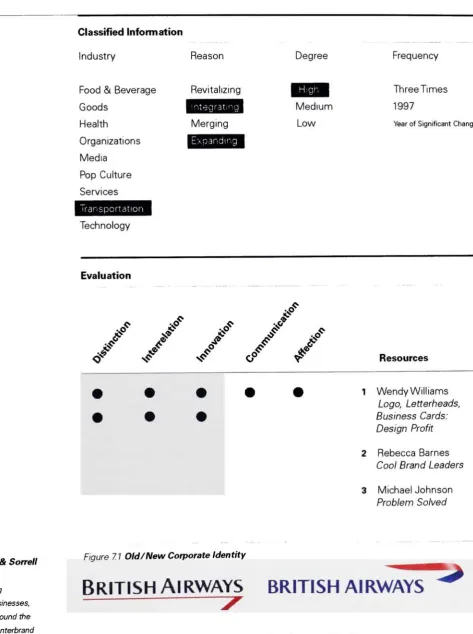
change.1
stStep
20 Industries
Airlines
Automobiles
Broadcast
Chemical/Oil
Computer
Education
Electronics
Entertainment
Delivery
Retail Store
Fashion
Financial
Food/
Beverage
Government
Hospital
Magazine
Machine
Pulp/Paper
Pharmaceutical
Telecommunication
2nd
Step
9
Industries
Food
& Beverage
Fast Food
Liquor/
Coffee
General Food
Goods
Pulp/Paper
Metals/Machine
Chemical/Oil/Gas
Hearth
Hospital
Pharmaceutical
Organizations
Education
Government
Media
Magazine
Broadcasting
Newspaper
Pop
Culture
Fashion
Entertainment
Sportswear
Services
Delivery
Financial
Retail
Store
Transportation
Airline
Automobile
Research
Continued
12
Classifying
Information
Reasons for
Change What
wasthe
main reasonfor
making
a corporateidentity
change?Degrees
ofChange
How different is
the
new corporateidentity
from
the
old one?Frequency
ofChange How
oftendoes
corporateidentity
changetake
place?Results
ofChange
How
effectiveis
the
corporateidentity
change?The
most appropriate and significant corporateidentity
changes were chosenbased
onthese
categoriesto
explorewhat makes a change successful orunsuccessful.Using
Research Methods
K3
*A
-c-,@
IBM
Hucaron
>De'Ti/e^L
1Ue>.f+wi
M bilf j
bP
H0O
GFAp/fl,.uict-aWr*?.
Fed
m
-*- *^^ Bjrth ofAi^*ric*-
MocVrj:
/
Mete
^'-uiaasa
Rt(p
/
feper-i^.
IIBBa(tc
* (p/-Ml
'
't,'fero.v/-,v.,-*.C\t"='-S
Bayer
:Categorizing
industries
andselectingcase studies> :-,.'t
/
L.;.i </ f'V,r^r'1
PWb
-.* CWfllk
I
I20 m{
1
-'Jlli*
4
12
,= _
Classifying
information
by
Degree
/Frequency
ofChange
/vw^=
'
tr/am?te
5
( '". ", Xrjuifrr-7
t-y,~\r.:\-,
* o o o "
.
* '
C
-1 . -
<"-" * PXXt>&
-o -oc
s
< c*v,..,v %, mC
Or-LfetiL*W
'><-. H |#
* c :
Four Reasons for
Corporate
Identity
Change
Even
though the
reasonsmay be
different,
the
ultimategoalfor
identity
change isthesame
among
companies.They
areaspiring
to
lead
themarket,
gain marketshare,
earn a good reputation and
have strong
recognitionamong
consumers.Merging
The
most common reasonfor
identity
change is merging.This
occurs whentwo
ormorecompaniesjoin
together
to
form
onecompany.To
maketheviewer awareofthis change,
companies communicatethe
mergerthrough the
design
of a new corporateidentity.Case
Study
onMerging:
BP
(British/
Beyond
Petroleum)
Citibank
Pharmacia
Expanding
As
a company's market growsinto
newareas, their
currentidentity
may
noteffectively
representwho
they
are.To
continueto
expresswhatthe company
standsfor,
they
undergoa corporateidentity
change.This helps
theviewerbecome
fully
aware ofall thatthe company
offers.Case
Study
onExpanding:
Amazon.com
FedEx
British
Airways
Revitalizing
When
acompany'sidentity
falls behind
the
times,
arevitalizing
change needsto
be
made.To
bring
life
back
into
the
company,they
updatetheirappearancethrough
acorporateidentity
changeThis demands
attentionfrom
viewers againdue
to the
company's re-energizedimage.
Case
Study
onRevitalizing:
Burger
King
John Deere
Nike
Integrating
This
occurs when acompany
lacks
visualconsistency
among
itsdifferent
products,
services and
divisions.
To
eliminatethe
confusionthis causes, the company
changestheircorporate
identity.
This
helps
the
viewerbecome familiar
with each part ofthe company
and realizethat
it
comesfrom
one entity-the parentcompany.Case
Study
onIntegrating
British Airways
Synthesis
Continued
14
Five Criteria
for
aSuccessful Change
Brand
Gap
Marty
Neumeier The bookis
abouthowtobridge thedifference between business strategyand visualdesign.Designing
Brand
Identity
Alina Wheeler
The bookprovides guidelines
for
building
andmaintaining strong brands.Truth,
Lies
&
Advertising
Jon SteelThe bookshowshowtogetinside
mindstodiscover
how
they
relatetocompanies and products.To
makethe
corporateidentity
changesuccessful, there
are certain criteriathat
mustbe
met.These
criteria are establishedbased
onin-depth
research, interviews,
and criticalthinking.
During
aninterview
withRobert
Swinehart,
a professoratCarnegie
Mellon,
it was mentionedthat
redesigning
a corporateidentity is
not jut aboutmaking
visualdifferences;
itis
also aboutdelivering
adifferent
message.Other
reserachbooks;
The Brand
Gap,
Designing
Brand
Identity,
andTruth,
Lies &
Advertising
alsopoint outthe
importance
ofhow
the
newcorporateidentity
is presented.The five
criteriafor
successfulchangeweredivided
intotwo
stagesbased
onthe
interviews
and case studies.The first
stageis
the
designing
stage;
which involves market anddesign
research,
holding
conferences,
and creativeproblem-solving
to
achievedistinction,
interrelation, andinnovation.The
second stageis
the
presenting
stage,
which occurs after
the
new corporateidentity
is completed.This
involves
developing
strategiesfor
implementing
a newindentity,
informing the
viewersaboutthe change,
and
deciding
whatkinds
of applicationswouldbe
most suitable.Designing
Stage
Distinction
Does
the
corporateidentity
changehelp
the company
standoutfrom
the
previousidentity
andamong
its
competitors?Interrelation
Does
thecorporateidentity
changehave
influence andrepresentationfrom
eacharea ofthe
company?Innovation
Does
thecorporateidentity
changecreatively
set newstandardsfor
the
market?Presenting
Stage
Communication
Does
the
corporateidentity
changeeffectively
statewhatthe
company does?
Affection
15
Case
Study
The
purpose ofthe
casestudy
is
to
evaluatethe
effectiveness of corporateidentity
change and explore
the
correlationbetween
reasonfor
change,
and successor
failure.
Nine
corporateidentity
changes were chosenbased
onthe
ninecategories ofindustries,
four
reasons ofchange,
five
criteriafor
successful corporateidentity
change,
andthe
degree
orfrequency
of change.Chosen
Corporate
Identity
Changes
Amazon.com
BP
British
Airways
Burger
King
Citibank
FedEx
Intel
John
Deere
Nike
Evaluation
The
casestudy
providesa meansfor evaluating
the
effectiveness of corporateidentity
change
using
the
five
criteriafor
a successful corporateidentity
changeand three publishedresearch articles.The
three
previous research papersarechosenfrom
expertsin different disciplines.
If
these
research papers mentionany
ofthe
five
criteriafor
a successfulchange,
onepoint
is
assignedfor
that
specific criterion.For
example,
if
two
ofthe
three papers statethatBP's
corporateidentity
change isinnovative, then
BP
receivestwo
points(represented
by
dots)
for innovation.
During
the
presentation ofthis
thesis,
the
general audience was askedto
participate inthe
evaluation ofthe corporateidentity
changes.They
were allowedto
vote oneachcorporate
identity
changeand indicateif
they
felt
the
change was"successful,"
"no
significantdifference,"
or
"unsuccessful."
The
casestudy
evaluation results willbe
comparedto
thesevotesto
seehow
the
generalaudience's opinion matchedwithSynthesis Continued
16
General Viewer
Survey
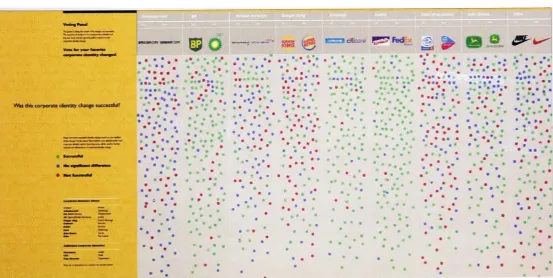
To
conductthe survey,
avoting
panel wasinstalled
during
the thesis
gallery
show.The Graduate
Graphic
Design
thesis
show presentsthe
processand progress ofthe
students'
research.
During
this thesis show,
voting
panels weredisplayed
because
this
allowed viewers
to
expresstheir
opinionsaboutthe
corporateidentity
changes.The
purpose ofdoing
this
survey
is
to
comparethe
evaluation ofthe
casestudies andthe
general public's reactionto the
corporateidentity
change.The
question asked was:Was
this
corporateidentity
changesuccessful?Please
rate each corporateidentity
changebased
onyour opinion ofthe
change.Put
the
stickerthat
matches youropinion undereach corporateidentity
section.Your
responses willbe
usedto
further
evaluatethe
effectivenessof corporateidentity
change.Successful
No
significantdifference
Not Successful
[image:19.610.37.591.494.772.2]Voting
Result
Figure 4. 1
Voting
took
place overatwo
weekpenod,
starting April 1
st andending
onApril 15th.
Detailed voting
results willbe
explainedin
each section ofthe
casestudies.Wasthiscorporateidentitychangesuccessful?
Figure 4.1
Voting
Panel
W O
'"""'m
^
r . ? . : * 1 * ..
*.
..
Study
17
[image:20.610.172.588.131.751.2]BP
Figure 5. 1
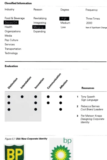
Classified Information
Reason
Degree
Industry
Frequency
Food & Beverage
Revitalizing
Three Times
i
B3M
Integrating
Medium
2000
Health
^S^IS^I
Low
YearofSignificant ChangeOrganizations
Expanding
Media
Pop
Culture
Services
Transportation
Technology
Evaluation
jr
?
?
/
,s&
&
<y
^
<? 05P
f
Resources
1
Tony
Spaeth
Sign Language
2
Rebecca
Barnes
Cool Brand
Leaders
3
Pat Matson
Knapp
Designing
Corporate
Identity
Landor Associates
Landor Associates
isaninternationally
recognizedbranding
and
design
consultancy.They
offeramultidisciplinaryrange ofbrand
strategy,
design,
naming,interactiveandresearch services.
Figure 5. 1 Old/New Corporate
Identity
Old
Corporate
Identity
New
Corporate
Identity
Synthesis Case
Study
1:
BP
18
BP's
Merging
The
1998
merger ofBP
andAmoco
created one ofthe
world'slargest
oilandpetrochemical groups.
Also,
in
2000,
BP
introduced anew,
unified globalcorporateidentity.
The
newdesign
conceptis
capturedby
the
phrase'beyond
petroleum',
reflecting
thecompany's aspirationto
meetthe
world'sfuture
energy
needs.(BP
News
Release,
1998)
Landor Associates
andBP decided
to
retainthe nameBP
because it
standsfor
the
aspirations ofthe
newcompany;
better
people,
better
products,
beyond
petroleum.Distinction
BP's famous
shieldlogo
survived overthree
decades. In
the
1980s,
the
logo
only
changedto an
italicized typeface, but
the
big
mergernecessitated a whole newidentity.
BP's
distinctive
green-yellowcolorsurvived andtransformed
into aflowery
burst
of sunand stands out
among its
competitors."It's
dynamic,
it's bold
andit's something
youwouldn't expect
from
an oilcompany."
(Pat Matson
Knapp,
P135)
Interrelation
BP
andAmoco's merging
created alarger
company
"BP
Amoco."But Amoco has
notappeared as a component
the
new corporateidentity.
Some Amoco
employeesjokedatthe time
"The Amoco
is(Tony
Speath, P24)
The group
chiefexecutiveJohn
Browne decided
that
perpetuating
two
names wouldbe
a poorfoundation
for
a globalpower
brand. At
the time
ofthe merger,
itwas noteasy
for both
companiesto
collaborateequally
and make an agreement onbig
decisions.
Innovation
The
newtrademarkofthesunburst shifted theparadigm ofhow
the
petroleumindustry
should appear.
The design
andthe
colors oftheir
new corporateidentity
aredistinguishable
andinnovative
whilesending the
messageofbeing "environmentally
friendly."
Communication
BP's ongoing
commitmenttobuilding
theirnewreputation asanenvironmentally
friendly
oil
company
involves
annual surveystomonitorthe
brand's impact externally
onrelations with consumersand communities."BP's desire
totranslate the
newcorporateidentity
concept
into
actionhas had
visible resultsaligning
behavior,
activities and(Alma
Wheeler,
P178)
Affection
The
new,
unified global corporateidentity
nowappears across allcompany
offices,
manufacturing
plants and retail service stationsall overthe
world.The
bright
sunburstalso appearsontrucks,
gasstations andT-shirts. Landor
Associates
has
explored animation andhas branded
sound."These
physical changes are supportedby
abehavioral
change withinthe
(Pat Matson
Knapp,
P135)
Because
newbehavior follows
the
newlook,
Study
[image:22.610.29.593.270.819.2]Voting
Result
Figure 6. 1
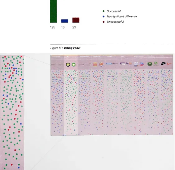
BP
received125
"successful
change,"16
"insignificant
change,'' and23
"unsuccessful
change"
votes out of
164
votes.BP
received one ofthe
best
responsesfrom
the
audience out ofthe
nine corporateidentity
changes.BP:
General Public's
Opinion
onCorporate
Identity
Change
125
16
23
Successful
No
significantdifference
Unsuccessful
Figure 6. 1
Voting
Panel
e*e*
, ,.
1=9 O
"
^5
^~c,r r-~Fed -,
a
m
&-#:*:
.
- * % .,*.:... .?.*.
; . . . . . > . # % t * ** * .* m < -' . * *\
#.%
%/
. * *. . .* .*. .. * ... , *** .*. * * * : . . * .:
. '*..
.. ?-.. . . '*. * .... * * * . # 1 _ * - * * 9 . * * ' , . * . ^ . * * * * " * '. ? * * ? , ' *m m * .
'
*
* .
'
% w
f | ,
... *
'.
**.
;
* .'
Synthesis Case
Study
7;
BP
20
Stationery
The
Identity
system canbe
useddynamically by
separating
theBP
logotype
from
thesunburst.Advertisement
/ Promotion
nevv^
/
Study
21
Signage/ Sculpture
Landor Associates
alsodesigned
metal signature and sculpturesfor
thecompany'sheadquarters.
Truck
Synthesis
Case
Study
2:
British Airways
22
[image:25.610.109.583.112.747.2]British Airways
Figure 7.1
Classified Information
Industry
Reason
Degree
Frequency
Food &
Beverage
Revitalizing
Three Times
Goods
WHBHsBI
Medium
1997
Health
Merging
Low
YearofSignificant ChangeOrganizations
BBBBH
Media
Pop
Culture
Services
ESHRHBPHBSB
ligjM*Mse|iyME
Technology
Evaluation
$>
Jf
a?
j*
&
<r
s<^JF
?
JF
Resources
1
Wendy
Williams
Logo,
Letterheads,
Business Cards:
Design Profit
2
Rebecca Barnes
Cool Brand Leaders
3
Michael Johnson
Problem Solved
Interbrand
Newell
& Sorrell
Newell
& Sorrellwasone of
Europe's
leading
identity
anddesignbusinesses,
workingwithdientsaroundtheworld.ItmergedwithInterbrand
in 1997tocreateInterbrand
Newell
&Sorrell.
Figure 7.1 Old/New
CorporateIdentity
Old
Corporate
Identity
New Corporate
Identity
Study
British Airways
23
British
Airways'Expandng
andIntegrating
British Airways began
as a mergerin
the
1970s
between
British
Overseas Airways
Corporation
andBritish European Airways.
In
the
1970s,
British Airways
was wellknown
through their
"We
fly
the
Flag" slogan.But
times
and perceptionchangedandthis
airlineneeded
to
redefineits
identity
in achanging
world.The
conceptbehind
the
corporateidentity
change was"Flying
the
World,
notFlying
the
Flag."British Airways
became
the
largest
airline ofthe
United
Kingdom. It is
also one ofthelargest
airlines inthe
world.During
the
1990s,
British Airways
startedusing
the
slogan"The
World's
Favorite
Airline"and
based
onthe slogan,
a new corporateidentity
waslaunched
in 1997
to
showthe
company
is
as"caring"
as
it
has
everbeen
andis
also"global."Distinction
The
standard approachto
a national airlineidentity is
to
link
it strongly
with nationalelements:
Alitalia
usesthegreen,
red and white colors ofthe
Italian
flag.
Air Canada
usesa maple
leaf,
KLM has
a crown motifto
show prestigefor
the
Netherlands. The
newcorporate
identity
ofBritish Airways
alsohas
a similar color schemeto
Britain's
traditional
red,
white andblue
flag
with softertypefaceand a new ribbonlogo.
But
onedistinctive
attribute
is
that the
airline andInterbrand Newell
&
Sorell
took the
global concept andapplied
it
to
theirairplanes.They
did
this
by
placing culturally influenced
patterns called'World
Images"on
the
plane'stailfin.
Since,
the tailfin
is
the
mostvisible applicationfor
airlines,
painting
them
withdifferent
patternsthat
representthe
plane'sdestination,
was a uniqueapproach.
Interrelation
The
newcorporateidentity
wasdeveloped
after2
yearsofcollaborationbetween
the
company's
design
managementdepartment
andtheir
selecteddesign team, Interbrand
Newell
&
Sorrel.
When British
Airways
presentedtheir
new corporateidentity,
they
madeit
aworldwide event.They
broadcasted
the
presentation oftheir
newidentity to
different
sections oftheir
company to
126
locations in 63
countries aroundthe
world via satellitebusiness
television.This
helped
tomake allthe
employees ofthe
airlinefeel like
they
were a
big
partofthis
event.Innovation
The
newcorporateidentity
systemwas implemented withforty
different
tailfin
designs
that
had
patternsrepresenting
people aroundthe
world.These designs
were also used onbusiness
cards, corporate publicationsanddocuments.
"There
weretwo
significantproblemswith thisproposal...
financial
fortunes
took
anose-dive;
andthere
wasthe
recognition
(Johnson,
P147)The
new corporateidentity
approach was"to
avoidthe
(Foges, Morgan,
P151)
but
this
radical approach at adesign
solutionlead
to
Synthesis Case
Study
2:
British Airways
24
Communication
"World
Images"was supposed
to
representthe
specificculture, nation,
and people ofthe
areas
to
whichBritish
Airways flies.
But,
the
images
that
Bntish
Airways
chose were controversialfrom
the
beginning
among
passengers."It
was not aneasy
birth,
costing
60m,
andto
a somewhathostile
reception"
(11
May,
2001
BBC News)
For
British
people,
it
was aboutlosing
their pride,
and peoplefrom
other nations werebewildered
aboutthe
airline's subjective choice
for
the
patterns.As
mentioned onthe
BBC,
market researchfound
that
British
customers-who makeup 40%
oftheairline'sbusiness-had
nottakento the
newdesigns.
The
process and reasonsfor choosing
the
designs for
the
different
countries was not explained
to the viewer,
whichled
to
confusion andfailure.
Affection
British
Airways'new corporateidentity
resultedin
a"love/hate"
response.
"The
planbackfired
andthe tailfins
became
a public relationsdisaster,"
(11
May,
2001
BBC
News)
with
the press, passengers, staff,
and evenBritish Prime Minister Margaret Thatcher
turning
her fire
onthe
new corporateidentity.
The
redesign attemptsweretoosubjectiveStudy
British
Airways
Voting
Result
Figure 8. 1
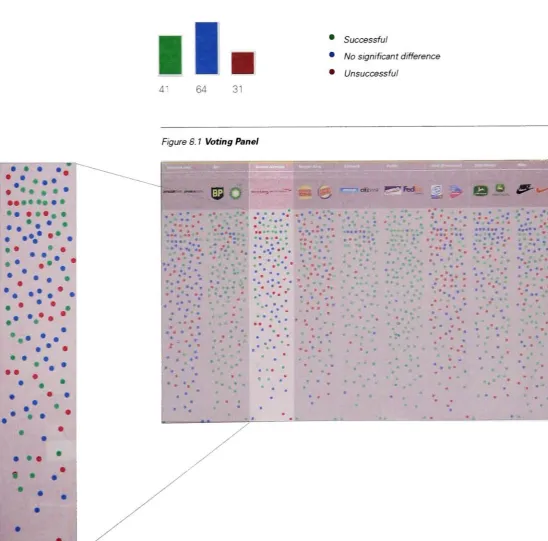
British
Airways
received41
"successful
change,"
64
"insignificant
change,"and
31
"unsuccessful
change"votes out of
136
votes.Based
onthe
voting
results,
the
logo
itself did
notmake astrong impression
onits
viewers.While
interviewing
someof
the voters,
it wasdiscovered
that
oftenthey
did
not recognizethe
new ribbonlogo
was related
to the
"World
Images"British Airways: General Public's Opinion
onCorporate
Identity
Change
ll.
41
64
31
Successful
No
significantdifference
Unsuccessful
[image:28.610.38.587.285.826.2]Synthesis Case
Study
2:
British Airways
26
Tailfin: World
Image
Union
Flag
United Kingdom
Fbttery
EnglandWood
Carving
NorthAmenca%
Painting
Tj0%
TraditionalPainting
South WestEngland '^*&'' Japan
5V
Ceramic Panel
Germany
^i
Celtic
Calligraphy
Ireland
World Images
was a concept ofglobalism,ratherthannationalism.Aircraft
Study
Burger
King
27
Burger
King
Figure
9. 1
Classified Information
Degree
Industry
Reason
Frequency
Lamm
High
Three Times
Goods
Integrating
IBBL9
1999
Health
Merging
Low
YearofSignificant ChangeOrganizations
Expanding
Media
Pop
Culture
Services
Transportation
Technology
Evaluation
^
^4>^
i&Jv &"
is"
Resources
1
Poppy
Evans
"
Fast-
Food
Facelift"HOW
April,
2000
2
Emily
Schurubble-Potts
Designing
Brands:
Market Success
through
Graphic Distinction
3
Mark
Hewitt
Brands
andBranding
Sterling
Group
Sterling
isaleading,
independently-owned
branding
consultancy
with officesinNew
York,
San
FranciscoandLondon.They
alsohavean [image:30.610.158.589.100.826.2]affiliateofficein Singapore.
Figure 9. 1 Old/New Corporate
Identity
Synthesis Case
Study-Burger
King
28
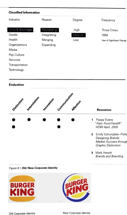
Burger King's
Revitalizing
After
25
years,
Burger
King
decided
to
updateits
corporate identity.The
New
York-based
Sterling Group
was commisionedto
do
anidentity
redesign in1999.
The
newcorporateidentity
wasimplementedin alladvertising, merchandising, packaging, uniforms,
signageand image
designs.
Distinction
Burger
King's
former
corporateidentity
gained significant recognition and possesseda
strong
concept,
which neededto
be
preserved.The
colorblue
joinedthe traditional
red and yellowtogive
Burger King's
newlogo
moredepth
than the
former
design.
The
bun image
remainedbecause
ithad been
used as astrong
communicator,
but
thetypography
was enlargedbeyond
the
bun
to
"convey
the
idea of abigger
taste
andbigger
Whopper."
(Schurubble-Potts,
P74)
It
was"questionable"(Schurubble-Potts,
R77)
whether a
bigger
type size,
morecolor,
and enhanced graphic elements capturedthe
"bigger
taste"concept and communicated it
to the
viewers.Interrelation
The
Sterling
Group's
creativeteam
wantedto
"retain
theconcept oftheBurger
King
name
framed
in a bun"(Evans,
P42),
sincethe
oldlogo
was"iconographic."
(Hewitt,
P 8)
But
the
company's request was a more significantchange.Another
adjustment madebetween
thedesign
team
andthe
company
resulted inadding
anextra graphic element.This
additional element gavethe
logo
a1950s
look.
The
creativeteam
disagreed
withthisidea,
but Burger
King
considered ittobe
abetter
approachbecause
the
1950s
was an era new corporateidentity
reflectsthe
periodwhenburgers
were'bigger
andtastier."
After
somedifficulty
andcompromise.
Sterling's
creativeteameventually
presented16
concepts.Innovation
Burger
King
introducedatransparent
bag
to
complimentthe
new packagedesign
and newlogo.
The
transparentbag
wasdesigned
sopeople couldeasily
see what wasinside
withouthaving
to
openthe
bag.
It
was a welcomed changeby
many
people,
but
it"mysteriously
disappeared"(Fitch.com,
white paper) after avery
short runbecause
Burger
King
Communication
The
newcorporateidentity
wasbased
onthepreviousdesign,
but
was revisedconsiderably.
The
typeface
was replaced andenlarged;
sharperedges wereadded,
and new coloranddynamic
graphics were introduced.Fitch,
anotherdesign
firm
that
worked with
Burger
King,
designed
the
exteriorand interiorofthe
restaurantsto matchthe
new corporateidentity
systemusing
the
retro-feeling blue fin
image.The
viewers' reaction waspositive,
but
the
retro corporateidentity
system, restaurants,
and packagesmakethe
company
look like
they
are"going
backwards
"(Evans,
P46)
Affection
With
the
newcorporateidentity,
Burger
King
redesignedthe
interior
tofollow
the
ordenng
process.The
menu was redesignedto
be
moreaccessible.The
combination ofthe
newcorporateidentity
andthe
storemake-over enhancedthe
impact
ofthe
newdesign.
People
responded morepositively
andfelt better
aboutthe
new change.
The
new slogan"Have
it
yourway"
followed
the
new corporateidentity
systemto showserviceis
faster (store
design)
andthe
productis
customized.Fitch
Fitch isone oftheworld'sbest
known designcompanies.
The company develops
environmental
design,
products,packaging,digitalmedia,brand
identity
andbrandexperiences.Thereareinternationaldivisions in
Synthesis
Case
Study
3:
Burger
King
30
[image:33.610.32.583.288.825.2]Voting
Results
Figure 10. 1
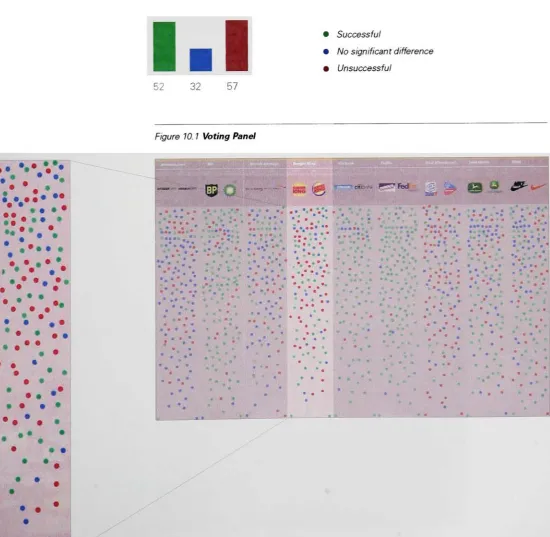
Burger
King
received52
"successful
change,"32
"insignificant
change"and
57
'unsuccessful
change"
votes out of
141.
The
evaluation andthe
voting
results weresimilar,
andvoters'
response
to
Burger King's
identity
change was not a positiveone.Burger King: General Public's Opinion
onCorporate
Identity
Change
52
32
57
Successful
No
significantdifference
Unsuccessful
Figure 10. 1
Voting
Panel
>
,.,..,:...". .
...,'.j-:-...
KBS
<@
cm. p-7fed
gf-s^
***#* * t
* ft ft) ft *' ft * ' .
1 i * ' *.
..
'
... , eft
ftft *ft 1 ? *
* ft* . > .. . * * * * " , * ft ft 1
" * 1 *
... , ?
t
. ft " .*. . , . "
r
.
** ft* '
ft * * * m * * ... 1 \ * ' *
, ft ft ft *
*
j * *
ft ! . . . * .. ' *
-I
' > ft * *It? * _ ft * *
ft * * *
.
ft
_ * Q ft
* *
* * ft) ft
>_ I
* ft) * <> * * ' * . * 9 -m * * . . * *
. " ft ft
ft *
*.
* *4
\j ._-*#_
Study
Burger
King
31
Proposed
Design Solutions
For
most oftheinitial
designs,
thedesigners
experimented withtypography
andbun design
to carry theconcept of
"bigger
taste."New Burger
King
Restaurant
Synthesis
Case
Study
3:
Burger
King
32
Packaging
New
clearbags
allowed customerstoseetheirorders.Restaurant
Interior
Menus
with clearimages
areconvenientlyplacedthroughout the restaurant,Study
FedEx
33
[image:36.610.159.591.121.625.2]FedEx
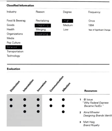
Figure 11. 1
Classified Information
Industry
Reason
Degree
Frequency
Food
&
Beverag
Revitalizing
Once
Goods
jWBBjaj
Medium
1994
Health
Merging
Low
YearofSignificant ChangeOrganizations
Media
Pop
Culture
Transportation
Technology
Evaluation
^
;4>^
&
JF J> is
rfp
Resources
Figure 11.1 Old/New Corporate
Identity
1
@ Issue
"
Why
Federal Express
Became FedEx
"2
Alina Wheeler
Designing
Brands
Identity
3
Matt
Haig
Brand
Royalty
8