Rochester Institute of Technology
RIT Scholar Works
Theses
Thesis/Dissertation Collections
7-1-2000
Effects of texture on color difference evaluation of
surface color
Alexei Krasnoselsky
Follow this and additional works at:
http://scholarworks.rit.edu/theses
This Thesis is brought to you for free and open access by the Thesis/Dissertation Collections at RIT Scholar Works. It has been accepted for inclusion
in Theses by an authorized administrator of RIT Scholar Works. For more information, please contact
Recommended Citation
Effects of texture on color difference evaluation of
surface color
Alexei L.Krasnoselsky
A thesis submitted
in
partial fulfillment of the
requirements for the Degree of Master of Science
in
the Chester F. Carlson Center for Imaging Science
of the College of Science
Rochester Institute of Technology
July 2000
Signature of the Author
Accepted
by
CENTER FOR IMAGING SCIENCE
ROCHESTER INSTITUTE OF TECHNOLOGY
ROCHESTER, NEW YORK
CERTIFICATE OF APPROVAL
M.S.DEGREE THESIS
The M.S. Degree Thesis of Alexei
L.
Krasnoselsky
Has been examined and approved
By two members of the color science faculty
As satisfactory for the thesis requirement for the
Master of Science degree
Dr. Ethan Montag, Thesis
Advisor
THESIS RELEASE PERMISSION FORM
Rochester Institute of Technology
Center for Imaging Science
Title of Thesis
"Effects of texture on color difference evaluation of surface color"
I, Alexei
L.
Krasnoselsky, hereby grant pennission to the Wallace Memorial Library of
R.I. T. to reproduce my thesis or part. Any reproduction will not be for commercial use or
profit.
Signature of the Author
Acknowledgements
I
amgratefulto the
people ofthe
Munsell Color Science
Laboratory
for
their time
andsupport
in
research and completionofthis thesis.
I
wouldlike
to thank
Roy
Berns
andEthan
Montag
for
their
guidancein
my
researchandeducation,
Garrett
Johnson,
Gustav Braun
andDi-Yuan
Tzeng
for
theirgreathelp.
TABLE OF
CONTENTS
FIGURES
ANDTABLES
3
ABSTRACT
5
INTRODUCTION
7
CHAPTER I. BACKGROUND
9
Color-difference
formulae9
parametric
effects13
Texture
15
Color
andtextureperception models18
CHAPTER II.
MEASURING
TEXTURE
21
CHAPTER III. EXPERIMENT I: AVERAGE BRIGHTNESS MATCHING
29
Texture
image capture29
Stimuli
generation32
psychophysical
experiment33
Results
andDiscussion
35
CHAPTER IV. EXPERIMENT II: COLOR DIFFERENCE EVALUATION OF
TEXTURE
43
Adaptive
psychophysicalmethods in colordifference research43
bayesian
adaptivemethods ofthreshold determination45
QUEST
adaptive procedure47
Assumptions
47
Placement
rule49
Termination
rule50
Application
ofQUEST
to colortoleranceestimation50
EXPERIMENT
II
54
Psychophysical
procedure54
Test
pairselection56
Instructions
58
Experimental
setup58
Choice
of theColor
centers59
Stimuli
specificationintheQUEST
procedure60
Texture
stimuli generation61
Observations
65
RESULTS
66
Thresholds
66
ANOVA
ON TEXTURE DATA ONLY74
Lightness
75
Chroma
76
Hue
76
PAIRWISE
COMPARISONS77
Student
t-Test77
Texture
vs.Uniform
77
"Directional"
versus
"diffuse"
texture
84
S-CIELAB
PREDICTIONS OF OUR VISUAL DATA88
CONCLUSIONS
93
SUMMARY
99
APPENDICES
101
FIGURES
ANDTABLES
Figure 1.
Spectral
reflectance of various surfacesmeasuredin SPIN
modeonthe
Macbeth
ColorEye
7000
d/0
spectrophotometer23
Figure 2.
Spectral
reflectance of various surfaces measuredin
SPEX
mode onthe
Macbeth
ColorEye
7000
d/0
spectrophotometer23
Figure 3. The
setup for
measurements of spectralirradiance
oftexture
surfacesin
the
light
booth
at various angles of
illumination
25
Figure 4.
Change in
the
reflectancefactor for
atexture
surface with relief(left)
and apearlescentsurface
(right)
as afunction
ofthe
angle ofillumination
26
Figure 5. Color
difference
(AE*ab)
between
measurements obtained atdifferent
angles ofillumination
andthe
measurement at0 angle(flat
onthe
light booth
table)
26
Figure 6.
Chromaticity
diagrams
ofthe
measurements obtained atdifferent
angles ofillumination (see
text
for
details)
27
Figure 7. A
diagram
oflighting
setup
for image
captureto
simulatedirectional
lighting
30
Figure 8. The
images corresponding
to
diffuse
anddirectional illumination
geometries31
Figure
9. Experimental setup for
the
averagebrightness
matching
experiment34
Figure 10.
Comparison
ofthe
measuredL
andL*
calculated
from
the
GOG
model35
Figure 11. Results
ofthe
averagetexture
image
brightness
experiment.Data
points representthe
average pooleddata
from
10
observers36
Figure 12. Examples
ofmatching
experiments withthe
stimuli ofaverage value ofL
around50.
37
Figure 13. Histograms
offor
three texture
images
39
Figure 14. Examples
ofQUEST
threshold
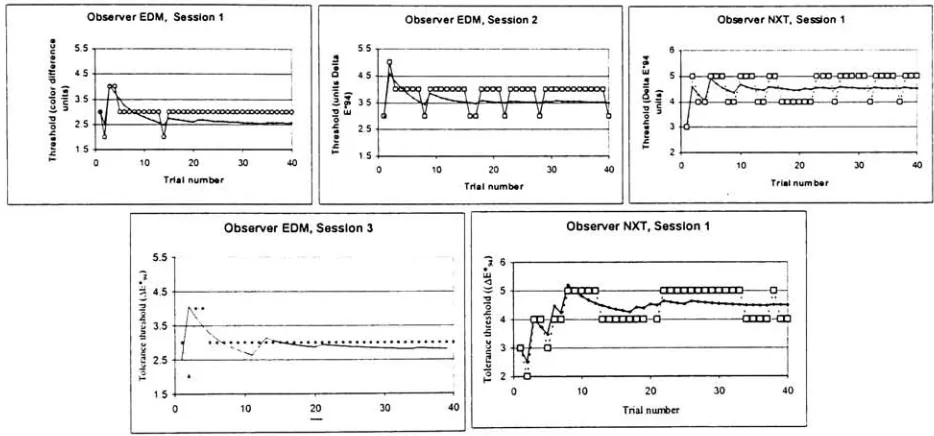
sessions51
Figure 15. Experimental
windowfor
the
pair-comparisonexperiment54
Figure 16. The flowchart
of stimuli specification56
Figure 17. Flowchart
ofthe texture
stimuli generation61
Figure 18. Examples
oftexture
images
usedin
the
experiment63
Figure 19. Tolerance
thresholdvaluesfor
observersALK
andEDM
for five
color centers66
Figure 20. The lightness
thresholdsas afunction
ofL*67
Figure 21. An
exampleofthe
estimatedtolerancethresholds
for five
observers70
Figure
22. The
averagetolerance thresholdvaluesfor
multipleobserversfor five
color centers.71
Figure 23. The
meandifference
predictionsbetween
successiveimages in
each series(L*,C*andH*)
90
Figure 24. The
maximumvaluesofdifferences between
successiveimages
predictedby
S-CEELAB
91
Table
I. CIELAB
colorimetriccharacteristicsofthe
display
window33
Table II. The
regression analysisfor
the matching
data
38
Table III. Image
contrast oftextureimages
atvariouslevels
ofL*40
Table IV. The
numberofpaircombinationsfor
each value ofAE
9455
Table VI. The
number of sessionsfor
each color center65
Table VII. Estimated
tolerance
thresholds
for
the
observerALK
68
Table VIII. Estimated
thresholds
for
the
observerEDM
69
Table IX. Thresholds
for
multiple observerdata
69
Table X. The
cumulativeANOVA
results(+
indicates
significance atP
<0.05)
74
Table XI. The
averageincrease in lightness
tolerance thresholds
for
texture
comparedto
uniform stimuli
78
Table XII.
Cumulative
t-testpairwise comparisons oflightness
thresholds
differences for
texture
vs uniform stimuli
for
each color center80
Table
XIII. Difference
in hue
tolerance thresholds
between
texture
anduniform stimuli82
Table XIV. The
averageincrease in
hue
tolerance thresholds
83
Table XV.
The
averageincrease in
lightness
tolerance thresholds
for directional
texturepatterncompared
to
diffuse
texture
pattern stimuli85
Table XVI.
Cumulative
f-testpairwise comparisonsoflightness
thresholds
differences for
Effects
of
texture
on
color
difference
evaluation
of
surface
color
Alexei
L.Krasnoselsky
Athesissubmittedinpartial
fulfillment
ofthe requirementsfortheDegreeofMasterofScience intheChester F.Carlson
Center forImaging
Scienceofthe
College
ofScience Rochester InstituteofTechnology
Abstract
The
parametric effects oftexture
on supratheshold colortolerance thresholds
wereinvestigated
in
two
psychophysical experimentsusing
simulatedtextures
presented on aCRT. Textured
images
were createdfrom
scannedphotographsof physicaltexture
samples withsemi-randomtextured
pattern.Differences in
appearance werecreatedby
varying
the
illumination geometry
during
the
image
capturestage.Two
conditionsweresimulated:diffuse
illumination
of aexperiment observers matched average perceived
lightness
of grayscaletextured
images
by
adjusting
the
lightness
of a uniformgray
field. Images
variedin
their
averageL*. The
resultsshowed
that,
onaverage, there
was nostatistically
significantdifference
between
the
observermatch and
the
averageL
ofthe
image.
The only
exception wasfound
for darker images
ofcoarse
texture.
In
the
secondexperiment,
anarray
of colorimages
was createdfrom
three texture
patterns:onesimulating
diffuse
lighting
conditions andtwo
simulating directional illumination. The CTELAB
coordinates of
the
images
were centered aroundthe
five CEE
color centersrecommendedfor
color
tolerance
research.Color differences
werevariedin
the
lightness,
chroma,
andhue
dimensions.
Color
tolerance thresholds
were measuredin
eachdimension for
eachtexture type
and uniform patches.
An
adaptive psychophysicaltechnique,
QUEST,
was utilizedto
determine
colortolerances
in
a greaterthan/lessthan task
using
test
pairsin
comparisonto
afixed
anchorpair of
1
unitAE*94.
The
resultsindicated
that the
presence oftextureincreases
tolerance
thresholds
for hue irrespective
ofthe
texture
pattern.The
chromadimension
remainedunaffected.
Less
conclusive resultswerefound for lightness dimension
with astrong
trend
toward
increased
tolerance thresholdsfor
texturedstimuli.When
the
different
textures
werecompared,
it
wasfound
that the
L*
thresholdswere
significantly
higher
for
the
images
simulating
directional
lighting
comparedto
the
images
ofdiffusely
illuminated
surface.No
differences in
Introduction
A
significant portion of colordifference
research revolves aroundthe
concept ofcolortolerances.
The
notion of colortolerance
comesfrom
the
industrial
quality
control,
where visualassessments
have been routinely
carried outto
ensurethat
eachnewbatch-color
materialfalls
within certain standards.
Color
tolerance
couldbe defined
asthe
maximum magnitude ofdeviation
from
a particular pointin
color space(a
"standard")
beyond
whichthe
perceptualdifference becomes
noticeableto the
normalhuman
observerto
suchdegree
that the
deviation
can not
be
accepted.In
anideal
perceptually
uniform color spacethe tolerance
canbe defined
geometrically
as a sphere around a chosen"standard"point.This
is
true
whentolerance
is
defined in
terms
of"perceptibility."All
points withinthe
spherebelong
to the
"acceptable"category.
In
the
absence ofsuch anideal
space,
non-idealspacesmay be
modifiedthrough the
use of equations
to
settolerances
relatedto
instrumental
measurements.One
type
ofvisual experimentthat
providesdata
for
this type
oftolerancing
is
a pass-failexperiment.1
Based
onvisualdata,
databases have been built
which allowthe
definition
oftolerance
ellipsoidsin
non-ideal colorspaces,
suchasCTELAB. The
idea
ofexpressing
colordifference perceptibility in
the
form
ofellipsesin
acolorspacecomesfrom
the
originalexperiments
by
McAdam,
whodescribed sensitivity
to
chromaticity
differences in
the
form
ofellipses on
the chromaticity
diagrams.
Besides
acceptibility
datasets
accumulatedin
the
industry,
numerousperceptibility
experimentsdetermine
the
threshold,
whichdefines
the
just
noticeabledeviation.
Rather,
the
goalis
to
quantify
the
magnitude ofthe
colortolerance
perceptually.Defining
the
boundaries
ofthe
tolerance
ellipsoidsinvolves
the
notion ofsuprathresholdperceptibility
ortolerance thresholds.Once
the
values ofthese tolerance
thresholds
are accumulated one canattemptto
derive
ametricthat
wouldadequately
relatethe
perceptualdifferences
with colorimetricparameters.Derivation
of color-difference
formulae
relies onboth
acceptability
andperceptibility data.
The
Munsell
Color Science
Laboratory (MCSL)
establishedthe
Industrial
Color Difference
Evaluation
Consortium in
1995. One
ofthe
objectivesofthis
researchprogramis
to
"develop
computational models of color-difference perceptionwith
improved
relationto
human
colordifference
judgements."1One
ofthe
currentdirections
ofthe
colordifference
researchin
MCSL
is
devoted
to
research on parametriceffectsin
colordifference
evaluation.This
thesis
is
acontinuation of
these
researcheffortsandfocuses
ontextureeffectsin
colordifference
Chapter
I.
Background
Color-difference
formulae
Human
visual systemis
ableto
distinguish between different
color stimuliby
responding
withdifferent
visual sensation.By
numerically
defining
a colorstimulus,
one candesign
a metric ofcolor
difference between
two
color samples.Ideally,
one numberis
soughtto
define
such adifference.
Many
empirical approaches weredeveloped
to
define
this
metric(AE) by
means ofcalculating
it
with a color-differenceformula. The
color-differenceformula
should achieve oneimportant
criterion ofbeing
robustin
predicting
colordifferences for
various samples.If
the
differences between
pairsof color samples are perceivedto
be
the same, the
value of colordifferences
for
these
pairs shouldbe identical
regardless oftheir
colorimetric values.Many
color-difference
formulae have been developed
overthe years,
fulfilling
the
requirementfor
uniformity
of colordifference only
to
adegree.
In 1
976
acolor-differenceformula
wasrecommendedby
CIE along
withthe
newly
introduced
CIELAB
colorspace.4
The
newformula
constituteda modification ofthe
Adams-Nickerson
color-difference equation
widely
usedby
the textile
industry
atthe time.
The
fifth-order
non-invertible
polynomialequation,
defining
the
lightness
scale was substitutedwitha cube-rootfunction,
L*. The CIELAB
color-differenceformula
offereda simpleEuclidean
distance
color space.
However,
the
AE*ab
formula
embodiedthe
perceptualnon-uniformity
ofthe
CIELAB
color space.The
non-uniformity
madethe
use ofCIELAB less
accuratefor
instrumental
color acceptancedetermination,
sincethe
different
tolerances
had
to
be
appliedto
different
regions ofthe
colorspace.5
These
non-uniformitiesincluded
dependence
ofAE*ab
onchroma,
hue
andlightness
positionin
the
color space.The
Colour
Measurement Committee
ofthe
Society
ofDyers
andColourists
in 1984
recommended
the
CMC(/:c)
color-difference equationfor
color acceptancedetermination.6
The
formula
was a modification ofthe
earlierformula
JPC79,
whichdemonstrated
anomaliesin
colordifference
predictionsfor
darker
colors andnear neutral samples.The
CMC(/:c)
formula
introduced weighting
coefficientsto
scalelightness,
chromaandhue. The weighting function
for
lightness
(Sl)
wasbased
onthe
resultsofMcDonald,7
who
found
that
for sewing
threads the
lightness
tolerancesincrease
withincreasing
L
,especially
atlow L
.The
l:c
ratio wasrecommended
to
be
setto
1
:1
for
the perceptibility
data,
and2:1
for
the
acceptibility data.
The
CMC
formula has
the
following
structure:AE
CMC(lx)'ac'^
ycSCJ
+'AH*V
V
SH
J
1/2
where
St
=0.04097L
(1
+0.01765L*)
0.0638
C
hSc
=V
+0.638
1
+0.0131 C
'abSH
=SC(TF+1-F)
F
=(O
1/2
(caby
+1900
T
=0.38
+|
0.4
cos
(hab
+35)
|
T
=0.56
+|
0.2
cos(hab
+168)
|
,
for
hab
between
164 and
345
The
BFD(l:c)
formula
wasintroduced
in 1987
by
Luo
and Rigg.8The
formula
wasdeveloped in
order
to
reconcilethe
availabledatasets
ofperceptibility
andacceptability data. The
perceptibility data
combinedten
separate studies andtotal
of2776
pairs,
whilethe
combinedacceptability data
included
1613
pairs.3
Based
onthe
results ofthe
analysisofthe
pooleddatasets
and additionalexperimentaldata,
a newscaling factor
for
lightness
wasderived
asLBfd=
54.6
logi0(Y+
1.5)
-9.6The
scalarsfor
chroma andhue
were modified with more complexfunctions
than
in
the
CMC
equation
(for
details
seeLuo
andRigg9).
One important
advancementmade withthe
BFD(lx)
formula
is
the
introduction
of arotationfunction
that
allowsto
changethe
orientation ofthe
color-tolerance
ellipsoids,
depending
onthe
hue
angle.Doing
so eliminatesto
some extentthe
errorswhichresult
the
anomalies ofthe
CIELAB (such
asdiscrepancy
between
the
lines
ofThe
combinedRIT-DuPont, Luo-Rigg,
andWitt datasets
were used
by
the
CIE in
development
of
the
CIE94
color-differenceformula10.
The
CIE94 formula has
the
same generalstructureasCMC
andBFD
formulae
and canbe
expressedasthe
following
equation:AE94
=AL'
kLSL
v
^AC*V
f
^+
y^c^cj
AH
k
<?1/2
where
the
weighting functions
areSL=1
Sc
=1
+0.045C
ab>standardSh
=1
+0.0 15C
abjStandard
kL
=kc
=kn
=1
for
the
reference conditions.It
mustbe
notedthat
in
contrastto
CMC
andBFD,
the
CIE94
formula
applies no correctionto
lightness.
The
usefulness ofthe
lightness
correctionis
stillthe
subject ofresearch.11'37Berns12
suggested
that
the
Sl
term
in
CMC
equation mightbe
a result ofthe
contributionofparametriceffects
in
the
corresponding datasets. On
the
otherhand,
the
weighting
functions for
chroma arevery
similarto those
usedin
the
CMC
andBFD formulae. There
is
acleardifference between
the
hue
weighting functions for
allthree
formulae. The weighting function
for hue in CIE94 is
alinear
function,
whereasCMC hue weighting function
is
characterizedby
two
minima.Three
minima are
found
in
the
respectivefunction for BFD formula. Both
equationsadequately
describe
the
datasets
upon whichthey
werebased.
However,
their
performancefalls beyond
optimalwhen
tested
onotherdatasets.3
datasets13.
He
found
that
only
one value ofKL
was neededto
predictboth
acceptability
andperceptibility data
withCIE94
formula.
However,
for
otherformulae
different
KL
valueswereneeded
to
achieveoptimalfit
ofacceptability
andperceptibility data.
Different
values ofKL
were needed
to
fit
paintperceptibility, textile
acceptability
andtextile
perceptibility data.
Currently,
the
CMC
andCIE94
equationshave
been
adoptedby
the
industry
for
colortolerancesdetermination.
The
CMC formula
enjoys wide acceptanceby
the
British
textile
industry,
whilethe
CIE94 formula is
widely
appliedin
imaging
applications as well as paint andtextile
industry
in
the
US.1Parametric
effectsThe reliability
of a color-differenceformula is
defined
by
how
wellit
predicts availabledata
setsof
perceptibility/acceptability data. Most
ofthe
data
sets were obtainedundersimilar standardviewing
conditions(D65
illuminant,
mediumgray
background,
light booth
viewing).However,
variations
in
the
natureofthe samples,
viewing
conditions,
or psychophysicaltechniques
may
result
in
predictions of colordifferences
by
aformula
optimizedfor
specific parametricconditions.
In
addition,
many industrial
applicationsinvolve
physical conditionsthat
deviate
from
the
reference conditions.Such deviations may
include
the
useofdifferent illuminants
orillumination geometry
andthe
use ofdifferent backgrounds. The
influence
of such conditions oncolor
difference
evaluationshas become known
asparametriceffects.15
Parametric
effects couldbe defined
aschangesin
perceivedcolordifference induced
by
the
that
are not relatedto the
instrumentally
measuredcolorimetric values ofthe
stimuli.A
classicalexample of aparametric effect
is
achangein
the
viewing
background.
The background for
standard referenceconditions
is defined
as mediumgray.14
The
changeto
awhite orblack
background
may
influence
the
perceived colordifference
ofthe
samples viewedonthese
backgrounds. Guan
andLuo15performed a series of studies onthe
parametriceffects,
such asbackground
change anddegree
of separationbetween
the
compared pairs.Their
experimentswere performed on wool samples
dyed in
colorscolorimetrically
closeto the
five
color centersrecommended
by
the
CIE. A
total
of75
pairs withthe
meancolordifference
of ca.3
AE*ab
unitswere assessed
by
21
observers.Three
parametricfactors
were studied:the
size ofthe
separationbetween
pair of samples(large
3
inch
gap
orhairline),
background
(white,
mid-gray,
andblack),
and
the
psychophysical method usedto
quantify
visualjudgments
(gray
scale orpaircomparison).
Guan
andLuo
found
no significant effects of eitherthe
separationgap
size orthe
background
onthe
perceived colordifference,
whenthe
gray
scalemethodwasused.The
overall strongesteffect was
less
than
14
percent.The
largest
effectwas observedfor
the
white/black
background.
A
reviewof recentliterature
relatedto
parametric effectsshowsthat
researchin
this
areais in
its
early
stages.This
mightbe
due
to the
fact
that the
currently
usedcolordifference
formulae
arenot
completely
ideal,
they
provide adequatecolordifference
calculationsfor many
applications.After
having
reachedathis satisfactory
level
ofperformanceofthese
formulae,
more researchis
Texture
The
physical samples usedto
build
the
color-differencedatasets
aredefined
as"surface
colors",
(e.g. glossy
automotivelacquer
coating,
paint,
etc.).One
ofthe
maincharacteristics ofthese
surface colors
is
relative surfaceuniformity
andlack
of surface reliefunderreferencediffuse
illumination.
However,
the
appearanceof object's colordepends
notonly
on spectral reflectanceof
the object,
but
also onthe
geometric characteristics ofthe
reflective surface(gloss,
texture,
etc.).
The
three-dimensional
appearance of atexture
withreliefcanbe
largely
defined
through the
presence of shadows and
highlights.
There
is
also a colorimetric aspectthat
highlights
contribute
-specular
highlights
are characterizedby
the
chromaticities ofthe
viewing
illuminant.
Shadows
accentuate
the
texture
pattern.A
combination of shadows andhighlights has been
proposedto
elicit cognitive mechanisms responsible
for
the
perceptionofshading,1
thus
indicating
to the
visualsystem
that
an objectsurfaceis
viewed.Another
important
aspectoftextureperceptionis
that the
colorappearance of atextured
sampleis
afunction
ofthe
distance between
the
observerandthe
object.Halftone
print,
viewed at aclose
distance,
presents anexampleof aregulartwo-dimensionalpattern,
whose appearancechanges with
distance.
Thus,
3-D
texture
presentsacomplexperceptualtask to the
visual system.Several
questions arisewhenoneconsiders color appearanceand colorspecification ofthe
surface colorof a
textured
sample.When
weconsiderthe
color appearance of atexture
sampleOne
way
to test this
hypothesis
is
to
create a uniform sample ofthis
averagecolor,
andcompareit
withtexture
sampleit
was modeled after.Oulton
et al. referto the
colordefined
only
by
the
colorant present asthe
intrinsic
color.In
their
experiments,
Oulton
et al.dyed fabric
materials ofthree texture types:
knits,
windings andfiber-end
tufts
of controlleddensity. Physical
samples were made of polyesteryarndyed in 20
different
colors.The 20
colors werebroken into
5
hues
(Red, Yellow, Green,
Cyan
andViolet)
and each
hue
subclassdiffered in
two
lightness
levels. The
resultsofthe
visual matches showeda significant effect of
texture
on perceivedlightness
ofboth
tufts
andknits
comparedto
the
windings.
The knits
texture
was viewed asdarker
andthe tufts
asmuchdarker
than the
windings.
The
effect waslarger
atlower
sample chroma.This
effectwas also afunction
ofthe
sample
lightness
and was most noticeableatlow lightness for low
chromasamples.In
addition,
the
knitted
texture
wasperceiveddarker
athigher lightness level. The
effect wasless
significanton
the tufts.
There
wereonly
two
groupsof samplesdiffering
in L
,withthe
values around30
and
80. Such limited
rangeof L*makes
it
difficult
to
draw
conclusions aboutthe
shape ofthe
L*-dependent function
oftexture
influence. At low
chroma, the
windings were perceived asthe
lightest among
the three
textures.The winding
texture
couldbe
viewedasahigh
frequency
patternof unidirectional
bars
andallowthe
observerto
infer
the
"intrinsic
color"of
the
sample.The
perceptionofthe
knits' chroma relativeto the
windingswas not affectedby
the
changein
lightness. For
tufts,
the
effect waspredictably
opposite: atlow lightness
tufts
appearedless
chromaticand at
low lightness
morechromatic.Thus,
the
colorattribute evaluations performedby
the
observers wereinfluenced
by
the
textureofthe
materials.This may
indicate
a changein
Does
the
perceived size ofthe
colordifference
between
two
uniformcoloredobjects remainconstant,
whentwo textured
objects are colored withthe
same colorant andviewed under similarconditions?
Lightness
dependency
ofthe
L*perceptual scalein
the
magnitudeestimation colordifference
experiments was
recently
studiedby Montag
andBerns,37
who
investigated
the
effects oftextureon color
tolerances
using
CRT
simulation.The
original physical samples were similarto
whatOulton
called "windings" and representedsewing
thread
wound on cards.The
images
ofthe
texture
were obtained with a high- resolutiondigital
camera.Those
images
were used astemplates to
generate a series ofstimuli with controlledcolorimetric parameters.Only
L
wasvaried
between
various sets.The
visual experiment wasdifferent from
the
study
by
Oulton
et al.in
away
that the
observersperformedapass/failexperiment on aCRT
in
dark viewing
environment.
The
resultsdemonstrated
that
for full-texture
samples,
anincrease
in
threshold
wasobserved.
The
data
were characterizedby
high
variability,
especially for higher L (the
highest
atL*
=
80). The
tolerance thresholdwasfound
to
increase from
ca.4.5
AL*
at
L*
=
10
to
almost10
unitsatL*
=
80. Such high
tolerance threshold
athigher L
mightbe
explainedby
the
loss
ofwelldefined
texture
for
the
images
athigher L*. Such
effect was not noticeablefor
the
lower lightness images.
However,
such explanation cannotcompletely
accountfor
the
increase
in
tolerancethreshold
withlightness found in
that
research.Uniform
patches alsoColor
andtexture
perception models
Poirsson
andWandell18'19suggestedthat
perception of color andtexture
patternmightbe
separable.
The
authors conducted experiments on changesin
colorappearanceofperiodicbars
with
changing
spatialfrequency.
They
found
that the
changesin
appearance couldbe
explainedby
assuming
that
signalsfrom
three
opponent color mechanisms are scaledby
againfactor
that
depends
onthe
local
spatialfrequency
content ofthe
image. One broadband
andtwo
spatially
lowpass
opponent-color pathwaysadequately
described
the
asymmetricmatching
results.The
authors
found
that the
asymmetric matches arenot photoreceptormatches,
but
occurthrough
higher level
processing.The
authorsfelt
that
whilethe
color-patternseparability
modelis
notprecisely
correct,
it is
usefulas afirst
approximationin explaining
the
perceptionof colorpatterns.
In
morecomplex regularpatterns,
such asmixturegratings,
Bauml
andWandell15
found
that the
subjects'
asymmetric matches could
be
reasonably
well explainedby
the
color-patternseparability
model.Moreover,
the
principle of superposition withrespectto
color matchesheld
reasonably
well.The
principleofsuperpositionholds
whenthe
colorCi
that
correspondsto
anasymmetric match
Mi,
andthe
colorC2
that
correspondsto
anasymmetric matchM2,
obey
the
rule
that
d
+C2
matchesMi
+M2. This
resultindicates
that
linear
models canbe
usedto
Though
this
modeleffectively describes
simple periodictexture
patterns and
their
simplemixtures,
it does
not provethat
asimple color-patternseparable modelis
adequatefor
describing
more complex stochastic
textures. It
is
appealing
to
divide functions
of colorperceptionandtexture
recognitionby
assigning
the
former
to the
chromatic channel andthe
latter
to
the
luminance
channel.The
television
industry
has been
using
this
principlefor
quite sometime.
However,
its
successdoes
not provethat this
is
how
human
visual system works.Bauml
andWandell
mentionthat
allsubjectsfound it difficult (or
impossible)
to
match gratings of4
and8
cycles per
degree,
while no subjecthad
adifficulty
with2
cycles perdegree
patterns.Perhaps,
this
difficulty
reflects abreakdown
of a simplelinear
model andindicates
the
existence of a morecomplex mechanism which cannot
be easily
reducedto
a simplematching
strategy
by
the
observer.
Spatial
extensionto
CIELAB
Zhang
andWandell21
proposed a spatial extension
to
CIELAB
as a metricfor
calculation ofcolorimetric errors
between
images
that
moreclosely
correlates with visual perceptionthan
pixel-by-pixel calculations.
The
algorithmis intended
for
applicationto
compleximages
wherepixel-by-pixel calculations
lead
to
resultsthat
do
not correspond well with visual experience.The
presence of afine
spatial pattern willlead
to
erroneously high
colordifference
predictionswhen standard
CIELAB
pixel-by-pixel colordifference
calculationis
applied.Consequently,
the
luminance
andchrominanceinformation
is
processedseparately
according
to the
corresponding
The
spatial extension algorithmis
appliedto
eachinput
image,
whichthen
is
subjectedto
standard color
difference
calculations, using
eitherCIELAB
AE*ab
orAE*94
metric.First,
the
image is
convertedinto
oneluminance
andtwo
chrominancesub-images(red-green
and yellow-blue).
This
is
alinear 3x3
transformation operation,
whichis
performedin
the
conespace
(LMS,
Smith-Pokorny
cone-sensitivity functions
are used as adefault)
orXYZ
space.A
spatial
filtering
operationis
then
appliedto
each componentaccording
to the
spatialsensitivity
ofthe
human
eyein
respectto that
component.Two-dimensional
separable spatialkernel
filters
areused
in
the
spatial processing.Spatial
filtering
operationpreservesmean colorvaluesof aninput
image. This
operation utilizesunit sumfilters
in
alinear
color space.This
is
important for
correctprediction of
the
uniform colorfields
as well asalmostuniform colortexture
patterns.The S-CIELAB
algorithmwasmore successfulin predicting
the
visibility
of errorsin
halftone
patterns and
JPEG-DCT
compressedreproductionimages
than
pixel-by-pixelCIELAB
calculations.22
In
the
experimentsby Zhang
etal. oncoloredhalftone
patterns,
S-CIELAB
estimates of error
visibility
correlatedsignificantly better
withthe
perceptionofhuman
observersthan
straightCIELAB
calculations.For
texturedimages,
on averageS-CIELAB
predicts smallercolor
difference
values comparedto those
predictedby
straightCIELAB. In
most casesthis
corresponds well with
human
visual perception.However,
S-CIELAB
is
notthe
final
answerto
the
problem of ametricfor
texturepatternorcompleximage difference
evaluations.It
failed
to
predict
accurately the
"image distortion
maps"
measured with
JPEG-DCT
reproductionsin
the
Chapter
II.
Measuring
texture
With
advancesin
spectrophotometersand recent refinements of color-differenceformulae,
the
instrumental
methods ofquality
control arebecoming
more and more popular.However,
automatic measurements can
be
reliableonly
when a significantagreementhas been
achievedbetween
the
predictionsbased
onmeasurements andthe
visual assessmentdata.
Relatively
goodagreement
has
been
achievedfor
instrumental
pass-failquality
controlfor
uniformsurfacecolor,
such as paint samples with smooth surface.
However,
such robustness of acolor-differenceformula
can notbe
extendedto
surfaces withrelief,
such ascarpet, textured plastic,
etc.In
spectrophotometric measurements of surface colortwo
main geometric configurationsareemployed
for
measuring
reflectance ofsurfacecolor:45/0
andd/0.24'25
The
latter
is
referredto
sometimesas
d/8
geometry.In
the
45/0
geometry, the
sampleis illuminated
at45
angle
to the
surface.
The
measurementis
made at0
to the
samplenormal.With 45/0
instruments,
the
measurements are
highly
affectedby
the
relief ofthe
surface.The
d/8
spheregeometry
is
usedto
diffusely
illumination
the
specimen and collects reflectedlight
atthe
position of8
to the
normalof
the
sample surface.Such diffuse illumination
correspondsto the
illumination
in
the
light
booth
wherevisual evaluationsarenormally
made.Since
mostsamples exhibitgloss, two
measuring
modes are usedto
accountfor it. When
the
glosstrap
in
the
spectrophotometeris
engaged, total
reflectedlight from
the
surface ofthe
sampleis
measured.This
methodis
referredposition, the
contribution of glossis effectively
subtracted.This
modeis
know
asSPEX
(.specular
excluded).We
measured reflectance oftextured
and smooth surfaces ofaplastic sample usedin
automobileinterior finish
manufacturing.This
sampleis
madefrom
onepieceofdark
blue-gray
plastic withseveral molded surface patterns.
It
offersan advantageof all surfacesbeing
madeoutof samematerial, thus
eliminating
colorant variations.The
variationin
reflectancewas expectedto
comefrom
the
difference
in
the
surface structure.Five
surfacetypes
ofthis
samplecouldbe described
as
follows:
1
.Smooth shiny
surface withhigh
gloss2.
Pearlescent
surface3.
Fine
grit matte surface(Matte
1)
4.
Fine
grit matte surface(Matte
2)
5.
Textured
surface with reliefThe
surfaces exhibitedvery different
appearances when viewedin
the
light
booth.
However,
when reflectancewasmeasured on
the
d/0
spectrophotometerin
the
SPIN
modevery
little
difference
in
the
reflectancefactor
wasfound (Figure 1). The
observedminordifferences
arelikely
to
be
the
resultofmultipleabsorptionscausedby
scattering.The lowest
reflectanceofthe
ti
OL 8
7
6
H
5
4 -I
3
2
1
400 450 500 550 600
Wavelength
(nm)
650 700
-Smooth
Glossy
-Pearlescent
Mattel
-Texturewith relief
[image:28.555.68.457.404.599.2]Matte2
Figure 1. Spectralreflectance of various surfaces measuredin SPINmode ontheMacbeth ColorEye 7000
d/0
spectrophotometer.
Smoothglossy
-Matte 2
Pearlescent
Matte 1
Texturewithrelief
400 450 500 550 600
Wavelength
(nm)
650 700
Figure2. Spectralreflectanceofvarious surfaces measuredin SPEXmodeontheMacbeth ColorEye 7000 d/0
When
the
same surfaces were measuredin SPEX
mode, the
only
significantdistinction
couldbe
made
between
the
high
gloss surface and other surfaces(Figure 2).
These
resultsdemonstrate
that
spectrophotometricmeasurementsusing
d/0
geometry
allowoneonly
to
distinguish between
highly
glossy
and matte surfaces.Such distinction
correlates withthe
visual experience-the
surface withhigh
glossis
perceiveddarker
than
mattesurfaces whenviewed at
approximately
45angle
to the
surface.However,
the
measurementsoffernodiscrimination between
matte, metallic,
andtexture
with relief surfaces.Visually,
these
surfacesappear
dramatically
different.
In
subjective assessmentby
severalobservers, the
averagebrightness
of alarge
area ofthe
surface appearsto
be different for
eachtexture
samplein
side-by-side
comparisonsin
the
light booth.
However,
nosuchdifference
wasfound in
the
measurements.
Thus,
one mighthypothesize
that texture
influences
the
perception ofthe
average
brightness
ofsurfacecolor.This
questionis
addressedin
our psychophysicalexperiment
I
(see below).
A
distinct
characteristicoftexture
surface with reliefis
the
patternoflight
scattering,
whichchangeswith
the
angle ofillumination. This
contributesto the
perceptionofhighlights
andshadows
that to
a great extentdetermine
the
appearanceofatexture
pattern.The
appearance ofpearlescent or metallic
paints,
widely
usedin
the
automotiveindustry,
is
alsohighly
affectedby
the
angle ofillumination. We
evaluatedthe
influence
ofthe
angleofillumination
onthe
amountof
light
reflectedby
severaltexturesurfaces under standardviewing
conditions.The
measurementsof a 1
area at a
distance
ca.1
m. were made withthe
PR650
PhotoResearch
the
light booth
atdifferent
anglesto the
surfaceofthe
light booth
table.
Schematically,
the
setup
[image:30.555.51.344.104.306.2]is
shown onFigure
3.
Figure 3. The setup formeasurements of spectral
irradiance
oftexturesurfacesinthelight boothat various anglesof
illumination.
The PR650 PhotoResearch
spectroradiometer was placed atthe
normal viewer'sposition,
approximately
45to the
surfaceofthe table
ofthe
light booth. This
positionwaschosento
simulate
the
normalviewing geometry
usedin
colordifference
evaluations.A
pressedhalon
tablet
wasused asapproximation ofthe
Lambertian
diffuser. All
measurements were normalizedto the
measuredspectralirradiance
ofpressedhalon
in
calculations ofthe
reflectancefactors.
The D65
simulatorin
the
light booth
wasthe
sourceillumination. The
results ofthese
measurements are shown on
Figure 4. The
pearlescentsurfacedoes
notshow a significantchangewithin
the
normalviewing
anglepositions.This
correlateswith visualexperience,
where0.45
0.4
S 0.35
1
0.3 0)0.25
g 0.2-I
I
0.15 0.10.05
0
10 20 30 40
Angle (degrees to normal)
50
10 20 30 40
Angle (degrees to normal)
Figure 4.
Change
inthereflectancefactor foratexturesurface with relief(left)
and a pearlescentsurface(right)
as afunctionoftheangle of
illumination.
Theangle ofilluminationcorrespondsto theanglebetweenthenormalto thesample surface andthenormalto the tablesurface ofthelight booth. Thereflectancefactor iscalculated asthe
average over380-730nm.
The
perception of"sparkling"
ofthepearlescent sample
is
largely
evokedthrough the motion,
and not
the
changein
the
angle ofillumination. The
surfacewithtexture
reliefshows a smooth5
4.5
4
3.5
3
M 2.5
2
1.5
-1
0.5
0
10 20 30 40
Angle to thenormal(degrees)
-Pearlescent Texturewith relief
50
Figure 5. Color difference
(AE*ab)
betweenmeasurementsobtainedatdifferentangles ofilluminationandthechange
in
the
averagereflectancewiththe
maximumplateaubetween
10-30to the
surface.This
reflectance pattern
is
typical
ofthe
diffuse
component.The
values ofAE*ab
calculatedfrom
the
measurementsare presentedin
Figure 5.
The CIELAB
values,
corresponding
to the
plate at at 0angle
(flat
onthe
light
booth
table),
were selected as astandard.
The AE
abwas calculatedfor
each measurementin
relationto this
standard.Based
onthe
average reflectance values shownin
Figure
4,
smooth curves wereexpected.Instead,
the
texture
with relief showed significantfluctuation
withtwo
minima andtwo
maxima.The
pearlescent sample showed
two
peaks with a significantdip
is
alsoobserved around30. When
the
colorimetric coordinates of each measurement were plottedin
the
x,y-chromaticiesspace,
it
was
found
that
nosignificantdeviation from
linearity
occurred(Figure 6).
Thus,
the
non-linearity
couldbe
attributedto the
non-uniformities ofCIELAB
space andL
contributionin
particular.
It
has been
shownthat
AE
aDpredictionsfor low
valuesL
deviate
from
the
visual0.294
0.292
-0.290
0.288
]
0.286
0.284
+*
?
*
0.276 0.278 0.280 0.282 0.284
x
0.298
-0.296
-0.294
-> 0.292
-?? 0.290
-?
0.288-
/
AOOC
_
?
U.ZOD H 1 '
0.275 0.280 0.285 0.2
X
Figure 6.
Chromaticity
diagramsofthemeasurements obtainedatdifferentangles ofillumination (see
textfordetails).
ATo
further
investigate
the
influence
oftexture,
psychophysicalexperimentswereperformed,Chapter
III.
Experiment
I:
Average brightness matching
The
goalthe
first
experiment wasto test the
hypothesis
that
perceivedbrightness
of atextured
surface
is
equalto the
averagebrightness
ofthat
surface.One way
to test this
hypothesis
is
by
comparing
brightness
perception of atextured
surface and uniformfield
ofthe
samesize,
whose*
average
L
are identical.If
the
hypothesis
outlined aboveis
correct, than the
average observerwould
find
no perceptualdifference in
the
brightness
oftextured
and uniform areas ofthe
sameaverage
L
.A
psychophysicalprocedure,
based
onthe
methodofadjustment wasused,
whereanobserver matched
the
brightness
of auniformfield
to the
perceivedbrightness
oftextured
surfaceor
its
image.
Texture
image
captureA
plasticplatewithseveraltexture
patternsmoldedonthe
surfacewas usedas a physicaltemplate to
createtextureimages. The
plate was photographedusing black-and-white
silverhalide
film
with amediumformat
cameraon274
sizefilm. An array
ofimages
wastaken
undertwo
illumination
conditions:directional
lighting
anddiffuse lighting. A
schematic representationof
the
directional
lighting
setup
is
illustrated in Figure 7. The
texturesampleswerephotographedat 0
angle
to the
normalto
theplate(perpendicular to the
surface ofthe
plate).Two lights
werepositionedonone sideofthe
sample atthe
following
anglesto the
plate normal:0, 60, 45,
30
and15 degrees. The diffuse
lighting
was simulatedby
the
conventionalMacbeth
viewer's vintage pointof ca. 30
to the
platenormal,
which was placedhorizontally
in
the
middleof
the
light booth. The
images
were printedon
black in
white photographic paper and scannedusing
Linotype-Hell flatbed
scannerat150
dpi
resolution.Two
scannedimages
were selectedto
represent
diffuse
anddirectional
illumination.
The image
selected
to
simulatedirectional
illumination
correspondedto the
60angle of
illumination
or 30angle
to the
surface ofthe
plate.Camera
Texture
sampleFigure
7. Adiagram
oflighting
setupfor image
capturetosimulatedirectional lighting.
The
image
was chosenbased
onthe
desired
representation oftexture
relief.The
selectedimages
are shown on
Figure
8. The
image
corresponding
to the
directional
illumination
wasdesignated
as
texture type
I,
the
image
corresponding to
diffuse
illumination
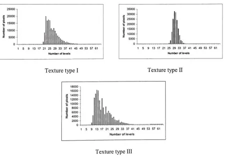
[image:35.555.178.378.223.462.2]In
orderto
createtwo types
oftexture
roughly
classified as"fine
and"coarse,"
aregion of
type
I
image
was enlargedby
scanning
the
original photograph at300 dpi. This
texturewasdesignated
as
type
m
andis
shown onFigure 8.
&EUES8UBBB8BBBBBE^fflB&M
"ft
;.-.
*yBSSalis&S(SiK*s?*.t.-'.,*
~ASx*&-Directional
illumination,
type
I
Diffuse
illumination,
type
II
>Wr
1-Directional
illumination,
type
JTI
Figure
8.
The imagescorresponding todiffuseanddirectionalillumination [image:36.555.84.235.156.313.2]Stimuli
generation
All
stimuli were presented on aSony
Trinitron Multiscan
15sf
monitor,
which wasmodifiedby
the
manufacturerto
increase
its
peakluminance.
The
monitor was controlledby
aMacintosh
PowerPC. The
softwarefor
the
monitor calibration was writtenby E.Montag
ofthe
Munsell
Color
Science Lab
and used with minor modificationsfor
the
purposesofthis thesis.
The
monitor was calibrated
using
Gain, Offset,
andGamma
(GOG)
modeldescribed
by
Berns.34The
software
to
design
and run psychophysical experiments waswrittenin MATLAB using
extensions provided
by
high-level Psychophysics
Toolbox26andlow-level
VideoToolbox.27
A
Radius ThunderPower 30/1920
video cardwasusedin
conjunction withthe
softwaretoenable10-bit
resolutionperchannel.The
three texture
images
wereimported
asTIFF
files
to
Matlab.
The
averageL
wasspecified asfollows. The Psychophysics Toolbox
allocates256
entriesfor
the
currently displayed
window,
whichareindexed
through the
10-bit
lookup
table.
In
orderto
maintain
the
highest
possibleprecisionofthe
matchL*the
images
were allocated64
entries,
thus
leaving
1 92
entriesfor
the
background
andgrayscalespecification.The
meanlinear
grayscale value
for
the
image
was specifiedby
the
desired L
viathe
lookup
table,
derived from
the
CRT
calibration.This
approach allowedasimpleandfast redrawing
ofthe
image
in
realtime.
The
valuesof L*used
in
data
analysiswere obtainedby
measuring
the
average L*of
the
displayed
images. There
was asmall averagedeviation
ofthe
measured L*from
the
exactdesired
L*,
which resultedfrom
the
calibrationmodel.However,
this
did
notaffectthe
analysisof
the
data. The matching
stimulus patchL*
was specified with
10-bit
precision.The
L*
value of
x,y-chromaticities remained
reasonably
constantthroughout
the
range ofdisplay
luminance
usedin
the
experiment,
as measuredwithLMT
colorimeter.For
each ofthe three
texturesthe
averageimage
L*was specified at
five
levels:
20, 40, 60, 70,
and80. An
additional set ofimages
withexpanded contrast was created
by
applying
a sigmoid compressionto
a10-bit
linear gray
scaleand
sampling it
atequally
spaced64
points.The
images
wererenderedusing
this
64-level gray
scale.
All
images
ofthe
expandeddynamic
rangewere aroundL*=50.
Psychophysical
experimentThe
experimentaldisplay
set-up is
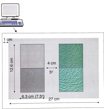
presented onFigure 9. The
texture
anduniformfield
stimuliwere presentedas square
images
andhad
a sizeof1 1
cm xl1
cm,
with4
cmgap in between. At
the
normalviewing distance
of18
in.,
eachimage field
subtended13.5
angle.
There
was nohairline border
around eachimage
field.
Also,
there
was no whiteborder
aroundthe
display
field (such
asin
the
experimentJT,
seepage54).
The
colorimetriccharacteristicsofthe
display
window arepresented
in
the
Table
I.
Table I. CIELAB
colorimetric characteristicsofthe
display
window.V
Background
Slider
background
49.25 0.81 -2.09
48.21 0.79 -2.01
The
experiment was carried outin
adark
room.Observers
were askedto
matchthe
perceivedbrightness
ofthe texture
images
withthe
uniformfield
by
adjusting
the
brightness
ofthat
field
with a slider
by
moving
the
mouse.Each
observer madetotal
of72
matcheswithfour
randomly
repeated presentations of each stimulus
(L*:
Texture
type).
In
addition,
they
made48
matches of3
texture
images
withL*
ca.50.
A
total
of10
observerswith normalcolorvision participatedin
the
experiment.Observers
made six practice matcheswithuniformgray
patchesin
the
image
window.
No
specificstrategy in evaluating
the
average perceivedbrightness
was givento
theobservers.
11
cm11
cm [image:39.555.105.447.385.605.2]Results
andDiscussion
Figure 10
showsthe
accuracy
ofL*
calculations
based
onthe
calibrationanalytical model.One
observer
(ALK)
made matches and measuredtheir
XYZ
values withthe
LMT
colorimeter.The
XYZ
values ofthe
matches were measured withLMT
colorimeter andL*
valueswere calculated
(denoted
in Figure
10
asMeasured L*). The corresponding
L*
were also calculated
from
the
RGB
values ofthe
matchesaccording
to the
GOG
model(denoted
in Figure 9
asL*
calculated
from RGB). The
differences between GOG
model predictions andthe
measurementswas,
onaverage,
0.2
unitsAL
for
all matches.MeasuredL'
vs.L"
calculatedfromRGB
huge type I D krege type I Afrnage type 111
40.0 50.0 600 MeasuredL*
Figure
10. ComparisonofthemeasuredL*
and
L*
Figure 1 1
showsthe
average resultsfor
the
10
observersfor
each ofthe three
textures.The
errorbars signify
one standarddeviation.
The
observervariability
wasthe
highest
whenL*
of
the
texture
image
was closestto that
ofthe
background.
One
possible explanationfor
this
effectis
that
whenthe
L
ofthe
matching
stimulus was closeto that
ofthe
background,
the
boundaries
between
the
patch andthe
background
area startedto
disappear.
The
naturaltendency
ofobservers wasnot
to
let
the
box disappear
and set a match suchthat the
brightness
ofthe
uniform^,
80-ll 80
-4
/8
y^
8
y
y
y
o S
,S O
5
0-
/
/
J 20 40 60 80 100 0 20 40 60 80 100
MeasuredL*
MeasuredL*
Texture Type I
Texture Type II
D) c
o ro E a> a> cu i_ > <
y
oft
0 40 60
MeasuredL*
80 100
Texture
type
III
Figure
1 1. Resultsoftheaveragetextureimage brightnessexperiment. Datapoints representtheaverage pooled
data from
10observers. The line(
)
represents afittedregressionline.
Theerrorbars
aretwicethestandardbox
was eitherhigher
orlower
than the
L*of
the
background.
Doing
so mighthave
led
to
ahigher
spreadin
the
data
pointsfor
this
value ofL*. This
trend
is
apparentfor
some,
but
not allobservers.
Adding
ablack
line
around each patch might preventthis
effect.The individual
observer
data
canbe
found
in
Appendix
A.
The matching
data
were analyzedusing
regression analysis.The
results arepresentedin
Table JT
(for
moredetails
seeAppendix C).
MXB
55
?
Li ?
f
50 545
?
y
,*#,
*v
A,
40 45 50 55 60
MeasuredL*
Figure
12. Examplesofmatchingexperiments withthestimuli of average value ofL*
around50.
For
allthree texture types
nosignificantdeviations from
linearity
werefound in
the
pooledobserver
dataset.
However,
there
werestatistically
significantdifference
(F-statistic)
in
the
slope of
the
regressionline
for
the three
texturetypes.
The
slopefor
texture
type
JT
stimuli wasslightly
lower
than
unity.There
was anincrease in
the
value ofthe
slopefound
for
texture
HI
by
Table
II. The
regression analysisfor
the
matching data.
Regression
Texture image
parameters
Type
I
Typell
TypeJTI
Slope
1.01
0.94
1.15
Offset
-0.793.76
-9.13r2
99.5
99.8
99.2
The
resultsimplicate
that
for
texture type
II
andHI,
the
darker
images
appeardarker
andthe
lighter
images
appearlighter.
This
suggestsincreased
gainin
L*
function. One
possibleexplanation
for
this
apparent change mightbe
a changein
image
contrast associatedwitheachtexture type.
If
we considerthe
histograms
ofthe textured
images in Figure
13,
it
canbe
notedthe type
JT
image
has
the
narrowestdynamic
range comparedto
othertwo textures.
If
image
contrast
is defined
asContrast
=49"Ll
^90 +
Lj0
where
L*qo
is
the
L*value
corresponding
to
90%
of pixels onthe
cumulativehistogram,
andL
]0is
the
L*value
corresponding
to
10%
ofpixelsonthe
cumulativehistogram,
then the
values ofcontrast
for
eachL*
level
canbe
calculated.The
contrastvaluesfor
eachimage
stimulus areshown
in Table in.
The
contrastis
the
lowest
for
texturetype
JT,
andthe
highest
for
texture
m. Based
onthe
resultswi