Will they goggle if we look like Google
Ô
?
Exploring a new paradigm for the USQ Library Home Page
Deidre Lowe, Alison Hunter
University of Southern Queensland, Australia
[email protected], [email protected]
A redesign of the USQ Library Web site was triggered by an overall University Web site restructure and introduction of a content management system. Focus groups held at the start of the project clearly indicated that the catalogue search was the number one reason users visited the Library web site. Online databases came in a close second. This feedback provided the essential user focus for reconsidering the purpose of a library "home page". Could we use the Web catalogue interface as the home page, rather than linking to the catalogue from a more traditional home page? Is it possible to provide a streamlined and simplified search experience like GoogleÔ for users, and still introduce them to the wealth of other resources that the library invests in to assist users with their studies? This paper explores the paradigm shift at USQ from static home page to interactive home page.
1 Introduction: User Experience
USQ Library’s Web redesign project began prior to the University’s decision to introduce a Content Management System, even though this later became a critical element of the project.
The catalyst for the redesign came from a realization that major rather than incremental change was going to be necessary for a successful revamp of the site. The appointment of a new Systems Librarian with Website management expertise, a new Client Services Manager with a strong background in user issues, and a new Information Literacy Coordinator gave the Library new skills and perspectives to drive the redesign forward from mid-2002.
Wider industry developments also came to bear. After four years of involvement with the LIDDAS project, Library staff felt that implementation was becoming a closer reality, raising questions about how it would be blended in with existing products and services. USQ Library also joined the AARLIN project, putting “portals” high in everyone’s consciousness. Our University Librarian had been very enthusiastic about the concept of portals for many years and had been pushing hard to make progress in this area particularly for the benefit of our external students.
This was definitely a project whose time had come.
Feedback from the different groups was surprisingly consistent. Results of the consultation can be summarised as follows: · The Library Catalogue and Databases were used most frequently. People wanted obvious, easy access to these features. · People wanted to be able to check and renew their loans from the home page.
· Library opening hours needed to be prominently displayed.
· Apart from the Catalogue and Databases, other features mentioned as being used were Faculty Librarians’ Resource Lists, Patron Information, Internet search tools, Exam papers, eGO, PostGrad Toolbox, Referencing, and Interlibrary loans, although these were not consistent across all groups consulted.
· Much of the information on the current home page was rarely or never looked at, eg About the Library.
· Most people thought there was too much content on the home page, and that the typeface was too small. There was a preference for fewer headings, and for headings only in some cases with rollovers to indicate content if needed.
Concurrent to the Library’s first phase of redevelopment, the University had formed an R & D team called BETTER*, whose brief included a full redesign of the University’s Web site. Their specific goals in this regard were (a) to streamline the web production process by implementing software and processes that enable content to be produced and changes and updates made quickly, and that minimize ongoing maintenance costs; and (b) to ensure quality and usability of the site by implementing quality control mechanisms that ensure accuracy and currency of information, meet accessibility guidelines and use best practice in information architecture and design so users can quickly locate the information they need. Their work culminated in the selection of Microsoft’s Content Management Server 2001Ô as the Content Management System (CMS) to be implemented University-wide.
It became apparent that the Library’s goal of producing a new Library site was running concurrently with the wider University plan to implement the CMS. The University Librarian had been a leader of the BETTER project team in the initial stages and a web maven within the University. As a result, we felt there would be great benefit to becoming an early adopter of the CMS.
A pivotal point for the Library project was the formation of an in-house Steering Committee in September 2002 to oversee the project management and implementation of the CMS. The Steering Committee consisted of four senior Library staff with the common focus of replacing an “institutional” viewpoint with a “user” or experience-oriented approach; a background of newness to the Library (3 of the 4 members were recent appointments) and a shared “hidden agenda” of culture change. This Steering Committee proved critical to the success of the project, as each member contributed unique skills such as negotiation, political manoeuvring, graphic design, project management, communication with staff and technical ability. Together, this proved to be a winning combination.
2 Complexity
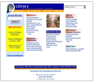
The existing USQ Library web page had tried to be all things to all people. Our Focus Group feedback demonstrated that our users felt overwhelmed by the detail on the page. A lot of content was rarely or never used. There was definitely tension between what users thought they wanted and what Library staff felt should be provided. As the project progressed, we had to work hard at balancing these two viewpoints. Our Information Literacy Coordinator was often a key decision maker who provided invaluable input.
Figure 1: The USQ Library home page, 1998 - 2002
In addition, we were aware of other complex issues with the site such as: · Redundancy of content.
· Poor management of images.
· Too many content creators doing their own thing without adequate guidelines or controls. · Tension between eye-catching presentation and content per se.
· Tension between getting staff acceptance of the CMS and the need to implement site wide central control and consistency. · Lack of centralized USQ standards
Most of these issues were addressed during the course of the project, but the priority was to address the design issues. Early on, the Steering Committee came up with the question: could we simplify the home page to the extent that it took on some of the characteristics of GoogleÔ? GoogleÔ is an interface that masks the complexity of the Web and appears to resolve the user’s immediate information needs – the page is clear, uncluttered, and the user gets instant gratification.
3 Simplicity
Figure 2: “Loogle”: the PhotoshopÔ mockup of a GoogleÔ look-a-like
The mockup was created as a bit of fun to see what we’d end up with, but turned out to be a very useful discussion point for continuing “reality check” sessions with Library staff. We very quickly dismissed the design for a number of reasons (not just because we weren’t sure what to serve up with “I’m feeling lucky”!). It placed undue emphasis on the Library catalogue search component to the detriment of other Library information that is highly relevant to users. It gives a misleading impression that a single search is going to provide all the answers – the impression of a true portal interface, which would be misleading for our users. Because this project was consciously going to be a unique stage in the Library’s Web life between a static home page and a portal environment, we felt it had to clearly represent a simplification of current systems and not an implementation of a true portal environment.
However, the Loogle mockup did focus our attention on the design issues for the home page. We had already done a working “proof of concept” using our Virtua iPortalÔ (web gateway) software so we knew that it was possible to build the home page into our catalogue interface. The bigger issue was how to present the catalogue search option as part of a larger whole when the vehicle we were using for the larger whole was actually the Library catalogue.
At this point we felt it would be sensible to research what other Libraries were doing.
A survey of 42 University Library web sites around Australia in October 2002 revealed that only one other organization at that time had a direct catalogue search option on their Library home page (Melbourne University Library#). A check at time of writing (February 2003) shows that five other University libraries now provide direct catalogue search options on their Library home pages.
We also checked UK, Canada and US Library home pages. Only four of 55 Canadian Libraries investigated had a catalogue search window displayed on the home page. None of the 116 UK sites provided a direct search option. We looked at approximately 150 US Library home pages; none of the surveyed sites had a direct search option. At this point, we wondered whether our concept of building the home page into the Catalogue was “leading edge” or “bleeding edge”. Questions began to pop up at 3 am: if we integrated the home page and catalogue to a single page, were we really simplifying the user experience, or
potentially just confusing them?
We kept coming back to the fact that in the focus groups, the users had clearly said they wanted fast, easy access to resources. This became our mantra for design, and convinced us we were on the right track. Our users had a very simplistic view of what they wanted. On the other hand, Library staff had always aimed to provide “one stop shopping” with the web site. In reality our site had become very much like the “Grand Central” shopping centre containing many specialty shops. We expected our users to be savvy enough consumers to know which floor and which shop they had to go into to get the right product to suit their needs. In an information literacy sense, this was quite a sophisticated expectation.
What we wanted to do with the new design was present the user with a site that was as self explanatory as possible, with minimal Library “jargon” and with services that would “self-market”. We wanted the information to be “just in time” and remove a lot of the “just in case” content from our old site.
We were well aware that portal developments could potentially give our new site a limited life span. We wanted a clean, simple and sophisticated interface to see us through the interim period.
4 Integration to produce a Hybrid System
Our strategy was simplicity. Our tactics became a seamless integration of multiple systems to get the result we wanted.
The decision to use Virtua’s iPortalÔ as the primary entry point for all Library content meant that we had to decide how to populate the content beneath the home page. The other main issue was integrating the redirect to the iPortalÔ from the CMS, and the co-location of CMS and CWIS content for seamless access.
We conducted an extensive review and analysis of content on the existing site, to develop a “mind map” of what we already had. This gave us a physical inventory of forms, attachments, specialist sub-sites (such as online tutorials), etc. More importantly, it gave us a mental view of the content we didn’t want to carry forward to the new site and ways in which we might reconfigure the important elements to suit a simplified approach. This analysis was stored in a spreadsheet format, with separate workforms for each “type” of content and for each “level” of links in the site.
The Steering Committee then began afresh with butcher’s paper, sticky notes and felt pens and mapped out the main content areas we wanted to display on the Home Page (as opposed to what was already there!). These key content areas became the filters for retaining, rejecting or rewriting existing content. A period of some weeks passed refining these ideas with input from existing content owners. A surprising (depressing?) amount of our “just in case” content crept back in during this process.
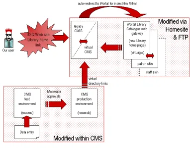
We consciously diverged from other implementers of the CMS on campus with our use of the Virtua iPortalÔ for a home page. Use of the iPortalÔ was necessary to retain the direct Catalogue search on the home page. We were faced with both visual and technical integration of the two systems. This was further complicated by the realization that we could not migrate all of the legacy content from the CWIS to the CMS, adding the retention of the old CWIS as a third system to be managed.
Figure 3: Schematic of 3 systems
The design of the home page in the iPortalÔ was created to blend in as cleanly as possible with the design limitations imposed by the CMS. In brief, this included the banner elements at the top of the page, the footers, and the left side navigation. Luckily, the iPortalÔ also works with the left side navigation for sub-level pages, further adding to the visual consistency of the site as users conduct catalogue searches. However, it meant we had to ensure that links on the left side of the home page would remain relevant while users searched the catalogue.
We were faced with integrating three separate systems, three separate servers, three separate technologies and had less than three months to pull it off!
5 Project
Management
To achieve “go live” by O-week, we needed a pretty tight project schedule. This included coordinating the content creators, finalizing and building the CMS structure, rewriting and re-badging legacy content, and completing the new home page design - all at the same time.
The content map was finalized using Inspiration± before Christmas and handed over to the University project team to build the
CMS site. Content authors were then briefed and given mockups and templates as a framework for preparing their new content. To prepare them for the dramatically different content structure, our Systems Librarian worked up plenty of mockups in PhotoshopÔ to provide working examples. Content maps were finalized in Inspiration, and Word templates were drawn up to clearly identify new content required from them. Because the CMS is WYSIWYG, their content could be copied in directly from their Word documents. The content creators modified the templates and came up with an excellent layout that assisted them with their content preparation and expedited data entry when it came time to populate the CMS (see template examples and workflow explanation in Appendix A).
The CMS incorporates a workflow system that allows for three levels of content management: creator, editor and moderator. The University Web Team retained technical control for building the site (channel structure) and also retained moderator approval status in the workflow. Two senior library staff were given publishing rights to enter and approve content to Editor level. Data entry was done directly from the content creator’s templates using copy and paste, with slight modifications to ensure consistent style, and to conform to style restrictions within the CMS (headings, tables, etc).
Legacy content targeted for review was extensively edited by existing and new authors under the watchful eye of the Steering Committee at the same time new content was being written. This was a demanding time for staff, but all participants could see the benefits of the new content structure.
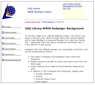
[image:7.595.143.453.409.689.2]Communication with Library staff was managed through a series of less formal group presentations, project reports submitted to Library Executive, and through an intranet set up to provide easy access to mockups and work in progress:
Figure 4: The Redesign Intranet – a vehicle for informing Library staff
renewal of loans and other patron functions. A staff skin with an extended timeout was also created for the Faculty Librarians.
Scoping the project to just a small section of content proved valuable as a learning exercise: we learned many valuable lessons for the rest of the content migration project and for future site control:
· Extensive planning of the content map.
· Use of mockups and templates for content creators.
· The need for a style guide, incorporating guidelines for content structure.
· Ensuring Staff communication and involvement throughout the project, with the confidence to overrule personal opinions or past practice to prevent compromising future goals.
· Building flexibility into the project plan to allow for software upgrades, and design modifications outside of our control. · Being prepared to set aside the baggage of existing structure, and look for new approaches.
Some issues were deliberately low on our agenda: · Workflow to incorporate a larger number of staff. · Training for data entry and management.
· Individual attachment to existing content (we avoided areas where there were strong feelings of ownership).
To some extent these issues were avoided because we had a tight and inflexible timeframe and because we were aware that it was a steep learning curve for everyone involved.
The final week was spent planning going live with the three systems. Timing was critical, because the new home page pointed to content in the new CMS as well as the legacy CWIS site. In the end, despite several hiccups, we cut the CMS content into the CWIS using virtual directories, and went live with the new iPortalÔ homepage in less than 20 minutes and it all worked!
[image:8.595.102.493.488.701.2]Going live went so smoothly it was almost an anticlimax.
6 Conclusions
With many projects involving a large number of staff, it is easy to get bogged down in the detail and forget the overall goal. With this project, the Steering Committee felt that the goal of providing a user focus and addressing the concerns raised by the Focus Group sessions in 2002 remained clearly with us throughout.
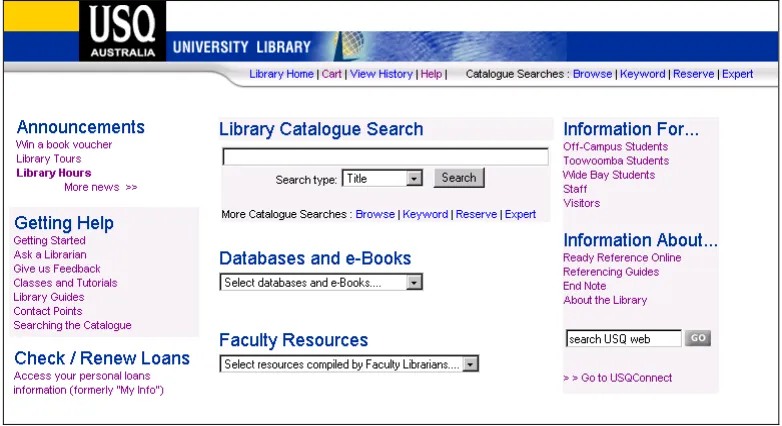
The new home page provides obvious, easy access to the Catalogue and Databases. We felt we had achieved the intended integration of Web site and Catalogue, to flatten the structure of our resources.
People can access their patron record and renew loans from the home page.
General information is much more closely targeted to specific groups, de-cluttering the presentation of information up front.
Other key services are readily available, but the Library staff as a whole agree that the look of the home page has been greatly simplified without compromise.
Our advice to others would be: · Plan content maps extensively.
· Question everything – especially the structure you have had in place (did it work?), and your reasons for change (will it work?).
· Smooth the way for content creators by providing mockups, templates, and demonstrations – make it easy for them to give you what you want.
· Be flexible enough to allow the content creators some influence in your process.
· Know the systems you want to use, and how well they will work together – try to address compatibility issues early on. · Learn as much as you can about the CMS and its idiosyncrasies during the planning stages. In our case, this impacted on
design, structure and content.
· Find out where you belong in the wider scheme of things: know the political pressure points, and find (and use) champions for your cause.
USQ Library sees this Web page as a transition between a static home page pushing content out and a fully interactive user portal. However, this project has given us a conceptual stepping-stone from one to the other. We know that the new site will be fairly short lived, and quickly overtaken by larger portal projects. Other services have yet to be plugged in, such as LIDDAS and AARLIN. More dynamically driven database systems will also enable us to provide more sophistication for our users. We are also now better equipped to integrate with the rest of the University.
Appendix A
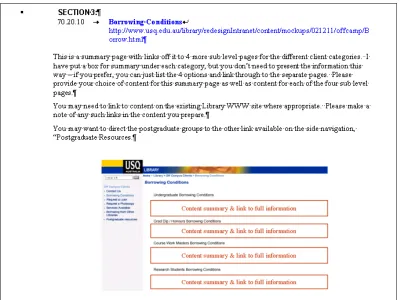
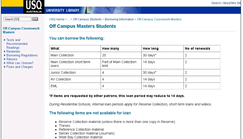
[image:10.595.99.502.149.449.2]The following sequence of figures show the content creation workflow that occurred, starting with the instructions given to content authors and finishing with an image of the finished page published in the CMS.
Figure 6: Instructions given to content creators, including a mockup produced in PhotoshopÔ
Content creators came up with their own simple design in WordÔ that cleanly reflected the layout and structure of the CMS:
[image:10.595.113.474.521.731.2]