Rochester Institute of Technology
RIT Scholar Works
Theses
Thesis/Dissertation Collections
5-1-1984
Medications
Patti Green
Follow this and additional works at:
http://scholarworks.rit.edu/theses
This Thesis is brought to you for free and open access by the Thesis/Dissertation Collections at RIT Scholar Works. It has been accepted for inclusion
in Theses by an authorized administrator of RIT Scholar Works. For more information, please contact
.
Recommended Citation
Qf\-dtn^
ROCHESTER
INSTITUTE
OF
TECHNOLOGY
A
Thesis
Submitted
to
the
Faculty
ofThe
College
ofFine
andApplied
Arts
in
Candidacy
for
the
Degree
ofMASTER
OF
FINE
ARTS
Medications
by
Patti
J.
Green
APPROVALS
Adviser:
Date:
----'----'---Associate Adviser:
-Date:
--..::...--1-''----'"--''--4---Associate Adviser:
-Date:
----"''--+---7'----'-''----7'---Fred Meyer
Assistant to the Dean
for Graduate Affairs:
----_
...
_---Date:
_ _ _ _ _ _ _ j : . . = = . . . : . J . . ~ U _ +-Robert H. Johnston
Dean, College of
Fine & Applied Arts:
---Date:
-=t-~\")..3
\1
Y
,
"/
I,
Pat
J.
Green
,
hereby (grant, deny)
permission
to the
Wai1a~Memorial
Library of RIT, to reproduce my
thesis in whole or in part.
Any reproduction will not be
for commercial use or profit.
Date:
sj/5/tYl
Table
ofContents
Page
Acknowledgements
1
Introduction
4
The
Medications
Concept
8
Medications
Development
12
Medications
Execution
16
Acknowledgements
It
is
notvery
oftenthat
onehas
the
opportunity
to
show admiration
in
away
far
more meaningfulthan
verbalappreciation and
that
goesbeyond
the
exchange of physicalgifts.
There
aretimes
whensaying
thank
youis
not enoughand
giving
one a coffeemug
orbook
is
not appropriate.Often
the
internal
spirit ofthanks
transcends
the
externalact and
there
seemsto
be
no realheartfelt
method of expressing
it.
Suddenly
though,
the
realizationthat
this
inability
to
find
the
proper expression of gratitude and appreciationis
notthat
at all aninability,
but
rather an oversight.For
it
has
been
expressed,
however
in
slightly
different
shape and
meaning
that
oneis
normally
accustomedto.
It
takes
onthe
form
of professionalattitude,
creativegrowth,
artistic
energy,
personaldevelopment,
andthat
strivefor
excellence.It
is
that
internal
spirit of satisfaction andthe
realization of self-worththat
payshomage
to
allthose
who gave of
themselves.
My
workis
atribute
and a giftin
spirit andmeaning
to
those
who contributedtheir
time
andenergy,
patience andunderstanding,
andknowledge
and experience so
that
my
experience was onethat
totally
embodied notonly
all ofthese
qualities,
but
alsothe
artistic andcreative
freedom
to
growinto
my
own artist.I
owe adebt
of gratitudeto
Robert
Wabnitz
for
showing
methe
"medical
illustration
way."He
taught
me whatit's
about andthen
granted meindividual
freedom.
He
sawme
through
the
academic rough spots andin
his
familiar
way
easedthe
pressure of graduate studies with patienceand
honor.
I
wouldlike
to
sincerely
thank
Bernadette
Merkel
whose graphic
design
input
and artisticjudgement
far
surpassed
being
just
helpful.
She,
too,
gave methe
incentive
to
pushmy
creativity
to
the
limit
withinthe
boundaries
ofthis
project,
while atthe
sametime
freeing
myself oflimitations
sothat
I
couldinterpret
and create asI
sawfit.
I
am gratefulto
Glen
Hintz
for
his
enthusiasm andsupport.
His
technical
input
as well ashis
fresh
ideas
and artistic
energy
were a constant creative stimulantthat
was much needed at
times.
I
alsofeel
that
this
projectis
in
partfor
allmy
fellow
"med.
ill."students,
undergraduate as well asgraduate.
Their
striving
for
perfection and relentlesspursuit of excellence was an
inspiration
to
me,
andthe
camaraderie
both
personal and professional could notbe
matched.
whose guidance
professionally,
personally,
andspiritually
was
invaluable.
He
pushed when weboth
felt
I
needed apush and
let
me go whencreativity
and attitude wereINTRODUCTION
As
I
first
began
to
investigate
possible subjectmatter or projects
for
my
master'sthesis,
I
found
that
I
was somehow overwhelmedby
the
scope or magnitude ofthe
task
soonto
be
undertaken.Possibly
it
was notthe
task
so much as
it
wasfinding
atask
that
was notonly
worthy
of a master's
degree
candidatebut
also of an artist whowanted and
believed,
that
this
shouldbe
the
sumtotal
ofall
his
experience educational and professional.For
this
project,
I
would clearthe
cobwebs,
pull outthe
stops,
and reach
deep
down
for
something
that
wouldsay
to
me,
"this
is
worthwhile,
meaningful,"
and
that
wouldsay
to
others,
"she
learned
her
craftwell,
this
has
meaning."With
education and experiencein
graphicdesign,
respect and amazement
for
my
newfoundfield
of medicalillus
tration,
andfascination
with artisticimagination
andthe
creative
process,
it
wasonly
fitting
that
my
thesis
reflect
these
qualities or properties ofmy
artisticdevelop
ment.
Thus
Medications
wasborn.
Medications
wasto
be
a medical magazine of which
the
main emphasisfor
this
project would
be
placed on coverillustration.
I
neededsome
form
of creative outletfor
my
medicalillustration
element or
lift.
From
my
point ofview,
Medications
would not
only
be
a publicationdesigned
to
journalisti
cally
inform,
but
alsoto
visually
excite or stimulatethe
reader
(in
varying
degrees)
.As
the
principal,
andonly
artistfor
these
covers,
I
decided
that
it
wouldbe
worthwhileto
exploredifferent
illustrative
techniques
and stylesin
orderto
find
an2
identity
that
workedfor
this
particular magazine.I
realized
that
there
wasthe
possibility
that
no one stylewould work
best
but
that
avariety
of styles orlooks
couldsuit
this
publicationbetter
andactually
enhancethe
magazine
visually
(a
little
unpredictability
in
afield
that
is
both
conservative andstrangely
enough oftenimpersonal)
.The
project was mapped out andthe
wheels wereturn
ing
soto
speak.Expectations
had
startedto
form
sothat
I
notonly
had
a conceptto
work withbut
also an attitudeto
develop
and goalsto
meet.These
wereimportant
sothat
I
couldbenefit
from
the
totality
ofthe
project and experience.
For
myself,
the
artist,
this
wasto
be
the
mostThe
New
England
Journal ofMedicine,
for
example,
journalistically informs,
and quite well as circulationis
approximately
207,000,
but
it
certainly
does
not artistically
excite.After
correspondence withmany
medical/scientificpublications such as
Prevention,
Omni,
Science
83,
andPostgraduate
Medicine
magazine,
I
discovered
that
mostuse a number of
freelance
illustrators
for
coverdesign
important
body
of workI
had
everdone,
both
personally
and educationally.
I
had
feelings
that
this
couldbe
the
last
time
that
I
have
full
control ofmy
work,
sotake
control!
Be
methodical,
think
things
out,
makedecisions,
stand
by
those
decisions,
visualize,
create,
and accept.This
processthat
sounds so cut anddry
is
actually
notthat
at allfor
it
is
really
a natural state or procedurethat
I
believe
every
artist goesthrough
whenfaced
withany
task.
It
was an organizational skillthat
was almostas much a part of
the
project asthe
artworkitself.
It
was
in
the
planfrom
the
beginning,
althoughit
probably
would
have
occurred naturally.If
I
expectedto
have
any
sense of order
in
these
coverdesigns,
there
had
to
be
orderin
the
method.For
the
projectitself,
my
largest
expectation wasthat
these
coverdesigns
should worktogether
as a cohesivebody
of work ratherthan
individual
"parts."I
knew
that
these
"parts" wouldbe
displayed
together
andthese
"parts"might all
have
acompletely
different
look,
however
I
had
to
somehowjoin
the
"parts" sothat
they
would reflectthe
original
basic
conceptfor
this
thesis
totality.
Underlying this,
I
expectedthat
the
artworkfor
the
project would
have
that
same sense of order and organizationthat
I
had
setdown
for
the
artist.I
supposedthat
it
wasthought
process, andcompletely
disorganized
in
execution,Again,
however,
totality
in
conceptdictated
that
this
should not
happen.
Now
that
the
basic
blueprint
for
the
projecthad
been
determined
including
purpose andexpectations,
amore
detailed
analysis ofMedications
was next.This
THE
MEDICATIONS
CONCEPT
On
onelevel,
Medications
wouldbe
a magazine aimedat
the
medical profession aboutthe
pharmaceuticalindustry.
It
would cover a wide range oftopics
dealing
with pharmaceuticals or
drugs
andit
would speakin
terms
that
would3
place it under
the
heading
oftrade
journal.
With
the
ever
changing
scientifictechnology
andthe
constant growthof medical
discoveries,
Medications
wouldinform
the
medical
community
on current andfuture
trends
in
medicationsand
treatments.
On
a more complexlevel,
Medications
is
acreatively
progressive publication aimed at
those
with a clear aesthetic
sense ofthe
visually
pleasing.It
communicates notonly
through
written workbut
also withquality
ofdesign
and creative character.
It
is
conservative and restrainedyet
artistically
free
to
set a mood orfeeling.
This
is
the
type
ofdesign
normally
reservedfor
art anddesign
related
publicationsbut
that
I
feel
is
much neededin
afield
that
is
similarly
subjectto
constant change and advancement,The
obvious questions raised now are: willthe
medical
community
appreciate orfor
that
matter even noticethe
quality
and caretaken
in
putting
together
such ajournal;
As
opposedto
a consumer magazine orjournal
aimedand will
it
be
worthwhileprofessionally
andfulfilling
artistically
to
place such emphasis on appearance andaesthetics?
The
first
questionis
a ratherdifficult
oneto
address and
I'm
not surethat
I
totally
answeredthe
problem.
However,
an attemptto
understandthe
literary
or
journalistic
expectations ofthose
who read medicalpublications presented me with enough
insight
to
make adecision
onthe
issue,
whichway
to
go, andhow
far
to
take
it;
andsubsequently
answerthe
second question.The
first
step
wasto
talk
to
peoplein
the
medicalcommunity
about current publications on ajournalistic
andartistic
level.
In
discussing
currenttrends
in
medicaltrade
journal
design
withPaula
Evans
ofthe
Strong
Memorial
Hospital
pharmacy,
I
was curious asto
why
somany
ofthese
publi-4
cations
had
poorto
marginal coverillustrations,
whenillustrations
were used atall,
andlittle
sense of creativity
orimagination.
It
couldbe
arguedthat
the
medicalprofession
is
on onehand
conservative or staid and onthe
other
inventive
andimaginative.
Modern
medicine could nothave
gotten whereit is
today
withoutimagination
andfore
sight
by
some rather creative scientists.Why
shouldn't4
10
their
journals
reflectthis
dichotomy
in
character?According
to
Ms.
Evans,
and echoedby
many
othersin
the
profession,
the
most predominant reasonwhy
this
situation exists
is
simply
that
the
medical worldis
notready
for
any
type
of radical changein
the
design
oftheir
publications.
"Far
out"or slick cover
designs
orillustrations
would
be
first,
not acceptabledue
to
the
conservative natureof
the
group;
second,
nottaken
seriously
ortaken
as aserious medical
journal;
andthird,
just
too
costly.Tina
Adamek,
Executive
Art
Director
ofPostgraduate
Medicine magazine,
alsobelieves
that
is
true
but
challengesthis
way
ofthinking
withdesign
that
is
conservative andillustrations
that
are often conceptual and always creative(Fig.
1)
.She
admitsthat
this
moveis
quitedaring
asquarterly
readership
studies showthat
mostin
the
medicalprofession
believe
that
their
journals
shouldbe
"clinical."This,
according
to
Ms.
Adamek,
means straightforward
in
formation
delivered
quickly
and cleanly-The
marks as aresult of
these
studies,
identifying
yourmaterial,
createsa market
for
advertisers.This
of courseis
wherefinancial
success
for
the
publicationis
achieved.Ms.
Adamek
also admitsthat
Postgraduate
Medicine
has
at
times
been
criticizedfor
notusing
morehard
core medical
illustrations
for
the
cover and as a resulthas
been
accused of
being
"fluff."Postgraduate
canhandle
this
for
11
keeps
circulation up.Unfortunately,
medical professionals are atough
audienceto
please anddeal
with.Often
they
are underthe
gun,
questioned aboutethics,
andfeel
somewhatthreatened.
Egos
runhigh
andtime
is
too
short so an attitude ofless
frills,
more goodinformation
pervades.There
is
nothing
wrong
withthis
way
ofthinking,
however
good
design
does
notnecessarily
qualify
as "frills."To
be
optimistic,
I
believe
this
will change.It
willtake
some
dedicated
and persuasive artists anddesigners
along
with some secure and "modern" medical professionals.
Post
graduate
Medicine
has
made afairly
successful attempt.This
nowleads
to
the
second question about profes sional value and artisticfulfillment.
Obviously
there
is
valuein
attempting
to
changesomething
that
needs change.Whether
it
is
successful or not remainsto
be
seen,
however
the
effortis
always worthwhile.Artistic
fulfillment
is
of a more personal nature.Anything
creatively
producedfor
any
reasonis
fulfilling
to
somedegree!
12
MEDICATIONS
DEVELOPMENT
In
developing
the
overall visual character ofMedications,
the
main consideration was placed onthis
conservative yet progressive nature of
the
industry
it
represents.
I
imagined
that
it
couldbe
conservative orrather
traditional
in
the
treatment
oftype
andlayout,
and
then
imaginative
andpossibly
evendaring
attimes
in
its
illustrations.
I
believed
this
would preservethe
intellectual
andjournalistic
integrity
ofthe
publicationwhile at
the
sametime
freeing
the
reader or viewerfrom
imaginative
constraints and creative predictability.To
achievethis
carefully
controlled visualstyle,
an
orderly
method or process was needed.I
decided
there
7
were
four
"parts"to
each coverto
consider:masthead,
type,
illustration,
andlayout.
The
masthead wasgoing
to
be
the
commondenominator
or constant
factor
among
allthe
covers andthis
of coursewould
tie
them
alltogether.
Design
ofthe
masthead wasMuch
like
Postgraduate
Medicine
has
accomplished.7
The
word mastheadis
a ratherconfusing
term
andis
usedby
many
printing
and publication professionalsto
denote
both
the
circulation andpublishing
information
printed onthe
inside
cover andthe
nameplateappearing
13
first.
Of
allthe
preliminary
orplanning
stages,
I
be
lieve
that
this
took
the
most amount oftime.
The
masthead
would sitatop
every
issue
and act notonly
as aninformational
device
advising
the
reader of whichjournal
he
or she wasreading,
but
it
would also represent or setthe
design
character ofthe
journal
as a whole.I
felt
it
was
important
that
the
mastheadclearly
symbolizedthe
meaning
and goals or expectations ofthe
publication.After
much exploration and experimentation(Fig.
2)
,a
design
that
felt
free
andinformal
in
type
style yet semiformal and conservativein
placement andpossibly
evenappearance,
was chosen.As
planned,
this
particular masthead
would always appearthe
same.Its
mood or character would not change withdifferent
illustrative
techniques
ordesign
solutions.In
this
way,
it
wouldtruly
remain aconstant within all
the
pieces andbe
the
crucialfactor
in
uniting
the
"parts" a whole.Once
the
masthead wasdesigned,
it
wastime
to
research possible
lead
articles on which each cover wouldbe
based.
After
going
through
many
medicaljournals
and reading
orskimming
through
many
articles,
alist
was compiledof possible
lead
stories(Fig.
3)
.The
final
selection was madeaccording
to
avery
simple method which wouldbe
mostchallenging
and mostfun
to
illustrate?
14
stories
selected,
the
preliminary
stages ofdesign
wereover.
It
wastime
to
organize
thoughts,
initiate
some problemsolving
methodin
orderto
unite verbal withvisual,
anddetermine
the
illustrative
technique
whichwould
best
suit a given cover story.I
organizedmy
thoughts
by
asking
myselfthree
questions:
(1)
What's
the
inspiration?
(2)
Where's
the
meaning?(3)
How
do
the
visuals come?My
problemsolving
method wasreally
one ofgoing
with gut
feelings
anddesign
instincts,
with alittle
brainstorming
thrown
in
for
good measure.It
may
sounda
little
simplistic or elementary-but
oftenthe
gutfeel
ings
arethe
right ones andif
onedoes
notfollow
through
with
them
they
just
continueto
haunt
you.If
they
workgreat,
if
not onto
the
next one.The
illustrative
technique
chosenfor
each cover wasa combination of some earlier
experimentation,
that
desire
to
be
challenged,
andthose
gutfeelings.
I
was atthis
point surprisedto
realizethat
all ofthese
things
had
previously
been
decided
upon.Somewhat
unknowingly
I
had
formed
preconceived visualideas
asto
how
these
cover stories would appear.I
supposethat
it
was
only
naturalthat
avisually
oriented person wouldform
a picture when some verbal stimulus or
inspiration
was presented and
that
again,
gutfeelings
would prevail.I
was15
thrown
away
everything
that
I
had
previously
been
taught
as a student of graphic
design
for
aradically
different
and
to
many,
totally
unacceptable approachto
design.
One
that
did
notinvolve
hundreds
ofthumbnails,
roughs,
sketches,
and grids on100%
rag
layout
paper,
but
ratherone
that
involved
carefulthought
and analysisboth
visualand verbal.
A
moreinternal
than
external search.A
morecerebral approach as
it
were.These
ideas
weretransformed
into
full
size sketches(on
100%
rag
layout
paper)
followed
by
corrections or revisions.These
werethe
rightillus
trations
anddesigns
because
they
had
gutfeelings
and gooddesign
instincts
to
back
them
up.Now
that
the
internal
thought
andanalysis,
as wellas
the
conceptual and visual processhad
taken
place withthe
resultsbeing
a clearidea
orimage,
both
mental andphysical,
of eachcover,
it
wastime
to
executethe
finished
16
MEDICATIONS
EXECUTION
Rather
than
describe
the
technique
in
execution ofeach
individual
coverin
detail,
I
preferto
speak ofthe
body
of work as a whole andto
siteindividual
examplesbriefly.
As
withany
design
problem,
oncethe
preliminarieshave
been
taken
care of andthe
thought
process and problemsolving
developed
to
the
pointin
whichit
yields a visualimage
(mental
andphysical)
,it
is
time
to
completethe
chain of events
by
calling
on all of one'spatience,
artistic
skill,
andcraftsmanship
in
executing
the
finished
art.With
Medications,
the
execution of most ofthe
coversdid
nottake
nearly
aslong
asthe
development.
It
required more physical
control,
more rigid concentration andmental
intensity
but
far
less
time
involved
(although
stillmany
hours
atthe
table)
.The
conceptualizing
anddevelop
ment were more unrestrained and open
to
internal
and external
stimuli.The
execution although cut anddry
wasthe
final
step
to
the
completed cover and couldinfluence
how
I
as
the
artist as well as others asthe
viewersfelt
aboutthe
piece.Therefore
careful control ofmy
mediumfor
eachparticular
cover,
orthe
work as awhole,
wasextremely
im
portant
to
achievethe
effect of aclean,
precise,
yet17
In
the
development
stage,
I
mademy
design
decisions
and could
mentally
visualizethe
appearance ofthe
finished
work.
In
the
executionstage,
the
best
medium was chosenin
orderto
physically
matchthe
mentalimage.
In
the
covers markedMedications
#1
(Fig.
4)
,Medications
#2
(Fig.
5)
,Medications
#5
(Fig.
8)
, andMedications
#6
(Fig.
9)
, a mixed mediatechnique
wasappropriate.
The
use ofthe
airbrush gavethese
piecesa
crisp,
precise,
and often eerie or surreal appearance.The
use of colored pencil and/or graphite addedto
the
surrealism as
in
the
case ofMedications
#1
and#6,
or amore
lighthearted
or whimsicalfeel
asin
Medications
#5.
The
colorful pills of#1
float
in
ablue
airbrushedsky
free
of all restraints or stress while a mouthcarefully
rendered
in
carbondust
andscreaming
in
painis
uneasily
and
harshly
placed overthis
serene setting.It
causes anuncomfortable
feeling
ortension
that
is
partially
due
to
layout
or placement andpartially
due
to
mixture of media.In
the
cover markedMedications
#3
(Fig.
6)
, againthe
media markedthe
mood ofthe
subject matter.This
piecewas executed
from
a sketchI
had
done
in
the
operating
roomat
Strong
Memorial
Hospital.
The
pace ofthe
surgery
wasfast
to
avoidinfection.
I
felt
that
pastels usedquickly
and somewhat
loosely
wouldbest
reflectthis
concernfor
18
Medications
#4
(Fig.
7)
was a straightforwardinfor
mational piece
that
wouldbest
be
servedby
giving
equalattention
to
type
andillustration.
To
addinterest
andcreativity,
a common medicalillustration
technique
ofusing
color aid paper cutouts andshading
with coloredpencil was used.
When
the
execution of all six covers wasfinished
and
the
body
of workcompleted,
I
wonderedif
the
projectworked
artistically
as a whole.Could
eachindividual
illustration
stand alone as anillustration
withoutthe
19
MEDICATIONS
CONCLUSION
This
project notonly
workedartistically
but
also professionally.The
pieces notonly
appear as actualmagazine
covers,
due
to
gooddesign
andquality
craftsmanship,
but
the
project as a wholeis
entirely
feasible.
The
illustrations
couldeasily
stand alone asillus
trations
for
that
was allthey
werebefore
the
type
wasadded
identifying
the
work as magazine covers.The
artwas somewhat editorial or
journalistic
in
appearance,
but
that
certainly
did
not makeit
any
less
acreatively
con ceived andartistically
renderedillustration
orgroup
ofillustrations
(as
opposedto
covers)
.I
also wondered atthis
point,
whatthe
body
of worksaid and
had
my
professional and artistic expectationsbeen
fulfilled?
Had
I
succeeded?The
work speaks ofquality
education and positiveexperience;
of meaningful relationshipsbetween
art andartist;
and of a more completeunderstanding
of notonly
the
physicaltools
ofthe
trade
but
ofthe
mental capabilities
and complexities withinthe
artist.The
project was approached withthe
spirit of experimentation and a
fierce
determination
to
"succeed" artistically,
creatively,
intellectually,
and personally.20
creativity
on others.It
is
the
artist'simpulse
to
assert
himself.
Success
celebratesthe
growth ofthe
inner
self andthe
human
spiritfinding
individual
shape and meaning.Success
is
a standard of performanceto
achieve
the
highest
degree
of personalfreedom
and expression.
It
is
the
qualitative elementin
the
artist's work andthe
quantitative passionfor
that
work.Success
is
measuredin
a positive mental statethat
causes reflection
on experience and realization of self-worth.as
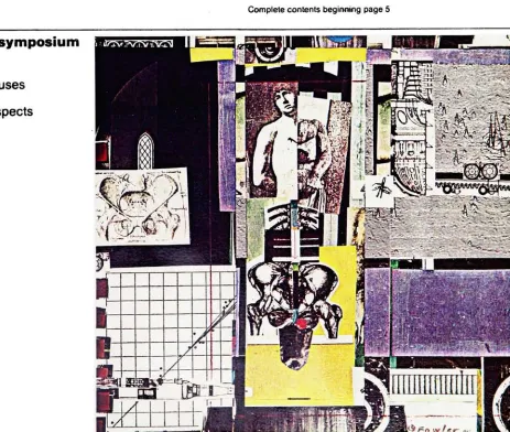
Fig.1
AMcGraw-HillPublication
The
Journal
of
Applied
Medicine
for
the
Primary
Care
Physician
Postgaduate
Medicine
EDITORIAL ARTICLES
Private
clinics:
Their
role
in
American
medicine
Removing
the
mystique
ofacupuncture
Anorexia
nervosa:
Thinness
as
illness
NEWSERIES
Optimizing drug
therapy
Update
on asbestos-related
diseases
Acute Ml: Tactics for
the
first hours
Diabetic
renalfailure:
Is it
inevitable?
Completecontents
beginning
page5Impotence
symposium
Evaluation
Endocrjne
causes
Psychiatric
aspects
[image:26.557.75.538.349.741.2]Fig.2
POSSIBLE
COVER
STORIES
Lead
Poisoning:
Detection
andChelation
Therapy
Toxicologic
Emergencies:
Rodenticides
The
Prophylaxis
andTreatment
ofSurgical
Infections
Various
Agents
Help
Duodenal
Ulcer
Healing
Nitroglycerin
Ointment
in
Heart
Failure
Therapeutic
Use
ofCannabis
is
Plagued
withProblems
Controlling
the
Higher
Ranges
ofPain
Management
ofthe
Patient
With Chronic
Pain
Nutrition
During Pregnancy
New
Drug
May
Lower
Cholesterol
Quarantined
Medicine:
The
Drug
the
Government
is
Trying
to
Hide
Healing
aHole
in
the
Stomach
Fish
Powder:
Fish
Protein
Concentrate
(FPC)
Medicine
Then
andNow
Mannitol
Reaching
the
Brain's
Barrier
Dark
Paradise:
Opiate
Addiction
in
America
Before
1940
Marijuana
asMedicine
Rnwc t)(f,. a,w
Medications
Fig.
3
'
medication/
-;k,xfc4!l
BcU '':<
medications
medications
Medications
7".-i~c*.,, "shc
Medications
i.j
Medications
Medications
med-ications
Medications
Medications
(..'':, KM
tfcrt\\o /Wfrfiv-m
Medications
med
ications
med
*icotions
med-ications
Medications
JOURNAL
OF
THE
PHARMACEUTICAL
TRADE
JOURNAL
OF
THE
PHARMACEUTICAL
TRADE
Hi
M
m&
In
Mannitol:
Breaching
the
Brain's
Barrier
iM*A
L
OF
THE
P H A
R.MPA.C
EU.TICAL
,TRADE
The
Prophylaxis
and
Treatment
of
Surgical Infections
,
PH
hMI
:->
H*.
1
ii
WMMEjfl'Wp:
i#xW#3msm1 Mm
Ss|qi4^^stoj3SB&uiCf^S5^l$%^
/*
JOURNAL
OF
THE
PHARMACEUTICAL
TRADE
Various
agents
help
duodenal
ulcer
healing
Repairing
a
hole
in
the
stomach
'',.-
>-:Z^
\\ &2&v
Update:
New
Abdominal
Medications
. . ,._..
W
z
v
zr
HI
'iFig. 9
JOURNAL
OF
THE
PHARMACEUTICAL
TRADE
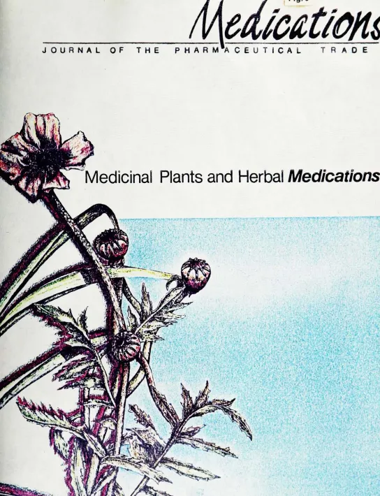
Medicinal
Plants
and
Herbal
Medications
[image:34.557.7.551.16.726.2]