City, University of London Institutional Repository
Citation:
Slingsby, A. & van Loon, E. (2016). Exploratory Visual Analysis for Animal
Movement Ecology. Computer Graphics Forum, 35(3), pp. 471-480. doi: 10.1111/cgf.12923
This is the accepted version of the paper.
This version of the publication may differ from the final published
version.
Permanent repository link:
http://openaccess.city.ac.uk/14159/
Link to published version:
http://dx.doi.org/10.1111/cgf.12923
Copyright and reuse: City Research Online aims to make research
outputs of City, University of London available to a wider audience.
Copyright and Moral Rights remain with the author(s) and/or copyright
holders. URLs from City Research Online may be freely distributed and
linked to.
Eurographics Conference on Visualization (EuroVis) 2016 K.-L. Ma, G. Santucci, and J. van Wijk
(Guest Editors)
Volume 35(2016),Number 3
Exploratory Visual Analysis for Animal Movement Ecology
A. Slingsby1and E. van Loon2
1City University London, UK 2University of Amsterdam, The Netherlands
Abstract
Movement ecologists study animals’ movement to help understand their behaviours and interactions with each other and the environment. Data from GPS loggers are increasingly important for this. These data need to be processed, segmented and summarised for further visual and statistical analysis, often using predefined parameters. Usually, this process is separate from the subsequent visual and statistical analysis, making it difficult for these results to inform the data processing and to help set appropriate scale and thresholds parameters. This paper explores the use of highly interactive visual analytics techniques to close the gap between processing raw data and exploratory visual analysis. Working closely with animal movement ecologists, we produced requirements to enable data characteristics to be determined, initial research questions to be investigated, and the suitability of data for further analysis to be assessed. We design visual encodings and interactions to meet these requirements and provide software that implements them. We demonstrate these techniques with indicative research questions for a number of bird species, provide software, and discuss wider implications for animal movement ecology.
Categories and Subject Descriptors (according to ACM CCS): H.5.2 [Information Systems]: Information Interfaces and Presentation—User Interfaces
1. Introduction
Animal tracking is increasingly important for studying animal be-haviour and their interactions with each other and the environ-ment [Nat08,KCW∗11]. Sampled space-time data are often supple-mented with temperature, accelerometer and other biometric data [WSL08,SBBvL∗12]. These can help investigate research ques-tions such as how individuals interact, the degree of diversity in be-haviour between individuals, foraging strategy and migratory route fidelity between different years. Using data to answer such research questions requires them to be processed, segmented and sum-marised in different ways, producing derived data. For example, investigating differences in foraging behaviour amongst individu-als requires some way ofquantifying behaviourfrom sampled GPS points at appropriate spatial and temporal scales and then compar-ing these amongst individuals grouped in various ways. It may be that behaviour differs only atparticular times of year, in particu-lar places[KKL∗12,OSFM10] orparticular groups of individu-als. There are many methods – ranging from manual to automatic techniques – for quantifying such behaviour [KS14,Sum14] and outputting derived data for visual and/or statistical analysis. Such methods require various parameter values (e.g. distance thresh-olds), data grouping and spatial & temporal scales to be defined. These should be informed by the characteristics of the data and topic of analysis and usually benefit from iterative process to iden-tify appropriate parameters.
Theproblemthat our workshops helped identify, is that data are
derivedquite early on in the analytical process, after which it is dif-ficult to go back to. As such,exploratory potentialof the original is lost. We thereforeidentified a needto facilitate exploratory anal-ysis on relativelyunprocessed data. Worked closely with a group of movement ecologists, we identify, design, implement and ap-ply visual encodings and interactions from cartography, informa-tion visualisainforma-tion and visual analytics to movement ecology. We want to use these methods ininitial phases of analysisto help un-derstandhowand how wellthe data represent the phenomena of interest and how they might need to be transformed to answer var-ious research questions. For example, measurement and sampling features [MSJ11] – noise, gaps, irregular sampling, biases and other complexities – affect the way in which data can be used.
Our contributions are to: (a) identify requirements for
ex-ploratory visual analysis for theinitial stagesof movement ecol-ogy analysis;(b)identify, design and implement visual encodings and highly interactive techniques from cartography, information vi-sualisation and visual analytics; and(c)demonstrate their use in the context of bird movement ecology. Our work helps improve the use of animal movement data by making them more acces-sible, easier to discuss with others, easier to assess their suitabil-ity, speeding up the explorative-inferential analysis cycle, helping identify suitable subsets for subsequent analysis, and helping in-form threshold and parameter selection. Software that implements this work with a video demonstrating its use are available from
2. Context and requirements
This work arose from the first author’s research visit to the second author’s animal ecology research group in 2011. The purpose of the trip was identify gaps in the animal ecologists’ research that might benefit from interactive visualisation. Our user-centred pro-cess has already been reported [Sli11,SD12], but we summarise some parts here to provide details of the participants and how this research gap was identified. First iterations of the software took place within the research visit using rapid prototyping and feedback cycles [Sli11,SD12]. Work has continued since then, influenced by subsequent workshops (see acknowledgments) and continued use by the original animal ecology group as new data come in. The work reported here as the result of a long-term perspective.
2.1. Initial workshops from the research visit
The participants were four animal movement ecology scientists (in-cluding an author) – quantitative scientists who study the ecology of sea birds using data from GPS loggers. They work with different bird species, so there are difference in some of their approaches.
Firstly, a“visualisation awareness”session exposed them to a range of applied interactive visualisation examples in contexts both similar and dissimilar to their own. Its purpose was to show a range of possibilities and to encourage thinking outside current practice. For example, the ability to instantly compute local statistics on se-lections made interactively had not previously been appreciated, and it led to ways in which this technique could be used with their data to be conceived [SD12].
Current practice and its shortcomingswere then identified. The ecologists commonly use R with existing libraries from the com-munity, but liked the flexibility of being able to write their own scripts. Static visualisation already supports their work. Interactive visualisation was limited to a custom-built Google Earth-based tool that enabled them to look at the original data. They found the tool enormously helpful for confirmatory and validation tasks, partic-ularly the aerial imagery. Limitations on the amount of data that could be loaded, a lack of control over temporal selection, and an inability to link to other interactive graphic types, were regarded as significant limitations. This was when the need for interactive visualisation to facilitate exploratory analysis of theoriginal un-processed databecame apparent.
Initially, the discussion was based on validation/confirmatory tasks, centring on the shortcomings of the Google Earth-based tool. However, the extent to which visual exploration of the unprocessed data could start to address initial research questions was also dis-cussed. To this end, we identified someindicative tasks represent-ing the kinds research of questions one might try to investigate with the unprocessed data. The initial “visualisation awareness” workshop served as inspiration for this. These werediscussed and rankedand were used to frame the evaluation (section4):
• Can we infer an individual’s behaviour along a journey?
• Which locations are frequently revisited, when and by whom?
• Which routes are frequently taken, when and by whom?
• When is there synchrony in behaviour?
• Where do individuals spend their time?
Some higher-level movement questions that these may help an-swer include the following. See section4for examples.
• How can we classify behaviour and segment journeys?
• What resources do individuals use (and where is further field-work needed)?
• What are individuals’ home ranges and territories and do these change over time?
• Do individuals exhibit generalist or specialist behaviour?
• How do individuals move in groups?
2.2. Our aim
These initial workshops and subsequent work identified a need for the rapid exploration of theoriginal datato:(a)help understand measurement and sampling characteristics of the data, to help as-sess suitability prior to data transformation;(b) to help identify thresholds, parameters and fieldwork necessary for further analysis; and(c)to explore initial research questions and help identify new ones. Studyinghowexploratory visual analysis can support animal movement ecologists explore newly-acquired datapriorto clean-ing, transforming and analysclean-ing, and the effect this has on the disci-pline is under-researched, yet important, particularly where vague ecological terminology such as ‘stop-overs’, ‘fidelity’ and ‘home range’ are used.
We also consider the following to be important roles for this work: (d)communicating interpretations to other audiences and
(e)facilitating groups of domain experts – including those from complementary disciplines such as statistics, physics and computa-tional geometry – to discuss how the data relate to the phenomena of interest and to help develop new methods to identify ecological artefacts and findings of interest. This is ongoing work.
2.3. Requirements
We created a set of requirements for interactive visualisation tech-niques to support animal movement ecologists, based on the out-comes of our original study, use of the resulting software and dis-cussions at subsequent workshops.
R1: Provide access to original data
This direct response to the problem we are addressing is important for helping understand how the data represent the phenomena of interest. It reduces the chance of data being accidentally misinter-preted and of interesting characteristics being lost through trans-formation prior to their adequate understanding. As well as helping support the data interpretation, this can help provide input for sub-sequent analytical steps.
R2: Allow exploration space and time at different scales
A. Slingsby & E. van Loon / Exploratory Visual Analysis for Animal Movement Ecology 3
modified to explore data and background mapping/imagery at dif-ferent extents and granularities. This is an important component of Shneiderman’s Information Seeking Mantra [Shn96]. Although the same principles apply to time, such functionality is generally un-derdeveloped [AAD∗10]. This was an inadequacy reflected in the workshop participants’ criticisms of Google Earth’s timeline. Since most statistics relating to spatial and temporal data are scale de-pendent [LP11] any reporting of these should be at the appropriate scale. We think there should be a dependency between cartographic (display) scale and reporting scale in visual interactive interfaces.
R3: Allow time, space and attribute perspectives to be related
Space, time and other attributes are intimately related for move-ment. Linking this so that these can be related at different scales is essential. Time has the additional complication that it can also be considered as cyclic, by year, week, day, hour [AAD∗10]. Other at-tributes associated with data points are also important, particularly altitude and speed.
R4: Allow aggregation into “ecologically-meaningful” units
Many research questions relate to ecologically-meaningful units of analysis such as the “journey’. For example, one of the tasks identi-fied in one of the initial workshops was to “infer a bird’s behaviour along its track (journey)” and the journey view in the original proto-type was considered useful and unique. Although we want to avoid imposing such interpretations on the data too early, we believe it is important to support the aggregation into ecologically-meaningful units where these havealreadybeen delineated and are of use.
R5: Provide rapid interaction with as few user interface interactions as possible
Visual analysis tools must facilitate but not disrupt the exploratory analysis process. Although quite an obvious requirement, it high-lights the importance reducing barriers to visual exploration. Inter-actions must be immediately available with as few user interface in-teractions possible. In fact Beaudouin-Lafon [BL04] suggests “de-signing interaction, not interfaces” is an important component of achieving “fluidity” [EMJ∗11] in interfaces. Drawing and interac-tion speeds are recommended to be at most a tenth of a second for drawing and animation and one second for interaction [CRM91].
R6: Provide continuous representations of discrete input data
The original data are sampled at discrete intervals, yet space and time are continuous, For analytical questions, simply presenting the original data points (R1) can be problematic, especially where irregularly sampled. Our solution is to interpolate continuous rep-resentationon-the-flyat a scale appropriate to the analyst’s viewing of the data. Any required parameters need to beinteractively ad-justablewith immediate feedback, because – as Laube and Purves [LP11] note – assumptions made whilst doing this will affect its output and perhaps its interpretation.
R7: Normalise statistics by time rather than frequency of sampled point.
Statistics based on frequencies of sampled points – for density esti-mates, histograms and tooltips – are problematic because points are
Map view
(section 3.1.1)
Timeline views
(section 3.1.2)
Individual view
(section 3.1.3)
Journey view
[image:4.595.316.554.84.229.2](section 3.1.4)
Figure 1:Prototype software that implements the design.
usually irregularly sampled [MSJ11] in a manner that is indepen-dent of the phenomenon. This point was raised in the initial work-shops. The usual approach is to resample data to fixed time inter-vals, but the disadvantage is loss of original data points (R1). Cor-recting on-the-fly and reporting time-based statistics is more satis-factory and helps address a common shortcoming that software of-ten does not ‘think temporally’ even though analysts do [AAD∗10].
R8: Provide topographic maps and aerial imagery
Participants in the first workshop reported that background map-ping was the most valuable aspect of their Google Earth based tool. Lautenschütz [Lau10] notes that these contextual geographical data are helpful for interpreting spatial data, particularly when the phe-nomenon is influenced by topography and landscape. Although an obvious requirement, it strongly influenced our original choice of implementation technology.
3. Visual encodings and interactions
Geographical depictions of data have a long history in cartography. Information Visualisation and Visual Analytics have taken interac-tive cartography to new heights. Many visual encoding and inter-action designs exist for movement data [AA13]. BirdVis [FLF∗11] is particularly relevant to our application area, using highly inter-active visualisation to help understand bird populations. The focus towards the end of the analytical process, helping analysts under-stand species distribution models that combine crowd-sourced bird observations with habitat, vegetation and climatic data. Scheep-enset al [SWvdW∗11] support ship movement behaviour detec-tion through composite multiscale density maps. Other work gets closer to the original data. Hurteret al[HTC09] study aircraft tra-jectories, supporting fast flexible spatial selection but only consider spatial aspects of the tracks. TaxiVis [FPV∗13] provide means to visually build queries of millions of taxi trips and TrajectoryLenses [KTW∗13] also suggests interactions for querying millions of tra-jectory based on origins, destinations and times. The Animal Ecol-ogy Explorer [SJM∗11] gets closer to the original data with its fo-cus on adding semantic content and Wareet al[WWF∗14] get even closer, focussing on the 3D movement of individual whales as they
c
2016 The Author(s)
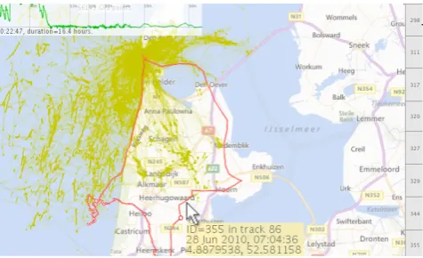
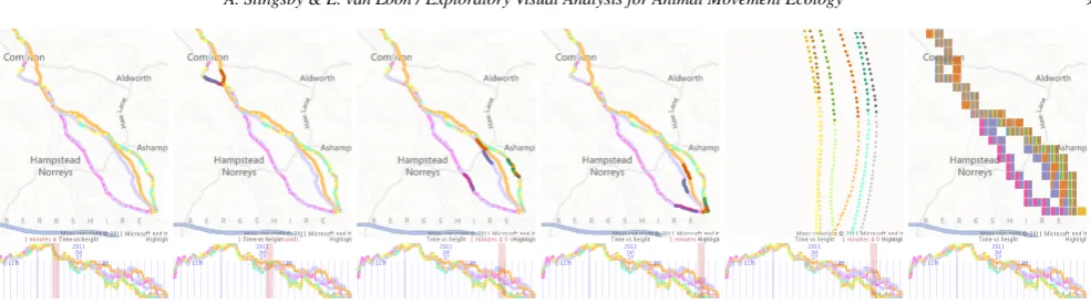
Figure 2:Five mapping modes:(a)original points;(b)lines;(c)
density estimation;(d)relative tile maps; (e)absolute tile maps, where b-e are coloured by duration spent there and (d-e) show rel-ative duration of time spent by each individual.
feed on the seafloor. This work draws on these advances and con-siders which techniques are relevant for supporting initial stages of analysis where initial questions are being asked of newly acquired data.
Our design is based on multiple coordinated views with brush-ing. Used in the original work, it was found to be extremely effec-tive for relating spatial, temporal and attribute aspects of the data (R3). Each view contains the same data, but are arranged and for-matted to represent different aspects. In our case, we have a geo-graphical view, a linear timeline view, a cyclic timeline view and an individual view organised as shown in Fig.1. Selecting data points in one view selects the corresponding data points in other views enabling these different aspects to be compared (R3). Software that implements the design is available (end of section1).
3.1. Visual encodings 3.1.1. Map view
We have designed five types of map – points, lines, densities and two variants of spineplots – with base mapping or aerial imagery (R8). Each type of map is suitable to answering a different type of research question.
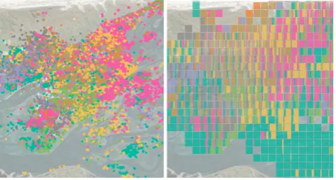
Thepoint mapin Fig.2a shows the original data points directly (R1), but suffers from occlusion making it difficult to determine density. It is also sensitive to sampling rates (compare with the den-sity surface in Fig.2c). Points can be coloured by individual to help distinguish them (Fig.3a), but these occlude each other making it hard to estimate diversity of individuals at locations. Since it is only possible to distinguish a small number of hues, we use a limited set (eight from ColorBrewer’s ‘DARK2’ palette) and allocate these to individuals, reusing if necessary. If required, they can be distin-guished through the tooltip or brushing.
All the other views useaggregationto compute densities to deal with the problem of occlusion. Aggregation is computed on the ba-sis of screen pixels making them adaptive to the zoom-level, reflect-ing the spatial scale at which the data are bereflect-ing viewed (R2). They all report thetime they spent there(R7), correctly compensating for irregularly temporally sampled as necessary on-the-fly. They also
[image:5.595.318.555.82.209.2]interpolate linearlybetween data points producing views that more closely match the original continuous phenomenon (R6). Interpola-tion only occurs between adjacent data points where the time differ-ence is less than a threshold that is interactively adjustable giving
Figure 3:Oystercatcher data on the mudflats: (a) Occluded point view, coloured by individual; (b) tile map showing the relative time of each individual in each grid square.
Figure 4: Timeline modes: (a) original points as time (x-axis) against speed (y-axis);(b)density as time against speed, showing the time at which birds spent at different speeds over time (note the possible distinction between flying and non-flying speed);(c) den-sity as time against altitude (y-axis), with birds spending more time at higher altitudes on certain days (e.g. 21stJune).
immediate results. As discussed, although this involves data trans-formation and inherent assumptions, we regard these as important for reflecting the original phenomenon. We do the computations on-the-fly and parameters that affect the transformation are interac-tively adjustable with immediate results. We use the simplest linear interpolation method between pairs of temporally adjacent points, whose time separation is less than an easily-adjustable threshold.
[image:5.595.317.555.263.405.2]A. Slingsby & E. van Loon / Exploratory Visual Analysis for Animal Movement Ecology 5
Figure 5:The timeline is time plotted against individual (one per row). There is little variation in density, because data are time-normalised. The area highlighted the map is only visited by one individual shown in a red on the timeline. Zooming in on 24thJune reveals that the individual visited the area twice on that day, once at 03:00 and once at 19:00.
the top right area of the view. Fig.3b illustrates how effective this method is for identifying usage of places by individuals and Fig.16
compares male and female gull foraging areas.
3.1.2. Timeline vs other attribute view
Timelines are appropriate means to display time [Shn96]. Since the passage of time is one dimensional, we can usefully use two-dimensional screen-space to plot altitude, speed or other numerical attribute specified in the data time. In addition, there is also the op-tion to use they-axis to distinguish individual, as in Fig.5. Due to the commonalities of time with space, similar principles apply and we offer points (Fig.4), lines or densities (Figs.4b &4c), but our use of they-axis is not compatible with the stacked barchart views. We have incorporatedtwotimelines: a linear timeline (bottom left in Fig.5) and a cyclic timeline for time of day (bottom right in Fig.
5) to meet part ofR3.
3.1.3. Individual view
The stacked barchart at the top right of Fig.6represents the amount of time (R7) each of the eight individuals spent in the current map view. The highlighted portion of the lower two individuals repre-sents the amount of time they spent in the highlighted (brushed) map area as reported by the tooltip. Where the point map uses colour to distinguish points or the tile map is used, it also acts as a legend as well as a statistical graphic [DWS10] (Fig.6), depicting the colour allocated to each individual.
3.1.4. Journey view
There are obvious advantages to exploring bird movement data in ecologically meaningful units. Definitions are dependent on the species, the collected data, its sampling rate and the research ques-tions being addressed. Here, we display journeysif they have
al-Figure 6:Gulls’ use of locations; the statistical legend on the right indicates the time spent in the current map view.
[image:6.595.52.291.79.244.2]Figure 7:Highlighted journeys on the map and timeline, with five of these journeys are shown (top) as distance from start on the (x-axis) against altitude (y-(x-axis) with 1 hour isochrones (grey vertical lines).
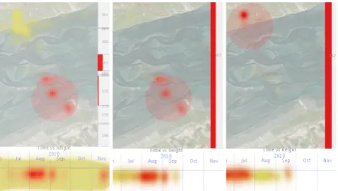
Figure 8:Left: Oystercatchers tend to only be in the in brushed area in August, with #367 spending the highest proportion of time there than other birds. Middle:Only #367shown, verifying it was indeed only there in August. Right: #367 was further North and on land earlier in the year.
c
2016 The Author(s)
[image:6.595.317.555.257.425.2] [image:6.595.316.555.495.630.2]Figure 9:Moving the mouse pointer over the density plot provides a tooltip whenever over an original data point (same dyke as in Fig.7). If multiple data points are at that location, left/right click-ing with cycle forward/backwards through these and any associated journey if one exists.
ready been defined; i.e. if each data point that is part of a jour-ney is marked with a jourjour-ney ID in the input file. Gull trips used here are defined asforaging tripsdefined as those that start and end around the birds’ nest site. Fig.7shows that two birds (see stacked barchart) visited the dyke fairly frequently during foraging trips at about the half-way point. Thex-axis isdistancefrom the start of the journey and the vertical lines are isochrones – birds spent more time at distances where these are closer together.
3.1.5. Access to details of original data points
Whichever display modes are being used for the map and timeline, the original data points are available (R1) and associated journey (if it exists). Fig.9shows a location on a dyke where one can cycle though all the points and associated journeys at the location.
3.1.6. Zoomable and pannable maps and timelines
Zooming on the map and timeline has two important roles.Firstly, it allows data to be visually resolved at different spatial and tem-poral scales; e.g. zooming into the timeline in Fig.5enables the time of day to be determined. Fig.10shows maps of the amount of time individuals spent at different locations at two spatial scales, where the large-scale structure can be interpreted using the aerial imagery option. The same principle applies for the timeline in Fig.
5, where zooming changes the temporal granularity. [LDH14] in-vestigated various interactions for temporal zooming, but ours are closely aligned to those of the map.Secondly– and importantly for data exploration at different spatial and temporal scales (R2) – also controls thescaleat which data are summarised (density plots, map-based stacked barcharts), brushing extents (section3.1.7) and animation speed (section3.1.9), allowing data to be explored at multiple scales, with background mapping (from a web map tiling service) and temporal tick-marks at the appropriate scale. Zoom-ing and pannZoom-ing interactions are identical for both the map and timelines, are quick and simple (R5) requiring only simple motions, centred on the mouse cursor.
3.1.7. Simple & rapid brushing and persistence
[image:7.595.315.554.81.166.2]Brushing [BC87] is an interactive means of selecting data in one view by ‘brushing’ a selection with the mouse. In multiple coordi-nated views, corresponding data points are highlighted in all views (e.g. [The02]), relate time, space and other aspects of data (R3). This is illustrated in Fig. 11. Of the places at which individuals spend time, the brushed area (in red) is mostly frequented by one
Figure 10:Density plot scale computed according to zoom level. (Left) Zoomed to full extent – individuals spend most time around the nest; (middle) density at a large spatial scale, showing a loop structure; (right) Aerial imagery context helps to interpret the loop structure.
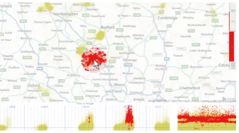
Figure 11:Brushing an area on the map indicates the duration time of individuals’ spent there as a proportion of the time they spent in the visible map area.
individual in 2011, at most times of day. There appear to be two distinct altitudes of movement during the night, corresponding to two distinct journeys at that time of night at different altitudes. Fig.
11illustrates that the brushed subset can be displayed in adifferent modeto the brushed data; in this case, density for the non-brushed subset and the original points for the rest.
We use ‘transient’ brushes [BC87] where the brushed area fol-lows the mouse whenSHIFTis down and persists when released. This behaviour makes the interaction in Fig.5possible: brushing an area on the map with the timeline zoomed out, identifying the times the area was visited at this coarse temporal scale and then zooming in to see temporal aspects at a higher temporal scale.
Brushing is performed at appropriate spatial and temporal scales. The size of the brush is based on a screen width which has the effect of brushing at an appropriate scale that for zoom level, thus the scale at which the analyst is using (R2). Pressing theLEFT
andRIGHTkeys during brushing (i.e. whilstSHIFTis down) on the map and timeline varies the width of the selection (distance or dura-tion), along as a proportion of the screen width, thus an appropriate spatial and temporal radius increment/decrement.
3.1.8. Colour scaling
[image:7.595.315.557.240.375.2]A. Slingsby & E. van Loon / Exploratory Visual Analysis for Animal Movement Ecology 7
Figure 12:Brushing modes. Left: Brushing early morning (03:00) on the cyclic timeline (right) to see the spatial distribution. Middle: Brush-ing the cyclic timeline (18:00) shows a different spatial pattern. Notice the repeated red highlightBrush-ing on the timeline. Right: BrushBrush-ing only high speeds of travel in attribute mode shows that travel along the coast is mainly at high travel speeds. The highlighted areas on the stacked barchart indicate that all these brushed subsets affect all individuals by a similar proportion of time to each other in the current field of view.
adjusted using a linear mapping. It is important that colour scal-ing ispersistentbetween zoomed/panned views for comparison, so colour rescaling as only changed by the user. A keystroke resets to the 95thpercentile (a good threshold) for the data and brushed por-tion independently) for thecurrent viewand theLEFTandRIGHT
keys increase or decrease this value (by a tenth of its value). Colour scaling applies independently to the map and two timeline views.
3.1.9. Animation
When the timeline is brushed, it can be animated forwards in time at a speedappropriate to the timeline zoom level; thus zooming the timeline will adjust the speed of the animation appropriately (R2). Such animation is appealing because movement is depicted directly and it effective for presenting temporal trends but [RFF∗08] show that is difficult toidentifytrends, except over very short timescales.
4. Validation and investigations
The original research visit and was followed up by some evaluation a couple of months later [SD12] with three of the original partici-pants. Using the questions identified in the workshop (section2.1), a new download of data was explored and this was used to pro-vide answers to each of the questions. At the end, participants were asked to assess how well the interactive techniques provided by the software facilitated answering the research question. The question-naire tried to separatetechniquesfromuser-interfaceas the soft-ware was still a prototype. Quantitative data was overwhelmingly positive, showed that they were able to use the software indepen-dently to carry out tasks it was designed to carry out. This was confirmed by screenshots that showed how the software was uses to answer to the questions. More useful, were the comments which have informed subsequent improvements. The research group con-tinue to use this software to explore new data that come in.
We now provide examples of how the interactive techniques can be used for wider questions.
4.1. Classifying behaviour and segmenting journeys?
[image:8.595.319.555.277.344.2]The map in Fig.13shows intriguing dark (indicating more time spent) ‘hook-like’ structures apparent on the sea but not on land.
Figure 13:Intriguing ‘hooks’ of floating birds being moved by the tide [SBBCB11].
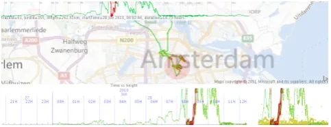
Figure 14:A lesser black-backed gull’s day trip to Amsterdam ex-hibiting soaring and gliding behaviour.
On further investigation (including determining their altitude) it was discovered that these are birds floating on the sea and being moved by tidal forces [SBBCB11], information that could be used in a segmentation or classification algorithm later. Where journeys have been specified, behaviours along the journey length can be explored and this may help further segment journeys. The journey view and ability to identify structure along it was considered one of the more unique and useful views provided by the original proto-type. Fig.14indicates a journey to Amsterdam. The map-brushed area is highlighted in the timelines and the journey view (top), the latter view indicating that Amsterdam was about a third of the way into the journey. The closeness of the isochrones indicates speed and the gliding and soaring behaviour of the gull taking advantage of thermals around the urban area.
c
2016 The Author(s)
[image:8.595.314.556.397.490.2]Figure 15:Brushed area visited at 03:00 in Fig.12(left) is visited in the morning and evening, mainly by three gulls.
4.2. What resources do birds use (and where is further fieldwork needed)?
Sites visited frequently by one or more birds are likely to contain resources important to them, but we often do not know what they are. A recent project (http://www.vogelhetuit.nl/) is in-vestigating where and when resources are available to lesser black-backed gulls. It is doing so by establishing where resourcesmight
be and then askingmembers of the public to do fieldworkto help identify locations to which fieldwork should be directed. Data are automatically downloaded from the tracking tags when they return to their nest. Using the software, members of the project identify ‘interesting sites’ – those regularly revisited, those that have partic-ularly long visits and those that appear to be avoided. For example, Fig.12(left) illustrates that gulls spend time near Winkel. Brush-ing this area in Fig.15 indicates that this area is only visited in the mornings and evening, mainly by three gulls and mainly in the first half of the month. Such behaviour suggests that this place is significant and fieldwork is needed to establish why.
4.3. Where are birds’ home ranges and territories and do these change over time?
Two important concepts in animal ecology are thehome range(the area used for an animal’s daily activities and whose extent may indicate scarcity of resources) and theterritory(area that an ani-mal uses and defends). These can vary greatly by time, sometimes even week-by-week. Territory size can give clues about breeding strategies [EKBH92], but also dietary requirements and travel con-straints related to a bird’s breeding stage [BEHdV96]. Fig.8shows an example where during chick rearing in July, a bird spends most of its time near the nest on the salt marsh, whereas after fledging in August when food becomes more scarce, the individual spends most of its time on the mudflats where there is more food.
Research on lesser black-backed gulls has aimed to identify dif-ferences between male and female home ranges in order to feed-ing strategies, dietary requirements and the risk adversity of be-haviour [WED∗08]. Fig.16codes gulls by gender, indicating they have different foraging areas with females using more terrestrial habitat and a large portion of the Wadden Sea. We speculate that males’ larger size gives them competitive advantage over females when foraging over the North Sea because of the efficiency of higher flight and greater chance of acquiring prey around fishing vessels, whereas females take advantage of shrimp fishing in the Wadden Sea and forage on land.
Figure 16:Foraging ranges of male gulls (left) and females (mid-dle) with proportions of time for each shown as a tile map (right).
4.4. Generalist or specialist behaviour?
Individuals’ locations and routes are strongly influenced by food availability, the energetic cost of movement, safety from predators and familiarity. For generalist species at apopulationlevel, the de-gree ofindividualspecialisation and consistency of this strategy through time is interesting [Val65]. Gulls display a high degree of individual specialisation, as exemplified by the visits to the dyke in Fig.7, however this behaviour is mixed with strategies that coincide more with gender (see section4.3). In spite of these individual dif-ferences, route and site fidelity can be observed. Fig.12(right) indi-cates that coast is an important route at flying speeds. Such routes are energetically beneficial because the dune ridge leads to wind conditions in which the gulls can use soaring flight. An example of a location that is visited by multiple individuals is the outer-fringe of a sandbank near the breeding colony (see Fig.10), at which gulls rest and probably socialise.
4.5. How do birds move in groups?
Homing pigeons and other flocking birds benefit from flying in groups, but the group dynamics of how collective decisions are made, which individuals contribute to these decisions and why, re-main open questions. [FAN∗13] investigated this by releasing hom-ing pigeons where individuals had different homhom-ing experiences, studied the leadership hierarchies and found that experience did not significantly affect leadership hierarchies. Fig.17uses these data to demonstrate how timeline brushing can help visually investigate flocking and leadership and indicates how the flock splits into sub-flocks, that individuals stay close to each other in their subflock, but time-lags emerge between different subflocks. Detailed visual inspection of southeastern-most subflock (zoomed in Fig.17) es-tablished that they remain seconds apart with one individual lead-ing most of the time, occasionally belead-ing replaced by another.
4.6. Other applications
[image:9.595.315.551.80.172.2]A. Slingsby & E. van Loon / Exploratory Visual Analysis for Animal Movement Ecology 9
Figure 17:Ten homing pigeons [FAN∗13]. Group behaviour can be explored by colouring the dots by individual and brushing the timeline (top row). Brushed dots are highlighted in the darker colour and zooming in (bottom left) can help identify the structure of the group. The map-based spineplots (bottom right) summarises which pigeons took which routes.
5. Discussion and Conclusions
The first contribution of this workidentifies a number of require-mentsfor interactive visual exploration techniques for supporting movement ecology in the early stages of analysis. This may be use-ful for designers of such systems. In order to help understand the way in which the data represents the phenomenon of interest and to not impose parameters that may lead to us miss important patterns, we keep the data is its original form, performing transformations on-the-fly in response to analysts’ input. Of the requirements, four are worth highlighting.Exploring space and time at different scales (R2)allows different spatial scales of behaviour (migration versus flocking behaviour as in Fig.17) to be studied. Although spatial scale is often supported well in such software, the same is often not true for time.Rapid interaction with few user interface inter-actions (R5)aims to facilitate exploratory analysis without disrupt-ing the exploratory analysis process. Tools must strive to do this. Showingspace and time as continuous (R6)is important because discrete data points are often irregularly sampled and are usually not significant in themselves for describing the continuous process of movement. Finally, movement ecologists are more interested in
temporal duration-based statistics (R7)than number of data points, important particularly where data points are irregularly sampled.
The second is tosuggest and justify visual encodings and inter-actions to support this. We suggest multiple coordinated views that are linked with brushing using ideas taken from cartography, infor-mation visualisation and visual analytics. We adapt these in some novel ways to meet our requirements including using time duration based graphics, tile maps that show time spent by multiple individ-uals, fluid zooming, panning and brushing that can be performed in space and time at different scales, on-the-fly. The design of this im-plementation has been described in this study and is implemented as a freely-available tool – see end of section1.
The final contribution is todemonstrate their use in the context of bird movement ecology. Section4does this, demonstrating how the rationale of this work, requirements, visual encodings and in-teractions help investigate animal movement issues of importance. Ongoing work includes incorporating other data sources such as wind (known to have a strong affect, particularly on migration), measurements from biometric sensors and observation data. We
also consider these techniques to have important roles for commu-nicating interpretations to different audiences and facilitating dis-cussion amongst domain experts. We plan to investigate these in animal movement workshops over the next couple of years.
Acknowledgements
We gratefully acknowledge COST MOVE (http://www. cost.eu/domains_actions/ict/Actions/IC0903) for funding the initial work, Judy Shamoun-Baranes, Adriaan Dokter & Willem Bouten (IBED, University of Amsterdam) for taking part in it and the funders, organisers & participants of Dagstuhl Seminar 10491 (2010), a Lorentz Center workshop (2011) and Dagstuhl Seminar 12512 (2012). The gull data was provided by UvA-BiTS (http://www.uva-bits.nl/) and Mate Nagy, Eotvos University. Thanks also to the reviewers’ constructive comments that have improved this work.
References
[AA13] ANDRIENKON., ANDRIENKOG.: Visual analytics of move-ment: An overview of methods, tools and procedures.Information Visu-alization 12, 1 (2013), 3 – 24.3
[AAD∗10] ANDRIENKOG., ANDRIENKON., DEMSARU., DRANSCH
D., DYKESJ., FABRIKANTS. I., JERNM., KRAAKM.-J., SCHU -MANNH., TOMINSKIC.: Space, time and visual analytics.International Journal of Geographical Information Science 24, 10 (2010), 1577–1600.
doi:10.1080/13658816.2010.508043.3
[BC87] BECKER R. A., CLEVELAND W. S.: Brushing scatterplots.
Technometrics 29, 2 (1987), 127–142.doi:10.2307/1269768.6 [BEHdV96] BUNSKOEKEE., ENSB., HULSCHERJ.,DEVLASS.: Why
do oystercatchers haematopus ostralegus switch feeding strategy?Ardea 84, A (1996), 91–104.8
[BL04] BEAUDOUIN-LAFONM.: Designing interaction, not interfaces. InProceedings of the Working Conference on Advanced Visual Inter-faces(NY, USA, 2004), AVI ’04, ACM, pp. 15–22. doi:10.1145/ 989863.989865.3
[CRM91] CARDS. K., ROBERTSONG. G., MACKINLAYJ. D.: The information visualizer, an information workspace. InProceedings of the SIGCHI(NY, USA, 1991), CHI ’91, ACM, pp. 181–186.3
[DWS10] DYKESJ., WOODJ., SLINGSBYA.: Rethinking map legends with visualization. IEEE Transactions on Visualization and Computer Graphics 16, 6 (November 2010), 890 – 899.5
c
2016 The Author(s)
[EKBH92] ENS B. J., KERSTEN M., BRENNINKMEIJER A.,
HULSCHER J. B.: Territory quality, parental effort and
reproduc-tive success of oystercatchers (haematopus ostralegus). Journal of Animal Ecology 61, 3 (1992), pp. 703–715.8
[EMJ∗11] ELMQVISTN., MOEREA. V., JETTERH.-C., CERNEAD.,
REITERERH., JANKUN-KELLYT.: Fluid interaction for information
visualization. Information Visualization 10, 4 (2011), 327–340. doi:
10.1177/1473871611413180.3
[FAN∗13] FLACKA., AKOS´ Z., NAGYM., VICSEKT., BIROD.:
Ro-bustness of flight leadership relations. Animal Behaviour 86, 4 (2013), 723 – 732.doi:10.1016/j.anbehav.2013.07.005.8,9
[FLF∗11] FERREIRAN., LINSL., FINKD., KELLINGS., WOODC.,
FREIREJ., SILVAC.: Birdvis: Visualizing and understanding bird
pop-ulations. IEEE Transactions on Visualization and Computer Graphics 17, 12 (Dec 2011), 2374–2383.doi:10.1109/TVCG.2011.176.3
[FPV∗13] FERREIRAN., POCOJ., VOH. T., FREIREJ., SILVAC. T.:
Visual exploration of big spatio-temporal urban data: A study of new york city taxi trips. IEEE Transactions on Visualization and Computer Graphics 19, 12 (Dec. 2013), 2149–2158. doi:10.1109/TVCG. 2013.226.3
[HTC09] HURTER C., TISSOIRES B., CONVERSY S.: Fromdady: Spreading aircraft trajectories across views to support iterative queries.
IEEE Transactions on Visualization and Computer Graphics 15, 6 (Nov. 2009), 1017–1024.doi:10.1109/TVCG.2009.145.3
[KCW∗11] KRANSTAUBERB., CAMERONA., WEINZERLR., FOUN
-TAINT., TILAKS., WIKELSKIM., KAYS R.: The Movebank data model for animal tracking. Environmental Modelling & Software 26
(2011), 834 – 835.doi:10.1016/j.envsoft.2010.12.005.1
[KKL∗12] KRANSTAUBERB., KAYSR., LAPOINTS. D., WIKELSKI
M., SAFIK.: A dynamic brownian bridge movement model to esti-mate utilization distributions for heterogeneous animal movement. Jour-nal of Animal Ecology 81, 4 (2012), 738–746. doi:10.1111/j.
1365-2656.2012.01955.x.1
[KS14] KRANSTAUBERB., SMOLLA M.: Visualizing and analyzing animal track data, 2014. R package version 1.2.475. URL:http:
//CRAN.R-project.org/package=move.1
[KTW∗13] KRÜGER R., THOM D., WÖRNERM., BOSCH H., ERTL
T.: Trajectorylenses – a set-based filtering and exploration technique for long-term trajectory data. Computer Graphics Forum 32(2013), 451– 460.doi:10.1111/cgf.12132.3
[Lau10] LAUTENSCHÜTZA.-K.: How context influences the segmen-tation of movement trajectories–an experimental approach for environ-mental and behavioral context. Online proceedings of GIScience 2010 (Extended abstract), September(2010).3
[LDH14] LEE C., DEVILLERS R., HOEBER O.: Navigating spatio-temporal data with spatio-temporal zoom and pan in a multi-touch environment.
International Journal of Geographical Information Science 28, 5 (2014), 1128–1148.doi:10.1080/13658816.2013.861072.6 [LP11] LAUBEP., PURVESR. S.: How fast is a cow? Cross-scale
anal-ysis of movement data. Transactions in GIS 15, 3 (2011), 401–418.
doi:10.1111/j.1467-9671.2011.01256.x.3
[MSJ11] MANSMANN F., SPRETKE D., JANETZKO H.: Lessons Learned from Tool Development for Animal Movement Analysis. In
Poster Proc. 1st IEEE Symposium on Biological DataVis(2011).1,3 [Nat08] NATHANR.: An emerging movement ecology paradigm.
Pro-ceedings of the National Academy of Sciences 105, 49 (2008), 19050– 19051.doi:10.1073/pnas.0808918105.1
[OSFM10] OWEN-SMITHN., FRYXELLJ. M., MERRILLE. H.: For-aging theory upscaled: the behavioural ecology of herbivore movement.
Philosophical Transactions of the Royal Society of London B: Biolog-ical Sciences 365, 1550 (2010), 2267–2278. doi:10.1098/rstb. 2010.0095.1
[RFF∗08] ROBERTSONG. G., FERNANDEZR., FISHERD., LEEB.,
STASKOJ. T.: Effectiveness of animation in trend visualization. IEEE
Trans. Vis. Comput. Graph. 14, 6 (2008), 1325–1332.7
[SBBCB11] SHAMOUN-BARANES J., BOUTEN W., CAMPHUYSEN C. J., BAAIJ E.: Riding the tide: intriguing observations of gulls resting at sea during breeding. Ibis 153, 2 (2011), 411–415. doi:
10.1111/j.1474-919X.2010.01096.x.7
[SBBvL∗12] SHAMOUN-BARANESJ., BOMR.,VANLOONE. E., ENS B. J., OOSTERBEEKK., BOUTENW.: From sensor data to animal be-haviour: An oystercatcher example.PLoS ONE 7, 5 (05 2012), e37997.
doi:10.1371/journal.pone.0037997.1
[SBvLP∗12] SHAMOUN-BARANESJ.,VANLOONE. E., PURVESR. S.,
SPECKMANNB., WEISKOPFD., CAMPHUYSENC. J.: Analysis and
visualization of animal movement. Biology Letters 8, 1 (2012), 6–9.
doi:10.1098/rsbl.2011.0764.2
[SBW13] SLINGSBYA., BEECHAMR., WOODJ.: Visual analysis of social networks in space and time using smartphone logs. Pervasive and Mobile Computing 9, 6 (2013), 848 – 864. Mobile Data Chal-lenge. doi:http://dx.doi.org/10.1016/j.pmcj.2013. 07.002.8
[SD12] SLINGSBY A., DYKES J.: Experiences in involving analysts in visualisation design. InProceedings of the 2012 BELIV Workshop: Beyond Time and Errors - Novel Evaluation Methods for Visualization
(New York, NY, USA, 2012), BELIV ’12, ACM, pp. 1:1–1:4. doi: 10.1145/2442576.2442577.2,7
[Shn96] SHNEIDERMAN B.: The eyes have it: a task by data type taxonomy for information visualizations. InVisual Languages, 1996. Proceedings., IEEE Symposium on(Sep 1996), pp. 336–343. doi: 10.1109/VL.1996.545307.3,5
[SJM∗11] SPRETKE D., JANETZKO H., MANSMANN F., BAK P.,
KRANSTAUBERB., DAVIDSONS., MUELLERM.: Exploration through
Enrichment: A Visual Analytics Approach for Animal Movement. In
Proceedings of the 19th SIGSPATIAL International Conference on Ad-vances in GIS(NY, USA, 2011), Agrawal D., Cruz I., Jensen C. S., Ofek E., Tanin E., (Eds.), GIS ’11, ACM, pp. 421–424.3
[Sli11] SLINGSBYA.: Supporting the visual analysis of the behaviour of gulls. COST-MOVE STSM report,http://openaccess.city. ac.uk/2528/, 2011.2
[Sum14] SUMNERM. D.: trip: Spatial Analysis of Animal Track Data, 2014. R package version 1.1-19. URL:http://CRAN.R-project. org/package=trip.1
[SWvdW∗11] SCHEEPENSR., WILLEMSN.,VAN DEWETERINGH.,
ANDRIENKOG., ANDRIENKON.,VANWIJKJ. J.: Composite density
maps for multivariate trajectories. IEEE Transactions on Visualization and Computer Graphics 17, 12 (2011), 2518–2527. doi:10.1109/ TVCG.2011.181.3
[The02] THEUSM.: Interactive data visualization using mondrian. Jour-nal of Statistical Software 7, 11 (11 2002), 1–9.6
[Val65] VALENL. V.: Morphological variation and width of ecological niche.The American Naturalist 99, 908 (1965), pp. 377–390.8 [WED∗08] WOOK. J., ELLIOTTK. H., DAVIDSONM., GASTONA. J.,
DAVORENG. K.: Individual specialization in diet by a generalist marine
predator reflects specialization in foraging behaviour.Journal of Animal Ecology 77, 6 (2008), 1082–1091. doi:10.1111/j.1365-2656. 2008.01429.x.8
[WFD∗99] WOODJ., FISHERP. F., DYKESJ., UNWIN D., STYNES K.: The use of the landscape metaphor in understanding population data.
Environment and Planning B 26, 2 (1999), 281 – 295.4
[WSL08] WILSONR. P., SHEPARDE., LIEBSCHN.: Prying into the intimate details of animal lives: use of a daily diary on animals. Endan-gered Species Research 4, 1-2 (2008), 123–137.1
[WWF∗14] WAREC., WILEYD. N., FRIEDLAENDERA. S., WEIN -RICHM., HAZEN E. L., BOCCONCELLI A., PARKS S. E., STIM -PERTA. K., THOMPSON M. A., ABERNATHYK.: Bottom side-roll feeding by humpback whales (megaptera novaeangliae) in the southern gulf of maine, u.s.a. Marine Mammal Science 30, 2 (2014), 494–511.