City, University of London Institutional Repository
Citation:
Okoe, M., Jianu, R. ORCID: 0000-0002-5834-2658 and Kobourov, S. (2018).
Node-link or Adjacency Matrices: Old Question, New Insights. IEEE Transactions on
Visualization and Computer Graphics, doi: 10.1109/TVCG.2018.2865940
This is the accepted version of the paper.
This version of the publication may differ from the final published
version.
Permanent repository link:
http://openaccess.city.ac.uk/20159/
Link to published version:
http://dx.doi.org/10.1109/TVCG.2018.2865940
Copyright and reuse: City Research Online aims to make research
outputs of City, University of London available to a wider audience.
Copyright and Moral Rights remain with the author(s) and/or copyright
holders. URLs from City Research Online may be freely distributed and
linked to.
City Research Online:
http://openaccess.city.ac.uk/
[email protected]
Node-link or Adjacency Matrices: Old Question,
New Insights
Mershack Okoe, Radu Jianu, Stephen Kobourov
Abstract—Visualizing network data is applicable in domains such as biology, engineering, and social sciences. We report the results of a study comparing the effectiveness of the two primary techniques for showing network data: node-link diagrams and adjacency matrices. Specifically, an evaluation with a large number of online participants revealed statistically significant differences between the two visualizations. Our work adds to existing research in several ways. First, we explore a broad spectrum of network tasks, many of which had not been previously evaluated. Second, our study uses two large datasets, typical of many real-life networks not explored by previous studies. Third, we leverage crowdsourcing to evaluate many tasks with many participants. This paper is an expanded journal version of a Graph Drawing (GD’17) conference paper. We evaluated a second dataset, added a qualitative feedback section, and expanded the procedure, results, discussion, and limitations sections.
Index Terms—Evaluation, user study, graphs, networks, node-link, adjacency matrices.
F
1
I
NTRODUCTIONV
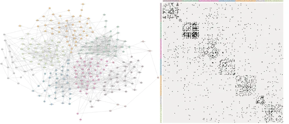
ISUALIZING network data is known to benefit a wide range of domains, including biology, engineering, and social sciences [1]. The data visualization community has proposed many approaches to visual network exploration. By comparison, the body of work that evaluates the ability of such methods to support data-reading tasks is limited. We describe the results of a comparative evaluation of the two most popular ways of visualizing networks: node-link diagrams (NL) and adjacency matrices (AM). Specifically, we consider two interactive visualizations (NL and AM), using a crowdsourced, between-subjects methodology, with864 distinct online users, 14 evaluated tasks, and 2 real-world datasets; see Fig. 1.
Several earlier studies compared NL and AM visualiza-tions on specific classes of networks and using a variety of tasks [2], [3], [4], [5]. They show that the effectiveness of the visualization depends heavily on the properties of the given dataset and the given data-reading tasks. For example, Ghoniemet al.’s evaluation [2] found that the two visualiza-tions’ ability to support specific tasks depends on the size and density of the network. Similarly, it is reasonable to hypothesize that there might be differences depending on the structure of the network (e.g., random networks, small-world networks). Thus exploring the effectiveness of NL and AM visualizations on different types of networks, and using a broader spectrum of tasks, seems worthwhile.
Our study uses two real-world, scale-free datasets, one of 258 nodes and 1090 edges, the other of 332 nodes and 2126 edges. This makes our datasets different in structure and larger than previously evaluated networks. For example, Ghoniem et al. evaluated random networks with fewer nodes , albeit somewhat denser. We argue (in section 3) that our chosen datasets are worth studying as they exemplify a large class of networks that occur in real applications.
Networks are used to solve increasingly complex prob-lems and as a result, there is an expanding range of tasks that are relevant in real applications and which are of interest to the visualization community. Our study evaluates
14 different tasks, carefully chosen to span multiple task taxonomies [6], [7]. Many of these tasks were not previously investigated in the context of NL and AM representations.
Given the caveat that these results apply to the specific underlying networks and the specific implementations of NL and AM visualizations, some of our results confirm prior observations in similar settings, while others are new. NL outperforms AM for questions about graph topology (e.g., “Select all neighbors of node,” “Is a highlighted node connected to a named node?”). Of 10 such tasks in two datasets, participants who used the node-link diagram were more accurate in5 and less accurate in3. AM outperforms NL in2of4tasks which tested the ability of the participants to identify and compare node groups or clusters. Finally, NL has a slight edge on1of2memorability tasks. The full results are shown in Figures 6-9. This paper is an expanded journal version of a Graph Drawing (GD’17) conference paper [8], with an additional dataset, a qualitative feedback section, and expanded procedure, results, discussion, limi-tations sections.
2
R
ELATEDW
ORKConsiderable effort has been expended on optimizing NL and AM visualizations to remove clutter, increase the saliency of visual patterns, and support data reading tasks [1]. NL, AM, and slight variations thereof have long been used in practice to support analyses of data in a broad range of domains, including proteomic data [9], [10], [11], [12], brain connectivity data [13], social-networks [14], and engineering [15].
Fig. 1. Evaluated visualizations: node-link diagram and adjacency matrix.
While the two types of visualizations have been used broadly for a long time, studying how people parse them visually and which visualization method supports specific tasks and datasets, is ongoing. For example, studies by Purchaseet al.[26], [27], [28] consider how node-link layouts impact data readability. Eye-tracking research by Huanget al.[29], [30] reveal visual patterns and measure the cognitive load associated with network exploration. More recently Jianuet al.[12] and Saketet al.[31] consider the performance of node-link diagrams with overlaid group information.
Our work is one in a series of studies that compare NL and AM representations. Ghoniem et al. [2] evaluated the two approaches on seven connectivity and counting tasks, using interactive visualizations (e.g., node can be selected and highlighted). Synthetic graphs of three sizes (20, 50, 100 nodes) and three densities (0.2, 0.4, and 0.6) were used. The authors found that for small sparse graphs, NL was better in connectivity tasks, but that for large and dense graphs, AM outperformed NL for all tasks. Keller et al.[5] evalu-ated six tasks on three real-life networks of varying small sizes (8, 22,50) and three densities (unspecified, 0.2, 0.5). Using both static and interactive variants of NL and AM, Abuthawabeh et al. [32] found that the participants were equally able to detect structure in graphs representing code dependencies. Alperet al.[13] found that in tasks involving the comparison of weighted graphs, matrices outperform node-link diagrams. Finally, Christensenet al.[33] evaluated matrix quilts in addition to NL and AM in a smaller scale study.
Our study adds to what is already known in several ways. First, we explore a significantly broader range of tasks than earlier studies. These were carefully selected to cover the graph task taxonomy of Lee et al. [6] and the general taxonomy of visualization tasks by Amar et al. [7]. We also considered the task taxonomies for simple graphs [6], clustered graphs [34], and more generally for visualization tasks [7], [35], which have been found to be useful in guiding research and informing user study task
choices [12], [31]. Second, our study uses two large real-world networks, typical of many scale-free networks that arise in practical applications.
Finally, unlike previous studies, we leverage crowd-sourcing, via Amazon’s Mechanical Turk, to evaluate many tasks with many participants. Mechanical Turk provides access to a diverse participant population [36], [37], and is considered a valid platform for evaluation in general [37], [38], as well as specifically in the context of visualization studies [39]. Many recent visualization studies are crowd-sourced [12], [40], [41], [42], [43] and specific platforms for online evaluations are developed, including GraphUnit, de-signed for online evaluation of network visualizations [44].
3
S
TUDY DESIGN 3.1 Stimuli: DataWe evaluated two networks. The first has 258 nodes and
1090edges, representing cooking ingredients connected by edges when frequently used together in recipes. This net-work had been explored previously by Ahn et al. [45]. In its original form, the network is larger (381 nodes) but we removed disconnected components and low-weight edges. The second network has332nodes and2126edges, repre-senting US airports with frequent flight connections [46].
The density of networks is measured and reported in different ways. When considered as the fraction of edges present compared to the maximum number of possible edges (computed as2#edges/#nodes2
) our first network has density0.032and the second network has density0.019. When measured as the ratio between the number of edges and the number of nodes (which is exactly equal to half the average degree) the first network has density4.22and the second network has density6.40. Table 1 describes the properties of the two datasets.
TABLE 1
Properties of the Ingredients and Airports datasets used in the two studies.
Ingredients Airports
Number of Vertices(V) 258 332
Number of Edges 1090 2126
Density(E/V) 4.22 6.40
Density(2∗E/(V ∗(V −1)) 0.032 0.039
Degree Assortativity 0.283 −0.208
Average Clustering Coef. 0.255 0.625
Global Clustering Coef. 0.284 0.396
Radius 5 3
Average Shortest Path Length 3.284 2.738
Rationale:Our motivation for choosing these networks was three-fold. First, they aredifferent than those evaluated already. Our networks are approximately2-3times larger than those evaluated by Ghoniem et al.and Kelleret al.. Second, our networks were chosen to be representative of several types of real-world networks. Specifically, we reviewed 22 relational datasets (e.g., trade exchanges between countries, the Les Miserable dataset, TVCG paper co-authorships, protein-interaction networks). We selected two from this set that were sufficiently small to be shown in a browser and were representative in terms of structure. Our networks have 4
and6times more edges than nodes. These edge/node ratios capture those observed in the22networks we reviewed and are also representative of many networks commonly found in practice [47]. Third, we believe a dataset revolving around concrete data such as cooking ingredients and airports would have agreater appeal to participants. Relatable, concrete dataset may help users understand tasks better [48].
3.2 Stimuli: Visual Encoding
We evaluated two visual encodings: a node-link diagram (NL) drawn using the neato algorithm from graphviz [49], and an adjacency matrix (AM) sorted to reveal continuous groups of clusters using the barycenter and cluster algo-rithms available in the Reorder.js library [18]. We clustered the networks using modularity clustering from GMap [50] and encoded this information in the two visual represen-tations using color, as shown in Fig. 1. Both visualizations were developed using the D3 [51] web-library.
Rationale:Neato is an exemplar multi-dimensional scaling algorithm, which is at the core of many modern efficient graph algorithms. It is also one of the two commonly used layout algorithms in AT&Ts GraphViz package, which in turn is among the most widely used graph layout packages. Multi-dimensional scaling algorithms such as neato are often among the best performers based on qualitative and quantitative metrics [52], [53]. Moreover, neato is frequently part of NL evaluations [2], [12]. We ordered our AM to reveal structure, as we considered this more representative of how matrices are used in practice, unlike Ghoniem et al.[2], who used a lexicographical order.
3.3 Stimuli: Interactions
Both visualizations support panning and zooming, using the mouse-wheel. Multiple nodes can be selected by clicking on them, and deselected with an additional click. Select-ing a node in NL colors both the node and its outgoSelect-ing edges in purple. Selections in AM operate on node labels but change the color of the corresponding node’s row or column. Similarly, node mouse-over in NL turns the node and its edges green and shows the node label via tooltips. Node mouse-over in AM colors the row or column. Note that for both node selection and node mouse-over in AM, if a row (column) is colored the complementary column (row) is not. We chose this approach since Ghoniem et al.
mentioned that multiple markings for the same node can confuse users [2].
To select a node as the answer to a task, the partic-ipants double-click it. This marks the node with a thick black contour. In both NL and AM this marking was re-stricted to nodes and labels, without extending to edges or rows/columns. The participants could also deselect an answer by double-clicking it again.
Similar interactions apply to edge selection: An edge mouse-over in NL turns the edge green, and if clicked it is selected and so turns purple. In AM, hovering over an edge-cell highlights its corresponding row and column in green, and clicking it selects the edge.
Rationale:Like Ghoniemet al.or Kelleret al.before us, we chose to evaluate interactive visualizations as interactivity is typical in real-world applications. Interactivity changes the effectiveness of visual encodings significantly, however, and a careful choice of interactive techniques is warranted.
Our goal was to use interactions that areecologically valid
(i.e., capture interactions typical of NL or AM visualizations) andfair (i.e., providing similar functionality and power in both visualizations). To this end, we reviewed 9 systems for network visualization (e.g., Gephi [17], Cytoscape [9], Tulip [16]),12network evaluation papers (e.g., Ghoniemet al. [2], Keller et al. [5], Okoeet al. [4]) and 6 systems and papers for adjacency matrices (e.g., ZAME [54], TimeMa-trix [55], work by Perin et al. [56], and work by Henry et al.[57]). We cataloged the interactions described or available in these systems, as well as their particular implementation, and then selected the set of most common interactions.
This resulted in a set of interactions that both overlapped and differed slightly from those implemented in previous studies. Overlapping interactions were described above. New interactions included zooming and panning, which was required to solve some of the tasks. We believe the addition of zooming and panning is valuable since such basic navigation is an integral part of real-life systems. Our node-link diagrams also allowed users to move nodes, an interaction that can be used to disambiguate cases in which nodes or edges overlap, and is ubiquitous in NL systems. This interaction does not have an equivalent in AM but is also not necessary as rows and columns are evenly spaced.
3.4 Tasks
Fig. 2. Participants mouse-over nodes to highlight them (green) and click on nodes to select them (purple). Designating a node as the answer for a task answer is accomplished via a double-click, which draws a black contour around the node.
task. Task repeats were selected manually on each network so as to cover multiple levels of complexity. For example, our repeats included nodes with both low and large degrees (e.g.,T1,T2), short and long paths (e.g.,T10,T13), or nodes with few and many neighbors (e.g.,T4).
Three of our tasks warrant a more detailed discussion. We included two memorability tasks, (T11,T14). The for-mer tested the ability of participants to recall data they had looked for or accessed at an earlier time, and is similar to memorability tasks evaluated by Saket et al. [58]. The latter tested the ability of participants to recognize visual configurations they had viewed previously and is more similar to tasks used by Jianuet al.and Borkinet al.[12], [43]. Both memorability tasks were based on questions that the participants had to answer early in their session (i.e.,T9in group 4, andT12in group 5) to prime the participants with a particular piece of information or visual configuration. A few minutes later, after performing a set of other tasks (i.e,T10in group 4,T13in group 5), the participants were asked about the information from the earlier task. Finally, we added a path-estimation task (T5), which required the participants to estimate how far two nodes are, in terms of the shortest path between them. Timing constraints ensured that participants used perceptual mechanisms to give a best-guess response instead of “computing” the correct answer.
Rationale:Our overarching goal in selecting our tasks was to cover a wide spectrum of different and realistic network tasks. As shown in Figures 6-9, we selected tasks to cover the graph objects they provide answers about (i.e., nodes, edges, paths), as well as cover Lee et al.’s categories of graph-reading tasks, and Amaret al.’s general types of visu-alization tasks [6], [7]. Several of our tasks have been used before but under slightly different conditions. Additionally, we included tasks that go beyond previous studies compar-ing NL and AM, such as tasks involvcompar-ing clusters. We also included memorability tasks as they are a topic of growing interest in the visualization community [43], [58]. We also hypothesized there would be differences between the two visualizations in this respect. We included a path-estimation task [12], as it is a good representative of the “Overview” category of graph tasks, and underlies perceptual queries that users make on relational data.
3.5 Hypotheses
Based on previous results by Ghoniem et al. [2], Keller et al.[5], Okoeet al.[44], Jianuet al.[12], and Saketet al.[31] we devised the null hypotheses:
H1: There is no statistically significant difference in time and accuracy performance between using NL and AM for tasks involving the retrieval of informa-tion about nodes and direct connectivity (T1,T2,T4,
T9,T12).
H2: There is no statistically significant difference in time and accuracy performance between using NL and AM for connectivity and accessibility tasks involving paths of length greater than two (T5,T10,
T13).
H3: There is no statistically significant difference in time and accuracy performance between using NL and AM on group tasks (T3, T6, T7, T8).
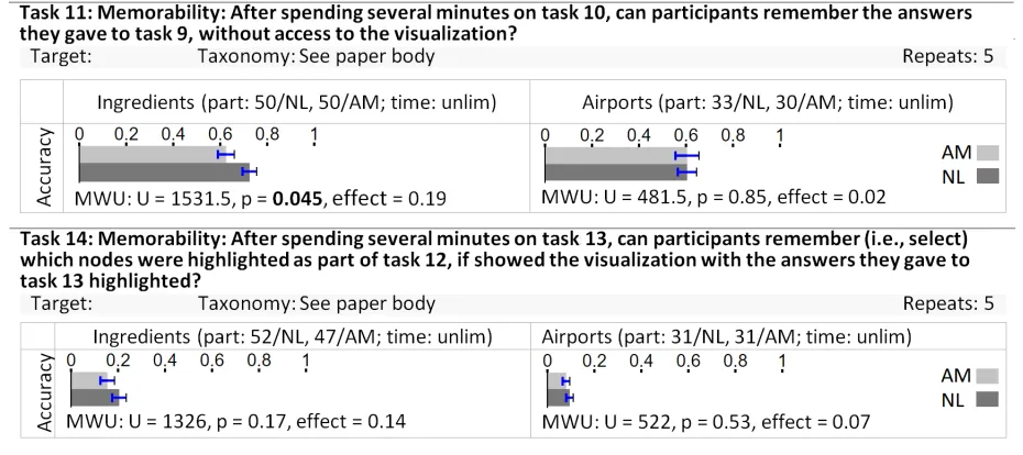
H4: There is no statistically significant difference in memorability between using NL and AM (T11, T14). We expected H1 to hold and H2 not to hold. We also thought H3 would hold, except for estimating group interconnectiv-ity (T6), since estimating the number of non-overlapping dots in a square (AM) should be easier than estimating overlapping edges in an irregular 2D area (NL). Finally, we anticipated memorability would be higher in node-link diagrams due to its more distinguishable features. Results for our four hypotheses are shown in Figure 6-9.
3.6 Design
The two datasets were evaluated independently in two separate studies, the ingredients dataset before the airports dataset, about two years apart. The structure of the two studies was identical apart from the dataset used and the fact that in the second study we collected more demographic data about participants (see section 4.2).
In each study we used a between-subjects experiment with two conditions. We divided our14 task types into 5
experimental groups and evaluated each group separately. Tasks1−3were evaluated first (group 1), then tasks4and
5 (group 2), tasks6−8 (group 3), tasks9−11(group 4), and tasks12−14(group 5). Each participant was allowed to participate in a single group and used just one of the two visualizations. We assigned participants to groups and conditions in a round-robin fashion. We aimed to collect data from around50participants per condition in the first study and 30 participants in the second study. As some participants did not complete the study, the total number of participants for whom we collected data varies slightly between conditions. All tasks were timed, with time limits determined experimentally through a pilot-study and cho-sen to allow most participants to complete the tasks, while moving the study along.
in a crowdsourced setting. Moreover, between-subjects de-signs are quicker (since only one condition is evaluated at a time) and online participants prefer shorter studies.
We divided the tasks into groups for the same reason. Having each participant evaluate all tasks would have re-sulted in excessively long sessions that participants would have found tiring. Having participants solve only subsets of tasks allowed us to reduce their time commitment. We used estimated task completion times to group tasks, aiming for an expected duration of about15minutes.
We aimed for30−50participants per condition in our first study, matching numbers used in earlier crowdsourced studies [12], [40]. We enforced short time-limits in order to make uniform the total session duration across participants.
3.7 Procedure
We used Amazon’s Mechanical Turk (MTurk) to crowd-source our study to a broad population. We followed best-practices recommendations for crowdsourcing-based stud-ies for visualization [62]. In the MTurk posting, we showed participants a visual sample of the tasks they will be per-forming with the NL or AM visualizations, informed them they will be performing the study with either the NL or AM visualization, and directed them to further information available on the webpage for the study.
To account for variations in participant demographics during the day, we published study batches throughout the day. Moreover, to reduce the risk that participants would not understand task instructions, we restricted participants to Amazon Mechanical Turk users registered in the USA. We ran conditions in parallel and directed incoming partic-ipants to them using a round-robin assignment, to ensure that the two conditions sampled participants from the same populations. Our participants’ demographics overlap the general demographics of Amazon Mechanical Turk [38], [63]. We note that our procedure and result interpretation as-sumes that this demographic has not changed significantly in two years between our separate studies, an assumption which may not hold entirely.
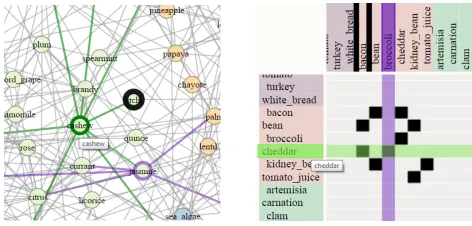
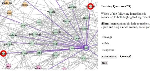
Each incoming participant was first presented with an introduction to the study, dataset, and the visualization they would see and use. We also described the tasks they would perform and provided two sample questions with correct answers for each task category (Figure 3). Since our interac-tions relied on color, participants were also administered a color-blindness test [64].
Next, participants were presented with training samples of the tasks they would perform in the experiment (at least two for each different task type). The training samples were not timed and participants could check the accuracy of their responses (Figure 4).
[image:6.612.316.560.48.223.2]After the training phase, participants were presented with the actual study. Here, task instances of each type in an assigned group were shown to the participants. For example, since group 1 involved three distinct task types, participants assigned to it solved three consecutive sections of ten task-instances each. Each task instance was shown with a countdown clock which was used to enforce the time-limits shown in Figures 6-9 by hiding the visualization once time expired (Figure 5).
Fig. 3. We instructed participants on the appearance of and answers to tasks.
Fig. 4. Participants solved a few training repeats of each task and could check the accuracy of their answers.
At the very end, we asked participants for open-ended comments. In the second study we also asked for participant information such as age, gender, education level, and expe-rience with network visualizations such as those evaluated. We used GraphUnit [44] to create the study, deploy it, and collect data. Visualizations were shown on the left, while task instructions and answer widgets were shown on the right. Depending on each task, users answered by selecting nodes or by using interactive widgets (e.g., text-boxes, check-boxes). To increase the chances of collecting clean data we awarded a bonus to the best result in each group and told participants that two of the task-instances were control tasks easy enough for anyone to solve.
4
R
ESULTSOur results include quantitative measurements of partici-pants’ time and accuracy on each task, the qualitative feed-back they offered at the end of the study, and the participant information collected in the second study. We note that a discussion of results is deferred to section 5.
[image:6.612.314.558.268.384.2]Fig. 5. Participants performed the tasks with a countdown time for each task instance.
could also be extended to include additional visual en-codings (e.g., AM-NL hybrids [65]) by evaluating the new encoding using the same datasets and tasks.
4.1 Quantitative results
We collected data from864 individual participants (557 in the first study, 307 in the second) distributed across task groups and conditions as shown in Figures 6-9. We removed
29responses from participants who spent an average of 2
seconds per task and had accuracy in the bottom 10 per-centile. We considered these likely to be random responses by participants attempting to game the study.
To compute the accuracy of node selections (T1,T2,T4), we used the formula Acc = (kP S∩T Ak)/kT Ak}, where
P Sis the participant’s selection andT Ais the true answer. To compute answers for tasks involving numeric answers (T6, T10, T13) we used the formula Acc = max(0,1− kP A−T A|/|T A|), where P A is the participant’s answer andT Ais the true answer. For other tasks we gave a1 to correct answers, and a 0 to incorrect answers. Since each task type was represented in the study by several repeats, we averaged the accuracies of a task’s individual repeats into an accuracy for the task as a whole.
When data was normally distributed (determined by a Shapiro-Wilk test), we used a t-test between conditions to determine if observed differences were significant. Other-wise we used a Mann-Whitney U test analysis.
Our results, including statistically significant differences and effect sizes, are shown in Figures 6-9. Overall they show that NL diagrams were better for more of our connectivity tasks in terms of time and/or accuracy (T1 - time and accuracy,T5- accuracy,T9- accuracy,T10- accuracy,T13
- accuracy). Exceptions are found for tasks that involve finding common neighbors (T4andT12), in which AM out-performed NL. We discuss possible explanations in Section 5. AM also outperformed NL in terms of time in T5 and
T10 but we believe that those results are anomalous and provide more context in Section 5. Altogether, these results lend support for the invalidation of bothH1andH2. The fact that H1 seems to not hold is surprising given previous results.
AM had an edge on group tasks and outperformed NL inT3(by accuracy),T6(by accuracy and time), andT8(by time) thereby invalidatingH3.
Finally, NL supported memorability tasks better (invali-datingH4). In particular, NL users outperformed AM users when recalling previously used data (T11).
4.2 Participant data
We collected demographic information about the partici-pants in the second study. Of 307 participants, 165 were males, and138were females. Participants were between19
and67years old with a median age of32. Regarding edu-cational level attained,28participants indicated high school diploma,79participants indicated some college courses,116
participants had a bachelors degree, and28participants had graduate degrees. Participants were generally unfamiliar with network visualizations and rated themselves on av-erage as a2on a scale of1-5(where 5 means expert).
4.3 Qualitative feedback
We analyzed the open-ended feedback participants pro-vided using a coding process. In a preliminary scan of all comments we identified 12 common themes such as ‘insufficient time’ or ‘too much navigation required’. In a subsequent more detailed pass we identified and counted occurrences of these themes in our participants’ comments. In the process, we merged several themes to end up with the8shown in Figure 10 and detailed below:
Fun or interesting:Many participants commented that the study was either fun or interesting. We included in this theme comments such as “This was really interesting, I enjoyed participating”, “Cool”, and “Great and fun survey, very different from other surveys posted on amazon turk!”.
Difficult: About 69 of the 864 participants described the study as a whole or specific tasks as being difficult. Ex-amples of comments in this theme include “I had a lot of trouble with it”, “Very difficult tasks”, and “The first section is easy but the second [path] seems almost impossible when it’s more than2or3connections.”
Insufficient time: About 45 participants felt rushed by our tasks’ time constraints. Comment examples include “I almost never felt like I had enough time” and “I thought that the timer was too short”.
Confusing:Some participants commented that task descrip-tions and/or the terminology used were confusing and not sufficiently explained, or that the tasks and visualizations themselves were confusing. Comment examples include “I am a little confused about what the ’shortest ingredient path’ means... it doesn’t seem to mean fewest number of shared ingredients” and “It took me a minute to realize that the ingredient needed to be highlighted in black instead of just highlighted purple”.
Zoom/Pan lag:We identified two common themes related to zooming and panning. First, a small number of participants reported technical issues, the most common of which was lag in zooming and panning. Participants experienced this in equal measures in the two visualizations.
Fig. 7. Hypothesis 2: task details and results, significant p-values highlighted. Times and accuracies for AM (light-gray) and NL (dark-gray) were compared using the Mann-Whitney U-test (MWU) or the T-test. Effect sizes correspond to eitherZ/√Nor Cohen’s d (details in section 4.1).
to the task. This was the second most common theme in our participants’ feedback. Examples include: “Scrolling in and out was a pain” and “I found that navigating the chart was more time consuming than finding the answer.”
We merged into this theme comments about the visual-izations showing too much data or being too complex such as “Spread of the network [NL] was too large to be able to see all the connections at the same time when zooming in” and “The image is small and it needs more time to zoom.”
Suboptimal interactions: A small number of participants commented on the particular ways interactions were im-plemented (e.g., “Had some trouble with the ingredient selection”, “Controls were a bit clunky”, “Was a little tricky working this with the way it moved and stuff”, “Put a zoom button on screen”).
Other technical issues: Finally, a few participants reported other types of technical difficulties such as “Would not zoom as instructed” or “I had to reload the page once”. We identified surprisingly few such comments (14) given the scale of our study (864participants).
5
D
ISCUSSIONWe now discuss several factors that may have played a role in the observed results. We base this discussion on the quantitative results and the qualitative feedback. We also looked at performance on individual task repeats to see if we can identify what about each repeat makes it easy or difficult (e.g., visual presentation, number of required inter-actions). This analysis was qualitative and based on our own interactions with the visualizations and attempts to solve the tasks. Note that we only provide possible explanations of observed effects, rather than definitive findings.
NL diagrams require less zooming and panning. NL layouts fully leverage the 2D area, while matrices are con-strained to two 1D linear node orders. Matrices favor dense networks but not sparse ones (empty matrices are as large as a dense ones). As networks grow larger but not denser, AM may incur increasing navigation overheads. Instead, sparse NL diagrams can be packed tightly. At the extreme, an empty network can be shown effectively using NL in a
√
Fig. 8. Hypothesis 3: task details and results, significant p-values highlighted. Times and accuracies for AM (light-gray) and NL (dark-gray) were compared using the Mann-Whitney U-test (MWU) or the T-test. Effect sizes correspond to eitherZ/√Nor Cohen’s d (details in section 4.1).
that zooming and panning were more of a problem in AM than NL. This could explain the differences inT1.
NL diagrams place a node’s glyph and connections to-gether.Once a label is spotted in an NL diagram, its out-going edges can be traced to other nodes and their labels. Moreover, the presence of the edge aids this tracing. The AM visualization shows node and edge information separately. Finding the endpoints of an edge involves two potentially long visual-traces along the horizontal and vertical axes. Similarly, finding an edge of an identified node involves a horizontal or vertical search.
We found that participants took longer and were less precise on taskT2 (find neighbors of selected node) in the AM condition the farther the target node was from the matrix labels. This is exemplified in Figure 12 and intuitively makes sense because to solve this task participants identify edges in the matrix and select nodes in the label areas. The farther the two are, the more difficult the task.
Fig. 9. Hypothesis 4: task details and results, significant p-values highlighted. Times and accuracies for AM (light-gray) and NL (dark-gray) were compared using the Mann-Whitney U-test (MWU) or the T-test. Effect sizes correspond to eitherZ/√Nor Cohen’s d (details in section 4.1).
Fig. 10. Issues reported by participants as qualitative feedback.
barely visible. Hovering over labels would reveal them, but the rows and columns are narrow and cursor movements need to be very precise. Alternatively, zooming in makes the labels visible but involves significant back-and-forth navigation. In contrast, labels in NL are visible even at an overview level. This may explain the effect observed inT9.
Distances are better represented with NL diagrams.While matrices can also order rows and columns, they are con-strained by the use of a single dimension. This could explain the results of T5: when one pair of nodes were in the same cluster and the other not, comparing their topological proximity was possible in both visualizations, but in all other cases NL outperforms AM.
Matrices eliminate occlusion and ambiguity problems. In NL diagrams it is sometimes difficult to tell if an edge connects to a node or passes through it, but this is not the case in AMs.
Tasks that involve visual searches in unconstrained 2D space are easier with AM.For example, finding a node in an AM involves a linear scan in a list of labels. Counting
nodes with certain properties can also be done sequentially by moving through the matrix’s headers. Such tasks are difficult in NL diagrams as users have to search a 2D space and keep track of already visited nodes.
This may account for T4 and T12, where AM out-performs NL: participants could systematically scan two selected AM node-rows and identify the columns where both rows had an edge.
We also expected that T3,T6, and T7 would be easier in the AM condition, since participants would compare dot-densities (T3), or line segments (the extents of the groups along an axis in T7), rather than counts of scattered 2D points or edges (Figure 11). We indeed found AM supports tasksT3andT6better, although that was not the case for
T7. It is possible that forT7some participants might have been looking at the number of edges (dots in the matrix) rather than the number of nodes (rows or columns).
More people commented on tasks being fun or interesting in NL than AM (Figure 10). Since we used a between-subjects design we could not ask participants to compare their preference for the two visualizations. We wonder if the unprompted description of working with one visualization or the other as fun might however provide a proxy for this comparison.
The results from study 2 confirm those from study 1.
[image:11.612.51.271.303.452.2]Fig. 11. Comparing group sizes should be easier in AM as it involves comparing lengths of line segments rather than counts of 2D points. Surprisingly however, average accuracy for this repeat was.92in NL and.75in AM.
6
L
IMITATIONSSeveral earlier studies comparing NL and AM considered the effects of network size and density [3], [5]. We recognize the value of this approach and therefore chose to evaluate two datasets with slightly different densities. However, it was beyond the scope of our study to investigate these factors exhaustively. Instead, we aimed to understand how the two visualizations support a more complete range of tasks (14 versus previously 6 and 7) in datasets that are representative of real-world networks in size and structure. It is unclear whether our results would generalize to real-world networks that are significantly larger or denser but our work does provide additional experimental data for networks unlike those evaluated earlier.
We use just two specific networks. This is a method-ological drawback which we accepted, due to the over-head associated with preparing multiple appropriate real-world networks for evaluation, and with phrasing partici-pant instructions using the semantics of different networks. While the limitations of this approach are non-trivial, we
Fig. 12. We noticed that generally AM participants were less accurate and took longer to select neighbors of a highlighted node (T2) when the node was a the bottom of the matrix (right, acc=.5, time=27s), then when it was closer to the top (left, acc = 0.79, time=22s).
attempted to balance them by using multiple task-repeats of the same task type and focusing each repeat on different parts of the network.
The densities of our networks were lower than [2], [5]. However, Melanc¸on points out that large real-world networks with high densities are rare [47]. He argues that the edge-to-node ratio is a better indicator for density in real-world networks as it is less sensitive to the number of nodes. Indeed, only 1 of the 22 networks we considered, and3of the19networks Melancon considered had densities higher than0.2. In3of these4cases, these dense networks were also the smallest in terms of number of nodes.
[image:12.612.56.284.47.442.2]the most common interactions and their implementations (see Section 3.3). This ensured, at least to some degree, that we evaluated the interactive visualizations as they appear in practice.
In our first study we did not collect sufficient demo-graphic data. We rectified this in our second study and presented the data in section 4.2.
It would have been interesting to test learning effects over time or task repeats. In other words, do participants learn to use the visualizations more accurately over ten re-peats of the same task? Our design does not allow us to test this because task repeats differ in difficulty and performance on the last repeat might have been best simply because this last repeat was easiest. A likely better approach would have been to use the same task instances for all participants, as we did, but randomize the order in which we show them. This would have allowed us to determine if an instance’s position in the sequence correlates with participants’ performance on that instance.
Crowdsourced studies have known inherent limitations, one of which is the difficulty to control or account for different work setup of participants. With this in mind, it was good to see that only a few participants actively re-ported technical issues (8). Also, the data we collected about browser sizes showed that all but two participants used reasonably large displays, such as laptops or tablets. We note that despite their limitations, crowdsourcing studies replicate prior controlled lab studies [39].
Finally, we point to the fact that a few participants complained about insufficient time. While this may have resulted in lower accuracy overall, both visualizations were affected in relatively equal amounts so the comparative results were likely unaffected.
7
C
ONCLUSIONWe presented the results of a crowdsourced evaluation of NL and AM network visualizations. Our study involved
864 online participants who used interactive versions of the two encodings, to answer14varied types of questions about two real-life networks, one with256nodes and1090
edges, the other with332nodes and2126edges. We found that N L is better than AM for questions about network topology, connectivity, and memorability tasks, while AM
outperforms N L for group tasks. These findings apply to visualizing datasets similar to the ones we evaluated, provided a similar interaction set.
R
EFERENCES[1] T. Von Landesberger, A. Kuijper, T. Schreck, J. Kohlhammer, J. J. van Wijk, J.-D. Fekete, and D. W. Fellner, “Visual analysis of large graphs: state-of-the-art and future research challenges,” in Computer graphics forum, vol. 30, no. 6. Wiley Online Library, 2011, pp. 1719–1749.
[2] M. Ghoniem, J.-D. Fekete, and P. Castagliola, “A comparison of the readability of graphs using node-link and matrix-based representations,” inInformation Visualization, 2004. INFOVIS 2004. IEEE Symposium on. Ieee, 2004, pp. 17–24.
[3] ——, “On the readability of graphs using node-link and matrix-based representations: a controlled experiment and statistical anal-ysis,”Information Visualization, vol. 4, no. 2, pp. 114–135, 2005. [4] M. Okoe and R. Jianu, “Ecological validity in quantitative user
studies–a case study in graph evaluation,” inIEEE VIS 2015, Poster Track, 2015.
[5] R. Keller, C. M. Eckert, and P. J. Clarkson, “Matrices or node-link diagrams: which visual representation is better for visualising connectivity models?”Information Visualization, vol. 5, no. 1, pp. 62–76, 2006.
[6] B. Lee, C. Plaisant, C. S. Parr, J.-D. Fekete, and N. Henry, “Task taxonomy for graph visualization,” inProceedings of the 2006 AVI workshop on BEyond time and errors: novel evaluation methods for information visualization. ACM, 2006, pp. 1–5.
[7] R. Amar, J. Eagan, and J. Stasko, “Low-level components of analytic activity in information visualization,” inInformation Vi-sualization, 2005. INFOVIS 2005. IEEE Symposium on. IEEE, 2005, pp. 111–117.
[8] M. Okoe, R. Jianu, and S. Kobourov, “Revisited network represen-tations,” in25th Symposium on Graph Drawing (GD), 2017. [9] P. Shannon, A. Markiel, O. Ozier, N. S. Baliga, J. T. Wang,
D. Ramage, N. Amin, B. Schwikowski, and T. Ideker, “Cytoscape: a software environment for integrated models of biomolecular interaction networks,”Genome research, vol. 13, no. 11, pp. 2498– 2504, 2003.
[10] F. Jourdan and G. Melanc¸on, “Tool for metabolic and regulatory pathways visual analysis,” inElectronic Imaging 2003. Interna-tional Society for Optics and Photonics, 2003, pp. 46–55.
[11] A. Barsky, J. L. Gardy, R. E. Hancock, and T. Munzner, “Cerebral: a cytoscape plugin for layout of and interaction with biological networks using subcellular localization annotation,” Bioinformat-ics, vol. 23, no. 8, pp. 1040–1042, 2007.
[12] R. Jianu, A. Rusu, Y. Hu, and D. Taggart, “How to display group information on node-link diagrams: an evaluation,”Visualization and Computer Graphics, IEEE Transactions on, vol. 20, no. 11, pp. 1530–1541, 2014.
[13] B. Alper, B. Bach, N. Henry Riche, T. Isenberg, and J.-D. Fekete, “Weighted graph comparison techniques for brain connectivity analysis,” inProceedings of the SIGCHI Conference on Human Factors in Computing Systems. ACM, 2013, pp. 483–492.
[14] F. B. Vi´egas and J. Donath, “Social network visualization: Can we go beyond the graph,” inWorkshop on social networks, CSCW, vol. 4, 2004, pp. 6–10.
[15] M. Sedlmair, P. Isenberg, D. Baur, M. Mauerer, C. Pigorsch, and A. Butz, “Cardiogram: visual analytics for automotive engineers,” inProceedings of the SIGCHI Conference on Human Factors in Com-puting Systems. ACM, 2011, pp. 1727–1736.
[16] D. Auber, “Tulip: A huge graph visualization framework,” in Graph Drawing Software. Springer, 2004, pp. 105–126.
[17] M. Bastian, S. Heymann, M. Jacomyet al., “Gephi: an open source software for exploring and manipulating networks.” ICWSM, vol. 8, pp. 361–362, 2009.
[18] J.-D. Fekete, “Reorder. js: A javascript library to reorder tables and networks,” inIEEE VIS 2015, 2015.
[19] M. Behrisch, J. Davey, F. Fischer, O. Thonnard, T. Schreck, D. Keim, and J. Kohlhammer, “Visual analysis of sets of heterogeneous matrices using projection-based distance functions and semantic zoom,” inComputer Graphics Forum, vol. 33, no. 3. Wiley Online Library, 2014, pp. 411–420.
[20] B. Bach, E. Pietriga, and J.-D. Fekete, “Visualizing dynamic net-works with matrix cubes,” inProceedings of the 32nd annual ACM conference on Human factors in computing systems. ACM, 2014, pp. 877–886.
[21] R. Blanch, R. Dautriche, and G. Bisson, “Dendrogramix: A hybrid tree-matrix visualization technique to support interactive explo-ration of dendrograms,” in Visualization Symposium (PacificVis), 2015 IEEE Pacific. IEEE, 2015, pp. 31–38.
[22] S. Rufiange, M. J. McGuffin, and C. P. Fuhrman, “Treematrix: A hybrid visualization of compound graphs,” inComputer Graphics Forum, vol. 31, no. 1. Wiley Online Library, 2012, pp. 89–101. [23] A. Bezerianos, P. Dragicevic, J.-D. Fekete, J. Bae, and B. Watson,
“Geneaquilts: A system for exploring large genealogies,” IEEE Transactions on Visualization and Computer Graphics, vol. 16, no. 6, pp. 1073–1081, 2010.
[24] K. Dinkla, M. A. Westenberg, and J. J. van Wijk, “Compressed adjacency matrices: Untangling gene regulatory networks,”IEEE Transactions on Visualization and Computer Graphics, vol. 18, no. 12, pp. 2457–2466, 2012.
[26] H. Purchase, “Which aesthetic has the greatest effect on human understanding?” inGraph Drawing. Springer, 1997, pp. 248–261. [27] C. Ware, H. Purchase, L. Colpoys, and M. McGill, “Cognitive
mea-surements of graph aesthetics,” Information Visualization, vol. 1, no. 2, pp. 103–110, 2002.
[28] H. C. Purchase, R. F. Cohen, and M. James, “Validating graph drawing aesthetics,” inGraph Drawing. Springer, 1996, pp. 435– 446.
[29] W. Huang, “Using eye tracking to investigate graph layout ef-fects,” inVisualization, 2007. APVIS’07. 2007 6th International Asia-Pacific Symposium on. IEEE, 2007, pp. 97–100.
[30] W. Huang, P. Eades, and S.-H. Hong, “Measuring effectiveness of graph visualizations: A cognitive load perspective,”Information Visualization, vol. 8, no. 3, pp. 139–152, 2009.
[31] B. Saket, P. Simonetto, S. Kobourov, and K. Borner, “Node, node-link, and node-link-group diagrams: An evaluation,”Visualization and Computer Graphics, IEEE Transactions on, vol. 20, no. 12, pp. 2231–2240, 2014.
[32] A. Abuthawabeh, F. Beck, D. Zeckzer, and S. Diehl, “Finding structures in multi-type code couplings with node-link and ma-trix visualizations,” inSoftware Visualization (VISSOFT), 2013 First IEEE Working Conference on. IEEE, 2013, pp. 1–10.
[33] J. Christensen, J. H. Bae, B. Watson, and M. Rappa, “Understand-ing which graph depictions are best for viewers,” inInternational Symposium on Smart Graphics. Springer, 2014, pp. 174–177. [34] B. Saket, P. Simonetto, and S. Kobourov, “Group-level graph
visualization taxonomy,”arXiv preprint arXiv:1403.7421, 2014. [35] B. Shneiderman, “The eyes have it: A task by data type taxonomy
for information visualizations,” inVisual Languages, 1996. Proceed-ings., IEEE Symposium on. IEEE, 1996, pp. 336–343.
[36] W. Mason and S. Suri, “Conducting behavioral research on ama-zons mechanical turk,”Behavior research methods, vol. 44, no. 1, pp. 1–23, 2012.
[37] R. Kosara and C. Ziemkiewicz, “Do mechanical turks dream of square pie charts?” inProceedings of the 3rd BELIV’10 Workshop: BEyond time and errors: novel evaLuation methods for Information Visualization. ACM, 2010, pp. 63–70.
[38] G. Paolacci, J. Chandler, and P. G. Ipeirotis, “Running experiments on amazon mechanical turk,”Judgment and Decision making, vol. 5, no. 5, pp. 411–419, 2010.
[39] J. Heer and M. Bostock, “Crowdsourcing graphical perception: us-ing mechanical turk to assess visualization design,” inProceedings of the SIGCHI Conference on Human Factors in Computing Systems. ACM, 2010, pp. 203–212.
[40] P. Chapman, G. Stapleton, P. Rodgers, L. Micallef, and A. Blake, “Visualizing sets: an empirical comparison of diagram types,” in Diagrammatic Representation and Inference. Springer, 2014, pp. 146– 160.
[41] L. Micallef, P. Dragicevic, and J.-D. Fekete, “Assessing the effect of visualizations on bayesian reasoning through crowdsourcing,” Visualization and Computer Graphics, IEEE Transactions on, vol. 18, no. 12, pp. 2536–2545, 2012.
[42] P. Rodgers, G. Stapleton, and P. Chapman, “Visualizing sets with linear diagrams,”ACM Transactions on Computer-Human Interaction (TOCHI), vol. 22, no. 6, p. 27, 2015.
[43] M. Borkin, A. Vo, Z. Bylinskii, P. Isola, S. Sunkavalli, A. Oliva, H. Pfisteret al., “What makes a visualization memorable?” Visual-ization and Computer Graphics, IEEE Transactions on, vol. 19, no. 12, pp. 2306–2315, 2013.
[44] M. Okoe and R. Jianu, “Graphunit: Evaluating interactive graph visualizations using crowdsourcing,” inComputer Graphics Forum, vol. 34, no. 3. Wiley Online Library, 2015, pp. 451–460.
[45] Y.-Y. Ahn, S. E. Ahnert, J. P. Bagrow, and A.-L. Barab´asi, “Flavor network and the principles of food pairing,” Scientific reports, vol. 1, 2011.
[46] B. Vladimir and M. Andrej, “Pajek datasets,” http://vlado.fmf. uni-lj.si/pub/networks/data/, 2006.
[47] G. Melancon, “Just how dense are dense graphs in the real world?: a methodological note,” in Proceedings of the 2006 AVI workshop on BEyond time and errors: novel evaluation methods for information visualization. ACM, 2006, pp. 1–7.
[48] D. Archambault, H. C. Purchase, and T. Hofeld,Evaluation in the Crowd: Crowdsourcing and Human-Centred Experiments. Springer, 2017.
[49] J. Ellson, E. R. Gansner, E. Koutsofios, S. C. North, and G. Wood-hull, “Graphviz - open source graph drawing tools,” in Graph Drawing, 2001, pp. 483–484.
[50] Y. Hu, E. Gansner, and S. G. Kobourov, “Visualizing graphs and clusters as maps,”IEEE Computer Graphics and Applications, vol. 30, no. 6, pp. 54–66, 2010.
[51] M. Bostock, V. Ogievetsky, and J. Heer, “D3 data-driven
docu-ments,” IEEE transactions on visualization and computer graphics, vol. 17, no. 12, pp. 2301–2309, 2011.
[52] U. Brandes and C. Pich, “An experimental study on distance-based graph drawing,” in International Symposium on Graph Drawing. Springer, 2008, pp. 218–229.
[53] J. F. Kruiger, P. E. Rauber, R. M. Martins, A. Kerren, S. Kobourov, and A. C. Telea, “Graph layouts by t-sne,” inComputer Graphics Forum, vol. 36, no. 3. Wiley Online Library, 2017, pp. 283–294. [54] N. Elmqvist, T.-N. Do, H. Goodell, N. Henry, and J.-D. Fekete,
“Zame: Interactive large-scale graph visualization,” in Visualiza-tion Symposium, 2008. PacificVIS’08. IEEE Pacific. IEEE, 2008, pp. 215–222.
[55] J. S. Yi, N. Elmqvist, and S. Lee, “Timematrix: Analyzing temporal social networks using interactive matrix-based visualizations,” Intl. Journal of Human–Computer Interaction, vol. 26, no. 11-12, pp. 1031–1051, 2010.
[56] C. Perin, P. Dragicevic, and J.-D. Fekete, “Revisiting bertin matri-ces: New interactions for crafting tabular visualizations,” Visual-ization and Computer Graphics, IEEE Transactions on, vol. 20, no. 12, pp. 2082–2091, 2014.
[57] N. Henry and J.-D. Fekete, “Matrixexplorer: a dual-representation system to explore social networks,” Visualization and Computer Graphics, IEEE Transactions on, vol. 12, no. 5, pp. 677–684, 2006. [58] B. Saket, C. Scheidegger, S. Kobourov, and K. B ¨orner,
“Map-based Visualizations Increase Recall Accuracy of Data,”Computer Graphics Forum, vol. 34, no. 3, pp. 441–450, 2015.
[59] C. Ziemkiewicz and R. Kosara, “The shaping of information by visual metaphors,”IEEE Transactions on Visualization and Computer Graphics, vol. 14, no. 6, 2008.
[60] M. Borkin, K. Gajos, A. Peters, D. Mitsouras, S. Melchionna, F. Rybicki, C. Feldman, and H. Pfister, “Evaluation of artery visualizations for heart disease diagnosis,”IEEE transactions on visualization and computer graphics, vol. 17, no. 12, pp. 2479–2488, 2011.
[61] G. Robertson, R. Fernandez, D. Fisher, B. Lee, and J. Stasko, “Ef-fectiveness of animation in trend visualization,”IEEE Transactions on Visualization and Computer Graphics, vol. 14, no. 6, 2008. [62] R. Borgo, B. Lee, B. Bach, S. Fabrikant, R. Jianu, A. Kerren,
S. Kobourov, F. McGee, L. Micallef, T. von Landesberger et al., “Crowdsourcing for information visualization: Promises and pit-falls,” in Evaluation in the Crowd. Crowdsourcing and Human-Centered Experiments. Springer, 2017, pp. 96–138.
[63] J. Ross, L. Irani, M. Silberman, A. Zaldivar, and B. Tomlinson, “Who are the crowdworkers?: shifting demographics in mechani-cal turk,” inCHI’10 extended abstracts on Human factors in computing systems. ACM, 2010, pp. 2863–2872.
[64] S. Ishihara, “Tests for color-blindness,” 1917.
[65] N. Henry, J.-D. Fekete, and M. J. McGuffin, “Nodetrix: a hybrid visualization of social networks,”IEEE transactions on visualization and computer graphics, vol. 13, no. 6, pp. 1302–1309, 2007.
Mershack Okoerecently received his PhD de-gree in Computer Science from Florida Inter-national University. He received an MS degree in Advanced Computing from University of Bris-tol, and a BS degree from Kwame Nkrumah University of Science and Technology. His re-search interests include visualization evalua-tion,information visualization, and visual analyt-ics.