PS1-14
Colour Terms in the Interior Design Process
Douha Y ATTIAH, Vien CHEUNG, Stephen WESTLAND and David BROMILOW School of Design, University of Leeds
ABSTRACT
Colour is a very important topic that interior designers need to consider. Considerable research has been conducted in the area of colour application in interior design; in this study we are concerned with colour terms in interior design, mainly the terms designers use and know about. Fifteen interior designers with varied professional backgrounds, but based in the Middle East (Saudi Arabia, Dubai, Bahrain, Lebanon, Egypt and Turkey), were interviewed. Previously we reported that fourteen out !"#$ !"% designers use whilst brainstorming and working on a design project; subsequent analysis of these terms could form a basis for understanding how interior designers communicate the abstract properties of colour as part of their design processes. In this paper we show how the 137 terms were categorised according to a framework of four categories of colour terms: emotional, descriptive, cultural and functional. In addition, some technical terms, which are widely used in colour science (such as CIELAB and saturation), were shown to the designers; their knowledge was shown to be incomplete.
Colour Terms in the Interior Design Process
Douha Y ATTIAH, Vien CHEUNG, Stephen WESTLAND and David BROMILOW School of Design, University of Leeds
ABSTRACT
Colour is a very important topic that interior designers need to consider. Considerable research has been conducted in the area of colour application in interior design; in this study we are concerned with colour terms in interior design, mainly the terms designers use and know about. Fifteen interior designers with varied professional backgrounds, but based in the Middle East (Saudi Arabia, Dubai, Bahrain, Lebanon, Egypt, and Turkey), were interviewed. Previously we reported that fourteen out of fifteen designers stated that colour thinking and decision making take place at the early stages of their design processes; eight of them reported that colour takes place in the first step when meeting clients and starting the project (Attiah et al., 2014). This study documented 137 terms which the fifteen designers use whilst brainstorming and working on a design project; subsequent analysis of these terms could form a basis for understanding how interior designers communicate the abstract properties of colour as part of their design processes. In this paper we show how the 137 terms were categorised according to a framework of four categories of colour terms: emotional, descriptive, cultural and functional. In addition, seventeen words (scientists names and technical terms), which are widely used in colour science (such as: CIELAB, Saturation, Itten) were shown to the designers; their knowledge was shown to be incomplete.
1. INTRODUCTION
The field of interior design is an interdisciplinary practice that is concerned with the creation of interior environments to articulate identity and atmosphere through the manipulation of spatial volumes, placements of specific elements, and dealing with special surfaces (Coates et al., 2009). Colour is an important element for both 2D and 3D surfaces of the interior, thus it plays a big role in the aesthetical success or failure of the interior. For this purpose, we are trying to look at the possibilities of enhancing better colour schemes for interiors through enhanced colour communication; hypothesising that some minor execution problems may be due to lack of technical knowledge and ineffective colour communication between designers themselves, designers and public (clients), designers and less-experienced designers, and contractors or working people.
2. METHOD
2.1 Case Studies
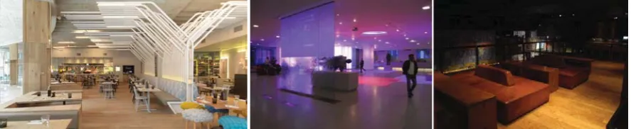
Figure 1: Three different semi-public interiors in the UK: restaurant (left), hotel lobby (middle) and bar (right).
Table 1: Four groups of colour terms category.
Groups Descriptions Examples
Cultural When the colour is used in the interior to depict a certain era or when the colour is inspired or used to show a cultural background.
x renaissance
x modern
Descriptive When a scientific colour term or name is used to describe a colour.
x hue
x shade Emotional When the colour is used in the design to
convey or leave a certain impact on users’ feelings.
x warm
x cosy
Functional When the colour is used in the space to create a specific effect such as to make the ceiling higher.
x deep
x enlarging
2.2 Interviews
A semi-structured individual interview approach was conducted to try to find out what designers really think, and to prevent designers impacting on each other (as in a focus group). A total of 15 designers were recruited from different cultural backgrounds, age groups, working experiences, and places of work around the Middle East. The duration of each interview was 45-120 minutes for each participant. Data were both qualitative and quantitative and in this study the focus will be on two of the fourteen interview questions, which are described in Sections 2.2.1 and 2.2.2.
2.2.1 Collecting terms
Name terms you always use in your daily design life/career describing colour choices/decisions/schemes?
2.2.2 Testing knowledge
What do you know about each given term/name. Summarise what you know about each? If not familiar cross the word out.
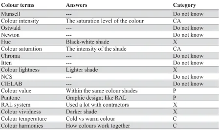
[image:3.595.83.534.347.613.2]Designers were given a sheet of seventeen colour terms (Table 2) and asked to write what they know about each. They were free to cross out what they believe they do not know. For each completed term the responses were categorised as being complete but with ambiguous description (CA), correct but incomplete (P), correct (C) or incorrect (X). Table 3 shows an example for one of the designer’s responses.
Table 2: Seventeen colour terms.
Munsell Colour intensity
Ostwald Newton Hue Colour
saturation
Chroma Itten Colour
lightness
NCS CIELAB Colour value
Pantone RAL system Colour
vividness
Colour temperature
Colour harmonies
Table 3: An example of colour terms answer sheets.
Colour terms Answers Category
Munsell --- Do not know
Colour intensity The saturation level of the colour CA
Ostwald --- Do not know
Newton --- Do not know
Hue Black-white shade X
Colour saturation The intensity of the shade CA
Chroma --- Do not know
Itten --- Do not know
Colour lightness Lighter shade X
NCS --- Do not know
CIELAB --- Do not know
Colour value Within the same colour shades P
Pantone Graphic design; like RAL P
RAL system Used a lot with contractors X
Colour vividness Darker shade X
Colour temperature Cold vs warm colour C
Colour harmonies How colours work together C
3. FINDINGS AND DISCUSSION
3.1 Collected terms
Table 4: Collected terms and their usage frequencies (terms with a frequency greater than 4 are highlighted yellow; terms with a frequency greater than 2 are highlighted grey).
accent 2 contrast 3 harmony 3 renaissance 1
achromatic 2 country 1 Honest 1 saturation 1
active 1 cozy 2 hue 3 shade 5
analogous 2 dark 1 maroon 1 shocking 1
armani beige 1 daylight 1 metallic 2 sophisticated 1
artificial 1 earth tones 3 modern 1 split complementary 1
babies 1 elegant 1 monochrome 4 stressful 1
beiges 1 family of colours 1 moody 1 strong 2
bold 2 fashionable 2 mustard 1 tetrad 1
bright 2 feminine 1 natural 5 tint 4
Brown-scale 1 fire 1 neutral 7 tone 2
champagne 1 flashy 2 office/formal 1 tone down 1
childish 1 fresh 1 pale 1 transparent 1
chroma 1 funky 3 pastel 6 trendy 2
classic 1 gipsy 1 posh 1 triad 1
colour scheme 3 green design 1 powerful 1 ultra bright / neon 1
comfort 1 grey-scale 1 pewter 1 value 2
complementary 3 Happy 1 refer to samples 1 warm/cool 10
contemporary 1 harmonies 1 relaxing 1 youth 1
3.2 Categorised terms
Table 5: Categorised terms in the Descriptive, Emotional, Cultural and Functional groups and their usage frequencies (terms with a frequency greater than 4 are highlighted yellow;
terms with a frequency greater than 2 are highlighted grey).
Descriptive Descriptive Emotional Cultural Functional accent 2 maroon 1 active 1 classic 1 comfort 1 achromatic 2 metallic 2 babies 1 contemporary 1 cozy 2 analogous 2 monochrome 4 bold 2 country 1 elegant 1 armani beige 1 mustard 1 childish 1 fashionable 2 feminine 1 artificial 1 natural 5 comfort 1 funky 3 fresh 1 beiges 1 neutral 7 cozy 2 gipsy 1 green design 1 bold 2 pale 1 elegant 1 modern 1 office/formal 1
bright 2 pastel 6 fresh 1 renaissance 1 sophisticated 1 brown-scale 1 pewter 1 funky 3 trendy 2
champagne 1 refer to samples 1 happy 1 youth 1 chroma 1 saturation 1 honest 1
colour scheme 3 shade 5 moody 1 complementary 3 strong 2 posh 1
dark 1 tetrad 1 powerful 1
earth tones 3 tint 4 relaxing 1 family of colours 1 tone 2 shocking 1 fire 1 tone down 1 sophisticated 1 flashy 2 trasparent 1 stressful 1 grey-scale 1 triad 1 strong 2
harmonious 1 ultra bright /
neon 1 warm/cool
1 0
[image:4.595.57.523.433.737.2]54% of the filtered terms were categorised as descriptive according to Table 1. Table 5 summarises the categorised terms. All the fifteen designers included descriptive terms. Functional terms such as green design and formal were mentioned the least (10% of the terms were categorised as functional). 24% of the terms were categorised as emotional and 12% as cultural. 44 terms were descriptive, 20 were emotional, 10 were cultural, and 8 were functional. Some terms were put in more than a category, for example: bold, warm/cool, and strong can be both descriptive and emotional.
[image:5.595.80.537.284.548.2]3.3 Technical colour terms
Table 6 shows the seventeen colour terms and a summary of the frequency responses in each of the categories: complete but with ambiguous description (CA), correct but incomplete (P), correct (C) and incorrect (X).
Table 6: Summary of responses from technical colour terms.
Colour terms CA P C X Do not know
Munsell 0 2 3 0 10
Colour intensity 9 0 0 5 1
Ostwald 0 1 1 0 13
Newton 0 2 2 2 9
Hue 0 0 5 6 1
Colour saturation 6 0 0 6 0
Chroma 1 0 0 2 9
Itten 0 1 1 0 13
Colour lightness 1 4 1 9 0
NCS 0 0 0 0 15
CIELAB 0 0 0 1 14
Colour value 0 3 3 4 5
Pantone 0 1 5 3 6
RAL system 0 0 3 1 11
Colour vividness 1 1 1 5 7
Colour temperature 0 0 12 2 1
Colour harmonies 0 0 13 0 2
As shown in Table 6, the terms that received the most correct responses were colour temperature (12 out of 15) and colour harmonies (13 out of 15). Most other terms wee poorly understood. The least known terms were: NCS, CIELAB, Itten and Ostwald (15, 14, 13 and 13, respectively, out of 15 do not know). Ambiguity was shown mainly between colour saturation and intensity.
4. CONCLUSIONS
Paterson (2003) suggested that any attempt to define or describe colour by means of words is doomed to failure; whereas we believe that an efficient verbal communication and knowledge on colour can result in better interior setups consequently. Although some of the colour terms in this study (such as Itten, Ostwald and Newton) may not have an impact on the colour choices in the design process, and indeed we previously found that most of these designers prefer to get inspired when thinking of the colours than sticking to a theory (Attiah et al, 2014), good technical knowledge on precise colour descriptions such as intensity, saturation and hue will enable effective colour communications. This study led us to rethink if designers’ knowledge needs to be rethought of in the region, and if we can suggest a framework for designers for better colour and design discussions using the resulted categories (Table 2). A future study can include comparing Middle-East participants’ results and Western designers’ (for example, in the UK and USA).
ACKNOWLEDGEMENTS
We would like to thank the designers as the results of this study would not be possible without their dedicated time for the interviews.
REFERENCES
Attiah, D.Y., Cheung, V., Bromilow, D. and Westland, S. 2014. Colour planning in the interior design process, Proceedings of The Second Conference of Asia Color Association, 187-191, Taipei, Taiwan.
Coates, M., Brooker, G. and Stone, S. 2009. The Visual Dictionary of Interior Architecture and Design. AVA publishing.
Paterson, I. 2003. A Dictionary of Colour. Thorogood publishing Ltd.
Address: Douha Attiah, School of Design, University of Leeds, Leeds LS2 9JT, UK E-mails:[email protected],[email protected],