City, University of London Institutional Repository
Citation
:
Dove, G. and Jones, S. (2014). Using Data to Stimulate Creative Thinking in the
Design of New Products and Services. Paper presented at the ACM Designing Interactive
Systems 2014, 21-06-2014 - 25-06-2014, Vancouver, Canada.
This is the unspecified version of the paper.
This version of the publication may differ from the final published
version.
Permanent repository link: http://openaccess.city.ac.uk/3761/
Link to published version
:
Copyright and reuse:
City Research Online aims to make research
outputs of City, University of London available to a wider audience.
Copyright and Moral Rights remain with the author(s) and/or copyright
holders. URLs from City Research Online may be freely distributed and
linked to.
City Research Online:
http://openaccess.city.ac.uk/
[email protected]
Using Data to Stimulate Creative Thinking in the Design of
New Products and Services
Graham Dove
Centre for HCI Design
City University London
[email protected]
Sara Jones
Centre for Creativity in Professional Practice
City University London
[email protected]
ABSTRACT
Exploring interactive visualizations of data generated within the domain for which new products and services are to be designed can play a useful role in stimulating ideas that are considered highly appropriate to that domain. We describe a study in which participants in four collaborative design workshops used information visualizations representing electricity consumption data to help generate ideas for new products and services that could utilise the data generated by a smart home. Participants in the workshops appeared to use sensemaking behaviour to develop insights about the domain, which were later used in generating new ideas. Ideas arising from workshops where the stimulus was data visualized with less ambiguity in the visual encoding were judged to be significantly more appropriate than those from workshops where ambiguity in the visual encoding of the data used as stimulus was intentionally increased. We discuss the implications of this with regards to designing future workshop activities.
Author Keywords
Information visualization; creativity support; collaborative workshop technique.
ACM Classification Keywords
H.5.2. [Information interfaces and presentation]: User Interfaces, User-centered design, Theory and methods
INTRODUCTION
It has been argued in previous work that domain relevant data can have a useful role to play in stimulating stakeholder creativity in early stage design workshops, and that visualizations of such data can play an important part in this [10, 9, 11]. In this paper, we begin by presenting a brief review of the theoretical underpinnings for work in this field by considering literature in three related areas. We then report an initial study, involving four collaborative design workshops, which aimed to investigate a key issue in
relation to the style of information visualization that might most effectively be used in implementing such an approach. The results from this study, including an analysis of both the activity during the workshops and the outputs they generated, provide some support for our conjectures regarding the processes likely to be involved in what is a valuable new technique designers can employ to research future users’ requirements and desires.
BACKGROUND AND MOTIVATION
Stakeholder creativity in early stage design workshops
Design is an inherently creative process, but without deliberate attempts to stimulate creative thinking, current approaches to user-centred design may inadvertently focus on refinement of existing concepts, rather than developing more radical ideas. In our work, we aim to address Norman’s criticism that current user-centred methods do not lead to major design enhancements [27] by introducing deliberate creativity techniques to stimulate creative thinking when eliciting ideas for design from stakeholder representatives.
According to one well-accepted definition, ‘Creativity is the ability to produce work that is both novel (i.e. original, unexpected) and appropriate (i.e. useful, adaptive concerning task constraints)’ [36]. Maiden et al [24] have discussed how creativity workshops in which a range of stakeholder representatives undertake activities using techniques such as constraint removal, brainstorming with creativity triggers and analogical reasoning can prompt participants to generate important ideas for requirements that are considered both novel and appropriate, and that may otherwise remain unexpressed. Jones et al [21] report on a workshop in a similar style that encouraged participants to brainstorm with creativity triggers, generate new ideas by removing constraints, and combine ideas about problems or requirements with other ideas about the application of new technologies; and Sustar et al [37] used similar techniques in workshops involving designers and older people in the design of digital devices.
These approaches to the use of deliberate creativity in early stage design have based their work on various models of the creative process. For example, Maiden et al [24] used methods derived from, and structured according to, models proposed by Osborn [20], Wallas [42] and Boden [2]. There are many such models, a summary of which can be found in [23]. Perhaps the most frequently referred to is the four Permission to make digital or hard copies of all or part of this work for
personal or classroom use is granted without fee provided that copies are not made or distributed for profit or commercial advantage and that copies bear this notice and the full citation on the first page. Copyrights for components of this work owned by others than ACM must be honored. Abstracting with credit is permitted. To copy otherwise, or republish, to post on servers or to redistribute to lists, requires prior specific permission and/or a fee.
stage model arising from work such as that of Wallas [42], which identifies the stages of preparation, including preliminary problem analysis and definition; incubation, in which associations are unconsciously developed in the mind of the problem solver(s); illumination, or idea generation; and verification, or conscious evaluation and refinement of ideas. All models of the creative process include one or more stages in which ideas are generated, and it is at these stages that most effort on creativity support has so far been concentrated. Most models also include reference to one or more preparatory stages. For example, Lubart [23] characterizes the preparatory phase as one in which “relevant information is gathered and preliminary ideas are advanced” while Treffinger [38] describes processes of mess finding, data finding (through information search), and problem finding. Here we focus on the way in which support can be provided during these preparatory stages, in order to effectively stimulate the generation of new ideas later in the creative process.
Using data to stimulate creative thinking
The amount of data we generate annually has grown exponentially, from 150 exabytes in 2005 to 1200 exabytes in 2010 [18]. This suggests that important opportunities may be available if these data sources can be exploited effectively. One way of capitalizing on this increased availability is by visualizing these data and utilising human perceptual capabilities and visual cognition skills to understand, explore and gain insights into that data. Cybulski et al [7] provide an overview of previous work describing how interactive visual analytics is a process of digital creativity that utilizes data for problem solving and decision-making amongst expert data analysts.
In our work, we look to explore data with stakeholders who are not necessarily expert analysts, helping both them and us to develop a better understanding of the context for which new systems are to be designed. We do this within workshop activities as part of the preparation stage of the creative process, described above, and with the aim of generating insight that can later be used to inspire new ideas for products and services. Interactive information visualization has been shown to be an effective method of making data more accessible and engaging to a public audience [44]. It is also one of the transformational tools and technologies identified by Shneiderman as being generators of excellence suitable for supporting creativity and innovation [34]. In particular he highlights the opportunities that information visualization provides for comparing alternatives thoroughly and rapidly by coding with visual variables such as colour and size; using computational power to filter or refine dynamically; and then utilising human perceptual skills to identify patterns, trends or outliers and gain insight.
Many approaches to information visualization design view it as an exercise in using graphical representations to amplify analytical cognition. Kosara [22] has used the term
pragmatic visualization to describe this style of design. Here the work of Tufte [39] has been influential with his call for “clarity, precision and efficiency” to “avoid distorting what the data have to say” and his statement that “[c]lear, detailed and thorough labeling should be used to defeat graphical distortion and ambiguity”. Similarly, Few [14] places an emphasis on clearly communicating precisely the data that is represented. In recent years, however, both the computational power available and the number of different ways in which researchers have used this in supporting information visualization have grown rapidly. There are now many possible ways of representing the same sets of data.
As the range of activities information visualization is employed to support has expanded, new styles of visualisation design have emerged. Pousman et al [31] describe a class of casual information visualization
characterised as being non-work related, with a user base not necessarily expert in analytical thinking. Here they describe visualizations that support peripheral or ambient information seeking, social data analysis and data art. Both Viégas and Wattenberg [41] and Kosara [22] use artistic visualization as a classifier, describing the use of visualization techniques to express a particular, contextualized viewpoint or evoke deep emotional or intellectual responses. Finally, Manovich [25] notes that any mapping between data and representation is potentially arbitrary, arguing therefore that information visualization techniques might be employed to display the ambiguity inherent in experience.
The role of ambiguity in creative thinking
For us, the notion of ambiguity in visual representation is of particular interest, due to frequent associations between the concepts of ambiguity and creativity. There are several lines of work that suggest the use of ambiguous stimuli may in some way be associated with high degrees of creativity.
A high tolerance of ambiguity is a trait that has been shown to be associated with creative personalities, being recognized as such in Guilford’s [16] foundational research. Vernon [40] considered it to be a necessary condition for creative personalities because it permits individuals to be satisfied with partial or sub-optimal solutions to complex problems. Sternberg & Lubart [35] suggest that a tolerance of ambiguity enables people to remain open and continue working through complex situations longer, thereby increasing the probability that they will discover a novel solution, and Zenasni et al [47] have demonstrated the relationship empirically.
cultural probes used to capture creative feedback from stakeholders during design research. Cruz and Gaudron [6] also employ ambiguity in their Open-ended objects, which, in a similar fashion to our use of information visualization, they employ as a preparatory tool in design workshops. In addition to this, many practitioner-oriented and commercial approaches to applied creativity, especially those used in design, urge followers to be comfortable with ambiguity in their own creative thinking, and to experiment playfully with the many possibilities it can present [13,3,19].
Therefore, as part of our investigation into the role of information visualization in stimulating creative thinking, we were interested to know whether it would be more productive to employ visualizations, which aim to clearly communicate precisely the data that is represented and are designed with a less ambiguous visual encoding, or whether the use of more ambiguous stimuli, where one representation could have several possible interpretations, would support greater creativity in the ideas our workshops’ participants generated.
STUDY DESIGN
To investigate the way in which visualizing domain relevant data supports creative thinking, and whether the degree of ambiguity in the visualizations of data that we provide as stimuli in workshops has an effect on our participants’ ability to gain insight from these data and then generate creative ideas, we designed a simple study. This study consisted of four workshops, each with three participants, where the objective was to generate ideas for new products or services that could utilise the energy data generated by a smart home to benefit its occupants in a future scenario where variable electricity pricing has been introduced. In each workshop participants undertook two rounds of identical idea generation activities, each round using a different style of information visualization as stimulus. We therefore had two conditions under investigation:
Idea generation with stimulation provided by an information visualization designed with a less ambiguous visual encoding (IV1).
Idea generation with stimulation provided by an information visualization in which ambiguity in the visual encoding is intentionally increased (IV2).
Participants
Twelve participants were recruited from City University London’s School of Informatics and School of Engineering and Mathematical Sciences. Seven participants were female and five male. Ten were in the age range 25-34 and two were in the age range 45-54. Participants of different ages, gender and experience were evenly distributed across each workshop.
Information visualization design
Both styles of information visualization used in this study were custom designed for the purpose. The data visualized
[image:4.612.316.558.172.477.2]was randomly selected from a set of anonymised electricity consumption data generated by the smart plugs and smart meters deployed in a test-bed of one hundred and thirty households that make up a long-term technology trial in Milton Keynes, UK. These represent consumption records for selected appliances named by the household (e.g. refrigerator or T.V.), and for total electricity consumption, all generated at three-minute intervals. The same data are represented in both visualizations.
Figure 1: Screenshot of IV1 showing total electricity consumption in kWh for Monday
Figure 2: Screenshot of IV1 showing the cost of the household's washing machine use on Thursday
[image:4.612.318.558.176.299.2]machine from the appliances list towards the bottom, Thursday from the days towards the top and the cost as a unit of measure (see Figure 2) will update each element of the visualization to reflect the corresponding data values.
[image:5.612.71.280.255.576.2]IV2 (Figure 3) was designed so that ambiguity in the visual encoding, that is the mapping between data and representation, was intentionally increased. We aimed to introduce a level of abstraction that provided a class of possible interpretations and gave participants multiple options for exploration. In IV2 we replaced the familiar linear timeline with a grid-based representation of the 24 hours in a day but retained the use of a bubble chart representation of energy consumption. This hinted at consumption within a given period of time but was equally open to alternative interpretations.
Figure 3: Screenshot of IV2 showing total electricity consumption for Monday in kWh
Figure 4: Screenshot of IV2 showing the cost of the household's washing machine use on Thursday
With IV2 we avoided using textual or numerical labels that would define visual items and used abstract symbols to represent the interactive features that control how the data are filtered. Here the pentagons represent different appliances, the stars days and the triangles are used to switch between units of measure. We used abstract symbols because they retain the ability to suggest similarity groupings without using textual labeling or explanation. This follows our understanding of visual variables [1] and
Gestalt principles of visual perception [45]. IV2 can be viewed online at www.dadc.co.uk/eon/infovis2.html. Again the information visualization interface is interactive. Selecting the abstract interface elements representing the day, appliance type and unit of measure updates the whole visualization to reflect new data values (Figure 4).
Workshop activities
Activity 1: Initial inspirations
The concept of control had been identified in earlier project research as being important in engaging customers with smart home energy technologies. As an initial preparatory activity, lasting approximately 25 minutes, participants were presented with a number of definitions of and synonyms for control and then asked to brainstorm ideas for people or things that exert control. We gave two examples to illustrate what was required:
A conductor controls an orchestra Traffic lights control the flow of vehicles
Activity 2: Generating insights about the domain
In a second activity, also part of the preparation stage, participants collaboratively explored one information visualization interface. They were asked to capture any insights, observations or aspects they thought important or found interesting on individual post-it notes. This activity typically lasted approximately 25 minutes. To encourage participants’ insight seeking during this activity, they were asked to consider the following five questions:
‘What do you see?’
‘What do you think it is for?’
‘What are you thinking whilst you explore?’ ‘What do you notice in the visualization?’ ‘What story does it tell?’
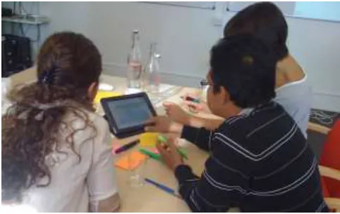
[image:5.612.67.284.257.398.2]Figure 5: Participants interacting with the information visualization during Activity 2
After a short break and refreshments, participants were asked to repeat Activity 2 using the second information visualization interface, and then to repeat Activity 3, combining the outputs of Activity 1 with those generated in the second instantiation of Activity 2. An example workshop structure was therefore as follows:
1.Activity 1
2.Activity 2: using IV1
3.Activity 3: outputs from Activity 1 combined with insights gained from IV1
4.Break and refreshments
5.Activity 2: using IV2
6.Activity 3: outputs from Activity 1 combined with insights gained from IV2
The order in which the information visualizations were used was counterbalanced, so that in two of the four workshops participants explored IV2 first and IV1 second.
EVALUATION AND DATA ANALYSIS
Effectiveness of support for creative thinking
To evaluate the effectiveness of our approach to stimulating creative thinking under each condition of interest, we analyzed the ideas generated during each instance of Activity 3 in two ways. First, we counted the number of ideas generated to give a measure of fluency, an important attribute of creative thinking [17]. Second, these ideas were transcribed, collated and their order randomized. They were then presented to three separate domain experts who were asked to rate each idea from 0 to 5 for novelty, based on their understanding of how new the idea was to the domain of smart home energy. The same domain experts were also asked to rate each idea from 0 to 5 for appropriateness, based on the their view of the idea’s usefulness within this domain and it’s fit to the workshops’ objective. This evaluation follows Sternberg and Lubart’s [36] definition of creativity in terms of novelty and appropriateness, described earlier, and an approach to evaluation outlined in Dean et al [8]and previously used in Jones et al [21].
Stakeholder perceptions of support for creative thinking
We were also interested in the extent to which participants felt their creative thinking was supported during the workshop by our use of information visualization and other techniques. We therefore asked participants to complete a short questionnaire at the end of each idea generation activity (Activity 3). The questionnaire included 7 questions. Four of these were derived from the Creativity Support Index [5], and concerned the extent to which the visualization and other aspects of the workshop supported various aspects of the creative process. The remaining three were concerned with the extent to which the visualizations supported insight seeking during the second workshop activity, and were derived from work describing how users gain insight from information visualization by Yi et al [46] and North [28]. Responses to all questions were collected using a Likert scale rating from 1 strongly agree to 5 strongly disagree. The questions were as follows:
Q1: I was very engaged and absorbed using the visualization. I enjoyed it and would do it again.
Q2: I was prompted to generate ideas that were new and varied.
Q3: I was able to work together with others easily. Q4: I felt able to explore many different options, ideas or
outcomes.
Q5: I could easily identify relationships and patterns in the data that contributed to new ideas.
Q6: It was easy for me to gain an overview of the data using the visualization.
Q7: I was able to combine my existing knowledge with insights from exploring the visualization to generate ideas that I had not previously considered.
Generation of insights into the domain
[image:6.612.53.294.60.212.2]participants’ new insights. On this basis, we identified four distinct categories of insights and observations:
Data Insight (DI): An insight gained into the underlying data. In sensemaking this would be the point where investigating a schema produced new insight.
Data Hypothesis or Question (DQ): An hypothesis or question about what the data being visualized represent. In sensemaking this is where schema are being instantiated, manipulated and investigated.
Observation About Use (OU): A suggestion for a context in which the visualization would be useful or an observation about its purpose. In sensemaking this is the initial search for useful mental representations.
Observation About the Interface (OI): A statement, comment, question or criticism of some part of the visualization’s interface or interactions. In sensemaking this is the initial search for useful mental representations. Finally, video data was used to identify how participants’ sensemaking activities progressed using each visualization. In each workshop, we analyzed the conversation and activity surrounding periods where participants were interacting with the information visualizations during each round of Activity 2. Here we used a thematic analysis technique [4], based on the coding scheme described above.
RESULTS
Effectiveness of support for creative thinking
When comparing quantitative results from the different conditions of interest, we adopted the following approach. First we used Levene’s test of equality of variance, followed by the relevant Student’s or Welch’s t-test and finally Cohen’s d measure of effect size for those results that were significant. We can see that participants were able to generate design ideas in both conditions (see Table 1), and that there was no significant difference in the number of ideas generated (p = 0.697). There was also no significant difference (p = 0.525) between the two conditions in the novelty of ideas generated (see Table 2 for mean and standard deviation).
Workshop IV1 IV2
WS1 16 14
WS2 23 24
WS3 14 12
WS4 14 11
[image:7.612.310.557.60.178.2]Combined 67 61
Table 1: Number of Ideas Generated
Workshop IV1 IV2
WS1 M=2.98, SD=0.70 M=3.00, SD=1.17
WS2 M=2.68, SD=1.10 M=3.24, SD=0.90
WS3 M=2.71, SD=0.43 M=1.83, SD=0.75
WS4 M=2.19, SD=1.17 M=1.79, SD=1.20
[image:7.612.312.562.199.314.2]Combined M=2.66, SD=0.94 M=2.64, SD=1.18
Table 2: Average Novelty Rating for Ideas Generated
Workshop IV1 IV2
WS1 M=3.48, SD= 0.94 M=2.98, SD=1.10
WS2 M=2.20, SD=1.15 M=2.53, SD=1.02
WS3 M=3.52, SD: 0.84 M=1.92, SD=1.44
WS4 M=2.31, SD=1.42 M=1.76, SD=1.35
Combined M=2.81, SD=1.26 M=2.37, SD=1.24
Table 3: Average Appropriateness Rating for Ideas Generated
However, there was a significant difference in the appropriateness of ideas generated (see Table 3 for mean and standard deviation), with ideas generated following preparation using the more ambiguous information visualization being judged significantly less appropriate for use in the energy domain than those generated using the less ambiguous design (p = 0.026, effect size = 0.347). To investigate this effect further, we turned to the data from our questionnaire.
Stakeholder perceptions of support for creative thinking
Perceptions of the general level of support for idea generation appear to be unaffected by the difference in the two conditions. There was no significant difference in responses to questions 2 - ‘I was prompted to generate
ideas that were new and varied’ - (p = 0.193) or 4 – ‘I felt
able to explore many different options, ideas or outcomes’ - (p = 0.244). In answers to question 3 - ‘I was able to work
together with others easily’ - there was no evidence that the difference in visualization style affected participants’ perceptions of the support for collaboration (p = 0.25).
[image:7.612.49.297.538.654.2]Generation of insights into the domain
The differences identified above can be further understood by considering the numbers of outputs of different types that were generated in the insight seeking activity (Activity 2) using the two different information visualizations (see Table 4). We found that increasing the ambiguity of the visual encoding had a negative impact on the number of observations generated during Activity 2 that were subsequently categorized as DI Data Insight (p = 0.019, effect size = 1.884). There was no significant difference in the number of outputs categorized as DQData Hypothesis or Question (p = 0.723), OU Observation About Use (p = 0.426) and OIObservation About the Interface (p = 0.113).
Observation Type IV1 IV2
DI 21 6
DQ 6 9
OU 7 3
OI 32 58
Table 4: Number of Categorized Outputs from Activity 2
Analysis of the video data further shows that participants discuss Data Insight (DI) more frequently whilst using the less ambiguous visualization (IV1). This indicates that their sensemaking is more successful in this condition. Conversely, when using the visualization in which ambiguity was intentionally increased (IV2), participants spent the largest proportion of their conversation on
Observation About the Interface (OI). In sensemaking terms, they were focused on searching for useful mental representations of the available information and not creating and manipulating the schema that might lead to their gaining insight.
A conversation from WS4 (Table 5) demonstrates the difficulties participants encountered using IV2. Their concerns remain concentrated on a series of Observation About the Interface (OI) comments with a single instance of
Miscellaneous Comment (MC), a category introduced during analysis to denote general comments that continue the conversation without applying directly to participants insight seeking or sensemaking processes. In this instance the sensemaking process does not reach a conclusion as participants struggle to turn the visualized information into useful mental representations of the underlying data.
By contrast, in Table 6 we see a conversation taking place when the same participants were using IV1. This demonstrates how the sensemaking process can reach a successful conclusion with participants sharing a new insight relating to the context of the energy use the data represent. In this conversation, we see a series of Data Hypothesis or Question (DQ) comments interspersed with
Miscellaneous Comments (MC). This indicates that participants have formed mental representations and created
schema relating to the information in the data underlying the visualization and that these schema are being investigated, re-framed and manipulated as they search for a Data Insight (DI). This we see at the end when they confirm that the data relates to a single household.
P3: What happens when you try that? You were going up that one? You were just going up like this…
OI
P3: So how many? OI
P1: It’s not really clear MC
P3: It’s 5 across here, 4 up and down OI
P2: These or these? OI
P1: Shall I see what this one? OI
P3: That is… What does it do? OI
[image:8.612.314.560.125.678.2]P1: More circles and less circles… OI
Table 5: Transcript of Sensemaking Using IV2 in WS4
P2: And this is washing machine. What does it look like? And there is nothing...
DQ
P3: Oh but that's on a Monday DQ
P1: If it's on Tuesday... DQ
P1: Yeah so people doing their... MC
P3: So who is doing their washing when? DQ
P1: On Thursday people are washing their... DQ
P2: And on Sunday. DQ
P1: Thursday and Sunday DQ
P3: Oh! You never do washing on a Sunday MC
P2: And dishwasher... on Saturday only in the morning ... on Friday.... Thursday no dishwashers… and on Wednesday…
DQ
P1: It’s at midnight. DQ
P3: Oh. Is this one persons consumption? Do you think? Because they didn't do anything on those days. What about fridge-freezer? That one's continually on... So does that one have something on every day? Yes.
DQ
P3: So something like that that's constantly plugged in is running throughout.
DQ
P1: Yes and if we see the fridge... the circles are almost the same
DQ
P3: So this is one person's consumption for a week and that's what the circle stands for.
DI
Our final investigation into the role of visualized data in supporting insight-seeking that can lead to creative ideas for new products and services involved attempting to trace the origins of some of the most appropriate ideas that emerged from each of the workshops. The idea that was scored most highly for appropriateness, with a score of 4.66 out of 5, was a suggestion to install a microcontroller into fridges so that their energy consumption could be regulated away from peak hours. This was recorded with the post-it headline “Microcontroller to Fridge Energy Consumption”.
When we look at the outputs from Activity 1 in this workshop we see that a microcontroller is listed as a thing that exerts control. The observations included in the outputs from Activity 2, when using IV1 in this workshop, include the Data Insight “Fridge Is Almost Stable Consumption For Every Day”. This reflects the conversations participants had around fridge consumption during Activity 2, some of which is shown in Table 6. From this, and from the explanation of the idea given to camera, it seems plausible to suggest that the Data Insight gained exploring the visualized data contributed to the idea generated during the combinational creativity in Activity 3. Investigations of other appropriate ideas have revealed similar histories.
DISCUSSION
We have seen from our study that ideas for new products and services that are highly appropriate to the domain for which they are intended can be generated in creative design workshops that use visualizations of domain relevant data to help participants prepare for ideation. We have also seen that increasing ambiguity in the visualization participants explored to understand the context of the design problem had a negative impact on creative performance, in particular with respect to the appropriateness of ideas generated. This may not be surprising in light of previous work in the field of information visualization. However, it is not a subject that to our knowledge has been addressed experimentally before and our study provides both some empirical evidence, and a potential explanation for the effects observed. In turn, this has helped us better understand the role information visualization can play in stimulating stakeholder creativity during early stage design workshops, and also how we should design activities in which information visualization is used as a creative stimulus. We should be wary, in the preparation stage at least, of intentionally increasing the ambiguity employed in information visualization design. Rather, we might design workshop activities that include other creativity techniques to exploit the ambiguity inherent in the data itself; in the design context from which the data are taken; and in the different interpretations that participants’ personal experiences, knowledge and viewpoints suggest.
In a more recent study [12], we have attempted to exploit ambiguity by combining the informal analytical work participants undertake using information visualization with intuitive activities that involve wishful thinking and
generative creativity. This follows Miller’s classification of deliberate creativity techniques on a continuum from those that are analytically dominant to those that are intuitively dominant [26]. The analytically dominant use structure to generate logical patterns of thought, for example, asking the classic journalist or detective 5Ws&H questions “Who
What Why Where When and How”. The intuitively dominant techniques, such as Wishful Thinking, are more likely to arrive at solutions in a single step or without following a particular sequence. Generative activities, such as those demonstrated by Sanders [33], where ambiguity has been shown to have a positive impact on participant creativity would fall into the intuitively dominant class as they utilise both wishful thinking and imaging.
This time, participants were asked to explore a visualization designed in a style similar to the visualization IV1 described in this paper, and use the insights they gained to develop an imaginary description of the type of household that might have generated the energy consumption data being represented. This description was realised in the form of a large collage created using a combination of photographs and other types of ambiguous stimuli such as paper shapes. The insights gained were used to inform and guide later design activities.
Returning to the study reported here, given that the data represented were the same and that large elements of the colour scheme were consistent across both visualizations, we might expect those groups given IV1 first to have been more successful in their sensemaking when subsequently using IV2. This, however does not appear to be the case. We actually found very little evidence of ordering or learning effects in this study, indicating perhaps that there are other factors in play that limit participants’ use of visual variables to retain knowledge. This is clearly an area for further investigation and one that potentially has wider implications for visualization design.
Another factor that we might expect to be influential in a small study such as this are differences between workshop groups. WS2 generated more ideas than any other group but like the others, a similar number in each condition. Also, WS2’s mean idea rating was higher for both novelty and appropriateness using IV2 than IV1. This was unlike other groups. However, their questionnaire scores were consistent with those of other groups. Therefore, whilst group differences can affect studies such as this, further investigation is needed to understand what those effects are. This is something we should be aware of in future studies.
the single iPad appeared to successfully support collaborative creativity. In addition, sharing a single iPad helped facilitate our analysis of participants’ conversation during Activity 2. However, because these factors have been noted in other studies, for examples see [43], they should remain an area for future investigation.
FUTURE WORK
Our work understanding how to exploit the growing amounts of domain relevant data to stimulate creativity in user-centred design is in its early stages and there remain a large number of outstanding questions we could fruitfully explore. In particular we need to investigate the factors that will lead to ideas that are judged to be significantly more novel as well as significantly more appropriate. We will also continue to investigate the effects that manipulating different dimensions of information visualization design have on stimulating creative thinking. Areas to investigate here include varying the degree of interactivity in visualization design; comparing visualizations that employ narrative for guided storytelling with those that are more exploratory; and comparing individual data exploration with collaborative use of visualizations.
In order to investigate the effectiveness of the insights and ideas generated using information visualizations through the whole of a design project we should also undertake a more longitudinal case study. Here we will more effectively be able to separate preparation and idea generation stages of creativity and gain a better understanding of how the ideas and insights gained from data can develop with longer incubation periods. In this way we might demonstrate the relative depth of different insights gained. A longitudinal study would also give us the opportunity to study how we can use information visualization in the idea selection and evaluation or verification stages of creativity and design.
Finally, we believe there should be ways in which increased ambiguity in information visualization design could be exploited more effectively in the context of creative design activities. The space for multiple interpretations that ambiguity offers might require more effective facilitation and more structured workshop activities than we offered in this study. Perhaps, for instance, explicitly requiring participants to work with each of the possible interpretations they make with regards to the visualized data would be effective as part of an exercise in transformational creativity [2].
ACKNOWLEDGEMENTS
The authors would like to acknowledge the support and funding provided for this research through E.ON AG International Research Initiative (IRI) 2012.
REFERENCES
1. Bertin, J. (2011). Semiology of graphics: diagrams, networks, maps. Esri Press.
2. Boden, M. A., (2004). The creative mind: Myths and mechanism. Psychology Press.
3. Brady, S., (2012), Tolerance for Ambiguity, Prism Decision Systems, Online
http://www.prismdecision.com/tolerance-for-ambiguity
4. Braun, V., & Clarke, V. (2006). Using thematic analysis in psychology. Qualitative research in psychology, 3(2), 77-101.
5. Carroll E.A, Latulipe C., Fung R., Terry M., (2009) Creativity Factor Evaluation: Towards a Standardized Survey Metric for Creativity Support. In Proc. C&C ‘09, ACM, 127-136
6. Cruz, V., & Gaudron, N. (2010). Open-ended objects: a tool for brainstorming. In Proc. DIS ’10, 85-88. ACM. 7. Cybulski, J. L., Keller, S., Nguyen, L., & Saundage, D. (2013). Creative problem solving in digital space using visual analytics. Computers in Human Behavior. 8. Dean, D. L., Hender, J. M., Rodgers, T. L. and Santanen,
E. L., (2006) Identifying Quality, Novel, and Creative Ideas: Constructs and Scales for Idea Evaluation. In Journal of the Association for Information Systems, 7, 10, 646-699
9. Dove, G. (2012). Visualizing Perspectives for Creative Collaboration. Doctoral Consortium DIS ’12 available at http://openaccess.city.ac.uk/1133/
10. Dove, G., & Jones, S. (2012). Narrative visualization: sharing insights into complex data, In Proc Interfaces and Human Computer Interaction (IHCI 2012) available
http://iadisportal.org/digital-library/narrative-visualization-sharing-insights-into-complex-data
11. Dove, G., Jones, S., Dykes, J., Brown, A., & Duffy, A. (2013). Using data visualization in creativity workshops: a new tool in the designer's kit. In Proceedings of the 9th ACM Conference on Creativity & Cognition, 304-307. ACM.
12. Dove, G., & Jones, S., (2014). Using Information Visualization to Support Creativity in Service Design Workshops, To Appear In Proc ServDes 2014
13. Duggan, M., (2013). Tolerating Ambiguity,
knowinnovation, Online
http://knowinnovation.com/tolerating-ambiguity/
14. Few, S., (2009) Now You See It. Analytics Press 15. Gaver, W., & Dunne, A. (1999). Projected realities:
conceptual design for cultural effect. In Proc. CHI’99, 600-607. ACM.
16. Guilford J.P., (1957) Creative abilities in the arts. Psychological Review. 64(2), (pp. 110-118).
17. Guilford, J. P. (1966). Measurement and creativity.
Theory into practice, 5(4), 185-189.
19. IDEO, (2013), Online, http://www.ideo.com/life-at-ideo/item/through-the-fog
20. Isaksen, S. G., & Dorval, K. B. (1993). Toward an improved understanding of creativity within people: The level-style distinction. Understanding and recognizing creativity: The emergence of a discipline, 299-330. 21. Jones, S., Lynch, P., Maiden, N., & Lindstaedt, S.
(2008). Use and influence of creative ideas and requirements for a work-integrated learning system. In
Proc. RE'08. (289-294). IEEE.
22. Kosara, R. (2007). Visualization criticism-the missing link between information visualization and art. In Proc IV'07, 631-636. IEEE.
23. Lubart, T. I. (2001). Models of the creative process: Past, present and future. Creativity Research Journal,
13(3-4), 295-308.
24. Maiden, N., Gizikis, A., & Robertson, S. (2004). Provoking creativity: Imagine what your requirements could be like. Software, IEEE, 21(5), 68-75.
25. Manovich, L. (2002). The anti-sublime ideal in data art.
Manovich.net. Online, http://manovich.net/articles.php 26. Miller, W. C. (1987). The creative edge: Fostering
innovation where you work. Reading, MA: Addison-Wesley.
27. Norman, D. A. (2010). Technology first, needs last: the research-product gulf. interactions, 17(2), 38-42. 28. North, C., (2006) Towards Measuring Visualization
Insight, Computer Graphics and Applications, IEEE
26,3 6-9
29. Poincaré, H. (1913). The foundations of science: Science and hypothesis, the value of science, science and method (Vol. 1). Science Press.
30. Pirolli, P., & Card, S. (2005). The sensemaking process and leverage points for analyst technology as identified through cognitive task analysis. In Proceedings of International Conference on Intelligence Analysis (Vol. 5), 2-4.
31. Pousman, Z., Stasko, J. T., & Mateas, M. (2007). Casual information visualization: Depictions of data in everyday life. Visualization and Computer Graphics, IEEE Transactions on, 13(6), 1145-1152.
32. Russell, D. M., Stefik, M. J., Pirolli, P., & Card, S. K. (1993). The cost structure of sensemaking. In
Proceedings CHI'93, 269-276. ACM.
33. Sanders E.B.N, (2005). Information, Inspiration and Co-creation. In Proc. 6th International Conference of the European Academy of Design.
34. Shneiderman, B., (2001) Supporting creativity with advanced information-abundant user interfaces.
Frontiers of human-centered computing, online communities and virtual environments. Springer London, pp.469-480.
35. Sternberg, R. J., & Lubart, T. I. (1995). Defying the crowd: Cultivating creativity in a culture of conformity.
New York: Free Press.
36. Sternberg, R. J. & Lubart, T. I. (1999) The Concept of Creativity: Prospects and Paradigms, in Handbook of Creativity, R. J. Sternberg (ed), Cambridge University Press.
37. Sustar, H, Jones, S. and Dearden, A. (2013). Older People as Equal Partners in Creative Design. Human Factors in Computing and Informatics. Springer Berlin Heidelberg. 649-656.
38. Treffinger, D. J. (1995). Creative problem solving: Overview and educational implications. Educational Psychology Review, 7, 301–312
39. Tufte, E. R. (1983). The visual display of quantitative information. Graphics Press, Cheshire, CT
40. Vernon, P. E. (1970). Creativity: selected readings. Penguin, Middlesex
41. Viégas, F. B., & Wattenberg, M. (2007). Artistic data visualization: Beyond visual analytics. In Online Communities and Social Computing, 182-191 42. Wallas, G. (1926) The Art of Thought. New York,
Harcourt Brace.
43. Warr, A., & O'Neill, E. (2005) Understanding Design as a Social Creative Process. In Proc. ACM C&C ’05 pp.118-127
44. Wattenberg, M., & Kriss, J. (2006) Designing for social data analysis. Trans. Visualization and Computer Graphics, 12(4) pp.549-557
45. Wertheimer, M. (1938). A source book of Gestalt psychology. Hartcourt, Brace and Co, New York. 46. Yi, J. S., Kang, Y. A., Stasko, J. T., & Jacko, J. A.
(2008). Understanding and Characterizing Insights: How Do People Gain Insights Using Information Visualization? In Proc. BELIV’08.